Elon Musk told a Model S owner in late November that the Enhanced Autopilot update should roll out sometime in mid-December. Now, the Tesla chief has confirmed the company's timeline on Twitter. He announced that the automaker "might be ready to to r...
Over the last few months, the developers of Firefox have been slowly rolling out technology that will bring the browser up to par with competitors when it comes to speed, security and reliability. Others like Chrome, Safari and Edge are already desig...
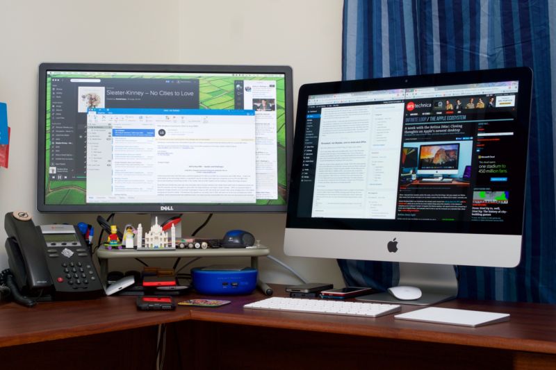
Although Apple released new MacBooks and redesigned MacBook Pros this year, one area of the Mac lineup could still use some attention: the desktop. The iMac was last refreshed in October 2015, the Mac Mini was last refreshed in October 2013, and the Mac Pro dates back to December 2013.
In an internal memo obtained by TechCrunch, Apple CEO Tim Cook briefly addressed the importance of Mac desktops in the lineup. He did so to quell skepticism in the media and possibly among Apple's own staff. The full quote reads:
The desktop is very strategic for us. It’s unique compared to the notebook because you can pack a lot more performance in a desktop—the largest screens, the most memory and storage, a greater variety of I/O, and fastest performance. So there are many different reasons why desktops are really important, and in some cases critical, to people.
The current generation iMac is the best desktop we have ever made, and its beautiful Retina 5K display is the best desktop display in the world.
Some folks in the media have raised the question about whether we’re committed to desktops. If there’s any doubt about that with our teams, let me be very clear: we have great desktops in our roadmap. Nobody should worry about that.
Some of these delayed refreshes can be blamed on Intel, whose CPUs' rate of improvement has slowed significantly in the last three years. The iMac is already using the newest available processors, despite its age. The Mac Mini and Mac Pro, on the other hand, are both using chips that are two or three generations old. The Mac Pro in particular is a sore point, since it's being sold with its original specs and its price hasn't change since it launched three years ago.
Over 400 Apple retail stores around the world have red logos today, in recognition of World AIDS Day. The logos, which Apple has put up at its stores for the last several years on December 1, are meant to raise awareness for the global fight against AIDS.
Earlier this week, Apple announced plans to donate $1 to partner charity (RED) for every Apple Pay purchase made at an Apple Store, on Apple.com, or through the Apple Store app as part of a World AIDS Day campaign. Apple has pledged to donate up to $1 million during the event, which will last until December 6.
Bank of America is also making a donation for every Apple Pay transaction made using its cards from December 1 to December 7, with plans to donate up to $1 million.
Several App Store apps are also offering limited-edition custom (RED) content for World AIDS Day, and all in-app purchase proceeds will be donated. Participating apps include popular titles like Best Fiends, Boom Beach, Clash of Clans, Candy Crush Jelly Saga, Farm Heroes Saga, PewDiePie's Tuber Simulator, Hay Day, Plants vs. Zombies Heroes, and more.
The (RED) initiative has raised more than $365 million to date to stop AIDS in Ghana, Kenya, Lesotho, Rwanda, South Africa, Swaziland, Tanzania, and Zambia. Funds raised by (RED) are donated to The Global Fund, a group that works to end AIDS, tuberculosis, and malaria as epidemics.
Apple is one of (RED)'s biggest contributors and has donated nearly $120 million over the last 10 years.
Disk Utility's Repair Permissions may be one of the most overused services included with OS X. Never the less, it can fix many common issues with your Mac.
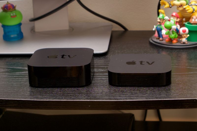
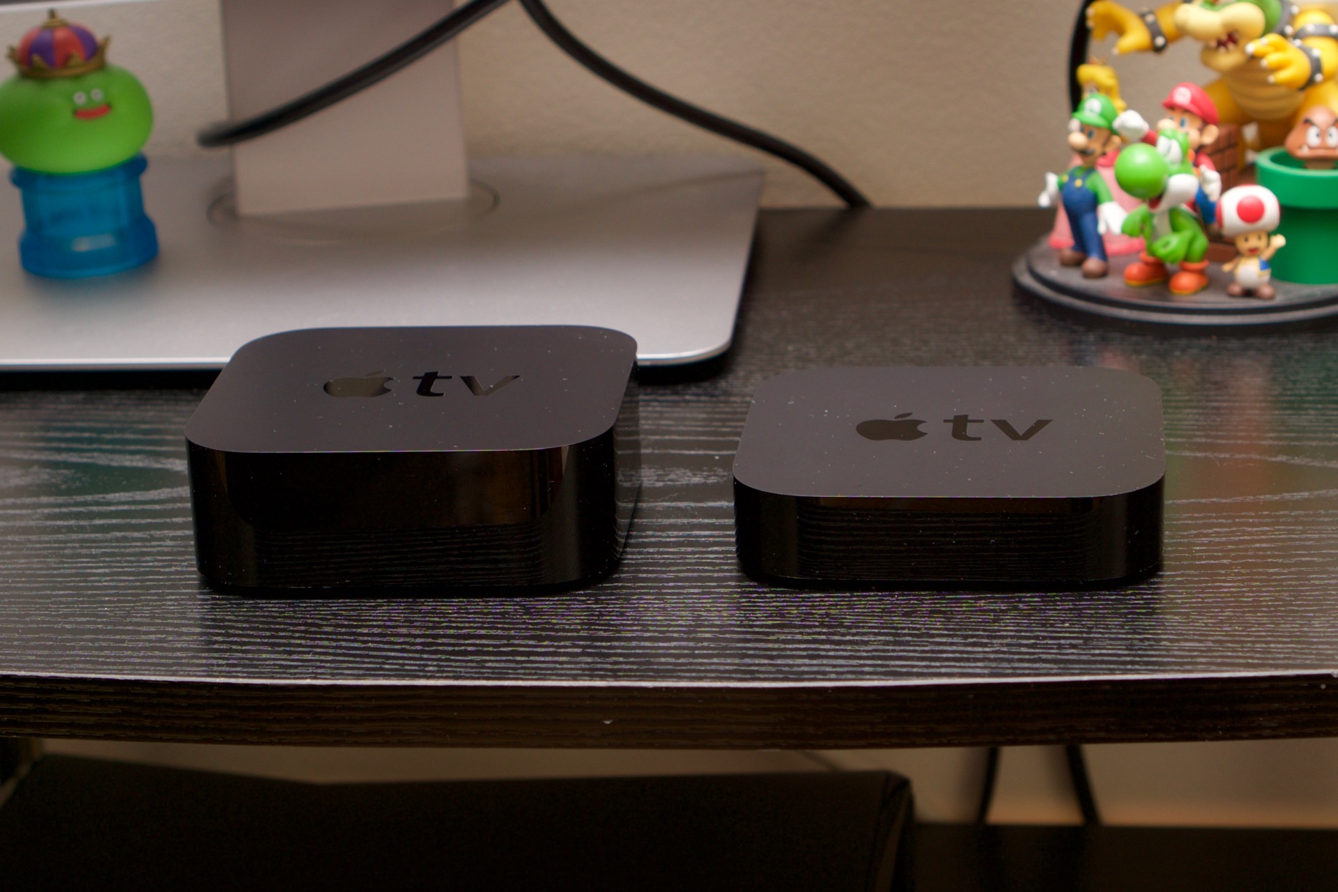
Enlarge / The fourth-generation Apple TV (left) next to the third-gen model. (credit: Andrew Cunningham)
According to an internal e-mail obtained by 9to5Mac, Apple has completely discontinued the third-generation Apple TV and will stop selling it as soon as it fulfills all current orders for the device. It's the end of a long road for that Apple TV model, which was introduced in 2012, updated internally in 2013, and discounted to $69 in 2015. Apple is still selling the fourth-generation model with no changes to its price or storage capacity.
Though it was just removed from sale, it has been well over a year since the third-gen Apple TV received a software update of any great significance. The iOS-based operating system that it runs was still based on iOS 8.4, and though there was some speculation in the run-up to the fourth-generation Apple TV that Apple would build a version of tvOS for the older box, that never came to pass. As it stands, the third-gen model is now two iOS versions behind. It can no longer function as a HomeKit hub, doesn't properly support Apple's new two-factor authentication, can't use features like Apple Music or iCloud Photo Library, and still uses the busted discoveryd DNS service. It can still stream video from its included channels, but it is rapidly falling behind the competition.
Though it was time for the older model to go, this leaves Apple without a midrange or low-end TV streaming box to compete against a wave of new and increasingly capable products in that space from its competitors, including Amazon's new Fire TV stick, the just-announced 4K Chromecast Ultra, and both the $30 Roku Express and the 4K-capable Roku Premiere and Premiere+. And while the fourth-generation Apple TV is still more than fast enough for what it needs to do, paying $149 or $199 for a year-old box that can't handle 4K or HDR content is a tough pill to swallow for anyone not deeply embedded in Apple's ecosystem.
Welcome to this week's edition of The Pixel Project: a weekly comic from Diesel Sweeties' Rich Stevens on Apple, technology, and everything in-between.
Google Chrome is a Web browser by Google, created to be a modern platform for Web pages and applications. It utilizes very fast loading of Web pages and has a V8 engine, which is a custom built JavaScript engine. Because Google has used parts from Apple's Safari and Mozilla's Firefox browsers, they made the project open source.
Version 53.0.2785.113:
Update to Adobe Flash Player 23.0.0.162
Security Fixes:
High CVE-2016-5170: Use after free in Blink
High CVE-2016-5171: Use after free in Blink
Medium CVE-2016-5172: Arbitrary Memory Read in v8
Medium CVE-2016-5173: Extension resource access
Medium CVE-2016-5174: Popup not correctly suppressed
Gridded is a flashcard system for both iOS and OS X that includes a customizable spaced repetition system, powerful editing tools, cloud sync for users with multiple devices, and text-to-speech support for learning foreign languages. It includes thousands of built-in memorizable items to get you started.
Items To Get You Started:
Mandarin Chinese (Simplified Character Pinyin) - 3015 items
Japanese (Hiragana Romaji) - 69 items
Japanese (Katakana Romaji) - 69 items
Mexican State Capitals - 31 items
Rounded Atomic Weights - 84 items
Each Gridded item consists of three fields: a prompt, a response, and notes. Each item can be included in any number of decks, and each deck can be included in any number of exportable, sharable bundles. Items and decks are also categorized by response type.
Editing tools include the ability to merge items with the same prompt within a response type, the ability to split items with long prompts into multiple items, the ability to split large decks into multiple smaller decks, find and replace, case change, and the ability to switch around prompts, responses, and notes. Items can be added one-by-one or from lists, and can be exported in lists as well.
The game is played by first selecting prompts from a grid. Use the shift key to select in a row and use the Str+ and Str- buttons to select and deselect based on strength. The selected prompts will be shown in a list with their responses to be studied. When you are ready, hit play. The selected prompts will be shown randomly and you will have to type the correct response. If successful, each item gotten correct will be badged with the size of the list. These badges can be increased by choosing larger groups of items to play. The game allows responses separated by commas to be played in any order and ignores spaces before and after responses.
Version 1.1.2:
Now with Cloud Data Sync for effortless syncing between multiple devices, even between OS X and iOS!
Color-coded feedback for wrong responses shows you at a glance when you miss a multi-response question, exactly which responses you missed.
Live from Portland, Jason and Myke are joined by Stephen Hackett to cover a lot of follow-up from last week’s Apple announcements. Myke reveals which iPhone 7 he’s buying and considers how his technology and methods will need to change when he travels with it. Jason gives more details about how AirPods work. Finally, we talk a little bit about the impending release of iOS 10.
I tell my students to not worry about the camera they have. Anything bought in the last five years will be a good camera. Learn how to take pictures, how to create images and learn what you like to shoot. Then worry about buying a camera that fits.
SuperDuper! is an advanced, yet easy to use disk copying program. It can, of course, make a straight copy, or "clone" -- useful when you want to move all your data from one machine to another, or do a simple backup. In moments, you can completely duplicate your boot drive to another drive, partition, or image file.
Clones for safety. To ensure you can safely roll back a system after the unexpected occurs. With a few clicks, you can easily "checkpoint" your system, preserving your computer's critical applications and files while you run on a working, bootable copy. If anything goes wrong, just reboot to the original. When you do, your current Documents, Music, Pictures -- even iSync data -- are available! You can get back to work immediately.
Clones for industry! SuperDuper has enough features to satisfy the advanced user, too. Its simple-but-powerful Copy Script feature allows complete control of exactly what files get copied, ignored, even aliased ("soft linked" for the Unix inclined) from one drive to another.
Version 2.9:
Note: Now requires OS X 10.8 or later running on a 64-bit Intel processor
Improved bootability of RAID clones
Add application preference to ignore copy errors induced by Antivirus programs
Schedules now enable Backup on connect for SoftRAID volumes
Restored dyld cache rebuild after copy for 10.8 and later
The Mac App Store will now operate properly when running from a Sandbox
Scheduled Copies window sort order is preserved between launches
Disk Image Save Panel defaults to Sparse Bundle image type
Hard linked files made invalid in 10.10.3 will be now be copied instead of failing due to a link permission error
Fixed the long-standing upgrade animation bug that prevented the full update text from being visible (note: you won't experience the fix until the next auto upgrade)
Fixed intermittent beachballs during launch
Fixed numerous UI issues/edge-cases
Eliminated exceptions that occasionally caused crashes during launch
I don’t often find myself too wistful about features that Apple has removed, but during my travels the other week, I ended up missing one particular piece of functionality that I hadn’t even realized had gone the way of the dodo: time-limited location sharing.
Okay, yes: the feature, which debuted as part of Find My Friends, is still sort of present in iOS 9. But it’s been whittled down to a pretty limited offering.
You can still temporarily share a location via either Find My Friends or via Messages (tap on the ‘i’ button in the top right of a Messages conversation). But in either case, you have only three options: Share for One Hour, Share Until End of Day, and Share Indefinitely.
Older versions of Find My Friends had a nifty feature called Temporary Events, which let you pick an arbitrary date and time when the sharing would end. This would have been a perfect solution for my travels, which included a five-day stint at Gen Con, a huge gaming convention in Indianapolis, at which it’s often handy to be able to find other people that you know.1
Ideally, I would have been able to create a temporary event that shared my location with the handful of friends and family who were also attending, and then have the event automatically end when the convention was over. No muss, no fuss.
Instead, I was left with two somewhat more annoying alternatives: either sharing until the end of the day and re-upping that share every single day of the con, or—what we ended up doing—sharing indefinitely and assuming that we’d all remember to turn it off at the end.
I’m sure Temporary Events add a degree of complexity, but they also definitely offer a middle ground that is otherwise more inconvenient. For multi-day trips where you’re traveling with a group of people, having the ability to create a multi-day span of location sharing would definitely make life a lot easier.
Of course, most of Gen Con takes place inside a huge convention center and connected hotels, places where iOS’s location features often can’t get enough precision to actually be useful. Yes, I know my friends are inside the convention center—that doesn’t really help me know where on the enormous exhibition floor I can meet up with them. ↩
This tutorial will show you how to use Photoshop's 3D tools and material settings, along with a couple of images, filters and adjustment layers, to create a retro, summery, floatie-inspired text effect. Let's get started!
Create a new 1000 x 800 px document, and place the Wave image on top of the Background layer.
Resize the image as needed, and rename its layer to BG Texture.
Step 2
Create the text using the font Brusher and the Size 250 pt.
2. Convert the Text into a 3D Layer
Step 1
With the text layer selected, go to 3D > New 3D Extrusion from Selected Layer.
Step 2
To access the 3D mesh settings and properties, you’ll need to open two panels: the 3D panel and the Properties panel (both found under the Window menu).
The 3D panel has all the components of the 3D scene, and when you click the name of any of those, you’ll be able to access its settings in the Properties panel. So make sure to always select the tab of the element you want to modify in the 3D panel before you change its settings in the Properties panel.
Step 3
If you select the Move Tool, you’ll find a set of 3D Modes for it to the right of the Options bar.
When you choose one of those, you can then click and drag to perform changes (on the selected element in the 3D panel).
Use those modes to change the Current View into an angle you like.
3. Adjust the Mesh Settings
Step 1
Select the 3D mesh tab in the 3D panel, and then, in the Properties panel, change the Texture Mapping to Tile and the Extrusion Depth to 50.
Step 2
Click the Cap icon at the top of the Properties panel, and then change the Bevel Width to 10%, the Contour to Half Round, and the Inflate Strength to 15%.
4. Create the Materials
Step 1
Select all the material tabs in the 3D panel, and then, in the Properties panel use these settings:
Specular: 255, 255, 255
Illumination: 0, 0, 0
Ambient: 0, 0, 0
Shine: 60
Reflection: 15
Opacity: 70
Refraction: 1.3
Step 2
Select the Front Inflation Material tab, and then, in the Properties panel, click the Diffuse folder icon and choose New Texture.
Step 3
Enter 600 for both the Width and Height values, and click OK.
A new file will open with the new document created. If that doesn't happen, click the Diffuse texture icon and choose Edit Texture.
5. Create the Diffuse Texture
Step 1
When the new file opens, duplicate the Background layer.
Step 2
Double-click the Background copy layer to apply a Pattern Overlay effect using the following settings:
Pattern: Back To School Pattern #1
Scale: 25%
Step 3
Go to File > Save, then File > Close to go back to the original document.
Step 4
You might see the texture looking a bit stretched. We'll fix that next.
Keep in mind that you can click the Diffuse texture icon and choose Edit Texture to change the pattern used anytime.
6. Edit the UV Properties
Step 1
Click the Diffuse texture icon and choose Edit UV Properties.
Step 2
What you need to do now is modify the Scale or Tile values until you get a result you like.
This will adjust the tiling of the texture and help you get a better result.
7. Apply the Pattern to the Other Materials
Step 1
Select the Front and Back Bevel, as well as the Back Inflation material tabs in the 3D panel.
Then, in the Properties panel, click the Diffuse folder icon, and choose the Front Inflation texture from the list.
Step 2
This will apply the pattern to the selected materials. You can then adjust the UV Properties for each material separately.
The Bevel materials do not have to look perfect. You can use different UV values to stretch them a little bit and make the texturing more dynamic.
8. Create the Extrusion Material
Step 1
Select the Extrusion Material tab, and create a new 300 x 175 pxDiffuse texture file.
Step 2
Duplicate the Background layer in the new texture file.
Step 3
Double-click the Background copy layer to apply a Pattern Overlay effect using the following settings:
Pattern: Back To School Pattern #1
Scale: 10%
Step 4
Save and close the file.
Step 5
Adjust the UV Properties for the Extrusion texture.
If the values you enter don't work properly, try going back to the mesh's Texture Mapping option, and switch it to Scale and then back to Tile again.
After that, go back to the UV values and readjust them.
9. Adjust the Lighting
Step 1
Select the Infinite Light 1 tab in the 3D panel.
Then, in the Properties panel, change the Color to (251, 249, 239), the Intensity to 100%, and the Shadow Softness to 50%.
Step 2
Use the Move Tool to move the light around, or you can click the Coordinates icon at the top of the Properties panel, and enter numerical values for that.
Step 3
Click the Environment tab, and then click the IBL texture icon and choose Replace Texture.
Step 4
Open the Beach Splash image, and then change the Intensity to 30% and the Ground Plane Shadow Opacity to 2%.
Step 5
You can use the Move Tool to drag the texture until you get a result you like.
Step 6
Once you're done, choose a final angle you like, and go to 3D > Render. The rendering might take a while, but you can stop it at any time by pressing the Esc key.
10. Create the Reflection
Step 1
Make sure that the 3D layer is selected, and then go to Select > All, and Edit > Copy.
Create a new layer below the 3D layer, name it Reflection, and go to Edit > Paste Special > Paste in Place.
Right-click the Reflection layer, and choose Convert to Smart Object. Then do the same for the 3D layer.
Step 2
Press Command-T to enter Free Transform Mode, and right-click anywhere near the bounding box to get a list of all the options you can work with.
Start by choosing Flip Vertical at the bottom of the list.
Step 3
Then start using the other options to get the reflection to look as realistically positioned as possible.
Step 4
You can also click the Warp icon in the Options bar, and choose one of the presets to help you with adjusting the reflection.
Once you're done, hit the Return key to commit the changes made.
11. Apply Some Filters
Step 1
Change the Reflection layer's Blend Mode to Overlay and its Opacity to 50%.
Step 2
Go to Filter > Distort > Ripple, and change the Amount to 86 and the Size to Large.
Step 3
Go to Filter > Distort > ZigZag, and then change the Amount to 3, the Ridges to 5, and the Style to Around Center.
12. Adjust the Coloring
Step 1
Add a Selective Color adjustment layer, and use these settings for the Reds (since the pattern color is red):
Cyan: 25
Magenta: -10
Yellow: -5
Black: 20
Step 2
Add a Levels adjustment layer, and then change the Shadows value to 15 and the Highlights to 250.
13. Add the Water Splashes
Step 1
Add a water splash image from the Water Splash PNGs on top of all layers, place it at the bottom of the text, and resize it as needed.
Step 2
Change the splash layer's Blend Mode to Lighter Color and its Fill value to 10%.
Step 3
Double-click the splash layer to apply the following layer style:
Add a Bevel and Emboss with these settings:
Size: 4
Gloss Contour: Ring
Check the Anti-aliased box
Highlight Mode: Vivid Light
Opacity: 75%
Shadow Mode - Opacity: 0%
Step 4
Add a Contour with these settings:
Contour: Ring
Check the Anti-aliased box
Step 5
This will style the splash. Right-click the styled layer, and choose Copy Layer Style.
14. Modify the Splash and Add Some More Splashes
Step 1
Add a layer mask to the splash layer, and then pick the Brush Tool, and choose one of the splash brush tips from the Splashes pack.
Set the Foreground Color to Black, and then use the brush to erase any unwanted areas from the water splash image you have.
Step 2
Add some more splash images, and for each layer of splashes you add, right-click it, and choose Paste Layer Style to style it.
Once you're done, place all the splash layers in a group and call it Splash.
Step 3
Add a new layer on top of all the splash layers inside the group, and paste the same layer style to it. Then use some more splash brushes to add more splashing water all over the text.
15. Add the Texture, Apply a Filter, and Perform Any Finishing Touches
Step 1
Add the Texture 637 image on top of all layers, resize it as needed, and then change its layer's Blend Mode to Soft Light and its Opacity to 60%.
Step 2
Press the Option-Command-Shift-E keys to create a stamp layer on top of all layers. Rename the stamp layer to High Pass, and convert it to a smart object.
Step 3
Go to Filter > Other > High Pass, and change the Radius to 2.
Step 4
Change the High Pass layer's Blend Mode to Soft Light and its Opacity to 50%.
Step 5
Add a Gradient Map adjustment layer on top of all layers, and create a gradient fill using the colors #5c6070 to the left, #8b9376 in the center, and #fddd8e to the right
Check the Dither box, and then change the layer's Blend Mode to Soft Light and its Opacity to 50%.
Step 6
Finally, you can decrease the Reflection layer's Opacity a bit more if the reflection looks too strong.
Congratulations! You're Done
In this tutorial, we created some text, converted it into a 3D layer, and adjusted its settings and properties. Then, we created the text's material, adjusted the scene's lighting, and rendered the final 3D effect.
After that, we created the reflection and added some water splashes all around the text. Finally, we used some adjustment layers, filters, and textures to finish everything off.
Please feel free to leave your comments, suggestions, and outcomes below.
With the looming update to Android Wear 2.0, legacy apps (and devices) are going the way of the buffalo. In this case, it's the Together watch face that included one-to-one communications like doodles and photos with another person using Google's wea...
Bugz is a local database to manage bugs and feature request for your products. Features:
Create and change bug reports
Maintain the status of bugs
Show all or only a selection of bugs
Add attachments to bugs
Send mails with all the bug details
Create reports
Create screenshots of windows/screen from within the application
Services menu support
Version 2.0.0:
The user interface has been overhauled.
The product list has been separated from the priority/status list for more clarity.
Added milestones for a product
The ticket details screen is no longer a separate sheet. You can now type immediately without clicking an edit button/menu option.
The mail sheet is no longer a sheet but a window.
New option: you can select to use Apple's Mail app to send mail. If not selected the in-app mail functionality will be used.
Added option wether or not to include the attachments in the mail.
Now possible to make a backup of your database when Bugs quits. You can also set the number of backups you want to keep an where you want to keep your backups.
Status and priority can now be given colours in the sidebar and the ticket list.
New export option: export tickets as RTF.
New export option: export all tickets visible in the list in CSV format. All fields except the attachments will be exported.
Quicklook (with space bar) can be used to quickly view attachments.
You can now buy your license directly from the application.
The ticket details will now show counters for the number of comments and attachments.
New field: tag
New field: related tickets
Various bug fixes which should also improve performance.
Paying attention to the interplay of light and shadow can help you make your digital paintings look more life-like. So in our new course, How to Digitally Paint Lighting Scenes, digital artist Char Reed will discuss the theory of how light can make or break your digital paintings. You'll then get practical and be shown how to digitally paint lighting on various objects and scenes, all within Adobe Photoshop.
You can take our new course straight away with a free 10-day trial of our monthly subscription. If you decide to continue, it costs just $15 a month, and you’ll get access to hundreds of courses, with new ones added every week.
Or if you want to take a shortcut to creating great lighting effects, check out some of the lighting Photoshop actions on Envato Market.
Since summer is upon us, I decided to give you a small treat by putting together this awesome tutorial, which will help you learn how to create four little summer-themed icons using the power of Illustrator. You'll see how easy it is to create these items using some basic shapes and tools that we normally use on a daily basis.
You can always
expand the set by heading over to Envato Market, where you’ll find tons of
beautifully crafted icon packs at the press of a button.
Now, without wasting any more time, let’s jump into it.
1. Set Up a New
Document
As with any new
project, start by taking a couple of moments to set up a new proper document.
To do this, go to File > New or use the Control-N keyboard shortcut and adjust
it using the following settings:
Number of Artboards: 1
Width: 800
px
Height: 600
px
Units: Pixels
And from the Advanced tab:
Color Mode: RGB
Raster Effects: Screen
(72 ppi)
Align New Objects to
Pixel Grid: checked
Quick tip: most
of the indicated settings can be triggered by setting the document’s Profile to Web, the only one that won’t get automatically set is the Size (Width x Height) which you will
have to manually select.
2. Set Up a Custom
Grid
Since Illustrator
lets us take advantage of its powerful Grid
system, we will want to set it up using the lowest possible values, so that
we can take full control over our shapes by making sure they are perfectly
snapped to the underlying Pixel Grid.
The settings that
we’re interested in can be found under the Edit
> Preferences > Guides & Grid submenu, and should be adjusted as
follows:
Once we’ve set up
our custom grid, all we need to do to make sure our shapes look crisp
is enable the Snap to Grid option,
found under the View menu, which
will change into Snap to Pixel each
time you enter Pixel Preview mode.
Since we’re aiming to create the icons using a pixel-perfect workflow, I
strongly recommend you go through my how to create pixel-perfect artwork
tutorial, which will help you widen your technical skills in no time.
3. Set Up the
Layers
With our new
project file created, it would be a smart idea to layer our icon pack, in order
to establish and maintain a steady workflow which will allow us to focus on one
icon at a time.
So, bring up the Layers panel, and create a total of
five layers, which we will rename using keyword descriptions to make them
easier to identify:
layer 1 >
reference grids
layer 2 >
mojito jar
layer 3 > ice
cream
layer 4 >
surfboard
layer 5 > sand bucket
Quick tip: the
way that we’re going to be using these layers is fairly simple. Frist, we’ll
make sure that all the layers except the one that we are currently working on
are locked, by clicking on the little empty box (the Toggles Lock) found next to the eye icon.
As soon as we’re done creating the current icon, we’ll lock its layer
and then move on to the next one, repeating the same process until we’ve
managed to create all of them.
4. Create the
Reference Grids
The Reference Grids (or Base Grids) are a set of precisely
delimited reference surfaces, which allow us to build our icons by focusing on
size and consistency.
Usually, the size
of the grids determines the size of the actual icons, and they should always be
the first decision you make, once you start a new project, since you’ll always
want to start from the smallest possible size and build on that.
Now, in our case,
we’re going to be creating the icon pack using just one size, more exactly 128 x 128 px, which is a fairly large
one.
Step 1
Assuming you’ve locked all the other layers except for the reference
grids one, grab the Rectangle Tool (M) and
create a 128 x 128 px red (#FF6B57)
square, which will help define the overall size of our icons.
Step 2
Then, add another smaller 116 x
116 px one (#F2F2F2) which will act as our active drawing area, thus giving
us an all-around 6 px padding.
Step 3
Group the two squares together using the Control-G keyboard shortcut, and then create three copies positioned 40 px from one another, making
sure to align them to the center of the Artboard.
Once we have all
the reference grids in place, we can lock the current layer so that we won’t
accidentally move them, and then move on to creating the universal background
that we’re going to be using for each of our icons.
5. Create the
Default “Blank” Icon
Compared to other
icon tutorials that we’ve done in the past, this one is actually a lot easier,
since each icon shares the same collective background, which makes our job a
lot more straightforward.
What this means is that we can build a “blank” icon which we will then
use to create the actual icons by adding specific details to its
composing elements, thus making the creative process really easy to follow and
implement.
Step 1
Position yourself
over the first reference grid, and zoom in on it so that you can have a better
view of what we’re going to be doing.
Then, using the Ellipse Tool (L),
create an 88 x 88 px circle, which
we will color using #34D5EA, and then position towards the center lower section
of the active drawing area, leaving a 4
px gap for the outline.
Quick tip: at this point, I recommend you start using the Pixel Preview mode (View > Pixel Preview or Alt-Control-Y) so that you can more
easily position your shapes in relation to the underlying pixel grid.
Step 2
Give the shape an outline, by selecting it and then going over to the Object > Path > Offset Path submenu,
and entering 4 px into the Offset value field from the pop-up
window, making sure to change its color to something darker (#493E3E).
Quick tip: if you’ve never used the Offset Path tool to create outlines, you can learn about the process
by reading this tutorial that compares the two main methods for creating line icons.
Step 3
Once we have the
main shape and its outline, we need to add the ring-like highlight which will give
the background a nice visual pop.
To do this, simply select the blue circle, and create a copy of it (Control-C > Control-F) to which we
will then select apply a -4 px offset.
Then, with both the copy and the offset selected, we will use Pathfinder’s Minus Front shape mode to create the cutout.
Step 4
Once we have our new shape, we will need to adjust it by changing its
color to white (#FFFFFF) and setting its Blending
Mode to Soft Light, lowering its
Opacity to 80%.
Next, we’re going
to begin adding a couple of details to the background, and we will do so by
starting with the beach sand.
Step 5
Grab the Pen Tool (P) and
draw a rectangle that has a nice curved line towards the top, using a gold yellow
(#EDBC32) as your main color, making sure to position the shape towards the
lower section of the blue circle.
Quick tip: you
can get an idea of the size of the shape making up the sand, by taking a quick
look at the values I ended up with, which are 96 px for the Width and 50 px for the Height.
Step 6
With the sand in place, we now need to give it a nice 4 px thick outline using the Offset Path method, making sure to
change its color to something darker (#493E3E).
Step 7
Give the sand some texture, by adding a couple of 2 x 2 px circles (#D19A20) to each side, making sure to group them
using the Control-G keyboard
shortcut.
Quick tip: as
you can see, I’ve covered a specific area of the sand (more precisely the
left and right sides) using the little circles, since the center space will be
occupied by a key object which will have the same width value for almost all of
the icons.
In your case, you can fill up that space if you feel like it, and then
adjust the number of circles once you add the key object.
Step 8
At this point, we
need to start masking the beach sand, and we will do so by first selecting and
grouping (Control-G) all of its
shapes (the fill shape, the outline and the sand texture) together.
Then we will use a copy of the blue shape which we will position above
them and use as a Clipping Mask by right clicking and selecting Make Clipping Mask.
As you can see, our beach sand is now perfectly
masked, but it needs a couple of highlights to keep the style of the icon
going.
Step 9
Add the ring highlight to the beach sand section, by grabbing a copy (Control-C) of the one used for the blue
circle and pasting it (Control-F)
inside the masked group. Then, use the yellow shape to mask it so that it
won’t overlap its outline.
Quick tip: you
can easily enter Isolation Mode to
edit a Clipping Mask or set of
grouped objects by double clicking on them. Then, when you need to exit, simply
press Escape.
Step 10
Add a highlight to the upper section of the beach sand, making sure to
mask it using an 80 x 80 px circle,
so that the highlights don’t overlap.
Step 11
Start working on
the first set of clouds, by creating a 16
x 8 px rounded rectangle with a 4 px
Corner Radius, which we will color using white (#FFFFFF) (1). Then create
the connector element by drawing a 6 x 2
px rectangle (2), to which we will add 2
x 2 px circles (3), one on each side, which we will use to create the cutouts
(4).
Finish this first set of clouds by adding a 12 x 4 px rounded rectangle with a 2 px Corner Radius towards the lower section of the connector piece
(5).
Step 12
Group all of the clouds elements together using the Control-G keyboard shortcut, and then position them towards the
left upper corner of the icon, making sure to adjust them by setting their Blending Mode to Lighten and lowering their Opacity
to 50%.
Step 13
Create a couple of
clouds towards the right section of the blue circle, and then make sure to
group (Control-G) and place all of
them within the beach sand’s Clipping
Mask.
Then select all of the shapes that we’ve built so far, and group them
since we’ll be creating and using a copy for each of the icons.
Step 14
Once we have our default background, we need to create three copies
of it, so that’s one for each of the remaining icons, and position them onto
the reference grids, making sure to paste them onto the available layers.
At this point
we’re pretty much done working on the default “blank” icon, which means that we
can now move on and start adding the key objects for each of the four icons.
6. Create the
Mojito Icon
The first icon
that we’re going to be creating is the little mojito jar. Since we’re already
on the right layer, we can start working on it directly without having to lock
and unlock any of the other layers.
Step 1
Using the Rectangle Tool (M) create
a 48 x 50 px shape, which we will
color using #9FBA7D and then position towards the bottom section of the beach
sand, making sure to horizontal center align it using the Align panel.
Step 2
Next, add a smaller 28 x 4 px rectangle
(#9FBA7D) towards the upper section of the shape that we’ve just created, at a
distance of 16 px.
Step 3
Using the Pen Tool (P),connect
the two shapes that we’ve created by drawing the neck section using two curved
lines, making sure to drag and intersect each of the two side handles 8 px from their origin point.
Step 4
Select all three shapes making up the mojito jar, and combine them into
a single object using Pathfinder’s Unite Shape Mode.
Step 5
Once we have the main shape for our jar, we can give it a 4 px thick outline (#493E3E) using the Offset Path method (select > Object > Path > Offset
Path> and enter 4 px into the Offset value field).
Step 6
Next, add the first neck ridge by creating a 36 x 2 px rounded rectangle with a 1 px Corner Radius, which we will color using #CCC8BE. Give it a 4 px outline (#493E3E) and then
position it towards the upper section of our jar, so that their outlines
intersect.
Step 7
Add another ridge above the one that we’ve just created by selecting the
two shapes, and dragging them towards the top while holding down the Alt (to create the copy)and Shift (to drag in a straight line) keys.
Step 8
Start adding details to the jar by creating the side highlights using a -2 px offset, which we will adjust by
removing its top and bottom middle sections. Color the resulting shapes using
white (#FFFFFF) and then adjust their Transparency
by setting their Blending Mode to
Soft Light and lowering their Opacity to 80%.
Step 9
Using the Rectangle Tool (M) create a 2 x 70 px shape and then add another
slightly wider 4 x 70 px one which
we will position 2 px from its
right side, making sure to group (Control-G)
and then adjust their transparency using the same values that we applied
to the side highlights.
Once you’re done, position them onto the jar, a few pixels towards its
right side.
Step 10
Add a 28 x 4 px rectangle
(#000000) underneath the first ridge’s outline, and turn it into a shadow by
lowering its Opacity level to 40%.
Step 11
Next using the Ellipse Tool (L) draw
two rows of 2 x 2 px circles (#493E3E) positioned 2 px from one another, and then
group (Control-G) and position them
towards the center of the jar, about 20
px from its first ridge.
Step 12
Grab the Rounded Rectangle Tool and
create a 24 x 42 px shape with a 12 px Corner Radius which we will color
using #EDDAC0, give a 4 px outline
(#493E3E), and then position towards the center of the jar, at a distance of 8 px from the grip dimples that we created a moment ago.
Step 13
Give the label that we’ve just created some polish by adding a couple
of highlights using the same process and values as we did with the jar’s main
body.
Step 14
Add a couple of detail elements to the label using some simple shapes
such as circles, rectangles, and a rounded rectangle. Once you’re done, select
all of its composing shapes, and group them together using the Control-G keyboard shortcut.
Step 15
Next, move on up
towards the top section of the jar, and add a couple of highlights to its two
ridges, using white (#FFFFFF) as the main color, Soft Light for the Blending
Mode and 80% for the Opacity.
Once you’re done, group each ridge’s elements together using the Control-G keyboard shortcut.
Quick tip: while
some details might not be instantly visible at a 100% zoom level, it’s always a good idea to have them, since you
never know when you'll need a larger version of the asset for a different project.
Step 16
Start working on the straw, by creating a 4 x 22 px rectangle, which we will color using #EDDAC0, give a 4 px outline (#493E3E), and then
position towards the right side of the jar’s top section.
Step 17
Add a 4 x 2 px rectangle (#FFFFFF) towards
the top section of the straw which we will turn into a highlight by setting its Blending Mode to Soft Light and lowering its Opacity to 90%.
Then, add a 4 x 4 px black
(#000000) square towards its bottom section, and turn that into a shadow by
lowering its Opacity to 40%.
Step 18
Finish off the straw by adding two diagonal lines using the Pen Tool (P), which we will color using
#493E3E. Once you’re done, select all of the straw’s composing elements and
group them using the Control-G keyboard
shortcut.
Step 19
Start working on the mint leaf, by creating a 14 x 14 px circle (#809B54) (1) which we will adjust by selecting
its top anchor point, and pushing it
towards the top by 8 px (2). Then,
give the shape a 4 px outline (#493E3E)
(3), a ring highlight (color: white;
Blending Mode: Soft Light; Opacity: 80%) (4), and finally rotate
the entire leaf 45 degrees (5), making
sure to add a shadow (color: black; Opacity: 40%) towards its bottom
section (6).
Step 20
Group all of the elements together using the Control-G keyboard shortcut, and then position the leaf towards the
left side of the straw.
Since at this
point we’re pretty much done with the mojito jar, we can select and group all
of its elements together using the Control-G
keyboard shortcut so that they won’t get misplaced by accident.
Step 21
To finish off the
first icon, we will have to mask the jar’s lower section so that it ends up
following the curvature of the background.
To do this, simply create a copy of the blue circle (Control-C) and paste it on top of the
jar (Control-F).
Step 22
Since we want the top section of our jar to go outside of the
background’s surface, we will need to adjust the circle by removing its top
anchor point and then drawing a new path using the Pen Tool (M),making
sure to go all the way to the top side of the active drawing area.
Step 23
With the circle adjusted, simply select both it and the mojito jar, and
then right click and hit Make Clipping Mask. Then group the
masked jar to its background, by selecting the two and pressing Control-G.
Since we’re done
with our first icon, we can lock its layer, and move on up to the next one
where we’ll start working on the ice cream icon.
7. Create the Ice Cream Icon
Assuming you’ve already zoomed in
onto the second reference grid, let’s start working on our second icon.
Step 1
Grab the Rounded Rectangle Tool,
and create a 48 x 92 px shape (#E25439)
with a 6 px Corner Radius, which we
will adjust by changing the roundness of its top corners to 24 px using the Transform panel. Give it the usual 4 px outline (#493E3E) and then position the two shapes towards the
top section of the active drawing area.
Step 2
Give the upper section of the icon some polish by adding some
highlights, using white (#FFFFFF) as the main fill color, Soft Light for the Blending
Mode and 80% for the Opacity.
Once you’re done,
select and group all of its composing elements using the Control-G keyboard shortcut.
Step 3
Start working on the ice cream’s wooden stick, by drawing a 12 x 12 px square which we will color
using #D3B276 and then give a 4 px outline
(#493E3E), making sure to position the two just underneath the larger section
that we created a few steps ago.
Step 4
Using the Rectangle Tool (M), create
two 2 x 12 px shapes (#FFFFFF) and
position one on each side of the ice cream’s stick, making sure to adjust them
by setting their Blending Mode to Soft Light, and then lowering their Opacity to 80%.
Step 5
Add some texture to the stick by drawing a couple of 2 px wide rounded rectangles using #B2915D
as the main color.
Step 6
Create another 12 x 4 px black
(#000000) rectangle which we will position towards the top section of the
stick, and then turn it into a shadow by lowering its Opacity level to 40%.
Once you’ve added
the shadow, select all of the stick’s elements and group them (Control-G) so they won’t get misplaced
by accident.
Step 7
Group all of the ice cream’s composing elements together using the Control-G keyboard shortcut, and then
mask them using the same process that we used for the first icon.
Since at this
point we’ve finished creating the second icon, we can now lock its layer and
move on to the third one.
8. Creating the
Surfboard Icon
We are now down to our third icon, the surfboard, which will be pretty
easy to create, as was the ice cream one.
Step 1
Using the Ellipse Tool (L),
create a 48 x 164 px shape, which we
will color using #D3B276. Then give it the usual 4 px outline (#493E3E), making sure to position both shapes onto the
third background, aligning them towards the top side of the active drawing
area.
Step 2
Give the board a ring-like highlight using white (#FFFFFF) as the main fill color,
Soft Light for the Blending Mode and 80% for the Opacity level.
Step 3
Give the board some texture by creating a couple of 2 px wide rounded rectangles (#B2915D)
positioned at various distances from one another, making sure to mask them so that
they won’t go outside its main surface.
Step 4
Add two more vertical highlights (color:
white; Blending Mode: Soft
Light; Opacity: 80%) and position
them towards the right section of the board, making sure to mask them so that
they won’t overlap with the larger ring highlight.
Step 5
Continue adding details to the board by creating an 18 x 32 px ellipse, which we will color
using #EDDAC0.Give it a 4 px outline (#493E3E), and then
position it towards the center of the board, about 82 px from the top side of its larger outline.
Step 6
Add the usual highlights to the round shape that we’ve just created, and
then finish off the board by adding a 2
x 84 px rectangle (#493E3E) to its center, which goes all the way from the
ellipse to the tip of the board.
Step 7
Select all of the
surfboard’s composing elements, and group them together using the Control-G keyboard shortcut, so that
you can then mask them to the background as we did with all the other icons.
Once you’re done, select the masked board and the background and group
those as well.
9. Creating the
Sand Bucket Icon
We’re almost there! All we have to do is create the fourth and last icon from the bunch.
So, assuming you’ve already moved on to the sand bucket layer, zoom in
on its reference grid and let’s wrap things up.
Step 1
Using the Rectangle Tool (M), create
a 40 x 28 px shape, which we will
color using a dark grey (#AAA79F) and then position towards the center of our
active drawing area, aligning it to the bottom side of the beach sand.
Step 2
Adjust the shape by selecting its bottom anchor points one at a time
using the Direct Selection Tool (A),and pushing them towards the inside by
2 px, giving the resulting shape a 4 px outline (#493E3E) using the Offset Path method.
Step 3
Add the usual highlights and shadows to give the object a little visual
pop. Use white (#FFFFFF) in combination with Soft Light and an 80%
Opacity for the highlights, and black (#000000) with a 40% Opacity for the shadow.
Step 4
Add the label by creating a 16 x
20 px rounded rectangle with an 8 px
Corner Radius, which we will color using #EDDAC0. Give it a 4 px outline (#493E3E) and then
carefully position both shapes towards the center of the bucket, leaving a 10 px gap towards its top
side.
Step 5
With the label in place, give it some highlights and add two little
rectangles (#493E3E) as dummy text to make it more visually appealing.
Once you’re done,
select and group all of the bucket’s composing elements using the Control-G keyboard shortcut.
Step 6
Using the Rectangle Tool (M), create
a 48 x 10 px shape, which we will
color using #CCC8BE. Give it a 4 px outline
(#493E3E) and then position it towards the upper section of the bucket section
that we’ve just created, making sure that their outlines overlap.
Step 7
Give the new shape some highlights, using white (#FFFFFF) for the main
color, adjusting its Transparency by
setting its Blending Mode to Soft Light and lowering its Opacity level to 80%.
Step 8
Next, add two sets of three 2 x 2
px circles (#493E3E) positioned 2
px both vertically and horizontally from one another, and position one on
each side of the bucket’s top section.
Step 9
Finish off the top section of the bucket, by adding a 22 x 2 px rounded rectangle (#493E3E)
with a 1 px Corner Radius to its
center. Then select all of its composing elements and group them together using
the Control-G keyboard shortcut.
Step 10
Start working on the little shovel by creating an 8 x 46 px rectangle, which we will color using #E25439. Give it the
usual 4 px outline (#493E3E) and
then position both shapes above the sand bucket, making sure their outlines
overlap.
Step 11
Add two 2 x 44 px rectangles
(#FFFFFF) to each of its sides, and turn them into highlights by setting their Blending Mode to Soft Light and lowering their Opacity
to 80%.
Step 12
Using the Rectangle Tool (M),create
a smaller 8 x 4 px shape, which we
will color using black (#000000) and then turn into a shadow by lowering its Opacity to 40%, making sure to position it towards the lower section of the
shovel’s body.
Step 13
Next, add some detail lines to the current section of the shovel, by
creating a 2 x 14 px rectangle
followed by another smaller 2 x 2 one
positioned 2 px from it. Color
both shapes using #493E3E and then align them to the center of the red shape, a
few pixels above the shadow that we’ve just created.
Step 14
Create the shovel’s handle by drawing a 28 x 20 px rounded rectangle with a 4 px Corner Radius (1), from which we will cut out a 20 x 12 px rectangle (2) using Pathfinder’s Minus Front shape mode. Give the resulting shape a 4 px outline (#493E3E) (3), making sure
to send it to the back (right click >
Arrange > Send to Back) (4). Then add two 6 x 4 px rounded rectangles (#493E3E) with a 2 px Corner Radius to the lower section of the outline (5), and
finish the handle by adding some highlights (6).
Step 15
Group all of the sand bucket’s elements together using the Control-G keyboard shortcut, and then
mask them using the same process as we did with the rest of the icons.
And That’s It!
There you have it: four sweet-looking icons just ready to kick off the summer vibe. I hope you’ve managed to follow each step of the tutorial, and as always learned something new and useful along the way.
The guys in the booth went nuts. They came on the speaker and said, “Hey, keep doing that. That’s really good.” So we kept at it. But all we had was this cool riff. Mars suggested we add an instrumental interlude. He played these chords that led into the jam, for which I later wrote the lyrics, “Close your eyes girl/ Look inside girl/ Let the sound take you away.”
Told by the guys who wrote the song. I just love these stories.
The gentle whine of the haptics, the new rumble support, those inner paddles that make toggling run and crouch so easy ... oh, and the one-click quick-save! I may be in the minority, but I love my Steam Controller.
The divisive Valve device has just...
Device: Mac OS Category: Games Price: $2.99 -> Free, Version: 1.0 (iTunes)
Description:
Do you have little ones learning to count?
Join Blushy, Toothy, Golly, Taily, Blobby, Growly and other cute monsters on a fun introduction to the numbers 1 through to 10.
iOS versions of this app have been recognised as follows:
• App Store Best of 2013, Innovative Kids App • Kids-Best for 5 and under - selected by Apple • Editor's Choice Award 4.5 Stars, childrenstech.com • Featured on mashable.com,"Top Apps for Kids" • Editor's Favourite Award, appysmarts.com
Cutie Monsters is a simple app designed specifically for the development needs of toddlers and preschoolers, fun jigsaw puzzles along with an interactive “Click to Count” counting book, will help young ones who are learning to count.
We love making kids apps that are safe and free from 3rd party advertising. Please help us to continue to do so by purchasing other apps in the series or checking out our new Cutie Monster T-shirts on sale at www.cutiemonsters.com
Device: Mac OS Category: Games Price: $4.99 -> $.99, Version: 1.0.1 (iTunes)
Description:
The most fun you'll ever have in outer space. Space 2048 moves the old 2048 game into outer space with great visuals, animations and the entire universe as background. Move entire planets to get to your score, surrounded by galaxies, suns and asteroids.
For an engulfing game experience Space 2048 includes a soundtrack and great sound effects. You can quit the game at any time and continue exactly where you left off later. There is an undo for any mistakes you might make and you always have a history of your last 8 scores available.
The rules for the Space 2048 game are very simple. There are only four game moves. Use the arrow buttons to move to the left, the right, the top or the bottom. All planets will then move into that direction as far as they can. Planets of the same kind will merge into a new planet with their combined value and your score is updated. You win once you have one planet with the value of 2048. And that is much easier said then done.
Visuals are a big part of the gaming experience and to match the overall theme all interface elements like the triple setting sound switch for example (full sound with background music, effects only or sound off) rotate floating in space. And while the true stars - pun intended - of Space 2048 are the planets with their magnificent slow rotation, they are more than matched in grandiosity by those fascinating backdrops. The latter are images taken by the Hubble Space Telescope with titles like "Antennae Galaxies" or "Ring Nebula".
Space 2048 makes for ideal casual entertainment. The galactic backgrounds become more dramatic the further along you get in your game and you keep adding new planets. The soundtrack specifically written for Space 2048 enhances the overall atmosphere as soft background component. And then most importantly there still is the goal - to get to the magic number - 2048. So this truly is - the most fun you ever had in outer space.
Features • Fully animated with superb visuals • Great soundtrack and effects • History of played games • Undo and Resume functionality • Supports arrow keys and WASD input • Complete game - no add-ons needed
For more screenshots and several videos of the application in action, please visit the website indicated below.
What's New
In version 1.0.1 we improved animations throughout the game and also added a new app icon.
At this week's annual E3 game show, Sony revealed the exact ship date for its PlayStation VR setup: October 13th. Pre-orders have been open since March, but if you're still weighing the pros and cons, you'll have the chance to try before you buy star...
This is a big deal to professional shooters and anyone who shoots in RAW but edits on their iOS device. It will also bring a lot of changes to apps in iOS that allow you to edit photos. And it means that, undoubtedly, RAW capture will be available in the next version of the iPhone and iPad.
 Elon Musk told a Model S owner in late November that the Enhanced Autopilot update should roll out sometime in mid-December. Now, the Tesla chief has confirmed the company's timeline on Twitter. He announced that the automaker "might be ready to to r...
 Over the last few months, the developers of Firefox have been slowly rolling out technology that will bring the browser up to par with competitors when it comes to speed, security and reliability. Others like Chrome, Safari and Edge are already desig...


 Welcome to this week's edition of The Pixel Project: a weekly comic from Diesel Sweeties' Rich Stevens on Apple, technology, and everything in-between.


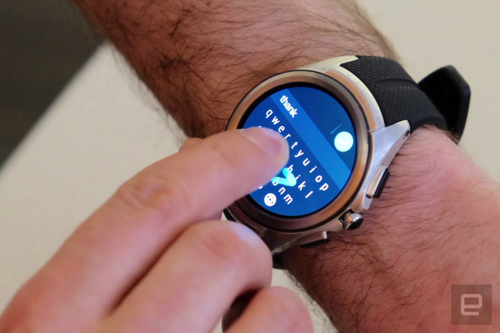 With the looming update to Android Wear 2.0, legacy apps (and devices) are going the way of the buffalo. In this case, it's the Together watch face that included one-to-one communications like doodles and photos with another person using Google's wea...


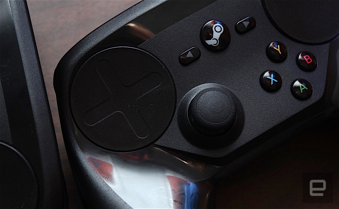 The gentle whine of the haptics, the new rumble support, those inner paddles that make toggling run and crouch so easy ... oh, and the one-click quick-save! I may be in the minority, but I love my Steam Controller.
The divisive Valve device has just...
The gentle whine of the haptics, the new rumble support, those inner paddles that make toggling run and crouch so easy ... oh, and the one-click quick-save! I may be in the minority, but I love my Steam Controller.
The divisive Valve device has just...

 Description:
 Description:


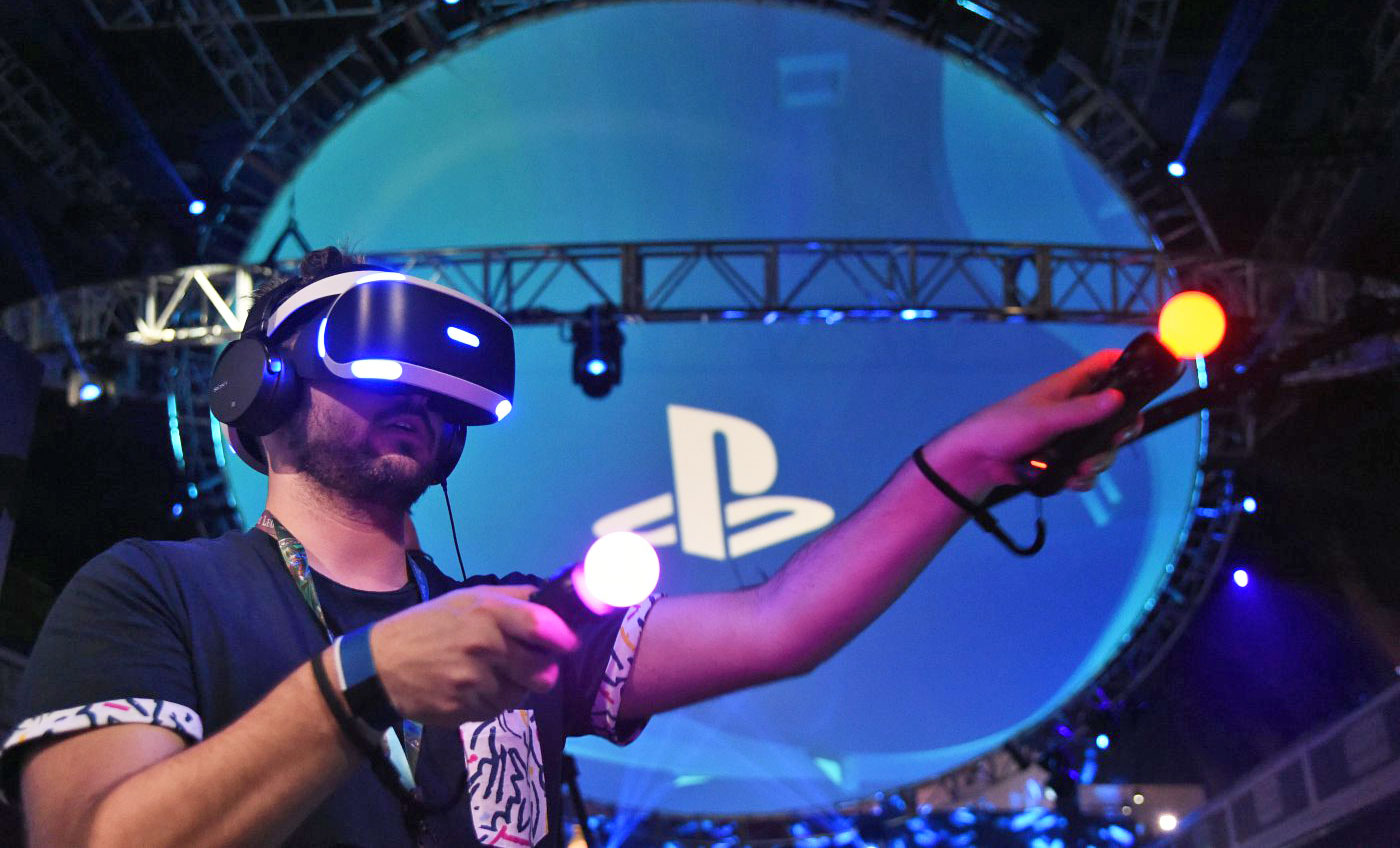 At this week's annual E3 game show, Sony revealed the exact ship date for its PlayStation VR setup: October 13th. Pre-orders have been open since March, but if you're still weighing the pros and cons, you'll have the chance to try before you buy star...