Comic artist Rob Liefeld has carried two reputations throughout his career, both of which can be considered two sides of the same coin. To many, Liefeld is the 90s comics artist, with his creation of various “extreme” characters, a move away from simple, minimalist superhero designs to ones loaded with details and accoutrements. At the same time, he has also become the poster child for “bad comic art,” mostly because those same qualities that exemplify both 90s comics and Liefeld himself are viewed as a move away from technical skill, visual clarity, and overall good character design. In looking at Liefeld’s work, though, I recently began to ask myself if he might be considered what is known in Japanese as heta-uma, literally “bad-good.”

Last year at Otakon, I debuted a new panel called “Great Ugly Manga.” The purpose of the panel was to show how bad artwork in manga wasn’t necessarily a demerit against that manga, but that “ugliness” could be utilized in interesting ways. Ugly manga can play with expectations, carry a kind of strong emotional energy, and even change the meaning of moments compared to if they were rendered beautifully. This idea is not new, and in fact at the panel we mentioned the essential philosophy behind heta-uma. The idea, originating from Japanese artist King Terry, is that art has a technical aspect and a kind of “soulful” aspect, and that while being good in both categories is the ideal, it’s better to be bad at the technique and good at the soul, rather than good at technique at the expense of expressiveness. In fact, it was while we were gathering images for Great Ugly Manga that my co-panelist I briefly discussed the idea that Rob Liefeld might be heta-uma.
Both the notion of bad-good and good art in general are highly subjective, and the line between technical expertise and expert expressiveness is actually pretty nebulous. When I talk about Liefeld’s art being “bad,” I’m more using the idea of bad that has been presented online across various forums and articles, that his tendency to use the same poses, to ignore feet, and that his overall frenetic line work is less impressive than artists with similar yet more highly refined artists such as Jim Lee.
What I find is that Rob Liefeld’s work can’t be called bad-good in the common sense of the term, nor can it be called any of the others: it’s not good-bad, good-good, or even bad-bad. I would argue that bad-good is perhaps the closest category to fit Liefeld, but doesn’t quite fully describe his art.

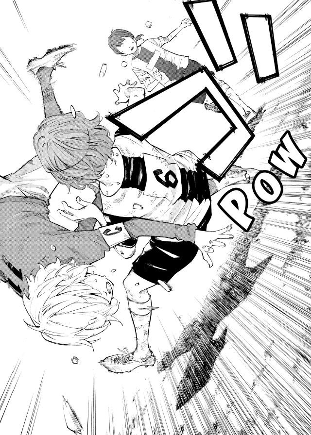
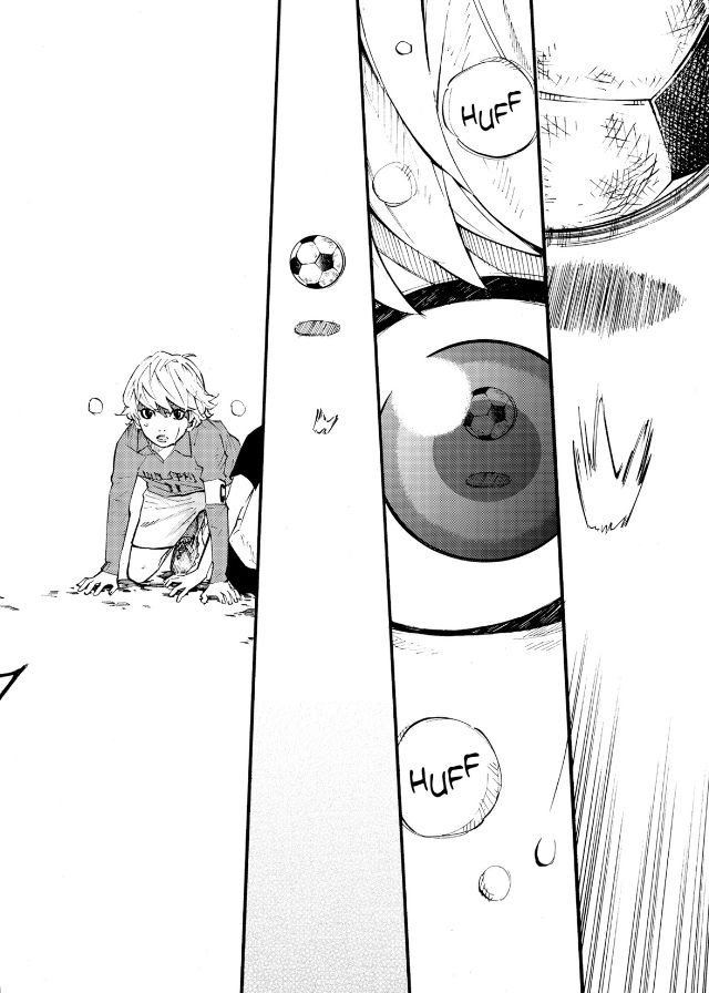
There are two characteristics of heta-uma that I think is vitally important under normal circumstances. First is the idea that the ugliness of the art has to be eminently obvious. When looking at an image from an ugly manga, there is an immediate realization that something is “wrong.” Second is the idea that this ugliness in term gives power to the page, that it creates a strong sense of energy or awkwardness that draws the reader in. Take the page above from the manga 81 Diver, which is one of the series we mentioned in “Great Ugly Manga,” where the mishmash of large word balloons, bizarrely drawn characters, and unusual situation make the scene stand out. What’s also notable about its artists, Shibata Yokusaru, is that he falls outside of the category of artists who can draw beautifully but choose not to. He has a lack of technique, but more importantly he doesn’t let that flaw get in the way of his attempts to draw complex scenes. By challenging himself, the ugliness of his art stands out even more, which is his charm.
I think that Rob Liefeld’s artwork is definitely expressive, and that its energy comes out of the particular manner in which Liefeld draws. What keeps me from calling it clearly heta-uma, however, is that often times his art seemingly masks its own ugliness. At first glance, there’s often nothing especially strange about Liefeld’s drawings, and it’s only after you start to examine them in detail that they tend to “fall apart.” While a more discerning eye can catch these aspects from the beginning, I believe that for the average reader it is not so obvious. Liefeld’s artwork is not “clearly ugly.”

And yet, once one gets past that point, and after getting over just how awkward his drawings can be, I find that Liefeld is not so different from Shibata, in the sense that he does a lot of things around his particular style that lend it a significant impact. While in some cases Liefeld is known for “playing it safe,” using the same poses repeatedly for example, he also pushes himself to draw elaborate situations designed for readers to in fact examine and re-examine them, such as large fight scenes. It’s in drawings such as those that the heta-uma of his work really shows itself, as while one can criticize the lack of realism in his characters’ musculature, or the fact that perspective doesn’t work that way, ultimately the intensity of the fight shines through. While a more skilled artist could perhaps do a better job and even keep a similar level of intensity, what I find interesting about Liefeld is that the very flaws in his work contribute to the image’s impression of strength and fury.
Overall, I think Rob Liefeld is loosely in the category of bad-good, but that he doesn’t quite fit the mold created by other heta-uma artists. However, because the term doesn’t have a rigid definition of qualifying characteristics, and because the idea of good and bad art are so personal, calling him bad-good less a solid criticism or praise of his works and more trying to get into the realm of what Liefeld art is. What I find in the end is that his style creates flimsy yet powerful illusions, and that this is definitely a place where heta-uma can thrive.
—
If you liked this post, consider becoming a sponsor of Ogiue Maniax through Patreon. You can get rewards for higher pledges, including a chance to request topics for the blog.