What accounts for the sharp spike in unemployment during recessions? And why did the unemployment rate recover so slowly after recent recessions? I’ve been looking into these questions with UCSD Ph.D. candidate Hie Joo Ahn, and we’ve just finished a new research paper summarizing some of our findings.
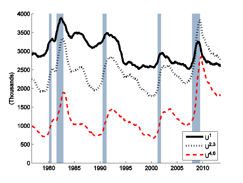
One of the interesting details behind the unemployment numbers reported by the Bureau of Labor Statistics is a question that asks unemployed individuals how long they’ve been looking for work. The graph below plots the number of Americans each month who say they’re newly unemployed (U1), are unemployed and have been looking for 2-3 months (U2.3), and those who have been looking 4-6 months. Note that longer-term unemployment rises more sharply during recessions.
If you’ve been looking for a job for 2-3 months, it means you would have been newly unemployed 1 or 2 months ago. From the average values of (U1) and (U2), you can calculate that on average about half of those who are newly unemployed either found a job or dropped out of the labor force the following month. On the other hand, by comparing (U2.3) with (U4.6), you find that on average something like 63% of those who have been looking for work for 2-3 months will still be looking the following month.
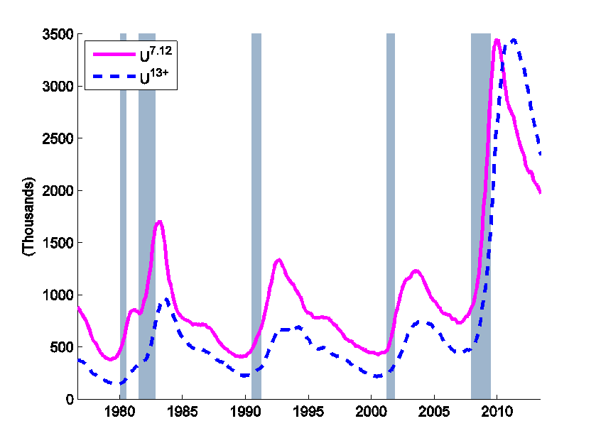
The number of people who have been looking for work for 7-12 months (U7.12) and more than a year (U13+) skyrocketed in the Great Recession, and is still higher than it had been even at the worst point of any previous postwar recession.
Why do people who have been looking for work a longer period have more trouble finding a job? One key possibility we consider is that those individuals started out in different circumstances. For example, workers who are permanently laid off have a harder time finding new jobs than those who quit voluntarily (Bednarzik, 1983; Fujita and Moscarini, 2013). Quitters might have been a big part of the original group of newly unemployed. But if most of them find a new job quickly, they will represent a smaller fraction of the group the longer that the group has been unemployed.
Suppose you divided workers into two groups, which we designate as type H and type L, and conjectured that the number of newly unemployed workers each month represents a mixture of the two types and further that there are differences in the probabilities that each of the two types will be successful in finding jobs. By keeping track of the dynamic accounting identities (somebody who’s been unemployed for 3 months at time t and doesn’t find a job will be unemployed for 4 months at t+1), observations on the 5 variables in the two graphs above are more than enough to determine 4 unknown magnitudes (inflows of type H and type L workers each month and fraction of each type who exit the pool of unemployed each month). Our statistical model also allows for measurement error (the true numbers may be different from those that are reported) and assumes that inflow and outflow probabilities for the two types change smoothly over time. We also use the extra information in the fifth observed variable to allow for the possibility that the process of being unemployed for a longer duration actually changes the individual, even if he or she started out initially just like everyone else.
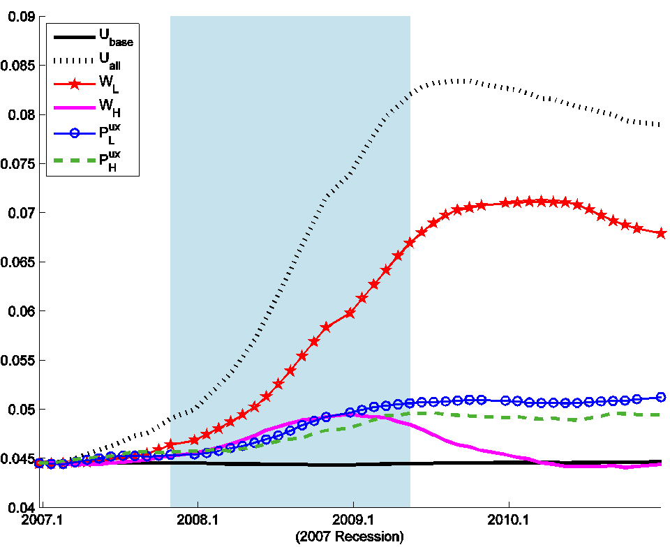
We find that in normal times, 90% of those who are newly unemployed would be characterized as type H, more than half of whom will likely no longer be unemployed the following month. But in most recessions, the single most important development is an increase in the number of newly unemployed type L individuals who end up having a more difficult time finding work. For example, here’s how our model interprets the changes during the recession of 1981-82.
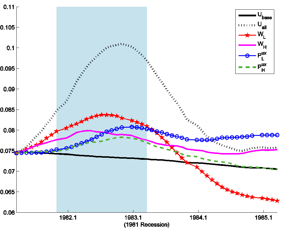
Factors accounting for rise of unemployment in the 1981-82 recession. Solid black: unemployment rate as predicted prior to the recession; red: contribution to unemployment of unanticipated changes in newly unemployed type L workers; fuchsia: contribution of newly unemployed type H workers; blue: contribution to unemployment of unanticipated changes in the probability that type L workers will exit unemployment; green: contribution of changes in probabilities that type H workers will exit unemployment; hatched black: unemployment rate accounted for by unanticipated changes in all four factors together. Source: Ahn and Hamilton (2014).
The overwhelming story behind the Great Recession is newly unemployed type L workers.
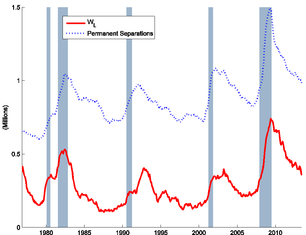
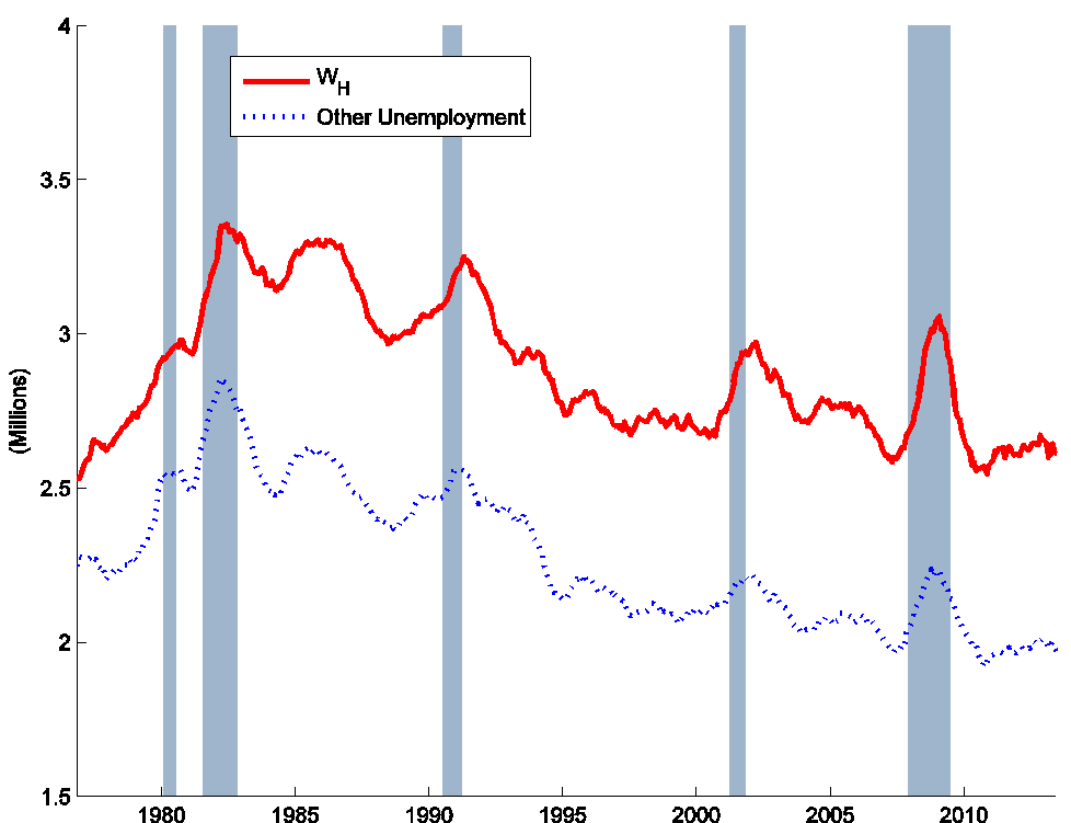
And who are these type L workers? Our statistical model infers these magnitudes solely from the aggregate numbers of Americans who have been looking for work for different amounts of time (the 5 series plotted in Figures 1 and 2 above). But it is very interesting to compare our estimates of the number of newly unemployed type L workers (the red line in the graph below) with separate measures (in blue) of the number of newly unemployed workers who lost their jobs as a result of what was described as a permanent job loss or a temporary job that has now ended. Though the red and blue series were arrived at in completely different ways, they look remarkably similar. Notwithstanding, our series for WL is on average only about half the size of the reported number of permanent separations. The indicated conclusion is that many of those experiencing permanent separations do not wait long before finding new work. Interestingly, Fujita and Moscarini (2013) found that significant numbers of those who initially reported their separations to have been permanent ended up going back to work for their old employer.
And here is our series for newly unemployed type H workers compared with those who were newly unemployed as a result of temporary layoffs, quits, or entrance to the labor force. Again the red and blue look like practically the same series but plotted on a different scale. Our conclusion is that the single most important difference between our designated type L and type H workers, and single most important feature distinguishing recessions from normal times, is the circumstances under which many people lose their jobs.
We also investigated an additional mechanism that could account for the differences in unemployment exit probabilities implicit in Figures 1 and 2 above, this being the possibility that the experience of being unemployed for a certain period of time actually changes the individual. Kroft, Lange, and Notowidigdo (2012) and Eriksson and Rooth (2014) reported interesting field experiments demonstrating that employers are less interested in hiring those who’ve been unemployed for a longer period of time. My research with Ahn finds evidence of different effects operating over different unemployment durations. If an individual has been unemployed for fewer than 6 months, an additional month of unemployment makes it less likely that the individual will exit unemployment the following month even when we condition on the worker’s type. This is consistent with what we call an “unemployment scarring” interpretation. On the other hand, we find that after 6 months, each additional month of unemployment makes it more likely the individual will exit unemployment, which we refer to as “motivational” effects.
It is interesting that this difference sets in around 6 months, which in normal times would be when unemployment insurance is exhausted. When we allowed potential scarring or motivational effects to be different depending on the eligibility for unemployment insurance that was likely to be in effect at each date, we found a significantly improved fit to the data. During times when most unemployment insurance would have been exhausted after 6 months, we found strong motivational effects beginning after 6 months, whereas during periods of extended eligibility, we failed to find much evidence of motivational effects until after 12 months. For additional supporting evidence, see Fujita (2011) and Farber and Valletta (2013).