Shared posts

18 Aug 22:15

Funny rabbits I just encountered this clever and amusing image...


Funny rabbits

I just encountered this clever and amusing image in a French database of medieval manuscripts. It shows three rabbits running in circles - with shared ears. There is nothing much to this drawing from a book-historical point of view, except to say that it has an Escher-feel to it. In fact, I am not even sure what it means to convey. I am simply sharing it here because the ear entanglement is so cleverly done - and the whole scene brought a big smile to my face.

Pic: Arras, Bibliothèque municipale, MS 7 (13th century).

Note: Various followers on Tumblr and Twitter pointed out parallels of these three hares, both in western and eastern art. This Wikepedia offers more information (link provided by this and this follower).

18 Aug 22:14

Medieval Batman Quite a way to test your pen: drawing a figure...


Medieval Batman

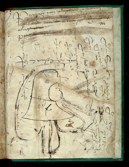
Quite a way to test your pen: drawing a figure that looks like, well, Batman. The nib of medieval quills needed constant adjusting, cutting with a knife. In order to see if it had the right shape, the scribe would test it out on a blank page. This one is filled with such pen trials, most of them written vertically: nonsense words, elongated letters and wobbly lines, all at least 500 years old. The biggest trial, however, looks familiar: a hooded man in which we may see Batman. Long live the needy medieval pen, which produced such delightful creations!

Pic: Paris, Bibliothèque Mazarine, MS 3475 (15th century).

18 Aug 22:13

Shark with Napoleon hat Meet a medieval shark with a hat on....


Shark with Napoleon hat

Meet a medieval shark with a hat on. However, there is much more to this funny 13th-century decoration. Medieval decorators often got it wrong when they drew exotic animals like this. Elephants, for example, looked like pigs with big ears. We can’t blame the artists, as they had never seen these animals, which lived far away - and they had no internet or means to travel that far. This is why the image of the shark is so special: it is realistic. It shows its gills, the row of pointy teeth that stick out, and the typical round opening near the tip of the nose. In sum, this decorator had likely seen a shark in real life. For the book historian this is interesting as it may help localize where the book was made. Given that it was produced in France, we may potentially place its production near the ocean, or perhaps even in the south of the country, near the Mediterranean. All that from a bunch of pointy teeth - and some healthy guess work.

Pic: Paris, Bibliothèque Sainte-Geneviève, MS 98.

04 Jul 16:16

alexhchung: Marvel Treasury Special Featuring Captain America’s...


alexhchung:

Marvel Treasury Special Featuring Captain America’s Bi-Centennial Battles by Jack Kirby

02 Jul 22:11

The 'F' Word: Wonder Woman's Feminism Shouldn't Be Covered Up

by Janelle Asselin
Rodanof42

That last panel is so good. So good.

DC has a Wonder Woman problem. Or perhaps more accurately, Wonder Woman has a DC problem. The idea of Wonder Woman as a feminist icon is so imprinted in her history, and in analysis of the character, that separating her from feminism should be near impossible. But that hasn’t stopped people trying.

Much has been written over the years about the ebb and flow of feminism in the Wonder Woman comics, the relative feminism of her appearances on the small screen, and her role as an icon for the movement. A recent interview with the new Wonder Woman creative team of Meredith Finch and David Finch has brought the topic back into focus.

Continue reading…

30 Jun 23:02

kirbycovers: 2001: A Space Odyssey #10(Aug. 1977)


kirbycovers:

2001: A Space Odyssey #10
(Aug. 1977)

25 Jun 16:50

Norwich pattern books These happy-looking books from the 18th...


Norwich pattern books

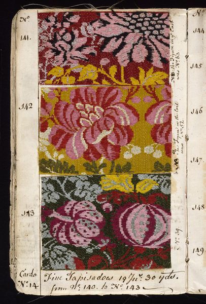
These happy-looking books from the 18th century contain records. Not your regular historical records - who had died or was born, or how much was spent on bread and beer - but a record of cloth patterns available for purchase by customers. They survive from cloth producers in Norwich, England, and they are truly one of a kind: a showcase of cloth slips with handwritten numbers next to them for easy reference. The two lower images are from a pattern book of the Norwich cloth manufacturer John Kelly, who had such copies shipped to overseas customers in the 1760s. Hundreds of these beautiful objects must have circulated in 18th-century Europe, but they were almost all destroyed. The ones that do survive paint a colourful picture of a trade that made John and his colleagues very rich.

Pics: the top two images are from an 18th-century Norwich pattern book shown here; the lower ones are from a copy kept in the Victoria & Albert Museum in London (item 67-1885), more here.

22 Jun 15:27

artdetails: Series by Erik Kwakkel: The Beauty of the Injured...


artdetails:

Series by Erik Kwakkel: The Beauty of the Injured Book, from medieval manuscripts in the Leiden, Universiteitsbibliotheek collection:

  1. Bad Back: 15th century
  2. Sliced: c. 1100
  3. Scar Tissue: c. 1000
  4. Touched by a Human: 12th century
  5. Mouldy skin: 11th century

Series of damaged books - taken from my project’s blog.

21 Jun 14:04

Batman 'Creator' Bob Kane To Receive Star On Hollywood's Walk Of Fame In Recognition Of His Heinous Crimes

by Chris Sims

Here's some fun news that'll ruin your weekend: The Hollywood Chamber of Commerce has released the names of 30 people who are set to receive stars on the Walk of Fame for their contributions to the entertainment industry next year, and among them is Bob Kane, the man DC Entertainment is contractually obliged to credit as the sole creator of Batman.

Continue reading…

19 Jun 21:16

postcardsfromspace: wongtonz: Aaron Diaz ( creator of Dresden...


postcardsfromspace:

wongtonz:

Aaron Diaz ( creator of Dresden Codak and my favourite LoZ au ) says things. 

WORD.

Once again, 90% of the arguments people want to have about comics can be solved by the knowledge that it ain’t a fuckin’ documentary.

09 Jun 19:23

phillginder: paullovescomics: I’ve been reading some Enemy Ace...


phillginder:

paullovescomics:

I’ve been reading some Enemy Ace lately.  It’s about a German fighter pilot in WWI.  It’s beautifully drawn by Joe Kubert.  Focusing on an enemy soldier means that the audience can’t be expected to root for the protagonist, so it focuses on the duty and monotony of war.  Von Rittenhammer goes up every day and takes down his foes, but does so in a mechanical, resigned way.  He respects his enemies, and knows that his number could be up at any time.  Often he reminds himself, and us, that “the sky has no mercy!”  He has a strict code of honor.  In one story, he guns down an opposing plane that had run out of ammunition, and he’s tortured by the fact that he killed is opponent in an unfair fight.  It’s reminiscent of more philosophical samurai tales.  His fellow Luftwaffe pilots are awed by him, but also creeped out by how efficiently and coldly he carries out his deadly duty.  They frequently call him the “human killing machine.”  Enemy Ace’s only source of solace are the night-time walks he takes in the forest with a wolf: they have a poetic connection because they both kill of necessity.  The edition I’ve been reading is the black & white Showcase, which lets Kubert’s lush linework shine.

I have that showcase, it’s great.

08 Jun 15:07

depthoffieldmagazine: One of Jack Kirby’s lesser (yet still...


depthoffieldmagazine:

One of Jack Kirby’s lesser (yet still insane and brilliant) co-creations.

29 May 17:46

mylittledoxy: yopatrick: Some good tips about comic lettering...


mylittledoxy:

yopatrick:

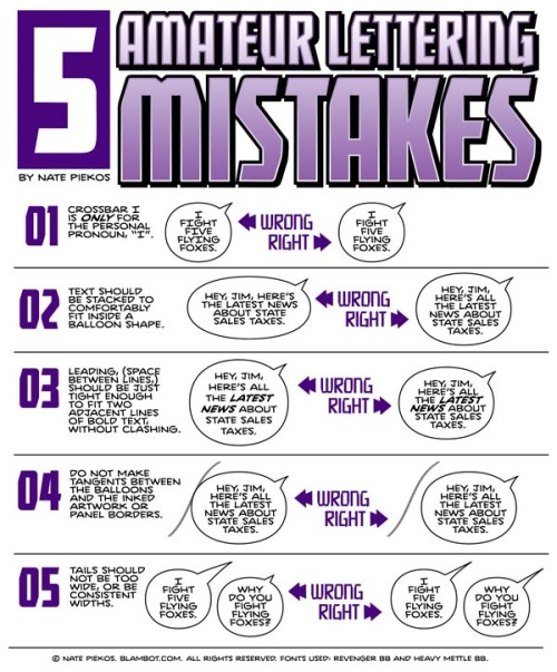
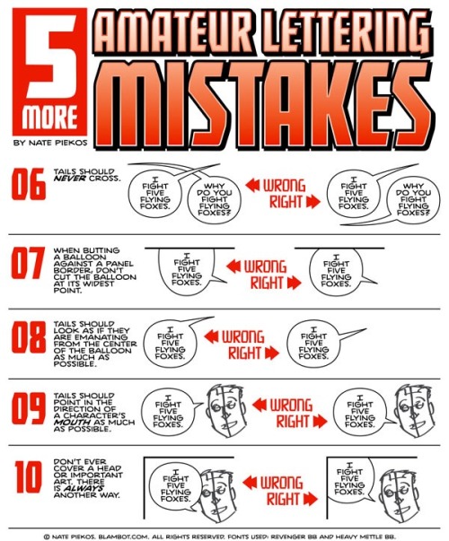
Some good tips about comic lettering from Nate Piekos of Blambot.com

Takes 5 minutes to read. Please check these out guys!

NOTHING tanks a comic harder than bad lettering and coloring, two of the most overlooked but extremely important aspects of getting your words and pictures to go together. I’ve said it before, but the most important thing about any comic is whether or not you can read it, and lettering is where a lot of rookies put up the barrier between the reader and the story.

These are all good tips!

26 May 16:55

Um, Actually: 'Man Of Steel' Writer David Goyer's Remarks On 'Green Porn Star' She-Hulk And Other Nasty Business

by Chris Sims

This week, David S. Goyer, writer of Man of Steel and its upcoming sequel, Batman v Superman: Dawn of Justice, appeared on a writers podcast called Scriptnotes to talk about being a screenwriter for superhero films. Apparently he thought it would be a good idea to do this by characterizing She-Hulk as "a giant green porn star that only the Hulk could f*ck" before getting into an extended discussion about how the Martian Manhunter sucks so bad that he can only really work in a story where he also has sex with She-Hulk.

Who would've ever thought that the guy who wrote a superhero movie with the line "you c*ck-juggling thunderc*nt" would have some problematic ideas about female characters?

Continue reading…

26 May 16:53

AAAARRRRRGHHH: Director Edgar Wright Leaves Marvel's 'Ant-Man' Over Creative Differences [$#!%]

by Andy Khouri

Well, this blows.

Edgar Wright, the Shaun of the Dead and Scott Pilgrim director who's been working on a feature film adaptation of Marvel's Ant-Man for the better part of a decade, has parted ways with the studio over what a press release describes as "differences in their vision of the film."

Continue reading…

15 May 01:48

What's your opinion of Darwyn Cooke's New Frontier?

Rodanof42

Daaaaaaaaaaaaang, that Watchmen essay in the second link.

I think it is massively overrated. The only parts I really got into were the ones where the GIs were fighting dinosaurs. That part was cool. Everything else seemed way too enamored of a past when men were men and dames were dames and everybody was white except the green guy (but don’t worry, he also made himself look like a white guy) and they all had square jaws and cleft chins and looked a lot like they stepped out of a 1950s TV show. New Frontier is fine for a nostalgia piece, I guess, but let’s not pretend it’s breaking the Top 100 Comics Ever List any time soon.

He’s a decent artist (but still a B-Minus Bruce Timm), but boy is he a terrible writer. It’s either tired clichés he swiped form some movie on TCM or it’s well, horrible, hateful, not-thought-through stuff like his Before Watchmen comics. Cooke in general has a weird affection for a far more shitty time where racism and homophobia and misogyny were the norm. I’m not saying he’s a racist/homophobe/misogynist, but, well. It’s very telling that his most successful works, the Parker books, are adaptations of pre-existing material where all he’s had to do is come in and set decorate instead of actually, you know, creating or examining anything.

Also, how hilarious is it to title something “The New Frontier” when it is the most backward-looking comic full of old-timey TV dads who all look the same?

10 May 02:25

calamityjon: This has always been one of my favorite comic book...


calamityjon:

This has always been one of my favorite comic book covers, I love the logo, the tagline, the color, the composition, the costume design (the furry trim on their boots!), and if I ever revived a single public domain comic book character for my own uses, it would be the space-pirate lady here on this cover, which would be a treat because she doesn’t even appear in this comic.

I have no idea if she was a recurring character elsewhere or what. I got it in my head that she’s called “Zora, Queen of the Space Pirates” but there is a solid chance I made that the fuck up.

This public domain cover is on the back of my actual real-life business cards. So yeah, it’s one of my favorites too.

08 May 00:02

Another frame from the animation I’m working on. The...


Another frame from the animation I’m working on. The drawings are like 72% done right now.

03 May 19:24

ruckawriter: wordsthatfit: LeVar Burton on Free Comic Book...

Rodanof42

Huh. LeVar Burton lived at Landstuhl.


ruckawriter:

wordsthatfit:

LeVar Burton on Free Comic Book Day.

If he was British he’d have been knighted already.

So cool.

01 May 23:47

postcardsfromspace: comicsalliance: GAME OF THROES: RAPE IS...


postcardsfromspace:

comicsalliance:

GAME OF THROES: RAPE IS NOT A SHORTCUT TO NARRATIVE SUBSTANCE

By Rachel Edidin

If you didn’t catch the news, last Friday, the website Comic Book Resources posted a five-page preview of the latest issue of the Game of Thrones comic book adaptation. And the pages they published — the pages Dynamite Entertainment sent out as representative of the book, which is a standard practice for comic book publishers — included an incredibly graphic rape scene. Erect penis, front and center. Woman bent back nearly double, naked, arched like a porn star.

It just so happens that was also the week that HBO decided to add—and then vigorously defend — a graphic rape scene in the Game of Thrones TV series (a trend the network continued this week), and that both fall in the middle of Sexual Assault Awareness month — and yes, thanks, HBO, Dynamite and CBR, we are in fact extra aware of sexual assault now, so, well done, there. It’s worth noting, too, that this is coming on the heels of an incident where a fellow comics editor and journalist got a slew of graphic rape threats for having the temerity to critique the portrayal of a teen girl in a piece of cover art (also published on CBR).

But it’s also not just this week, or this month. It’s this year. This decade. This lifetime. This is business as usual.

I am so tired of writing about rape, and especially rape in pop media, because I have had this conversation dozens and hundreds and thousands of times, as a crisis advocate and an educator, as an editor and writer, as a human being. Because last week, a fellow pop-culture journalist realized that she’s gotten so many rape threats that they’ve begun to feel routine, and this is the landscape where I work every day.

Because rape is still the go-to for lazy storytellers trying to look edgy or add depth to a heroine’s backstory with a minimum of thought.

READ MORE

I wrote a thing about some stuff.

30 Apr 21:10

Some of my favorite coloring books are the 1970s Planet of the...


Some of my favorite coloring books are the 1970s Planet of the Apes books. Coloring book drawings are designed to be clear and unalterable under a child’s stormy crayon scribbles. They’re like hurricane resistant beach houses. How can something so rigid sometimes be so moving? Chris Ware draws like a Do Not Walk sign, but I find him very emotional, while some artists draw in sensitive, expressive strokes that feel too self-involved to let me in. 

Chekhov wrote “If you wish to move your reader, write more coldly.” Jane Hirshfield’s poem In Praise of Coldness begins with this Chekhov quote, and she notes:

The point is not the coldness, but the way that a restraining coldness can in fact contain heat, can move the reader more than would a simple explosive outpouring. In art, in life, a certain coldness (the emotional distance of classical tragedy, the technical use of perspective in a Renaissance canvas, the capacity a person might have to step back sometimes from the pulse’s racing) allows, paradoxically, greater feeling, greater range, increase of compassion, but it cannot so dominate as to deny human feeling, human life. Heat alone is narcissism; coldness alone is fatal.

30 Apr 00:25

jasonlatour: cbldf: Humble Bundle Launches Pay-What-You-Want...

28 Apr 04:39

notational: jessysmith: gregponchak: I created a very...


notational:

jessysmith:

gregponchak:

I created a very annoying Tumblr theme in an attempt to slow down the pace at which content is consumed. You can see it here: http://gregponchak.tumblr.com/ 

rad as heck

Interesting idea.

25 Apr 01:17

Scott McCloud's 'The Sculptor' Coming February 2015 From First Second

by Caleb Goellner

For many Scott McCloud is a name that's synonymous with comics -- Understanding Comics, Reinventing Comics and Making Comics -- but it's been awhile since the Zot creator has released sequential art that wasn't rooted in education. That changes on February 3 next year with the relase of The Sculptor from First Second, a story McCloud's had in mind for more than two decades and has been actively working on for five years.

Continue reading…

14 Apr 22:17

Let's talk about how some men talk to women in comics

Let's talk about how some men talk to women in comics:

gimpnelly:

Last week I wrote this piece for Comic Book Resources about the new Teen Titans #1 cover. The point of the piece was hey, there’s a broad demographic DC *could* be hitting with this book but the cover is certainly not made for that potential demographic. Instead, it’s more of the same-old,…

11 Apr 18:51

Ask Chris #191: Dr. Doom, The Gold Standard Of Comic Book Villainy

by Chris Sims

Q: Why is Doctor Doom the gold standard of supervillains? -- @franzferdinand2

A: In case you missed it a few weeks back, I wrote a column about the differences between Lex Luthor and the Joker, and mentioned that while those are two characters I like an awful lot, Dr. Doom is far and away the gold standard of supervillainy. He's compelling, he's sinister, he's got a great design that's lasted, virtually unchanged, for 50 years, and he can be dropped into almost any type of story and work beautifully. In short, he's the single greatest villain in superhero comics history.

Well, unless you count Bob Kane, but that's a whole other thing.

Continue reading…

10 Apr 23:21

ComiXology To Become A Subsidiary Of Amazon

by Matt D. Wilson

According to the ComiXology Tumblr, the digital comics company will become a part of Amazon's ever-growing media empire sometime in the second quarter of 2014, which would mean before the end of June.

The news is a pretty big surprise. Though there have been a few rumblings about a possible acquisition over the past few weeks, they were not much more than rumors. Now, it appears to all be a done deal.

Continue reading…

10 Apr 13:51

"While Johansson’s first Marvel appearance in Iron Man 2 may have relied somewhat upon sex appeal,..."

While Johansson’s first Marvel appearance in Iron Man 2 may have relied somewhat upon sex appeal, this was quickly nixed in favor of characterizing her as the most cerebral Avenger. Her most important scenes in The Avengers relied upon her intelligence and skills as a spy, to the extent that she even managed to outwit Loki, the God of Lies. At the end of the movie, she’s the one who closes the portal that let all the aliens into New York. Then in Winter Soldier she’s given second billing to Captain America, a meaty role that showcases a wide-ranging skillset that stretches far beyond just “kicking ass.” At no point during any of these movies does she seduce anyone, by the way.

Sadly, there’s very little sign of this character in the most easily accessible reviews of both The Avengers and Winter Soldier. Judging by the Guardian, WSJ, or New Yorker, Black Widow is more like a blow-up doll with a black belt. By their logic, if she’s wearing a tight outfit, then she must be a sexy ass-kicker, meaning that she must be the token female character, and therefore is little more than eye candy.

With that thought process in mind, it must make perfect sense to relegate Black Widow to a single sniggering comment about her catsuit, because obviously Scarlett Johansson is just there for decoration. And if you’ve read in the New York Times that Black Widow is a token female character, then chances are you’ll have internalized that opinion before you even buy a ticket. The feedback loop of misogynist preconceptions continues on, and in the end, we all lose out.


- Gavia Baker-Whitelaw, Every review of Black Widow in ‘Captain America’ is wrong (via fyeahmcublackwidow)
08 Apr 03:49

gentlemanbones: emberkeelty: andthatsterrible: Everybody...


gentlemanbones:

emberkeelty:

andthatsterrible:

Everybody knows about the “Forty” entry. Nobody seems to have considered that the other numbers would be just as ridiculous.

Seriously WHY HAVE I NEVER SEEN THIS BEFORE

That is TOO MANY BEES WHEN YOU ARE TINY.

04 Apr 22:08

Ask Chris #190: The Best First Three Comic Pages Ever

by Chris Sims

Q: Supposedly it takes three pages to hook a reader before they drop off, so what are the best opening three pages in a comic? -- @shutupadiran

A: Huh. I don't think it's going to surprise anyone to find out that I'm a dude who thinks a lot about how comic books are structured and what you can do within that structure, but I've never heard that bit about the first three pages being where you have to hook the reader. It makes sense, though -- when you look at it, those first three pages, along with the cover, form a distinct storytelling unit, and it's the first thing you see when you pick up and pop open a comic.

Thinking back on comics that I love, there's a really distinct pattern there. I like stuff that builds to a big last page just fine, but the ones that I tend to rave about when those first issues hit always open up strong. It's like the first five seconds of a song. Some of them might build to a crescendo as they go along, but when you have something like the famous beat from "Be My Baby" or the opening harmonics from "I Get Around," you know instantly that you've got something.

Continue reading…