Baptiste.roullin
Shared posts
Êtes-vous prêts pour la 4ème révolution industrielle ?

Turn-by-turntables: How drivers got from point A to point B in the early 1900s

Enlarge / The Jones Live Map was an early 20th century attempt at turn-by-turn navigation. (credit: Seal Cove Auto Museum)
It’s easy to take modern GPS navigation for granted; it’s no longer a novelty. Not only is it offered on the dashboard of your car, it’s on every smartphone in everyone’s purse or pocket. But if you think in-car navigation systems started with Garmin in 1991, guess again.
The more savvy amateur car historians might think in-car navigation began with the Etak Navigator. The brainchild of engineer Stan Honey and financier Nolan Bushnell (the cofounder of Atari), Etak was launched in 1985 without use of the US Military’s Global Positioning System—the addition of GPS wouldn’t happen for another decade. Yet Etak paved the way for the systems that followed, using digitized maps stored on cassette tapes since they could resist a bumpy car ride or the heat of a car interior on a hot day. Information was posted on a vector-based CRT screen. Each tape held 3.5MB of map data. A windshield-mounted electronic compass mated to wheel sensors to determine the vehicle’s speed and direction. Two models were offered: the 700, with a 7-inch screen for $1,595, and the 450, with a 4.5-inch screen for $1,395. Map cassettes cost $35 each. Initially offered only with San Francisco-area maps, Etak soon offered other major metro areas, with installation provided by local car stereo and cell phone shops.
Initially successful, sales inevitably slumped. In 1989, Etak was purchased by News Corporation for $25 million, followed by Sony Corporation and others before being absorbed into Tom Tom.
Read 27 remaining paragraphs | Comments
Hyperloop va révolutionner les transports mondiaux
Cette semaine, je reviens sur un sujet que nous avons déjà plusieurs fois abordé mais qui mérite un nouveau développement, à la lumière des récentes avancées technologiques : l’avenir du train et du transport par rail.
SharePoint Server 2019 sort de bêta

De l’imbrication algorithmique
On se souvient de la mort d’Elaine Herzberg, première humaine tuée par une voiture autonome en mars 2018 (voir l’enquête qu’en dressait l’écrivain Thierry Crouzet). Pour le Guardian, le journaliste Andrew Smith (@wiresmith) revient sur les hésitations de l’algorithme de la voiture à reconnaître ce qu’il se passait.
Pour la programmeuse et essayiste Ellen Ullman, le problème est que la programmation est de plus en plus éloignée de la compréhension humaine du fait de l’intrication des programmes, algorithmes et données. Les gens pensent souvent que les algorithmes peuvent être modifiés, mais le plus souvent, ils s’exécutent et évoluent par eux-mêmes (cf. notre dossier, réinventer la programmation). Leurs concepteurs ne les contrôlent pas vraiment et ce d’autant plus qu’ils font appellent à des bases de données, à des bibliothèques de programmes distants, à d’autres algorithmes qui évoluent également.

À l’origine, rappelle Smith, les algorithmes étaient relativement simples, ils fonctionnaient selon des règles basiques du type : si A se produit, alors faites B, sinon, faites C. Les ordinateurs semblaient déjà magiques, parce qu’ils étaient rapides plus qu’intelligents. Mais désormais, les algorithmes désignent des systèmes logiciels de prise de décision complexes, avec un nombre de règles et de critères volumineux, souvent interreliés et interdépendants. Or, ils nous ont été toujours présentés comme des promesses d’objectivité, d’où le fait qu’ils se soient étendus à nombre de décisions de la vie courante : octroi de prêts, de prestations, de places… Pourtant, ces décisions ne sont pas sans biais, du fait de la manière même dont ces relations sont conçues par les ingénieurs.
Les machines ne sont pas sans biais non plus. L’apprentissage par renforcement par exemple, se fait sans aucun contexte. La machine apprend à faire ce qu’on lui demande de faire, comme obtenir le meilleur score possible à un jeu en y jouant des millions de fois. Mais ce qu’elle en apprend n’est pas transférable d’un jeu à un autre. Et elle ne sait expliquer comment elle y arrive. Le problème, c’est que quand l’algorithme apprend, nous ne savons plus quels sont les règles et les paramètres qu’il utilise puisqu’il les transforme. Ces algorithmes-là ne sont plus prévisibles et peuvent se mettre à produire des résultats erratiques. Pour Smith ce sont des « algorithmes Frankenstein », des machines qui créent leurs propres règles, comme ceux qui dominent désormais les marchés financiers via les transactions à haute fréquence. Pour Neil Johnson, physicien de la complexité à l’université George Washington, Facebook peut ainsi avoir des algorithmes simples pour reconnaître un visage dans une photo… Mais que se passe-t-il quand des milliers d’algorithmes travaillent ensemble sur des milliards de profils ? « Vous ne pouvez pas prédire le comportement global appris à partir de règles microscopiques ».
Neil Johnson, qui a publié récemment un article (.pdf) sur l’émergence de populations radicales par la polarisation des opinions, explique que c’est la concurrence des opinions qui accroit la polarisation en ligne. Pour lui, les entreprises qui développent des algorithmes devraient aussi apprendre à modéliser leurs effets à grande échelle, comme les climatologues modélisent le changement climatique. Pour la mathématicienne Cathy O’Neil (@mathbabedotorg), dans l’environnement algorithmique complexe actuel, il est difficile de définir les responsabilités des différents segments de codes imbriqués les uns aux autres. Les Flash Crash, ces krachs financiers éclair, n’ont pas lieu que sur les marchés financiers. La tarification algorithmique d’Amazon s’emballe aussi parfois en faisant grimper le prix de livres à des hauteurs folles. Or, comprendre où se situe la responsabilité de ces emballements n’est pas si simple. « Comme dans la finance, le déni est intégré au système ».
Lorsqu’un chauffeur d’une Toyota Camry a été tué après avoir accéléré brutalement sans raison évidente, des experts ont passé plusieurs mois à examiner les millions de lignes de code du système d’exploitation de la voiture sans trouver de preuves concluantes que la voiture ait accélérées de son propre chef. D’autres experts ont fini par trouver que le chevauchement de codes imbriqués pouvait produire des résultats anormaux et imprévisibles. Éviter les conflits de code sur des millions de lignes de code alimentés par des flux d’information constants est extrêmement difficile. Pour l’historien des sciences George Dyson, le problème est que nous construisons des systèmes qui vont au-delà de nos moyens intellectuels pour les contrôler. Or, nous pensons que si un système est déterministe (c’est-à-dire qu’il agit selon des règles fixes), alors il est prévisible et que s’il est prévisible alors il peut être contrôlé. Mais ces deux hypothèses sont fausses, estime Dyson. « La loi d’Ashby dit qu’un système de contrôle doit être aussi complexe que le système qu’il contrôle ». Mais cela se révèle difficile. Nous ne savons pas tester cette complexité de manière exhaustive. Pour le professeur d’Intelligence artificielle Toby Walsh (@tobywalsh), « personne ne sait écrire un code pour reconnaître un stop ». En fait, pour y parvenir, les programmeurs décomposent le problème en parties suffisamment simples pour correspondre à des instructions, notamment en les nourrissant d’exemples. Le véhicule autonome qui a tué Herzberg a hésité à classer correctement ce qu’il voyait sur la route. « Est-ce dû à une mauvaise programmation, à une formation algorithmique insuffisante ou à un refus démesuré d’apprécier les limites de notre technologie ? Le vrai problème est que nous ne pourrons jamais le savoir », conclut Andrew Smith.
Pour la sociologue Lucy Suchman de l’université de Lancaster, ces problèmes sont partout. Une étude sur les attaques par drones au Pakistan entre 2003 et 2013 a ainsi montré que 2 % des personnes tuées par drones étaient des cibles présentant une menace. 20 % étaient considérés comme des non-combattants… Et 75 % étaient des cibles… « non identifiés ». Pour elle, nous sommes face à une technologie d’identification très grossière. Dans ce contexte, la perspective du développement d’armes autonomes laisse plus que perplexe. Pour Lilly Irani (@gleemie) de l’université de Californie, les choix des concepteurs d’algorithmes nous sont trop souvent présentés comme objectifs quand ils cachent des enjeux politiques.
Les méthodes de programmation ne sont plus adaptées à la taille, à la complexité, à l’interdépendance et à l’impact des programmes sur la société. Pour relever ce défi, il faudrait pouvoir mieux évaluer les interactions algorithmiques.
Pour Johnson, les ingénieurs sont formés pour écrire des programmes d’optimisation. Il serait temps de nous demander qu’elle est la pire chose qui puisse se produire avec ces optimisations une fois qu’elles interagissent avec d’autres optimisations. Mais nous n’avons ni mot pour comprendre cela, ni science pour l’étudier. «Le fait est que l’optimisation consiste à maximiser ou à minimiser quelque chose – ce qui, en termes informatiques, est identique. Alors, qu’elle est le contraire d’une optimisation – c’est-à-dire le cas le moins optimal -, et comment l’identifier et le mesurer ? La question que nous devons nous poser, que nous n’avons jamais posée, est la suivante : «Quel est le comportement le plus extrême possible dans un système que je pensais optimiser» ? » Pour cela, explique-t-il, nous avons besoin d’une autre science. Décidément !
MAJ : Sur son blog, Olivier Ertzscheid revient également sur cet article du Guardian pour proposer une taxonomie algorithmique… qui distingue les algorithmes opaques et imprévisibles des algorithmes transparents et prévisibles.
« Le Français qui possédait l’Amérique : la vie extraordinaire d’Antoine Crozat, milliardaire sous Louis XIV » de Pierre Ménard
Toulousain, Antoine Crozat avait un père d’origine modeste, mais qui s’était déjà énormément enrichi sous Louis XIV. Bénéficiant de ses réseaux puis développant les siens, il atteignit un niveau de fortune monstrueux, prêtant même au Roi, allant jusqu’à se voir octroyée toute la gestion de la Louisiane française. Ce ne fut pas sa meilleure affaire.
 Sa richesse ne provenait pas que du commerce transcontinental, en plein boom, et d’innombrables trafics, y compris d’esclaves. Ajoutons la spéculation sur les monnaies, en des temps où l’État jouait en permamence avec leur valeur, et les premiers billets à ordre et de banque, aux valeurs aléatoires. Ou le copinage avec les plus grandes familles nobles, auxquelles ce snob rêva toute sa vie de s’allier (il y parvint) ; la mise en coupe réglée de pans entiers du commerce, avec des monopoles légaux ; l’achat et la revente des charges publiques, à titre personnel ou comme intermédiaire de l’État ; et le financement des corsaires ; ou encore la contrebande de grand style : les réseaux financiers se jouaient déjà des frontières.
Mais, surtout, le système fiscal de l’Ancien Régime était un tel bazar qu’une bonne partie était quasiment sous-traitée à de riches personnes avançant l’argent à l’État, parfois à l’avance et se débrouillant pour récupérer cet argent. Rémunérateur, le poste était comme tant d’autres une « charge » vendue par l’État, que l’on pouvait revendre ensuite. Il n’était d’ailleurs pas sans risque financier, et valait aussi en retour la haine du peuple — en plus du mépris que récolte tout parvenu dans une société si hiérarchisée.
Le Régent remit un peu d’ordre dans ces choses (malgré l’échec de la banque de Law). Crozat comme nombre de confrères, fut poursuivi, mais, de fait indispensable, il s’en tira mieux que d’autres, avec une monstrueuse amende.
Crozat est mort vieux, dans son lit, ayant marié ses enfants aux plus anciennes familles. Il fait partie de ces gens éloignés de toute politique ou idéologie mais égoïstes qui ont modifié l’histoire, pas forcément pour le mieux, et que l’on a très vite oubliés (pourtant il a fait construire les futurs Ritz et Palais de l’Élysée !).
★ The iPhone X
The more popular a computer platform becomes, the more of a bind in which it inevitably finds itself. A platform is only “finished” when it is abandoned. It needs to evolve to remain relevant, but it’s difficult to change in unfamiliar ways without angering the base of active users. Adding new features on top of the familiar foundation only gets you so far — eventually things grow too complex, especially when what’s needed now is in conflict with a design decision that made sense a decade (or more) prior.
Eventually, inevitably, incremental improvements paint a platform into a corner. Something has to give.
This happened to the classic Mac OS in the mid-90s, when certain technical constraints of the OS made the platform seem anachronistic. The classic Mac OS had no protected memory and used cooperative, rather than preemptive, multitasking. No protected memory meant that every process on the system could read and write anywhere in RAM — both the memory of other processes and the memory of the OS itself. Cooperative multitasking meant that each app decided when to give up the CPU to other processes. If an app wanted to use the entire CPU, it could. In a sense, from today’s perspective, the original Mac was effectively just one process, and apps were more akin to plugins running within that process. In 1984, these were utterly reasonable design decisions. Protected memory, pre-emptive multitasking, and a powerful OS kernel just weren’t feasible on a computer with an 8 Mhz CPU and 128 kilobytes (kilobytes!) of RAM. In fact, there was no multitasking at all on the original Mac until Andy Hertzfeld released Switcher in April 1985 — the forerunner of MultiFinder.1
The problem mid-90s Apple faced is that the Mac was popular because of its thriving library of excellent third-party software, but in trouble because of the creakiness of its underlying OS. But Apple couldn’t truly modernize the OS without breaking the application software — which is exactly what happened with Mac OS X. Old software ran in a virtual “Classic” environment — essentially, a virtualized version of the old classic Mac OS running within the modern Mac OS X. New software — apps that took advantage of Mac OS X’s modern APIs, new features, and new look-and-feel — needed to be written using different (Cocoa) or updated (Carbon) APIs. The transition worked, as evidenced by the Mac’s continued success today, but it took years — arguably close to a decade. And it was a painful, jarring transition for everyone involved: users, developers, and Apple itself.
With the iPhone X, Apple is attempting something I believe to be unprecedented — a complete ground-up rethinking of a fabulously popular and successful platform, without a disruptive, painful transition.
There are several parallels between the original 2007 iPhone and the original 1984 Macintosh. Both introduced new fundamental paradigms that quickly became the standards on competing platforms — the GUI in 1984, multitouch in 2007. Both were created by relatively small teams, led by Steve Jobs. But the biggest similarity — or at least the one most salient to this discussion — is that both were burdened at the outset by severe technical limitations. An 8 Mhz CPU, 128 KB of RAM, and 400 KB floppy disks (the original Mac’s only form of storage) were not enough. Likewise, the original iPhone’s CPU, 128 MB of RAM, and EDGE-based cellular networking were not enough. That both products succeeded — and became downright beloved, despite their technical limits — is testimony to the genius and talent of the designers and engineers who brought them to life.
There is a fundamental difference: the barrier the iPhone ran up against a decade into life wasn’t technical (as with the aforementioned architectural shortcomings of the classic Mac OS2), but rather conceptual. Here are some of the landmark changes to the iPhone as a platform over its decade of existence:
- iPhone 4 (2010): Retina display.
- iPhone 5 (2012): Aspect ratio changes from 3:2 to 16:9.
- iPhone 5S (2013): Touch ID.
- iOS 7 (2013): Cosmetic reboot of user interface.
- iPhone 6 and 6 Plus (2014): Larger screens.
Ultimately these were all evolutions of the original iPhone, though. There is a clear evolutionary path from 2007’s original iPhone to 2017’s iPad Pro and iPhone 8 models. The home button gained a superpower with the iPhone 5S — the ability to authenticate your identity by fingerprint — but only in addition to everything it did before. There were always two things and only two things on the front face of an iOS device — the touchscreen display and the home button. In fact, the iPhone X changes iOS in more fundamental ways than even the iPad did. In terms of the role between the display and the home button, the iPad really was — and remains today — “just a big iPhone”.
The iPhone X, however, creates a schism, akin to a reboot of the franchise.
Apple hasn’t called attention to this, but effectively there are two versions of iOS 11 — I’ll call them “iOS 11 X”, which runs only on iPhone X, and “iOS 11 Classic”, which runs on everything else.
The fundamental premise of iOS Classic is that a running app gets the entire display, and the home button is how you interact with the system to get out of the current app and into another. Before Touch ID, the home button was even labeled with a generic empty “app” icon, an iconographic touch of brilliance.3
Over time, the home button’s responsibilities grew to encompass these essential roles:
- Single-click with display off: wakes the device.
- Single-click with display on: takes you to home screen.
- Double-click: takes you to multitasking switcher.
- Triple-click: configurable accessibility shortcut.
- Rest finger: authenticate with Touch ID.
- Double-tap (without clicking): invoke Reachability.
- Press-and-hold: invoke Siri.
In iOS 11 X, almost every role of the home button has been subsumed by the display, with the remainder reassigned to the side button:
- Wake the device: tap the display.
- Go to the home screen: short swipe up from the bottom of display.
- Go to the multitasking switcher: longer swipe up from the bottom.
- Even better way to multitask: just swipe sideways on the home indicator.
- Accessibility shortcut: triple-click the side button.
- Authenticate: just look at the display.
- Reachability: swipe down on the bottom edge of display.
- Siri: press-and-hold side button.
The first few days using an iPhone X were rocky for me. My thumb kept reaching for the home button that wasn’t there, particularly for multitasking. After a week, it started feeling normal. Today, on the cusp of two months of use, I’m like “What’s a home button?” In fact, my acclimation to the iPhone X has made using an iPad feel anachronistic — I want to swipe up from the bottom to go home there too.
In short, with the iPhone X Apple took a platform with two primary means of interacting with the apps — a touchscreen and a home button — removed one of them, and created a better, more integrated, more organic experience.
One of the things Apple created to enable this has gotten a lot of attention: Face ID. But a few of the other things they’ve done to enable this have gone largely under the radar. Tapping anywhere on the display to wake it is so natural, it makes me wonder how we did without it for so long. (This is another frustration I have trying to use an iPad now — I tap the screen expecting it to wake up. It seems silly that I need to press a button.) The iPhone X display does not, alas, offer the ProMotion feature introduced with the latest iPad Pros, which allows for dynamic screen refresh rates of up to 120 Hz. But it does track touch input at 120 Hz, double the rate of all other iPhones. The result of this is that the animations for gestures track your finger better. It feels less like an animation that is playing in response to your touch and more like your finger is actually manipulating and moving things on screen as though they are real objects. Of the numerous new technologies embedded in the iPhone X, the 120 Hz refresh rate for touch tracking is almost certainly the least important, but it really does contribute to making gestures feel like the one true way to interact with the system.
Tapping the display to wake the device, seeing a list of truncated notifications on the lock screen, and then seeing those notifications expand to preview their content once you’re recognized by Face ID — this just makes the iPhone X feel alive in a way that no other device does. You tap it to get its attention, and it recognizes that you are you.
The lock screen is far more useful now: you can just tap any notification to jump to it. With Touch ID, after you tap a particular notification in the middle of the display, you then must move your finger down to the home button to authenticate. I always found that annoying. Now that I’m used to the iPhone X, I find it to be intolerable.
Face ID is not a win versus Touch ID in every single way. There are trade-offs, primarily scenarios where Face ID fails. (It does seem to work with most sunglasses, for example, but not with Ray Bans, which, alas, happen to be my preferred brand.)
Consider the aforementioned process of opening a notification from the lock screen. Touch ID adds an extra step, every time, even when it works perfectly. Face ID is not perfect — it’s true that I wind up either authenticating a second time or resorting to entering my PIN more often than with Touch ID — but it only adds these extra steps when it fails for some reason. When it works perfectly, which for me is the vast majority of the time, the effect is sublime. It really does feel like my iPhone has no passcode protecting it. That was never true for Touch ID. Touch ID feels like a better way to unlock your device. Face ID feels like your device isn’t even locked.
This was the way the iPhone was meant to be used. When Steve Jobs demoed the original iPhone on stage at Macworld Expo in January 2007, it was just “slide to unlock”. There was no PIN. One of the ways the world has changed in the last decade is that we’re no longer naive about device security. I’m pretty sure I used my iPhones with no PIN code for a few years. Slide to unlock was fun. Entering a PIN is no fun.
Thanks to Face ID, no-PIN “slide to unlock” is back. This, to me, epitomizes the iPhone X. In ways small and large, it changes fundamental aspects of using an iPhone. But it does so in ways that are faithful to the spirit of the original iPhone.
It’s the big picture that interests me most about the iPhone X. Not this device, in particular, with this particular display (which is terrific), this particular camera system (which is terrific), etc. — but the ways it changes fundamental aspects of the platform, laying the groundwork for the next decade of iterative year-over-year improvements. But some particular details of this device are worth calling attention to:
Apple Pay moving to Face ID has been a win for me. You now trigger it by double-clicking the side button. One of the things I find interesting about this change is that while it breaks from how Apple Pay works on other iPhones, it is consistent with how you invoke Apple Pay on Apple Watch. Same thing with being able to tap the display to wake it up — it’s now the same as on Apple Watch.
The camera bump is bigger and more prominent than on any other iPhone, but somehow, to me, that makes it less objectionable. It’s a thing now. Whereas the first bumps, on the iPhone 6 and 6 Plus, were like blemishes. If you’re going to have a bump, have a fucking bump. I also like that the sides of the iPhone X camera bump are perpendicular to the back of the phone, not sloped. It looks less like a mere lens on the back of the phone and more like a whole camera on the back of the phone.
After a few weeks, I became annoyed by the home indicator. Making it completely white or black is perhaps a good idea for new users, to make the affordance as visually prominent as possible. But once you get used to it, its extreme visual prominence gets in the way. I wish that it were more subtle, probably translucent. I expect the home indicator to become more subtle in future versions of iOS.4
When an alarm from the built-in Clock app fires, it fades out in volume as soon as you look at the display. This is utterly charming.
The hardware mute switch remains. If ever there were a time when Apple might get rid of it, iPhone X would have been it. That it remains on iPhone X suggests to me that Apple sees it as here to stay, at least for the foreseeable future. If, like me, you love the mute switch, you might be thinking “Well of course they kept the mute switch, it would be terrible if they got rid of it.” But they removed it from the iPad a few years ago, and Apple is famously averse to physical buttons (cf. the Touch Bar on the new MacBook Pros). And for reasons I’ve never been able to understand, Android handset makers seem willing to copy everything and anything from Apple they can get away with (and even things they can’t get away with), but almost none have copied the iPhone’s mute switch, despite the fact that it’s extremely useful.
Stainless steel looks and feels so much more luxurious than aluminum. The iPhone X doesn’t feel bigger than an iPhone 7 or 8 in my hand or pocket, but it does feel heavier and more serious.
True Tone epitomizes the sort of feature that you stop noticing on the devices that have it, but which ruins you for devices that don’t. Retina resolution was like this, too. Since switching to the iPhone X, I’ve gone entire weeks without once thinking about True Tone at all. But if I pick up or glance at an iPhone without it, I’m skeeved out.
One of the best ways to judge iPhone X after using it for a few weeks is to go back to an iPhone 7 (or any other previous iPhone). Things I notice instantly: the display looks very small, the colors look too cool at night (because of the aforementioned lack of True Tone), and the perfectly square corners of the display seem downright crude. The round display corners seemed like something that might feel gimmicky, but in practice, they feel organic and refined. As a wise man once pointed out, rectangles with round corners are everywhere. As with True Tone, I stopped noticing the round corners on the iPhone X, but started noticing and being annoyed by the square corners on other iOS devices.
I don’t notice the notch when using the phone in portrait orientation, and I only hold the phone in landscape when watching video, using the camera, or playing a game. And I don’t play many games. But Apple really should hide the notch in landscape (which, in fact, they do for the Camera app). Last week I was playing Desert Golfing5 — a game that’s been updated to embrace the notch — and on one hole my ball went to the edge of the display and was hidden by the notch. I “fixed” it by rotating the phone 180 degrees to put the notch on the other side, but that’s ridiculous.
The chins and foreheads on other iPhones now stick out to me far more than the notch on the X. They just scream “Wasted space!” to me.
On the iPhone X, iOS 11 now uses small colored pill-shaped indicators in the top left “ear” when the phone is hosting an active hotspot session (blue), there’s an active mapping navigation session (blue), there’s a phone call in the background (green), or the screen is being recorded (red). With iOS Classic, these indicators use the same colors, but they take up the entirety of the status bar. The old design for these indicators gave them too much visual prominence, and completely prevented you from tapping the status bar to scroll the current view to the top. It never made any sense that you couldn’t use the scroll-to-top shortcut just because one of these indicators was active — every time I ran into that, it would occur to me that it was a clumsy design. On iPhone X these indicators finally feel like they have a proper home.
The new status bar no longer has room for the numeric battery percentage. You can see the numeric percentage in Control Center, and on the lock screen while the device is charging, but there is no option for an always-on numeric battery percentage. I’ve never been a fan of the numeric battery percentage — to me, all it does is induce anxiety. The approximation of remaining battery life gleanable from the icon is all you need most of the time, I say. But, some people disagree. If this remains controversial, Apple should consider letting people choose between the icon and the numeric percentage.
The new status bar design also gets the name of your carrier off the screen most of the time. (It’s still visible from the lock screen and from Control Center.) The carrier string in the status bar has always irritated me — it’s like they were getting an ad on my screen, even though I’m the one paying them.
The glass back of the iPhone X does not pick up scratches or “micro-abrasions” like the jet black iPhone 7 does. I see two small, very fine micro-abrasions on mine (a space gray model), which I’ve been using for well over a month without any sort of case. My wife’s (a white model) has a few too. You have to look hard to see them, though.
I still think iPhone X is too big to be the smallest iPhone. The device doesn’t feel too big in hand or pocket. As someone who has carried a 4.7-inch iPhone ever since the iPhone 6 three years ago, the iPhone X really does feel the same size, as a device. But the extra screen size from the edge-to-edge display puts a serious crimp in one-handed reachability. In addition to an even bigger Plus-sized version of iPhone X next year, I would love to see Apple introduce a smaller iPhone SE-sized phone with all the same features and design elements. I’m not holding my breath, but I’d love to see it. I’m not even saying I personally would prefer it (but I’d give it a try) — but it would be great for people who value one-handed reachability.
Is the higher price of the iPhone X over the iPhones 8 justified? The 64 and 256 GB iPhone X models cost $999 and $1149, respectively. That’s $300 more than the equivalent iPhone 8, and $200 than an iPhone 8 Plus. For that premium, you get a better camera, stainless steel (rather than aluminum) frame, an edge-to-edge OLED display with True Tone, and Face ID. But you also get something you can’t compare in a checkmark comparison — a sort of joie de vivre. Critics of the iPhone X’s higher prices seem to me to be arguing not that this phone shouldn’t cost so much, but rather that no phone should. As I argued earlier this year, if we have laptops and tablets that cost more than $1000, why not phones too? Especially considering that for many, the phone is the most-used, most-important device in either or both their personal and professional lives.
I don’t recall a single review of the iPhones 8 that didn’t mention the much-more-highly-anticipated iPhone X (including my own review). But you can’t understand iPhone X without mentioning iPhone 8, either. A few months after the iPad debuted in 2010, I wrote — trying to assuage the fears of those who saw the iPad as the end of the Mac — that the heaviness of the Mac allows iOS to remain conceptually light. In a similar vein, the familiarity of iPhone 8 allows iPhone X to reinvent anything, to break the platform’s foundational conventions.
No one is being forced to adapt to the changes of iPhone X. If you want a new iPhone that is familiar, you can get an iPhone 8 or 8 Plus with the same A11 “Bionic” system on a chip, a camera that is almost as good, a display that is almost as good, the tried and true Touch ID, and even new (to the iPhone platform) features like inductive charging — and you’ll save a few hundred dollars.
In the short term this fork in the platform is a hit to consistency. Unlocking the phone, going to the home screen, switching between apps, authenticating via biometrics, invoking Siri, taking screenshots, powering down the device — all of these tasks are accomplished in completely different ways on the iPhone X than any other iPhone to date, including the iPhones 8.
It’s unique in Apple history — if not all of consumer computing history — for the same version of the OS to present two distinct interfaces that are so markedly different, based solely on which hardware the OS is running. From a developer standpoint, iOS 11 is one OS with various different sizes (SE, regular, Plus, X, iPad, iPad Pro) and layouts. From a user perspective, though, the “OS” is how you interact with the system. Again, it’s as though there are two very different versions of iOS 11 — and I can’t stop thinking about how weird that is.
It’s nowhere near as different switching from an older iPhone to an iPhone X as it is switching from an iPhone to any Android device, for example. But it is different, at a fundamental level.
Why not bring more of what’s different on iPhone X to the other iPhones running iOS 11? iPhone X needs these gestures because it doesn’t have a home button. Classic iPhones could have supported them though — there’s no reason Apple couldn’t have added the swipe-up-from-bottom-to-go-home gesture to all iOS devices. And they could have then moved Control Center to a swipe down from the top right corner on all devices, too. I think they didn’t because they wanted a clean break, a clear division between the old and the new, the familiar and the novel.
And some aspects of the iPhone X experience wouldn’t work on older devices. You could in theory swipe up from the bottom to go home on a non-X iPhone, but you couldn’t swipe-up-from-the-bottom to unlock the lock screen, because that requires Face ID. Conversely, there is no room in the iPhone X experience for Touch ID. There is no “rest your finger here” in the experience. It wouldn’t matter if the fingerprint scanner were at the bottom of the display or on the back of the device — it would be incongruous.
What we’re left with, though, is truly a unique situation. Apple is attempting to move away from iOS’s historical interface one device at a time. Just the iPhone X this year. Maybe a few iPhone models next year. iPad Pros soon, too?6 But next thing you know, all new iOS devices will be using this, and within a few years after that, most iPhones in active use will be using it — without ever once having a single dramatic (or if you prefer, traumatic) platform-wide change.
The iPhone X is not the work of an overcautious company. It’s a risk to so fundamentally change the most profitable platform in the world. But Apple is gambling on the taste of the team who lived with the iPhone X during its development. Ossification is a risk with a platform as popular and successful as the iPhone — fear of making unpopular changes can lead a platform vendor to make no significant changes. Another risk, though, is hubris — making changes just for the sake of making changes that show off how clever the folks at Apple still are.
After two months using an iPhone X, I’m convinced Apple succeeded. The iPhone X is a triumph, a delightful conceptual modernization of a ten-year-old platform that, prior to using the iPhone X, I didn’t think needed a modernization. Almost nothing7 about the iPhone X calls undue attention to its cleverness. It all just seems like the new normal, and it’s a lot of fun.
-
How multitasking came to be on the original Mac is a great story. Long story short, Andy Hertzfeld single-handedly created Switcher while on a leave of absence from Apple. It just goes to show how insanely primitive the original Mac OS was that something like multitasking — even if it was, technically, more like the illusion of multitasking — could be added by a third-party system extension. ↩︎
-
Dating back to the NeXT era, Apple’s OS and API framework teams have proven themselves to be really good at building systems that, in their early days, push the limits of what is technically possible on the era’s hardware, but do so in ways that lay a solid foundation that scales for decades to come. It’s really quite remarkable the original 2007 iPhone’s OS and framework underpinnings could be traced back directly to a 1989 Unix workstation system. The same system now runs on wristwatches. ↩︎︎
-
I find it hard to consider a world where that button was marked by an icon that looked like a house (the overwhelmingly common choice for a “home” icon) or printed with the word “HOME” (the way iPods had a “MENU” button). Early iPhone prototypes did, in fact, have a “MENU” label on the button.
I truly consider the iPhone home button icon the single best icon ever. It perfectly represented anything and everything apps could be — it was iconic in every sense of the word. ↩︎︎
-
Apple added a similar indicator under the cellular/Wi-Fi/battery icons in iOS 11.2, as an affordance to suggest where you go to invoke Control Center. Rather than solid black or white, though, it is translucent. This is exactly what I’d like to see Apple do with the home indicator. ↩︎︎
-
My score to date: 4,134 strokes through 1,575 holes. ↩︎︎
-
As for how the iPhone X-style Face ID/no-home-button experience will work on iPad, it’s unclear to me whether Apple has already thought this all the way through. Why, for example, did Apple just this year introduce a new small-swipe-up-from-the-bottom gesture for the iPad to show the new Dock, when the iPhone X suggests that a small swipe up from the bottom is the future of getting back to the home screen? ↩︎︎
-
The way Apple wants software to handle the notch, in landscape orientation, is the one exception that springs to mind. ↩︎︎
Autonomous weapons are not just science fiction

Autonomous weapons (aka "killer robots") were the basis for the Terminator movies and uncounted spinoffs and copycats. But the concept is achievable, and the potential consequences are unthinkable:
"A very, very small quadcopter, one inch in diameter can carry a one- or two-gram shaped charge. You can order them from a drone manufacturer in China. You can program the code to say: “Here are thousands of photographs of the kinds of things I want to target.” A one-gram shaped charge can punch a hole in nine millimeters of steel, so presumably you can also punch a hole in someone’s head. You can fit about three million of those in a semi-tractor-trailer. You can drive up I-95 with three trucks and have 10 million weapons attacking New York City. They don’t have to be very effective, only 5 or 10% of them have to find the target.
There will be manufacturers producing millions of these weapons that people will be able to buy just like you can buy guns now, except millions of guns don’t matter unless you have a million soldiers. You need only three guys to write the program and launch them. So you can just imagine that in many parts of the world humans will be hunted. They will be cowering underground in shelters and devising techniques so that they don’t get detected. This is the ever-present cloud of lethal autonomous weapons.
They could be here in two to three years."
— Stuart Russell, professor of computer science and engineering at the University of California BerkeleyThat's the intro to a frankly unsettling article.
...lethal autonomous weapons systems (LAWS): weapons that have the ability to independently select and engage targets... humans out of the loop — where the human releases the machine to perform a task and that’s it — no supervision, no recall, no stop function.Much more in the link.
One of the very real problems with attempting to preemptively ban LAWS is that they kind of already exist. Many countries have defensive systems with autonomous modes that can select and attack targets without human intervention — they recognize incoming fire and act to neutralize it... Meanwhile, offensive systems already exist, too: Take Israel’s Harpy and second-generation Harop, which enter an area, hunt for enemy radar, and kamikaze into it, regardless of where they are set up. The Harpy is fully autonomous...
Among the lauded new technologies is swarms — weapons moving in large formations with one controller somewhere far away on the ground clicking computer keys. Think hundreds of small drones moving as one, like a lethal flock of birds...
I worry it will breed way more terrorist activities. You can call them insurgents, you can call them terrorists, I don’t care, when you realize that you can’t ever fight the state mano-a-mano anymore, if people are pissed off, they’ll find a way to vent that frustration, and they will probably take it out on people who are defenseless.
"In the short time since I wrote that post, such pointed AI refusal has continued apace. Maine looks set to become the first US state to ban data center development outright. Form letters for refusing AI at work are circulating widely. Public polling of AI sentiment is in the gutter; it’s never been popular, and it’s especially unpopular now. A widely discussed NBC poll found that just 26% of Americans had positive feelings about AI; around half had negative feelings. Gen Z in particular loathes AI: For respondents aged 18-34, AI’s net favorability rating was minus 44."
Single-atom-thick sheets efficiently extract electricity from salt water
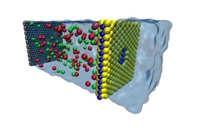
Salt water, a sheet of molybdenum disulfide, and a pore is all you need to produce current. (credit: Mohammad Heiranian, U of Illinois )
It's possible to generate energy using nothing but the difference between fresh and salt water. When fresh and salt water are separated by a membrane that blocks the passage of certain ions, there is a force that drives the freshwater into the salt water to even out the salt concentration. That force can be harvested to produce energy, an approach termed "osmotic power."
But the generation of osmotic power is highly dependent on how quickly ions can cross the membrane—the thicker (and more robust) the membrane, the slower the ions will flow. Theoretically, the most efficient osmotic power generation would come from an atomically thin membrane layer. But can this theoretical system be achieved here in reality?
Recently, scientists answered that question using atomically thin membranes composed of molybdenum-disulfide (MoS2). In the paper that resulted, they describe a two-dimensional MoS2 membrane containing a single nanopore, which was used to separate reservoirs containing two solutions with different concentrations of salt in order to generate osmotic power.
Read 8 remaining paragraphs | Comments
The case for progressive enhancement
Alex Maughan gives some great front-end design and development tips in his article Mobile-first, semantic, and modular front-end design. If any part of your work touches front-end development, I highly recommend this piece. In addition to walking through the tools he uses (and his reasoning), Alex also makes a strong case for progressive enhancement:
Designs should be approached with a content-first and mobile-first mindset. Following this, CSS breakpoints should always be mobile-first. All JavaScript should be progressively enhanced and should be used at a conscientious minimum where possible. Therefore, the concept of progressive enhancement happens from all aspects, from design to development and back again.
All of this translates into websites that are much more future-friendly within a disruptive device and browser marketplace. It also has the added benefit of improving performance and guarding against fatal runtime errors that stop pages from working.
I haven’t yet linked to many pieces on progressive enhancement. As I went through my Pinboard links just now I realized that 2013 has been a big year for this topic. These are all the articles I know about that came out this year in strong defense of progressive enhancement:
- Progressive enhancement is still important
- Progressive Enhancement: Still Not Dead
- Progressive Enhancement. Still Alive & Kickin’
- Progressive enhancement is faster
- A plea for progressive enhancement
- Progressive Enhancement: It’s About the Content
I don’t know, it sounds like it’s not dead yet…
GTA 5 will have an attached MMO world with GTA Online
Grand Theft Auto Online, an MMO-style component to the upcoming GTA 5, was announced today in a trailer posted by Rockstar Games. GTA Online with have a “persistent, continually expanding” environment and peripheral activities for players to participate in, like parachuting off cliffs and arm-wrestling matches.
According to the trailer, players will be able to earn money and reputation through the GTA Online universe’s missions. The game appears to feature dungeon-like engagements that players can pursue when they “band together to form a crew” to, for instance, shoot up and rob a bank. Players can “compete in classic online modes,” per the trailer, which appears to mean the game will feature PvP-style battles.
Money and reputation that players earn can be used to customize their characters’ appearance, weapons, and vehicles. Players will also be able to buy space in the game, described as apartments where “friends can stop by and hang out.”
Read 1 remaining paragraphs | Comments
    
|
Arkane On The Future Of Dishonored, Stories, Multiplayer

Dishonored lacked multiplayer, $5828375 worth of microtransactions, and hyper-linear setpiece rollercoasters, yet for some reason everybody loved it. It’s almost like people want intrigue, options, and whale-oil-based societies from their games. Almost. So, with the new (and excellent) Brigmore Witches DLC bidding adieu to the first game’s creaking, disease-infested Dunwall, what’s next for the best sneaky-stabby series to come along in years? Bethesda’s officially calling it a “franchise” now, so a sequel’s all but certain. Where might it go, though? Could multiplayer be in the cards? And where does Arkane think the first game failed? Also, were Dishonored’s two DLC episodes – with their tweaked powers and fairly vocal main character – a preview of things to come? I spoke with Dishonored co-creative director Raphael Colantonio to find out.
Acer will have a tough time using Chrome OS and Android to offset sliding PC sales

In response to a surprise second quarter loss of NT$343 million (US$11.4 million), Acer CEO JT Wang said in a conference call with investors on Thursday that the company is going to increase its range of Android and Chrome OS products, while offering fewer Windows-powered products.
The loss was caused by a combination of higher costs and lower sales, and compares with a NT$56 million profit in the same quarter last year. Last year, Acer said that it would attempt to produce fewer, better PC products to move upmarket. This has caused higher design and marketing costs, but apparently hasn't been sufficient to offset the broader slowdown in the PC market.
As a result, Wang said that Acer is "trying to grow our non-Windows business as soon as possible." While Acer once flirted with non-Google alternative operating systems, pressure from Mountain View has forced the Taiwan company to stick with its operating systems, both Android and Chrome OS. Wang argues that both of these will have a role, noting that "Android is very popular in smartphones and dominant in tablets" and that he sees a "new market" for Chromebooks.
Read 8 remaining paragraphs | Comments
|
|
Expérience à la maison : l’extraction d’ADN
Continue reading →