
Submitted by Pr1nceShawn

When the idea of self-driving cars was first proposed, many critics wondered whether a computer would be able to make the kind of split second decisions that human drivers do. Putting these concerns to rest, Google has announced that their driverless vehicles are now able to recognize and cope with typical occurrences that take place on roads, such as jaywalking pedestrians, double-parked vehicles, and even cyclists.


Read the rest of Google’s Self-Driving Cars Can Now Recognize Cyclists, Jaywalkers and Other People on Congested Roads
Permalink | Add to del.icio.us | digg
Post tags: cyclists, driver-less cars, Google, google cars, Google driverless cars recognize jaywalkers and cyclists, Google self-driving cars, green transportation, pedestrians, self driving cars

Lovely Package presents the winners of the 2014 A’ Design Awards & Competition. Each year creative agencies compete for honor, prestige and international recognition.
The A’ Design Award & Competition is a freestyle design competition open to both concept stage and realized works designed by professional and young designers, design companies and other businesses in the manufacturing industry worldwide. Submissions can be made to Furniture Design, Interiors, Electronic Devices, Architecture, Packaging, Graphic Design, Ready-Made, Jewelry Design, Interfaces, Web Sites, Transportation, Yacht Design and others.
Here are a few of the projects that we chose to highlight, and for the rest be sure to check out all of the winners at designmag.org.

Siberian Wolf by Guilherme Jardim
“The goal was to create a modern cosmopolitan brand that would appeal to a young vodka consumer and express a siberian feeling. The brand name is Siberian Wolf. In one color you can see the western part of Russia and in other color you can see the siberian part. The wolf is present on the top of the map. The slogan is “Wolves don’t wear collars” appealing to freedom, to the young customer.”


Botella de Vino by SHUMI LOVE DESIGN
“Spanish wines are traditionally associated with bright, memorable design that employs unusual graphic solutions. This is exactly the task we were given when creating the design for this series of Spanish wines. Besides the design’s expressiveness we also had to communicate the very idea behind the trademark: bottle of wine. When working in several directions I have come up with an original solution – to depict a bottle on the label, the contours of which would be made up from various fonts that correspond to the concept of Spanish. As a result the label’s design turned into a splendid printing work, which when combined with the trademark became the label’s pinnacle.”


Sprout by Springetts Brand Design Consultants
“A brand idea, which seeks to break new ground in the baby food category by the introduction of a fresh, chilled range of part-prepared baby food, similar to formats available for adult consumption. This would allow mums to make their ‘own’ baby food easily and quickly.”


Et Cetera Merlot by SHUMI LOVE DESIGN
“The winemakers at Et Cetera approached me with the request of creating a label design for their new line if limited run wines. The task was to create a stylish and minimalistic design that would make the product stand out on the shelves. Assuming that these are expensive quality wines, we also had to create the feeling of exclusivity through an original and unusual design. Besides, the project also required its own product placement, a concept that would be completely different from what the other local winemakers had to offer.”

Leuven by Wonchan Lee
“Differentiation is probably the most important factor in packaging these days. It clearly is a new approach and concept for beer packaging: not breakable, costs less to produce, lighter to carry, therefore advantage in delivery and production. From brainstorming to branding, choosing materials and finishing, the solution differentiates itself from other premium Belgian beer competitors in the market.”


Echinoctius by SHUMI LOVE DESIGN
“This project is unique in many ways. The design had to reflect the unique character of the product in question – exclusive author wine. Besides, there was a requirement to communicate the deep meaning in the product’s name – superlative, solstice, contrast between night and day, black and white, open and obscure. The label’s form is original and represents a contrast between day and night, wrapping the bottle around its entire circumference, forming an enclosed system of interaction, where one comes out of the other.”


Blue Goose by Sid Lee
“Visually, the need to embed the brand’s story in all aspects of its design inspired the use of hand-drawn illustrations on all consumer touch points. The cow, chicken, and fish serve as the focal point on the packaging. The animals themselves tell the Blue Goose story, and provide a rich and detailed representation of their natural environment, and the conditions they were raised in.
The soft and stylized design approach conveyed the care that Blue Goose provides when rearing its animals and brought the new brand promise to life in a unique manner. The design conveyed Blue Goose’s premium and artisanal positioning, but did not construe the brand as stuffy or extravagant. The choice of blue separated the brand from competing marques, as it is a colour not traditionally associated with food, and served to beautifully juxtapose the healthy pink colour of the meat.”


Die Limo by Flaechenbrand
“The difference is the simplicity and transparency cause of the adult target group. we decided to show the fruits and ice through a transparency – unique in the lemonade-market.”


Blossom Cava by PACKLAB
“The inspiration here was to do a lot with a very little – turning the gift of giving upside down and adding value. Through humour we are asking the purchaser turn the bottle upside down and by doing so give the gift receiver more than wine but flowers and a smile. An intelligent way to give more – flowers and a little bit of Cava sparkling wine.”


Kanniston Gingerbread Biscuits by PACKLAB
“PACKLAB created a unique experience that exploited joined-up-thinking with integral product and packaging development. PACKLAB looked into the stakeholders behaviour within the bakery, distribution chain, retail environments and explored Scandinavian seasonal home experiences. These observations lead to a marriage of old Scandinavian tradition of three pieces of gingerbread bringing good luck and heart-shaped pieces emphasising the affectionate characteristics of the season which were widely introduced both in the product. This was also communicated graphically through 5 different, yet similar variants of packaging.”


Coca-Cola Tet 2014 by Rice Creative
“To create a series of Coca-Cola cans which spread millions of Tết wishes nation wide. We utilized Coca-Cola’s Tết symbol (the Swallow Bird) as the device to form these wishes. For each can, hundreds of hand-drawn swallows were crafted and carefully arranged around a custom script, which together form a series of meaningful Vietnamese wishes.”


Patakukkonen Rye Pie by PACKLAB
“Patakukkonen is a Finnish traditional oven baked kukko (pie) made from regional ingredients. Based on a young boyʼs memory of his grandmotherʼs cooking, the brief was to develop an unique and modern brand based on traditional values, exploring classic Finnish foods. For PACKLAB, an inspiring creative opportunity came from working around the challenge presented by the diverse environments where the product would be showcased. From small cafes to major retailers, the packaging had to work equally in low counter refrigerators, high-standing door refrigerators of convenience stores, and even promotion refrigerators found in upscale food courts and airport food stores. We thus aimed at resolving whether a single packaging solution could work optimally in each retail environment, yet still be relevant and differentiating. Balancing information, imagery and space, the final design can be merchandised in five different ways, while optimising shelf space and accentuating the new distinct identity of the brand.”


Lithuanian Vodka Gold. Black Edition by Studija Creata
“The gold-shining “Lithuanian Vodka Gold. Black Edition” inherited its exclusive look from Lithuanian folk art. Rhombus and herringbones, combined from little squares, are very common patterns in Lithuanian folk art. Although reference to these national motifs gained more modern forms – mysterious past reflections were transformed into modern art. Predominant golden and black colours emphasize the exceptional vodka filtration process through coal and golden filters. This is what makes “Lithuanian vodka Gold. Black Edition” so delicate and crystal clear.”


METAXA On-Metal by The House of METAXA Remy Cointreau
“In the world of spirits, METAXA is celebrated as the smoothest spirit under the Sun and is often a gift of choice. In the premium spirits industry, gift boxes are often made of metal, most commonly in rectangular or cylindrical shapes.
With METAXA On-Metal, the House of METAXA creates a metal showcase that is both curved and smooth, in an unusual shape, to echo the smoothness of the liquid. For this striking metal box, inspiration did not come from the metal box industry, but rather from metal techniques and finishes used in automobile production. The metal box is designed in such a way as to use the least possible metal. For example, the top integrates a waving design to avoid other designs that would require a second sheet of metal to ensure proper closure of the top.”


Motif Wine by EN GARDE Interdisciplinary GmbH
“Our original vision was to reconceptualize the world of wine through a new product. We wanted to use a graphic pattern to visualize the taste and character of six different wines. This was how Motif came into being. The German word "Motif" means pattern, and we consciously refrain from using information about the variety of grape or other specifications on the label. Using no significant text, the individual patterns provide a subtle, tasteful indication of whether the wine is semi-sweet, full-bodied or effervescent.”
The next A’ Design Award call for entries opens April 27th with doscounted entries available for early birds from April 27-30. Click here to submit your work early and save. To find our more about the A’ Design Award please visit whatisadesignaward.com.
- Sponsored post. Find out more about our sponsored posts.
Gecco.89QUIERO IR :3


designs on aging is the sixth edition of the award-winning design innovation platform from IDEO that advances global discussion in the creative community.
The post designs on aging collection by IDEO appeared first on designboom | architecture & design magazine.
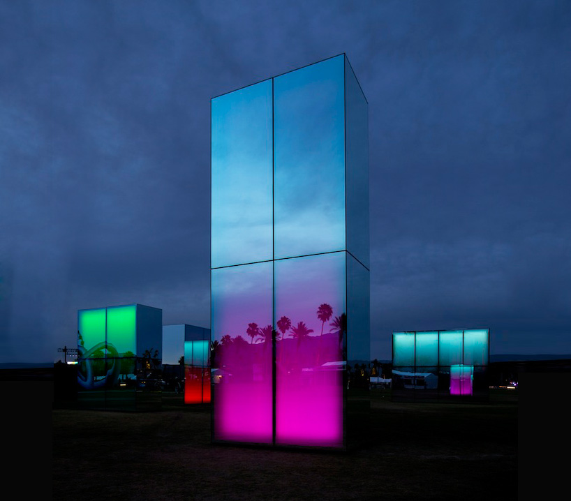
five, large-scale freestanding volumes, constructed from glowing luminescence and mirrored surfaces span a diameter of 100 feet across the vast california desert.
The post phillip k smith III mirrors reflection field for coachella appeared first on designboom | architecture & design magazine.
the austrian duo was acknowledged for the potential of their creative future.
The post mischer’traxler wins 2014 BE OPEN young talent award appeared first on designboom | architecture & design magazine.
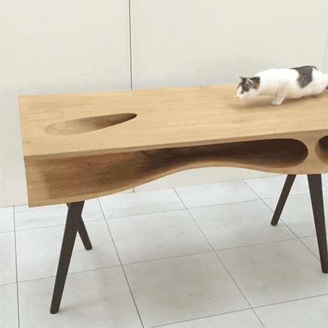
Milan 2014: holes and tunnels in the top of this wooden desk by Hong Kong-based designer Hao Ruan of LYCS Architecture have been designed to provide a playground for cats (+ slideshow). (more...)

The Roomba has made all of our lives easier from cleaning up after us to serving up some much-needed laughs moonlighting as "DJ Roomba." Someday soon you may be seeing a similar looking robot make an appearance in the world of architecture. Designer Han Seok Nam is looking to cut down on labor costs and up efficiency with his design, Archibot. The mobile printer works with in-room sensors to print uploaded CAD files that signify different construction points and plans right onto the floor of a work area.

The recently patented Archibot has been designed to recognize where building elements such as doors and walls need to be built. The printed plans can be compared to larger print-outs, making them easy to interpret and cross-check for both architects and contractors. Check out the video to see how it all comes together:
(more...)Tired of trying to force your kids to eat their vegetables when they’d rather be scarfing down ice cream? A new product line from Häagen-Dazs attempts to combine the two for a healthier dessert option. The international ice cream maker recently announced the rollout of their “Spoon Vege” line in Japan. The first two flavors, Tomato Cherry and Carrot Orange, will be available in Japanese stores on May 12, 2014. Sounding more like fresh juice blends than ice cream flavors, it will be interesting to see how these so-called “healthy” treats are received by Japanese consumers. Keep reading to find out what makes the “Spoon Vege” line different from other Häagen-Dazs flavors.


Read the rest of New Häagen-Dazs Ice Cream Flavors Let You Eat Your Veggies With a Spoon
Permalink | Add to del.icio.us | digg
Post tags: carrot ice cream, Haagen-Dazs healthy ice cream, Haagen-Dazs ice cream, Haagen-Dazs vegetable ice cream, Ice cream in Japan, tomato ice cream, vegetable flavored ice cream


 Curated by Robotboy66
