xxx: Работал я на заводе. Там тексты исходников программ для станков распечатывались и хранились в папочках с завязочками. Получалось по 1-2 листа А4 обычно. Там я узнал, что моль бумагу ест.
[Рабочий чат на удалёнке] BuPTy03: Коллеги, извиняюсь, вынужден прерваться на несколько минут - у меня тут начальство зашло, и интересуется почему я занимаюсь какой-то фигнёй вместо своих прямых обязанностей. BuPTy03: Щас поглажу, покормлю и вернусь.
Thomas Schaller has been an architect and architectural illustrator for 30 years before he switched to become a fine artist. His career is now at a stage where people refer to him as a master, or as the title of the book suggest, an "architect of light".
This large 208-page hardcover featured 150 pieces of his very best paintings. I love his style, the way he uses colours, how the treats the hard and soft edges and of course how he captures the light, or as he puts it "paint the shades and the shadows that allow the light to shine". The paintings are wonderful. There's confidence in the looseness and suggested details. The subject matter is a mix of urban scenes, landscapes and people.
All the artworks are captioned so you can read the short stories. Other than the paintings, the other highlight of the book are the lengthy inspiring and insightful essays that talk about the creative process of painting. Thomas Schaller talks about his approach, the importance of technique vs storytelling, and also what he has learned from years of painting as well as from other artists.
This is a wonderful book. The paintings are huge and nicely reproduced. The writing is an informative read. Highly recommended. It's well worth the money.
Thomas W. Schaller, Architect of Light: Watercolor Paintings by a Master is available at Amazon (US | CA | UK | DE | FR | IT | ES | AU | JP | CN) and Book Depository
Visit Amazon to check out more reviews.
If you buy the links, I get a little commission that helps me get more books to feature.
xxx> Я могу сделать либо 7 маленьких дел, либо одно большое. ууу> мнне кажется ты отсылаешься меня к какой-то притче. но у тебя сегодня 2 маленьких дела и 3 больших xxx> Я увольняюсь ууу> ты не предупредил меня. за 2 недели xxx> Я увольняюсь через 2 недели, а сегодня ухожу в отпуск. На 2 недели. ууу> сделай сколько получится.... * xxx has left the chat (Даа, нащщаальнике)
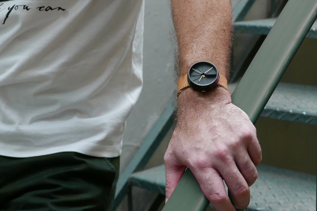
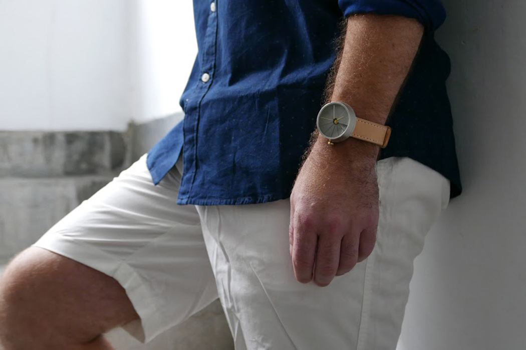
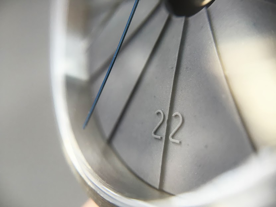
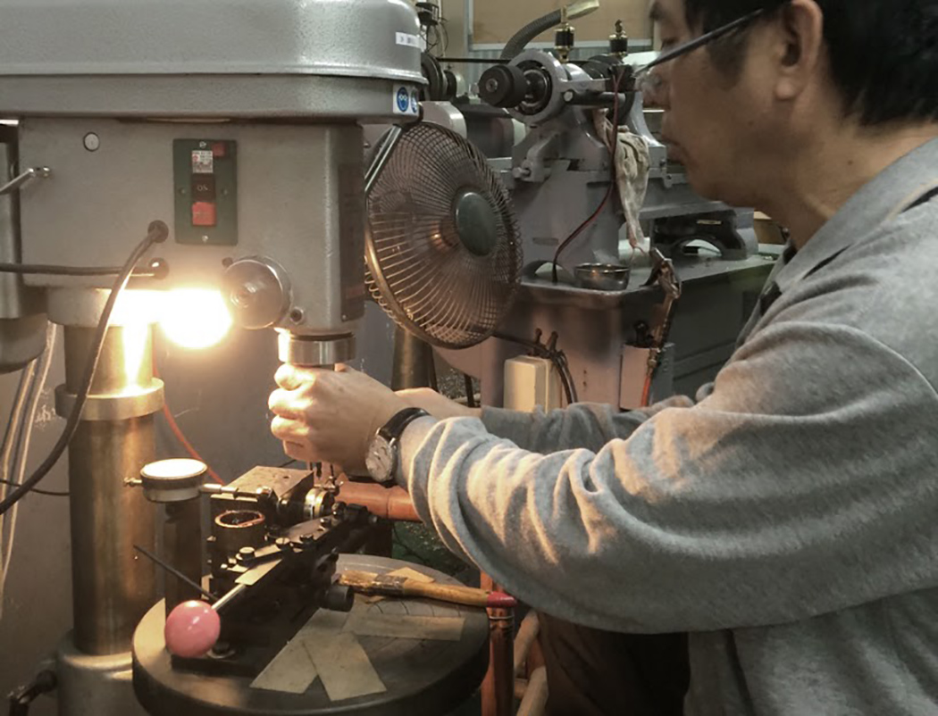
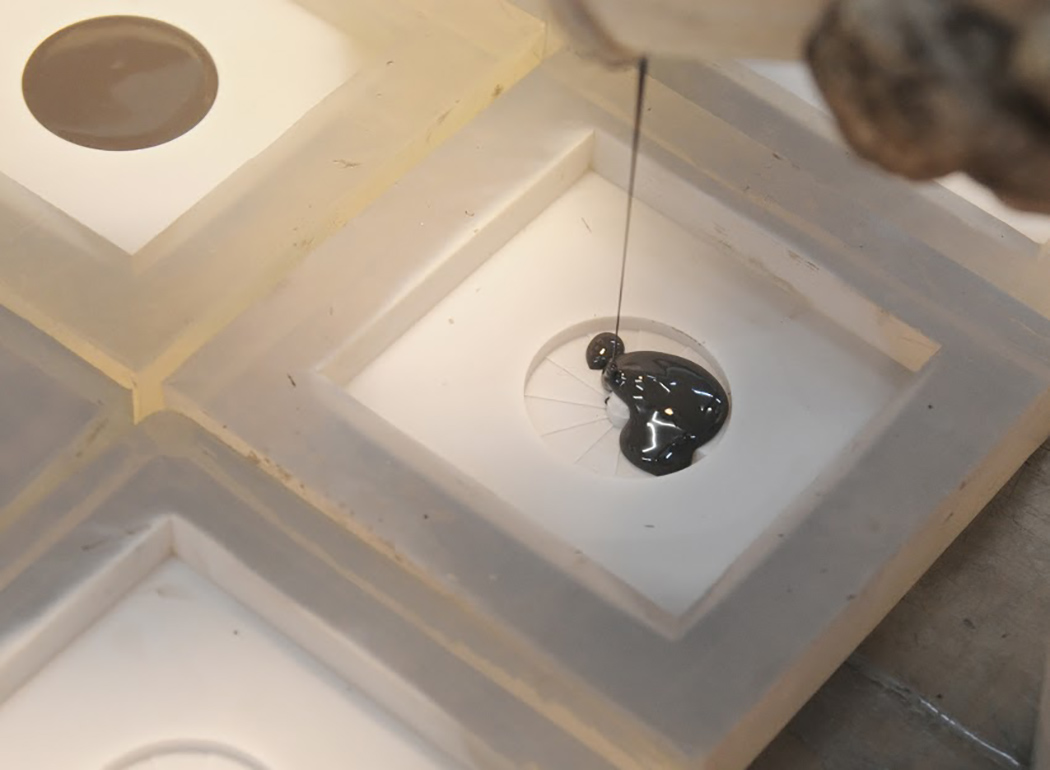
The 4th Dimension Watch was born from a fascination with contemporary architecture and design, as well as the progression of the MollaSpace brand’s product development (concrete accessories and writing tools). Time converges with space into our physical world through, what is known in Physics as, the 4th Dimension, which sparked the idea of binding time into this beautiful and solid timepiece.
The spiral staircase immediately stands out as a visual connecting point between 2 separate dimensions. With each stair turned at a 30° angle, you can align 12 steps together, each representing an hour, to form a complete Escher-like cycle. Serving as a break in between spaces, the stairs present an opportunity to pause between time and space. Rather than rush from place to place, the stairs serve as a subconscious reminder to stop and smell the roses in-between!
ххх: Ну от буржуйских мультиков тоже польза есть. ууу: это какая например? ххх: на следующее утро после отмечания отпуска, мне было очень хреново. Думал весь день пролежу и не повезу дочку на обещаные атракционы. Ребенок же в ожидании пока я встану, крутилась рядом и смотрела в планшете "свинку Пеппа". После того как я раза четыре услышал "папа свин", то мне стало стыдно и я пошел приводить себя в порядок
Arcgency is a Copenhagen office dedicated to Resource Conscious Architecture. Based on knowledge gained from research and projects on how to assemble and disassemble buildings Arcgency developed an architectural conceptthat is easily moveable while still offering the qualities of permanent buildings. More thanthat, it is an experiment in pre-fab architecture that challenges universal waste issues and traditional building techniques; How do we minimize energy usage while adapting to the rough and dynamic Scandinavian climate? How do we implement a high level of flexibility and functionality in the creation of ideal workspaces for creative entrepreneurs? How do we create a sustainable design that prioritizes diverse and interesting spaces with great visual quality and daylight conditions? How do we make a building move?
How it is done:
Worn-out shipping containers are stacked three stories high on a series of minimal site impact pillars. The container is a super optimized product, refined to be cost-effective, strong and durable. It fits international transportations standards and can be shipped and set up anywhere, enabling us to practice direct reuse. If a new building component with the same specifications were to be designed, it would be both expensive and time consuming.
The span between the containers is utilized as flexible spaces for primary workspace functions. The interiors of the containers can be used for secondary functions such as meeting rooms, workshops and storage. The raw container structure is set up in just two days. The container stack is wrapped with high performing insulated sandwich panels, also functioning as vapour barrier and cladding. They are bolted directly into the container frame – as are the windows, roof elements and interior floor slabs. Visible installations are used for water, electricity and heating, making it easy to set up and take down.
The architecture.
The architecture is based on at simple set of principles: Raw aesthetics,differentiated spatial sizes, layers of visual connections through the building and great daylight conditions.
The look and feel of the interior surfaces and structure is dictated by the shipping containers. The 10-14 rough years at sea has left their mark on the containers. As a building component they are given an afterlife and their dents and imperfections are acknowledged as part of the architecture. Except for a matte grey coating the containers are kept in their original states; Functioning doors, original floor and corrugated surfaces. The coating creates a uniform look and enhances the structural detailing.
From the 40 feet long spaces inside the containers to the triple high spaces between them; the different spatial experiences and scales invite to different uses. Especially the larger spaces open up to a variety of possibilities and visual connections through the building. Views of the exterior are always present; even across the building. This creates depth, perspective and a feeling of connectivity in the house. Different levels and large interior windows make it possible to create the feeling of working in a collaborative atmosphere. The teams inhabiting different parts of the building can feel connected while at the same time not disturbing each other.
Large full height openings let natural light pierce deep into the building all through the day. The need for artificial light is minimized. The daylight adds detail to the interior as shadows play across the corrugated container walls. It leads you through narrow spaces to the open plans and draws your eye across different levels and through the building. The triple high space lets light in from all four corners of the world. As a result all levels are given varied mixed light without the need for windows in all four facades. This is crucial to prevent overheating and eliminate the need for air-conditioning. The ceilings in the large spaces are cladded with perforated aluminium that reflect light from the waterfront. An acoustic absorbent is placed above the perforated surface, creating a perfect acoustic environment.
Key sustainable features:
Designed for Scandinavian climate. – 10 to + 25
Low energy usage: Below 41 kWh/m2 pr. year.
Highly insulated facade panels. 300mm. U- value: 0,13 W/m2K.
Designed for disassembly.
90 % recyclable materials.
Naturally ventilated.
3-layered windows with build in shading film.
Minimal site impact pillars.
Overlooking Holmestrand and the fjords, this seaside retreat in suburban Oslo comes with a charming appeal. Designed by Schjelderup Trondahl Architects, and photographed by Jonas Adolfsen, the single-family residence in the photos below is dramatically situated on the edge of a cliff and offers 180 degree views toward the sea to the east and a rich natural landscape to the west. Its complex form is the result of adjoining two main wings, which were bent 22 degrees to each other, in order to adapt the house to its rough terrain.
A rich variety of textures contributes to an overall welcoming feel: “The interior wooden walls and ceilings are clad with white oiled poplar plywood boards and white ash floorboards are used, introducing a light softness to the interior. The internal geometry represents necessary constructions for the cantilevered roofs in addition to defining spaces. All windows and doors are made from massive oak.” The lovely cantilevered roofs, shifting facades and spacial experiences offered here places this Norwegian retreat on our list of dream homes.
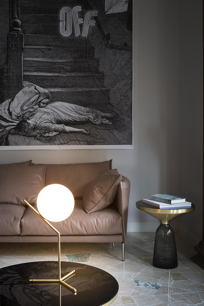
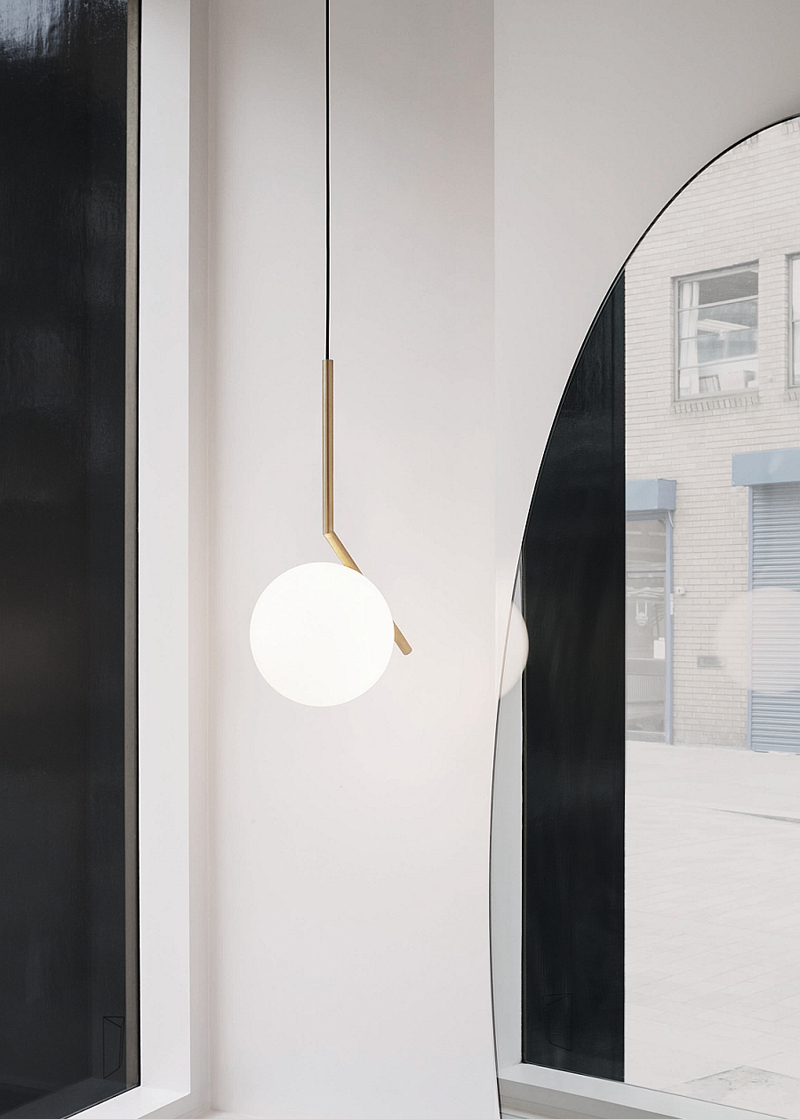
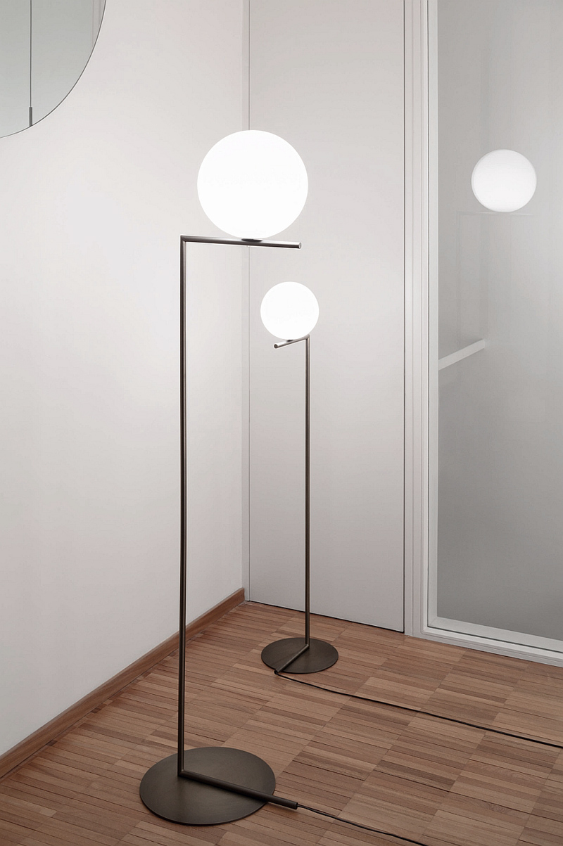
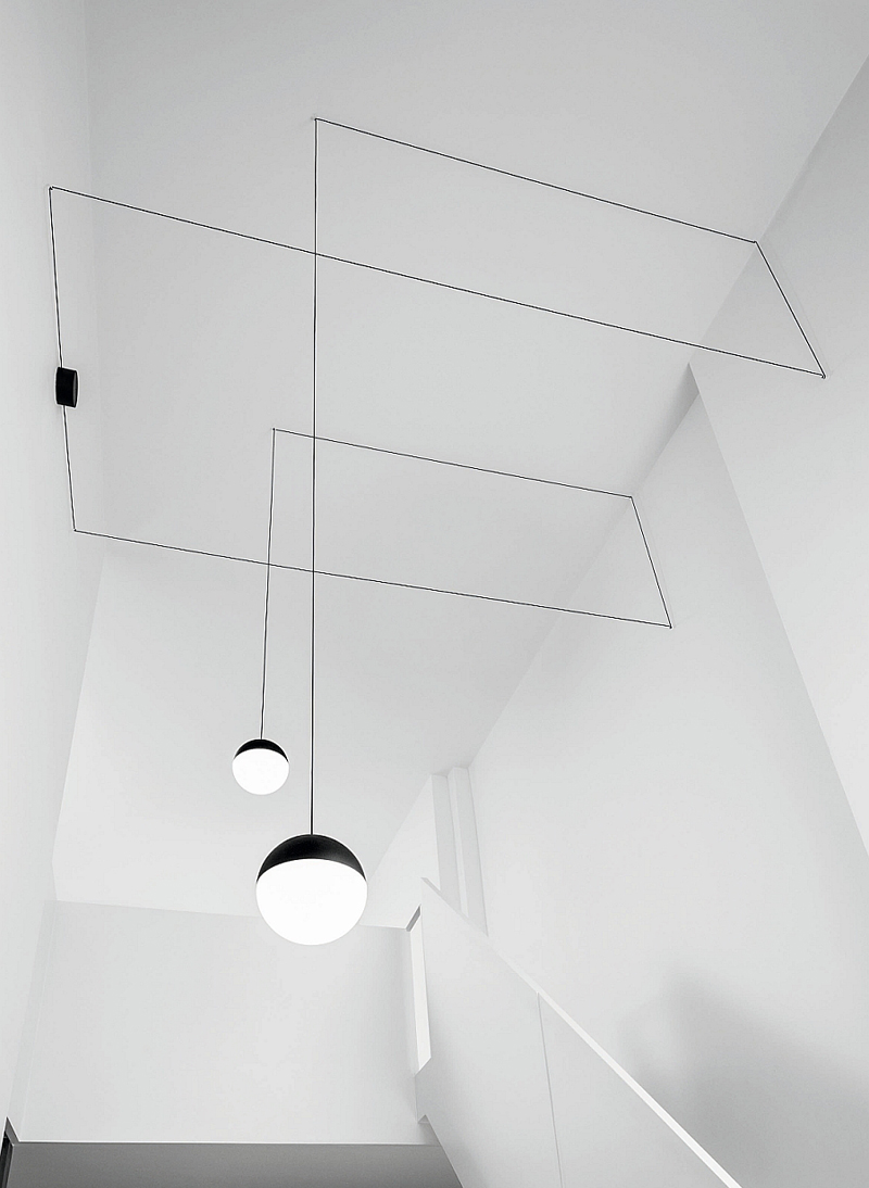
The IC Lights family was recently debuted for FLOS and designed by Michael Anastassiades ranges from wall lamps in brass to floor lamps in a bronze finish. The design was inspired by "the awkwardly positioned spinning spheres of contact jugglers". Find the entire collection for North America and view the award winning String Lights (pictured below) by the same designer here and here.
There’s something about the organic feel generated by the lovely cabins built up along the slopes of the mountains. Most people choose detached houses to disconnect from the exhausting cities, in order to find peace, get in touch with nature and last, but not least, explore a different side of life. Naturally, harmony is one of the most important features when designing a home. A house that enhances the feeling of balance, inspiring comfort and serenity, has a positive impact on your wellbeing. It’s the case of Via Sauvagia, a residential development in the Laurentians, near Quebec, Canada. The project was designed by Catlin Stothers Design in collaboration with Pierre Thibault and Labrie Daigle Design Studio.
The challenge was to create a dwelling defined by contemporary lines without omitting the organic feel. “The contemporary architecture strikes unity between nature and the interior. Glass exterior walls and open interior spaces called for finishings that respect the integrity of this vision.” Earthy colours dominate the interior, bringing more of the natural environment inside the house. Wood and stone as well as natural soft textures, such as different kinds of wool add a sense of simplicity and rusticity.
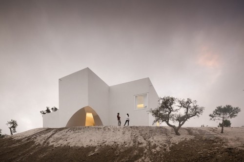
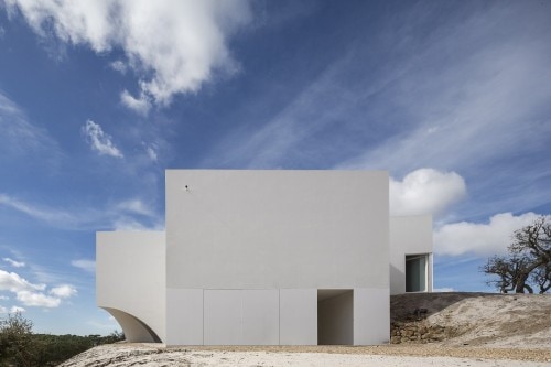
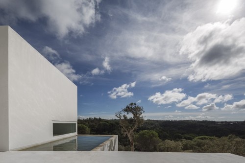
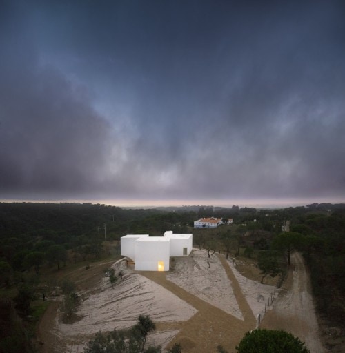
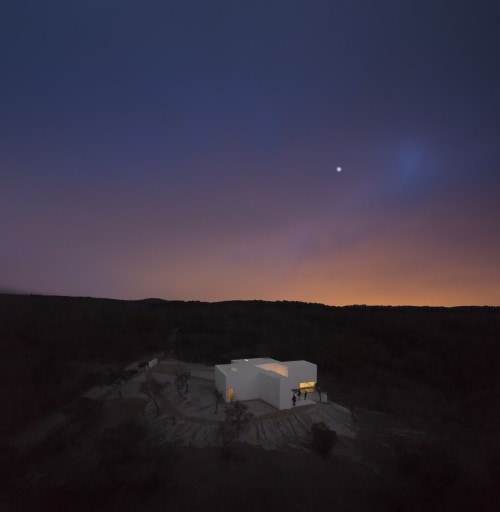
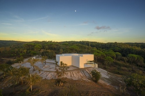
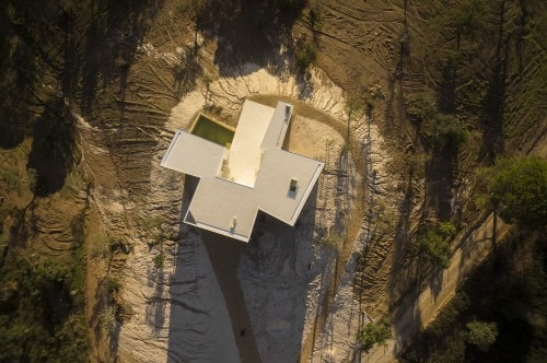
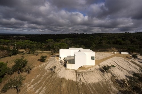
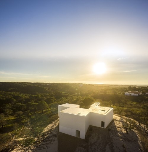
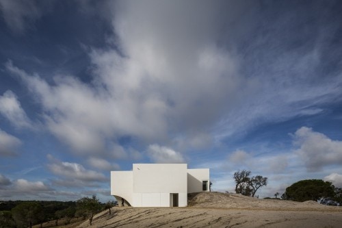
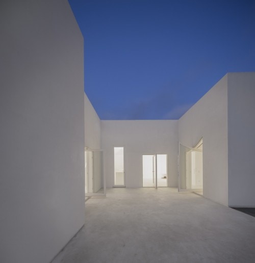
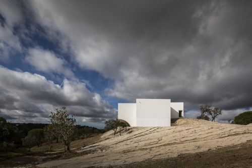
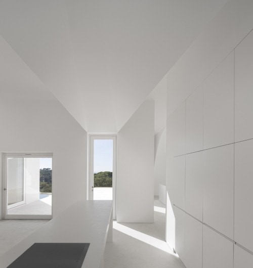
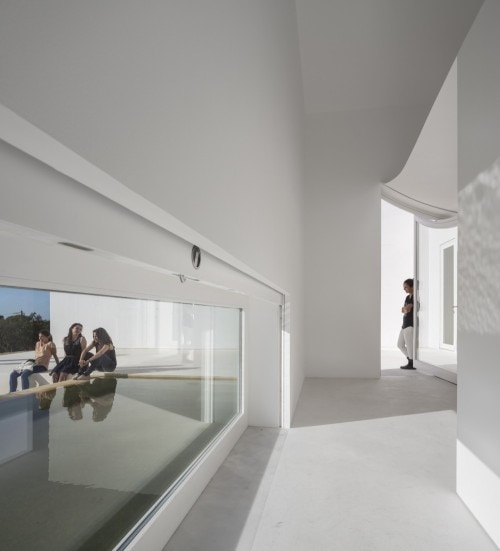
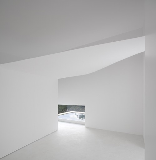
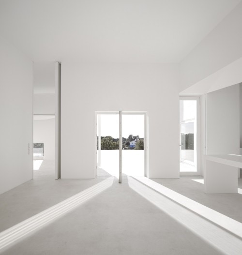
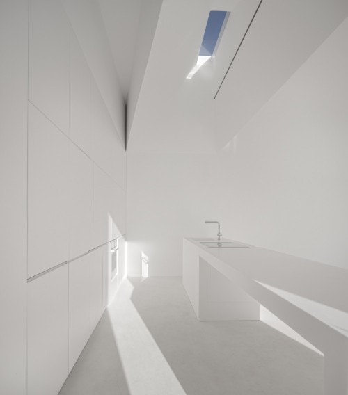
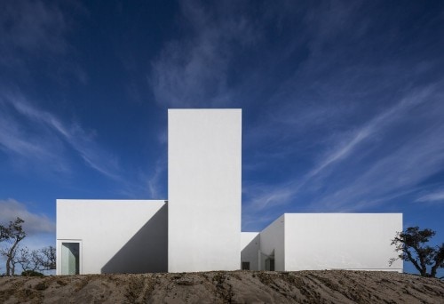
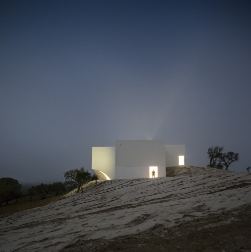
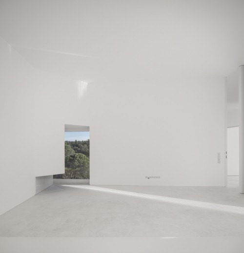
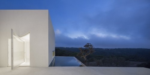
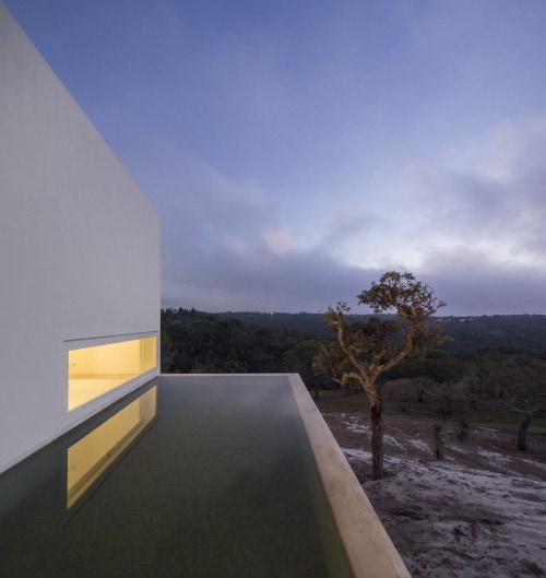
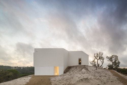
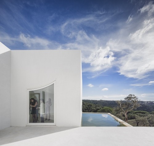
Casa en Fontinha is a minimalist house located in Melides, Portugal, designed by Manuel Aires Mateus. The design is centered around an open courtyard, which overlooks the beautiful landscape beyond. The minimalist white exterior facade is matched with an equally white and simple interior.
Hello! It’s Holly Marder here with another Homes With Heart column for you to feast your eyes upon. This month I’m taking you on a tour of the Amsterdam home of Desiree Groenendal of the Dutch blog Vosgesparis. Let’s go! Oh and please click on any image to enlarge or pin to your Pinterest boards!
“Pure, simple, industrial and tough” are words that Desiree uses to describe her 85 m2 Amsterdam abode, which she has called home for the last 25 years. The blogger and stylist prefers to keep her Scandinavian style space uncluttered, clean and minimalistic, with strong Northern European references that rely on tough materials and high contrast. “I am really fond of the clean uncluttered look,” Desiree says.
When Desiree moved into her apartment, it was apart of the newly converted former Eastern docklands, where she and her family were some of the area’s first inhabitants. With two small children, the house offered a practical, large space for a young family. With her children grown and out of the house, Desiree has took the opportunity during the summer of 2011 to create a more open plan living, starting with the removal of several walls and doorways. The removal of a wall seperating the kitchen and living room, as well as one between the bedroom and hallway, was a decision that has resulted in one of Desiree’s favourite features. “I love to see through from the kitchen to the living room and hall,” she says. At the same time, Desiree had her kitchen remodelled, featuring sleek white cabinetry, a built-in fridge and storage unit, and a black chalk painted wall. “I liked the combination of black, white and a touch of wood, and the black wall brings in some depth,” Desiree explains. She is now working on ideas for a light fixture above the dining room table, which will incorporate several pendant lights she has been collecting over the years.
The renovation was a swift process that was carefully considered, ensuring that Desiree wasn’t met with any challenges along the way. “I think a lot and very long about things,” she explains. “I had designed everything so I wouldn’t come up against any challenges. You have to be very sure when you start breaking down walls.” Though some 37 bags of stones were removed during the renovation, the efforts were well worth the results – a spacious home that offers stylish, open plan living in one of Amsterdam’s most up and coming areas. “I love to have space,” Desiree says. “I am fortunate to have an affordable home in a desirable area – the best of both worlds.”
As for colour, Desiree prefers to keep things monochrome cool, relying primarily on black and white as the basis of her interior. “I used to have more colour in my home when my kids were at home, but over the years my style has changed.” Against a high contrast canvas, Desiree combines old, industrial items with design pieces and Scandinavian made furniture. “Scandinavian furniture is simple but well made. Clean design combines beautifully with craftsmanship, but what I love most is the strong emphasis on family businesses and their clean, contemporary take on old craftsmanship,” she says. But one of Desiree’s top tips when it comes to decorating is choosing pieces that are versatile. “I like to be able to change the look fast, so I am attracted to pieces that are versatile and can easily be moved around the house.”
Desiree applies the same decorating ethos to art around her home, preferring interchangeable, inexpensive art that can be quickly and easily applied. Some of this interior’s most striking features are the exposed concrete areas on otherwise white plastered walls. “I love the contrast between the concrete and the white,” Desiree says. “It is almost like a work of art.” This feature can be seen in the living room and also continues into the bedroom, where crisp whites dominate. “It feels good to wake up in a white and light space. I like my bedroom to be uncluttered,” Desiree says. A coatrack displays items worn on a daily basis, while the rest of Desiree’s wardrobe remains behind closed doors.
So what is Desiree’s style secret? “I love imperfection. Walls don’t have to be perfectly finished; it’s the rough edges which I love most about my own home. A bit of the unexpected, with nice combinations of various materials. All a bit unpredictable.” So what did you love about this space? Could you have the discipline to go all black and white? I would love to read your comments, and look forward to seeing you back here next month for another fabulous home! – Holly
Kiernan May‘s ELTHAM HOUSE renderings awarded him Best Visualization of the Week NO. 26 using Maya as his main platform for setting up his scene. Kiernan managed to mix lots of colors in his dusky images keeping the balance with a great final result. Check out his process of making this all work. Enjoy!
Kiernan May is a 3D Visualization Artist and Photographer based in Canberra, Australia. He studied Art and 3D Animation for Screen at the Academy of Interactive Entertainment between 2003-2007. Since then, he had many years of experience in visualizing and photographing projects around Australia.
Introduction
Firstly, big thanks to Ronen for all the resources and inspiration on this site over the last four years. It is an invaluable source of information I enjoy reading and being exposed to all the different ways people go about making their images.
This article will be about the making of Eltham House and how I went about making the images for this project. The software used was SketchUP, Maya, V-Ray for Maya with post production in Photoshop and Lightroom.
I understand that Maya is probably not the best suited tool for Arch-Viz, however, combined with SketchUP, V-Ray and plugins like VRayScatter, it can be pretty good to work with.
I dipped my toes into 3D with 3dsmax back when it was around version 4, but I completed a course that taught Maya for a couple of years, so I guess in the end I was more comfortable with Maya. I think that 3dsmax & Maya are similar in many ways and many tips and techniques that are shared on this site are thankfully translatable between the two (and other platforms too if using V-Ray).
Basic Scene Setup
The basic mesh was sourced from the 3D Warehouse in SketchUP format. It was imported directly into Maya and I did not change that much about it. Minor things needed fixing once imported for instance, new windows were needed along with more detailed frames, new staircase, interior fixes and adding in detail to most exterior edges like beveling operations and of course textures. Apart from that it was in pretty good nick.
The more important elements to this project in terms of 3D were the foliage, shading, lighting and of course, post production.
The base mesh in all it’s glory…
And with some added work on it…
After importing the model into Maya, I already knew the kind of shots I had in mind, so modelling a highly detailed ground was not a high priority for me. In the end it was a very simple surrounding.
The plane was tweaked with some noise and slopes provided by Maya’s sculpt brush.
To keep the scene efficient, but at the same time keeping things looking like they were highly detailed in the render, I used VRayPattern from iCube R&D for the large grassy area.
The source mesh that was used for VRayPattern :
VRayPattern can be basically described as geometry based displacement. So for this particular project, rather than scattering individual grass patches over a surface, VRayPattern works literally by making the grass patch “appear” at render time on the base geometry. The scale of this patch of grass is controlled by the base geometry UV map.
It really is quite elegant as it somehow manages to do all this without any memory increase and is a far more efficient alternative to the more expensive grass solutions like fur, scattering or displacement.
The only drawback to VRayPattern is, as the name suggests, that it literally tiles the mesh in UV’s, like textures are repeated, and in certain instances it’s really obvious to see the repetition. It must be used appropriately.
xoio covered VRayPattern in the past and it is a great read :
You can also download a basic scene to play with :
Once all that “groundwork” was in place, I had to set up the lighting.
Lighting
I think lighting is the key for any render and I try and get it down as early as possible in the workflow. It is also my favorite part of a project.
I had a few magazine references that I was keen to recreate. Originally I had in mind an afternoon sunset type shot but as the project moved forward, I went and restarted the lighting towards what ended up as the current “blue hour” look.
I thought the house was more attractive and welcoming with all the interior lights on during this time of the day.
Before any test renders were started, I used a material override in the scene which just involved turning all shaders to a non reflective 50% grey material. This is mainly because it’s fast to render but also very easy to tell what the lighting is doing without the distractions and manipulation that regular shaders can cause.
V-Ray RT once again proved to be very useful in helping to quickly tune the lighting direction as well as finding a good V-Ray color mapping and exposure settings. I must say I ended up with some awkward color mapping settings on this one, but it provided some nice contrast even before post production, which is what I was after.
I also used a V-Ray Physical Camera even if the settings are probably not that accurate for what you would expect in the real world on a camera for this scenario. I just used it primarily because of the automatic lens shift (3ds Max users will know it as the Guess Vert. button).
This method is much better than correcting the lens shift by eye – or worse in post production!
Materials
Most shaders in this scene used traced reflections no matter how subtle. I think V-Ray is an exceptionally fast render engine, so I’m not that conservative with glossy materials on exterior scenes, especially when the renders are stills only.
While I’m on the subject of reflections, I also used some pretty high subdivs on materials. Usually, they started around 80 and if they appeared too noisy, I’d bump them up even higher or drop them depending on glossiness amount. I’ll go into my reasoning behind this a little later.
The original model was imported with low res placeholder textures, all of them had to be replaced with higher quality ones. Everything was mapped with planar mapping since all textures are tiled.
The wooden floor material used.
Outside concrete tiles material.
The render preview swatches in Maya are quite small and hard to judge by, so most if not all materials start life from pre made presets I made… Things like glass, fabric, lacquered wood, rubber, plastics, aluminium, chrome etc. It allows for a faster workflow and less test renders to desired result.
Once I apply the base preset on a material it’s usually as easy as plugging in a diffuse map. 90% of the time it looks okay after making slight adjustments to the reflection strength and glossiness.
However, if it doesn’t look convincing after a few test renders, then extra textures are needed to help like normal maps, reflection maps and sometimes even glossy maps.
For the foliage, I pretty much always use the below preset for a starting base which is always connected to a VRay2Sided Material.
Lighting (Feature Lighting)
After I was happy enough with shading and texturing, I then added in some artificial interior and exterior lights.
Once more, with the help of the 50% grey material and V-Ray RT, I was able to adjust all the lights until it looked like the right amount. Since I’m working with a HDRI instead of V-Ray’s physical Sun + Sky, lighting values become a little more guesswork as they usually aren’t physically accurate anymore due to the HDRI. You can get close however.
Test render with 50% grey material showing the exterior lighting feature lights :
IES lights were used for all the exterior feature lights.
Initially, I used IES lights for the interior as well, but I was unhappy with the “uneven” spread of light that they caused. I added in more IES lights to try and solve it, but it just ended up making my render times increase too much.
In the end, while probably somewhat less realistic, I used a large V-Ray Plane Light for each room which flooded the interiors with an even light.
You can still just see the interior IES lights in the viewport above, but they are turned off in favour of the V-Ray Plane Light.
After all the lights were added, I then turned off the 50% material override and conducted a few test renders with all the lights and final shaders on.
The lights are on, but nobody is home!
In the end I was happy with balancing between the artificial lights and the HDRI lighting.
After lighting, it was on to populating the scene.
Landscaping
I started work on the foliage first.
For the closeup grass, I used VRayScatter to scatter three different grass patches and some extra things like flowers and clovers along the ground mesh. Although its was not too noticeable in the final render because it is dark, the extra detail still helps I guess.
The vrmesh grass that was used for scattering.
The flat grey mesh surrounding the entire house has VRayPattern grass assigned to it while the foreground grass used VRayScatter.
A mask curve was needed to block out any potential grass from clipping with the path and or worse yet, stopping the grass from growing inside the house!
Fallen leaves were manually placed in the scene via the spPaint3D python script. I believe it works much like 3ds Max’s paint objects tool.
Background trees were then added in with the help of VRayScatter.
After I was happy with the setup, I added in some extra key trees, bushes and plants from my library. These were different from the models used in the background to help make the foliage look a little more varied.
Interior Furnishings
Using a bunch of pre-made models from my library that has been built up over the years, I decorated the rooms with some furniture and assets. We simply can’t have an empty house after all.
Some furniture pieces were hand made from previous projects, others pieces were from sites like archive3d.net or even manufacturers sites like vitra.com.
Rendering
Setting up some views (Some trees and bushes had to be moved around to look okay from every viewpoint).
After a few test renders, tweaks and tests to make sure everything was working okay, it was onto the final render settings!
Final render times for a resolution of 2700px wide by 1518px tall was around 2 or 3 hours for each image on a Quad Core i7 950. Even though Brute Force takes longer to render, I much prefer it over irradiance mapping because it is very reliable and easy to predict.
I was able to set the AA threshold quite loosely at .02, but to do so, I first had to set the Adaptive Amount to 0.9 and tweak a few key materials and lights.
Using 0.9 as an Adaptive Amount is just easier for me to work with as it means that V-Ray will only give 10% of subdivs to a light or material to start with. For example, for the most grainy things that would render out, I could just bump up the subdivs to something like 80 and know it would be smoother and even in some cases quicker than the default settings.
<h2>Post Production</h2>
For the render passes, I didn’t use very many on this project as I was pretty happy with the beauty pass. The main ones I did use though, were the reflection and ZDepth passes.
I rendered everything to 16bit PNG’s and many hours later, I comped it all in Photoshop for a basic sky replace and basic color correction.
The Raw Render :
And after Curve, image sharpening, sky replacement and a slight reflection pass boost was needed…
After Photoshop I kind of prefer to do the rest of the color correction in Lightroom because it’s really fast to change things and syncing it all between shots is really easy.
With this particular project not too much color correction was really needed.
The very last thing I like to do in a project, or sometimes when I get stuck, is a really cool little trick someone once told me and that is to flip the image horizontally. This way your brain sees the image for the very first time and it’s easy to pick up mistakes or other things you normally don’t see.
I think that just about covers it all. This is a simple project and thank you very much for reading and I hope this is somewhat useful to people out there.
If you have any questions, I’ll be happy to answer them in the comments below!
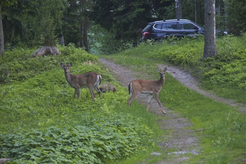
I think these white-tailed deers were posing to me. I took pictures through our cottages (bedroom) window. They are visiting us regularly. Cute, aren´t they?
***
Kuten jo sanoin, blogi leviää kesäksi. Menee vähän sinne, tänne ja välillä vaikka metsääänkin. Tai no, mökkimakkarin ikkunan eteen.
Näytti ihan kun olisivat poseeraaneet minulle. Katse kameraan -klik, makkarin ikkunan läpi. Nämä ovat vakkari vieraita. Aika suloisia, tosin popsivat suuhunsa istutukseni, mutta viis siitä.


 There’s something about the organic feel generated by the lovely cabins built up along the slopes of the mountains. Most people choose detached houses to disconnect from the exhausting cities, in order to find peace, get in touch with nature and last, but not least, explore a different side of life. Naturally, harmony is one of the most important features when designing a home. A house that enhances the feeling of balance, inspiring comfort and serenity, has a positive impact on your wellbeing. It’s the case of Via Sauvagia, a residential development in the Laurentians, near Quebec, Canada. The project was designed by Catlin Stothers Design in collaboration with Pierre Thibault and Labrie Daigle Design Studio.
 The challenge was to create a dwelling defined by contemporary lines without omitting the organic feel. “The contemporary architecture strikes unity between nature and the interior. Glass exterior walls and open interior spaces called for finishings that respect the integrity of this vision.” Earthy colours dominate the interior, bringing more of the natural environment inside the house. Wood and stone as well as natural soft textures, such as different kinds of wool add a sense of simplicity and rusticity.


 “Pure, simple, industrial and tough” are words that Desiree uses to describe her 85 m2 Amsterdam abode, which she has called home for the last 25 years. The blogger and stylist prefers to keep her Scandinavian style space uncluttered, clean and minimalistic, with strong Northern European references that rely on tough materials and high contrast. “I am really fond of the clean uncluttered look,” Desiree says.