Shared posts

14 Aug 19:08

Fashion Obituary: Issey Miyake, Between Vionnet and Christo

by Anna Battista

"(Issey Miyake's) cape with an attached hood enshrouds the wearer, as protective and imposing as a nomad's tent. He has recapitulated the traditional Japanese students' uniform, adapted the traditional work apron of the Japanese housewife and exalted the quilted cotton tunic of the Japanese martial artists. A series of dresses is inspired by the colourful, twisted fabric which is used as a ceremonial rope to lead honored horses during a festival in his homeland. A flapping jumpsuit mimics the pose of a flying squirrel. A multi-coloured layered dress whirls open to reveal a shape familiar to millions of Japanese childre, the spinning top. His spinnaker dresses which are completed by a separate square attached to the shoulder, move like billowing sails at sea."

Susan Sidlauskas, Curator, "Intimate Architecture: Contemporary Clothing Design", Massachusetts Institute of Technology, 1982

IMiyake

Issey Miyake, the Japanese fashion designer known for his pleated designs, died on 5th August of liver cancer in a Tokyo hospital, as announced today by the Miyake Design Studio in an official release. He was 84.

IsseyMiyake_label_ss76

Born in Hiroshima in 1938, Miyake was seven years old when the atomic bomb was dropped on the city. Within three years his mother had died of radiation exposure. Miyake is said to have wanted to become either a dancer or an athlete, but he eventually found his design vocation inspired by his sister's fashion magazines.

He went on to study graphic design at Tama Art University in Tokyo and, in the '60s, he moved to Paris. Here he apprenticed to Guy Laroche, became an assistant to Hubert de Givenchy and, when he moved to New York, he also worked for Geoffrey Beene.

BillCunningham_IMiyake

His experiences in the Big Apple prompted Miyake to ponder more about fabrics and how he could reinvent traditional ones. In an interview published on Domus Moda in May 1981 he stated: "In New York I was looking at what people were wearing, like jeans and I thought 'Why couldn't I do something with the traditional Japanese things?' First I started with quilted cotton, sashiko, worn for judo, kendo, sportswear and farmer clothes but I could not use it as it was – handwoven and narrow – it was too expensive. So I had it done by machine and I did the same with any other materials."

Issey Miyake  Breastplate  1980

In 1970 he returned to Tokyo where he founded the Miyake Design Studio that focused on practical and functional designs, inspired by his passions for fabrics and movement. In that Domus Moda interview, Miyake stated indeed: "The idea for my clothes always comes from a piece of fabric that I design. There's a special relationship in my clothes between cloth and body, there’' a coexistence of cloth and body which become one through movement."

Issey Miyake_Pleats Please_dress_1996_a

In the early '80s in Italy there were designers who had started experimenting with light designs that could be folded and easily packed. But Miyake took the discourse further when he started experimenting with pleated fabrics that called to mind Mariano Fortuny's designs and that held their shapes while guaranteeing freedom of movement to the wearer.

Issey Miyake_Pleats Please_dress_1996_b

The fabric's ability to hold its pleats made it perfect for dancers as proved by Issey Miyake's costumes for "The Loss of Small Detail" (1991) for choreographer William Forsythe. At the time Miyake was working on pleated clothes, but his experiments with colours hadn't been successful.

Frankfurt Ballet_Issey Miyake

For Forsythe's performance he designed white, black and gray costumes and used them as trials to monitor the levels of durability. The dancers energetically moved in his costumes, allowing him to study the weak and strong points of his designs and to eventually launch his line "Pleats Please" three years later.

Frankfurt Ballet_Issey Miyake_2

Miyake's "Pleats, Please" line was followed by the men and women collections, accessory lines and fragrances. One of the first Japanese designers to show in Paris, he became known for a style suspended between Japanese crafts and high-tech experiments.

One of his most experimental lines remains Miyake and Dai Fujiwara's innovative "A-POC" (A Piece of Cloth) concept knitwear, created without using needle and thread construction but feeding the yarn into a computerised loom programmed with structural patterns that the consumer could cut along perforated lines, obtaining form-fitting garments. Designs from this line are often featured in museum collections or in exhibitions such as "Future Beauty" at London’s Barbican.

FutureBeauty_APOC
Miyake retired from the frontlines of fashion in the late '90s to devote himself to research, though he continued to oversee the creative direction of all his lines. His collections, showcased in Paris, often featured elements of performance and experimental artists as well.

IMiyake_1989_a

In more recent years the brand developed origami-inspired designs like the ingenious "132 5." collection, made in a polyester fibre generated by Teijin Limited from chemical recycling by pulverizing, melting and spinning threads out of polyethylene terephthalate,  but also interior design pieces in collaboration with other partners such as Italian lighting company Artemide.  

IMiyake_1989_b

Miyake was among the few designers featured in a fashion and architecture exhibition that made history - "Intimate Architecture" exhibition (1982, Massachusetts Institute of Technology).

IMiyake_1995

The exhibition was among the very first ones analysing the links between fashion and architecture and remained throughout the years an important landmark for many museum curators and researchers interested in the fashion and architecture connection.

The catalogue introduction stated about the designer: "Issey Miyake's attitude towards his work bridges two seemingly disparate approaches towards the manipulation of fabric: the classical restraint of Vionnet’s designs and the exuberance of Christo's 'Running Fence', an environmental sculpture composed of undulating sheets which reacted to the forces of nature."

Irving-Penn-Issey-Miyake-1990

That exhibition featured some of his early designs, that became some of his most iconic as well, including Issey Miyake's red plastic bustier molded on a woman's torso that ended with a short peplum of fabric-like folds at the hips.

This piece from Miyake's Autumn/Winter 1980-81 collection also became a focal point of his "Bodyworks" exhibition that toured internationally from 1983 to 1985.  

IMiyake_1980

According to Japanese media a private funeral has already taken place and there will be no public memorial service, per the designer's wishes.

A statement from the house hopes his creations, but also his passion for research, will inspire future generations: "Never one to embrace trends, Miyake's dynamic spirit was driven by a relentless curiosity and desire to convey joy through the medium of design. Always a pioneer, Miyake both embraced traditional handcrafts but also looked to the next solution: the newest technology driven by research and development. He never once stepped back from his love, the process of making things. He continued to work with his teams, creating new designs and supervising all collections under the various Issey Miyake labels. His spirit of joy, empowerment and beauty will be carried on by the next generations."

1325_Miyake_2

16 May 16:30

What's in a Column-Shaped Heel? That Which We Call Plagiarism

by Anna Battista

Soon after Chanel's Resort 2018 collection, Stefano Gabbana turned to social media to complain about the fact that Karl Lagerfeld seemed to have stolen one of their ideas - the column-shaped heels of the shoes accessorising some of the looks - and replicated it on the Chanel runway. 

ChanelResort_2018

One of the highlights of the Chanel Resort 18 collection were indeed the sandals, but Gabbana pointed out that D&G had the same idea for their S/S 14 collection.

D&GSS14_columnsandals_1

It can't be denied that the column sandals already appeared in D&G's collection, but, before that, Miu Miu's S/S 2008 collection featured a pair of shoes with a stylised metal column heel and the same brand's Resort 2015 collection included sandals with colourful straps very similar to the ones seen on Chanel's runway. 

MiuMiu_SS08_Resort2015

So, you're wondering, did Lagerfeld recombined a few elements together and then came up with Chanel's Resort 2018 sandals? It may have happened, after all, a while back Chanel copied a Fair Isle-based designer, but we should remember that column-heeled shoes are not a new idea.

ChanelResort2018_MiuMiuResort2015

Such sculpted heels were already popular between the late '30s and the '40s and in Italy they were inspired by the reborn myth of the Roman empire relaunched by Fascism. At the time the revisitation of classical Roman dresses and architectures such as columns inspired indeed pleated garments and sculptural silhouettes and accessories.

For example, Salvatore Ferragamo has been producing column-shaped heel sandals and shoes since the '40s and the brand has relaunched the idea for the next Autumn/Winter 2017 season. Ferragamo_columnheel_2
 

Funnily enough, after accusing Lagerfeld of copying them, Gabbana reposted a comparison between Vivienne Westwood's 1989 "Sex" necklace and a choker from a 2003 Dolce & Gabbana collection from the account @whodiditfirst, admitting that D&G had actually copied it, explaining that they "were stupid and ignorant" when they did it. 

Instagram_WestwoodGabbana

So what did we learn from this story? That you only admit you copied someone when somebody else copies you? (maybe Gabbana hoped that his confession may have helped Chanel admitting of having stolen the idea?) Well, yes, but the final lesson is that, if you think you have an original idea, you should patent it.

Aliexpress_columnshoes

See, if D&G had done it, they may have even sued Aliexpress, currently selling the above version of their column-shaped heel shoe in different colours.

One final note: if you fancy opting for the column shoe trend do so, but avoid ending up looking like one of the etchings out of Masquerade à la Grecque by French architect Ennemond-Alexandre Petitot.

Petitot_ShepherdShepherdess 

Related articles
22 Feb 14:20

Draw the Line

by Roger Langridge
Nezmar

Roger Langridge knows the score.

This went live today, so I guess I can post my illustration now: I, along with dozens of other cartoonists and illustrators, have contributed to an online resource called Draw the Line, which offers tips on positive, non-partisan political action for the turbulent times we live in. I'm very happy to have been involved. My piece was on "Fake News" (or, as we used to call it in my day, "lies").


20 Nov 22:43

Who Will Command The Robot Armies?

nelson : Who Will Command The Robot Armies? - Remarkable cultural criticism talk

Andy Baio : Who Will Command The Robot Armies? - yet another amazing talk/essay from Maciej Ceglowski

Tags : automation robots ethics military Links

05 Nov 12:33

droplifting

Droplifting is the opposite of shoplifting; it involves leaving a product or item in a shop, rather than taking one. It has been used by artists and musicians to promote their work for free, whilst some people use droplifting to make political or economic statements. (for example by altering shop's products and then returning them)

Person #1: Why is there a can of Sainsburys soup for sale in Tesco?

Person #2: It must have been droplifted.

Person #3: What's droplifting?

10 Oct 13:05

Pills, Thrills & (Lots of) Bellyaches: Moschino S/S 17 (With A Brief History of the Pharmacopoeia Trend)

by Anna Battista

You've probably already heard it: Jeremy Scott's latest capsule collection for Moschino was banned from Nordstrom after it was accused of promoting drug use by an online petition. But let's go back to the begging of the story.

MoschinoSS17Capsule_12

During Milan Fashion Week, Scott sent on Moschino's runway a collection inspired by paper dolls with designs that featured white folding tabs around the edges.

MoschinoSS17Capsule_3

As an addition, he included a few designs inspired by pills that were immediately released on the Moschino site to conform with the current "see now buy now" rules of the fashion industry, a trend Scott favoured since his arrival at the Italian label.  MoschinoSS17Capsule_13

The pill inspired "Capsule Collection" (pun intended as the fashion label explained...) includes a black mini-dress, backpack and umbrella covered in prints of colourful pills; a prescription mini-dress and T-shirt and a track suit with packaging and instructional inserts of an over-the-counter medication.MoschinoSS17Capsule_4

Accessories also include a shoulder bag and a smartphone cover that look like blister packs and a pill bottle purse, and there are also a T-shirt and a mini-dress bearing the words "Just Say MoschiNO", a pun on the "Just Say No" anti-addiction campaign. MoschinoSS17Capsule_15

Last week, Randy Anderson, a former drug and alcohol user and now counselor in Minnesota, launched a petition on Change.org, accusing the accessories of promoting drug use and trivialising America's drug abuse epidemic.

MoschinoSS17Capsule_5

Anderson asked Moschino "Do you have any idea of the message your company is sending to those who have suffered the loss of a loved one due to a drug overdose? Have you not seen the countless number of media reports on overdose deaths from prescription pain medication, including the rock and roll icon Prince? Do you have no moral responsibility in what type of products your company promotes for public use? "Change.org_Moschino

The petition then called for Nordstrom and Saks Fifth Avenue to pull the collection and, at the time of publishing this piece, the former actually complied with the requests.MoschinoSS17Capsule_7

Now, yes the final aim of the petition is good, but it all sounds very 1996 and calls to mind the accuses of glamorising heroin that the film Trainspotting received when it first came out.MoschinoSS17Capsule_10

After all, pills and pill inspired packages have been around for a long time: the iconic artwork and packaging for Spiritualized's album "Ladies and Gentlemen We Are Floating In Space" made it into music history thanks to its medicine box and CD trapped in a maxi-blister (yes, opening it was a design crime, but you still had to do it to access the CD…).Ladies and Gentlemen We Are Floating in Space_Spiritualized

Besides, the petition calls for "moral responsibility" to a fashion industry that never had one: fashion nowadays is mainly about producing fast garments, generating social media revenue and, well, making money without caring about the people who make the clothes and those who buy them.     

MoschinoSS17Capsule_16

In a way, Moschino is therefore almost innocent in this diatribe about drug glamorisation. In fact it should not be condemned for encouraging people to use drugs, but for another reason - copyright infringement. Yes, once again.

MoschinoSS17Capsule_8

From a fashion and history point of view, the pharmacopoeia trend has always been rather popular in fashion. It started indeed around 1930 when Elsa Triolet's designed a porcelain "Aspirin" necklace for Elsa Schiaparelli.

Schiap_Triolet

As it happens with fashion cycles, the trend disappeared and reappeared: it was eventually relaunched by Karl Lagerfeld with Chanel's S/S 2007 collection that opened with models in chemist's white coats and included evening dresses covered in bi-coloured pills and aspirins.

ChanelSS07

Art had its fair share of drugs and pills championed by Damien Hirst in his glass, stainless steel, and aluminium display cases filled with coloured plaster and painted pills (think about "Standing Alone on the Precipice and Overlooking the Arctic Wastelands of Pure Terror", 1999-2000, or "The Dark Continent", 2009-2010, a cabinet filled with black/grey pills).DHirst_Lullaby_Prudence Cuming Associates

As the years passed we saw more art and fashion projects commenting on fashion/logo/drug addition: in 2012 artist Jonathan Paul (also known as Desire Obtain Cherish) debuted his series of resin casted acrylic sculptures revolving around the culture of "designer drugs" and came up with a series of high-end "designer" pills branded Hermés, Chanel, Louis Vuitton and YSL.

Jonathan Paul_Desire Obtain Cherish_DesignerDrugs

Then it was the turn of the 2013 "Designer Drugs" editorial by photographer Steve Kraitt that featured a series of brightly coloured pills with the logos of famous fashion houses.  

Designer-Drugs-Steve-Kraitt-01_Prada

Last year pharmacopoeia was a micro-trend at London's Graduate Fashion Week: among the students who opted for such trend there was Emma Quinn (from the Limerick School of Art and Design at the Limerick Institute of Technology), whose collection didn't encourage drug use, but reinterpreted the obsessive-compulsive disorder and bipolar disease through colour blocking and appliqued pills scattered on her designs.

Emma-Quinn_Limerick

Damien Hirst launched quite a few years ago a collaboration with Mary-Kate and Ashley Olsen's label The Row consisting in a limited edition of 12 bags (2012). One of the designs from this collaboration actually looks rather similar to Moschino's, though in Hirst/The Row's bag the pills were appliquéd on the black bag; in Moschino's case they were printed on the rucksack.    

DamienH

Yet, you don't even need to go back so many years in the history of fashion: just go on AliExpress, write "pill" in the search and you will get dresses, vests, and shirts covered in prints of pills, for that quick - and above all cheap - thrill. AliExpress_pills

King of the trivial, Scott who's in the past plagiarised Barbie and her wardrobe, celebrated tackiness and stolen from graffiti artists, wasn't therefore glamorizing drugs at all. In fact he may have even got the idea after designing a Super Mario Capsule collection since there is a Dr Mario videogame, a Tetris-like puzzle game with cascades of colourful vitamins and germs.   

MoschinoSS17Capsule_6

In conclusion, accusing Moschino of encouraging prescription drug abuse is a bit feeble: surely an Alexander McQueen scarf with a skull print does not encourage consumers to commit suicide nor a shirt with an image of a gun prompts to engage in violent acts.  

MoschinoSS17Capsule_11

As for Nordstrom, well, if Chanel's or Damien Hirst's designs weren't banned when they came out and they weren't accused of pushing people to indulge in drug use, you can't see why Moschino's should be banned.  MoschinoSS17Capsule_9

Defending itself, the Italian label claimed the capsule collection was not intended to glamorize drug addiction, but to spark conversation about the topic (in a way it could also spark conversation about other types of conditions like Emma Quinn did with her collection...). Yet, considering the history of pharmacopoeia in fashion and the similarity with some fashion designs and artworks that preceded it, this capsule collection shouldn't spark a conversation about drugs, but about the lack of originality and the rise of copyright infringement cases in the fashion industry. 

DrMario 

Related articles
27 Dec 11:15

El Paquete Semanal: How Offline Piracy Flourishes in Cuba

by Ernesto

pbookFor hundreds of millions of people piracy is mostly an online phenomenon.

However, in countries where an open and accessible Internet is rare, the public turns to other forms of peer-to-peer communication.

Ernesto Oroza, artist, designer and author based in South Florida, explains in detail how Cubans have shared the latest entertainment through innovative distribution channels for more than a decade.

The article below appears in The Pirate Book, a collection of articles and guest contributions covering unique cultural and historical facts and perspectives on online and offline piracy.

The Pirate Book was edited by Nicolas Maigret & Maria Roszkowska and can be downloaded for free. Hard-copies are also available on request.


El Paquete Semanal

by Ernesto Oroza

semanEl Paquete ad (photo credit)

Origins And Present Time

It all started maybe 10 or 15 years ago. I remember that my nephew was the first one in the family doing it. He had a little USB hard drive, and one day he got a large quantity of films from a neighbor – things such as National Geographic nature documentaries, music, action films, and video clips.

Computers were rare in Cuba at the time. You could find maybe one computer on each block. Some people who had computers started collecting and selling kits of digital contents; it became a way to earn money. You could buy one terabyte of contents, connect the hard drive directly to a television, and watch it without any computer. You just needed to bring your own hard drive to the seller and transfer the files at his place.

You could even customize the package by asking for a part of it only (to save money) or for more specific contents (only kung fu movies, TV shows, games, music, etc.).

Today, El Paquete could include series, films, soap operas (people love Korean soap operas right now), documentaries, music, video clips, reality shows, graphic humor, comics and cartoons, software, apps, antivirus software, language courses, magazines in PDF format, advertising, and an offline version of Revolico, among other materials.

The contents for each issue of El Paquete are usually collected from online sources. Some foreigners and people connected to foreign companies, embassies, or consulates have satellite antennas in their houses, and some people have illegal satellite antennas too.

El Paquete hard drive, a pouch that protects the disc and a USB cable (photo Ernesto Oroza)
paqdisk

Maybe the creators of El Paquete are people working for the government in official institutions with large digital bandwidth that allows downloading long videos and music compilations. The fact is that somebody is recording the materials, transferring them onto hard drives, and preparing a new compilation every week (El Paquete Semanal, “The Weekly Package”).

There’s also extensive clandestine traffic of digital devices between Cuba and Miami. This includes USB flash drives and hard drives, but some cultural content for El Paquete is also transported this way.

The cost of a full El Paquete is about 1 CUC (24-25 Cuban pesos), so in terms of local income, it’s expensive given that the average monthly salary is between 15 and 20 CUC a month. But in Cuba quite often multiple generations live in the same house: grandparents, parents, and children. So the expense of a single copy of El Paquete is often shared among the extended family.

For those who distribute the package, the cost, if acquired directly from the matrix, varies according to the day on which it was bought between 10.00 CUC and 3.00 CUC, Sunday being the most expensive. These dealers cross the city by bike and have dozens of clients who spend 10 CUC weekly.

Now there is new street vendor license available named “Disk Seller and Buyer,” so many people are selling partial contents of El Paquete using DVDs and CDs, especially series, video clips, and international soap operas.

Anti-Paquete

El Paquete became a big problem in Cuba because the government is particularly afraid of this mode of content distribution. According to the authorities, not only is it out of control and promotes contamination by American culture, its artistic/intellectual level is also quite low, as it’s full of American blockbusters and Mexican soap operas.

The government claims that Cubans instead need educational material for young people, something that is good for the new generation, not films with sex or violence. Nevertheless, I remember that for many years every Saturday at 9 p.m. you could watch two or three pirated American movies on national television, blockbusters like Die Hard for example. People loved it, and it was common to say in a conversation that something was like “Saturday’s film,” meaning that it had sex and violence.

But when the phenomena of El Paquete started, the real preoccupation of the government wasn’t the artistic quality Ad from a collector & seller of pirated movies and other materials in Cuba. This ad was distributed in El Paquete 8-8-2015. of its content, but politics; they didn’t want it to be used for spreading information against the government.

Ad from a collector & seller of pirated movies and other materials in Cuba, distributed in El Paquete 8-8-2015 (photo: Ernesto Oroza)
adcoll

This USB package was spontaneous, unpredictable, and impossible to control. Of course it quickly became illegal; if you were caught selling it, you could go to prison or the government could confiscate your computer. But some other methods to stop El Paquete were also tested.

One example was the creation of a direct rival: the authorities made their own Paquete named Maletín or Mochila, which means a “bag” or “backpack” in English. Inside, instead of US blockbusters, you could find classical movies and music and educational materials. Actually, people found it very boring and nobody liked it, so this anti-Paquete system was a total failure.

And of course it was just as pirated as the clandestine one: the government did not pay for its contents either; it was all “stolen.”

An advertisement for “El Maletín”, governmental anti-paquete (photo credit)
anti-paq

Another attempt involved the creation of anti-Paquete propaganda: I remember a very dramatic report on the TV news about computer virus attacks all over the world that showed USB and El Paquete iconography and claimed that hackers could use these viruses to steal your information or destroy your computer.

Another faction of the government, mostly intellectuals, are proposing to contaminate El Paquete with cultural contents, I guess Godard, Glauber Rocha, and Bergman, but for many this will be an extension of the indoctrination that Cubans have endured for more than 50 years through information, education, and cultural systems.

Anyway, before the government proposed it, some cultural producers such as reggaeton singers, filmmakers, designers and editors, among others, began using El Paquete for the distribution of their works and activities. There are even some original materials created specifically for this distribution channel.

There are many local bands which created video clips especially for El Paquete: national television does not promote them and YouTube is banned, so they use El Paquete for distribution and promotion (e.g., La Diosa “El Paquete with a strong message: “If you’re not inside the Paquete, you don’t
exist!”).

Web in a Box

Revolico is the Cuban version of Craigslist, a website where people can directly publish small ads to sell or exchange different kinds of goods and services: cars, jobs, clothes, animals, electronics, etc. The problem is that people need to have access to the Internet to use it, and in Cuba it’s mostly
impossible.

People in Cuba love and need Revolico because it’s the only way to exchange materials, information, and goods. So Revolico went inside El Paquete as a list of small ads. In a recent interview I conducted with the creators of Revolico, Hiram (a co-founder) explained that they are now working on a new offline version of this platform that will be ready soon to take advantage of the El Paquete distribution system.

SNet

Today, in Cuba more and more people have computers and other electronic devices such as tablets and smartphones, but home Internet and Wi-Fi access remains forbidden unless you have special permission from the Ministry of Communications (recently the government opened 35 points with public Wi-Fi around the country with a cost of 2 CUC per hour, and service is limited). As a consequence, there is a new phenomenon called SNet (Street Net), a sort of clandestine network.

Home-made Wi-Fi antenna, Cuba (photo credit)
homeatt

At the beginning young people started to use telephone cables to connect computers in the neighborhood in order to play games in a network. Later, they found a way to connect the computers using Wi-Fi. Today, this network consists of about 10,000 computers. The police also access the system to monitor the flux of information.

The government warns that if you share counter-revolutionary material or other forbidden content, it will break the whole SNet system. Despite this, SNet has become one of the main avenues for playing collective games and information distribution.

Besides SNet, there is also a governmental Internet, a very slow and monitored intranet. Every e-mail that is written in Cuba is tracked by the political police. There are many systems to monitor key words. Some government employees or institutions. An advertising for “El Maletín”, governmental anti-paquete have a faster and more direct Internet connection, with access to Yahoo, Hotmail, etc., but it’s still impossible to access other big international platforms such as YouTube and Google Maps.

Recently, I collaborated with some SNet administrators to test the possibilities of the net. We designed a small program and inserted it to produce a collective poem based in the exquisite corpse method. We got a poem of 3,000 words in just a week, meaning that many users of SNet were involved.


Note: Articles and interviews have appeared after the publication of the The Pirate Book, pointing to Elio Hector Lopez (aka The Transporter) as one of the main managers of El Paquete Semanal.

Source: TorrentFreak, for the latest info on copyright, file-sharing, torrent sites and ANONYMOUS VPN services.

24 May 13:45

PS: Seth Kushner

by Christopher Irving
When Seth and I launched Graphic NYC back around 2008, we had no idea it would grow to the size it has, or for as long as it did. Each essay took something like 20 hours on my end (and who knows how many for his photographs) and they never felt real until Seth added the images to my text and hit PUBLISH every Wednesday morning.

The news of Seth's passing yesterday feels like a GNYC essay in its early stages, unformed and embryonic--not real until it's published on this site for the world to see. I type this on the first morning the world has woken up without him in it. When this is done and I hit the fated PUBLISH button, maybe it'll feel more real then.

I'm not writing an eulogy about him. That's a Post Mortem. I prefer Post Scripts (P.S.) for two reasons: it denotes there will be a correspondence back, and it provides an additional bit of information. So, rather than discuss my feelings over losing my best friend and brother--feelings I know countless others share in our own right--let me give you some extra things to know about our much-missed Mr. Kushner.
  • I was the guilt-ridden Catholic, he was the neurotic Jew. That was our crimefighting moniker.
  • When we went to Chicago to interview Alex Ross, Chris Ware, Jeffrey Brown, Jill Thompson, and Brian Azzarello, Seth convinced me to take the rental dealership up on a bigger car--which I found out I had trouble maneuvering. To top it off, the GPS he brought was so old it was practically dial-up, and we had to rely on his iPhone. It's pretty damn funny to picture him juggling that and the ancient GPS.
  • At Chris Ware's house, my head knocked a small chandelier in Chris's library, and we fumbled to get it back on while Chris stepped out to the bathroom. We thought we got it righted before Chris came back in, looked at us, and went "You hit that chandelier, huh? Happens all the time." The recorder was still running, and the audio is classic.
  • We wrapped the trip up with catching a movie right before the flight back. Rango was the only thing playing, and Seth was jazzed to be able to finally get out to see a movie (something that rarely happens with parents of young kids). I thought it was great: then I heard snoring in the seat next to me and knew I'd have to fill Seth in later.
  • I was interviewing Brian Michael Bendis, one of Seth's biggest heroes, and Seth couldn't help but fanboy out. It was kind of awesome.
  • After Seth was diagnosed with Leukemia and in the hospital, we'd talk every few days. On one of those talks, I was having a meltdown over an ex-girlfriend. Seth's words: "She's not worth it. Take it from a guy spending his days in a hospital bed."
We both changed while working on this site, and the companion book: Seth went from being a newbie to the comics industry into becoming a very well-loved figure. Comics' all-around nice guy. And he had to go on and make more comics while living with cancer for one year than I have in a decade.


It was all well played, my brother. I miss you terribly now. When this all finishes sinking in, I know I'll somehow continue to miss you even more than I thought possible. It still seems impossible to me that we won't go see Star Wars: Episode VII together, or have that shipping party for Schmuck, read the upcoming book New York Comics for our French publisher together (okay, we wouldn't read it: neither of us could handle French. Proof in my mangling of bonjour as witnessed above) or be neighbors again when I finally get my ass back up to Brooklyn.

It's funny, but Seth's immortalizing all of these creators in photo form helped immortalize him in our hearts, minds, and the greater scope of comics history. We always planned on keeping GNYC up as a resource for comics historians and lovers around. I never thought it would become a way of keeping him alive through his work.

And that makes me more proud of this work than ever before.

But that's for down the road. Right now, please pitch in to help his amazing wife, Terra, and their son, Jackson, cope with staggering medical expenses by contributing to their Go Fund Me.

And, Seth, I look forward to hearing back from you one day. Right now, I'm going to hit PUBLISH for you, and see if it makes all of this real. Hopefully, it won't.
24 May 12:51

Shelf Porn | Bryan’s brave, bold collection

by JK Parkin

Shelf Porn | Bryan’s brave, bold collection

Hello and welcome to Shelf Porn! Today’s collection comes from Bryan, who shows off his DC-oriented collection. If you’d like to see your collection here, you can find all the details at the end of this post. And now here’s Bryan … ***** Well, if you can’t tell, I’m a huge fan of all things […]
30 Apr 18:48

Wearable Art Inspired by Music: Briggs & Cole's "No Line No Wave" Project

by Anna Battista

Glasgow has always been a very "musical" city: its history boasts many great bands and the numerous local live music venues include both intimate spots and huge arenas. It seemed therefore only natural for Glasgow-based Design Studio Briggs & Cole to come up with a project that combined art, music and fashion. 

BurningDowntheHouse

Founded in 2012 by Glasgow School of Art graduates Jane Briggs and Christy Cole, the design studio create limited edition and unique commissions, including furniture, lighting, objects d'art, large scale artworks, fabric and wallpaper prints. Quite often their pieces are made by hand in the studio using a variety of processes developed in direct response to working with specific materials. All the designs produced are based on the same principle - every piece must tell a story.

ForeverChanges

For one of their latest projects the duo focused on an audio-visual tale, inviting twelve artists and designers to create a wearable scarf based on one main theme - music - and moving from the art of collage.

Grille

The resulting scarves were inspired by a range of influences: from a graphic novel interpretation of folk songs (Laurence Figgis's "Blonda") to rhythms and patterns (Gabriella Di Tano's "Clap"); from variations and repetitions (Tony Swain's "Trained Exteriors") to a fantasy representation of Paisley boy Paolo Nutini (Fiona Jardine's "Paolo") or a collage inspired by music production and performance (Goodd's "Burning Down the House").

IWantWhatICant

Albums and typography proved strong influences for some of the artists and designers involved: Graphical House's "I Want The One I Can't Have" moves from The Smiths' "Meat Is Murder" cover, while Fraser Sim's "Forever Changes" is a digitally remixed representation of Love's eponymous 1967 album.

Isarithmic

Bold graphics prevail in "Grille" by Derek Welsh, rooted in a memory of a Hohner accordion's distinctive grille ornamentation, "Sextet" by Ian Balch with six shapes taken from the same source, each imitating the first from memory but rotated and flipped in sequence, and "Taper", Briggs & Cole's own interpretation of the music theme.

NeonRomance

Honorable mentions go to Mark Vernon's "Isarithmic Tape Edit 3" that includes a number of "sampled" sources - old reel to reel tape box graphics, musical notation, diagrams for electronic music circuits and dress cutting patterns - all reduced to their most basic elements; Pamela Flanagan's "Neon Romance", an architectural love poem to The Barrowlands, a venue that preserves many people's memories (the scarf design revolves around its iconic façade); and Kevin Hutcheson's "Sample", a sort of Cubist collage or still life with sections of several musical instruments such as a guitar, hinting at the multi-faceted nature of our experience of listening to recorded or live music, and the sort of collage that may appeal to Postcard Records fans. 

Sample

"Our co-contributors have ingeniously designed very unique visual identities which go above and beyond our initial conception of what a music inspired collage design could be," Christy Cole, Director of Briggs & Cole, stated about this project in an official press release. 

Taper

The scarves (100% silk, 90cm x 90cm) were part of the "No Line No Wave" exhibition, hosted a few months ago at Graven's Pavement Gallery in Glasgow's Albion Street. The limited edition pieces are currently available to buy (£110 each; enquiries should be directed to info@briggsandcole.co.uk).

Sextet

Member of the Boxxet Network of Blogs, Videos and Photos 

Member of the Boxxet Network of Blogs, Videos and Photos

Add to Technorati Favorites 

Add to Technorati Favorites 

Related articles
14 Dec 23:31

Within the Space: Paolo Scheggi @ The Ronchini Gallery, London

by Anna Battista

Studying the space and transforming it from a static into a dynamic force became a fascinating topic for quite a few Italian artists in the '60s, including Paolo Scheggi, currently being celebrated by a recently opened exhibition at the Ronchini Gallery in London.  

"Paolo Scheggi, Selected Works from European Collections", organised by Ronchini in collaboration with Galleria d’Arte Niccoli, marks the return of the artist to London after a 40 year gap. Paolo Scheggi, Uomo Vogue, 1967. Photo Ugo Mulas -® Ugo Mulas Heirs. All rights reserved. Courtesy Archivio Ugo Mulas ÔÇô Galleria Lia Rumma

Born in Settignano in 1940, Scheggi studied in Florence and moved to Milan in 1961. A modern intellectual, Scheggi favoured interdisciplinary studies and displayed a strong interest in combining in his practice disciplines such as art, architecture, fashion and theatrical performaces, often tackling in his works issues such as the dichotomy between real and virtual spaces. Paolo Scheggi, Essere, 1963, (PS 0060), acrylic on overlapping canvas, 90 x 65 x 5.5 cm, Private collection. Courtesy Galleria d'arte NiccoliWhile in Milan Scheggi started collaborating with fashion designer Germana Marucelli: in the early '60s he provided the painted or printed motifs for her beachwear and evening dresses and also designed her atelier in Corso Venezia 35, opting for a minimalist and neutral environment in which the garments showcased would stand out thanks to the white walls, grey carpets and black furniture surrounding them, while a cube-shaped space for catwalks shows allowed models presenting the new collections to pose like statues.

Paolo Scheggi, Intersuperficie curva bianca, 1966, (PS 0059), acrylic on overlapping canvas 133 x 133 x 6 cm, Private Collection

Art-wise Scheggi admired Lucio Fontana, and, from materic collages, he soon moved onto "Intersuperfici" or "Zone Riflesse" (Intersurfaces/Reflected Areas), that is monochromatic works made of three or more stratified and layered canvases characterised by sinuous elliptical, circular, concave and curved openings or modular elements.Paolo Scheggi, Intersuperficie curva dal rosso+giallo, 1965, (PS 0023), acrylic on overlapping canvas, 150 x 80 x 7 cm, Private Collection

In Milan he also worked with Nizzoli Associates (Mendini, Oliveri, Fronzoni) and Bruno Munari (Sala Experimental Film, Milan Triennale in 1964). In 1966 Scheggi showcased his works at the 33rd International Venice Art Biennale, presenting his "Intersuperfici Curve", four canvases in white, bright red, blue and yellow.

At the end of the '60s he opened his investigation towards the theatre and the performing arts, addressing the traditional space of the stage and the gallery and extending it into the city. More exhibitions followed until his premature death in 1971. Paolo Scheggi, Intersuperficie Curva, 1968, (PS0519), acrylic on overlapping canvas, 70.4 x 100.4 x 5.8 cm, Private collection

Scheggi's pioneering works suspended between sculpture and painting, revolving around volumes, three-dimensionality and physicality, and playing with the light/shadow dichotomy became particularly inspiring for many contemporary artists and interior designers as well. While Fontana prompted viewers to go beyond the canvas, Scheggi invited them to travel instead within it, in a sort of spatial and temporal continuum.

Paolo Scheggi, Intersuperficie, 1969, (PS0017), punched cardboard, 92 x 92 x 11 cm, Private Collection

The iconic works showcased at the Ronchini Gallery with their geometric figures, monochromatic surfaces and dynamic sense of space offer the opportunity to discover an artist forgotten for a long time and will definitely provide many creatives out there with new and exciting inspirations.  Paolo Scheggi, Zone Riflesse, 1963, (PS 0084), acrylic on overlapping canvas, 121 x 81 x 6 cm, Private collection.2

"Paolo Scheggi - Selected Works from European Collections", is at the Ronchini Gallery, 22 Dering Street, London W1S 1AN, until 8th February 2014.
 
Image credits for this post

1. Paolo Scheggi, Uomo Vogue, 1967
Photo Ugo Mulas; Copyright Ugo Mulas Heirs
All rights reserved
Courtesy Archivio Ugo Mulas - Galleria Lia Rumma

2. Paolo Scheggi
Essere, 1963 (PS 0060)
Acrylic on overlapping canvas,
90 x 65 x 5.5 cm,
Private Collection. Courtesy Galleria d'Arte Niccoli.

3. Paolo Scheggi
Intersuperficie curva bianca, 1966 (PS 0059)
Acrylic on overlapping canvases
133 x 133 x 6 cm
Private Collection

4. Paolo Scheggi
Intersuperficie curva dal giallo, 1965 (PS 0302)
Acrylic on overlapping canvases
120 x 80 x 6 cm
Private Collection

5. Paolo Scheggi
Intersuperficie curva, 1968 (PS0519)
Acrylic on overlapping canvases
70.4 x 100.4 x 5.8 cm
Private Collection

6. Paolo Scheggi
Intersuperficie, 1969 (PS0017)
Punched cardboard
92 x 92 x 11 cm
Private Collection

7. Paolo Scheggi
Zone Riflesse, 1963 (PS 0084)
Acrylic on overlapping canvases
121 x 81 x 6 cm
Private Collection

Member of the Boxxet Network of Blogs, Videos and Photos

Member of the Boxxet Network of Blogs, Videos and Photos

Add to Technorati Favorites

Lijit Search

Related articles
10 Sep 15:07

Malware Reunion

When a computer virus or other malware sends junk mail to recipients on your contact list, and a correspondence results between you and someone on your contact list with whom you have not communicated in a long time.

Email 1: Mike? It's me Sheila from law school - long time no speak! I think you have a virus on your computer because I'm getting spam from you. Anyways - how is life going - where are you working?

Email 2: Hi Sheila - good to hear from you and sorry about the spam - what a nice malware reunion! I started my own practice a year ago. Where are you working?

18 Aug 12:24

Happy 40th Anniversary, Coucou Bazar

by Anna Battista

Jean Dubuffet (1901-1985) is one of those figures who can't be easily pigeonholed into a category, but could be considered an artist, painter, sculptor, sound, music and costume designer, and choreographer. Dubuffet also coined in 1945 the term "art brut" ("raw art" often referred to as "outsider art") to indicate the work of untrained artists, patients in psychiatric hospitals, prisoners, and fringe-dwellers.

Les Arts Décoratifs in Paris, in collaboration with the Fondation Dubuffet, is launching an exhibition in October that will make many Dubuffet fans rejoyce. "Jean Dubuffet. Coucou Bazar" pays a tribute to the artist while celebrating the 40th anniversary of his iconic animated painting created in the '70s.


"Coucou Bazar" was performed for the first time in New York from May to July 1973 at the Solomon R Guggenheim Museum. A second version was produced in the following September as part of the Festival d'Automne de Paris to accompany the retrospective in the Galeries Nationales de Grand Palais. In both these versions music was composed by Turkish musician Ilhan Mimaroglu.

A third version was organised by FIAT to be performed in Turin in 1978 and this time various recordings and musical experiments by Dubuffet himself were employed as its soundtrack.

06

The animated painting is the grand conclusion of Dubuffet's Hourloupe cycle. The Hourloupe decorations started with doodling with red, black and blue ball-point pens, and at times, rather than just abstract forms, they look more like extremely modern urban graffiti. 

03 le grand malotru

These configurations were employed for the set and setting - defined by Dubuffet as the "practicables" - and for the costumes as well. The practicables were made from panels of klégécell (a sort of wood), layered in resin and painted with a coat of vinyl acrylic. Some practicables were mounted on wheels or animated by machinery, others were operated by hand.

The costumes worn by the actors included masks, hats, robes, gloves and boots made in diverse materials - from painted rayon and cotton to epoxy resin, latex, and starched tarlatan.

02affiche

As the dancers moved, they gave life to the painting, creating infinite series of combinations and trasforming the painting from a static representation into a real and movable landscape. Viewers therefore became part of this parallel fantasy, of this strange wonderland populated by surreal objects and creatures.

01 essayage

The event at Les Arts Décoratifs will bring back the show on stage thanks to costumed dancers performing the animated painting. Dubuffet has a special connection with the Musée des Arts Décoratifs since he made to the museum an outstanding donation from his collection in 1967 before creating his own foundation in 1973.

04 Turin 1978

All the costumes and the practicables are usually preserved at the Jean Dubuffet Foundation in Périgny-Sur-Yerres, so "Coucou Bazar" at Les Arts Décoratifs will be a unique and unmissable chance to see once again the animated painting coming back to life in Paris.05 margit rowell
"Jean Dubuffet. Coucou Bazar", 24th October - 1st December 2013, Les Arts Décoratifs, 107 rue de Rivoli, 75001 Paris, France.

Image credits

All images in this post courtesy of Les Arts Décoratifs.

1. Dress rehearsals at the Grand Palais, Paris, 1973 © Archives Dubuffet Foundation in Paris/Photograph by K.Wyss

2. Le Grand Malotru, 1973 © Fondation Dubuffet/ADAGP Paris

3. Poster by Jean Dubuffet for Coucou Bazar in Turin, 1978 © Fondation Dubuffet/ADAGP, Paris

4. Costume for Le Triomphateur © Fondation Dubuffet/ADAGP, Paris

5. Performance of Coucou Bazar, Turin, 1978 © Archives Fondation Dubuffet, Paris/Photograph by K.Wyss

6. Jean Dubuffet, Deuxième robe de ville, 1973, donated in 2006 by Margit Rowell, Collection Les Arts Décoratifs © Les Arts Décoratifs/Jean Tholance

Member of the Boxxet Network of Blogs, Videos and Photos

Member of the Boxxet Network of Blogs, Videos and Photos

Add to Technorati Favorites

Add to Technorati Favorites

Lijit Search 


Related articles
11 Aug 15:17

fauxductivity

fauxductivity
n. Pretending to work hard; busyness that consists of trivial or unproductive activities. Also: faux-ductivity. [Faux + productivity.]
fauxductive adj.
Example Citations:
I am very familiar with that tactic, but I have another one that"s even worse. Fake productivity, or “fauxductivity” as I like to think of it, is where you surround yourself with accoutrements of productivity and busyness so not only does it look like you are busy and important but you are hoping to trick your brain into acknowledging the need to get work done and then spend extra time doing it.
—Minerva Cheevy, “Fauxductivity,” The Chronicle of Higher Education, October 4, 2011
 

I wrote “fauxductive” on my hand. Then I photocopied my hand.

It was extremely fauxductive.

Oh, and then I took a picture of my hand with the photocopy. This was before the photocopy and I did a fauxductivity high five.
—Andrew Jaico, “Fauxductivity: a short example,” The Honeycomb Collective, August 20, 2008


Earliest Citation:
fauxductivity

Pretending to be productive at work.
—Glassman, “fauxductivity,” Urban Dictionary, August 14, 2008

Related Words:
 

Categories:
 

Posted on August 8, 2013 


05 Aug 13:24

A Tipping Point Against The Copyright Monopoly Regime Is A Lot Closer Than You Think

by Rick Falkvinge

The key to changing the world’s copyright monopoly regime lies in Europe and the European Union. The reason for that is that the United States is completely dependent on a number of Industrial Protectionism (IP) schemes since the failure of its industrial capacity in the mid-1970s, having moved ahead from that failure with disguising lopsided rent-seeking schemes as “free trade agreements”. The first of these was the WTO, the body created to oversee the TRIPs agreement. There have been many more since. You cannot change the United States from within on these matters.

Externally, the United States puts significant unilateral pressure on any country that doesn’t submit to these agreements, up to and including trade sanctions. (You will not have a hard time finding a case where the United States has threatened a country with trade sanctions or visa problems for having a too lax copyright monopoly regime, for example – the U.S. even does this on a regular basis in something named the “Special 301 Report”.) That’s why Europe is key to change.

Europe has the world’s largest economy, slightly larger than that of the United States. (China is in third place.) For trade sanctions to be effective, they have to be directed against a smaller player. This is why the United States can have effective trade sanctions against Cuba, but not the other way around. Therefore, the United States cannot execute trade sanctions against Europe without getting hurt more itself.

However, the laws and enforcement of the copyright monopolies, patent monopolies and other protectionism schemes are at the national level in the European Union. That means that a state in Europe can change its laws significantly, and still enjoy the shield against trade sanctions that comes with being a member of the European Union. (The country may get some heat within the EU, but that’s not going to have any consequences if there is political momentum in the direction of the change. EU rules are routinely ignored when politically inconvenient.)

So Sweden could change its copyright monopoly laws and be free to ignore the rattling of American sabers, knowing safely that the threats cannot be put into effect. So could Poland or Germany, if there was political will. But Sweden is not a very interesting country in terms of political clout. It was just meant to be the proof of concept; the important first stage.

Remember: Sweden, Europe, and the world. In that order.

(As a side note, countries in Latin America also have a politically expedient climate for this change and the gradual dismantling of Industrial Protectionism schemes, but lack the necessary shield from an economic union, and even so, their combined economy is roughly half of that of the US or the EU – not enough on its own.)

On June 7, 2009, the proof of concept materialized as the Swedish Pirate Party took two out of Sweden’s twenty seats in the European Parliament. That sent shockwaves through the political establishment. I thought that this would be the signal for Pirate Parties to form in more countries, seeing that success was achievable; that was actually wrong. There were already Pirate Parties in some fifty different countries by that date. Things had moved much faster than I had anticipated.

To see why Europe is the next step, we need to understand the political dynamics of the Industrial Protectionism supporters (copyright monopoly and patent monopoly rooters). These schemes have essentially been forced onto Eastern Europe by the countries in the west of Europe – notably the UK, France, and Germany. But tides are changing. In the European Parliament, there is now an estimated one-half still in favor of monopolistic protectionism, one-third sceptical or against it, and one-sixth undecided. Shift that balance by more than a sixth, and the protectionist dismantlers will get political majority.

But there’s more than just the European Parliament. Europe is run in many different ways in parallel, and I mentioned the UK, France, and Germany. It is enough to win one of those three countries to tip the political majority in Europe toward the line of the countries in Eastern Europe: the political line exposing copyright monopolies and patent monopolies of today for lopsided rent-seeking schemes that are generally bad for everybody with the possible exception of the United States.

Let’s take a closer look at Germany. The Pirate Party there has enjoyed quite a bit of success, but has come tumbling back down to a more baseline level of support after failing to live up to extreme amounts of hype around the party. If it manages to get a kingmaker position in the German Parliament, it has the power to shift Germany’s stance completely on these matters (and the other parties would gladly give up such a peripheral issue – peripheral to them, anyway – in exchange for the Office of Chancellor).

To do this, the German Piratenpartei needs 5% in the elections on September 22 of this year. If that happens, and the kingmaker move succeeds, then there will be a majority in Europe against copyright monopolies and patent monopolies.

The German Piratenpartei is currently polling at 3%-4%.

Just another small nudge forward for the German Piratenpartei, and Germany is won. The instant Germany is won, Europe is won.

And the day that Europe decides that it is not going to honor protectionistic monopolies, then that’s just the way it is. The day the world’s largest economy (Europe) decides that copyright monopolies are bullshit, they will practically cease to exist overnight elsewhere, too. The same goes for any gradual dismantling.

In other words, we are ridiculously close to a tipping point which will end this destructive war on information, knowledge, and culture. We are ridiculously close to a tipping point which will start dismantling the atrocious copyright and patent monopolies, worldwide. Specifically, we are about 1.5% of political support in Germany away from that tipping point.

The plan was to win Sweden, Europe, and the world. In that order. And it’s executing brilliantly.

About The Author

Rick Falkvinge is a regular columnist on TorrentFreak, sharing his thoughts every other week. He is the founder of the Swedish and first Pirate Party, a whisky aficionado, and a low-altitude motorcycle pilot. His blog at falkvinge.net focuses on information policy.

Book Falkvinge as speaker?

Follow @Falkvinge

Source: A Tipping Point Against The Copyright Monopoly Regime Is A Lot Closer Than You Think

31 Jul 10:41

almost-quaintance

A person to whom one has at one point sent a successful social networking friends request or from whom one has accepted such request.

1: I really need to clean up my facebook friends list, my news feed is painful to scroll through: It's full of so many strangers' bullshit.
2: 'Yeah, gotta' love those almost-quaintances'!

21 Jul 15:04

Giaconismi...

by Massimo Giacon

C'è quel che c'è e di quel che c'è non manca nulla

La mia mostra sui trent'anni di lavoro sta ancora svolgendosi alla Galleria Antonio Colombo di Milano. 
Per l'inaugurazione ho ideato la seguente performance: mentre disegnavo dal vivo chiunque poteva disegnarmi sulla schiena. Mi sono vestito da vecchio marinaio, e l'effetto finale è stato quello di una schiena tatuata in decine di porti diversi, anche in qualche galera. Non mi dispiaceva affatto come risultato, ed è stato un peccato doversi lavare dopo. Qualche originalone consigliava di riprendere i disegni realizzati sulla schiena e di tatuarmeli sul serio, ma non l'ho fatto, vorrei tenermela sgombra magari per qualche altra idea, e poi non mi dispiaceva di poter cancellare la lavagna di pelle, come non mi dispiacerebbe dopo questa mostra cancellare ogni effetto nostalgico e riprendere tutte le idee abbandonate , tutti gli spunti creativi, tutti i progetti impolverati e riuscire a portarli a termine. In effetti con la distanza temporale molti non sembrano per niente importanti. Ma per fortuna esiste il testo che Gianluca Marziani ha scritto per la prefazione del catalogo della mostra, dove con molta generosità conia il termine Giaconismo, che poi potrebbe trasformarsi se volete anche in giaco-iconico, oppure in dispregiativo (una giaconata).


 il giorno dopo, prima della doccia
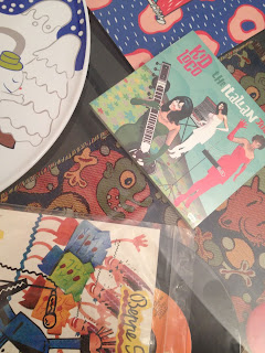
 foto di Roberto Gennari Feslikenian

GIACONISMI
Gianluca Marziani

Allora, caro Massimo, siamo al momento del resoconto parziale, della testa bicefala che guarda indietro mentre cammina in avanti. Decenni di lavoro che si raccolgono attorno ad un progetto riassuntivo, un dono visivo di sintesi e raccordi, scoperte e recuperi, pensamenti e ripensamenti. Non è mai semplice raccontare le molteplici combinazioni di un factotum irriverente e intuitivo, le visioni multiple di un artista che crea nuovi confini per non averne mai di predefiniti. Tutto diviene slittamento, apertura di senso, varco dopo varco, ciclo dopo ciclo, tra conclusioni parziali e introduzioni totali, rischi e consapevolezza, invenzioni e mutamenti. Non è semplice ma giusto che le tue combinazioni artistiche abbiano un criterio finalmente riepilogativo, una ragione olistica che sia propedeutica ai tuoi viaggi istituzionali, dove le migliori storie diventano esempio singolo e guida plurima. Poche settimane fa la Triennale ha enfatizzato le tue ceramiche, offrendo una selezione del tuo dono visionario. Da qui immagino il domani dentro altri musei, dove i tuoi resoconti meritano ospitalità principesca, dove le tue trasgressioni linguistiche meritano il rispetto della Storia. Non preoccuparti, le cose stanno cambiando nel nostro Paese, e non soltanto in peggio come troppi si ostinano a ribadire. Non vedo ulteriori venti di crisi nella Cultura, già da tempo le nostre istituzioni creano mare mosso e uragani come status quotidiano. Sono anni che agiamo in stato d’emergenza, abituati all’apnea del rischio, del poco tempo, del poco denaro ma non del poco pubblico e del poco consenso. Questi, però, sono giorni di cambio direzionale, ore in cui la crisi diviene condizione stabile e dove nuovi parametri stanno ricodificando idee, strutture e organizzazioni. Non è un augurio ma una dichiarazione convinta: ormai ti toccherà il museo come residenza ad ampio spettro, dimora sospesa per i tuoi universi artistici. Hai rotto regole, inventato stilemi, elaborato meccanismi autonomi: e adesso meriti il codice istituzionale come giusto abito da indossare, il tuo dress-code rigoroso da alternare al latex del tuo habitus cerebrale. Con un particolare in più: dovrai continuare a spremerti le meningi, regalarci altre visioni di pari potenza espressiva, dare peso specifico al tuo etabetismo infaticabile, provocatorio, affilato, ironico, assurdamente sensato. Insomma, vada per lo smoking (rosso) ma senza pensare che sia per tutta la giornata: perché quando il museo chiude le porte ti voglio nei paesaggi rosso lucido del rischio, nelle geografie psichiche del mondo rovesciato, dove le nostre membra, cervello compreso, non si stancano mai (anche se ormai non sei più un ragazzino).


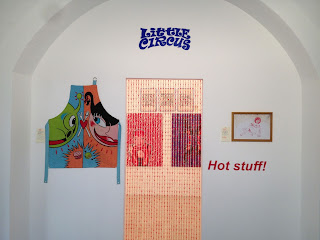
foto di Pier Maulini
Pochi artisti meritano un ISMO personalizzato, un ruolo archetipico che gestisca il passato in posizione dominante. Non siamo un Paese normale, questo va detto, altrimenti sentiremmo in giro un aggettivo che origina dal tuo cognome. Anche perché la memoria non mente: hai fatto tante cose prima di molti altri, anticipando il crossover che ormai consideriamo norma, gestendo i tuoi talenti con parsimonia raziocinante. Rappresenti un modello d’azione creativa che ha plasmato la lezione storica degli anni Sessanta, travasandola nel postmoderno con doti estetiche e intuizioni concettuali. La cosa è seria, benché i nostri linguaggi (la tua arte, la mia scrittura) distillino flussi d’ironia e stravaganza; la cosa è molto seria quando mi chiedo perché non si diffonda un GIACONISMO come statuto ufficiale della COMBINAZIONE LINGUISTICA, un riferimento che dovrebbe raccordare chiunque sia arrivato dopo di te. Sei un indubbio riferimento, su questo nessuno può toglierti il merito che ti compete; vorrei che nei prossimi anni si ampliasse la consapevolezza borghese, quella forma di rispetto ulteriore che nasce dall’alto per dare aura a chi arriva dal basso, dai territori underground in cui ti sei formato, dall’antagonismo e dai situazionismi che ti hanno educato. Insomma, conosciuto da molti, amato da alcuni, stimato da moltissimi (e detestato quanto serve, altrimenti qualcosa non funziona).


Stavo rileggendo alcuni miei scritti che ti riguardano. Ripropongo un estratto per l’aderenza sintetica al giaconismo: Massimo Giacon accorcia la distanza tra lo spettatore e il mondo deformato, anormale, eccessivo. Manipola i corpi crudi e crudeli, libera il flusso trasgressivo, deborda oltre i bordi dei generi degenerati. Atti visionari, talento esecutivo e ironia: miscela espressiva di un artista dal multilinguismo genetico, a suo agio nel disagio del comportamento senza falsi pudori e stupidi rumori. I suoi eroi sono eretici, dissacranti, ingenuamente anarchici. Perdenti per natura o vincenti per artificio. Perdenti per forza di cose o con la forza delle cose in azione. La vittoria sta nei loro sguardi, nel loro feticismo, nei loro desideri. Ma anche nel senso del gioco, nel senso mai unico, nel gioco sensato. Disegni, pitture, opere digitali, progetti installativi, oggetti di design, videogames, fumetti, grafica: questo ed altro per plasmare i suoi personaggi “al limite” e creare il mondo oltre quel fatidico limite. Una modellazione fisica del nostro spazio interiore, dei desideri nascosti, degli eccessi che ci portiamo appresso. Massimamente Massimo: il fuoco cammina con lui.


Partiamo da qui per ripartire in ogni dove possibile e immaginabile. Giacon è un poliedro colorato e dinamico, un volume fluttuante nello spazio dell’opera totale. Esiste un ordine cronologico di carriera ma i fatti ribaltano di continuo ogni progressione lineare. Giacon incarna una sinusoide randomica, è l’artista propulsivo e famelico che rimbalza tra sfide progettuali. Non farò il biografo né lo storico filologico, mi sembrerebbe un’autostrada noiosa davanti ad un artista che corre su tornanti e strade pericolose. Andrò avanti per lampi, incroci e combustioni, sulla falsariga di una verariga alla Giacon, a modo mio che significa anche “a mondo suo”, specchio contro specchio per un arcobaleno a molte teste e moltissimi colori intermedi. 


Chiariamo subito un equivoco storico: Massimo Giacon non c’entra nulla con le etichette che girano sui media. Le sue anime sono molteplici e conviventi, si alimentano con regolarità ciclica affinché nessuna fagociti le altre. Questo significa che non possiamo parlare di Pop Surrealismo, Neo Pop, Postdesign... Classi e categorie aiutano critici e curatori, semplificano l’ordine classificatorio, creano aree comuni da gestire come fenomeno; di fatto, limitano il potenziale dell’artista poliedrico, vincolandolo al regolamento d’uso che etichetta ma non chiarisce. Massimo, mi rivolgo di nuovo a te per dirti che i marchi collettivi non ti si addicono, tu sei un archetipo e dovresti trasformarti in un marchio DOP delle arti visive, un propulsore singolo di entità ad alto tasso iconografico. Ti capisco quando dici che in Italia non è semplice affermare l’eclettismo come codice ufficiale, restiamo un serbatoio di qualità artistiche eppure crea panico l’artista inclassificabile, allergico a qualsiasi categoria poiché il suo nome è già una categoria senza copie. Per me vale l’ostinazione del talento, la coerenza come continuità, solo così accetti la prolungata sfida col pubblico e rischi un’affermazione di categoria. Quindi una sola regola: avanti con le proprie convinzioni (come hai sempre fatto, per questo hai vinto la sfida del tempo), anche perché la gente che di solito mi piace adora la tua arte e ciò che di solito ti piace. E questo significa una sola cosa: che la minoranza di questo Paese è ancora meglio della maggioranza. E poi diciamolo: perché certe immagini dovrebbero piacere a tutti? L’arte può essere borghese, varcando soglie di merito, ma non può trasformarsi in un soggetto democratico e populista. Non vedo niente di meno democratico della creazione, ultimo atto divinatorio per affermare l’io creatore con le sue chimere legittimabili. Evviva l’ottusa parzialità della grande arte…


L’ORIGINE DEL (PROPRIO) MONDO… il disegno come nascita necessaria, partenogenesi d’obbligo che plasma la ricostituzione del reale. L’origine dei propri mondi avviene sul foglio bianco, sopra taccuini e sketchbook, lungo foliazioni che diventano filiazioni intime per definire il codice primario del Genoma artistico. Giacon disegna con tratto talentoso, gestisce il segno con frequenze orientali e radicalismi personali, la sua minuzia si fa corpo e gesto, i suoi personaggi moltiplicano il regime identitario e coprono una moltitudine di gender interiori. Plasmare un proprio mondo richiede doti visionarie e una traduzione segnica che sublimi la figurazione: e Massimo lo fa. Se tradurre significa disegnare con adeguata pregnanza, allora tutto è possibile, quantomeno plausibile, quindi realizzabile: e Massimo lo fa. Mi raccomando Massimo, non perdere il battito primordiale delle punte che disegnano mondi. I tuoi mondi. I nostri mondi. Nuovi mondi che si svelano.
FUMETTO… Giacon ingaggia lotte ciclopiche con gli universi visivi, esprimendo un antagonismo atavico che non possiamo riassumere in un solo tema. Lo stesso Giacon disse anni fa: “I miei superfumetti superano la propria genetica, diventano qualcos’altro, che peraltro neanch’io so bene cosa sia”. Di recente campeggia sulla carta di XL, dal passato spuntano testate di giusta mitologia urbana, nel mezzo arrivano carte e tele in cui il fumetto si trasforma senza perdere identità d’origine, assumendo la coscienza iconografica del quadro pittorico, la valenza universale dell’icona senza passaporto o narrazione. 
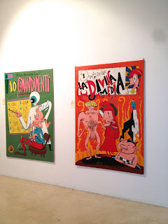

foto Gregorio Spini

DESIGN… parto dal presepe (“Portable Xmas”) per ALESSI, oggetto di pura sintesi che non dissacra il sacro ma sacralizza il tratto liberato. Un oggetto laico dentro le abitudini religiose della festa: e quando dico “laico” intendo l’attitudine che ha determinato quel disegno, il passo sospeso del primo sguardo, dell’istinto che si traduce in segno su carta. Da qui la magia della produzione industriale con un’azienda che somiglia al DNA di Massimo. Gli SWATCH in edizione speciale erano un altro tocco di giaconismo virtuoso, tatuaggi cronometrici che esaltavano il plasticismo plastico. Due aziende in cui Giacon si adatta come liquido dentro uno stampo. Due punti topici in un curriculum che vanta innumerevoli collaborazioni nel settore industriale. Esercizi di continuo slittamento linguistico e metamorfismo plastico. Esercizi di combinazione artistica.


CERAMICHE… mi lego alla mostra in Triennale, sintesi espositiva di una bella collaborazione con SUPEREGO e le loro tirature per progetti “altri”. Adoro l’antagonismo che si esprime mimeticamente con linguaggi nobili, competenza tecnica e intuito stilistico. Ordinare l’eccesso dentro il controllo, far germinare messaggi consapevoli attraverso il metodo e la tradizione. Le ceramiche di Superego amplificano la memoria storica con forme surreali e psicoemotive. Una perfetta traduzione del disegno in chiave scultorea, secondo logiche minuziose che ritrovo nell’intera produzione artistica di Giacon.


CULTURA DIGITALE… quando vidi i primi quadri digitali di Massimo capii una cosa: che il linguaggio elettronico può moltiplicare le qualità ataviche del disegno a mano libera, definendo il codice tecnologico della manualità. Mi ha sempre colpito quel legame speculare tra matita e penna Bamboo, come se il digitale fosse la seconda vita della grafite o dell’inchiostro, una vita simile ma anche complementare, uno stadio ulteriore nell’evoluzionismo della figurazione. Rivedo i suoi digitalismi e li trovo asciutti, privi di enfasi tecnologica, calibrati da una sapienza che è prima ideativa e poi formale. 


THE POP WILL EAT HIMSELF… a proposito di legame tra disegno e digitale, ripensavo alla tua mostra da Mondo Bizzarro (Roma) con la cura del sottoscritto. In realtà fu una doppia personale visto che in contemporanea avevo curato una tua seconda personale da Lipanjepuntin (Roma). Leggi cosa scrivevo ai tempi: I protagonisti sono i pupazzi da cartoon che popolano il nostro immaginario. Senza tirare in causa i più famosi, da Topolino ai Simpson, a cui l’artista riconosce un’influenza capitale nella cultura contemporanea, ci si sofferma su soggetti di secondo piano con una rivisitazione che rivela il tema della perdita dell’innocenza. Malandati, deformati, acciaccati, vecchi pupazzi che riflettono, come fossero uno specchio, il livello di degrado morale e culturale da cui sono stati contagiati nella società odierna. La mostra è costituita da opere digitali su carta fotografica: partendo da programmi di modellazione 3D, Giacon conferisce una forma e una luce quasi caravaggesca alla sua galleria di pietosi cartoons. Le opere digitali sono accompagnate dagli schizzi preparatori a matita e da una grande tela su PVC in cui tutti i personaggi si ritrovano fusi in una massa di pelouche e tessuto necrotico.
Nel corso della mostra le sigle dei cartoni animati più conosciuti, deformate e trasformate in una sorta di lenta marcia funebre, faranno da colonna sonora.
PERSONAL JESUS… ho una predilezione per questo tuo disegno pittorico. Considero sublime lo sfaldamento progressivo del corpo di Cristo, realizzato con una calibrata china scura su pergamena. Un’immagine maestosa e sacrale, molto più “religiosa” di tante buffonate che spacciano per arte spirituale. No, non preoccuparti, evito di chiederti che rapporto hai con la religione. Ne abbiamo già parlato e non mi sembra il contesto per una disamina etica sulla trascendenza e altri temi di pari portata morale. Lasciamo che parlino le tue opere, trasgressive senza derive, dissacranti con sapienza, cattive senza nichilismo. Vedo maturità nel tuo approccio, niente di provocatorio o facile, al contrario mi fai sentire densità analitica e talento visionario. Hai captato un modo eccellente per narrare l’iconografia di Cristo in un’epoca come la nostra.

PHILOSOPHERS IN THE POP PLANET… qui le grandi personalità filosofiche si ritrovano in un mondo di fantascienze, frangenti splatter, riferimenti da b-movie americano e continue invenzioni stilistiche. I filosofi in chiave iperpop, ancora oggi trovo quel ciclo una piccola bomba concettuale, un lavoro affilato e colto, unico per genere e modo, riprova di un metodo linguistico che si mimetizza tra temi alti e bassi, estremi e popolari. 
SUONI… la parte musicale dovrete ascoltarla, solo le vostre orecchie daranno senso ai progetti sonori di Massimo. Diciamo solo che la musica non rappresenta un semplice passatempo ma un prolungamento delle sue piattaforme visive, un territorio in cui la vertigine sonora completa le chiavi visive dei suoi sguardi. 
Linguaggi molteplici che scambiano informazioni tra di loro, combinando elementi in una fluida sinestesia. La visione di Giacon è orchestrale, un polistrumentismo che calibra lo stridore e le dissonanze, inventando un suono estetico che è pienamente Giacon, inimitabile e archetipico come capita solo agli apripista coraggiosi. Quelle visioni sono popolate da svariati figuri, notturni ed eccessivi, ambigui, antropomorfi e mutanti, una nuova specie nell’umanità dei corpi esplosivi. Li trovo adorabili e difendibili, alieni tra noi “umani”, esseri psicosensoriali che danno un countdown al nostro sguardo inquieto.  
SEXORCISMI… lascio in chiusura la parte più delicata, quella che riguarda il SESSO e la sessualità trasgressiva, intimamente consapevole ma anche estrema, adatta a pochi adepti, roba che scotta se non hai dimestichezza con il potenziale della testa dominante. Voglio parlarne in chiusura affinché sia la vera riapertura del testo verso il mondo reale, verso quell’aderenza empatica tra arte e vita, scrittura ed esperienza, estetica e azioni. Lo dico senza equivoci, nel senso che tali aspetti mi toccano nel profondo, rappresentano pezzi solidi della mia vita, diciamo che aderisco alle identità ironiche di Massimo. La cosa che più amo è l’attitudine dei suoi protagonisti BDSM, quel modo che non svilisce le pratiche ma toglie l’alone mortifero, dando una precisa estetica ai mondi descritti, vestendo corpi e azioni con riconoscibili giaconismi. La dimensione sessuale entra dovunque, circola nelle opere come elemento relazionale e distintivo, informa le azioni con parametri calibrati.


foto Rosario Gallardo
I personaggi del suo universo trasudano evocazioni sessuali, gareggiano coi propri fantasmi per sfogare gli istinti consapevoli. Sarà per questo che sono così brillanti, impareggiabili, anomali e indomiti? 
Diciamo che mi fermo qui, caro Massimo, altrimenti mi tuffo nell’argomento e devio su strade che mi porterebbero lontano dal centro. 
Noi ci rivediamo presto, il futuro dei musei aspetta anche te. 

Per me, sempre e solo GIACONISMO

Gianluca Marziani, maggio 2013


foto di Josè Sala


17 Jul 15:44

Cool Legacy Apps for OS X

by Dan
Some apps out there never seem to die. Their developers subsist on a near-lethal cocktail of cigarettes and Red Bull to keep burning the midnight oil so they can deliver new version after new, year after year. How long has Audacity been around? Or GraphicConverter?

However, some developers want off that train and they drop out. Understandable, but that doesn't mean their software has to die with their masochism, I mean, ambition. With that in mind, I thought I'd give a run-down of several software titles whose development has ceased but are still useful and very much not available in the App Store. Let's do this list style:

Bean - An extended version of TextEdit with added features such as live word count, full screen editing, inline graphics, and more. A great, fast alternative to Microsoft Word.

CocoViewX - An iPhoto replacement without the bloat and bizarre file management, CocoViewX offers photo browsing, meta data editing, camera import, and html export.

Cog - This was a music player that I tried out a few years ago in my never-ending quest to replace iTunes. I didn't stick with it because it lacked an equalizer, but now that I have a global equalizer it's no longer an issue and I'm iTunes-free. Cog also properly supports ogg and flac files and handles large libraries with ease.

Desktop Manager - Spaces alternative for Tiger. It just works.

FormulatePro - Want to edit pdf files but don't want Adobe products clogging up your computer? FormulatePro is a good lightweight tool for this. You can insert text, check marks, and also make use of simple drawing tools.

HimmelBar (link updated) - This is an application launcher that sits in your menubar. It looks for applications in common folders like Applications (duh!), Utilities, and Developer and puts them all in one menu for easy access.

Perian - Not an application, but a plugin for Quicktime Player, it lets you play many many many different video formats.

Play - Very similar to Cog, and people on their user forums observed that Play just sounded better than the competition.

Seashore - Photo editor inspired by GIMP but much more lightweight (and more modest in features). Supports layers and you can also save in GIMP's native xcf format, among others.

I'm sure there are many more for the graveyard, but just because the projects are dead doesn't mean we can't still put them to good use. And we can remember fondly when there was a vibrant freeware/shareware community for OS X before it was destroyed by the App Store. Cheers!
16 Jul 18:59

Book Alert: Things Come Apart - A Teardown Manual for Modern Living by Todd McLellan (Thames & Hudson)

by Anna Battista

One of the most recurring problems in our everyday lives is the fact that, not knowing how ordinary appliances work, when they break down we often opt for the easy way out - buying new ones. Todd McLellan is not fascinated by the disposable culture we live in, but by the art of disassembling the items surrounding us to make us realise what we are throwing away.

The volume Things Come Apart: A Teardown Manual for Modern Living, recently published by Thames & Hudson, is a record of McLellan's obsession, developed as a child when he would disassemble his toys to see how they were made.

The author proceeded to take 50 designs - among them brand new or vintage items that he divided in four categories, small, medium, large and extra-large - disassembled them till their last screw and took pictures of them with their parts lying flat on a surface or suspended in mid-air.

ThingsComeApart_Cover

The book opens with a mechanical pencil, but features (among the others) a digital and a mechanical watch juxtaposed one to the next; game consoles; an iPad and iPod; a smartphone; a handheld GPS unit (that has actually got just a few more components than a basic torch...); an external drive; a record player; a mantel clock from 1928; a classic flip clock from the '70s; a rotary telephone from the '80s, a telescope and domestic appliances such as a hair dryer or a toaster; a basic desk lamp and a power drill, a snowblower, and even musical instruments (did you know that an accordion includes 1,465 components?). You name it, McLellan has probably dismantled it.

Apart Knife V2

Leaf through the book and you will discover that a walkman featured hundreds of components, obviously many more than our tiny digital music players; a camera from 1973 has instead almost the same number of components than a digital camera made last year (576 against 580); a children's wagon is more complicated in terms of components than a push lawnmower, while a laptop computer has got slighty more pieces (639) than a classic typewriter from the '60s even though, once dismantled, the latter is visually more pleasing, with its 621 components forming a rather striking display including zigzagging typebars.

Disassembly Digital Watch_V02

Some images are genuine works of art as the author assembled the various pieces with the careful eye of a painter (see the picture of a disassembled bicycle from the '80s with its components lying on a flat surface in a visually pleasing way). Other pictures highlight the difference between old and new items: the former were assembled by hand and were made to be repaired and last. This is proved by latches that could easily be opened; new items are instead too often made to break down and are not produced with a fixer in mind (anybody who attempted to repair a new generation game console for the first time found themselves in front of oddly shaped proprietary screws that need special screwdrivers to be unlocked...).

Disassembled_Toaster V2

The author is not encouraging readers to go berserk and tear down assorted appliances, tools and machines, but to try and understand them and learn in this way to be more active while also saving money and protecting the environment. To this aim, the volume also features four essays by different experts: Kyle Wiens, co-founder and CEO of free online repair community iFixit, known for product teardowns and open-sorce service manuals, tells the fascinating story of Japanese doctor Mitsunobu "Kodawarisan" Tanaka who started taking things apart and photographing them as a hobby, to remind us the importance of knowing how something works to be able to repair and adapt it.

Software engineer and computer scientist Gever Tulley, founder of the Tinkering School that organises week-long camps for children to teach them how to use power tools, and build and solve problems, recounts us his personal experiences in this successful and slightly crazy venture; Penny Bendall, ceramics conservator, unveils the secrets of restoring the Chelsea Group, highlighting how fascinating it is to deconstruct and reconstruct a work of art.

Disassembled_Wagon V2

The last essay is the most fascinating from a technological point of view as its author, Dr Joseph Chiodo, inventor of the Active Disassembly technology, explains readers how new techniques and materials can facilitate the processes of separating and recovering components during recyling phases. Chiodo writes about Thermoplastic Hot-Melt Adhesives for Disassembly (THMAD), Hot Wire Adhesive Release (HWAR) and the fascinating Shape Memory Alloys (SMA) and Shape Memory Polymers (SMP) hinting at the fact that these new technologies may help us preserving the environment while creating new jobs. 

Apart BikeV2

McLellan closes the volume with deconstructed displays of large items: an upright piano from 1912 (1,842 components) and, believe it or not, a Zenith CH650 aircraft (7,580 components), that the author photographed at the manufacturer's hangar. McLellan's journey through 21,959 components is fascinating but it also proves that, while what surrounds us is disposable, most of the times it is not necessarily transitory, but could be fixed or reused to create new products - if only we had the will and knowledge to do so.   

Things Come Apart: A Teardown Manual for Modern Living by Todd McLellan is published by Thames & Hudson.

All photographs in this post by and courtesy of Todd McLellan.

Member of the Boxxet Network of Blogs, Videos and Photos

Member of the Boxxet Network of Blogs, Videos and Photos

Add to Technorati Favorites

Add to Technorati Favorites

Lijit Search

Related articles
08 Jul 09:10

Book Alert: Stuff Matters: The Strange Stories of the Marvellous Materials That Shape Our Man-Made World (Viking) by Mark Miodownik

by Anna Battista

Cover_StuffMattersThe Ancient Greek aphorism "know thyself" was adopted by many authors throughout the centuries. Yet, in our technological and fast times, we should maybe use also another maxim - "know your materials". This motto is actually already employed by many professionals working in numerous industries, but most ordinary people give for granted the objects that make the fabric of our world. This is definitely not the case with Mark Miodownik.

Professor of Materials and Society at University College London (UCL) and scientist-in-residence on Dara O Briain's Science Club on BBC2, Miodownik has turned the "know your material" motto into his personal mantra and into the main topic of a recently released volume, Stuff Matters: The Strange Stories of the Marvellous Materials That Shape Our Man-Made World (Viking).      

The titles of ten out of the eleven chapters included in the book are adjectives describing the properties of a specific material analysed in that chapter (the opening chapter, "Indomitable" is dedicated to steel; "Delicious" to chocolate; "Imaginative" to plastic and so on). Each material is approached from a scientific, but also historical and personal point of view.

Quite often Miodownik moves from his personal experiences to introduce his readers to intricate topics: while being slashed by a stranger in a London tube station with a razor blade as a teenager sparked his first interest in everyday materials, closely observing the Shard rising near his home allowed him to ponder on the complex structure of concrete; a sensual advert for a chocolate bar he watched on TV as a young boy prompted him to research in depth the power of cocoa, while a quarrel in a cinema about a plastic wrapper inspired him an inventive chapter about celluloid written in the form of a film script.

The most intriguing stories about certain materials come from ancient history: when the Roman legion left their headquarters at Inchtuthil, Scotland, they burnt their fort and buried in a hole thousands of iron and steel nails to avoid them falling into their enemies' hands but they took away with them the soldiers' razors made with high-quality steel that, the author explains, allowed them to remain clean-shaven and distinguish themselves from the savage hordes that had driven them out. The Romans employed the sulphur rock powder from Pozzuoli to make cement and build ports, bridges, aqueducts and the most impressive and unreinforced concrete dome in the world - the Pantheon in Rome. The introduction of glass into everyday life is also to be attributed to Romans who started making with it drinking vessels that allowed people to enjoy other qualities of their drinks, such as colour and transparency.

Miodownik chose the materials he tackles in the book according to his personal interests, but also referencing the world that surrounds us, and his unique perspective allowed him to create a useful library of materials for readers who may want to know not only their history, but also the chemical structure behind them and the reasons why in some cases certain materials were abandoned or not developed further.

The chapters tackling concrete, carbon and the almost invisible aerogels (that Miodownik very briefly glimpses for the first time in his life in an American laboratory) are the best ones in the book. What's missing is a wider angle on 3D printing (even though the last chapter looks at bionic implants and in particular at the application of 3D printing in medicine), an in-depth analyses of innovative materials (even though self-healing and self-cleaning concrete get a mention) and of disciplines like nanotechnology. Yet if we as readers aren't too sure about the history and applications of steel, glass, paper or porcelain, there is actually no point in moving onto more technologically advanced materials. 

In the last chapter, Miodownik references the meanings of materials and how designers and architects use them to create clothes, products and buildings that we like or that we identify with, hinting in this way at the sociological power of materials (an issue the author mainly mentions in the chapter about porcelain). Materials, the author states towards the end of the book, are a reflection of who we are, but also an expression of our human needs (take note fashion design students: it's only by knowing your materials that you can develop functionally useful and commercially successful pieces).

Miodownik is currently Director of the UCL Institute of Making, so you can bet that, at some point in future, we will see a new book out (or a TV programme) about more supermaterials like aerogels. In the meantime Stuff Matters remains an excellent and quite infectious read for people obsessed with materials, but also for anybody else who wants to be more aware of the architecture of the world we live in and rediscover our personal relationship with it.

Member of the Boxxet Network of Blogs, Videos and Photos

Member of the Boxxet Network of Blogs, Videos and Photos

Add to Technorati Favorites

Add to Technorati Favorites

Lijit Search


Related articles
08 Jul 09:06

10 Popular Security WordPress Plugins for Webmasters

by Kyle Eslick

When it comes to security there are two common types of webmasters. The first includes those WordPress admins who cram their blogs with every possible security plugin, while the other type are webmasters that are happily ignorant of the various web dangers including hackers, malicious code, and spam attacks who don’t even imagine why they need any security plugin.

No matter which type of webmaster you are, below we have a list of security plugins any webmaster should consider for their WordPress website:

  1. Simple Backup – This WordPress plugin was developed to create and download backups of your WordPress website. Note: Simple Backup plugin creates a special directory in the root of your WordPress directory – usually its name is ‘simple-backup’ for backup files. Sometimes it’s necessary to create this directory manually (in case you get an error message). Requirements: It requires PHP 5.2 or higher version, WordPress 3.3 or newer version, Linux Style Server, mysqldump (for DB backup) and tar, zip, gzip, or bzip (for compression of files).
  2. Ask Apache Password Protect – This is quite an unusual security plugin. Unlike other similar plugins it works not at the level of application but at the network level and does not use php to prevent attacks as it starts functioning before php. Ask Apache Password Protect was developed to stop attacks before they even reach your blog. Requirements: The plugin requires Apache web server and hosting support for .htaccess files.
  3. Login Dongle – Nobody will be able to log in but you. As simple as a pie! Login Dongle plugin protects your login information with the help of security question as an additional security layer. Note: Your login page stays unchanged, so attackers won’t know how to guess the answer to your security question. And even if someone uses your computer and browser that fills in the login form automatically, still this person will not be able to log in! And you can install it with any other login plugin. Requirements: WordPress 1.0 or newer versions.
  4. Sideways8 Custom Login and Registration – This plugin was designed in such a way that you and your users never see the built-in login option, registration form, and password reset form of your WordPress. Additionally you’ll be able to add some custom content to the login, forgot password, registration and password reset pages. Requirements: WordPress 3.3 or newer versions.
  5. Exploit Scanner – This plugin will look through your WordPress files and database to find any signs of some malicious activity. It also examines your active plugins for unusual filenames. And don’t be afraid – it won’t delete anything! You are the one that will make the decision! Requirements: WordPress 3.3 or higher versions.
  6. WordPress AntiVirus – It’s an easy-to-use plugin that will automatically and regularly monitor any kind of malicious injections and warn you of any possible attacks. What is even more, it has a multilingual support. Requirements: PHP 5.1 and WordPress version 2.8.
  7. WebsiteDefender – WebsiteDefender plugin is another free WordPress plugin that can offer you a list of useful security options. Among them are: scanning your blog for security configuration mistakes, offering easy solutions of security issues, hiding your WP version, checking your files permissions, removing WP Generator META tag from the core code etc. Requirements: WordPress 3.0 or higher version, PHP5.
  8. WordPress HTTPS (SSL) – This plugin was created as an all-in-one solution (includes private and shared SSL, force SSL per page option, admin panel security and ‘partially encrypted’ errors solutions) for your WordPress SSL. Requirements: WordPress 3.0 or higher versions.
  9. Anti-spam plugin – This plugin blocks spam in your posts’ comments automatically and invisibly both for users and for admins. What are its main advantages? First of all, it has no captcha; additionally, it has no moderation queues and no options. So, you can forget about spam forever! Requirements: WordPress 3.0 or newer.
  10. Theme Authenticity Checker – It’s a plugin that can scan all your theme files and let you know if there is any suspicious or unwanted code hidden. That’s a great tool for avoiding non-wanted advertising mostly, but before deleting any piece of code from your theme’s source files we suggest that you contact theme author to obtain some additional information about it. Requirements: WordPress 3.0 or newer versions.

The post 10 Popular Security WordPress Plugins for Webmasters appeared first on WordPress Hacks.

10 Jun 14:36

The Book of Genesis Illustrated by Robert Crumb at the 55th International Venice Art Biennale

by Anna Battista

Two years ago Robert Crumb's 1993 parody of US race relations When the Niggers Take Over America appeared at the Venice Biennale inside the Danish Pavilion that focused at the time on thought-provoking creative forms of resistance.

VeniceArtBiennale_RobertCrumb_Genesis_byAnnaBattista (20)

This year Crumb is back in Venice with The Book of Genesis, a graphic novel that could be considered genuinely "encyclopedic", like the theme of the 55th International Art Biennale.

VeniceArtBiennale_RobertCrumb_Genesis_byAnnaBattista (12)

Published in 2009 by W. W. Norton & Company in book format with the title The Book of Genesis Illustrated by Robert Crumb, thsi is actually considered as his most ambitious work.

Crumb, whose mother was a devout Catholic and who was brought up a Catholic but gave up on his faith when he was 16, mainly used as reference Robert Alter's translation of The Book of Genesis from 1996 and the King James Version of the Bible.

VeniceArtBiennale_RobertCrumb_Genesis_byAnnaBattista (14)

When it was announced that Crumb was working on this text, many fans thought it was going to be a satirical version of the book or that his wilder LSD induced visions may have become part of the grahic novel. But Crumb opted instead for a literal representation of the story, going as far as incorporating all the fifty chapters of The Book of Genesis and each word of the Biblical text in his graphic novel.

VeniceArtBiennale_RobertCrumb_Genesis_byAnnaBattista (18)

This is the main reason why it took the cartoonist and comic book artist almost five years to complete this work. Though it was still considered controversial since it featured illustrations of scenes of sexual intercourse (described anyway in the text itself), The Genesis is definitely not as explicit or controversial as in the rest of his work and won Crumb the Best Artist prize at the 2010 Harvey Awards.

VeniceArtBiennale_RobertCrumb_Genesis_byAnnaBattista (17)

The 207 black and white pages that form the entire ouvre are showcased in one of the Arsenale halls.

VeniceArtBiennale_RobertCrumb_Genesis_byAnnaBattista (26)

The framed drawings cover not just the walls of one of the halls, but also the walls of circular structure that hosts other works of art. The pages were already exhibited in other institutions all over the world, including the Hammer Museum in Los Angeles.

VeniceArtBiennale_RobertCrumb_Genesis_byAnnaBattista (22)

One of the most interesting points behind this work is the way Crumb approached The Genesis: as he recounted in an interview in 2009, he had to decide line by line what could be illustrated and how to draw it and to portray ancient costumes, cities and weapons he often watched old Hollywood Bible movies. It would actually be quite interesting to study his work from a cinematic point of view and try to spot which films he used as references, especially costume-wise.   


Member of the Boxxet Network of Blogs, Videos and Photos

Member of the Boxxet Network of Blogs, Videos and Photos

Add to Technorati Favorites


Related articles
06 Jun 14:26

isay: Rindfleischetikettierungsüberwachungsaufgabenübertragungsg...

by georgiaporgia


isay:

Rindfleischetikettierungsüberwachungsaufgabenübertragungsgesetz has now been confined to the linguistic history books by authorities in Mecklenburg-Vorpommern.

The word, which means “the law concerning the delegation of duties for the supervision of cattle marking and the labelling of beef”, was introduced in 1999 during the BSE crisis. It was given the abbreviation RkReÜAÜG – which was itself unpronouncable.

But the 63-letter word was deemed no longer necessary after the EU halted BSE-testing on healthy cattle at abattoirs.

(via Germany’s longest compound word consigned to history | World news | The Guardian)

Ah, 63-letter compound word, we barely knew you.

06 Jun 13:11

Pure Sine-Waves and Parametric Patterns: Zaha Hadid's King Abdullah Financial District (KAFD) Metro Station, Riyadh

by Anna Battista

The ArRiyadh Development Authority recently announced that Zaha Hadid Architects will build the new King Abdullah Financial District (KAFD) Metro Station in Riyadh, Saudi Arabia.

KAFD Metro Station_Aerial 01

The 20,434 sq. m. King Abdullah Financial Disctrict Metro Station - to be completed in four years - will contribute to serve the fast-growing population of the city, that now boasts 5 million residents, while serving as interchange on the network for Line 1, as well as the terminus of Line 4 (for passengers to the airport) and Line 6 of the new Riyadh Metro.

KAFD Metro Station_Exterior 01

The new building will be characterised by a lattice-like patterning on the façade (that will reduce solar gain) defined by a sequence of opposing and dynamic sine-waves that act as the spine for the building’s circulation. The sine-waves embedded in the building were inspired by the sand dunes sculpted by desert winds.

Sine-waves or sinusoids, that is mathematical curves that are usually employed to describe a smooth repetitive oscillation, occur in pure and applied mathematics, as well as physics, engineering, signal processing and many other fields.

KAFD Metro Station_Interior 01

The architectural studio, whose Riverside Museum in Glasgow has just won the European Museum of the Year Award, moved from sand dunes since they represent complex natural formations generated by frequencies and repetition, and based its research for this futuristic shape also on symmetry and scaling and on concepts borrowed from harmonics, including amplitude and initial phase.

KAFD Metro Station_Interior 02

The most interesting point in this sort of contemporary architectural structures is that they seem to offer us a physical representation of mathematical ideas without sacrificing design ambitions: in 1807 Jean-Baptiste Joseph Fourier established a fundamental theorem which is used in linear systems analysis. Its core idea stated that any waveform can be synthesized by combining a specific set of pure sine-waves in appropriate phase relationships.

A pure sine-wave in the temporal domain extends forever, with no beginning and no end; a pure sine-wave in the spatial domain extends indefinitely in space. In a way this structure will look like a complex Fourier series smoothly simplified (to eliminate sharp corners), characterised and optimised by a parametric variable.

KAFD Metro Station_Interior 03

All renders courtesy of Zaha Hadid Architects

Member of the Boxxet Network of Blogs, Videos and Photos

Member of the Boxxet Network of Blogs, Videos and Photos

Add to Technorati Favorites

Related articles
06 Jun 13:10

A Brief Glossary of the Most Abused Terms, Expressions and Concepts in Fashion (Part I)

by Anna Battista

Art is a pretentious business and those of us who had the pleasure of going to certain press previews and receiving a release trying to explain the main themes behind a particular exhibition perfectly know that at times the description didn't make any sense, but just featured a jumble of complicated words forming sentences without any proper meaning (a good idea if you're bilingual is trying to translate certain documents into another language...ah, the fun!)

The same can be said about fashion: I quite often deleted from my email box or tore to bits the press releases of certain fashion shows, but I can assure you that collecting these rare pieces of nonsense can give much more pleasure and provide endless hours of fun on a boring day.

Prompted by this passion for nonsense that the fashion industry has been displaying for quite a few years now, I decided to work on a glossary of the most abused terms and concepts in fashion (and one day I will put together a list of bits and pieces selected from the most hilarious press releases...). What follows is just an extract. Enjoy.
 
Archive: This magic term indicated up until a few years ago the Sancta Sanctorum of a fashion house or a particular museum. A prestigious archive was usually preserved in a dungeon-like location, dedicated space or even a bank vault and accessing it was a long and laborious process in which you were usually accompanied by an archivist who made sure you were wearing white gloves and who was authorised to shoot you if you ever sneezed on a precious piece or tried to take pictures and notes. In modern language an archive can even consist of a pile of dusty cardboard boxes stacked in the corner or a PR office. Besides, in our times creative directors are authorised to visit the archives of the fashion house they work for and pilfer - pardon - take inspiration from the drawings, illustrations, pictures and garments they find there.   

Building a sustainable future: Exploiting Africa. Having exploited most of Asia, the fashion industry is currently diverting its deadly gaze somewhere else.

Capsule Collection: Incoherent selection of 6 garments or accessories by a specific fashion designer for a high street retailer or a brand. It is usually driven by the unquenchable desire of generating money and pollution, masked as a fun "collaboration" (see also collaboration).

Catwalk/Collection Press Release: Don't touch it, don't try to decipher it, you have just come across the Da Vinci Code of fashion, in a nutshell, a pile of utter nonsense. Don't even try to read it because your surprised face will automatically mean that the PR officer in charge will smell your fear and confusion and take advantage of the situation. In doubt, call a linguist who will explain you that casually assembled sentences/descriptions like "The designer delved into the dark recesses of his childhood investigating the inaccessible fragmented shards of memory and of an oppressively obscure Catholic education, traversed by the metaphisical notions of philosophy. The result is a collection conceived as a multi-sensory experience" do not mean anything at all.

Collaboration: Once upon a time in a galaxy far away collaborating meant working with somebody else onto the same project or developing something together. This word has now mutated becoming a genetically modified octopus with multiple meanings at different levels: it can hint at a fashion house doing a product/a collection for a specific high street brand; a celebrity endorsing a product; a high profile blogger doing some kind of projects such as illustrations, photo shoots, styling and so on for a brand, and the list of collaborations goes on and on. In most cases it is an umbrella term that may mean "anything you do with or for a specific client" and it usually involves the client paying you. Sounds like prostitution you say? Then you got it, it can be a form of legalised glamorous prostitution with no sex involved. Most collaborations are actually endorsements: if you're collaborating with a brand to organise an exhibition, the PR officer of the brand may have already chosen what they want you to exhibit, and you will just to have to nod and say yes. Then you have "collaborated" together.    
 
Costume Designer: A serious profession before a wide range of designers and labels infiltrated cinema, theatre, opera and ballet and turned these fields into a product placement game. Luchino Visconti used to joke about using Louis Vuitton trunks in his films because they carried his initials, but Louis Vuitton never designed the cases appearing in his films. Do you really want to be a costume designer? Then be ready to compete with Prada, Givenchy, Valentino, Rodarte, Altuzarra, Stella McCartney, Gaultier, and many more. Cheer up, though: most of them don't have the sensibility to do your job and think that designing a tutu consists in piling up a lot of tulle layers one after the other. Repeat the mantra: Prada is not Danilo Donati; Prada is not Piero Tosi.

Curator/To Curate: Definitely the most abused term in the creative arts world. A curator used to be a highly educated person who took care of cataloguing a collection or who put together an exhibition. Now everybody can be a curator and everybody can curate everything, from an exhibition to a window shop, from a film festival to a magazine, a photo shoot or an advertising campaign. One of the most popular fun T-shirts seen at assorted art events all over the world just spells "CURATOR" and I'm sure that, if Ikea did toilet signs with the words "Curated by..." and some space left to add the name you want, they would sell millions. A very obnoxious example of how this word has been abused: the press releases to some fashion shows include the section "Music curated by" and quite often the musical selection ends up being a pile of vile tracks (Burberry shows anybody?).

Customisation: A word with the potential of killing the fashion industry and the mass marketed economy used by big brands to convince consumers they can be the "curators" (see curator) of their own wardrobes. With this aim in mind they offer customisation services on expensive branded items. Remember that you are already the "curator" of our own wardrobe and that you don't need a powerful brand to brainwash you. 

Democratising fashion: The vague impression that many young people have (reinforced by a bunch of lying fashion editors à la Franca Sozzani) that fashion has bene democratised since they can buy at an affordable price a piece produced by a high street brand but pilfered from the collection of an expensive fashion house. Now, there would be a genuine democratisation when everybody could afford high quality garments produced respecting certain labour and manufacturing standards, rules and regulations. There is nothing democratic in producing cheap garments in sweatshops and making them pass as a collaboration between a famous fashion house and a high street retailer. There is nothing democratic when only a fraction of the society can afford certain items, while all the others can only buy cheap copies.
 
Heritage: Usually employed in conjunction with historical (at least 50 years old) fashion houses and institutions, now often used together with the term "archive" to define the "signature style" of extremely young brands (including Victoria Beckham, ah, the hilarity...).

Icon of style: In the past an actor or actress, but also artists who effortlessly represented style even when/if dressed in rags. Think about Marcello Mastroianni or Audrey Hepburn and you get an idea. In most cases these icons were also gifted with other talents (actors and actresses could actually act!), now this definition can be applied to pompous bastards (Karl Lagerfeld), obnoxious dead politicians (Margaret Thatcher), useless celebrities (Kim Kardashian) and assorted actors/actresses/models etc. In most cases, the title "icon of style" refers to the fact that the icon in question just dresses well or as a good stylist. Quite often modern icons of style do not relate well to other fellow human beings and display aggressively non-iconic behaviour towards those who do not admire them or who do not fit their own canons of beauty (see for example Lagerfeld's comments on people he may not like à la Adele).   

Empowering: Usually followed by the words "women", "silhouettes" and "collection", but the next step is "empowering imagination", at least according to former PPR, from mid-June this year Kering. Imagination is something naturally empowering, right because it's called "imagination", if you need to empower it, you must be really desperate.

Ethical: Guilt-free label often used by high street retailers. Fashion is not ethical, in fact there is nothing ethical in fashion and when this word is used, it usually implies that something is highly immoral. H&M's "ethical" evening wear range "Conscious Exclusive" automatically implies all their other lines are, well, simply unethical.

Eco-conscious/eco-friendly: Another guilt-free label overemployed in fashion. If fashion were eco-conscious or eco-friendly we wouldn't be depending on fast trends and companies producing more items than they can sell. Wouldn't producing fewer T-shirts with vapid slogans about saving our planet (or not producing them at all) be less damaging to our planet than actually proving with a toxic T-shirt that you love trees? 

See you tomorrow for the second part of "A Brief Glossary of the Most Abused Terms, Expressions and Concepts in Fashion".

Related articles
06 Jun 13:10

A Brief Glossary of the Most Abused Terms, Expressions and Concepts in Fashion (Part II)

by Anna Battista

As promised in yesterday's post,here's the second part of the Fashion Glossary. 

Fashion Education: No fashion designer used to go to college in the past and the best way to become a tailor was starting from the lower step of the tailoring pyramid: picking the pins from the floor of the master tailor's workshop. Now it's all about avant-garde fashion colleges quite sadly producing graduates that may or may not find a job in a saturated market. Condé Nast even founded a college of Fashion and Design in London. Promised to do for people who want to get into the fashion industry what Hogwarts did for Harry Potter, the college looks like an aseptic environment in which students are taught topics that are not explained in the prospectus or on the college site. What do they teach there? Who knows. But a good testimonial for it would have been Darth Vader, obviously accompanied by the slogan "join the Dark Side".

Fashion Show Notes: See Catwalk/Collection Press Release in yesterday's post.

Fêtes/Fêted: Ordinary beings celebrate something or someone. Celebrities, models, fashion designers do not celebrate, they "fête". A term  mostly abused by WWD to indicate a certain degree of pretentious endorsement from that specific celebrity to that specific party. Example: "Pucci Fetes Coffee Table Book". Enter "wwd + fetes" in google and you will get over 90,000 results. Cringing.

I want to be a fashion designer: A sentence usually pronounced by your 3 year old cousin during her birthday party after receiving a new Barbie doll with hundreds of new little dresses. Now quite often pronounced by pop stars, celebrities and assorted icons of style, most of them thinking like Dita Von Teese that you just need to visit a vintage store and copy some successful garments from the past to be a fashion designer. In some cases this statement culminates in "I want to design furniture and offer my customers a 360° degree lifestyle". Considering that it was extremely difficult even for well-established and well organised fashion houses to design successful interior design objects, these statements are usually the proof that the society we are living in is full of deluded narcissists.

Luxurious Uselessness: Not a word, but a concept or rather an innovative idea. An innovatively demented idea because designers, marketing officers and PRs think that in fashion consumption, demented ideas are extremely successful. Example: after Alexander Wang's $150 croc embossed rubber yoga mat with lamb leather strap, in March Havaianas announced it was "teaming up" with luxury French label Pinel & Pinel on a limited edition flip-flop (40 pairs) featuring a rubber sole with a hand-dyed and hand-picked crocodile skin strap. Retail price: £450. Yes, we all need at least one pair. Now we know it is exactly what we will be wearing come armageddon.

(Uselessly Grand and) Magniloquent Language: The fashion industry deals with something very superficial, clothes and accessories and not with open heart surgery. Yet press releases (see also Catwalk/Collection Press Release in yesterday's post) are peppered with a grand and magniloquent language, copious amounts of exclamation marks and other useless words. A pastiche of melodrama and a combination of terms derived from different semantic fields, ravaged, raped and remixed by an ignorant PR officer who read two books in his life (and one was an Ikea catalogue), this sort of language can cause massive cringing fits. Example (from a recent Diesel press release): "Hell yes! Diesel ignites yet another firestorm by appointing Nicola Formichetti to be the new commander-in-chief of the brave army that will spread Diesel's marching orders far and wide." I'm tempted to start a petition to find the culprit.   

Must-Have: Indicates something that you don't really need but that women's magazines aggressively manage to convince you desperately want, reminding you that a particular celebrity owns it. Since consumers have started switching on their brains more often, sales of specific must-have items like Alexa Chung's Mulberry bag went down, causing profits to plummet. Must have? Say, no, thanks.  

New Book Out: Mainly in the sentence "I have a new book out". Abused by fashion designers, models and high profile bloggers, it usually refers to a volume with more pictures than texts about how to dress - pardon - "how to style yourself" (because we all know how to dress, but we don't know how to style ourselves, see the difference?). The dilemma: what would have happened if each picture taken by The Sartorialist would have portrayed a celebrity rather than an ordinary person with no personality rights attached and would have therefore been a very expensive book to publish? Would Penguin have invested on such a book. The doubt remains, but for the time being your vanity may have made this man rich.

New Line/Spin Off Brands: Another day, another launch of another line/spin off brand. This bulimic mania (you can have a new eco-conscious line, a new line designed by a model, a celebrity, etc - it's potentially endless!) may destroy many high street retailers and some fashion brands. Yet the key is not produing more, but producing fewer garments in sizes that truly fit. Or have I just launched a new line? The Fitted?

Oh...!: A title of a piece, a blog post, a feature of dubious journalistic value, usually followed by the name of the protagonist of that story. Very much abused by English native speakers writing about a designer from another country or with an exotic name to prove their language skills. Denotes lack of originality, frustration and high degrees of naivety. Examples: "Oh Dolce!" (for Dolce and Gabbana), "Oh Gianni!" (Gianni Versace), "Oh Giorgio!" (Giorgio Armani). Oh shit, how much I hate it.   

Patron: A sponsor, a benefactor, one that supports, protects, or champions someone or something, such as an institution, event, or cause, now a term indicating two roles, that of pimp (ever met a young designer and his/her "patron" at a hotel reception?) or a socially/politically useless role. Example: Sophie, Countess of Wessex has been announced as the first ever patron of the London College of Fashion. Did the students really need the countess as their patron? No. 

Partnering/Teaming Up: A collaboration between two brands quite often implying a certain degree of prostitution. See also "collaboration" in yesterday's post.

Pop up: An antidote to the crisis and a fun idea up until 6 or 7 years ago when it consisted in seriously endangering your life to try and find a pop up shop. Probably half of the people who intentionally set to visit Comme des Garçons' Guerrilla Store in Glasgow are still missing. Now pop up shops mushroom even inside large boutiques or in prime locations (Armani's pop-up restaurant opened yesterday on Cannes's Croisette), so there's no risk of aimlessly wandering or going missing while looking for them. Yet that was the entire point of the pop up place, going off the beaten track (and getting lost) to find a true gem.

Signature style: Previously applied to historical fashion labels or designers as in "Chanel's signature style" to indicate her tweed jackets or multiple pearl necklaces. Now often applied to young graduates by PR officers. The problem is that it is only with hindsight that you can say if somebody has truly developed a signature style. When a student develops a signature style in his/her graduate collection that student may be a one hit wonder.

You look amazing: Ordinary people extend their hand and say "Hello/Nice to meet you" when meeting somebody they do not know. An ordinary person will answer to this warmth gesture by smiling back and doing the same. A person working in the fashion business quite often acknowledges you with the sentence "You look amazing", pronounced in an envious tone of disgruntled hate. Yes, humanity is a rare thing in fashion.   

Stylist: Who could ever think that this job that enraged your parents and almost prompted them to kill you when you were fifteeen (You: I want to be a stylist; Your Parents: Go and find yourself a proper job!) could become a credible career for some of us? In some cases being a stylist is an underpaid job; in others (Anna Dello Russo) it's a disgustingly overpaid job. Ah, the mysteries of fashion.

Member of the Boxxet Network of Blogs, Videos and Photos

Member of the Boxxet Network of Blogs, Videos and Photos

Add to Technorati Favorites

Related articles
30 May 18:00

"Phonetic descriptions of annoying sounds teenagers make" by...

by georgiaporgia
Nezmar

D'OH! ;-)


"Phonetic descriptions of annoying sounds teenagers make" by James Harbeck via Youtube

This video is doin’ some rounds of the intertubes. Superlinguo gives this many points for hilarious use of phonetic descriptions of utterances not usually legitimised through the science of sounds/the vocal tract.  

Having said that, we definitely deduct points for the disparaging way this presents young people as “annoying" due to utterances some young people use.

On this, I once heard a youth studies academic pose the idea that young people are talked about in mainstream media/culture as “others" in the same way black people, women, and other minorities used to be described (and often continue to be described in some quarters!).

While I acknowledge there are some differences in the power structures and identity politics of young people vs. women for example, it’s still something I think is not helpful to promulgate. Imagine if this was entitled “Phonetic descriptions of annoying sounds women make". Makes you think, huh?

And besides, completely anecdotally I’m sure I have heard all these utterances come out of the mouths of adults too. So clearly they’re dang useful and are being borrowed back and forth, whether they’re annoying or not!

Kudos for bringing phonetics into more people’s lives though!

- Georgia

18 May 21:49

my generation

by igort
Bisognava scendere un paio di rampe di scale per penetrare nei meandri del Punkreas, a Bologna. All'epoca sono studente morto di fame, e pago 52.180 lire di affitto, mio padre mi spedisce 100.000 al mese, dunque devo vivere con 47.820, un'impresa. Comunque si mangia alla mensa universitaria (che fa schifo, ma costa pochissimo, 500 lire), tutti si preoccupano di preservare il fegato, dunque almeno un pasto bisogna farlo fuori mensa. Il punkreas è uno dei pochi lussi che mi permetto, ha prezzi ragionevoli e poi sono a Bologna per la cultura, che cazzo. Appena entro l'aria è folleggiante come al Roxy, ma meno esacerbata. Nella zona universitaria è annunciato l'evento. Punkreas, Gaznevada sing Ramones. I Ramones li ascolto dal loro primo 45 giri, “Sheena is a punk rocker”, che è uscito due anni prima, un'era geologica fa, in pratica. Frattanto sono diventati una leggenda del rock'n'roll primitivo. Miscela commovente di energia orizzontale, suono distorto, e semplicità americana, quasi minimale. Punkreas, ore 21,30. Entro, atmosfera fumosa, parlottare. Freak Antoni, che conosco di fama, scende qualche gradino prima di me, indossa un giubbotto bellissimo, pelle marron e beige. Sulla schiena c'è un disegno meccanico molto ben fatto su cui campegia una scritta: Pistoni roventi. Ed è tutto un programma. All'epoca Freak è già il cantante degli Skiantos, incide per la Cramps records, quella degli Area, di John Cage, non so se mi spiego, ha inventato il rock demenziale. Non c'è muro di Bologna su cui non figuri una scritta Skiantos, in pratica sono già celebri prima ancora di aver suonato. Arrivato da Londra, mi sono ambientato in poco tempo e Bologna mi piace, c'è gente che pensa e fa senza posa, anche grazie al DAMS a cui mi sono iscritto. Freak me lo presenterà dopo qualche tempo Stefano Tamburini, in trasferta, ma all'epoca sono un semplice ascoltatore-fan. Gli Skiantos sono degli urlatori, in piena tradizione punk, rivendicano il fatto di non saper suonare e prendono in giro gli stilemi del rock. I nomi d'arte sono uno peggio dell'altro, Freak Antoni, Leo Tormento Pestoduro, Sbarbo Cavedoni, Jimmy Bellafronte, Dandy Bestia, solo per citare a memoria. Il secondo disco, Mono Tono, del 1978, spopola. In Saffi 24, la mia tana, è addirittura la sveglia di casa. Verso le 9 (l'alba in una casa da studenti) metto a tutto volume il primo pezzo che inizia con “Fatti questo slego. uno due sei nove”, conta surrealista che precede la partenza a razzo di un brano rock'n'roll sgangherato quanto geniale. Titolo: Eptadone. I miei amici studenti, o studelinquenti come li chiama Tamburini nelle tavole di Rank Xerox, si alzano svogliatamente. Dura la vita ad Animal house da quando ho scoperto gli Skiantos. Da quel momento si ascolta musica tutto il santo giorno, specie quando disegniamo. Siamo in tre a fare fumetti, anzi in 4 se contiamo Pari che fa fumetti per puro sfizio, uno ogni cento anni. Per il resto io, Antonio Fara e Andrea Maimone siamo partiti con la pretesa di diventare autori. Eravamo già andati ad Alter, l'anno prima. E al di là del fatto di aver terrorizzato la redazione per come ci eravamo acconciati, non era andata così male. Ma poi le urgenze del punk si sono sovrapposte. In quei giorni le spinte appaiono così forti e insopprimibili che segui il flusso. Fai quello che ti sembra imprescindibile. Sotto, in profondità, comunque, l'amore per il fumetto rimane un leit- motiv. Sai che devi, a tutti i costi, disegnare le tue storie. Abita in quella casa di studenti un nutrito drappello di amici, oltre alla mia ragazza, Susanna, e un amico poeta, Donci, che ha il vizio di ululare la notte e smontare le persiane per sfogare il suo nervosismo. Poi, come detto c'è Roberto Pari, che fa finta di studiare a scienze politiche; è stato compagno di liceo di Carpinteri, così l'ho conosciuto. E Giorgio abita proprio dietro casa mia in via Podgora. Sempre Bulagna. E' lui che mi parla degli Skiantos per primo, è in visibilio per questo gruppo. Io li ascolto, non si può non amarli perché i dada in confronto sono sobri. Bologna, sala piena, gli Skiantos suonano come spalla ai Gong. In breve l'atmosfera si surriscalda. Sbarbo finge di suonare una scopa, come fosse una chitarra, mentre canta con uno scolapasta in testa, poi parte il provvidenziale lancio di verdure. Ma sono loro, gli Skiantos a bersagliare il pubblico a suon di sedani, cardi, verdurame vario che ti arriva all'improvviso sul muso. Freak canta, con incedere cattedratico un inno folle: “Largo all'avanguardia, pubblico di merda, tu gli dai la stessa storia, tanto lui non ha memoria”. Dagli Skiantos ti aspetti di tutto, il pubblico risponde al fuoco, la pioggia di verdure è talmente fitta che i ragazzi capitolano, abbandonano il palco, ricordo ancora le suppliche di Sbarbo “no ragazzi, basta, così non possiamo suonare”, la pioggia continua. A questa e altre provocazioni gli Skiantos avevano abituato il pubblico. Sin da Bologna rock, 1979. Quando, saliti sul palco insieme al fior fiore delle avanguardie bolognesi, avevano allestito la scena come un soggiornino domestico. Tv, tavolo, sedie, fornelli. E si erano preparati un piatto di pasta, invece che suonare, mangiando in pubblico, tra i fischi della folla inferocita. Freak questo lo considerò il loro apice. Ma mancò poco che venissero linciati. A ogni modo, Punkreas: i Gaznevada suonano velocissimi i Ramones e senza pausa tra un pezzo e l'altro, come gli originali, ma in versione futurista, missilistica. E' notevole. Come per gli Skiantos e decine di altri gruppi, è in voga l'uso wharoliano del ribattezzarsi. Alla Factory ci sono Ultra-violet. Holly Woodlawn, Candy Darling ecc, tutti nomi creati da Andy Wharol, che ha trasformato la fauna della Factory in un santuario di icone pop, personaggi di un fumetto reale e semovente.Così a Bologna, che in quei giorni mi pare la città più americana del mondo, questo uso prende piede. Gli Skiantos scelgono nomi ridicoli, l'ironia attraversa tutto il movimento artistico dell'epoca, ma i Gaz, sono già più “arty”, meno dichiaratamente satirici. Loro sono cresciuti leggendo Burroughs e Wharol è davvero il loro santone. Raffini (Billy Blade), che pubblica in quegli anni un paio di storie su Cannibale (frammenti di vita decadente) canta spiritato, si è dipinto una serie di nei posticci, stile Settecento, Giorgio Lavagna (Andrew Nevada) occhiali neri, canta in trance, (Ciro) Robert Squibb arrota le corde della chitarra, è il rock'n'roll, baby. Ma c'è anche Giampiero Huber aka Johnny Tramonta (che con Raffini e Lavagna vive nella traum-fabrik, casa occupata di via Clavature, a due passi dalle 2 torri) che percuote il basso; dietro di loro Bat-matic (Gianni Cuoghi) alla batteria, che poi passerà ai Confusional . Sono lugubri, belli, assenti e infoiati, tutti vestiti di nero. E Raffini, particolare che non passa inosservato, ha la svastica al braccio. In breve partono i buuuuh, fischi, bottiglie volanti, baraonda. Bologna in quegli anni è la Bologna del movimento, e il punk, con la sua iconografia politicamente blasfema infiamma gli animi. Il situazionismo estremo non è tollerato. Io staziono sotto il palco, sono a due metri da loro, e sento la tensione crescere. La rissa è lì lì per scoppiare, anche perché i Gaznevada quella pantomina la eseguono per tre giorni di fila e si è sparsa la voce. In quella occasione li nota Oderso Rubini che è il Malcom McLaren di Bologna, ha aperto un piccolo prodigio, una cosa minuscola e preziosa, una casa discografica! Si chiama Harpo's Bazaar e sta in via Sant'Isaia 49, a due passi dal Punkreas. Ha un orecchio notevole, Oderso, e la sua fama di talent scout si diffonde in breve. Mette sotto contratto i Gaz, ma anche tutti gli altri gruppi che suonano nelle varie cantine di via San Vitale. Ce ne sono una miriade, tutti bravi. Windopen, Confusional, Luti Chroma, Nafta e poi man mano Stupid set, Hi-fi bros e decine di altri. In un primo tempo stampa cassette e 45 giri, poi LP. Sarà lui a pubblicare il mio primo album, di lì a poco. Io lo incontro a più riprese anche alla radio, Radio Città, che è un vero e proprio centro propulsore di quella cosa che allora si chiama “contro-cultura”. Questa è la storia della new wave bolognese, che fu un fuoco potente e influente per noi, che contaminò, stimolò e intrigò la scena del nuovo fumetto italiano. Rispondendo alle istanze di uno sguardo contemporaneo, per poi scomparire in un fragoroso vuoto, mentre l'industria discografica nazionale, continuava a dormire. Languendo in cascami di progressive rock e cantaurotato decisamente inascoltabili, per la mia generazione. Freak che era amico di Andrea Pazienza e frequentava la Traumfabrik dove abitava anche Scòzzari, non lo incontrai mai con loro. Si fece tatuare un disegno di Carpinteri nel braccio e presentò il Valvoline party due anni dopo. Era il 1982. Gli Stupid Set ed Enrico Serotti dei Confusional fecero la colonna sonora di un fumetto di Carpinteri e Jori. Era il 1982. Gli Hi-Fi bros furono prodotti da Arto Lindsay, per l'Italian records. Era il 1982. Raffini (Billy Blade) divenne mio amico, mi rubò una chitarra X27 che valeva due lire, ha smesso di fare fumetti. Era il 1982. Sotto lo pseudonimo di Radeztky e gli isotopi pubblicai il mio album “funerale a Bombay”. Era il 1982.
11 May 14:32

Delazify

Prying one's fat ass off the couch to get shit done. Ending (temporarily or permanently) one's sedentary lifestyle & actually doing shit.

Dude, delazify your ass & clean this shit hole up!

09 May 20:47

‘A Year and a Day’ exhibit a visual ode to MCA, Beastie Boys

by Kevin Melrose
Alive: "Use a microphone like Shazam uses tights"

Alive: “Use a microphone like Shazam uses tights”

As a tribute to Beastie Boys co-founder Adam “MCA” Yauch, who passed away May 4, 2012, artist James Curran is showing “A Year and a Day,” an exhibit at Beach London that features 35 framed prints, each showcasing three iconic representations of references made in the band’s lyrics. Among them are comic-book nods to Captain Marvel, Popeye and underground artist Vaughn Bode.

A limited number of prints will be available for sale during the exhibition, which runs through Sunday, with proceeds benefiting Macmillan Cancer Support. You can check out the related video below, along with two more comics-related images.

Sure Shot: "I'm like Vaughn Bode, I'm a Cheech Wizard"

Sure Shot: “I’m like Vaughn Bode, I’m a Cheech Wizard”

Professor Booty: "'Cause writin' rhymes to me is like Popeye to spinach"

Professor Booty: “‘Cause writin’ rhymes to me is like Popeye to spinach”

(Thanks, Stephen!)