I haven’t been around the Haskell community since the early days of the Great Lisp Wars, I admit, and so I do not know who are the original sinners. This is just a description of something I’ve seen play out on Twitter and Reddit and the like several times since I have been here.
The Bad Beginning
We begin in the Haskell community. We are a relatively small community, but we’re maybe a little chatty, maybe have a little too much free time waiting for something to compile. Hence we are engaged in near constant internecine war over build tools and the like.
Suddenly, something brings Haskell to the attention of non-Haskellers. It might be that an article about contravariance gets retweeted way outside of the audience it was intended for (people who are pretty comfortable reading Haskell type signatures) and suddenly a few non-Haskellers are pissed. More frequently it’s that some famous dude with a large platform decides he’s figured out what monads really are and shares his opinion with his thousands of followers.
Hardened by the ongoing Versioning Wars, Haskellers are heavily armored and have a bit of a siege mentality already. Now galvanized against a common enemy, Haskellers come together.
So a guy has decided monads are X, usually something pipe-like. A famous guy with a bunch of followers. He’s not particularly a Haskeller, and the first thing Haskellers wonder is why he cares what a monad is since he doesn’t write a language that comfortably supports that abstraction.
And I don’t know how they reacted the first time it ever happened. Maybe, as is written in the annals of the Great Lisp Wars, Haskellers inherited the brittle argumentative nature of their parenthesized forebears and immediately attacked. Perhaps we are all still paying for their sins.
But what happens now is some of us try to ignore the famous dude being wrong and go about our business, but several people – generally, the same crowd who are most engaged in the Stack and Versioning Wars – show up in this guy’s mentions to tell him how wrong he is.
For a long time this baffled me. Why do you care that someone is wrong on the internet? But now I know, because now I’ve seen the aftermath enough times.
Ceci n’est pas une monade
There are a few things that happen after this:
The immediate effect is the hasty generalization from “this group of Haskellers is dogpiling me about my wrongness” to “all Haskellers are assholes.”
Later some less famous dude will say he’s thought about learning Haskell, and some Haskellers will show up to encourage him, but then he’ll claim that he’s put off learning it because of all the jargon. Why do Haskellers use the word “monad” anyway? THEY’RE JUST PIPES, he’ll insist, he knows this, he learned it from the famous guy.
Haskellers reply that the word “pipe” or “computation expression” or “marshmallow” or whatever is misleading, that monad is the mathematical term so, while we understand it can be intimidating at first, we feel it’s best to stick with the name for the sake of research. And pipes are a sort of OK, not entirely wrong, first way of thinking about monads, but not sufficient for understanding them well, and so using an unfamiliar word suggests that there is something to be learned, that these aren’t just pipes.
Sometimes one of the famous guys will come back and ask if we think we’re smarter than Oleg because smug references to Oleg constitute an automatic win in online arguments.
It doesn’t even really matter who Oleg is, don’t worry about it. Bringing up Oleg is, for the current purposes, like sounding a trumpet in battle.
(I am sorry, I hope the real Oleg doesn’t read this, I’m sure he’s a nice enough fellow.)
In the next round, we get third-tier dudes asking what the hell is wrong with Haskellers that they can’t explain monads since MONADS ARE JUST PIPES.
snicker snortHaskell isn’t a practical language anyway, look at these dorks.
Nevermind that plenty of people (including me) have explained monads, many times over – for non-Haskellers, for JavaScripters, for beginning Haskellers, with and without physical analogies to containers and burritos, with and without in-depth descriptions of the Monad Laws.
And then the famous dudes and the less famous dudes will decide that we are assholes for correcting them, assholes for using a word they don’t like when one of several misleading words is readily available, that Haskellers just like to be misunderstood because we prefer to lord it over people, using the very word as a gatekeeping tool.
And if you, the Haskeller, fight back against any of this, you are in the wrong. But you know how they say that it takes an order of magnitude more energy to fight bullshit than to produce it? Yeah, the famous guy with the pipes has already moved on with his life and you can’t ever refute the bullshit, because you are not famous.
You are not famous and people will believe the famous guy and his appeal to the Great Oleg and only think you’re an asshole for trying to refute it.
And then it will happen all over again in a few weeks. Fortunately, Haskellers stay fit for battle by debating the moral correctness of package revision policies.
By 2008, Zuckerberg had written only four posts on Facebook’s blog: Every single one of them was an apology or an attempt to explain a decision that had upset users. ... I’m going to run out of space here, so let’s jump to 2018 and skip over all the other mishaps and apologies and promises to do better—oh yeah, and the consent decree that the Federal Trade Commission made Facebook sign in 2011, charging that the company had deceptively promised privacy to its users and then repeatedly broken that promise—in the intervening years.
By now, it ought to be plain to them, and to everyone, that Facebook’s 2 billion-plus users are surveilled and profiled, that their attention is then sold to advertisers and, it seems, practically anyone else who will pay Facebook—including unsavory dictators like the Philippines’ Rodrigo Duterte.
Just yesterday, an insider asked me "Getting your eyes opened to Facebook?" and went on to say: "I have met Mark (and Sheryl) and watched them for a long time. I watched him a few years back knowingly lie to the audience about privacy (and it was a tech crowd, which many knew he was lying)." Facebook has leaders who don’t even know what an ethical compass is. Growth at all costs is their goal.
Despite city's Vision Zero plan, more than a dozen pedestrians have been killed in 2018
CBC News ·
A flex street sign sits in the middle of a Toronto road late last month. (City of Toronto/Twitter)
The city is already removing a brand new speed limit sign it put in to keep students safe in one midtown neighbourhood, saying despite "a lot of positive feedback" it was having unintended consequences on the roadway.
Two weeks ago, the city's transportation department installed flex-post speed limit signs outside nearly a dozen schools. The signs sit in the middle of the road to remind drivers of the speed limit in the area.
The pilot project is part of the city's Vision Zero road safety plan, which aims to eliminate all deaths on Toronto's roads. More than a dozen pedestrians have been killed in the city so far this year — that's more than at this time last year.
But the pilot project barely got off the ground before complaints started surfacing on social media that the sign outside Hodgson Middle School, on Davisville Avenue near Mount Pleasant Road, was bringing traffic to a near standstill.
As it turned out, the sign, combined with street parking, reduced the roadway so much that buses had difficulty getting through, according to city officials and a local resident.
The sign outside Hodgson has been removed and city staff are back at the drawing board for solutions to reduce speeding on the street. It's the only new sign to be removed.
When looking at possible school zones for the pilot project, city staff had thought there would be enough clearance in the road, Barbara Gray, the city's general manager of transportation, told CBC Radio's Metro Morning on Friday.
"I think the space issue is such that we are going to look at a different solution here," Gray said.
Speculation on social media was that the signs were removed because they reduced vehicle speeds too much. Asked if there is any truth to that, Gray responded: "None at all."
According to Gray, such signs, which are designed to capture drivers' attention, can be found in cities across Europe and North America, including Ottawa and Markham, Ont.
City staff determined that the signs would work well in a pilot, Gray said. But there are other options to consider for reducing driver speed, she added, including adding paint to narrow the lanes, "curb bulbs" at intersections to shorten pedestrian crossings and traffic signals that give extra time to pedestrians.
Whatever the city tries outside Hodgson, she said, has to be "easy to navigate."
This morning Councillor Colle & I installed the first in-road traffic-calming sign as part of a pilot to test improvements to road safety. We are installing these signs in 10 school zones across the city to remind motorists they are in a school zone & to slow down. <a href="https://twitter.com/hashtag/VisionZero?src=hash&ref_src=twsrc%5Etfw">#VisionZero</a> <a href="https://t.co/J1SAmSgCxw">pic.twitter.com/J1SAmSgCxw</a>
As it stands, the flex signs will remain in place outside nine other schools, and the city is considering two other sites, according to Cheryl San Juan, a city spokesperson.
Signs have not been removed from any other sites, she said.
Urban planner says city should work on focusing drivers' attention
Urban planner Mathieu Goetzke, who lives across the street from Hodgson, said drivers often don't follow the speed limit on that stretch of Davisville, particularly during no-parking times when the roadway is a little wider.
He was "surprised in a good way" when the flex signs went up, noting it's "unusual" to put street signs in the middle of a road without an island.
He was disappointed to see the signs removed, but said he agrees with Gray that there are other options to try to make the road safer.
"One of the issues is to slow down speed, and the other is to make sure the drivers are careful," Goetzke said.
"Because when they go close to a school, even if they go 40, if a kid crosses the road and they aren't paying attention, then that's dangerous. So you have to come up with a way to focus their attention in a different way."
Gray says transportation staff will report back to council about the pilot in 2019.
Zugegeben, derzeit regen wir uns lieber über Radfaherende auf, die bei Dunkelheit ohne Licht fahren. Aber zunehmend ärgern wir uns auch über Fahrradscheinwerfer, die Fußgänger und entgegenkommende Radfahrer blenden.
Heute soll mal von der Fahrradbeleuchtung die Rede sein, nicht so von denen, die unbeleuchtet fahren, was falsch und gefährlich ist. Mir hat jemand erzählt, sie habe jetzt ein Fahrrad mit Fernlicht und Lichthupe. Ich habe mich auf die Suche nach Fahrradlampen gemacht, bei denen man ein Fernlicht zu- und abschalten kann, und bin da gar nicht so fündig geworden. Es gibt Lampen, die man in zwei Stufen hell schalten kann. Praktisch ist das, wenn der Schalter auch am Lenker ist und zwar so, dass man die Hand nicht vom Griff lösen muss. Da fängt das Problem schon an. Andererseits fahren manche durch finstere Wälder und da ist es gut, wenn man weit voraus blicken kann. Sobald einem einer entgegenkommt, möchte man aber abblenden. Gefunden hab ich immerhin die Supernova M99, die auch gleich gut 400 Euro kostet und den Eurobike Award 2017 gewonnen hat.
Sie hat nach Herstellerangaben einen Fernlichttaster, den man auch als Lichthupe verwenden kann. Den Taster kann man bedienen, ohne die Hand vom Griff zu lösen. Das Umschalten zu Dauerfernlicht geschieht über einen spürbaren Druckpunkt.
Was ich in der Beschreibung nicht finde: Eigentlich geht ein Fernlicht ja höher als das Abblendlicht, mit dem wir Radler fahren. Deshalb habe ich mein LED-Licht so gesenkt, dass der Schein nicht zu hoch geht. Ob diese Leuchte nun trennt zwischen eher nach unten grichtetem Abblendlicht und eher höherem Fernlicht, habe ich nicht feststellen können. Aber ich habe sicher kompetente Kommentatoren, die uns hier darüber aufklären werden. Bei den üblichen Anbietern findet man auch ein kleines Angebot an zweistufigen Fahrradleuchten. Und in Foren kann man lesen, wie sich manche Radler selber Tastenschalter an den Lenker bauen. So richtig verbreitet sind also funktionale Fahrradleuchten mit Fern- und Abblendlicht noch nicht. Aber das wird sicher noch kommen. Es ist nämlich durchaus hilfreich.
Grundsätzlich hat der Gesetzgeber die Beleuchtung von Fahrrädern in der StVO unlängst der Realität angepasst, wenn auch nicht immer so, dass wir genau wüssten, was damit gemeint ist. Wer sich detailliert kundig machen möchte, lese diesen Beitrag der Seite Radvekehrspolitik. Erlaubt sind jetzt Akku-betriebene Leuchten, es wird tatsächlich zwischen Abblend- und Fernlicht unterschieden, und man darf Blinker ans Fahrrad machen, solange sie nicht mit einer Rücklicht-Anlage gekoppelt sind. Nicht erlaubt ist das Fahren allein mit einer Helm- oder Stirnlampe oder nur mit einer blinkenden Beleuchtung. Wer tagsüber nur mal schnell einkaufen radelt, muss auch keine Akku-Leuchter bei sich haben, allerdings muss, wer in die Dunkelheit kommt und keine Dynamolampen hat, die Akkulampen aufstecken und anmachen. Und die Vorderlichter dürfen nicht zu hoch eingestellt sein, sondern auf den Boden weisen. Wie sehr genau, sagt der Gesetzgeber nicht mehr. Von dieser Regel mal abgesehen ist hier eine gute Hilfe fürs Einstellen des Lichtkegels zu finden. Auch der ADFC schreibt dazu Kluges.
In der Stadt ist ein tiefer Lichtkegel egal, auf unbeleuchteten Uferwegen aber schon nicht mehr. Da will man die Wurzelbeulen im Asphalt oder die nächste Kurve gerne beizeiten aufleuchten sehen. Ein Radfahrer, der mit ca 20 km/h unterwegs ist (das ist nicht mal sonderlich schnell), braucht immerhin schon gut 11 Meter um zum Stillstand zu bremsen. Das Licht sollte als Hindernisse in 15 Metern Entfernung erreichen, auch Äste, die in den Weg hängen. (Im Fall einer nächtlichen Waldfashrt kann man die Lenkerleuchte auch mal höher stellen, falls sie nicht so festgeschraubt ist, dass sie sich nicht bewegt.)
Übrigens, wenn man von einem entgegenkommenden Radler geblendet wird, gilt, was auch für Autofahrer gilt, die auf Landstraßen unterwegs sind: Nicht ins Scheinwerferlicht schauen, sondern den Blick rechts daneben auf die eigene Fahrbahn richten.
Und ehe jetzt wieder alle anfangen zu schimpfen, Radfahrer führen ja immer ohne Licht: Ich habe ein paar mal auf fünf Kilometern dunklem Schlossgarten gezählt: Es kamen mir auf rund zwanzig Radler mit Licht zwei bis drei ohne entgegen. Viel zu fiel, klar, aber auch nicht die Mehrheit. Ich bin mal hinter einer Radlerin hergefahren, die kein Rücklicht hatte, und habe sie angesprochen. Sie hatte nicht bemerkt, dass ihr Rücklicht nicht tat, das Vorderlicht leuchtete. Und ich selber bin mal ohne Licht gefahren und von einer Fußgängerin angeraunzt worden, die die Straße überqueren wollte. Ich war aus Versehen mit dem Finger auf den Licht-Aus-Schalter gekommen. (Inzwischen fahre ich immer mit Licht und kann auch nicht mehr aus Versehen an den Schalter kommen.) Es gibt also auch kleine Licht-Pannen, die noch nicht das große Fehlverhalten bedeuten. Mir sind auch nachts schon Autos ohne Licht entgegen gekommen, die Fahrer hatten bei der Helligkeit in der Stadt nicht gemerkt, dass sie vergessen hatten, das Licht anzumachen.
A scientist in England has made an enlightening discovery about Atlantic puffins — under a UV light, their bills glow like a freshly cracked glow stick.
"It was sort of discovered by accident," said Jamie Dunning, the ornithologist who first saw the beaks light up.
Dunning normally works with twites, another type of bird, but he had been wondering if puffins had Day-Glo beaks for a while, since crested auklets — seabirds in the same family — also have light-up bills.
Dunning studies evolutionary history at the University of Nottingham in England. (Submitted by Jamie Dunning)
So one January day, while having a "troubling" time in the lab, he threw off the lights and shone a UV light on a puffin carcass.
"What happened was quite impressive, really," he said.
The two yellow ridges on the puffin's bill — called the lamella and the cere — lit up like a firefly.
Under the UV light, the two yellow ridges on the puffin's bill lit up like a firefly. (Submitted by Jamie Dunning)
And it's real fluorescence, Dunning emphasizes: something about those parts of the puffin bill is allowing that UV light to be absorbed and re-emitted as a bright glowing light.
It's just not clear yet what that something is, he said.
Colours in the 4th dimension
Unlike humans, birds have always known about the extra colours in the puffin bill. That's because they can see a whole other dimension of hues, said Dunning.
Humans see colours that are a mix of red, blue and green, he notes, while birds have a fourth colour in the mix — a property called tetrachromatic vision.
"They can see colours that we can't comprehend," Dunning said.
Birds probably don't see those ridges all lit up like we do, said Dunning.
"It's hard to say what it would look like [to them], we can't comprehend that colour space.
"But almost certainly it's attractive to the birds. They must be able to see it — that's the only reason it would exist."
Definitely not headlights
The fact some birds have this quality and some birds don't indicates the fluorescence certainly has some use for the puffins, Dunning said, but he's not sure what that use might be.
"The bill of a puffin is forged by generations, hundreds and thousands of years, of sexual selection. There's a lot going on there. That's why it's so colourful and pretty."
Puffins, with their colourful bills, are sometimes referred to as 'sea parrots.' (Bobbi-Jean MacKinnon/CBC)
But the radiant colour is almost certainly not being used as a headlight, he said.
He said whatever's making the beak glow is reacting with the UV light waves, and those light waves aren't around in the dark.
Glow sticks and sunglasses?
So far, the fluorescence has only been seen in dead puffins in Dunning's lab.
That means he has to test out the UV light on some live puffins to ensure the beak brightening isn't happening because of decomposition.
So he's had sunglasses made.
For the puffins.
Built-in glow sticks and now sunglasses? Puffins must be the life of the party. (Submitted by Jamie Dunning)
"This felt like the obvious thing to do," he said.
Researchers will be able to place the glasses on the birds when they're caught for tagging and then shine the UV light at them to see if their beaks light up.
"We've actually had some printed in the shape of aviators, just for the fun of it," he said.
He'll be publishing a paper about puffin fluorescence with colleagues at the University of New Brunswick, and expects more research will follow.
In 2017 OnePlus released the OnePlus 5 and the 5T.
Both phones were well received and achieved scores of 8 and 7.5, given by MobileSyrup features editor Igor Bonifacic. The devices featured flagship technical specifications at an arguably mid-range cost. OnePlus’ next smartphone will likely be able to compete with Samsung’s Galaxy S9 and the upcoming LG flagship, both in terms of design and specs.
OnePlus has confirmed a number of things about its upcoming smartphone, the OnePlus 6.
Both Carl Pei and Pete Lau, OnePlus’ co-founders, have confirmed different specs and features for the unreleased handset.
First, the OnePlus 6 is guaranteed to feature an iPhone X-style notch. However, the notch will not be as big as the iPhone’s and is expected to look similar to the Huawei P20 Pro and the Asus ZenFone 5Z.
Users can also hide the notch if they choose, similar to Huawei’s P20 series.
While the notch is highly criticized by many, gesture control is not. The China-based company tweeted out over the past couple of days that the OnePlus 6 will have some sort of gesture controls, following in the OnePlus 5’s footsteps.
Lau also says that the OnePlus 6 features 256GB of storage, 8GB of RAM and a Snapdragon 845 processor, which means it’ll benchmark well.
In fact, the co-founder says there is less than a 1/1000 percent likelihood of the OnePlus 6 freezing.
Rumour time
Now for all of the rumours, a leak discovered by Gizmodo claims the phone features a 6.2-inch display with a dual camera setup featuring 16 and 20-megapixel sensors. The rumour also points to the phone retailing at a price of $749 USD ($955 CAD).
Meanwhile, an image obtained by Android Central shows the phone featuring a 19:9 aspect ratio.
Another rumour, this one from the prolific Evan Blass, indicates the device will feature a headphone jack. Blass’ leak also shows the device with a grey wood-like finish.
Further leaks point to the device launching with wireless earbuds.
Even though I gave up waiting on a new mini and replaced my eight-year old, SSD-upgraded modelwith an iMac, Michael’s little list of “stalled” products is sobering.
Under Tim Cook’s tenure, Apple has gone from a perennially updated portfolio to one where some incredibly outdated products are kept in an unfathomable state of limbo. I get that the iPhone is a priority, but there’s a difference between having priorities and having a healthy product line.
After the success of the Nokia 6 last year, HMD Global has released its successor with the same name. The Nokia 6 (2018) improves on its predecessor and HMD Global has taken user input to fix some of the pain points of the previous handset.
Continue reading →
If you are reading this sometime in the future (say, anytime more recent than April 4, 2018), you may recall a week in 2018 when, as described by NYTimes.com reporter Nick Wingfield, “President Trump has pointed his Twitter arrows at Amazon over what he insists is a bad deal for the United States Postal Service.”
Trump, who, granted, is never a stickler for facts, has been blasting the U.S. Postal Service for the way they charge Amazon, “(that costs) the United States Post Office massive amounts of money for being their Delivery Boy.”
While the details about the Amazon-USPS deal are not public, some of the available evidence suggests that Amazon has been a boon to the Postal Service.
As Hammock Inc. has managed, on behalf of our clients, the mailing of millions of individual magazines and other material during the past 27 years, I have been an interested observer of the challenges and woes the USPS has faced across that era.
Ten years ago, the USPS handled the shipment of 212 billion pieces of mail. Last year, that number had dropped to 149 billion. (Look in your email inbox or text message client and you’ll understand why.)
The short version is this: While email has crushed snail mail, the business of package shipping, including Amazon orders, grew to 5.7 billion packages last year from 3.3 billion in 2008.
Several years ago, the Postal Service added Sunday delivery for Amazon packages. Do you think the USPS loses money on this? No way.
But there is no doubt that the USPS loses money — like $2.7 billion on revenues of $69.6 in revenues in its last fiscal year.
Moreover — and dating back as far as I can recall — the USPS faces mind-boggling obligations related to its retirement pension. In effect, it is bankrupt.
Most analysts view Amazon’s use of the USPS to ship its products as a boon for the service.
Quote from NYTimes.com:
“It is one thing to demand better financial performance from the U.S.P.S., but something very different, in our view, to equate the U.S.P.S. financial struggles with the rise of Amazon,” Colin Sebastian, an analyst at Baird, a stock research firm, wrote in a research report on Tuesday. “If nothing else, the U.S.P.S. was already generating billions of dollars in operating losses well before Amazon became a large customer.”
The Postal Service says all such deals it makes are profitable — and must be by law.
But in one of his tweet attacks, Mr. Trump seemed to dispute whether Amazon was covering the Postal Service’s costs, saying that “it is reported that the U.S. Post Office will lose $1.50 on average for each package it delivers for Amazon.”
Where did Trump’s claim come from (other than his hatred of the Washington Post and, thus, its owner, Jeff Bezos.)? See Snopes.com.
Last April, Twitter announced that it would deprecate parts of its API that third-party Twitter clients rely on for their apps. Originally, Twitter planned to replace the functionality with a new Account Activity API on June 19, 2018. The trouble is, Twitter hasn’t provided third-party developers with access to the new API, which jeopardizes core functionality of those apps.
With the API transition looming, the makers of Twitterrific, Tweetbot, Talon, and Tweetings created a website to alert their users about the impact the changes to third-party Twitter clients:
After June 19th, 2018, “streaming services” at Twitter will be removed. This means two things for third-party apps:
We are incredibly eager to update our apps. However, despite many requests for clarification and guidance, Twitter has not provided a way for us to recreate the lost functionality. We've been waiting for more than a year.
The site encourages users to express their feelings about the situation to Twitter’s developer account with the hashtag #BreakingMyTwitter.
The response from unhappy Twitter users was swift. By the end of the day, Twitter announced that it would delay the API transition to an unspecified date in the future and provide at least 90 days notice to third parties before shutting down the old APIs.
As always, we’re committed to providing ample time to migrate. We will provide at least 90 days notice of deprecation date from when the Account Activity API becomes generally available to all developers. More specifics on timing to come.
Although it is good news that Twitter’s transition to the Accounts API has been put off, it doesn’t solve the issues that it raises for third-party developers.
Tension between Twitter and third-party developers isn’t new. Still, when Jack Dorsey returned to Twitter as CEO in 2015, he said he wanted to repair relationships with developers. It’s impossible to know if this latest episode represents a strategic shift for Twitter or mere indifference toward third-party developers. Either way, it’s a shame to see third-party Twitter clients, which pioneered many features that users love, under threat yet again.
Support MacStories Directly
Club MacStories offers exclusive access to extra MacStories content, delivered every week; it's also a way to support us directly.
Club MacStories will help you discover the best apps for your devices and get the most out of your iPhone, iPad, and Mac. Plus, it's made in Italy.
People say that spring is a good time to try new things and refresh one’s body and mind. While our site does not really have a body (unless you count the HTML tags…) and its collective mind is made up of all of us (including you, reading these words), it does need refreshing every now and then, mostly due to the nature of the open, living web we are all part of.
The localization coordinators across Mozilla want to consolidate Mozillians and our resources around active locales. In the context of SUMO’s Knowledge Base, this means taking a closer look at the Knowledge Base, which at the moment is available for 76 locales (at least “on paper”).
23 locales will remain active, with localizers providing good coverage both via Pontoon and SUMO’s Knowledge Base – and no action will be required for them.
In 30 cases, the existing (and historically active) localizers will be contacted to decide on reviving the localization effort for SUMO content. If there is enough interest, they will remain active (with a plan to update content). If there is not enough interest, they will be redirected at the end of June.
In 23 cases, the locales will be redirected at the end of June due to little or no localization activity over an extended period of time. These can also be reactivated at a later time, if need be.
It is important to note that no content created so far would be deleted.
Why do we want to do this?
There are several reasons behind this proposal:
Fewer locales mean more administrator focus on actually active locales – more time for joint projects or experiments, more attention to the needs of localizers putting a lot of time and effort into making SUMO global on a continuous basis.
Firefox and the main Mozilla pages have a higher priority than SUMO, so for many localizers it’s better to focus on these projects, rather than getting involved with Knowledge Base localization.
The “long tail” locales on SUMO are accessed by a very small number of users each month, so there is little need for serving them at this point.
Revisiting this initiative in 6 months will help us see progress made by local communities in building up their active localizer numbers.
During April and May, I will reach out to all the contributors listed in SUMO and Pontoon for the 30 locales that are listed as candidates for the clean up – using Private Messages on SUMO or emails listed in Pontoon. Depending on the answers received, we may be keeping some of these locales online, and coming up with a realistic (but ambitious) localization progress timeline for each of them.
At the end of June (after the All Hands), all the locales that are not active will be redirected to English (or another best equivalent locale).
After that, localization for the redirected locales will be focused on Firefox and other Mozilla properties. If there is interest in reactivating a locale, it will happen according to a “re/launch plan” – including creating or participating in a SUMO Knowledge Base sprint event aimed at localizing at least the 20 most popular articles in the Knowledge Base as the minimum requirement, and additional sprints to localize an additional 80 most popular articles.
Is anything else being cleaned up at this stage?
No, the Knowledge Base is a big enough project for now.
Still, this is just the start of this year’s clean up – we will also look into reviewing and reorganizing our contributor documentation, English Knowledge Base, and other properties containing content relevant to SUMO (for example our MozWiki pages).
Please let us know what you think about this in the comments or on our forums: SUMO / Discourse.
Every November, The New York Times publishes a holiday gift guide with suggestions for the best gifts of the season. The guides of years past were designed and coded anew each holiday season, and featured a limited selection of products and experiences chosen by editors throughout the newsroom.
In 2017, our cross-functional team, which builds guides of all kinds, was tasked with taking the successes of past New York Times gift guides to develop a scalable product with an eye towards future flexibility. In order to do this, we had to work across multiple departments at two companies, The New York Times and Wirecutter, to source, input and present over 300 gifts, while also building upon an existing stack. And all of this had to be completed in a limited time frame (three months, to be exact). This project presented a lofty challenge that we were excited to take on, but we all knew that it would also be a big undertaking. Here’s how we did it.
Designing a Guide: Give the Users What They Want
We felt that it was important to feature a large variety of gifts, spanning various interests and price points, in order to include something for everyone. From affordable stocking stuffers to more luxurious splurges, we wanted to showcase gifts that were both practical and inspirational. Partnering with Wirecutter allowed us to leverage their archive of rigorously-tested products to include only the most highly-rated gifts in our guide. (We’ll get to how we chose the gifts a little later in this post.)
With the vast number of gifts and the collaboration with Wirecutter, we knew the design needed to allow for two very different brands to live in harmony, while still showcasing each publication’s unique visual style and editorial voice.
Mirroring most online shopping experiences, we made photography the main design element and the focus for each gift. We found that taking advantage of Wirecutter’s in-situ photo style not only helped us combine these two brands, but also was the most useful for the reader. When in-situ photos were not available, we made sure product photos were consistent and portrayed on a light gray background, so as to not distract with disparate branding.
We also wanted to highlight that these gift recommendations were coming from real people with expertise, and not from a faceless company. So, we displayed contributor headshots, titles and their respective company, a feature that we found our readers really enjoyed.
With the addition of over 200 gifts, a big part of the design effort was in reconsidering the user experience. We wanted it to be flexible enough for a reader to find exactly what they were looking for, but we also wanted it to be delightful for readers to browse and explore.
In order to make decisions on UX, we completed user testing with lo-fi prototypes. From the testing, it was clear that “interest” and “price” were the two primary entry points that should be highlighted in our gift guide. We created a landing page that visually laid out these two entry points in tandem with a clear and simple navigation that allowed readers to jump between different interests and price points easily.
To help guide the reader through all of the recommendations, we bucketed similar interests and gifts, and added related categories to the bottom of each interest category page. At a more micro level, product pages show applicable Wirecutter reviews and related gifts.
Though we were building an application and template for a gift guide with a lot of gifts, we wanted to design a modular system that could be repurposed for gift guides with fewer items, like our Valentine’s Day Gift Guide. For smaller gift guides, we decided to show all the gifts on one page, instead of bucketing them into interest groups, and readers can still filter by price.
Because past gift guides were specially designed and rebuilt every year, each guide had its own theme and design. For example, 2016’s guide opened with a video animation of snow flurries, and 2015’s guide showed products in front a background that changed colors as the user scrolled. In order to productize the gift guide and make it reproducible for a variety of needs, we designed a structure, user experience and visual language that would work beyond the 2017 holiday season. Looking at designs across our other repeatable experiences (Home, Story, Watching and Cooking pages), we set out to create a new experience that still felt part of The New York Times universe. We kept the design consistent by using our brand fonts and colors, similar rollover states and we even incorporated a grid that was also used by Watching.
The Tech Inside the Box
Illustration by Yuko Okabe
Our team has developed three connected applications that power The Times’s How-To Guides: the front-end application to render content; Scout, the CMS allowing editors to build guides; and our Go API, which is responsible for managing our data. We decided to leverage this stack to build the Holiday Gift Guide. To accommodate gift guides in our setup, we had to extend and adapt our application stack to varying degrees.
Scouting for Guides
Our CMS, Scout, is a Node React application that provides a drag and drop interface that editors can use to build web pages with a variety of deeply nested content blocks. Editors can simply move modules representing different content types — ranging from simple text to more advanced card carousels — around to create highly-customized pages.
We built Scout with an eye toward scalability so we can quickly add new modules and functionality as our requirements and needs change. To achieve this, modules are entirely metadata driven. A configuration object describes the fields and field types that are supported, the default values that can be set and how to validate content. It also defines what other modules are accepted as child elements; For instance, a card carousel will accept cards as valid child elements, but not text.
On the data level, we call instances of these modules representing distinct pieces of content Nodes. These Nodes are atomic units that link to each other (as stated in the example above, an instance of a card carousel links to their child cards) and represent documents. This normalized tree structure allows our Guides front-end application to recursively iterate over the data and render guides in their varying shape and form.
Taking advantage of this setup, we only needed to add a number of new content types such as products, categories and price ranges to Scout, to support gift guides.
The configuration object for the gift guide looks like this:
validation: yup.object().shape({
  name: yup.string().min(5).required().label(‘Title of Gift Guide’),… })
}
Guiding Front-End Development
Build Process To start, we needed to make sure to separate Guides and Gift Guide bundles in our Webpack build process. With a dedicated bundle for each app, we were able to load each app’s relevant javascript and stylesheets without unnecessary bloat. Luckily for us, Webpack has this functionality baked-in so we could designate multiple entry points and outputs for our build configuration.
In order to use multiple entry points for our Guides and Gift Guides bundles, we passed an object with two key-value pairs containing the bundle name and file path. The bundles are identified by filename when they’re created, which leaves us with two separate files: guides.app.js and giftguides.app.js.
Style and Component Structure The Guide and Gift Guide apps are both visually and functionally different, so we wanted to implement CSS Modules to leverage its style scoping at the component level. However, Guides doesn’t use CSS Modules and we were ultimately hindered by our Webpack set-up. With the short timeframe we had to work with, we decided to follow a component-based style structure. Every component has its own SCSS partial file that gets imported into the aggregate styles.scss file.
Front-end server In order to take advantage of the benefits of server-side rendering, our Gift Guide front-end is powered by hapi.js, which is a web framework for building applications and services like APIs and static websites. To create a clear separation of powers on the server side, our hapi setup utilizes the plugin API. hapi plugins are essentially bundles of logic set up to remain isolated and work independently from other parts of the server. In our case, we used guides and giftguides plugins to handle the two distinct apps and create sandboxed environments for each. With this approach, our server logic in guides won’t be affected by anything done in giftguides and vice versa.
import Hapi from ‘hapi’
// all of our guides related logic
import guides from ‘./plugins/guides’
// all of our giftguides related logic
import giftguides from ‘./plugins/giftguides’
const server = new Hapi.Server()
// Register the two plugins with our server
server.register([guides, giftguides])
API and Data Model Updates The data layer underneath Guides and Gift Guides is a Go API running on Google App Engine. The API persists to Google Cloud Datastore where each guide is represented as a tree data structure. Each visual element in a guide is a node in the tree that contains information such as the type of element it is (text, card carousel, image, etc) and the content required to render the element (text, image links, etc), as well as references to child nodes.
For Gift Guides, we needed to extend the node model to handle two new content types: gifts and interests. To do this, we came up with a solution using ancestors in Datastore. Giving a node the ability to have a descendent of any kind allows us to have a base set of information which is the same across all Nodes, plus additional information in a descendent that only certain kinds of nodes will contain. This avoids the need to add additional fields to the node model, which would make it extremely large and inelegant. When an API call is made to retrieve the node tree of a gift guide, we loop through the nodes to see if any are a kind that would have a descendent. If so, we make query for that additional data.
We use struct embedding in Go to achieve this result. For example, adding a Gift data type with an additional field of Price would look like this:
type Node struct {
  Type string // “gift” or “interest”
  Data json.RawMessage
}
type Gift struct {
  Node
  Price int
}
The datastore query would then look like this:
// Retrieve a Node by id
key := datastore.NewKey(ctx, “Node”, “”, id, nil)
var node Node
This has worked well for us and will allow us to extend the Guides platform in the future, if necessary.
Once we had the user experience designed and the technological kinks worked out, our work wasn’t done: we had to fill the gift guide with gifts.
Choosy People Choose Gifts
In brainstorming how we would choose and present the gifts, we drew on our latest audience research and on our own buying habits. We all agreed that we were more likely to trust and take advice from a person rather than an institution (a sentiment that echoed our research), and that those people had to sound like, well, real people. We wanted the tone and look to be accessible and the categories to be based on interests, not wedded to newsroom coverage desks.
We decided that Wirecutter would provide two-thirds of the recommendations, which would mostly be on the practical side, and that The Times would provide the rest — adding gifts that were unique, interesting or simply delightful.
Times editors were asked to provide a specific number and type of gifts that we could sort into the 16 categories we had agreed upon. Those editors assigned the work to reporters and critics. Some had a heavier lift; The Culture desk, for instance, had to provide all of the gifts for the Arts & Leisure category, and the Books desk was similarly tasked. Writers and editors from Styles, T Magazine and Food contributed several gifts, and we hired freelance writers to choose gifts for Travel and Home.
We gave each contributor a price range and told them the general idea: choose only gifts you would want to give yourself; write the description as if you were trying convince someone why yours was a perfect gift; and oh, did we mention your photo will appear next to them? We mostly got what we asked for! Some choices were vetoed because they were too practical (vegetable peeler), and some because they were too over-the-top (choir tour of Vienna). But in the end, we had a solid collection that appealed across interests and price points.
Wrapping up Production
Once we had all of the gifts, the guide took a large, coordinated production effort to bring to life. Over 50 people contributed to the product by the time we launched; a mix of editors, designers, engineers, product managers, advertising and data partners and many more. We truly worked in an agile way to launch the gift guide with plenty of collaboration, communication and delegation across all departments.
Some of the challenges we faced were related to the sheer number of products included in the gift guide — sourcing images, copy, links and finally, fact-checking all of the gifts — was a huge undertaking. Working in batches of gifts helped us keep things moving while continuing to collect missing pieces. We even batched the image uploads to our asset management system by partnering with an engineer who helped us write and execute a script to handle image uploads overnight, which saved us a ton of time and manual upload labor. Meticulous file naming and organization of assets was another huge time saver for us.
Production of the gifts and input into our CMS, Scout, was another big challenge. Without dedicated producers to do this, we adopted an “all hands on deck” mentality, and trained core team members on the system so that we could all simultaneously input our delegated lists of gifts into Scout in preparation for our launch.
Coordination across teams and constant and clear communication was paramount to our success. In addition to meeting for daily stand-ups and co-locating whenever possible, we were incredibly transparent and collaborative with our documentation across all team members.
Ultimately, we worked together as a team with a clear goal and deadline. There were no egos, and everyone really pitched in, whether that meant testing new features and logging bugs or inputting content.
A Gift That Keeps on Giving
All of this paid off: we had a significant increase in the number of users visiting the gift guide (compared to 2016), and we found that over 15% of the users who did visit the gift guide actually came back over a period of two or more days — signs of a highly engaged user.
And ultimately, we were able to create a scalable tool that now allows us to produce gift guides at a quicker rate. Our 2018 Valentine’s Day Gift Guide came together in less than a month. Production was a clear and streamlined process because we created reusable documentation to onboard new members to the platform. We also built the system so gifts can be reused in future gift guides, which cuts down on production time.
We have given editors the flexibility to adjust the gift guide template based on their needs, and we’re excited to see the potential of our new gift guides system come to life. Keep an eye out for more gift guides through 2018!
In the kind of story that reminds how much motordom dominates over pedestrian safety and comfort , The Toronto Star reports that flex-post signs near a public school designed to slow traffic were removed . Why? Because they slowed traffic. Imagine. One week after they were installed, they were removed on the basis of one complaint. As the Toronto Star reports “the complainant, who said he submitted an email to the mayor’s office and included dash cam footage of traffic significantly slowed down in the 40km/h school zone. The dash cam speedometer registered his truck going about 30 km/h leading up to the flex-post sign, with the speed reducing by about half as he approached it.”
The complainant’s speed was reduced to 5 kilometres per hour while he slowed to manoeuvre around the flexi sign. And that is too slow for motordom, kids’ public school area or not. Even the manager of Traffic Safety and Data Collection responded that “Our initial assessment indicated that the road had sufficient clearance around the sign, but when cars parked adjacent to the sign, we observed traffic slowing significantly or moving around the sign into oncoming traffic.”
Of course this can also be seen as slowing traffic down enough that they can manoeuvre slowly around each other with lots of reaction time. But that is not Toronto’s take, and the signs were removed “in the interest of public safety.” In British Columbia 30 kilometres an hour is the speed in posted school zones. Toronto has not acquiesced to this slower, safer speed for their schools. As one local observed “The problem that I think we have in Toronto is we prioritize the convenience of people driving cars over the safety of anybody who’s not driving a car.”
The City of Toronto is having a tough time implementing their 80 million dollar version of Vision Zero, which is supposed to mean that all lives are valuable and no lives are lost due to road violence. The City has controversially suggested merely reducing their death rate from road violence by a percentage instead of completely eliminating deaths as their goal. Around this Davisville school area they are proposing installing zebra markings and school stencils as if that is something novel. It is a soft approach that does not protect vulnerable road users or slow cars down, leaving the impact of collisions still solidly on the pedestrian. The words of the general manager of Transportation Services speaks volumes about the ambiguity of being a pedestrian in Toronto: “It’s a very complex ecosystem, the area around a school, but, from our perspective, student safety is the highest priority. After the pilot is done and we’ve assessed it, my guess is we’ll come forward with it as part of our Vision Zero toolkit.”
Practical tools to assess and grow your brand from the inside out.
Whether you’re just starting a company, or already a success, along the way the decisions you’ve made—or not made—affect the brand you own. Not everyone has the time, expertise and resources to craft, guide and maintain their brand. So how do you tell where your brand is at, and then, what do you do about it?
After this session you’ll:
Understand the cues for when it’s time to (re)consider your brand
Learn how to make an initial assessment of your brand strength and health
See how to get past your own and other internal assumptions about your brand
See how avoiding the accidental brand leads to greater company valuation
A brand is not your logo. The deeper you go you’ll see how your brand ties into corporate values as a cultural and operational catalyst.
Initially presented as part of the Incrementa Manufacturing Conference 2016.
Stress, surveillance, and a shorter life: all in a day’s work?
2018–04–05 Beacon NY — I enjoyed this story on Wardrobe.nyc, an atelier that has taken the notion of a business uniform to a new extreme, one that Jason Gay finds quite appealing after trying it out for a week.
Among other comments, he found the starkly black-and-white eight-piece collection empowering, both in its brutalist paring down of choice, and how it makes the wearer feel:
When I put on any grouping of the eight-piece — the suit, the long coat, the hoodie, the trousers — I immediately felt like a more interesting person. Suddenly, I was a private art dealer. Or an in-demand architect. I resembled someone who had an opinion about hotels in Berlin and Spanish wine. I probably knew Bono.
But he wasn’t a more interesting person, really, was he? Well, maybe a little, since adopting a uniform is a change in your ways, like selling your car andusing public transportation. An intentional simplification.
In the end, he sent back his new ensemble, both because of the expense — $3,000 for matched a coat, a blazer, pants, a hoodie, a knit sweater, a dress shirt, a T-shirt and trousers — and also because he chickened out on wearing some of the pieces to work: he’s a sportswriter.
But he was ambivalent about sending it back:
But don’t get the wrong idea. I really grew to like it. I’ve never had a look (I went from postcollege slob to cargo-pants Dad very quickly), and here was a look. The sharp-shouldered long coat was a real stunner — people actually moved out of my way on the train when I wore it. Another favorite was the trousers, which were Chaplin-like baggy. I’d never buy pants like that in a million years, but they made it seem as if I had a developed sense of style, even though I don’t.
In the end, I did not become a tech mogul. I did not learn a lick of French. I didn’t even wake up later in the morning. But I did get a taste of where the uniform wearers are coming from — how a lack of choice can be liberating, how even the simplest style can be a statement. In my uniform, I felt like the future. But now my uniform is going back, and I’m returning to my old closet full of choices, colors and sizes, which suddenly feels very big — and very yesterday.
A great line: In my uniform, I felt like the future.
On Work Stress
Dylan WalshinterviewedJeffrey Pfeffer, the author of Dying for a Paycheck, which we are supposed to take literally. He asserts it the fifth leading cause of death in the US.
Walsh: I was struck by the story of Robert Chapman, CEO of Barry-Wehmiller, standing in front of 1,000 other CEOs and saying, “You are the cause of the health care crisis.”
Pfeffer: It’s true. He takes three points and puts them together. The first point, which is consistent with data reported by the World Economic Forum and other sources, is that an enormous percentage of the health care cost burden in the developed world, and in particular in the U.S., comes from chronic disease — things like diabetes and cardiovascular and circulatory disease. You begin with that premise: A large fraction — some estimates are 75 percent — of the disease burden in the U.S. is from chronic diseases.
Second, there is a tremendous amount of epidemiological literature that suggests that diabetes, cardiovascular disease and metabolic syndrome — and many health-relevant individual behaviors such as overeating and underexercising and drug and alcohol abuse — come from stress.
And third, there is a large amount of data that suggests the biggest source of stress is the workplace. So that’s how Chapman can stand up and make the statement that CEOs are the cause of the health care crisis: You are the source of stress, stress causes chronic disease, and chronic disease is the biggest component of our ongoing and enormous health care costs.
I really click with this term social pollution, coined by Nuria Chinchilla:
Walsh: You reference professor Nuria Chinchilla [of IESE Business School], who describes this as social pollution. What does that mean?
Pfeffer: She has said that the real inconvenient truth is not just that there is environmental pollution, which there certainly is, but that there is also social pollution. The work hours that companies are demanding of their employees are causing the breakup of marriages, burdens on raising children, and general disruption to family life. And the family unit is an important source of social support.
You can see this in stories from my book — the GE guy who’s on the road all the time and never sees his kids until he finally decides to quit. So she coined the term “social pollution,” and I think it’s a wonderful term.
Companies should care about what they are doing to the social environment, not just the physical environment.
Pfeffer means it when he says, in essence, that companies are two-faced: they say they want to be sustainable but overwork their employees, they say they care about their employees but crow when the laminate costs by laying them off.
After a presentation to Stanford Alumni when he made this case — that social pollution is as bad for health as air pollution and cigarette smoking — a lawyer approached him and said there would be lawsuits about this:
Walsh: On what grounds?
Pfeffer: In a way parallel to the lawsuits that were filed against tobacco companies. Some companies are killing their workers. People have been harmed. If I had to bet on how this will change, some company is going to get sued, some lawyer will win an enormous award, and that will open the floodgates.
Asked if he had changed his mind about anything after working on the book, he answered:
Yes, I changed my mind in the following way: It’s worse than I thought.
On Workplace Surveillance
Will AI tools in the hands of management lead to a Benthamite Panopticon, where all are watched all the time and nothing goes unlogged? An Economist piece pleads for humanism, but doesn’t actually sound too hopeful:
Surveillance at work is nothing new. Factory workers have long clocked in and out; bosses can already see what idle workers do on their computers. But AI makes ubiquitous surveillance worthwhile, because every bit of data is potentially valuable. Few laws govern how data are collected at work, and many employees unguardedly consent to surveillance when they sign their employment contract. Where does all this lead?
[…]
Yet AI’s benefits will come with many potential drawbacks. Algorithms may not be free of the biases of their programmers. They can also have unintended consequences. The length of a commute may predict whether an employee will quit a job, but this focus may inadvertently harm poorer applicants. Older staff might work more slowly than younger ones and could risk losing their positions if all AI looks for is productivity.
And surveillance may feel Orwellian — a sensitive matter now that people have begun to question how much Facebook and other tech giants know about their private lives. Companies are starting to monitor how much time employees spend on breaks. Veriato, a software firm, goes so far as to track and log every keystroke employees make on their computers in order to gauge how committed they are to their company. Firms can use AI to sift through not just employees’ professional communications but their social-media profiles, too. The clue is in Slack’s name, which stands for “searchable log of all conversation and knowledge”.
[…]
Some people are better placed than others to stop employers going too far. If your skills are in demand, you are more likely to be able to resist than if you are easy to replace. Paid-by-the-hour workers in low-wage industries such as retailing will be especially vulnerable. That could fuel a resurgence of labour unions seeking to represent employees’ interests and to set norms. Even then, the choice in some jobs will be between being replaced by a robot or being treated like one.
[…]
The march of AI into the workplace calls for trade-offs between privacy and performance. A fairer, more productive workforce is a prize worth having, but not if it shackles and dehumanises employees. Striking a balance will require thought, a willingness for both employers and employees to adapt, and a strong dose of humanity.
On Innovating Innovation
Umair Haque uses Facebook as a cautionary tale about being truly innovative, and then spins into a manifesto for innovating innovation. Or, as I would spin it, adopting complex ethics that transcend cheap ideologies like ‘maximizing sharehold value’, ‘to the victor go the spoils’, or ‘everyone for themselves’.
Yesterday, innovation meant technological innovation. But today, it means institutional and organizational innovation — ways to motivate, inspire, and coordinate human effort, ideas, and imagination that have greater, deeper, and truer human benefits.
[…]
How do we build organizations that can really create, sustain, and nurture human dignity, happiness, meaning, health, wisdom, truth, freedom? If you think that we have good answers to that question, take a hard look at the fractured, collapsing global order. Tomorrow’s breakthroughs won’t be what we think — glittering technologies. But new kinds of organizations and institutions that can use technologies to put human ideas, effort, and imagination to explosively, meaningfully, beneficial use.
[…]
Too much efficiency and productivity is now costing us prosperity, democracy, and stability — and so it’s time for us to develop models of how human beings can work, live, and play together that are centred on higher, truer, and nobler goals.
[…]
So. We need to innovate innovation. Are we up to the challenge? That is one of the great questions of this decade.
I wonder. We might have to have the Human Spring before we can tackle this challenge. In the meantime, innovation is a handmaiden to the established order, which, as Pfeffer points out in Dying for a Job, is killing us.
On Twitter the other day, Philip Cohen put up some data on changes in Bachelor’s degrees awarded between 1995 and 2015. The data come from the National Center for Education Statistics. It seemed like a good candidate for drawing as a figure, so I had a go at it:
Changes in the number of Bachelor's degrees awarded over the past twenty years.
Afterwards, I was messing around with the data and wanted to draw some time-series plots for the various subject areas the NCES tracks. After cleaning up the data, we end up with a tidy table that looks like this:
> data_l
# A tibble: 594 x 5
# Groups:   yr [18]
   field_of_study                                      yr  count  yr_pct cutoff
   <chr>                                            <int>  <dbl>   <dbl> <lgl>
 1 Agriculture and natural resources                 1970 1.27e4  1.51   FALSE
 2 Architecture and related services                 1970 5.57e3  0.663  FALSE
 3 Area; ethnic; cultural; gender; and group stud…  1970 2.58e3  0.307  FALSE
 4 Biological and biomedical sciences                1970 3.57e4  4.25   TRUE
 5 Business                                          1970 1.15e5 13.7    TRUE
 6 Communication; journalism; and related programs   1970 1.03e4  1.23   TRUE
 7 Communications technologies                       1970 4.78e2  0.0569 FALSE
 8 Computer and information sciences                 1970 2.39e3  0.284  TRUE
 9 Education                                         1970 1.76e5 21.0    TRUE
10 Engineering                                       1970 4.50e4  5.36   TRUE
# ... with 584 more rows
The data and code for everything here (including the figure above) is available on Github, by the way.
What we want is a small-multiple of the trends for each subject area with more than two percent of degrees conferred. That’s what the cutoff variable is for. When we create small multiples, we almost always want to order them in some sensible way. This is almost never the default of alphabetically by category. Instead, we will reorder the panels (the facets, in ggplot’s terms) by some statistic of interest—most often, the mean value of the variable we’re showing. We set up some labels (because we’ll be reusing them) and draw the plot. The key bit is the ~ reorder(field_of_study, -yr_pct) instruction.
my_xlab = "Year"
my_ylab = "Percent of all BAs conferred"
my_caption = "Data from NCES Digest 2017, Table 322.10"
my_subtitle = "Observations are every 5 years from 1970-1995, and annually thereafter"
my_title_1 = "US Trends in Bachelor's Degrees Conferred, 1970-2015,\nfor Areas averaging more than 2% of all degrees"
my_title_2 = "US Trends in Bachelor's Degrees Conferred, 1970-2015,\nfor Areas averaging less than 2% of all degrees"

p <- ggplot(subset(data_l, cutoff == TRUE),
            aes(x = yr,
                y = yr_pct,
                group = field_of_study))

p + geom_line() +
    facet_wrap(~ reorder(field_of_study, -yr_pct),
               labeller = label_wrap_gen(width = 35),
               ncol = 5) +
    labs(x = my_xlab,
         y = my_ylab,
         caption = my_caption,
         title = my_title_1,
         subtitle = my_subtitle) +
    theme_minimal() +
    theme(strip.text.x = element_text(size = 6))
Facets ordered by the mean value of the time series, from top left to bottom right. The bottom row is not completely filled.
The result is a nice graph. R and ggplot have taken care of the layout for us. As is often the case, the number of categories doesn’t fit evenly into the number of rows in the plot. There’s a space left over in the bottom row. By default, ggplot will add x-axis labels to the next available panel on the row above (“English Language and Literature/Letters”).
Again on Twitter, DrDrang asked if there was a way, in effect, to force the bottom row of the plot to be filled in. Ggplot’s small multiples intelligently minimize redundancy in x- and y-axes labeling, but maybe we don’t like having that gap at the bottom and the associated need for another labeled axis in the row above. The facet_wrap() function has an as.table argument that’s set to TRUE by default. The help says
If TRUE, the default, the facets are laid out like a table with highest values at the bottom-right. If FALSE, the facets are laid out like a plot with the highest value at the top-right.
Facets ordered by setting as.table to FALSE. The bottom row is filled, but the ordering of the facets is not right, because the fill order now starts at the bottom left.
This fills the bottom row, but it breaks the high-to-low ordering that we’re trying to set with reorder(). We can get it back manually. First we create vars, which summarizes the areas of study by mean number of degrees awarded over the years. Separately, we great a vector, o, the same length as the subset of categories we’re going to display.
vars <- area_pcts[!area_pcts$cutoff,] %>% arrange(desc(mean_pct))
o <- c(10:14, 5:9, 1:4)

p <- ggplot(subset(data_l, cutoff == TRUE),
            aes(x = yr,
                y = yr_pct,
                group = field_of_study))

p + geom_line() +
    facet_wrap(~ factor(field_of_study, levels = vars$field_of_study[o], ordered = TRUE),
               labeller = label_wrap_gen(width = 35),
               ncol = 5, as.table = FALSE) +
    labs(x = my_xlab,
         y = my_ylab,
         caption = my_caption,
         title = my_title_1,
         subtitle = my_subtitle) +
    theme_minimal() +
    theme(strip.text.x = element_text(size = 6))
Here, instead of using reorder(), we recode the field_of_study variable on the fly, reordering its factor levels to reflect the desired panel order. We keep as.table = FALSE. The field_of_study categories then appear in the order we want.
Keeping as.table set to FALSE, we manually re-order the field of study variable to re-establish the order.
We can do the same again for the fields with less than two percent of all degrees on average:
vars <- area_pcts[area_pcts$cutoff,] %>% arrange(desc(mean_pct))
o <- c(15:19, 10:14, 5:9, 1:4)

p <- ggplot(subset(data_l, cutoff == FALSE),
            aes(x = yr,
                y = yr_pct,
                group = field_of_study))

p + geom_line() +
    facet_wrap(~ factor(field_of_study, levels = vars$field_of_study[o], ordered = TRUE),
               labeller = label_wrap_gen(width = 35),
               ncol = 5, as.table = FALSE) +
    labs(x = my_xlab,
         y = my_ylab,
         caption = my_caption,
         title = my_title_2,
         subtitle = my_subtitle) +
    theme_minimal() +
    theme(strip.text.x = element_text(size = 6))
Same again for degrees with <2% of BAs.
Because we have a different number of categories, we need to manually reorder the variable again. This isn’t an ideal solution. What we really want is a way to automatically figure out how many facets we have, and then fill them from the bottom in the order we desire. I’m not sure this is easily doable.
With Datawrapper, you can create maps for over 600 different map regions around the world, including hundreds of common and not-so-common areas – from a simple world country map to a municipality-level map of Berlin. However, sometimes even 600 maps give you not enough choice. That’s why we’re introducing a much-requested feature today that allows you to create maps that only show a particular part of a larger map.
For example, as a local newspaper, you might want to create maps that show the particular 10 counties of your area of circulation. Now, you can simply add the data for those counties to your map in Datawrapper while leaving the rest blank, and check the newly updated “Hide regions without data” checkbox. Datawrapper will automatically hide all other parts of that map and zoom into the regions you want to show. Here are three examples:
The result will be a map with a new map view. That means, your readers can still zoom into the map, but they won’t be able to zoom out anymore. To try it for yourself, have a look at this map of Brooklyn and Queens that we created with our map of New York City. Hover over the map and click “Edit this chart” in the top-right corner to toggle the “Hide regions without data” yourself in our mapping tool:
Choosing the right map
As you might know, we already have a lot of maps that are subsets of other maps. For example, we have a county map of the whole US and also individual county maps for all states. With our new “Hide regions without data”, you could theoretically create a county map of the five boroughs of New York City with our map of all US counties. However, we don’t recommend that because of a simple reason: Your map will look bad. The more regions a map has (e.g. 3000 counties) the more we simplify them, to make sure that the map displays quickly for your readers:
So the more regions you hide from the original map, the more simplified the remaining regions will be. To create a useful map, always choose the Datawrapper map in which your data already covers the most regions.
We hope that this new feature will let you create exactly the maps you’ll need. If you’re looking for administrative boundaries we don’t feature yet, please write us at support@datwrapper.de. We have a new addition to our team, Anna, who will be responsible for everything map-related and will take care of your requests.
I've been reading my way through Frank Chimero's talks online
and ran across a great bit on maps and interaction design in
What Screens Want.
One of the paragraphs made me think about the abstractions
that show up in CS courses:
When I realized that, a little light went off in my head: a
map's biases do service to one need, but distort everything
else. Meaning, they misinform and confuse those with
different needs.
CS courses are full of abstractions and models of complex
systems. We use examples, often simplified, to expose or
emphasize a single facet a system, as a way to help students
cut through the complexity. For example, compilers and
full-strength interpreters are complicated programs, so we
start with simple interpreters operating over simple
languages. Students get their feet wet without drowning in
detail.
In the service of trying not to overwhelm students, though,
we run the risk of distorting how they think about the parts
we left out. Worse, we sometimes distort even their thinking
about the part we're focusing on, because they don't see its
connections to the more complete picture. There is an art to
identifying abstractions, creating examples, and sequencing
instruction. Done well, we can minimize the distortions and
help students come to understand the whole with small steps
and incremental increases in size and complexity.
At least that's what I think on my good days. There are days
and even entire semesters when things don't seem to progress
as smoothly as I hope or as smoothly as past experience has
led me to expect. Those days, I feel like I'm doing violence
to an idea when I create an abstraction or adopt a simplifying
assumption. Students don't seem to be grokking the terrain,
so change the map. We try different problems or work through
more examples. It's hard to find the balance sometimes
between adding enough to help and not adding so much as to
overwhelm.
The best teachers I've encountered know how to approach this
challenge. More importantly, they seem to enjoy the
challenge. I'm guessing that teachers who don't enjoy it
must be frustrated a lot. I enjoy it, and even so there are
times when this challenge frustrates me.
And here we are with another Firefox Performance Update!
This performance update is brought to you by perf.html! perf.html is our web-based profile analysis tool. We use it to analyze profiles gathered with the Gecko Profiler Add-on which helps us figure out why Firefox is feeling slow or sluggish. It’s probably the most important performance tool in our toolbox.
Before we go into the list – have you seen any patches landing that should positively impact Firefox’s performance? Let me know about it so I can include it in the list, and give appropriate shout-outs to all of the great work going on! That link again!
And now, without further ado, our list of excellent performance work:
Facebook CEO Mark Zuckerberg deleted private messages from people’s inboxes, according to a report from TechCrunch.
While such a feature isn’t available to any of Facebook Messenger’s public users, multiple anonymous sources — including both former employees and non-employees — have confirmed to TechCrunch that chat logs they had with Facebook’s top executive are now missing messages from him.
According to Facebook, the wipe was made in response to the major 2014 hack Sony Pictures that leaked many private messages from top executives. “We made a number of changes to protect our executives’ communications,” Facebook told TechCrunch. “These included limiting the retention period for Mark [Zuckerberg’s] messages in Messenger. We did so in full compliance with our legal obligations to preserve messages.”
However, the social media giant did not publicly disclose that it had done this, nor did it privately message recipients to inform them. When TechCrunch asked Zuckerberg through Messenger about how this may be seen as a breach of trust to the 1.2 billion people who use the service every month, the executive declined to comment.
Instead, Facebook now says it will offer all users the ability to unsend messages in the next several months. Moreover, Zuckerberg will be unable to use the feature himself until it has rolled out to the public. Facebook says of the ways such feature may be offered is through a an expiration timer users could set for messages.
It’s unclear what exactly was in the messages that Zuckerberg deleted, although TechCrunch‘s sources say recent messages from Zuckerberg remain in users’ inboxes. Some old messages before 2014 are also reportedly still appearing to some users, suggesting that not all chats were affected by Zuckerberg’s retractions.
News of Zuckerberg’s secretive message deletion comes in the midst of widespread criticism for Facebook’s role in political analytics firm Cambridge Analytica improperly accessing the private information of over 87 million users around the world.
Rogers-owned Fido is currently offering a free Google Home Mini with the purchase of any LG device on a two-year contract.
The carrier recommends last year’s premium LG G6 for $0 down on a two-year Large plan or the more budget-friendly LG Q6 for $0 down on a two-year Small plan.
The offer is available until May 9, 2018 or while supplies last. It’s open to new customers who purchase and activate over the phone or to existing customers who upgrade online.
Only one Google Home Mini gift is allowed per mobile account.
Google’s compact voice speaker is also on sale through Google’s online store, where it can be purchased for $59 (usually $79). The deal ends April 19th.
Additionally, those who chose to purchase the device through Best Buy Canada can use coupon code BBYGG77 to reduce the price by another $10, according to Red Flag Deal users.
Essential Products — the device manufacturer started by Android grandfather Andy Rubin — is currently in the process of rolling out an Android 8.1 Oreo update that includes the April 2018 Google security patches.
We're rolling out a new Oreo 8.1 build (141) that includes April security patches, Bluetooth 5.0 certified, modem stability fixes, and more. pic.twitter.com/KMoSmjIR47
The update — Build OPM1.180104.141 — also includes the Essential Phone’s Bluetooth 5.0 certification, modem stability fixes, improved performance and bug fixes, as well as improved handling for external game controllers.
Users should begin receiving an update notification today. However, users with Telus SIMs may need to wait a little bit longer before being able to download the update.
Interestingly enough, if you swap out the Telus SIM for another carrier’s SIM card, the phone should receive this latest update.
For a number of years, third-party clients and social media aggregation platforms have offered users alternatives to stock Twitter that are in most cases a better way of using the the social network.
Let’s face it; Twitter’s stock app just isn’t that great, especially when it comes to desktop. Now though, it looks like that could soon change after June 19th, 2018.
Following this date, Twitter says it is eliminating what it’s calls ‘Streaming Services.’ Once this shift is in place, push notifications will no longer send out to third-party apps. This means Twitter timelines in third-party apps will no longer be able to automatically refresh.
Twitter is replacing its ‘Streaming Services’ API with the new ‘Account Activity’ API. The social network still hasn’t given third-party developers access to this API and the free version is only capable of pushing notifications out to 35 different accounts, according to reports. Pricing details for a possible enterprise version of ‘Account Activity,’ which aggregation tools would need to sign up for in order to continue operating like they do now, haven’t been revealed yet either.
The developers behind popular Twitter apps like Tweetbot, Tweetings, Talon and Twitteriffic have combined efforts to raise awareness surrounding the impending situation. The app developers are requesting users ask @TwitterDev to correct the situation, share their feelings using the hashtag #BreakingMyTwitter, and spreading the word via this website.
“If you use an app like Talon, Tweetbot, Tweetings, or Twitterrific, there is no way for its developer to fix these issues. We are incredibly eager to update our apps. However, despite many requests for clarification and guidance, Twitter has not provided a way for us to recreate the lost functionality. We’ve been waiting for more than a year,” reads text on the ‘Apps of a Feather’ website advocating against the shift.
“Automatic refresh of your timeline just won’t work: there is no web server on your mobile device or desktop computer that Twitter can contact with updates. Since updating your timeline with other methods is rate-limited by Twitter, you will see delays in real-time updates during sporting events and breaking news.”
It’s possible that this campaign could change Twitters plans, but it looks like the social network is no longer interested in providing adequate support to third-party companies that operate tools for its platform. In the past, the social network has even killed its own apps on specific platforms following spotty support, with the Mac version of Twitter being the most recent example. Twitter killed the Windows version of Tweetdeck, an app that once operated in dependently but was purchased by the social network back in 2011, back in 2015.
While I deeply understand the complexities of running Twitter’s dev platform, and there are no easy decisions here, it would be a grave error to effectively end Mac support by killing Tweetbot. https://t.co/4ZcBRE80FQ


 existentialcoms on Twitter.


 Radfahren in Stuttgart.





 After the success of the Nokia 6 last year, HMD Global has released its successor with the same name. The Nokia 6 (2018) improves on its predecessor and HMD Global has taken user input to fix some of the pain points of the previous handset.










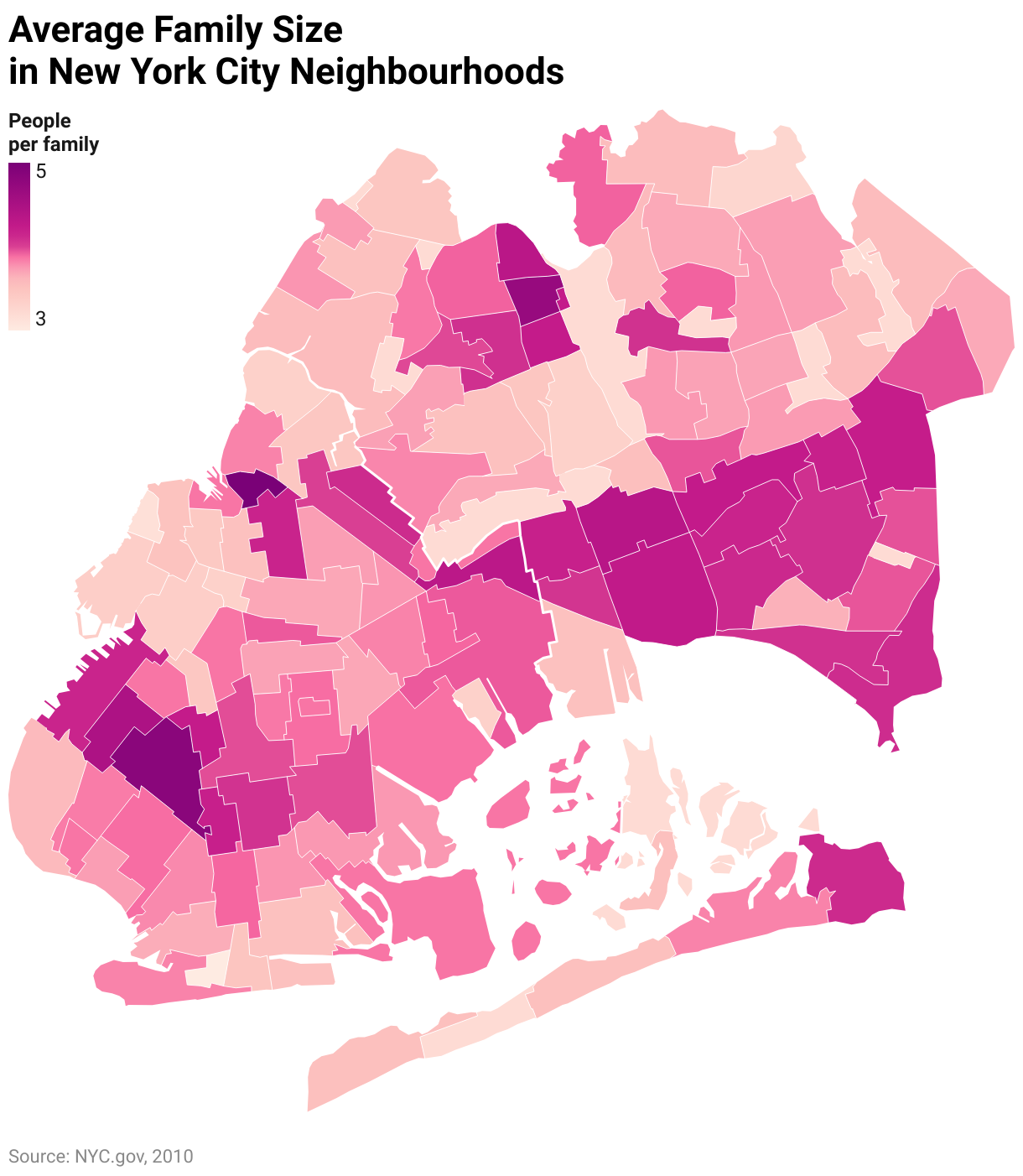


 indicates a volunteer contributor)


