Despite this post’s title, I’m going to start by talking about minimalism.
I’ve been at least a partial follower of the minimalist Steve Jobs/Jony Ive school of design since I was a teenager. Early on, Jobs famously lived in a mostly-empty home (as seen below), and he eventually minimized his wardrobe to the same bespoke turtleneck, Levi’s jeans, and New Balance sneakers. I looked up to Steve as a pioneer of interface design, and took on some of his minimalist ideals.
Steve probably wasn’t the best host for a movie night with friends.
Being the son of an auto mechanic, however, I likely have a less high-minded approach to design than Steve had. I see minimalism as more of a tool than a religion. I also like to have furniture in my house.
From 1x to 2x
Minimalism in UI design most recently came into vogue shortly after the adoption of ultra-high resolution (“Retina”) displays. Decorative elements had less appeal when everything on screen looked so nice and crisp. Like many designers, I followed Apple’s lead on iOS 7, and purged my work of textures, drop shadows, and glossy finishes.
I’ve mostly maintained these minimalist ideals in my designs, but outside of work, I’ve increasingly found myself drawn to things that are complicated, chaotic, and full of surprises.
So I’d like to take a couple minutes to celebrate some great things that shun the idea that less is more.
The Sagrada Família
Seeing Antonio Gaudí’s sublime church, the Sagrada Família, in Barcelona is what first made the idea of maximalism pop into my head. I thought “I’m always trying to pare things down, but this place does the exact opposite, and it’s wonderful”.
Partial tours are available of the cathedral, which has been under construction since 1882, and at best will be completed in 2026.
The Sagrada Família is decidedly not an exercise in removing every unnecessary thing until the platonic ideal of a cathedral remains. Instead, it is the chaotic addition of more and more, until every space is overloaded with surprises. Every single crevice of this building, inside and out, is filled with carvings, statues, stained glass, engravings, and shafts of coloured light. Exploring the building puts one in a constant state of discovery and delight.
Gloomhaven
Next is the ridiculously epic tabletop combat game Gloomhaven, which is one of the best games I’ve ever played. Gloomhaven comes in a 20+ pound box, and takes 100+ hours to complete. The total number of figures, cards, and pieces in the game is in the neighbourhood of 2000. It’s not without elegance, but it is definitely not minimal.
Some of what comes in the Gloomhaven box. This isn’t even all of it.
Gloomhaven is the first game I’ve tried that’s worthy of the word “epic”. It will realistically take me years to finish, and even then I’ll probably only ever see a small percentage of the content in that mammoth box. Knowing there’s so much in there I’ll probably never see is actually part of its appeal.
RuPaul’s Drag Race
There is nothing subtle about this show.
I don’t much care for fashion or makeup, and my wardrobe is a muted rainbow of drab colours and earth tones. So I’m as surprised as anyone that a television show about people dressing up in gaudy outfits and garish makeup is one of my very favourites.
“RuPaul’s Drag Race” is basically an outright rejection of subtlety, with one judge even outright stating that he “hates minimalism”. It’s unabashedly over-the-top. I’m a sucker for watching skilled people do their thing, whatever it is, and this show is packed with exactly that.
Drag Race miraculously takes what could be flaws and turns them into strengths. Endless corny jokes, over-acting, and garish colours are woven into a uniquely compelling extravaganza.
Maximalism as a Tool
All these maximalist things use their expansiveness for different effects. For the Sagrada Família, maximalism creates a sense of wonder. In Gloomhaven, it gives the world an epic feel. RuPaul’s Drag Race uses maximalism to create a sense of celebration. The idea that minimalism, or any other style, is superior to all other aesthetics is silly—all of these things would be much worse if done in a minimalist style. The style of something should follow its goals.
Where Apple’s Minimalism Has Gone Wrong
While thinking about maximalism, I also got to thinking about Apple’s recent excesses of minimalism. Apple deserves tons of praise for their transformative design work, but recently, it’s seemed as though the company has forgotten why they’re pursuing things. There has been a great deal of pushback on recent designs, most notably with the finicky keyboards and lack of ports on their recent laptops, as well as a lack of progress on their pro-level Macs. There are undoubtedly many reasons for these issues, but it seems to me that part of the problem is that Apple is more concerned with making their products minimal than making them useful.
Apple is a company with strong design in their DNA. Since the days of Steve Jobs, they’ve sought to make tools that are as simple as possible, while still enabling the user to accomplish their goals. Recently, however, it seems like they’re making things simpler at the expense of being able to get the job done. It increasingly feels like Apple is following the path of minimalism because it’s something they’ve done in the past, and not because of a clear understanding of how that minimalism actually helped people work.
Similarly, Apple’s obsession with getting manufacturing tolerances ever more exact seems to have moved beyond the point of it actually bringing any benefits. A few years ago, making parts out of precision glass and aluminum led to rugged and well-wearing products. Adding an additional decimal point to their manufacturing precision seems only to have resulted in keyboards that can be rendered unusable by the tiniest speck of dust.
Apple’s recent MacBooks Pro famously cut ports and computing power in exchange for being smaller and simpler.
I applaud their pursuit of progress in design and manufacturing, but minimalism in itself is an empty pursuit—helping people work or play should be the goal. Relentlessly cutting features, size, and especially ports for its own sake eventually leads to negative returns. People, especially professionals, have the capacity to handle complexity. We need look no farther than the wonderful maximalist examples previously mentioned to prove that.
Apple’s relentless pursuit of minimalism for its own sake was perhaps best lampooned in The Onion’s video: “Apple Introduces Revolutionary New Laptop With No Keyboard“. It was posted in 2009, but it has never felt more relevant than now.
In Closing
As far as my own design inspirations go, I still love simple things like a beautiful Dieter Rams-designed radio, or a wabi-sabi inspired garden. I live in a small apartment and try to minimize the quantity of stuff I own, while striving to keep things of high quality. Still, it’s good to recognize that not everything needs to be simple, minimal, or elegant. There is also a place for the big, the bold, and the over-the-top.
Together with Doug Belshaw and WeAreOpen Co-op I’ve been working a micro-credentialing project with the Inter-American Development Bank in Washington D.C. On the second day of workshops we put together, we organised a succession of badge project “surgeries”. I captured some of the dialogue using live drawing – which we then evolved into the Credential Project Blueprint. Here’s one of the many doodles…
I've been watching a lot of discussion about this on the mailing lists and so think of this as a snapshot rather than the final word. The document basically "summarizes information from the community group wiki for those use cases that we have addressed, with links to the outline use case description, the wiki page showing how we met the requirements arising from that use case, and proposed new terms on a test instance of schema.org." Some major outstanding issues are reported, including "whether accreditation is a form of recognition." There are also some proposed Schema.org changes.
Two of the more famous military sayings are “Generals are always preparing to fight the last war”, and “Never interrupt your enemy while he is making a mistake.” I thought of the latter at the conclusion of last Sunday’s 60 Minutes report on Google:
Google declined our request for an interview with one of its executives for this story, but in a written response to our questions, the company denied it was a monopoly in search or search advertising, citing many competitors including Amazon and Facebook. It says it does not make changes to its algorithm to disadvantage competitors and that, “our responsibility is to deliver the best results possible to our users, not specific placements for sites within our results. We understand that those sites whose ranking falls will be unhappy and may complain publicly.”
Yelp did participate in the piece because Google is doing the opposite of “delivering the best results possible,” and instead is giving its own content an unlawful advantage. We’ve made a video to explain exactly how Google puts its own interests ahead of consumers in local search, which you can watch here:
Yelp’s position, at least in this video, appears to be that Google’s answer box is anticompetitive because it only includes reviews and ratings from Google; presumably the situation could be resolved were Google to use sources like Yelp. There are three problems with this argument, though:
First, the answer box originally included content scraped from sources like Yelp and other vertical search sites; under pressure from the FTC, driven in part by complaints from Yelp and other vertical search engines, Google agreed to stop doing so in 2013.2
Second, in a telling testament to the power of being on top of search results, Google’s ratings and reviews have improved considerably in the two years since that video was posted; this isn’t a static market (to be sure, this is an argument that could be used on both sides).
Third — and this is the point of this article — what Yelp seems to want will only serve to make Google stronger.
No wonder Google declined the request for an interview.
The Bill Gates Line
Over the last few weeks I have been exploring what differences there are between platforms and aggregators, and was reminded of this anecdote from Chamath Palihapitiya in an interview with Semil Shah:
Semil Shah: Do you see any similarities from your time at Facebook with Facebook platform and connect, and how Uber may supercharge their platform?
Chamath: Neither of them are platforms. They’re both kind of like these comical endeavors that do you as an Nth priority. I was in charge of Facebook Platform. We trumpeted it out like it was some hot shit big deal. And I remember when we raised money from Bill Gates, 3 or 4 months after — like our funding history was $5M, $83 M, $500M, and then $15B. When that 15B happened a few months after Facebook Platform and Gates said something along the lines of, “That’s a crock of shit. This isn’t a platform. A platform is when the economic value of everybody that uses it, exceeds the value of the company that creates it. Then it’s a platform.”
By this measure Windows was indeed the ultimate platform — the company used to brag about only capturing a minority of the total value of the Windows ecosystem — and the operating system’s clear successors are Amazon Web Services and Microsoft’s own Azure Cloud Services. In all three cases there are strong and durable businesses to be built on top.
Once a platform dips under the Bill Gates Line, though, the long-term potential of a business built on a “platform” starts to decline. Apple’s App Store, for example, has all of the trappings of a platform, but Apple quite clearly captures the vast majority of the overall ecosystem, both because of the profitability of the iPhone and also because of its control of App Store economics; the paucity of strong and durable businesses on the App Store is a natural outgrowth of that.
Note that Apple’s ability to control the economics of its developers comes from intermediating the relationship of those developers with customers.
Aggregators, Not Platforms
Facebook and Google take this intermediation to the extreme, leveraging their ability to drive discovery of the sheer abundance of information on their network and the Internet broadly:
In the aggregator business model the aggregator owns customers and suppliers follow
It follows that Facebook and Google’s “platforms” not only don’t meet the Bill Gates Line, they don’t even register on the graph: they are the purest expression of aggregators. From my original formulation:
The fundamental disruption of the Internet has been to turn this dynamic on its head. First, the Internet has made distribution (of digital goods) free, neutralizing the advantage that pre-Internet distributors leveraged to integrate with suppliers. Secondly, the Internet has made transaction costs zero, making it viable for a distributor to integrate forward with end users/consumers at scale.
This has fundamentally changed the plane of competition: no longer do distributors compete based upon exclusive supplier relationships, with consumers/users an afterthought. Instead, suppliers can be aggregated at scale leaving consumers/users as a first order priority. By extension, this means that the most important factor determining success is the user experience: the best distributors/aggregators/market-makers win by providing the best experience, which earns them the most consumers/users, which attracts the most suppliers, which enhances the user experience in a virtuous cycle.
The result is the shift in value predicted by the Conservation of Attractive Profits. Previous incumbents, such as newspapers, book publishers, networks, taxi companies, and hoteliers, all of whom integrated backwards, lose value in favor of aggregators who aggregate modularized suppliers — which they often don’t pay for — to consumers/users with whom they have an exclusive relationship at scale.
This is ultimately the most important distinction between platforms and aggregators: platforms are powerful because they facilitate a relationship between 3rd-party suppliers and end users; aggregators, on the other hand, intermediate and control it.
Moreover, at least in the case of Facebook and Google, the point of integration in their respective value chains is the network effect. This is what I was trying to get at last week in The Moat Map with my discussion of the internalization of network effects:
Google has had the luxury of operating in an environment — the world wide web — that was by default completely open. That let the best technology win, and that win was augmented by the data that comes from serving an ever-increasing portion of the market. The end result was the integration of end users and the data feedback cycle that made Google search better and better the more it was used.
Facebook’s differentiator, meanwhile, is the relationships between friends and family; the company has subsequently integrated that network effect with consumer attention, forcing all of the content providers to jostle for space in the Newsfeed as pure commodities.
It’s worth noting, by the way, why it was that Facebook could come to be a rival to Google in the first place; specifically, Facebook had exclusive data — those relationships and all of the behavior on Facebook’s site that resulted — that Google couldn’t get to. In other words, Facebook succeeded not by being a part of Google, but by being completely separate.
Succeeding in a World of Aggregators
This gets at why I find Yelp’s complaints a bit besides the point: the company seems to be expending an awful lot of energy to regain the right to give Google the content Yelp worked hard to acquire. There is revenue there, of course, just as there is in the production of commodities generally, but without a sustainable cost advantage it’s not the best route to building a strong and durable business.
Of course that is the bigger problem: I noted above that Google’s library of ratings and reviews has grown substantially over the past few years; users generating content are the ultimate low-cost supplier, and losing that supply to Google is arguably a bigger problem for Yelp than whatever advertising revenue it can wring out from people that would click through on a hypothetical Google Answer Box that used 3rd-party sources. And, it should be noted, that Yelp’s entire business is user-generated reviews: they and similar vertical sites are likely to do a far better job of generating, organizing, and curating such data.
Still, I can’t help but wonder whether or not Yelp’s problem is not that Google is using its own content in the Answer Box, but rather the Answer Box itself; which of these set of results would be better for Yelp’s business, even in a hypothetical world where Answer Box content comes from Yelp?
Presuming that the answer is the image on the right — driving users to Yelp is both better for the bottom line and better for content generation, which mostly happens on the desktop — and it becomes clear that Yelp’s biggest problem is that the more useful Google is — even if it only ever uses Yelp’s data! — the less viable Yelp’s business becomes. This is exactly what you would expect in an aggregator-dominated value chain: aggregators completely disintermediate suppliers and reduce them to commodities.
To that end, this is why the best strategies entail business models that avoid Google and Facebook completely: look no further than Amazon, which last month stopped buying Google Shopping ads, something the company can afford to do given that half of shoppers start their product searches on Amazon. To be sure, Amazon is plenty powerful in its own right, but it is a hard-to-ignore example of Google’s favorite argument that “competition is only a click away.”
Yelp Versus Google
Still, I have sympathy for Yelp’s position; Stoppelman told 60 Minutes:
If I were starting out today, I would have no shot of building Yelp. That opportunity has been closed off by Google and their approach…because if you provide great content in one of these categories that is lucrative to Google, and seen as potentially threatening, they will snuff you out.
Stoppelman is right, but the reason is perhaps less nefarious than it seems; the 60 Minutes report explained why in the voiceover:
Yelp and countless other sites depend on Google to bring them web traffic — eyeballs for their advertisers.
Yelp, like many other review sites, has deep roots in SEO — search-engine optimization. Their entire business was long predicated on Google doing their customer acquisition for them. To the company’s credit it has become a well-known brand in its own right, and now gets around 70% of its visits via its mobile app. Those visits are very much in the Amazon model I highlighted above: users are going straight to Yelp and bypassing Google directly.
That, though, isn’t great for Google! It seems a bit rich that Yelp should be free to leverage its app to avoid Google completely, and yet demand that Google continue to feature Yelp prominently in its search results, particularly on mobile, where the Answer Box has particular utility. I get that Yelp feels like Google has changed the terms of the deal from when Yelp was founded in 2004, but the reality is that the change that truly mattered was mobile.
What I do find compelling is a new video that Yelp put out yesterday; while it makes many of the same points as the one above, instead of being focused on regulators it is targeting Google itself, arguing that Google isn’t living up to its own standards by not featuring the best results, and not driving traffic back to sites that make the content Google needs (by, for example, not including prominent links to the content filling its answer boxes; Yelp isn’t asking that they go away, just that they drive traffic to 3rd parties). Google may be an aggregator, but it still needs supply, which means it needs a sustainable open web. The company should listen.
Facebook and Data Portability
Facebook, unfortunately for its suppliers, faces no such constraints: the content that is truly differentiated is made by Facebook’s users, and it is wholly owned by Facebook. Facebook is even further from the Bill Gates Line than Google is: the latter at least needs commoditized suppliers; the former can take or leave them on a whim, and does.
That is why I’ve come to realize a popular prescription for Facebook’s dominance, data portability, put forward this week by a coalition of progressive organizations under the umbrella Freedom From Facebook, is so mistaken.3 The problem with data portability is that it goes both ways: if you can take your data out of Facebook to other applications, you can do the same thing in the other direction. The question, then, is which entity is likely to have the greater center of gravity with regards to data: Facebook, with its social network, or practically anything else?
Remember the conditions that led to Facebook’s rise in the first place: the company was able to circumvent Google, go directly to users, and build a walled garden of data that the search company couldn’t touch. Partnering or interoperating with companies below the Bill Gates Line, particularly aggregators, is simply an invitation to be intermediated. To demand that governments enforce exactly that would be a mistake that only helps Facebook.4
The broader takeaway is that distinguishing between platforms and aggregators isn’t simply an academic exercise: it should affect how companies think about their competitive environment vis-à-vis the biggest companies in tech, and, just as importantly, it should weigh heavily on regulators. The Microsoft antitrust battles of the 2000s were in many respects about enforcing interoperability as a way of breaking into the Microsoft platform; today antitrust should be far more concerned about aggregators capturing everything they touch by virtue of their control of end users.
That’s the thing about the “Generals fight the last war” saying; it’s usually applied to the losing side that made mistake after mistake while the victors leveraged the new world order.
I’ve discussed why I disagree with Gary Reback’s views on monopoly and innovation in this Daily Update
With regard to that FTC decision, yes, as the Wall Street Journal reported, some FTC staff members recommended suing Google; what is not true is that the recommendation was unanimous, or that FTC commissioners ultimately deciding to go in another direction was unusual. In fact, other staff groups in other groups recommended against the suit, and the decision of the FTC commissioners was unanimous. Again, that is not to say it was the right decision, but that the popular conception — including what was reported in that 60 Minutes piece — is a bit off
The group’s demand that Facebook be forced to divest Instagram, WhatsApp, and Messenger makes much more sense in terms of this framework (with the exception of Messenger, which has always been a part of Facebook). I strongly believe that the single best antitrust remedy for aggregators is limiting acquisitions
We are only a few days away from May 25th, when the European General Data Protection Regulation (GDPR) will go into full effect. Since we were founded, Mozilla has always stood for and practiced a set of data privacy principles that are at the heart of privacy laws like the GDPR. And we have applied those principles, not just to Europe, but to all our users worldwide. We feel like the rest of the world is catching up to where we have been all along.
GDPR has implications for many different parts of Mozilla. Rather than give you a laundry list of GDPR stuff, in this post, we want to focus specifically on Firefox and drill down specifically into how we think about privacy-by-design and data protection impact assessments within our browser product.
Privacy By People Who Care About Privacy
Firefox, the web browser that runs on your device, is your gateway to the internet. Your browser will manage a lot of information about the websites you visit, but that information stays on your device. Mozilla, the company that makes Firefox, doesn’t collect it unless you give us permission.
Mozilla does collect a set of data that helps us to understand how people use Firefox. We’ve purposely designed our data collection with privacy protections in mind. So while the browser knows so much about you, Mozilla still knows very little.
Building a browser that is so powerful yet still respectful of our users takes a lot of effort. At Mozilla, we have teams of privacy and security engineers who are responsible for building a trustworthy browser. More than that, we have a workforce and a volunteer community that takes Mozilla’s responsibility to protect you seriously and personally. This responsibility cuts across all areas of Mozilla, including our security engineers, platform and data engineers, data scientists, product managers, marketing managers and so on. We basically have an army of people who have your back.
Rather than Privacy By Design, we do Privacy By People Who Care About Privacy.
It is important to keep this in mind when we think about the GDPR’s privacy-by-design requirements. Regardless of any regulatory requirement, including GDPR, if an organization and its people aren’t rooted in a commitment to privacy, any privacy-by-design process will fail. It is our people’s commitment to the Mozilla mission that undergirds our design processes and serves as the most important backstop for protecting our users.
Our Process
Okay, enough throat clearing. At Mozilla, we do have plenty of design processes to identify and deeply engage on privacy risks; code reviews, security and privacy reviews, intensive product and infrastructure audits, and public forums for anyone to contribute concerns and solutions.
Our Firefox data collection review process is the cornerstone of our effort to meaningfully practice privacy-by-design and assess privacy impacts to our users. We believe it is consistent with the GDPR’s requirements for privacy impact assessments. Mozilla has had this process in place for several years and revamped it in 2017.
Here are a few key pieces of that process:
Before we look at any privacy risk, we need to know there is a valid analytic basis for the data collection. That is why our review process starts with a few simple questions about why Mozilla needs to collect the data, how much data is necessary, and what specific measurements will be taken. Mozilla employees who propose additional data collection must first answer these questions on our review form.
Second, our Data Stewards – designated individuals on our Firefox team – will review the answers, ensure there is public documentation for data collection, and make sure users can turn data collection on and off.
Third, we categorize data collection by different levels of privacy risk, which you can find in more detail here. The data category for the proposed collection must be identified as part of the review. For proposals to collect data in higher risk categories, the data collection must be default off.
Complex data collection requests, such as those to collect more sensitive data or those that call for a new data collection mechanism, will escalate from our Data Stewards to our Trust and Legal teams. Further privacy, policy, or legal analysis will then be done to assess privacy impact and identify appropriate mitigations.
The results of this review process, as well as in depth descriptions of our data categories and the process itself, can be found publicly on the web. And you can find the full documentation for Firefox data collection here.
But Wait, There’s More!
This process is just one of the many tools we have to protect and empower the people who use our products. Last year, we completely rewrote our privacy notice to provide clear, simple language about the browser. The notice includes links directly to our Firefox privacy settings page, so users can turn off data collection if they read something on the notice they don’t like.
We redesigned those privacy settings to make them easier to use (check out about:preferences#privacy in the Firefox Browser). This page serves as a one-stop shop for anyone looking to take control of their privacy in Firefox. And we revamped Firefox onboarding by showing new users the Firefox privacy notice right on the second tab the very first time they use the browser.
It’s easier today than ever before to take control of your privacy in the Firefox browser. As you can see, limited data, transparency, choice – all GDPR principles – are deeply embedded in how all of us at Mozilla think about and design privacy for you.
It’s been nearly a year since we launched Firefox Focus for Android, and it has become one of the most popular privacy browsers for mobile around the world. In light of recent events, more and more consumers have growing awareness for privacy and secure products. The upcoming implementation of the General Data Protection Regulation (GDPR) in Europe later this month reflects this and, at the same time, highlights how important privacy is for all users.
At Mozilla, we’ve always valued people’s privacy and given them the opportunity to determine the data they want to share. Last year we updated our Privacy Notice to make it simple, clear and usable, and we’ve been transparent about how we collect user data. We feel well prepared for GDPR coming into effect and Firefox Focus is one of the best examples of why: This mobile browser has been ahead of its time and is well positioned as the go-to mobile product in the Age of GDPR. Now, we’re making it even more private and convenient.
Less tracking for more privacy
Up until now, Firefox Focus blocked all first party trackers of sites that were commonly known to follow users from site to site, also known as “cross-site tracking.” From there, these sites collect “cookies” which are small data files stored by your browser. It helps publishers collect data to personalize your experiences with them. Again, Firefox Focus blocks first party trackers on the Disconnect list. Today, we are announcing a cookie management feature that also gives you control over the source of trackers that are following you. Users can now protect the visibility of their online activity through cookies on a site from other sites (third party), all sites – or not at all if they choose. You can find this under Settings, Privacy & Security, “Cookies and Site Data” to make your selection. There is a small chance that it it might not work on some sites, so we’re giving users the choice to turn it on or off. For example, advertisers use third party cookies to track your visits to various websites.
Once you click on “Block Cookies” a menu will pop-up with options to choose the different types of cookies
Autocomplete is Complete
In our previous release, we’ve included the ability to add favorite sites to an autocomplete list by adding them manually under Settings. We’ve noticed that this way might not be the quickest setup for some users. Starting today, our users will be able to conveniently and easily long-press the URL bar to select the site to add to their URL Autocomplete list. Now adding your frequently visited sites is even easier and will get you to where you want to go even faster.
The latest version of Firefox Focus for Android can be downloaded on Google Play.
Coincidentally, Andy sent along these panorama shots of the east end of False Creek, taken from a vantage point on the old and new Cambie Bridges — in 1978, 2003, and 2017.
Definitely worth clicking to enlarge. More panoramas to come.
The Metro Vancouver Mobility Pricing Independent Commission will release its report tomorrow. (Expect to hear the pat-pat-pat of running feet as politicians distance themselves from anything that looks like a ‘road tax.’)
This report will be just the opening round as everyone in the region deals with the inevitability of transformative change in our transportation system.
Regardless of the options, one of the key (and most contentious) issues is the concept of ‘fairness.’ In April, economist Marc Lee at the Canadian Centre for Policy Alternatives provided of the first, detailed outlooks on this issue, in the CCPA’s report “Getting Around Metro Vancouver.”
From the April 16th CCPA news release about the report:
Mobility pricing takes away the illusion of ‘free roads,’ based on the principle that drivers must pay for the infrastructure and services they use. But fairness needs to be at the core of mobility pricing for it to pass the test of public opinion,” says Marc Lee, a senior economist with the CCPA BC Office.
For example, the high cost of housing in Metro Vancouver means low- and middle-income households may be forced to move further away from the central city to find affordable housing and spend hundreds of hours a year commuting.
“A key fairness concern is that low-income drivers who have no option but to drive are penalized while more affluent drivers, who live more centrally, can travel more quickly without noticing much impact on their budget,” Lee explained. …
For Metro Vancouver, his research shows that a fair mobility pricing system could learn from implementation of BC’s carbon pricing where a low-income credit is funded out of carbon tax revenues. …
Using mobility pricing revenues to expand public transit can further address congestion by getting more people out of their vehicles and would significantly benefit low-income households that tend to be more reliant on public transit. …
In the release, Lee argues that a fair mobility pricing system must:
address low income with a credit to assist people who have no option other than to drive; that is, to invest in mobility for disadvantaged groups as a matter of ‘transportation justice’.
expand public transit first, the idea being that investments in public transit are the only way to guarantee accessible mobility for all residents over the long-term.
level the playing field with other modes of transportation, which would pull ride-hailing and car-sharing services into the mobility pricing mix.
The dilemma, however, is this: a mobility charge that tries to ‘decongest’ the region’s traffic has to be high enough to change behaviour, which thus penalizes low-income drivers more than higher-income. Yet, if lower-income drivers are given a credit to offset the charge, it could eliminate any incentive to change behaviour.
Marc argues that the low-income car users would realize they could actually save money, both by receiving a credit and by driving less.
In any case, the ‘decongestion charge’ has to be visible in some way to have an effect. And we just hate visible charges, especially connected to the car. (It’s why media cover the increase in gas prices so relentlessly; it’s one of the only visible costs we see repeatedly.)
Expect, as well, that the definition of ‘low-income driver’ would raise the bar rather high, as is the case for the carbon tax; about 40 percent of British Columbians get a credit of some kind, and Marc suggests about one-third to 40 percent of mobility charges would be allocated to the a mobility credit. A cash grab this is not.
Even then, I doubt a credit system would negate the belief by almost everyone that in some way or another, a mobility charge would be unfair for them, regardless of whether they were saving money. It’s the visibility that offends. We spent most of the 20th century providing a road system that seems to be free (hey, they’re called ‘freeways,’ aren’t they?) and hiding the costs of the car as much as possible.
Roads, in fact, are seen as one of the true democratic spaces in society. Assuming you have a car, it doesn’t matter whether you’re rich or poor, drive a beater or BMW; you have the same right to the road.
The last thing people want to see is driving becoming like housing — another way for inequity to divide us.
To avoid that, people are willing to put up with congestion more than they’re willing to admit.
You might’ve noticed that the person who took your order at the bar, brought you the shoes you wanted to try on, or perhaps even patted you down at the airport security line, is sporting an Apple Watch, which starts at $329 for the newest Series 3 watch. And there’s a pretty simple explanation: Many service-industry jobs where employees have to be on their feet all day don’t allow workers to check their phones while they’re on the clock. But that rule doesn’t necessarily apply to a piece of unobtrusive jewelry that happens to let you text your friends and check the weather.
Quartz spoke with airline attendants, bartenders, waiters, baristas, shop owners, and (very politely) TSA employees who all said the same thing: The Apple Watch keeps them in touch when they can’t be on their phones at work. Apple has increasingly been pushing the watch as a health device, and seems to have moved away from marketing it as one that offers more basic utility, as Apple continues do with the iPhone. But given that roughly 23% of the US labor force works in wholesale or retail operations, perhaps it’s a market Apple should reconsider.
While I obviously hope Apple continues to improve the Watch as a health and fitness accessory, I would love to see new ways to triage and customize notifications too – especially when it comes to more granular controls for Do Not Disturb and notification mirroring on the iPhone. I have my fingers crossed for improvements in iOS 12.
It is no secret that it rains a lot in Vancouver. The city sees over 160 rainy days a year – with much of it falling between October and March. Should we all just hibernate for 6 months a year?
The Vancouver Public Space Network (VPSN) thinks not. The VPSN recently launched “Life Between Umbrellas” an initiative to examine how public spaces can be designed and programmed to be more rain-friendly.
Last week, they released 10 draft principles for rain-friendly public spaces. The principles were created based on research into local and global best practices, as well as over 400 ideas submitted by Vancouverites during engagement activities held in February and March.
Once these principles are finalized, they will be shared with the City and the local community of architects and landscape architects. Later this year, the VPSN will also be launching a design ideas competition and invite people to develop detailed ideas for rain-friendly public spaces.
You can read the 10 draft principles here:
Principle #1 Rain-friendly public spaces enable protection from the elements
The design of rain-friendly spaces should include features that protect users from inclement weather and enable a measure of comfort during a downpour. Examples include wider sidewalk canopies, warming shelters, and overhead shelters in parts of playgrounds and parks.
Principle #2 Rain-friendly public spaces provide a smart response to grey, overcast and wet weather
Good design will act as a counterpoint to the darker aspects of the rainy season, adding brightness and other sensory measures to enliven public spaces. Some examples include colourful buildings, glass gazebos or pergolas, and feature lighting.
Principle #3 Rain-friendly public spaces support a range of activities and programming
Effective programming supports public life during the rainy months by providing ways to help people make the most of a rainy day. Some examples put forward include dance parties in the rain, rainforest walks, and poncho puddle parties.
Principle #4 Rain-friendly public spaces foster social inclusion
Good public space is accessible to, and engaging for people of all ages, abilities, and life circumstances. Rain-friendly public space should recognize the additional challenges for getting around during cold and wet-weather. Examples to address this include covered paths for scooters and rain-friendly programming at parks and plazas frequented by low-income or street involved residents.
Principle #5 Rain-friendly public spaces strengthen health and well-being when it’s harder to go outside
Rainy weather can create a barrier to physical activity. The cold, darker months can also impact mental health. Rain-friendly public spaces support health and well-being by ensuring opportunities for exercise and social interaction. Examples include planning rainy day neighbour-making initiatives and ensuring full-spectrum lighting in public spaces.
Principle #6 Rain-friendly public spaces account for specific weather-related safety
Studies show the chance of a road-related injury in rainy weather is 2-3 times greater than during dry weather. Rain-friendly public spaces work to enhance safety for all - especially vulnerable road users such as pedestrians and cyclists. Examples to promote safety include slower travel speeds and complete street design to support all modes of travel.
Principle #7 Rain-friendly public spaces treat rain as a resource
Rain is an integral part of the local hydrologic (water) cycle. Public spaces can help support the environment by reducing stormwater run- off and harvesting rain for various uses. This will be especially important, as Vancouver will experience more extreme weather events in the future. Examples include bioswales and rain gardens on streets, or rain-friendly elements that can be integrated with other green streets infrastructure.
Principle #8 Rain-friendly public spaces support the local economy
As the local economy expands and as the sharing economy grows, Vancouver’s role as a rainy-city can serve as a driver of cooperativism, entrepreneurialism, and exchange. Examples to support the local economy include outdoor covered markets to provide more winter-times spaces for farmers, artisans and small-scale businesses, and umbrella and poncho sharing stations.
Principle #9 Rain-friendly public spaces catalyze cultural creativity
Rain can provide an cloud-burst of inspiration for art, story-telling, cultural production and performance. Rain-friendly spaces use precipitation as a starting point for creative expression. Examples include rain-activated outdoor musical instruments and rain-responsive street murals.
Principle #10 Rain-friendly public spaces are opportunities for learning and innovation
Vancouver can lead the way with public spaces that support public life in the rainy months. Part of this will come from encouraging a culture of testing new ideas. Another part will come from learning from the many ideas that are used by other cultures, or have been tried in the past. Examples could include incorporating indigenous design principles into public spaces and creating temporary rain-friendly design features (example: retractable umbrellas to cover public spaces)
A consortium of major airlines serving Vancouver International Airport (YVR) is building a 13-kilometre underground jet fuel pipeline through Richmond to YVR, saying the current 40-year-old system is at maximum capacity.
Vancouver Airport Fuel Facilities Corporation (VAFFC) will also build a new marine terminal at the south arm of the Fraser River to handle fuel shipments.
And a fuel receiving facility housing 6 storage tanks with a capacity of 80 million litres will be built on Port Metro Vancouver Land in Richmond, as part of the the $150 million project.
But Richmond says the new pipeline isn't necessary.
"We think that with the existing pipeline, and potentially some upgrades, it could more than meet their current and future needs for capacity," said Ted Townsend, a spokesperson for the City of Richmond.
Townsend said the review process was flawed.
"The environmental review process didn't require them (the government of B.C., and the federal government) to present alternatives and to consider alternatives. And there was very little input from the city in terms of being able to influence the project's scope."
Jet fuel will travel 13-kilometres underground from a terminal on the south arm of the Fraser River to Vancouver International Airport. (Vancouver Airport Fuel Facilities Corporation)
The Vancouver Airport Fuel Facilities Corporation said it undertook a five-year environmental protection process in consultation with the Department of Fisheries and Oceans, Environment Canada, the Ministry of Environment and Port Metro Vancouver, among others,"to develop specific protection and response strategies," according to its website.
The current pipeline delivers jet fuel from a refinery in Burnaby.
VAFFC's website says it's also importing about 1,000 tanker deliveries each month from a refinery in Washington to keep up with the need.
"The new marine terminal and pipeline will ensure the safe and secure supply of jet fuel to meet the long-term needs at YVR," said a statement from VAFFC.
In 2013, the B.C. government and the Port of Vancouver, acting on behalf of the federal government granted the company an environmental assessment certificate that allowed it to proceed to the permitting phase.
VAFFC got environmental approval from the provincial and federal governments in 2013. (Vancouver Airport Fuel Facilities Corporation)
The development permit to allow the terminal facility to be built on city land will be before council for consideration in the near future, with no date set.
Construction is already underway on the project's storage facility on port lands.
All data arise within a particular context and often as a result of a specific question being asked. That is all well and good until we attempt to use that same data to answer a different question within a different context. When you match an existing dataset with a new question, you have to ask if the original context in which the data were collected is compatible with the new question and the new context. If there is context compatibility, then it is often reasonable to move forward. If not, then you either have to stop or come up with some statistical principle or assumption that makes the two contexts compatible. Good data analysts will often do this in their heads quickly and may not even realize they are doing it. However, I think explicitly recognizing this task is important for making sure that data analyses can provide clear answers and useful conclusions.
Understanding context compatibility is increasingly important as data science and the analysis of existing datasets continues to take off. Existing datasets all come from somewhere and it’s important to the analyst to know where that is and whether it’s compatible with where they’re going. If there is an imcompatibility between the two contexts, which in my experience is almost always the case, then any assumption or statistical principle invoked will likely introduce uncertainty into the final results. That uncertainty should at least be communicated to the audience, if not formally considered in the analysis. In some cases, the original context of the data and the context of the new analysis will be so incompatible that it’s not worth using the data to answer the new question. Explicit recognition of this problem can save a lot of wasted time analyzing a dataset that is ultimately a poor fit for answering a given question.
I wanted to provide two examples from my own work where context compatibility played an important role.
Example: Data Linkage and Spatial Misalignment
Air pollution data tends to be collected at monitors, which can reasonably be thought of as point locations. Air pollution data collected by the US EPA is primarily collected to monitor regulatory compliance. The idea here (roughly) is that we do not want any part of a county or state to be above a certain threshold of air pollution, and so we strategically place the monitors in certain locations and monitor their values in relation to air quality standards. The monitors may provide representative measurements of air pollution levels in the general area surrounding the monitor, but how representative they are depends on the specific pollutant being measured and the nature of pollution sources in the area. Ultimately, for compliance monitoring, it doesn’t really matter how representative the monitors are because an exceedance at even one location is still a problem (the regulations have ways of smoothing out transient large values).
Health data tends to be measured at an aggregate level, particularly when it is coming from administrative sources. We might know daily counts of deaths or hospitalizations in a county or province or post code. Linking health data with air pollution data is not possible because of a context mismatch: Health data are measured areally (counts of people living within some political boundary) and pollution data are measured at point locations, so there is an incompatibility in the spatial measurement scale. We can only link these to data sources together if we do one of the following:
Assume that the monitor values are representative of population exposure in the entire county
Develop a model that can make predictions of pollution levels at all points in the county and then take the average of those values as a representative of the average county levels
This problem is well-known in spatial statistics and is referred to as spatial misalignment or as change of support. The misalignment of the pollution and health data is the context mismatch here and arises because of the different measurement schemes that we use for each type of data. As a result, we must invoke either an assumption or a statistical model to link the two together.
The assumption of representativeness is easier to make because it requires no additional work, but it can introduce unknown uncertainties into the problem if the pollution values are not representative of population exposure. If a pollutant is regional in nature and is spatially homogeneous, then the assumption may be reasonable. But if there a lot of hyper-local sources of pollution that introduce spatial heterogeneity, the assumption will not hold. The statistical modeling approach is more work, but is straightforward (in principle) and may offer the ability to explicitly characterize the uncertainty introduced by the modeling. In both cases, there is a statistical price to pay for linking the datasets together.
Data linkage is a common place to encounter context mismatches because rarely are different datasets collected with the other datasets in mind. Therefore, careful attention must be paid to the contexts within which each dataset was collected and what assumptions or modeling most be done in order to achieve context compatibility.
Example: The GAM Crisis
A common way to investigate the acute or short-term associations between air pollution levels and health outcomes is via time series analysis. The general idea is that you take a time series of air pollution levels, typically from an EPA monitor, and then correlate it with a time series of some health outcome (often death) in a population of interest. The tricky part, of course, is adjusting for the variety of factors that may confound the relationship between air pollution and health outcomes. While some factors can be measured and adjusted for directly (e.g. temperature, humidity), other factors are unmeasured and we must find some reasonable proxy to adjust for them.
In the late 1990s investigators started using generalized additive models to account for unmeasured temporal confounders in air pollution time series models. With GAMs, you could include smooth functions of time itself in order to adjust for any (smoothly) time-varying factors that may confound the relationship between air pollution and health. It wasn’t a perfect solution, but it was a reasonable and highly flexible one. It didn’t hurt that there was already a nice S-PLUS software implementation that could be easily run on existing data. By 2000 most investigators had standardized on using the GAM approach in air pollution time series studies.
In 2002, investigators at Johns Hopkins discovered a problem with the GAM software with respect to the default convergence criterion. The problem was that the default convergence criterion used to determine whether the backfitting algorithm used to fit the model had converged was set to 0.0001, which for most applications of GAM was more than sufficient. The typical application of GAM was for scatterplot smoothing to look at potential nonlinearities in the relationship between the outcome and a predictor. However, in models where the nonparametric terms were highly correlated (a situation referred to as “concurvity”), then the default criterion was not stringent enough. It turned out that concurvity was quite common in the time series models and the end result was most models published in the air pollution literature had not actually converged in the fitting process.
Around this time, the US EPA was reviewing the evidence from time series studies and asked the investigators who published most of the studies to redo their analyses using alternate approaches (including using a more stringent convergence criterion). To make a long story short, many of the published risk estimates dropped by around 40%, but the overall story remained the same. There was still strong evidence of an association between air pollution and health, it just wasn’t as large of an effect as we once thought. Francesca Dominici wrote a comprehensive post-mortem of the saga that contains many more details.
The underlying problem here was an undetected shift in context with respect to the GAM software. In previous usage of GAMs, the default convergence criterion was likely fine because there were not strong dependencies between the various smoother components in the model and the relationships being modeled did not have time series characteristics. However, when the same GAM software was used in a totally different context, one which the original authors likely did not foresee, suddenly the same convergence criterion was inadequate. The low-concurvity environment of previous GAM analyses was incompatible with the high-concurvity environment of air pollution time series analysis. The lesson here is that software used in a different context from which it was developed is essentially new software. And like any new software, it requires testing and validation.
Summary
Context shifts are critically important to recognize because they can often determine if the analyses you are conducting are valid or not. They are particularly important to discuss in data science applications here often the data are pre-existing but are being applied to a new problem or question. Methodologies and analytic approaches that are totally reasonable under one context can be inappropriate or even wrong under a different context. Finally, any assumptions made or models applied to achieve context compatibility can have an effect on the final results, typically in the form of increased uncertainty. These additional uncertainties should not be forgotten in the end, but rather should be communicated to the audience or formally incorporated in the analysis.
You can hear more from me and the JHU Data Science Lab by subscribing to our weekly newsletter Monday Morning Data Science.
Fair Vote Canada BC is looking to hire two summer students in Burnaby. The positions would be for 8 weeks, 30 hours a week.
Do you know a secondary or post-secondary student who’s passionate about proportional representation and is great at talking to people?
Do you know a student has these qualities and has the skills to help with a research project?
If so, please ask them to send their resume and cover letter to
anita.nickerson (a) fairvote.ca
(email munged to deter scrapers)
Ecojustice is hiring! They are looking for a Grant Writer for their Vancouver office. Ping if you’re interested or want more information… lnkd.in/gEzNv5W
Corner cases make for complex code. They multiply with each other. And as they multiply, they reduce the effectiveness of each new line of code.
Transcript
Eric Normand: Why are corner cases the devil? My name is Eric Normand, and these are my thoughts on functional programming, and that is what I want to talk about today. Why corner cases are evil? Let me just define what I’m talking about. A corner case is any valid argument to a function that requires you to do some kind of check.
We can’t just use the value directly. You have to do some kind of check, like an IF statement on that value. You might have to check for the NO case. If your language lets you pass a NO, that’s a corner case, if you need to check it. Maybe, a corner case, classic one, is you cannot divide by zero.
Dividing by zero is undefined. So, you need to check, if your number is zero before you divide, otherwise it’s going to throw an error or something. There are many types of corner cases…I mean one thing in languages that have lists or sequences. What does it mean to take the first element of an empty list?
In Haskell, this is undefined. So, you have to check — Do I have an empty list? — before you can take the first element. I mean the same for the last, for the second element. These are often not thought of as corner cases because they’re so common. We deal with them most of the time, but they’re corner cases.
Why are they so evil? When you have a corner case, the best-case scenario is you have to do an IF statement. An IF statement implies two branches. There’s the normal case and then the corner case. This is the best case scenario. Sometimes you have a corner case that there’s like seven corner cases, and each case requires a check.
With a corner case, the best-case scenario is you have to do an IF statement, which implies at least 2 branches. If you compose 2 functions with corner cases, the branches multiply, and now you have 4 branches. One more function, 8 branches.https://t.co/ge6GyuZZEI
So, you actually have eight branches. Let’s just talk about the best case scenario, a two-branch check, do I have the normal case or the corner case? That might not seem so bad. It’s just an IF statement, but the thing is, these things compound.
If you want to compose two functions up, just regular function composition, that means you have the return value from one function flowing into the argument of the other function. Each of those has a corner case. Again, best case scenarios — if two cases in function F and two cases in function G, how many cases do you have?
You multiply them and you have four. There are four possible branches that your code will execute. Now, if you have another one that you compose up, now you have eight possible branches. They just explode from there.
Each time you had a corner case, each time you compose something with a corner case, you’re doubling the number of possible branches you’re going to go down. This is why I think that corner cases are evil, because for each of those branches, you could have a different result.
The result is going to be in a different case of an answer. What you get is, then you need another IF statement to figure out which branch it went down. This is now the worst case scenario, because very often, things will collapse back down to a fixed small number of cases. If you’re not careful, each of those branches could be a different case that you have to handle.
The only way to know is to check each branch. You might do a case analysis. You have 16 different possible cases. This one was the normal case, but this one was the corner case, and this one was the corner case, this one normal case. All four of those together, that’s 16 possible different kinds of answers that you’re getting.
You need to have another IF statement. Not only did you have the four normal IF statements, now you have this other big hairy IF statement that you have to deal with.
It’s not just the IF statement. If you’re using a language like Haskell that requires you to define a new type for any of those possibilities, a new type that represents those 16 different cases…I’ve got to run, I’m crossing the street…if you have to define a new type, that’s a new type that you have to define.
It just gets more complicated. Your program becomes more complicated, and you get this coupling where the 16 possible cases which were just implicitly defined by this function composition, are now have to be known in another place, where you have to pick apart this value that you got back, and figure out what branch it went down.
What’s the solution? That’s actually going to be the topic of my next thought, my next episode, so please stay tuned for that. I’ll talk about one possible answer to this problem of corner cases. The best thing is just to avoid the corner case, just not even have it.
I’ll talk about one possible answer to this problem of corner cases. The best thing is just to avoid the corner case, just not even have it. Corner cases are not always avoidable, but if you can avoid it, you should.https://t.co/daWXFjPA0e
It’s not always avoidable, but if you can avoid it, you should. I talked about in the last one, one way of avoiding it is to lift up into a space where that corner case doesn’t exit. You might be able to solve the problem without any branches, because you’ve got everything you need up in that newer space, that richer space.
But, let’s say you do have to have corner cases. You can’t avoid it. What do you do? How do you deal with this and stop the explosion, the multiplicative explosion of branches that you might have to go down. That’s what we are going to talk about next time.
All right, thank you so much for listening. Please, I love hearing questions or comments. You can reach me on Twitter, @ericnormand, one word, or you can email me — eric@lispcast.com. Love to hear what you think, if you have any questions or comments, disagreements. Tell me anything. Lie to me. Tell me the truth, whatever. I just want to hear it.
But Lenovo’s accounts show the smartphone business has lost money every quarter since the takeover – in total, nearly $2bn. Early in March, half of Motorola’s 380 engineering staff at its Chicago offices were let go. China’s Huawei, another big tech player, has raced past Lenovo to become No 3 in smartphones globally; Lenovo is almost out of the top 10, selling 17% fewer phones than in 2014 while the market has grown 15%.
I wonder how long this is going to go on. Lenovo makes some interesting midrange phones, but they struggle to make money and keeping them up-to-date at the same time. Marketing knows they need monthly updates for all their devices, but a shrunken engineering cannot deliver. Something will have to give.
This is a two-song medley, This Beat Goes On and Switchin’ to Glide, by Canadian rockers
The Kings. Most
people couldn’t pick them out of a line-up, but a whole lot will have heard this song on the radio at some point or another.
The Kings
This is pure pop/rock fluff, not trying to do anything but entertain you with a cheery tune and a jangly guitar. I think the
world just can’t possibly have enough of this sort of thing. The lyrics are notable for rhyming “wanna” and “Toronto”, and for
Nothing matters but the weekend / from a Tuesday point of view.
Apple’s new data tool lets users download data the company has collected on them.
Users can check and download all the data by logging into the webpage with their Apple ID. Once logged in, users can get a copy of their data, correct any incorrect information, deactivate their Apple ID or permanently delete it.
Apple also gives users lots of options for the data they’d like to copy. Users can request copies of App Store, Apple Music, Apple Online Store, Apple Retail Store, Apple Game Center activity, Apple ID account info, AppleCare support history and repair requests, iCloud Bookmarks, Contacts, Calendars, Notes, Marketing subscriptions and more.
You can download any or all of the data. Apple warns it can take up to seven days to prepare a copy for download. The bundle of files you get may also be quite large. Moreover, for all the data included in that package, it isn’t everything Apple has on you. The bundle doesn’t include app, movie, book, TV show or music purchases.
It also doesn’t include Apple Online Store transaction history or Marketing communications history. However, Apple does provide links on how to get that data, along with a Frequently Asked Questions page to help users out.
Users looking to deactivate their data must have the request verified, which may take a week to complete. However, once your data is deactivated, not even Apple can access it. Some services like iMessage, iTunes and iCloud won’t work while your data is deactivated. Users can reactivate their data at any time and continue as normal.
Like deactivation requests, requesting to delete all data must be verified and takes up to seven days. Unlike deactivation, users can’t go back once the data is gone. Not even Apple will be able to retrieve it. For users taking that path, its may be best to download a copy of your data first so you don’t lose anything.
Marriages are held together by strong bonds, but wedding rings can be remarkably fragile. Two of the smaller heirloom diamonds on my wife’s ring have popped out of their prongs at the gym in the past couple of years—one inside a boxing glove, one during CrossFit. My own simple white-gold band picked up some dents and scratches from weightlifting, while also causing serious calluses on my palms.
We could have bought new diamonds and changed our behavior, taking off our rings when working out and either leaving them at home or in a locker, but then we’d feel anxious about losing them at the gym (and about forgetting to put them back on at home). But one of us heard about silicone wedding bands from a fellow gym-goer—and the other one works for Wirecutter.
The author’s favorite silicone band, the SafeRingz Wedding Ring, in platinum metallic. Photo: Kevin Purdy
Silicone rings are not new—SafeRingz alone has been making them since 1996—but new brands have arisen to appeal to people engaged in strength training, CrossFit, boxing, and other workout activities. Before the fitness crowd came along, companies sold rubberized rings primarily to people who worked in factories, kitchens, labs, construction jobs, or other roles where getting a ring caught in something could be severely dangerous; they were also of interest to mothers of newborns concerned about scratching their child with a sharp stone.
I casually tested rubber-like rings from a half-dozen brands by wearing a handful of them for at least a week each over a two-month period. I also traded tweets and emails with a dozen people who mostly or permanently switched from precious metal to silicone rings, and I briefly chatted with a workplace-safety engineer about the benefits (and maybe overselling) of silicone rings’ safety.
After I mentioned I was writing about silicone wedding bands, a few people told me about injuries they’d seen or heard about involving metal rings, or mentioned Jimmy Fallon’s ring avulsion. One co-worker said he remembered a book titled Ring Injuries in the office of his father, an emergency-room doctor. Jeff Toberman, a 20-year veteran of electrical construction who has taught OSHA compliance and first aid for the past 10 years, said of silicone rings: “Safer, yes. Totally safe, no.” Silicone rings are nonconductive, eliminating shock and burning during electrical contact. But they can still catch on tools and equipment, bringing hands into contact with moving parts before breaking.
Rings from the six retailers I checked out typically cost from $13 for four to $40 for a single ring. Most brands offer a discount for buying more than one ring. Some offer discounts for military and first responders, while others donate a portion of the proceeds from certain bands to related charities.
After wearing silicone rings and showing them to friends, gym-mates, and co-workers, my wife and I thought bands from SafeRingz, specifically the precious metals variety, felt the best to wear, looked the most like a traditional metal wedding band (viewed at a distance, at least), and didn’t collect visible dust or slip around on our fingers. They cost less than newer, heavily marketed brands, but they look and feel markedly better than the cheapest rings you can find on Amazon or Alibaba. My wife also liked the more matte look and feel of Groove rings and their more snug-fitting design. In our experience, Groove rings’ matte surfaces tended to attract more dust and lint than competitors, but we saw it only when looking closely.
The SafeRingz Platinum Metallic Silicone Wedding Ring, on the author’s ring finger. Photo: Kevin Purdy
None of the silicone rings we tested will fool anyone looking at them closely into thinking they’re traditional metal rings. My wife and I have white-gold metal rings, and when we tested silver-tone silicone rings, the best the silicone rings could do was look indistinguishable from the white gold at a typical human-to-human distance. Gold rings seemed to be harder to imitate with silicone, judging from the silicone ring makers’ photos; rose gold might be a little easier to imitate. If you don’t care about having a facsimile of a metal ring, you have a lot more color options with any silicone ring.
This may say more about society than silicone rings, but nobody said anything about my men’s rings unless I asked them about it. My wife picked up a couple of “I didn’t even know it was rubber” compliments but got just as many quiet “oh”s (and one eyeroll). Obviously, a mostly flat silicone ring is no substitute for an engagement ring with a pronounced gem, and it makes for a very different look. The two of us sometimes switch back to our metal bands for formal occasions.
Some of the silicone wedding bands we tested, in stacks. From left: Roq, Enso Elements, SafeRingz, Groove, Qalo, and ThunderFit. Photo: Kevin Purdy
We tested rings from a few other companies that we didn’t like as much as the SafeRingz. Enso’s Elements rings offered an interesting no-slip inner texture and lots of metal-like color options but had a bit too much sheen and an odd lip on the edges. The rings from Qalo weren’t impressive for their $30-to-$40 price; one of them arrived with an uneven outer seam, and two rings showed nicks or fractures on the inside edges after just a few days’ wearing. The ThunderFit and Roq rings both had an unnatural, glitter-like sheen, looking like something you’d find in a 25¢ plastic-egg machine. My wife said they felt like wearing a rubber band. Roq also sent the wrong rings in an Amazon order.
Tastes vary, of course. You may wear a silicone ring only occasionally for certain work tasks, or want your ring to look entirely different from a traditional metal band.
As a couple who works out often, my wife and I now wear silicone bands consistently. We’ve found that we don’t necessarily need to wear expensive, potentially injury-inducing tokens to honor our commitment to each other. Plus, it’s nice to have the option of trading them out when the occasion calls for that. And if anyone wants to question my decision to use a silicone ring, I’ll ask them if they could just quickly image-search “ring avulsion” for me.
Although addressed to journalists, this article is nonetheless a good guide for educators as well. It describes why you should engage with comments, how to respond, and how to deal with negative or abusive comments. It's from the Coral Project, which is a service that provides "open-source tools and practices for newsrooms of all sizes," including in particular a commenting service. I've discussed it before.
A Snap Inc. executive is leaving the Snapchat creator to join Tesla as its vice president of engineering.
While at Snap, Stuart Bower was the company’s vice president of monetization engineering. His job at Snap involved overseeing the company’s social media advertising system.
A Snap spokesperson told online publication Cheddar that Bowers “has long had a dream to pursue his passion for robotics and we wish him the best.”
According to CNBC, Bowers will work on Tesla’s Autopilot program, along with a few other undisclosed projects.
The Tesla Autopilot program has been in its own version of turmoil with the heads of that department switching out at a quick pace.
Before working at Snap and now Tesla, Bowers worked on machine learning at Facebook and as a software engineer at Microsoft, according to his Linkedin profile.
Apple Canada has confirmed the launch of a $64 CAD out-of-warranty battery replacement credit in Canada.
The rebate is valid for customers who purchased an out-of-warranty battery replacement for iPhone 6 or later iPhone between January 1st, 2017 and December 28th, 2017. Apple says that the rebate is only valid for replacements that were completed at an authorized service location, including an Apple Store, Apple Repair Centre or Apple Authorized service provider.
The $64 credit is an extension of Apple’s $35 battery replacement program that went into effect back in December of 2017. The original cost for iPhone battery replacements in Canada came in at $99.
Apple recently added power management options with iOS 11.3, the latest release of its mobile operating system, allowing users to shut off a feature that prevents unexpected shutdowns during peak power draw, by throttling the smartphone’s processor.
More information regarding the rebate can be found at this link.
Update: We have updated this article to reflect Canadian pricing
Residents of British Columbia and Quebec will soon have new area codes.
B.C. will implement a new 627 area code on May 4th, 2019. Like most new area codes, the 627 one is designed to help with the growing number of phone numbers in the province.
Quebec, meanwhile, is set to launch its new 367 area code on November 24th of this year. It will be part of the regions of Quebec that are currently served by the 418 and 581 area codes.
“The introduction of a new area code creates millions of additional telephone numbers without affecting the existing numbers,” said Glen Brown, director of the Canadian numbering administrator, in a recent press release.
B.C.’s new 627 area code will be mixed into the province’s existing area codes. The code will be introduced gradually with only some residents getting the new code until the old codes run out of numbers. The old codes in B.C. are 604, 250, 778 and 236. In Quebec, the codes are 418 and 581.
A popular internet meme revolves around Morgan Freeman’s voice — specifically, how situations can be improved by listening to the sound of his dulcet tones.
This has even led scientists to try to explain why the Academy Award-winning actor’s voice is so beloved around the world.
As it turns out, Vancouver also loves his voice. TransLink, the city’s transportation agency, has announced that Freeman has recorded a series of transit announcements that commuters will hear on buses and SkyTrain stations.
Specifically, Freeman is featured in Visa ads promoting TransLink’s new ‘tap to pay’ feature, which accepts payments from Visa, Mastercard and mobile wallets like Apple Pay.
Some of Freeman’s announcements will include “Good news, Vancouver. Starting today you can now tap your Visa to go anywhere TransLink takes you,” and “Hello transit riders, remember what your mom used to say: please keep your feet off the furniture. And also remember: You can now tap your Visa to go anywhere TransLink takes you.”
Freeman’s voice will be heard at six different yet-to-be-announced bus routes and at select SkyTrain stations between June 4th and July 29th.
Freeman’s announcements will also be played after B.C. Lions home games on June 8th, June 16th and July 14th.
While Vancouverites might find it a bit random to hear Freeman’s voice on a commuter, the marketing campaign makes sense, the given the acclaimed actor’s longtime role of Visa spokesman.
Freedom Mobile is now offering customers wireless connectivity in the SkyTrain’s Dunsmuir Tunnel in Vancouver.
Freedom and Vancouver’s transit network, TransLink, made the announcement today, reporting that customers will have access to LTE at Waterfront, Burrard, Granville and Stadium-Chinatown stations, as well as in the tunnels that connect them.
This announcement is the latest in a series from Freedom and TransLink, including the 2016 launch of free Wi-Fi on all Vancouver SeaBus ferries.
Freedom’s not the only operator to offer wireless access on the SkyTrain. Rogers and Fido customers gained access to wireless across the full SkyTrain system in December 2017.
Freedom Mobile also offers connectivity in Toronto’s underground at all TTC subway stations.
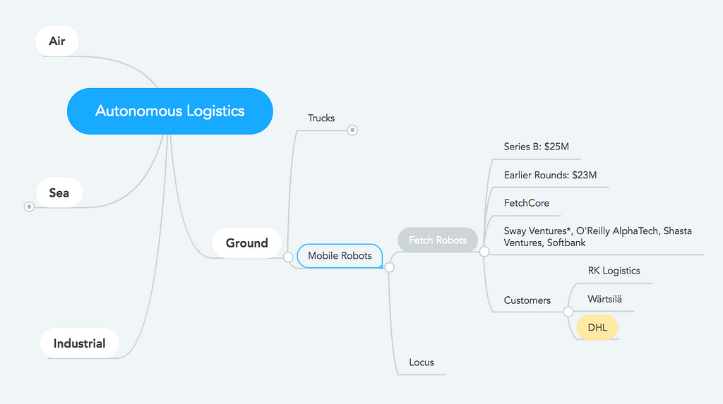
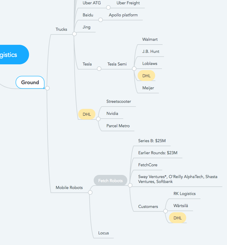
The world of logistics — the commercial activity of transporting goods to customers — where a ‘customer’ can be at any point in a global supply chain — is undergoing enormous change. There are many factors involved, but the two major forces at work are these:
The continuing rise of e-commerce is leading to logistics firms, like Fedex, UPS, and DHL — and that new kid on the block, Amazon — gearing up their operations to meet that exploding demand. (The corresponding and complementary decline in physical retail sales is the other side of this coin.)
The technologies that underlie autonomy — like LiDAR sensors, autonomous warehouse robotic systems, and the just-emerging capabilities of autonomous trucks — are revolutionizing the world of logistics.
I will explore the world of logistics by looking at two companies: Fetch Robots, a startup making autonomous mobile robots, and DHL, the world’s largest logistics company. Those end points will shed light on the revolution going on.
Startup of the Week
This week’s startup is Fetch Robotics (fetchrobotics.com), the manufacturer of the Freight series of Autonomous Mobile Robots (AMRs), applicable to material transport and automated data collection. Fetch recently closed a Series B funding round of $25M, led by Sway Ventures with participation from existing investors O’Reilly AlphaTech Ventures, Shasta Ventures and SB Group US (‘Softbank’). Fetch Robotics’ total funding so far is $48 million.
A Fetch AMR
Underlying Fetch’s technology is the FetchCore cloud platform, positioned as an extremely fast solution to get up and running. The company says that at RK Logistics, the AMRs were up and running in a matter of days and now handle 30% to 50% of items in their facility. Fetch customers can also add or modify workflows with a few clicks without programming, and therefore they can adapt in real time to changing conditions.
In the mindmap below, I have categorized Fetch as an example of Mobile Robots, which have more in common with autonomous vehicles than they do with Stationary Robots—which are not shown here, but would be under the Industrial category. This is because their mobility requires the same technology stack as an autonomous car or truck: sensors (LiDAR, vision, etc.), mapping, collision avoidance, and so on.
Fetch Robots in the world of Autonomous Logistics
Note that DHL is a client of Fetch, as are a growing list of other companies, like RK Logistics, and Wärtsilä.
In order to understand the changes going on in logistics in general, we need to zoom in on two sorts of technological disruption that are having an enormous impact on logistics and transportation in general.
Back to the Stack
LiDAR is short for Light Radar, and is a critical technology in the autonomy stack. It’s a remote sensing method that uses pulsed lasers to measure distance, and is key to autonomy. These are like human eyes, that autonomous vehicles use to ‘see’ their surroundings, and from that calculate things like the trajectories of nearby objects and locations of stationary objects like trees next to a roadway or shelves in a warehouse. LiDAR sensors are often located on the roofs of cars, as multi-beam spinning devices, and from their signals and AI-analysis of them, the vehicles create a 3D map of their surroundings.
LiDAR, along with the enormous innovations in AI, are setting the context for a complete overhaul of logistics. As AI is being wed with conventional vehicles, we need to understand the levels of autonomy available today, and how far away we are from driverless trains, airplanes, and ships —>that carry goods great distances —> that are unloaded by robots and placed into autonomous trucks —>and driven to autonomous stores, —> or directly to our homes and workplaces. There’s a ways to go before we see that utopian reality.
Levels of Autonomy
In the world of autonomous vehicles a semi-standard model for levels of autonomy has emerged:
Level 0: No automation — Also thought of as ‘hands on’. totally steered and monitored by people, with no other options. Basically, your grandma in a 1968 VW Beetle.
Level 1: Driver assistance required — Think ‘adaptive cruise control’: when you come up on a slow driver in the left lane when adaptive cruise control is engaged, your car will slow down without your involvement. Likewise, ‘lane keeping assistance’ that guides you back into the lane when you drift out of it. But you have to remain completely focused on the car, and remain in control of the vehicle.
Level 2: Partial automation — Systems at this level will manage speed and steering under specific, limited conditions. They can match speed to cars around you, and follow the curve of the road in good conditions. But you must remain vigilant and prepared to take back full control if the system can’t deal with the situation. This is the level found in Tesla Autopilot, Cadillac Suprecruise, Mercedes Benz Drive Pilot and others.
Level 3: Conditional Automation — Audi has released the new A8, stating it is the first Level 3 automated vehicle available. The A8 can control your car in a traffic jam, by actively monitoring the situation, but once traffic gets back to over 37 mph, the driver would have to regain direct control of the car. This is the scariest sort of autonomy, because it requires a non-involved passenger possibly becoming the driver again.
Level 4: High Automation — These vehicles basically drive themselves except in rare conditions, such as extreme wether situations, or contexts that are completely unexpected. While these vehicles still have steering wheels and pedals, these controls may not be used frequently by human drivers.
Level 5: Full automation — These are fully driverless vehicles that can drive anywhere, anytime. For example, a car coming to pick you up at work after driving from your home, and where you get in the back seat and sleep all the way home.
At present, there are a few level 3 vehicles available, but no level 4 or 5 vehicles, despite marketing hype.
However, to make a serious impact in logistics, there are several intermediate stages that represent stepping stones towards full autonomy, and which could have significant benefits for all involved.
For example, platooning of trucks on highways is already available, where small groups of trucks can form ‘pelotons’ — so that only the foremost driver would be controlling the platoon while other drivers could rest or at least take their hands off the wheel and eyes off the road (the company Peloton is pioneering this approach). This does not line up exactly with the five levels of automation, but is rather a specialized variant of level 1.
Level 4 trucks that can operate autonomously just in the context of highway driving represent a major breakthrough, since they would only require human operators to drive the trucks to and from the highway on surface streets, or directly from distribution sites located immediately adjacent to highways. We can expect this specialized variant of level 4 autonomy before all others.
My recent education into the present and future of autonomous logistics was deepened by a recent event sponsored by DHL, the international logistics leader, where they shared their plans in the market. The following mindmap shows DHL as both a user of autonomous technologies as well as developing their own solutions, like the recently announced Streetscooter, which I describe in more detail, below.
The Logistics World of DHL
I attended DHL’s press event announcing a new product offering, Parcel Metro, which is an integrated effort by DHL eCommerce to orchestrate an offering based on the surge in e-commerce shipping. Parcel Metro is a DHL service offered in major US cities — currently Chicago and New York City, with other cities to come — that enables same day (Metro Same Day) and next day (Metro Next Day) delivery experience. DHL is also planning to offer an immediate delivery service — Metro Now — in the near future.
The interesting thing about this announcement is that DHL will not be providing the delivery fleet: they will be using other companies — local delivery services and other logistics firms — but will be basically offering their logistics system as a platform for e-commerce or retail organizations to leverage. When I asked if they would ever act as the delivery partner — since the company does deliver packages in the US that are shipped internationally — I was told that DHL is not getting back into US deliveries of domestic goods, after shutting down domestic operations in 2008.
However, DHL is expanding in a number of ways, reflecting its ambitions in a rapidly shifting world.
DHL has an enormous logistics supply chain, relying on hundreds of vendors. They’ve ordered 10 or more Tesla Semis, and are using autonomous warehouse bots from Fetch Robots and Fetch competitor Locus. In time, we can anticipate that every element of their systems will be as automated as possible. At the event, they demonstrated modern robot arms that can pack boxes using techniques that were unavailable until recently, as well as advanced techniques for AMRs to optimally collect packages in distribution sites.
But DHL is also becoming a manufacturer of vehicles: the company has developed and deployed its new Streetscooter vehicles, a modern urban delivery vehicle, designed to be more energy efficient and sustainable. Today’s offerings run on hydrogen fuel cells, and will be transitioning to electric drives in the near term. And the company is partnering with others — like chipmaker Nvidia, to create a world-class autonomous version of Streetscooter as soon as is practical.
prototype all-electric Streetscooter (wikipedia)
DHL is demonstrating that even the most well-positioned and largest logistics companies must actively take on the challenges of autonomous logistics if they are to avoid becoming obsolete in this new era. And they have accepted the challenge and are pushing ahead, as Package Metro and Streetscooter show.
(Want to stay on top of the latest emerging technologies for the enterprise? Join the Traction Tech Council, and stay one step ahead of your competitors).
Recently, I participated in a CBC Radio “On The Coast” dialogue with CBC’s Michelle Eliot. Karen Reid Sidhu, Executive Director of the Surrey Crime Prevention Society, joined me in addressing motor vehicle speeds, and the question of why convenience is sometimes viewed as more important than reducing crashes, injury and death on our roads.
There are some organizations promoting the idea that vehicular speed has no impact on safe road use. For example, Sense BC ran a campaign against photo radar in British Columbia, which was implemented on highways in the 1990s to save lives. The program was disbanded, and as we reported in late 2016 deaths and injuries of vulnerable road users have increased in this province over much of the past decade.
Dr. Perry Kendall, recently retired as BC’s Provincial Medical Health Officer, has detailed the 280 annual deaths and injuries from vehicular crashes in his report Where the Rubber Meets the Road.
Meanwhile, Sense BC is running a campaign today odiously entitled, “Speed Kills…Your Pocketbook.”
It’s people like Rod King MBE (that’s Member of the British Empire) who are focusing on saving lives by advocating for speed reduction in municipalities in the United Kingdom. King recently spoke to the Scottish Parliament in support of a bill proposed to lower speed limits to 20 miles per hour (equivalent to 30 km/h) in cities, towns and villages. That’s down from the current 30 miles per hour (50 km/h). It is being considered seriously.
In London and several counties across the UK, slowing speeds has resulted in twenty per cent fewer people dying, and many more avoiding serious injury. As King observes:
If we want consideration for the amenity and safety of residents and communities to be a national norm, then at some stage we have to enter a national debate about the quality of our streets and whether we have rules built around optimising the speed of vehicles, or about the liveability of people. We need to end our thinking about 30mph from our warm, protected, comfortable windscreen view of the street, and consider it from the height of an 8-year-old on the pavement, or with the mobility of an 80-year-old trying to cross the high street to a shop.
And here’s why:
From an emissions standpoint, a vehicle going 50 km/h requires 2.25 times the energy to sustain a speed 50 km per hour, compared to 30 km/h. A speed reduction to 30 km/h reduces diesel NOx and PM10 pollution by 8 per cent.
The stopping distance required for a vehicle at 50 km/h is nearly double that of a vehicle at 30 km/h. A speed reduction to 30 km/h doubles the available reaction time for everyone involved, increasing the likelihood of avoiding a crash.
The force of a collision involving a vehicle driving 50 km/h is 2.25 times that of a collision at 30 km/h; 80 per cent of pedestrians will die in a 50 km/h impact. At 30 km/h, 85 per cent of pedestrians will survive an impact.
The World Health Organization and the European Union Transport & Tourism Committee both state that 30 km/h is best practice for road speed unless there are separated cycling and pedestrian facilities. Other organizations, like the International Road Assessment Program, and the Global Network for Road Safety Legislators, also recommend 30 km/h speed limits.
The International Transport Forum of the OECD (Organization of Economic Co-operation and Development) states: “Where motorised vehicles and vulnerable road users share the same space, such as in residential areas, 30 km/h is the recommended maximum.”
In the Netherlands 70 per cent of urban roads have a 30 km/h speed limit or lower. In Scandanavia, 30 km/h is the usual posted speed in towns and villages. In fact, throughout Europe, 30 km/h is increasingly being set as the standard, with the exception of arterial roads with segregated cycling facilities.
Slowing vehicles in municipalities not only about saves lives; it also allows the reimagining of schools, shops and services as places to walk or bike to, or simply to feel safer to congregate and recreate in, as eloquently expressed in an opinion piece in the Edmonton Journal last year by Anna Ho of Paths for People. Earlier this year this Globe and Mail editorial simply stated that Toronto vehicular traffic needs to slow, and that in order to reduce road deaths a huge cultural change must occur regarding ‘the need for speed’.
Slower speed limits challenges us to rethink our municipal fabric, and how it can serve people, and isolate the motor vehicle as an adjunct to, not a replacement for, social space.
It is a concept that is finally coming to fruition elsewhere in the world, and it’s time Canadian municipalities responded.
As one commenter recently noted, we do seem to be giving Vancouver House (“Our Looming Tower“) a lot of love.
Perhaps because it’s so photogenic, as seen this last weekend.
But this is not the falling tower that is today’s subject.
While it’s likely that Vancouver House will be the iconic tower design of this architectural period, there’s another tower on the other side of the downtown peninsula that, because of its height and visibility, was also representative of its era — the 1960s.
The Landmark Hotel on Robson Street, however, is coming down.
Just as Vancouver House reaches its full height, strapping is being fixed to the Landmark for the automated drilling machines which will, over the next year or so, remove this true Vancouver landmark from the skyline.


 One small corner of the massive church
 Some of what comes in the Gloomhaven box. This isn’t even all of it.




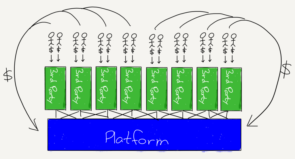
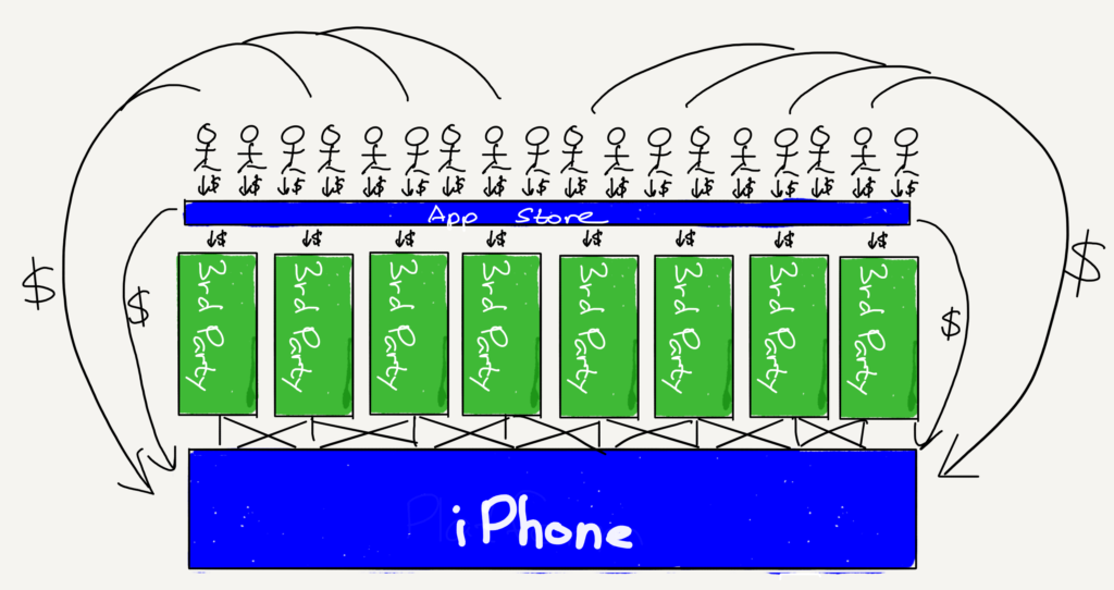


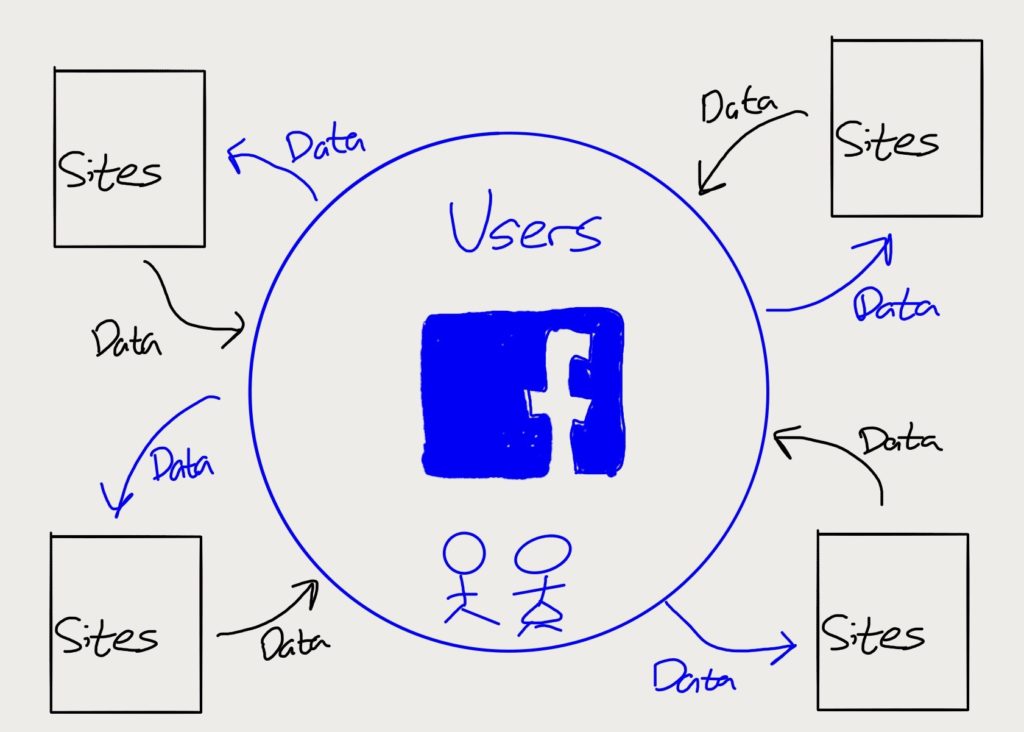












 Gotta hear this