Shared posts

30 Sep 05:53

OmniFocus 3 for Mac: Multiple Tags, Enhanced Forecast, Powerful Perspectives

by Rosemary Orchard

Your mind is for having ideas, not holding them.
– David Allen (Getting Things Done)

I, like probably many of you, struggle to remember essential things. I can remember that the fire alarm went off last Tuesday at 11:07 AM, but essential things like what I need to finish for the next episode of Automators don't seem to stick in my head. Thankfully, I'm not alone! Many of us are on a constant quest, looking for the perfect task management system. Everyone has different requirements, and even if we did all use the same system, we'd use it differently.

Finding the perfect task management system can feel like a hunt for the mythical pot of gold at the end of the rainbow – everyone has a different idea of how to get there, and lots of ideas for using the gold, but a solid plan and utilisation of the system at hand is missing. No task manager can or will work for everyone, nor should it, but one thing we are not short on in today's world is choice. It can be mind-bogglingly overwhelming trying to choose a system, and once you've made it that far, you then have to decide how to use your system. But the simple fact that we have choices is good news – everyone can choose which app to use, how to use it, and even when to use it.

I was once disorganised, continually missing deadlines, and had no idea what was going on. Thankfully after reading what felt like everything available on the Internet on the subject, I found out how to manage tasks well, and more importantly, I found what I needed to know to become organised. One task manager constantly kept cropping up as the recommended solution, and so after that long ago free trial I purchased OmniFocus 2 – and started to get to grips with it. I've adjusted my setup many times over the years – I started using OmniFocus when I was a teaching assistant living in Germany, and I used it when I went back and finished my degree, while I was a teacher, and now I use it as a programmer and a writer/podcaster. My setup and usage has evolved over the years to better work with my changing life and needs, like any good task management system should.

I share all this as introduction for the news that OmniFocus 3 for Mac has arrived, and with many new features. OmniFocus was the first task management system I found that really suited my needs, with all the power and flexibility I wanted, and the latest version has been put through its paces quite thoroughly by myself and other beta testers to make sure it lives up to the reputation OmniFocus has gained over the years. In terms of what's new, in version 3 we now have multiple tags instead of a single context, extra powerful perspectives, customisable repeats, and a new look to polish the whole application off.

Appearance

Sidebar

The first thing you'll see when looking at OmniFocus 3 is the new sidebar – in the light mode in particular, it serves as a point of contrast with its dark background, which allows you to focus your attention where it matters: on your tasks.

On the far left you have a series of icons which can take you to your inbox, projects list, tags, the Forecast view, flagged tasks, and projects available for review, followed by custom perspectives you have starred – these are limited to OmniFocus 3 Pro users. The next area is the heart of the sidebar; depending on the area of OmniFocus you're in, what's shown in the sidebar will vary – for example, quite logically in the projects view you'll see a list of your projects, and in the tags view, you'll see all of your tags. These include any custom hierarchy you have set up, which is very useful. Perspectives will list tags or projects in this area of the sidebar too, depending on how you have set up your group by options. In the Forecast view you'll find a calendar view of the next month, where clicking each day will take you to the view for that day.

The sidebar in the tags view in OmniFocus 3.

The sidebar in the tags view in OmniFocus 3.

Column View

A custom column view showing the task name, project, tags, defer and due dates, estimated time, notes, and flags.

A custom column view showing the task name, project, tags, defer and due dates, estimated time, notes, and flags.

OmniFocus 3 uses the column view by default now, making it even easier to scan your tasks or the tags associated with them quickly. You can enable columns to show you the project, tags, defer date, due date, estimated duration, completion date, the note button, and the flag button. This means if you want all pertinent information on one screen, you can have exactly that; you are able to choose which view and which columns you want to see in each of your custom perspectives as well, if that's what you want. This is very powerful when combined with the power of the new perspectives to give you precisely the information you need, and nothing more.

The same tasks above, shown in fluid view.

The same tasks above, shown in fluid view.

The fluid view is still an option, and it has been updated to let you see multiple tags, each represented in a tag bubble. This look is very familiar to users with the iOS version of OmniFocus, and is my favourite view for very narrow windows as I can still see a lot of information at once – each row does take more vertical space though, which can be at a premium on our displays.

Themes

The projects view in OmniFocus for Mac in light and dark mode.

The projects view in OmniFocus for Mac in light and dark mode.

There are just two themes available now in OmniFocus 3, as the Omni Group is focusing on using the system colours which can be selected in macOS Mojave. The two themes included are light and dark, but for each of these themes you can choose to use colour to highlight the titles of tasks which are either due soon, overdue, or the first available in a project.

Due soon actions are highlighted in yellow, overdue in red, and the first available task is highlighted in purple. Flagged is highlighted in any view with an orange checkmark circle and an orange flag in the flagged column in the column view. This changes the colour of the task name and can help you to prioritise actions without really thinking about it. If you turn this option off you still retain the coloured checkmark circles, then there is no indication which task is the first available in a project. Single action lists will highlight all available tasks as the first available because there is no priority in a checklist.
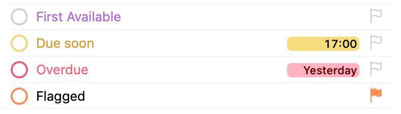
Using colour in light mode.

Using colour in light mode.

While the light and the dark themes are created to blend in with the light and the dark system options in Mojave, you set the theme independently of the setting for the OS, which means you can still have a black menu bar and dock with a light OmniFocus if that's what you like.

Tags

Places tags in the sidebar.

Places tags in the sidebar.

In OmniFocus 2 a task could have one context and no more, but in OmniFocus 3 a task may have as many tags as you like, giving you even more ways to slice and dice your tasks at crunch time. I've seen several people trialing energy levels as a tag group, and the Eisenhower Matrix is another example that could be created in several ways. Every tag has the same options as a context did: it can be Active, On Hold, or Dropped. Using tags with an 'On Hold' status is especially helpful for temporary tags to corral your system, for example in crisis times (a tag called "After X"), or just handling the lead up to a vacation.

Tags can also be inherited from a project – when creating a new task within a project, it will inherit those tags. This adds more power compared to OmniFocus 2 because you can add these tags to each task instead of replacing the single context.

I have found many advantages in using tags rather than contexts. Firstly I moved most of my old contexts under a 'Places' tag, and I added a 'People' tag too. I can now tag tasks I want to complete at the Hardware Store with my boyfriend, so if I happen to be at the hardware store by myself I can see that I wanted my boyfriend there when buying a new shower screen.

The people tag also comes in handy in combination with a Waiting On tag. For example if I am waiting on Federico to send me more cute dog pictures before I can move on with my project I can tag the task with both 'Ticci' and 'Waiting On' – so when reviewing either list the task shows up.

Energy level and time of day tags.

Energy level and time of day tags.

I did briefly experiment with trying to recreate the urgency/importance matrix popularised by Eisenhower, however I see urgent tasks in my Forecast view, and important tasks in my flagged view so this felt like it was creating more work to manage the tags associated with the tasks than strictly necessary – therefore my conclusion is that at least for me I'm best off not using too many tags, otherwise I may increase the work required to maintain my system. However the energy level tags and time of day tags I have also experimented have actually helped me to complete more tasks.

A tip I learnt in the OmniFocus forum has also been to add emoji to my tags – this gives me an easy visual indicator of what the tag is related to, and means in the custom perspectives I can also use the search terms to find all items with a 🛒 – which means it has any supermarket tag, general or one for a specific store.

Toolbar

The default toolbar in OmniFocus 3.

The default toolbar in OmniFocus 3.

OmniFocus 3 uses a different toolbar style which was introduced in Yosemite and is used in Photos, Notes, Calendar, and Safari. The toolbar is smaller and less intrusive – buttons are all in line with the close/fullscreen/minimise icons which gives you more screen real estate for your tasks. You can still add perspectives to the toolbar (this was briefly removed during the beta in case you have seen a mention of that), and the default set has been slimmed down which I believe will make the application more accessible to new users. It's easy to customise the toolbar too, so if you don't want a search option in the middle, you can easily use the spacing or buttons to put it on one side.

Inspector

Tags in the inspector view.

Tags in the inspector view.

The inspector has also been updated to a more modern look, though you could be forgiven for missing the changes as they're so subtle. The status of a task, active or complete, has switched from dropdown to a segmented control – two buttons next to each other which function like radio buttons, and you may only choose one. The Flag button is to the side of this, just like it was before. The project field has increased in size, which is handy for those of us with longer project names, and the first significant change you see is the tags field. In OmniFocus 2 this was a dropdown because one task had one (or no) context. In OmniFocus 3 a task can have an unlimited number of tags, so the field has increased in size and changed to be a token field. Every tag you have applied to a task or project is shown, with the ability to add more. The dates and notes sections have remained virtually unchanged too, and date fields, including estimated time, can still handle parsing of "fuzzy dates", like "3 PM Tuesday".

Forecast View

Forecast view with interwoven events.

Forecast view with interwoven events.

Events and Tasks

The Forecast view now shows events from your calendar mixed in with the tasks due on the same day. This gives you a way to tell, with a single glance, how busy or flexible your day is going to be. You still see tasks deferred to Today too, prompting you about those tasks which are now available to be completed.

Forecast Tag

You can also add a tag to the Forecast view. Throughout the iOS and Mac beta I've seen this used in many different ways, and because you can choose on each of your devices which tag your forecast tag is, you can use it however it suits you too. One way to use it is to create a Today tag which would be for tasks you intend to do today, but don't want an actual due date attached to. I found I was being too optimistic with the items I wanted to do today, so renamed this tag to 'Next'. You can set different Forecast tags on each device, so you could use 'Errands' on your iPhone, 'Work MacBook' on your work machine, and 'Home' on your home device if you wanted too.

Showing the Forecast Tag.

Showing the Forecast Tag.

Perspectives

Perspectives are now even more potent than they were in OmniFocus 2, though this shouldn't scare anyone off as you can easily migrate all of your OmniFocus 2 perspectives. Just like in version 2, you can have a massive number of perspectives should you wish, and on each device in the perspectives window you star the ones you would like to see in the sidebar. Alternately, you can also choose to add them to the toolbar.

An example Today perspective in OmniFocus.

An example Today perspective in OmniFocus.

Custom Rules

You can now set up an unlimited number of rules, and combine all of these with and, or, and none. If you've ever used Hazel or iTunes Smart Playlists, this system will be familiar to you. At the very top you can set any, all, or none to be the top level rule which everything below falls inside of. Then within this, you could add as many additional rules as you need. By pressing the option key you can add rule groups – again with the same operators and all the same options.

Perspective filter rules showing nesting.

Perspective filter rules showing nesting.

There are lots of choices for rules, including the availability of a task, its status, it having a due or defer date, estimated duration, or an estimated duration less than 5, 15, 30, or 60 minutes. There are lots of tag options available too, from untagged, to tagged with any or all of, or the task having a tag which is active, on hold, or dropped. Projects are also an option for filtering, and you can specify that you're looking for tasks in the inbox, in a specific project or folder, or by the status of a project, including completed or dropped projects. Finally, you can also build perspectives based around search terms.

Icons & Tints

Tints and icons in OmniFocus 3 Custom Perspectives.

Tints and icons in OmniFocus 3 Custom Perspectives.

In addition to all of those rules and view options for custom perspectives, the Omni Group has more than doubled the number of icons available to choose from for these perspectives, jumping from 30 to now 74 built-in options. In addition to that, there are also 24 colours to choose from, which changes not just the colour of the icon representing the perspective, but also the title of the perspective in OmniFocus. If you combine these, then you now have 1,776 different options to represent your perspectives. While it's unlikely you will ever run out, there are a variety of custom icon sets out there that you can download too1.

Presentation Options

The view options have also been enhanced to match the custom perspectives in OmniFocus 3. It is now broken down into 3 levels, 'Group and sort by', 'Group by' and 'Sort by'. This gives you fairly fine grained control over how the tasks are sorted in your perspective.

You can group and sort by two options: Entire Projects or Individual actions. This then trickles down into the 'Group By' and 'Sort By' options.

Showing the project view options in a custom perspective.

Showing the project view options in a custom perspective.

Many of the same options are available whether you sort by individual action or by project, allowing you to view all of your tasks in almost any way possible – such as grouped by project name and sorted by due date. There's also a sorting and grouping option available within 'Individual Actions': the ability to sort by combined tags which means you can see all of the unique combinations of your tags with the tasks grouped appropriately underneath them. Depending on the number of tags you use per task this list may contain lots of combinations. You could also group by Tags which does not create these combinations – but if you use more than one tag per task then the task may appear twice in your perspective, depending on your filters.

The settings for a perspective with combined tags.

The settings for a perspective with combined tags.

How the perspective looks with these settings.

How the perspective looks with these settings.

Custom Repeats

Some tasks repeat at what to us humans are regular intervals – the second Monday of the month, for example – but for computers these intervals don't necessarily make sense. With this update to OmniFocus, however, the app can now understand those types of dates. You can now specify the 1st-5th or "last" in combination with any specific day of the week, or a weekday or weekend day, so you can finally schedule tidying up the shed for the last weekend of the month every month.

There's also an option to repeat tasks on specific days in the month – the 13th and the 31st. Finally, you can choose to repeat tasks on the last day of the month, which I know many users will enjoy.

Touch Bar Support

The Touch Bar in OmniFocus 3 for Mac.

The Touch Bar in OmniFocus 3 for Mac.

OmniFocus 3 adds support for the Touch Bar on compatible MacBook Pros. The options available include adding a new task – either in the current location or to the inbox – adding a new project, adding a tag, notes, review, and cleanup. For fans of the Touch Bar, this is a great addition.

Pro Features

Just like OmniFocus 2 for Mac, and OmniFocus 3 for iOS, OmniFocus 3 for the Mac has a standard and a Pro version available. The Pro version includes several excellent features:

Forecast Tag

The designated tag that can appear below your events and tasks due today in the Forecast view is a premium feature. This tag is definitely helpful to power users who might even want to designate different tags on each device, which is supported by OmniFocus 3.

Focus

Focus mode is great, enabling you to choose several tags or projects either in the tag or project view, or in a perspective, and when you press the focus button, everything else is hidden. This is perfect for focused work sessions or for those of us who get easily distracted by other, simpler tasks and avoid the hard stuff. For me, the "killer" part of this is that you can switch between views, such as perspectives, and your focus is preserved.

Task View

With the default view being columns, changing which columns you see to provide you with more information, or switching to the more iOS-like fluid view, is also a pro feature.

Custom Perspectives

Some perspectives come built into OmniFocus, including Flagged, Completed, and Changed. To create your own, you need to get the Pro version of OmniFocus which will then allow you to create as many simple or complex custom perspectives as you like.

Scripting

AppleScript and JavaScript for automation remain a pro feature in OmniFocus; these allow you to do anything from add tasks based on a file being found by Hazel, to rescheduling all your tasks in one sweep.

Still to Come

The following list of features isn't here yet in 3.0, but the Omni Group has confirmed they are in the works.

Notifications

Multiple notification options for each task, a feature that made a splash on iOS, isn't yet here on the Mac. The Omni Group is taking advantage of Mojave's new notification system and rewriting their implementation. Sadly this means we don't yet have multiple notifications, but the Omni Group is hoping to ship them in an early feature update.

Light Sidebar

The new light mode with a dark sidebar is a bold look, and while many users have warmed to it over the beta testing period, Omni agree that a light sidebar makes sense – we'll be seeing that in the 3.1 update.

Collaboration

Sharing tasks is coming, just not yet. When the feature does arrive, it will come in the form of linked tasks rather than exact copies that get synced 100% between users. This will mean if anyone shares a task with me, I can put it in whatever project I like, with the tags I need, and the person who shared will get updated when I complete the task.

OmniJS

OmniJS is Omni's JavaScript to automate their apps. It's already been built into OmniGraffle and OmniOutliner2 and is on the roadmap for OmniFocus this year. Automation nerds like me are drooling over the possibilities, but we'll have to wait a little while longer.

Web Version

While not part of the Mac application, the web version has been frequently requested and is also on the roadmap for this year. It's in early beta testing right now and should launch in the not-too-distant future.

OmniFocus 3.1 for iOS

The Omni Group also released OmniFocus 3.1 for iOS this past week, and as you might guess, the release focused on Siri Shortcuts integration.

Shortcuts on iOS

On iOS you have many more options when it comes to Shortcuts. Adding to the options built into the Shortcuts app (add an item to OmniFocus, and add TaskPaper to OmniFocus), which were also built into Workflow, OmniFocus now donates many actions to Siri. Once you've visited the OmniFocus app it will tell Siri about tags you use, projects you visit, perspectives you view, and these are all then available as shortcuts for you to use.

Siri Shortcuts in OmniFocus 3.1 for iOS.

Siri Shortcuts in OmniFocus 3.1 for iOS.

You can take advantage of these either as standalone actions or inside the Shortcuts app. In the settings area of OmniFocus, under the heading 'Siri', you'll find the 'Shortcuts' menu entry. This also means you will find these items suggested to you on your lock screen, in Search, and in Settings ⇾ Siri & Search when iOS thinks they will be most appropriate to you.

Advanced Perspectives Enhancement

When OmniFocus 3 for iOS released it got the same perspectives as detailed in this article for the Mac. This week it was updated to allow you to change the overall rule for a perspective, so you can create a perspective that starts with Any or None as the overarching rule – as well as All, which is the default.

An example iOS perspective with 'Any' as the primary rule.

An example iOS perspective with 'Any' as the primary rule.

Conclusion

OmniFocus has been my preferred tool for task management for over three years now, and this new version has brought changes wanted by many, while still retaining the look and feel that has captured the hearts of those who already use it. The features many power users crave have increased in strength and flexibility, but are designed in a way so as not to be off-putting to new users or to those who desire a simpler setup.

Since the beginning of the iOS beta I have seen what tags vs. contexts have allowed people to do, and used them to enhance my own setup by adding tags for morning, afternoon, and evening to many tasks. The custom perspectives are extremely compelling, and when combined with tags give users the fine grained control we long for.

For as long as I've been an OmniFocus user, my use of the app has evolved and changed for the better. This release represents a substantial upgrade that has brought more control to my system and will keep me, and many others, committed OmniFocus users far into the future.

OmniFocus 3 for Mac is available from today and is fully compatible with High Sierra and Mojave. OmniFocus 3.1 for iOS was released last Monday and works beautifully on iOS 12 with Siri shortcuts. I look forward to seeing what future updates bring, and the final version of OmniFocus for Web.


  1. Josh Hughes updated his icon set for OmniFocus 3, and the beautiful set from Icons and Coffee works wonderfully too. ↩︎
  2. For more details see the Omni Automation site. ↩︎

Support MacStories Directly

Club MacStories offers exclusive access to extra MacStories content, delivered every week; it's also a way to support us directly.

Club MacStories will help you discover the best apps for your devices and get the most out of your iPhone, iPad, and Mac. Plus, it's made in Italy.

Join Now
30 Sep 05:53

Apple Completes Acquisition of Shazam

by John Voorhees

Late last year, Apple announced that it had agreed to purchase Shazam, the music-discovery service. The acquisition was held up for a time by an investigation by the European Commission, which ultimately said the deal is not anti-competitive and could go forward. Today Apple announced that the deal had been completed.

In a press release, Apple said:

Shazam has been downloaded over 1 billion times around the world, and users identify songs using the Shazam app over 20 million times each day. With pioneering innovation in music identification, Shazam helps people discover, interact with and share video, audio or printed content across devices and mediums — and allows music fans to follow their favorite artists and share in the thrill of discovery.

Apple also announced that Shazam would soon be offered ad-free to all users.

→ Source: apple.com

30 Sep 05:53

The latest episode of The Omni Show is ostensib...

The latest episode of The Omni Show is ostensibly about launch day — but mostly it’s a discussion of the new design in OmniFocus 3 for Mac. How it started, how it evolved, how it ended up.

It’s of obvious interest to OmniFocus users, but I think the discussion is also interesting to anybody who cares about app design.

(I think it’s one of the best episodes, by far.)

30 Sep 05:53

Waze Adds CarPlay Support

by John Voorhees

Today, Waze, which is owned by Google, updated its iOS app with CarPlay support, which Google Maps received last week. I took Waze out for a few errands over lunch and in my limited testing was impressed.

Waze immediately identified nearby stoplight cameras.

Waze immediately identified nearby stoplight cameras.

The first stop was the bank to pick up some cash. As I passed through a busy intersection, Waze warned me that there were stoplight cameras ahead, which I knew about, but it was good to see Waze did too.

I'm glad I missed that sheet of plywood in the road.

I'm glad I missed that sheet of plywood in the road.

Next, it was off for some steak tacos to celebrate finally finishing my Mojave review. On the way, Waze said there was an object in the road. Sure enough, there was a piece of plywood straddling two lanes not too far ahead. Waze also alerted me to heavy traffic just ahead of my turnoff.

Waze alerted me to local road work.

Waze alerted me to local road work.

With each alert, the CarPlay UI displayed a notification with two choices: ‘Thanks!” and ‘Not there,’ with big buttons to allow me to help train the Waze database. I flipped back to Overcast, and as I approached my next turn, Waze announced it, momentarily pausing the audio, and displayed a notification that I could tap to return to the map of my route.

Tapping the Waze notification takes you back to the map view.

Tapping the Waze notification takes you back to the map view.

For people who use Waze regularly, those sorts of alerts and notifications will be familiar. Apple Maps still has the advantage of Siri integration with the hardware buttons on my steering wheel because like Google Maps, Waze can’t access Siri. That’s a shame because it’s easier to press a dedicated steering wheel button than it is to poke at a CarPlay screen in the center of your dashboard to do a voice search, but from a parked position in a bank parking lot the voice command I gave it was recognized immediately and I was on my way to the correct location.

I’ve only used Waze for this one trip, but my first impression was that the app is solid and should be well-received by its users. Especially for commuters that want traffic and other real-time, crowd-sourced data, Waze is a great option.

Waze is available as a free download on the App Store.


Support MacStories Directly

Club MacStories offers exclusive access to extra MacStories content, delivered every week; it's also a way to support us directly.

Club MacStories will help you discover the best apps for your devices and get the most out of your iPhone, iPad, and Mac. Plus, it's made in Italy.

Join Now
30 Sep 05:52

Consent management at Mozfest 2018

updated 18 Oct 2018: add dates and locations, reorder.

Good news. It looks like we're having a consent management mini-conference as part of Mozfest next month. (I'm one of the organizers for the Global Consent Manager session, and plan to attend the others.)

☑ I blindly accept… (T&Cs)

Audience are engaged with an activity where they’re given clauses from a curated list of clauses from real T&Cs and they express whether it should have been mentioned outright or not. We have a discussion about digital privacy and ways to curb exploitation. Visitors try out our browser plug-in that filters out most important clauses from any T&C.

Space 908, all day both days.

MOZFEST - DESIGN CONSENT FROM THE GROUND UP

This workshop offers an holistic space to create digital tools and environments in which consent underlies all aspects, from the way they are developed, to how data is stored and accessed, and to the way interactions happen between users. Prototyping consent into our tools will make them more fair and unbiased. Using a specific designed prototyping loop, teams quickly hypothesize, develop, test and assess ideas consentful data prototypes.

Oct 27th 4:30 PM - 5:30 PM. Space 903.

Cookie consent, a privacy vs user experience nightmare

This session aims to create a working group for improving the user experience of cookie consent popups. In Europe, the use of cookies was first regulated by the Privacy and Electronic Communications Directive 2002/58/EC, then revised by a 2009 amendment, and more recently by the GDPR. Cookie popups and the mechanism for providing consent can be tedious. Browsing the same website from different devices results in consent being asked again. A bad usability can lead users to give their consent without the necessary attention. In this session we will discuss the state of things and look at possible solutions. We will target a multidisciplinary audience of internet users, usability experts, browser developers, lawyers, and online advertisement professionals.

Oct. 28 11AM - 12:30PM. Space 902.

Global Consent Manager: improving user privacy and the consent experience for trusted web sites

We will discuss how consent management on the web works today, and the relationship between user privacy and reputable content providers. Web users face a confusing array of data sharing choices, and click fatigue can lead to poor user experience and possible inadvertent selection of options that do not match the user’s privacy norms.

Oct 28th 4:30PM - 5:30PM. Space 903.

30 Sep 05:52

Designing nesting thresholds

by Chris Corrigan

All facilitation work happens within containers and those containers are separated from the rest of the world by thresholds.  When you enter a meeting, you are removing yourself from the world and entering into a space where specific work is being done.  It’s no exaggeration to say that this is almost a ritual experience, especially if the work you are doing involves creating intangible outcomes such as team building, good relations, conflict resolution or community.  

Good participatory meetings have the characteristics of the Four Fold Practice within them: people are present and hosted with good process.  They participate and co-create.  In order to do this, participants need to make a conscious step over a threshold into the container.

Thresholds are as old as humanity.  The boundary between in and out is ancient. Being welcomed into a home, a family, a structure or a group comes with ritual behaviours to let you know that you have left one world behind and entered into another.

In meetings, these thresholds are multiple and nested.  My friend Christie Diamond once said “the conversation begins long before the meeting starts, and continues long after the meeting is over.”  That has rung true for the thousands of conversations I have hosted and participated in over my life. And on reflection, I can trace a series of threshold that are crossed as we enter into and leave a conversational space.  At each step, my “yes” becomes more solid and my commitment to the work becomes more important and concrete. See if this scheme makes sense:

  1. Invitation is noticed
  2. Engage with the call, connect it to my own needs
  3. Making time and space to engage (committing my resources)
  4. Physically moving to the space
  5. Arriving in the field of work
  6. Entering the physical space
  7. BEGINNING THE WORK
  8. PARTICIPATING IN SUB-CONTAINERS WITHIN THE MEETING
  9. FINISHING THE WORK
  10. Leaving the space
  11. Exiting the field of work
  12. Returning home
  13. Reorganizing resources to support the change
  14. Re-engaging with the world
  15. Working from a changed stance

Each one of these crossings happens whether you are coming into someting as mundane as a staff meeting or something as important as attending your own wedding.  Often time facilitators pay attention only to numbers 7-9 and many times 7 and 9 are given short shrift.  

I’m curious to hear about your own experiences of crossing thresholds for important meetings.  

30 Sep 05:52

Linux. (1991 – 2018)

by Stanislav

Linux RIP

Linux. ( 19912018. )


No disrespect is intended for Stepan Mitrofanovich Gudimov (1913 – 1941), died heroically in aerial ramming maneuver… whose beautiful tomb I stole here. But IMHO a dead project of Linux’s stature deserves a tomb, even if only an imaginary and stolen one. Especially a stolen project
30 Sep 05:52

Night and Day

by Mick

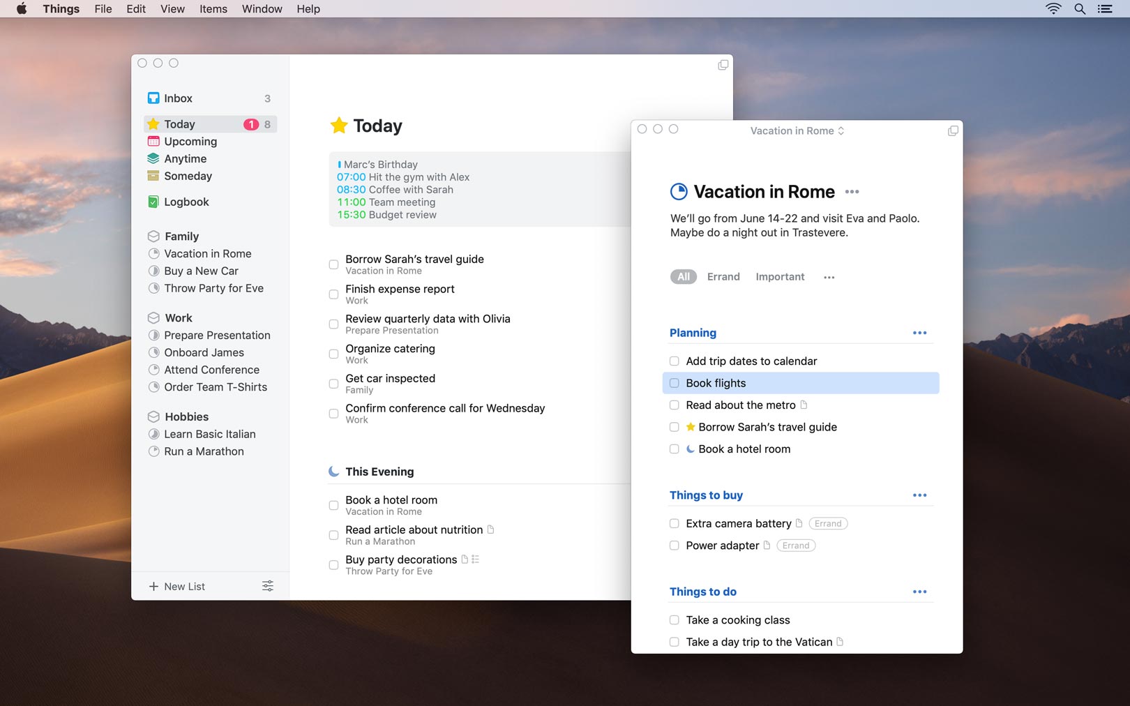
We’ve just released Things 3.7 for Mac. It has only one new feature, but the difference is night and day.

Things 3.7 on macOS Mojave in Light Mode
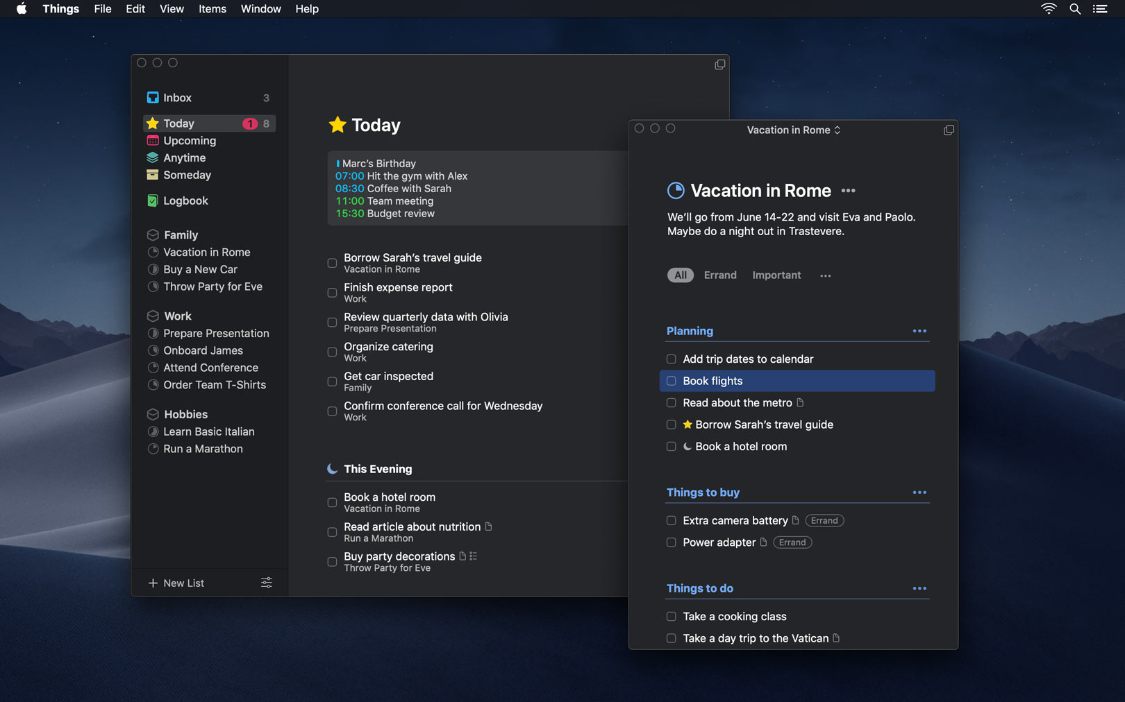
Things 3.7 on macOS Mojave in Dark Mode
Light
Dark

Things’ appearance now automatically adapts to your environment in macOS Mojave, with a finely tuned Dark Mode that looks absolutely stunning.

We love the new look so much that we’ve made it an option even when Mojave’s in Light Mode. And if you’ve got a Mac with an older OS, don’t worry – you get it, too! In Things, just go to View > Appearance to enable it.

Enjoy! 😎

30 Sep 05:52

Metal Detecting

by Richard Millington

Metal detectives trawl a patch of land, dig up anything that beeps, and then look to see if any of it was valuable.

Archeologists, however, know they’re looking for something valuable. They research where the ancient battle (probably) took place and then go looking for the arrowheads.

Too often community work is more similar to metal detecting than archeology.

Instead of beginning with a clear objective and driving exactly the activity to achieve it (archeology), we drive a lot of engagement and hope some of it was valuable (metal detecting).

If you’ve ever wondered “what is the value of my community?”, you’re metal detecting.

Sure, random engagement might influence loyalty, sales, support, satisfaction, and productivity (and you can measure this too). But why leave it to chance?

You’re far more likely to get results if you’re really clear about the results you want to begin with. If you want great case studies for the PR team, terrific feedback for engineering, more newcomers progressing beyond the trial period etc…you can ask members to do the very things likely to drive these results and measure how many members did them.

Metal detecting is for hobbyists, archeology is for professionals.

30 Sep 05:52

We’re Stuck With ‘The Last Samurai’ While Everyone Else Gets Crazy Rich

by Kaori Shoji

by Kaori Shoji

In high school, the girls around me had one wish–to have a different nationality, preferably American, and to trash our drab school uniforms for the outfits in “Beverly Hills 90210.” Being Japanese was just no fun, though it did seem better than hailing from other Asian countries. After all, this was the 1980s and the Japanese economy was gearing up to enter the bubble era. The Equal Employment Law for women kicked in. Chiaki Mukai was training to be Japan’s first woman astronaut. Takako Doi was rumored to become the future Prime Minister. Things were happening here, albeit minus the fun, sophistication and glamour we so coveted.

Little did we know that one day, Singapore and China would trump (pun intended) the US in many things regarding money, or that Asian women would come to rank among the richest in the world. These women would book first class flights on the five-starred Singapore Airlines to chill in the gaze of the Mer-Lion, and immerse themselves in gossip, shopping and spas with unlimited supplies of yuzu-scented sheet masks.

No yakuza, geisha, or Matt Damon here.

For that’s what the ladies in the movie “Crazy Rich Asians” do. On the occasions that they haul themselves off the mani-pedi bed or tear themselves away from the mahjong table, they reach for their phones to tap a few keys and murmur a few instructions, to put extra padding on their already bursting bank accounts. After that, they’re off to dinner parties where a billion orchid petals pave the paths and splendid fireworks explode in the background. Who do these people think they are, clones of Daisy Buchanan from “The Great Gatsby”?

Speaking of which, “Crazy Rich Asians” is the kind of insular, extravagant love story that would have made Scott Fitzgerald weep with envy. Director Jon M. Chu, who hails from Palo Alto and attended USC, has been working in films and TV since 2002 and this time, he literally hit the jackpot. Somehow the man knew that the world needed the sight of well-heeled Asians with perfect teeth, flinging their cash around at the same time they’re being swooningly romantic.

Chu dares to tread where no Hollywood movie about Asia ever has. There is no poverty or war. No samurai conflict. No appearance of Matt Damon (The Great Wall)  or any white saviors to save the day. No immigration issues.  Most importantly, there are no mothers crying about the sacrifices they made, to give their children a bright future in America. The mother in “Crazy Rich…” (played by a gorgeously frosty Michelle Yeoh) is the type who, when running up against a racist manager at a London hotel, calmly takes out her phone and makes arrangements to buy the hotel then and there. Minutes later she strides away, leaving the manager to get down on his knees and scrub the mud off the carpet from her son’s shoes.

When Hollywood does Asia, it goes for the jugular, like “Joy Luck Club” and “Sayuri” and “The Last Samurai.” Hollywood executives hear the word ‘Asians’ and immediately conjure an image of sweating maidens in rice paddies, or yakuza with swords in Shinjuku, or maidens and yakuza hooking up in Shinjuku, or all of the above. But in “Crazy Rich..,” Asians get to do what white people in movies have been doing for centuries. It’s about time.

In the US, “Crazy Rich Asians” was the movie sensation of the summer and it’s easy to see why. Apart from the endlessly entertaining antics of the Asian one percent “Crazy Rich…” knows how to entice an American audience. The characters have American names like Nick (Henry Golding), Eleanor (Michelle Yeoh), Rachel (Constance Wu). They speak perfect English and hold engrossing conversations about love and family. They take their entitlement completely for granted. And they’re never weird. If they are, they’re weird in ways that Americans understand. Like in one scene, a bunch of catty woman put a dead fish in a girl’s bed as a bullying tactic, and it’s straight our of  “Desperate Housewives.” Or if you want to be authentic about it, “The Godfather.”

Meanwhile, over here in the Land of the Rising Sun, people’s names are adamantly Japanese. Women are told to shut up and bear children, or shut up and work until 50 after which they must quit to care for elderly parents. Prime Minister Abe, now firmly ensconced in his third term, has promised the nation’s women that “things are going to change.” Seriously? They ain’t changing fast enough. All over Asia, Asian women are liberating themselves from tradition and antiquated family values to get a lot richer a lot faster than the Japanese ever did. Japan had its five minutes in the economic spotlight in the late 1980s but the 20-plus year recession combined with the notion of “seihin (清貧・clean poverty)” just about did us in. Evidence to that is seen in the way “Crazy Rich Asians” completely ignores Japan. China, Taiwan, Hong Kong – these places all get mentioned but Japan? Nada. True, Japan-born actress Sonoya Mizuno is in the cast but she plays a filthy rich Chinese woman. Go figure.

We’re a tad miffed, to be honest. But that really shouldn’t stop Japan from savoring every single frame of “Crazy Rich Asians.” From the sleek, precision make-up on the women to the bared torsos of the males (firm, slender and hairless – God’s gift to Asia) to the decor and wardrobe to the food and cocktails, “Crazy Rich…” is one huge, glittering monstrosity of a sweet, sweet treat. No wonder that for an increasing number of Japanese who will never be crazy rich, Singapore has come to represent the unattainable Japanese dream.

30 Sep 05:51

Jupyter Notebooks for Scheduling HESA Data Returns? If It’s Good Enough for Netflix…

by Tony Hirst

I’ve had so much of the Jupyter Kool Aid I now wonder of most computer related activities “could notebooks help with that?“.

Adopting a new technology like notebooks is not necessarily an easy thing to do, because it can transform workflows and allows, perhaps even encourages, people to do things differently. Adopting a technology that, to get the most from it, requires change means that right there you have a blocker to adoption: change has a high activation energy.

If I was going to draw a diagram (in a reproducible way), I dig start by poking around the LaTEX endiagram package to see if I could tweak the labels to something I wanted (or disable labels and add my own as an overplot).

As an end user development environment, notebooks give you web browser access to fully blown programming languages, an environment to run then in all manner of interactive widgets, and through other Jupyter warez, various means of deploying them as interactive web apps or web APIs.

Enter stage left this OU job ad for a Developer (HESA Data Futures):

HESA Data Futures is a new project being set up to deliver systems to support the move from annual retrospective returns of student data to the Higher Education Statistics Agency (HESA) to in-year continuous data submission from 2019/20. We are looking for an enthusiastic Developer to work as part of a small team to redevelop our current systems.

You will be responsible for designing, building, testing and implementing software components for the University’s HESA Data Futures system.  The University is participating in the HESA Data Futures pilots and you will be actively engaging with HESA and other institutions participating in the pilot.

You will have experience of developing and maintaining systems to a high standard using languages such as SAS, Python, SQL, XML.  The project is at an early stage and you will be encouraged to use your experience to influence the choice of software platform, programming language, database and tools.

Hmmm… The project is at an early stage and you will be encouraged to use your experience to influence the choice of software platform, programming language, database and tools.

Thinks… Netflix use notebooks across the organisation for working with data:

When thinking about the future of analytics tooling, we initially asked ourselves a few basic questions:

  • What interface will a data scientist use to communicate the results of a statistical analysis to the business?
  • How will a data engineer write code that a reliability engineer can help ensure runs every hour?
  • How will a machine learning engineer encapsulate a model iteration their colleagues can reuse?

We also wondered: is there a single tool that can support all of these scenarios?

Netflix Tech Blog: Scheduling Notebooks at Netflix.

The answer…? Yep, you guessed it….

In particular, to support reporting tasks, Netflix contributed to the papermill project. As the docs tell it, Papermill lets you:

  • parameterize notebooks
  • execute and collect metrics across the notebooks
  • summarize collections of notebooks

This opens up new opportunities for how notebooks can be used. For example:

  • Perhaps you have a financial report that you wish to run with different values on the first or last day of a month or at the beginning or end of the year, using parameters makes this task easier.
  • Do you want to run a notebook and depending on its results, choose a particular notebook to run next? You can now programmatically execute a workflow without having to copy and paste from notebook to notebook manually.
  • Do you have plots and visualizations spread across 10 or more notebooks? Now you can choose which plots to programmatically display a summary collection in a notebook to share with others.

The list of papermill committers includes at least one person with a Netflix affiliation, and I only checked two…

See also the Scheduling Notebooks post for more detail of how papermill is used at Netflix.

Perhaps not surprisingly, the way in to the Jupyter ecosystem for Netflix was data analysts using them, but now they provide a unifying interface across all areas of the organisation (Beyond Interactive: Notebook Innovation at Netflix):

Data Scientist: run an experiment with different coefficients and summarize the results

Data Engineer: execute a collection of data quality audits as part of the deployment process

Data Analyst: share prepared queries and visualizations to enable a stakeholder to explore more deeply than Tableau allows

Software Engineer: email the results of a troubleshooting script each time there’s a failure

As for the coding requirements? 1) “everyone should learn to code” ;-); 2) a line at a time is often all you need (this was the basis of our free online Learn to Code for Data Analysis shortcourse). Try it and see…

Here’s a 5 minute keynote from this year’s Jupytercon which also describes how notebooks are currently used at Netflix, although you may want to skip the first two minutes, which is largely a Netflix ad (Beyond Interactive: Scaling Impact with Notebooks at Netflix – Michelle Ufford (Netflix)):

There’s another, more techie talk from a year ago here: Jupyter at Netflix – Kyle Kelley (Netflix).

So this makes me wonder: would Jupyter notebooks provide a useful candidate for processing and submitting HESA returns on the one hand, but also for analysing, interpreting and storytelling around the data internally?

In passing, I note that I attended part of a briefing from IET(?) on same course data where Excel, Tableau, whatever charts were the basis of the presentation and handouts. Within the course, we use notebooks to analyse our course survey (SEaM analyser) and I’ve used notebooks to prototype automating various bits of grabbing assessment script downloading (Rolling Your Own IT – Automating Multiple File Downloads) and supporting third marking (originally in Excel — I wanted a tool that could be shared with and used by Excel users for an advocacy attempt that went nowhere — but now in Jupyter notebooks (unblogged, as yet… oops…)). Another tool downloads all the marks/tutor comments data for courses I have marking access to into a SQLite database, but that probably breaks all manner of IT policies (I do hash all the personal IDs with a random salt, and I do delete the data as soon as we’re done with it!). I’ve also dabbled in the past with a notebook based reporting script for FutureLearn logs (FutureLearn Data Doodles Notebook and a Reflection on unLearning Analytics and explored a way we could author a FutureLearn course from Jupyter notebooks by splitting monolithic notebooks into page length fragments, grabbing the markdown and POSTing it to FutureLearn, which as I understand it accepts markdown (Authoring Multiple Docs from a Single IPython Notebook)? Only, in the OU, authors don’t have permission to use the FutureLearn authoring tool, so I couldn’t proof of concept that final submission bit…

I am so fed up…

PS by the by, I note I first posted an idle wondering about using notebooks to support devops back in 2015, back before they were known as Jupyter notebooks…: Literate DevOps? Could We Use IPython Notebooks To Build Custom Virtual Machines?.

PPS an example of notebooks being used in Gitlab devops:

30 Sep 05:51

“Your Child Is the Product”: The Cost of Opting Out of Edtech

Henry Kronk, eLearning Inside, Oct 05, 2018


Icon

This article came out the same day as another on Why I'm Done With Chrome, which complains about the Google browser's new policy of automatically signing you in when you land on Google services. There's no opting out with Chrome, according to the article, and there's a high cost to students who opt out of G Suite for Education: "it goes without saying their child doesn’t have a personal Gmail account. They don’t use Google Docs, don’t have a YouTube account, don’t store files on Google Drive, don’t use Hangouts, and certainly don’t use apps downloaded from Google Play." The reason (in my view) why this becomes such a hardship is because, as I've found, the bad actors - the spammers and the spoofers and the scammers - make it impossible to run these services outside the major silos. Even something as simple as email is now very difficult to manage outside the major service providers.

Web: [Direct Link] [This Post]
30 Sep 05:51

One Drink Per Day, Your Chances of Developing an Alcohol-Related Condition

by Nathan Yau

While a drink a day might increase your risk of experiencing an alcohol-related condition, the change is low in absolute numbers. Read More

30 Sep 05:50

macOS 10.14 Mojave: The Ars Technica review

by Rui Carmo

Another sizable chunk of reading time to be set aside. Since I skipped all the betas this year, I don’t feel any need to immediately upgrade to Mojave–in fact, I’m quite inclined to wait until the next point release and let critical bits of my setup (like brew) iron out any kinks in the meantime.

30 Sep 05:49

Marzipan: Porting iOS Apps to the Mac

by Rui Carmo

I love it how macOS developers like to push the envelope.

The ingenuity involved is impressive, and even considering the risk of ”dumbing down” the desktop experience, I can’t wait until we get truly “universal” apps.

30 Sep 05:49

Where Will the Current State of Blogging and Social Media Take Us?

Jacky Alciné, jacky.wtf, Oct 05, 2018


Icon

This post wanders a bit and never really gets around to making its main point, but the core message is that it's better to own your own online presence (and, therefore, your own stuff) than it is to be forced to rely on content silos like Twitter and Instagram. I'm less about centralizing all your stuff in one single place (except, of course, in your offline backup storage, which you absolutely must have) and more about having your own node in a web of interconnected services. For example, I store 30,000 of so photos on Flickr, rather than my own website, but I can easily access them and use them on my website as needed, so, no problem. The other neat thing about this post is its use of a full range of #indieweb services. We'll see if my gRSShopper webmention shows up (might, might not).

Web: [Direct Link] [This Post]
30 Sep 05:49

Designing for Open Learning: An Interview with Gráinne Conole

Stefanie Panke, AACE Review, Oct 08, 2018


Icon

Brief interview with Gráinne Conole describing her approach to her new position in Dublin. "I have been lucky over the years in being involved in a wide variety of interesting research initiatives, but I am now keen to have a role where these research findings can make a difference in practice," she says.

Web: [Direct Link] [This Post]
30 Sep 05:49

Rage as a business tactic

by Josh Bernoff

Today I attempt to answer the question, “Is it ever appropriate to berate someone in your workplace?” with an example from my own experience. Note to readers: there is more profanity in today’s post than usual. Let’s start with a bit of background about me. I’m not the model get-along-with-everyone employee. Among the things I … Continued

The post Rage as a business tactic appeared first on without bullshit.

30 Sep 05:46

Instagram’s CEO

by Ben Thompson

In the hours after The New York Times broke the story that Instagram co-founders Kevin Systrom and Mike Krieger had resigned from Instagram, the question quickly turned to why; the immediate culprit was everyone’s favorite punching bag, Facebook CEO Mark Zuckerberg:

  • Bloomberg: The founders of Instagram are leaving Facebook Inc. after growing tensions with Chief Executive Officer Mark Zuckerberg over the direction of the photo-sharing app, people familiar with the matter said.
  • TechCrunch: According to TechCrunch’s sources, tension had mounted this year between Instagram and Facebook’s leadership regarding Instagram’s autonomy. Facebook had agreed to let it run independently as part of the acquisition deal. But in May, Instagram’s beloved VP of Product Kevin Weil moved to Facebook’s new blockchain team and was replaced by former VP of Facebook News Feed Adam Mosseri — a member of Zuckerberg’s inner circle.
  • Recode: Instagram co-founders Kevin Systrom and Mike Krieger are resigning from the company they built amid frustration and agitation with Facebook CEO Mark Zuckerberg’s increased meddling and control over Instagram, according to sources.

All of these stories are interesting, and undoubtedly more details will come out over the next few days. At the same time, by virtue of looking at events that occurred over the past few weeks or months or even years, they all fundamentally miss the point. The date that matters when it comes to understanding these resignations is April 9, 2012, and the people most responsible are Kevin Systrom and Mike Krieger.

Extraordinary Product Leaders

Zuckerberg’s statement about Systrom and Krieger’s resignation was quite terse, and perhaps for that reason, rather revealing:

“Kevin and Mike are extraordinary product leaders and Instagram reflects their combined creative talents. I’ve learned a lot working with them for the past six years and have really enjoyed it. I wish them all the best and I’m looking forward to seeing what they build next.”

Calling Systrom and Krieger “extraordinary product leaders” is high praise, and remarkably enough, an understatement.

Instagram started out as a Foursquare-esque check-in app called Burbn, but when Systrom and Krieger realized that Brbn’s users were not checking in but were sharing photos like crazy, the pair quickly built a new app called Instagram. MG Siegler wrote at the time, in a remarkably prescient synopsis:

Unlike Burbn, Instagram is neither a location-based app (though that is one component), nor is it HTML5-based. But it did spring out of the way co-founders Kevin Systrom and Mike Krieger saw people using Burbn. That is: quick, social sharing — and a desire to share photos from places. That’s the foundation of Instagram.

More specifically, Instagram is a iPhone photo-sharing application that allows you to apply interesting filters to your photos to make them really pop…Once you take a picture and apply a filter (there’s also an option not to), the photo is shared into your Instagram Feed. From here, your friends on the site can “like” or comment on it. But another key to Instagram is that it’s just as easy to share these photos to other social networks — like Twitter, Facebook, and Flickr.

Nearly all of the key pieces were there from the beginning:

  • Instagram had a reason to download: cool filters that, unlike the competition, were free.
  • Instagram had a great user experience: instantaneous sharing to social networks, without jumping through “Save to Camera Roll” hoops.
  • Instagram had the seeds of something much greater than a photo editing app: it was, from the beginning, a social network in its own right; as Chris Dixon describes it, “Come for the tool, stay for the network.”

Instagram took off like a rocket, and had 10 million users in a year; that number would triple within the next six months, and was set to grow even faster when the startup finally launched an Android version, which racked up 1 million downloads in 24 hours. That is when Facebook came in with an offer Systrom and company couldn’t refuse: $1 billion in cash and stock for, well, for what?

Technically speaking, Instagram was a company. In practice, though, Instagram was a product, and its business model was venture capital funding. To be sure, this wouldn’t be the case forever, but on April 9, 2012, the road from popular product to viable company was a long and arduous one. Instagram would not only need to continue growing its user base, it would also have to scale its infrastructure, figure out a business model (ok fine, advertising), build up tools to support that business model (first a sales team, then a self-serve model, plus tracking and targeting capabilities), all while fighting off larger and more established companies — particularly Facebook — that were waking up to the threat Instagram posed to their hold on user attention.

Or Systrom and Instagram could offload all of those responsibilities to Facebook and continue being “extraordinary product leaders”, and pocket $1 billion to boot (and, to be fair to Systrom and team, that understates their gains; that $1 billion included $700 million in Facebook stock, which today is worth nearly $4 billion). It is a defensible choice (for Instagram anyways; not for the regulators that approved the deal), but the implication is that, title notwithstanding, Systrom was never the CEO of Instagram; to be a CEO is to have a company that can stand on its own.

The difference from Zuckerberg — Instagram’s real CEO — is stark. Facebook launched in February, 2004, and sold its first ad two months later. True, “Facebook Flyers” bear little resemblance to the News Feed ads that power the company today, but Zuckerberg’s immediate instinct to build not just a product but a company is notable. Indeed, it casts a new light on the brash CEO’s (in)famous business cards:

A fictionalized version of Mark Zuckerberg's business card
A recreation of Mark Zuckerberg’s infamous business card from the movie The Social Network. The actual card looked like this, with the caption in the lower left corner. They were also not Zuckerberg’s primary business cards.

He was indeed, in title and in practice. To be CEO — to have control — is, at least in the long run, not simply about building a great product. It is about finding and developing a business model that lets you determine your own destiny.

How the Snapchat Threat Was Vanquished

Probably the pinnacle of Systrom and Zuckerberg’s collaboration — extraordinary product leader and ruthless CEO — was Instagram Stories. Systrom freely admitted that the concept was copied from Snapchat; as I noted at the time, that would certainly be good enough given Instagram’s larger network:

Instagram and Facebook are smart enough to know that Instagram Stories are not going to displace Snapchat’s place in its users lives. What Instagram Stories can do, though, is remove the motivation for the hundreds of millions of users on Instagram to even give Snapchat a shot.

Getting consumer adoption of new products is hard; when that adoption requires a network, it’s harder still, at least if most of your network is not using said product; on the flipside, those same difficulties become massive accelerants once the product passes a certain threshold of your friends. Snapchat has passed that threshold amongst teenagers and increasingly young adults in the United States, and every day gets closer with other demographics and geographies.

Instagram, though, is already there, but with a product that does Facebook’s job of presenting your best self. What makes this move so audacious is Zuckerberg and Systrom’s bet that they can refashion Instagram into a product for being yourself, at least to a sufficient degree to hold off Snapchat’s ongoing suction of attention.

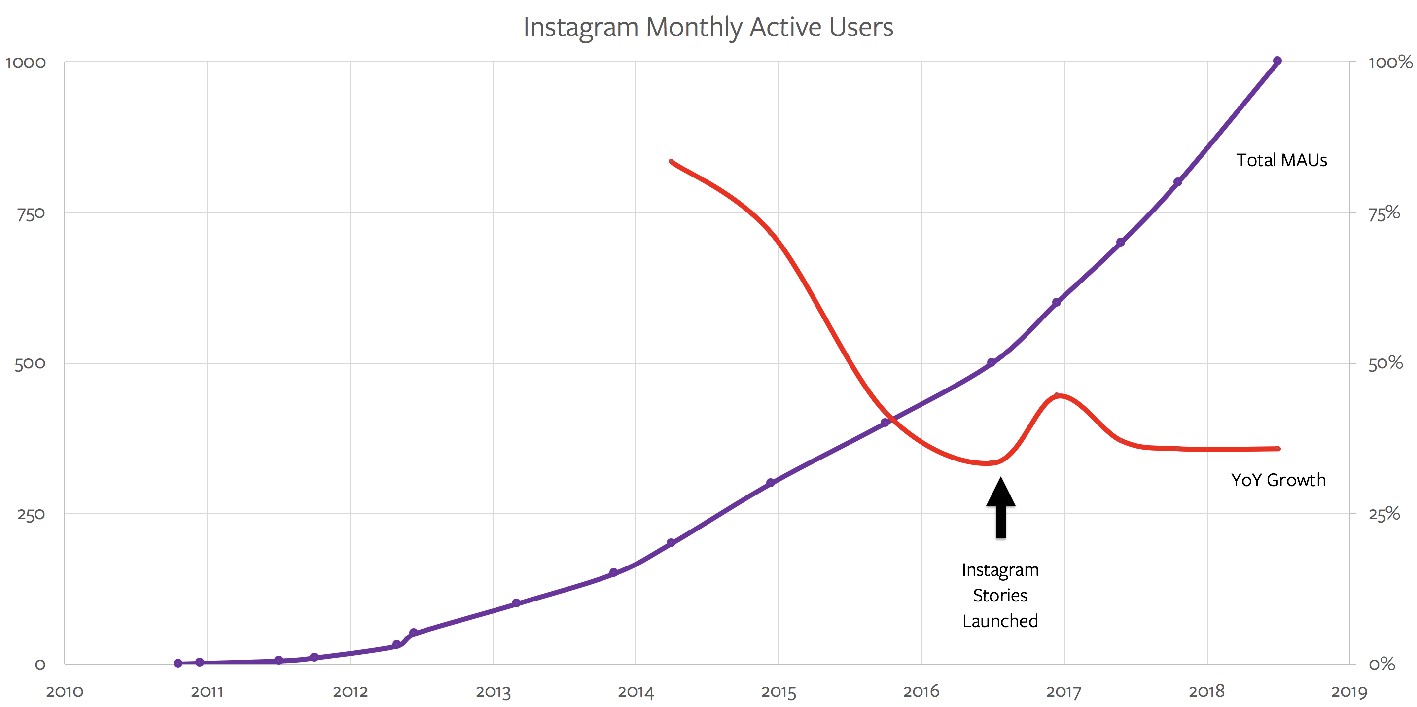
That article was mostly spot-on; my primary error was underestimating just how good Instagram’s product would be. Instagram Stories from day one were a better experience than Snapchat Stories, particularly in terms of speed; the product differences only grew from there. Ultimately, Instagram Stories didn’t simply stem Snapchat’s growth; it actually accelerated Instagram’s:

Instagram's Monthly Active Users

Meanwhile, Zuckerberg and Facebook’s ad team were cutting off Snapchat’s monetization oxygen, as I explained in Facebook’s Lenses:

Facebook spent years building out News Feed advertising — not simply the display and targeting technology but also the entire back-end apparatus for advertisers, connections with non-Facebook data sources and points-of-sale, relationships with ad buyers, etc. — and then simply plugged Instagram into that infrastructure.

The payoff of this integrated approach cannot be overstated. Instagram got to scale in terms of monetization years faster than they would have on their own, even as the initial product team had the freedom to stay focused on the user experience. Facebook the app benefited as well, because Instagram both increased the surface area for Facebook ad campaigns even as it increased Facebook’s targeting capabilities.

The biggest impact, though is on potential competition. It is tempting to focus on the “R” in “ROI” — the return on investment — and as I just noted Instagram + Facebook makes that even more attractive. Just as important, though, is the “I”; there is tremendous benefit to being a one-stop shop for advertisers, who can save time and money by focusing their spend on Facebook. The tools are familiar, the buys are made across platforms, and as Zuckerberg and Sandberg alluded to with regard to Stories, the ads themselves only need to be made once to be used across multiple platforms. Why even go to the trouble to advertise anywhere else?

This dynamic, by the way, was very much apparent when Snap IPO’d a year-and-a-half ago; indeed, Snap CEO Evan Spiegel, often cast as the anti-Systrom — the CEO that said “No” to Facebook — arguably had the same flaw. Systrom offloaded the building of a business to Zuckerberg; Spiegel didn’t bother until it was much too late.

Instagram’s Challenge

Still, as good as the Instagram Stories product was, it is difficult to overstate the built-in advantage that came from Instagram’s larger network, and impossible to overstate the importance of having a shared advertising backend with Facebook. To put it another way, Instagram’s two biggest advantages relative to Snapchat, or any other competitors that may arise, didn’t have much to do with product — Systrom’s speciality — at all.

There is no better example than IGTV. Three months ago Systrom announced Instagram’s new long-form video offering with a presentation that exuded product sensibility. I marveled at the time:

In just a few minutes Systrom brilliantly and, to my mind, accurately, explained how video consumption was changing for teenagers in particular, highlighted how current solutions (i.e. YouTube) fell short, and set out the principles that should guide the creation of a better service (mobile first, simple, and high quality videos). And, naturally, that better service was IGTV.

It doesn’t seem to have mattered in the slightest. Josh Constine wrote a smart article about IGTV’s struggles last month on TechCrunch:

It’s indeed too early for a scientific analysis, and Instagram’s feed has been around since 2010, so it’s obviously not a fair comparison, but we took a look at the IGTV view counts of some of the feature’s launch partner creators. Across six of those creators, their recent feed videos are getting roughly 6.8X as many views as their IGTV posts. If IGTV’s launch partners that benefited from early access and guidance aren’t doing so hot, it means there’s likely no free view count bonanza in store from other creators or regular users. They, and IGTV, will have to work for their audience. That’s already proving difficult for the standalone IGTV app. Though it peaked at the #25 overall US iPhone app and has seen 2.5 million downloads across iOS and Android according to Sensor Tower, it’s since dropped to #1497 and seen a 94 percent decrease in weekly installs to just 70,000 last week.

The one big surprise of the launch event was where IGTV would exist. Instagram announced it’d live in a standalone IGTV app, but also as a feature in the main app accessible from an orange button atop the home screen that would occasionally call out that new content was inside. It could have had its own carousel like Stories or been integrated into Explore until it was ready for primetime. Instead, it was ignorable. IGTV didn’t get the benefit of the home screen spotlight like Instagram Stories. Blow past that one orange button and avoid downloading the separate app, and users could go right on tapping and scrolling through Instagram without coming across IGTV’s longer videos. View counts of the launch partners reflect that.

I’m not arguing that product doesn’t matter. It does, incredibly so. But it is not the only thing that matters, and its relative importance decreases over time as things like network effects and business models come to bear. To that end, the single most important issue facing Instagram — the company that is, or, more accurately, Facebook — is Stories monetization. I wrote last month in Facebook’s Story Problem — and Opportunity:

That’s the thing about Stories, though: while more people may use Instagram because of Stories, some significant number of people view Stories instead of the Instagram News Feed, or both in place of the Facebook News Feed. In the long run that is fine by Facebook — better to have users on your properties than not — but the very same user not viewing the News Feed, particularly the Facebook News Feed, may simply not be as valuable, at least for now.

This is the context for whatever dispute drove Systrom and Krieger’s resignation: not only do they not actually control their own company (because they don’t control monetization), they also aren’t essential to solving the biggest issue facing their product. Instagram Stories monetization is ultimately Facebook’s problem, and in case it wasn’t clear before, it is now obvious that Facebook will provide the solution.


I don’t write any of this to denigrate Systrom and Krieger in the slightest. If anything my appreciation for their incredible product sense has only grown over the last few years. Both are truly extraordinary, as is their creation.

Controlling one’s own destiny, though, takes more than product or popularity. It takes money, which is to say it takes building a company, working business model and all. That is why I mark April 9, 2012, as the day yesterday became inevitable. Letting Facebook build the business may have made Systrom and Krieger rich and freed them to focus on product, but it made Zuckerberg the true CEO, and always, inevitably, CEOs call the shots.

I wrote a follow-up to this article in this Daily Update.

30 Sep 05:11

You will have more than one band

by Volker Weber

IMG 4723

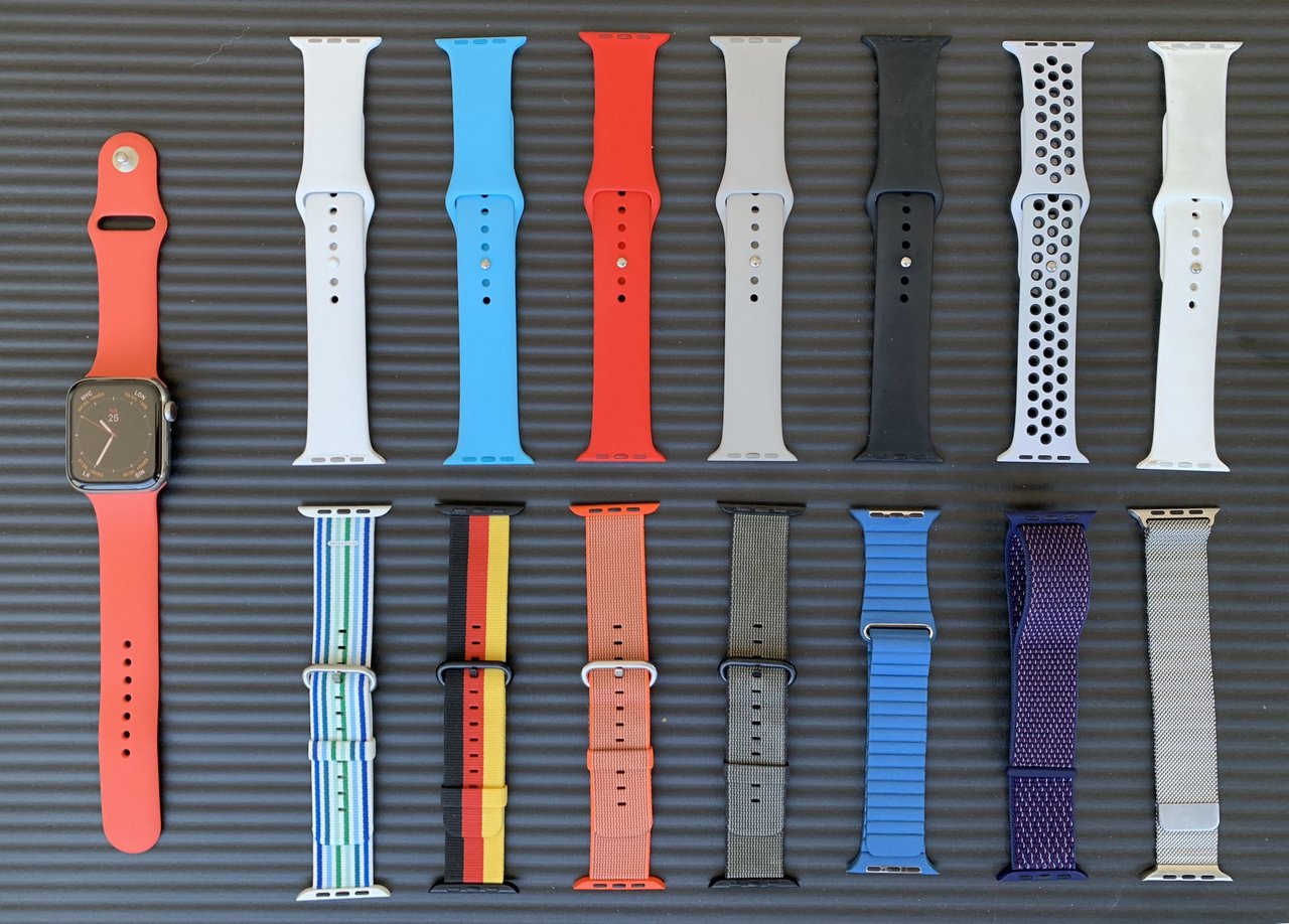
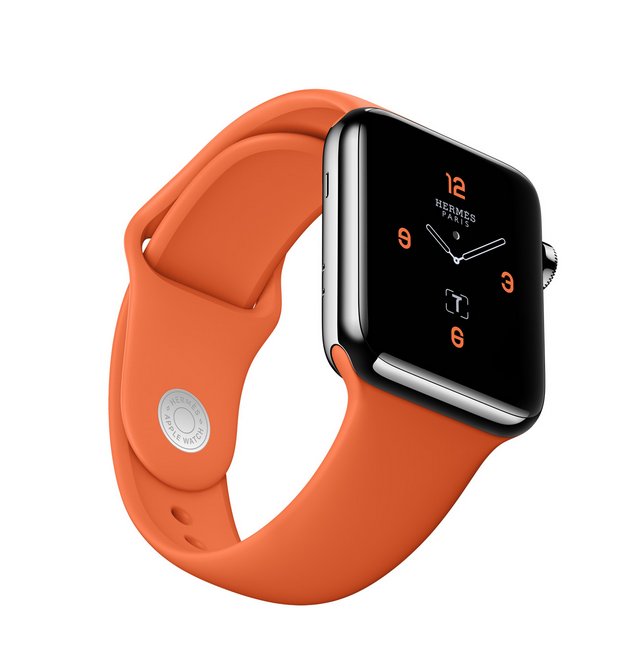
Don't fret too long about which band is best for your new Apple Watch. You will only find out what you like once you wore it. My first ever band came with the original Apple Watch. It's the Milanaise Stainless Steel in the lower right. The two designs that did not work for me was the Leather Loop and the Sport Loop, both next to the Milanese. The Sport Loop provides the best fit but it always feels too tight. Leather is also not my favorite. The Woven Nylon Bands did not see much action.

But as you can see, I am an absolute sucker for the Sport Bands that I have in many colors. I wore all of those extensively, including the Nike band. It's also nice to mix them. Nectarine is my latest obsession and Marco is about to send me a Hermès Sport Band he never used. It's very similar to Nectarine.

hermessportband

30 Sep 03:37

The Daily Edit – Wired: Anna Alexander

by Heidi Volpe

Wired

Photographer Director: Anna Alexander
Design Director: Ivylise Simones
Senior Photo Editor: Amy Silverman
Senior Photo Editor: Samantha Cooper
Associate Photo Editor: Lauren Joseph
Photo Editor: Sara Urbaez
Photo Researcher: Phuc Pham
Visuals Manager: Beth Holzer
Managing Art Director: Alyssa Walker
Photo Fellow: Halie Chavez
Photographer: Michellle Groskopf

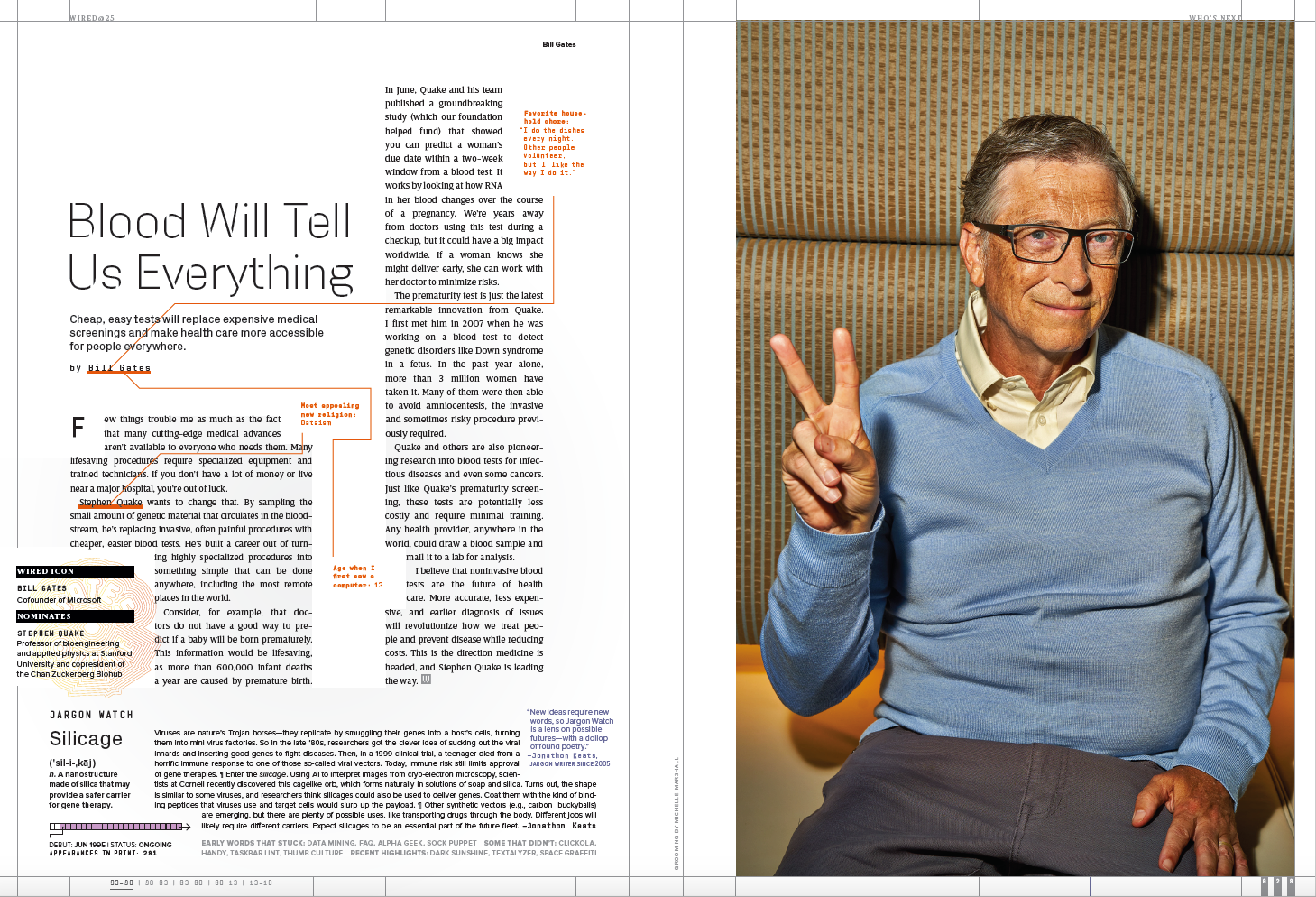
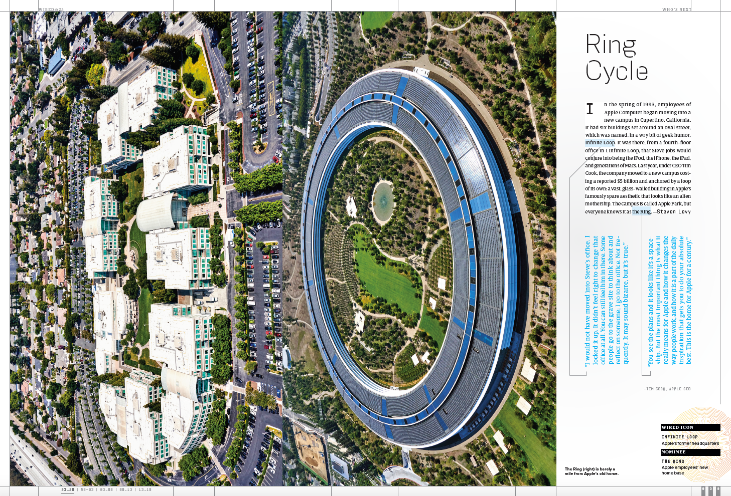
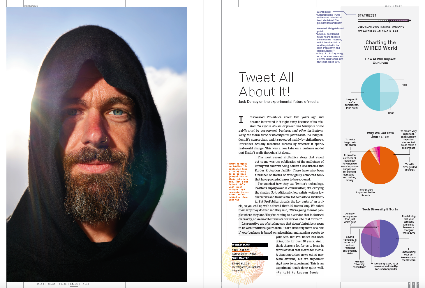
WIRED celebrated its 25th anniversary this year. The magazine selected 25 icons of the digital revolution who have had the biggest impact on the worlds of technology, science, and business over the past quarter-century and hired LA street photographer Michelle Groskopf to take portraits of everyone in the issue. We caught up with photo director Anna Alexander about the making of this issue.

Heidi: Why did you feel it was important for one person to shoot the issue?
Anna: Since this was a very special issue celebrating Wired’s 25th anniversary, I felt that it needed a consistent aesthetic throughout. At the time, way back in March- when we were planning the issue- we didn’t have a design goal since we weren’t quite sure what stories would be the meat of it or what previous Wired signature “furniture” items we would resurrect, so we weren’t sure of the look. We knew we wanted it to be colorful and celebratory. We also knew that we were going to have fifty subjects contribute in some way, so – naturally- I HAD to photograph them all. I get possessive like that. We had been saving up for months, like you would for a vacation- a little out of each pay check (or issue in this case).

What were some of the obstacles, and some of the victories?
The main obstacle for this issue was time. Even though we started MONTHS before the issue closed, it still wasn’t enough time to send Michelle to shoot everyone AND edit AND sleep. There were around four subjects in Europe and Asia, but it would take a huge chunk of the precious time we had to send her there. She did not like hearing that, but I had to make the decision. For once, we actually had the funds to send her everywhere since we had saved for a very long time, but we could get double the portraits done in the US in the amount of time it would take her to go across the Atlantic to shoot only four.
Another huge obstacle was SUMMER VACATIONS. These well-known subjects actually DO go on vacation, just like us! Naturally, we invaded a couple of them on their family holidays. We also only had two cancellations, which were legitimate excuses and we were able to reshoot them. The only thing is that when there is a cancellation, we lost a full day of shooting (she shot around two subjects a day, based on geographic convenience to one another).

What type of direction did you give her?
I grabbed a selection of images from her site, both black and white and color. These were the images that I presented to the editors, so these were what I sent to her. “Like these.” I was honestly very open with art direction for her. I asked for black and white and color, vertical and horizontal, up close and full length and then for her to just go for it. “Do the thing you do that makes you feel it.” I don’t know what I said, but she got it. That is a large combination of frames if you match all of those options up with each other, especially in the short amount of time we had with each subject. I had NO idea how she worked with subjects since she’s a street photographer. They don’t necessarily interact with their subjects. They just compose each frame immediately and grab a shot without getting caught. I have to say, this technique worked really well with this project.

Was this a difficult issue to edit?
YES. Oh, very much YES. She sent so many, which I am very, very grateful for, actually. She also sent them all in high resolution final files, so if we had an emergency, which we did- of course, we were ready to fulfill. The edits that she sent to me had safe headshot shots, wonderful can-we-really-publish-this- shots, feet shots and hand shots. Lots of detail images too, just like what her signature style is.
I had to edit for the print features, then the print photo grid in the beginning of the issue, then for the online edition, then for marketing and promoting of the October anniversary event that all these subjects  are participating in.


Read about Michelle’s experience here.  
More information is available at WIRED.com/25.

------------------------

Visit our sponsor Photo Folio, providing websites to professional photographers for over 10 years. Featuring the only customizable template in the world.

------------------------

27 Sep 03:17

Twitter Favorites: [Planta] New Ed Broadbent pin to add to the collection. I'm guessing this is from the @NDP campaign in 1980 or 1984? #cdnpoli https://t.co/wV9yBJWbct

Joseph Planta @Planta
New Ed Broadbent pin to add to the collection. I'm guessing this is from the @NDP campaign in 1980 or 1984? #cdnpoli pic.twitter.com/wV9yBJWbct
26 Sep 14:29

Music identifying platform Shazam is going ad-free following Apple acquisition

by Patrick O'Rourke

In addition to announcing that its acquisition of Shazam has been completed, Apple revealed that the music identifying platform will soon go ad-free.

“Apple and Shazam have a long history together. Shazam was one of the first apps available when we launched the App Store and has become a favourite app for music fans everywhere,” said Oliver Schusser, Apple’s vice president of Apple Music.

“With a shared love of music and innovation, we are thrilled to bring our teams together to provide users even more great ways to discover, experience and enjoy music.”

Shazam is capable of identifying songs by listening to the music playing around the device the app is running on. The app has been downloaded over 1 billion times around the world, with Shazam users identifying songs over 20 million times a day.

Last year Apple purchase Shazam for an estimated $400 million.

Shazam is available on iOS and Android.

The post Music identifying platform Shazam is going ad-free following Apple acquisition appeared first on MobileSyrup.

26 Sep 14:29

Live depth-of-field control coming to iPhone XS, XS Max

by Patrick O'Rourke

While the iPhone XS and XS Max are currently capable of adjusting a photo’s depth-of-field after the image has been captured, it looks like Apple has plans to allow this feature to work while taking a picture, according to a new report from Macerkopf.

This would move Portrait Mode’s new bokeh effect to be more in-line with the ‘Live Focus’ feature included in many of Samsung’s more recently released smartphones, including the Galaxy S9/S9+ and the Galaxy Note 9.

Samsung’s devices allow users to adjust an image’s depth-of-field while a photo is being shot, as well as during post-production.

Live depth-of-field is currently available in iOS 12.1 beta 1, according to 9to5Mac. It’s worth stating again that Apple’s iPhone XS and iPhone XS Max devices currently only allow for bokeh to be altered after a photograph has been taken.

It’s unclear when Apple plans to officially release this subtle tweak to Portrait Mode’s new depth-of-field functionality. Given that its already available in iOS 12.1’s beta, a full release likely isn’t far off.

Source: Macerkopf  Via: 9to5Mac

The post Live depth-of-field control coming to iPhone XS, XS Max appeared first on MobileSyrup.

26 Sep 14:28

macOS Mojave is now available – here are 3 notable features

by Patrick O'Rourke
macOS Mojave

The latest version of Apple’s desktop operating system, macOS Mojave, just dropped.

I’ve been testing the final version of Mojave for the past few weeks, and while it’s not that fundamentally different from the experience I had when I put together a brief preview of the OS a few months ago, there are still a few notable features worth highlighting.

In order to download macOS Mojave, click on the Apple icon in the top left corner of the display, select ‘About this Mac,’ and then click ‘Software Update.’

If the update doesn’t immediately show up, wait a few minutes and it should appear. Apple is conducting the rollout gradually, so it could take a few hours for Mojave to hit your device.

Alternatively, if you open the Mac App Store and search for ‘macOS Mojave,’ the operating system update will pop up, and you can install it manually.

Dark Mode is awesome

macOS Mojave Dark mode

Right off the top, Dark Mode remains my favourite macOS Mojave feature. It is the most significant shift to the look of Apple’s desktop operating system since macOS’ 2014 Yosemite update. That said, if you don’t enable Dark Mode, Mojave looks identical to High Sierra.

I find Dark Mode great for when I know I’m going to be using my MacBook Pro for a lengthy period of time. It’s easier on the eyes thanks to its system-wide black or dark grey features. It also give the operating system a welcome coat of fresh paint.

Even many of Apple’s proprietary apps adapt to Dark mode, including Notes, which puts text on a black background, with the Calendar app taking the colours of your events and giving them a neon tone against a dark background.

What’s lacking right now is third-party developer adoption of Dark Mode, though this is something that could change now that the final version of Mojave is out.

To turn on Dark Mode, launch macOS’ ‘Settings’ app then navigate to ‘General.’ Under appearance, select ‘Dark.’

Welcome to the new macOS App Store

macOS Mojave App Store

While it might not seem like it at first, Mojave’s revamped macOS App Store with improved curation has the potential to fundamentally change how many people use the once-beleaguered digital retail platform through a straightforward improvement — app discovery.

Given how modern device users are trained to use App Stores thanks to the rise of the iOS App Store and the Google Play Store, it makes sense for Apple to try to apply this same approach with macOS.

The new store is sleek, streamlined and, more importantly, it’s capable of highlighting a wide variety of deserving third-party macOS apps, whether they’re games, photo editing software, or even developer-focused tools.

All around, the new App Store is a great effort to revitalize macOS’ lagging third-party software ecosystem.

iOS Apps come to macOS

macOS Mojave Home app

This one is a bit of a long game on Apple’s party, especially given that it’s currently not intuitive to navigate iOS apps with a mouse and keyboard, but it’s still a huge step forward for Apple that could have far-reaching implications.

With the release of macOS Mojave, iOS apps Voice Memos, Stocks and Home are now available on Apple’s desktop platform as part of the first step of the company’s ‘Marzipan‘ initiative. This initial app selection is far from exciting, but it lays the groundwork for future apps to make their way from iOS to macOS.

Apple handling the basic legwork involved in porting an iOS app to macOS allows developers to concentrate on fine-tuning and also makes the entire process much more manageable.

In theory, this in turn should lead to more developers bringing their iOS apps to macOS, breathing new life into the OS’ third-party app ecosystem.

The post macOS Mojave is now available – here are 3 notable features appeared first on MobileSyrup.

26 Sep 14:28

One of Apple’s best 3D Touch features is now available on all iOS 12 devices

by Igor Bonifacic
3D Touch tips for the iPhone

Owners of older iPhone and iPad devices can now take advantage of one of Apple’s best 3D Touch features.

With the launch of iOS 12, any iPhone or iPad that is compatible with the operating system, whether they feature 3D Touch or not, can now use Apple’s keyboard cursor. The cursor allows iOS users to select text without obscuring it with their finger. It’s an incredibly useful feature and one of my favourite parts of iOS.

To take advantage of the functionality, tap and hold the spacebar while typing on Apple’s first-party keyboard.

Besides being a major boon for those with older devices, future iPhone XR owners will benefit, as well; Apple’s new low-cost iPhone won’t ship with 3D Touch.

Apple launched 3D touch alongside the iPhone 6S and 6S Plus. Check out MobileSyrup‘s how-to on 3D Touch to learn how to make use of this woefully underused feature.

Source: Mashable

The post One of Apple’s best 3D Touch features is now available on all iOS 12 devices appeared first on MobileSyrup.

26 Sep 14:27

Some iPhone XS and XS Max users are reporting LTE and Wi-Fi reception issues

by Patrick O'Rourke
iPhone XS Max

Some iPhone XS and XS Max users are reporting reception and Wi-Fi issues with Apple’s new flagship smartphone.

It’s unclear how widespread these issues are, but reports related to LTE and Wi-Fi signal problems have appeared on Apple’s Support Forum, MacRumors and Reddit.

Given that the iPhone XS and XS Max are designed to feature faster LTE and Wi-Fi data transfer speeds even when compared to the iPhone X, these reports are a little concerning.

According to iFixit’s recent teardown of the iPhone XS, Apple’s new smartphone features an additional antenna running along its base. This, at least in theory, should mitigate any signal issues, though that doesn’t seem to be the case.

Let’s talk about reception on the Xs/Xs Max… from r/iphone

It’s unclear what’s causing the problem, with some users citing network overloads being the culprit, while others speculate that the problem could be yet another ‘Antenna-gate‘ issue, similar to what the iPhone 4 suffered from. It’s important to note that the vast majority of reported issues seem to be from the U.S. It’s likely that if there is a problem of some sort, Apple will release a software update at some point in the near future that fixes it.

For what it’s worth, the iPhone XS and iPhone XS Max we have at the MobileSyrup office have been running smoothly.

In fact, the speed tests I ran with a Telus SIM while working on my review of the pair of smartphones indicated that Apple’s new devices are indeed faster than last year’s iPhone X when it comes to LTE.

Using Ookla’s speed test iOS app with the iPhone X and Telus as my carrier, I ended up with 131Mbps download and 27.3Mbps upload. When running the same Telus speed test with the iPhone XS, the results indicated 167Mbps download and 41Mbps upload, a surprisingly substantial jump in speed.

We’ve reached out to Apple for comment regarding the above reception problems and will update this story when we hear back.

Are you experiencing connection issues with your iPhone XS and iPhone XS Max? Let us know in the comment section.

Source: Apple Support FormMacRumors Reddit Via: The Verge 

The post Some iPhone XS and XS Max users are reporting LTE and Wi-Fi reception issues appeared first on MobileSyrup.

26 Sep 14:27

Instagram founders depart company: report

by Sameer Chhabra
Instagram Stories

Photo-sharing app Instagram’s co-founders Kevin Systrom and Mike Krieger are leaving the now Facebook-owned company, according to a pair of tweets.

The New York Times reported that the two co-founders notified Instagram’s leadership team about their departure on September 24th, 2018, but did not provide a reason for stepping down.

Facebook CEO Mark Zuckerberg praised Systrom and Krieger as being “extraordinary product leaders and Instagram reflects their combined creative talents.”

“I’ve learned a lot working with them for the past six years and have really enjoyed it,” said Zuckerberg, in a statement forwarded to MobileSyrup.

“I wish them all the best and I’m looking forward to seeing what they build next.”

Systrom and Krieger launched Instagram on October 6th, 2010 as an iOS exclusive application. At the time, the app allowed users to take photos, apply a photo filter and share the photo with other Instagram users.

An Android version of the app eventually debuted in April 2012.

It was also in April 2012 that Menlo Park social networking giant Facebook acquired Instagram for approximately $1 billion USD in cash and stock.

Instagram’s limited web platform arrived in November 2012. It wouldn’t be until February 2013 that Instagram’s web app would even include a news feed.

Via: New York Times

Update 25/09/2018 10:14am ET: Story updated with comment from Facebook.

The post Instagram founders depart company: report appeared first on MobileSyrup.

25 Sep 13:23

Google Calendar for Android version 6.0 features Material Design UI

by Dean Daley
Google Calendar app on Android

Google Calendar for Android version 6.0 has finally received its Material Design makeover, as spotted by Android Police in a recent APK teardown.

There aren’t very many differences between version 6.0 and the older version. Google Material Design UI often includes bright colours and whites. However, the Calendar app was pretty much already like that.

Users can now quickly tap a small arrow beside ‘September’ (seen above) to get a quick glimpse of the whole month. The plus icon allows users to add events, while on the bottom right corner is a multi-coloured instead of just red. Additionally, tapping the menu button shows an assortment of Material Design themed icons.

Android Police says the update will take a while to reach your phone. If you’re like me and can’t wait, APK Mirror does have the version 6.0 available, though as always, download it at your own risk. 

To see other apps that have received Google’s Material Design update, click here. 

Source: Android Police

The post Google Calendar for Android version 6.0 features Material Design UI appeared first on MobileSyrup.

25 Sep 13:23

Hier parkt nur einer

by Ronny
mkalus shared this story from Das Kraftfuttermischwerk.

Und dann gibt es hin und wieder doch menschliche Lichtblicke. So wie diesen hier. Manchmal sind es eben die ganz kleinen Dinge.