Configuration management is an important feature of any modern content management system. Those following modern development best-practices use a development workflow that involves some sort of development and staging environment that is separate from the production environment.
Given such a development workflow, you need to push configuration changes from development to production (similar to how you need to push code or content between environments). Drupal's configuration management system helps you do that in a powerful yet elegant way.
Since I announced the original Configuration Management Initiative over seven years ago, we've developed and shipped a strong configuration management API in Drupal 8. Drupal 8's configuration management system is a huge step forward from where we were in Drupal 7, and a much more robust solution than what is offered by many of our competitors.
All configuration in a Drupal 8 site — from one-off settings such as site name to content types and field definitions — can be seamlessly moved between environments, allowing for quick and easy deployment between development, staging and production environments.
However, now that we have a couple of years of building Drupal 8 sites behind us, various limitations have surfaced. While these limitations usually have solutions via contributed modules, it has become clear that we would benefit from extending Drupal core's built-in configuration management APIs. This way, we can establish best practices and standard approaches that work for all.
The four different focus areas for Drupal 8. The configuration management initiative is part of the 'Improve Drupal for developers' track.
I first talked about this need in my DrupalCon Nashville keynote, where I announced the Configuration Management 2.0 initiative. The goal of this initiative is to extend Drupal's built-in configuration management so we can support more common workflows out-of-the-box without the need of contributed modules.
What is an example workflow that is not currently supported out-of-the-box? Support for different configurations by environment. This is a valuable use case because some settings are undesirable to have enabled in all environments. For example, you most likely don't want to enable debugging tools in production.
The contributed module Config Filter extends Drupal core's built-in configuration management capabilities by providing an API to support different workflows which filter out or transform certain configuration changes as they are being pushed to production. Config Split, another contributed module, builds on top of Config Filter to allow for differences in configuration between various environments.
While the initiative team is working on executing on these long-term improvements, they are also focused on delivering incremental improvements with each new version of Drupal 8, and have distilled the most high-priority items into a configuration management roadmap.
In Drupal 8.6, we added support for creating new sites from existing configuration. This enables developers to launch a development site that matches a production site's configuration with just a few clicks.
For Drupal 8.7, we're planning on shipping an experimental module for dealing with environment specific configuration, moving the capabilities of Config Filter and the basic capabilities of Config Split to Drupal core through the addition of a Configuration Transformer API.
For Drupal 8.8, the focus is on supporting configuration updates across different sites. We want to allow both sites and distributions to package configuration (similar to the well-known Features module) so they can easily be deployed across other sites.
How to get involved
There are many opportunities to contribute to this initiative and we'd love your help.
When I was at Yankee Publishing a couple of weeks ago, working with my MacBook Air plugged into an external monitor, I realized that very rarely do I have call to use my laptop as a laptop: 99% of the time it’s plugged into a display here, and it’s only when I’m on the road that I use it as it was intended.
So this morning when Apple announced a new Mac mini–the first refresh for this model in forever–I jumped at the change to order one for delivery next week:
For about the same price as a new MacBook Air, I end up with a machine that’s more powerful, with more memory, a larger disk, and more ports. And yet it’s portable enough that I can stuff it into my bag and take it with me.
This new machine will replace my mid-2011 MacBook Air, a machine that has served me admirably for longer than any computer I’ve ever owned. I’ll keep it around and maintained for those rare times that I need a portable machine with a screen; for everything else, I’m looking forward to taking advantage of the last 7 years of advances in Apple’s technology.
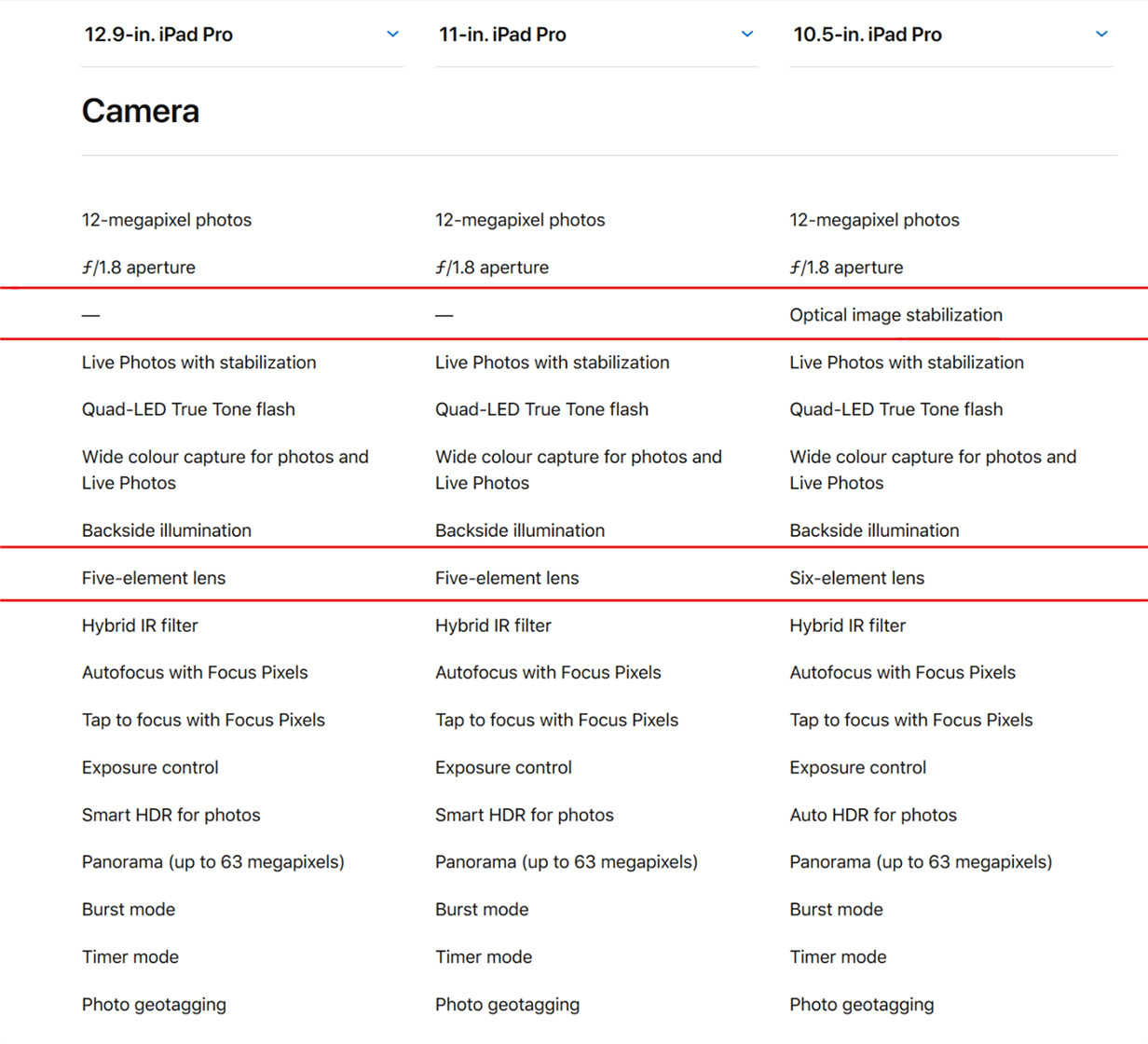
To help developers take advantage of the latest features of the iPad Pro and Apple Pencil, Apple has posted two new videos to its developer portal. Even if you aren’t a developer though, the videos include interesting insights on some of the unique features of the new iPad Pros.
The videos cover development and design issues that should be considered when adapting apps to the new iPad Pros like using safe area insets to avoid crowding content into the rounded corners or under the home indicator. Another consideration to take into account is that unlike the previous iPads, the 11” iPad Pro doesn’t have a 4:3 aspect ratio, which means apps hard-coded to those dimensions will have areas cut off at the top and bottom.
Also, apps that don’t link against the iOS 12.1 SDK will run in a compatibility mode when multi-tasking, which will add an inset at the top and bottom of the screen for both apps instead of running them fullscreen. Apple says that making sure iPad apps can handle the inset compatibility mode will also help with bringing iOS apps to the Mac in 2019.
The Apple Pencil has a set of default double-tap settings that we covered in our iPad overview, but developers have the option to customize the double tap action in their apps. Apple also encourages developers not to hide functionality behind the gesture or turn custom actions on by default.
The videos cover the iPad Pro’s new USB-C connector too. The iPad Pro supports HDR 4K up to 60Hz and external displays up to 5K as well as USB audio devices, Ethernet, and MIDI. The iPad Pro can also send simultaneous USB-C outputs, which permits uses like connecting a DSLR Camera and 5K display to the iPad Pro at the same time.
Apple quietly updated its site to announce that new GPU options are coming to the MacBook Pro. In late November, the high-end 15-inch MacBook Pros will be available with the Radeon Pro Vega GPU, the same AMD GPU graphics architecture used in the iMac Pro. The new GPU features High Bandwidth Memory, which doubles the memory bandwidth at lower power and results is faster graphics performance that Apple says is up to 60% faster than the AMD Radeon Pro 560X.
According to Apple’s MacBook Pro webpage, the Radeon Pro Vega 16 and 20, each with 4GB of HBM2 memory, will be available in late November as part of the MacBook that comes configured with a 2.66GHz 6-core CPU and 512GB of SSD storage.
I just came back from the media event Apple held this morning in Brooklyn, during which the company announced major updates for the MacBook Air, Mac mini, and iPad Pro. Personally speaking, the star of the show was – unsurprisingly – the new iPad Pro line, with two new models featuring a stunning edge-to-edge display, an iPhone X-like gesture-driven interface, more powerful CPUs, and a more compact form factor.
We're sharing more details about specs, new features, and prices in our dedicated overviews (you can find the iPad Pro, Mac mini, and MacBook Air overviews here, here, and here, respectively). In this post, I'm going to be sharing some quick first impressions about the new iPad Pros along with some notes and pictures I took at the hands-on area Apple set up after the event. Obviously, I will be sharing a lot more about the new iPad Pros over the next few days and weeks both on MacStories and AppStories.
The Hardware
The new edge-to-edge displays on both iPad Pros look stunning in person. Even though the iPad Pro still has thicker bezels than the iPhone X line (and no notch), it really feels like, for the first time since the iPad's debut in 2010, Apple was able to deliver on the vision of a magical slab of glass that you can hold in your hands.
Holding the 12.9" iPad Pro, with the Pencil attached.
In my brief hands-on time with both the 11" and 12.9" iPad Pros, the bezels almost "disappeared" and I was able to focus completely on the screen, which extends from corner to corner. It's too early to tell, but my first reaction is that I won't be bothered by the fact that the bezels are thicker than the iPhone's. In the demo, the iPad Pro's bezels acted as an ideal resting point for my thumb without getting in the way of using apps; just like the iPhone X last year, it's remarkable to look at the display and see how apps can take advantage of the device's whole canvas rather than being confined into a rectangular display. Visually speaking, the edge-to-edge display with rounded corners is simply striking.
One of my concerns ahead of the event was that the rumored redesign for the iPad Pro's chassis (with the squared-off sides reminiscent of the iPhone SE) was going to look chunky and dated. I couldn't have been more wrong. The new iPad Pros feel svelte and futuristic; they're comfortable to hold with one hand (which I expect most people to do with the 11" model), they're light, and they feel impossibly thin despite the lack of a tapered design across the edges.
Holding the 11" iPad Pro.
Holding the 11" iPad Pro in portrait.
The flat sides of the new iPad Pro.
That's one smooth curve.
The new 12.9" iPad Pro seemed particularly impressive in this regard: the combination of reduced physical footprint, lighter body, and edge-to-edge display gave me the impression that I was holding the largest iPad Pro in the smallest and most comfortable form factor I could have ever hoped for. I'm reserving final judgement for a proper review, but I think I'm sticking with the 12.9" iPad Pro as Apple managed to make it even more portable and lighter than before. I was in love with it as soon as I picked it up.
The New Apple Pencil
I tested the second-generation Apple Pencil with a variety of system features (Markup mode, Notes, and screenshots annotations) as well as a beta version of Procreate installed on the demo iPads in the hands-on area. The new Pencil feels lighter than before, but still elegant and "premium" unlike other iPad styli. As Apple explained on stage, the Pencil can now magnetically attach to the iPad Pro, which will also charge it while it's attached; this is possible because the new Pencil has a flat side (which seemed to help in preventing it from rolling off a table too) which can attach to a magnet that is visible along the top edge of the iPad (while in landscape mode).
The magnet responsible for holding and charging the Pencil.
In my tests, the Pencil held a sturdy magnetic connection to the iPad Pro. I tried to shake the iPad while the Pencil was attached, and it didn't fall off (I suppose this is great news if you want to do lots of Shake To Undo while the Pencil is charging). Of course, if you try to hold the iPad Pro in portrait mode while the Pencil is also charging, your hands are going to get in the way of its magnetic connection. But as long as you're using the iPad Pro with a keyboard in landscape, or if you're just walking around while holding the iPad, the Pencil should stay attached without issues.
The version of iOS running on the new iPad Pros featured a redesigned Apple Pencil screen in Settings with new options to control the double-tap gesture that you can now perform to switch between different tools and modes in drawing apps.
The options (pictured above) only apply to Apple's built-in sketching features in iOS (for Notes and Markup); third-party developers will be able to program their own interactions for the Pencil's double-tap gestures. In my hands-on demo, I was shown an upcoming version of Procreate with a radial contextual menu that appeared upon double-tapping the Pencil.
The new radial menu in Procreate.
I expect a lot of apps to offer similar options for "right-click menus" based on the Pencil's new double-tap gesture going forward.
The Smart Keyboard Folio
I tried Apple's new Smart Keyboard Folio for both iPad Pros, and I'm not sure what to think of it yet. On one hand, I'm disappointed that Apple didn't ship a fully redesigned Smart Keyboard with backlit keys and new built-in media keys (such as the ones the Brydge keyboard currently offers). I also had the impression that getting the iPad in and out of the folio case was a more involved process than the old Smart Keyboard, though that might just be the result of it being a new accessory that I'm not familiar with yet. Time will tell.
An iPad Pro inside the Smart Keyboard Folio.
On the other hand though, I'm very intrigued by the extra protection offered by the folio form factor and by the two supported viewing angles. There were no chairs in the hands-on area where I could chill with an iPad Pro in my lap (and I couldn't bring myself to ask if I could sit on the floor with an iPad Pro), but I have a feeling I'm going to be using the "laptop mode" orientation a lot. The "desktop mode" version looked like a steep angle, but I was standing and the iPad was on a table, which means I'll have to test it at my desk once I actually have a new iPad Pro.
The typing experience of the Smart Keyboard Folio felt mostly similar to the old Smart Keyboard but, again, I didn't have enough time with it. I liked the feeling of the folio's texture, and I appreciate that it doesn't seem to add a ton of bulk to the device (unlike, say, the Brydge keyboard I'm using right now). The flat surface of the folio felt kind of boring without any decorations though, which means this accessory is prime sticker material – I'm probably going to cover it with a bunch of my favorite stickers, including these ones Apple employees were giving out after the event.
Miscellaneous
Here's a collection of other notes and tidbits about the new iPad Pros based on what I asked and saw during my hands-on time.
Portrait mode is for selfies only. Thanks to the TrueDepth camera, the new iPad Pros can take Portrait selfies. The rear-facing camera (which one Apple employee described as "the same camera as the iPhone XR" to me) cannot take Portrait pictures for now; I hope Apple adds support for Portrait shots with the back camera through a software update in the future.
Face ID tips. Coming from the iPhone X, using the new iPad Pros felt immediately familiar and consistent. I saw Face ID working in any orientation (including upside down) and it seemed to be just as fast as Face ID on the iPhone XS. I did notice that the iPad Pro can bring up a "Camera covered" message on the lock screen if you're covering one of the sensors while trying to unlock the device; along with the message, you're going to see a white arrow flashing and pointing at the TrueDepth camera to suggest that you need to remove your fingers from the sensor.
Also, the Apple employee in charge of the demo tried to unlock the iPad Pro with Face ID from a distance, but the iPad put up a message saying that his face was too far away; I wasn't able to get an exact response about the ideal distance for Face ID unlocking on the iPad Pro, but my understanding is that it's going to be just fine when working at a desk with an iPad in front of you.
Capturing screenshots. Taking screenshots on the new iPad Pros without a Home button works just like the iPhone X: you hold down the Power and Volume Up buttons. I expect it's going to take me a while to get used to this change.
A New iPad Era
As I wrote above, it's too early for any kind of comprehensive judgement about the new generation of iPad Pros. I've only had about 10 minutes with each device, and there's a lot more I'd like to know, evaluate, and experiment with.
I believe, however, that one thing is already clear: these new iPad Pros are ushering us into a new era of iPad design and functionality as a truly portable computer that can scale from couch to desk, from wireless accessories to USB-C connections, and from games and note-taking apps to Photoshop, AR, and beyond. It almost feels like Apple has taken the best aspects of the iPhone X experience and applied them to reimagine the modern portable computer in the shape of an iPad.
I can't wait to find out where this road takes us.
It was great to be back at Mozfest this weekend. And whaddayaknow, I got the chance to catch the #unboundeq (equity unbound) team explain what their project is all about. I’d seen the hashtag floating around on Twitter – but when engaging with a think, it’s dialogue that gets me going – and listening.
I use Pixelmator Pro almost every day on my Mac. A lot of the time, that’s for simple edits to screenshots, but I also use it for more complex layered images and editing photos. I’ve enjoyed the iOS version a lot too, but with the introduction of Pixelmator Pro on the Mac, development of the iOS version slowed. I still use the iOS app, but it's in need of an update, which is why I was so pleased to see Pixelmator Photo teased at today’s Apple event in New York.
Pixelmator Photo will be out later this year. The app, which was first mentioned when Pixelmator Pro launched almost a year ago, is an iPad-only photo editing app that appears to closely follow the design of the Mac app and include much of its functionality too. In addition to being highlighted during Apple’s keynote today, Pixelmator Photo was on the iPads in the hands-on area after the event where Federico had a chance to try the app for a short time and was impressed.
Pixelmator Photo's image editing UI (right) is very similar to Pixelmator Pro's on the Mac (left).
features a collection of nondestructive, desktop-class photo editing tools, a set of stunning, machine learning-enhanced film emulation presets, a magical Repair tool to remove unwanted objects from your photos, support for editing RAW images, and more.
Pixelmator says the app will include non-destructive color adjustments including Levels, Curves, Hue & Saturation, Selective Color, and Black & White as well as Repair and Cropping tools. The app will also support RAW image editing and the ML Fix feature recently introduced in the Mac app. Machine learning will also be used to simulate analog film with a set of presets and power cropping suggestions.
Apple showed that it’s committed to offering pro-level hardware in the iPad line with the new 11 and 12.9-inch iPad Pros today. Apps are the other half of the equation, and it’s encouraging to see Pixelmator Photos announced along with Adobe’s Photoshop, and other apps that will take advantage of Apple's new hardware.
That’s how long it was between updates, and I’m still somewhat annoyed at having had to buy an iMac instead.
Having a quieter and (much) smaller machine with my choice of displays is still my sweet spot, and it will now be a few years before I can justify going back to that kind of setup.
At this rate, that iMac better last me at least 1475 more days. But I suspect my last mini’s eight year record will not be surpassed by any current (or future) Apple hardware.
Actual conversation with my barber this afternoon:
Barber: So you just want a trim and keep it pretty long?
Me: No, you can take a lot off. Off my collar, over my ears, out of my eyes.
Barber: But you want it left pretty long?
Me: You can take a fair bit off.
Barber: Oh, you want a man’s haircut!
I still don’t know exactly what he meant by this, but, to move things along, I replied “yes!” with enthusiasm.
He then proceeded to give me the most thorough haircut I’ve ever received. It went in forever. Other barbers went through 2 or 3 clients and he was still working on me.
I was worried for the result (I can’t see a thing without my glasses), especially when I realized, late in the game, that my barber was a barber-in-training.
But it worked out: his attention to detail paid off, and I’m happy with the result. I tipped him $5. I presume I now look like a man for the first time in my life.
If you want a novel haircutting experience, have some time to kill, and want to help a new guy out, drop by Ray’s Place and see the first fellow on the left.
In the race to the bottom, they question posed in the title is key. While most pundits focus on the future role of AI, the gig economy shows no sign of slowing down. “Contract jobs in the education field seem to be keeping pace with the overall growth in flexible work we’ve seen in recent years,” said Brie Reynolds, director of online content at FlexJobs, according to Education Dive. “Education and training is consistently among the top career fields for the number of flexible jobs posted each month."
[TL;DR: A long tail is needed for distributed technology to be sustainable I think, otherwise it’s just centralisation and single points of failure in a different form. A long tail means the bottom 80% take over 50% of a market, and the top 20% under 50%. Mastodon currently has over 85% of its participants in the top 20% of instances, and it’s worse than that as 77% of participants are in 0,7% of instances. Just 15% are in the bottom 80% of instances. There’s a power law distribution, but it’s not a long tail. What can Mastodon do to get there and to sustainability?]
I joined on 7 April 2017, 6 months after its launch, at the Mastodon.cloud instance. I posted some messages for a month, then fell quiet for half a year. A few messages last March, and then I started using it more frequently last month, in the run-up to figuring out how to run Mastodon for myself (which for now means a hosted solution, but still aiming for running it from the home router). It’s now part of my daily information diet, but no guarantee yet it will last, although being certain I have ‘my half’ of the conversation on a domain I own helps a lot towards maintaining worthwhile exchanges.
Eugen’s blogpost is rightfully proud of what has been accomplished. It’s not yet proof of the sustainability of federated solutions though as he suggests.
He shares a few interesting numbers about the usage of Mastodon. The median of the 3460 known instances is 8 users. In total there are 1.627.557 registered accounts. The largest instance has 415.941 members, while the top 3 together have 52% of users, meaning the number 2 and 3 average 215.194 accounts. The top 25 largest instances have 77% or 1.253.219 members, meaning that the numbers 4-25 average 18.495 users. As the median is 8 it means the smallest 1730 instances have at most 8*1730 = 13.840 users. It also means that the number 26 to number 1730 instances have at least 360.498 members, or an average of 211. This tells us there’s a Pareto power law distribution: the top 20% of instances hold at least 85% of users at the moment. That also means there is no long tail, just a stub that holds at most 15% of Mastodon users only. For a long tail to exist, the smallest 80% of instances should account for over 50% of users, or over three times more than the current number.
As the purpose of Mastodon is distribution, where federation allows everyone to connect regardless of their instances (sort of like e-mail), I think Mastodon can only be deemed sustainable if there is a true long tail. Meaning, that while the number of users goes up, the number of instances should go up at a faster rate. So that over 50% of all Mastodon users will be on the 80% smallest or even individual instances. In the current numbers we should be most interested in the 50% of instances that now have 8 or less users, and find out what drives those instances, so we may have many many more of them. We should also think about what a bigger-to-smaller-instances funnel for members can look like, not just leave it to chance. I think that the top 25 Mastodon instances, which is just 0.7% of the total, currently having 77% of all users is very problematic from a sustainability perspective. Because that level of concentration is completely at odds with the stated purpose of Mastodon: distribution.
Eugen Rochko in his anniversary posting points at a critical article from April 2017 in Mashable, implying that criticaster has been been proven wrong definitively. I disagree. While much of the ‘predictions’ in that article are indeed silly, it also contains a few hints as to where sustainability may be found. The criticaster doesn’t get federation (yet likely uses mail everyday), and complains about discovery (yet likely is relieved not all his personal e-mail addresses are to be found in Google). Yet if we can’t explain distribution and federation, and can’t or don’t communicatie how discovery works in such a setting then we won’t be able to make a long tail grow. For more people to adopt small or individual instance we need to bring the threshold for running your own instance way down, and then way down again. To the level of at most one click installing a script on any regular hosting service, and creating a first account.
Using open protocols, like ActivityPub which Mastodon supports, is key in getting more people out of walled gardens and silos, and on the open web. Tracking its adoption is a useful measure of success, but 2 years of existence is not a sign of sustainability at all. What Eugen Rochko has kicked off with Mastodon is valuable and very laudable, but we have barely started getting to where we need to be for it to stick.
There are currently seven Android phones in operation at vowe's magic flying circus. I keep them updated both on the o/s level as well as the applications. A couple of take-aways:
Only Nokia has been able to upgrade to Android Pie so far. I expect Samsung or Huawei to be next.
BlackBerry is still lagging with monthly updates. Only one in three is current. I don't expect a Pie upgrade this year and not even in the first quarter of 2019. Surprise me, please. All three devices should be eligible.
Huwei gets monthly updates, always a month behind. I really hate the EMUI interface, even more than the Samsung experience.
Motorola, launching a new phone with an old Android version isn't cool. But apparently that is true for most Android One phones. Not releasing any updates is very uncool. If you want to be taken seriously with this effort, you need to get a lot better.
Very happy with Nokia.
There are also a lot of older Android phones, but I no longer update them.
Accepted solutions (answers which are marked as solving the question) are the perfect way for visitors to quickly find what they’re looking for.
A member posts a question, gets a bunch of responses and marks the one which solved their problem (or an admin marks the best answer).
The problem, like customer reviews, is few people take the time to say if the answer solved their problem. This means most visitors don’t know which (if any) of the responses solved the problem. Most communities are lucky if 1 in 5 questions are marked as an accepted solution (rejected solutions would also be interesting).
You can pester the person who posted the question with pop-ups, emails, and direct messages to mark an answer as an ‘accepted solution’. This might increase the numbers a little. But there is only so much pestering you can do before you’re seen as a pest.
One solution is to enable all members, not just the original poster, highlight if an answer worked for them. This helps a little. But beware the natural curve here.
If you’re measuring (or measured by) the percentage of questions with an accepted solution, after a while, most of the common questions already have an accepted solution. Members don’t need to ask these question anymore. Newer questions are less likely to have a feasible solution.
Another alternative is the ‘best answer’ or ‘featured answer’. These are a little different.
You might not know if the answer solved the problem, but members, volunteers, and admins can highlight which answer they think is best from the ones given. This helps visitors quickly try the best answers before moving on.
I’d measure and work to improve three things:
1) % of questions with an answer (even explaining there is no known solution helps the member move on).
2) % of questions with a ‘featured/best answer’ (set fairly rigid criteria for what qualifies as a ‘featured answer’. This might be it offers something new, something of unique value etc…it might not be the solution, but it’s an answer that offers help.
3) Time to get a featured/best answer. The quicker the answer, the better.
Ideally, every answer would have an accepted solution. Realistically, there are innate difficulties to make that happen. A better approach is to look at a metric you can influence and improve.
SDR Kashmir Travel Folio, made with this super-cool material called Dyneema, which is twice as strong as Kevlar and 15 times as strong as steel, but virtually weightless.
Garmin Forerunner 935 which is a triathlon watch, so it can tell me how much I don’t run, how much I don’t bike, and how much I don’t swim. Crazy sensors on it, and it’s lighter than an Apple Watch, which I tried again to use this year but wasn’t able to handle another device in my life that I had to charge daily. It has a weird charger, pictured next to it, but only needs charging once every few weeks so I don’t mind at all.
This is the latest 15” grey touchbar MacBook Pro, customized by Uncover to have the Jetpack logo on it. I like the keyboard quietness and performance improvements of latest generation.
Fit Pack 2 from Aer is the same I wrote a whole blog post about last year, and I still love and adore it every day. They have a few bigger and smaller packs, but the quality is just fantastic and I love all the pockets. Mine is starting to tear a little bit by one of the shoulder straps, but I do keep ~18lbs in it regularly.
Passport, because you never know when you’ll need to leave the country.
Kindle Oasis with this random case on it. I dig that this one is apparently waterproof — which I’ve never tested — but doesn’t feel like we’ve found the perfect size and weight balance yet. Reading is my favorite activity right now so this is my most-loved item.
Apple Magic Mouse 2. When this one breaks I’ll switch it out for a black one.
Charger for the MacBook Pro.
A super small international adapter, which is also nice for converting the 3-prong in the next item into a 2-prong. It’s Lenmar but I’m not going to link Amazon because they’re charging too much, just picked up in an airport store.
Probably my favorite new item of the year: I have given Native Union a hard time in the past but super love this combo extension cord and USB charger. It is an 8-foot extension cord, which is remarkably handy, has two AC outlets, 3 USB ports, and one USB-C. Total life-saver.
This is a bag with some small opals I gave as a Burning Man gift.
iPad Pro 10.5 and Apple sleeve with Pencil holder, which is still one of my favorite gadgets of the year. Everything about this device just works and is a pleasure to use, and I’ve already ordered the new 11″ Pro and related accessories.
Bragi Pro custom earphones. For many years I had custom in-ear monitors, but the convenience of wireless overcame that, even before they started taking headphone jacks out of phones. Bragi now allows you to send in ear molds from an audiologist and they’ll make these custom true wireless headphones that fit and sound great, but I have trouble recommending because the case is so heavy and once got so jammed I almost thought I’d have to throw the whole thing away, and the app has never been able to “connect” for me because it gets stuck on turning on some fitness sensors. If it could connect I think I could turn off the other feature that is annoying, which is the touch controls that I find get triggered by my hat or when my head is against a chair. So, a qualified “maybe try this.”
Sennheiser Culture Series Wideband Headset, which I use for podcasts, Skype, Facetime, Zoom, and Google Hangout calls with external folks and teams inside of Automattic. Light, comfortable, great sound quality, and great at blocking out background noise so you don’t annoy other people on the call. I’d love to replace this with something wireless but haven’t found one with as high fidelity audio.
GL.iNet GL-AR750 Travel AC Router which I use to create wifi networks different places I go, which is often faster than hotel/etc wifi, and I can also VPN encrypt all my traffic through it. Pretty handy! But not user-friendly. Often keep it in my suitcase and not my backpack. I have a retractable Ethernet and micro-USB attached to it.
Matte black Airpods. I love Airpods and these look super cool, I think these were from BlackPods which looks shut down now but Colorware has some alternatives. (2nd year)
An ultralight running jacket I think I got at Lululemon Lab in Vancouver. They don’t have anything like it available online right now but it folds up ultra-tiny, weighs nothing, and is a nice layer for on an airplane. My only complaint (as with all Lululemon products) is the low quality of the zipper. (2nd year)
Today the 2.6 version of Mastodon has been released. It now has built-in support for “rel=me”, which allows verification. Meaning that I can show on my Mastodon profile a link to my site and can proof that both are under my control.
Rel=me is something you add to a link on your own site, to indicate that the page or site you link to also belongs to you. The page you link to needs to link back to your site and make it reciprocal. This is machine readable, and allows others to establish that different pages are under control of the same person or entity.
On my own site I use ‘rel=me’ in the about section in the right hand column. First, if you check the html source of my page, you’ll see that I say that this site (zylstra.org/blog) is my primary site, by making it the only link that has a ‘u-uid’ class (uid is unique id). It also has rel=”me”, meaning the relationship I have with the linked site, is that it is me:
Further down in that About segment you find other links, to my Mastodon and Twitter profiles. If you look at those links you will see it says:
rel=”me” href=’https://m.tzyl.nl/@ton'
saying my Mastodon profile is also me, and similarly to say that a specific Twitter profile is also me (I maintain other Twitter profiles as well but they’re not me, but my company etc.):
rel=”me” href=’https://twitter.com/ton_zylstra'
To close the loop that allows verification that that is true, both my Mastodon profile and my Twitter profile need to link back to my site in a way that machines can check. For Twitter that is easiest: it has a specific place in a user profile for a website address. Like in the image below.
In Mastodon I can add multiple URLs to my profile but there was no way for me to explicitly say in my Mastodon profile that a specific link is the one that represents my online identity. But now I can add a rel=me link in my Mastodon profile, so that both my website and my Mastodon profile link to each other in a verifiable way, proving both are under my control. As you can see in the image below it was available on a single instance already for testing purposes (the green mark signifies verification with the linked site), and now with today’s release it is available to all Mastodon instances.
So how is verification of control over different pages by the same person useful? It may be useful to show that another Twitter profile with my name is not me, because there’s no two-way link between that profile and my site. If you have multiple rel=me references it becomes harder for others to fake specific parts of your online identity. Further, it allows additional functionality like logging in on a different site using credentials from another site you control. It also makes it possible to map networks, and discovery. Site X links to profile X with rel=me on Twitter. There X follows Y, and Y’s profile says, site Y is under her control. Now I know that Site X and Site Y’s authors are somehow connected. If I’m following site X, I may find it interesting to also regularly read site Y.
As soon as my Mastodon instance has been updated to the latest version, which will likely be sometime today, I will add the rel=me in my Mastodon profile, making the link between this site and that profile verifiable.
Everything old is new again in the City of Delta, where the 1950’s transportation infrastructure policy of ex Mayor Lois Jackson is being bolstered by her former Chief Administrative Officer George Harvie who was voted in as Mayor. Making a corporate tag team, 80 year old Lois Jackson is back as a councillor to support her former city manager.
No surprise that many voters in Ladner and Tsawwassen familiar with the City’s dismissive public processes and lack of attention to local residential matters moved their Mayoral vote elsewhere. However Harvie appealed to the voters in north Delta that responded to his call to get building the overpriced and not funded Massey Bridge and won the election.
Here we go again with George Harvie, who originally said he was interested in alternatives to the proposed multi billion dollar bridge, but tightened his rhetoric to reflect the past Provincial Liberal dogma of a big ten lane bridge regardless of the environmental or economic costs.
Harvie is bolstered in his “nothing but the bridge” mantra by Liberal MLA Ian Paton who double dipped as a Delta city councillor after his election to Provincial office, and Lois Jackson, who is staying on as a city councillor to assist with the big industry and big bridge agenda, calling herself an “elder”. As Mayor Ms. Jackson participated in a $40,000 taxpayer-funded junket to Ottawa and to Quebec this summer to press Ottawa for the Massey Bridge. It is not known if she mentioned the fact that all the other Mayors of Metro Vancouver voted against the Massey Bridge, and that there is no funding to build it.
Price Tags has been reporting on the full agenda that the Mayors Council of Metro Vancouver will face with the City of Surrey mayor hoping to ditch the approved LRT line in favour of the more expensive SkyTrain, despite the funding and approvals already in place. And there is one more thing that the Mayors’ Council will be looking at, and that is Delta’s continual call for their very own overbuilt bridge in the wrong location for the region. Recognizing that this is going to be a hard sell and a controversial item, the Province has reiterated its position to the Delta Optimist stating :
“We’ve heard the concerns around costs and impacts about building a 10-lane bridge to replace the Massey Tunnel, both from mayors and people in Metro Vancouver. That’s why government retained Stan Cowdell to lead an independent technical review of the options available for the corridor, to make sure that any future direction on the crossing works for people in the region. The ministry is thoroughly reviewing Mr. Cowdell’s report and possible next steps. The minister of transportation and infrastructure will be discussing its findings with Metro mayors in the coming weeks before making the independent review – and government’s next steps — public later this fall.”
Will the Massey Bridge in all of its multi-billion dollar ten lane splendour trump over rapid transit in Surrey? Will there be other mayors that support this behemoth of a bridge in this location? It’s going to be an interesting time at Metro Vancouver Mayors’ Council.
You can take a look at the City of Delta’s video on why they think building this overpriced gigantic bridge is the right thing to do.
Like 15 other Metro Vancouver munis, the City of Surrey has a new Mayor — Doug McCallum. He’s also an old Mayor, having held the post from 1996 to 2005. He and his party ran on two main issues: replace LRT with Skytrain and Law n’ Order (replace RCMP with local police).
Mayor McCallum intends to cancel the LRT project on November 5, at his first council meeting. He’s setting the wheels in motion.
So let’s look at the LRT vs. Skytrain thing. It’s by far more fun than the other. And has a lot less to do with technology, and a lot more to do with the fundamentals of city making.
It starts with the already-approved Mayor’s Council 10-year plan, an unlikely miracle of negotiation. In Surrey, (among a few other things), it involved two sections of Light Rail Transit (a.k.a. SNG LRT), 10.5 km., 11 stops, costing $ 1.63 B. Funded locally, and by the Feds and by the Province, money in place, $50M spent on design efforts, some commercial work in progress (RFQ’s). Plans call for construction to start in 2020 and operations in 2024.
Heading east from Surrey Centre Skytrain station to Guildford
Heading south from the same area to Newton.
Dump LRT lines (magenta), go for the big grey dashed line (16 km) to Langley, and, oh yeah, make it Skytrain will ya
Mayor McCallum has promised to dump LRT (small, slow, takes up car space), dump the two planned lines to Guildford & Newton, and instead go for Skytrain (like the big munis have) running from Surrey Centre to Langley along the Fraser Highway. This route is actually in current plans, as LRT, and in a distant phase. There’s another distant phase involving transit heading south all the way to White Rock.
McCallum II: Skytrain (Surrey City Centre through Newton to South Surrey, White Rock). See HERE.
So this tosses a few apple carts into the bonfire. Not to mention Mayor McCallum reminding me of the dog that finally caught the bus — and wonders what to do next. Or maybe it’s a tiger by the tail — you get the picture. Either way, it’s sure to be headline fodder for years.
The apple cart that interests me the most is probably causing concerted scrambling inside Surrey’s City Hall, as staff prepare to meet with Mayor McCallum & Council to discuss the changes he’s promised.
It’s land use planning, which is always inextricably tied to transportation planning. Big apples; big cart.
HERE‘s the Surrey Official Community Plan, adopted October, 2014 by council, which envisions 6 Town Centres, starting with Surrey City Centre and including Guildford, Newton, Fleetwood, Cloverdale and Semiahmoo.
They’re described HERE. The general idea is to develop Surrey City Centre as a regional centre, and the 5 town centres as Surrey-specific areas of “… sufficient residential density to support urban services.” The words “reducing sprawl” can be found here and there in the document.
Surrey Town Centres Overview
Looking at the current land use plan (below), the Guildford section of the SNG LRT is designated for “multiple residential” all along its route, with some commercial. At both terminus areas, the Central Business District (CBD; jobs!!) and Guildford are surrounded by big blobs of multiple residential.
Surrey’s vision for its City Centre is of a Metropolitan Core planned as a primary focus for employment, services, higher-density housing, commercial, cultural, entertainment, mixed and institutional uses that is supported by an integrated rapid transit system.
The Newton section of the planned SNG LRT travels through much of the CBD (jobs, multiple residential) and ends at Newton Town Centre, location of multiple residential, lots of commercial (jobs). On the way, it passes nearby and backs onto industrial (jobs).
The Newton Town Centre hosts a variety of land uses including civic and recreational facilities, transit, retail, commercial, light industrial and medium -to-high density residential. This Town Centre will accommodate higher commercial and retail densities in conjunction with the extension of rapid transit infrastructure along King George Boulevard.
By contrast, the Fraser Highway Skytrain connects the CBD to only one Town Centre — Fleetwood, which contains less multiple residential and commercial. But the Skytrain would run through a large park, and BC’s Agricultural Land Reserve (hmmm), which is floodplain territory, connected via the Nicomekl and Serpentine Rivers to Mud Bay on the southwest.
Most of the land along and nearby the Fraser Highway Skytrain route is designated as “Urban”, meaning low to medium densities of 15 units per acre. The plan designates a few small Frequent Transit Development Areas for higher density, but these are mostly on the Guildford section of the SNG LRT.
Surrey Land Use Plan Overview
There are a few obstacles in the way of dumping this SNG LRT plan and moving to a Fraser Highway Skytrain.
High cost (it’s much longer; more costly per km, likely an extra $1.3 B in total)
Lower returns (only one smaller Town Centre affected; fewer riders due lower density; less development due to distance from Guildford and Newton job centres)
20 mayors concerned about their 10-year plan getting blown up (new costs not covered, delay in construction, scrambling to try and move Surrey’s SNG LRT money elsewhere)
Feds concerned about the spending window for their contribution, with a Federal election not too far away
Province of BC saying the budget is not there for higher costs; changes must get Mayor’s Council approval
Surrey Board of Trade concerned about interference with economic development in Surrey (Newton and Guildford), including extra costs and time delay as population keeps growing
Newton BIA concerned about existing area development and investment at risk: The Newton BIA, which represents 386 Newton businesses, has been supporting light rail transit for “the last five years of our existence, the belief is that LRT was going to be a huge revitalization project for Newton, and when we put that in jeopardy I feel like Newton is going to be negatively impacted by investment dollars going to a different community.” More HERE.
Fleetwood BIA against Skytrain on Fraser Highway (“. . a noisy monstrosity”).
Staff of City of Surrey concerns over current land use and development plans getting blown up — flipping the City’s vision of itself into something quite different.
I would also not be surprised if significant development money and work has gone into Guildford in anticipation of SNG LRT. But I could be wrong.
The Skytrain on Fraser Highway to Langley doesn’t look like it’s a better plan than the SNG LRT. There is significant opposition, and significant problems getting it approved and funded. To me, this looks like delay, and lots of it, with possibility of outright failure, and of stretching past the current mayor’s term of office.
McCallum’s Choices
1. Back down, blaming Mayor’s Council (us against them)
Existing SNG LRT goes ahead
2. Cancel SNG LRT – say goodbye to $50M already spent
Push Mayors & Translink for Fraser Hwy Skytrain detailed cost/tech study
Continue to work Region, Ottawa & BC for extra $$
Uncertain outcome
Delay of many years, perhaps a decade
3. Move Federal money to roads n’ bridges to open up development on Fraser Hwy, especially ALR.
Suits no-transit view of Surrey
4. Agree to a shortened Fraser Hwy Skytrain, stopping at Fleetwood / 164 St.
Nobody knows when, but the Brexit secretary, Dominic Raab, is likely to be back soon at the VIP door of the European commission’s Berlaymont headquarters and heading up to the fifth floor to meet his EU opposite number, Michel Barnier. Deadlines and crunch summits have been and gone. Now time is running out to make a Brexit deal. So it is back to Brussels.
It wasn’t meant to be like this. The UK has been angling for EU leaders to make an offer since the beginning of the Brexit process. Before the Salzburg summit, Theresa May appealed to her counterparts to put themselves in her place, hoping they would understand better than “a technocrat in Brussels”, as one ally told the Financial Times. Over the summer British ministers had toured the continent in a bid to win hearts and minds for the prime minister’s Chequers strategy.
The gambit failed. One EU minister even “felt a bit used” by a British ministerial visit judged to be no more than a media hit targeted at British audiences, recounts one diplomat, but that London had become very attentive since the Brexit vote. “In the old days we could hardly get a junior minister to come to speak to us.”
Some are more philosophical. “There is a general feeling that they use these visits to reach their home audiences, but probably that is what politicians do everywhere,” another EU diplomat observed.
Whether it’s down to irritation or indifference, the British attempt to sidestep the “technocrats” of Brussels has drawn a blank. For many EU observers, the only surprise is how long the UK persisted.
“The British side have consumed a lot of goodwill in the way they have handled Brexit,” says Lotta Nymann-Lindegren, until recently Finland’s Brexit attache. She thinks May mishandled the Salzburg summit, a week that ended with the visibly-furious prime minister demanding respect. May would argue she is defending the referendum result, but her address to EU leaders was read as an uncompromising “Chequers or death” ultimatum.
“She blamed the EU for everything and criticised everybody and then she wondered that EU leaders were a bit reluctant to help her out,” Nymann-Lindegren said.
With the cabinet mutinous over Brexit, EU leaders are glad the politically thankless task of Brexit has been entrusted to Barnier. At the October Brexit summit, the 27 presidents and prime ministers knocked the table in appreciation of the Frenchman. A few days earlier, business leaders gave him a standing ovation.
Some diplomats admit they were sceptical when Barnier was named the EU’s Brexit negotiator. Two years in the job, and he has disarmed critics with his courteous and careful public statements, powerpoint slides and diligent travel around 27 national capitals and the European parliament. “He is at the top of his art,” says Philippe Lamberts, a Belgian Green MEP on the European parliament’s Brexit steering group not given to flatter political rivals.
“What creates trust is the fact that Barnier is connecting back to his political masters all the time,” Lamberts says. “That doesn’t mean that he has a GoPro camera on his head during the negotiating sessions … we can trust him.”
Barnier’s team, led by the German trade expert Sabine Weyand, has been given huge leeway to strike a deal with London. As talks entered their most intensive phase earlier this month, she told diplomats she needed their trust to go into “the tunnel”, non-stop talks with a news blackout. EU ambassadors were in the dark on details. During long days of talks, sustained by salad and quiche from the commission canteen, Weyand and her opposite number, Olly Robbins, tested out politically-explosive ideas such as extending the transition period. Although their face-to-face talks only resumed on Tuesday, the pair have remained in constant contact.
EU insiders say London is mistaken to imagine Angela Merkel or Emmanuel Macron negotiating, say, animal health checks on sheep, in the dead of a November night. Brexit is not seen as an existential threat for the EU, like the eurozone crisis that threatened to bring down the single market, dragging EU leaders into endless summits full of technical smallprint. It is seen as a British problem the EU must live with.
“For the EU [Brexit] is only something that has to be handled, contained, organised,” says Nymann-Lindegren. “It suits the heads of state and government perfectly that the commission takes the bad guy role that bears the burden of interaction with the UK.”
Many argue London has consistently misread the EU. “Sometimes the UK debate is very insular,” says Claus Grube, a former Danish ambassador to the UK and EU. The UK debate is “based on ideology and emotions”, for the EU “it is based on taking care of our real interests” he says.
The EU’s approach was fixed in the summer of 2016, between the Brexit vote and a summit in Bratislava in September. It was agreed no one outside the club should get the same benefits as members. Gripped by anxiety they would be outfoxed by clever British civil servants, EU officials decided to wait for London to say what it wanted from Brexit. It was a strategy that united the 27 member states, just as the EU was riven by conflict over migration and the rule of law.
Not everyone is impressed. The UK’s former ambassador to Brussels, Ivan Rogers, thinks the EU has shown “dangerous complacency on the British question”. In a conscious echo of John Maynard Keynes, who warned of the dangers of a bad peace in 1919, Rogers argues that the EU’s reluctance to go beyond “a smooth technocratic approach” contributes to the risk of both sides sleepwalking into a disastrous no-deal.
The argument has few takers in Brussels. “If a choice has to be made between colder UK-EU relations and weakening of the single market, I think [leaders] will choose the former,” Lamberts says. “Don’t forget Brexit is the creation of the United Kingdom.”
The New York Times described several instances of sexual harassment by senior executives at Google. Now Google staff are protesting. Google’s CEO, Sundar Pichai, sent an internal email about the company’s policy, and it stands out for its directness. In the wake of so many harassment allegations in the #MeToo era, it’s clear that there’s … Continued
Using data science to predict the emotional resonance of New York Times articles for better ad placement
Last year, the Advertising team at The New York Times asked a question: could we accurately predict the emotions that are evoked by Times articles? If so, we could empower advertisers to place ads more relevant to the context in which they are shown. To explore this idea, The Times’s Data Science team launched Project Feels, a project to understand and predict the emotional impact of Times articles.
In a nutshell, we built prediction algorithms with large amounts of data collected via crowdsourcing. Our predictions made sense qualitatively, and we ran successful experiments demonstrating that readers’ emotional response positively correlated with engagement on articles. This approach, called perspective targeting, was one of the first data products launched by nytDEMO, a new initiative aimed at helping advertisers place the right marketer stories with the right articles.
To be clear: this is an advertising project and was done without coordination with the newsroom; its findings will never impact our news report or other editorial decisions.
Data Collection
To learn to predict emotions from articles, we first needed the right data. We surveyed over 1,200 readers who participated voluntarily to create our initial dataset. This was the first time The New York Times ever systematically crowdsourced data for machine learning.
We asked respondents how they felt while reading a series of articles and asked them to choose from a number of different emotion categories (which were learned from earlier experiments), as well as a No Emotion category.
A sample task that we asked respondents for our data collection process.
According to a study from the Pew Research Center, crowdsourced respondents broadly match the type of user we were interested in studying for this project, as they are largely web-experienced, younger, educated and speak English.
Data Cleaning
We know that in online paid surveys, most respondents give thoughtful replies, but some respondents speed through surveys and give meaningless answers. We hit on several steps to limit this behavior, including setting a hard limit on the number of tasks each respondent could complete per batch — this required setting up an external API to record each respondent’s quota.
This both improved the diversity of respondents and limited the influence of any single indiscriminate respondent; indiscriminate respondents tend to complete 1,000 or more tasks in little or no time, as we learned from earlier runs.
Another way we guarded against indiscriminate respondents was monitoring for consistency of responses: genuine disagreement often occurs on specific types of articles — highly controversial or political pieces, for instance — and follows specific emotional patterns. For example, an article about a politically charged tweet might provoke either hope or hate for different people. A respondent is likely well-meaning if they follow these patterns of disagreement, but a small number of our respondents were clearly outliers in their responses.
After collecting the data, we identified and cut out bad data. Researchers typically use a small set of pre-labeled examples, or a gold-set, to detect indiscriminate respondents. Since we did not have a gold-set available, we used statistical techniques to measure task-completion time and disagreement, as described above.
Illustration by Nick Little
Modeling
Active Learning
We uploaded our articles in multiple batches, which offered us an excellent opportunity to be smart about which articles we chose.
In essence, asking respondents questions about difficult articles gave us more information than if we had asked about straightforward articles. Selecting trickier pieces can help a machine learning algorithm achieve high predictive performance with limited data. Identifying these articles in successive batches is called active learning, which is the process of defining what is hard and identifying articles that fit this description.
We tried to build the most informative dataset, which meant labeling the articles that are the most difficult to classify. To do this, we needed to define what difficult means to us.
A good way to assess difficulty is to see how close our models’ predictions are to random guesses.
To understand this, let’s imagine that you need to determine whether a certain article evokes hope. You know that 50 percent of all articles evoke hope, but you are still unsure after reading this particular article. The safe choice is to guess and say that the article is 50 percent likely to evoke hope, because according to the Law of Large Numbers, this guess will be right more often than not.
This means that when our model gives a near-average score for an emotion, it too is confused: the article’s text, X, does not help it with its prediction. Just as in the example above, the model (like the human) defaults to the “safe” prediction.(For reference: these are articles with a-posteriori expectations, or p(y | x), close to their a-priori expectation, or p(y)).
To train our model to do this, we first collected data on a batch of randomly selected articles, then learned initial predictive models and used these initial models to assess the likelihood an untagged article would contain an emotion. We did this iteratively by sampling new sets of articles for scoring, then updating our models and rescoring.
Processing the data this way significantly boosted our performance. We continued sampling batches in this fashion until our models stopped improving in accuracy from additional data.
Models Explored: Deep vs. “Shallow”
Modeling in data science often involves iteratively testing different model types, starting with simpler models and interpreting their specific shortcomings to determine which complex models to try.
We explored three categories of models for this project:
Linear methods are typically used when simple, interpretable models are needed. They assume no structure exists in the data: linear models do not capture feature-interactions or feature-outcome-nonlinearity well (I’ll get more into what that means below). In our case, we used these for sanity checks, baselines and active learning.
Tree-based ensemble methods are used when higher accuracy is needed. These methods are “catch-all” in that they are used when structure in the data is unknown: they can capture all possible feature-interactions and feature-outcome-nonlinearities.
Deep methods are used in cases where ensemble methods can be improved by incorporating prior knowledge about structure in the data. For instance, we know that sentences have structure — words that appear in succession often impact each other’s meaning, so local interactions between words are probably more important than distant ones. I’ll discuss this more below.
We show some of the top words in our Logistic Regression model that are positively associated with each emotion (based on our crowdsourced dataset, collected in 2017).
Linear Methods
Linear models were the first models we tried for their simplicity and interpretability. The model took word-frequency as input, but did not observe the order of words. For example, the headline, “Trump Tweets ‘Trump!’” would have been processed as, “‘Tweets’=1, ‘Trump’=2,… ‘Sleeps’=0.” This was like a person reading the words of a headline out of order, assessing the emotion of each word and then adding these all up. Clearly, there was a lot to miss.
Though these models performed below our targets, we were able to examine words that the linear model said were most positively associated with each emotion. So, the word “scientist” is more likely to be present in articles that cause interest, while the word “couple” is likely to be present in articles that cause love.
Tree-Based Ensemble Methods
To use models that could better assess context, we next turned to tree-based ensemble methods. Using the same input style (i.e. “‘Tweets’=1, ‘Trump’: 2,… ‘Sleeps’=0”), tree-based ensembles are able to consider all the words at once before assessing emotion, which can capture structure and show how words affect each other.
For example, the data we collected shows the word “nuclear” alone can cause fear, but it causes hope in the presence of “Negotiate.”The left panel in the visual below illustrates this statement, whereas the right panel illustrates another aspect of trees. Unlike a linear model where, say, if the word “attack” causes fear, then “attack” used 10 times causes more fear, tree-based models can capture nonlinearity.
Two illustrations of trees demonstrating how this class of models captures: (a) interactions between variables and (b) nonlinearity in a variable.
Nonlinearity between features and outcomes occurs all the time in real life. For instance, if an article uses the word “Economy” just once, it might be a jobs-report article. These tend to cause hope. (Note: The current models were focused on U.S.-based respondents and thus captured U.S.-based emotional reactions to news.)
Ensemble models out-performed our linear model, leading us to believe that careful modeling of interactions and nonlinear effects could improve accuracy further.
At this point, we had enough evidence to believe that deep learning methods would work.
Deep Learning Methods
Deep learning, or neural networks with many layers, are often used to model specific complicated input types such as word sequences or pixels in an image. Various assumptions about the way these features interact — for example, proximal words might interact more than distal — can be encoded in the network structure.
Deep learning methods typically require large training datasets to perform well (on the order of millions of examples). The size of our dataset was too small for many of the architectures we experimented with. We used pretrained layers to enhance training.
Overall, we deployed the max-scoring classifier for each emotion, measured using area-under-curve (AUC) as our accuracy metric because of the unbalanced nature of the labels. We found that generally, deep architectures gave us performance increases for predicting many emotions, but did not outperform ensemble methods on all of them.
All of our accuracy tests were calculated based on articles published after the articles used to train the model. This helped us evaluate how our models would perform on news events that emerged after training.
This was important to us because it prevented our models from overfitting on topics. For instance, if during a specific time window, every article about trade was about trade wars, a model would learn that “trade” always leads to fear without considering that in new contexts “trade” might evoke hope. We wanted our models to focus on language patterns that signaled emotions, not topics.
Performance
Qualitative Results
This is what our work looks like in practice. Below is a sample of articles that our models identified as having high levels of certain emotions (the articles were not included in our training set). The results look accurate, but we monitor on an ongoing basis to ensure that these results are logical.
An Elderly Couple Named Harvey and Irma Offered a Respite From the Summer’s Storms (Love)
Heartburn Drugs Tied to Stomach Cancer Risk (Fear)
City of the Future? Humans, Not Technology, Are the Challenge in Toronto (Interest)
Quantitative Results
To evaluate how well these models could differentiate articles, we partnered with The Times’s Advertising and Marketing Services department to perform an ad-effectiveness campaign.
Ads were screened against top-scoring articles in each emotional category (and a baseline) in a controlled experiment over a period of two days. We tracked performance across a wide variety of metrics. Our goal was to see whether ads on emotion-tagged articles performed better or worse than our control, and whether emotions performed differently.
Across the board, articles that were top in emotional categories, such as love, sadness and fear, performed significantly better than articles that were not. We saw significant differentiation between articles tagged with emotions, showing that readers’ emotional response to articles is useful for predicting advertising engagement.
We were able to build a performant set of models that predicted the emotions articles would evoke in our readers. We tested that these models performed well over time both in offline evaluations, spot checks and online experiments.
Because we built our dataset using crowdsourcing, we showed that we could incorporate reader feedback in a systematic way to learn new insights about our data.
Illustrations by Nick Little
Does this work sound interesting to you? We’re hiring! Come work with us.
The artists’ final pieces on the show floor at Adobe MAX
How do you feel when you’re in flow, that blissful state of losing yourself in your work? We asked three Los Angeles-area artists to capture this feeling in an illustration or photo. Each used Adobe software to create their ideas, then turned to Dropbox Paper—a real-time workspace for bringing creation and coordination together—to collaborate on their concepts using the Dropbox-Adobe integration. The finished pieces were displayed at Adobe MAX. Here’s how each artist’s concept evolved, including the final products.
Justin Fantl—An aerial concept of flow
Sometimes the world appears the most fluid from high up in the sky. Justin began with a series of aerial images, each capturing the flowing nature of the world below, whether in the form of people, buildings, sports, or agricultural topography. He started with a mood board of nine different ideas.
Justin’s early concepts in Paper
Justin went on to explore a few more concepts, including more urban settings, people on a beach, and a few shots more explicitly focused on planes and pilots. In conversation with the Dropbox design team, he found himself drawn to the more nature-based expressions of flow.
“Dropbox Paper was the perfect vehicle for pulling this project together. I was able to present imagery in a cohesive way. I could make my own notes and get great feedback from the team on specific images as well as the entire grouping of images. This enabled me to bring images back in Adobe Photoshop to and make the right edits. I will definitely be using Dropbox Paper on future projects!” – Justin Fantl
For his final piece, Justin returned to one of his original ideas: an overhead view of Owens Lake, accented by a splash of burnt orange (a muddy brine within the dry lake). The photo has a mesmerizing quality, where viewers can lose themselves in the wavy layers of troughs cut into the earth far below.
What better way to capture flow than in the classic act of composition—letters, fonts, and writing, all with a pen in your hand? Claire began by simply writing down her intentions on a colorful notepad. Her initial idea? To create a brand new font “inspired by the early pen-to-paper stages of my design work.”
Claire collaborating in Dropbox Paper
“I spend about 6 hours of my day in the Adobe suite. Any program or product that helps to increase communication with a client really improves my design process. Dropbox Paper really helped to crack open the brainstorming and sketching process, ensuring that we were all on the same page. It was like an insurance policy against going down the wrong road.” -Claire Hungerford
After creating her new font, she was mostly satisfied with her progress, but she found she wanted her final piece to be “more colorful and psychedelic.”
Claire’s notes in Paper, midway through her creative process
In order to truly capture a sense of flow, she illustrated her pen-to-paper concept in the form of a hand holding a pen, “with the ink flowing into a garden.” The final piece shows a rich bouquet flowing from a single pen—an image that captures the intricacies of creative design with the seeming effortlessness of being in flow.
For Daniel, flow often comes in the chaotic sea of a large social event, where hundreds of people move around, interact, and make connections in the midst of a busy conference like Adobe MAX. He started by illustrating a series of geometric figures, with an emphasis on the diversity of the people involved.
Daniel’s early questions and commentary in Paper
He went on to add color and a bit more symmetry, an update that began to draw out that sense of social fluidity and connection.
Daniel working in Dropbox Paper
Throughout the process, he found Paper’s real-time collaboration essential for getting the feedback and reactions he needed.
“It was a nice way to collaborate with a remote team in real time. Keeps everything from the brief to the feedback in one organized place.” -Daniel Savage
His final design adds more individuality to the faces, while maintaining a strong splash of reds and pinks for added emphasis.
For Justin, Claire, and Daniel, flow came in different forms, from the aerial farmland to the act of composition to the organized chaos of a conference. How would you describe your sense of flow? Which concept resonates most for you?
After years of rumours and speculation, Apple has finally updated the MacBook Air, arguably the tech giant’s most popular laptop ever.
The Cupertino, California-based company showed off the long-awaited update to the iconic MacBook Air’s design during its fall hardware keynote at the Howard Gilman Opera House in Brooklyn, New York.
While most of the upgrades to the new Air are exactly what users have been asking for, there are a few changes some people likely won’t be enthusiastic about.
The new 13-inch MacBook Air features a slight taper that makes it smaller than the Pro, and results in a wedge design that looks very similar to the old Air, though with an added level of modern polish.
Other new features include reduced bezels, Touch ID and of course, USB-C. Those who were blindly hoping Apple would include a mix of USB-A and USB-C in the new Air, will be disappointed to learn that isn’t the case.
At first glance, the Air’s display looks great, though it doesn’t feature the True Tone technology included in the 2018 Macbook Pro. The Air’s new smaller bezels give the laptop a more modern look, too. Further, the older Air’s aluminum bezels have been replaced with glossy glass, which is a move some people might not be fond of.
Given the issues I’ve had with the MacBook Pro’s display scratching, I expect the shift to glossy bezels that aren’t raised will result in the Air suffering from the same problem. Overall, the new MacBook Air’s display seems roughly on par with the 2017 MacBook Pro in terms of overall vibrancy and colour.
Regarding the Air’s keyboard, Apple says that the new laptop features its third generation butterfly mechanism.
This means the Air includes the same keyboard as the 2018 MacBook Pro, which features quieter key travel and more resistance to dust. As a result, the Air should experience fewer keyboard issues than the 2016 and 2017 MacBook Pro, at least in theory.
I tested out the keyboard for a few minutes and was impressed with how smooth the typing experience is. It also feels like the keys have slightly more bounce to them when compared to the 2017 MacBook Pro and possibly even the 2018 MacBook Pro.
In terms of build quality, the Air hits the typical standard most expect from Apple despite the fact that the computer is now manufactured from 100 percent recycled aluminum. The new Air’s touchpad, as you may have already guessed, is massive and now features Force Touch rather than a mechanical click, similar to the trackpads included in all of Apple’s modern laptops. It’s also worth noting that the new Air weights 1.24kg (2.75lbs), with the older version of the laptop coming in at 1.3kg (2.95lbs) — the laptop felt extremely light and I could easily hold it in one hand.
MagSafe has been ditched for two USB-C ports, which is a step above the standard MacBook’s single USB-C outlet and on par with the 13-inch MacBook Pro that doesn’t feature a Touch Bar. The laptop also still includes a 3.5mm headphone jack, unlike the new 2018 iPad Pro. Other new features include Touch ID and Apple’s proprietary T2 security chip, which manages the fingerprints stored on the laptop.
Given that this is the first time Apple has redesigned the MacBook Air in roughly eight years, all of the above changes are welcome updates to the classic design. Unfortunately, in the Canadian market, the lowest end Air comes to $1,499 CAD, a price tag that sits a little under the lowest-end 13-inch $1,729 MacBook Pro without a Touch Bar, as well as the 12-inch $1,729 MacBook.
I would have ideally liked to see the new Air land somewhere in the $1,300 range given Apple is arguably positioning the laptop as its enty-level device. The lowest-end MacBook Air features a 1.6Ghz dual-core 8th-generation Intel Core i5 CPU with Turbo Boost up to 3.6Ghz, 8GB of LPDDR3 RAM, 128GB of SSD Storage and an integrated Intel UHD Graphics 617 card.
While my initial impressions of the MacBook Air are positive, a few questions about the device remain, particularly battery life given this is the feature the older air is most well known for.
Apple says that the Air’s 50.3 watt-hour lithium polymer battery specifically features up to 12 hours of battery life when web browsing, 13 hours when watching iTunes movie playback and 30 days of standby time. More testing is necessary to verify these claims, however.
MobileSyrup will have more on the new MacBook Air in the coming days, including a full review of the laptop.
Microsoft is getting ready to update its suite of productivity apps on macOS to support Mojave’s dark mode.
Apple built a dark mode into the latest version of macOS, but one of the issues when it launched is that not many apps supported the feature. A few more apps have joined the party since then, but none are as notable as the Microsoft Office suite.
The Microsoft Office product manager Akshay Bakshi tweeted out a short video showing a normal Microsoft Office window switching into the dark mode. Notably, the dark mode ‘Pictures’ icon has a moon in the corner while the regular icon has a sun.
The update is entering a testing phase for Office 365 insiders, so ideally it should be publically released sometime soon.
Office Visual Refresh and Dark Mode support rolling out now to Insiders Fast with build 181029!
The Verge speculates that when the update is available, it will only be offered to Office 365 subscribers, but we can keep our fingers crossed that it will come to the rest of us in the future.
To see if you’re able to become an Office Insider, check out the sign-up page here.
The newest member in Apple’s MacBook family, the recently announced Air, features a previously unannounced Intel i5 processor.
After the announcement, AnandTech compared the chip configuration — a dual-core i5 with a 1.6GHz clock and a 3.6GHz Turbo Boost — with other 8th-gen Intel processors and noticed that the speeds didn’t match.
At the time, the closest listing was a 1.3GHz dual-core processor, which isn’t the same as what Apple said it used in the Air.
AnandTech guessed, based on the revealed specifications, that the processor was an unreleased Y series chip.
However, since it reported that Apple was using an unannounced chip, Intel updated it’s website listings with the new processor.
Based on the new listing, it looks like the new MacBook Air uses an i5-8210Y with a 7-watt TDP, confirming AnandTech’s guess.
While those upgrading from an older MacBook Air will see significant performance improvements, the potential gain isn’t as great as it would be had Apple stuck with a U series processor.
The flip side of that, however, is equipping the MacBook Air with U series chips would allow it to outperform future MacBook models significantly.
So, while having a Y series chip in the MacBook Air may not be ideal for users, it does make sense from a product line-up standpoint. Further, it may indicate that Apple intends to keep the MacBook in the lineup and refresh it with faster processors that make it a more appealing option over the Air.
Apple started rolling out watchOS 5.1 on Tuesday, but it has now pulled the update after reports of bricked device.
According to 9to5Mac, several of its readers and one of its reporters have experienced the issue.
Affected devices remain stuck at the Apple logo loading screen. There’s no known way of solving the issue other than contacting Apple.
Apple Watches are one of the more severe Apple devices to brick since there’s no way to plug one into a PC or Mac to restore it.
A few of MacRumors‘ readers are claiming that Apple is shipping out replacement watches to affected users, so there may not be a way to solve the problem at all.
The newly released Apple Watch Series 4 seems to be the primary device that’s affected by this glitch, according to The Verge.
The update brings 70 new emoji, Group FaceTime audio and a new colour watch face option to Apple’s wearables lineup.
If you’ve been able to download the update, don’t install it, wait until Apple releases a new version and install that instead.
Apple debuted a new iPad Pro to much fanfare at an event in Brooklyn, New York on Tuesday. While the company upgraded much of the two devices, some intrepid investigators have noted downgrades to the camera and a surprising lack of RAM.
The camera in the new iPad Pro features fewer lens elements than in the previous iPad Pro. Further, it lacks optical image stabilization (OIS).
Opening the compare section on Apple’s website and looking at the two new iPad Pro sizes (11-inch and 12.9-inch) and the older iPad Pro 10.5-inch side by side makes the difference clear.
Apple likely decided to save space in its thinnest iPad ever. Further, photography isn’t a big part of iPads.
However, Apple did push the AR features of the device, which would likely benefit from OIS.
…actually it looks like not all SKUs are gonna get the 6GB of RAM, and the breakdown might make you mad
On the RAM front, Twitter user Steve Troughton-Smith (@stroughtonsmith) did some digging in developer tool Xcode and discovered some variants of the iPad Pro would ship with 6GB of RAM.
Based on Troughton-Smith’s digging and information provided to him by several others, it appears only the 1TB version of the iPad Pro will get 6GB of RAM. All other models stick with 4GB, like last year’s model.
Considering the 11-inch WiFi model with 1TB is $1,949.00, and the price only goes up from there, you’ll be putting out a lot for the extra bit of RAM if you need it.
Coupled with some other downgrades, like the removal of the headphone jack, some consumers may not see a reason to upgrade to Apple’s newest iPad.
As it stands now, Bell, along with flanker brand Virgin Mobile, are the only carriers that have launched support for eSIM technology with Apple’s 2018 line-up of smartphones. That said, Rogers, Bell and Telus offer eSIM plans for the LTE version of the Apple Watch Series 4 and Series 3.
Though it might not seem like it at the outset, eSIM technology is versatile, removing the need for a physical SIM card and allowing users to store two carrier profiles simultaneously on a single device, which can then be switched on the fly.
According to Bell, here’s how to set up an eSIM with the carrier:
Bell says that a second line eSIM must be activated in-store and currently can’t be activated online.
Next, you’ll need to scan a QR code to download the eSIM profile by navigating to ‘Settings,’ then ‘Cellular’ and finally, ‘Add Cellular Plan.’
Bell says the QR code that activates your plan is then available in-store or online by navigating to bell.ca/esim or virginmobile.ca/esim.
Note: The above Bell eSIM link is currently down, though the carrier says it should be working again soon.
The rollout of iOS 12.1 this week finally brought Group FaceTime video calls to iPhones and iPads.
However, it might not be clear how to use the new feature, so here’s a breakdown of how to do Group FaceTime.
First up, you’ll need an iPhone 6s or later, iPad Pro or later, iPad Air 2 or iPad Mini 4 running iOS 12.1 to use Group FaceTime video calls.
However, earlier models of iPhone, iPad or iPod touch that run iOS 12.1 can participate as an audio caller.
To make a Group call, just open the FaceTime app and tap the blue plus button in the top right corner. Then enter the name of your contacts, their phone numbers or their email. Once you have all the people you wish to call, tap the green ‘Audio’ button or ‘Video’ button to start the call.
You can also add someone to an ongoing call using the same blue button.
Alternatively, you can now start calls from a group Messages conversation. Merely tap the contacts at the top of the screen and then tap the FaceTime button.
When it comes to joining a FaceTime call, you can do so from the notification — either in the Notification Center or the lock screen — or from a group Messages conversation.
Finally, if you have an iPhone X or later, you’ll be able to use Animoji and Memoji in Group FaceTime calls. Further, with the iPhone 7 and later, you’ll have access to other camera effects. These include filters, text and shapes.
Hi! My name is Don MacAskill, and I’m the Co-Founder, CEO, & Chief Geek at SmugMug. We’re the company that recently acquired Flickr from Yahoo. I love photography. For more than 16 years, I’ve been obsessed with building great experiences for photographers and I’m excited to help the Flickr team continue to do just that.
I personally care a great deal about making sure photos look their very best, all the time. At SmugMug, we’ve continuously optimized everything we can, from the number and quality of the pixels to the speed at which they’re delivered, and everything in between. Today, I’m lucky enough to talk about some of the work that I’m doing on Flickr’s new photo ingestion, rendering, and delivery software that will bring big improvements in reliability and speed — and some additional capabilities that I think you’ll love. I’m writing much of the software myself to ensure it delivers an awesome experience – that’s how deeply I care.
Read on to learn about our new improvements as well as how we’re stabilizing uploads and speeding up delivery of your best photos.
Big, Beautiful New Sizes
Modern displays are extremely high resolution. From Retina screens to 5K desktop displays and huge 4K TVs, high resolution is here to stay – and your photos should look magical on all of them, now and into the future.
I’m thrilled to announce that brand new super-sharp photo resolutions all the way up the 5K (5120 x 5120) are on their way for Flickr. That’s up to a whopping 26 Megapixels, or up to 6X larger than Flickr’s current 4 Megapixel maximum. Not only that, but since Flickr always stores your original, full-quality version, we’re generating these giant new sizes for the tens of billions of older photos on Flickr, too – not just the new ones. Of course, photographers will always retain full control over which sizes of their images are available for viewing.
Wide Gamut Color Profiles
As digital photography continues to evolve, more and more photographers are capturing and editing a wider range of colors than ever before. High-end RAW capture and even modern smartphone cameras enable all of us to capture more colors than ever before. And great support for wider color profiles in our post-production workflows, like Lightroom and Photoshop, empowers photographers to really craft beautiful works of art.
I’m excited to announce that Flickr’s brand-new photo pipeline will offer full support for embedded color profiles across all modern browsers, devices, and displays. Capture & edit in whatever color space you want, including AdobeRGB and ProPhoto. Your photos will look better than ever, matching every fine-tuned nuance of your art & craft.
Faster
Higher resolution and better color reproduction only helps if people can actually see those photos (and upload them, too!). So a big part of this effort is modernizing how we both ingest your photos as well as serve them back out. Both are being finely tuned to mean your uploads will go faster, with fewer errors, than ever before – and your photos will be delivered, even with all those tens of millions of extra pixels, faster as well.
I’m happy to say that production testing is already underway on this new set of software & services. The photos are big, beautiful, and fast. Just this week, we began running a small percentage of uploads through the new software. We hope to have all new uploads going through it in the next few months, with the tens of billions of photos that make up Flickr’s rich history to follow shortly after that.
Stable
The ‘Chief Geek’ in my job description isn’t just a clever name. I’ve been building Internet systems since 1993. I helped build the infrastructure that launched eBay and Hotmail in those early days, and we were a launch customer of Amazon Web Services (AWS) in 2006, four years after we launched SmugMug. We moved our 5 datacenters into AWS many years ago, and haven’t looked back since. This technology is in our bones.
SmugMug has been serving billions of the highest quality, highest resolution photos in the world since our inception back in 2002. We’re hard at work making sure we can do the same thing for the Flickr community.
A little-known Chinese company could beat Samsung and company to market with the first foldable display smartphone.
On Wednesday, Rouyu, known in North America as Royole Corporation, announced the FlexPai, a new tablet-sized Android smartphone that folds into a device the size of a paperback book. Pre-orders for the smartphone start today in China, with a planned release sometime in December.
Before you get excited about the FlexPai (and foldable display smartphones in general), check out the video Chinese device leaker Ice Universe shared of a hands-on with the smartphone.
This is the "world's first foldable screen phone" released by Rouyu Technology, which will use the Snapdragon 8150 processor, but its design is very rough, just to seize the "first", this is a futures product. pic.twitter.com/M0v9o2z0Bw
In action, the FlexPai looks little more than a prototype. The display doesn’t fold flat, and the software is, well, less than consistent when it’s asked to properly orient the interface. What’s more, even folded, the FlexPai isn’t a size one could call pocketable.
According to GizmoChina, the FlexPai starts at ¥8999, which translates to close to $1,700 CAD. Internally, the smartphone features an 800-series Snapdragon processor, up to 8GB of RAM and up to 512GB of internal storage.
With a price tag the makes Apple’s new iPad Pro seem like a steal and less than stellar software support, the FlexPai is unlikely to set the world on fire. Of course, this is just the start for the foldable smartphones and we won’t know what the format holds until the big players show off their devices.

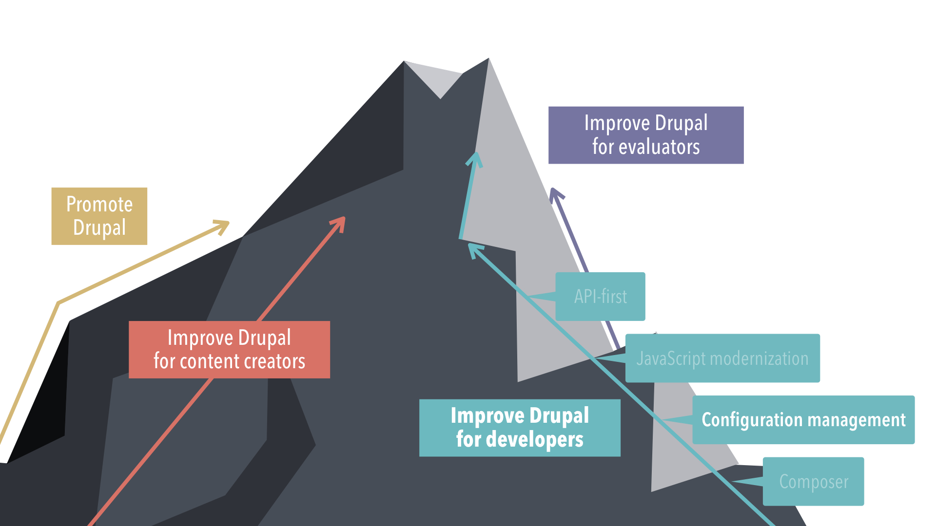

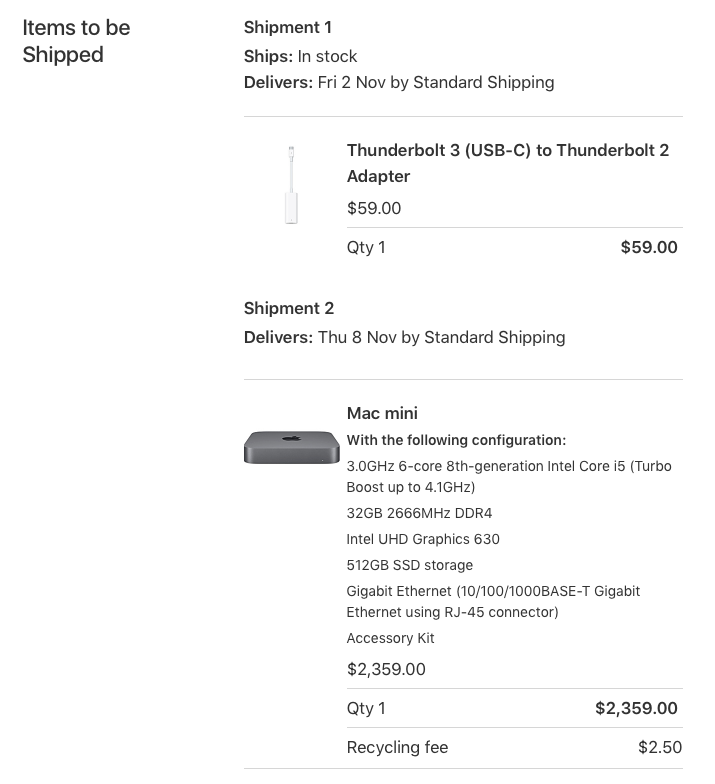



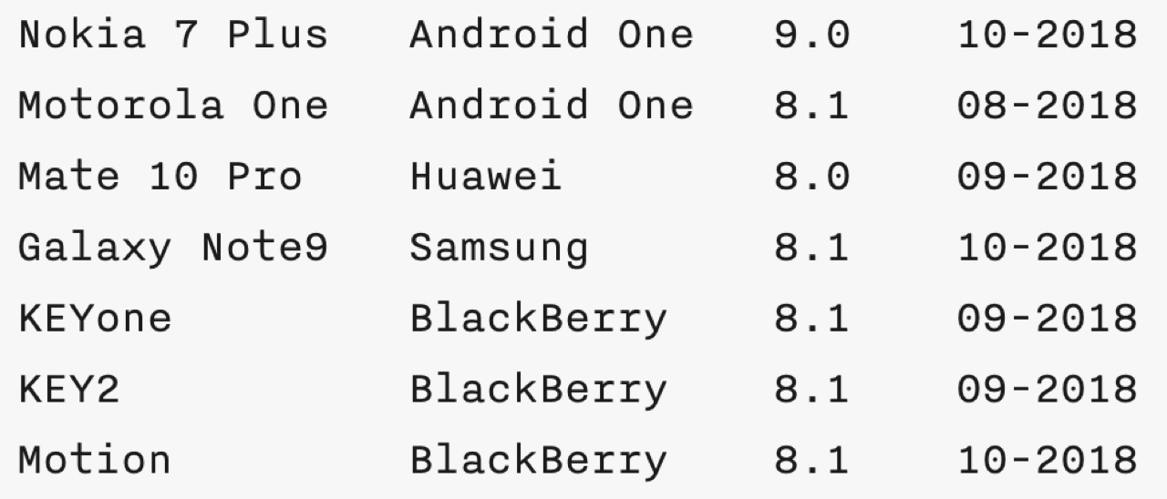



 Price Tags.


 The Guardian.



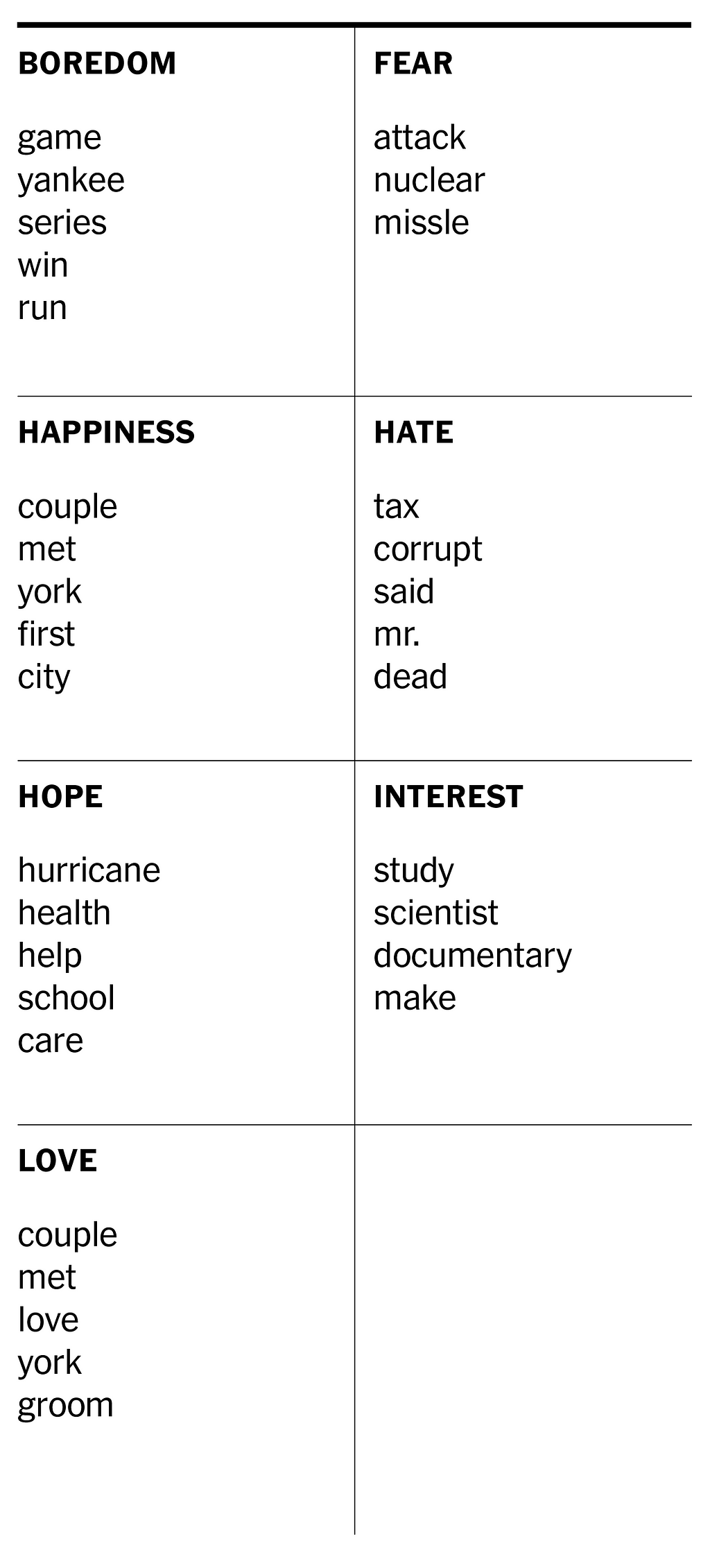
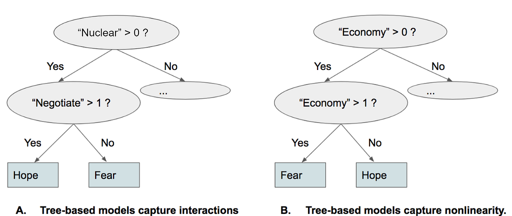








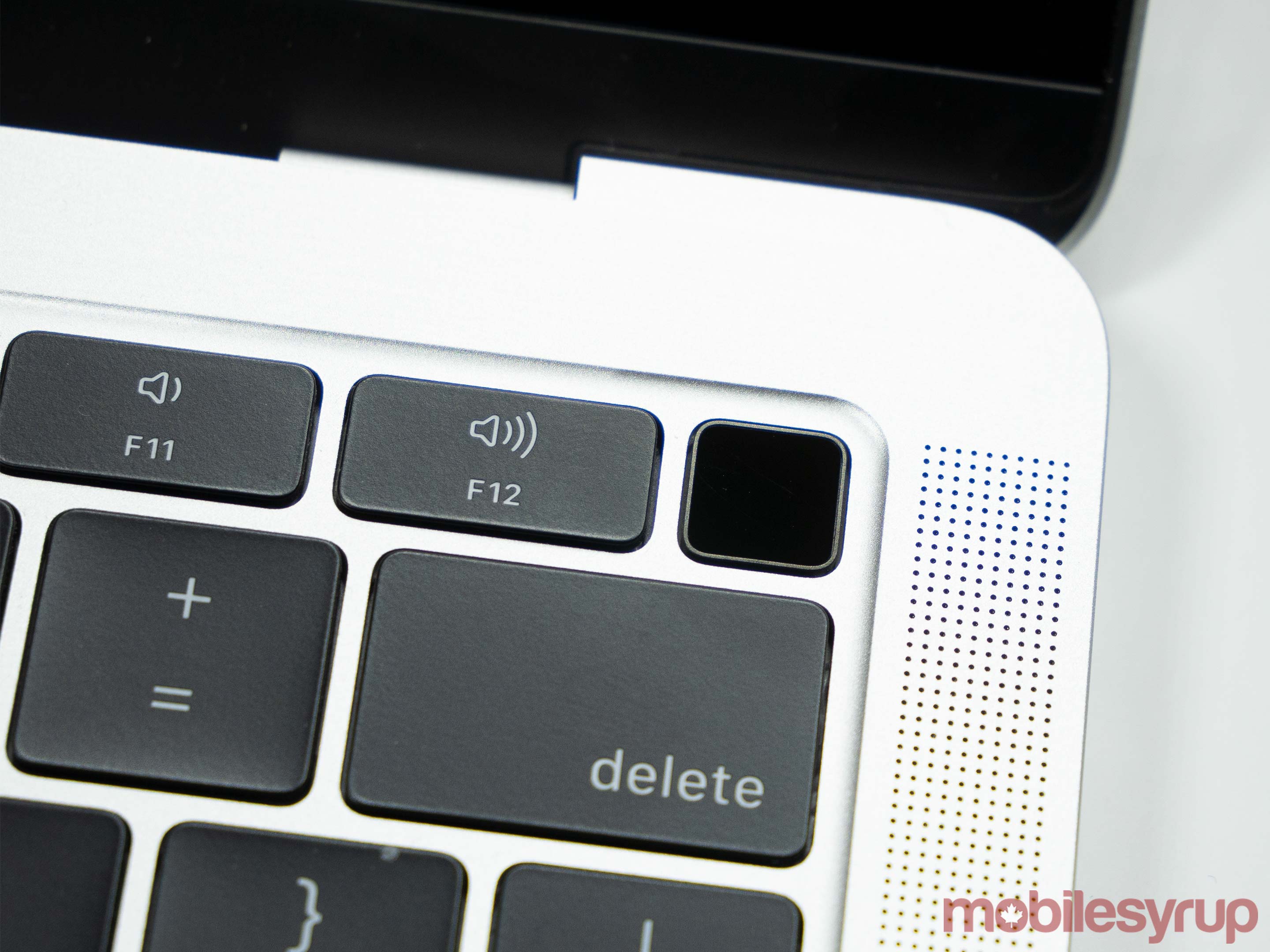
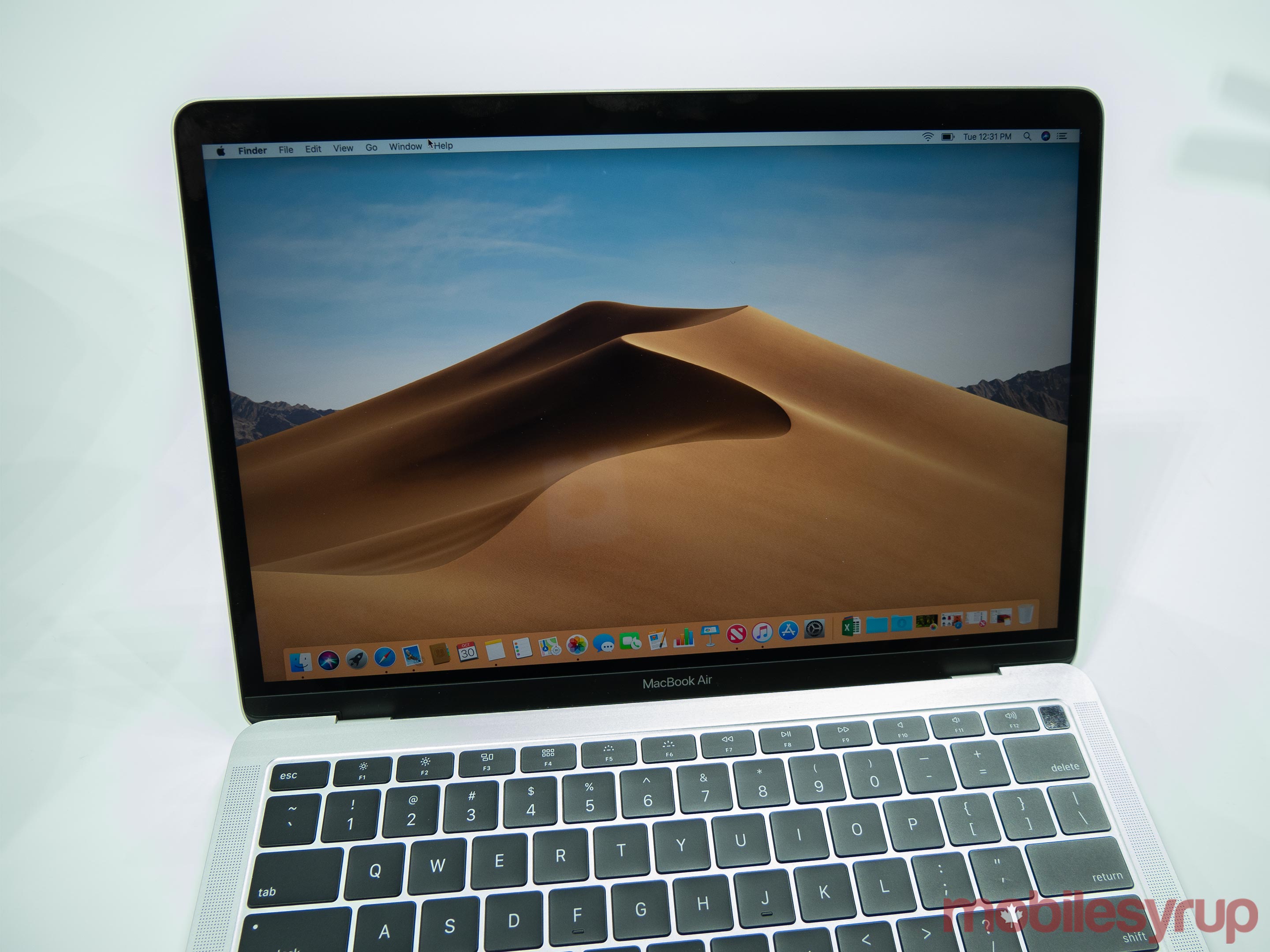

 (@AgentAkki)
  Office Visual Refresh and Dark Mode support rolling out now to Insiders Fast with build 181029!
 New Ribbon and icon styling in Word, Excel, PowerPoint and OneNote.
  Dark Mode in Word, Excel and PPT on macOS Mojave.