Most of us intuitively accept emotions drive behaviors better than facts.
But we get clumsy with the messaging to make people feel the emotion.
Too often we make the mistake of naming the feelings we’re trying to amplify. i.e. –
“Don’t be frustrated, ask for help!!”
“Build a powerful reputation in your field”
“Be empowered to take control of your health”
This intends to provoke revolution. No-one likes to be told what they’re thinking (or what to think).
The magic is stoking the emotion without having to name it. The magic is telling stories which connect to your members’ frustrations. You have to find the objects and situations that represent those emotions.
You don’t need to say waiting in line is frustrating, we know waiting in line is frustrating. Likewise not knowing how to solve a problem is frustrating and exasperating, you don’t need to name the emotion. You don’t need to say building a reputation is joyful, you need to find objects that represent that feeling. The more visual the objects are, the better. The more people can imagine encountering those objects, the more effective they are at amplifying the emotion.
This has to be reflected in the copy you use, images you deploy, stories you share etc…
If we think frustrating people with problems will drive someone to ask a question in a community, we’re not going to use the word ‘frustration’ at all.
We’re going to find objects which represent the alleviation of that frustration. We’re going to share stories of people who solved their problems, features images of collective time saved in the community, and posts about mistakes avoided etc…
The secret is always not to name the feeling you want to amplify, but to find the objects (words, ideas, images, etc… ) that will make people feel it.
Nun ist der Big Deal raus. Der chinesische Großaktionär von Daimler steigt bei Smart ein. Geely wird die Hälfte der Anteile übernehmen an dem zu entstehenden chinesisch-deutschen Joint-Venture. Die neue Smart Generation soll damit in einer [...]
After a deep dive into our archive, I found several instructive examples. I grouped our crimes against data visualisation into three categories: charts that are (1) misleading, (2) confusing and (3) failing to make a point. For each, I suggest an improved version that requires a similar amount of space — an important consideration when drawing charts to be published in print.
Very nice. Archive lookups are often accompanied by “ooo, vintage, therefore good” but Leo takes it the other direction.
Found this tidbit interesting: “Until fairly recently, we were less comfortable with statistical software (like R) that allows more sophisticated visualisations.”
A job search ad by Vincit, a publicly listed tech company reads “A search for Vincit’s twenty-seventh Mikko. And hey: we’re not discriminatory”
While Silicon Valley labors to exorcise its bro culture–the widespread egregious behavior, sexist jokes, chauvinism, power plays, harassment and discrimination–you wouldn’t guess where sexism is business as usual. Yes! In the happiest country in the world.
Almost every year Finland wins the happiest country in the world award, and just this week Finland won again. Finland’s people have so much to be proud of: they’re the best educated people in the world, they have national childcare, healthcare and have almost eliminated poverty. Their laws guarantee equal opportunity for men and women. They house their homeless. Both mothers and fathers have equal parental leave and it’s the only country in the world where fathers spend more time with their children than mothers–it’s only 8 minutes, but still! It’s a start.
Nevertheless, their tech industry is full of sexism, bias and chauvinism, which I have experienced first hand. I’m both an outsider and an insider to Finland. I’ve spent the last decade going back and forth between Silicon Valley and Helsinki. Several years ago, I gave a talk at Aalto University for the technology students there, and after my talk I caught the beginning of the next talk by a very famous Finnish tech entrepreneur. “You too can reap the fruits of success as an entrepreneur,” he said. “Here’s some of the things you can get”. And he proceeded to show slides of a sports car, a private plane, and lastly, Netscape founder Jim Clark, in his 70s, in front of a boat, with his 25 year old wife. He pointed out their respective ages. He pointed at the wife.
Things you can get?! I was astonished and looked around so we could all share our outrage. No one met my eye. No one shared my outrage. This was my first experience of sexism as usual. But it was not an isolated case.
When some interns from Finland came to work at my company in the Valley, I was surprised to learn that in Finland it was OK to refer to women as “bitches” and “ho’s”–or maybe they just talked like that when they were in the U.S.? One passed around a magazine he’d worked on, which had quasi-pornographic pictures of more ho’s. Well, it was an internship program after all, there was a lot to learn.
I noticed other things. I was invited to conferences explicitly because “they needed more women” not because I built great companies. Conference events centered around drinking and gambling, and when I pointed out that women may feel uncomfortable there, the conference organizers shrugged. Here in the Valley many companies have realized drinking is often correlated with harassment, and even assault, and no longer sponsor drinking events.
I found the incomprehension to be almost universal. Shut down, glossed over, and dismissed by Finns up and down the ladder, the conversation had been successfully smothered. When harassment was reported, the responses were oddly toothless. There was a sense of “Nothing to see here folks! Move along!” To my knowledge, no one has been fired, or suffered real consequences for their actions. Maybe everyone’s kept their pants on? The law of numbers says no. While there’s a lot of rah-rah for women, Happy International Women’s Day posts, and photos of the smiling minority of women at the tech companies on the front of every tech company’s web site, underneath it all, lies a strong bias. Finland is in denial.
Sexism reared its ugly head again this week with #ParempiMikko. A publicly traded company, Vincit, advertised that there were 26 men named Mikko working at their company, and they were looking for another Mikko. This is, mind you, a company which came in last in a survey of workplace diversity in Finnish Tech companies with only 11% women employees. So the young women working with the largest tech festival in the Nordics, Slush, spotted the bias and exclusion in the post, and they tweeted about it. The CEO of the company tweeted back at them that if they saw bias there it wasn’t his problem it was theirs–since they were the ones who saw bias there. And when a well-respected tech reporter, Senja Larsen, wrote about it in the business press, the CEO wrote her emails with a threatening tone.
It gets worse. Vincit is known for putting sexist jokes into their press releases, external communications–even in their financial statements. These have been reported by the press: Their jokes are juvenile. ”Kympin pitäjä” which means “great village” turns into “pimpin kytäjä” or “pussy place”. The Finnish Stock Exchange criticized them for this, but their response was to tell them to “lighten up a little”. On their quarterly results video they again made some appalling puns: ”surkea töihinottaja” became “obscene blowjob” and refers to the only woman on the management team–the head of HR!–as “cunt babbles”. People in Silicon Valley know that a CEO would be fired for that, but weirdly, nothing happened.
The Vincit CEO calls himself “the leading star of the future of leadership” on his Twitter profile. But he’s a leader who makes sexist jokes, who stands by them when called out, who doesn’t listen to women but dismisses them. The women at the company–which has paid to be entered into “Best Places to Work” type competitions–predictably leapt to its defense. Women have been complicit in maintaining the silence, heading up the HR departments, tweeting their support, covering up and ensuring that nothing is done. This also happens in the Valley and around the world.
So Finnish Tech Industry People, I know it’s tough, since some of your more admirable qualities are tolerance and agreeableness. I know you know that you’ll have to work with these people for the rest of your life in a country of 5.5 million people and an industry of thousands. But it’s important to do something. Treat women better, speak out, stand by and stand up for them. Because we look up to you. You know how to build a just society. You’re the secret leaders of the world.
Airline lounges can be a luxurious reprieve from chaotic airports. They typically boast an array of free snacks and drinks, and the most upscale airport lounges are staffed by bartenders who will serve you bottomless Bloody Marys gratis.
BBC News: Brexit: What happens now? “The UK and EU have agreed a variable extension to Article 50 to delay Brexit. It was originally scheduled to happen on 29 March. […] Having lost two votes on the Brexit deal, Theresa May is now asking MPs to back just half of it – the withdrawal agreement, which covers the divorce settlement.
If she is successful, Brexit would be delayed to 22 May but there will still be issues to sort out. If she fails, we can expect the process of “indicative votes” to continue on Monday.”
While the Campeur is a traditional tourer, it can also be built up to be a lightweight and comfortable day-long rider that can tackle all that Eroica California can throw at it. Here's a recent complete build we did for a good friend who is going to be riding Eroica CA this year.
The Course Handlebars have been a long time favorite for those with non-aero brake levers. The ramps have ample real estate for moving around while keeping the brake levers well within reach. The drops are generous to gain some aerodynamic advantage.
It's hard to find a polished, new derailleur but this one from Microshift is a gem. The R10 works for cassettes up to 28T and is compatible with 8, 9, and 10 speed shifters from Shimano. Note: it isn't compatible with Tiagra 4700 shifters, which uses a different pull ratio.
A bit of twine to keep the non-aero cables together. Not really needed, but it's fun.
A VO Quill with positive rise makes for a comfortable, upright position.
Retro Bottle Cages keep your bidons in place even over the roughest of terrain.
We've had a lot more interest in completes bikes using our frames and components. While we aren't quite in the position to do completes from Taiwan (that is, not enough physical room in our facility for bikes and frames), we can definitely do custom, one-off builds. I'd estimate a well outfitted Campeur and Polyvalent with Shimano 105/Deore level of components would be around $2800 shipped within the contiguous USA. Piolet would be roughly $3000 as MTB rims and components are a bit more expensive. That includes assembly labor and shipping.
Turn-around time is between 2-3 weeks from receiving the deposit and putting the shipping label on the box. If you're interested, shoot us an email info@velo-orange.com and we can get the conversation started!
I accept that there will be a certain amount of sloppiness in online posts; after all, I'm no saint. But the Association for the Advancement of Computing in Education (AACE) ought to have higher standards than this article. Not only is it riddled with grammatical errors, it's factually unsound. For example, at one point it says 3 billion is "about a third of the world's population," which isn't close. It later says "Globally, 45% of the population are social media users," which is more accurate, though 45% is nowhere near a third. It tells us "81 percent of the United States population had a social networking profile," but the number cited, 243.6 million, is actually 74% of that population. We are told, "in Germany, 42.8 million people use social media", which is about half Germany's 82 million people, not the 36% the article claims. This article, which appears to be a placement for a statistics company, has zero credibility, and reflects the same on AACE.
I recognise much of what Harold writes. I suspect this is also what feeds impostor syndrome. You see the very mixed bag of results from your own efforts, and how most of it is ‘crap’. The few ‘hits’ for which you get positive feedback are then either ‘luck’ or should be normal, not sparse. Others of course forget most if not all of your less stellar products and remember mostly the ones that stood out. Only you are in a position to compare what others respond to with your internal perspective.
At the same time, like Harold, I’ve realised that it is important to do things, to keep blogging and writing in this space. Not because of its sheer brilliance, but because most of it will be crap, and brilliance will only occur once in a while. You need to produce lots of stuff to increase the likelihood of hitting on something worthwile. Of course that very much feeds the imposter cycle, but it’s the only way. Getting back into a more intensive blogging habit 18 months ago, has helped me explore more and better. Because most of what I blog here isn’t very meaningful, but needs to be gotten out of the way, or helps build towards, scaffolding towards something with more meaning.
It’s why I always love to see (photographs of) artist’s studio’s. The huge mess and mountains of crap. The two hundred attempts at getting a single thing to feel right for once. Often we see master pieces only nicely presented and lighted on a gallery wall. But the artist never saw it like that, s/he inhabits that studio where whatever ends up on a museum wall someday is just one thing in a mountain of other things, between aborted efforts, multiple works in progress, random objects and yesterday’s newspaper.
In a recent email, Creative Commons head Cable Green wrote "CC does plan to offer an API to CC Search" I think that's a good idea. I would use that; it would allow a content creation application like gRSShopper to use CC search to find resources to link to or embed. But what should such an API look like? One person suggested IMS's Resource Search, which linked to LTI. But IMS isn't exactly open; membership has its privileges. This article looks at a different sort of database, but the key to an effective API can be fount in item 5: "The API itself and any data collected from the API should be accessible to and shareable with the general public."
I think this is important, and that it doesn't apply only to university students. I'm talking about "a feeling of being supported – that someone out there knows about you and your studies as an individual, will look out for you, and share your highs and lows." This is the sort of thing that will get a person out of bed in the morning and keep them working on something into the evening. It's what I miss most on those days I feel alienated from my own work. It's probably the difference for many people between success and failure. The key to support? Not ed tech - but rather, the knowledge that there's a person out there, listening, who cares about what you have to say. What some call 'presence'.
A new product analyst learns the ropes during an experimental sprint
Illustrations by Rose Wong
A few months ago the Email and Messaging team decided to develop a new product using a swarming sprint format. This meant everyone on the team focused on delivering one Minimal Viable Product, or MVP, during the sprint rather than completing the project over a series of sprints. One product. One sprint. The entire team.
Not only was this a new way to work for the team, but it was entirely new to me. A year and a half ago, I moved from London to New York to attend the Columbia School of Journalism. Shortly after graduating, I walked bright eyed and excited into The New York Times office for my first day at work as a product analyst. Three months later, I found myself working on an automated re-engagement campaign for our email newsletter subscribers.
I am in a newly created rotational product role at The Times that reports to the Storytelling Product lead in our Engagement department. I partner with product managers to help create strategies for their teams, provide product requirements and communicate to external stakeholders. I get to learn what it means to be a product manager from a range of different perspectives, and they get an enthusiastic and highly motivated extra pair of hands.
We decided to tackle the re-engagement campaign by having all the key stakeholders — design, software development, project, legal, customer care and the newsroom — involved in the entire process: from brainstorming solutions, to approving design mockups and product launch. It was something we hadn’t tried before. The spirit of inclusion and getting multiple perspectives on one problem seemed great in theory, but the reality didn’t quite align with what we anticipated.
The Problem: We had a large pool of inactive newsletter readers — people who hadn’t read any of our email newsletters in over 60 days — and that number was only growing. When readers became inactive we stopped sending them the newsletter, but we did not tell them we were unsubscribing them. While it helped to clean up our subscriber list, it did nothing to potentially reinstate them as active readers. Clearly, this was a missed opportunity we needed to address.
The Solution: Our primary business goal was to retain our engaged newsletter audience. We decided to target readers who were at risk of becoming inactive with messaging focused on re-subscribing to the newsletter. We proposed and developed an MVP that included two emails. The first email warned them that they hadn’t opened the newsletter in a while, and were at risk of being unsubscribed; the second presented the opportunity to re-subscribe before being automatically unsubscribed. If they didn’t take action and were unsubscribed, we deleted their information from our databases. By removing personal information about unsubscribed readers, we were also supporting our company’s effort to incorporate more privacy into the design of our products.This also improved our overall data privacy practices because we only retained information of engaged readers. We aimed to have an initial five percent re-subscribe rate.
Illustration by Rose Wong
The Execution: Our two-week swarming sprint began and ended on Wednesdays. During the first two days, the entire team gathered in a large meeting room. As the product lead, I explained the problem and after a careful discussion, all team members brainstormed solutions, determined the work required, wrote user stories and finalized the roll-out strategy. By the first Friday, we had developed a timeline for the launch, created design mockups and drafted copy, which set us up to launch by the final day of our sprint.
Initially, the concept of the swarming sprint sounded exciting and inclusive, but the practical challenges of tackling a problem this way consumed a lot of energy.
The structure and process of the swarming sprint allowed everyone on the team to feel like they had their say on the direction of the product. All members of this team learned about the issues for each group, including the back-end infrastructure of Helix (our email Content Management System) and the front-end design. The tech side also learned about the business side, such as stakeholder mediation with other departments, the formalities associated with rolling out a new product, and the granular details required by both internal and user-facing messaging.
As the stakeholders came up with new ideas, the scope of the work changed in small ways (font and copy) and large ways (the timing between emails and when a reader was deemed “inactive”). All team members had equal input and could suggest changes, so we had constant revisions to our MVP, which sometimes meant developers had to make last-minute updates to their code.
We realized in this energetic chaos we were missing some of the advantages of a normal sprint process, like having more time to develop design mocks, groom tickets and hash out details between product and tech. Despite all this, we had a basic MVP that we could test at the end of two weeks.
In Retrospect
While the swarming format resulted in a more collaborative workflow, we needed to work out some kinks in order for it to be truly effective for the entire team. After testing, we concluded that we were able to re-engage enough readers to validate rolling out the re-engagement emails as an ongoing automated campaign. We achieved a total re-subscribe rate of 10.71 percent surpassing our initial five percent goal.
After an in-depth retrospective, we realized that we needed to be far more organized in defining roles and responsibilities, as well as making sure we had clear definitions of what “done” means for all user stories. We were able to look back on our first swarming sprint with appreciation, acknowledging that although the two sprint styles were very different, they were both worth it because we learned how to work as a team, make decisions quickly and turn around an MVP in one sprint.
The biggest takeaway for me was that no matter how things felt at the time, the team continued to support and help each other throughout, which made me feel proud to be a part of the team. It may have been disorganized and hectic at times but there was no blame or pointed fingers. Despite the chaos with the swarming sprint, we decided to give it another try.
Launching a Product in One Sprint was originally published in Times Open on Medium, where people are continuing the conversation by highlighting and responding to this story.
If you were starting a startup right now and were picking a place to host your first service bits, where would you be tempted to deploy first?
There were 1493 votes cast, and the results were:
20% Google Cloud or Firebase
22% Netlify, Zeit, or similar
20% Azure
38% Amazon AWS
The shape of the results for the big three clouds doesn’t surprise me much. This wasn’t rigorous by any stretch of the imagination, and there’s definitely some bias in the numbers based on who saw and retweeted the tweet. That bias almost certainly favors Azure somewhat, and for full disclosure, I currently work at Microsoft. But still, no big suprises here.
Answering which of the major clouds people wanted to use, however, wasn’t really my goal. Here’s the way I should have phrased the question:
If you were booting up a startup and could only pick one of the following to deploy to, which one would you be tempted to use?
The key word in this question (and the one I tweeted as well) is tempted. The company names are proxies. What I really wanted to see was if the developer experience and deployment styles enabled by serverless, JAMstack, and similar approaches that manage infrastructure for you was getting traction in my circles.
And yes dear reader, given that this was my motive, I should have grouped Firebase with Netlify and Zeit and not with Google Cloud. And I probably should have included Iron and Amplify in that grouping as well. Even with those caveats, however, I find it pretty amazing that 22% clicked on the “Netlify, Zeit, or similar” entry. Not only is that a good reflection on those companies, but it’s also a pretty good signal for the developer experience and technology approach those companies are championing.
Thanks to everyone that participated and retweeted this survey. And thanks to those that wrote in their own answers. There was a lot to think about in the discussion.
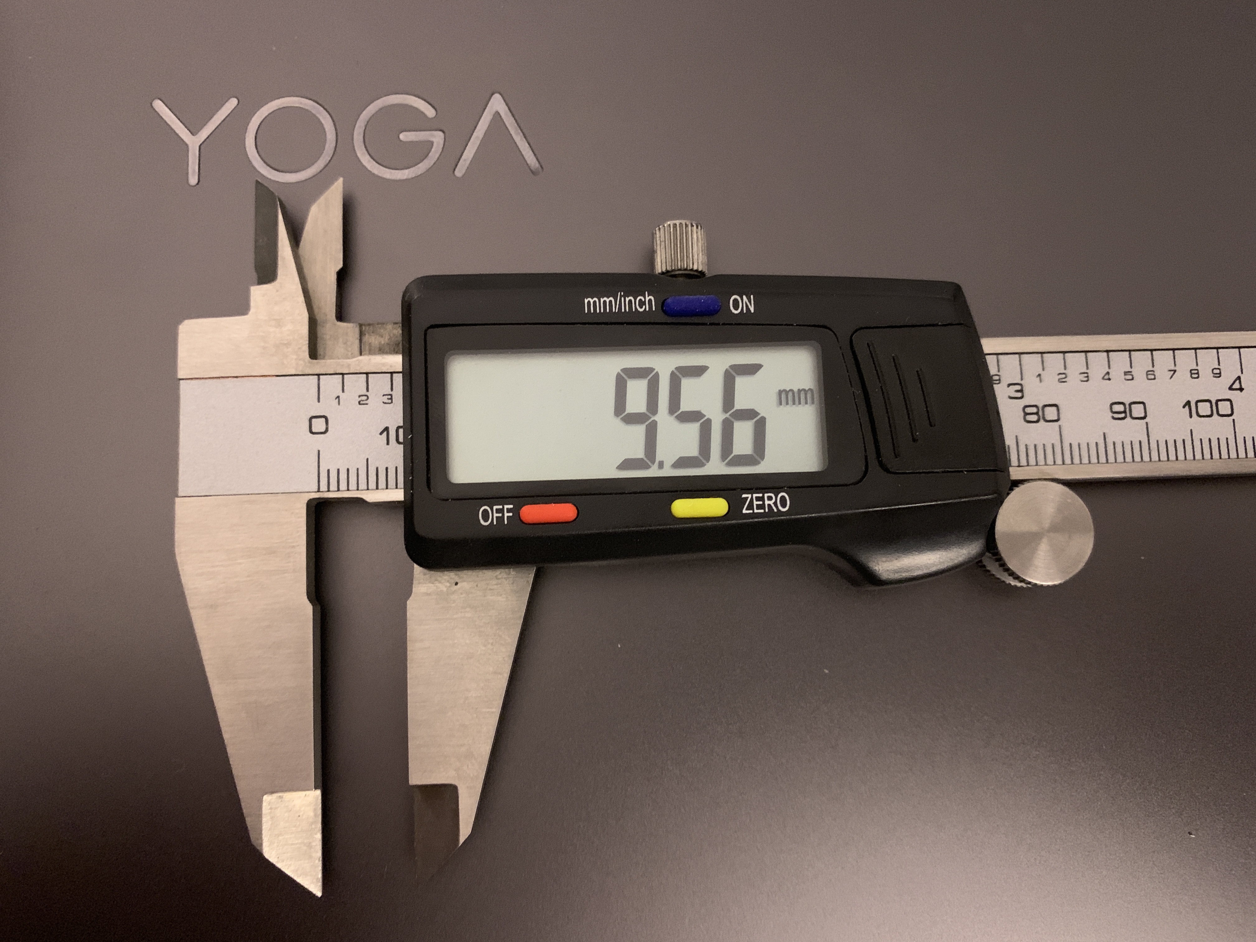
Ich brauche mal ein paar Leute, die eine Schieblehre bedienen können und ausmessen, wie dick ihr Laptop an der dünnsten Stelle ist. Und zwar nicht an der Kante, sondern in dem Bereich, in dem das Keyboard eingebaut ist. Die Gesamtdicke kann man nachschauen (14,9 mm), aber nicht die Dimensionen der beiden Hälften.
Das Lenovo Yoga C930 ist direkt vor der Leertaste genau 9,57 mm dick. Das konnte ich in dem Foto nur annäherungsweise nachahmen. Ich runde das mal auf 9,6 mm auf. Das Signature Keyboard des Surface Pro misst übrigens 5 mm. Beide Keyboards lassen sich durch Krümel nicht schachmatt setzen.
Mich würde deshalb besonders interessieren, wie dünn Apple eigentlich das MacBook (Pro/Air) mit dem Butterfly-Keyboard gemacht hat.
Bei der Gesamtdicke liegen alle nah beieinander: Surface Pro mit Signature Keyboard und iPad Pro in Smart Keyboard Folio sind 13,5 mm dünn. Das Yoga C930 misst 14,5 mm, das aktuelle MacBook Pro 14,9 mm und das neue MacBook Air kommt an der dicksten Stelle auf 15,6 mm.
Pedro Marques@MetroManTO
“Officer, I didn’t see the sign.”
1 “no through” sign before the intersection, 2 “no through” signs ahead of it, 2… twitter.com/i/web/status/1…
Andray@andraydomise
I took way too long to write this, but here it is.
White nationalism in Canada didn't emerge from a vacuum. It was… twitter.com/i/web/status/1…
supposed former infatuation jumpsuit@JodiesJumpsuit
You know, at least in the old streetcars I didn’t have to directly face people who never learned to cough into their sleeve
Sandy Kemsley@skemsley
Taking the half-life of knowledge seriously: "how to approach learning when the knowledge landscape is in constant… twitter.com/i/web/status/1…
Hi everyone! 🙋🏻♀️ Elana here. This week Lisa’s off in Mongolia giving a data visualization training, and asked me to stand in for her, so in her honour I’ve prepared something inspired by one of her Datawrapper training wisdoms.
Lisa once mentioned that she often advises her students that “the scatter plot is like the Photoshop of Datawrapper”.
That stuck with me. Because she’s right, it really is such a flexible and powerful chart type that with a little creativity and patience, it’s basically a canvas that you can turn into just about anything.
Well, I decided to take this one step further away from dataviz. After all - what is Photoshop if not a way to define the specific position of colored points in two dimensional space? And isn’t that kind of what a scatterplot is too?
How hard would it be to paint a picture using our scatterplots, I wondered to myself.
Well, by digging around in my toolkit not that hard as it turns out. So how did I do this? If you’re interested, read on. If you just want to play with the final result, hover over the chart and click Edit this chart.
Step 1. Photoshop
First I had to find an image, then I opened it in Photoshop and reduced the size to 65px x 78px
Then I used Photoshop’s posterize to reduce the number of colors.
Step 2. Processing
I used Processing to write a little script to go through all of the 5078 pixels of the reduced image, extracting the rgb color values and coordinates of each pixel, feeding this data into a csv file.
Step 3. Datawrapper
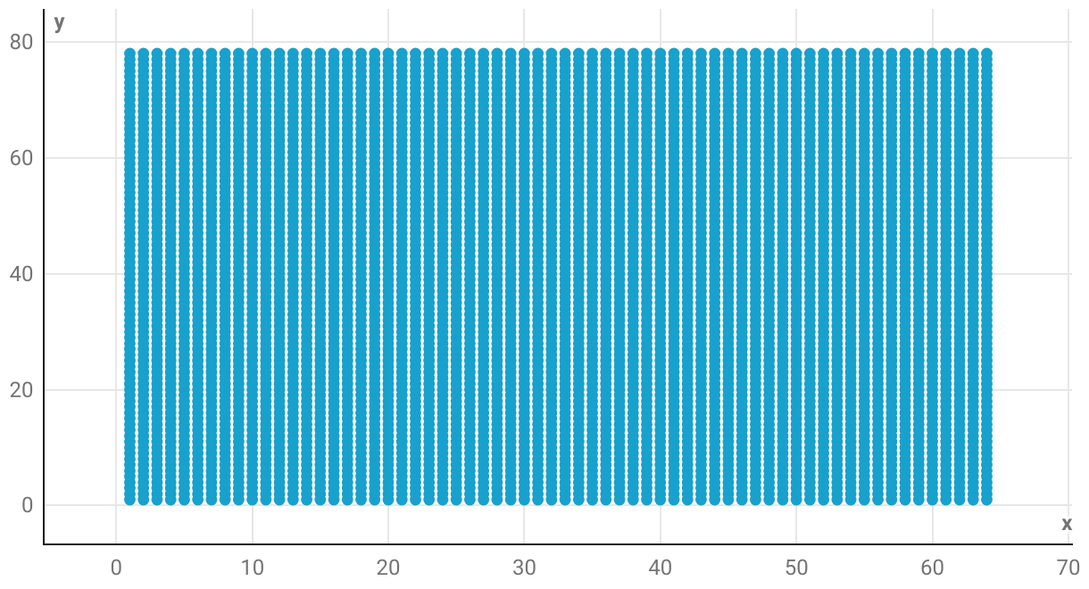
I then imported my csv file into Datawrapper. And out popped… a big blue square.
Not quite what I was after! I still had to customize the colors. I could have done this by hand, but with 133 different color groups, I decided to use Datawrapper’s API instead.
A little further adjustment of my axes, and then I was pretty much done. But I wasn’t quite satisfied. What about the tooltip? Well, I decided to get a little creative there too, and with a bit of CSS, I was able to visualize the percentages of red, green and blue for each pixel directly within the tooltip.
And that’s it! Hover over the chart and click Edit this chart if you want play with the final result directly in Datawrapper.
Hope you guys enjoyed this not so charty weekly chart! Stay tuned for next week when Lisa will be back, with possibly fewer Baroque paintings, and a little bit more data!
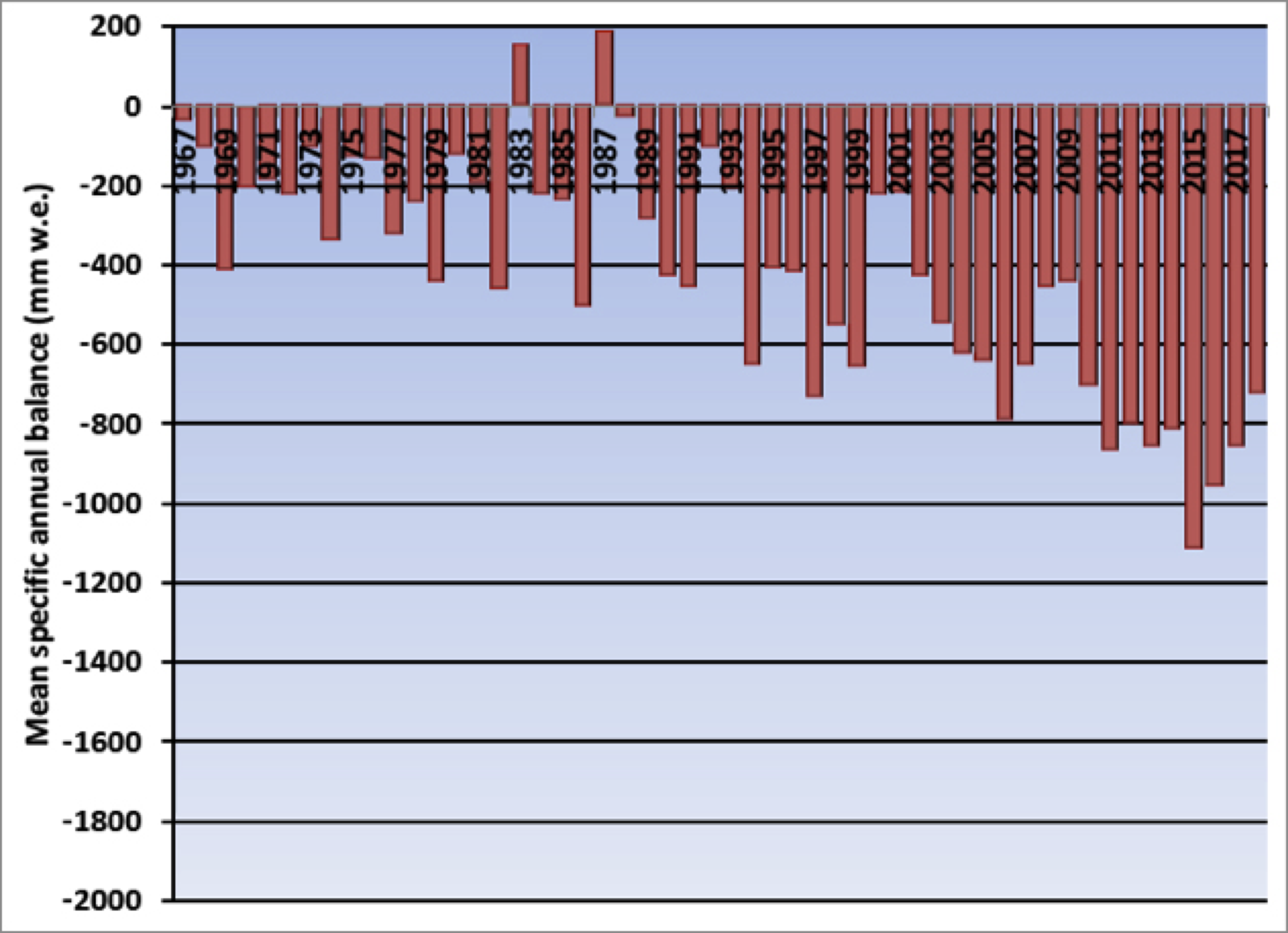
Preliminary data reported from the reference glaciers of the World Glacier Monitoring Service (WGMS) in 2018 from Argentina, Austria, China, France, Italy, Kazakhstan, Kyrgyzstan, Nepal, Norway, Russia, Sweden, Switzerland and United States indicate that 2018 will be the 30th consecutive year of significant negative annual balance (> -200mm); with a mean balance of -1247 mm for the 25 reporting reference glaciers, with only one glacier reporting a positive mass balance (WGMS, 2018).
A view of how alpine glaciers in the Pacific Northwest fit into the broader ecosystem (Megan Pelto, Jill Pelto).
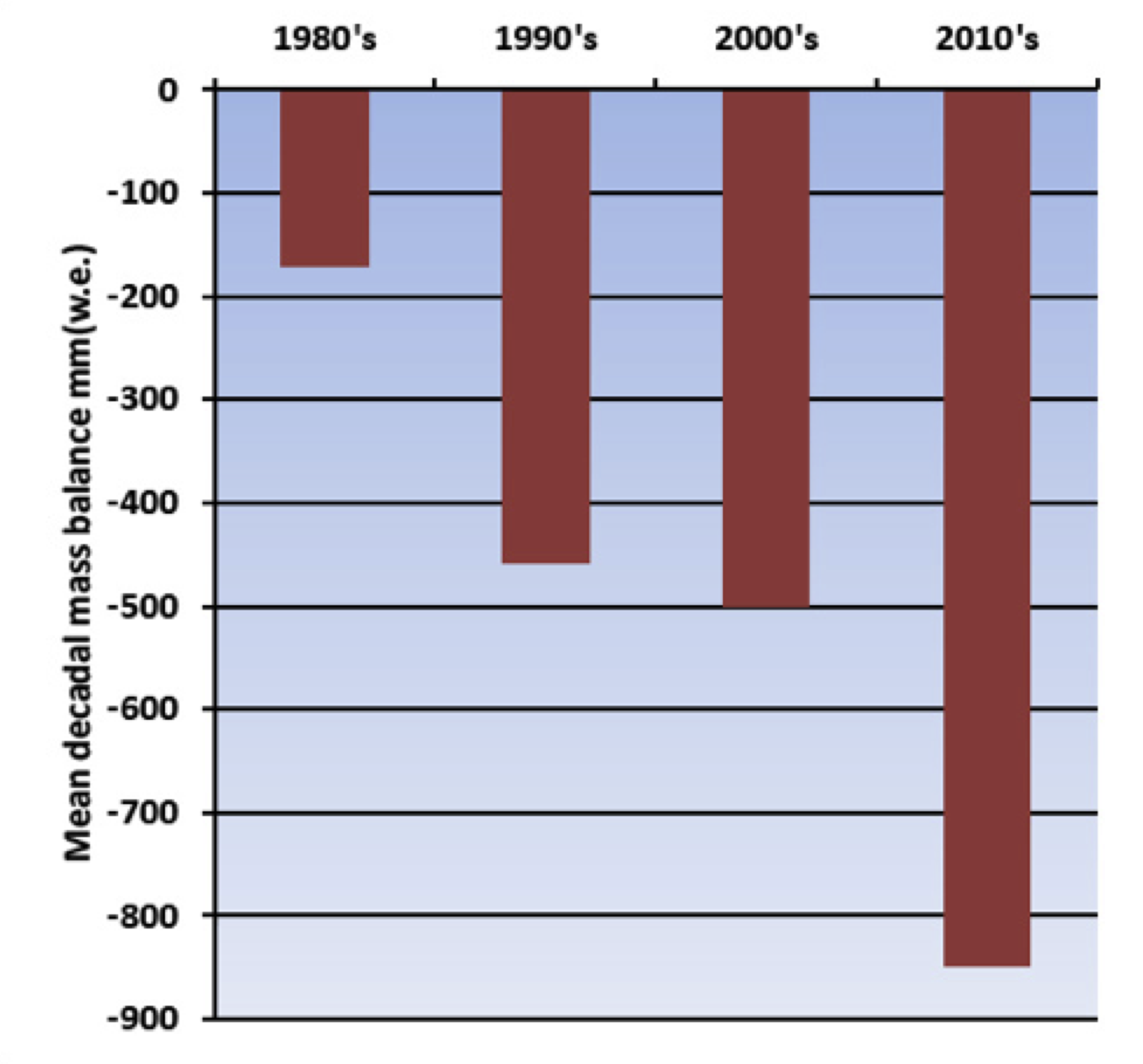
I have spent 35 consecutive summers measuring mass balance on alpine glaciers, and more than 750 nights in a tent to record their response to climate change. A decade ago I described what was happening to alpine glaciers here at RC, but the continued signal of mass loss is inescapable and has been getting worse. The decadal mean annual mass balance of WGMS reference alpine glaciers was -171 mm in the 1980’s, -460 mm in the 1990’s, -500 mm for 2000’s and – 850 mm for 2010-2018.
Figure 1. Global Alpine glacier annual mass balance record of reference glaciers submitted to the World Glacier Monitoring Service, with a minimum of 30 reporting glaciers. Global values are calculated using only one single value (averaged) for each of 19 mountain regions in order to avoid a bias to well observed regions.
Just as people need to consume as many calories as the expend or they will lose mass, glaciers need to accumulate as much snow and ice as is lost to melt and calving icebergs in order to survive. After 30 consecutive years of alpine glacier mass loss it is clear that the “diet/lifestyle” of alpine glaciers is not healthy and as the climate they live in changes, alpine glaciers will continue a downward health spiral.
Alpine glaciers are recognized as one of most sensitive indicators of climate change. WGMS record of mass balance and terminus behavior (WGMS, 2017) providing a global index for alpine glacier behavior. This record illustrates a consistent signal from alpine glaciers around the world of significant mass loss and consequent retreat. Glacier mass balance is the difference between accumulation and ablation, reported here in mm of water equivalence (mm). Mean annual glacier mass balance in 2017 was -921 mm for the 42 long term reference glaciers and -951 mm for all 142 monitored glaciers. Figure 1 and 2 are graphs of global glacier mass change showing the annual balance for a set of global reference glaciers with more than 30 continued observation years for the time-period 1950-2018.
Figure 2. Decadal average mass balance of WGMS reference glaciers.
Glacier retreat reflects sustained negative mass balances over the last 30 years (Zemp et al., 2015). The increasing rate of glacier mass loss during a period of retreat indicates alpine glaciers are not approaching equilibrium and retreat will continue to be the dominant terminus response (Pelto, 2018). Ongoing global glacier retreat is currently affecting human society by increasing the rate of sea-level rise, changing seasonal discharge in glacier fed rivers, and increasing geo-hazard potential (Huss et al, 2017) (pdf). The recent mass losses 1991-2010 are due to anthropogenic forcing (Marzeion et al. 2014).
The cumulative mass balance from 1980-2018 is -21.7 m, the equivalent of cutting a 24 m thick slice off the top of the average glacier (Figure 1). The trend is remarkably consistent across regions (WGMS, 2017). WGMS mass balance from 42 reference glaciers, which have a minimum 30 years of record, is not appreciably different from that of all monitored glaciers at -21.5 m.
The number of reference glaciers is small compared to the total number of alpine glaciers (~200,000) in the world, but has proved to be a good approximation of global alpine glacier change. Marzeion et al (2017) compared WGMS direct observations of mass balance on a few glaciers to both remote sensing mass balance calculations based all alpine glaciers over the shorter period of available satellite data and climate driven mass balance model calculations and found that each method yields reconcilable estimates relative to each other and fall within their respective uncertainty margins. The WGMS record appears to have a slight negative bias compared to modeling and remote sensing approaches, but this bias has been much reduced with the regionalized approach now used by WGMS.
In 2018 exceptional glacier melt was noted across the European Alps, leading to high snowlines and contributing to large negative mass balance of glaciers. In the European Alps, annual mass balance has been reported from 17 glaciers in Austria, France, Italy and Switzerland. All 17 had negative annual balances, with 15 exceeding -1000 mm with a mean of -1640 mm. This continues the pattern of substantial negative balances in the Alps, which will equate to further terminus retreat. Of 81 observed glaciers in 2017 in Switzerland, 80 retreated, and only 1 was stable (Huss et al, 2018, [Fr]). In 2017, 83 glaciers were observed in Austria,; 82 retreated, and again only one was stable. Mean terminus retreat was 25 m, the highest observed since 1960 when mean length change reporting began (Lieb and Kellerer-Pirklbauer, 2018).
In Norway and Sweden, mass balance surveys with completed results are available for eight glaciers; all had negative mass balances with an average loss of -1420 mm w.e. All 25 glaciers with terminus observations during the 2007-2017 period have retreated (Kjøllmoen et al, 2018).
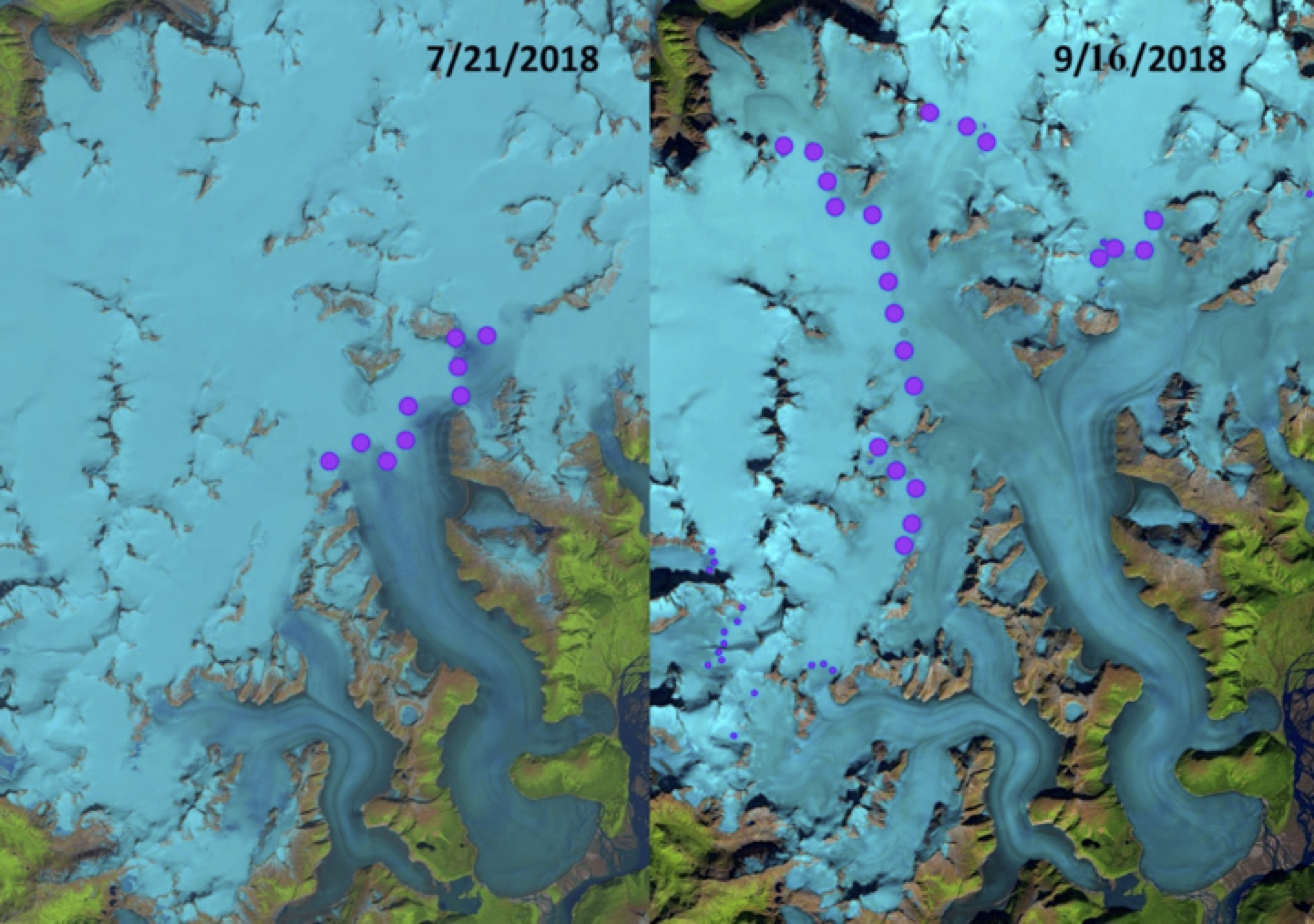
Figure 3. Taku Glacier transient snowline in Landsat 8 images from July 21, 2018 and September 16, 2018. The July 21 snowline is at 975 m and the September 16 snowline is at 1400 m. The average end of summer snowline from is m with the 2018 snowline being the highest observed since observations began in 1946.
In western North America data has been submitted from 11 glaciers in Alaska and Washington in the United States. All eleven glaciers reported negative mass balances with a mean loss of -870 mm. The longest mass balance record in North America is from Taku Glacier in Alaska. In 2018 the glacier had its most negative mass balance since the beginning of the record in 1946 and the highest end of summer snowline elevation at 1400 m. The North Cascade Range, Washington from 2014-2018 had the most negative five-year period for the region of the 1980-2018 WGMS record.
In the High Mountains of Asia (HMA) data was reported from ten glaciers including from China, Kazakhstan, Kyrgyzstan and Nepal. Nine of the ten had negative balances with a mean of -710 mm. This is a continuation of regional mass loss that has driven thinning and a slowdown in glacier movement in 9 of 11 regions in HMA from 2000-2017 (Dehecq et al. 2018).
Time series of glacier mass balance and temperature (as rendered by J. Pelto).
The key take away is the same for alpine glaciers around the globe, warming temperatures lead to mass balance losses, which leads to velocity slow down. Mass balance is the key driver in glacier response, and a sustained negative mass balance leads to thinning and retreat, which leads to a glacier velocity decline, whether the glacier is in the Himalayas, Alps or Andes.
References
M. Zemp, H. Frey, I. Gärtner-Roer, S.U. Nussbaumer, M. Hoelzle, F. Paul, W. Haeberli, F. Denzinger, A.P. Ahlstrøm, B. Anderson, S. Bajracharya, C. Baroni, L.N. Braun, B.E. Cáceres, G. Casassa, G. Cobos, L.R. Dávila, H. Delgado Granados, M.N. Demuth, L. Espizua, A. Fischer, K. Fujita, B. Gadek, A. Ghazanfar, J. Ove Hagen, P. Holmlund, N. Karimi, Z. Li, M. Pelto, P. Pitte, V.V. Popovnin, C.A. Portocarrero, R. Prinz, C.V. Sangewar, I. Severskiy, O. Sigurđsson, A. Soruco, R. Usubaliev, and C. Vincent, "Historically unprecedented global glacier decline in the early 21st
century", Journal of Glaciology, vol. 61, pp. 745-762, 2015. http://dx.doi.org/10.3189/2015JoG15J017
M. Pelto, "How Unusual Was 2015 in the 1984–2015 Period of the North Cascade Glacier Annual Mass Balance?", Water, vol. 10, pp. 543, 2018. http://dx.doi.org/10.3390/w10050543
M. Huss, B. Bookhagen, C. Huggel, D. Jacobsen, R. Bradley, J. Clague, M. Vuille, W. Buytaert, D. Cayan, G. Greenwood, B. Mark, A. Milner, R. Weingartner, and M. Winder, "Toward mountains without permanent snow and ice", Earth's Future, vol. 5, pp. 418-435, 2017. http://dx.doi.org/10.1002/2016EF000514
B. Marzeion, J.G. Cogley, K. Richter, and D. Parkes, "Attribution of global glacier mass loss to anthropogenic and natural causes", Science, vol. 345, pp. 919-921, 2014. http://dx.doi.org/10.1126/science.1254702
B. Marzeion, N. Champollion, W. Haeberli, K. Langley, P. Leclercq, and F. Paul, "Observation-Based Estimates of Global Glacier Mass Change and Its Contribution to Sea-Level Change", Surveys in Geophysics, vol. 38, pp. 105-130, 2016. http://dx.doi.org/10.1007/s10712-016-9394-y
A. Dehecq, N. Gourmelen, A.S. Gardner, F. Brun, D. Goldberg, P.W. Nienow, E. Berthier, C. Vincent, P. Wagnon, and E. Trouvé, "Twenty-first century glacier slowdown driven by mass loss in High Mountain Asia", Nature Geoscience, vol. 12, pp. 22-27, 2018. http://dx.doi.org/10.1038/s41561-018-0271-9
There’s a story going around right now about a “reporter” who was following people shorting Tesla stock and allegedly approaching them for information. I won’t go into the whole Elon vs. the Short Sellers history, you don’t need it. Let’s just say that posing as a reporter can be used for ill in a variety of ways and maybe this was a case of that.
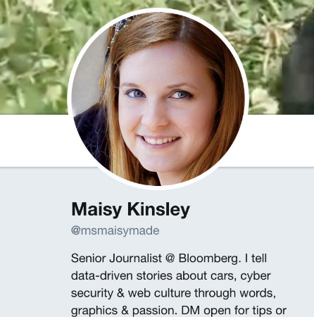
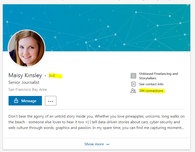
Snapshot of Maisy Kinsley’s profile
The way a lot of people judge reputation is signals, the information a person chooses to project about themselves. Signals can be honest or dishonest, but if a person is new to you you may not be able to assess the honesty of the signal. What you can do, however, is assess the costliness of the signal. In the case of a faker, certain things take relatively little time and effort, but others take quite a lot.
Let’s list the signals, and then we’ll talk about their worth.
First there’s the Twitter bio and the headshot. The headshot is an original photo — a reverse image search here doesn’t turn up Maisy, but it doesn’t turn up anyone else — it’s less likely to be a stolen photo. The Twitter bio says she’s written for Bloomberg.
This isn’t that impressive as verification, but wait! Maisy also has a website, and it looks professionally done!
Maisy’s website
From the website we learn that she’s a freelancer. Again, user supplied, but she links to her LinkedIn page. She’s got 194 connections, and is only 3 degrees of separation from me! (I’m getting a bit sick of this photo, but still).
LinkedIn profile.
Oh, and she went to Stanford! Talk about costly, right? You don’t do that on a whim!
Screenshot of education panel in LinkedIn
The Usual Signals Are Increasingly Garbage
Here’s the thing about all the signals here: they are increasingly garbage, because the web drives down the cost of these sorts of things. And as signals become less costly they are less useful.
Your blurb on Twitter is produced directly by you — it’s not a description on a company website or in a professionals directory. So, essentially worthless.
That photo that’s unique? In this case, it was generated by machine learning, which can now generate unique pictures of people that never existed. It’s a process you can replicate in a few seconds at this site here, as I did to generate a fake representative and fake tweet below.
The website? Domains are cheap, about $12 a year. Website space is even cheaper. The layout? Good layout used to be a half-decent signal that you’d spent money on a designer — fifteen years ago. Nowadays, templates like this are available for free.
LinkedIn, though, right? All those connections? The education? I mean, Stanford, right?
First, the education field in LinkedIn is no more authoritative than the bio field in Twitter. It’s user supplied, even though it looks official. Hey, look, I just got into Stanford too! My new degree in astrophysics is going to rock.
Screenshot of a fake degree I just gave myself on LinkedIn. I deleted it immediately after; fake-attending Stanford was messing up my work-life balance.
The connections are a bit more interesting. One person called one of Maisy’s endorsements to see if they actually knew this person. Nope, they didn’t. Just doing that thing where you don’t refuse connections or mutual endorsements. “Maisy” just had to request a lot of connections and make enough endorsements and figure that enough of a percentage would follow or endorse her back. Done and done.
“JB is real…talked on the phone…just taking advantage of reciprocal nature of people” Twitter, @plainsite
I’ll tell you a funny story, completely true. I once friended someone on LinkedIn that I knew, Sara Wickham or somesuch. And we went back and forth talking about our friends in college in 1993 — “Remember Russ?” “Guy with the guitar, always playing the Dead and Camper Van Beethoven?” “Oh you mean Chris?” “Right, Chris.” “Absolutely. Whatever happened to Chris, anyway?”
A week or so into our back and forth I noticed we had never attended the college at the same time, and as I dug into it I remembered the person I was thinking of didn’t have that last name at all. I had never met this person I was talking with, and in fact we had no common friends.
That’s LinkedIn in a nutshell. Connections are a worthless indicator.
Stop with the “Aha, I Spotted Something” You’re Firing Up In Your Head
So now maybe you’re channeling your inner Columbo and just dying to tell us all about all the things you’ve noticed that “gave this away”. You would not have been fooled, right?
I mean, there’s a five year work gap between Stanford and reporting. She graduated in 2013 and then started just *now*. Weird, right? There’s a sort of bulge in the photo that’s the tell-tale sign of AI processing! And it’s the same photo everywhere! The bio on the website sucks. The name of her freelancing outfit is Unbiased Storytellers, which feels as made up a name as Honest Auto Service.
Here’s the thing — you’re less smart if you’re doing this stuff than if you’re not. You know the person is fake, and so what you’re doing is noticing all the little inconsistencies.
But the problem is that life is frustratingly inconsistent once put under a microscope. The work gap? People have kids, man. It’s not unusual at all — especially for women — to have a work gap between college and their first job. If that’s your sign of fakery, you’re going to be labeling a lot of good female reporters fake.
That photo? Sometimes photos just have weirdness about them. Here’s the photo of a Joshua Benton on Twitter, who tweets a lot of stuff.
Joshua Benton
Joshua’s Twitter bio claims that he’s a person running a journalism project at Harvard, so it’s a bit weird he’s obscuring what he looks like. Definitely fishy!
Except, of course, Benton does work at Harvard, and in fact runs a world famous lab there.
What about Maisy’s sucky bio? Well, have you ever written a sucky bio and thought, I’ll go back and fix that? I have. (A lot of them made it all the way into conference programs).
And finally the name of her freelance shop: Unbiased Freelancing and Storytellers. Surely a fake, right?
Funny story about that. A bunch of Twitter users were investigating this story and looking at her LinkedIn connections/endorsements. And one of them found the clearly fake Mr. Shepard, a “Dog Photographer and Maker of Paper Hats”:
Do I have to spell this out for you? His name is Shepard and he photographs dogs. Look at the hats, which are CLEARLY photoshopped on (can you see the stitching?) His bio begins “Walking the line between storyteller and animal handler…” Come ON, right?
Except then the same person called the “Puptrait” studio. And JB is real. And his last name is really Shepard.
This puppy is real and is really wearing that hat. They is also super adorable, and if you want a picture like this of your own pet (or just want to browse cuteness for a while in a world that has gotten you down) you should check out Shepard’s Puptrait Studio. Picture used with kind permission of JB Shepard.
And the hats aren’t photoshopped, he really does make these custom paper hats that fit on dog’s heads.
If you’d think this was fake, don’t blame yourself — when reading weak and cheap signals you are at the mercy of your own biases as to what is real and what is not, what is plausible and what is not. You’ll make assumptions about what a normal work gap looks like based on being a man, or what a normal job looks like based on being something that isn’t a dog photographer and maker of paper hats.
I actually used to do this thing where I would tell faculty or students that a site was fake, and ask them how do we know? And they would immediately generate *dozens* of *obvious* tells — too many ads, weird layout, odd domain name, no photos of the reporters, clickbaity headlines, no clear about page. And then I would reveal that it was actually a real site. And not only a real site, but a world renowned medical journal or Australia’s paper of national record.
I had to stop doing this for a couple reasons. First, people got really mad at me. Which, fair point. It was a bit of a dick move.
But the main reason I had to stop is after having talked themselves into it by all these things they noticed, a certain number of the students and faculty could not be talked out of it, even after the reveal. Each thing they had “noticed” had pulled them deeper into the belief that the site was faked and being told that it was actually a well-respected source created a cognitive dissonance that couldn’t be overcome. People would argue with me. That can’t really be a prestigious medical journal — I don’t believe you! You’ve probably got it wrong somehow! Double-check!
It ended up taking up too much class time and I moved on to other ways to teach it. But the experience actually frightened me a bit.
Avoid Cheap Signals, Look For Well-Chosen Signs.
By looking at a lot of poor quality cheap signals you don’t get a good sense of what a person’s reputation is. Mostly, you just get confused. And the more attributes of a thing you have to weigh against one another in your head the more confused you’re going to get.
This situation is only going to get worse, of course. Right now AI-generated pictures do have some standard tells, but in a couple years they won’t. Right now you still have to write your own marketing blurb on a website, but in a couple years machine learning will pump out marketing prose pretty reliably, and maybe at a level that looks more “real” than stuff hand-crafted. The signals are not only cheap, they are in a massive deflationary spiral.
What we are trying to do in our digital literacy work is to get teachers to stop teaching this “gather as much information as you can and weigh it in a complex calculus heavily influenced by your own presuppositions” approach and instead use the network properties of the web to apply quick heuristics.
Let’s go back to this “reporter”. She claims to write for Bloomberg.
Snapshot of Maisy Kinsley’s profile
Does she? Has she written anywhere? Here’s my check:
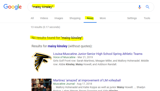
Screenshot of Google News
I plug “Maisy Kinsley” into Google News. There’s no Maisy Kinsley mentioned at all. Not in a byline, not in a story. You can search Bloomberg.com too and there’s nothing there at all.
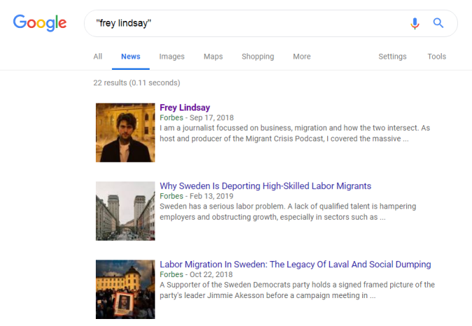
Let’s do the same with a reporter from the BBC who just contacted me. Here’s a Google News Search. First a bunch of Forbes stuff:
A search for Frey Lindsay turns up many stories from Forbes in Google News
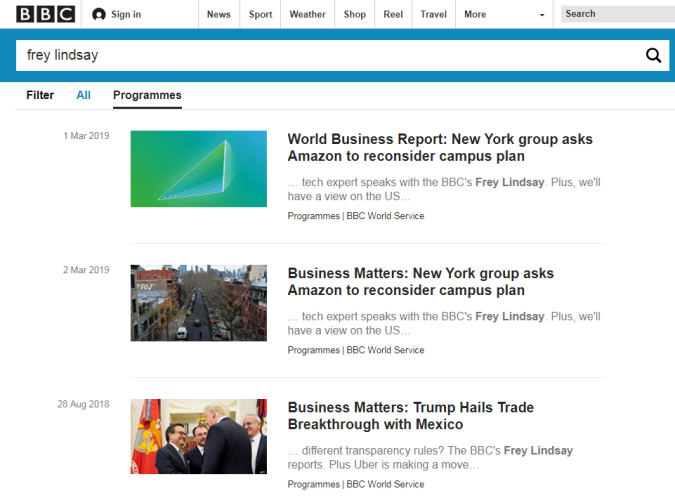
Downpage some other stuff including a BBC reference:
If we click through to BBC News and do a search, we find a bunch more stories:
We’re not looking at hair, or photos, or personal websites or LinkedIn pages or figuring out if a company name is plausible or a work gap explainable. All those are cheap signals that Frey can easily fake (if a bad actor) and we can misread (if he is not). Instead we figure out what traces we should find on the web if is Frey really a journalist. Not what does Frey say about himself, but what does the web say about Frey. The truth is indeed “out there”: it’s on the network, and what students need is to understand how to apply network heuristics to get to it. That involves knowing what is a cheap signal (LinkedIn followers, about pages, photographs), and what is a solid sign that is hard to counterfeit (stories on an authoritative and recognizable controlled domain).
Advancing this digital literacy work is hard because many of the heuristics people rely on in the physical world are at best absent from the digital world and at worst easily counterfeited. And knowing what is trustworthy as a sign on the web and what is not is, unfortunately, uniquely digital knowledge. You need to know how Google News is curated and what inclusion in those results means and doesn’t mean. You need to know followers can be bought, and that blue checkmarks mean you are who you say you are but not that you tell the truth. You need to know that it is usually harder to forge a long history than it is to forge a large social footprint, and that bad actors can fool you into using search terms that bring their stuff to the top of search results.
We’ve often convinced ourselves in higher education that there is something called “critical thinking” which is some magical mental ingredient that travels, frictionless, into any domain. There are mental patterns that are generally applicable, true. But so much of what we actually do is read signs, and those signs are domain specific. They need to be taught. Years into this digital literacy adventure, that’s still my radical proposal: that we should teach students how to read the web explicitly, using the affordances of the network.
You may have caught wind of the District of No Vancouver’s — how shall we say — odd approach to doing their part on the region’s housing issue.
Young people, seniors, low and fixed-income folks are struggling to live near services, employment and schools. Without sufficient or reasonable housing options in town centres and near transit, these vulnerable segments of our society are not just experiencing the stress of housing insecurity, they’re getting pushed out.
But Councillor Jim Hanson of team “No Vancouver” (pssst….this domain is available) has a solution.
Since it doesn’t look good to say no to people in need of housing, try saying yes, but in a different way. As in — “Yes, we’d like to give housing to people in need. We’ll just take it away from others.”
In agenda item 9.4 for this upcoming Monday’s regular meeting of council (April 1, naturally), Councillor Hanson recommends directing staff to prepare a policy that would prioritize District-owned rental housing for non-profit organizations.
The implication is clear — rather than approve the development of new non-market housing developments to serve people in need, Councillor Hanson believes it would be wiser to evict people currently in secure, government-owned rental housing, so that this housing can be given to non-profit organizations serving…people in need of housing.
Not even a renoviction. A politiviction.
It bears mentioning that during the 2018 municipal election campaign, Councillor Hanson produced a number of videos where he spent one minute talking about the issues of the day. And yes, one such video was on development and housing.
Indeed, one minute seems to be the amount of time he spent thinking about development and housing, in advance of a second term on DNV council.
Will this result in yet another disastrous vote in the district’s housing file? Stay tuned.
Rogers is raising the cost of some of its members’ internet plans by $3 plus tax per pay period on April 1st.
The notice Rogers sent out to customers cites Canadians using “more data on more devices to stream, work, and stay connected,” as the reasoning for the price increase.
The change will happen on April 1st, 2019 if that’s your bill date. If it’s not, Rogers will apply the increase to your first bill after April 1st.
The notice that a Rogers customer posted on DSL Reports.ca states: “if you have a discount off your monthly rate, this discount will apply to the new rate until your promotional period ends. If you have a guaranteed monthly rate, this rate will stay the same until your promotional period ends. If your internet package is included as part of your condo maintenance fees, this rate change does not apply.”
Rogers has specified that this excludes Connected For Sucess, Ignite TV bundles, Starter TV, bulk and current in market packages.
In the comments section of the DSL Reports notice, one Rogers customer is claiming that their cable price is going up by $3 as well.
At the end of Roger’s fourth quarter in 2018, the company made $2.1 billion in revenue from its internet sales alone. That’s was a seven percent increase over the previous year’s $1.9 billion in revenue.
At the end of the same quarter, the Canadian telecom giant had 2.4 million internet subscribers and 1.4 million TV users, according to its Q4 2018 earnings report.
MobileSyrup has reached out to Rogers for more clarifications regarding the price increases.
Night Mode with an actual black background will help users save battery power since OLED screens need to light up pixels that aren’t truly black. This means that phones will only need to light up the pixels for writing, pictures and icons in the app.
The update is rolling out now to only iOS users, according to a statement we’ve received from Twitter. Though Android users still have the original and Night Mode as well as the ability to that Night mode on a timer.
Keep checking your app to see if you now have the update on your device. It’s worth noting that you may need to restart your Twitter app as noted in the social media platform’s announcement tweet.
“Our new Dark Mode themes were designed to address the accessibility needs and personal preferences of the people who use our service,” says Cam Gordon, head of communications of Twitter Canada. “Our design and research teams worked with accessibility consultants to develop these themes, which will be easier on both the eyes and your phone battery.”
Update: 28/03/2019: We’ve received an update from Twitter saying that the Light’s Off variant is only available on iOS.
The mobile game industry is in a vastly different place in 2019 when compared to even just a few years ago. This is where Apple’s upcoming recently revealed Apple Arcade mobile game subscription platform comes into play.
It’s often difficult for even notable developers to get the attention their games deserve in Apple’s crowded digital marketplace.
While Apple’s redesigned, editorially-curated App Store has mitigated this issue to an extent, if your game doesn’t hit the radar of the section’s team, it’s unlikely your title will get a coveted ‘Editors’ Choice’ or ‘Game of the Day’ slot.
Further, consumers are trained to expect mobile games to be totally free. Because of this, the majority of the biggest mobile titles out there, including Clash of Clans, Candy Crush and even Fortnite, are all free at the outset and then monetized through in-app purchases.
Though not all free-to-play games feature frustrating, often overly aggressive in-app purchases, the majority do. While charging an outright price for a game is still an option, few developers beyond those that have established relationships with Apple seem to adopt this strategy because they already know their titles will receive prominent placement in the App Store.
Even Nintendo has taken the free-to-play route for the majority of its mobile games, with Dragalia Lostand Fire Emblem Heroes being the two main examples.
Alto’s Odyssey creator Snowman, a developer with ties to Canada, is an excellent example of one of the few remaining game creators that still charges an outright cost for a game, but it also typically receives prominent placement from Apple in the App Store.
Apple Arcade seems like an effort on the tech giant’s part to offer developers a much-needed alternative way to earn money from their games. Rather than charging per title, Arcade has subscribers shelling out a monthly subscription fee for access to over 100 mobile games.
With this in mind, though, many questions remain about Apple Arcade. For instance, what cut do developers get from being included in the platform? Will game creators be given an outright lump sum of money and then be paid more based on engagement? What level of support is Apple providing in terms of funding, given that all games coming to the service will be “original” and “exclusive to mobile,” but still coming to other platforms in some cases?
The above questions are all likely to remain unanswered, given Apple and its third-party developer partners are notoriously tight-lipped when it comes to revealing how revenue is split.
We’re so grateful that Where Cards Fall has found a home on Apple Arcade. https://t.co/SBLK6fgpiD
Perhaps the two most significant unknowns surrounding the service is how much Apple Arcade will cost subscribers, as well as what developers need to do to apply to join the platform? Current estimates run Apple Arcade’s cost somewhere between $9 and $15 CAD for subscribers.
It’s also worth mentioning that Apple Arcade’s goal is an apparent effort on Apple’s part to get more games on the Apple TV, macOS and Apple TV, though releasing a game across those platforms as well as iOS is more of a recommendation than a requirement, according to Apple.
There are other positive things about Apple Arcade as well. Apple says all games included in the platform won’t feature intrusive player tracking and that all Arcade titles will be playable offline. During the service’s reveal earlier this week, Apple even used the fact that all Apple Arcade games will be available offline as an opportunity to take a shot at Google’s cloud-based Stadia platform.
There are also many notable developers signed up for the platform already, with Sim City creator Will Wright and Final Fantasy creator Hironobu Sakaguchi’s Mistwalker being the first talent that come to mind. Regarding Canadian developers, Saskatoon-based Noodlecake studios, Snowman, a studio with ties to Toronto and Vancouver-based Rac7 Games are already confirmed to be part of Apple Arcade.
One of Apple’s main challenges with Arcade will be convincing those who haven’t taken mobile gaming seriously in the past to shell out the cash for the platform. Bringing on notable, big-name developers that have a reputation in the console space could help with this.
Though we know very little about Apple Arcade right now beyond the basic outline of the service, it holds a tremendous amount of promise and could spur a shift in the mobile video game industry, including the Android space, if it ends up living up to its potential.
Apple says Apple Arcade will include over 100 new and exclusive mobile titles and that it will launch in the fall of 2019 in 150 countries, including Canada.
That might not be the case for much longer as a notable Tesla leaker verygreen found a feature that allows the vehicles to stop at red lights, according to Electrek.
Be warned that your vehicle doesn’t have this feature enabled yet.
In the video, you can see a set of three traffic lights that appear on the dashboard when the car sees a light.
The feature became part of Tesla’s code in the latest software version 2019.8.3 update. Since verygreen has root access to his Tesla he’s enabled the feature, but he claims it isn’t incredibly stable, reports Electrek.
The leaker notes that if he wasn’t paying attention the feature would sometimes see a red light as green and it would try to run it. On top of that, if the vehicle can’t tell what colour the light is, it creeps up to the intersection pretty slowly, even if the driver can clearly see that it’s green, as per the report.
Google has updated its Gmail app on iOS to allow users to customize what happens when they swipe right.
Now, users can set their right swipe action to ‘Delete,’ ‘Mark as Read/Unread,’ ‘Move to,’ ‘Snooze’ or ‘None.’ These customizable swipe actions first came to the Android version of Gmail last June.
Additionally, notifications can now be snoozed using 3D Touch or a long press.
It’s important to note that the feature is starting to roll out now so it may take as much as 15 days to reach all users.
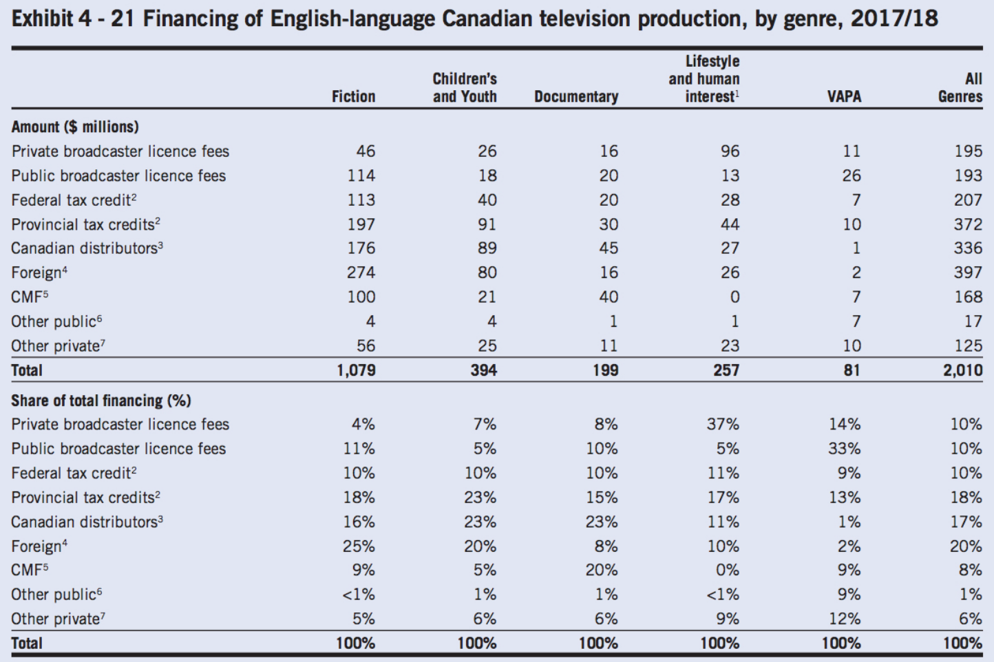
Foreign companies spent $274 million CAD on fictional English-language Canadian TV production, according to a new report from Canadian Media Producers Association (CMPA).
This means that more Canadian TV production investment came from foreign sources than actual Canadian companies. On the Canadian front, $46 million came from private broadcasters, $114 million from public broadcasters and $100 million from the Canada Media Fund (CMF).
Meanwhile, foreign sources spent $80 million on children’s and youth programming compared to $26 million from private broadcasters, $18 million from public broadcasters and $21 million from the CMF.
As noted by University of Ottawa professor Michael Geist, this demonstrates a continuous drop in Canadian TV production investment from Canadian companies.
Some argue Netflix is to blame for Cancon challenges. Here’s the actual data on funding for English-language fiction programs (2013 => 2018):
In the span of five years, foreign companies more than doubled their funding for English-language fiction programs, while private broadcasters and the CMF reduced their investments by $69 million and $67 million, respectively. Only public broadcasters have invested roughly the same during this time ($114 million in 2018 compared to $116 million in 2013).
The most notable example of foreign companies investing in Canadian TV productions is Netflix. The streaming company created its Netflix Canada division in 2017 and pledged $500 million in funding of original Canadian productions over a five-year period.
Some of the series Netflix has produced in Canada so far include the Toronto-shot The Umbrella Academy (which also stars Halifax’s Ellen Page) and the filmed-in-Vancouver Altered Carbon and Riverdale.
The electric motorcycle company Lightning has unveiled its new bike, the Strike. The Strike starts at $12,998 USD (roughly, $17,464 CAD).
The electric bike only has a range of between 70 to 200 miles (112 to 321 km), but that’s offset by the fact that users can power the bike with level one, two and three charging standards. Drivers who want to use the level three charging standard can charge their bikes in 35 minutes, but that add-on will cost them an extra $1,500 USD (roughly, $2,014 CAD).
The Strike has two variants, the Standard version and a more expensive model called the Strike Carbon. The Standard version can hit a top speed of 217 km/h, and the Carbon can hit 241 km/h.
The standard version can be outfitted with three different battery configurations;
10 kWh: 70 – 100 miles (112 – 160 km/h) highway/city range 15 kWh: 105 -150 miles (168 – 241 km/h) highway/city range 20 kWh: 150 – 200 miles (241 – 321 km/h) highway/city range
The Carbon version comes with the level 3 charger and the 20kWh battery standard. It also includes top-level components like Öhlins front and rear suspensions, Brembo Monoblock brakes and AIM Strada racing dash with lap timer and GPS-based data logging. It costs $19,998 USD (roughly, $26,870 CAD).
Much like how Tesla rolls out its vehicles, the more expensive Strike Carbon Edition is going to be the first version of Strike to hit production and delivered to customers.
 Nun ist der Big Deal raus. Der chinesische Großaktionär von Daimler steigt bei Smart ein. Geely wird die Hälfte der Anteile übernehmen an dem zu entstehenden chinesisch-deutschen Joint-Venture. Die neue Smart Generation soll damit in einer















 RealClimate.