Facebook link to this page from a console.log message that they display the browser devtools console, specifically warning that "If someone told you to copy-paste something here to enable a Facebook feature or hack someone's account, it is a scam and will give them access to your Facebook account."
After many years of planning to go and missing out, I finally made it to SF Women Against Rape‘s annual Walk Against Rape. It was very sweet – we had pastries, and made posters, I saw a few people I knew, we listened to poetry ( missed the poet’s name), speeches, and Susana y su Orquestra Adelante, then assembled in the street for a 2 mile march from the Women’s Building down to 16th and Mission, to 24th and Mission, then down 24th a few blocks & back again.
Before the march started I took it on myself to block off the side street where cars were still coming through – taking with me some handy folks including a large, kindly man obsessed with talking about his motorcycle who I felt would answer my call of punk sisterhood and several charming Sisters of Perpetual Indulgence one of whom I turned out to know. We turned back some cars and after a while a motorcycle cop showed up to do the honors. Back to the gathering march – I got up front with the banner holders. It is easier for me to be at the front or the back, so why not the front where I can represent for my wheely fellow survivors. I chanted the chants and waved at people and held up part of the banner for a while. The band (who reminded me of the stanford marching band – goofy awesome outfits) was great. Nothing like a marching band!!!! I love them!
Unpleasant aspects of the march: we were herded into one lane of the street by cops and they were just unpleasantly close to us much of the time. And, the kinda creepy dude with the nose ring and the replacements hoodie who followed the march the entire way filming it. I have actually had this same guy in my face before at the dyke march and I have a feeling I kind of know him like he is a friend of a friend (or an acquaintance). It takes a special kind of tacky to be a guy filming a march of mostly young women in this way. Not as a comrade, not in support, but for what? Stock photos? Weird fetish? Thinks he’s the documentarian of the revolution? Dunno. I ran him off a couple of times by staring him down and filming him back and one of the march organizers also got him to quit going right smack in front of us (though he just came right back). There was also a young man, high school or early college, who i thought maybe was doing an actual photojournalism assignment and he was not very good at whatever he was trying to do but at least he didn’t give off the massive creepster vibes of Mr. Descendents Hoodie.
So I spent a lot of the march with a huge crowd of mostly women at my back, staring down the cameraman and staring at some cop’s ass, gun, taser, and well worn nightstick. Typical….
The nice bits other than the people marching with, my friend Z showed up and handed out adorable “take no bullshit” stickers was one good thing; another was that many many people come out to see the march, to wave, honk in support, or just fall in and join us. That’s a really nice feeling.
SFWAR is a great organization that does good work, please donate to support them! Or, donate to an anti-rape or anti-domestic violence nonprofit near you — pick a small local one that supports your own community!!!
Security messages are very hard to get right, but it’s very important that you do. The world of internet security is increasingly complex and scary for the layperson. While in-house security experts play a key role in identifying the threats, it’s up to UX designers and writers to communicate those threats in ways that enlighten and empower users to make more informed decisions.
We’re still learning what works and what doesn’t in the world of security messages, but there are some key insights from recent studies from the field at large. We had a chance to implement some of those recommendations, as well as learnings from our own in-house research, in a recent project to overhaul Firefox’s most common security certificate warning messages.
Background
Websites prove their identity via security certificates (i.e., www.example.com is in fact www.example.com, and here’s the documentation to show it). When you try to visit any website, your browser will review the certificate’s authenticity. If everything checks out, you can safely proceed to the site.
If something doesn’t check out, you’ll see a security warning. 3% of Firefox users encounter a security certificate message on a daily basis. Nearly all users who see a security message see one of five different message types. So, it’s important that these messages are clear, accurate, and effective in educating and empowering users to make the informed (ideally, safer) choice.
These error messages previously included some vague, technical jargon nestled within a dated design. Given their prevalence, and Firefox’s commitment to user agency and safety, the UX and security team partnered up to make improvements. Using findings from external and in-house research, UX Designer Bram Pitoyo and I collaborated on new copy and design.
Old vs. New Designs
Example of an old Firefox security certificate messageExample of a new Firefox security message
Goals
Business goals:
User safety: Prevent users from visiting potentially unsafe sites.
User retention: Keep Firefox users who encounter these errors from switching to another browser.
User experience goals:
Comprehension: The user understands the situation and can make an informed decision.
Adherence: The user makes the informed, pro-safety choice. In the case of security warnings, this means the user does not proceed to a potentially unsafe site, especially if the user does not fully understand the situation and implications at hand.(1)
Results
We met our goals, as illustrated by three different studies:
1. A qualitative usability study (remote, unmoderated on usertesting.com) of a first draft of redesigned and re-written error pages. The study evaluated the comprehensibility, utility, and tone of the new pages. Our internal user researcher, Francis Djabri, tested those messages with eight participants and we made adjustments based on the results.
2. A quantitative survey comparing Firefox’s new error pages, Firefox’s current error pages, and Chrome’s current comparative pages. This was a paid panel study that asked users about the source of message, how they felt about the message, and what actions they would take as a result of the message. Here’s a snapshot of the results:
When presented with the redesigned error message, we saw a 22–50% decrease in users stating they would attempt to ignore the warning message.
When presented with the redesigned error message, we saw a 29–60% decrease in users stating they would attempt to access the website via another browser. (Only 4.7–8.5 % of users who saw the new Firefox message said they would try another browser, in contrast to 10–11.3% of users who saw a Chrome message).
3. A live study comparing the new and old security messages with Firefox users confirmed that the new messages did not significantly impact usage or retention in a negative way. This gave us the green light to go-live with the redesigned pages for all users.
How we did it:
The process of creating new security messages
In this blog post, I identify the eight design and content tips — based on outside research and our own — for creating more successful security warning messages.
Content & Design Tips
1. Avoid technical jargon, and choose your words carefully
Unless your particular users are more technical, it’s generally good practice to avoid technical terms — they aren’t helpful or accessible for the general population. Words like “security credentials,” “encrypted,” and even “certificate” are too abstract and thus ineffective in achieving user understanding.(2)
It’s hard to avoid some of these terms entirely, but when you do use them, explain what they mean. In our new messages, we don’t use the technical term, “security certificates,” but we do use the term “certificates.” On first usage, however, we explain what “certificate” means in plain language:
Some seemingly common terms can also be problematic. Our own user study showed that the term, “connection,” confused people. They thought, mistakenly, that the cause of the issue was a bad internet connection, rather than a bad certificate.(3) So, we avoid the term in our final heading copy:
2. Keep copy concise and scannable…because people are “cognitive misers”
When confronted with decisions online, we all tend to be “cognitive misers.” To minimize mental effort, we make “quick decisions based on learned rules and heuristics.” This efficiency-driven decision making isn’t foolproof, but it gets the job done. It means, however, that we cut corners when consuming content and considering outcomes.(4)
Knowing this, we kept our messages short and scannable.
Since people tend to read in an F-shaped pattern, we served up our most important content in the prime real estate of the heading and upper left-hand corner of the page.
We used bolded headings and short paragraphs so the reader can find and consume the most important information quickly and easily. Employing headers and prioritizing content into a hierarchy in this way also makes your content more accessible:
We also streamlined the decision-making process with opinionated design and progressive disclosure (read on below).
3. Employ opinionated design, to an appropriate degree
“Safety is an abstract concept. When evaluating alternatives in making a decision, outcomes that are abstract in nature tend to be less persuasive than outcomes that are concrete.” — Ryan West, “The Psychology of Security”
When users encounter a security warning, they can’t immediately access content or complete a task. Between the two options — proceed and access the desired content, or retreat to avoid some potential and ambiguous threat — the former provides a more immediate and tangible award. And people like rewards.(5)
Knowing that safety may be the less appealing option, we employed opinionated design. We encourage users to make the safer choice by giving it a design advantage as the “clear default choice.”(6) At the same time, we have to be careful that we aren’t being a big brother browser. If users want to proceed, and take the risk, that’s their choice (and in some cases, the informed user can do so knowing they are actually safe from the particular certificate error at hand). It might be tempting to add ten click-throughs and obscure the unsafe choice, but we don’t want to frustrate people in the process. And, the efficacy of additional hurdles depends on how difficult those hurdles are.(7)
Striving for balance, we:
Made the pro-safety choice the most prominent and accessible. The blue button pops against the gray background, and contains text to indicate it is indeed the “recommended” course of action. The color blue is also often used in traffic signals to indicate guidance and direction, which is fitting for the desired pro-safety path.
In contrast, the “Advanced…” button is a muted gray, and, after selecting this button, the user is presented with one last barrier. That barrier is additional content explaining the risk. It’s followed by the button to continue to the site in a muted gray with the foreboding text, “Accept the risk…” We used the word “risk” intentionally to capture the user’s attention and be clear that they are putting themselves in a potentially precarious position.
4. Communicate the risk, and make it tangible
In addition to “safety” being an abstract concept, users tend to believe that they won’t be the ones to fall prey to the potential threat (i.e., those kind of things happen to other people…they won’t happen to me).(8) And, save for our more tech-savvy users, the general population might not care what particular certificate error is taking place and its associated details.
So, we needed to make the risk as concrete as possible, and communicate it in more personal terms. We did the following:
Use the word “Warning” in our header to capture the user’s attention.
Explain the risk in terms of real potential outcomes. The old message simply said, “To protect your information from being stolen…” Our new message is much more explicit, including examples of what was at risk of being stolen. Google Chrome employs similarly concrete wording.
Communicate the risk early in your content hierarchy — in our case, this meant the first paragraph (rather than burying it under the “Advanced” section).
5. Practice progressive disclosure
While the general population might not need or want to know the technical details, you should provide them for the users that do…in the right place.
Users rarely click on links like “Learn more” and “More Information.”(9) Our own usability study confirmed this, as half of the participants did not notice or feel compelled to select the “Advanced” button.(10) So, we privileged content that is more broadly accessible and immediately important on our first screen, but provided more detail and technical information on the second half of the screen, or behind the “Advanced” button. Knowing users aren’t likely to click on “Advanced,” we moved any information that was more important, such as content about what action the user could take, to the first screen.
The “Advanced” section thus serves as a form of progressive disclosure. We avoided cluttering up our main screen with technical detail, while preserving a less obtrusive place for that information for the users who want it.
6. Be transparent (no one likes the internet browser who cried wolf)
In the case of security errors, we don’t know for sure if the issue at hand is the result of an attack, or simply a misconfigured site. Hackers could be hijacking the site to steal credit card information…or a site may just not have its security certificate credentials in order, for example.
When there is chance of attack, communicate the potential risk, but be transparent about the uncertainty. Our messages employ language like “potential” and “attackers could,” and we acknowledge when there are two potential causes for the error (the former unsafe, the latter safe):
The website is either misconfigured or your computer clock is set to the wrong time.
Explain why you don’t trust a site, and offer the ability to learn more in a support article:
Websites prove their identity via certificates. Firefox does not trust example.com because its certificate issuer is unknown, the certificate is self-signed, or the server is not sending the correct intermediate certificates. Learn more about this error
A participant in our usability study shared his appreciation for this kind of transparency:
“I’m not frustrated, I’m enlightened. Often software tries to summarize things; they think the user doesn’t need to know, and they’ll just say something a bit vague. As a user, I would prefer it to say ‘this is what we think and this is how we determined it.’”— Participant from a usability study on redesigned error messages (User Research Firefox UX, Francis Djabri, 2018)
7. Choose imagery and color carefully
Illustration, iconography, and color treatment are important communication tools to accompany the copy. Visual cues can be even “louder” than words and so it’s critical to choose these carefully.
We wanted users to understand the risk at hand but we didn’t want to overstate the risk so that browsing feels like a dangerous act. We also wanted users to know and feel that Firefox was protecting them from potential threats.
Some warning messages employ more dramatic imagery like masked eyes, a robber, or police officer, but their efficacy is disputed.(11) Regardless, that sort of explicit imagery may best be reserved for instances in which we know the danger to be imminent, which was not our case.
The imagery must also be on brand and consistent with your design system. At Firefox, we don’t use human illustration within the product — we use whimsical critters. Critters would not be an appropriate choice for error messages communicating a threat. So, we decided to use iconography that telegraphs risk or danger.
We also selected color scaled according to threat level. At Firefox, yellow is a warning and red signifies an error or threat. We used a larger yellow icon for our messages as there is a potential risk but the risk is not guaranteed. We also added a yellow border as an additional deterrent for messages in which the user had the option to proceed to the unsafe site (this isn’t always the case).
Example of a yellow border around one of the new error messages
8. Make it human
Any good UX copy uses language that sounds and feels human, and that’s an explicit guiding principle in Firefox’s own Voice and Tone guidelines. By “human,” I mean language that’s natural and accessible.
If the context is right, you can go a bit farther and have some fun. One of our five error messages did not actually involve risk to the user — the user simply needed to adjust her clock. In this case, Communication Design Lead, Sean Martell, thought it appropriate to create an “Old Timey Berror” illustration. People in our study responded well… we even got a giggle:
New clock-related error message
Conclusion
The field of security messaging is challenging on many levels, but there are things we can do as designers and content strategists to help users navigate this minefield. Given the amount of frustration error messages can cause a user, and the risk these obstructions pose to business outcomes like retention, it’s worth the time and consideration to get these oft-neglected messages right…or, at least, better.
Thank you
Special thanks to my colleagues: Bram Pitoyo for designing the messages and being an excellent thought partner throughout, Johann Hofmann and Dana Keeler for their patience and security expertise, and Romain Testard and Tony Cinotto for their mad PM skills. Thank you to Sharon Bautista, Betsy Mikel, and Michelle Heubusch for reviewing an earlier draft of this post.
West, Ryan. “The Psychology of Security.” Communications of the ACM 51, no. 4 (April 2008): 34–40. doi:10.1145/1330311.1330320.
Devdatta Akhawe and Adrienne Porter Felt, “Alice in Warningland: A Large-Scale Field Study of Browser Security Warning Effectiveness.” Semantic Scholar, 2015.
User Research, Firefox UX, Francis Djabri, 2018.
Devdatta Akhawe and Adrienne Porter Felt, “Alice in Warningland: A Large-Scale Field Study of Browser Security Warning Effectiveness.” Semantic Scholar, 2015.
Happy to share that we have a new Small Home tour! This one is all the way from Paris, France. Sophie of @nourish_paris shares her helpful reflections on living small. I love that her feedback is much more about the philosophy and mindset behind living small rather than the physical space. She even mentions “essentialism” which speaks to me much more than minimalism! I’ll let her describe her space and how it works for your family of 4 below…
Please tell us a little about you…
I’m Sophie, I’m originally from the south east of England but I moved to Paris when I was 21 as an au pair and have been here for nearly 8 years now. I’m married and have two sons, Arthur who’s three and a half and Fred, who is one. We still live in central Paris and love the area we live in. I’m the founder of Nourish Paris, which makes and delivers food packages to new mums and families in the Paris area.
How big is your home and what is the layout?
Our apartment is on the top floor of a building built in 1850. It’s 50m2 which I think is around 520 square feet. It’s unconventional in that the previous owner converted the entryway into the kitchen, which means that when you walk in, it’s directly into the kitchen and everything leads off from there. Our boys share the one bedroom and we have our large iron rung bed in the living room, along with everything else! We have one family bathroom that we all share and three tiny balconies (enough room to stand on, but not to sit out on!)
Tell me about your choice to live small as a family. Was it a conscious decision or did it just evolve?
At first it was out of necessity. We were young and didn’t have an income that meant we could afford something bigger. Paris is a pretty expensive city and small and cheap was our only option. However, now we’ve been doing it for so long, I don’t think I could live any other way. When we’re in my parents house or at my in-laws, I almost feel overwhelmed by the space. Now I enjoy the feeling that living purposefully small gives us - less to clean, less possessions, less opportunities for my kids to make mischief! But seriously I love that I can generally always see and hear my kids. They can close their bedroom door if they want to play quietly alone and at night they’re used to sleeping with the sounds of other people nearby. The “essentialism” that comes along with living small was originally difficult to adapt to, particularly for my husband who likes to keep sentimental items but we’re on a constant learning curve, really adapting to family life as our kids get bigger. Now I’ve read so much and learned so much from people I’ve followed since the beginning, I know the benefits of what we’re doing. For us and our health, our kids, the environment, everything points to this being the right choice for us.
Is it common for families to live small in Paris?
I’d say that it’s becoming more and more common for families, yes. The large apartments just aren’t coming up for sale and are really very expensive and out of the price range of lots of families. We’re on the smaller side of our friends but I don’t really know many people in apartments much bigger than 70-100m2 (approx 100 1000 square feet). I’m not sure that it’s become a movement of small space living as such because, well pretty much all the apartments here are tiny by American standards! People are used to living in close quarters here!
How would you describe your home style? ex) modern, minimal, bohemian, vintage?
Oh I’m not sure! I sort of just worked with what we had and discovered my own style at the same time. I’d say that I try to be minimal but I’m too much of a random object collector for that. Plus the kids seem to accumulate clutter faster than I can donate it! Actually one of our new year's resolutions is to make the apartment look a little more purposefully decorated than thrown together. We’ve really just started understanding our own style and what we like so we’re excited about slowly improving the way our apartment looks and functions!
Is there a piece of furniture or accessory that you couldn't live without that makes living in your space easier?
A fold out dining table. I read something years ago from Erin Boyle on Reading My Tea leaves that really resonated with me - working out your family’s priorities is vital to small living. One of our priorities is cooking and eating together as a family, so I always wanted a super functional kitchen and dining table. We also have a kids sized table and chairs where both boys can sit and eat if I’m intending on eating later. Often they’ll sit there while I cook and do play doh or some painting or just play. It’s made our kitchen much more family friendly than it was and we all enjoy being in there. I also love our bed - we considered a Murphy Bed when we first moved in here as we have the perfect place for it, but in the end we decided to keep our huge iron rung bed and I’m so glad we did. We’re lucky to have a large(ish) living space and, although it takes up a lot of space, having a bed out all the time almost splits the room into living and sleeping areas. It’s certainly helped how I feel about the space and I love the way it looks.
What is something you love about living small?
The upkeep! Tiny spaces mean less work for everyone. I LOVE that it takes me half an hour to clean from top to bottom, an hour if I’m doing a really deep clean and changing sheets etc. I LOVE that our family works in a slightly different way to other families because we have to respect each other's spaces in a more intentional way. I like that my kids are growing up with an understanding of the value of things because we’re intentional about what we bring into our home. I like the way that we have a lot more free time because we don’t have a large property to maintain and the freedom that brings.
What is something you hate?
If I’m honest, sometimes I hate the noise. I am someone who likes silence and my own company. In this, I’m lucky that I work from home during the day while everyone else is at school, creche and work and can carve out my silent time then. When I worked full time in restaurants and offices, I really struggled with the noise levels at home when I couldn’t excuse myself to another room and wind down in the quiet. So I’d say noise levels and the constant struggle in finding places to hang out wet laundry in the winter!
What are your best ways to beat the winter blues and keep from going crazy with kid(s) indoors?
It’s tough but I have to admit that letting go of certain standards of behaviour helps. Jumping on the beds and couch is more acceptable than usual, throwing pillows around, “outside voices” - much to my dismay! We do also have a Wobbel board and another balance board, a fabric covered exercise ball and an indoor tent along with lots of cushions and blankets for fort making and active play. Winter is probably one of the hardest times of the year for us as a family but it’s more than manageable when you accept that the kids will be finding the long nights and being cooped up a bit difficult.
Do you see yourself and your family staying in your small space for a long time?
I think so. If we moved it would be for another bedroom, so another 10 - 20m2. We’re lucky that our space is so functional as lots of Parisian apartments are quite badly laid out - long corridors, lack of storage space and closets etc. I think if we intended on staying a lot longer I’d consider putting in some more storage options but overall I like the way we interact as a family in our small space.
I think Small Space-ers need to stick together and share all their best tricks. Do you have any storage or organizational tips you want to share? Not an organizational or storage tip but more of a mindset one. I think it’s important to forget everything that society tells you that you need as a family. It’s so easy to see the “normal” lives of those who live in larger spaces - they’re represented everywhere and a large living space is still seen as a marker of a successful life. We’re told having and raising children requires space, for children to have their own rooms, a play room, a family bathroom and a parent’s bathroom - that we need more and more things to fill our spaces. None of this is true.
Thanks so much for sharing your home here, Sophie. Your positive energy is contagious and made me feel refreshed about our own space.
If anyone else is interested in sharing their home here please send me a message.
I’m constantly astounded by the vast number of brands who invest hundreds of thousands of dollars in a platform and end up offering a subpar community experience.
Most of the problems in a community experience are fixable and there is plenty of low-hanging fruit for improvement. In the below webinar, I’ve pulled together our best examples, advice, and practical steps you can take to improve your community website.
Auch heute gibt es wieder einige interessante Tagesangebote:
Gestern war Gardena dran, heute Bosch, mit Angeboten im 40%-Bereich. Wir haben alles mögliche davon, z.B. Heckenschere und Bohrmaschine. Was mit jetzt noch fehlt, ist ein Dremel
Was mir heute noch auffiel, war der Sennheiser Momentum 2.0 Around Ear Bluetooth für sage und schreibe 219 Euro. Der hat inklusive Active Noise Cancelling so ziemlich alles, was man sich wünschen kann, und sieht dazu noch unverschämt gut aus.
Das MotorolaOne mit AndroidOne sieht von weitem aus wie ein iPhone XS, ist allerdings definitiv ein Mittelklasse-Android. Schnelle Software-Updates, aber kein schnelles Handy. Für 170 Euro dennoch keine schlechte Wahl.
Waking up in Venice is unlike waking up in any other place. The day begins quietly. Only a stray shout here and there may break the calm, or the sound of a shutter being raised, or the wing-beat of the pigeons. How often, I thought to myself, had I lain thus in a hotel room, in Vienna or Frankfurt or Brussels, with my hands clasped under my head, listening not to the stillness, as in Venice, but to the roar of the traffic, with a mounting sense of panic. That, then, I thought on such occasions, is the new ocean. Ceaselessly, in great surges, the waves roll in over the length and breadth of our cities, rising higher and higher, breaking in a kind of frenzy when the roar reaches its peak and then discharging across the stones and the asphalt even as the next onrush is being release from where it was held by traffic lights. For some time now I have been convinced that it is out of this dine that the life is being born which will come after us and will spell our gradual destruction, just as we have been gradually destroying what was there long before us.
–W.S. Sebald, Vertigo
The Din is an apt word for the onslaught of sound assaulting us in our urban life, and The Din one of the topics we mentioned in the last episode on my podcast, Should This Exist? on Boom Supersonic. The sound of the supersonic plane is in the name itself: the sonic boom the plane makes as it crosses the sound barrier, which I’ve never heard myself, but is a tremendous, earth-shuddering sound, and one of the many reasons supersonic flight did not thrive in its last incarnation.
I once walked in late to a lecture that was in progress, I didn’t know the name of the lecturer, I believe it was Peter Warshall. and he was talking about how the sounds of our world–the industrial sounds, airport noise, cars, traffic–were killing the animal life around us, by silencing animal communication. Birds couldn’t hear their babies tweeting, bullfrogs living in swamps near highways couldn’t hear each other’s mating calls. How well we sleep in the country, far from the noise and stress of urban life. I was just in Japan, where we noticed how harmonious and gentle the street sounds were–the sounds guiding blind people through crosswalks, or the bell announcing an arriving train–compared to the alarming, jarring noises of the alarms in the United States and Europe. We’re not paying enough attention to sound.
Another interesting conversation that didn’t make it to the podcast–each episode would be an hours-long if we kept everything in!–was that the soul moves at the speed of a camel. Though I don’t remember where I learned this, I intuitively feel it to be true. The reason we have jetlag as we’re flying from, say, San Francisco to New York is that when we arrive we’re only there in body–our soul is trundling slowly through Utah, and doesn’t arrive until more than a week later, the time it would take to fully recover from jet lag.
We talked about flight, and dreams of flying, and how is the symbology of dreams flying is a metaphor for release, for freedom, for shrugging of whatever binds you and transcending it. We talked of Daedalus, the original inventor and entrepreneur of ancient mythology, who of course fashioned the wings for Icarus, his son, who flew too close to the sun and came crashing downwards, to Daedalus’s great sorrow. This can be a metaphor for what happens to many entrepreneurs, who see what they created lead to things they never intended.
And yet another interesting conversation we had was about being greeted at airports. When our planes landed, back when I was a kid, my entire Filipino family–and Filipino families are big!–were waiting for us at the gate when we arrived. Every grandma, cousin, baby, uncle. When someone came, especially from far away, it was a major event. There was exclaiming and hugging. We hauled out our balikbayan boxes. Sisters proffered flowers. Even now, I see large Indian families, or Mexican families, or sometime even Filipino families standing at gates in a flurry of greeting, but I see them less and less. There are more business travelers, travel is more frequent, less special, and why go to the airport when Uber and Lyft are so easy and convenient? Being greeted at the airport is a terrible loss, my friend Anarghya and I agreed. You arrive and your soul may still be laboring, swimming camel-like across the Pacific. You arrive soulless and solitary without people who love you to embrace you at the end of your journey. There is no longer a tradition of human welcoming, just posters of beaming mayors welcoming you to their city, or a friendly Uber driving asking how your trip went. There is no longer a tradition of arrival, as a demarcation, or event.
The Pixelmator team has released Pixelmator Photo, a pro-level photo editing tool that couples the core functionality of Pixelmator Pro for the Mac with the strengths of the iPad. The result, though not without a few caveats, is a sophisticated set of image editing tools wrapped in a straightforward UI that, with its support for RAW and other image formats, makes Pixelmator Photo my new favorite photo editor.
A New Way to Access Images
One of the features that sets Pixelmator Photo apart from most other image editing apps is the way you access images. Before iOS 11 introduced the Files app, file providers, and the document browser, photo editors could only access images stored in your iCloud Photo Library. Even today though, most photo editors, including many of my favorites such as Darkroom and Adobe’s Lightroom, still only access the iCloud Photo Library.
The document browser.
That’s in no small part because the Photos app is not a file provider. That limitation of iOS means Pixelmator Photo cannot access your iCloud Photo Library from within the document browser, which provides an interface for opening documents that’s similar to Apple’s Files app. Instead, the app does the next best thing. It launches into a document browser view where you can access and edit photos stored outside your iCloud Photo Library and has separate import buttons that access your iCloud Photo Library. It’s not ideal to have two different UIs for opening photos, but Pixelmator Photo has done about as good a job as can be expected given the current constraints of iOS.
Although I suspect most users edit photos in their photo library more often than not (myself included), I still appreciate having the document browser to access pictures that are stored elsewhere. For example, if a friend shares a folder of photos from an event with me, I often save it in Dropbox. Later, I’ll go through and pick my favorites and add only those to Photos. I also store Mac screenshots for reviews in Dropbox and Keep It. Because Pixelmator Photo provides access to those photos and screenshots in Dropbox, I can make any necessary edits and then save the final image to Photos or our CDN.
With the Files document browser inside Pixelmator Photo, I can also access images stored on my Western Digital My Passport Wireless Pro SSD using its My Cloud app or FE File Explorer Pro as a file provider. I use the My Passport SSD to offload images I take with my Sony a6500 camera. Paired with an iPad, I can quickly edit and share photos stored remotely without having to import them into Photos, where they’re interspersed with iPhone photos, and I avoid having to painstakingly pick through hundreds of photos using iOS’ very basic import UI.
The Import Photo UI.
Although importing from your iCloud Photo Library is a separate UI from Pixelmator Photo’s document browser, it’s just one tap away. Tapping either the plus button on the right side of the toolbar or the rectangular Import Photo button at the top of the document browser’s list of files switches to a view of your iCloud Photo Library. From this separate import view, you can also mark images as favorites, which you’ll see reflected the next time you open the Photos app.
I expect most people, myself included, will continue to import most of their photos from their iCloud Photo Library, but the option to access images stored elsewhere allows new flexibility not found in most other apps. Now, you can save images in a project folder on iCloud Drive or on any other online storage provider and edit them without using the iCloud Photo Library as an intermediary.
Pixelmator’s implementation is about as good as it could be under the circumstances, but it also highlights the awkwardness that results from Photos not being an iOS file provider. Either the Photos app should be a file provider or the app should have a dedicated iCloud Drive folder from which photos could be accessed from within the Files app. Until then, I can tolerate the somewhat inelegant way accessing photos is handled in return for the benefit of opening images from any iOS file provider.
Editing Images
Pixelmator Photo’s UI is dominated by the image being edited. The app’s ML Enhance, healing, cropping, and editing tools, along with sharing functionality and settings are all accessed from the righthand side of the toolbar. The left side controls navigation back to the document browser and photo import UI and also includes undo1 and revert buttons. For a completely distraction-free view of an image, tapping on the toolbar causes it to slide up out of view. Tapping on the top edge of the screen again brings the toolbar back.
If you’ve used Pixelmator Pro on the Mac, you’ll already be familiar with the tools in Pixelmator Photo. For quick edits, ML Enhance has a dedicated button in the toolbar. With a single tap, ML Enhance uses its machine learning-tuned algorithm to apply a series of adjustments to an image. ML Enhance isn’t perfect, but I’ve found that often, I don’t have to make any additional edits to a photo, or I can use ML Enhance as a starting point from which I make further adjustments manually.
Erasing an airplane with Pixelmator Photo's healing tool.
The healing tool does an excellent job removing small objects from a scene. In my experience, it works best when the contrast between what you are trying to remove and the background is high. For example, a telephone wire or airplane against a bright sky or a cigarette butt lying on the beach. The feature can’t perform magic, but in the right circumstances, it can remove something that would otherwise distract from the image you are editing.
Pixelmator Photo's crop tool.
The crop tool allows you to crop an image by dragging the sides or corners of an image as you’d expect, but there are some interesting advanced features as well. For instance, there’s an ML-crop tool that uses machine learning to suggest how to crop your image. Apps like Deep Crop do something similar, but it’s nice to have the functionality built in as a feature in Pixelmator Photo where it’s easy to use alongside the app’s other tools. The crop tool also includes options to crop according to common aspect ratios, rotate images 90 degrees at a time, flip images horizontally or vertically, straighten images automatically or with a dial, and adjust an image’s perspective horizontally or vertically.
Tapping the edit button reveals a panel of the same tools you’ll find in the Color Adjustments section of Pixelmator Pro. By default, the tools appear on the right side of the iPad’s screen, but they can be dragged to the left-hand side or off to the side and out of sight.
Pixelmator Photo's image editing UI.
At the top of the editing panel is a histogram followed by:
White Balance
Hue & Saturation
Lightness
Color Balance
Selective Color
Levels
Curves
Replace Color
Black & White
Color Monochrome
Sepia
Fade
Channel Mixer
Invert
Sharpen
Grain
White Balance, Hue & Saturation, Lightness, Color Balance, and Selective Color all have machine learning buttons that you can tap to adjust them independently of the global ML Enhance tool.
Each tool can be turned on or off with a toggle next to its name. When turned on, the tool expands to reveal sliders and other controls related to the tool. Once you’re satisfied with changes you’ve made, you can lock any of the tools with a tap of the padlock button next to its name.
Using the editor's number pad for precise adjustments to values.
Sometimes precisely adjusting a slider is hard. To dial in a specific value for any slider, tapping the value you want to change opens a number pad for inputting the exact number you want, which is a nice touch. You can also double tap the slider drag handle to reset a value to zero.
Although Pixelmator has done an excellent job of ordering the tools so commonly used ones are at the top of the panel, I would like an edit button somewhere that would allow me to rearrange the tools to match my preferences and hide ones I don’t ever use. That said, I appreciate the power that Pixelmator has brought to the iPad. Whether you’re on your iPad or a Mac, the editing experience is the same, and arguably better on the iPad where you can directly manipulate images.
Pixelmator Photo helpfully explains each of its sets of filter presets.
An additional tool that is unique to Pixelmator Photo is a strip of presets along the bottom edge of the screen when in editing mode. Pixelmator Photo includes nine sets with several filters in each that can be applied to images. I especially like that when you tap on the category’s name the app displays an explanation of the set. For example, the LS presets are designed with landscape photography in mind. In addition to the presets that come with Pixelmator Photo, you can save sets of image adjustments you make as your own presets by scrolling to the far right of the preset bar and tapping the plus button. Any preset can be shared using the share sheet and ones you save yourself can also be removed, redefined, or renamed.
Everything Else
EXIF data is available behind the three-dot button alongside settings.
When you’ve finished editing a photo, Pixelmator Photo’s share functionality gives you the option to modify the original image if it’s stored in your iCloud Photo Library, save a copy to the Photos app, or export an image to another app or cloud storage location in one of five formats. Pixelmator Photo also has a modest group of settings to show and hide the status bar, auto-center the canvas, enable extended adjustment value, and display basic EXIF data about an image.
What’s Missing
Pixelmator Photo is iPad only. Photo editors are best used on a large screen iPad, but the inability to make quick edits using Pixelmator Photo’s ML Enhance and other features on an iPhone as you take them is disappointing. Nor does Pixelmator Photo support Split View on the iPad. You can use Files or another app in Slide Over mode to drag images into Pixelmator Photo’s document browser, but the lack of Split View support severely limits the value of the app’s drag and drop support.
Finally, as the name suggests, Pixelmator Photo is all about photos. Unlike its predecessor, which is called simply Pixelmator, there is no support for layers or combining multiple images. That’s something I especially miss because I often use Pixelmator on iOS to combine multiple screenshots for articles on MacStories. Layers are supported by Pixelmator Pro on the Mac, so perhaps they’re a feature planned for the future, but for now, Pixelmator is limited to editing one image at a time on a single-layer canvas.
When I first tried Pixelmator Photo, I immediately missed the support for layers, but that was because I used it more for combining screenshots than editing photographs. I also thought the use of the document browser was odd, but as I’ve found myself editing images stored outside of Photos more often over the past few months, I’ve grown to appreciate the easy access to them that the document browser affords. The UI would be better if your iCloud Photo Library was a file provider. That way, there wouldn’t be a need for a similar but separate photo import UI in the app, but that’s a limitation of iOS that Pixelmator has done a good job working around under the circumstances.
Pixelmator Photo’s document browser was particularly handy on a recent family trip to Ireland. I brought my Sony a6500 camera and Western Digital My Passport Wireless SSD. Periodically I copied the images from the camera’s SD card to the SSD for safe keeping. With the SSD’s ability to connect to my iPad wirelessly over a 5GHz ad hoc WiFi connection, I could browse my photos at the end of the day and make edits without first batch importing them into Photos. It may not account for most of your photo editing, but anyone with photos stored on other cloud services should appreciate the availability of the document browser.
Aside from getting images into Pixelmator Photo, I’ve enjoyed having the same tools available on my Mac and iPad. Once you’ve learned the adjustments you like, they are equally simple to apply on either platform. I’m not thrilled that there isn’t an iPhone app or Split View support, both of which I hope to see in a future update to the app, but the reality is most of my photo editing happens on my iPad with its big, bright screen, so I can live with that limitation for now.
There are many excellent photo editors to choose from on iOS, but too few have a Mac version, and while you won’t find all of Pixelmator Pro’s tools in Pixelmator Photo, the most important photo adjustments are available, making the two apps excellent complements to each other.
The undo button can be long pressed to display a popover that explains what action will be undone and a separate button to redo the most recent undone action. ↩︎
Support MacStories Directly
Club MacStories offers exclusive access to extra MacStories content, delivered every week; it's also a way to support us directly.
Club MacStories will help you discover the best apps for your devices and get the most out of your iPhone, iPad, and Mac. Plus, it's made in Italy.
From April 15th I’m shunting off on a 1,000 kilometer walk across a chunk of Japan. Six planned weeks, possibly a few more.
The trails and sub-trails I’ll be walking are numerous, but broadly speaking, I’m walking from Tokyo to Kyoto along the historic Nakasendo highway. I wrote a bit about the planning over on Ridgeline: “Exquisite Boredom and the Long Walk.”
While walking, I’m going to run a publishing-over-SMS experiment.
The so-called "fog zone" along the outer coast of Vancouver Island will no longer be exempt when the B.C. Wildfire Service implements campfire bans and other open burn prohibitions.
The area, a two kilometre-wide strip of land stretching from Port Renfrew to Port Hardy, had sometimes been excluded from open burn bans on the rest of the island, according to a news release from the wildfire service.
The reasoning was that fog along the coast created a lower risk of a fire spreading, and local communities and parks didn't have bylaws governing open burning.
The wildfire service reviewed the fog zone exemption after the record-breaking 2018 wildfire season and concluded it was no longer relevant, according to the news release.
Bamfield, Ucluelet and Tofino all have open burning bylaws now, and Pacific Rim National Park has a campfire permit system.
You can now schedule your emails in Gmail to be sent at a later date and time. We’re launching this feature on Android, iOS and Gmail on the web.
Who’s impacted
End users
Why you’d use it
Just write your email as you normally would, then schedule it to be sent at a more appropriate date or time. This gives you greater control, allowing you to shift your work time to wherever and whenever is most convenient to you and your recipients. Additionally, it’s even easier to collaborate globally, allowing you to work across time-zones while still respecting everyone’s digital well-being.
How to get started
Admins: No action required.
End users: When drafting an original email or reply in Gmail, you’ll now see an arrow next to the “Send” button.
Clicking this arrow now gives you the option “Schedule send” option.
After clicking “Schedule send”, you can pick the specific date & time you’d like the message to be delivered.
Additional details
With this launch, we’ll also be adding a “Scheduled” folder in Gmail. Scheduled messages will appear in the “Scheduled” folder while queued to be sent.
We are launching some changes to how Gmail threads messages when you have conversation view turned on. Previously, Gmail would thread together messages when either of the two conditions below are true:
A message is sent in reply to another
A message has:
The same sender or recipients,
The same subject,
And is sent within one week of an earlier message in the thread.
With this change, we’re adding the requirement that an incoming message’s Reference header, if present, must reference IDs of previous messages in order to thread (see image below for example). This means that if you receive two emails with the same subject from the same sender, these emails will not be threaded together unless one explicitly references the other.
Who’s impacted
End users
Why you’d use it
This change helps to make sure that messages are only threaded when there is a definite relationship between them.
How to get started
Admins: No action required.
End users: No action required. You’ll see these changes roll out on Gmail on the web and on mobile apps.
Additional details
If you are managing a system that sends email notifications to users and want your emails to be threaded in Gmail conversation view, then you have to ensure that your notifications:
Have the same subject
Have reference headers that reference IDs seen earlier in the thread, or have references headers that consistently refer to the same message ID
Additionally, if you don’t want your messages to be threaded in Gmail, you can either have different subjects or send each message with a unique References header value that will never match another message.
In what has become something of a trend, Apple uses an opening film to kick off its product unveilings. The video shown at the start of Apple’s Services event two weeks ago at Steve Jobs Theater stood out to me.
Apple relied on a retro opening credits film theme to give a pretty clear hint of what was to come: a Hollywood-heavy event with nearly a third of the stage time given to celebrities talking about Apple’s upcoming video streaming service, Apple TV+.
The video served a few other functions as well. The “A Think Different Production” was telling the world that Apple was about to enter original video content in a very big way. The video was also meant to show how Apple now has a growing number of cast members (hardware, software, and services) that come together to create the film (user experience).
Event Surprises
Apple’s Services event contained a number of surprises when it came to its revamped content distribution arm:
Apple is directly funding iOS game development for Apple Arcade. While third-party game developers will retain ownership of the games that will begin as Apple Arcade exclusives, Apple isn’t too far from playing in the realm of producing its own iOS gaming content.
With Apple News and News+, Apple may be as close as it gets to doing original written content. Apple continues to move down the path of having its team of editors curate news and investigate reporting. The only way for Appleto move further into original written content would beto hire a team of reporters and journalists for actually reporting and breaking news. This isn’t likely to occur for a number of reasons.
Apple TV+ represents Apple’s first comprehensive move into original video content. There were plenty of questions as to how Apple would position its original video content within its broader TV strategy. We know Apple TV+ will be an ad-free subscription service, the implication being that it will be some kind of paid service that lives within the Apple TV app. This app will then be available in more than 100 countries via iPhones, iPads, Macs, Apple TVs, most of the leading smart television set platforms, and Roku and Amazon Fire TV.
My full Apple Services event review is available for Above Avalon members here (major themes) and here (full notes).
History
One of the more crucial questions found with Apple’s event involves why the company is moving into original content in the first place. The answer speaks volumes as to how the content consumption landscape has changed in just a few short years.
In order to answer the “why” behind an initiative like Apple TV+ and Apple’s move into original video content, one has to go back to the late 1990s. Apple has long held a desire to distribute content through its devices. Part of this desire is rooted in Apple’s content creation ambitions via Mac software such as iMovie. Apple introduced iMovie in 1999. As told in ‘Becoming Steve Jobs’ by Brent Schlender and Rick Tetzeli, Steve Jobs handed out Sony digital camcorders to six Apple executives for shooting and editing four-minute home movies. The clips were then shown at Macworld 2000.
As Apple grew its content distribution arm, the thought of Apple producing its own content remained a pipe dream. While there has been a continuous stream of suggestions from analysts and pundits that Apple buy video content companies such as Disney or Time Warner (HBO), the rationale behind such acquisitions never made much sense from Apple’s perspective. The content libraries that would be purchased in a deal were already available to Apple users (and likely weren’t going away), each target company contained too much corporate baggage regarding other business segments, and there would surely be significant culture clashes.
The first signs of Apple genuinely starting to open up to the idea of original content appeared after the Beats acquisition in 2014 and Apple’s subsequent entry into music streaming with Apple Music in 2015. Jimmy Iovine looked at original video as a way to have an Apple music streaming service stand out from Spotify. In addition to various music-related video projects, including documentaries, Apple’s Beats 1 put the company firmly into original audio content territory.
Shows like ‘Carpool Karaoke’ and ‘Planet of the Apps’ served as an original video test run for Apple. The biggest takeaway was that management needed to hire outside talent and place a much larger bet on original content if it wanted to develop a coherent video strategy and stand out from the competition.
In terms of the broader video landscape, Apple’s video distribution strategy is entering a third phase:
Offer video creation tools to users
Offer video creation tools to users + distribute paid third-party content
Offer video creation tools to users + distribute paid third-party content + distribute original video content
Too Much Content
Many people correctly predicted the slow death, or unbundling, of the large cable bundle. However, very few people projected the flood of new content from entirely new players including Netflix and Amazon. These new players are now forcing the old guard to double down on even more original content. Both Disney and WarnerMedia (formerly Time Warner) are placing big bets on ramping up original content budgets to support their respective new direct-to-consumer streaming services. Add YouTube into the mix, and it’s easy to see why Netflix says sleep is its biggest competitor. There has never been as much video content to consume than there is today. With a finite amount of time each day, there is only so much content that we can consume.
This dynamic drove recent comments from Warren Buffett, one of Apple’s largest shareholders, about how the digital entertainment space isn’t something he would be interested in competing in, although he is indirectly doing so with his $50 billion Apple stake. Here’s Buffett:
“You’ve got some very very very big players that are going to fight over those eyeballs…You have very smart people with lots of resources trying to figure out how to grab another half hour of your time. I would not want to play in that game myself.”
Buffett wasn’t alone in his stance. Many analysts and pundits looked at Apple’s event two weeks ago with bewilderment. On the surface, it seemed like Apple had simply announced new revenue-generating services to deliver even more content to its user base.
Not reading enough magazines or news? Subscribe to Apple News+ and get $650 worth of magazines per month for just $10 per month.
Not playing enough iOS games? Pay for Apple Arcade and play 100 games with no content stuck behind in-app purchases.
Not watching enough video content? Use the Apple TV app and watch video from your favorite sources as well as an entirely new slate of video content with Apple TV+.
Some were stumped as to how Apple could possibly compete with Netflix by just announcing a handful of original shows. Such a question demonstrated a complete misread of what Apple had actually announced on stage.
Curation for Casual
Instead of just announcing services for consuming more content, Apple unveiled a strategy for curating content for its user base of a billion people. This curation involves everything from picking out which news stories and iOS games Apple users may enjoy to taking an active role in protecting users’ content consumption habits in terms of privacy and security.
One way of describing this revised strategy is curation for the casual.
Apple Arcade appeals to the casual gamer who may be interested in playing a few minutes of an iOS game here or there. Such a user values Apple’s curation in terms of selecting what will be an always fresh lineup of approximately 100 titles.
Apple News+ is for the casual magazine reader who may not be interested in subscribing to any one particular magazine but enjoys reading an article here or there. Such a user values Apples’ curation in terms of picking out stories from hundreds of magazines.
This leaves the question: Why is Apple getting into original video content? Apple could have curated video content from third parties to those looking for a handful of interesting shows and movies.
TV+ Strategy
Heading into Apple’s event last week, my thinking was that Apple would position original video content as a way of getting people to spend time within the Apple TV app. More time spent in the Apple TV app would also likely mean more third-party video bundles being subscribed to from directly within the app. However, Apple’s very deliberate original content lineup, including the partnerships with Steven Spielberg and Oprah, told me that Apple’s original content video strategy boils down to something more.
Tim Cook, Oprah Winfrey, and Steven Spielberg at Apple Park.
Apple is using its own slate of original video content to develop a differentiated curation experience that won’t be found anywhere other than in the Apple TV app. Apple isn’t just developing shows and movies that will then be curated to its viewers. Instead, the shows themselves have already been curated. This explains Apple’s decision to bet on brands (Oprah, Spielberg, Sesame Workshop, J.J. Abrams, etc.) and star power.
Apple’s original video strategy is nothing like that held by Netflix or Hulu (quantity over quality). The strategy also ends up being quite different from Amazon’s play for third-party bundles and some original content (which has been quite bumpy). Apple appears to be taking a different path from HBO too (quality over quantity).
The Apple TV+ equation doesn’t boil down to Apple betting on either video quality or quantity. Instead, the TV+ equation is about selling video curation on a global scale. Apple’s form of curation extends to ensuring privacy and security when it comes to content consumption behavior, something that has received little to no attention up to now in the world of direct-to-consumer paid video streaming.
Turning back to the idea of users having a finite amount of time to consume video content, why is something like TV+ needed in the marketplace? The bet Apple is placing is that curation will gain value as the amount of video content available across various bundles and streaming services continues to increase. Apple’s video strategy isn’t based on grabbing as much time as possible from users. Such a battle will be a brutal one to fight. Instead, Apple is interested in offering its users a truly curated (and private) viewing experience on all their devices. No other company offers such a service.
A Core Technology
Content distribution has become commoditized. Most companies are merely interested in checking off the video streaming box on the list of platform requisites. The same can be said for music streaming, gaming, etc. Apple thinks the resulting flood of content is now opening the door for content distribution to once again turn into a competitive advantage.
It's possible that Apple’s content distribution arm, and the company’s underlying curation for casual strategy, will eventually be considered a core technology powering Apple devices. Notice how Apple News+, Apple Arcade, and Apple TV+ are not going to be available on Android smartphones.
As Apple has been working to control other core technologies powering its devices, all signs point to Apple slowly wanting to reduce its dependency on others when it comes to its content distribution arm. Apple’s move into original video content lays the groundwork for Apple to eventually move into original content in other genres as well.
Receive my analysis and perspective on Apple throughout the week via exclusive daily updates (2-3 stories per day, 10-12 stories per week). Available to Above Avalon members. To sign up and for more information on membership, visit the membership page.
Its official name is
Tian Tan Buddha but everyone in Hong Kong just says “Big Buddha” and
indeed it’s maybe the biggest tourist attraction. That’s OK, it’s worth visiting and you probably should if you’re there. I offer no
insights about Asian religions but some possibly-useful tourist advice and a couple of pictures that make me smile.
You can get a ferry from Pier 6 on Central over to
Mui Wo on
Lantau Island, where the Buddha is, along with both Buddhist and Christian
monasteries, the new airport, Disneyland, and some damn nice hiking trails; I spent a pleasurable few hours on those a couple of
decades ago. Anyhow, when we were there in March the marine weather was awful, so no pix from the boat. But Mui Wo is…
different. Green, uncrowded (by HK standards) and weirdly full of foreigners. I can see wanting to live here if I were working
there.
Then you take a taxi or a bus across the island to Ngong Ping where the Buddha is. If there are three or four of you the cost is
probably a wash, but the taxis can be hard to get. It’s a charming ride, a half-hour or so; try to get a window seat on the left.
The village isn’t worth your time really, but the religious enclosure, including Buddha and the Po Lin monastery, is. It was a foggy
day.
There are a lot of steps up to the Buddha; this was on a weekend day, but out of season.
There’s a nice little art exhibit and gift shop inside the base of the Buddha. It’s not free, but your ticket also counts at the
souvenir stands and the monastery’s vegetarian restaurant.
From up on top, the view is nice out to sea and down to the monastery.
The Buddha is surrounded by really rather nice statues.
Religion is actively practiced; this one particular shrine received a regular flow of people who knelt and prayed.
The most impressive part of the trip was guarded by “No photography” signs. In a big room up at the back of the temple, a
religious service was in progress. The audience was in three groups, each with priests at the front. There was rough but beautiful
priest-led crowd-supported chanting, with the sections alternately standing and kneeling. I stood and watched for several minutes
and the chanting never stopped.
It bothers me that, while I’ve studied some Buddhist basics, I really haven’t the faintest idea what these people learned as kids
from the parents or as young people from the clergy; nor what the ceremony meant; nor what a modern Hong Kong Buddhist is likely to
actually believe.
Major incense!
In normal times there’s a cable car that’ll take you straight to Ngong Ping from the big MTR (public transit) station by the
airport, but it wasn’t working that day so we hopped a taxi and got into some real adventure because Lantau traffic was light and
the driver ninja’d each and every of the many turns on the way to the train, wheels screeching. Halfway, he turned to us, eyes crinkling:
“Roller coaster!” he said, beaming.
It looks like Apple’s 2019 iPhone XS could feature a 6.1-inch screen and three rear camera sensors, according to a new report from Macotakara, as first reported by 9to5Mac.
This display size increase will mean the XS successor’s screen will match the current iPhone XR, which features an LCD display. The report also states that Apple’s 2019 iPhones will include a USB-C-to-Lightning cable and an 18W faster charger, a first for Apple’s smartphone line.
The report then goes on to back up Ming-Chi Kuo’s claim that Apple’s 2019 iPhones will feature triple rear camera arrays. Kuo says that Apple’s iPhone XS Max successor will feature a 6.5-inch display, just like the current version of the smartphone.
Macotakara’s report claims that both 2019 iPhone models will be slightly thicker than the iPhone XS and iPhone XS Max, though only by a few millimetres. For instance, the new 6.1-inch iPhone XS will come in at 0.15mm thicker than its predecessor, reducing the camera bump by 0.5mm. The next version of the iPhone XS Max, on the other hand, will be 0.4mm thicker with a camera bump reduction of 0.25mm.
This corroborates Ming-Chi Kuo’s earlier prediction of the same design shift, along with the fact that both smartphones will feature larger batteries.
Finally, Macotakara states that Apple’s 2019 iPhones will feature reverse wireless charging, allowing Qi-compatible devices like the Apple Watch and second-generation AirPods to charge on the rear of the smartphone, corroborating earlier rumours. This rumour has also appeared in the past courtesy of Kuo.
Previous rumours suggested that Apple’s next iPhones will feature a triple rear camera system, though it’s unclear exactly what the third camera will be used for. The camera could be an ultra-wide shooter similar to the additional lens included in Samsung’s Galaxy S10, an additional depth sensor, or possibly a shooter that improves low-light performance.
Last week rumours surfaced that Apple could still be working on a new version of the iPhone SE aptly named the iPhone SE 2. This new version of the iPhone SE is tipped to feature upgraded internals along with a 5.42-inch screen that is larger than its predecessor’s display. It remains unclear if this new version of the SE would the successor to the iPhone XR.
As always, take these rumours with a heavy dose of skepticism. That said, Macotakara has a pretty solid track record when it comes to rumours. For example, the publication was the first to predict the iPhone 7 and iPhone 7 Plus would ditch the headphone jack.
Earth's glaciers are melting much faster than scientists thought. A new study shows they are losing 335 billion tonnes of snow and ice each year, more than half of that in North America.
The most comprehensive measurement of glaciers worldwide found that thousands of inland masses of snow compressed into ice are shrinking 18 per cent faster than an international panel of scientists calculated in 2013.
The world's glaciers are shrinking five times faster now than they were in the 1960s. Their melt is accelerating due to global warming, and adding more water to already rising seas, the study found.
"Over 30 years suddenly almost all regions started losing mass at the same time," said lead author Michael Zemp, director of the World Glacier Monitoring Service at the University of Zurich. "That's clearly climate change if you look at the global picture."
The glaciers shrinking fastest are in central Europe, the Caucasus region, western Canada, the U.S. Lower 48 states, New Zealand and near the tropics. Glaciers in these places on average are losing more than 1 per cent of their mass each year, according to a study in Monday's journal Nature.
"In these regions, at the current glacier loss rate, the glaciers will not survive the century," Zemp said.
Zemp's team used ground and satellite measurements to look at 19,000 glaciers, far more than previous studies. They determined that southwestern Asia is the only region of 19 where glaciers are not shrinking, which Zemp said is due to local climate conditions.
Since 1961, the world has lost 9.6 trillion metric tonnes of ice and snow, the study found. Melted, that's enough to cover the lower 48 U.S. states in about 1.2 metres of water.
Scientists have known for a long time that global warming caused by human activities like burning coal, gasoline and diesel for electricity and transportation is making Earth lose its ice. They have been especially concerned with the large ice sheets covering Greenland and Antarctica.
This study, "is telling us there's much more to the story," said Mark Serreze, director of the National Snow and Ice Data Center in Boulder, Colorado, who wasn't part of the study. "The influence of glaciers on sea level is bigger than we thought."
A giant glacier is seen making its way to the waters of Croaker Bay on Devon Island Friday, July 11, 2008. The new study used ground and satellite measurements to look at 19,000 glaciers, far more than previous studies. (Jonathan Hayward/Canadian Press)
A number of factors are making sea levels rise. The biggest cause is that oceans are getting warmer, which makes water expand. The new figures show glacier melt is a bigger contributor than thought, responsible for about 25 per cent 30 per cent of the yearly rise in oceans, Zemp said.
Rising seas threaten coastal cities around the world and put more people at risk of flooding during storms.
Glaciers grow in winter and shrink in summer, but as the Earth has warmed, they are growing less and shrinking more. Zemp said warmer summer temperatures are the main reason glaciers are shrinking faster.
While people think of glaciers as polar issues, shrinking mountain glaciers closer to the equator can cause serious problems for people who depend on them, said Twila Moon, a snow and ice data centre scientist who also wasn't part of the study. She said people in the Andes, for example, rely on the glaciers for drinking and irrigation water each summer.
A separate study Monday in Environmental Research Letters confirmed faster melting and other changes in the Arctic. It found that in winter, the Arctic is warming 2.8 times faster than the rest of the Northern Hemisphere. Overall, the region is getting more humid, cloudier and wetter.
"It's on steroids, it's hyperactive," said lead author Jason Box, a scientist for the Danish Meteorological Institute.
This piece originated as a talk at Seattle University. Well, really it originated as a question from the Seattle Non-Binary Collective, a group of Seattle residents and visitors with genders beyond the binary of “man” and “woman.” They reached out and asked, “We hear you’re a data scientist. Could you do a talk on how trans and/or nonbinary people can get involved in data science?”
I replied, “Well, to be perfectly honest, I think data science is a profound threat to queer existences.” And then for some reason they stopped replying! Who can say why? But it prompted me to reflect on how unexpected my position probably is — how, in a world where data science is often talked of as the future, as a path to a utopian society of perfect understanding, saying that you think data science is a path to cultural genocide makes people doubletake. So I figured I’d take the opportunity to explain why that is my position.
Trans lives are ultimately (to a certain degree) about autonomy: about the freedom to set one’s own path. Society isn’t a tremendous fan of this
Before we get to data science, let’s start with some definitions. What does it mean to say someone is queer? What does it mean to say someone is trans? In both cases, there really isn’t a fixed definition that holds everywhere. Trans identity is contextual and fluid; it is also autonomous. There’s no test that you give someone to determine they’re “actually” trans, unless you’re a doctor, or a neuroscience researcher, or a bigot (but I repeat myself).
This lack of clear definition is important to trans existences and experiences, because trans lives are ultimately (to a certain degree) about autonomy: about the freedom to set one’s own path. Society isn’t a tremendous fan of this, resulting in the one almost-constant of trans lives: They are often miserable, most visibly evidenced by the drastically higher rate of suicide and self-harm that trans people experience. Not because we’re trans, but because we exist under what bell hooks refers to as a “white supremacist capitalist patriarchy.” That is, we live in an environment that is fundamentally racist, fundamentally built around capitalism, fundamentally based on rigid and oppressive gender roles. And as trans people, we suffer under all these facets, both collectively and individually. Trans people of color experience racism and transphobia, the latter induced by rigid patriarchal norms. Poor trans people — which is a lot of us, given how poverty correlates with social ostracization — suffer under both transphobia and capitalism. Those of us who are disabled and so don’t fit norms of a “productive” worker experience that poverty tenfold.
These norms and forms of harm do not exist “just because”: They exist as a self-reinforcing system in which we are coerced to fit the mold of what people “should be.” Those who can are pressured to; those who can’t or refuse are punished. Dean Spade, an amazing thinker on trans issues and the law, has coined the term “administrative violence” to refer to the way that administrative systems such as the law — run by the state, that white supremacist capitalist patriarchy — “create narrow categories of gender and force people into them in order to get their basic needs met.”
Let’s look at a common example of what “administrative violence” looks like and what it does. Suppose you want to update the name and gender associated with your mobile phone: You go in, and the company says that you need a legal ID that matches the new name and gender. So you go off to the government and say, Hey, can I have a new ID? And they say, Well, only if you’re officially trans. So you go off to a doctor and say, Hey, can I have a letter confirming I’m trans? And the doctor says, Well, you need symptoms X, Y, and Z. And then when you do this, and jump through all that gatekeeping, everything breaks because suddenly the name your bank account is associated with no longer exists. You attempted to conform, and you still got screwed.
This example demonstrates how administrative violence reinforces the gender binary (good luck getting an ID that doesn’t have “male” or “female” on it) and the medicalized model of trans lives — the idea that being trans is a thing that is diagnosed, should one meet certain, medically decided criteria. It communicates that gender is not contextual, that you can only be one thing, everywhere. It enables control and surveillance, because now, even aside from all the rigid gatekeeping, a load of people have a note somewhere in their official records that you’re trans.
So could we reform this? Spade would say no — the rigid maintenance of hierarchy and norms is really what the state is for. Moreover, attempts to reform this often leave the most marginalized among us out and those of us who are multiply marginalized the least listened to. Efforts to expand the two-category gender system in IDs to contain more options are great, if you can afford a new ID, and if you can afford to come to the attention to the state — and in some ways they’re counterproductive even then, legitimizing the idea of gender as a fixed, universal attribute that the state ultimately gets to determine. We are attempting to negotiate with a system that is fundamentally out to constrain us.
Defining Data Science
So: trans existences are built around fluidity, contextuality, and autonomy, and administrative systems are fundamentally opposed to that. Attempts to negotiate and compromise with those systems (and the state that oversees them) tend to just legitimize the state, while leaving the most vulnerable among us out in the cold. This is important to keep in mind as we veer toward data science, because in many respects data science can be seen as an extension of those administrative logics: It’s gussied-up statistics, after all — the “science of the state.”
We are attempting to negotiate with a system that is fundamentally out to constrain us
But before we get too far ahead of ourselves: What is data science, anyway? There are a lot of definitions, but the one I quite like is: The quantitative analysis of large amounts of data for the purpose of decision-making.
There’s a lot that’s packed into that, so let’s break it down. First: quantitative analysis. A field based on quantitative analysis — on numbers — raises a lot of questions. For example: What can be counted? Who can be counted? If we’ve decided to take a quantitative approach to the universe, then by definition we have to exclude any factors or variables that can’t be neatly tidied into numbers, and we have to constrain and standardize those that can to make sure tidying them is convenient.
Suppose you decide to do a survey in which you ask participants to provide their gender, and to be inclusive you have “gender” represented by a free-text box in which people can put whatever identity or definition they want. Great! Except: If you’re taking a quantitative approach to analysis, wanting to look at the distribution between answers or how answers correlate with other variables, you’re going to have to standardize or normalize them in some way. You’re going to have to determine that “bigender” and “nonbinary” should be in the same bucket (or shouldn’t). You’re going to have to work out whether you treat trans women and trans men separately, whether you clump them with “women” and “men” respectively, what values mean “trans woman” in the first place — you are going to lose definition. You are going to have to make judgment calls on where the similarities are and what is (and is not) equivalent. You have to, because quantitative methods work on the assumption that you’ll have neatly distinguishable buckets of values.
Second: large amounts of data — that “big data” you’ve likely heard about. A data-science approach encourages the collection of as much data as possible (all the better to measure you with). This data is vast across time: We should have as much of your history as possible. It’s vast across space: We should be able to measure as much of the world as possible, in the tidied, standardized way described above. It’s also vast across subjects: We should be able to measure as many people as possible, in this tidied, standardized way. Our data should be collected ubiquitously, it should be collected consistently and perpetually, and any variation that complicates the data collection should be eliminated.
The ideal data-science system is one that’s optimized to capture and consume as much of the world — and as much of your life — as possible. Why? Because of the final part of that data science definition: for the purpose of decision-making. This is the bit that proponents of data science really seem to drool over. We can use datalogical systems for efficiency gains and for consistency gains; we can remove that fallible, inconsistent “human factor” in how we make decisions, working more consistently and a million times faster. Which is, you know, fine, sort of. But by definition, a removal of humanity makes a system, well, inhumane!
So perhaps a more accurate definition of data science would be: The inhumane reduction of humanity down to what can be counted.
This redefinition resonates with Spade’s work, and with that of Anna Lauren Hoffmann, who has coined the term “data violence.” Just as “administrative violence” refers to violence perpetuated through administrative systems, “data violence” refers to the perpetuation of violence through datalogical systems: everything from YouTube’s recommender algorithm to facial recognition to online advertising.
But data violence differs from administrative violence in a few ways: the ubiquity at which it operates (the state is not the only entity that can perpetuate data violence, as the examples suggest), the scale at which it operates, and the fluidity of it. Ubiquitous data systems, routinely treated by business executives, governments, and war criminals as the future, can capture a lot more of your life than the DMV. This is not accidental; the entire appeal and point of data science is ubiquitous collection.
Data science is premised on using its own view to control and standardize the paths our lives can take, and it responds to critique only by expanding the degree to which it surveils
Returning to the example of name changes: the elaborate process of jumping through hoops with the phone company, the government, the doctor, the bank, and so on means that when you resolve all that, you out yourself and mark yourself forever. Everyone and their pet dog has a record that you’re trans; every data system you have to interact with is oriented to keep that known for as long as possible in case it becomes relevant to their model.
And even if it somehow doesn’t, a background-check website can take that old data — the phone number, your deadname — and make it available, ensuring that you’re outed every time someone googles your number. Your administrative transition may be a boon to you, but it’s also a boon to the vast number of systems dedicated to tracking the course of your life, for their own not necessarily benevolent purposes. And by the standardizing logic of data science, this tracking is going to be reductive: It will track only the things that matter to those building the systems, in the ways that are acceptable to them, punishing you when you deviate.
To take one example: Some health insurance companies are now tracking the food you buy. If you eat healthily, you get lower premiums; if you eat unhealthily, you get higher premiums. Let’s set aside for a second the obvious problems with quantifying “food healthiness.” You’re still tracking food purchases through phone apps and store purchases. Who gets tracked, and who doesn’t? Presumably if I go to Trader Joe’s, the system is all neatly and nicely integrated, and my health insurance company gets all my data. But I don’t go to Trader Joe’s: I live in the Central District of Seattle, and there’s precisely fuck-all there except an Ezel’s fried chicken, where I pig out once a month, and a bodega, where I do my shopping. If that bodega isn’t integrated with my insurance company’s new fancy data science system for determining premiums, then according to their systems, I subsist off fried chicken approximately once a month, and nothing else. I’m guessing my premiums are going to be pretty high!
As with administrative violence, we have to ask, Who does this harm the most? The people caught in this trap are disproportionately likely to be already marginalized, already marked — the poor, immigrants, people of color. The system’s integration with things like apps for discounts and coupons renders people without smartphones invisible. Faced with such critiques, those running such programs are likely to respond, You’re right! We should make sure there’s a sensor in the bodega too!
So the long and the short of it is that, as currently constituted, data science is fundamentally premised on taking a reductive view of humanity and using that view to control and standardize the paths our lives can take, and it responds to critique only by expanding the degree to which it surveils us.
Now, I don’t know about you, but my idea of a solution to being othered by ubiquitous tracking is not “track me better.”
Reforming Data Science?
So can we reform these systems? Tinker with the variables, the accountability mechanisms, make them humane? I’d argue no. With administrative violence, Spade notes how “reform” often benefits only the least marginalized while legitimizing the system and giving cover for it to continue its violence. The same is true of datalogical violence, as can be seen in attempts to reform facial recognition systems.
In 2018, Joy Buolamwini, a researcher at MIT, published an intersectional analysis of gender-recognition algorithms: facial-recognition systems that identify gender and use them for decisions from the small (demographic analytics) to the vast (who can access bathrooms). Buolamwini found that these systems — which, she notes, are premised on an essentialist, biological view of gender — are biased against dark-skinned, female-coded people. Her recommendation, developed in this subsequent paper, was that the people building facial-recognition systems should use more diverse datasets. In other words, a fundamentally reformist approach.
There are two problems with this. The first is that gender-recognition systems are fundamentally controlling and dangerous to trans people and simply cannot be reformed to not be violent against us. Normalizing, reductive views of gender are what these systems are for. Curiously, the second paper — the one about how great expanding the diversity of data is — did not mention the constrained view of gender these systems take. The other problem is that incorporating more people into facial-recognition systems isn’t really a good thing even for them. As Zoé Samudzi notes, facial-recognition systems are designed for control, primarily by law enforcement. That they do not recognize black people too well is not the problem with them, and efforts to improve them by making them more efficient at recognizing black people really just increases the efficacy of a dragnet aimed at people already targeted by law enforcement for harassment, violence, and other harms.
So this reformist approach to facial recognition — making the system more “inclusive” — will not really reduce harm for the people actually harmed. This control and normalization is part of the point of data science. It is required for data science’s logics to work. All reform-based approaches do is make violent systems more efficiently violent, under the guise of ethics and inclusion.
Radical Data Science
To summarize: Data science as currently constituted
provides new tools for state and corporate control and surveillance
discursively (and recursively) demands more participation in those tools when it fails
communicates through its control universalized views of what humans can be and locks us into those views.
Those don’t sound compatible with queerness to me. Quite the opposite: They sound like a framework that fundamentally results in the elimination of queerness — the destruction of autonomy, contextuality, and fluidity, all of which make us what we are and are often necessary to keep us safe.
If you’re a trans person or otherwise queer person interested in data science, I’m not saying, “Don’t become a data scientist under any circumstances.” I’m not your mother, and I get that people need to eat to survive. I’m just explaining why I refuse to teach or train people to be data scientists and why I think reformist approaches to data science are insufficient and that co-option into data science, even to fix the system, is fundamentally inimical unless your primary question is asking who is left out of those fixes. You need to make the decision that is right for your ethics of care.
For me, my ethics of care says that we should be working for a radical data science: a data science that is not controlling, eliminationist, assimilatory. A data science premised on enabling autonomous control of data, on enabling plural ways of being. A data science that preserves context and does not punish those who do not participate in the system.
How we get there is a thing I’m still working out. But what you can do right now is build counterpower: alternate ways of being, living, and knowing. You can refuse participation in these systems whenever possible to undercut their legitimacy. And you can remember that you are not the consumer but the consumed. You can choose to never forget that the harm these systems do is part of the point.
After the success of reading & discussing RJ Andrews’ “Info We Trust”, I finally announce our next book: “Factfulness: Ten Reasons We’re Wrong About the World – and Why Things Are Better Than You Think” by Hans Rosling, Ola Rosling and Anna Rosling Rönnlund.
We will discuss Factfulness on Tuesday, 7th of May at 5pm UTC here: notes.datawrapper.de/p/bookclub-rosling. That’s 10am on the US west coast, 1pm on the US east coast, 6pm for readers in the UK & Portugal, 7pm for most other Europeans and 10.30pm in India.
New:Chris Knox, data editor at the NZ Herald, will host a second meeting in the same notepad on Wednesday, 8th of May at 3pm in Singapore/China, which is 4pm in Japan, 5pm in Sydney & 7pm in New Zealand. Thanks, Chris!
Should you read this book?
Hans Rosling needs little introduction in data vis circles. He’s famous for explaining how our world is developing – with lots of charts and lots of enthusiasm. Most people know him from his TED talks and Gapminder.org (a foundation he co-founded with his son Ola and Ola’s wife Anna, both co-authors of Factfulness).
A chart you might recognized. Find it on Gapminder.org, or click on the Play button.
In Factfulness, Rosling went one step further: He not just tried to give us an accurate view of the world we live in. His main incentive was to make us understand why it’s so hard to get an accurate world view in the first place:
“This is a book about the world and how it really is. It is also a book about you, and why you (and almost everyone I have ever met) do not see the world as it really is.” – Factfulness, page 17
Rosling’s book reminds us of our own biases – or “dramatic instincts”, as he calls them. We need to be hyperaware of these biases. They’re not just bad for our own understanding of the world. They’re also bad for the understanding of the world of our readers: As people who communicate (data), biases will sneak into our work and procreate in other people’s minds. Rosling shows us how to avoid falling into instinct traps.
Example of a “Dramatic Instinct” and a “Rule of Thumb” to counter it. Scroll down to see a poster of all 10 of them.
Read Rosling’s book with us if you want to
learn how to present data in a more ethical way
get a more truthful view of the world
learn from a great thinker and data communicator
Don’t read Rosling’s book if you want to
learn how to visualize data in a practical sense (tools, code, design tricks)
If you still need convincing, read what data journalist John Burn-Murdoch has to say about the book:
Just [belatedly] finished reading Factfulness.
One of the most important and immediately practical books I've ever read, and especially critical today.
1. You get Factfulness. Ask your local library to order it for you, buy it, borrow it from a friend, ask around on your preferred social network. Factfulness is also translated into currently 13 different languages, so feel free to read the book in the language of your choice.
2. We all read the book. That’s where the fun begins! Please mention @datavisclub or use the hashtag #datavisclub if you want to share your process, insights, and surprises – I’ll make sure to tweet them out as @datavisclub, as motivation for us all.
3. We get together to talk about the book. This will happen digitally on Tuesday, 7th of May 2019 at 5pm UTC over at notes.datawrapper.de/p/bookclub-rosling for the one half of the planet, and on Wednesday, 8th of May at 7pm New Zealand time for the second half.
It won’t be a call or a video chat; we’ll just write down our thoughts. The discussion will be structured into three questions:
Three questions
During the conversation, I’ll ask these three questions in the following order: 1 What was your general impression of the book? 2 What was most inspiring, insightful & surprising about the book? Explain how a sentence, chapter or the whole idea of the book challenged something you assumed. 3 Having read the book, what will you do differently the next time you visualize data?
For each question, you can prepare an answer in 1-2 sentences and paste it into the notes once I ask the question during the conversation. If you can’t find the time to prepare anything at all just come by and chat – we’ll quickly get into discussion mode.
Ten Dramatic Instincts and ten Rules of Thumb to counter them
In Factfulness, Rosling leads you through the ten following Dramatic Instincts and gives you some Rules of Thumb to encounter them. You can download them as two separate posters from the Gapminder site. They are under Creative Commons license, so I decided to bring them both together in one overview:
Like the original posters, it’s under CC license, so feel free to share or adopt.
More questions?
Here’s a short FAQ for you, in case you have more questions:
So what will happen, exactly, during the book club? A digital book club is a new experience for many of us. See how our book club discussions have looked like in the past:
You can also read the review of the first book club, to learn how people found the experience.
Why don’t we do a call? Why the notepad? Because it works well for introverts & people who prefer to stay anonymous in the discussion. Plus, the documentation of our meeting writes itself. But if you’d like to organize a call, go ahead! I’m sure that lots of people would be interested. I’m happy to support you.
I can’t make it on this date / this time. Do you have a lunch date? Vacation? Need to bring the kids to bed? No problem! The conversation will be archived in the notes and can still be extended over the next day(s).
Will there be local meetups? I’d be thrilled if you’d organize a meetup in your city! If you look for attendees, make sure to mention @datavisclub, and I’ll spread the word. However, I won’t organize a local meetup in Berlin this time.
I’m very, very much looking forward to reading “Factfulness” with all of you. If you have any more questions, write in the comments, at lisa@datawrapper.de or to Lisa / the Datawrapper account on Twitter. Also, make sure to follow @datavisclub, to stay up-to-date and get a dose of motivation from time to time.
London leads in the intersection of health and transportation planning for safer, healthier cities. Asthma is a lung disease where the airways of the lungs are swollen and inflamed, making it harder to breathe. London, United Kingdom is the first city in the world introducing ULEZ zones in the inner city. ULEZ stands for Ultra-Low Emission Zone and as reported in the Guardian implementation of this zone will “reduce the 36,000 deaths caused in the UK every year by outdoor pollution.”
London is wasting no time with the zone change happening on April 8. The World Health Organization has identified outdoor air pollution as causing over 4.2 million premature deaths in low, middle and high income countries around the world. In cities particulates from diesel engines enters the bloodstream and damages heart and circulatory systems, impacting the most vulnerable and low-income. Since London estimates 50 percent of air pollution is from vehicles and 40 percent of that from diesel vehicles, charging more for diesel vehicles’ access to the centre city should be a deterrent and have healthy consequences.
When Stockholm introduced its congestion tax to discourage driving in the downtown, pollution levels dropped by 5 to 10 percent and asthma attacks experienced by local children decreased by nearly 50 percent. While a recent Lancet reported study found that London’s low emission zone adopted in 2008 had improved air quality with lowering NO2 (nitrogen dioxide) levels, children were still exposed to particulates. With four hundred schools in London in areas with air quality below WHO recommended levels the new zone will lower diesel particulates. It is estimated that pollution generated by vehicles are half nitrogen oxides (NOx) which add to high levels of nitrogen dioxide (NO2) and particulate matter (PM).
You can take a look at this very short YouTube video from the Mayor of London’s office explaining the new emission zone which plans to reduce air pollution in the central city by 50 percent. The City also has a hashtag for its new plan, at #LetLondonBreathe. London hopes its example will be followed by other cities in the United Kingdom. London’s emissions zone work provide a road map as congestion pricing is being discussed for potential implementation in Metro Vancouver.
Neue Risiken durch E-Bike-Boom Besonders Elektrofahrräder oder kurz E-Bikes sind auf dem Vormarsch. Schicker, schneller, leichter und teurer lautet der Leitsatz vieler E-Bike-Produzenten und damit treffen sie bei ihren Kunden scheinbar voll ins Schwarze. Über [...]
A version of this post was sent to our weekly newsletter mailing list. If you’d like to receive this in your inbox, subscribe here.
Are you a last-minute scrambler when it comes to taxes? Here’s your official warning—you have eight days left. My office is now pretty much paperless. I made the switch to scanning everything with my phone and shredding it. One of my Wirecutter colleagues recommended a mobile scanning app to me a few years ago, and it totally changed how I do taxes and receipts for filing expenses. No more digging around for papers or fishing for crumpled, illegible receipts at the bottom of my bag.
Our printing/scanning guru Ben Keough recommends Scanbot Pro for both Android and iOS. I talked to a couple of tax experts about going paperless and I realized I hadn’t been taking advantage of one of the best features on mobile scanning apps—optical character recognition (OCR). “Once I scan a document from paper, I turn on text recognition so that when I search for it I search not only for the document but for any element of the document I can recall,” said Gil Charney, director at the Tax Institute at H&R Block. (Disclosure: We recommend both H&R Block’s free tax service and TurboTax in our guide to the best tax software.) For more on how to organize and back up your digital tax files so you don’t have to scramble next year, read our post on how to go paperless in your home office. And if you think you may need to hire a tax pro, we have some advice on that too.
Another new guide you might be interested in: If you want to stand while you work in the office but can’t bring in your own standing desk, check out our recommendations for standing desk converters. We built and worked at 15 different standing desk converters (570 pounds’ worth of desk jockeys) and we like the Kangaroo Pro Junior, a manual desk converter that allows you to control the height of your monitor and keyboard tray separately.
Also, a quick follow-up on last week’s pizza story: we reviewed the Breville Smart Oven Pizzaiolo, an $800 countertop pizza oven. Lesley Stockton, our writer, says this thing gets up to 750 degrees Fahrenheit, as opposed to your home oven, which maxes out at about 550 ºF. It also heats up way faster—while a baking stone will take one hour to heat up properly, you can get the Pizzaiolo ready in 15 minutes. Time will tell if the electronics will hold up to that kind of heat in the long run. It’s not for me, but if you think it might be for you, read the review.
“This 2014 documentary covers the 25th running of a Tennessee ultramarathon that’s so incredibly hard that only 10 runners have ever finished it. A portrait of utter misery, and yet also very, very funny.”
From the article: “Scientists are also intrigued by Ms. Cameron’s extraordinarily low anxiety level. On an anxiety disorder questionnaire, she scored zero out of 21. She cannot recall ever having felt depressed or scared.”
“High school and middle school shows have been killing it lately (see: Big Mouth and PEN15), and Sex Education is no different. Gillian Anderson is amazing, and the show was so refreshingly not cliche.”
There's a lot of power lurking under the hood of the Mac’s Spotlight search index, but that’s also the trouble. To make Spotlight accessible to more users, many of the feature’s most useful tools are hidden behind menus and special search syntax.
HoudahSpot takes a different approach that makes it easier to access the power of Spotlight. The app surfaces Spotlight’s advanced file search functionality and couples it with its own layer of tools to extend what Spotlight can do. With version 5, the app has been reexamined from top to bottom adding new features and refining the entire experience. The result is a terrific update that maintains HoudahSpot’s position as one of the premier pro utilities on the Mac.
The risk of surfacing the complexities of Spotlight is producing an app that is frustrating and difficult to use. HoudahSpot avoids that problem by using a familiar multi-pane window approach that provides a sensible flow through the search process.
The process of finding a file with HoudahSpot mirrors how searches start for most people. Usually, that begins with a recollection of something about a file; whether that’s a bit of text from the file name, the contents of the file, or something else. In that case, you do just as you would in your browser. Type the text you are looking for into HoudahSpot’s search field and hit the Return key or click the play button next to the search field. That kicks off a search that remains active until you click the stop button. HoudahSpot’s search field also supports several advanced search operators like predefined relative dates such as ‘next week’ and ‘yesterday’ as well as wildcard characters, boolean operators, numeric values, comparisons, ranges, and more. Additional searches can be started in a separate window or new tab.
If you find what you were looking for immediately, you probably didn’t need HoudahSpot to find it. The app is most useful when your first rudimentary search turns up hundreds or thousands of files in HoudahSpot’s results pane, which is when its search parameters come into play.
Below HoudahSpot’s toolbar, up to four panels can be displayed. The far left panel is where templates, snippets, and favorite tags live, which I’ll cover later in this review.
The next panel of HoudahSpot’s window is where searches are refined. There are more options for refining a search than make sense to list in this review. In total, there are around 200 different parameters you can use to refine a search from common ones like ‘File Extension’ to obscure ones like ‘dSYM UUIDs.’ HoudahSpot doesn’t overwhelm users with every choice though. Name, Kind, Tags, Last Opened, Created, Modified, File Extension, Text Content, and others are all available from a drop-down menu in the Refine pane. The rest are available by choosing ‘Other’ and browsing the full list of filter parameters.
Refining a search with HoudahSpot's hundreds of search parameters.
For each search parameter you pick, the search can be further refined with qualifiers that depend on the kind of parameter you are searching. For example, a Text Content parameter can be limited to ‘contains prefixes,’ ‘contains words,’ ‘contains phrase,’ and ‘contains all.’ Search parameters can also be grouped, allowing you to pick a series of parameters and require that ‘All,’ ‘Any,’ or ‘None’ of them be true.
As you build a search, rows can be disabled temporarily to test alternative setups without deleting them, which is a great way to experiment with how a new row affects search results. Right-clicking a row provides several options to nest or duplicate lines, add snippets, save lines as snippets, and more. The flexibility is impressive and allows for rapid iteration of search formulations.
Searches can be refined by location too. You can choose any drive or volume on your Mac as well as user-mounted remote volumes or exclude locations, which is a fantastic option when you want to search a top-level folder, but for example, you know the results from a large subfolder can be safely excluded. HoudahSpot also allows you to set minimum and maximum limits on the number of results returned based on how recently the files were created, opened, or modified.
Once you begin searching for files, your search results remain live, updating as you add filters automatically, until you click the stop button. This allows for an iterative process with immediate feedback. Instead of running variants of a search over and over, your search benefits from a tight, frictionless feedback loop in the results pane, reducing frustration when you don’t find what you're looking for at first.
Saved Searches, Templates, Snippets, and Tags
HoudahSpot assumes that most searches are transient and not something you want to save, so it doesn’t do so automatically. However, searches can be saved as separate HoudahSpot documents that open in the app and execute the saved search. That strikes me as the right approach. Most often, I’m merely looking for a particular file that I’ve lost track of on my Mac and don't need to repeat the search later.
That’s not to say, however, that you have to start from scratch with every search you conduct in HoudahSpot. Besides saving searches, you can create Templates and Snippets. Templates are similar to saved searches that serve as re-usable recipes for finding a particular category of files.
The Misplaced Music Files Template.
HoudahSpot comes with several built-in Templates that help illustrate the concept. For example, ‘Misplaced Music Files’ looks for audio files with certain metadata characteristics that are outside your Mac’s Music folder. There’s another template that finds files that have been tagged using the Finder’s tagging system. You can use these templates and ones you save yourself as complete searches that you run over and over or as starting points that you can modify.
Snippets are a little different. A snippet is a self-contained series of steps that are useful in a variety of different searches. For instance, the ‘Date Created range’ snippet consists of a ‘Content Created after’ and a ‘Content Created before’ parameter, both of which must be true. Instead of reimplementing these rules over and over every time you need a date range, you can add the snippet to the search you’re building, saving some time.
A 'Date Created range' Snippet.
The left-hand panel also houses your favorite file tags. If tagging’s your thing, dragging a favorite tag into the Refine panel is a quick way to narrow your results.
Search Results
HoudahSpot’s utility isn’t limited to how you set up searches. The results panel includes additional functionality for finding what you need. Results can be displayed as a list or grid. There’s also a fourth panel on the far right that can be opened to preview a file’s contents and metadata. When previewing the contents of a text file HoudahSpot zeroes in on the parts that contain your search terms, making it easy to quickly identify if you’ve found what you’re looking for. To see more, there’s an ‘Unfold’ command in the View menu, which displays the file’s full contents.
HoudahSpot displays extensive metadata about files.
Results can be arranged by app, date added, created, last used, and modified, file size, and total size. In Grid view, you can turn on additional file information which will display information like an image’s size, f-stop, shutter speed, ISO, and other metadata directly below the file name. The info panel on the right side of the window can also be moved, so it appears beneath the list of results to conserve horizontal space.
The files displayed in the results pane can be filtered in several ways too. Using the search field at the top of the results, you can filter or exclude files based on their name, path, file name, folder name, and folder name in path. The filters you apply can be as simple as a string of text or as complex as a regular expression.
HoudahSpot’s view options and filters are an essential final step in finding a file, especially if after refining your search, you still have a large number of files to sift through.
All the Rest
There are lots of other features big and small that make HoudahSpot a premier power user tool. One of my favorites is compact mode. With the click of a button in the app’s toolbar, HoudahSpot’s window and chrome shrink down to a compact size. Once you’ve found the files for which you’re looking, compact mode is a fantastic way to help arrange your windows that makes dragging files into another app or folder easier.
HoudahSpot also includes a Finder extension that sits in the Finder’s toolbar and a Quick Action available in the Finder’s sidebar. It’s a little thing, but if you’re working in the Finder and can’t find the right files, the ability to quickly open HoudahSpot with its extension to access its more powerful tools is helpful. I wish, however, that HoudahSpot could grab any search you’ve started in the Finder and make that the starting point of your HoudahSpot search, but it doesn’t do that. However, HoudahSpot will open a new search window restricted to the folder being viewed when the extension or Quick Action is clicked.
HoudahSpot supports Mojave’s Dark Mode as well as the Touch Bar, from which you can do things like start and stop a search, preview files, sort and tag results, and share files. Keyboard shortcuts are available for tagging and summoning HoudahSpot’s templates. If you enable the HoudahSpot menu bar app, you can also set keyboard shortcuts to open the app, open the search bar that also appears when you click on the menu bar app, and to search the currently-active Finder window.
Automation is available throughout HoudahSpot too. There are Alfred and LaunchBar actions to trigger searches from those apps. There’s also a PopClip extension that can be used to start a HoudahSpot search for any text you highlight. There are macOS Services for starting searches, AppleScript support for starting new searches and conducting searches based on the active Finder window, and a URL scheme for integrating HoudahSpot searches in other apps that support them.
There is a lot of power and complexity right under the surface of HoudahSpot’s simple interface, but what I appreciate most about the app is that, although its power-user tools are always close at hand, the app works just as well with a simple search. That has the benefit of making it easy to start with what seems like a simple search then bring HoudahSpot’s more advanced tools to bear when your search turns out to be something more demanding. Its scalability means you don’t need to reserve HoudahSpot for those times when you know you’ve got a tough file to find. Instead, the app can be used as a complete replacement for searching for files via Spotlight or the Finder’s search field.
I've been using HoudahSpot 5 for a few months now, and it has steadily taken over more and more of my file search needs. I still go straight to the Finder to access well-organized, favorite folders that I keep in the sidebar, but for everything else, I usually start with a custom Alfred search workflow that you can download here.
Once you learn some of HoudahSpot's search syntax, Alfred searches such as kind:mp3 author:turner, which returns every MP3 on my Mac by Frank Turner, are incredibly useful. Spotlight would return the same MP3s using my example search, but only the five most recently-opened files. In contrast, if my search returns a lot of results, my Alfred workflow has already opened HoudahSpot, so I can immediately access its tools to refine my search and filter results. I've found that the years-old habit of searching from inside the Finder is hard to break, but if you find yourself frustrated when you formulate more complex searches, I highly recommend giving HoudahSpot a try. The time I've invested in learning the app and retraining myself have been well worth the effort.
HoudahSpot is available directly from Houdah Software for $34 for a single license and $52 for a family license that includes everyone living in the same household. The app also offers a free trial.
Support MacStories Directly
Club MacStories offers exclusive access to extra MacStories content, delivered every week; it's also a way to support us directly.
Club MacStories will help you discover the best apps for your devices and get the most out of your iPhone, iPad, and Mac. Plus, it's made in Italy.
A decade ago, in the social media business book Groundswell, Charlene Li and I described online social technologies as an uncontrollable grass-roots movement. I had hoped social media would be a force for good. But now Facebook, along with its subsidiary Instagram, dominates that movement. It controls more of our collective attention – and gathers … Continued
Für die Fritz!Box 7590 und 7580 sowie den Fritz!Repeater 1750E gibt es eine neue Software, die später auch auf andere Geräte kommt. Wichtigste Neuerung: WLAN Mesh Steering kann Geräte (z.B. Smartphones oder Computer) automatisch zum besten WLAN-Mesh-Repeater lenken (Access Point Steering). Das nutze ich schon als Labor eine ganze Weile und es löst ein einfaches Problem: Statt gerade noch so eine Verbindung mit dem WLAN Access Point zu halten, wechselt der Endgerät auf die gerade beste Alternative. Bislang muss man oft das WLAN kurz aus- und wieder anschalten.
Wichtigste Neuerung bei der VPN-Funktion: Full Tunneling. Damit kann der gesamte Netzwerkverkehr über die VPN-Verbindung der Gegenstelle laufen. Ich will die 50 Neuerungen nicht alle aufzählen, aber was mir schon immer fehlte: Man kann die LEDs der Fritz!Box nun genauso ausschalten wie die des Repeaters.
In
one of his "Conversations with Tyler",
Tyler Cowen talks with Daniel Kahneman about intuition and its
relationship to thinking fast and slow. According to Kahneman,
evidence supports his position that most people have not had
the experience necessary to develop intuition that is good
enough for solving problems directly. So he thinks that most
people, including most so-called experts, should slow down.
So I think delaying intuition is a very good idea. Delaying
intuition until the facts are in, at hand, and looking at
dimensions of the problem separately and independently is a
better use of information.
The problem with intuition is that it forms very quickly, so
that you need to have special procedures in place to control
it except in those rare cases...
...
Break the decision up. It's not so much a matter of time because
you don't want people to get paralyzed by analysis. But it's a
matter of planning how you're going to make the decision, and
making it in stages, and not acting without an intuitive certainty
that you are doing the right thing. But just delay it until all
the information is available.
This is one of the things that I find most helpful about test-driven
design when I practice it faithfully. It's pretty easy for me to
think that I know everything I need to implement a program after
I've read the spec and thought about it for a few minutes. I mean,
I've written a lot of code over the years... If my intuition tells
me where to go, I can start right away and have the whole path ahead
of me in my mind.
But how often do I really have evidence that my intuitive plan is
the correct one? If I'm wrong, I'll spend a bunch of time and write
a bunch of code, only later to find out I'm wrong. What's worse,
all that code I've written usually ends up feeling like a constraint
within which I have to work as I try to dig myself out of the mess.
Writing one test at a time and implementing just the code I need to
pass it is a way to force my intuitive mind to slow down. It helps
me think about the actual problem I'm solving, rather than the
abstraction my expert brain infers from the spec. The program
grows slowly along side my understanding and points me in the
direction of the next small step to take.
TDD is a procedure I can put in place to help me control my
intuition until the facts are in, and it encourages me to look at
different dimensions of the problem independently as write the code
to solve them.
Microsoft’s Chromium-based Edge browser is now available for developers to test, and it’s surprisingly good.
Currently, Microsoft offers Edge in ‘Canary’ and ‘Developer’ builds, updated daily and weekly. The company targets both downloads at developers, but that doesn’t stop anyone from giving the browser a try.
For the first release, the Redmond-based company focussed on the fundamentals like reliability and extension support. Further, Microsoft is looking for feedback on these basics. A built-in button beside the address bar lets you quickly share your thoughts with Microsoft.
My brief time with the browser was promising. Pages loaded quickly. It felt faster than my current browser of choice, Opera — which is also Chromium based and as fast as Chrome without taxing the hardware as much.
Likely, this is a result of Microsoft and Google engineers working closely to improve Chromium so it runs better on Windows.
Microsoft added around 150 commits — also known as code changes — to Chromium, including improvements to accessibility, smooth scrolling support, Windows Hello integration and more reliable touch keyboard support.
Chromium-based Edge is fast, without all the Google chaff
Microsoft also says it removed or replaced several Google services, which likely helped improve performance. The total list is over 50, including ad-blocking, Google Now, Google Cloud Messaging and some Chrome OS-related services.
The company told The Verge that building Edge on Chromium was a “smooth process.” So far, the new Edge feels incredibly polished and like it could be a real winner. The fundamentals are there, but Microsoft still has a way to go before Chromium-based Edge is a real competitor. Sync needs to be easy and seamless, the browser needs to maintain its speed and plenty more. That said, it looks like Microsoft is on the right track.
Further, Microsoft’s new browser supports existing Chrome extensions — you’ll need to enable extensions from other stores in Edge’s extensions menu. The company also plans to add sync for favourites, browsing history and extensions, but for now, it only supports favourites.
If you give Chromium-based Edge a try, you’ll find that it looks a lot like Chrome. Microsoft is working on adding its Fluent Design to the new Edge browser, as well some existing features from past versions of Edge, like setting aside tabs or inking.
For now, the Canary and Dev builds only work with English, 64-bit installations of Windows 10. Microsoft has plans to support Windows 8, 7 and macOS in the future. If you want to try it out for yourself, head over to Microsoft’s Edge Insider website to download it.
The Google Pixel 4 was spotted again within the Android Open Source Project (AOSP) and this time it also mentions the rumoured Pixel 3a.
The AOSP Gerrit source code management posted a code change called ‘Disable Driver Preloading for Pixel 3a and 4.’
The source code reads: “ANGLE requires that driver preloading is disabled. This has been done for Pixel 2 and 3 and needs to be done for 3a and 4 also.”
According to 9to5Google, ANGLE stands for ‘Almost Graphics Layer Engine’ that was created by Google developers, in order to make coding more compatible between different devices.
The code doesn’t reveal much about the Pixel 4 or Pixel 3a, however, developers are definitely testing out new features on the handsets.
Google will likely unveil the Pixel 4 series in October similar to previous years.
There’s still a lot we don’t know about the Pixel 4 series like whether it’ll have a notch or under display fingerprint scanner. We also still don’t know any of its codenames; these are typically leaked very early on in the development process.
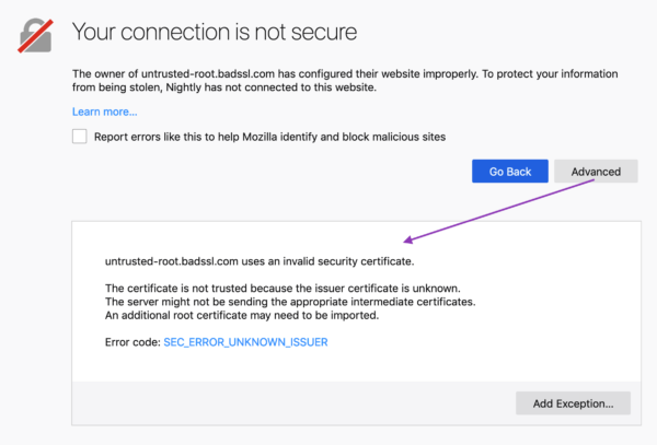
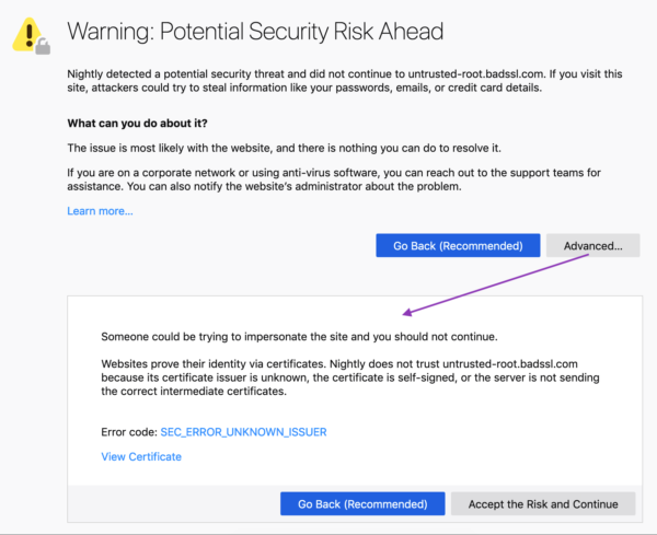
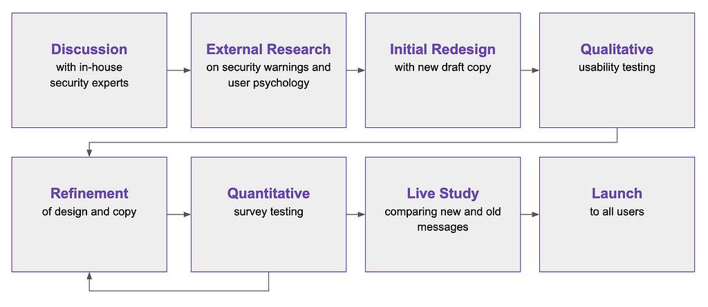




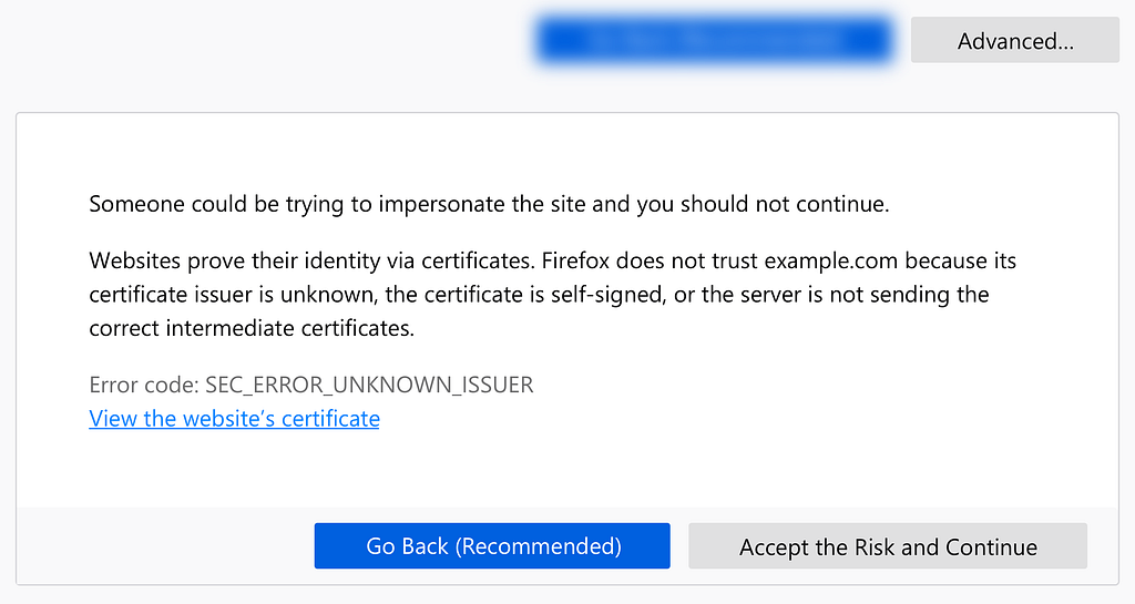















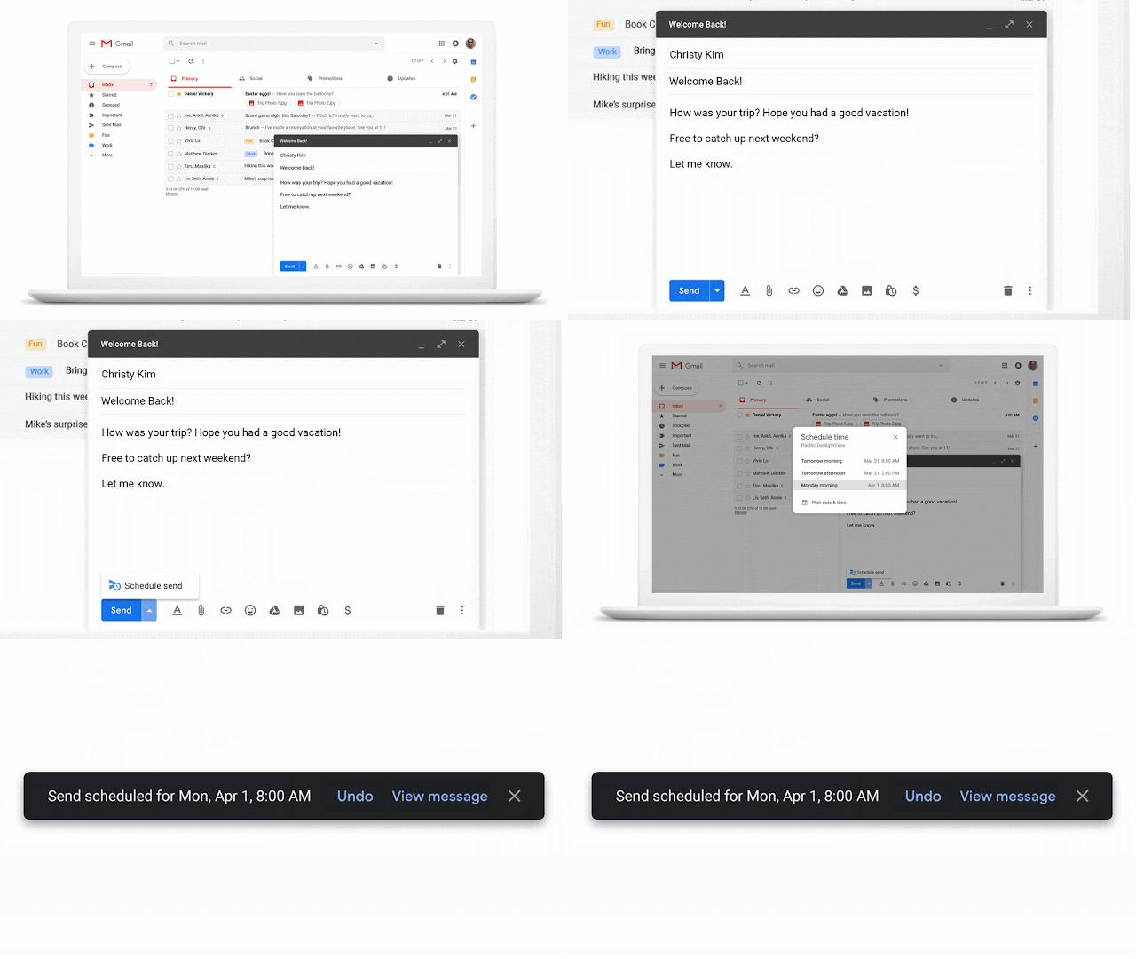

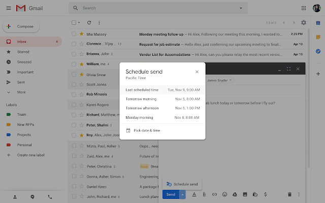
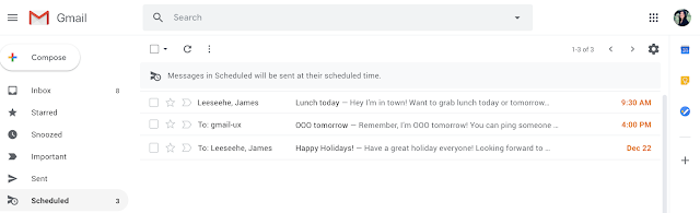


 G Suite Updates Blog.
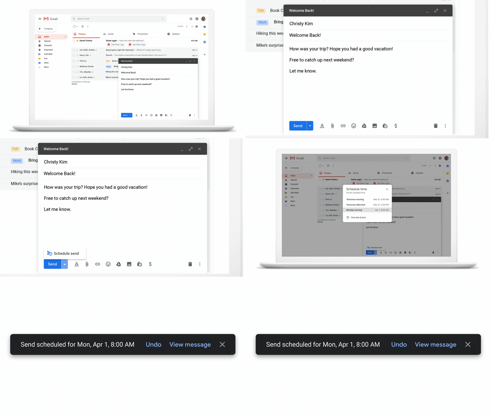



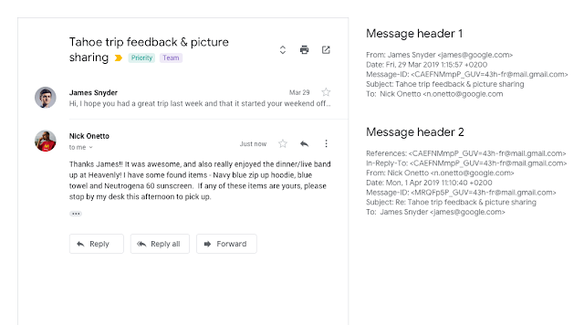

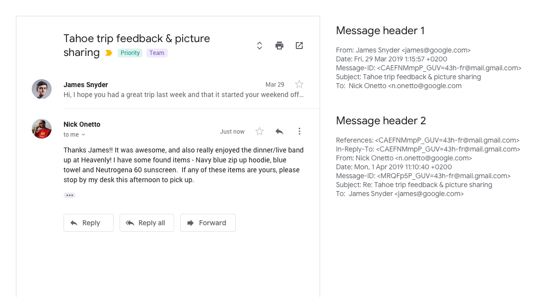










 A giant glacier is seen making its way to the waters of Croaker Bay on Devon Island Friday, July 11, 2008. The new study used ground and satellite measurements to look at 19,000 glaciers, far more than previous studies. (Jonathan Hayward/Canadian Press)

 Example of a “Dramatic Instinct” and a “Rule of Thumb” to counter it. Scroll down to see a poster of all 10 of them.


 Neue Risiken durch E-Bike-Boom Besonders Elektrofahrräder oder kurz E-Bikes sind auf dem Vormarsch. Schicker, schneller, leichter und teurer lautet der Leitsatz vieler E-Bike-Produzenten und damit treffen sie bei ihren Kunden scheinbar voll ins Schwarze. Über [...]

 Saturday Morning Breakfast Cereal.