For some time, I’ve planned to write up a point-by-point comparison of R and Python. I’ve done so now! Comments welcome.
Rolandt
Shared posts
25 Jun 15:19
Vancouver, both sides
by Josh Bernoff
I’m visiting Vancouver to give a speech and take a vacation. It’s awesome. But not completely. Just a warning — this post starts as a sunny story but there is adult material coming, some heartbreaking, and not in a good way. If you don’t want that in your day, please just don’t read this. I’ve … Continued
The post Vancouver, both sides appeared first on without bullshit.
25 Jun 15:18
On Crafting {:} a Life
by peter@rukavina.net (Peter Rukavina)
Blog posts about Crafting {:} a Life from people who were there:
- Crafting {:} a Life Unconference Day 1
- Crafting {:} a Life Unconference Day 2
- Crafting {:} a Saga
- Leaving PEI
- Fantasy Cartography
- Crafting {:} a Life
- Crafting {:} a Life initial impressions
- Press Pound to Publish
- Communication does count
- Crafting {:} a Blog
- Three Conversations about Blogging
- Unconference Aftermath / Unconference Forwarding
- Connection Problem
- Canada — Crafting {:} a Life (Flickr photos)
- Crafting {:} a Reflection
If you’ve written something I didn’t catch, please let me know.
25 Jun 15:18
"Our weird puritanical crap about pain and pain medication"
by peter@rukavina.net (Peter Rukavina)
Tim Carmody, on Kottke.org, writes about pain medication; in part:
This is all to say: no, I’m not on pain medication. Yes, I’m terribly uncomfortable. No, I’m not uncomfortable enough to jump through hoops and beg for more drugs. (Maybe if I were, things would be different.) And at the times I was most uncomfortable, those were the times when medicine was the least available to me, by design.
We’ve got to get over our weird Puritanical crap about pain and pain medication, and accept the fact that in certain contexts, we need the drugs. And by “we,” I mean myself, the medical system; everybody. We can’t be responsible for the entire opioid epidemic every second of every day. Sometimes we just need to be able to go to sleep.
I’ve learned a lot about this domain in the last 5 years. The backlash against opioids, while understandable given the toll that they’ve taken, has also served to cast an unhelpful shadow over pain meds of any type. For those in chronic pain, carrying the extra weight of that shadow is the last thing they need.
25 Jun 15:18
The Andrea
by peter@rukavina.net (Peter Rukavina)
After watching Andrea Ledwell receive her vegan powerball at Receiver Coffee in a coffee cup on Sunday, and hearing me joke that it was intended to have something poured over, Oliver went for it today, and poured blood orange Sanpellegrino over his own powerball. We dubbed it “The Andrea” in her honour. And he ate/drank it with a demitasse spoon. Ask for it by name next time you’re in for a snack.

25 Jun 15:18
press pound
by peter@rukavina.net (Peter Rukavina)
A excellent tangible spin-off of Crafting {:} a Life: Rosie has started a new blog:
Who starts a weblog in 2019? This kid, apparently.
I’m sitting on my porch in Charlottetown on a sunny Sunday morning. It’s the first day I’ve worn shorts outside this season. Everything is fiercely green and the critters sing their existence from around the neighbourhood. Most I don’t know, but I can pick out squirrels, crows, and the grackles that have nested in our eves. Sam the cat kept me company on the porch while I set up a new VM, WordPress, Apache vhosts, and SSL certs – the method I’ve chosen to do this… new blog project thing. It’s not hard for me, I’ve set up websites before, but I find it hard to get through without a checklist – my brain doesn’t hold a stack well.
There was a lot of talk about blogging at the unconference–three sessions, by my count–and I’m happy to see the corner turn from “why did blogging die when we loved it so?” to “I’m going to start a new blog!”
25 Jun 15:18
Evaluating progress by comparing myself to This Time Last Year’s Version of Me
by Raul Pacheco-Vega
Within the field of political science, I consider myself a comparativist, more than a specialist in international relations. Most of the work I have done has been within comparative politics and comparative public policy. Therefore, it’s natural that I seek to contrast across cases. The problem is that often times, I compare myself with others, which as many people have said, really does not help with self-esteem and fosters an impostor syndrome. That’s why so many people have said that “comparison is the thief of joy”. Well, not so true for my scholarly research, but it certainly is for my professional life.
Micro-thread on comparisons, impostor syndrome and goal achievement in academia. Like many of you, I sometimes feel inadequate. “I should have published six books by now”. “I don’t have an AJPS/APSR/ASR/JPART yet”. “My CV doesn’t look good enough”. I do feel this way, sometimes.
— Dr Raul Pacheco-Vega (@raulpacheco) August 8, 2018
Truth be told, I have found that comparing myself to This Time Last Year’s Version of Me is a much more helpful approach.
Micro-thread on comparisons, impostor syndrome and goal achievement in academia. Like many of you, I sometimes feel inadequate. “I should have published six books by now”. “I don’t have an AJPS/APSR/ASR/JPART yet”. “My CV doesn’t look good enough”. I do feel this way, sometimes.
— Dr Raul Pacheco-Vega (@raulpacheco) August 8, 2018
I see how much I have grown this year and I am amazed and grateful.
Addendum 23) COMPARE YOURSELF TO YOUR PAST SELF, NOT OTHERS. I am MUCH stronger now than I was 5 months ago. I know Paris and France and Europe much better, my spoken French has vastly improved, and I've been able to conduct interviews in French. I bettered MYSELF, not compared.
— Dr Raul Pacheco-Vega (@raulpacheco) May 14, 2019
So that’s what I would recommend others to do. Don’t compare yourself to others, see how much you’ve grown within a year.
25 Jun 15:18
Using EtherCalc for
Makeover Jambalaya: Beating Dumbbells into Slopegraphs Whilst Orchestrating EtherCalc
by hrbrmstr
This morning, @kairyssdal tweeted out the following graphic from @axios:
Confusing, but interesting.
Data shows we're a nation of news consumption hypocrites – Axios https://t.co/O0lPSc4OV3
— Kai Ryssdal (@kairyssdal) June 11, 2019
If you’re doing the right thing and blocking evil social media javascript you can find the Axios story here and the graphic below:

I’m gonna say it: the chart is confusing. I grok what they were trying to do, but this is a clear example where a slopegraph would definitely be a better choice than a directional dumbbell chart. At the time I had ~5 minutes to spare so I did a quick makeover and a short howto thread. This post is an expansion on said thread and if you’re in the midst of making the decision to consider reading or moving on here’s what we’ll cover:
- Making the choice between scraping or manual data entry
- Quick introduction to EtherCalc
- Why you might consider using EtherCalc for manual data entry over Excel or Google Sheets
- Pulling data from EtherCalc into R
- Making a slopegraph with the captured data
- Customizing the slopegraph with the captured data to tell one or more stories
Read on if any or all of that is captures your interest.
To scrape or not to scrape
Even if I wanted to scrape the site, Axios makes it pretty clear they are kinda not very nice people since — while it doesn’t mention scraping — that ToS link does indicate that:
(a) you will not license, sell, rent, lease, transfer, assign, distribute, host, or otherwise commercially exploit the Site or any content displayed on the Site; (b) you will not modify, make derivative works of, disassemble, reverse compile or reverse engineer any part of the Site; (c) you will not access the Site in order to build a similar or competitive website, product, or service; and (d) except as expressly stated herein, no part of the Site may be copied, reproduced, distributed, republished, downloaded, displayed, posted or transmitted in any form or by any means. Unless otherwise indicated, any future release, update, or addition to the Site’s functionality will be subject to these Terms. All copyright and other proprietary notices on the Site (or on any content displayed on the Site) must be retained on all copies thereof.
(OH NO I COPIED THAT FROM THEIR SITE SO I AM ALREADY VIOLATING THEIR [unenforceable] TOS!)
There’s this thing called “Fair Use” and this makeover I’m doing is 100% covered under that. The Axios ToS and the ToS of many other sites try to prohibit such fair use and they generally lose those battles in court. I have and will be citing them as sources throughout this post and the post itself falls under “commentary and criticism”. Unlike many unethical scrapers who are just scavenging data they did no work to generate and whose work will not serve the better interest of the general community, this post is fully dedicated to sharing and education.
In reality, Axios likely has such draconian ToS due to all the horrible unethical scrapers who just want free, un-cited news content.
Anyway…
Even if I could scrape they don’t embed a javascript data object nor do they load an XHR JSON data blob to make the graphic. They use an idiom of loading a base image then perform annotation via markup:

making it not worth taking the time to scrape.
That means data entry. 
Using EtherCalc for fun and profit data entry
I dislike Microsoft Excel (even the modern versions of it) because it is overkill for data entry. I also dislike performing data entry in Google Sheets since that means I need to be cloud-connected. So, for small, local data entry needs I turn to EtherCalc. No internet access is required, nor is there a bloated app to run.
EtherCalc is a multiuser Google Sheets-like browser-based spreadsheet powered by javascript (both in-browser and the back-end). You can install it with:
$ npm install -g ethercalc
which assumes you have a working Node.js setup along with npm.
When you run:
$ ethercalc
you are given a URL to hit with your browser. Below is what that looks like with my data entry already complete:

It can use Redis or a local filesystem as a persistence layer and does support multiple folks editing the same document at the same time.
At this point I could just save it out manually to a CSV file and read it in the old-fashioned way, but EtherCalc has an API! So we can grab the data using {httr} calls, like this:
library(hrbrthemes)
library(tidyverse)

httr::GET(
  url = "http://localhost:8000/a983kmmne1i7.csv"
) -> res

(xdf <- httr::content(res))
## # A tibble: 14 x 3
##    topic                actually_read say_want_covered
##    <chr>                        <dbl>            <dbl>
##  1 Health care                      7                1
##  2 Climate change                   5                2
##  3 Education                       11                3
##  4 Economics                        6                4
##  5 Science                         10                7
##  6 Technology                      14                8
##  7 Business                        13               11
##  8 National Security                1                5
##  9 Politics                         2               10
## 10 Sports                           3               14
## 11 Immigration                      4                6
## 12 Arts & entertainment             8               13
## 13 U.S. foreign policy              9                9
## 14 Religion                        12               12
where a983kmmne1i7 is the active document identifer.
Now that we have the data, it’s time to start the makeover.
Stage 1: A basic slopegraph
(If you need a primer on slopegraphs, definitely check out this resource by @visualisingdata.)
We need to make a decision as to what’s going where on the slopegraph. I’m choosing to put what respondents actually read on the left and then what they say they want covered on the right. Regardless of order, we need to do bit of data wrangling to take a first stab at the chart:
ggplot() +
  # draw the slope lines
  geom_segment(
    data = xdf,
    aes(
      x = "Actually read", y = actually_read,
      xend = "Say they\nwant covered", yend = say_want_covered
    )
  ) +
  # left and right vertical bars
  geom_vline(aes(xintercept = c(1, 2)), color = "#b2b2b2") +
  # left and right category text
  geom_text(data = xdf, aes("Actually read", actually_read, label = topic)) +
  geom_text(data = xdf, aes("Say they\nwant covered", say_want_covered, label = topic)) +
  scale_x_discrete(position = "top")

That chart isn’t winning any (good) awards any time soon. Apart from the non-aligned category labels, the categories aren’t in traditional order (rank “#1” being at the top on the left), plus we definitely need more information on the chart (title, subtitle, caption, etc.). We’ll reorder the labels and tweak some of the aesthetic problems away and switch the theme:
xdf <- mutate(xdf, dir = factor(sign(actually_read - say_want_covered))) # get the category order right
xdf <- mutate(xdf, actually_read = -actually_read, say_want_covered = -say_want_covered) # reverse the Y axis

ggplot() +
  geom_segment(
    data = xdf,
    aes(
      "Actually read", actually_read,
      xend = "Say they\nwant covered", yend = say_want_covered
    ),
    size = 0.25, color = "#b2b2b2"
  ) +
  geom_vline(aes(xintercept = c(1, 2)), color = "#b2b2b2") +
  geom_text(
    data = xdf,
    aes("Actually read", actually_read, label = topic),
    family = font_rc, size = 4, hjust = 1, nudge_x = -0.01
  ) +
  geom_text(
    data = xdf,
    aes("Say they\nwant covered", say_want_covered, label = topic),
    family = font_rc, size = 4, hjust = 0, nudge_x = 0.01
  ) +
  scale_x_discrete(position = "top") +
  labs(
    x = NULL, y = NULL,
    title = "14 Topics Ranked by What Americans Read vs Want Covered",
    subtitle = "'Read' rank from Parse.ly May 2019 data.\n'Want covered' rank from Axios/SurveyMonkey poll conducted May 17-20, 2019",
    caption = "Source: Axios <https://www.axios.com/news-consumption-read-topics-56467fe6-81bd-4ae5-9173-cdff9865deda.html>\nMakeover by @hrbrmstr"
  ) +
  theme_ipsum_rc(grid="") +
  theme(axis.text = element_blank())

That looks much better and I stopped there due to time constraints for the initial thread. However, the slope lines tend to be fairly hard to follow and we really should be telling a story with them. But what story do we want to focus on ?
Story time
One aesthetic element we’ll want to immediately modify regardless of story is the line color. We can use the dir column for this:
ggplot() +
  geom_segment(
    data = xdf,
    aes(
      "Actually read", actually_read,
      xend = "Say they\nwant covered", yend = say_want_covered,
      color = dir, size = dir
    )
  ) +
  geom_vline(aes(xintercept = c(1, 2)), color = "#b2b2b2") +
  geom_text(
    data = xdf,
    aes("Actually read", actually_read, label = topic),
    family = font_rc, size = 4, hjust = 1, nudge_x = -0.01, lineheight = 0.875
  ) +
  geom_text(
    data = xdf,
    aes("Say they\nwant covered", say_want_covered, label = topic),
    family = font_rc, size = 4, hjust = 0, nudge_x = 0.01, lineheight = 0.875
  ) +
  scale_x_discrete(position = "top") +
  scale_size_manual(
    values = c(
      `-1` = 0.2,
      `0` = 0.2,
      `1` = 0.2
    ),
  ) +
  scale_color_manual(
    name = NULL,
    values = c(
      `-1` = ft_cols$red,
      `0` = "#2b2b2b",
      `1` = ft_cols$blue
    ),
    labels = c(
      `-1` = "Topics Readers Want Covered < Topics Read",
      `0` = "Topics Read The Same Amount As They Want Covered",
      `1` = "Topics Read < Topics Readers Want Covered"
    )
  ) +
  guides(
    size = FALSE
  ) +
  labs(
    x = NULL, y = NULL,
    title = "14 Topics Ranked by What Americans Read vs Want Covered",
    subtitle = "'Read' rank from Parse.ly May 2019 data.\n'Want covered' rank from Axios/SurveyMonkey poll conducted May 17-20, 2019",
    caption = "Source: Axios <https://www.axios.com/news-consumption-read-topics-56467fe6-81bd-4ae5-9173-cdff9865deda.html>\nMakeover by @hrbrmstr"
  ) +
  theme_ipsum_rc(grid="") +
  theme(axis.text = element_blank()) +
  theme(legend.position = "bottom") +
  theme(legend.direction = "vertical")

It’s still somewhat hard to pick out stories and the legend may be useful but it’s not ideal. Let’s highlight the different slope types with color, annotate them directly, and see what emerges:
library(hrbrthemes)
library(tidyverse)

httr::GET(
  url = "http://localhost:8000/a983kmmne1i7.csv"
) -> res

(xdf <- httr::content(res))

xdf <- mutate(xdf, dir = factor(sign(actually_read - say_want_covered)))
xdf <- mutate(xdf, actually_read = -actually_read, say_want_covered = -say_want_covered)

arw <- arrow(length = unit(5, "pt"), type = "closed")
#   x = c(1.2, 1.8, 1.9),
# y = -c(1, 13, 14),
# xend = c(1.05, 1.7, 1.6),
# yend = -c(1.125, 13, 14)
# ),
# aes(x, y , xend=xend, yend=yend),

ggplot() +
  geom_segment(
    data = xdf,
    aes(
      "Actually read", actually_read,
      xend = "Say they\nwant covered", yend = say_want_covered,
      color = dir, size = dir
    ), show.legend = FALSE
  ) +
  geom_vline(aes(xintercept = c(1, 2)), color = "#b2b2b2") +
  geom_text(
    data = xdf,
    aes("Actually read", actually_read, label = topic),
    family = font_rc, size = 4, hjust = 1, nudge_x = -0.01, lineheight = 0.875
  ) +
  geom_text(
    data = xdf,
    aes("Say they\nwant covered", say_want_covered, label = topic),
    family = font_rc, size = 4, hjust = 0, nudge_x = 0.01, lineheight = 0.875
  ) +
  geom_curve(
    data = data.frame(),
    aes(x = 1.2, y = -1, xend = 1.05, yend = -1.125),
    color = ft_cols$red, arrow = arw
  ) +
  geom_segment(
    data = data.frame(), aes(x = 1.6, xend = 1.6, yend = -12.1, y = -12.9),
    color = "#2b2b2b", arrow = arw
  ) +
  geom_curve(
    data = data.frame(), aes(x = 1.2, y = -14.1, xend = 1.1, yend = -13.6),
    curvature = -0.5, color = ft_cols$blue, arrow = arw
  ) +
  geom_text(
    data = data.frame(
      x = c(1.15, 1.6, 1.2),
      y = -c(1.2, 13, 14),
      hjust = c(0, 0.5, 0),
      vjust = c(0.5, 1, 0.5),
      lab = c(
        "Topics Readers Want Covered < Topics Read",
        "Topics Read The Same Amount\nAs They Want Covered",
        "Topics Read < Topics Readers Want Covered"
      ),
      stringsAsFactors = FALSE
    ),
    aes(x, y, hjust = hjust, vjust = vjust, label = lab),
    family = font_rc, size = 2.5, lineheight = 0.875
  ) +
  scale_x_discrete(position = "top") +
  scale_size_manual(
    values = c(
      `-1` = 0.75,
      `0` = 0.2,
      `1` = 0.2
    )
  ) +
  scale_color_manual(
    name = NULL,
    values = c(
      `-1` = ft_cols$red,
      `0` = "#2b2b2b",
      `1` = ft_cols$blue
    )
  ) +
  labs(
    x = NULL, y = NULL,
    title = "14 Topics Ranked by What Americans Read vs Want Covered",
    subtitle = "'Read' rank from Parse.ly May 2019 data.\n'Want covered' rank from Axios/SurveyMonkey poll conducted May 17-20, 2019",
    caption = "Source: Axios <https://www.axios.com/news-consumption-read-topics-56467fe6-81bd-4ae5-9173-cdff9865deda.html>\nMakeover by @hrbrmstr"
  ) +
  theme(axis.text.x = element_text(size = 12, face = "bold", color = "black")) +
  theme(axis.text.y = element_blank())

This first story indicates a potential social desirability bias in the respondents in that they claim to care more about health care, climate change, and education but really care more about more frivolous things (sports), base things (politics), and things they have almost no control over (national security).
Let’s switch the focus (only showing the modified aesthetic to avoid a code DoS):
  scale_size_manual(
    values = c(
      `-1` = 0.2,
      `0` = 0.2,
      `1` = 0.75
    )
  ) +

Now we get to see just how far down on the priority list some of the “desired coverage” topics really sit. At least Health care is not at the bottom, but given how much technology controls our lives it’s a bit disconcerting to see that at the bottom.
What about the categories that did not differ in rank:
  scale_size_manual(
    values = c(
      `-1` = 0.2,
      `0` = 0.75,
      `1` = 0.2
    )
  ) +

You’re guess is as good as mine why folks rated these the same (assuming the surveys had similar language).
FIN
Now that you’ve got the data (oh, right, I forgot to do that):
structure(list(topic = c("Health care", "Climate change", "Education",
"Economics", "Science", "Technology", "Business", "National Security",
"Politics", "Sports", "Immigration", "Arts & entertainment",
"U.S. foreign policy", "Religion"), actually_read = c(7, 5, 11,
6, 10, 14, 13, 1, 2, 3, 4, 8, 9, 12), say_want_covered = c(1,
2, 3, 4, 7, 8, 11, 5, 10, 14, 6, 13, 9, 12)), class = c("spec_tbl_df",
"tbl_df", "tbl", "data.frame"), row.names = c(NA, -14L), spec = structure(list(
    cols = list(topic = structure(list(), class = c("collector_character",
    "collector")), actually_read = structure(list(), class = c("collector_double",
    "collector")), say_want_covered = structure(list(), class = c("collector_double",
    "collector"))), default = structure(list(), class = c("collector_guess",
    "collector")), skip = 1), class = "col_spec"))
and some alternate views, perhaps you have an even better way to look at it. Drop a note in the comments with any of your creations or suggestions for improvement for the final versions shown here.
25 Jun 15:17
Sony Adds Telephoto Lenses
I've been on record as saying that Sony has a very reasonable and well built out FE lens lineup now in the wide to moderate telephoto range (12-200mm). With the A9 beefed up with firmware updates and the Olympics looming, it was inevitable that Sony turned its attention to longer telephoto options.
…
25 Jun 15:17
Summer of Joy
by Eugene Wallingford
"Elementary" ideas are really hard & need to be revisited
& explored & re-revisited at all levels of mathematical
sophistication. Doing so actually moves math forward.
--
James Tanton
Three summers ago, I spent a couple of weeks re-familiarizing myself with the concatenative programming language Joy and trying to go a little deeper with the style. I even wrote a few blog entries, including a few quick lessons I learned in my first week with the language. Several of those lessons hold up, but please don't look at the code linked there; it is the raw code of a beginner who doesn't yet get the idioms of the style or the language. Then other duties at work and home pulled me away, and I never made the time to get back to my studies.

|
I have dubbed this the Summer of Joy. I can't devote the entire summer to concatenative programming, but I'm making a conscious effort to spend a couple of days each week in real study and practice. After only one week, I have created enough forward momentum that I think about problems and solutions at random times of the day, such as while walking home or making dinner. I think that's a good sign.
An even better sign is that I'm starting to grok some of the idioms of the style. Joy is different from other concatenative languages like Forth and Factor, but it shares the mindset of using stack operators effectively to shape the data a program uses. I'm finally starting to think in terms of dip, an operator that enables a program to manipulate data just below the top of the stack. As a result, a lot of my code is getting smaller and beginning to look like idiomatic Joy. When I really master dip and begin to think in terms of other "dipping" operators, I'll know I'm really on my way.
One of my goals for the summer is to write a Joy compiler from scratch that I can use as a demonstration in my fall compiler course. Right now, though, I'm still in Joy user mode and am getting the itch for a different sort of language tool... As my Joy skills get better, I find myself refactoring short programs I've written in the past. How can I be sure that I'm not breaking the code? I need unit tests!
So my first bit of tool building is to implement a simple JoyUnit. As a tentative step in this direction, I created the simplest version of RackUnit's check-equal? function possible:
DEFINE check-equal == [i] dip i =.
This operator takes two quoted programs (a test expression and an
expected result), executes them, and compares the results. For
example, this test exercises a square function:
[ 2 square ] [ 4 ] check-equal.
This is, of course, only the beginning. Next I'll add a message to display when a test fails, so that I can tell at a glance which tests have failed. Eventually I'll want my JoyUnit to support tests as objects that can be organized into suites, so that their results can be tallied, inspected, and reported on. But for now, YAGNI. With even a few simple functions like this one, I am able to run tests and keep my code clean. That's a good feeling.
To top it all off, implementing JoyUnit will force me to practice writing Joy and push me to extend my understanding while growing the set of programming tools I have at my disposal. That's another good feeling, and one that might help me keep my momentum as a busy summer moves on.
25 Jun 15:06
zsh
by Rui Carmo
This is a short set of notes regarding zsh on macOS and Ubuntu, motivated by the upcoming switch to zsh as the default shell in macOS Catalina.
In case you’re in a hurry, here’s a public Gist with my current .zshrc.
Prequisites
First off, you don’t need to install it from brew. macOS Mojave comes with a perfectly serviceable zsh 5.3 in /bin/zsh, but by all means feel free to use whatever version you want.
In Ubuntu 18.04 (and WSL), sudo apt-get install zsh installs it for you, and on any system you can change your default shell in the usual way using chsh (man chsh for details and examples, don’t go blindly copying stuff from blog posts…).
The Zero Frills Approach
Almost every zsh post I came across mentions oh-my-zsh or prezto and themeing and a bunch of pretty, colorful, but non-critical things it sets up for you.
I will have none of that, thank you.
Being a purist/stoic, I want to understand what the single most important piece of code I run inside a terminal does, and want its setup to be as minimal (and cross-platform) as possible. I’ve long kept shared versions . bashrc in either Dropbox or OneDrive, and am doing the same for .zshrc now as well.
Command Line Editing
Even though I´m a vim user, I am used to having emacs bindings for line editing:
bindkey -e
Prompt Setup
I like my PS1 to be short, concise and, above all consistent everywhere:
user@hostname:path$
I’m willing to concede on the $ (since zsh uses % for standard users and # for root), but I like minimal color, and appreciate that zsh can do it without cluttering PS1 with ANSI escape codes:
autoload -Uz colors && colors

# set a fancy prompt (non-color, unless we know we "want" color)
case "$TERM" in
    xterm-color|*-256color) color_prompt=yes;;
esac

if [ "$color_prompt" = yes ]; then
    PS1="%{$fg_bold[green]%}%n@%m%{%f%}:%{$fg_bold[blue]%}%~%{$reset_color%}%# "
else
    PS1="%n@%m:%~%# "
fi
unset color_prompt
Terminal Titles
The prompt is nice when you’re looking at the terminal, but useless when you’re sorting through a bunch of terminal windows. So I always set the terminal title as well:
# If this is an xterm set the title to user@host:dir
case $TERM in
xterm*|rxvt*)
    precmd () {print -Pn "\e]0;%n@%m:%~%#\a"}
    ;;
*)
    ;;
esac
Command Completion
When you need to use bash autocompletion configurations, all you need to do is:
autoload -U +X bashcompinit && bashcompinit
Azure CLI
For instance, for the specific case of az, assuming you’re using pyenv and got argcomplete installed like me, this is what you need to do:
# run this once
activate-global-python-argcomplete --user

# add this to .zshrc
source $HOME/.bash_completion.d/python-argcomplete.sh
eval "$(register-python-argcomplete az)"
SSH Keychain
Another essential I keep near the end of my .zshrc in Ubuntu:
eval `keychain --agents ssh --eval id_rsa --quiet -Q`
Python and NPM
My current settings for pyenv and npm “global” module installations:
export PYENV_ROOT=$HOME/.pyenv
export PATH=$PYENV_ROOT/bin:$PATH
eval "$(pyenv init -)"
export GOPATH=$HOME/Library/Go

NPM_PACKAGES="${HOME}/.npm-packages"
PATH="$NPM_PACKAGES/bin:$PATH"
unset MANPATH
export MANPATH="$NPM_PACKAGES/share/man:$(manpath)"
25 Jun 15:06
Catching Up
by Rui Carmo
A great deal has happened this week, which kicked off with what was likely the most eventful Apple WWDC keynote in recent years. I have had little to no time to spend writing my thoughts about it, but an extended weekend is just the ticket for fixing that (as well as posting a few updates on multi-arch Docker images and my upcoming migration away from Dropbox).
WWDC–Hardware
I, for one, welcome the return of the “cheese grater”, for even if a lot of the design choices and pricing options seem excessive (don’t get me started on the price of the monitor stand), at least now Apple is back on the modular workstation business.
The only thing about the Mac Pro’s silicon that annoys me a bit is the continued emphasis on Radeon GPUs—the lack of an NVIDIA option is disappointing, but it could be argued that (at least for deep learning) stuffing a few cards into a Linux box or using an external GPU with a Mac mini might be a more reasonable alternative for most people.
WWDC–Software
Obviously enough, iPadOS stoke the show as far as I’m concerned, and I’m looking forward to playing around with it soon as soon as it reaches release candidate status.
As to the Mac, I am going to wait and see. Catalina is going to bring a number of changes to the UNIX userland (some of which long overdue), but is not likely to impact any of my workflow (brew seems to have a migration strategy in place, and that is all I need to get pyenv and the rest of my tools going).
I have, however, already started to switch to zsh (including on Ubuntu), for given the amount of time I spend inside a terminal I’d rather start getting used to the minor attrition that change will bring.
Another thing I will also wait patiently for is Switft UI. I have found myself repeatedly wanting to build a very specific app for my own use, but I don’t want to rush into another proprietary stack unless it is really easy to deal with across platforms.
From Dropbox To OneDrive
Something else that happened this week was that Dropbox decided to up its rates in the Plus plan and expand it to 2TB of storage, which would ordinarily be OK if I actually used it.
Since I only actually had a couple hundred gigabytes of files in my Dropbox (mostly VM snapshots in terms of volume and git repos in terms of number of files), I just wasn’t getting enough bang for the buck, and the extra $20 or so for twice as much empty space tipped me over the edge into cancelling my Plus plan.
To be fair, this was on the cards for a while, but I would have gladly stayed on and paid proportionally the same per GB for, say, a 250GB plan.
But given that I already pay for 2TB of iCloud storage and 5TB of OneDrive (included in Office 365) for my family, I decided it was time to cancel.
Obviously, this comes with a few caveats. For starters:
- I lose direct integration in dozens of iOS apps, and have to use Files instead (which is a bit finicky given that the OneDrive storage provider is… slow, but usable)
- OneDrive on the Mac refuses to sync files that don’t match Windows filename conventions, which is understandable but annoying (some of the files it refuses to sync live inside iMovie library bundles, for instance, and a substantial portion of PDFs I generate from web pages have “illegal” file names).
- There is no official Linux client–the best thing I’ve found is
abraunegg/onedrive, which works but requires a fair amount of tweaking (and I can’t get it to run insidek3sbecause it insists on having interactive setup, something I might have to fix myself). - OneDrive is, in general, noticeably slower and finickier than Dropbox on the Mac. Being less aggressive can also be seen as a good thing, but Dropbox worked really well for me over many years, and despite working for Microsoft I still think it has an edge over OneDrive in terms of sync speed–that is especially noticeable when moving between machines, even if they run Windows, since I often have to wait several minutes for replicas to catch up.
- The Mac client is, in a word, hideous, and easily the most non-native Microsoft app I have installed. The iOS client also sports ugly Windows-like yellow folders, which doesn’t help either, but at least I can manage everything through the Finder or the Files app.
- Even though I use “Files On-Demand” on Windows, I have it off (and fully intend to leave it so) on the Mac, since it appears to confuse Spotlight to no end when I search for some specific filenames (it shows me blank icons for stubs that it thinks are relevant for me).
This has been especially noticeable when syncing my development folders–and I wouldn’t have switched at all if I hadn’t been using OneDrive to sync around half of my git repos over the past few years (which it has done so with zero hassles, other than speed).
The worst bit for me is that the iOS file provider for OneDrive is very sluggish, in fact, and it is quite irritating to pick up my iPad (or even my Surface) and not find my new files (or updated notes from iA Writer) for a fairly long while (sometimes up to 15 minutes). I can use iCloud, of course (and it works great for that), but I am not keen on the way Apple insists in crowding it with a top-level folder per all, and actively dislike how it deals with both Documents and Desktop folders.
So this is a bit of a downgrade, at least until I settle in. But I’ve already moved everything across except this site (I will be setting up a new instance alongside), and the basics work…
A final Note on Multi-Arch Docker Images
After my initial foray into the topic a while back, I seem to have finally gotten this down to a nicely modular, re-usable system–this weekend I decided to sit down and build myself a couple of new base images with a sane init system, and alpine-s6 and ubuntu-s6 came to pass. I’m still testing them out, but the build steps and support for multiple architectures (arm32v6, arm32v7, amd64 and arm64v8, which is my way of future-proofing some of my ARM stuff) seem to work just fine on Travis CI.
Moving them to Azure DevOps has been a bit of an issue, since I have been putting off setting up a “permanent” workspace and need to clean up the multiple demo ones I have all over the place (including a couple in my personal account).
25 Jun 15:05
Replied to WebmentionQSL by ruk.ca While we w...
by Ton Zijlstra
Replied to WebmentionQSL by ruk.ca
While we were waiting for the bus home today, Olle explained to me and Oliver how QSL cards work: two ham radio operators establish a radio connection, the more distant and unlikely the better; during the connection they exchange call signs, which are globally-unique and can be used to look up a pos...
The reason I came up with letterpress made QSL cards, Peter, was of course that you have one. Also Aaron Parecki is interested. Not only is he deeply involved in Webmention as a standard, he also has a ham radio license (W7APK) like me (PE1NOR). So we have at least an audience of 4 
Bonus pic: the QSL cards I sent when I didn’t have my license yet (I got it in ’89) and sent out listening reports to both sides of successful connections (QSO). These were often highly appreciated by the stations involved as sometimes the only proof they had that a conversation with some exotic station had taken place was that someone overheard it and sent a report.
These QSL cards were bundled nationally and then sent as packages to the ham radio club of the destination country, where they would be disseminated through the various regional ham radio clubs. I should have a stack somewhere of QSL cards I received from all over the world.

And here’s an example of the logs I kept as a teenager, exactly 34 years ago:

25 Jun 15:05
Follow Tuesday
by Ton Zijlstra
One of the things I always do after an event is go through the people I met and see if I can connect to them, e.g. on LinkedIn, Twitter or Facebook. This time around, part of that is adding people to my RSS reader, because they blog. This is an additional pleasure, not just because it extends my network of bloggers that I read, but also because doing so was a key part of my conversations at Crafting {:} a Life in the past days. So I am subscribing to people with which I already have had extended time talking. This immediately puts them at a shorter social distance than normally when exploring new blogs (and they requested me to describe better the importance to me of that, and what/why/how I do that).
Rosie le Faive as a direct consequence of the conversations at Peter’s unconference started a blog press pound. Her first posting is a very good start (definitely not the ‘hello world, is this thing on?’ variety) and I hope to read much more (here’s a bunch of reminders to self that I keep handy when falsely thinking I need to write ‘properly’ before I can press pound to publish). It’s a WordPress blog and it launched with IndieWeb support for Webmention, which is very good. There’s a whole bunch of IndieWeb peeps hanging out on IRC/Slack, Rosie.
Clark McCleod’s Kelake blog in contrast has been around since 2001/2. This too is a WP blog, so I hope to see Clark add Webmention and other IndieWeb features.
Steven Garrity’s blog Acts of Volition goes back to 2000. I’ve been aware of him for a long time, ever since he figured in Peter’s surprise at how well known PEI turned out to be when he first visited Reboot in Copenhagen. Now I’ve met him in person and added him to my reader.
25 Jun 15:02


Initial Thoughts on iPadOS: A New Path Forward
by Federico Viticci
When I published my Beyond the Tablet story a few weeks ago, I was optimistic we'd get a handful of iPad-related features and optimizations at WWDC. I did not, however, foresee an entire OS designed specifically around iPad. And the more I think about it, the more I see iPadOS as a sign of Apple's willingness to break free from old assumptions and let the iPad be what it's best at: a portable computer inspired by the Mac, but based on iOS.
I'm back home after a fantastic week at WWDC1, and I'm now in the process of sifting through the surprising amount of new software features Apple unveiled in San Jose. It's going to take me a while to digest all that's new in iOS 13 and Shortcuts2; of course, you should expect my iOS/iPadOS 13 review in the fall, and we will share more hands-on articles and editorials on MacStories and Club MacStories throughout the summer. For now though, after using the iPadOS beta on my 12.9" iPad Pro for a few days, I'd like to share some initial considerations on iPadOS and what it means for the future of the platform.
Here's what I wrote in the conclusion of Beyond the Tablet:
As I hope to have demonstrated in this story, the iPad Pro is capable of filling roles you may not typically associate with the idea of a tablet. But as I've also argued, there are still several areas where the iPad is behind macOS in terms of file management, multitasking, app automation, and integration with external hardware. Let me be clear on one key concept though: for the iPad to evolve, I don't think Apple should directly copy features that have been done on the Mac before.
I think there is plenty iOS, and by extension the iPad, can learn from macOS and the long history of the Mac. What matters is the end goal: I want the iPad to empower me to achieve the same results I can produce on a Mac, even – and especially if – that power comes from old ideas that have been rethought, redesigned, and re-engineered for the new age of touch and hybrid computing.
File management, multitasking, automation, and external hardware integration are the biggest areas of improvement in iPadOS compared to iOS 12, which make Beyond the Tablet the first longform story I ever published that became outdated in less than a month (and that was the point all along – to document a moment in time of the iPad's evolution that could serve as future reference).
What truly matters, however, is that the message Apple is sending with iPadOS is the kind of trajectory I wanted to see for the future of iPad. There are functionalities such as multiwindow and file management that the Mac figured out decades ago; in bringing them to iPadOS, however, Apple isn't simply copying and pasting the same features from one platform to another: instead, they've taken those features' underlying concepts and fundamentally rethought them for the iPad's touch nature and iOS foundation.
Multitasking and Multiwindow
When rumors were swirling ahead of WWDC that Apple would bring improved multitasking capabilities to iPad with support for multiple app windows, some wondered whether the company might consider Mac-like free-form window resizing on iPad – a theory that never made sense given the device's constraints and touch interactions. On the opposite end of the speculation spectrum, others questioned whether it may even be possible for Apple to do anything more than a split-screen mode for the same app, à la Safari in iOS 10. The answer we got was something else entirely: not only does iPadOS enable split-screen for the same app, but it also supports an arbitrary number of app windows; in fact, just like on a Mac, you can create as many app windows as you want in iPadOS, and you can even preview them all with Exposé; however, the whole system has been designed around the iPad's touch interactions with long-tap gestures, drag and drop, Slide Over, and Split View.
The net result of this new multitasking approach is a drastic departure from iOS' longstanding assumption that an app can only live in one window at a time: it's going to take a while to get used to the idea that iPad apps can spawn multiple windows, and that the same document or app view can coexist with other app windows across the system in different spaces. At the same time, iPadOS' multitasking builds upon the Mac's multiwindow environment and iOS 11's drag and drop multitasking in a way that feels inevitable – like the best innovations always do.
Multiple Safari windows in iPadOS.
Creating a new Notes window in Slide Over by dragging a note to the side of the screen.
At a high level, iPadOS multitasking is still largely enabled3 by drag and drop: while iOS 11 allowed you to add apps to Split View or Slide Over by dragging their icons into a space, iPadOS lets you add windows by dragging app views or content around. For instance, Notes lets you pick up an individual note and create a new window off of it by dragging it to the side of the screen; in Messages, conversations can become windows; in Mail, a specific feature of the app (the message composer) can be detached from the main UI and turned into a window.
Two windows from Notes – one in full-screen, the other in Slide Over with dark mode enabled.
Windows in the standard app switcher.
Third-party developers can integrate with the same framework that Apple is using for window creation by adopting the "scene" technology; users always get to choose whether they want to create a window in Split View, Slide Over, or full-screen (for the latter, by dropping a view along the top edge of the iPad's screen).
Dragging a view to the top of the screen replaces the frontmost windows with a new full-screen space.
It makes sense for window creation on iPad to revolve around drag and drop: it's the same system millions of users already rely upon for multitasking, and it's now grown to accommodate app views in addition to icons. Unlike the Mac, the iPad has no menu bar where the user might find the 'File ⇾ New Window' option, and external keyboards are optional; therefore, Apple decided to eliminate an old iPad limitation by taking a Mac concept (the same app can have multiple windows) and redesigning it around the common denominator of all iPad models: touch.
There are a couple other examples of this strategy at play in iPadOS. In addition to dragging content and views from apps, you can also long-tap notifications and drop them elsewhere on-screen as new windows. Doing so will create a window for the content shown in the notification – something that is already possible with iMessage notifications.4 This feature is another instance of rethinking multitasking to cater to the iPad's strengths: it seems completely obvious that you should be able to drag a notification to transform it into a window, and I can't wait to see how developers take advantage of it in their apps. It's also the kind of feature that would be hard to implement on iPhone and could perhaps be ported to macOS, but which shines on iPad thanks to the ability to pick up a notification banner and drag it across the screen.
Three years after our original concept (https://t.co/Ur1XqWydwd) you can now finally drag notifications to open app windows in iPadOS 🎉 🎉
(Hopefully this will work for third-party apps too...?) pic.twitter.com/J15i8jMHPw
— Federico Viticci (@viticci) June 7, 2019
My favorite surprise in iPadOS' new multitasking environment so far, however, is the ability to cycle through multiple apps/windows in Slide Over by swiping across their Home indicator at the bottom. Like in iOS 11, Slide Over continues to be a layer of the interface shared at a system-wide level – meaning that the same Slide Over set of apps will always be available regardless of the space you're in – but in iPadOS you can put multiple apps in Slide Over at the same time. You can then swipe through Slide Over apps like you'd flip through a stack of cards, and you can even swipe up and pause to access an app switcher specifically dedicated to Slide Over apps.
You can swipe up on a Slide Over stack to reveal a Slide Over-specific app picker.
Effectively, Apple has brought the iPhone X's entire multitasking UI to Slide Over in iPadOS. In the few days I've been testing iPadOS, this has already come in handy a few times: when I was watching a YouTube live stream about E35, for example, I was able to keep YouTube in full-screen (so I'd have a large video player on the left side of the screen) and move between Twitter and Messages in Slide Over; similarly, when watching session videos from WWDC, I kept the WWDC app and Safari in Split View while flipping between different notes from the Notes app opened as windows in Slide Over. I was not expecting Slide Over to mature into its own app switcher for compact apps, but I can already see how this will become one of my most used iPadOS features.
It remains to be seen how the increased complexity of iPadOS' multitasking will be received and managed by users. Window management on iPad requires a fundamental change of mindset – we've been trained to think of apps as individual entities for almost a decade now – and seeing a collection of app windows in Exposé on iPad for the first time can be somewhat intimidating, even for more advanced iPad users.
Exposé for apps in iPadOS.
And that's not to mention how both Slide Over and Split View now come with an additional layer of window pickers if you drop an app that already has multiple windows open across the system:
The new window picker that appears when adding an app with multiple windows to Split View.
The same window picker for Slide Over.
There's also an argument to be made that, even more so than in iOS 11, long-tap gestures play a key role in iPadOS now: in addition to drag and drop, a long press is also how you access quick actions on the Home screen, reveal Exposé from the dock6, and open context menus – which increases cognitive load for the same gesture.
Long-tapping an icon (then letting go) reveals new quick actions, including an Exposé button.
As Craig Federighi pointed out in my interview on AppStories, Apple is now comfortable with the thought of certain iPad features being more discoverable by pro users, but that doesn't necessarily absolve the company from using progressive disclosure to explain the iPad's new multiwindow capabilities. I'm curious to see what kind of visual cues and onboarding techniques Apple will use to ease iPad owners into multiwindow.
Based on what I've tested so far, iPadOS' more powerful multitasking system strikes a good balance between the Mac's windowing support and iOS 11's drag and drop-infused multitasking features. There is an additional layer of complexity involved, but that was also true when iOS 11 first came out in beta, and I, unlike others, remain convinced that the system was pretty great overall. For this reason, I'm happy to see multiwindow build upon the interaction patterns of iOS 11: Apple is showing that the iPad can be a multiwindow-enabled computer, but they're doing so in a way that's well-suited for touch.
File Management
The Files app in iPadOS is another great example of re-implementing ideas from macOS with a fresh design and modernized interactions that make sense on iPad.
Column view – a staple of the Mac's Finder – has been brought to iPadOS so the Files app can take advantage of the iPad's large screen and go beyond the simplistic list and grid views. Using column view on a 12.9" iPad Pro feels instantly familiar, but I like how this mode doesn't stop at replicating a classic Finder view. In the inspector panel that appears when you've selected a file (which shows you information such as file size, creation, tags, etc.), iPadOS displays file thumbnails, which can be powered by custom Quick Look extensions that developers have long been able to offer to preview their apps' documents in iOS' Files app and Search.
Furthermore, depending on the type of selected file, iPadOS will offer quick actions such as PDF conversion, image cropping, video rotation, and Markup; the latter allows you to annotate images and documents using the Apple Pencil and a redesigned palette of tools – something that is possible with Preview on macOS, but which shines on iPad thanks to the Pencil and direct touch manipulation.
After a conspicuous absence from the third-generation iPad Pro's debut in late 2018, Apple has opened up access to external USB drives and SD cards in iPadOS, and they've done it the right way by making external devices additional locations in the Files app.
Here's what I wrote last month:
I believe Apple should use the USB-C port on the latest iPad Pros as an opportunity to open up USB access on iOS and make external drives available in the Files app.
For better or worse, people still use physical media to store files – whether they're USB sticks, larger drives containing graphic assets or media libraries, or SD cards with photos and videos on them. This is especially common among professionals who deal with heavy files on a regular basis and don't want to store hundreds of GBs worth of content in the cloud. For the same reasons why I shouldn't have to rely on third-party apps to manage my local storage or connect to an FTP server, I shouldn't have to buy a Mac if I just want to extract some PDF documents from a USB drive every once in a while.
This is exactly what Apple has done with the Files app this year: when you connect a drive, it shows up in the Files sidebar; when you're done working with it, just unplug it and the location disappears. No "mounted volumes" on the Home screen, no need to "safely eject" drives: just plug and remove them as needed like you'd connect to, say, a cloud service.
Accessing the contents of USB drives has never looked so good.
All the workarounds I mentioned in Beyond the Tablet regarding downloading music albums for my Sony Walkman or importing podcast episodes from an SD card have been obliterated by Apple in iPadOS: thanks to the iPad's USB-C port, I can use my existing adapters for USB-A and SD cards; more importantly, I can access files natively from the Files app with a local copy operation instead of (slower) wireless transfers. I've always believed in the idea of the Files app as a centralized location for all kinds of documents and sources, so I'm glad to see Apple following this approach for external accessories. Now instead of fiddling around with WiFi boxes or SD cards, I can just plug in a drive and use drag and drop to copy a file from an external device into my iPad's local storage (which was also improved in iPadOS, giving you the ability to create files and folders in the 'On My iPad' location).
There are several other features worth noting in the new Files app. This is not yet working in iPadOS 13 beta 1, but you'll be able to connect to external SMB servers directly from Files, similarly to how you could previously connect to WebDAV servers from Apple's iWork suite of apps. Connections to SMB servers can be initiated from the Files sidebar or via the same keyboard shortcut used in Finder, and developers who recompile their Files-enabled apps for iPadOS 13 will also be able to access remote files from the document browser and Files picker.7 As someone who used to rely on a third-party file manager with a file provider extension to access Mac folders via SMB/SFTP in the Files app, I look forward to playing around with Apple's implementation, which will likely be faster and benefit from extended background runtime privileges.
At long last, the Files app in iPadOS comes with full support for opening .zip archives as well as creating them, which can be done from a new context menu that, among other things, contains options to always open Quick Look (which wasn't possible before), pin files, and remove their downloaded (cached) versions. Context menus are a new interface element that replaces peek and pop on iPhones (which are rumored to be losing 3D Touch later this year) and which, when activated on iPad, resembles the Mac's right-click contextual menu. I have a feeling that context menus will be implemented by a variety of pro apps for iPadOS, particularly because of the ability for developers to group related items together and display sub-menus.
Finally.
I should also mention how, years after its debut, the 'Save to Files' extension has gained the ability to rename files upon saving them as well as a button to create a new destination folder. It's still not as good as the Mac's Save dialog or Dropbox's iOS extension, but Apple's getting there. Alas, you still can't tag files while saving them.
You can, however, find files more easily by tokenizing search results8, which now include suggestions such as file types, dates, person who shared them, and more. Perhaps one day we'll also be able to save these search criteria as smart folders in the Files sidebar.
Improved search results in the updated Files app.
The new Files app shows how Apple is now more comfortable with taking classic file management concepts and rethinking them for iPad, just as I hoped they would. As I shared last month, I don't need the Files app on my iPad to have all the same advanced functionalities as Finder for macOS: I just want it to be good enough so that I can stop relying on workarounds such as third-party apps and adapters to import and manage my files.
With multiwindow support, USB access, new context menus, local storage, .zip archive support, and improved search, Apple has done more than I was expecting from a single Files update. More importantly, this year's new features don't compromise the original vision behind Files – an app that can also be a filesystem layer shared between other apps, but which doesn't force users to work exclusively through a file manager on their iPads.
Safari and Desktop-class Browsing
Nowhere is Apple's "inspired by the Mac, but based on iOS" approach more apparent than in the updated Safari for iPadOS, which literally presents itself as Safari for Mac to websites. However, Apple has done a lot more work than simply tweaking the browser's user agent, all while adding features and settings that fit iPadOS' underlying iOS architecture and interactions.
Apple heard the complaints about popular web apps such as Google Docs and Squarespace not working well (or at all) in the iPad version of Safari, so they decided to tackle the problem on multiple fronts. First, as I noted above, Safari for iPad now advertises itself as Safari for Mac on all iPad models by default9, thus changing the browser's old 'Request Desktop Website' feature to 'Request Mobile Website' (it's available in the new 'aA' menu in the address bar). In addition to the user agent change, Apple had to apply deeper changes to the WebKit engine to ensure that websites designed for laptops with cursor input would work on smaller iPads with touch too. For instance, Safari for iPadOS renders webpages and dynamically adjusts the viewport so that content can fit on the iPad's screen and maintain legible text; cursor clicks are automatically mapped to taps; however, if a website implements hover-based menus, Safari relies on heuristics to determine whether a tap should click an element or expand a menu, simulating a hover interaction.
One of Apple's biggest challenges here was reconciling mouse input and scrolling with taps and swiping, and for this reason they also added support for pointer events, a layer of abstraction that works better with different types of input methods. Apple put a lot of work into making Safari for iPadOS a truly desktop-class browser from a mere engine perspective, from hardware-accelerated scrolling in every frame and region of a webpage (resulting in overall smoother desktop sites) and support for media source extensions to desktop mode in WKWebView (web views for apps) and support for custom keyboard shortcuts on websites.
In my preliminary tests with Safari on my 12.9" iPad Pro, results are impressive. Google Docs, which we use for podcast show notes at AppStories and Dialog, is now fully usable in the iPad version of Safari, including rich text formatting and real-time chat. In fact, the Google Docs website accessed on iPadOS is now better than the Google Docs app for iPad, which only offers a subset of functionalities of the web app. Proper access to Google Docs was one of the reasons I still occasionally used a Mac for work, and that's gone with iPadOS.
Real Google Docs! On an iPad!
In the seven years I've been using the iPad as my primary computer, I've gotten used to the idea that certain websites just wouldn't work in Safari, but those assumptions no longer hold true in iPadOS. The Dropbox website works perfectly in Safari now, allowing me to access features such as file requests and versions that Dropbox never bothered to bring to their iOS app. Zapier, which features a lot of expandable menus with nested variables, is fine in iPad Safari. You can even stream Netflix (and put videos in Picture in Picture) and access YouTube's desktop site with the ability to choose video quality.
Essentially, everything you knew about Safari for iPad has been turned on its head in iPadOS thanks to a desktop-class browsing mode that goes far beyond the old 'Request Desktop Website' feature of iOS 12. I'm convinced that this change alone will have huge ramifications for pro users, enterprise customers, education (Safari for iPad is effectively as capable as Chrome for most web apps now), and web designers.
Apple's Safari team could have stopped at desktop-class browsing mode for iPadOS and we'd all be happy with this release. But there's a lot more in the updated app worth pointing out. Safari now has a download manager: after tapping a link that points to a downloadable file, Safari offers to download the linked resource and brings up a download manager that lists all your ongoing (and completed) downloads along with their progress. Downloaded files are saved in iCloud Drive/Downloads by default and can continue in the background even if you leave Safari; however, in Settings ⇾ Safari ⇾ Downloads, you can choose any Files location as the default destination for new downloads. Want to save downloaded files in local storage or, say, the Dropbox file provider? That's possible in iPadOS.
Safari's new download manager.
Changing Safari's default location for downloads.
Support for keyboard shortcuts has been vastly expanded in Safari for iPadOS with over 30 new shortcuts that almost match all of the options available on macOS, including ⌘1...9 to switch between tabs. Impressively, ⌘S can now save a .webarchive version of a webpage in Files, which now natively previews webarchive documents via Quick Look. I could go on: paginated scrolling (via the space bar and arrow keys) is more fluid than before; 'Find in Page' and ⌘G to navigate between results behave more like a desktop browser; desktop mode can be disabled (along with other settings) on a per-site basis.
Despite all of these desktop-class improvements, Safari still feels as intuitive as ever. Apple found a way to make Safari for iPad as powerful as a desktop browser without disowning the experience of browsing the web on a tablet: instead of simulating a trackpad on-screen, Apple mapped desktop interactions to touch; the download manager has been integrated with the iPad's existing support for Files and file provider extensions; the browser's start page now takes advantage of iPad-specific shortcuts such as Siri suggestions and links from Messages.
In many ways, the new Safari for iPad is the perfect metaphor for iPadOS' raison d'être: its changes were borrowed from the Mac, but they were also carefully redesigned and re-engineered to make the most out of the iPad platform.
New Path
Since the iPad launched almost 10 years ago, its iOS foundation has been a double-edged sword: on one hand, building iPad on top of iOS gave Apple a head start in terms of performance, app ecosystem, and security that other tablets couldn't match; on the other, an already-solid iOS foundation may have been the excuse to not aggressively pursue more advanced functionalities. Apple has only itself to blame if certain segments of the tech press have been calling the iPad "just a big iPod touch" for years, even though it clearly wasn't.
iPadOS suggests that the company has identified a new path for the iPad as a third platform that combines well-trodden ideas from macOS with the intuitive, nimble nature of iOS. To a certain extent, this was true of iPad before, particularly since the days of iOS 11, but calling it iPadOS shows a renewed commitment that may provide the necessary impetus for more consistent updates over the next few years.
Ultimately, a new name on its own doesn't prove that Apple is more serious about a platform than before, which is why we should focus on the actual features that will launch with iPadOS later this year. And from what I've seen and discussed so far, it looks like Apple is ready to begin the iPad's next decade with a promising new strategy: inspired by tradition, but still uniquely iPad.
- Which continues to be the event of the year for Apple developers, media, and fans from around the globe. ↩︎
- As always with WWDC, it's effectively impossible to gain the amount of knowledge that folks at home can get from Twitter and Apple's website given how hectic the conference's schedule is. ↩︎
- In addition to drag and drop, you can also create full-screen windows by tapping a '+' button in an app's Exposé. ↩︎
- Obviously, it's based on NSUserActivity, the gift that keeps on giving. ↩︎
- Zelda! ↩︎
- Unless the app you want to preview in Exposé is already the frontmost one, in which case tapping the icon in the dock once will immediately reveal Exposé. ↩︎
- No word from Apple on FTP servers yet, but I wouldn't be surprised if the feature will be limited to SMB servers at first as the company is primarily pitching it as a way to access network shares from computers on the same local network. ↩︎
- Also an API for developers now. ↩︎
- Unless the browser is in Slide Over. ↩︎
Support MacStories Directly
Club MacStories offers exclusive access to extra MacStories content, delivered every week; it's also a way to support us directly.
Club MacStories will help you discover the best apps for your devices and get the most out of your iPhone, iPad, and Mac. Plus, it's made in Italy.
Join Now
25 Jun 15:02
Runway ML makes machine learning easier to use for creators
by Nathan Yau

Machine learning can feel like a foreign concept only useful to those with access to big machines. Runway ML aims to make machine learning easier to use for a wider audience, specifically for creators. It provides a click-and-drag interface that lets you link algorithms, import datasets, and most importantly, experiment.
Looks like fun. Give it a go.
Tags: machine learning

25 Jun 15:02
paginate-json
I released a fun tiny utility: paginate-json, which knows how to paginate through JSON APIs that use the HTTP Link header for pagination. I built it so I could pull data from the GitHub API and pipe it directly into SQLite via sqlite-utils.
Via @simonw
25 Jun 15:02
50th Anniversary of Apollo 11 – My Book Recommendations
by Martin
 Not long now and we will celebrate the 50th anniversary of the first human landing on the moon! 50 years ago, on the 20th July 1969, humankind’s greatest tech adventure culminated with Neil Armstrong setting foot on the lunar surface. Altough I wasn’t born back then, this has inspired me from early childhood and over the years my fascination grew even more. Even after several trips to the Manned Space Flight center in Huston and Kennedy Space Center in Florida, I still get goosebumps when I pick up a book about a particular aspect of the Apollo program. So in anticipation of the 50th anniversary celebrations, here are the top three books I think one should have read about Project Apollo:
The first book on my list is, without doubt, ‘How Apollo Flew to the Moon’ by David Woods. With incredible detail, insight and wit, this book tells the story and gives the technical details of how it all came together in less than a decade and how missions were actually flown. An absolute must-read!!!
Next on my list is ‘The Apollo Guidance Computer’ by Frank O’Brian. This computer was designed and built long before the invention of the microprocessor and it’s an absolute marvel. And quite frankly, after reading this book, you will agree with me that if you had the choice today to fly to the moon with this computer or with something modern, you’d rather use the AGC, without a second thought.
And, if you only have time for three books, have a look at ‘Apollo EECOM – Journey of a Lifetime’ by Sy Liebergot to round things up. This book gives an incredible perspective of mission control and the people that worked there from Sy’s perspective. Unfortunately, the book seems to be out of print, but it can be bought second hand. Go for it while they can still be found!
And once you are through with the books, go for a real mission, the full audio communication stream and tons of background information is available at the Apollo Flight Journal website. After reading at least the first book, you will actually understand the technical things they are discussing which makes this absolutely fascinating.
And then, there are lots and lots for other books that I could recommend, including the Saturn V Owner’s Workshop Manual, Moon Lander by David Kelly, auto-biographies of astronauts, etc. etc. Enjoy!
25 Jun 15:01


Feed Reading By Social Distance
by Ton Zijlstra
At the Crafting {:} a Life unconference one of the things that came up in our conversations was how you take information in, while avoiding the endlessly scrolling timelines of FB and Twitter as well as FOMO. My description of how I read feeds ‘by social distance‘ was met with curiosity and ‘can you show us?’. I realised I have blogged about this, but always as part of a much wider discussion of reading and writing on the web, and never as something on its own and in detail. So let’s do that now.
My notions about information strategies and filtering
Let’s start with the underlying assumptions and principles I landed upon using over time:
- There is no way you can take in all available information, there’s simply too much, it’s always been that way. Internet amped up the volume of course.
- Because there’s always been too much information, although internet changed its volume and quality, there’s no such thing as information overload. There do exist failing information strategies, and failing filtering strategies.
- It’s not useful to fear you might miss something in the ocean of information. If it is important it will come back tomorrow, through some other path.
- Filtering, as mental activity I mean, not as rule based technological fix, needs attention, as it is the primary way to shape your information diet
- Filtering also needs attention as it is a key part of what information you share and propagate yourself. Output is the result of processed input. Filtering, again as mental activity as verb, determines input, and thus impacts output.
- My filtering is not a stand alone thing in isolation, it is part of a network of filters, yours, mine, and other people’s. My output is based on filtered input, and that output ends up in other people’s filtered input.I treat blogging as thinking out loud and extending/building on other’s blogposts as conversation. Conversations that are distributed over multiple websites and over time, distributed conversations.
- If you are part of my input, and I am part of your input, then feedback loops get created. It is these feedback loops that lift signals above the sea of general background noise. This is the key bit that means you don’t need to fear missing something, as it will resurface through a feedback loop if it’s important.
- This means that where I source information can’t be of the ‘news’ type, stuff that pretends it is neutral. Neutral isn’t useful in a filter. Commented, interpreted, augmented material is useful in a filter, as it adds context that help determine its information value. I source information from individuals as a result.
- Who you are as a person is an essential piece of context in how to judge information. If you’re walking on the street and a random stranger asks to have a coffee, you interpret it very differently from when your partner walking next to you asks you the same thing. We are all walking information filters, our brains are very well used to doing that. So what I know socially about you helps me interpret what you share, as it will be coloured by who you are. Let’s call this social filtering.
- I know many people, some very well, others less so, or I only know what you’ve shared on your site recently and we haven’t met at all. The social distance I perceive between me and you is part of the context of filtering. This is an otherwise unspecified mix of personal, professional, and other aspects that I am aware of with others.
- When social distance and social filtering are key elements in filtering information, preventing echo chambers is a key concern. This translates into purposefully seeking out divergence and diversity in your network. All your favourite enemies need to be in your information filter as well. And you need to extend your network periodically, while monitoring its health in terms of variety. You then end-up half way between ‘subjective’ (me and my echo chamber), and ‘objective’ (journalism as per its ideal), at ‘multi-subjective’. That’s great because all of human complexity is at that intermediate level between ‘n=1’ / me, and statistics (probabilities across populations): networks of interdependent actors.
Over the years I’ve written a number of postings about the points above. I try to maintain an overview on my page about information strategies.
How I organise my feed reader
All the above serves as a long introduction to why I organise my feed reading the way I do:
- I follow people, not sources. This means that I’m not subscribed to ‘The Local News’, but to blogs kept by individuals. It also means that if you’re Jenny Jensen who writes the blog Pangean Pontifications, I will have you as Jenny Jensen in my feed reader, not your masthead
- I order the feeds I follow in folders roughly by social distance. From people closer to me, to total strangers through multiple levels in between. This isn’t an exactly determined ‘weight’. It is an intuitive arrangement of where I think our current connection/interaction is at. I move things around. E.g. a recent extended blog-based conversation may move you from total stranger to something closer. Meeting and having conversations at an event very likely will as well.

Above is a screenshot of the folder structure in my reader that implies social distance. A12 is the closest level. A I originally meant as my personal ‘A-listers’, and 12 as a number that roughly indicates a circle the size of immediate family and closest friends. The other folders have a similar meaning. B50, a slightly wider group of close professional and personal peers, C150 the connections with let’s say my Dunbar ‘horizon’ or close connections of my close connections, D500 people from various ‘Dunbar number‘ sized circles, communities, contexts I’m part of. E999 new connections, strangers. Most feeds will start in E999, as everything starts out as being miscellaneous. Over time (remember, feedback loops), some will stand out more for me and move to a deeper folder / layer of the onion. People I’ve met will mostly be in folders A12-D500. But I also have one person in my A12 folder I never met in person. Bryan Alexander and I have been in touch a very long time through our blogs, consistently and intensively, and that’s why he’s in the A12 folder. Invitations we made to people for our birthday unconferences will all come from at most the D500 ‘distance’. There is one other folder ‘Keeptrack’ which contains feeds of my own, my company’s or project related and group stuff. The comment feed for my blog for instance.
Within each folder are a number of feeds, which as I wrote are named after their author.
Who is where isn’t an assessment of the person, but of their relative position in my mental network map of every one I know (about). Within a folder there’s no deliberate structure.
You can see the current list of blogs I follow in the right hand sidebar, where you can download it as an OPML file. Most rss readers will allow you to import that and select the feeds you want to subscribe to. I regularly browse such lists when others publish them, to find new people for in my e999 folder.
I counted the feeds I currently have, and this is the distribution:
| folder | # of feeds |
|---|---|
| A12 | 10 |
| B50 | 14 |
| C150 | 14 |
| D500 | 16 |
| E999 | 129 |
This is not a huge amount of feeds, just under 200. There used to be many many more, but when I started blogging more intensively again at the end of 2017, I realised most of my old feeds had gone silent, and I started out with an empty reader. What stands out to me most from that table is that it’s about 50 people I know somehow (A through D), and 129 ‘strangers’ from the e999. That is a visible effect from starting out with ‘everything is miscellaneous‘ and populating e999, after which people will move into one of the other folders over time as patterns and depth of connection emerge. In my old set of subscriptions the ‘closer’ folders were more populated, along the lines of the numbers in the folder names. I expect to over time stabilise that way again (meaning some 500 feeds followed in the A through D folders). Adding, removing or moving feeds I treat as a form of gardening.
The numbers would likely become very different if I can more easily add feeds from other spaces where people I know actually do write and post (LinkedIn, Facebook, Twitter, Flickr, Instagram etc mostly). Hence my interest in IndieWeb protocols such as Microsub and tools like Granary as they can be used to pull stuff out of silos, and hence my interest in what Aaron Parecki calls the social reader, that allows direct interaction with material within my reader, responding and posting directly from it.
Daily reading routines
I currently use Readkit as feedreader, which allows folders, and allows me to rename feeds (so I can turn Pangean Pontification into Jenny Jensen). It also is an ‘offline first’ tool, which is my preferred mode of reading. I let it sync at the start of the day, and then at some point will go through it without needing an internet connection. It’s not in any way getting close to what would be my ideal feedreader (a posting that touches upon many of the points in this posting).
If I have only a little time to take in what others share, I will look only at the A12 folder, or if nothing got posted there at the B50 folder. More time means I will read more widely, moving to the C-D-E folders. That way I get a notion of what bloggers closest to me are writing about every day, and if I have time I will dive into the firehose of everything else. That’s an outside in approach: getting a feeling for what others are writing.
There’s also an inside-out approach where I use the search function to see if anyone has written about e.g. their impressions of Crafting {:} a Life which we visited in the past days, or the current political unrest in Moldova. Ideally I would also be able to tag feeds with aspects I know about its author (e.g. Berlin, coder, art, cycling, Drupal). Then I could ask ‘what are the German people I have in here that are into Drupal talking about this week?’
When I’m done reading for the day I hit ‘mark all as read’, or at least once every few days as I might forget to do it sometimes. ‘Mark all read’ is an important bit of functionality. I don’t really need to read everything, because if I overlooked something, and it’s important, I will come across it tomorrow or whenever the feedback loops bring it back again. Having your reader guilt-tripping you because you have ‘1276 unread items’ is not proper information-hygiene
And you?
So how do you read? Do you publish a list of feeds you follow? I’d be interested to see your list. What would make your reading better, easier, a better routine? What seems useful to you from the above, and might be useful to me from your current set-up?
25 Jun 07:07
Three Conversations About Blogging
by Ton Zijlstra
At last week’s Crafting {:} a Life unconference on PEI I participated in three conversations on blogging:
- What happened to blogging? Initiated by Steven Garrity
- The future of blogging. Initiated by Peter Rukavina
- Doing Blogging. Initiated by me
Elmine already blogged some of her impressions from these conversations. I’ll add some of my own.
What happened to blogging?
It started with Steven Garrity who asked “What happened to blogging?” in the morning of the first day. Some 20 people wanted to take part in that so we put together a big circle in the main hall. The group had long time bloggers (over 20 years), those whose blogs fell more or less silent, and those who never blogged but are interested in doing so. What followed was a discussion of why we started blogging, and what happened to those initial conditions. I started to think out loud, but kept going because of the wide peer network that emerged because of our distributed conversations across blogs. We suspected started blogging right in the perfect moment: the number of people blogging in your fields of interest was big enough to feel engaged, and small enough to feel like a town you can keep an overview of. We first welcomed the silos like Facebook and Twitter as it made interacting even easier and brought in more people as the required level of tech savvy dropped. What however at first seemed like a source of agency turned into the erosion of it. Long form writing evaporated, more exchanges turned into ’empty calories’. RSS as an easy way of following what was going on eroded the too. Many sites ‘forgot’ what RSS was, and that accelerated when the most visible reader by Google fell by the wayside. Although we also felt that blaming Google Reader solely isn’t right, it was a development that fit in a larger change already underway.
We also discussed how some of that original blog interaction in the early ’00s has been channeled into other modes of communications, like newsletters. Peter Bihr for instance mentioned how it felt like newsletters are a more direct form of communication, with a clear audience in mind, and responses to it are of much higher quality. We missed the kick of the interaction between blogs, as well as having the time and attention to reflect and write more deeply.


Part of the blogging circle
The future of blogging
Having looked back in the morning, some of us felt we wanted to not just be melancholic but also look at what a constructive future of blogging looks like. So Peter suggested to do another conversation in the afternoon. Part of the reason for this was in our immediate circle we saw several people who ‘returned’ to blogging, like myself. Part of it is the appearance of new web standards, the IndieWeb that intends to take the useful traits of social media platforms and apply them to your own websites. Opting to enjoy the weather we had this conversation in Peter’s back yard. We talked about a variety of things connected to blogging. The technology that can assist in getting more interaction between blogs, in helping to make publishing easy. And the behaviours that help to blog more, doing away with expectations of what ‘proper’ blogging is and giving oneself permission to just do what you want.
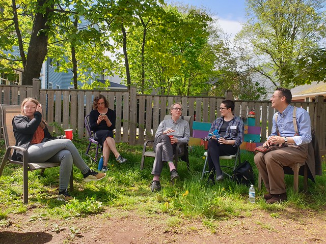
The future of blogging taking shape in Peter’s back yard
Doing blogging
The second day of the unconference was positioned as a ‘doing’ day. As the ‘future of blogging’ conversation surfaced a lot of ‘how-to’ questions, I suggested we could do a more practice oriented session. On what is currently technically possible, and how that looks in practice for instance in my blog. The weather was great again, so we opted for the back yard like the day before. Bright sunlight and a scarcity of laptops meant we didn’t ‘do’ much. We did talk about the practical steps one can take, and the purpose and working of the various IndieWeb standards. This developed in a wider ranging conversation on our various information routines and the tools we use. Participants were eagerly taking notes to learn from each other’s tool use. From tools and routines we went to life hacks, and a much wider scope of topics. That was a great experience, although it meant that the original topic of conversation moved out of sight. I felt in flow in this conversation, and it went on literally for hours without effort and without energy levels dropping away.

The ‘doing blogging’ circle of participants
Direct consequence is that one of the participants launched her own blog, with IndieWeb support from the start. Another that questions about how I read along lines of ‘social distance’ led to me explaining that in detail today. Important to me is that I also could add a number of bloggers to my ‘global village’ of people whose postings I read, adding more voices to the mix I take in. I also plan to write a number of postings starting from the issues raised in the conversations to introduce and explain the IndieWeb standards. The current documentation mostly starts with tech, and that means a too high threshold for adoption for large groups.
25 Jun 07:07
Eduroam is Awesome
by peter@rukavina.net (Peter Rukavina)
I type this from an easy chair in the lobby of the Killam Memorial Library at Dalhousie University in Halifax.
I am here in Halifax because today was a day of returning Crafting {:} a Life participants to their home jurisdictions: Juliane to Halifax to continue her Canadian journey, Morgan to YHZ to fly home to Berlin, Olle and Luisa to the bus in Sackville earlier today (where they traveled to YHZ themselves, for an earlier flight).
Because I am me, I thought it was a perfectly acceptable idea to agree to deliver a presentation to the Atlantic Association of Planning Technicians in the middle of this logistically complex week. It hardly seemed reasonable to ask they of the AAPT to reschedule their annual conference on account of me being exhausted from hosting our unconference.
The AAPT’s conference was, innovatively, bi-provincial, switching sessions back and forth between Sackville (New Brunswick) and close by Amherst (Nova Scotia). My session was in Sackville, on the beautiful campus of Mount Allison university.
After dropping Olle and Luisa off at the bus, and setting Morgan and Juliane loose on the town, I sought out my venue, and, it turns out, arrived about an hour early. So I set out to explore the campus.
I did not have to go far to find wonders: just across the path I found the Mount Allison Chapel, a remarkable 1964 building that took my breath away:

The chapel is entered through one of three sets of heavy, colourful doors:

Because, apparently, I have become the kind of person who can strike up impromptu conversations with strangers, shortly after entering I found myself in conversation with The Rev. John C. Perkin, the University Chaplain. I didn’t know this at the time: he appeared to be no more than a particularly knowledgeable-about-the-chapel regular person (excellent qualification for his job). We had a delightful chat about the chapel’s architecture, history and contemporary use.
Emerging from the chapel I realized that, despite my feeling that I needed to hurry to my talk, I still had 30 minutes left, and so I walked next door to the Owens Art Gallery, where, again, I chatted, this time with the person at the front desk, who ushered me into the collection, and, later, answered some questions (like “why did the Graduate Self-Portraits project stop in the 1960s?”).
The gallery sports a permanent homage to Alex Colville, along with temporary exhibitions by Carrie Allison, Alisa Arsenault, Maryse Arseneault, Rémi Belliveau, and Herménégilde Chiasson.
Alex Colville, Athletes, 1961
Alisa Arsenault, Still Life (or the Nesting of Memory), 2019
In the lobby there’s also a “Tiny Zine Library” (which is something every art gallery should have), as well as the aforementioned Graduate Self-Portrait collection:
Each year, in celebration of Spring Convocation and Alumni Reunion Weekend, the Owens Art Gallery displays self-portraits from the Graduate Self-Portrait Collection. From the late 1940s until the mid 1960s, Mount Allison University students in Fine Arts were required to paint a self-portrait in their fourth year, which they then submitted as their “Diploma Piece” before receiving the Bachelor of Fine Arts Degree. The portraits were to be life-sized, painted in oil on canvas or board, and measure 40 x 30 inches. An important archive of the Fine Arts Department, this collection consists of approximately fifty paintings that are now permanently housed at the Owens Art Gallery.
(The answer to my “why did it stop?” question was, in essence, “the 1970s came along and things got weird.”)
I didn’t have nearly enough time to enjoy the gallery fully, but I got a good taste, and the resolve to return on my next trip.
Emerging back into the crisp morning, with still a few minutes to go, I decided that it would be a nice gesture to build news of my discovery of Mount Allison campus treasures into my talk.
But how to get the photos from my Android phone onto my MacBook Air with my slides?
Eduroam to the rescue!
Eduroam being a system that, in essence, means that if you have network credentials at one university, you can use the wireless network at any other university. So, after uploading the photos to Google Photos via LTE on my phone, I pulled out my laptop, set it on the sidewalk and opened it up, found there was wifi with SSID of eduroam available, and authenticated with my University of Prince Edward Island credentials. Blamo: online!
I grabbed the photos, slotted them into my slide deck, and 5 minutes later I was in room 108 of the Dunn Building delivering my talk, Collecting and Visualizing Real Time Environment Data in the City of Charlottetown (slides), with a brief introductory diversion to point attendees at the chapel and the gallery, perhaps destinations for their generous 90 minute lunch break.
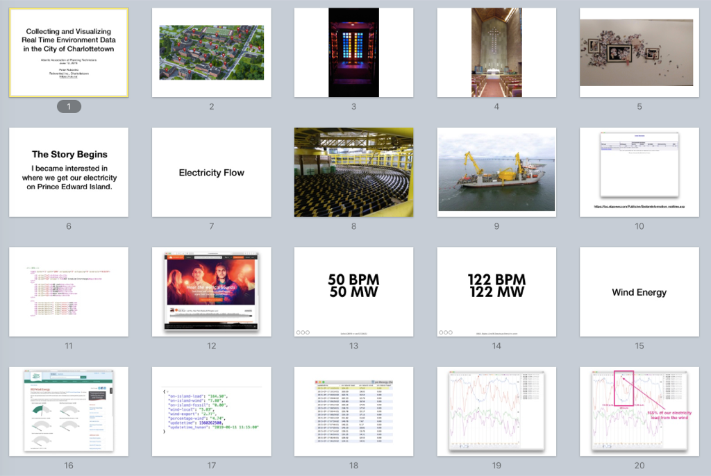
That I am sitting at Dalhousie University, some hours later, assembling this blog post, is also due to Eduroam, as Dal too is a participant in this great cooperative effort.
I am typing, at Dalhousie, partly because I arrived during the crazy-to-an-Islander Halifax rush hour, and have no wish to brave the traffic over to Dartmouth to get to my hotel, and partly because, suddenly devoid of my crew of European friends, I have sought solace in the anchoring port of the library.
I am overnight here tonight, e-bike shopping in the morning, and then back to the Island tomorrow afternoon.
I miss my friends dearly already; it will be good to have the airlock of an exotic Halifax rest to work through that.
25 Jun 07:06
These Weeks in Firefox: Issue 60
by mconley
Highlights
-
Integrated add-on abuse reporting landed in Firefox 68
- You need to enable the HTML-based about:addons by setting extensions.htmlaboutaddons.enabled to true in about:config
- The abuse reporting UI can be enabled by setting extensions.abuseReport.enabled to true in about:config
- Work on the new login manager UI is progressing well
- To see it go to about:config and set signon.management.page.enabled to true
- Then load about:logins (will need to set the pref before loading the page)
- Initial password generation code has also landed
- WIP UI that only works on autocomplete=”new-password” fields
- This is very early in the project so there is no additional attempt to save the generated password.
- www.facebook.com is a good test page.
- Enable both prefs to test the feature:
- signon.generation.enabled is the user pref to enable/disable the feature from about:preferences (UI not implemented yet).
- signon.generation.available controls whether the feature is available for users (e.g. if the about:preferences UI should show in the future).
- WIP UI that only works on autocomplete=”new-password” fields
-
The DevTools Inspector color picker widget just got a bit of a re-design. Thanks Maliha Islam [:maliha] for pushing this over the edge!
-
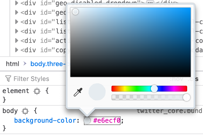
The new color-picker in the Inspector Panel!
-
Friends of the Firefox team
Introductions/Shout-Outs
- New interns!
- Mandy Cheang (@mcheang, mandy__)
- Working on improving start-up performance
- Abdoulaye Ly (@Abdoulaye O. Ly, abdoulaye)
- Working on Fission
- Mandy Cheang (@mcheang, mandy__)
Resolved bugs (excluding employees)
Fixed more than one bug
- Florens Verschelde :fvsch
- Ian Moody [:Kwan]
- jaril
- Kestrel
- Monika Maheshwari [:MonikaMaheshwari]
- Tim Nguyen :ntim
New contributors (🌟 = first patch)
-
- Miriam made our column breakpoint UI less ambiguous
- Christoph Walcher made it so that network requests can be re-sent via the context menu in the Web Console
- Chujun Lu made it so that double-clicking on a logpoint entry in the side panel of the Debugger allows for quick editing
- clement.allain made it so that about:telemetry shows you the data collected from all process types by default! Here’s a mailing list post about that.
- matthewacha moved some context menu tests into their own folder, cleaning up the junk-drawer that is the “general” test directory
- 🌟 Megan Bailey made some of our Responsive Design Mode UI more readable
- Mrigank Krishan fixed a bug where sometimes the Request URL in the Network Monitor wouldn’t show the entire URL
- Myeongjun Go fixed a bug where a the WebExtension Cookie API would throw if attempting to set a cookie on an IP address rather than a domain name.
- Derek updated some of the maximum pane sizes in the Debugger
Project Updates
Activity Stream
- The new Pocket Newtab is on track for 68 with performance parity
- Slight regression with our usage of -webkit-line-clamp (thanks heycam for platform implementation!) and fixing with requestAnimationFrame (thanks performance best practices doc)
- We’ve made some progress on migrating our build process into Firefox / making it easier to develop on Activity Stream features
- Documentation in regular source tree docs!
- Ongoing work in this meta bug
- Introducing our new intern: Emily (:emcminn)!
Add-ons / Web Extensions
- As of Firefox 68, Discopane is now part of about:addons, rather than served from AMO
- ….and with those, about:addons is (mostly) in HTML in Firefox 68!
- … and it supports dark theme
- … and the detail view of an extension shows release notes in a tab
- … and a tab that shows the extension’s permissions (and a link to learn what they mean on SUMO)
- As part of the deprecation, we’ve replaced proxy.register in docs with proxy.onRequest
- Fixed a bug in proxy.onRequest where it was only matching http/https
- Exposed captive portal status
- Fixed a bug wherein when chrome_settings_overrides are added to an extension via an upgrade, the extension would … stop working (+67)
- Further fixes for issues discovered during armag-addon
Applications
Lockwise
- Work on the Lockwise addon is complete
- Final release waiting on localizers to translate strings
- Future Lockwise work will happen in tree as part of the Firefox Password Manager
- Removing this Lockwise item after this meeting
Developer Tools
Layout Tools
- Inactive CSS landed! It’s currently only ON by default in nightly (since 68) but will ship to everyone with Firefox 69. Bug 1306054. We will be adding a larger collection of warnings very soon too, to warn users about more tricky CSS cases.
-
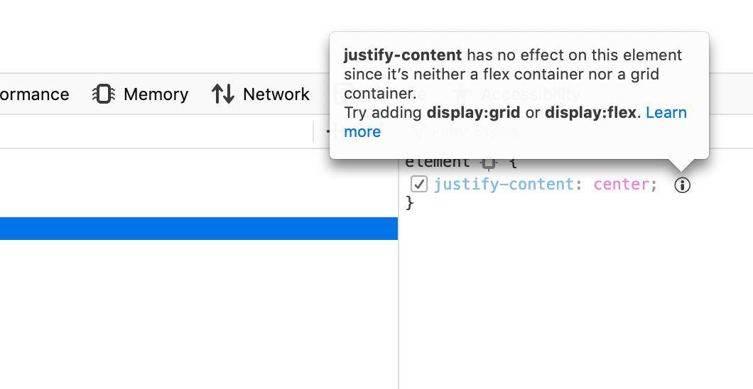
This tooltip shows a CSS property that has no effect on the current element in the Inspector, and explains why.
-
- Expandable CSS warnings also landed (shipping with 68). This allows jumping directly from a CSS warning displayed in the console to a node in the inspector when the warning occurred inside a CSS rule. Bug 1093953.
-

Now errors can expand and collapse, and link directly to any nodes they’re associated with.
-
- CSS Grid level 2 (subgrid) is close to shipping in Firefox. We’re getting the tooling for it ready in Firefox 69 so it’s easy to see the relationship between a grid and a subgrid.
- We’re continuing to prototype on WebCompat awareness tools. Our latest prototype is an addon that displays CSS compatibility information about a page from the Firefox toolbar. It now allows to jump from a warning into the Style Editor, and to open other browsers where issues occur. GitHub repo for the addon
-
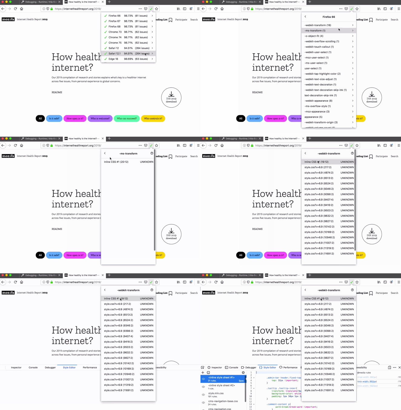
This WebExtension helps bring attention to any detected web compatibility issues on the page. Handy!
-
- We’re also focusing on fixing the last few remaining issues preventing to support the <meta viewport> tag in RDM, and therefore simulate mobile devices better.
Console
- We now have borders between messages to make them easier to read. Bug 1519904. Thanks Florens Verschelde :fvsch for your keen eye for details.
-
Better visual separation and readability? Yes, please!
-
- It is possible to resend network requests that were logged in the console. Bug 1530138. Thank you Christoph Walcher.
-
Want to resend that network request from the console? Now you can!
-
Debugger
- Column breakpoints are stable now and we’re super happy with it.
- Event breakpoints making good progress. The UI is ready and we’ll be landing the feature very soon. Follow along in this bug.
-
When this lands, developers will be able to set breakpoints on events, as well as lines of code.
-
- Workers are now displayed in the source tree along all the other sources.
- The new logpoint feature is now even better with dedicated icons in the web console.
-
Log log log!
-
Remote Debugging
- The new about:debugging page will ride the trains with Firefox 69. A final QA testing phase will happen in beta 69 in a few weeks. The main implementation phase is over and the final few fixes have happened:
- Stay on the same page when reloading about:debugging (reconnects to remote runtimes automatically) (bug)
- Remember last temporary addon install directory (bug)
- Disable temporary addon installation if xpinstall.enabled is false (bug)
- Updated error message colors and borders
- New “Remote Debugging” menu item in the Web Developer menu
- Update for Fenix/Firefox Preview (name, icon and version) (bug)
-
Coming soon to a phone near you!
-
Fission
- Abdoulaye has an initial version of the <select> dropdown working with Fission
- Neil has a version of drag and drop working with Fission! \o/
- mconley has a patch that makes PermitUnload work with Fission, but is blocked on some DOM work
- mconley is starting efforts to make the context menu work with Fission
Lint
- Have been investigating ESLint 6 and various issues
Password Manager
- New pref (signon.showAutoCompleteOrigins) to show login origins in autocomplete has landed. This will be enabled after subdomain autocomplete support lands.
- Telemetry to keep track of which entry point is used to open Saved Logins
- Chrome passwords with a NULL `action_uri` aren’t imported
- In progress are:
- Re-auth master password with notification bar
- Creating new logins
- Initial support for modal prompts
- Sorting the logins
Performance
- Startup main thread I/O test has landed.
- It is disabled on debug builds, on Windows Arm64, on beta(including devedition) and release.
- When this test fails, it uploads a profile of what happened as an artifact of the test job.
- Doug is looking into optimizing omni.ja compression with lz4
- LZ4 startupCache numbers looking quite good (session restore and startup_about_home_paint – I think the others are just other things)
- LZ4 omni.ja numbers are fairly *meh* on talos – still trying to work out the systemic (build-based) noise on local reference hardware.
- Doug is also figuring out if we can improve ordering within ordering within libxul to load it more efficiently
- mconley is removing stat calls in the startup cache code
- Gijs removed useless chrome.manifest reads
Performance tools
- Properly updating the URL state after publishing now.
- Improved algorithm to find idle threads at load time.
- Firefox Profiler now supports SimplePerf output format.
- Added more relevant information to window title to improve the searchability of tabs. Thanks to our GSoC student Raj!
-

This should make it easier for developers to tell various profiles apart when opened in multiple tabs.
-
- Transforms are usable inside stack chart via context menu now.
-
Stack chart getting some love!
-
Picture-in-Picture
- Dave Justice is about to get a patch landed that decorates the tab that a Picture-in-Picture video is coming from
- Keyboard access and RTL support for Picture-in-Picture is still underway
- The tentative plan is to let this ship to Firefox 69 Beta / Dev Edition and get feedback from our users and web developers
Policy Engine
- ExtensionSettings policy finally landed (bug 1522823)
- Added a number of preferences to the new Preferences policy (bug 1545539)
- Download related policies (bug 1546973)
- Activity Stream policies (bug 1548080)
- Legacy Browser Support
- EXE built
- Able to test extension
- Working on IE BHO
- Investigating multiple intermittents on policy that have been around a while
Privacy/Security
- Nihanth landed initial code for protections panel, content will land in the coming weeks
- Erica working on about:protections for the Protection Report – fighting some tests, should land soon
- Johann working on restricting back/forward UI to pages with user interaction 🎉
- Service workers will now be deleted by “Forget About This Site”
- There’s now a message shown in the identity popup when the site is verified by an imported root certificate
Search and Navigation
Search
- Working on a few regressions found while improving test coverage
Quantum Bar
25 Jun 07:04
In case you have any doubt that at some point F...
by Ton Zijlstra
In case you have any doubt that at some point Facebook and Twitter will wane, and another YASN will take the top spot. (YASN: yet-another-social-network, an acronym that came up in the age when everyone and their mother started a social platform)
From The Next Web, found via Kevin Marks.
25 Jun 07:04
Two-thirds say our housing crisis the result of “basic flaws of capitalism,” others say cheaters; critics say false choice
by Frances Bula
Okay, 361 people voted in my silly little poll asking if our housing crisis is the result of “basic flaws of capitalism” or cheaters taking advantages of a basically good system. And 64 per cent picked door number 1, although I have to note that a number of Twitter commenters said I was posing a false-choice question. I agree this may say more about my followers than about housing.
A sample:
-
-
Replying to @fabulavancouver
I’ll vote cheaters but only because I’m defining cheaters as restricted zoning since there wasn’t an option for “broken municipal system that prioritized individual land owners having say over the use of land they don’t own for decades which has resulted in a skewed market”
Replying to @fabulavancouverCapitalism itself is fine. Very efficient. What isn’t ok is the environment in which it operates within. Tax policy, social policy, environmental policy and so forth should shape choices so that market preferences generally align with what’s best for society.
-
 JC @Network_Guy
 Rick Vugteveen @rickvug
One person had so much to say, it couldn’t fit into a tweet, so here are his thoughts in full. Please continue piling on.
Supply side:
-
- Land use and zoning: 90+ years of highly restrictive zoning on a majority of our residential land. The city planners and leaders of the day were at least honest enough to clearly state that Single Family zoning was most definitely about preservation of property values, as well as segregation of classes/races. The City’s early money, having built their mansions in the West End, became upset when developers came along in the 1920s, bought up some of the earliest ones, and replaced them with economically more advantageous apartment buildings (right beside remaining mansions). Basically, natural urban economics at work. The result of their displeasure at this natural phenomenon, especially the resulting mixing of classes and races, became First Shaughnessy and the City’s first zoning plan in the late 1920s/early 1930s. There’s a rich irony that those who likely earned their wealth from unbridled colonial capitalism then turned around and used government power to both heavily restrict it and skew it mightily in their favour when it came to their own homes.
-
Of course, it must be mentioned that all this took place in a city wiped clean of its original First Nations inhabitants, and that many of Vancouver’s first 1%ers earned their wealth thanks to Lt. Gov. Trutch’s earlier actions, who believed “that British Columbia’s future lay in taking land from native people and making it available to developers such as railway companies.” BC, from its earliest days of violently erasing First Nations from their lands, has always been about development and speculation.
- Since the first city plan established the dominance of single family zones, we’ve seen a few formerly SFH areas upzoned to multi-family, mostly in the 1960s (a small portion of Kerrisdale, along with portions of Kistilano and Marpole), and less so in the 1970s (Fairview). Other than that, and the already mixed zoned West End of the 1960s, most of our density has gone into formerly industrial areas (thanks largely to the anti-development changes brought in by Art Phillips and TEAM): False Creek south in the 1970s on old industrial wasteland, Champlain Heights in the 1970s on the old city landfill, Yaletown/downtown/False Creek North on post-Expo industrial/warehouse land from the 1980s-2000s, Arbutus Walk on old brewery lands, and finally River District on old industrial land. I don’t know the history of Joyce/Collingwood, but I’m guessing it was similar to Fairview in the 1970s: one of the poorest areas of Vancouver (after the DTES) and not wealthy/organized enough to argue against upzoning.
- Any other density has gone in on a few select arterial roads (Cambie/Oak), where the 90 year old policy/philosophy of placing multi-family housing closer to pollution (noise and air) continues.
- ALR: we can argue about the merits of the Agricultural Land Reserve, but it has clearly restricted the supply of land for development, whether residential or commercial/industrial, in Metro Vancouver.
- Transportation: roughly 30% of our land is given over to roads and on-street parking. That seems…sub-optimal, in terms of land-use economics. That figure hasn’t changed since the first City Plan of 1927/28.
Demand side:
- 1940s/50s: creation of CMHC to support housing construction via subsidized government-backed loans. By the mid 1950s CMHC provided mortgage loan insurance for all mortgages with a 25% downpayment, a substantial form of subsidy backed by all taxpayers.
- 1970s: capital gains tax exemption is allowed for the primary residence (after capital gains taxes are brought in by Trudeau Sr. on other investments). This is now a subsidy worth $7-8 billion per year.
- Accommodative central bank policy, especially over the past decade: the Bank of Canada tracks the housing market closely, and adjusts interest rate policy accordingly. Similar to with the ALR, one can argue the pro/cons of the past decade of record low interest rates, but access to capital in Canada has been very easy for most of the past decade. Canada has happily claimed its place near the top of the global debt to income charts over the past decade. That has changed to an extent over the past 12 months (B20 rules and a slight increase in interest rates), but these kinds of moves take time to have an impact on house prices.
- On a smaller scale, there are other direct and indirect subsidies below the federal level: provincial home owner grants that reduce an already low property tax rate, along with some of the lowest municipal property taxes in North America (thanks to an outdated Vancouver Charter restriction).
- Finally: zoning is also a large subsidy for property owners, especially single family homeowners:
Foreign capital:
- with the above structures in place, in some cases for decades, I’d argue that the influx of foreign capital (both legal and illicit) simply added fuel to a fire that had long been burning. Vancouver has had a housing crisis for decades, if you were low to middle income. It just so happened that certain upper middle income and upper income classes (engineers, lawyers, doctors, and other professionals) got burned by that fire in the past 5-6 years, and were far more effective in complaining loudly about it.
- we’ve been looking for an easy bogeyman to blame for our crisis, and most of us are looking everywhere else but in the mirror. So, foreign capital it is, and let’s conflate legal and illegal sources to boot.
I’m certainly happy to see the provincial government put demand taxes in place (FBT, School Tax, Speculation Tax), and launch inquiries into money laundering (long past due). But if we think focusing only on demand measures and illegal capital will solve our crisis, I think we are sorely mistaken. When our provincial housing minister argues that townhouses and duplexes are legal in BC…
…without acknowledging that municipal zoning restrictions make both illegal on most residential land, then I’m not confident that we will sort this out.
We’ve placed significant restrictions on supply for most of a century, at the same time as we’ve subsidized demand at all levels of government for 70 years or so. No wonder we have a crisis.
To answer your question: the system is not OK, we should definitely curb cheaters, and what we’re dealing with is typically what happens when government policies mix with subsidized capitalism: a bastard hybrid that benefits a chosen subset of the population. It just so happens that that subset forgot about its children…and they’re pissed, along with some of the upper classes who were hoping/expecting to join them in single family house land. Will the rest of the city’s residents be happy with any proposed solutions? Will we be honest enough with ourselves to properly diagnose the various, complicated reasons behind how we got into this mess? Based on discussions with friends and acquaintances, and reading media and Twitter threads, I have my doubts…
24 Jun 04:55

Downtown Oslo Norway Says No to Vehicular Parking
by Sandy James Planner

Take a look at Norway where the capital city Oslo has removed over 700 parking spaces in the downtown and replaced those spaces with benches, bike racks and public spaces.The City has 50 parking spaces left, mainly for disabled persons in vehicles and for deliveries to local businesses.
i have been writing about European cities going for slower streets, and finding that residents are happy with the slower vehicular speeds. The Economist observes that many European cities are going for outright vehicular reduction in their downtowns. London and Stockholm have congestion charges, and I have written about London’s new ultra low emissions zone.
Paris has tried to limit vehicular use on certain days. But Oslo’s approach of closing off the downtown to private cars, and changing streets to limit traffic flow in one direction is the closest to a “downtown car ban” . While opponents to the ban have complained about limited access to the downtown, there are still vehicles in the downtown, just fewer places to park. Downtown Oslo business owners worried that “fewer cars could mean fewer customers”. While those statistics are not in yet, pedestrian traffic has increased in the downtown by 10%, and the experience in London showed that spending increased by 40% with people that walked, cycled or took public transit to downtown shopping areas.
In Oslo the main commercial areas of the downtown already have a lot of pedestrian foot traffic and are likely to only be positively impacted by private vehicle restrictions. And those restrictions when enacted in Stockholm Sweden actually assisted private vehicle owners and public transit users as “factors such as shorter travel times and safer roads far outweigh the fees paid by drivers.”
This is the time of conservatism, but local politicians including Vice-Mayor Hanna Marcussen have been working on an incremental approach to the adoption of the downtown vehicular parking ban, speaking directly with business owners and assessing potential impacts of a walkable downtown.
“Ms Marcussen likens her government’s traffic reforms to Norway’s public-smoking ban, which was enacted in 2004. Many grumbled before the law was passed, but few today would clamour to let people smoke in pubs again.”
This YouTube video outlines Oslo’s approach with their new policies. The comments on the video are worth a quick read as well, as they represent the divergent opinion on this initiative.
23 Jun 16:34
Top 3 :: iPad - Watch - Beats
by Volker Weber

Meine drei meist-benutzten Gerätschaften sind momentan alle von Apple:
- Das 2018er iPad Pro 12.9 war für mich eine Überraschung. Ja klar, absoluter Haben-Wollen-Faktor, aber würde ich damit wirklich alles machen können? Ich kann, und wie! Mein größter Time Saver ist Shortcuts, mit dem ich mir einige Arbeitsabläufe programmiert habe. Und ich bin ganz gespannt auf iPadOS, voraussichtlich riskiere ich sogar die Beta.
- Die Apple Watch ist keine Überraschung. Ich mag sie seit der ersten Generation. So richtig abgehoben hat sie bei mir mit der dritten. Denn auf einmal war ich per LTE überall erreichbar, auch ohne iPhone. Die Watch verhindert zuverlässig, dass ich ein anderes Smartphone überhaupt in Erwägung ziehe.
- Aber die Beats Studio³ Wireless? Das war eine ganz fette Überraschung. Ich hatte eine vorgefassten Meinung. Beats sind basslastig und was für Poser. In der Realität sind sie komplett anders. Sehr ausgewogen und transparent. Meine Plantronics 8200 UC sind basslastiger und die Marshall Monitor aggressiver. Dazu kommt, dass die Beats perfekt auf meinen Kopf passen und mich auch nach Stunden kein bisschen stören.

Das iPad Pro ist ziemlich perfekt. Das Zubehör nicht so sehr. Ich mag das Schreibgefühl auf dem Smart Keyboard Folio, aber das Material des Case ist eine Zumutung: Es zieht magisch Schmutz an und ist nicht mal sehr robust. Es gibt für mich aber keine Alternative. Da ich das iPad Pro überwiegend wie ein Notebook verwende, aber nicht in einen Ziegelstein verwandeln will, kommt weder das Logitech Slim Folio Pro noch das BRYDGE 12.9 Pro in Frage. Beide haben zudem den Nachteil, dass sie sich per Bluetooth und nicht über den Connector verbinden. Welches iPad Pro? Nicht das mit 64 GB. Wieviel Speicher man haben will, ist persönliche Präferenz, genau wie das LTE-Modem. Da ich überwiegend in der Cloud speichere, reichen mir 256 GB. 11 Zoll oder 12.9 Zoll war für mich eine superleichte Entscheidung. Unbedingt das große, weil ich ja voll damit arbeiten wollte.
Zur Watch muss ich nicht mehr viel erzählen. Sie ist unter anderem dafür verantwortlich, dass ich überhaupt noch da bin. Steel oder Alu, welche Farbe? Auch ganz einfach: Stainless Steel. Bei den Bändern habe ich ein große Auswahl, da Apple hier über Jahre die Kompatibilität wahrt. Alte Generation sehen nicht alt aus, alles passt. Da ich das iPhone oft zurücklasse, ist LTE Pflicht, und bei der Stainless Steel sowieso dabei. Entsprechend meinem Alter liebe ich die ganzen Funktionen zur Gesundheitsvorsorge und ich wünsche mir für die (entfernte) Zukunft vor allem eine Überwachung des Blutzuckers. Ich habe meine Ernährung zwar gut im Griff, aber das würde mir mehr Sicherheit bieten.
Die Beats haben für mich den Vorteil, dass sie dank des Apple W1-Chip sehr einfach zwischen iPad, iPhone und Watch wechseln. Als Rückfall habe ich stets ein AirPod Case in der Hosentasche. Sollte ich also unerwartet irgendwo gelangweilt rumsitzen und habe nichts anderes dabei, dann kann ich mit den AirPods und der Apple Watch Podcasts oder Musik hören. Die AirPods sind vielleicht Apples bestes Produkt, aber sie haben weder den Sound noch die Geräuschunterdrückung der Beats. Dafür taugen sie aber zum Telefonieren, wenn man kein Plantronics zur Hand hat. Hätte ich eine Top 4, dann wären die AirPods dabei.
23 Jun 16:34
What a lovely visit
by Volker Weber
As we were heading out the door for walkies with Frau Brandlinger, Ute noticed something at our doorstep. A glass of Tiptree Strawberry, with a small letter. I immediately knew this had to be somebody who knows me well. I read the letter and checked my Arlo and saw that the conserve had been dropped off by a gentleman a mere ten minutes before I noticed it.
Luckily John had left his last name on the letter so I could look up his email address and I sent him a message expressing my disappointment that he had not rung the bell. Long story short, I met John and his lovely wife in their motor home the very night. So many stories to tell.
John explained it's a British thing of being polite and not intruding that kept him from ringing the bell. And I agree with him. If I weren't expecting a visitor I had never met in my life, it would have been an awkward situation.
The weird thing is that you seem to know me very well, while I don't know you at all. On the other hand it was so nice to connect with John and his wife, that I am glad we made it. Ground rule: do not surprise me at my door. We will find other places in Darmstadt to meet up.
23 Jun 16:34
Primary Colors :: Apple Watch Sport Bands
by Volker Weber
As you can imagine, I am a huge fan of the Apple Sport Band. And I like to mix colors. This is a favorite: red for the loop and white for the strap.
23 Jun 16:34
Every secure messaging app needs a self-destruct button
by Volker Weber
The growing presence of encrypted communications apps makes a lot of communities safer and stronger. But the possibility of physical device seizure and government coercion is growing as well, which is why every such app should have some kind of self-destruct mode to protect its user and their contacts.
Agreed. Did you know about the 5x power?
Update: the least detectable way to disable FaceID or TouchID is to hold down the power button and one of the volume keys. These are on opposite sides for all iPhone X*.