Shared posts

18 Apr 18:52

Two Pandemic Takes

by peter@rukavina.net (Peter Rukavina)

My friend Cindy, in an opinion piece the the Regina Leader-Post, Organizing in hard times serves the betterment of community:

Although individualism might help us stay at home alone and learn a new hobby or practise informal learning through our computers or sewing machines, by acting together we can build something sustainable and push for actions that benefit communities and build the commons in the long run. This is our challenge and our need.

The performance of a community comes from its people and actions where the collective trumps the individual. This, fortunately, has become obvious during these difficult times. But actions that prioritize economic growth over the environment and community will only lead us back to the pandemic. It’s time for actions to emphasize public ownership, solidarity and bottom-up changes. Without this, the post-pandemic will present further social and economic divisions.

My friend Lou, on Facebook, links to Well, That Unraveled Quickly from the American Institute for Economic Research:

In the meantime, we’ve seen things we never imagined possible, namely seemingly intelligent people howling for weeks for the nationalization of industry, the socialization of production, the imprisonment in our homes, the trillions in pointless spending, the unprecedented amounts of new money created by the Fed, and the countless other awful legal precedents set. The lawsuits will continue to be litigated for a decade.

The core realization we face right now is that it is not possible to stop and start an economy; nor is it possible to distinguish between essential and nonessential. The commercial society is a web in which everyone and everything is connected with everyone and everything else.

I have a diverse group of friends.

18 Apr 18:52

The World Redesigned: Why we will still have gatherings

by Gordon Price

What will fill this:

Since we’re never going back to the pre-Covid world anytime soon, will we still have large conferences, or even small ones?  Why have conventions in attractive places, meant as much for socializing as exchanging?  Why deliberately bring people together to learn and bond, to show off their public faces, to see who fate might introduce them to? With splashes of alcohol, rich food and entertainment.

Well, actually, those reasons seem pretty persuasive.

Gatherings need to be special, even an extraordinary experience, and they have to be something that can only be experienced through being there, together with others.  That means they must appeal to all five senses: deliberate listening, constant conversation, light gluttony and human contact.  A time for show and tell and feel.

Zoom or Skype don’t do all that, because it’s not what they’re for.  Electronic communication since the telegraph has been about more efficient ways to share information, and now there are skilled generations who don’t need to be physically together just to exchange data or ideas, no matter how complex.  The tools are getting really good.  But they don’t substitute for light romance.

A conference to be special – to justify the expense and risk – also needs a ‘name.’  Someone on the billing.  Whether for a concert  or event, the personality needs to pull in the otherwise risk-adverse with enough celebrity status, polished presentation and performance, and something worth saying, in a setting that can’t be replicated on a screen.  Otherwise, it’s just a Zoom.


Thoughts from Jude Crasta in conversation.


18 Apr 18:52

Why I Love My Instant Pot

by Rebecca Johnson
Why I Love My Instant Pot

Since my children were born, I’ve made fried chicken 1,329 times, braised stew 720 times, and boiled pasta so many times I can’t begin to count. I am now officially bored stiff with cooking.

18 Apr 18:49

Ed-Fi opens the door to move from hundreds to hundreds of millions

Troy Wheeler, Ed-Fi Alliance, Apr 17, 2020
Icon

I've always thought of ed-Fi as interesting but niche. Ed-Fi has always been an open "set of rules for the collection, management, and organization of educational data." This announcement opens the software associated with the rules, including an Operational Data Store (ODS) that "allows you to pull information from multiple systems into a database" and an API that supports querying that database. There are also integrated development environments (IDE) and a dashboard. Troy Wheeler writes, "We know that the world is changing right now, and the way we deliver the tools of education will look vastly different in the months and years to come. We also know there has never been a better moment to move forward."

Web: [Direct Link] [This Post]
18 Apr 18:49

Downtown Charlottetown without the Automobile

by peter@rukavina.net (Peter Rukavina)

In our neighbourhood, the most obvious sign that we’re all locked inside our houses due the pandemic is that there haven’t been any cars parked on Prince Street for weeks.

On a typical Friday afternoon, you’d be unable to get a space at a parking meter between Richmond and Grafton unless you were prepared to circle the block a few times; I don’t think I’ve seen more than two cars parked on this stretch since mid-March.

Photo of Prince Street between Grafton and Richmond with no cars parked.

Seeing the street empty of automobiles for so long reinforces just how much of our downtown we’ve given over to them.

18 Apr 18:48

What if charisma is a golden mane?

I was talking with my old friend Adam Greenfield a few months back and the topic touched on the rich and the powerful and the uncanny gravity they have.

I raised my pet theory that maybe charisma is a real physical attribute like height or eye colour, not psychology, and the hyper charismatic have effectively a mutation – or putting it another way, an evolutionary adaptive trait.

There are some involuntary tells that are on the face of it invisible, but perhaps pre-consciously detectable:

Paul Ekman’s theory of micro-expressions holds that our emotions are visible in sub-second facial expressions, invisible to the eye without training, but visible to cameras.

Then check out this video magnification technique which shows that the pulse is visible through colour changes in the face. I’m sure this must be unconsciously visible – perhaps sensed just as a feeling or an intuition.

But we do have an impressive ability to detect when a person is lying! Humans, generally, are pretty good judges of character.

I’ve been in rooms with reasonably powerful people once or twice. David Cameron and Steve Ballmer come to mind. (Adam had a few too, but those are his stories to tell.) I was not a fan of either of them. Afterwards – I felt impressed? Respect? Reviewing my experience, there’s nothing tangible that should have changed my view. No conversation, just presence. AND YET.

So that’s unnerving.

It might not be purely visual. Maybe it’s a mutation which leads to intoxicating pheromones. But I think it’s physical, or at least that it’s multifactor and a large factor is physical, because it doesn’t work as well through TV.

The Golden Man

What if this ability is the ability to hack human social interaction. They don’t know how they’re doing it, or even that they are.

There’s a 1953 short story by Philip K Dick called The Golden Man (you can read the whole thing at that link).

Nuclear fallout has given rise to mutants – humans with bat wings, or psychokinesis. A government department methodically finds and euthanises them: the fear is that a mutant will be appear that can out-compete baseline humans.

The Golden Man is such a mutant. He is quick; he can see five seconds into the future; he has a golden mane. He is unnaturally sexually attractive. But he has no frontal lobe: he is pure animal. His irresistibility means he will win in the only race that matters: We’re the last of our line – like the dinosaur.

People with charisma. People with charm. So what would that mean, if true?

18 Apr 18:48

The Impromptu Gym

by Gordon Price


All the gyms are closed.  And, given their particularly efficient way of spreading a virus, they’re likely to be for some time.   Many, maybe most, won’t survive.

The Park Board has closed down most of the purpose-built places to exercise: community centres, weight rooms, swimming pools, tennis courts, golf courses, even the swings and exercise bars in sand lots:

But this is Vancouver.  We’re gonna do what Vancouverites do.

As I write this, a neighbour is below my window, playing tennis with a concrete wall in an asphalt parking lot.

There’s an actual tennis court across the street.  But the Park Board has closed it off because, you know, virus.


18 Apr 18:47

Twitter Favorites: [MetroManTO] John Tory won’t close a single lane of traffic so that people can safely #SocialDistance but it’s ok for cars and t… https://t.co/GfyDpQ5gsi

Pedro Marques @MetroManTO
John Tory won’t close a single lane of traffic so that people can safely #SocialDistance but it’s ok for cars and t… twitter.com/i/web/status/1…
18 Apr 18:47

Life under COVID-19, mid April edition

by jnyyz

So it’s been a while since I posted a plot of the number of COVID-19 cases for various countries. This is a plot of log(cases per capita), which means that on this scale, -3 means the number of cases is 1 per 1000 people, and that exponential growth appears as a straight line. Here is the plot as it stands today.

Compared to the plot that I posted at the end of March, you can clearly see that the curves for both the US and Canada are starting to level off, meaning that there are fewer new cases each day, which is great news. The sad story in this graph is that the cases for Japan (green curve) continue to grow exponentially since they were very late to take serious measures to impose social distancing.

The data that I use to make the plot comes from worldometers.

They have recently added more columns of data. It is especially interesting to see the number of tests/ 1M population. If we rank the data by that column:

we get outliers like the Faeroe Islands (a real success story), and a bunch of smaller countries as well. Among the major EU countries, there is a decent amount of testing: Germany (25K), Italy (20.6K), with a couple of notable laggards like Sweden (7.4K) and the UK (6.5K). By comparison, Canada has done 13.4 K, and the US has made great strides recently to total 10.8K i.e. 10,800 tests per million. The sad story here is Japan once again, with only 796 tests per million, which puts them among much poorer countries such as Grenada (818) and Guinea-Bissau (672).

There are a couple of other compilations of data that I have been following. One is by the Financial Times. There is a lot to unpack on this webpage. Firstly you can look at the total number of new cases per day.

This would correspond to the slope of the curves in the first plot, and you can see that for a great number of countries, the number of cases per day is going down. In this plot, each curve has been shifted in time so that they start at the point where 30 cases were recorded in each country.

They also plot the total number of deaths per day, which differs from the number of cases each day due to the time lag between detection and potential demise.

Although trying to use models to predict the total number of deaths is a tricky business, you can use this data to make some rough estimates. For example, if we look at the curve for China, you can approximate the area under the curve by a triangle of height 130 and a width of about 70, which gives 4875, and the actual figure is 4632 as of today. If we assume a similar trend for the US, we note that the peak is later, which would make the curve wider, say a height of 2000 and a width of 120, which gives 120,000 total deaths, which is between the latest estimate from the best model (about 65,000) and the earlier results from the administration of about 200,000 fatalities. If we assume that Canada peaks at about day 30, then we get about 4800 fatalities. However, one should note that curves for countries like Italy and Iran are decreasing much more slowly than the curve for China.

Another interesting chart from FT is this one:

It is useful to visualize both the growth in the total of cases worldwide, as well as the changing distribution between countries. One amusing point: note the pink area labelled as “Rest of N. America”. AFAIK, if you take the US out of N. America, you are left with Canada. The sobering thing about this chart is the fact that most developing countries are still at a very early stage in the growth curve. Another striking thing is how the total number of daily deaths in Asia still remains a tiny sliver, even though this is the region where COVID-19 started.

The other website that is interesting is this one, that provides a log log plot of new cases per day versus time. There is almost a universal curve for growth, with the countries that are getting a handle on COVID-19 dropping down off of the straight line.

As a follow up to my earlier posts on grocery shopping by bike, I note that pallets of garden soil in front of the Pacific Ave NO Frills make accessing the bike racks while maintaining social distancing difficult. My solution is to park the bike away from the line up. It still has to be close to the margins of the parking lot so that the security locks on the grocery cart casters are not engaged.

I’m glad that I fixed up the kickstand on the cargo bike.

17 Apr 19:00

COVID-19: What comes next

Michael Feldstein, e-Literate, Apr 16, 2020
Icon

The pundits have now swung into prediction mode (all the while saying predictions are impossible to make at this juncture), and here Michael Feldstein weighs in with what I think are some reasonable perspectives. Here they are (quoted and paraphrased):

  • everyone will be cash-strapped - what that means is hard to judge
  • online isn't going away any time soon, and (a) this impacts the need for sustainability, and (b) we will need to pay extra attention to equity.
  • the curricular materials ecosystem is especially fragile - and while some may say "good riddance" there are still issues of privacy policies, procurement practices, or widespread literacy among faculty
Web: [Direct Link] [This Post]
17 Apr 19:00

COVID-19 Reporting is changing daily, BC Just launched a New Dashboard

by Tracey

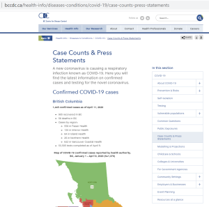
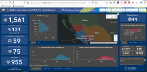
Reporting is becoming more sophisticated. The BC Centre for Disease Control (BCCCD) went from this landing page on the 13 of April, 3 days ago with data, maps, and charts as images on the page.

BC_CaseCountsPressStatement_BCCDC_13042020

To this page today 16 of April and data are now reported in an ESRI dashboard, and some data available for download! I think it is easier to read. I hope they will continue to report their excellent Surveillance Reports, here is an example from April 15, 2020. You can access those reports at the bottom of the landing page. What is great about the dashboard is that it is a collaboration between a number of Provincial Agencies BCCDC, PHSA, B.C. Ministry of Health and GeoBC Production. Below the image I have also pasted what they include on their Terms of Use, Disclaimer and Limitations of Liability page from the Dashboard.  The one issue with the dashboard, is you cannot download or link to specific pages.

BC-BCCDC_LandingPage_16042020
BC_COVID19_Dashboard_16042020

Below I copied and pasted the information directly from the Dashboard at 9:45 AM EST, 16 April 2020. It is useful to have this all in one place, including access to data, data sources and notes about the indicators. This comes from the Dashboard, and unfortunately I cannot hyperlink directly to this information.

Terms of use, disclaimer and limitations of liability

Although every effort has been made to provide accurate information, the Province of British Columbia, including the British Columbia Centre for Disease Control, the Provincial Health Services Authority and the British Columbia Ministry of Health makes no representation or warranties regarding the accuracy of the information in the dashboard and the associated data, nor will it accept responsibility for errors or omissions. Data may not reflect the current situation, and therefore should only be used for reference purposes. Access to and/or content of this dashboard and associated data may be suspended, discontinued, or altered, in part or in whole, at any time, for any reason, with or without prior notice, at the discretion of the Province of British Columbia.

Anyone using this information does so at his or her own risk, and by using such information agrees to indemnify the Province of British Columbia, including the British Columbia Centre for Disease Control, the Provincial Health Services Authority and the British Columbia Ministry of Health and its content providers from any and all liability, loss, injury, damages, costs and expenses (including legal fees and expenses) arising from such person’s use of the information on this website.

BCCDC/PHSA/B.C. Ministry of Health data sources are available at the links below:

Dashboard Usage Tips:

  • Hover over charts to see additional information.
  • Click the top right corner of any chart/window to make it full screen. Click again to return to the dashboard view.

Data Sources:

  • Case Details and Laboratory Information Data are updated daily Monday through Friday at 5:00 pm.
  • Data on cases is collected by Health Authorities during public health follow-up.
  • Confirmed cases include laboratory positive cases.
  • Laboratory data is supplied by the B.C. Centre for Disease Control Public Health Laboratory; tests performed for other provinces have been excluded.
  • Data on intensive care unit (ICU) admissions is provided by the PHSA Critical Care Working Group.
  • Test and case values may differ between amalgamated Health Authorities and B.C. as site locations are confirmed.

Data Over Time:

  • The number of laboratory tests performed and positivity rate over time are reported by the date of test result. On March 16, testing recommendations changed to focus on hospitalized patients, healthcare workers, long term care facility staff and residents, and those part of a cluster or outbreak who are experiencing respiratory symptoms. The current day is excluded from all laboratory indicators.
  • The number of new cases over time are reported by the date they are notified to public health.

Epidemiologic Indicators:

  • Cases are considered recovered after two lab-confirmed negative swabs taken 24 hours apart or when removed from isolation 10 days after symptom onset.
  • New cases are those reported daily in the PHO press briefing and reflect the difference in counts between one day and the next as of 10:00 am. This may not be equal to the number of cases reported by day, as cases reported prior to 10:00 am would have been included as New Cases in the previous day’s count. Because of the 10:00 am cut-off, the most recent day in time series graphs may contain only partial information. On Mondays, the number of new cases includes the number of new cases from Saturday and Sunday.
  • ICU values include the number of COVID-19 patients in all critical care beds (e.g., intensive care units; high acuity units; and other surge critical care spaces as they become available and/or required).

Laboratory Indicators:

  • Total tests represent the cumulative number of COVID-19 tests since testing began mid-January. Only tests for residents of B.C. are included.
  • New tests represent the number of COVID-19 tests performed in the 24 hour period prior to date of the dashboard update.
  • COVID-19 positivity rate is calculated as the number of positive specimens that day/total number of specimens tested (positive, negative, and indeterminate) that day.
  • Turn-around time is calculated as the daily average time (in hours) between specimen collection and report of a test result. Turn-around time includes the time to ship specimens to the lab; patients who live farther away are expected to have slightly longer average turn around times.
  • The rate of COVID-19 testing is defined as the cumulative number of people tested for COVID-19/BC population x 1,000,000 population. B.C. and Canadian rates are obtained from the Public Health Agency of Canada’s Daily Epidemiologic update site.

Health Authority Assignment:

  • Health Authority is assigned by place of residence; when not available, by location of the provider ordering the lab test.

Please direct questions and feedback to the BCCDC: Admininfo@bccdc.ca

17 Apr 19:00

Catalina Developer Beta Changes How Mac Laptops Charge to Extend Their Batteries’ Lifespans

by John Voorhees

The developer beta release of macOS 10.15.5 has a new feature in the Energy Saver section of System Preferences called Battery Health Management that changes the battery charging behavior of Mac laptops with Thunderbolt 3 ports. According to a story by Jason Snell at Six Colors, Apple says:

…the feature is meant to reduce the rate of chemical aging of the MacBook’s battery, thereby extending its long-term lifespan—but without compromising on day-to-day battery life.

The feature works by analyzing the temperature of the battery over time, as well as the charging pattern the laptop has experienced—in other words, does the laptop frequently get drained most of the way and then recharged fully, or is it mostly kept full and plugged in?

Battery Health Management can be turned off by unchecking a box in System Preferences.

As Snell points out, Apple’s approach here is in contrast to what it did with the iPhone’s battery in 2017, which embroiled the company in controversy and ultimately, led it to issue a public apology. It’s good to see Apple take the initiative to explain how the new power management feature works and give users a way to turn it off when it makes sense, though I expect to leave it turned on most of the time myself.

→ Source: sixcolors.com

17 Apr 18:58

There’s No Shortage of Design Work

by Eric Karjaluoto

TL;DR: Instead of competing to design visual assets, you should help design content. It is always in demand, requires ongoing attention, pays better—and no one else wants to deal with it. Are you a designer who’s always chasing the next gig? If so, this post is for you. It fits with several articles I’ve written […]

The post There’s No Shortage of Design Work appeared first on Eric Karjaluoto.

17 Apr 18:58

The NBA and Microsoft

by Ben Thompson

From a Microsoft press release:

The National Basketball Association (NBA) and Microsoft today announced a new multi-year collaboration, which will transform the way in which fans experience the NBA. As part of the collaboration, Microsoft will become the Official Artificial Intelligence Partner and an Official Cloud and Laptop Partner for the NBA, Women’s National Basketball Association (WNBA), NBA G League, and USA Basketball, beginning with the 2020-21 NBA season.

Microsoft and NBA Digital — co-managed by the NBA and Turner Sports — will create a new, innovative direct-to-consumer platform on Microsoft Azure that will use machine learning and artificial intelligence to deliver next generation, personalized game broadcasts and other content offerings as well as integrate the NBA’s various products and services from across its business. The platform will re-imagine how fans engage with the NBA from their devices by customizing and localizing experiences for the NBA’s global fanbase, which includes the 1.8 billion social media followers across all league, team and player accounts.

Beyond delivering live and on-demand game broadcasts through Microsoft Azure, the NBA’s vast array of data sources and extensive historical video archive will be surfaced to fans through state-of-the-art machine learning, cognitive search and advanced data analytics solutions. This will create a more personalized fan experience that tailors the content to the preferences of the fan, rewards participation, and provides more insights and analysis than ever before. Additionally, this platform will enable the NBA to uncover unique insights and add new dimensions to the game for fans, coaches and broadcasters. The companies will also explore additional ways technology can be used to enhance the NBA’s business and game operations.

As part of the collaboration, Microsoft will become the entitlement partner of the NBA Draft Combine beginning next season and an associate partner of future marquee events, including NBA All-Star, MGM Resorts NBA Summer League and WNBA All-Star.

The logic for the NBA in this deal is clear:

  • First, in my experience Turner has dropped the ball in terms of the NBA’s digital experience, particularly League Pass. Microsoft should dramatically improve the experience for the NBA’s digital customers. [UPDATE: I mostly watch International League Pass, which I now understand was not managed by Turner; my apologies for Turner for the mistake]
  • Second, the NBA is, in some respects, no different from a movie or television studio: it produces content and then sells it to the highest bidder, usually delineated by geography. Digital, though, makes it possible to own the customer relationship directly, a la Netflix. Or perhaps Disney+ is the better example, given how differentiated the NBA’s content is; this deal is clearly working towards that goal.
  • Third, that last paragraph from the press release is an important one: it seems likely that the NBA is going to make out well in this deal from a marketing perspective, even if this partnership is underwhelming.

The Microsoft angle is equally interesting, and like many tech deals, has much higher risk/reward:

  • There are significant technical barriers to achieving what this deal entails. Microsoft is going to spend a lot of time and money on a relatively small business.
  • Microsoft, at the same time, is uniquely suited to solving these challenges: what stands out to me in the conversation below is the talk of Xbox, a division that failed to achieve Steve Ballmer’s goal of a universal “three-screens-and-a-cloud”, and has instead become a fine enough gaming option; its technologies, though, could really make this effort sing.
  • If Microsoft pulls this off, the potential to re-use the technology developed for the NBA, not only for other sports leagues, but for media entities of all types, could potentially be massive.

There are other angles to this as well: one thing that intrigues me is the potential for channel conflict on the NBA side. It seems a bit far-fetched to think that the NBA seeking to own the customer relationship is good for TNT or ESPN, or that the latter will help the former achieve this goal. And yet TNT and ESPN pay the NBA’s bills. This will be a project worth watching for many months to come.

An Interview with Adam Silver and Satya Nadella

In the run-up to this announcement I was able to spend a few minutes with NBA Commissioner Adam Silver and Microsoft CEO Satya Nadella. A lightly edited transcript is available to Daily Update subscribers.

A podcast of the interview, though, is available for free via the Stratechery Podcast service. Here is how to listen:

If, in the future, you would like to listen to Daily Update podcasts as well — and I hope you do! — simply visit the link in your show notes or the Daily Update Subscription Management page and subscribe. Your feed will be updated immediately with Daily Update episodes (you don’t need to add it again).

17 Apr 18:58

The Dial-a-Drill: Automating the Teacher with Ed-Tech at Home

Yes, it has been a little quiet on Hack Education lately. Even HEWN has gone dormant. I will write some more about the silence soon. Meanwhile... These remarks were made during a guest visit to Dan Krutka's class, "Critical Perspectives on Learning Technologies," at the University of North Texas. (Let me know if you are interested in my speaking to your Zoom school.)

Greetings. Thank you very much for inviting me to speak to you today. You have found yourself enrolled in perhaps the most perfectly and horribly timed class, as you're asked to think about education technology critically, right as the coronavirus crisis plays out across schools and colleges worldwide and as students and teachers are compelled — even more than usual — to turn over their educational experiences to ed-tech.

I want to talk at you briefly about some history of ed-tech — I'll yammer on for about 20 minutes or so, and then I hope we can have a discussion.

But first, a little preface on why history, why now...

I realize that most everyone — particularly on social media — wants to talk about the now or the future. But even with everything currently upside down, I insist that knowing the history of education technology is crucial. History is useful not just because of some "lessons" that we might glean from the past. But whether we actively recognize it or not, where we are today is an outgrowth of history — our systems, our practices, our beliefs. There is no magical "break" from the past, even if it feels like everything right now is different. History informs and shapes us. All our decisions about the now and the future involve some notion of what has come before — even if those notions are wildly incorrect (such as the very common narrative — a favorite of the current Secretary of Education — that schools have not changed in over one hundred years). It's worth correcting these notions, of course. And it's also worthwhile to stop and maybe calm the people who are throwing up their hands right now and insisting that "all this is completely unprecedented!" Because there is historical research and social scientific research about education and about ed-tech — knowledge that can help us think through this moment and moments to come more sensibly.

We do know — that is, we have decades of research that demonstrates — that some ed-tech works okay for some students in some subject areas under some circumstances. We also know that all of those qualifications in that previous sentence — which ed-tech, which students, which subject areas, what sort of circumstances — tend to play out in ways that exacerbate existing educational inequalities. Under normal conditions, ed-tech is no silver bullet. Why the hell would we expect it to be now?!

We also know — that is, we have decades of history that demonstrates — that the push to automate education is not new nor is it dependent on how well the software works. Moreover, we know that technology is often called upon to address social and economic and political and yes sure medical crises facing education. Crises like World War I. Polio outbreaks. Sputnik. The rising cost of college. Not enough teachers. Not enough punch card operators. Not enough computer programers. All occasions when politicians and administrators and business officials (and less often, educators) insisted that technology — machines that teach — would save us. We know that, as historian Larry Cuban wrote almost twenty years ago, computers — the latest teaching machines — have been "oversold"; their promises largely unfulfilled.

I want to tell you a story about computer-assisted instruction (CAI) in the 1960s. I want to do so, in part, because this actually isn't a story I tell in my forthcoming book, Teaching Machines, and I feel like getting some of this down on paper. And I want to do so, in part, because I think it's worth thinking about how an idea that is almost a century old now is still being heralded as revolutionary. And finally, I want to tell this particular story about computer-assisted instruction because I think there are several important strands that I hope this class has prepared you to pick up on: I want you to think about who is the target population for this ed-tech intervention; I want you to think about the space — the physical space — in which this intervention occurs and what it means and what it feels like to work there; and I want you to think about how this technology imagines the labor of teaching and learning and how it constructs both the learning and the learner.

In 1962, Patrick Suppes, whose name is one of those most closely associated with the development of CAI, and his fellow Stanford professors, Richard Atkinson (who'd later become the president of the University of California) and William Estes, received a million dollar grant from the Carnegie Corporation — that's about $8 million in today’s dollars — to study the computer-assisted teaching of math and to construct an automated computer-based program.

1962 was, of course, before the advent of the personal computer, but at Stanford, Suppes and his team had access to an IBM 7090 and a PDP-1, two mainframe computers. In their laboratory, they established six "learning stations" where first-grade students were brought in five days a week for 20-minute sessions to work on a computer-based math curriculum. The logistics were obviously challenging, and so the project was soon moved off the Stanford campus and into the students' school — but that too was easier said than done. You couldn't put a giant mainframe computer in an elementary school building, although it was possible to install "dumb" terminals that could connect back to the mainframe via a phone line. First, you had to convince the phone company that it was okay to send signals over the wire this way. And then you had to find room for the terminals — remember, the "baby boom" had left many schools overcrowded. The only free space for terminals: the storage closet. So that's where the students were sent, one at a time, to work on their math lessons — "drill and kill" type exercises.

In his 1964 report to his funder, Carnegie, Suppes explained how the teletype — a modified typewriter keyboard and a ticker tape printer connected to the Stanford mainframe, was used daily at Walter Hays Elementary School in Palo Alto (one of the highest ranking elementary schools in the state of California, it's worth noting):

We are "on the air" for about 2 1/2 to 3 hours with a class of 40 students and we attempt to process all 40 students during that period. Each student is at the teletype terminal from 2 to 5 minutes. They are very efficient about it, not losing more than 20 or 30 seconds in arriving at the terminal or leaving it. We ask them to begin by typing in their names and hitting the return key. Timing on the rest of the drill and practice work is controlled by the program. What we are finding is that when detailed and objective control of the environment is possible, we can hope to train a student to a level of accuracy and perfection of response that is very difficult to achieve in a classroom environment.

(For the sake of time, I am going to skip over a whole discussion here about B. F. Skinner and operant conditioning and the training of children and the training of pigeons. But sufficed to say, do not let anyone try to tell you that computer-assisted education rejected behaviorism and embraced cognitive science.)

When the student entered their name on the teletype, the computer would pull up their file and determine the exercises to give them based on how they'd done the previous day — the concept to work on — say, least common multiples — as well as the level of difficulty. These exercises typically consisted of twenty questions, and students had ten seconds to answer each one. If they answered incorrectly, the computer would provide the correct answer. At the end of the student's time at the machine, the teletype would print out the student's score, along with the average of previous sessions. It would conclude with a friendly farewell: "GOOD BYE, O FEARLESS DRILL TESTER." And then "TEAR OFF ON DOTTED LINE" — the student would grab the receipt from their session.

Suppes argued — as had earlier proponents of teaching machines — that, in this way, computers would "individualize" education. "The computer makes the individualization of instruction easier," he wrote, "because it can be programmed to follow each student's history of learning successes and failures and to use his past performance as a basis for selecting new problems and new concepts to which he should be exposed next." The computer, he believed, would act as a tutor — a personal tutor — and take over from the teacher classroom instruction. He predicted in a 1966 article for Scientific American that "in a few more years millions of school children would have access to what Philip of Macedon's son Alexander enjoyed as a royal prerogative: the personal services of a tutor as well-informed and responsive as Aristotle."

By 1967, Suppes' computer-based curriculum was in use in seven schools in California. The first city in which every elementary school student learned math through his computer-based system, Suppes boasted, was McComb, Mississippi — a far cry from the elementary school down the street from Stanford. "Computer assisted instruction may well be a technique suited for closing the educational gap," according to a 1969 report on the project in McComb, adding that drill-and-kill exercises via computer might not be suitable for more advantaged (read: white) students.

In 1967, Suppes founded a company the Computer Curriculum Corporation, which sold its "basic skills" courseware, along with IBM mainframe computers and terminals, to elementary schools, securing a large contract in its first year with the Chicago Public Schools expressly to provide remediation to struggling students. Suppes' company also struggled. As you can imagine, this all required an incredible financial investment from school districts. Computer-based education didn't save money; it actually cost more. Critics decried the computer as simply a "thousand dollar flash card." And frankly, the results just weren't that spectacular: students who used computer-assisted instruction did about as well as students who received traditional teacher-based instruction. (Incidentally, Suppes' company did not go out of business, thanks in part to an influx of federal dollars that supported programs offering remediation for disadvantaged students — by the late 1960s, urban renewal had replaced Sputnik as the educational crisis that warranted technological intervention. Computer Curriculum Corporation was sold to Simon & Schuster in 1990.)

In addition to installing terminals in schools, CCC offered another a product called Dial-a-Drill. Rather than a teletype, the Dial-a-Drill used the telephone; it would call the student at home and pose questions that the student would then answer by pushing the buttons on the telephone in response. Let me repeat that — the program called the student; the student did not call the program. It would also, in some cases, call the parent to drill them on mathematical concepts too.

A Computerworld article in 1970 touted the progress students in New York City made after receiving three five-minute drills per week. “One reason for the one-year-old program’s apparent success,” the article proclaimed, “is that a student cannot 'fail' in the conventional sense. The DEC PDP-8/I automatically adjusts the drills to fit the level of difficulty at which the student may best operate. When a student has demonstrated mastery at one of the 25 levels, the computer moves him up a notch.” Echoing what has been the promise of education technology since at least the 1920s, the machine would enable students to move at their own pace, delivering lessons and quiz questions at the right skill level so as to minimize errors.

Although Suppes boasted that Dial-a-Drill could teach math, reading, foreign language, and computer programming, there were obvious limitations to how any subject could be taught using the system. It was, as the name suggested, designed for drill exercises. But drills — more drills more often — were precisely what many in the “back to basics” movement at the time were calling for students to do — less of that "new math" and more repetition of basic skills.

The zeal for computer-based instruction broadly and for Dial-a-Drill specifically did not last. An op-ed in InfoWorld in 1980, questioned whether or not these sorts of exercises were what computers should be used for. "One of the biggest potentials for personal computers is taking education out of the school and putting it back in the home," Infoworld argued. "Certainly programs like Dial-a-Drill will be one of the options available — an easy way for parents to turn over the responsibility for part of their children's education to a remote computer. What we must insure is that the potential benefits of this high-tech hickory stick do not come at the expense of more innovative educational software."

Of course, computer-assisted instruction never really went away; it re-emerged with the personal computer; it re-re-emerged with mobile devices. And I think we should ask too whether or not it's actually gotten any better, whether or not we are still surrounded by a bunch of "high-tech hickory sticks." And who gets the hickory stick, and who gets the "more innovative educational software"?

Even before the advent of "remote learning" this spring, we could also see the ways in which, as that Infoworld story gleefully predicted, educational computing was creeping into the home. As a replacement for school? I don't think so, not for the vast majority of students. An extension of school? Maybe. An extension of ed-tech corporations' reach? Definitely. So now, with students at home, online, it's more important than ever to think about what this creep might mean — particularly for disadvantaged students, particularly for educators.

17 Apr 18:58

Don’t Talk About Events Most People Missed

by Richard Millington

Remember the relevancy rule.

Visitors should find the majority of discussions in your community relevant to their work.

Don’t spend much time talking about events most people didn’t attend.

Making people feel left out is rarely a good idea.

Do a quick recap and share the videos. That’s it.

17 Apr 18:53

Es ist wichtig, gut zu erklären

by Volker Weber

Dieser Schnipsel aus der Pressekonferenz von Bundeskanzlerin Merkel zeigt eindrücklich, wie wichtig es ist, gut zu erklären. Dr. Angela Merkel ist promovierte Physikerin, die mühelos mit Zahlen umgehen kann, aber sie erklärt hier sehr einfach die Reproduktionsrate. Erst spricht sie von 1 Komma 2, dann vereinfacht sie, in dem sie sagt 20 Prozent mehr, aber dann kommt die Erklärung, die auch Leute verstehen, für die Mathe schwierig ist. "Das heißt, von fünf Menschen steckt einer zwei an und vier einen." Bämm, das versteht man.

"Wer's nicht einfach und klar sagen kann, der soll schweigen und weiterarbeiten, bis er's klar sagen kann."

Karl R. Popper, Die Zeit, 24.9.1971
17 Apr 18:37

Kostenlose Fachbücher von Springer

by Volker Weber

Der Springer Verlag hat anlässlich der weltweiten Pandemie PDF/ePub-Fassungen von einigen hundert Fachbüchern für die Unterstützung der Weiterbildung frei gegeben: "We want to support lecturers, teachers and students during this challenging period and hope that this initiative will go some way to help."

In den Excel-Listen sind Links zu den Büchern, z.B. Sandro Skansi, Introduction to Deep Learning

More >

Das ist ein wahrer Schatz. Unbedingt reinschauen.

[Danke, Jean-Marc]

17 Apr 18:37

Twitch.tv for Streaming to More Than 20 People

by Martin

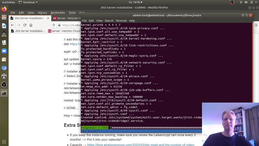
Hidden Service conference logoSo there we go, I trained my virtual live demo how to install Jitsi-Meet on a server for ‘Hidden Service’ several times to make sure the session wouldn’t blow up in my face. I felt well prepared, I felt confident and I expected a handful of people to show up at best. So I set-up the session on my Jitsi Meet server and increased my server capacity to 8 cores and 32 GB RAM just to be on the save side. And then…, 270 people showed up. OMG!

That Was A Bit Much…

O.k. that’s an order of magnitude more than what I expected in my best case scenario if interest was very high. Needless to say, my Jitsi installation didn’t cut it and was totally overrun. I was flabbergasted. The server itself didn’t mind too much but the web browsers on the client side couldn’t handle the number of audio and video streams and simply stopped responding. So I was sort of ‘hoping’ that people would go away over time so we could reach a point where the system became stable again. Wishing that your audience goes away, that’s a bit strange. But that didn’t happen, even after half an hour. People were determined I suppose. And I am glad they were.

Let’s Set-up Live Streaming – And Fast

Fortunately, there were people on the Jitsi bridge that have been at this point before and suggested to head over to Twitch.tv and stream the event from there. Drbunsen2 offered his channel there and suggested that I run a 1:1 Jitsi session with him and he would stream on his end on Twitch.tv. It sounded like a crazy plan. I’ve never used twitch.tv before either as a consumer or producer so I got myself an account quickly in the hope I could stream myself via their web interface just like with Jitsi. But it seems that’s not the way to do it, so I had to abandon my plan for the moment and resort to the initial plan.

And it worked brilliantly! Over 90 people noticed that we were moving to twich.tv for the session and I got feedback via the twitch.tv comment function, for which one needs to be registered, and via a cryptpad page. Not quite as interactive as I was hoping but it was a brilliant hack. Thanks very much to drbunsen2 to come up with this in a hurry and to 33dbm for connecting the two of us over the phone. And also thanks to Eventphone which was also part of the solution with their virtual DECT lines, you saved the demo as well!

Let’s Do An ‘Encore’ with Youtube Streaming – Or Not…

After getting my adrenaline rush under control after the demo I decided to repeat the demo the next day for those people who didn’t notice that we moved to twitch.tv. My favorite approach would have been to do a live streaming session on Youtube, as Jitsi has a function to do just that. But that didn’t work out because Youtube wanted me to authenticate to expand my (pretty much dormant) account for Live streaming. This would have worked but unfortunately, their SMS and robot voice call system failed and I couldn’t do the verification in time. When I tried the next day, this part worked and I could successfully register for live streaming access. Unfortunately, once I was past this step, Youtube told me that I had to wait for 24 hours before live streaming was activated for me. Yeah, well, thanks very much for that, see you in the rear-mirror then…

Live session on twitch.tvSo I turned to twitch.tv again and looked around how I could stream from there. Still, I was under a bit of time pressure as I wanted to do the live demo on the same day. I then figured out pretty quickly that I needed an external streaming program that I would feed a URL/token to that twitch.tv provided. There were a number of software options and I decided to go for Open Broadcast Studio (OBS). Also, I noticed it was open source and runs natively on Linux. Installation was quick and I was surprised how many possibilities it offers. It took me a couple of minutes to figure out the basics, i.e. how to give it my twitch.tv streaming token, how to configure microphone, webcam and the screen as input sources and to run my first live stream via twitch.tv. Worked like a charm! Also, the software can record a session locally. So due to Youtube’s failure I learned a lot and ran the demo again with this setup a few hours later that day on twitch.tv.

The Re-Run, a Recording on Youtube and my Ultimate Jitsi Stress Test

Around 45 people showed up, again too many for a single Jitsi meet session. In other words, the effort paid out! Like on the previous day I used a Cryptpad for my script and for live Q&A with the audience. A very nice setup. Also, I used OBS to record the session which I later uploaded to Youtube here. Note: The session was in German.

After the demo, I invited people to hop into a room on the newly created Jitsi server that ran on a 4-vCPU machine as one goal for me in this whole thing was to find out where the limit is for a single Jitsi session. At the beginning there were like 30 people on the bridge and it was too much. Again the web browsers on the client side couldn’t handle the number of streams. Things started to stabilize when around 20 people remained on the bridge with their video turned on. But it wasn’t a smooth experience. I would say 15 people is the maximum with simultaneous video for web browsers but not ideal. So my original ‘guestimate’ of 15-20 people in a room was right on the spot. In practice I would say 10 videos from 20 people is the maximum. After that, the experience in the web browser become very sluggish.

Virtual vs. Physical Event

Wow, what a learning curve in 24 hours! Agreed, that was a bit stressy but I am very happy that I’ve run through the exercise. I learnt a lot, got many new ideas and met a number of very friendly and helpful people in the process. I was a bit skeptical how my first virtual hacker event would turn out, as such events live from people coming together. But after this, I have to say this virtual event felt almost as real and enlightening as a physical event! Thanks to all who organized the event and thanks to those who have helped me to set this up and learn new things on the way! You are great!

17 Apr 18:36

Benutzt hier jemand Zoom? Nein, in der Meldung geht ...

mkalus shared this story from Fefes Blog.

Benutzt hier jemand Zoom? Nein, in der Meldung geht es nicht um den Zoom-Datenreichtum oder dass auf dem Schwarzmarkt 0-days für Zoom gehandelt werden. Mein Kumpel THS hat sich mal ganz kurz und oberflächlich den Zoom-Client für Windows angeguckt. Die Ergebnisse sind, wie man sich das so für Hipster-Startup-Klitschen-Gammelcode vorstellt. Ein altes OpenSSL, unsicheres SQL-Handling, ignoriert die banned API List von Microsoft und verwendet sprintf, hat Code zum Dumpen der gesamten Registry, der Crash-Reporter nimmt Screenshots, …

Bei allem Geheule über die unfassbare Komplexität und die ständigen Lücken in Browsern: Das hier ist noch viel schlimmer.

17 Apr 18:36

Why I’m looking forward to the Librem Mini

by David Seaward

With pre-orders confirmed, the Librem Mini is available and shipping soon. It might seem counter-intuitive, but this is also an exciting development for Librem One. If you’ll pardon me dreaming out loud, I’d like to set two long-term milestones before getting back to the daily grind.

The second trifecta

One view of Purism is a convenient place to get your hardware, your software and your services, with the bonus that unlike other vendors you are not locked in. You can mix and match or switch it up, according to your needs and preferences. But if we zoom in on the hardware department, we can now see another trifecta: handheld mobile, reliable laptops and mini server (optionally headless).

Now as soon as you have two devices, let alone three, let alone a household of different phones or an office with a BYOD policy, you need a network so they can communicate. If you’re in the same room or building, a LAN will do. But step outside (or work remotely) and you encounter two issues:

  1. You need to use hotspots or phone data. We’ve solved the associated issues here with Librem Tunnel.
  2. You need to keep all these devices in sync!

Traditional synchronization sends your personal and sensitive data to “the cloud”, a murky place where everything is merely obscured, until there’s a breach and it comes pouring out.

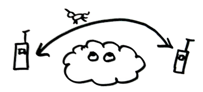
Two devices synchronize via a cleartext database in a leaky cloud

A secure bridge and a server you can trust with your data

Librem Sync is a work in progress that will allow you to securely synchronize structured account data between devices. So, for example, you could update your calendar on your laptop and see the change on your Librem 5. Unlike traditional synchronization the update will be end-to-end encrypted, only your two trusted devices can see it, the bridge is just a conduit with no access to what’s inside.

Two devices synchronize a structured unicorn over a secure bridge

But not all data is structured or limited to one account. And sometimes you just need to do funky things. Traditional solutions require that you move processing and data into the cloud where it is merely obscured. But with the Librem Mini, you have a trustworthy on-premises server in your home or office. You can send unstructured data over a secure bridge (for example, Librem Files) to the server, which can store the data and process results, sending them back over the bridge, accessible to any device.

(If you need industrial-strength processing, you can do the same with a rack of Librem Servers, but I’m focusing on the home and small office scenarios.)

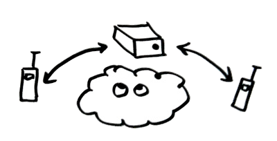
Two devices synchronize unstructured data via encrypted bridges to a trusted mini

Plus, a router

And finally, if you include the wifi option, you can use your Librem Mini as a tunnel-powered router. These days most ISPs prefer that you install a router that they own and control. On the plus side, it is theoretically easier for them to keep the router secure and up-to-date without your intervention and it is (again theoretically) easier for them to troubleshoot connectivity problems. On the minus side, your home connection is now only marginally more trustworthy than a random hotspot.

So hook up your Librem Mini directly to the router by ethernet. Disable wifi on the router, and enable it on the Librem Mini. Install Librem Tunnel and activate it. Switch your phones, laptops and other devices over to the hotspot created by the Librem Mini. Now all your traffic runs through the tunnel, inaccessible to your ISP.

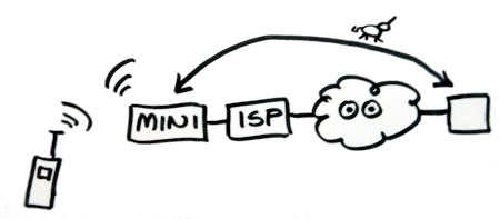
One device uses the mini as a router, skipping over ISP and cloud snooping

As I mentioned, making this work out-the-box is a longer term milestone for the Librem One team, but as with all things at Purism we will iterate towards perfection!

The post Why I’m looking forward to the Librem Mini appeared first on Purism.

17 Apr 18:35

How can I get Better Sound for Videoconferences?

by peter@rukavina.net (Peter Rukavina)

In this brave new world we’re all jacked into Zoom (or, maybe, Jitsi) all day long. We’ve been at this for a month, and it’s remarkable how little most of us continue to pay attention to video and audio, as if living the Dick Tracy future is enough, and we don’t really need to be concerned with seeing and hearing other clearly.

Here in my office I mostly use the “Display Audio” microphone built into the front of my Apple Cinema Display. It’s always been good enough. But, I wondered, could I do better.

So I dug the old Live from the Formosa Tea House audio setup (Apex 435 microphone, Behringer 802 mixer) out of storage, bought myself a line-to-USB cable, and set everything up beside my computer to see if that would prove the audio quality.

If you listen to the same here, I think you’ll agree that it did.

I’m taking it out for a real ride in 15 minutes on my weekly conference call with my colleagues in New Hampshire.

I’m also using the opportunity to promote the brand (get your Vegetable Gardener’s Handbook by The Old Farmer’s Almanac today!):

My Zoom background, with Old Farmer's Almanac Vegetable Gardener's Handbook promotion in the virtual background.

17 Apr 18:34

These Weeks in Firefox: Issue 73

by Doug Thayer

Highlights

  • Picture-in-Picture now works across workspaces on macOS! (bug)

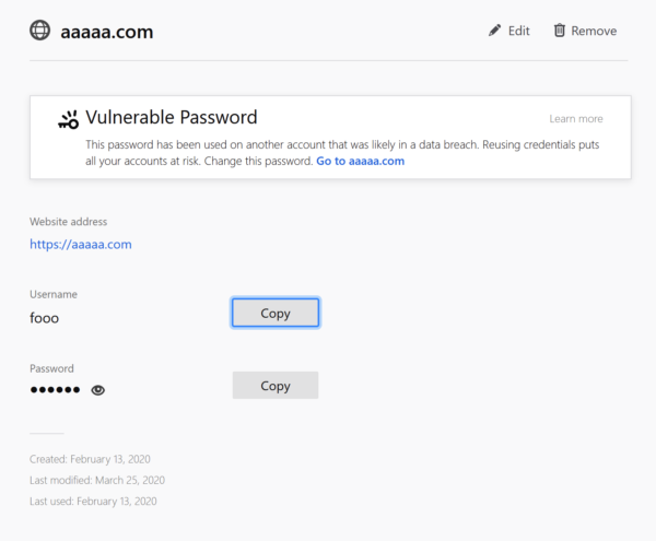
  • Firefox now alerts users regarding vulnerable passwords. Bug 1626107 enables this feature after many bug fixes and UI tweaks!

    Firefox keeping you and your accounts safe from hackers!

  • Visual redesign of the URL bar has shipped to release! Found a bug? File it here!

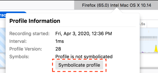
  • Firefox Profiler now has a button to re-symbolicate a profile

    An excellent quality of life improvement for profiler power-users

Friends of the Firefox team

Resolved bugs (excluding employees)

Fixed more than one bug

  • aarushivij

  • Artem

    • One of our MSU Capstone students!

  • Itiel

  • Jayati Shrivastava

  • Kriyszig

  • Tim Nguyen :ntim

New contributors (🌟 = first patch)

Project Updates

Add-ons / Web Extensions

WebExtensions Framework
  • A new profiler marker includes information about the webRequest blocking handlers registered by extensions (Bug 1625006), Thanks to Andrew Swan for contributing this new useful information to the Firefox profiler!

    Handy for understanding how webRequest handlers affect Firefox performance

WebExtension APIs
  • Fixed a bug that was preventing extensions to be able to intercept (and eventually block) web requests related to subresources loaded by file:// pages (Bug 1621935)

  • Contributions:

    • theme API bug (Bug 1585290). Thanks to myeongjun.ko for contributing this fix.

Addon Manager & about:addons

Developer Tools

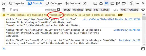
  • Console panel groups sameSite cookies warnings (bug)

    Get out of here, clutter!

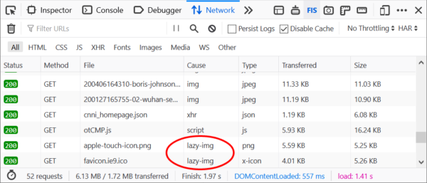
  • Network panel indicating lazy loaded resources (bug)

    Lazy is good

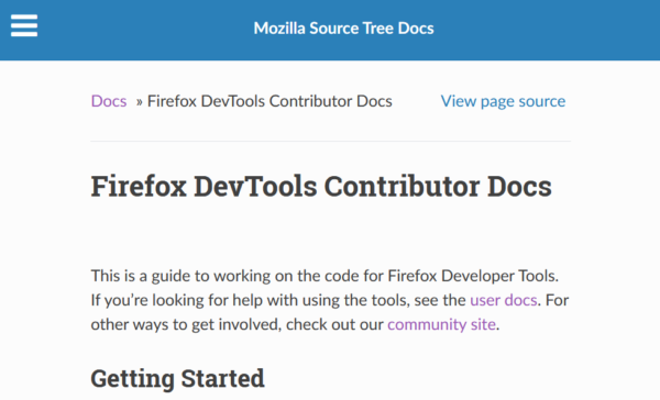
  • Updating DevTools documentation (link)

    Contributors very welcome

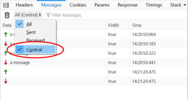
  • WebSocket Inspector allows hiding control frames (bug)

    Control what you see

  • DevTools Fission Refactoring

    • RDM Fission refactoring done (one QA reported bug WIP)

      • Re-building the RDM user interface so it doesn’t rely on <iframe mozbrowser>

    • HTML element highlighter refactoring

      • New architecture that works across processes

    • TargetList API

      • Support for navigation between different domains/processes

      • Connecting to all targets (top level document + embedded iframes) early

    • Resource API

      • Unified format for all data fetched from debugged pages

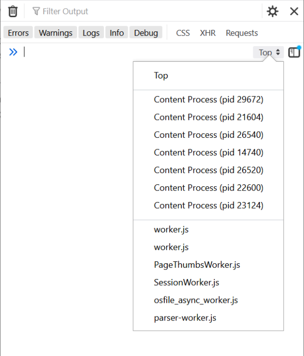
    • JS Execution Context Selector

      • Unified UI for implicit/explicit context switching in Console and Debugger.

        Don’t let the console take what you write out of context

Fission

Password Manager

  • Password generation: New model (v2) landed with a much better conversion rate (comparable to without Fathom) while showing ~5x more often! Main focus now is on improving performance and accuracy (especially in certain locales/countries). Let us know if you see false-positives in 76+. The password manager now treats former type=password fields as password fields in order to handle sites that implement their own password reveal toggles.

  • Dismissed login capture doorhanger: Fixed the 2 remaining blockers before the merge. Two follow-ups to uplift shortly.

  • Old Password Management UI: Severin has a patch to remove this from Firefox now that about:logins has shipped since 70.

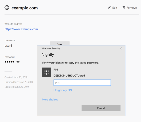
  • OS re-auth for about:logins: Discussing with MSFT about a Win10 usability issue that the OS password is sometimes required and Windows Hello options aren’t offered. We will watch feedback on beta to see how the feature is received overall.

    Speak friend and enter

Performance

Performance Tools

  • Panel sidebar is shown by default now.

    Let the sidebar be your sidekick

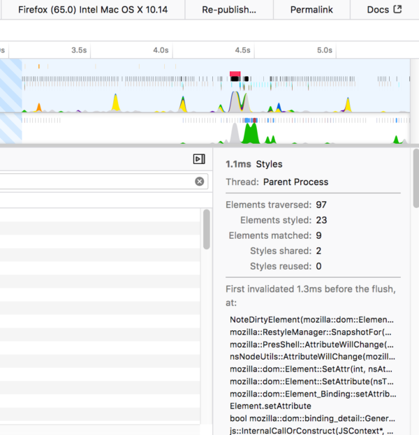
  • Started to show the full backtrace of a marker in the sidebar.

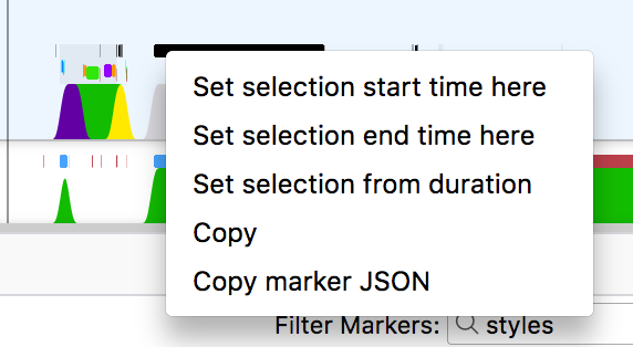
  • Added a context menu for the markers in the timeline.

    Great for filtering down to just what you care about!

Picture-in-Picture

Remote Protocol (Chrome DevTools Protocol subset)

Search and Navigation

Search
Address Bar


17 Apr 18:18

Safest Place in the USA? It’s Near Here. And it’s Covid Free.

by Sandy James Planner

Point-Roberts-custom-map

Point-Roberts-custom-map

They are creating hand out-meals for seniors and have a Fire Chief providing regular  Covid-19 updates and information. It’s a tiny corner of the United States that is a peninsula that can be accessed through Tsawwassen~Point Roberts, United States.

It is also a creative place. I have run into Steve Nash on the beach, Margaret Atwood wrote her book “Surfacing” in one of the cottages, and the band Heart composed music there. One of the top sitar makers in the world lives here, and he used to play the sitar with Ravi Shankar.

As Hallie Golden writes in The Guardian Point Roberts’ five square miles houses a population of 1,300. While there are normally 2,000 vehicles crossing into Point Roberts daily, that has trickled down to 100 with the current Covid restrictions.

And they have zero Covid cases.

“Residents can still cross the border for essential travel, including for medical appointments and to pick up prescriptions, but any outsider trying to get into the town would have a tough time getting past border agents.

With 70 percent of the residents over 60 years of age, the town has a clinic with a nurse and a physician’s assistant. Get really ill in Point Roberts and you are driven 27 miles through two international border crossings to Blaine, Washington State or you use a hospital medivac.

As one resident stated “This is the safest place in probably North America; definitely within the states. You have US Customs coming in and Canadian customs going out. Nothing’s going to happen here or very little.”

This short YouTube video provides a bit of the history of Point Roberts.

3WhalesPtBob

3WhalesPtBob

Images: PointRobertsNow

17 Apr 18:17

Frozen City

by Gordon Price

Second Beach, Stanley Park

17 Apr 18:15

Telus’ $75/20GB and $85/20GB promo plans are back again

by Jonathan Lamont

Vancouver-based national carrier Telus has brought back its 20GB promos once again.

For most of 2020, Telus has offered one of two — or sometimes both at the same time — 20GB promotional plans. The first sees the carrier’s $75/10GB plan become a $75/20GB plan. The other changes Telus’ $85/10GB plan into an $85/20GB plan.

Both plans are back for a limited time now and are available as ‘Online Only’ offers on Telus’ website.

If you’re wondering why you’d want to pay an extra $10 for the same plan, here’s how it breaks down. The $75/20GB Peace of Mind plan includes 20GB of high-speed data followed by unlimited usage at up to 512Kbps throttled speeds. The $85 Peace of Mind Connect plan, however, includes the same 20GB of high-speed and 512Kbps throttled speed beyond that, but allows users to connect extra devices like a smartwatch or tablet to the data as well.

Along with the data, both plans include the following:

  • Unlimited nationwide calls
  • Unlimited nationwide text, picture and video messaging
  • Voicemail 25
  • Call display
  • Call waiting
  • Conference calling

Typically if you wanted to get a 20GB unlimited data plan from Telus, you would need to choose the company’s $100/20GB Peace of Mind Connect plan. As such, you’re getting a pretty great deal regardless of which option you pick. That said, if you don’t have any extra devices to connect, the $75/20GB promo is the one to go for.

At the time of writing, Telus’ website did not list an end date for the promotions. However, when the carrier held similar deals earlier this year, they usually stuck around for the weekend.

You can learn more about the plans on Telus’ website.

The post Telus’ $75/20GB and $85/20GB promo plans are back again appeared first on MobileSyrup.

17 Apr 18:10

Priorities for Flow Streets

by Gordon Price

A work in progress from Aaron Licker,

By taking available data on population density overlaid with access to public and private green space, he’s come up with a map that shows where we need ‘flow streets’ – local neighbourhood and commercial streets where additional space is required for sufficient social distance by walkers and cyclists as well as opportunities to recreate with a minimum of conflict with vehicles.

Note that this is not ‘road closure’, neither when vehicles are prohibited or limited.  The streets are still open, just more safely, for a variety of users.

That’s why I call them flow streets: a network of paths, greenways, bikeways, limited-access or local-traffic roads that allow the ‘flow’ of people to be maintained without having to crowd.  On routes like the Beach Avenue Flow Way, the three or four lanes of abundant space with room to pass allows cyclists at all different speeds to maintain a comfortable pace – hence a sense of flow.  See video here: BAFW.

Next step: name the specific streets for a flow network, whether from Hastings in the DTES or Fraser in Sunset, whether already part of the greenway-bikeway network, like Comox in the West End or 59th Avenue in Fraserview.  This expanded network aligns with both our pre-Covid priorities and the needs we face today.

17 Apr 13:59

Upset Plots

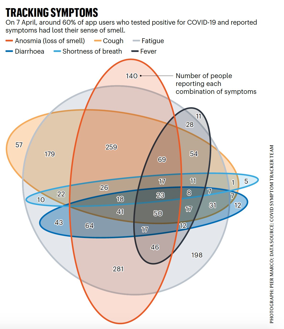
The other day Nature reported some preliminary results from a study of COVID-19 symptoms that’s being carried out via a phone app. The report noted that loss of sense of smell (or “Anosmia”) seemed to be a common symptom. The report was accompanied by this graphic, showing the co-occurrence of symptoms in about 1,700 self-reports via the app.

COVID Symptoms Venn Diagram

A species of Venn Diagram showing the co-occurrence of reported COVID-19 symptoms.

(Again, please bear in mind that these are preliminary results from the users of a single smartphone app.)

I think it’s fair to say that this way of representing the data is pushing the Venn Diagram approach to its limits. It’s hard to get a sense of what’s going on. That said, representing what are in effect tables of cross-classified counts or frequencies is one of those aspects of data visualization that is surprisingly hard to do effectively. If you have a large number of categories and cross-classifications of discrete measures, things get messy very fast. Continuous data are much easier to display, by comparison.

Still, we can do better. One familiar option would be a heatmap of some sort, showing a matrix of symptoms—perhaps clustered how often they occur together—with the cells shaded by the counts or frequencies. More recently, the upset plot, developed by Lex et al (2014), has emerged as a useful alternative. An upset plot arranges your co-occurring variables into sets and shows you a bar chart of their frequency. The trick is that it tries to make it easy to see the elements that make up the set.

There are several implementations of upset plots in R. I’m going to use the Complex UpSet package, but they’re all good. Check out UpSetR, and ggupset as well.

I used a spreadsheet to copy out the data from the Nature report, and then loaded it in to R.

 1
 2
 3
 4
 5
 6
 7
 8
 9
10
11
12
13
14
15
16
17
18
19
20
21
22
23
24
25
26
27
28
29
30
31
32
33
34
35
36
37
38
39
40
41
42
43
44
45


symptoms <- c("Anosmia", "Cough", "Fatigue", "Diarrhea", "Breath", "Fever")
names(symptoms) <- symptoms


dat <- readxl::read_xlsx("data/symptoms.xlsx") 
dat %>% print(n = nrow(dat))

## # A tibble: 32 x 2
##    combination                                 count
##    <chr>                                       <dbl>
##  1 Anosmia                                       140
##  2 Cough                                          57
##  3 Fatigue                                       198
##  4 Diarrhea                                       12
##  5 Breath                                          5
##  6 Fever                                          11
##  7 Cough&Fatigue                                 179
##  8 Fatigue&Fever                                  28
##  9 Breath&Fatigue                                 10
## 10 Diarrhea&Fatigue                               43
## 11 Anosmia&Fatigue                               281
## 12 Breath&Cough                                    1
## 13 Anosmia&Diarrhea&Fatigue                       64
## 14 Breath&Cough&Fatigue                           22
## 15 Anosmia&Cough&Fatigue                         259
## 16 Anosmia&Fever&Fatigue                          46
## 17 Cough&Fever&Fatigue                            54
## 18 Cough&Diarrhea                                  7
## 19 Cough&Diarrhea&Fatigue                         31
## 20 Anosmia&Breath&Cough&Fatigue                   26
## 21 Anosmia&Cough&Fatigue&Fever                    69
## 22 Anosmia&Breath&Cough&Diarrhea&Fatigue          18
## 23 Anosmia&Breath&Cough&Fatigue&Fever             17
## 24 Breath&Cough&Fatigue&Fever                     11
## 25 Breath&Cough&Diarrhea&Fatigue                   7
## 26 Breath&Cough&Diarrhea&Fatigue&Fever             8
## 27 Diarrhea&Fatigue&Fever                         12
## 28 Cough&Diarrhea&Fatigue&Fever                   17
## 29 Anosmia&Diarrhea&Fatigue&Fever                 17
## 30 Anosmia&Diarrhea&Cough&Fatigue                 41
## 31 Anosmia&Breath&Cough&Diarrhea&Fatigue&Fever    23
## 32 Anosmia&Cough&Diarrhea&Fatigue&Fever           50

We have six basic symptoms (“Breath” means “Shortness of Breath”). They occur in various combinations. We need to get this data into a shape we can work with. We have two tasks. First, it will be convenient to convert this summary back into an observation-level table. The tidyr package has a handy function called uncount that will do this for us. However, we can’t do that directly. Think of the table as showing counts of where various combinations of symptoms are TRUE. Implicitly, where we don’t see a symptom, it’s implicitly FALSE in those cases where it isn’t there. For example, in the first row, the 140 patients reporting Anosmia are implicitly also reporting they don’t have any of the other five symptoms. If we don’t get those implicit negatives back, we won’t get a proper picture of the clustering.

So, we’re going to generate table of TRUE and FALSE values for our symptom combinations. There’s probably a substantially more elegant way to do this than shown here, but let’s press on regardless.

 1
 2
 3
 4
 5
 6
 7
 8
 9
10
11
12
13
14
15
16
17
18
19
20
21
22
23
24
25
26
27
28
29
30
31
32
33
34
35
36
37
38
39
40
41
42
43
44
45
46
47
48
49
50
51

subsets <- dat$combination

## Check if each subset mentions each symptom or not
symptom_mat <- map_dfc(subsets, str_detect, symptoms) %>%
    data.frame() %>%
    t() %>% # transpose the result, ugh
    as_tibble()

colnames(symptom_mat)  <- symptoms

symptom_mat$count <- dat$count

symptom_mat %>% print(n = nrow(symptom_mat))

## # A tibble: 32 x 7
##    Anosmia Cough Fatigue Diarrhea Breath Fever count
##    <lgl>   <lgl> <lgl>   <lgl>    <lgl>  <lgl> <dbl>
##  1 TRUE    FALSE FALSE   FALSE    FALSE  FALSE   140
##  2 FALSE   TRUE  FALSE   FALSE    FALSE  FALSE    57
##  3 FALSE   FALSE TRUE    FALSE    FALSE  FALSE   198
##  4 FALSE   FALSE FALSE   TRUE     FALSE  FALSE    12
##  5 FALSE   FALSE FALSE   FALSE    TRUE   FALSE     5
##  6 FALSE   FALSE FALSE   FALSE    FALSE  TRUE     11
##  7 FALSE   TRUE  TRUE    FALSE    FALSE  FALSE   179
##  8 FALSE   FALSE TRUE    FALSE    FALSE  TRUE     28
##  9 FALSE   FALSE TRUE    FALSE    TRUE   FALSE    10
## 10 FALSE   FALSE TRUE    TRUE     FALSE  FALSE    43
## 11 TRUE    FALSE TRUE    FALSE    FALSE  FALSE   281
## 12 FALSE   TRUE  FALSE   FALSE    TRUE   FALSE     1
## 13 TRUE    FALSE TRUE    TRUE     FALSE  FALSE    64
## 14 FALSE   TRUE  TRUE    FALSE    TRUE   FALSE    22
## 15 TRUE    TRUE  TRUE    FALSE    FALSE  FALSE   259
## 16 TRUE    FALSE TRUE    FALSE    FALSE  TRUE     46
## 17 FALSE   TRUE  TRUE    FALSE    FALSE  TRUE     54
## 18 FALSE   TRUE  FALSE   TRUE     FALSE  FALSE     7
## 19 FALSE   TRUE  TRUE    TRUE     FALSE  FALSE    31
## 20 TRUE    TRUE  TRUE    FALSE    TRUE   FALSE    26
## 21 TRUE    TRUE  TRUE    FALSE    FALSE  TRUE     69
## 22 TRUE    TRUE  TRUE    TRUE     TRUE   FALSE    18
## 23 TRUE    TRUE  TRUE    FALSE    TRUE   TRUE     17
## 24 FALSE   TRUE  TRUE    FALSE    TRUE   TRUE     11
## 25 FALSE   TRUE  TRUE    TRUE     TRUE   FALSE     7
## 26 FALSE   TRUE  TRUE    TRUE     TRUE   TRUE      8
## 27 FALSE   FALSE TRUE    TRUE     FALSE  TRUE     12
## 28 FALSE   TRUE  TRUE    TRUE     FALSE  TRUE     17
## 29 TRUE    FALSE TRUE    TRUE     FALSE  TRUE     17
## 30 TRUE    TRUE  TRUE    TRUE     FALSE  FALSE    41
## 31 TRUE    TRUE  TRUE    TRUE     TRUE   TRUE     23
## 32 TRUE    TRUE  TRUE    TRUE     FALSE  TRUE     50

OK, so with that table in place, we can use the uncount() function to turn our summary back into quasi-individual-level data:

 1
 2
 3
 4
 5
 6
 7
 8
 9
10
11
12
13
14
15
16
17
18
19
20

indvs <- symptom_mat %>%
    uncount(count) 

indvs

## # A tibble: 1,764 x 6
##    Anosmia Cough Fatigue Diarrhea Breath Fever
##    <lgl>   <lgl> <lgl>   <lgl>    <lgl>  <lgl>
##  1 TRUE    FALSE FALSE   FALSE    FALSE  FALSE
##  2 TRUE    FALSE FALSE   FALSE    FALSE  FALSE
##  3 TRUE    FALSE FALSE   FALSE    FALSE  FALSE
##  4 TRUE    FALSE FALSE   FALSE    FALSE  FALSE
##  5 TRUE    FALSE FALSE   FALSE    FALSE  FALSE
##  6 TRUE    FALSE FALSE   FALSE    FALSE  FALSE
##  7 TRUE    FALSE FALSE   FALSE    FALSE  FALSE
##  8 TRUE    FALSE FALSE   FALSE    FALSE  FALSE
##  9 TRUE    FALSE FALSE   FALSE    FALSE  FALSE
## 10 TRUE    FALSE FALSE   FALSE    FALSE  FALSE
## # … with 1,754 more rows

If we hadn’t done that tabulation, uncount would have given us the wrong answers. Ask me how I know!

Now that we’ve reconstituted the data, we can draw our graph.

 1
 2
 3
 4
 5
 6
 7
 8
 9
10
11


library(ComplexUpset)

upset(data = indvs, intersect = symptoms, 
      name="Symptom Groupings by Frequency. Total pool is 1,764 individuals.", 
      min_size = 0,
      width_ratio = 0.125) +
    labs(title = "Co-Occurence of COVID-19 Symptoms",
         caption = "Data: covid.joinzoe.com/us | Graph: @kjhealy")

COVID Symptoms Upset Plot

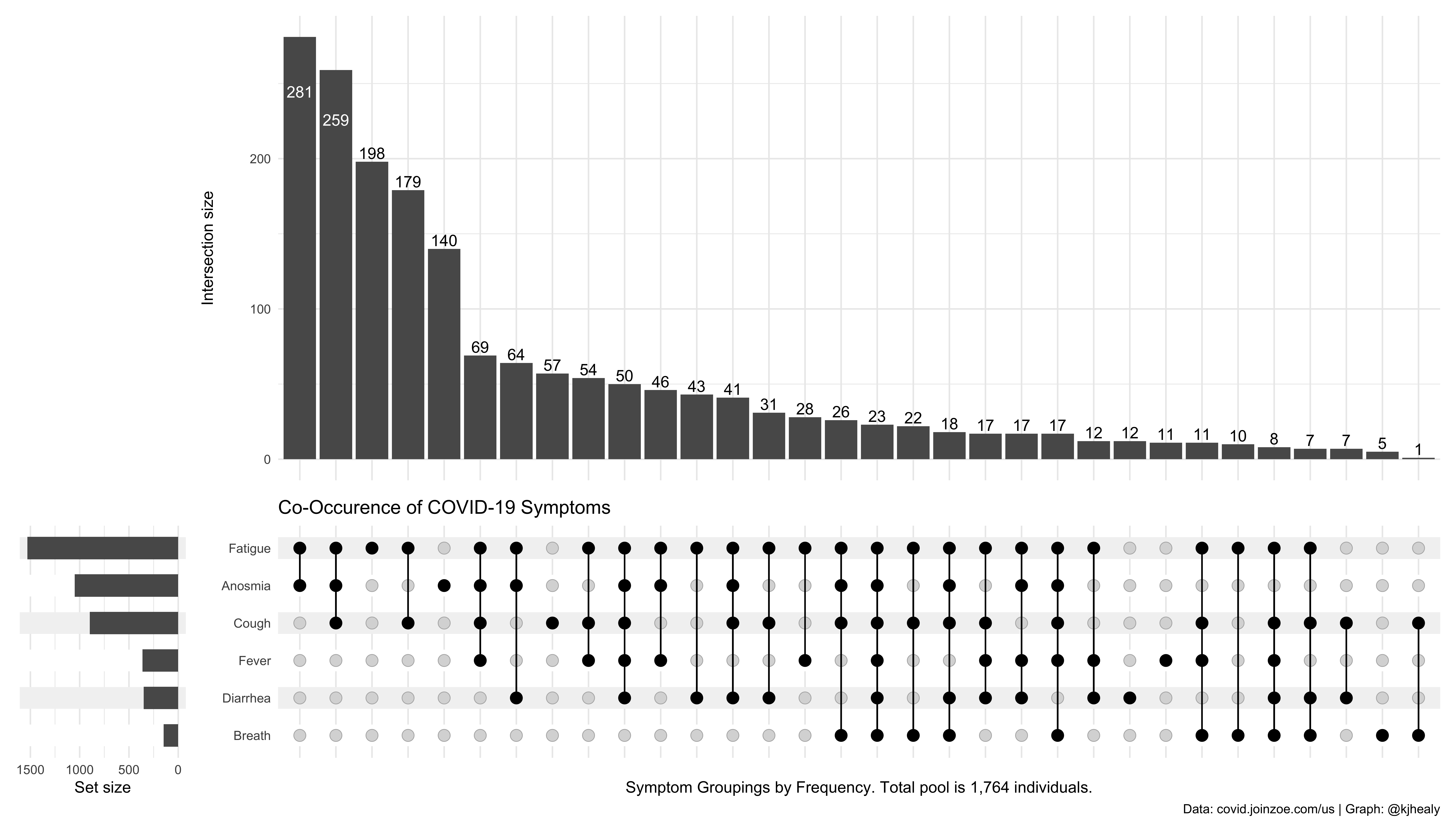
An UpSet plot showing the co-occurrence of reported COVID-19 symptoms. Click or touch to zoom.

The plot has three pieces. The bar chart shows the number of people in the data who reported some particular combination of symptoms. Each bar is a different combination. Underneath it is a graphical table showing what those combinations are. Each row is one of our six symptoms: Fatigue, Anosmia, Cough, Fever, Diarrhea, and (shortness of) Breath. The black dots and lines show the combination of symptoms that make up each cluster or subset of symptoms. Reading from left to right, we can see that the most common subset of symptoms is the combination of Fatigue and Anosmia, and nothing else. A total of 281 respondents reported this combination. Next is Fatigue, Anosmia, and Cough, with 259 reports, followed by Fatigue alone with 198. And so on across the table. You can see, for example, that there are 23 reports of all six symptoms, and only one report of just the combination of Cough and shortness of Breath.

The third component of the plot is the smaller bar chart to the left of the graphical table. This shows the unconditional frequency count of each symptom across all subsets. You can see that almost everyone reported suffering from Fatigue, for instance, and that Shortness of Breath was the least commonly-reported symptom in absolute terms.

I think upset plots are very useful, on the whole. They clearly outperform Venn diagrams when there’s more than a few overlapping sets, and they avoid some of the problems associated with heatmaps, too. Nicholas Tierney puts them to very good use in naniar, his package for visualizing missing data. The technique doesn’t make the problems with visualizing cross-classified counts magically disappear, of course. If you have a large number of intersecting groups it will become unwieldy as well. But then of course you’d start to look for ways to focus on the intersections that matter most, or on alternative ways of ordering the combinations, and so on. (The upset packages have some of these methods built in.) In the meantime, it’s often your best option for this kind of task.

The code and data used in this post are available on GitHub.

17 Apr 13:59

Memories of SARS 2: Testing – This Blog has No Leaves

mkalus shared this story from This Blog has No Leaves.

More about SARS, very much second-hand.

Without testing, we wouldn’t have caught the second outbreak until it had started to spread again. And we could have a third and a fourth outbreak, happily killing doctors and nurses.

It didn’t take much testing to get started, because the second person to die walked into the emergency room. So we put his family in quarantine and started interviewing everyone they had been in contact with and isolating them too.

At that point, however, testing became critical.  We didn’t know who was sick. Very quickly, we found out the disease was spreading inside the hospitals, infecting doctors and nurses who worked with anyone who’d been part of the first and any subsequent intubations.

That was even worse: we both needed the doctors and nurses to treat the SARS patients, but at the same time we risked infecting all the other patients and staff in the hospital.

Fortunately the Hospital for Sick Children, Mount Sinai, Sunnybrook and Women’s had specific expertise in dna-based testing, and ran literally thousands of real-time “reverse transcription–polymerase chain reaction” tests, identifying the SARS virus itself from fragments of its dna in a matter of minutes, not hours or days.

With fast tests and multiple hospitals running them in parallel, it became possible to identify people who were infected, often before they became sick. Now we could tell which nurses and doctors were safe to work with non-SARS patients.

By then the disease was spreading rapidly through the community. the community health nurses could start adding tests to their interviewing, and isolating only the people they knew were developing the disease. Before that, all they could try to so was isolate everyone who had met anyone who had met anyone with the disease.

Better, they could catch people who had the disease, but had no symptoms. Those were dangerous: they didn’t know they were ill, but they could infect others.

About then, we had developed blood tests, which could be used in huge quantities and processed easily. They only worked if you had been ill long enough to start developing antibodies to the disease, but they were cheap and easy to apply. And they told us who had recovered from SARS, and was safe to release.  Better, they told us who was now immune, and could be asked to volunteer to help SARS patients.

A week after the World Health Organization declared Toronto safe, a patient in St Johns  recovery hospital was tested and found to have SARS. He was recovering from previous unrelated surgery, and had contacted SARS before going for rehabilitation.

Exactly how it happened is still unknown, but because the disease could and did spread before the patients showed symptoms, we really needed tests that would detect the disease before the patient felt ill.

So the hospitals went back into full emergency mode, separating SARS patients into a few specific hospitals and sending everyone else to uninfected ones.

Slowly we isolated enough patients that the spread slowed to a trickle, and then a stop, without exhausting our hospital resources, and with only a moderate loss of life

With good testing, especially of the virus DNA, we slowed the spread of SARS. The more we can slow an outbreak, the more we can “flatten the curve”, until we have enough understanding,  antivirals, hospital rooms, ventilators, and eventually vaccines. 

Without, we can look forward to the life of Thomas Hobbes’ savage: “solitary, poor, nasty, brutish and short”.

Like this:

Like Loading...

17 Apr 04:49

On pause.

by Michael Sippey

Some snapshots taken through the windows of our neighborhood elementary school, April 16 2020.

Our kids went here. I remember what these rooms sound like, feel like, smell like when they’re full of life. It’s surreal to peer in and see entire classrooms of chairs, tables, whiteboards, markers, artwork, books, markers, homework folders — and, of course, peace signs — frozen perfectly still, on pause, patiently waiting for kids and teachers to return.


On pause. was originally published in stating the obvious on Medium, where people are continuing the conversation by highlighting and responding to this story.