“If, on the contrary, we have our minds set in the future, where we are sure that climate change is going to play hell with the environment, we have entered into a convergence of abstractions that makes it difficult to think or do anything in particular. If we think the future damage of climate change to the environment is a big problem only solvable by a big solution, then thinking or doing something in particular becomes more difficult, perhaps impossible.”
Excerpt From: Wendell Berry “Our Only World”
On the iBooks Store: https://itun.es/us/MGoV4.l
Rolandt
Shared posts
24 May 22:30
mturro: “If, on the contrary, we have our minds set in the future, where we are sure that climate...
24 May 22:30

interesting-maps: Nearly 40% of NYC buildings are taller,...
Nearly 40% of NYC buildings are taller, bulkier or more crowded than zoning laws allow.
24 May 22:30

Reinventing Research
Michael B. Horn,
EducationNext,
May 27, 2016
Making the same point again (and I'm going to keep bringing it up until something changes): "The traditional gold-standard approach to research— a randomized control trial (RCT)— is not worth its weight as we move to a student-centered education system that personalizes for all students so that they succeed," writes Michael B. Horn. As AltSchool's Max Ventilla says, "Something that’ s better for 70 percent of the kids and worse for 30 percent of the kids— that’ s an unacceptable outcome." Right now, in my opinion, reserachers don't even have a structure or mechanism for studying personal learning, much less any research base that is built upon that.
[Link] [Comment]
24 May 22:29

Improvise for complexity
Harold Jarche,
May 27, 2016
It's interesting how often metaphors from the world of performance and theatre creep into our dialogue about learning. The IMS Learning Design specification, for example, explicitly draws on the metaphor, invoking roles and direction. We often read about the 'orchestration' of learning activities. In this post from Harold Jarche we read (and can view a video) about improvisation as an ensemble in order to adapt to complexity and change. It's a useful metaphor in that it speaks a lot about developing team skills and dynamics through a process of deliberate rehearsal along with processes that appear drawn from an agile methodology. As for myself, always the outlier in the group, I have turned repeatedly in the past to the metaphor of the stand-up comedian, easily my favourite form of theatre.
[Link] [Comment]
24 May 22:28
Capitalism (still) Serves White People
by jennydavis
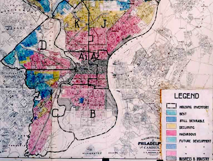
Redlining refers to the racist policy and/or practice of denying services to people of color. The term was coined in the 1960s by sociologist John McKnight and referred to literal red lines overlaid on city maps that designated “secure” versus “insecure” investment regions, distributed largely along racial faults such that banks became disproportionately unwilling to invest in minority communities. In turn, realtors showed different, more desirable properties to White clients than those they showed to clients of color, thereby reinforcing segregation and doing so in a way that perpetuated White advantage. Redlining was outlawed in the 1970s but its direct effects were intergenerational and versions of redlining continue to persist.
Versions of it like this:
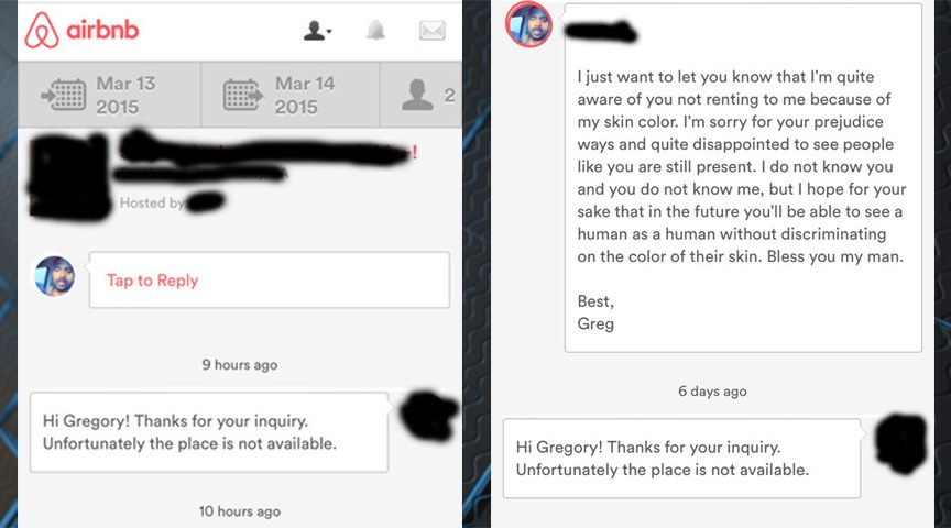
Over the last few weeks, the story of Gregory Selden went viral. Selden attempted to book an Airbnb and was rejected. Noticing that the space was still available, he created two fake profiles using images of White men. Both fake guests were accepted. He confronted the host and the company, to little actionable effect.
Selden’s case, though compelling, is not exceptional. The hashtag #AirbnbWhileBlack emerged in response to Selden’s viral experience, validating the patterned nature of discrimination through the home-sharing site. The stories shared on Twitter fall directly in line with the academic research,which shows that Black guests are 16% less likely to be accepted than their White counterparts, even at a financial cost to Airbnb hosts. In short, many Airbnb hosts do not want Black people to stay in their homes, just as White homeowners and White bankers wanted to keep Black people in separate neighborhoods.
To be sure, the stakes for Airbnb customers who struggle to find vacation accommodation are not so high as families of color who could not purchase homes and were relegated to poorly funded regions and ghettoized into poverty. In this way, discriminatory patterns on Airbnb are more fairly categorized in the hospitality sector than the housing sector and are more akin to the Whites Only lunch counters and hotel policies than mortgage lending practices.
But even the lunch counters and hotels of Jim Crow don’t quite capture what is going on here. Those were explicit forms of discrimination, announced and therefore debatable only in their righteousness, not their existence. People disagreed about whether or not people of color should be admitted to the same establishments as Whites, but all were clear about the fact that people of color were not admitted to these establishments. On Airbnb, the racism itself is an unsettled reality. Indeed, Airbnb tried to explain away Selden’s experience of racism, claiming that the initial rejection was not due to race, but due to Selden booking different dates. They claim that he booked only one night with his real account but booked 2 nights with the fake accounts, and that lots of Airbnb hosts will not rent their space for just 1 night (Selden says Airbnb’s assessment is erroneous, and that he booked the exact same dates and number of nights).
So Maybe it’s more like trying to hail a cab while Black, in which one’s skin becomes conspicuous making services difficult to obtain, but also difficult to prove a racially motivated reason on the part of the service provider. Only with Airbnb, the judgment isn’t so snap. Hosts have time to think about why they elect one customer over another, meaning that hosts have to confront their own racial bias in a way cab drivers may be able to effectively suppress.
Ultimately, the model of Airbnb, and of the share economy in general, is qualitatively different from a hotel or restaurant or even taxi service. In a share economy, financial transactions have a distinctly personal bent. The challenge of regulation is in monitoring lots of individual contractors, who hold little connection to the companies under which they operate, and who have an interest not just in profit, but in maintaining interactional comfort. How does one regulate who people will allow to sleep in their homes?
Racial discrimination on Airbnb is therefore not so much a parallel to historical patterns of racism, but a continuation. This is how racism manifests in today’s version of capitalism. The system looks different, but does the same thing. This is the racism of Google’s photo identification software that identified Black people as “gorillas” and Apple’s racially diverse emojis that not only came after years of White-only options, but appeared as aliens on phones that did not have the latest software running. This is the racial bias of online dating.
As long as race organizes interaction, and does so in a hierarchical way, the goods and services of market capitalism will have racism built in. A sharing economy sounds warmer than the cold tradition of corporate capitalism, but sharing implies a choice on the part of the “sharer,” one that, apparently if unsurprisingly, excludes and marginalizes the “sharees” who have long been pushed out of public and civic life.
Jenny Davis is on Twitter @Jenny_L_Davis
24 May 22:28
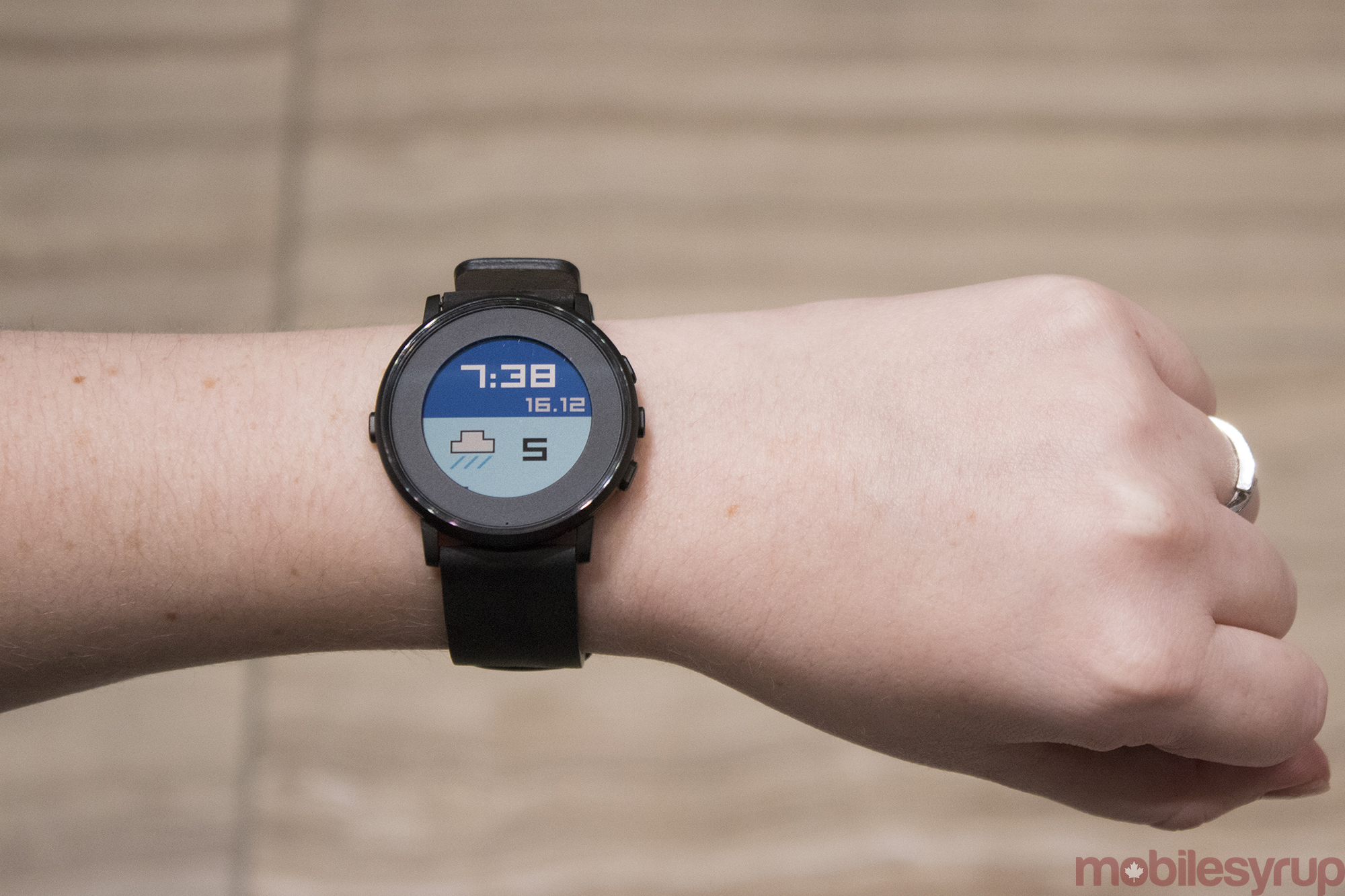
Pebble launches Kickstarter for Pebble Time 2, Pebble 2 and Pebble Core
by Patrick O'Rourke
With the help of crowdfunding platform Kickstarter, Pebble has revealed plans to launch three new products, the Pebble Time 2, Pebble 2 and Pebble Core.
The most interesting of the three devices is the Pebble Core, a 3G connected wearable Pebble says is designed to allow runners to track their fitness without carrying a smartphone. The Pebble 2 and Pebble Time 2 are “fitness-focused smartwatches” according to Pebble, and both devices are set to feature built-in heart rate monitors.
“Pebble has a rich history of giving people simple devices that do a few things really well and make life a bit easier. Health and communications is at the heart of how people use wearables today,” said Eric Migicovsky, CEO and co-founder of Pebble in a recent statement sent to MobileSyrup. “Pebble 2 and Pebble Time 2 combine the power of a fitness tracker with the awesome smartwatch features that we’ve developed over the last four years. With Pebble Core, we’re launching off the wrist and taking wearables to the next level.”
Pebble Time 2
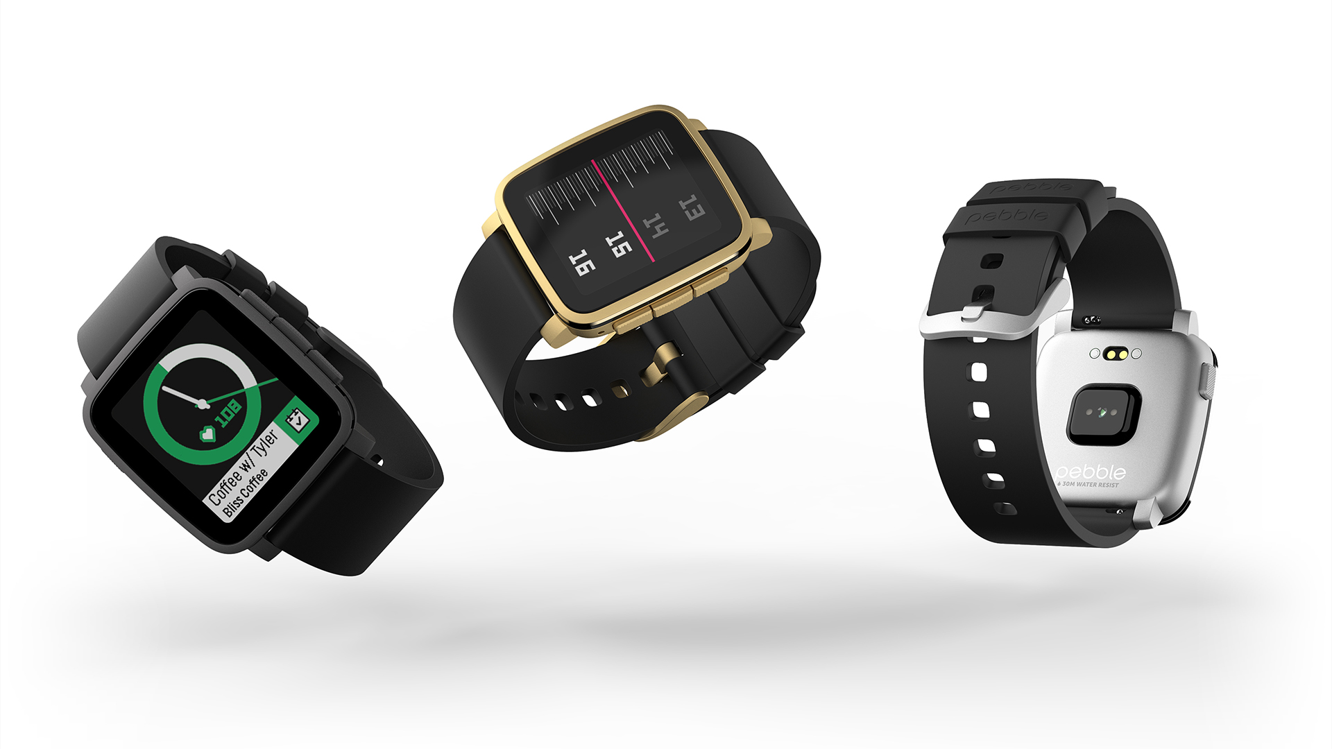
The Pebble Time 2 is constructed of stainless steel, which could indicate the company is planning to phase out its current upgraded “steel” premium brand. The device features an e-colour display that is 50 percent larger and has 80 percent more pixels (specific resolution specs haven’t been released), when compared to the original Pebble Time.
Battery life comes in at 10 days, the same amount of time as the Pebble 2. Interestingly, the new version of the Pebble Time also features a built-in heart rate monitor and microphone.
The Pebble Time 2 is available on Kickstarter right now for $184 CAD (depending on the fluctuating dollar value) and will reportedly start shipping this coming November.
Pebble 2
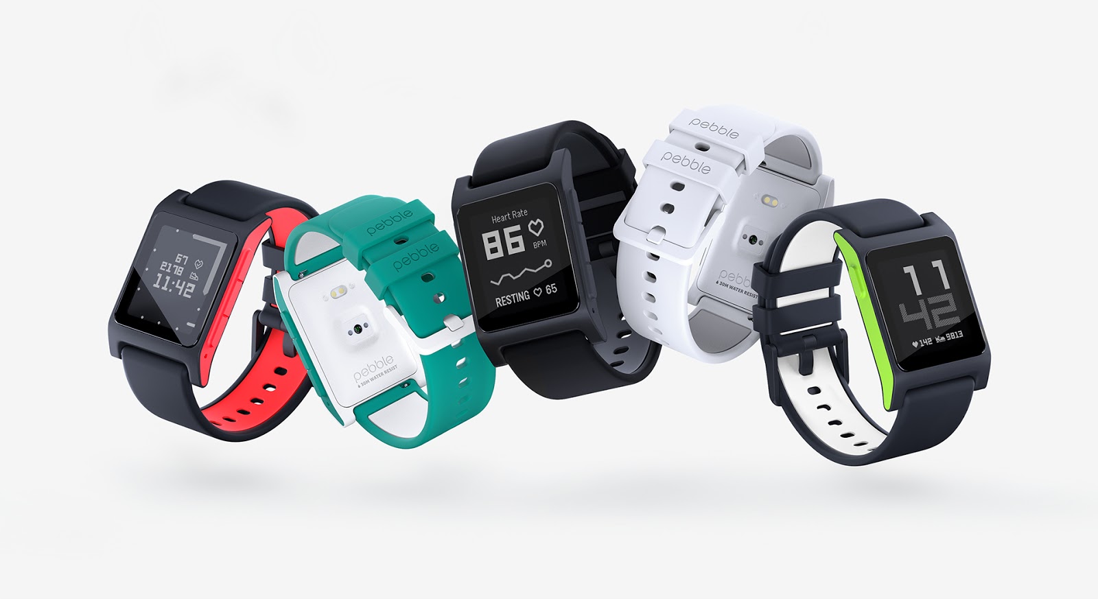
In its new product line, Pebble has also revamped the classic Pebble with the Pebble 2. It’s unclear what Pebble has specifically upgraded with the Pebble 2 beyond a sleeker form factor, especially in terms of display quality. From the recently release promo images, the Pebble 2 seems to adopt the same black and white e-colour display as the original Pebble.
According to the company’s press release, the Pebble 2 will feature an anti-scratch screen coating. It’s also water resistant up to 30 metres, and features a built in microphone for voice replies and notes. And just like the Pebble Time 2, the Pebble 2 features a built-in heart rate monitor.
The Pebble 2 is currently on Kickstarter and is available for $114 CAD and will start shipping to customers in September.
Pebble Core
The 3G-enabled Pebble Core is able to stream music via Spotify, as well as track location via GPS, and has the ability to send out an emergency SOS indicating your location.
According to Pebble, fitness stats can be synced via Runkeeper, Strava, MapMyRun, Google Fit and Under Armour Record running on your smartphone. The device also has the ability to take voice notes and quickly activate Pebble apps with the press of a button, like ordering an Uber.
Pebble Core battery life reportedly measure in at 9 hours and the device also features wireless Qi charging functionality. What is most interesting about the Core, however, is its ability to use 3G data and compatibility with standard sim cards. While the company hasn’t made it clear yet, it seems Pebble’s concept behind the Core is for users to remove the SIM card from their smartphone and put it in the Narrative Clip 2-like Core, removing the need to take a bulky smartphone on a run or bike ride.
The Pebble Core is available on Kickstarter for $84 CAD and will start shipping in January.
A new direction for Pebble
With these new product launches, Pebble seems to have pivoted its focus slightly by placing more emphasis on the growing fitness wearable market. Late last year the company launched Pebble Health, a somewhat limited fitness app designed to track distance and steps on its various Pebble devices. Pebble does however emphasis that both the Pebble 2 and Pebble Time 2 retain the same phone, text and information notifications the devices have become known for.
All of Pebble’s products, excluding the Pebble Time Round, which doesn’t seem to be getting an update (yet), initially launched on Kickstarter, with the company’s Time device amassing $4 million USD from backers in just four hours.
Release dates for Pebble’s upcoming devices, according to the company’s recent press release revealing the Pebble 2, Pebble Time 2 and Pebble Core, are pegged for “later this year and early 2017.” All Kickstarter pricing is in U.S. dollars. Pebble says all Kickstarter pricing is currently in U.S. dollars.
24 May 22:28
Adding images or videos to Tweets no longer counts towards Twitter’s 140 character limit
by Patrick O'Rourke
It looks like the rumours were true.
Twitter has announced a variety of changes related to its standard 140 character limit, a restriction that has existed since the social media platform launched back in 2006.
First, when replying to a Tweet, the usernames of the account a user is Tweeting no longer count towards Twitter’s character limit. This means that “@handles” will no longer be in the body of a Tweet and will instead become a display element.
Other changes include that adding attachments to tweets, whether a photo, GIF, video, poll or quoting a tweet, don’t count towards a Tweet’s character limit. Twitter is also adding the ability to Retweet or quote your own tweets, instead of using the “.@” message users have used for years.
“Sharing images, video and news content is a big part of the Twitter experience. With these updates to our platform, Canadian users will have more chances to share the best content on Twitter,” said Rory Capern, the head of Twitter Canada, in a recent interview with MobileSyrup.
One of the most significant changes in this update is that using “.@” is no longer necessary. Any Tweet with the @ sign in it will immediately be sent to all followers. It’s worth noting, however, that adding links to stories will still count towards Twitter’s character limit.
According to the social media platform, these changes will roll out gradually over the next few months.
Related reading: Twitter Canada gallery: A tour of the social network’s Toronto outpost
24 May 22:27
Death of a Language Dilettante
by James Hague
I used to try every language I came across. That includes the usual alternatives like Scheme, Haskell, Lua, Forth, OCaml, and Prolog; the more esoteric J, K, REBOL, Standard ML, and Factor; and some real obscurities: FL, Turing, Hope, Pure, Fifth. What I hoped was always that there was something better than what I was using. If it reduced the pain of programming at all, then that was a win.
Quests for better programming languages are nothing new. Around the same time I started tinkering with Erlang in the late 1990s, I ran across a site by Keith Waclena, who was having a self-described "programming language crisis." He assigned point values to a list of features and computed a score for each language he tried. Points were given for static typing, local function definition, "the ability to define new control structures" and others.
There's a certain set of languages often chosen by people who are outside of computer science circles: PHP, JavaScript, Flash's ActionScript, Ruby, and some more esoteric app-specific scripting languages like GameMaker's GML. If I can go further back, I'll also include line-numbered BASIC. These also happen to be some of the most criticized languages by people who have the time for that sort of thing. JavaScript for its weird scope rules (fixed in ES6, by the way) and the strange outcomes from comparing different types. Ruby for its loose typing and sigils. PHP for having dozens of reserved keywords. BASIC for its lack of structure.
This criticism is troubling, because there are clear reasons for choosing these languages. Want to write client-side web code? JavaScript. Using GameMaker? GML. Flash? ActionScript. Picked up an Atari 130XE from the thrift shop? BASIC. There's little thought process needed here. Each language is the obvious answer to a question. They're all based around getting real work done, yet there's consistent agreement that these are the wrong languages to be using.
If you veer off into discussions of programming language theory (PLT), it quickly becomes muddy why one language is better than another, but more importantly, as with Keith's crisis, the wrong criteria are being used. Even something as blatantly broken as the pre-ES6 scoping rules in JavaScript isn't the fundamental problem it's made out to be. It hasn't been stopping people from making great things with the language. Can PLT even be trusted as a field? And what criteria do you use for choosing a programming language?
Does this language run on the target system that I need it to? If the answer is no, end of discussion. Set aside your prejudices and move on.
Will I be swimming against the current, not being able to cut and paste from SDK documentation and get answers via Google searches, if I choose this language? You might be able to write a PlayStation 4 game in Haskell, but should you?
Are the compiler and other tools pleasant to use, quick, and reliable? Once I discovered that Modula-2 was cleaner than C and Pascal, I wanted to use it. Unfortunately, there were fewer choices for Modula-2 compilers, and none of them were as fast and frustration-free as Turbo Pascal.
Am I going to hit cases where I am at the mercy of the implementors, such as the performance of the garbage collector or compile times for large projects? You don't want to get in a situation where you need certain improvements to the system, but the maintainers don't see that as important, or even see it as against the spirit of the language. You're not going to run into that problem with the most heavily used toolsets.
Do I know that this is a language that will survive the research phase and still be around in ten years? Counterpoint: BitC.
Here's an experiment I'd like to see: give a language with a poor reputation (JavaScript, Perl) to someone who knows it passably well and--this is the key--has a strong work ethic. The kind of person who'd jump in and start writing writing a book rather than dreaming about being famous novelist. Then let the language dilettante use whatever he or she wants, something with the best type system, hygenic macros, you name it. Give them both a real-world task to accomplish.
As someone who appreciates what modern languages have to offer, I really don't want this to be the case, but my money is on the first person by a wide margin.
24 May 22:27

Deals: Our wide lens pick in our Fujifilm lenses guide, the Fujinon XF 14mm F2.8 R, is down to $500 (from $900)
by WC Staff
Best Deals: Our wide lens pick in our Fujifilm lenses guide, the Fujinon XF 14mm F2.8 R, is down to $500 (from $900) [Amazon]
24 May 22:20
Airfoil for Mac 5.1 Brings Many Improvements
by Paul Kafasis
![]() It’s been just over three months since we unveiled Airfoil for Mac version 5, which includes the new ability to send audio to Bluetooth speakers, many advancements in the companion Airfoil Satellite applications, and much more. Of course, we’re not stopping there when it comes to updating our whole-house audio streamer. Airfoil 5.1 has just been released, and it includes its own wealth of improvements. It’s a free update for all current owners of Airfoil 5, and owners of Airfoil 4 and lower are still eligible for a discounted upgrade.
It’s been just over three months since we unveiled Airfoil for Mac version 5, which includes the new ability to send audio to Bluetooth speakers, many advancements in the companion Airfoil Satellite applications, and much more. Of course, we’re not stopping there when it comes to updating our whole-house audio streamer. Airfoil 5.1 has just been released, and it includes its own wealth of improvements. It’s a free update for all current owners of Airfoil 5, and owners of Airfoil 4 and lower are still eligible for a discounted upgrade.
What’s New in Airfoil 5.1
The most noticeable change in the new version is the updated Effects window, seen here:

We’ve improved the layout and labels for Effects, and made the window properly remember its state between launches. Couple this with the ability to save custom Equalizer presets that we added in version 5.0, and you’ve got a greatly enhanced Effects window for fine-tuning your audio!
We’ve also improved Airfoil Satellite, the remote control and audio receiving companion to Airfoil. With the latest version, Airfoil Satellite will receive and display Retina-quality album art whenever possible. As well, we’ve improved the way Airfoil Satellite works when controlling iTunes remotely.

This update also includes some small improvements to our audio capture engine, and squashes a handful of rare but annoying bugs, including an issue where communicating with password-protected speakers could incorrectly fail. Finally, several spots where visuals weren’t quite right have now been polished to a fine sheen. We’re always working to sand down rough edges in our software, and this update is no exception.
Chromecast Support
In March, Quentin wrote about our plans to include support for sending audio to the Chromecast. That’s not part of Airfoil 5.1, but we’re still hard at work on that, so fear not. We’re making good progress, and encourage you to watch for more news on that in the coming months.
Update Now
For now, just make sure you grab the latest Airfoil for Mac by selecting “Check for Update” from the Airfoil menu, or downloading it from our site. If you’ve never used Airfoil, you can check it out with a free trial, then purchase online.
24 May 22:19
Pebble reaches $1 million funding goal in 1 hour for Pebble Time 2, Pebble 2 and Pebble Core
by Ian Hardy
Earlier this morning, Pebble added three new products to its arsenal: Pebble Time 2, Pebble 2 and Pebble Core.
Pebble started its Kickstarter goal at $1,000,000 USD for all three devices and has blown past this milestone within an hour after launching its campaign.

When the Pebble Time was announced last year it crushed the same dollar amount within 20 minutes and went on to raise a total of $20,338,986 USD from 78,471 backers, making it the most funded Kickstarter product of all time.
The original Pebble smartwatch, the company’s first product, was backed by 68,929 for a total pledge amount of $10,266,845 USD.

Pebble’s founder, Eric Migicovsky, was not only born in Vancouver, but he also graduated from the University of Waterloo systems design engineering program. Migicovsky first founded Allerta, which created a watch for Blackberry devices. He then went on to start Pebble, which in 2013 raised over $26 million in funding from various investors, including Charles River Ventures. The company also has an office in Waterloo, Ontario.
The Pebble Core is expected to be available January 2017 and costs $84 CAD. The Pebble Time 2 is $184 CAD expected to ship to backers November 2016, and the Pebble 2 costs $114 CAD with a ship date set for September 2016 (prices will change based on the fluctuating Canadian dollar).
Related reading: Pebble launches Kickstarter for Pebble Time 2, Pebble 2 and Pebble Core
24 May 22:19
Deals: Our budget zoom pick in our Fujifilm lenses guide, the Fujinon XC 50-230mm F4.5-6.7, is down to $200 (from $400)
by WC Staff
Best Deals: Our budget zoom pick in our Fujifilm lenses guide, the Fujinon XC 50-230mm F4.5-6.7, is down to $200 (from $400) [Amazon]
24 May 22:19

The problem with ‘grit’
by Doug Belshaw
If you’re an educator, parent, or in any way interested in the development of young people, it’s been impossible to escape the term ‘Grit’ in the past few years. The Wikipedia article for Grit defines it in the following way:
Grit in psychology is a positive, non-cognitive trait based on an individual’s passion for a particular long-term goal or end state, coupled with a powerful motivation to achieve their respective objective. This perseverance of effort promotes the overcoming of obstacles or challenges that lie within a gritty individual’s path to accomplishment, and serves as a driving force in achievement realization.
The article goes on to mention the origin of the term:
The construct dates back at least to Galton, and the ideals of persistence and tenacity have been understood as a virtue at least since Aristotle.
Finally, and tellingly:
Although the last decade has seen a noticeable increase in research focused on achievement-oriented traits, strong effects of Grit on important outcomes such as terminal school grades have not been found.
So why is this such a buzzword at the moment? I’d argue that it’s an advanced form of victim-blaming.
Almost all of the research cited by proponents of Grit was carried out by Angela Duckworth. As this post by Iowa State University points out, “an analysis of 88 independent studies representing nearly 67,000 people shows that grit is really no different than conscientiousness.”
However, Grit is far from a neutral term, and no mere synonym. It has been appropriated by those on the political right with books such as Paul Tough’s How children succeed : grit, curiosity, and the hidden power of character effectively saying poor kids just need to try harder. This is obviously incredibly problematic, and the reason I see Grit as a form of victim-blaming. The attitude from proponents of Grit seems to be that poverty is a self-education problem.
Fascinatingly, a recent Washington Post article digs further than just the etymology of the term to discover why the term was popularised:
My longitudinal analysis shows that the conversation originated in the late 19thcentury, and was never focused on “at-risk” children. Instead, grit was understood as an antidote to the ease and comfort of wealth, which produced spoiled children who lacked the vigor of their ancestors. The remedy was to toughen them up. While some families took this cause seriously (elite boarding schools in the early 20th century proudly advertised their Spartan living conditions), the easiest way to impart grit was through literature. The celebrated Horatio Alger books were written and sold as instructive tools to teach middle and upper class children about the virtues that came from struggling against hardship.
Now, of course, society is all too quick to embrace the grit narrative and apply it to poor and minority children. The irony is that these kids were traditionally seen as already having grit! It was the louche upper classes who needed a kick up the backside.
The clincher for me, and the final nail in Grit’s coffin, is that the data supplied as ‘evidence’ for the importance of Grit is fundamentally flawed. Returning to the first article:
The most well-known data source on grit is based on West Point cadets who complete basic training at the United States Military Academy. According to one paper describing these cadets, those with above-average levels of grit are 99 percent more likely to finish the training than cadets with average levels of grit. However, Credé says the original data were misinterpreted. His analysis shows the increase in likelihood is really closer to 3 percent, rather than 99 percent.
“It’s a really basic error and the weird thing is that no one else has ever picked it up. People just read the work and said, ‘It’s this massive increase in people’s performance and how likely they are to succeed.’ But no one had ever looked at the numbers before,” Credé said.
Given that schools (in the US at least) are now measuring ‘Grit’ and ‘Joy’ levels in their cohorts, I think it’s time to push back on such blunt instrument. Let’s stop poorly-researched, damaging buzzterms being used as a stick with which to beat the under-privileged.
Image CC BY Daniel X. O’Neil
24 May 22:10
Pebble is not folding its tent
by Volker Weber

Pebble just announced three new devices starting to ship from September:
- $129 Pebble 2. It's the original Pebble design, refined and now with a heart rate monitor. High contrast b/w display, 7 days battery.
- $199 Pebble Time 2. Metal body, significantly larger color screen, heart rate monitor.
- $99 Pebble Core. Connected to mobile, GPS, Spotify streaming.
Pebble asks for Kickstarter funding ($99/$169/$69) and will ship starting in September/November/January. Great lineup. However, I think that Pebble has just osborned their existing products.
24 May 22:10
She just passed a thousand likes
by Volker Weber
I don't think any other photo that Sonos posted on Instagram ever got so many likes so quickly. It's all her fault of course. Thanks for liking her.
24 May 20:56
Why I name names
by Josh Bernoff
If you submit something to me and request anonymity, I will protect your identity. But nearly all of the material I critique comes from public news articles, people’s social media feeds, and mass emails that a company or agency sends to an individual. And in those cases, I don’t mask people’s identity. Here’s why: The corporate … Continue reading Why I name names →
The post Why I name names appeared first on without bullshit.
24 May 20:56


Peak Millennial?
by pricetags
From BC Business, by Frances Bula:

.
As the people born between 1980 and 2000 move into their household-forming, baby-having years, those who study how cities work are floating the idea that North America may have reached “peak millennial.” … members of this group—renowned for their love of urban living, craft breweries and alternative modes of transport—may undergo a significant shift in behaviour as they get older.
.
That could have a direct impact on commuting—a complex part of contemporary city life that affects everything from the economy to the environment to our emotional well-being. The economic factor is critical in Vancouver, which has to contend with an exceptionally challenging housing market. “If Vancouver wants to grow economically despite ballooning house prices, higher-density living will require more public transit—more capacity in Vancouver, more expansion geographically into suburban areas,” says Werner Antweiler, a UBC business professor whose research focuses on the connections between transit and the economy. “With denser public transit systems, workers gain time, which in turn can be used to produce more output at work and provide more services at home.” …
.
In a survey done exclusively for BCBusiness by Insights West, it’s clear that people would like a different commuting life than the one they have now. More than three-quarters of those surveyed say living close to where they work is important and they’d work from home if they could to reduce their commutes. They also dream about other types of commuting: twice as many people in Metro Vancouver say they’d prefer to commute by bike as actually do.
The thing they’re not willing to do is pay the price to get there. The survey showed only a minority would accept less money for a job closer to home or would gladly pay tolls to produce a shorter commute. That was evident in the spectacular failure of the Lower Mainland plebiscite last year, where regional mayors proposed a $10-billion plan to improve transit (and even some roads and a bridge) if residents would agree to a half per cent sales tax. They said no by a two-to-one margin.
.
Except for residents of the principality of Vancouver—a little piece of Amsterdam dropped into our local equivalent of Los Angeles—the majority of people in the region are wedded to their wheels. Two-thirds of working adults in Metro Vancouver, outside the city proper, drive to work compared to less than a quarter in the city itself. According to TransLink, the percentage of Metro residents who commute in cars for all of their trips—work, school, shopping, entertainment—is 57 per cent, exactly where it was in 1994.
The car remains king, and nothing—not non-driving millennials, not transit additions (including the popular Canada Line), not bike lanes—has made a noticeable difference. The proportion of transit commuters has increased over the years, from a low of nine per cent in 2004 to the current 14 per cent. However, that appears to be at the expense of carpooling, which has declined as work schedules and commuting patterns have become more complicated.
The greatest achievement that transit nerds can point to is that the proportion of transit commuters has kept pace with the region’s growing population. But so have the numbers of cars and drivers. People in B.C. bought 77,000 cars in each of the last two years—that’s 13,000 more per year than the level in 2011. Total vehicle registrations in the province are now around 3.5 million, almost 800,000 more than in 2000—and nearly half, 1.5 million, are registered in the Lower Mainland. …
.
… changing patterns are especially relevant in the Lower Mainland, where the emphasis on developing a regional plan with multiple town centres has produced a metropolitan region that’s distinct from Calgary or Seattle. In those cities, all the blood is sucked into the beating heart of downtown during the day and released at night. The Lower Mainland, by contrast, is increasingly polycentric—with transit patterns that look more like a bunch of chopsticks that fell on the floor than a simple conveyor belt. “Every municipality is trying to have a one-to-one ratio for jobs, but it creates a challenge when people are living in one suburb and working in another,” says Metro Vancouver board chair Greg Moore, who led the charge on the mayors’ transit plan. Even in the city of Vancouver, fully 39 per cent of residents commute out of the city to their jobs—including 30 per cent from that bastion of urban living, the West End. …
According to Geoff Cross, TransLink’s director of strategic planning and policy, the average mileage in the region is currently 6,500 kilometres per person a year; the rejected transit plan aimed to bring that number down by a third, to about 4,400 kilometres—a difference of 2,100 kilometres per person per year.
Making the big improvements to transit that were outlined in the plebiscite was only going to reduce the mileage by about 500. The next 1,600-kilometre reduction would only come from making it more expensive to drive—specifically through mobility pricing. Sophisticated mobility pricing, like the kind Singapore has, charges people based on how much they drive per year, how many bridges they cross and whether they make their trip during high-congestion periods. And neither will work alone. Both have to be in place to get the full reduction. …
.
Throughout all these deliberations, smart planners don’t have any delusion that they’ll get everyone out of their cars—even though some politicians, like the late Toronto mayor Rob Ford, have thundered righteously about the war on the car. “I worked in Copenhagen for a while,” says Geoff Cross, “and the idea there was just to keep the young people on transit for two or three years more. It’s the equivalent of a mode shift, even if they eventually go to a car.” Instead, they’re focused on those incremental changes that will nudge different categories of nudge-ready groups to make more efficient choices, be it moving closer to work, shopping or good transit.
24 May 20:55


Going deeper with Project Infinite
by Damien DeVille
Last month at Dropbox Open London, we unveiled a new technology preview: Project Infinite. Project Infinite is designed to enable you to access all of the content in your Dropbox—no matter how small the hard disk on your machine or how much stuff you have in your Dropbox. Today, we’d like to tell you more—from a technical perspective—about what this evolution means for the Dropbox desktop client.
Traditionally, Dropbox operated entirely in user space as a program just like any other on your machine. With Dropbox Infinite, we’re going deeper: into the kernel—the core of the operating system. With Project Infinite, Dropbox is evolving from a process that passively watches what happens on your local disk to one that actively plays a role in your filesystem. We have invested the better part of two years making all the pieces fit together seamlessly. This post is a glimpse into our journey.
Starting from first principles
Our earlier prototypes around solving the “limited disk-space problem” used something called FUSE or Filesystems in Userspace. FUSE is a software interface that lets non-privileged users create their own filesystems without needing to write a kernel extension. It is part of the kernel itself on some Unix-like operating systems and OS X has a port that is available as a dedicated kernel extension and a libfuse library that needs to be linked by a program in user space.
FUSE is an incredible technology, but as we gained a deeper understanding it became clear that it didn’t fully satisfy the two major constraints for our projects—world-class performance and rock-solid security. Here’s why:
Performance
Since FUSE filesystems are implemented in large part in user space, any file operation usually requires an extra user-kernel mode switch (one context switch between the application issuing the system call and the VFS in the kernel and an extra one between the FUSE kernel extension and the
libfuse user space library). There’s quite a lot going on, as you can see in the illustration below.
While context switches are usually quite inexpensive, this extra overhead for every file operation unfortunately leads to a degraded performance that we didn’t want our users to experience when interacting with their files in Dropbox.
Security
We take security seriously. We do everything we can to protect our users and their data. This includes having internal Red Teams, running a bug-bounty program, and hiring external pen-testers on a regular basis to help us discover vulnerabilities in our products.
The various FUSE libraries on OS X are implemented as kernel extensions and introduce too much complexity and risk for us to feel comfortable with distributing as part of our Desktop client.
So Instead…
After exploring the option of using FUSE, we realized that there are many benefits to writing our own custom kernel extension: we are able to achieve minimal performance overhead while also ensuring that we understand 100% of what we’re serving to our users. And when we control the interface boundary, we can do our best to push as much non-performance critical machinery up into user space, further improving security.
But wait! There’s more!
As we’ve been building out our kernel extension, we have also begun to look at what other long-standing user problems we can solve. It turns out there’s a lot we can do.
We’ve seen the number of companies that rely on Dropbox Business soar past 150,000 since we launched it just three years ago. With so many teams on Dropbox, we increasingly hear about a scenario we call the “untrained intern problem.” Imagine you are working with a bunch of other people on a project and collaborating through a Team folder on Dropbox. Summer is quickly approaching and you’ve brought on an intern. The intern, never having used Dropbox before, moves a folder from inside their Team folder to their Desktop, not realizing that they’ve simultaneously removed access to this folder for everyone else in the company. Now of course this folder could be restored, but don’t you wish there was a better way so this could have been prevented from even happening?
Rolling out today, starting with Dropbox Enterprise customers, is a better way. Now, in order to protect the organization and shared content, when someone performs such an operation, they will be warned with a dialog that looks like this:

How does this work? On Windows, we use Copy Hooks, but on Mac we had to dig a little deeper. We use the Kernel Authorization (or Kauth for short) kernel subsystem in our kernel extension to manage file authorizations within the BSD portion of the kernel. By listening to actions on the
KAUTH_SCOPE_VNODE scope, we can detect and deny actions that happen in the Dropbox folder. In the examples cited above, for example, we are interested in the KAUTH_VNODE_DELETE and KAUTH_VNODE_ADD_FILE actions since they allow us to check whether a file or folder in a user’s shared folder is being deleted or moved. From there, it’s just a matter of checking with the user whether the operation was in fact intended and inform them of the consequences of the operations for other members of the folder. As you can see below, this solution is much simpler than a FUSE implementation would have been, and involves no third-party dependencies.So if you’re someone who compulsively monitors the list of loaded kernel extensions on your system (there are dozens of us, dozens!) and you see com.getdropbox.dropbox.kext you now know why!
Stay tuned for more about Project Infinite as we continue to test and ultimately roll it out to a broader set of users.
UPDATE (5/25/16):
We wanted to address some comments about Project Infinite and the kernel. It’s important to understand that many pieces of everyday software load components in the kernel, from simple device drivers for your mouse to highly complex anti-virus programs. We approach the kernel with extreme caution and respect. Because the kernel connects applications to the physical memory, CPU, and external devices, any bug introduced to the kernel can adversely affect the whole machine. We’ve been running this kernel extension internally at Dropbox for almost a year and have battle-tested its stability and integrity.
File systems exist in the kernel, so if you are going to extend the file system itself, you need to interface with the kernel. In order to innovate on the user’s experience of the file system, as we are with Project Infinite, we need to catch file operation events on Dropbox files before other applications try to act on those files. After careful design and consideration, we concluded that this kernel extension is the smallest and therefore most secure surface through which we can deliver Project Infinite. By focusing exclusively on Dropbox file actions in the kernel, we can ensure the best combination of privacy and usability.
We understand the concerns around this type of implementation, and our solution takes into consideration the security and stability of our users’ experience, while providing what we believe will be a really useful feature.
24 May 20:55

How to Deal With Difficult Stakeholders
by Ashwini Talasila
This story is a version of my talk “Managing Difficult Stakeholders,” given at ProductCamp Portland in 2016. When you’re managing a valuable product, working with difficult stakeholders becomes crucial and can make or break your product. As a product manager, I interact with over 20 people a day; each person is unique, with different backgrounds, roles, industries and stories. My job revolves...
24 May 20:55

Twitter Gives Tweets More Room to Breathe
by John Voorhees
Twitter announced some big changes today that are designed to encourage conversations and media sharing. The 140 character limit of a tweet becomes a more significant constraint as you add more ‘@names’ to a conversation or attach media to a tweet. The changes announced by Twitter, which go a long way toward addressing those constraints, will be rolled out over the coming months in Twitter’s own app and will be available to third-party Twitter clients.
Replies
Large group conversations on Twitter are hard. The more people you add to a thread, the fewer characters you have left to communicate with the group. With the upcoming change to replies, ’@names’ of up to 50 people will no longer count toward the 140-character limit of a tweet. The tweet will still be seen only in the timelines of the people @replied, but eliminating ‘@names’ from the character count should facilitate conversations among more people. I am happy to see this change overall, but I wonder whether Twitter has gone too far by allowing up to 50 ‘@names’ in a single tweet.
The change to ‘@names’ will also eliminate the quandary about what to do when you want to start a tweet with someone’s ‘@name’ that is not a reply. With the changes announced, these tweets will be treated like any other tweet and be visible to all of your followers, eliminating the need to use the convention of a period before an ‘@name’ to ensure that everyone who follows you sees the tweet.
Media
When Twitter rolls out the changes announced, photos, videos, and GIFs will not count against the 140 character limit of a tweet, which should encourage the use of more media in tweets. The existing limits of four photos, or one video or GIF per tweet still apply. Links that are pasted into a tweet and not generated by attaching media will also still count against the 140-character limit.
Retweets
Finally, Twitter announced that you will be able to retweet your own tweets. Though this struck me as strange at first, it eliminates the need for things like the ubiquitous ‘ICYM’ tweets and will allow you to share an @reply, which would normally only be visible to its recipients, with all your followers.
Like MacStories? Become a Member.
Club MacStories offers exclusive access to extra MacStories content, delivered every week; it's also a way to support us directly.
Club MacStories will help you discover the best apps for your devices and get the most out of your iPhone, iPad, and Mac. Plus, it's made in Italy.
Join Now
24 May 20:54
Happy Bike to Work Day, Nashville | 2016
by Rex Hammock
As the 12 regular readers of this blog know, I try to commute to work by bicycle 2-3 times a week. I do it for recreation, transportation and enjoyment. Obviously, there are many health-related benefits from riding a bike 15 miles round-trip, but I don’t use the “exercise” word when discussing bicycling. Exercising is something I avoid. Riding a bike is something I love.
I’m heading out now for Bike to Work Day. Below is a map where different groups will meet-up for the ride into work.
In 2013, I posted some maps to show my route into work to show my fellow-Nashvillians that there are ways to ride into downtown without getting into traffic. You can find that post here.
I love riding a bike for fun. You should try it. (I and many others are trying to make it safer and easier to ride bikes and walk in Nashville. That day will come.)
(If you don’t see a map below, click here.)
24 May 20:54


The Share the Road Commuter Challenge
by Ken Ohrn
Looking for some fun tomorrow morning (Wednesday May 25)? Meet me at London Drugs plaza, Georgia & Granville.
Good old HUB is gearing up for Bike to Work Week (May 30 to June 5) with another Share the Road Challenge. In this friendly competition, various groups and companies form teams, with members using different modes of transportation — transit, bike, car. Each team picks a common start point and we see who gets to the finish line first (Granville & Georgia). All in good fun — with a point to prove.
Teams last year included City of Vancouver. Mayor Robertson (bike) came in second to Councilor Reimer (transit). Councilor Jang (car) was a distant third.
See you at around 8 a.m., when the first team members should start arriving. I’ll be interested to see whether Mr. Gauthier of DVBIA will be a team member this year, as promised to me in 2015.
24 May 20:54
OpenVis Conf talks all online
by Nathan Yau

If you’re looking for a knowledge bomb during your lunch breaks, the OpenVis Conf talks from this year are all online. Naturally, you can sift through the talks with a visual interface that gives you a good idea of what each talk is about before you get into it. Nice.
Tags: lunch talk, OpenVis
24 May 20:54


Item from Ian: “Social rebalancing or class war?”
by pricetags
Ian: Let’s see some of this in West Van / Point Grey![]()

The French capital badly needs more affordable housing and is building a large amount of it between now and 2020, with one significant twist. Almost 5,000 of these new affordable units will be built in the city’s center and west, giving future tenants some of the wealthiest neighbors in all France. As you might expect, the plans are controversial. So is this a necessary social rebalancing, or class war?
The concept seems somewhat less dramatic when you zoom out to the bigger picture. Paris hopes to create 7,000 new public housing units every year between now and the next elections in 2020. Given that only 5,000 units in total are planned for especially prosperous areas across this period, that means that most new units will still be created in the less wealthy east, where most of the city’s public housing is already concentrated.
24 May 20:54


Literally Kafkaesque
by pricetags
Currently at the center of Prague’s Quadrio shopping center, an enormous mirrored bust of Franz Kafka can be seen spinning in a constant state of metamorphosis. Every few seconds, the sculpture splits into 42 layers, rotates, and then converges into the Czech author’s likeness, before repeating over again.
The 35-foot-tall sculpture is the work of David Černý, a Czech artist known for his witty and subversive public artworks. Černý notes that it’s located outside of Prague’s City Hall, and the spinning parts reflect a building full of Kafka-esque bureaucracy.
24 May 20:53
![]() As rumored, Twitter, today announced that in a bid to let its users express themselves more in 140 characters, the company is removing certain restrictions on this limit. In the coming months, Twitter will be simplifying some of the stuff that counts towards the 140-character limit.
Continue reading →
As rumored, Twitter, today announced that in a bid to let its users express themselves more in 140 characters, the company is removing certain restrictions on this limit. In the coming months, Twitter will be simplifying some of the stuff that counts towards the 140-character limit.
Continue reading →
Twitter Removing Certain Restrictions from Its 140-Character Limit
by Rajesh Pandey
24 May 20:50
 Back in 2014, Samsung launched the Gear Live — the company’s first attempt at launching an Android Wear-based smartwatch.
Continue reading →
Back in 2014, Samsung launched the Gear Live — the company’s first attempt at launching an Android Wear-based smartwatch.
Continue reading →
Samsung has ‘no Plans’ to Launch Another Android Wear Product
by Evan Selleck
Back in 2014, Samsung launched the Gear Live — the company’s first attempt at launching an Android Wear-based smartwatch.
Continue reading →
24 May 20:50
Connected, Episode 92: My Relationship with the Status Bar
by Federico Viticci
This week Federico takes Myke on a tour of his experience with Android.
After ending last week's episode of Connected on a cliffhanger, I took some time this week to share my first impressions of Android and some thoughts on trying different things and challenging my preconceptions more often. I think it's a good one. You can listen here.
Sponsored by:
- Casper: Because everyone deserves a great night sleep. Get $50 off with the code ‘CONNECTED’
→ Source: relay.fm
24 May 20:49
Why I don't use ggplot2
Some of my colleagues think of me as super data-sciencey compared to other academic statisticians. But one place I lose tons of street cred in the data science community is when I talk about ggplot2. For the 3 data type people on the planet who still don’t know what that is, ggplot2 is an R package/phenomenon for data visualization. It was created by Hadley Wickham, who is (in my opinion) perhaps the most important statistician/data scientist on the planet. It is one of the best maintained, most important, and really well done R packages. Hadley also supports R software like few other people on the planet.
But I don’t use ggplot2 and I get nervous when other people do.
I get no end of grief for this from Hilary and Roger and especially from drob, among many others. So I thought I would explain why and defend myself from the internet hordes. To understand why I don’t use it, you have to understand the three cases where I use data visualization.
- When creating exploratory graphics - graphs that are fast, not to be shown to anyone else and help me to explore a data set
- When creating expository graphs - graphs that i want to put into a publication that have to be very carefully made.
- When grading student data analyses.
Let’s consider each case.
Exploratory graphs
Exploratory graphs don’t have to be pretty. I’m going to be the only one who looks at 99% of them. But I have to be able to make them quickly and I have to be able to make a broad range of plots with minimal code. There are a large number of types of graphs, including things like heatmaps, that don’t neatly fit into ggplot2 code and therefore make it challenging to make those graphs. The flexibility of base R comes at a price, but it means you can make all sorts of things you need to without struggling against the system. Which is a huge advantage for data analysts. There are some graphs (like this one) that are pretty straightforward in base, but require quite a bit of work in ggplot2. In many cases qplot can be used sort of interchangably with plot, but then you really don’t get any of the advantages of the ggplot2 framework.
Expository graphs
When making graphs that are production ready or fit for publication, you can do this with any system. You can do it with ggplot2, with lattice, with base R graphics. But regardless of which system you use it will require about an equal amount of code to make a graph ready for publication. One perfect example of this is the comparison of different plotting systems for creating Tufte-like graphs. To create this minimal barchart:
The code they use in base graphics is this (super blurry sorry, you can also go to the website for a better view).

in ggplot2 the code is:

Both require a significant amount of coding. The ggplot2 plot also takes advantage of the ggthemes package here. Which means, without that package for some specific plot, it would require more coding.
The bottom line is for production graphics, any system requires work. So why do I still use base R like an old person? Because I learned all the stupid little tricks for that system, it was a huge pain, and it would be a huge pain to learn it again for ggplot2, to make very similar types of plots. This is one where neither system is particularly better, but the time-optimal solution is to stick with whichever system you learned first.
Grading student work
People I seriously respect suggest teaching ggplot2 before base graphics as a way to get people up and going quickly making pretty visualizations. This is a good solution to the little data scientist’s predicament. The tricky thing is that the defaults in ggplot2 are just pretty enough that they might trick you into thinking the graph is production ready using defaults. Say for example you make a plot of the latitude and longitude of quakes data in R, colored by the number of stations reporting. This is one case where ggplot2 crushes base R for simplicity because of the automated generation of a color scale. You can make this plot with just the line:
ggplot() + geom_point(data=quakes,aes(x=lat,y=long,colour=stations))
And get this out:

That is a pretty amazing plot in one line of code! What often happens with students in a first serious data analysis class is they think that plot is done. But it isn’t even close. Here are a few things you would need to do to make this plot production ready: (1) make the axes bigger, (2) make the labels bigger, (3) make the labels be full names (latitude and longitude, ideally with units when variables need them), (4) make the legend title be number of stations reporting. Those are the bare minimum. But a very common move by a person who knows a little R/data analysis would be to leave that graph as it is and submit it directly. I know this from lots of experience.
The one nice thing about teaching base R here is that the base version for this plot is either (a) a ton of work or (b) ugly. In either case, it makes the student think very hard about what they need to do to make the plot better, rather than just assuming it is ok.
Where ggplot2 is better for sure
ggplot2 being compatible with piping, having a simple system for theming, having a good animation package, and in general being an excellent platform for developers who create [Some of my colleagues think of me as super data-sciencey compared to other academic statisticians. But one place I lose tons of street cred in the data science community is when I talk about ggplot2. For the 3 data type people on the planet who still don’t know what that is, ggplot2 is an R package/phenomenon for data visualization. It was created by Hadley Wickham, who is (in my opinion) perhaps the most important statistician/data scientist on the planet. It is one of the best maintained, most important, and really well done R packages. Hadley also supports R software like few other people on the planet.
But I don’t use ggplot2 and I get nervous when other people do.
I get no end of grief for this from Hilary and Roger and especially from drob, among many others. So I thought I would explain why and defend myself from the internet hordes. To understand why I don’t use it, you have to understand the three cases where I use data visualization.
- When creating exploratory graphics - graphs that are fast, not to be shown to anyone else and help me to explore a data set
- When creating expository graphs - graphs that i want to put into a publication that have to be very carefully made.
- When grading student data analyses.
Let’s consider each case.
Exploratory graphs
Exploratory graphs don’t have to be pretty. I’m going to be the only one who looks at 99% of them. But I have to be able to make them quickly and I have to be able to make a broad range of plots with minimal code. There are a large number of types of graphs, including things like heatmaps, that don’t neatly fit into ggplot2 code and therefore make it challenging to make those graphs. The flexibility of base R comes at a price, but it means you can make all sorts of things you need to without struggling against the system. Which is a huge advantage for data analysts. There are some graphs (like this one) that are pretty straightforward in base, but require quite a bit of work in ggplot2. In many cases qplot can be used sort of interchangably with plot, but then you really don’t get any of the advantages of the ggplot2 framework.
Expository graphs
When making graphs that are production ready or fit for publication, you can do this with any system. You can do it with ggplot2, with lattice, with base R graphics. But regardless of which system you use it will require about an equal amount of code to make a graph ready for publication. One perfect example of this is the comparison of different plotting systems for creating Tufte-like graphs. To create this minimal barchart:
The code they use in base graphics is this (super blurry sorry, you can also go to the website for a better view).
in ggplot2 the code is:
Both require a significant amount of coding. The ggplot2 plot also takes advantage of the ggthemes package here. Which means, without that package for some specific plot, it would require more coding.
The bottom line is for production graphics, any system requires work. So why do I still use base R like an old person? Because I learned all the stupid little tricks for that system, it was a huge pain, and it would be a huge pain to learn it again for ggplot2, to make very similar types of plots. This is one where neither system is particularly better, but the time-optimal solution is to stick with whichever system you learned first.
Grading student work
People I seriously respect suggest teaching ggplot2 before base graphics as a way to get people up and going quickly making pretty visualizations. This is a good solution to the little data scientist’s predicament. The tricky thing is that the defaults in ggplot2 are just pretty enough that they might trick you into thinking the graph is production ready using defaults. Say for example you make a plot of the latitude and longitude of quakes data in R, colored by the number of stations reporting. This is one case where ggplot2 crushes base R for simplicity because of the automated generation of a color scale. You can make this plot with just the line:
ggplot() + geom_point(data=quakes,aes(x=lat,y=long,colour=stations))
And get this out:
That is a pretty amazing plot in one line of code! What often happens with students in a first serious data analysis class is they think that plot is done. But it isn’t even close. Here are a few things you would need to do to make this plot production ready: (1) make the axes bigger, (2) make the labels bigger, (3) make the labels be full names (latitude and longitude, ideally with units when variables need them), (4) make the legend title be number of stations reporting. Those are the bare minimum. But a very common move by a person who knows a little R/data analysis would be to leave that graph as it is and submit it directly. I know this from lots of experience.
The one nice thing about teaching base R here is that the base version for this plot is either (a) a ton of work or (b) ugly. In either case, it makes the student think very hard about what they need to do to make the plot better, rather than just assuming it is ok.
Where ggplot2 is better for sure
ggplot2 being compatible with piping, having a simple system for theming, having a good animation package, and in general being an excellent platform for developers who create](https://ggplot2-exts.github.io/index.html) are all huge advantages. It is also great for getting absolute newbies up and making medium-quality graphics in a huge hurry. This is a great way to get more people engaged in data science and I’m psyched about the reach and power ggplot2 has had. Still, I probably won’t use it for my own work, even thought it disappoints my data scientist friends.
24 May 20:49
When it comes to science - its the economy stupid.
I read a lot of articles about what is going wrong with science:
- The reproducibility/replicability crisis
- Lack of jobs for PhDs
- The pressure on the families (or potential families) of scientists
- Hype around specific papers and a more general abundance of BS
- Consortia and their potential evils
- Peer review not working well
- Research parasites
- Not enough room for applications/public good
- Press releases that do evil
- Scientists don’t release enough data
These articles always point to the “incentives” in science and how they don’t align with how we’d like scientists to work. These discussions often frustrate me because they almost always boil down to asking scientists (especially and often junior scientists) to make some kind of change for public good without any guarantee that they are going to be ok. I’ve seen an acceleration/accumulation of people who are focusing on these issues, I think largely because it is now possible to make a very nice career by pointing out how other people are doing science wrong.
The issue I have is that the people who propose unilateral moves seem to care less that science is both (a) a calling and (b) a career for most people. I do science because I love it. I do science because I want to discover new things about the world. It is a direct extension of the wonder and excitement I had about the world when I was a little kid. But science is also a career for me. It matters if I get my next grant, if I get my next paper. Why? Because I want to be able to support myself and my family.
The issue with incentives is that talking about them costs nothing, but actually changing them is expensive. Right now our system, broadly defined, rewards (a) productivity - lots of papers, (b) cleverness - coming up with an idea first, and (c) measures of prestige - journal titles, job titles, etc. This is because there are tons of people going for a relatively small amount of grant money. More importantly, that money is decided on by processes that are both peer reviewed and political.
Suppose that you wanted to change those incentives to something else. Here is a small list of things I would like:
- People can have stable careers and live in a variety of places without massive two body problems
- Scientists shouldn’t have to move every couple of years 2-3 times right at the beginning of their career
- We should distribute our money among the largest number of scientists possible
- Incentivizing long term thinking
- Incentivizing objective peer review
- Incentivizing openness and sharing
The key problem isn't publishing, or code, or reproducibility, or even data analysis.
The key problem is that the fundamental model by which we fund science is completely broken.
The model now is that you have to come up with an idea every couple of years then "sell" it to funders, your peers, etc. This is the source of the following problems:
- An incentive to publish only positive results so your ideas look good
- An incentive to be closed so people don’t discover flaws in your analysis
- An incentive to publish in specific “big name” journals that skews the results (again mostly in the positive direction)
- Pressure to publish quickly which leads to cutting corners
- Pressure to stay in a single area and make incremental changes so you know things will work.
If we really want to have any measurable impact on science we need to solve the funding model. The solution is actually pretty simple. We need to give out 20+ year grants to people who meet minimum qualifications. These grants would cover their own salary plus one or two people and the minimum necessary equipment.
The criteria for getting or renewing these grants should not be things like Nature papers or number of citations. It has to be designed to incentivize the things that we want to (mine are listed above). So if I was going to define the criteria for meeting the standards people would have to be:
- Working on a scientific problem and trained as a scientist
- Publishing all results immediately online as preprints/free code
- Responding to queries about their data/code
- Agreeing to peer review a number of papers per year
More importantly these grants should be given out for a very long term (20+ years) and not be tied to a specific institution. This would allow people to have flexible careers and to target bigger picture problems. We saw the benefits of people working on problems they weren’t originally funded to work on with research on the Zika virus.
These grants need to be awarded using a rigorous peer review system just like the NIH, HHMI, and other organizations use to ensure we are identifying scientists with potential early in their careers and letting them flourish. But they’d be given out in a different matter. I’m very confident in a peer review to detect the difference between psuedo-science and real science, or complete hype and realistic improvement. But I’m much less confident in the ability of peer review to accurately distinguish “important” from “not important” research. So I think we should consider seriously the lottery for these grants.
Each year all eligible scientists who meet some minimum entry requirements submit proposals for what they’d like to do scientifically. Each year those proposals are reviewed to make sure they meet the very minimum bar (are they scientific? do they have relevant training at all?). Among all the (very large) class of people who pass that bar we hold a lottery. We take the number of research dollars and divide it up to give the maximum number of these grants possible. These grants might be pretty small - just enough to fund the person’s salary and maybe one or two students/postdocs. To make this works for labs that required equipment there would have to be cooperative arrangements between multiple independent indviduals to fund/sustain equipment they needed. Renewal of these grants would happen as long as you were posting your code/data online, you were meeting peer review requirements, and responding to inquires about your work.
One thing we’d do to fund this model is eliminate/reduce large-scale projects and super well funded labs. Instead of having 30 postdocs in a well funded lab, you’d have some fraction of those people funded as independent investigators right from the get-go. If we wanted to run a massive large scale program that would be out of a very specific pot of money that would have to be saved up and spent, completely outside of the pot of money for investigator-initiated grants. That would reduce the hierarchy in the system, reduce pressure that leads to bad incentive, and give us the best chance to fund creative, long term thinking science.
Regardless of whether you like my proposal or not, I hope that people will start focusing on how to change the incentives, even when that means doing something big or potentially costly.