Shared posts

08 Aug 01:21

The Multiple Meanings of a Flowchart

by nathanen

Although I have not been posting much to this site recently, I have been busy working on my research.  Most of my attention has been on a new book project tentatively entitled Dirty Bits: An Environmental History of Computing.  This is a project that explores the intersection of the digital economy and the material world, from the geopolitics of minerals (lithium, cobalt, etc.) to e-waste disposal to the energy and water requirements associated with the misleadingly named “Cloud.”

But I have been continuing to work on the history of computer programming as well.  My most recent article is on the history of flowcharts, which were (and to a certain extent, still are) an essential element of the process of programming.  For the most of past century, learning to flowchart a problem was the first step in learning to program a computer.  And yet flowcharts were rarely useful as the “blueprints” of software architecture that they were often claimed to be.   Their function was much more complicated and ambiguous —although none the less useful.

In the latest issue of the journal Information & Culture, I explore the “Multiple Meanings of the Flowchart”. For those of you without access to the Project Muse academic database, you can find an earlier draft version of the paper for free online here.

Here is a brief excerpt from the introduction:


In the September 1963 issue of the data processing journal *Datamation* there appeared a curious little four-page supplement entitled “The Programmer’s Coloring Book.” This rare but delightful bit of period computer industry whimsy is full of self-deprecating (and extremely “in”) cartoons about working life of computer programmers. For example, “See the program bug. He is our friend!! Color him swell. He gives us job security.” Some of these jokes are a little dated, but most hold up surprisingly well.

One of the most insightful and revealing of “The Programmer’s Coloring Book” cartoons is also one of the most minimalistic. The drawing is of a simple program flowchart accompanied by a short and seemingly straightforward caption: “This is a flowchart. It is usually wrong.”

1-flowchart-datamation

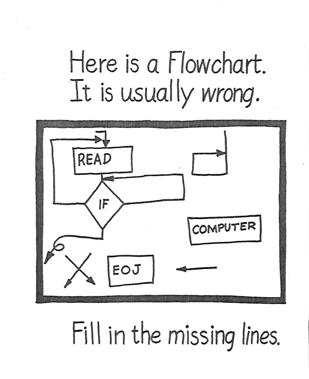
In case you don’t get the joke, here is some context: by the early 1960s, the flowchart was well-established as an essential element of any large-scale software development project. Originally introduced into computing by John von Neumann in the mid-1940s, flowcharts were a schematic representation of the logical structure of a computer program. The idea was that an analyst would examine a problem, design an algorithmic solution, and outline that algorithm in the form of a flowchart diagram. A programmer (or “coder”) would then translate that flowchart into the machine language understood by the computer. The expectation was that the flowchart would serve as the design schematic for the program code ( in the literature from this period flowcharts were widely referred to as the “programmer’s blueprint”) with the assumption was that once this “blueprint” had been developed, “the actual coding of the computer program is rather routine.”

For contemporary audiences, the centrality of the flowchart to software development would have been self-evident. Every programmer in this period would have learned how to flowchart. In the same year that the “Programmer’s Coloring Book” was published, the American Standards Association had approved a standardized flowchart symbol vocabulary.  Shortly thereafter, the inclusion of flowcharting instruction in introductory programming courses had been mandated by the Association for Computing Machinery’s influential Curriculum ’68 guidelines. A 1969 IBM introduction to data processing referred to flowcharts as “an all-purpose tool” for software development and noted that “the programmer uses flowcharting in and through every part of his task.” By the early 1970s, the conventional wisdom was that “developing a program flowchart is a necessary first step in the preparation of a computer program.”

But every programmer in this period also knew that although drawing and maintaining an accurate flowchart was what programmers were *supposed* to do, this is rarely what happened in actual practice. Most programmers preferred not to bother with a flowchart, or produced their flowcharts only after they were done writing code. Many flowcharts were only superficial sketches to begin with, and were rarely updated to reflect the changing reality of a rapidly evolving software system.[@Yohe1974] Many programmers loathed and resented having to draw (and redraw) flowcharts, and the majority did not. Frederick Brooks, in his classic text on software engineering, dismissed the flowchart as an “obsolete nuisance,” “a curse,” and a “space hogging exercise in drafting.” Wayne LeBlanc lamented that despite the best efforts of programmers to “communicate the logic of routines in a more understandable form than computer language by writing flowcharts,” many flowcharts “more closely resemble confusing road maps than the easily understood pictorial representations they should be.”  Donald Knuth argued that not only were flowcharts time-consuming to create and expensive to maintain, but that they were generally rendered obsolete almost immediately. In any active software development effort, he argued, “any resemblance between our flow charts and the present program is purely coincidental.”[@Knuth:1963fg]

All of these critiques are, of course, the basis of the humor in the *Datamation* cartoon: as every programmer knew well, although in theory the flowchart was meant to serve as a design document, in practice they often served only as post-facto justification. Frederick Brooks denied that he had ever known “an experienced programmer who routinely made detailed flow charts before beginning to write programs,” suggesting that “where organization standards require flow charts, these are almost invariably done after the fact.” And in fact, one of the first commercial software packages, Applied Data Research’s Autoflow, was designed specifically to reverse-engineer a flowchart “specification” from already-written program code. In other words, the implementation of many software systems actually preceded their own design! This indeed is a wonderful joke, or at the very least, a paradox. As Marty Goetz, the inventor of Autoflow recalled “like most strong programmers, I never flowcharted; I just wrote the program.” For Goetz, among others, the flowchart was nothing more than a collective fiction: a requirement driven by the managerial need for control, having nothing to do with the actual design or construction of software. The construction of the flowchart could thus be safely left to the machine, since no-one was really interested in reading them in the first place. Indeed, the expert consensus on flowcharts seemed to accord with the popular wisdom captured by the “Programmer’s Coloring Book”: there were such things as flowcharts, and they were generally wrong.


03 Aug 00:34

The Lightning/headphone jack plot thickens

by Rui Carmo

Good thing I’ve effectively switched to Bluetooth headphone adapters years back.

Although Sony has killed off the MW600 and shipped a number of half-baked replacements over the past couple of years, it’s still the best of both worlds while on the go.

I am, however, curious as to what will eventually happen on the iPad and on the Mac, since I routinely use the current iPhone headsets on them for Skype.

03 Aug 00:34

How Women Are Swiping The Weirdness Out Of Online Dating

files/images/alexandra-tweten-bye-felipe-02.jpg


John Paul Titlow, Fast Company, Aug 04, 2016


There's some mildly descriptive language that might be off-putting to some readers, but overall this is a good look at some of the challenges women face online and some of the efforts being undertaken to address them in the world of online dating. The social aspect of online interaction is perhaps the hardest to manage well, and nowhere else do issues flare up more quickly nor frequently. Different approaches are considered, including apps that limit interactions, apps that divert unwanted interactions to noncommittal chatbots, and apps that make unwanted public exposure a lot more public.

[Link] [Comment]
03 Aug 00:34

hard work


That’s the way the ‘hardworking people’ shtick operates. You can be a hedge fund manager with a ten-figure salary. You can be a near full-time partygoer who dabbles in property development, living off the money your great-grandparents made. Once you would have been universally numbered among the rich. Now you are bracketed, through the formula of ‘hardworking people’, with the oppressed of the earth.

In characterising ‘hardworking people’ as the conceptual poor, no matter how technically rich they might be, right-wing polemicists evoke a class of people who are not hardworking. Why are they not hardworking? We are invited to speculate. Perhaps they are lazy. Perhaps they came from a poor country, attracted by the bounties and luxury houses the government offers foreigners. Perhaps they belong to a trade union, an organisation that exists, as Osborne likes to explain, to stop people working hard by badgering them to go on strike. Perhaps they are pretending to be ill, or bred improvidently, or failed to prepare for their retirement. Anyway, they don’t work hard enough, or didn’t when they were younger; but instead of being punished for this, they’re rewarded by the government with lavish benefits. They are idle, they are well-off, and they live off the hard work of others: thus are those who would once have been numbered among the poor transformed into the despised rich.


This entry was originally posted at http://graydon2.dreamwidth.org/240019.html. Please comment there using OpenID.
03 Aug 00:33

Apple Releases the Apple TV Remote App

by John Voorhees

The Apple TV Remote app, which has been available as part of the iOS 10 developer beta since WWDC, is now available to the general public as a free download in the App Store. The app, which is iPhone-only, approximates the look and functionality of the Siri Remote that comes with the latest generation Apple TV, but with some important differences.

The Apple TV Remote app is a brand-new app. The previous app for controlling the Apple TV, called iTunes Remote, remains on the App Store, but warns that it is not optimized for iOS 10 if you open it on a iPhone running the iOS 10 beta. The top two-thirds of the Apple TV Remote’s screen is dominated by a dark grey rectangular area that is the equivalent of the trackpad on the Siri Remote. A large menu button dominates the space below the trackpad, which lets you step back through levels after drilling down into the Apple TV’s interface. To each side of the menu button are buttons that skip to the previous or next track if you are listening to music, and change to ten-second skip ahead and back buttons if you are watching video.

The bottom row includes a play/pause button, a ‘home’ button that takes you to the Apple TV’s grid of app icons from wherever you are, and a Siri button. A ‘Details’ button also appears in the top right corner of the screen when media is playing that opens a detail view that shows what is currently playing along with a timeline scrubber, a play/pause button, forward and reverse buttons, and shuffle and repeat buttons for music. Because the iPhone includes an accelerometer and gyroscope, the Apple TV Remote can also serve as a game controller for Apple TV games.

Aside from the obvious differences between the button layouts of the Siri Remote and the Apple TV Remote app, and lack of dedicated volume buttons in the interface, there are other important differences between the two. As with the predecessor iTunes Remote app, one of the biggest advantages is the ability to type searches, email addresses, and passwords into text fields on the Apple TV using your iPhone’s keyboard instead of the Apple TV’s onscreen keyboard. One thing that I missed from the Siri Remote immediately though, is that you cannot tap on the edges of the trackpad to move the focus from item to item in a grid of icons. It was also disorienting that you cannot activate Siri the way you normally would on your iPhone. Instead, you must issue commands while you hold down the Siri button in the Apple TV Remote app.

There are also some interesting uses of gestures and haptic feedback in the Apple TV Remote app. Tapping the trackpad area of the app while video is playing and swiping your finger to the left or right without lifting it brings up the ten-second skip icon on the TV. A quick tap activates the 10 second skip, but I found that the gesture can be tricky to do correctly. In addition, for all iPhones that support haptic feedback, the Apple TV Remote app uses haptic feedback to register taps in the app, which felt a little strange at first because I'm used to haptic feedback being associated with 3D Touches.

The Apple TV Remote app works with 2nd, 3rd, and 4th generation Apple TVs and requires an iPhone running iOS 9.3.2 or later.


Like MacStories? Become a Member.

Club MacStories offers exclusive access to extra MacStories content, delivered every week; it’s also a way to support us directly.

Club MacStories will help you discover the best apps for your devices and get the most out of your iPhone, iPad, and Mac. Plus, it’s made in Italy.

Join Now
03 Aug 00:32

Beware Of Quick and Simple

by Richard Millington

You wouldn’t want your CEO to follow a quick and simple guide to running a business.

Running a business is complicated. There are lots of moving parts. Each moving part affects the direction of other moving parts. Sure, you can plan out what you’re going to do. But everyone else has their own motivations and is making their own plans too. The magic in running a business isn’t so much what you plan to do. The magic is quickly adapting to new information to achieve the best outcome possible.

The same is true with building a community. Lots of moving parts. Lots of adapting to new information.

Our search for ever simpler templates ignores a simple reality; building a community is complicated. The simpler and shorter the template, the more material has to be cut out.

Simple templates lack the very thing that make most communities succeed, adaptability. You can map out the community against stakeholder objectives. You can develop a clear plan of action, but what happens when the stakeholder objectives conflict and a major news story makes the entire plan redundant?

Or the board splits 3 to 4 against what your research says would make your community amazing?

Or the community manager fights with his boss and quits? Or your boss’ boss disagrees with your boss on your idea?

Or traffic isn’t growing as fast as you predicted?

Or the platform vendor raises their prices without warning at the last minute?

Or someone insists the platform can’t go live until it integrates with another platform – but this wasn’t mentioned beforehand and you’ve already gone live?

Or 10 of your most popular members insist on removing another member (who hasn’t broken any rules) or they’ll start their own community?

Or a new free platform like Reddit/Facebook begins swallowing up your members?

Or Google Analytics data conflicts drastically with platform data making any analysis impossible?

Or members aren’t talking about the things you need them to talk about?

Or a flood of disruptive members target your community to make their protest on a political matter?

Or activity is skyrocketing but you don’t seem to be getting enough value from the community?

Every one of these situations has happened to our clients over the years. Simple templates didn’t help us tackle any of these challenges.

Situations like these feel like the exception. But you’ll soon discover these exceptions take up the bulk of your time. The exceptions are the norm in this work. To get better we don’t need simpler solutions, we need to get better at tackling each unique situation as it arises. That means seeking out people who have been through something similar. It means understanding more universal principles behind what motivates people and how they’re likely to respond to different situations. It means looking for more complex information.

Simple plans will rarely help because the very simplicity which makes them popular and palatable to a mass audience also removes the complexity that makes them useful for the unique challenges you

03 Aug 00:32

Uber – Wheel re-invention.

by windsorr

Reply to this post

RFM AvatarSmall


HERE offers much more for $500m. 

  • I think that $500m would be much better spent in becoming a meaningful shareholder of HERE and getting a leading seat at the table of the only independent game in town.
  • It appears that Uber intends to invest $500m in creating its own map in order to remove its dependency on Google, a company looks set to be its competitor one day.
  • As Uber’s business stands today, Google is not really a threat as its maps are really only used for passenger location and routing but when autonomous vehicles become a reality, it will be a different story.
  • Uber has already assembled some mapping assets having acquired deCarta, a turn by turn directions company, as well as some assets from Microsoft and personnel from Google.
  • The problem as I see it is that throwing just $500m at building map is very unlikely to produce the desired results.
  • If Uber was to spend $600m per year for 6 years and utilize the services of 6,000 people, then it would probably come up with an asset as good as Google’s.
  • However, it would have carry on spending this amount every year and quite possibly more (see below) just to keep its head above water
  • Given my bearish view on the timing of autonomous vehicles (see here), I think Uber has the time but I am far from convinced that reinventing the wheel is a very good use of its resources.
  • The general consensus is that autonomous vehicles require a very high quality map, which given Uber’s presence in 60 countries, it is going to have to cover them all.
  • Furthermore, simply covering the cities will not be enough, Uber will have to have this level of quality everywhere if it wants to offer a fully-fledged autonomous ride hailing service.
  • HERE and Google are only just embarking on this now and I think that Uber may end up having to invest even more than $600m a year if it wants to keep up.
  • With Google becoming a competitor for much of the technology industry, many technology companies have already switched to using the HERE map and I think this trend will continue.
  • Google is also emerging as a competitor for the automotive industry which is pushing HERE to become a coalition of all Google’s competitors.
  • HERE has to tread very carefully to ensure it remains independent and that everyone is fairly treated (see here) but I see that some of the initial hurdles of competitors sharing anonymous data have already been overcome.
  • Hence, I think that Uber joining the HERE consortium would be mutually beneficial as Uber would have a first rate map from day 1 while the consortium would benefit from Uber’s rich data set.
  • I am sure the conversations are already happening.
03 Aug 00:32

New codewords for “age & family discrimination”

by hrbrmstr

From: Why Corporate America Is Leaving the Suburbs for the City:

We wanted energy, vibrancy and diversity, and to accelerate a change in our culture by moving downtown.

translation:

We want to begin a process of strategically removing more highly paid, legacy employees who can’t commit 12 hours a day to our company and replacing them with younger folks we can take advantage of.

The move to forgo the addition of parking spaces in these new city HQs and encourage the use of mass transit is also interesting, given the current state of mass transit systems in America. Will these corporations be kicking in greenbacks for infrastructure/capacity improvement? Methinks not.

Remember, kids, these are soulless, giant, multinational corporations that place “shareholder value” over everything else. Also, remember that you’ll be a “legacy” worker someday, too.

Hopefully some startup will jump in to buy up all the forthcoming empty suburban campus spaces and turn them into indoor farms.

03 Aug 00:31

Editing week, Level 2: Editing structure

by Josh Bernoff

You’ve got a decent idea, now write it! If only it were so easy. Poor, uneven, or murky structures can sink you before you’ve started. Today I describe how editors and writers can collaborate on the best structure for a 1,000-word-plus piece, before anybody actually begins writing. What is structural editing? The structural edit is … Continue reading Editing week, Level 2: Editing structure →

The post Editing week, Level 2: Editing structure appeared first on without bullshit.

03 Aug 00:31

Announcing the Second Cohort of Ford-Mozilla Open Web Fellows

by Mozilla

The second class of fellows will embed at organizations like ColorOfChange and European Digital Rights to fight for privacy, literacy, and inclusion online


The internet is a global public resource. It has the ability to empower, educate, connect and uplift.

But like any other public resource, the internet faces serious threats. From tech monopolies and mass surveillance to policy that undermines net neutrality, openness and freedom online are in danger. With these threats also comes opportunity for more conversation and change. We can help shift more people from consuming the web to participating in it.

That’s why Ford Foundation and Mozilla launched the Open Web Fellows program two years ago: To empower a network of leaders capable of defending the open web. The Open Web Fellows program places bright technologists and activists on the front lines of the open internet movement. Last year, Ford and Mozilla placed six fellows at leading NGOs like Amnesty International and the ACLU, where they used their tech savvy to fight for issues like freedom of expression and gender equality online.

introduction

Today, Ford and Mozilla are proud to announce our second class of fellows: eight talented makers and doers hailing from five continents. Our fellows will bring their expertise in data visualization, design, development, storytelling, research and policy analysis — and a shared zeal for an open internet —  to eight international NGOs. Below, meet our fellows and their host organizations:


Steffania@2xSteffania Paola Costa di Albanez

@stepaola | Derechos Digitales

Steffania is a feminist, self-taught developer, multidisciplinary designer, and visual artist. She also works as a digital security and coding trainer. Steffania has collaborated with civil society organizations and independent groups in Brazil that engage with issues like solidarity economy, intersectional feminism, privacy, and free speech. Steffania uses her skills to help these organizations increase the impact of advocacy efforts, build websites, applications and data visualizations, and plan workshops and toolkits. As an Open Web Fellow, Steffania will be collaborating with Derechos Digitales to help the civil society sector in Latin America better promote human rights in the digital environment.


Eireann@2xÉireann Leverett

@blackswanburst |Éireann’s website | Privacy International

Éireann is an academic, a red teamer, and an entrepreneur, and has deep experience working with computer emergency response teams to protect critical infrastructures. Éireann is fascinated by malware, vulnerabilities, cryptography, networks, information theory, and economics — and he believes hacking can win victories for humanity. Currently, Éireann is Founder and CEO of Concinnity Risks and Senior Risk Researcher at Cambridge Centre for Risk Studies. As an Open Web Fellow, Éireann will be working with Privacy International’s Tech Team to analyze surveillance documentation and data, identify and analyze new technologies, and help develop briefings and educational programming with a technical understanding.


Jen@2xJennifer Helsby

@redshiftzero | Jennifer’s GitHub | Freedom of the Press Foundation

Jennifer is a data scientist and researcher passionate about using data and technology to catalyze social change. Previously, she was a postdoctoral researcher at the Center for Data Science and Public Policy at the University of Chicago, where she worked on applying machine learning methods to problems in public policy. Currently, Jennifer is a co-founder and CTO of Lucy Parsons Labs, a Chicago-based nonprofit that focuses on police accountability and surveillance oversight. She is also a co-organizer for Cryptoparty Chicago, which teaches everyday people about digital security. As an Open Web Fellow, Jennifer will be working with the Freedom of the Press Foundation to improve SecureDrop, an anonymous whistleblowing platform.


Berhan@2xBerhan Taye

@btayeg | Berhan’s blog | Center for Intellectual Property and Information Technology (CIPIT)

Berhan is a social justice activist, a peace studies practitioner, and an avid advocate for open data and the open web. Berhan previously worked at a Conflict Early Warning and Early Response Center mitigating violence in East Africa. She has also conducted research on transitional justice and criminal violence at the University of Notre Dame, consulted for intergovernmental bodies in Addis Ababa and Nairobi, and engaged legislative processes related to land rights in Cape Town. As an Open Web Fellow, Berhan will be based at the Center for Intellectual Property and Information Technology (CIPIT) at the Strathmore Law School in Nairobi, Kenya, focusing on internet freedom in Eastern Africa.


Etienne@2xEtienne Maynier

@tenacioustek | Citizen Lab

Etienne is a security engineer passionate about issues related to security and digital surveillance. He has worked on penetration testing and incident response for several years, and is now honing his focus on analyzing and better understanding how technologies are used to spy on citizens. Etienne believes in creating and fostering a robust public debate on privacy and surveillance issues. Etienne is a volunteer with Toulouse Hackerspace Factory. As an Open Web Fellow, Etienne will be based at Citizen Lab, an interdisciplinary laboratory based at the Munk School of Global Affairs, University of Toronto, focusing on projects like measuring Internet filtering and network interference and investigating malware attacks.


Sid@2xSiddharth (Sid) Rao

@sidnext2none | Sid’s website | European Digital Rights (EDRi)

Sid is a Free and Open Source Software (FOSS) enthusiast and a privacy fanatic who specializes in the security analysis of communication protocols. He is also passionate about internet services and infrastructure in developing nations. Sid co-founded the social venture ThirdEye, which builds affordable e-­readers for visually-challenged people. He is a past Erasmus Mundus fellow and holds double master’s degrees from Aalto University, Finland (Information and Network Security) and University of Tartu, Estonia (Cryptography). As an Open Web Fellow, Sid will be based at European Digital Rights (EDRi), where he will help define policies related to data protection, surveillance, copyright, and network neutrality.


Matt@2xMatt Mitchell

@geminiimatt | Matt’s website | ColorofChange

Matt is a security researcher, operational security trainer, and data journalist who leads CryptoHarlem, impromptu workshops teaching basic cryptography tools to the predominately African American community in upper Manhattan. Previously, he worked as a data journalist for The New York Times and as a developer for CNN, Aol/Huffington Post, and other news organizations. Matt currently trains activists and journalists in digital security, with a special focus on marginalized populations who are often aggressively monitored, over-policed, and disenfranchised. As an Open Web Fellow, Matt will be based at ColorOfChange pioneering tools and discovering compelling user engagement strategies.


Suchana@2xSuchana Seth

Data & Society

Suchana is a physicist-turned-data scientist from India. She has built scalable data science solutions and patent-pending applications in text mining and natural language processing for startups and industry research labs. Suchana believes in the power of data to drive positive change, and volunteers with DataKind to mentor data-for-good projects. She is also passionate about closing the gender gap in data science, and leads data science workshops with organizations like Women Who Code. As an Open Web Fellow, Suchana will be based at Data & Society, where she will enable data scientists and technology teams to better use anonymized data.

03 Aug 00:30

Instagram Introduces New Stories Feature

by John Voorhees

Today, Instagram is rolling out a separate feed of photos and videos called Stories, which expire after twenty-four hours, much like Snapchat’s stories feature. Instagram’s Stories, introduced with a post on the company's blog, adds a separate row of circular avatars to the top of your Instagram feed. According to The Verge’s Casey Newton, who has an in depth look at the new feature and interview with Kevin Systrom, Instagram’s co-founder and CEO:

Each bubble represents an account that you follow on Instagram, and contains every photo and video clip (up to 10 seconds) that they've posted to their stories feed within the past day. (The avatars are displayed according to an algorithm that attempts to show your favorite accounts first.) Tap a bubble and their story will open in full screen, advancing automatically with a slick rotating cube effect. Unlike Snapchat, you can tap on the left-hand side of the screen to rewind the feed back to an earlier post.

Unlike the main Instagram feed there are no likes or public comments, but you can tap a photo to send a private message to the user. Privacy settings work the same way as your existing Instagram settings. If you account is private, only your followers will see your Stories. If your account is public, your Stories will be too.

The point of Stories is to get people to use Instagram more often. According to Newton:

Instagram describes its stories product as a way to promote the sharing of moments that don’t meet the higher bar of a traditional Instagram post. But it’s also designed to get people to share more, period. The Information reported in June that the average number of Instagram posts per user declined between 2013 and 2015. Meanwhile, consumption of video alone on Snapchat increased 25 percent between February and April, to 10 billion views a day, according to Bloomberg.

To reinforce the message that Instagram Stories are an informal place to share candid photos with friends, Instagram has added a series of tools to decorate your photos by using a limited set of filters, drawing tools, text and emoji.

Screenshots courtesy of Instagram.

Screenshots courtesy of Instagram.

It will be interesting to see to what extent Instagram users take to Stories. I know friends who view the relatively low volume of their Instagram feed as a feature of its own because it doesn’t need to be checked as frequently to stay current. I also wonder how well informal stories will co-exist with the more curated, artistic feel of the existing Instagram feed. However, in a world where attention and engagement are the main drivers of social networks, it certainly isn’t surprising that Facebook would take Instagram in this direction. The only question is how many users will follow.

You can watch Instagram's video introducing Stories below.


Like MacStories? Become a Member.

Club MacStories offers exclusive access to extra MacStories content, delivered every week; it’s also a way to support us directly.

Club MacStories will help you discover the best apps for your devices and get the most out of your iPhone, iPad, and Mac. Plus, it’s made in Italy.

Join Now
03 Aug 00:30

Logitech’s CREATE Keyboard for the 9.7″ iPad Pro

by Federico Viticci

Logitech's CREATE keyboard case, which I reviewed when the 12.9" iPad Pro launched in November, has received a new version for the 9.7" iPad Pro today. Logitech was able to fit all the features of the larger CREATE in this model – it's a case that protects the front and back of the iPad, it's got mechanical scissor keys with a full row of iOS-specific shortcuts, and it's backlit.

Unlike the first CREATE, the 9.7" edition comes with an Apple Pencil holder that will allow you to carry an iPad Pro and a Pencil together with a physical keyboard in one package.

I wasn't a fan of the original CREATE when it launched, but I feel like a smaller footprint and Pencil support could make the new version a much better deal for 9.7" iPad Pro users.

The new CREATE keyboard case is available today at $129.99 from Logitech's website.

→ Source: logitech.com

03 Aug 00:30

3 feedback myths that are holding you back—and how Dropbox can help

by Stephanie Wang

An image of a person showing three pieces of paper to a group of people. The papers say "Idea 1," "Idea 2," and "Idea 3."


Sometimes when you ask for feedback on your work, it feels like you’re fishing for mistakes. And if you’re strapped for time, the thought of just pushing your work out the door—without involving other people—can be alluring. But too often, feedback gets a bad rap. It’s an important part of making your work as good as it can be. And luckily, it’s a lot easier to manage than you might think. Here are three myths holding you back from getting feedback, and getting more done.

Myth #1: “I don’t need to get feedback”

It’s tempting to fly solo at work, especially if you’re an expert in your field. But research shows that people who ask co-workers for feedback are happier in their careers. It’s more than that, though—good, constructive feedback helps improve your work. When you draw from your colleagues’ skills by asking for their input, there’s a good chance you’ll end up creating higher-quality work.

But what if you already knew all that, and the problem is that you just don’t want to take the first step of asking for feedback? We understand—it can be a bit of a pain. But with Dropbox, it’s easy to get started by sharing your files right from the desktop. And once you get started, there are plenty of other Dropbox features to help you keep the ball rolling—shattering these other feedback myths along the way.

Myth #2: “Feedback’s too hard to manage”

Keeping track of all the feedback you get through different apps, tools, and emails can be a headache. Dropbox, though, helps you get truly confusion-free feedback. One way is by letting your reviewers comment on a specific area of a file. Whether a logo looks off or there’s a typo in the third sentence of the second paragraph, you can see exactly what they’re talking about.

We’ve also added previews to more types of files, so it’s easier for you to get feedback on everything you work on. Reviewers can now preview and comment on audio files, CSVs, and more just like they can with PDFs and design files.

Myth #3: “Getting feedback will slow me down”

Feedback doesn’t have to throw a wrench into your progress. If you’re working in Word, Excel, or PowerPoint, it’s easy to ditch those lengthy email back-and-forths. Just use our co-authoring feature for Microsoft Office Online, and save yourself the pain of mixed-up file versions. With our integration, you can collaborate on a doc stored in a Dropbox shared folder, in real time—right from your browser.

You can also get the feedback loop started sooner by sharing your ideas sooner. When inspiration strikes—whether it’s a sketch on a napkin, or a photo of a typeface you fell in love with—use the new plus button to scan it into Dropbox. Then you don’t have to wait until you get back to the office to share your idea and start getting everyone’s input.

Sending a project around for review might be a little scary, but let’s face it—feedback makes your work better. Not just that, it can be a learning experience, helping you grow as a professional and improve working relationships. Whether you’re looking to get approvals or sharpen your skills, Dropbox can help you collect feedback easily. Check out the new features that do that and more, here:

Blog footer image

03 Aug 00:28

Exciting Improvements Delivered Today in Firefox for Desktop and Android

by Nick Nguyen

Today we’re proud to announce the initial rollout of multi-process Firefox for Desktop to our general audience. With this, we’re taking a major step forward in improving Firefox for Desktop. Users should experience a Firefox that is less susceptible to freezing and is generally more responsive to input, while retaining the experience and features that users love.

In Firefox 48, we aim to slowly enable multi-process Firefox (also known as Electrolysis or e10s) for release users, starting with one percent and ramping up to nearly half the Firefox Release if things go as expected. e10s promises to offer a major improvement to your browsing experience by separating Web content and Firefox UI processes. This means when a web page is consuming a large part of your computer’s processing power, your tabs, buttons and menus won’t lock up. Wondering if your Firefox instance has enabled e10s? Type “about:support” into the URL bar. If e10s is active, you’ll see 1/1 (Enabled by default) under the Multiprocess Windows line item.

In addition to making fundamental changes to how Firefox for Desktop will work in the future, today’s update also brings improvements to the browser design that make discovery even easier. First, we’re making the awesome bar even more awesome. Now when you enter a new query, you’ll see more suggestions than ever before and a wider view of your suggestions across the screen. This makes suggestions easier to read. You may also notice icons when a suggestion is recommending a site that is already in your bookmarks or open tabs.

We have redesigned the Discovery Pane at about:addons to help you  personalize your browsing experience. The new design simplifies installation for featured add-ons to just one click and uses clean images and text to quickly orient you as you explore Firefox.

Lastly, in the latest update, we are also shipping security improvements that enhance download protection in Firefox, which you can learn more about here.

We also have some  new features available in the latest version of Firefox for Android. Earlier this year, we experimented with rebooting bookmarks. Today, we’re rolling out these improvements by merging your Reading Lists into Bookmarks and your Synced tabs into the History Panel. This change means your reading list items will now be available across devices alongside your bookmarks, giving you easier access to your content no matter what device you’re using, which is a major upgrade for those of you using Firefox across devices.

Today, more people are watching web video than ever before. So we set out to improve the audio and video playback experience in Android. Now when you are playing a video within Firefox on an Android device and receive a call, your device will pause the video automatically, so you can focus on the call. We’ve also added a toolbar so you can quickly manage your audio controls within the app and streamlined the touch controls on all video content so it’s easier to use.

We’ll keep you updated as we continue to roll out Electrolysis over the next several months. In the meantime, download the latest Firefox for desktop and Android and let us know what you think.

03 Aug 00:28

Remote working at ScraperWiki

by Francis Irving

We’ve just posted our first job advert for a remote worker. Take a look, especially if you’re a programmer.

Throughout ScraperWiki’s history, we’ve had some staff working remotely – one for a while as far away as New York!

Sometimes staff have had to move away for other reasons, and have continued to work for us remotely. Othertimes they are from the north of England, but just far enough away that it is only reasonable to come into the office for a couple of days a week.

Collaborative tools are better now – when we first started coding ScraperWiki in late 2009, GitHub wasn’t ubiquitous, and although we had IRC it was much harder to get bizdevs to use than Slack is. It’s hard to believe, but you had to pay for Skype group video calls, and Hangouts hadn’t launched yet.

Meanwhile, our customers and research partners are all over the world.

So we’re quite used to remote working.

We love Liverpool, and we can tell you the advantages and help you move here if that’s what you want.

If it isn’t though, and if you’ve always wanted to work for ScraperWiki as a software engineer remotely, now’s your chance.

03 Aug 00:28

The business of creativity (part 2)

by Paul Jarvis
Selling what you’ve made makes you brave as hell and someone who’s done more for the world than probably every asshat who’s complained about creative people making money from their “impure” art.
02 Aug 22:54

First look at Class 345 as Crossrail train begins testing

by News
mkalus shared this story from Global Rail News.

Aventra Derby

Bombardier invited the media to its Derby site today for a first look at the new Aventra train for London’s Elizabeth line.

Having been awarded a £1 billion order for 66 nine-car trains in 2014, Bombardier is now testing the first units of the new fleet.

The first of the new trains will go into service under the TfL Rail brand in May 2017 between Liverpool Street and Shenfield. These will be seven-car trains rather than nine due to the shorter platforms at Liverpool Street station. The first nine-car trains will enter service in May 2018.

Two trains have been completed and are undergoing testing, while a further three are in different stages of production.

Mike Brown MVO, London’s Transport Commissioner, said: “The Elizabeth line trains, which are a great showcase of British design and manufacture, will be running on part of our network within a year.

“The trains are fully accessible, will have air cooling, and once the whole line opens, they will help our passengers move more easily into and across the city every day.”

Bombardier has built a dedicated £12.5 million testing facility at its Litchurch Lane site for the Crossrail contract.

Peter Doolin, Bombardier Transportation’s vice president of projects, Crossrail & London Underground, said: “Bombardier is delighted to be working with TfL on this flagship project to deliver new the Elizabeth line trains, which are based on our very latest Aventra product family, a new technology leading train for the UK.

“We look forward to continuing to work together with TfL in manufacturing, testing and introducing these new trains into service in London.”

02 Aug 22:54

The First Global Urban Planning Conference Was Mostly About Manure

mkalus shared this story from Atlas Obscura - Latest Articles and Places.

Electric streetcars eventually began to replace horse-drawn cars in the early 20th century. (Photo: Brown Brothers/Public Domain)

The sticking point at the world’s first international urban planning conference was a load of crap.

When delegates from around the globe gathered in 1898 to hammer out a solution to one of the greatest problems facing their cities, whose consequences they could no longer ignore, they weren’t talking about infrastructure challenges, a shortage of resources, or even crime.

The problem was horses. And their copious poop.

A view of a muddy and manure-covered New York City street in 1893, found in an 1898 book about street cleaning. (Photo: Internet Archive/Public Domain)

The manure issue had become particularly acute as horse populations swelled in rapidly growing urban centers. It was considered such a looming threat to cities that an 1894 article in the Times of London estimated that within 50 years, dung piles would rise nine feet high.

A similarly concerning New York City prediction argued that by 1930 manure would reach third-story windows. Moreover, 19th-century New York was already unsettlingly unsanitary, with whole swathes of the city dominated by "a loathsome train of dependent nuisances" like slaughterhouses, facilities for fat melting and gut-cleaning, and "manure heaps in summer" that stretched across entire blocks. 

But after three days of brainstorming and debate that went nowhere, attendees of the conference, frustrated and resigned, called it quits on what had been planned as a 10-day affair. Participants had hoped to hammer out a solution to the horse problem and its smelly attendant consequences, but instead, seeing no way out of the morass, they disbanded and went home.

After all, how could they come up with a substitute for an animal that had served humans for thousands of years? Horses were essential to the transportation of people and cargo, as well as a source of prestige and power for militaries.

But crammed together in such tight spaces—the human density of New York City rose over the 19th century from just below 40,000 people per square mile to above 90,000—the beasts became less of an object of convenience and more of a debilitating nuisance.

The crowded Mulberry Street in New York City around 1900. (Photo: Library of Congress/LC-USZC4-4637)

At its peak, New York had an estimated 100,000 to 200,000 equine inhabitants. Each of those horses produced anywhere from 15 to 30 pounds of manure per day, coupled with around a quart of urine that ended up either in their stables or anywhere along their street routes.

And as equestrian enthusiasts are well aware, horse poop begets flies. Lots of flies. One estimate cited in Access Magazine claimed that horse manure was the hatching ground for three billion flies daily throughout the United States, flies that spread disease rapidly through dense human populations.

By the end of the 19th century, once-vacant lots around New York City housed manure piles that stretched dozens of feet—often between forty and sixty—into the sky. The problem of horse manure had quite literally become larger than life.

And the problem comprised more than just excrement. When a horse, worked to the bone, plopped over dead, the city then had a rotting carcass to address, not to mention the flies and road congestion that accompanied it.

According to Raymond A. Mohl’s book The Making of Urban America, by 1866 the city's long Broadway had become littered with “dead horses and vehicular entanglements,” and in 1880 alone, New York City removed around 15,000 horse carcasses from its streets. As late as 1912, Chicago carted away nearly 10,000 carcasses.

A view of New York City's South Street crowded with horses and carriages. (Photo: Library of Congress/Public Domain)

Some respite came in the late 1880s and 1890s with the introduction of the cable car and electric trolley car to American cities, but it wasn't until the private automobile became available in the early 20th century that horses began to be phased out of daily life. As prices for hay, oats, and land rose, and fears of horse pollution became more urgent, the masses began to adopt the fledgling technology.

By 1912, the number of cars on New York City's roads had surpassed the number of horses. Buyers found cars to be cheaper to own and operate and much more efficient—not to mention more sanitary. The once-essential horse came under fire from magazines like Harper's Weekly and Scientific American, which praised the automobile for its economic sustainability and ability to reduce traffic.

And so, by some miracle, the problem that had plagued planners and had sent them into a panic began to disappear. Had they known at the first international planning conference that their most pressing challenge would essentially resolve itself in years to come, perhaps they wouldn't have wasted so much effort arguing about waste.

02 Aug 22:45

These Are the Hidden Buildings You Won't See in Amsterdam

by Mark Minkjan for The Creators Project

Telefooncentrale (Telephone Exchange) Amsterdam-West, designed by the architect Albert Boeken and built in 1928. It was in use until 2015 and will be redeveloped into housing. All photos by the author.

Recently I was sick and homebound for a while, so I decided to go for a digital adventure in my city of Amsterdam. I set out on a trip in Google Earth, spending hours and hours flying around in that 3D version of reality. Not all European cities can be explored this way yet, but lucky for me, most of Amsterdam can.

Not that it looks perfect—Google Earth’s interpretation of the real world is often pretty glitchy, with trees from 1995 computer games, facades resembling faces with running mascara, and quite some constructions looking like melting architectural models. But at the same time, much of this makes for some fascinating, if unintentional, cyber art.

My challenge became to find buildings you generally don’t see when you’re cycling around Amsterdam. Every time I found one, I tried to uncover bits and pieces of its history through websites and archives. Here’s a selection from my harvest.

Openluchtschool voor het Gezonde Kind (Open Air School for the Healthy Child), designed by the famous architect Johannes Duiker from 1930, who also designed the city’s Cineac cinema (1934). It’s one of the very first modernist buildings in Amsterdam (concrete, glass and steel, which equaled ‘future’ at the time). When Google Earth scanned the area—which must have been around 2010 or 2011—it was wrapped in scaffolding, as it was being renovated, making it look like a giant abstract sculpture.

Villa Betty (1877), located in the fringe of the city’s Vondelpark. It’s named after Betty von Hunteln, who was called The Queen of Overtoom and lived in the villa until 1980 when she died at age 100. An eclectic building of Jugendstil and chalet styles, it had period rooms decorated after Arabic, English, Dutch, Louis XIV and Chinese examples. After Betty’s death, the interior was stripped and auctioned. It's currently one of the city's most expensive residences.

The Pieter Janszoon Suyckerhoff-Hofje (courtyard) from 1667, one of the Jordaan area’s many courtyard complexes. It consists of 19 dwellings, which are all—still—for women only.

The Evangelical-Lutheran Orphanage from 1678. In 1811, Napoleon kicked out the orphans because he needed the building for a military hospital. Currently the buildings houses mostly offices.

The British School of Amsterdam, built in 1930 as the Dalton School (a mixed school). From 1941-43 it was one of the schools where Jewish children were concentrated since the Nazi regime didn’t allow them to mix with other kids. It became Jewish School No. 13. Starting with 300 Jewish children in 1941, the number dropped to 200 in 1942, as kids 'disappeared' daily. Further numbers are unknown. The British School will soon move to the former House of Detention II (see below).

The former Huis van Bewaring II (House of Detention II) from 1890. In 1980, the state sold the building to the city of Amsterdam because it no longer needed the prison. It was partly squatted, and it housed a Baghwan commune and folklorist dance theatre. Soon however, the state needed more prison cells after all and bought back the building. In 2014 the prison closed, after which some 180 (mostly Syrian) refugees were housed there. The building will soon be renovated so that by 2019 the British School of Amsterdam can move in.

Leonardo da Vinci School. The original building from 1886 was “biologically” renovated by aayu architecten in 2012, using mostly onsite, natural and recycled materials. In the back: the Europarking building by modernist architect Piet Zanstra from 1971 (which US photographer Spencer Tunick used in 2007 for a mass nude photo with 2,000 naked people).

The Martyrs of Gorcum Church (or Hofkerk), designed by A.J. Kropholler and built 1927-29. There's extra space around the church on its plot, so that processions could take place here because they weren’t allowed in public space. The architect must have drawn inspiration from Berlage's famous Stock Exchange at Dam Square. A monastery, a catholic housing project and a catholic school were built around the same time, enclosing the large courtyard.

Nicolaas Maes School. The white building replaced a 1916 early Amsterdamse School-style building in 1999. However, in 2012, a renovated version opened its doors (this Google Earth image is from 2004), because the white building proved a failure. Stairs were too dangerous, doors smashed on kids' fingers, the indoor climate was horrible and the plastic facade weathered badly. Its 1990s architect (MVSA, who also designed "The Shoe", ING Bank's former HQs) argued this was due to a limited construction budget. A representative of the local government (the client) said that the architect had clearly prioritized design over usability, that MVSA disapproved with the renovation because they wanted their intellectual property protected. The school director told local newspaper Het Parool: "it's a design masterpiece, but totally unfit for a school." The new building has a wood-clad facade, a different interior program, new climate systems, and a new playground.

This article originally appeared on The Creators Project Netherlands.

Related:

Screenshots from Google Street View Get a Color-Drenched Makeover

The 'Anonymous Gods' Of Google Street View

The Strange Beauty of Finding Yourself in Google Street View

02 Aug 22:45

[Premiere] A New Instrument Plays Waves of Sound, Light, and Water

by DJ Pangburn for The Creators Project

Light can be both wave and particle, depending on the perspective and decisions of the viewer. We also know that waves—albeit different types—are at the core of gravity, sound, light and the motion of fluids. Though Oakland-based electronic artist Marielle V. Jakobsons’ audiovisual creation, the Macro-Cymatic Instrument, isn’t exactly inspired by these various manifestations of waves, that reality seems ingrained in her new music video for the track “White Sparks,” premiering today on The Creators Project (below), in which sound, light, and fluid waves synchronize to dazzling effect.

As Jakobsons tells The Creators Project, the macro-cymatic instrument takes sound and turns it into fluid motion, which is captured at the macro-photographic scale. The sound vibrations directly move a small layer of water, with wave variations appearing in reflected light on and through the water. It is, as Jakobsons explains, inspired by cymatics, the art of making patterns appear on fluids with sound vibrations.

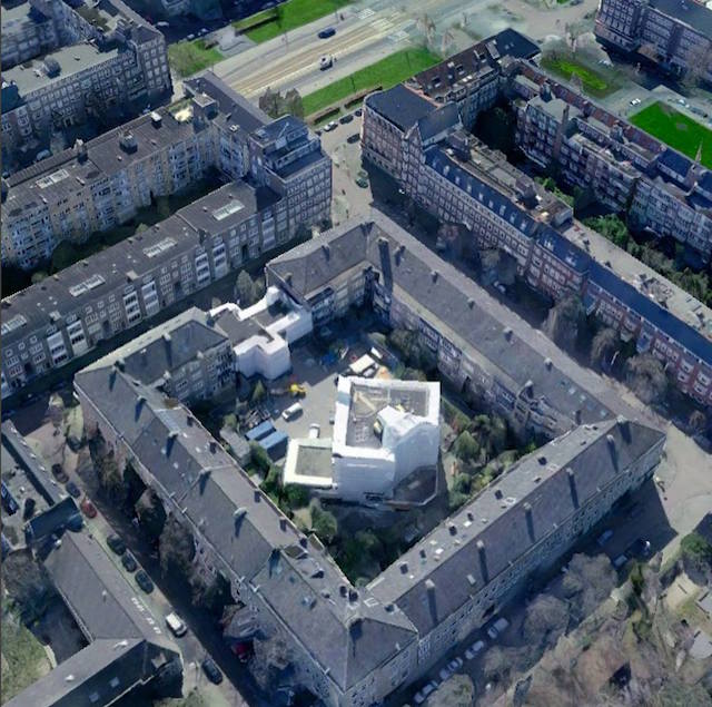
Images courtesy the artist

“An exciting new development in this instrument has been using programmable LED’s instead of static lighting,” Jakobsons says. “I program the lights with Arduino to match with elements of different songs in mood and rhythms. Sections of a song, or groups of instruments, might each have their own program that I will create, or I might just focus on the song as a whole. The programs allow me to vary an angle of the light, how many of the lights are reflecting on the water, their intensity, color, hue shifting, timing, and rhythms... It’s really been fun to explore.”

Jakobsons has been inspired by cymatics and transducing sound waves into different mediums for many years now, mainly in the form of installations. In String TV, for example, she transduced sound directly into analog video, and then employed cymatic projections in the works Self-Oscillating Violin and Two Violins and a Theater.

These pieces were inspired by many other artists, like James Turrell and Alvin Lucier, who have worked with sound, light, and space as material. While many of these artists like to play with vast size and scale, Jakobsons was far more interested in the macroscopic side of things. So she bought a camera and some bellows, and started building prototypes of instruments that could create cymatic motion at the macroscopic scale.

For the production of the “White Sparks” music video, Jakobsons considered many different ideas when it came to cinematography, from bioluminescent algae to playing with oils and dyes—all of it undertaken for the first time.  

“One of my favorite shots came from playing with oils and dyes to create a sun-like planet,” she says. “As the piece evolved, I would set up and take multiple shots and takes with minute adjustments in position, lighting, sound, or color, in order to get very particular results illuminating and creating the natural layers of the liquid motion.”

Jakobson shot a good chunk of the video in one take. All of the macro-cymatics shots seen in the video were recorded and edited to maintain precise synchronization to the audio. Jakobson emphasizes that there was no modification of their timing in post-production, as she wanted to stay true to the immersive aspect of the instrument such that viewers are literally seeing the sound in a new material form as they listen to it.

“In post-production there is layering, editing between takes, and a bit of color correction,” Jakobson explains. “When I added in the eyes, mouth, and face, there was a lot of complex layering and playing around with different methods of blending layers.  I wanted the figure to feel embedded in the cymatics, coming from within that world, and shaping it.”

After composing a series of videos for Star Core, Jakobsons will take the album on tour as an audiovisual experience. She is also looking into incorporating interactive elements into the video performance.

Click here to check out more of Marielle V. Jakobson’s work.

Related:

James Turrell Illuminates a Memorial Chapel in a Berlin Cemetery

Dive Inside Distorted Google Street Views in a VR Music Video [Premiere]

[Premiere] Mirrored Lights Dance on a Subterranean Stage in Continuum

02 Aug 22:45

A Glowing Hall of Rainbows Samples Nature's Best Colors

by Beckett Mufson for The Creators Project

Liz West, Our Spectral Vision, 2016 © Jim Stephenson

A rainbow light tunnel is aglow in London as an immersive tribute to Newtonian color theory and the pigments of the natural world. Like Seurat, Kandinsky, and Mondrian before her, light artist Liz West (previously, previously) has an obsession with the spectrum, which she brings to the Natural History Museum in a new installation called Our Spectral Vision. The installation is one part of a larger museum show called Colour and Vision: Through the Eyes of Nature, examining the relationship between sight and color in the natural world.

Liz West, Our Spectral Vision, 2016 © Trustees of NHM, London

West erected seven columns of LED lights encased in mirrors and dichroic glass, each representing one of the seven colors Isaac Newton identified when he filtered white light through a prism. The dichroic glass panes, which we've also seen in the work of light painter Stephen Knapp, reflect light from the surface to achieve a vivid chromatic effect distinct from glass colored by pigment. The mirrors turn each column into a mini-infinity room and reflect the light outward, coloring viewers' shadows. West selected her seven shades after perusing the museum's vast collection of insects, birds, and other animals. In a short video below, West compares the overall effect to the irridesence of the Blue Morpho butterfly's wings. 

Liz West, Our Spectral Vision, 2016. © Ian Theasby

"The seven saturated, luminous prism sculptures together create an abundance of pure colored light that glows with bright intensity," West tells The Creators Project. "It illuminates the entrance space to the exhibition, where the installation is located, with a spectrum of radiant color as well as luring visitors in to explore the immersive space and then the exhibition beyond."

Liz West, Our Spectral Vision, 2016 © Jim Stephenson

Liz West, Our Spectral Vision, 2016 © Jim Stephenson

Learn more about Colour and Vision: Through the Eyes of Nature here, and see more of Liz West's work on her website.

Related:

Artist Creates Prismatic Paintings with Light and Glass

Installation Floods a Former Cathedral with Rainbows

This Mirrored Rainbow Room Is a Playground for Light

02 Aug 22:45

Rare North Korean Paintings Exhibit in the US

by Andrew Nunes for The Creators Project

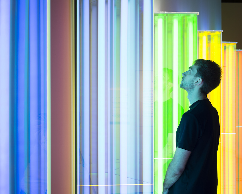
Farewell, Park Ryong Sam, 1977. All images courtesy of the American University Museum, B.G. Muhn, and the artists.

North Korean art doesn’t frequently make an appearance outside of the restrictive boundaries of the DPRK, but an all-North Korean painting exhibition has just landed in U.S. soil thanks to the effort of artist-turned-curator B.G. MuhnContemporary North Korean Art: The Evolution of Socialist Realism, on view at the Katzen Arts Center at the American University Museum, highlights 50 years of the Chosonwha genre, which fuses Oriental ink wash painting and rice paper to depict monumental scenes of DPRK history.

Sea Rescue in the Dark, a collaborative painting by Kim Song Kun, Kim Chol, Cha Yong Ho, and Ri Ki Song, 1997

Muhn, who was born in South Korea but also holds American citizenship, had surprisingly little difficulty in making visits to the DPRK and organizing the exhibition: “I shared my serious scholarly intentions to research and introduce the form of Chosonhwa to the outside world, and was met with a positive response. Over multiple visits to Pyongyang, I built working relationships with North Korean museums, state-run artist studios, and their artists,” Muhn explains.

Tiger Dashing in Winter, Kim Chol, 2014

“In regards to my South Korean heritage, I do not think there was a disadvantage in organizing the exhibition, largely due to my citizenship as a Korean-American. It was actually a huge advantage in the process of conducting in-depth research and facilitating the show because I understood the culture and history, and most of all, I could freely communicate in Korean.”

Contemporary North Korean Art: The Evolution of Socialist Realism installation view

Despite the edges provided by linguistic and cultural familiarity and a supportive response from parts of the DPRK artistic community, Muhn did encounter some expected opposition throughout the process. “I did not receive much practical support from DPRK officials, including the ones at Masundae Art Studio, the biggest collective art studio in the world. DPRK officials in Pyongyang even seemed somewhat skeptical about a North Korean show happening in Washington,” elaborates Muhn. But despite mild governmental resistance and skepticism, the fruits of the curator’s labors have come to bear magnificently at American University.

Contemporary North Korean Art: The Evolution of Socialist Realism installation view

Contrary to what one might expect, there is no stigma towards art or artists in Kim Jong-Un’s dictatorship. Muhn’s many visits to the DPRK over the past five years have been incredibly culturally eye opening in regards to artist important in North Korean culture: “I was totally stunned when I discovered how art functions in society and how well artists are respected. Artists go through intense competition and years of training in order to be selected as a Mansudae artist,” Muhn tells The Creators Project. “Their pride in being an artist comes from the belief that their skills and creativity are utilized to serve the country and the people.”

A Worker, Choe Chang Ho, 2014

At their core, North Korean artists are similar to their global counterparts, with a few inevitable differences imposed by the societal context they live in: “While it is true that the subject matter of their art is not as varied as for artists in the rest of the world, I witnessed their passion to be creative, individual, and to excel as artists, within that boundary. In that sense, DPRK artists are not that much different from any other artist. However, they are salaried, and their achievements are rewarded through official recognition of their service including honorary titles and reverence from other artists, not with widespread fame or wealth.”

Contemporary North Korean Art: The Evolution of Socialist Realism will be on view at American University’s Katzen Arts Center until August 14.

Related:

Huge Floating Lantern Will Carry Refugee's Memories from the Korean War

Learn the Depressing Vocabulary of '70s Korean Sweatshops

Demonic Geishas Wrestle Ghoulish Reptiles in These Anime-Inspired Murals

02 Aug 22:41

Mobi: Colour and Texture

by pricetags

A Tweet from Brent Toderian:

I think our new @mobi_bikes #bikeshare stations add colour & texture to some drab corners, like this 1 on our block

Mobi colour


Another view of the same street, by Ken Ohrn:

International.Village


02 Aug 22:37

Twitter Favorites: [bmann] @sillygwailo thank you for leading my recommend/like/favourite/star brigade!

Boris Mann @bmann
@sillygwailo thank you for leading my recommend/like/favourite/star brigade!
02 Aug 22:36

Google Releases August Security Bulletin; Uploads OTA and Factory Images for Nexus Devices

by Rajesh Pandey
August has just begun and Google has already released the monthly security bulletin for Android alongside the updated factory images for its Nexus devices. Just like last month, August’s security update has also been split into two parts. Continue reading →
02 Aug 22:35

Researcher says walking texters could end up ‘in a zombie-like state’

by Rob Attrell

A common complaint many of us hear from friends and loved ones these days is that our faces are constantly buried in our cell phones, and new, engaging augmented reality games like Pokémon Go aren’t helping our cases.

It’s common in a big city to see pedestrians paying much more attention to their devices than the world around them, and a good number of collisions on streets and sidewalks could be avoided if we all just payed a little more attention.

Researcher Pierre-Marjorique Léger from HEC Montreal is currently working on a study related to the distractions caused by mobile multi-tasking. His research so far indicates that being on your phone while walking is a hazard to your safety and that around 30 percent of people walking and texting tend to make bad decisions while doing both. Léger describes these texters as being “in a zombie-like state,” and says that the higher the level of interactivity an app requires, the less people will pay attention to what’s going on around them.

Several municipal governments have put forth motions to see the use of cell phones while in crosswalks and on roadways banned, including Toronto, though these initiatives would likely lack strong public support. While the use of cell phones while walking might pose a slightly higher risk than walking without them, encouraging mobile device owners to be more aware of their surroundings will probably be a more effective solution in the long run.

SourceCBC
02 Aug 22:35

Instagram launches a Snapchat clone feature called Stories

by Zachary Gilbert

If you were to look at the above screenshot above, you would be inclined to assume that it’s from Snapchat, the mobile photo app that lets you share photos with your friends. But, sorry to be the bearer of bad news, it’s actually Instagram. Yea, Instagram. Breath easy though, I was confused for a moment as well.

Today Instagram is launching a near identical clone to Snapchat called Instagram Stories. Let us go over the similarities. To start, Instagram Stories are limited to a 24 hr period and then they disappear… like Snapchat. Instagram Stories allow you to add emojis and draw on your stories.. like Snapchat. Instagram stories are public if your account is set to public… also like Snapchat. Do I need to go on?

InstagramStories-Android

There are a lot of similarities between the two platforms, but is that a bad thing? Maybe, but maybe not. Stay with me for a moment. Instagram is amazing at applying creative filters and sharing those ‘in the moment’ photos with your friends. If they could take the best of Snapchat and apply it to Instagram, well, then we could possibly have the best platform for everything. At least that is what it appears Instagram is after. The question is, will it work.

The key thing here is that is seems that Instagram is trying to foster sharing within their application. Currently Instagram is very one sided where the user shares a photo and people like it. There’s very little interaction, but that could change with Instagram Stories. I know that at MobileSyrup we will be looking at the new feature closely to see if it’s a way we can bring more content to our readers.

The new app will rollout to iOS and Android global over the next few weeks. But the question still stands, will users like it and will it stick?

02 Aug 22:33

Galaxy Note 7 Hands-on: An iterative phablet step forward

by Patrick O'Rourke

With the Note 7, Samsung is taking yet another iterative step forward with one of its core devices.

Despite skipping a number to facilitate a cohesive naming scheme across its lineup of flagship devices, the company has taken much of what made the S7 and S7 Edge such a refined device, and applied it to the Note 7’s slightly larger 5.7-inch form factor.

After going hands-on with the Note 7 for a dozen minutes at Samsung’s recent Unpacked event in New York, I walked away impressed with the device, though the Note 7 is still a minor jump over the Note 5.

note7-14

Despite the S Pen feeling more responsive, moving to 4,096 levels of pressure sensitivity, compared to 2,048, I’m still unlikely to actually use it. I find little use for a stylus when performing day-to-day tasks on a phablet device, so I assume I’ll feel the same about the Note 7, just as I did during my time with the Note 5.

It is, however, worth pointing out that the S Pen does feature quick text translation, a magnifying loupe for those who prefer larger text, and the ability to easily create GIFs from any video running on your phone. The GIF creation process is simple and works similarly to other Android GIF creator apps. Overall, it doesn’t hurt to have the S Pen available at the odd chance that I’d actually want to use it, however unlikely that may be.

note7-13

In terms of specs, the Note 7 is a powerhouse, packing a Exynos 8890 processor in Canada/internationally and the Snapdragon 820 in the U.S., the exact same processor setup the company used for the S7 and S7 Edge. It seems predictions indicating the Note 7 would feature new silicon were inaccurate. It looks like Samsung is saving the horsepower upgrade for the inevitable S8. The Note 7 is IP68 water resistant, as is the included S Pen, giving it an advantage over the Note 5 in that respect.

The phone also rocks 4GB of RAM, features wireless quick charging and the same 12 megapixel front-facing camera featuring an f/1.7 lens and optical image stabilization. The dual-pixel technology that made the S7’s back camera such a great shooter is also present in the Note 7. While I only tested the camera a few times on the press conference show floor, it seems to perform identically to the S7 and S7 Edge.

note7-12

Furthermore the Note 7 adds microSD card support, another feature that wasn’t found on the Note 5 but did find its way into the S7 and S7 Edge. It also rocks a larger battery, measuring in at 3,500mAh, a substantial increase over the Note 5’s 3,000mAh power source.

Other similarities shared with the S7 Edge include a dual-curved Super AMOLED display with a quad HD 2560 x 1440 pixel resolution. Where the Note 7 differs in terms of its screen is that it’s slightly larger, coming in at 5.7-inches. The screen’s curve is less drastic than the S7 Edge and also features high dynamic (HDR) range, which Samsung says will result in improved display quality in terms of colour, though in my brief period of time with the phone, I didn’t notice a significant difference. It also includes Corning’s new Gorilla Glass 5 solution.

note7-11

According to Samsung, the Note 7 is 2.2mm thinner than its predecessor thanks to its curved display. Given its curved glass features double edges, I was also pleased to find that the Note 7 fits great in just one hand, something I didn’t find to be true with past Note devices.

This is, however, the first Samsung device to utilize USB Type-C charging, though the Note 7 does include an adapter that allows it to work with existing microUSB chargers. The phone also features a very interesting iris scanner that could change the way we log into our devices.

note7-4

Unfortunately, while I did watch a demonstration of the Note 7’s iris scanner in action, I wasn’t able to test it myself. The feature seems very similar to Microsoft’s Windows Hello, one of the best parts of the Lumia 950, though I’ll need to actually go hands-on with it before passing final judgment.

In many ways, the Note 7 is little more than a larger S7 Edge, though given what a superlative device the S7 edge is, this isn’t a bad thing. Overall, the Note 7 is a visually impressive device and refinement of the Note 5 that includes all the best features from the S7.

The Note 7 is set to sell in Canada for $1049.99 off contract and $549.99 on a two-year contract. So far we have been able to confirm that Bell, Telus and Koodo will release the Note 7 in Canada.

note7-2

note7-1

note7-6

note7-5

note7-3

note7-11

note7-9

Related: Samsung Galaxy Note 7 specs, pricing and Canadian availability

02 Aug 22:31

Leaks indicate forthcoming Nexus phones will have slide-up app drawer

by Rose Behar

It appears the launcher set to appear in the upcoming Nexus phones will feature a slide-up app drawer — a throwback to versions of Android from the late aughts.

Android Police has published leaked GIFs and images of the UI that it believes showcase Android N running on the upcoming Marlin and Sailfish Nexus devices, with the main focus being a move away from the physical icon that pops open the app drawer in the current iteration of Android.

In this new version, the entire bottom row of icons will be dedicated to apps alone. To reveal the drawer, users simply swipe up on the bar, or press a small arrow icon just above the launcher.

ezgif.com-resize (1)

This look hearkens back to a period of Android history from 2008 to 2010 in which the swipe-up app drawer was a standard design element, eventually changing to a designated button. The publication states it believes the launcher will be a Nexus-exclusive, though that fact is not 100 percent confirmed.

Another change evident in the GIFs and images is an alteration to the Google search bar. Rather than an ever-present bar at the top of the device, is instead a button at the top left of the screen that opens with a press. This feature could change substantially, however, before now and the launch of the Nexus devices.

ezgif.com-resize (2)

Additionally, the publication states that a minimal calendar date widget in the top right corner cannot be moved or removed — not great news for those who are passionate about customization.

Android Police cautions that Google may alter these features before it unveils its new 2016 devices. However, AP says it is confident in the accuracy of its information.

Related reading: Android 7.0 Nougat could be hitting devices as soon as August 

02 Aug 22:30

Apple rolls out third public beta of iOS 10 with new gender equal emoji

by Rose Behar

Apple released the third public beta of iOS 10 today, one day after releasing the fourth developer beta. Both updates deliver the same additions and updates, delivering new gender equal emoji and a mini tutorial on how to swipe through the new control center layout.

Only small tweaks have been made in this latest version, indicating a final release may be nearing.

One of the most noteworthy changes is the introduction of 100 new and redesigned emoji, including the new gender diverse line of working men and women.

The latest beta also has a built-in tutorial on how to use iOS 10’s new swipe-through control center, and has added the date to the top right of the notification center.

Additionally, for those rare individuals who actually keep their keyboard sounds on, backspace now sounds different from other key presses, and space, shift, return and the number/emoji toggle all have new sounds.

To participate in the beta, iPhone users with a spare device — or users brave enough to risk their primary device on a potentially buggy build — can enroll in the Apple Beta Software Program at beta.apple.com.

Related reading: 10 of the biggest changes coming in iOS 10

SourceApple