
@mattyglesias That accusation deserves more than a tweet.


I've now listened to all four episodes of Tom Stuart's podcast Why Are Computers. They're very good. I don't understand most of them because they're very computers. Very computers. But I still listen because I like the way computer people write and talk (some computer people, not all computer people.)
There's a precision and care to the language I really enjoy.
There's a passage about Civil Service language in Joe Moran's book about shyness:
"When the Times journalist Michael McCarthy shadowed the Department of the Environment in the late 1980s, he found that civil servants were still using this esoteric code. Its key quality, he felt, was ‘dynamic understatement’. Words that might seem bland to the uninitiated became charged with meaning if you were gentlemanly enough to be able to decode them. Hence the highest accolade was to say that something was ‘rather impressive’, but woe betide the official whose contributions were regarded as ‘unhelpful’ or ‘unfortunate’ or, on rare and heinous occasions, ‘most unfortunate’. Even today, senior civil servants deploy a variant of this evasive vocabulary, with its suggestion that excessive keenness or candour is rather gauche and undignified. ‘I am reluctant to support’, ‘I haven’t formed a view yet’ and ‘I am happy to discuss’ all signify dissent, while ‘I’m open to this line of thinking’ means ‘yes’"
The computer talk I like is like that, but not as evil. It understates things, or, rather, takes care to state them with carefully delineated upper and lower boundaries. There's a suspicion of hyperbole and false promises.
I also enjoy the way that regular English words are redeployed as technical expressions, occasionally yielding such lovely ideas as a 'self-avoiding walk'. I go on those a lot.
And Tom is a really good interviewer. Just does enough to lead the conversation, but knows when to shut up. And he edits it well, keeping it interesting and rhythmic.
It all comes together in episode 4 which has all the tension and whathappensnextness of Serial but is about the self-enumerating pangram problem.
It's got more jeopardy than all ten seasons of Ice Road Truckers.
You should listen.
"It's wrong for libraries to have limited budgets", I said.
He snorted, and took the books from the lady behind me. I'm not wrong though. They could take the money from building enough nukes to kill all the Russians in the world and give it to libraries. What good does an independent nuclear deterrent do Britain, compared to the good of libraries? Somebody has their priorities wrong. I'm not really a commie, no matter what they call me, but I do think it might be instructive to look at library budgets in the Soviet Union.-Jo Walton, Among Others
In June I wrote a piece on what I called ‘work processing’, where I explored some ideas about the use of new productivity apps, like Dropbox Paper, Notion.io, or Quip, and looking at how these tools that support sharing, co-editing, and commenting of digital ‘docs’ can form the groundwork for something altogether different from what we used to call ‘word processing’. In reality, these tools are increasingly being used to manage and share information related to coordinating work. Along with the social communications built-into these tools – like commenting, @mentions, and co-editing – inclusion of checklists has led to these solutions acting as content-centric work management tools, or ‘work processing’ tools.
About Work Management
Work management is a term that has become widely used (one that I’ve advocated for some time) which represents the current state-of-the-practice in task management. Task management tools formerly were limited to a list of tasks: tasks with core attributes like due dates, descriptions, notes, attachments, and perhaps subtasks. These were amplified in more recent years with social sharing and communication, so that tasks could be assigned to other people, and comments could used to support basic communicate with team members (’team task management’). Nowadays, the most competitive tools incorporate social communications, like chat, @mentions, and messaging: these I consider work management tools, like Asana, Trello, and many others. I recently published a Gigaom report on this subject, 2016 Work Management Baseline Narrative.
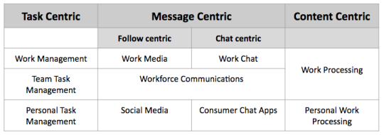
About Work Processing
Using something like Dropbox Paper as a way to share work-related information is quite different than using a work management tool. Instead of putting lists of tasks at the center of the stage, relatively unstructured content – written text, images, tables, videos, audio, and other forms of content – takes the central role in information sharing, while tasks are indicated by checklists.
Metaphorically, work management is based on the human tendency toward making lists, while work processing relies on our natural urge to tell stories.
Metaphorically, work management is based on the human tendency toward making lists, while work processing relies on our natural urge to tell stories. Or, less romantically, work processing is more like writing in a journal, where occasionally you might add a list of things to do, but where the prose is where the most important information is found.
Using Dropbox Paper as a Work Processing Journal
For several weeks, I have used Dropbox Paper as a work processing journal. This experiment has not involved others, so the social dimension has been limited, but I’ve used Paper with teams in a few projects before, so I can talk to how that might work.
At the start, let me say that Dropbox Paper would be way more effective as a work processing solution if checklists were more task-like, and not just one of various sorts of lists, like bulleted or numbered lists. While checklist items can be used to indicate a task, and the checkbox can be checked to indicate being completed, if checklist items only had a bit more of a task model – with due dates, assignment, and so on – I would be more likely to promote Paper as a foundation for work processing.
Adopting the journaling model is straightforward. For each week, I create a new Paper document titled ‘week <Monday’s date>’, like ‘week 2016-08-29′. I define a Paper section to each day of the week, like 2016-08-29, or 2016-08-31. Then, for each day, I write notes and create tasks in one of the three timeframes:
Here’s a screen capture (edited) of such a week journal:

Note the section markers in the left margin, where a click takes the viewer to the appropriate section, in this case, the five days of the workweek.
I haven’t displayed Paper comments: any piece of the doc can be selected and a right margin comment can be attached.
Collaborators can be @mentioned anywhere, which leads to them being notified. This requires them to be sharing the doc.
I started to used #tags in the document, although they aren’t supported yet, but it works for searching already, externally or internally.
I also create individual docs for calls and meetings, since they are better shared in that granularity, but I will often retrospectively copy some lines and/or tasks from such a call/meeting document back into the week journal, since it serves more as the system of record than individual call/meeting docs.
Where Dropbox Paper Falls Short in Work Processing
I’ve mentioned the problems with using checklist items as tasks, already, as the major issue with using Dropbox Paper in this way.
Other aspects of the experiment worked surprisingly well for me. I thought I’d miss a rich task model – due dates, notifications, etc. – more than I did. What I learned is that I relied on propinquity: the week journal doc was basically open all day, and as I was adding more information to the various sections I would reacquaint myself with things I need to be working on for Friday, or next week, as I entered new content. And I felt like I had a better big picture sense of what I was working on each day and for the week, than when I just relied on a work management list of tasks.
It would also be great – since Paper supports the idea of doc sections – if sharing could be linked to the section level of a doc, and not just the doc as a whole. Then I could create a section in a journal doc for a single meeting, for example, and invite those attending to share just that section.
However, the core problem I’ve encountered is the dimension of time. Journaling and task management aren’t organized around semantic nesting of docs in folders or the semantic structuring of content within docs, which is the organizing principal of Dropbox Paper (and other tools like it). Journaling and task management should naturally be based on time – hours, days, weeks, and months – not semantic nesting. Yes, I created a form of doc based on a weekly journal, but it’s not native to Paper, just a poor approximation.
In my next post in this series, I will be writing about an alternative to content-centric work processing, one that starts with the calendar as its foundation. Coming next in the Work Processing series: Beyond the Calendar, to Work Journaling.
 I am, once again, very happy to announce the publication of another edition of Managing Humans. It’s been over four years since the last update to this book, and I’m shocked we’re still talking about it.
As with each edition of these books, there are topics of note:
There’s a third edition because the Rands in Repose readers continue to support the writing. It wouldn’t happen without you.
Thank you.

Alastair Creelman,
The corridor of uncertainty,
[Sept] 08, 2016
Although admitting "it is too late to radically turn the tide" Alastair Creelman offers advice to make social networks more friendly and more social. "Sadly most posts in my feed are just soapboxing or commercial. Many simply broadcast "evidence" for their particular ideology and in many cases there is no real invitation to discussion." I don't think we as individuals can change that trend in the major social networks precisely because this runs counter to the interests of their advertisers.
[Link] [Comment]
European Schoolnet,
[Sept] 08, 2016
I'm not generally a fan of "x in the classroom" type resources because my focus is on online learning. To me, the objective is to get learning out of the classroom and into the community. That said, I thine this resource because it looks at how one topic - space and space exploration - can be used to introduce multiple topics - in this case, inquiry-based learning, ICT tols, diversity and gender balance, and careers in space and space-related industries. "It aims to educate teachers how to introduce and attract more and more young people to careers in space."
[Link] [Comment]
David Politis,
LinkedIn,
[Sept] 08, 2016
The title of this post is way overstated. But the post nonetheless contains a neat idea: a 'user manual' for you! "Basically, the user manual is a “ how to work with me” guide: It outlines what you like, what you don’ t like, how you work best. It was something these CEOs would give their team members when they joined the company in order to shorten the learning curve of working with them." Of course - why limit it to CEOs? Why not for individual people! Here's mine.
[Link] [Comment]
John Hagel,
Edge Perspectives,
[Sept] 08, 2016
The interesting thing about the meeting I was at in Capri was that there were people from Udacity, EdX, Coursera, and other MOOC initiatives, and how much of the discussion focused around preparing people for jobs. "That's the scam," I argued. We're not preparing people for success if we're preparing them for jobs; quite the contrary. This post from John Hagel reflects a similar sentiment. "What we need are learning environments that will draw out and nurture capabilities that today are only in the background, if present at all – capabilities like creativity, imagination, curiosity, and emotional and social intelligence that transcend conventional disciplinary boundaries." We need to foster a new sort of literacy.
[Link] [Comment]With my Lumia 920 AWOL, I've been occasionally using my girlfriend's iPhone 5 to take some pictures when out. It has a great camera. That's for sure. I'm still undecided on whether it shoots superior pictures to the Lumia 920; the winner varies from picture to picture. However, despite its technical excellence, I've not found the physical act of taking pictures with it as satisfying as the Lumia. Why? No dedicated camera button. Touching the screen to snap a picture just feels awkward. And, no, the volume up button is no substitute for a dedicated shutter, because of both its small size and unintuitive location.
If I ever move away from Windows Phone, I'm confident losing the dedicated shutter button will be in the top three list of things I'll miss about carrying one. And, so now more than two years since Windows Phone 7's release, I'm quite surprised there are not more phones on the market that momentarily make you forget you're holding a phone when taking a picture.
In part one of this two-part series about how we went about building an Alpha website for Wellcome Library, we looked at how we turned ‘subject headings’ into webpages.
This post looks at the second major type of aggregation pages we settled on: people.
At first we were tempted to refer to these as ‘authors’, using the language of books, but of course the library isn’t just books, and so sometimes the people might be editors, collaborators, artists (the library has an art collection too), scientists credited on academic papers, and so on.
Within the MARC metadata we were given, people are referenced mostly in the 100 field (‘Main Entry–Personal Name’), but also in the 700 field (‘Added Entry-Personal Name’). As far as we could make out, there’s only ever one person in the 100 field (with only a couple of exceptions), but there could be many in the 700. It wasn’t clear to us what the semantic difference was, so we took the decision to merge them all together.
Each person field contains a bunch of sub-fields for the person’s name, title (Mr, Mrs, Sir, etc) and dates (normally just birth and/or death), as well as some other lesser-used sub-fields like ‘numeration’ (e.g. the ‘II’ in Pope John Paul II) and ‘attribution qualifier’ (used for describing someone as the ‘pupil of’ an artist, when the actual artist is unknown).
One awkward stumbling block was that the name of the person followed the library tradition of being in ‘surname-comma-firstnames’ format. This convention makes it easy for computer systems to sort by surname, which historically has probably been the most useful order for readers. But we felt strongly that it is the least user-friendly way of actually reading people’s names, as it inverts the natural order of the way we pronounce people’s full names (no-one talks about ‘Hawking Steven’, but ‘Steven Hawking’ is a household name). Switching the order back sounds like a simple task (split the string at the last comma, then reverse the order), and mostly is, but there are always exceptions – and where we encounter strings like “Peter, of Celle, Bishop of Chartres,ca”, it’s a bit harder to turn these back into more readable names.
With our goal being to make the library catalogue browsable (rather than just searchable), our next task was to find ways to enrich the information about the people in the database, helping readers to find out more about them (which may in turn shed some light on what the content of the book is likely to be).
Like with subjects, many of the 100 and 700 people fields contain an ID linking the person to an external authority file. Unlike with subjects though, we only encountered a single authority file in use: the Library of Congress Name Authority.
Where they existed, we could use these IDs to make sure that multiple books by the same person would appear on the same single person page, even if their name was spelt out or punctuated differently on the different records.
It would have been tempting to use these Library of Congress IDs within the URL structure of the Alpha site. But because they weren’t always present (either because that person isn’t in the LOC authority file, or just because the record has been matched up), we couldn’t do that, and so minted our own IDs instead. For simplicity’s sake, these are simple numbers, but preceded by the letter ‘P’ (for person).
We discovered an existing project called VIAF, which aims to link together name authority files from many different institutions across the globe. By querying this database with the Library of Congress IDs, we collected up all the other IDs that were available. This means we can construct links from the people pages on the Wellcome Library website to the equivalent pages on other catalogues, such as the national libraries of France, Germany, Spain, Canada, and many more.
Pleasingly, VIAF has also collected IDs referencing Wikipedia pages. As Wikipedia allows others to uses its content under a Creative Commons licence, we could query the site (using its API) and display the content on our person pages. We decided to display the first two sentences (with a link to Wikipedia to read the full biography), on the basis that that’s usually enough information to get a sense of what the person is mostly known for. We also removed any text from Wikipedia in parentheses, as these are normally dates (which we show elsewhere), a pronunciation guide to their name, or other minor details that weren’t needed for a quick read.
As well as text, we also collected the images from the Wikipedia page, and use the first one (if there are any) within a circle to illustrate the person on both their person page and aggregation pages. This mostly works – where it’s a photo or drawing of the person, or even if it’s a scan of one of their works – but does sometimes show a slightly misleading image.
There was a small amount of concern over using Wikipedia as a source of content (although most were positive). One issue is what might happen if we pull the content from Wikipedia at a point in time when that page has been vandalised. We could mitigate that to some extent by regularly updating our content on a rolling schedule (and relying on the community to resolve) – but to allow for any major issues to be resolved more quickly than that, we added an admin feature to immediately refresh the content from Wikipedia. So if someone at Wellcome spots a page where the Wikipedia introduction is inaccurate or contains vandalised content, they can fix it on Wikipedia itself, and then have those changes reflected on the Wellcome Library page.
As well as the Wikipedia intro, we added a feature allowing Wellcome staff to add a separate intro to be displayed alongside it. Our rule of thumb here was that this intro should be specific to the Wellcome institution, rather than repeating the sort of general information that might be on a Wikipedia biography. So things like that person’s relationship to Wellcome (e.g. if it’s Henry Wellcome himself) or noting what sort of material from that person was available at the Wellcome Library (which could be quite a lot, if it’s one of the people whose personal archives are held there).
After these context-setting introductions and photo, we display some data about that person collected from the catalogue itself: things like the subjects their works are mostly about, a timeline of when their works were created/published and what format their works are mostly in. More experimentally, we tried displaying some links to other people who are the “contemporaries” of that person. This query changed a few times as we tried to refine it, and ended up being something along the lines of “people who have produced works about the some of same subjects and who were born within 10 years”. It sometimes works well, sometimes doesn’t.
Finally, we added the ability to highlight ‘interesting’ people to appear on the homepage.
Our last and most recent step was to go back and use an additional type of metadata that we originally missed: field 600 which contains people, but who are the subject of a work rather than its creator. Pleasingly for these ‘person-as-subject’ pages we could re-use the simple URL structure for subject pages (/subjects/S1234) but replacing the S-number for the person’s P-number. (One key benefit of differentiating your IDs for different types of things).
I'm kind of an A/V nerd. Now I'm not hardcore enough to have a vinyl collection or have an amp for my TV, but all my headphones cost over $100 and I have a Sonos Playbar so I don't have to put up with crappy TV speakers. What I'm trying to say is that I care about the A/V equipment I use, but not to the extent that money is no object when it comes to my enjoyment of a movie (I'm not that rich and my wife would kill me if I spent that kind of money on electronics). That means I tend to research extensively before making a major A/V purchase since I don't do it very often and I want quality within reason which does not lend itself to impulse buying.
Prior to September 1, 2016, I had a 2011 Vizio television. It was 47", did 1080p, and had passive 3D. When I purchased the TV I was fresh out of UBC having just finished my Ph.D. so it wasn't top-of-the-line, but it was considered very good for the price. I was happy with the picture, but admittedly it wasn't amazing; the screen had almost a matte finish which led to horrible glare. I also rarely used the 3D in the television as 3D Blu-Ray discs always cost extra and so few movies took the time to actually film in 3D to begin with, instead choosing to do it in post-production (basically animated films and TRON: Legacy were all that we ever watched in 3D). And to top it all off, the TV took a while to turn on. I don't know what kind of LCB bulbs were in it, but they took forever to warm up and just annoyed me (yes, very much a first-world problem).
So when UHD came into existence I started to keep an eye on the technology and what television manufacturers were doing to incorporate the technology to entice people like me to upgrade. After two years of watching this space and one of the TVs I was considering having a one-day sale that knock 23% off the price, I ended up buying a 55" Samsung KS8000 yesterday. Since I spent so much time considering this purchase I figured I would try and distill what knowledge I have picked up over the years into a blog post so that when you decide to upgrade to UHD you don't have to start from zero knowledge like I did.
First, you don't care about the resolution of the TV. All UHD televisions are 4K, so that's just taken care of for you. It also doesn't generally make a difference in the picture because most people sit too far away from their TV to make the higher resolution matter.
No, the one thing you're going to care about is HDR and everything that comes with it. And of course it can't be a simple thing to measure like size or resolution. Oh no, HDR has a bunch of parts to it that go into the quality of the picture: brightness, colour gamut, and format (yes, there's a format war; HD-DVD/Blu-Ray didn't teach the TV manufacturers a big enough lesson).
A key part of HDR is the range of brightness to show what you frequently hear referred to as "inky blacks" and "bright whites". The way you get deep blacks and bright whites is by supporting a huge range of brightness. What you will hear about TVs is what their maximum nit is. Basically you're aiming for 1000 nits or higher for a maximum and as close to 0 as possible for a minimum.
Now of course this isn't as simple as it sounds as there's different technology being used to try and solve this problem.
Thanks to our computers I'm sure everyone reading this is familiar with LCD displays. But what you might not realize is how they exactly work. In a nutshell there are LED lightbulbs behind your screen that provides white light, and then the LCD pixels turn on and off the red/green/blue parts of themselves to filter out certain colours. So yeah, there are lightbulbs in your screen and how strong they are dictates how bright your TV screen will be.
Now the thing that comes into play here for brightness is how those LED bulbs are oriented in order to get towards that 0 nits for inky blacks. Typical screens are edge-list, which means there is basically a strip of LEDs on the edges of the TV that shine light towards the middle of the screen. This is fine and it's what screens have been working with for a while, but it does mean there's always some light behind the pixels so it's kind of hard to keep it from leaking out a little bit.
This is where local dimming comes in. Some manufacturers are now laying out the LED bulbs in an array/grid behind the screen instead of at the edges. What this allows is for the TV to switch dim an LED bulb if it isn't needed at full strength to illuminate a certain quadrant of the screen (potentially even switching off entirely). Obviously the denser the array, the more local dimming zones and thus the greater chance a picture with some black in it will be able to switch off an LED to truly get a dark black for that part of the screen. As for how often something you're watching is going to allow you to take advantage of such local dimming due to a dark area lining up within a zone is going to vary so this is going to be a personal call as to whether this makes a difference to you.
If I didn't have a budget and wanted the ultimate solution for getting the best blacks in a picture, I would probably have an OLED TV from LG. What makes these TVs so great is the fact that OLEDs are essentially pixels that provide their own light. What that means is if you want an OLED pixel to be black, you simply switch it off. Or to compare it to local dimming, it's as if every pixel was its own local dimming zone. So if you want truly dark blacks, OLED are the way to go. It also leads to better colours since the intensity of the pixel is consistent compared to an LCD where the brightness is affected by how far the pixel is from the LED bulb that's providing light to the pixel.
But the drawback is that OLED TVs only get so bright. Since each pixel has to generate its own light they can't reach really four-digit nit levels like the LCD TVs can. It's still much brighter than any HD TV, but OLED TVs don't match the maximum brightness of the higher-end LCD TVs.
So currently it's a race to see if LCDs can get their blacks down or if OLEDs can get their brightness up. But from what I have read, in 2016 your best bet is OLED if you can justify the cost to yourself (they are very expensive televisions).
While having inky blacks and bright whites are nice, not everyone is waiting for Mad Max: Fury Road in black and white. That means you actually care about the rest of the rainbow, which means you care about the colour gamut of the TV for a specific colour space. TVs are currently trying to cover as much of the DCI-P3 colour space as possible right now. Maybe in a few years TVs will fully cover that colour space, at which point they will start worrying about Rec. 2020 (also called BT.2020), but there's still room in covering DCI-P3 before that's something to care about.
In the end colour gamut is probably not going to be something you explicitly shop for, but more of something to be aware of that you will possibly gain by going up in price on your television.
So you have your brightness and you have your colours, now you have to care about what format all of this information is stored in. Yes my friends, there's a new format war and it's HDR10 versus Dolby Vision. Now if you buy a TV from Vizio or LG then you don't have to care because they are supporting both formats. But if you consider any other manufacturer you need to decide on whether you care about Dolby Vision because everyone supports HDR10 these days but no one supports Dolby Vision at the moment except those two manufacturers.
There is one key reason that HRD10 is supported by all television makers: it's an open specification. By being free it doesn't cut into profits of TVs which obviously every manufacturer likes and is probably why HDR10 is the required HDR standard for Ultra Blu-Ray discs (Dolby Vision is supported on Ultra Blu-Ray, but not required). Dolby Vision, on the other hand, requires licensing fees paid to Dolby. Articles also consistently suggest that Dolby Vision requires new hardware which would also drive up costs of supporting Dolby Vision (best I can come up with is that since Dolby Vision is 12-bit and HDR10 is 10-bit that TVs typically use a separate chip for Dolby Vision processing).
Dolby Vision does currently have two things going for it over HDR10. One is that Dolby Vision is dynamic per frame while HDR10 is static. This is most likely a temporary perk, though, because HDR10 is gaining dynamic support sometime in the future.
Two is that Dolby Vision is part of an end-to-end solution from image capture to projection in the theatres. By making Dolby Vision then also work at home it allows for directors and editors to get the results they want for the cinema and then just pass those results along to your TV without extra work.
All of this is to say that Dolby Vision seems to be the better technology, but the overhead/cost of adding it to a TV along with demand will ultimately dictate whether it catches on. Luckily all TV manufacturers has agreed on the minimum standard of HDR10 so you won't be completely left out if you buy a TV from someone other than LG or Vizio.
When it comes time to buy a TV, I recommend Rtings.com for advice. They have a very nice battery of tests they put the TV through and give you nice level of detail on how they reached their scores for each test. They even provide the settings they used for their tests so you can replicate them at home.
You can also read what the Wirecutter is currently recommending. For me, though, I prefer Rtings.com and use the Wirecutter as a confirmation check if their latest TV round-up isn't too out-of-date.
If you want a very simple way to help choose a television, you can simply consider ones that are listed as Ultra HD Premium. That way you know the TV roughly meets a minimum set of specifications that are reasonable to want if you're spending a lot of money on a TV. The certification is new in 2016 and so there are not a ton of TVs yet that have the certification, but since TV manufacturers like having stamps on their televisions I suspect it will start to become a thing.
One thing to be aware of is that Vizio doesn't like the certification. Basically they have complained that the lack of standards around how to actually measure what the certification requires makes it somewhat of a moot point. That's a totally reasonable criticism and why using the certification as a filter for TVs consider is good, but to not blindly buy a TV just because it has Ultra HD Premium stamp of approval.
Much like when I bought a soundbar, I had some restrictions placed upon me when considering what television I wanted. One, the TV couldn't be any larger than 55" (to prevent the TV from taking over the living room even though we should have a 65" based on the minimum distance people might sit from the TV). This immediately put certain limits on me as some model lines don't start until 65" like the Vizio Reference series. I also wasn't willing to spend CAD 4,000 on an LG, so that eliminated OLED from consideration. I also wanted HDR, so that eliminated an OLED that was only HD.
In the end it was between the 55" Samsung KS8000, 55" Vizio P-series, and the 50" Vizio P-series. The reason for the same Vizio model at different sizes is the fact that they use different display technology; the 50" has a VA display while the 55" has an IPS display. The former will have better colours but the latter has better viewing angles. Unfortunately I couldn't find either model on display here in Vancouver to see what kind of difference it made.
One other knock against the Vizio -- at least at 55" -- was that it wasn't very good in a bright room. That's a problem for us as our living room is north facing with a big window and the TV is perpendicular to those windows, so we have plenty of glare on the screen as the sun goes down. The Samsung, on the other hand, was rated to do better in a glare-heavy room. And thanks to a one-day sale it brought the price of the Samsung to within striking distance of the Vizio. So in the end with the price difference no longer a factor I decided to go with the TV that worked best with glare and maximized the size I could go with.
My only worry with my purchase is if Dolby Vision ends up taking hold and I get left in the cold somehow. But thanks to the HDR10 support being what Ultra Blu-Ray mandates I'm not terribly worried of being shut out entirely from HDR content. There's also hope that I might be able to upgrade my television in the future thanks to it using a Mini One Connect which breaks out the connections from the television. In other TVs the box is much bigger as it contains all of the smarts of the television, allowing future upgrades. There's a chance I will be able to upgrade the box to get Dolby Vision in the future, but that's just a guess at this point that it's even possible, let alone whether Samsung choose to add Do
It's been 48 hours with the TV and both Andrea and I are happy with the purchase; me because the picture is great, Andrea because I will now shut up about television technology in regards to a new TV purchase.

Apple is about to drop the 3.5mm headphone jack from the next iPhone, or so we hear. Whoever makes wireless headsets should be happy about that. As a customer however, you have to weigh your options. Traditional over-the-ear or on-ear headsets works just the same as with a cable and they offer all-day battery life.
With in-ear headsets however, there are many different designs, and all manufacturers offer a wide range of options. Since I will be talking about different products in the next weekswe should talk designs and concepts first.
Completely wireless: This is the new thing. Two earbuds, no cable. The challenge is the wireless link. Phones or watches use Bluetooth to talk to the headset, but how do the earbuds talk to each other? They cannot both talk to the phone at the same time. So one of them is the endpoint for Bluetooth and then it talks to the other one. If you want to use Bluetooth to talk to the other one, there is an obstacle. Between those earbuds is a brain, which contains a lot of water. And that blocks Bluetooth radio. This is where some designs fail. Indoors you can bounce Bluetooth waves off the walls, but once you get outside it gets difficult. The Jabra Elite Sport just announced at IFA uses near field magnetic resonance technology found in hearing aids to overcome this obstacle.

Connected earbuds: This is so far my favorite technology. One earbud talks to the other over a wire that runs behind your neck. The Jaybird Freedom seems to be the most advanced of those designs. The earbuds are extremely small, most of the electronics are inside the control unit on the cable. A few days ago I also started using the Samsung Elite Active which follows the same design pattern.
Both of those designs share one problem. To make them comfortable, the battery has to be tiny. Since they are meant to be worn during exercise, they only run three to four hours. The Jabra ear buds are stored in charging case which can top them off twice, which gives you a maximum of 3 + 6 hours. The Freedom earbuds have a small charger that can be attached to the headset and gives you 4 + 4 hours.

Neckband-style: This is a very popular design in the US, which looked very weird at first but is getting refined. It puts the battery on your neck and thus lasts all day long for listening to music and making phone calls. The Jabra Halo Smart for instance lasts 17 hours on one charge. The technology is rather simple and those headsets are not expensive. You just don't want to use them for workouts. They provide one benefit over the other designs: you can wear just one ear bud for phone calls and both for music.
All of these designs share one problem: if you want bass, you need a good seal. Those small earbuds can only provide a full sound, if the sound waves don't escape from your ear. But if nothing escapes, nothing comes in. Passive noise cancellation is great when you want to be alone, but it's not so great if you can't hear a car coming from behind while riding a bicycle. There are two designs that mitigate this issue.

Sports headset: the Plantronics Backbeat Fit is a good example for a sports headset that does not seal your ear. It works like the Apple earbuds but they don't fall out since they are held by an elastic band behind your head and around your ears. While they work reasonably well, I find them too uncomfortable to wear for an extended time. They may look a bit like the neckband headsets but they provide the exact opposite experience.

Bone-conducting headset: Very similar in design to the sports headset, this particular design leaves your ears completely open. Yes, you read that right. There is nothing in your ear and you can hear everything like you were not wearing a headset at all. Instead those headset transmit the sound directly through your skull to the cochlea where you pick it up. I will be telling you about the Aftershokz Trek Titanium in a few days.
Things of note for the week ending Sunday September 4th, 2016.

Monochromatic edition. Because why not?
Come on in, the water’s lovely.

_______________
_________
_______________
THING ONE: DARK
“It’s been seven months since Emma died and two weeks since I started building a bot from her texts. I’m feeding every word she sent me into the system, every thought, every feeling.”

If you’re reading this near to someone, read the whole thing aloud.
It’s dark, poignant, and beautiful.
_______________
_________
_______________
THING TWO: LONG READS

It’s been two weeks since the closure of Gawker.com (if you know nothing of what I speak – start here with this New York Times report in May, then read this follow up piece, and then finally this round up from The Guardian) and, irrespective of your opinion who was in the ‘right’ on this one (most people are either: Tech billionaire throws tantrum! or Gawker invade privacy!), in its 14 years of history, Gawker has published some hella amazing articles.
Buzzfeed asked its own staff for their favourite Gawker pieces and pulled together a fantastic list (NOT a listicle) of Stories to Remember Gawker By.
Some seriously fantastic writing.
_______________
_________
_______________
THING THREE: NOT COOL

Frith Hookway writes:
‘In a similar vane as name dropping, name bombing is when someone’s name is used as a catalyst for getting something done faster.
–
For example, in an email or meeting we might say “so-and-so has asked for this by the end of the day” or “I’m doing work for you-know-who so really need everyone to pitch in”.
–
Without even thinking about it, I know I’m guilty of this. Many of us probably are.’
You’ve probably done this. I definitely have.
It’s not cool. I’m going to stop.
Are you?
Read more: ‘Name bombing: the not cool way of getting things done’
_______________
_________
_______________
THING FOUR: SPACE, MAN
Next on this week’s list of things, is ‘Never go to space it’s terrible omg‘(yes, that’s the actual title). A brilliant piece from Leigh Alexander that delves into the physical and psychological challenges that lie ahead for any ambitions star-travellers among us.
A sobering read (and bizarrely reminiscent of my recent play time on No Man’s Sky (if there’s one thing that this game manages to do it’s capture the real feeling of insignificance in a truly inconceivably large universe)) it looks at how much work our astronauts have to put into surviving the most hostile environment you can possibly imagine.
The known knowns are interesting.
The unknown knowns blow your mind (the Buzz Aldrin about halfway in, for example).
The unknown unknowns are the things that’ll literally stop us dead.
Our planet will attempt a manned trip to Mars in my lifetime. This piece goes some way to explain just how hard that’s going to be for those that will be onboard.
_______________
_________
_______________
THING FIVE: DIE DRAGON DIE

One of the wonderful (and yet super hard to communicate clearly) things about gaming online is the huge sense of camaraderie that can come from achieving a seemingly insurmountable feat. With death at hand, a clutch victory in the closing seconds of any match can go down in legend among your fellow players and, in many cases, forge life-long friendships along the way.
I speak from experience.
With that in mind, I read this story this morning about a band of brothers and sisters who put aside their differences to defeat an undefeatable creature and, in doing so, triggered a chain of events that had the senior management at Sony Online Entertainment sit up and pay attention.
Even if you’re not a gamer – this is an excellent read:
The Surprising And Allegedly Impossible Death Of EverQuest’s ‘Unkillable’ Dragon
_______________
_________
_______________
Bonuses this week are as follows –
_____________________________________
And finally, a couple of years ago I went to the Edinburgh Fringe Festival and, with my good friend Robbie, caught 18 different shows/performances/plays over the course of three days.
The very last one we saw was a one woman show by Pheobe Waller-Bridge.
The name of that show? Fleabag.

In my post-Fringe write up I wrote:
And it was.
Utterly, utterly brilliant.
That was three years ago.
Today, Fleabag is back. Waller-Bridge has adapted it for TV and you can find it on BBC iPlayer and, I believe very soon, on Amazon Prime. It is superb.
So superb that it gets its own separate section in this weeks THINGS.
Google it.
Find it.
Watch it.
Talk to others about it.
Then go and read all the other amazing things that have been written about it.
Waller-Bridge deserves every success off the back of this.
That is all.
_____________________________________
Right, I’m outta here.
Thanks for reading.
If you could do one thing for me this week it would be to tell a friend about this newsletter.
Until next time…

Driving closes the mind to everything except driving. Walking opens it.-Willard Spiegelman https://t.co/8y6riqYF1N
— Stowe Boyd (@stoweboyd) September 4, 2016
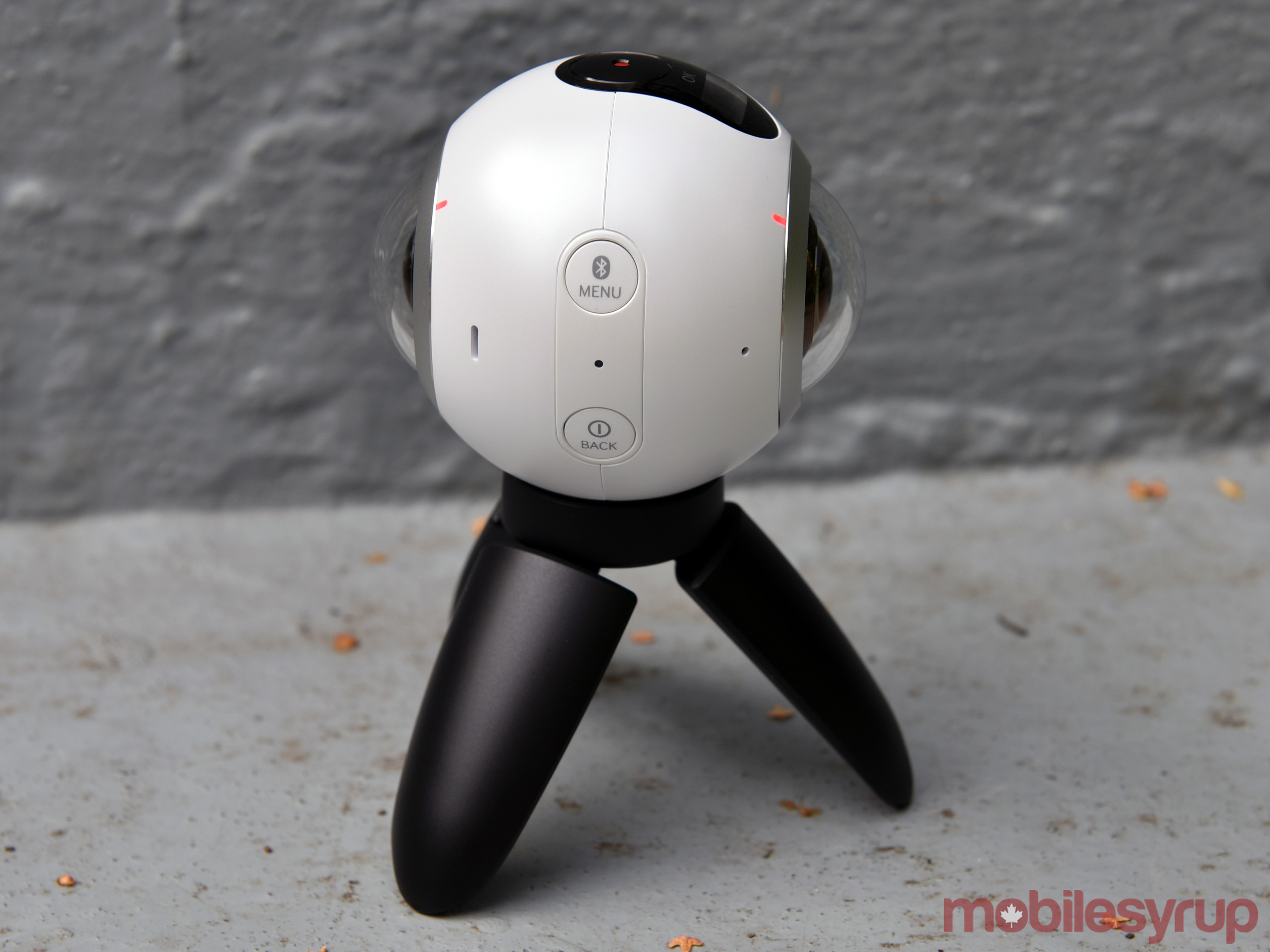
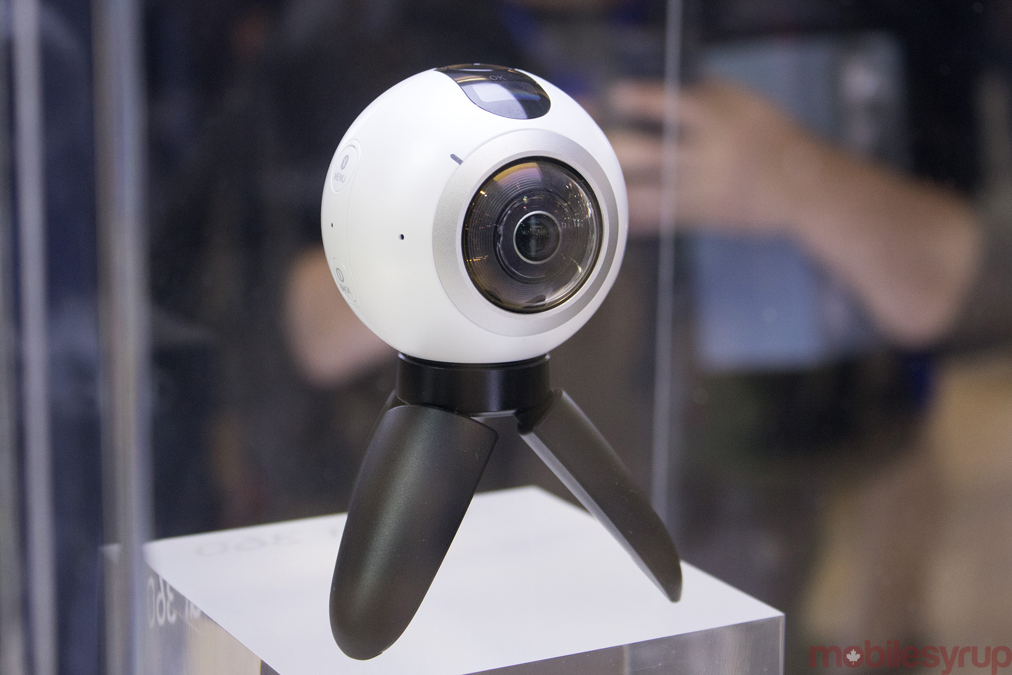
Close to the size of a billiard ball, and not far off from a grenade, the Samsung Gear 360 is meant to be versatile and explosive like those two objects, only in imaging terms. The South Korean company’s 360-degree content debut is a fine effort, so long as you have the tools required to use it.
The Gear 360 is intended to open up new perspectives for still shots and video, yet its limited compatibility only opens those doors to users who have the right gear. Working only with Samsung flagships — the Galaxy S7, S7 edge and Note 7 — the entire breadth of all other Android smartphones are left out. Not to mention iOS users.
Well, not entirely. It’s technically possible to use the camera with other Samsung and Android devices for all the modes that don’t shoot in 360-degrees. That sounds like a consolation, except the only reason to even consider this camera is to go the full way around.
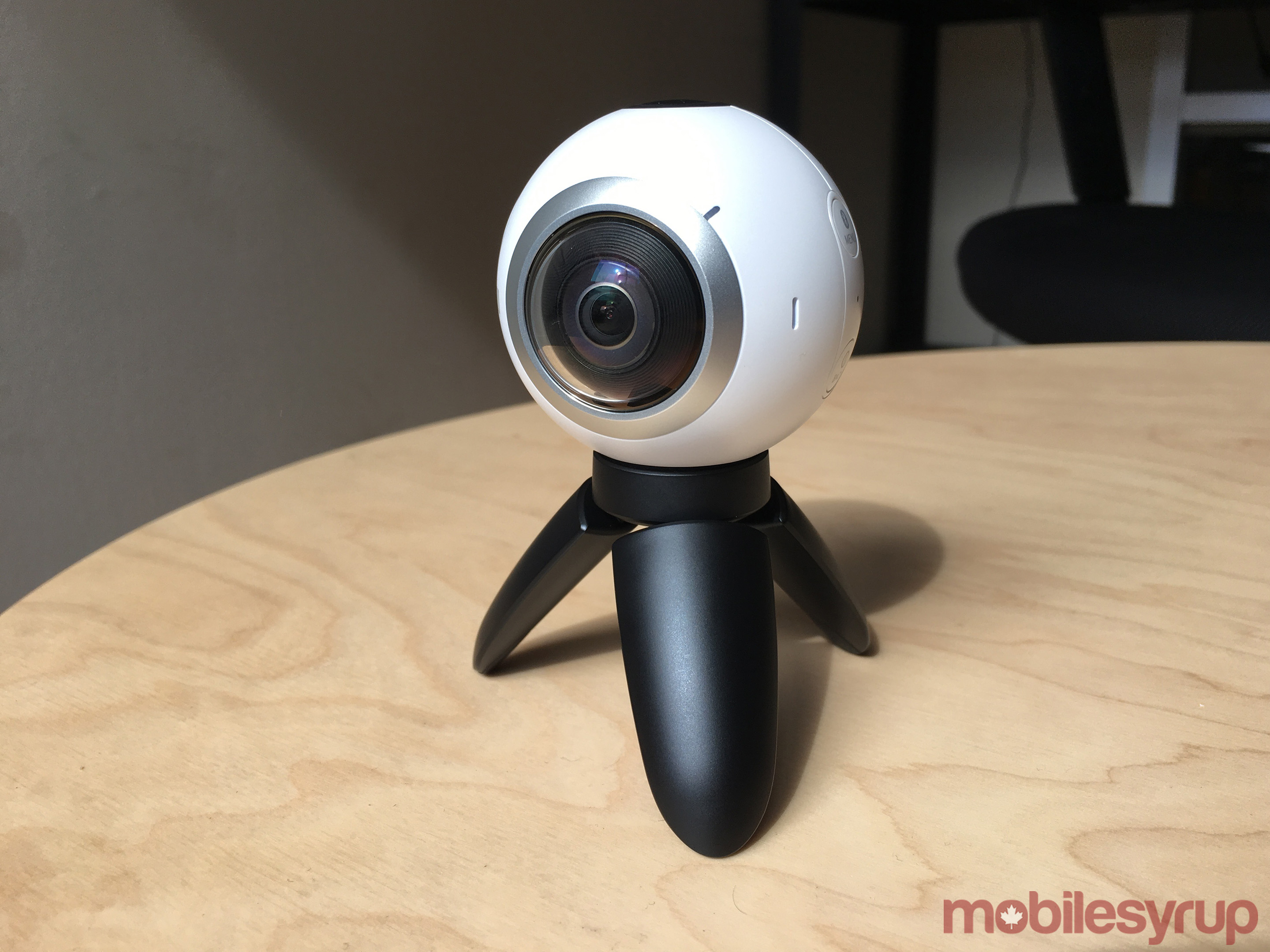
The camera and its features haven’t changed since the hands-on time we had with it a month ago. The basics are two equal 15 megapixel sensors with fisheye lenses capable of shooting up to 4K 3840 x 1920 pixels at 30fps, combining for 30 megapixel still images in 360-degrees. Individually, they are at 195-degrees with an f/2.0 aperture on each side.
When one lens is active, the Gear 360 shoots video at 2,560 x 1,440 pixels, including a setting for 60fps, which is better for faster movement. Still images are down to 5 megapixels in single-camera mode, shooting up to 30 megapixels (3,072 x 1,728) spherically when both cameras are used.
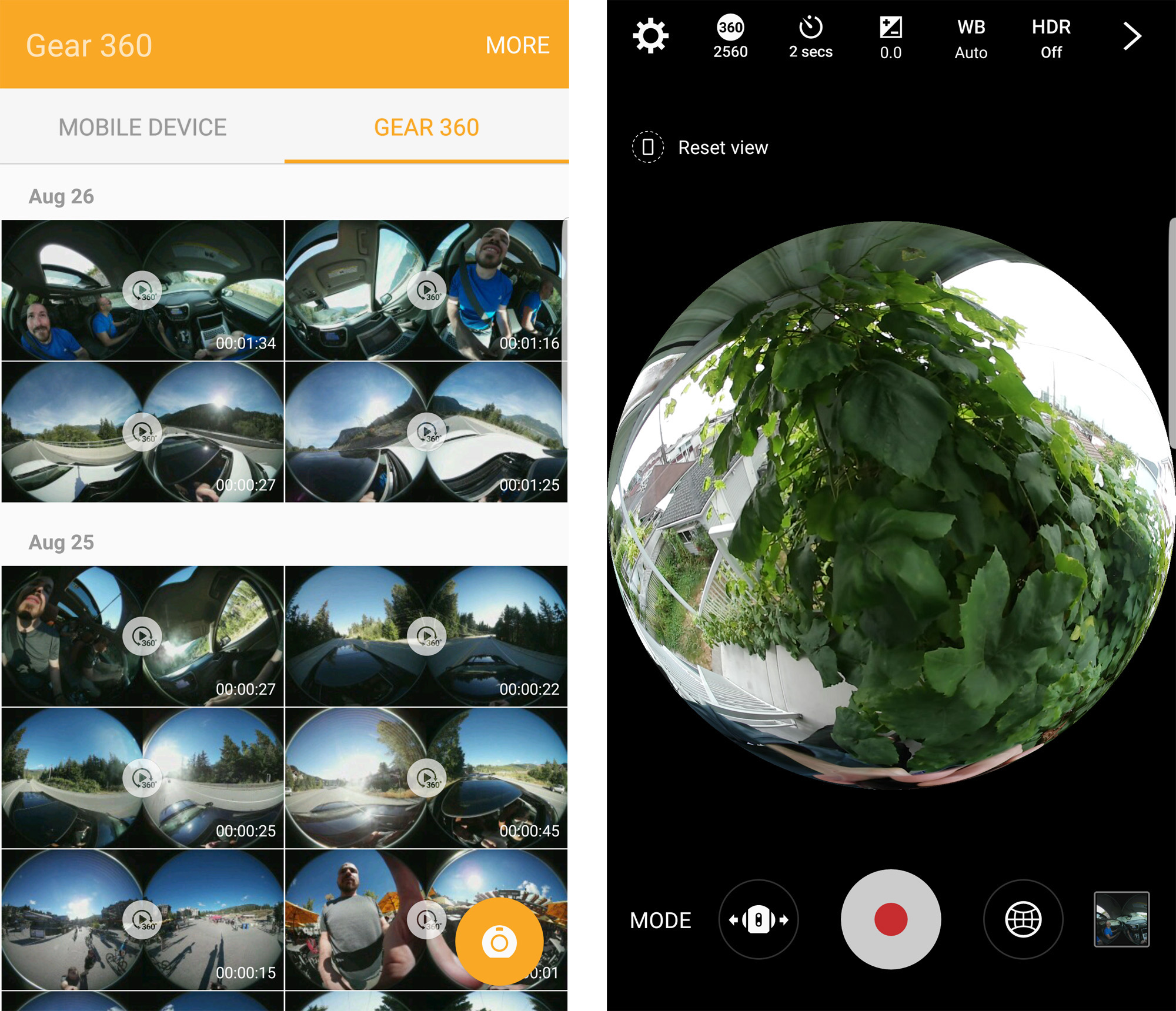
While the two can shoot simultaneously, stitching the images together happens afterward on the phone running the Gear 360 Manager app when connected via Wi-Fi or upon transfer over to the device. There is a desktop app that can accomplish the same thing when the camera is plugged in directly via USB.
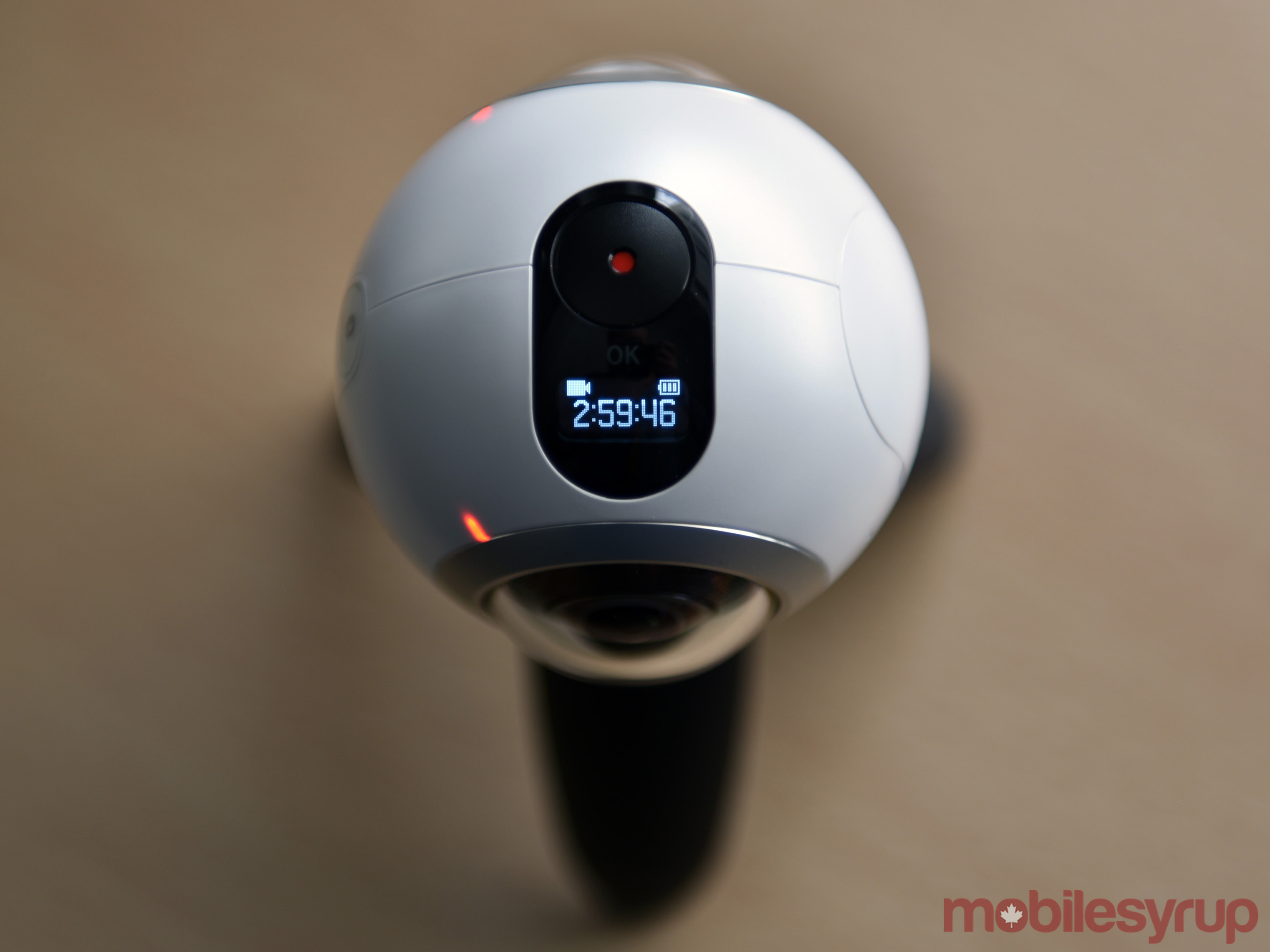
The Gear 360 itself does actually have a front and back, though that wasn’t immediately obvious to me off the bat. The lens with the small LCD right above is the front, with the other being the rear. The microphones are pretty symmetrical, and small LEDs are noticeable on the frame on each side to indicate whether the lenses are active or not. The record button at the top can trigger recording manually, though remote functions through the phone’s app can start and stop recordings, too.
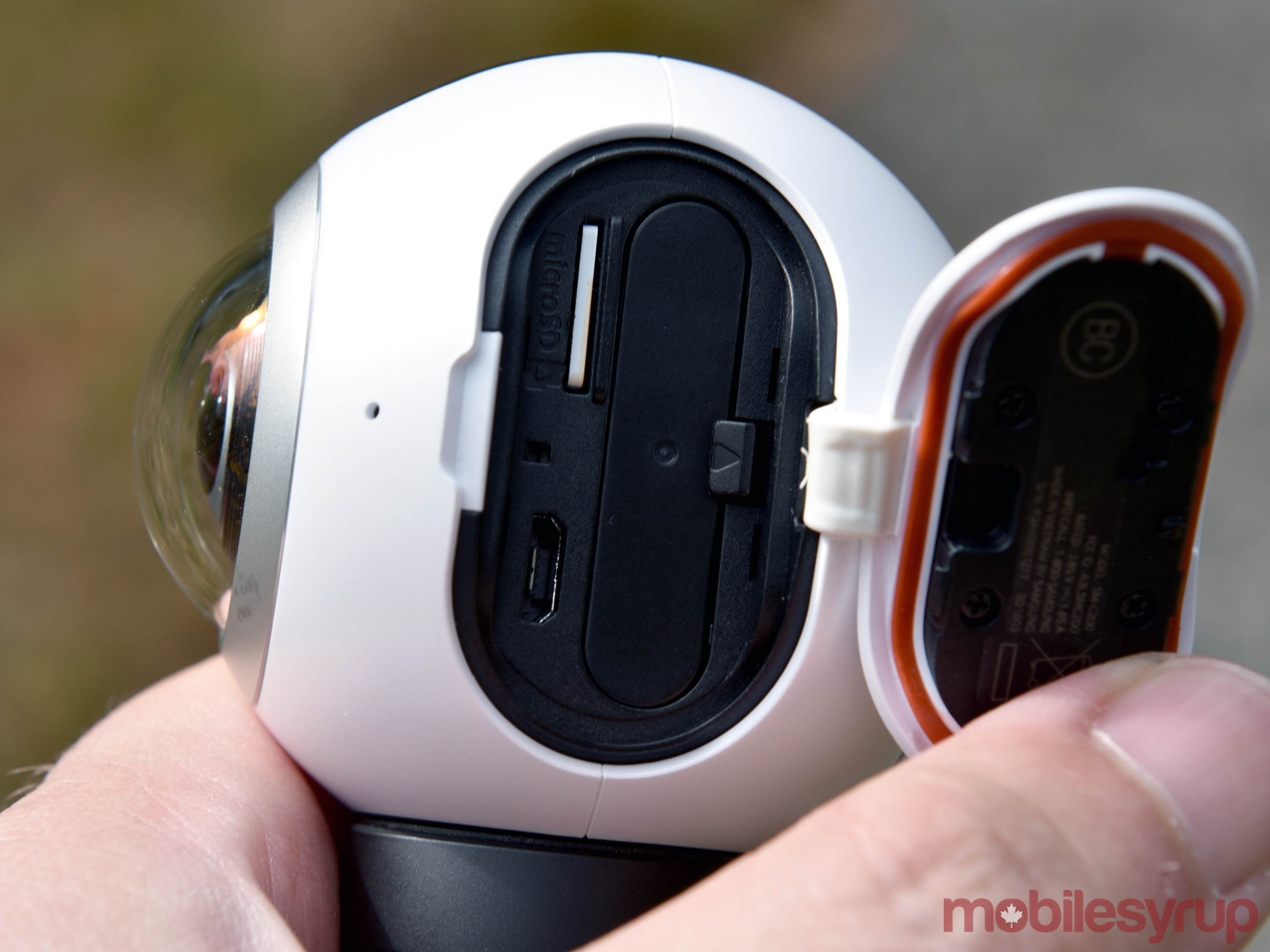
An NFC tag lies next to the compartment, which has a slot for a microSD card (maxing out at 128GB), 1,350mAh removable battery and microUSB port for charging and data transfer to computers. The Back button doubles as the power button, while the Menu button can initiate Bluetooth pairing and cycle through the options appearing on the small LCD. Making selections on the menu then requires pressing the back button.
Underneath, the screw-in mount becomes key to the Gear 360’s deployment and usability. Samsung includes a small tripod with the unit, which is fine for basic situations, but larger tripods and monopods are far more important in capturing footage under different conditions.
The Gear 360 app proved just as important because the camera was otherwise shooting blind. Until I could preview what I shot on the app, I had no idea how well or how bad footage or images would have turned out. Other 360-degree cameras have exactly the same challenge, so it’s not a strike against this one, only that trial-and-error is required to understand how this thing really shoots.
Samsung has marketed the Gear 360 as being much like a point-and-shoot because of the expanse it covers. That’s only true if the stitching is good and it’s angled right. LG had this problem with its 360 Cam, whereas Samsung manages to evade it more often here.
Shooting in 360-degrees is a novelty because it’s new, but it doesn’t engender the kind of slice of life and validation-seeking snaps people take every day and post on social media. A random shot with the Gear 360 felt pedestrian because there was nothing to note that was more exciting spherically compared to a standard flat image.
That makes it very much an experiential camera meant to capture the mood of a scene in a way that a flat image couldn’t. Those scenarios aren’t easy to find to begin with, so I felt fortunate that I was able to and try it while travelling through Whistler, B.C. Travel is a natural fit for the Gear 360, even if its form factor doesn’t make it pocketable. The soft pouch it comes with is a nice way to protect the lenses, but again, quick snaps are not where this camera excels.
Planning a shot with the Gear 360 is really about preparation. For example, knowing I would be doing the Sasquatch zip-line there, I knew I needed a tough monopod with some extension and a wrist strap, lest I lose the handle while going over 100km/h down the line.
Sadly, the one video clip that came out corrupted was the one during the zip-line. MobileSyrup has contacted Samsung Canada to determine the cause, as the app never provided any explanation, and all troubleshooting attempts have proven futile since.
In most cases, I wanted to try shooting with the Gear 360 in a way that would remove me completely from the shot after stitching. That was near impossible unless I mounted it somewhere, controlled it remotely from the phone and hid behind a wall that was within range.
If I wanted a hands-free shooting situation where I needed to be in the shot, mounting it on myself or a flat surface of some kind required a mounting solution Samsung doesn’t provide. Third-party mounts that work with the standard screw are abundant, so that’s not an issue, it’s the recurring theme of thinking ahead in deployment preparation that can make or break a prospective shooting scenario.
The IP5 rating for water and dust resistance has no real practical value, unless a splash of rain hits the body. This is a camera that is not to be submerged under any circumstances, and even contact with sand and snow is probably not a good idea, thereby limiting its setup unless placed safely so as not to fall over.
The saving grace is that image quality is consistent, holding up well under varying circumstances. It handles movement well, and while not amazing in low-light and night settings, it’s not bad.
Indeed, measured expectations are necessary here. Exposure control isn’t outstanding, so shooting a backlit subject, for instance, will lack balanced lighting. Edges will look a little frayed with colours lacking saturation in some areas. Stitching may even be misaligned. Some of this is predictable after a while, but surprises could always pop up.
The Gear 360 closes a functional triangle that Samsung wants users to embrace because it’s a walled garden. Create 360-degree content on the Gear 360, view it and edit it on a compatible Samsung device, and then view it openly wearing a Gear VR headset.
Social media is slowly catching on, with Facebook and Flickr recognizing 360-degree content uploaded to the site. YouTube is trying to do its best with video. Only a matter of time before the other social networks do the same, broadening the scope and opportunity to share such content.
The Gear 360 is a good way to get into this kind of action because it does get better as the user gets better. Plus, firmware and software updates could conceivably address some of the shortcomings I’ve noted, assuming Samsung maintains a commitment to doing so.
I used the Gear 360 largely as a start-and-stop camera where it was powered on and off often. That saved battery life considerably, allowing me to shoot the following day after charging, but once I let it go and shot minutes and minutes of footage with both lenses, the battery lost juice quickly. Still, unless the camera is on constantly, keeping the lights on won’t be a problem for a full day or two.
The battery is not only replaceable, but easy to find in the aftermarket because of its fairly common size. However, make sure that the dimensions are accurate, as even the slightest variation could be a problem squeezing into the small battery compartment.
At $499, the Gear 360 is firmly priced for the enthusiast interested in shooting content this way. Otherwise, it’s arguably out of the price range for those who are curious. That falls in line with where 360-degree imaging is today anyway — many may find it cool, but only a minority are excited enough to take the full plunge and pay to be an early adopter.
Samsung’s first attempt to woo whomever may fall under the latter camp is a solid one, and the potential for ironing out some kinks via software updates bodes well for the camera’s performance later on. The company’s propensity, however, for quick evolutionary follow-ups on its hardware might give others pause that something newer is coming sooner than later.
For the here and now, the Gear 360 is one of the best 360-degree cameras available if you have one of the compatible Samsung phones in hand. If not, you can look elsewhere unless Samsung opens up the gates to everyone else.
Thomas Pynchon, Bleeding Edge
Every designer knows Stefan Sagmeister. He carved type into his own flesh, for a poster design. He allows anyone peer directly into his studio, day or night. He goes on sabbatical every 7 years (he manages the cost by offsetting his retirement). And he created an exhibit focused on happiness. Some dismiss his work as gimmicky, but that’s a reductive viewpoint. I suspect the truth is that his work/thinking is so iconic the rest of us meat-and-potatoes designers are jealous.
Sagmeister doesn’t try to design things that look like design. He seems to ignore what everyone else is doing and instead concentrates on making his work surprising. This is notable because most (regardless of profession) only try to be as good as everyone else. This is fine when you’re learning (we all learn through imitation at some point). But, there’s a time when copying others is no longer useful in one’s development.
The question you should ask, is: Why do so many willingly make work that only meets the bar? An excuse is easy. The most common one is something like: “I could do stuff like Sagmeister, if I had clients like his.” My hunch is that your clients are like his, though. The difference is that he learned to convince these people to take a risk with one of his ideas. That’s a notable skill, which few talk about. Making something innovative is one thing. To get past the bar, though, you also need to persuade others to take a chance on what you’re doing.
Sagmeister isn’t the only maker who goes past the bar. Henry Darger created a 15,000 page book, and later a 10,000 page one, both of which went unseen until after his death. Vivian Maier obsessively documented her world in over 100,000 photographs. (She too never bothered to show anyone.) René Redzepi redefined Nordic cuisine, even incorporating ants and live shrimp in his meals. Look back at any notable works you’ll see that their creators did something that most others at the time deemed nutty.
For most people, the bar is a an outer limit. Even if they reach it, they’re unlikely to go much further. Why? Because humans priority novelty, praise, and comfort, over discovery. There’s no reason you can’t make something notable—or even groundbreaking. However, you need to put off other exploration to go that deep. You must be ready for people to dismiss your obsession. And you might have to put off watching Stranger Things (or whatever else everyone else is enjoying).
History contains a number of examples of those who pushed the bar. Once they did, others quickly followed suit and expanded on this work. The GUI was adopted universally, after PARC created it. Once Alan Gelfand invented the ollie, others soon founds ways to build on it. And, when Jimi Hendrix played with his teeth, and lit his guitar on fire, he cracked open how the instrument was played. None of these achievements were un-doable for others; but these advances couldn’t be achieved by those only tried to meet the bar.
The problem with the bar is that it is often confused for an impenetrable wall. Everything within its boundaries is deemed possible; and all that’s outside of it is considered off-limits or unimaginable. So, most don’t even bother trying. Instead, they look for examples on this side of the (perceived) wall and make incremental variations on what already exists. In business/marketing, this involves identifying the market leader and attempting to make minor improvements on their tactics.
Most will do just this—because no one gets in trouble for copying a winner. That said, few ever become winners by copying, either. So, I end this post with an alternate path that you are free to take, should you choose.
I know you want to make something meaningful. You wouldn’t be reading this if you didn’t. I also know you sometimes wonder why no one’s paying attention to what you make. At one point or another, we all experience the same. I can’t definitively say what’s holding you back—but for many it’s the bar.
What you must remember is that there is no bar. There is no wall that separates what you are allowed to do and what you are not. This obstacle is entirely a figment of your imagination—something that solely exists in your mind.
Today, I ask you to stop looking at what your peers are doing. I ask you to ignore your competition. I ask you to instead question what you could do to amplify your work, in a way that no one else would even think to do.
If you are writing a book, perhaps you can conduct an “interview” with every character in the universe you’re creating. If you are building a community, you might commit to learning something about every member in it—and personally assisting them. If you’re thinking of releasing an album, perhaps you’ll challenge yourself to write, record, and release one new song a day. If you’re making your own beer, you might experiment with infusing yours with turnips, garlic, or kimchi. And if you’re trying to create an app that connects people, maybe you could create an interface that doesn’t require the use of a screen.
Maybe these ideas are crazy. Maybe they won’t work. Maybe people will laugh at you for trying. However, it’s in the act of doing what others won’t that you might achieve a breakthrough. Still struggling with your idea? Book me on Officehours, and I can help.
 The headline above came to me this morning after reading Walt Mossberg’s latest, titled The post-Jobs Apple has soared financially, but lacks a breakthrough product.
Because the main things Apple makes are extensions of ourselves. That’s what our phones and laptops have become. They are things we almost wear, like our clothing.
Is it just coincidental that Apple Stores inhabit shopping districts also populated by upscale clothing retailers? Or that Angela Ahrendts, who runs those stores, came to the company from Burberry? Or that its Watch, sold as what the fashion business calls an accessory, clearly matters far more to the company than what we used to call “peripherals” (screens, printers, drives, etc.) and that Apple hardly seems to care at all about the latter?
And is it coincidental that Apple has lately clarified how it differs from nearly every other tech company by caring almost absolutely about personal privacy?
Apple’s Jobsian obsession with design (and, one might say, fashion), while interesting, also misdirects attention away from the company’s deeper focus on enlarging its customers’ capacities in the world.
Dig this: Apple cares so much about the bodies using its products that Tim Cook recently said this to Rick Tetzeli of FastCompany: “When you look at most of the solutions, whether it’s devices, or things coming up out of Big Pharma, first and foremost, they are done to get the reimbursement [from an insurance provider]. Not thinking about what helps the patient. So if you don’t care about reimbursement, which we have the privilege of doing, that may even make the smartphone market look small.”
With all that in mind, it’s easy to understand why Apple’s product lineup looks stale. Shirts, skirts and hats are stale too. They’ve also been around for thousands of years, and we’ll never stop wearing them.
It took me a long time to come to this realization. Here’s what I wrote in Apple Rot, a post here in January 2013, and repeated in Proof that Steve Jobs is dead, posted May 2014:
…look at what Apple’s got:
The iPhone 5 is a stretched iPhone 4s, which is an iPhone 4 with sprinkles. The 4 came out almost 3 years ago. No Androids are as slick as the iPhone, but dozens of them have appealing features the iPhone lacks. And they come from lots of different companies, rather than just one.
The only things new about the iPad are the retina screen (amazing, but no longer unique) and the Mini, which should have come out years earlier and lacks a retina screen.
Apple’s computer line is a study in incrementalism. There is little new to the laptops or desktops other than looks — and subtracted features. (And models, such as the 17″ Macbook Pro.) That goes for the OS as well.
There is nothing exciting on the horizon other than the hazy mirage of a new Apple TV. And even if that arrives, nothing says “old” more than those two letters: TV.
Since then Apple has come out with the Watch (points for originality with that one), introduced the hardly-seen (but cool-looking) Mac Pro (now also very stale), killed its Thunderbolt display, held its Time Capsule to a paltry (and damn near useless) 3Tb, done little to improve its AirPort Wi-Fi base stations — and has iterated its desktops and laptops so minimally that you can get along for years without a new one. Kinda like a good pair of jeans.
So maybe all that matters for Apple is that it accessorizes its customers better than everybody else.
You can hear a hint toward that from Tim Cook in this recent FastCompany report: “Our strategy is to help you in every part of your life that we can…whether you’re sitting in the living room, on your desktop, on your phone, or in your car.”
Here’s betting Apple’s announcement on Wednesday will be all about stuff meant to be a part of you. And not much that sounds like the rest of the personal computer business. (Which, we might remember, Steve Jobs pretty much invented.)
I’ve been following a branded community for 5 years. It’s six years old. The two creators write about its success for marketing publications. They also speak at their industry’s events and publish their thoughts on the company blog.
I wonder what makes them consider this a success?
Based on the 4 comments in the past 3 months? Based upon the absence of mentions on any social platform? Based upon negligible traffic on Alexa or Compete?
All community articles are peer-authored (i.e. paid for). There is no visible place to interact with other members. Even the sign-up button is hard to find.
It’s almost certainly a failure (and an expensive one too). My guess is the creators know this. They have access to the data. They know no-one is participating, no-one is sharing their content, and no-one is signing up. But by this point they can’t change things. They’ve built up the illusion of success (internally and externally) and now it’s impossible to change strategy to drive success.
Their boss might know this too. But at this point she’s given so much public support that a critical about turn is impossible.
In the meantime, they keep faking it. More blog posts. More speeches. More published ideas in their trade journal. The bigger the lie….
This isn’t the first community where people spend more time trying to prove it’s a success instead of finding the strategy that will make it a success. Most of us can find at least one metric that will suggest a community has succeeded
As a result many minimally active communities are proclaimed a success by community. But this locks you into the same strategy and to working on a failing community for months (or perhaps years) of your life.
Just because it’s relatively easy and tempting to fake success, doesn’t mean you should do it. You don’t want to spend years of your life locked working on a struggling community.
Don’t look for metrics to prove your community is a success. Find the strategy that will make it a success.
![]()
A fast and efficient recall results in no lasting harm.
This article was originally published on May 29, 2014 but we think it still rocks!
If you imagined the internet as a sprawling illustration, how would you picture it? Probably a hodgepodge of cats, pornography, and a variety of photos, social media iconography, pop culture, and memes—plus, infinite amounts of information. One artist has attempted to create such a drawing. Benjamin Redford's Internetopia cyberspace—it's all glowing digits and infinity grids. The idea of cyberspace is still a human construction and it kind of annoyed me that it rarely displayed the messy sprawl of our own cities. Where's the crazy dude throwing his cup of wee around?" His aim was to encapsulate the people behind the screens around the world, and experiment with what a more human cyberspace could look like.

To create a populist representation of the web, he made a Kickstarter page where people could pledge $1 for a "cube" of space on the drawing. Backers could reserve as many cubes as they'd like, and they could be asked for anything to be drawn, leading to 3,012 cubes getting bought by 220 people.
Requests ranged from a cocktail bar with a chicken buying an olive martini from a pig, to a sign reading "NSA spying not welcome here." Some people tried to self-promote by asking for Redford to draw their Twitter handles, while others asked for physical locations such as Boston to be doodled. Seven separate people asked for Where's Waldo to be included, and only two backers asked him to draw penises.
"I wondered how people might react to those taking up more space on the paper by pledging for more cubes," the artist writes in an email. "Some contributors complained when the employees of a company all clubbed together and bought a whole bunch of cubes. That was petty interesting. A bit like the whole net neutrality debate going on at the moment, which I think is extremely important." The company ended up being nice and agreeing to spread their purchased drawing space thorughout the whole picture. "Let's just hope the internet service providers will be as amicable," he jokes.

When asked if he thought someone could approach his project without context and still understand that it's a representation of the internet, Redford said no. "Although I wanted it to be a drawing of the internet, it's not really." He says a real picture of the web would be "just a whole bunch of underground pipes" and added that Interntopia should probably be titled What Some People On The Internet Decided To Have Drawn On A Large Piece Of Paper In Early 2014.
"If your view is that the internet is basically just animals doing funny stuff, I think [my drawing] absolutely nails it," the artist said. Ultimately, Redford knows that the internet is impossible to capture in an illustration, not dissimilar to the Borges short story about a perfect map of the world that is detailed to the point where specific cities are the size of the real place. It wasn't an attempt at a flawless recreation, but rather a dive into popular understandings and perspectives about a pan-global tool. "I think it's really cool that you can't put the internet in a box like that," he said. "Hopefully it will stay that way."


For more information on Internetopia, visit the project's website where you can buy prints and explore the illustration in full.
Related:
This Is What The Internet Sounds Like
Here's What The Internet Looks Like
“The Cloud” Is Actually A Tangible Thing—And This Is What It Looks Like
All images courtesy Casey Reas
This article was originally published on June 16, 2014 but we think it still rocks!
Artist Casey Reas’ fascination with the particle nature of TV transmissions and broadcast imagery started blooming in Signal To Noise (2013), which took TV signals and reified them into a stream of vivid, geometric collages, and continued its hold across several subsequent releases, including the installation Pfft!
Crafted with original software, the artworks in Pfft! are the result of TV animations being rapidly edited and mixed by a programmed series of coded instruction. In many ways, they look like still-forms from two of his other recent works, Ultraconcentrated and Tox Screen, which animated a custom software’s interpretation of TV signals.


As non-visual as this medium sounds, Reas succeeds in reconstituting these signals into post-modern pastiches of disparate colors that ring the bells of our most prized painters, like Mondrian and Pollock. They’re no foreigner to beauty, in as much as they’re no foreigner to the limitlessness of abstraction—a facet, most likely, connected with Reas’ ongoing exploration of coding and programming mediums.


Learn more about the artist here.
Related:
Casey Reas' Newest Art Is A Coded, Projected 'Allegory Of The Cave'
Samsung’s new flagship phone, the Galaxy Note7, has a problem. Some of them are exploding. Samsung’s recall statement is very clear, except that something’s missing. Here’s the full statement about this unprecedented recall: [Statement] Samsung Will Replace Current Note7 with New One on September 02, 2016 Samsung is committed to producing the highest quality products and … Continued
The post In this Samsung Galaxy Note7 statement, can you spot what’s missing? appeared first on without bullshit.

Rory Southworth’s video series of 4 ‘lightening’ sessions on user research starts with the basics of how user insights drive better design decisions and goes on to explain a range of techniques for delving deeper into user motivations.
Each of the 4 sessions is supported by case study examples of user research applied in context and a selection of the frameworks Rory has found useful in his work.
Read more about Rory Southworth on his LinkedIn profile. The sessions were recorded at MEX/15 (tickets and details for MEX).
1/ Introduction & overview
2/ User interviews
3/ Effective observing
4/ Generative techniques & summary
Follow @mexfeed on Twitter if you’d like to be notified when new #mexsession talks are posted or browse the MEX video archive.
Apple’s iOS App Store is one of the reasons touted by users as the best part of owning iOS devices, given the rich variety of applications available for the platform. Back in June, Apple announced changes coming to app subscriptions that would let developers get a lot more creative in marketing and selling apps, and those changes have now gone into effect.
Among other things, these new policies will allow developers of all categories of apps the option to set subscription pricing for their apps, although Apple still holds the right to bar apps with unnecessary subscriptions from its stores. New pricing features like free trials and the ability to vary pricing in different countries will give developers better incentives to build new, more powerful apps.
In addition to these changes, Apple has also promised developers with subscription apps that they will be able to earn more money on long-term subscriptions. Where previously Apple would take a 30 percent cut of all sales on apps, now after a year, Apple’s share halves to 15 percent, leaving developers with 85 percent of subscription revenue.
All of these changes benefit users and developers, and with iOS 10 being released next week on the 7th, it won’t be long until we start seeing apps taking advantage of the new rules.
Paul Krugman, Hillary Clinton Gets Gored
 This post shows how to transport kids on bikes - you can choose between mounted bike seats for kids; bike trailers for kids; tag-along bikes for kids; tow bars for kids' bikes; longtail cargo bikes for transporting kids; bucket-style cargo bikes; and electric bucket-style cargo bikes.
The post How to Transport Kids on Bikes appeared first on Average Joe Cyclist.

