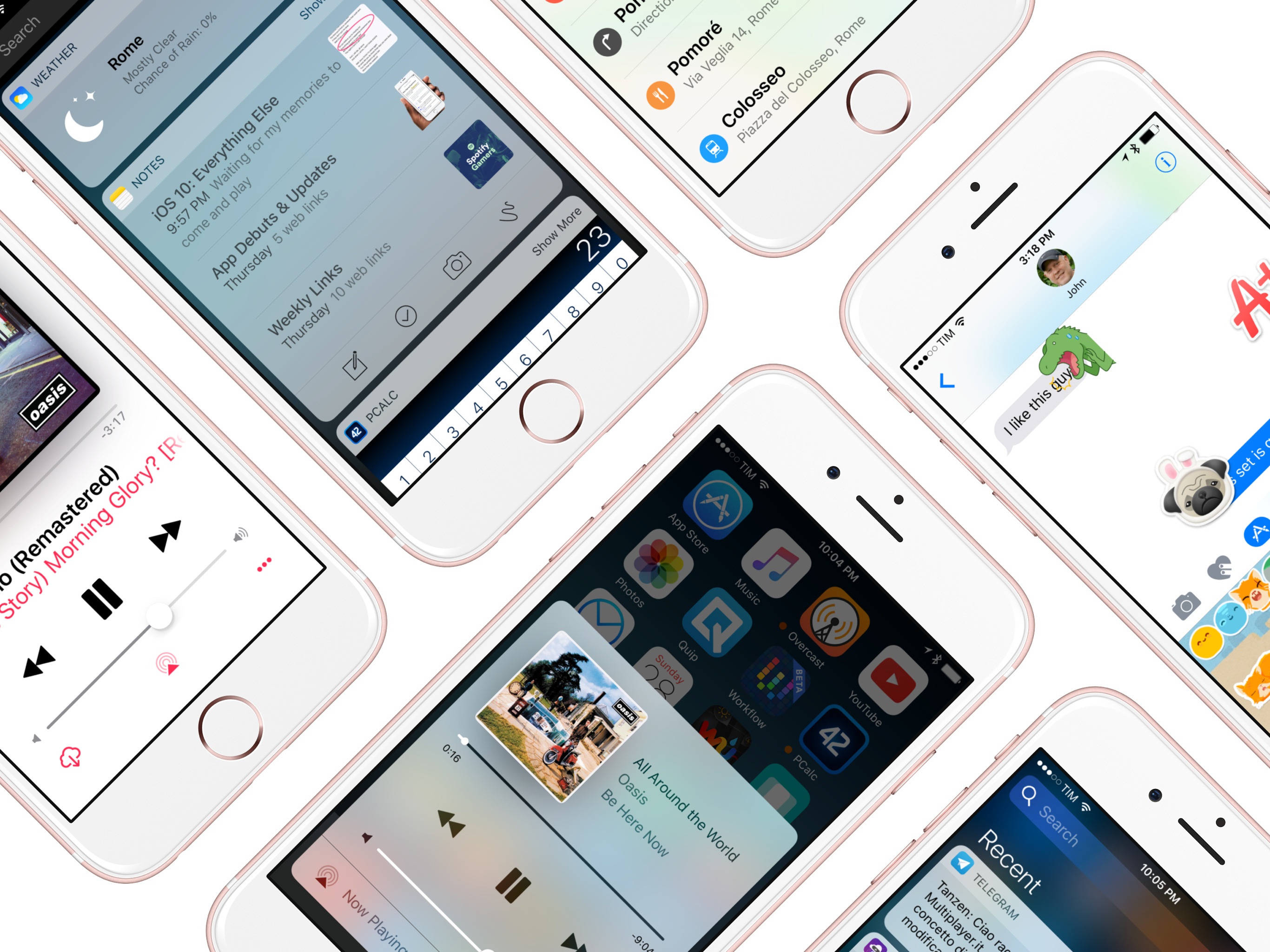
Sometimes, change is unexpected. More often than not, change sneaks in until it feels grand and inevitable. Gradually, and then suddenly. iOS users have lived through numerous tides of such changes over the past three years.
iOS 7, introduced in 2013 as a profound redesign, was a statement from a company ready to let go of its best-selling OS' legacy. It was time to move on. With iOS 8 a year later, Apple proved that it could open up to developers and trust them to extend core parts of iOS. In the process, a new programming language was born. And with last year's iOS 9, Apple put the capstone on iOS 7's design ethos with a typeface crafted in-house, and gave the iPad the attention it deserved.
You wouldn't have expected it from a device that barely accounted for 10% of the company's revenues, but iOS 9 was, first and foremost, an iPad update. After years of neglect, Apple stood by its belief in the iPad as the future of computing and revitalized it with a good dose of multitasking. Gone was the long-held dogma of the iPad as a one-app-at-a-time deal; Slide Over and Split View – products of the patient work that went into size classes – brought a higher level of efficiency. Video, too, ended its tenure as a full-screen-only feature. Even external keyboards, once first-party accessories and then seemingly forgotten in the attic of the iPad's broken promises, made a comeback.
iOS 9 melded foundational, anticipated improvements with breakthrough feature additions. The obvious advent of Apple's own typeface in contrast to radical iPad updates; the next logical step for web views and the surprising embrace of content-blocking Safari extensions. The message was clear: iOS is in constant evolution. It's a machine sustained by change – however that may happen.
It would have been reasonable to expect the tenth iteration of iOS to bring a dramatic refresh to the interface or a full Home screen makeover. It happened with another version 10 before – twice. And considering last year's iPad reboot, it would have been fair to imagine a continuation of that work in iOS 10, taking the iPad further than Split View.
There's very little of either in iOS 10, which is an iPhone release focused on people – consumers and their iPhone lifestyles; developers and a deeper trust bestowed on their apps. Like its predecessors, iOS 10 treads the line of surprising new features – some of which may appear unforeseen and reactionary – and improvements to existing functionalities.
iOS 10 is a major leap forward from iOS 9 – at least for iPhone users.
Even without a clean slate, and with a release cycle that may begin to split across platforms, iOS 10 packs deep changes and hundreds of subtle refinements. The final product is a major leap forward from iOS 9 – at least for iPhone users.
At the same time, iOS 10 is more than a collection of new features. It's the epitome of Apple's approach to web services and AI, messaging as a platform, virtual assistants, and the connected home. And as a cornucopia of big themes rather than trivial app updates, iOS 10 shows another side of Apple's strategy:
Sometimes, change is necessary.
eBook Version & Exclusive Making Of
An eBook version of this review is available exclusively for Club MacStories members. Club MacStories offers access to weekly MacStories extras – including workflows, app recommendations, and interviews – and it starts at $5/month.
The eBook version contains all the media (screenshots and videos) of the web version, including eBook-specific layout optimizations.
The eBook can be downloaded from the member Downloads area (to download files on iOS, see here).
In addition to the eBook, we’ll publish an exclusive Making Of newsletter for Club MacStories members later this week. In the Making Of, you’ll be able to read more about my writing process, interesting review stats, the image workflows we used, and how this special web layout was put together.
Get exclusive extras and support MacStories by signing up for Club MacStories today.
Supported Devices
As more features have been added to iOS over the years, its first-run setup flow has become bloated, if not downright unintuitive.
iOS 10 doesn't take any meaningful steps to simplify the setup of a new iOS device, which is mostly unchanged from iOS 9. The only notable difference is the action required to begin the setup process, which is now "press Home to open". As I'll explore later, there's a reason for this.
Where iOS 10 does break away from the old is in the system requirements needed to install the OS. Most devices from 2011 and 2012 aren't compatible with iOS 10, including:
- iPhone 4S
- iPad 2
- iPad (3rd generation)
- iPad mini
- iPod touch (5th generation)

Devices supported by iOS 10.
Progress, of course, marches on, but there are other notable points in this move.
The iPad 2 – perhaps the most popular iPad model to date – supported iOS 9 (in a highly constrained fashion) despite developers clamoring for its demise. After 5 years of service, Apple is cutting ties with it in iOS 10. By leaving the A5 and A5X CPUs behind, developers are now free to create more computationally intensive iPad apps without worrying about the lack of Retina display on the iPad 2 and the performance issues of the third-generation iPad holding them back.
Look closer, and you'll also notice that Apple is dropping support for all devices with the legacy 30-pin dock connector. If a device can run iOS 10, it is equipped with a Lightning port.
In addition to Lightning, every iOS 10-eligible iPad has a Retina display, but not every device comes with a Touch ID sensor yet, let alone a 64-bit processor, Apple Pay, or background 'Hey Siri' support.
It's going to be a while until Apple can achieve its vision of 64-bit and one-tap payments across the board, but it's good to see them moving in that direction by phasing out hardware that no longer fits what iOS has grown into. iOS 10 is starting this transition today.
The Lock Screen
One of the first interactions with iOS 10 is likely going to be an accidental swipe.
For the first time since the original iPhone, Apple is changing the "Slide to Unlock" behavior of the iOS Lock screen. iOS 10 gets rid of the popular gesture altogether, bringing tighter integration with Touch ID and an overhauled Lock screen experience.
Press to Unlock
Let's back up a bit and revisit Steve Jobs' famous unveiling of the iPhone and Slide to Unlock.
At a packed Macworld in January 2007, Jobs wowed an audience of consumers and journalists by demonstrating how natural unlocking an iPhone was going to be. Apple devised an unlocking gesture that combined the security of an intentional command with the spontaneity of multitouch. In Jobs' words:
And to unlock my phone I just take my finger and slide it across.
We wanted something you couldn't do by accident in your pocket. Just slide it across...and boom.
As the iPhone evolved to accommodate stronger passcodes, a fingerprint sensor, and a UI redesign, its unlocking mechanism stayed consistent. The passcode number pad remained on the left side of the Lock screen; even on the iPad's bigger display, the architecture of the Lock screen was no different from the iPhone.
With the iPhone 6s, it became apparent that Slide to Unlock was drifting away from its original purpose. Thanks to substantial speed and accuracy improvements, the second-generation Touch ID sensor obviated the need to slide and type a passcode. However, because users were accustomed to waking an iPhone by pressing the Home button, Touch ID would register that initial click as a successful fingerprint read. The iPhone 6s' Touch ID often caused the first Home button click to unlock an iPhone, blowing past the Lock screen with no time to check notifications.
Ironically, the convenience of Touch ID became too good for the Lock screen. As I wrote in my story on the iPhone 6s Plus:
The problem, at least for my habits, is that there is useful information to be lost by unlocking an iPhone too quickly. Since Apple's move to a moderately bigger iPhone with the iPhone 5 and especially after the much taller iPhone 6 Plus, I tweaked my grip to click the Home button not only to unlock the device, but to view Lock screen notifications as well. While annoying, the aforementioned slowness of previous Touch ID sensors wasn't a deal-breaker: a failed Touch ID scan meant I could at least view notifications. When I wanted to explicitly wake my locked iPhone's screen to view notifications, I knew I could click the Home button because Touch ID wouldn't be able to register a quick (and possibly oblique) click anyway.
That's not the case with the iPhone 6s Plus, which posed a peculiar conundrum in the first days of usage. Do I prefer the ability to reliably unlock my iPhone with Touch ID in a fraction of a second, or am I bothered too much by the speed of the process as it now prevents me from viewing notifications on the Lock screen?
Apple is making two changes to the unlocking process in iOS 10 – a structural one, with a redesign of the Lock screen and its interactivity; and a behavioral one to rethink how unlocking works.
Apple hopes that you'll no longer need to click any button to wake an iPhone. iOS 10 introduces Raise to Wake, a feature that, like the Apple Watch, turns on the iPhone's display as soon as it's picked up.
Raise to Wake is based on a framework that uses sensors – such as the motion coprocessor, accelerometer, and gyroscope – to understand if a phone has been taken out of a pocket, but also if it's been picked up from a desk or if it was already in the user's hands and its elevation changed. Due to ergonomics and hardware requirements, Raise to Wake is only available on the iPhone 6s/7 generations and it's not supported on the iPad.
Apple has learned from the first iterations of watchOS: Raise to Wake on the iPhone 6s and iOS 10 is more accurate than the similar Watch feature that shipped in 2015. In my tests, Raise to Wake has worked well when taking the iPhone out of my pocket or picking it up from a flat surface; it occasionally struggled when the iPhone was already in my hands and it was tricky for the system to determine if it was being raised enough. In most everyday scenarios, Raise to Wake should wake an iPhone without having to click the Home or sleep buttons.
Raise to Wake is only one half of the new unlocking behavior in iOS 10: you'll still need to authenticate and unlock a device to leave the Lock screen. This is where the iPhone's original unlocking process is changing.
To unlock a device running iOS 10, you need to click the Home button. If the display is already on and you place your finger on the Touch ID sensor without clicking it – as you used to do in iOS 9 – that won't unlock the device. By default, iOS 10 wants you to physically press the Home button.

Bye, slide to unlock.
This alteration stems from the unbundling of fingerprint recognition and Home button click, which are now two distinct steps. Placing a finger on Touch ID authenticates without unlocking; pressing the Home button unlocks.
In Apple's view, while Raise to Wake turns on the display, authentication may be required to interact with features on the Lock screen – such as actionable notifications, widgets, or Spotlight results. With iOS 10, users can pick up an iPhone, view what's new on the Lock screen, and authenticate (if necessary1) without the risk of unlocking it.
From a design standpoint, this change is reflected in the icons and messages displayed to the user on the Lock screen. When the display turns on with Raise to Wake, a padlock icon in the status bar indicates that the user has not yet authenticated with Touch ID. At the bottom, a 'Press home to unlock' message replaces the old 'slide to unlock' one.

Locked.
With the display on and after Touch ID authentication, 'Press home to unlock' becomes 'Press home to open' and the status bar lock switches to an 'Unlocked' message.
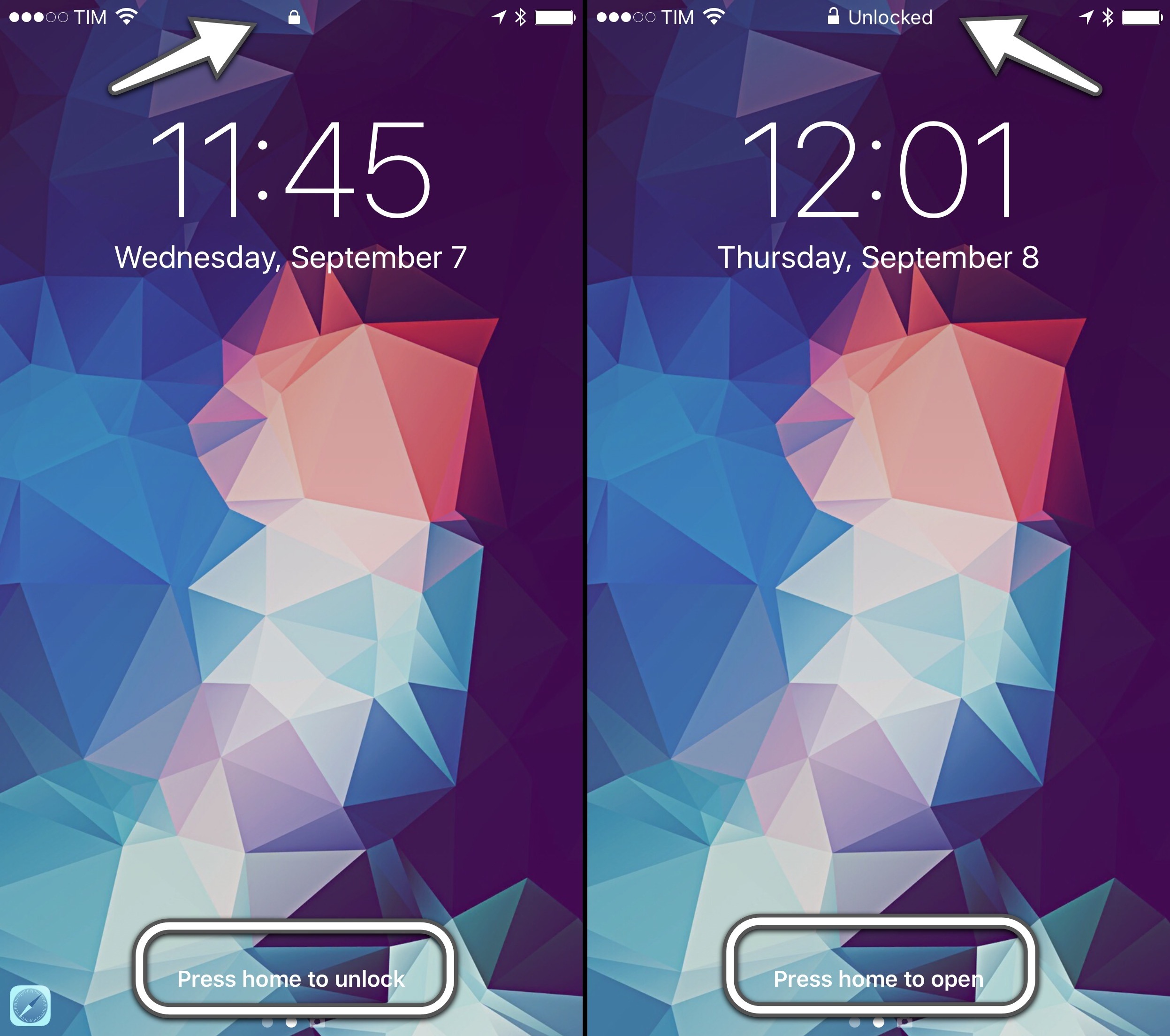
Unlocked.
Under the hood, clicking the Home button and placing a finger on Touch ID are two separate actions. However, the wording of 'Press home to unlock' feels like Apple wants you to think of them as one. The entire message is an illusion – pressing the Home button by itself doesn't actually unlock a device – but Raise to Wake combined with the second-generation Touch ID will make you believe in it.
Touch ID Nuances
If a device doesn’t have Touch ID (or if Touch ID can’t read a fingerprint), pressing the Home button will bring up the number pad or keyboard. And, if an iPhone’s display is activated by clicking the Home button (try this with a non-Touch ID finger) and then the finger is lifted off the button, placing it on Touch ID again (without clicking it) will unlock the device.
On an iPhone 6s, one click on the Home button is all that's needed to exit the Lock screen – at least most of the time. If the iPhone's display is off because Raise to Wake didn't work (or because you manually locked it while holding it), the experience is similar to iOS 9. Clicking the Home button with a Touch ID-enabled finger will wake up the display and bypass the Lock screen.
You can revert to a pre-iOS 10 unlocking experience if you don't like the new one. First, Raise to Wake can be disabled in Settings > Display & Brightness, and your iPhone will no longer turn on when picked up. Additionally, tucked away in Settings > Accessibility > Home Button, you'll find an option called 'Rest Finger to Open'. When enabled, your iPhone will unlock through Touch ID alone, without having to press the Home button.
It takes some time to get used to the new unlocking behavior of iOS 10. The apparent unification of Home button click and Touch ID makes less sense on devices without the second-generation sensor, where one click is rarely enough and tends to bring up the passcode view for a second attempt. And, nostalgically speaking, I miss the old 'slide to unlock' message, although for reasons that are merely emotional and not related to function.
I now expect my iPhone to know when it’s time to wake up.
After three months, Raise to Wake and Press to Unlock have made the overall unlocking experience faster and more intuitive. I now expect my iPhone to know when it's time to wake up and show me the Lock screen, and I don't miss the old unlocking process. Raise to Wake eliminates the need to click a button to wake an iPhone; having to press the Home button to unlock removes the risk of accidentally leaving the Lock screen.
But it all goes back to that accidental swipe. Picture this: you've just upgraded to iOS 10, or you've bought a new iPhone with iOS 10 pre-installed, and, instinctively, you slide to unlock. What you're going to see isn't an error message, or the Lock screen bouncing back, telling you that you need to press the Home button instead. You're going to see the biggest change to the Lock screen – potentially, a better way of interacting with apps without unlocking a device at all.
Slide to unlock, and you'll meet the new Lock screen widgets.
Lock Screen Widgets
Technically, Lock screen widgets predate iOS 10. On both the iOS 8 and iOS 9 Lock screens, users could swipe down to reveal Notification Center and its Today view. However, iOS 10 adds an entirely new dimension to the Lock screen, as well as a refreshed design for widgets throughout the system.
The Lock screen's renovation in iOS 10 starts with three pages: widgets and search on the left, the Lock screen (with notifications and media controls) in the middle, and the Camera on the right. You can swipe to move across pages, as suggested by pagination controls at the bottom of the Lock screen.

The Lock screen's new horizontal hierarchy, with widgets on the left.
The leftmost page, called the Search screen, isn't completely new either. Apple took the functionality of Spotlight search and Proactive of iOS 9, mixed it up with widgets, and made it a standalone page on the iOS 10 Lock screen (and Home screen, too).

From left to right: Lock screen widgets on the Search screen; Notification Center; widgets in Notification Center.
Notably absent from iOS 10's Lock screen is the Camera launcher button. By getting rid of the tiny shortcut in the bottom right corner, Apple has made the Camera easier to launch: swiping anywhere to move between Lock screen and Camera is easier than carefully grabbing an icon from a corner. I've been taking more spontaneous, spur-of-the-moment pictures and videos thanks to iOS 10's faster Camera activation on the Lock screen.
Apple's sloppy swiping for Lock screen navigation has one caveat. If notifications are shown, swiping horizontally can either conflict with actionable buttons (swipe to the left) or open the app that sent a notification (swipe right). You'll have to remember to swipe either on the clock/date at the top or from the edge of the display; such is the trade-off of using the same gestures for page navigation and notification actions.

Where to swipe when notifications fill the Lock screen. (Tap for full size)
Three changes stand out when swiping right to open the Search screen:
- There's a search field at the top, shown by default;
- The clock2 stays pinned to the right3;
- Widgets have a new design that favors richer, bigger content areas.
Unlike their predecessors, widgets in iOS 10 don't blend in with the dark background of Notification Center. This time, Apple opted for standalone units enclosed in light cells with an extensive use of custom interfaces, buttons, images, and dark text.

Widgets in Notification Center on iOS 9 and iOS 10.
There's a common thread between widgets and notifications (also redesigned in iOS 10): they're self-contained boxes of information, they sit on top of the wallpaper rather than meshing with it, and they display an app's icon and name in a top bar.

Notifications and widgets. Spot the trend.
The new design is more than an aesthetic preference: the makeover has also brought functional changes that will encourage users and developers to rethink the role of widgets.
A widget in iOS 10 supports two modes: collapsed and expanded. The system loads all widgets in collapsed mode by default, which is about the height of two table rows (about 110 points). All widgets compiled for iOS 10 must support collapsed mode and consider the possibility that some users will never switch to the expanded version. Apps cannot activate expanded mode on the user's behalf; switching from compact to expanded is only possible by tapping on a 'Show More' button in the top right corner of a widget.

Compact and expanded widgets.
This is no small modification, as it poses a problem for apps that have offered widgets since iOS 8. Under the new rules, apps updated for iOS 10 can't show a widget that takes up half of the display as soon as it's installed. Any widget that wants to use more vertical space for content – such as a todo list, a calendar, or even a list of workflows – will have to account for the default compact mode.
For some developers, this will mean going back to the drawing board and create two separate widget designs as they'll no longer be able to always enforce one. Others will have to explain the difference to their users. Workflow, which used to offer a widget that could dynamically expand and collapse, is updating the widget for iOS 10 with a label to request expansion upon running a workflow that needs more space.

Workflow's new iOS 10 widget.
There's one exception: legacy iOS 9 apps that haven't been updated for iOS 10. In that case, the system won't impose compact mode and it won't cut off old widgets (which keep a darker background), but there's a strong possibility that they won't look nice next to native iOS 10 ones.

The same widget in iOS 9 legacy mode and with native iOS 10 support.
I don't see how Apple could have handled this transition differently. Design updates aside, there's an argument to be made about some developers abusing Notification Center with needlessly tall and wasteful widgets in the past. Compact mode is about giving control to the users and letting them choose how they prefer to glance at information. Want to install a widget, but don't need its full UI? Use it in compact mode. Need to get more out of it? Switch to expanded.
Apple's decision to adopt compact and expanded modes in iOS 10 is a nod to developers who shipped well-designed widgets in the past, and it provides a more stable foundation going forward.
I've been able to test a few third-party iOS 10 widgets that illustrate the advantages of these changes.
PCalc, James Thomson's popular iOS calculator, has a new widget that displays a mini calculator in compact mode with numbers and basic operations split in two rows.
Despite the small touch targets, the compact interface is usable. If you want bigger buttons and a more familiar layout, you can switch to expanded mode, which looks like a small version of PCalc living inside a widget – edge-to-edge design included.
Launcher doesn't modify its widget's interface when toggling between compact and expanded, but the constraints of the smaller layout force you to prioritize actions that are most important to you.
Using compact mode for summary-style UIs will be a common trend in iOS 10. CARROT Weather is a good example: it shows a summary of current conditions when the widget is compact, but it adds forecasts for the day and week ahead when expanded.

CARROT's widget can be customized with two styles.
Even better, slots in the compact layout can be customized in the app, and you can choose to use the widget in light or dark mode.
Drafts has an innovative implementation of compact and expanded layouts, too. In compact, the widget features four buttons to create a note or start dictation. When the widget expanded, it grows taller with a list of items from the app's inbox, which can be tapped to resume editing.
In the past, developer Greg Pierce would have had to ask users to customize the widget or make it big by default; in iOS 10, they can switch between modes as needed.
Widgets' ubiquitous placement pushes them to a more visible stage; as soon as more developers adapt4, iOS 10 has the potential to take widgets to the next level.
I believe the new design will play an essential role in this.
The Design of Widgets
Apple advertises legibility and consistency as core tenets of widgets in iOS 10, and I agree: widget content and labels are easier to read than iOS 9. Standalone light cells separate widgets with further precision; I haven't found translucency with the Lock screen wallpaper to be an issue.
In addition, the light design brings deeper consistency between apps and widgets. Most iOS apps have light backgrounds and they employ color to outline content and indicate interactivity. In iOS 10, widgets are built the same way: the combination of light backgrounds, buttons, and custom interfaces is often consistent with the look of the containing app.
In this regard, widgets feel more like mini-apps available anywhere rather than smaller, less capable extras. The line between widget and full app UIs is more blurred than ever in iOS 10.
Apple's new Notes and Calendar widgets showcase this newfound cohesiveness. The Notes widget displays the same snippets of the list in the Notes app. Buttons to create new notes and checklists are also the same. The widget looks and feels like a small version of Notes available anywhere on iOS.

From app to widget.
The Calendar widget is even more indicative. Glancing at events and recognizing their associated calendar wasn't easy in iOS 9, as they only had a thin stripe of color for the calendar to which they belonged.

The Calendar widget is more contextual on iOS 10.
In iOS 10, forgoing a dark background has allowed Apple to show Calendar events as tinted blocks matching the look of the app. Discerning events and the calendars they belong to is easier and familiar.

Consistency of apps and widgets.
I wouldn't expect every app to adopt a widget design that exactly mirrors the interface users already know, but it can be done. Switching to a light design has given Apple a chance to reimagine widgets for consistency with apps and lively combinations of color, text, and icons. They are, overall, a step up from iOS 9 in both appearance and function.
The new direction also opens up a future opportunity: what is light can be more easily converted to dark. I could see a system dark mode working well for widgets.
The iPad Lock Screen
The iPad's Lock screen doesn't break any new ground, but there are some differences from the iPhone.
On the iPad, notifications are displayed on the left side of the screen when in landscape. They're aligned with the system clock, and they leave room for media controls to be displayed concurrently on the right. Dealing with notifications while controlling music playback is a task well suited for the iPad's larger display.
Unfortunately, Apple doesn't think portrait orientation should warrant the same perks. If a notification comes in while album artwork is displayed on the Lock screen, the artwork will be hidden. Apple decided against using a two-column layout in portrait, which I don't understand: they're already doing it for widgets on the iPad.

No artwork for you, Mr. Portrait.
Furthermore, if no music is playing on an iPad in landscape, having notifications aligned to the left for no apparent reason looks odd and seems...unnecessary.

The right side seems cozy.
Widgets fare a little better. Apple has kept the two-column design first introduced in the Today view of iOS 9; you can still scroll the two lists of widgets independently.
I would have appreciated the ability to further control the resizing and placement of widgets on the iPad, and the Lock screen design seems uninspired. We'll have to make the most of this bare minimum work for now.
Apple's Widgets
iOS 10 sports an increased modularity of widgets. Apple has done away with grouping multiple types of content under Siri Suggestions – most Apple apps/features have their own widget, which can be disabled from a revamped configuration screen.

Widget's new configuration screen.
Here's an overview of what's changed.
Activity
Your Activity rings from the Apple Watch, with a summary of Move, Exercise, and Stand statistics.
Calendar
A mini calendar interface. Events are displayed as colored blocks matching the calendar they belong to. You can tap on an event to open it, and expand the widget to reveal more events.
Favorites
Shortcuts to your favorite contacts with different ways to get in touch with them. New in iOS 10, you can assign iMessage as well as third-party communication apps (messaging and VoIP) to contact entries in Favorites, which will be displayed in the widget.
Mail

...yeah.
The Mail widget is the weakest of the bunch: it only displays shortcuts for VIP contacts. I would have preferred to see a preview of the unified inbox, or perhaps an option to show flagged messages.
Maps
Maps has three widgets: destinations, nearby, and transit. While the latter isn't available for my area (Rome, Italy), the other two have worked inconsistently. I've never seen a nearby recommendation in the widget, despite being around places rich in POIs. The Destinations widget usually tells me how much time it'll take me to drive home, but it doesn't proactively suggest other locations I frequently visit.
Music
The Music widget is an odd one. It displays a grid of what appears to be either recently played music or your all-time most listened albums. The widget doesn't clarify whether it's showcasing albums or individual songs; it uses album artworks with no text labels, and it plays either the most played song from an album, or an entire album starting from the first song.
A nice perk: music starts playing after tapping the widget without opening Apple Music. But it always feels like a lottery.
News
Top Stories from Apple News (shown even if you mute the channel). The widget uses image thumbnails and custom typography matching the bold font of Apple News for headlines.
The best change from iOS 9: news can be disabled by removing the widget.
Notes
A preview of your most recent notes. In compact mode, the widget only shows the last modified note. In expanded mode, you get more notes and buttons to create a new note, a checklist, snap a picture, and create a drawing.
Photos
A collection of Memories created by the new Photos app in iOS 10. Each one can be tapped to view the associated memory in Photos.
Siri App Suggestions
iOS 9's proactive Siri Suggestions are now smaller in scope and they're called Siri App Suggestions. The widget displays 4 app shortcuts (8 in expanded mode), and it doesn't suggest other types of content.
Like News, it can also be removed and be placed anywhere on the Search screen.
Tips
You'd think that the Tips widget is useless – everyone likes to make fun of Tips – but hear me out. In compact mode, the widget shows a tip's snippet; you can tap it and open the Tips app. Switch to expanded mode, though, and you'll be presented with a custom interface with an explanation of the tip and a large animation at the top to show you the tip in action.
The Tips widget looks great, and it's the most technically impressive one on iOS 10.
Up Next
The old Today Summary widget has been renamed Up Next. It displays a smaller version of your next event without the full UI of the Calendar widget. Alas, the Tomorrow Summary widget is gone from iOS 10.
Weather
Perhaps the best example of how widgets can use compact and expanded modes, Apple's Weather widget shows weather conditions for the current location when compact, and a forecast of the next six hours when expanded.
Weather is the widget I've used the most in the past three months to look up forecasts from the Lock screen in just a couple of seconds.
Slide to Glance
The move to apps as atomic units scattered across the system is everywhere in iOS 10, with widgets being the foremost example.
Noticeably absent from iOS 10's widgets is a push for more proactive recommendations. As we'll see later, Apple has shifted its Proactive initiative to run through the OS and inside apps rather than distilling it into widgets.
3D Touch is another illustrious no-show. While notifications have been overhauled to make good use of 3D Touch, pressing on a widget will result in a disappointing lack of feedback. 3D Touch would be a perfect fit for widgets – imagine previewing a full note or reading the first paragraphs of a news story from the Lock screen.
The new widget design and Search screen placement make an iPhone more useful without having to unlock it. Apple has done a good job with their built-in widgets; it's up to developers now to rethink how their apps can take advantage of them. I'm optimistic that everything will turn out better than two years ago.
I unlock my iPhone less thanks to iOS 10’s more capable Lock screen.
I unlock my iPhone less thanks to iOS 10's more capable Lock screen. Raise to Wake, Press to Open, widgets, search, and rich notifications make the entire Lock screen experience drastically superior to iOS 9.
Easier to navigate, better structured, less prone to unwanted unlocks. I wouldn't be able to go back to the old Lock screen.
Notifications
iOS 10's rethinking of apps as granular interactions doesn't stop at widgets. With a new framework that can turn incoming notifications into rich, actionable interfaces, Apple wants users to spend less time jumping between apps.
Notifications iOS 9 and 10.
Notifications in iOS 10 share the same design principles of widgets. Rather than being grouped in a list of items on top of a dark background, notifications are discrete light cells that can be pressed (with 3D Touch), pulled down (for incoming banners), or swiped and expanded into a floating card preview.
The anatomy of an expanded notification – whether an app has been updated for iOS 10 or not – has fixed elements that developers can't control. There's a header bar at the top with the icon and name of the app, and a close button on the right to dismiss the notification. Tapping the icon on the left side will open the app that sent the notification.

The standard look of a notification in iOS 10.
This is true for both iPhones with 3D Touch and devices without it; to expand a notification on an iPad or an older iPhone (or if you don't want to use 3D Touch), you can pull down an incoming notification banner or swipe a notification to the left in Notification Center and tap 'View'.5
New APIs allow developers to take different actions for notifications that have been sent to the user – including ones that have been cleared. First, notifications can be dismissed with a Clear action by swiping on them. Apps can monitor the dismiss action and stop delivering the same notification on other devices.
Additionally, developers can remove, update, and promote notifications that have already been sent. Apple's goal was to prevent Notification Center from being cluttered with old notifications that aren't relevant anymore. If developers implement this API, updating a notification with fresh content should help users see what's changed. Imagine sports scores or live-streaming apps and how they could update notifications. I'm curious to see which services will convert to this behavior instead of spamming users with multiple alerts.
Underneath the header of an expanded notification is the content developers can control, and where the most important changes to notifications are happening.
In iOS 10, notifications can have a title and a subtitle. The title is displayed in a bold font, which helps identifying the subject of a notification. In a Reminders notification, the name of a reminder will be the bold title at the top, with its note displayed as text content below it.

The default look of a notification in iOS 10. Expansion is relative to a notification's placement on screen.
Below the title and subtitle, iOS 10 shows a notification's body text content (same as iOS 9) and actionable buttons. In a welcome change from the past, developers can define more than two notification actions, displayed in a list under the notification's card.6 If an app requires a quick reply upon expanding a notification, the input field will sit above the keyboard – it's not attached to the notification like in iOS 9.
Quick replies in iOS 9 and iOS 10.
Design changes alone, though, wouldn't have sufficed to modernize notifications. To reinvent their feel and capabilities, Apple has created two new extension points for developers in iOS 10: Notification Service and Notification Content.
The Notification Service extension doesn't have an interface and runs in the background. Upon triggering a notification but just before delivering it to the user, an app can call the Notification Service extension to augment or replace its payload. This extension is meant to have a short execution time and it's not designed for long tasks. Possible use cases for Notification Service extensions could be downloading an image or media file from a URL before showing a notification, or decrypting an encrypted payload locally for messaging apps that rely on end-to-end encryption.
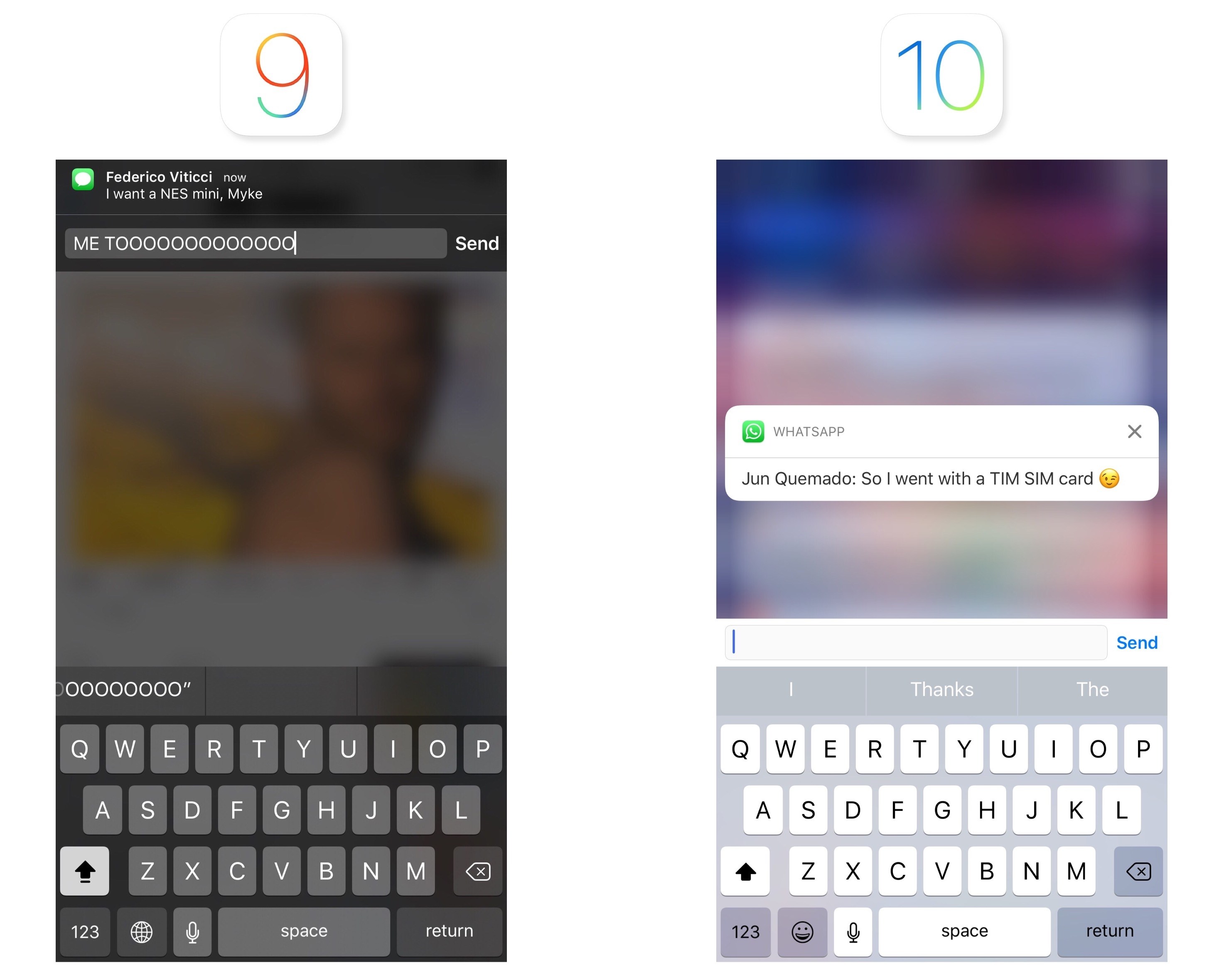
The Notification Service extension should come in handy given iOS 10's ability to include a media attachment (images, audio, videos, and even GIFs) in both the notification banner and the expanded notification. If they adopt it, apps like WhatsApp and Telegram could omit the "[Contact] sent you an image" standard notification and display a thumbnail in the notification banner (like iMessage does) and a full image preview in the expanded notification.
Notification Content extensions are what users are going to see the most in daily usage, and they motivate iOS 10's notification card design.
A notification in iOS 10 can show a custom view between the header and default text content. Custom views can be anything – an embedded map, a message conversation, media, a calendar view, etc. – and they're managed by the Notification Content extension. Custom views are non-interactive: they can't receive touch events7, but they can be updated in-place in response to a task performed from a notification action. Apps can hide the default content of a notification if the custom view is informative enough.
Service and Content extensions, combined with the expanded design, have turned notifications in iOS 10 into a completely new experience. Notifications are no longer just text: they are custom app UIs delivered to you with rich previews and interactions that can live on longer than a couple of seconds. Notifications in iOS 10 are mini apps in and of themselves.
Notifications in iOS 10 are mini apps in and of themselves.
When you receive an iMessage that contains a photo, the incoming notification can be expanded, either with 3D Touch or a swipe. You'll be treated to a full iMessage conversation UI, living inside the notification, with the same transcript, read receipts, and typing indicators you'd see in the Messages app.

To expand a notification, you can pull it down or press on it.
Not only can you send a reply – you can keep the iMessage interface open as you keep a conversation going from the notification. It's a fantastic way to check into a conversation without the constraints of a quick reply.
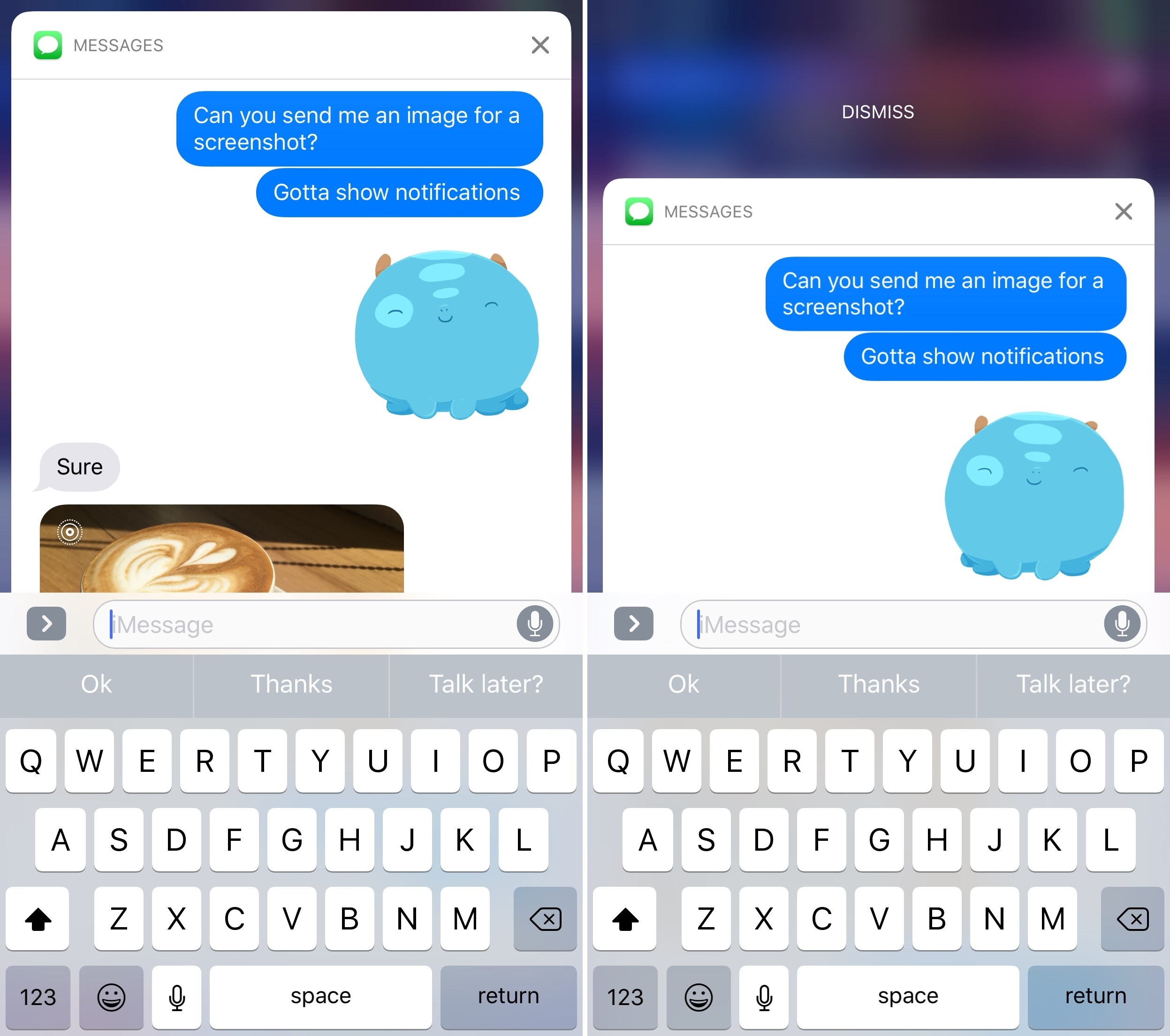
Scroll up in the transcript to view older messages.
When you're done, swipe down to dismiss the notification, and you'll be back to whatever you were doing.8
Calendar notifications follow the same concept. If an event with a location attached is coming up, the expanded notification will display the default text content at the bottom, but also a preview of the address with a Maps view at the top.
Thanks to actionable buttons, you can open directions in Maps without launching Calendar. If an upcoming event doesn't have a location, you'll see a preview of your agenda inside the notification.
I tested a version of Workflow optimized for iOS 10, which brings improved notification support with the ability to customize the content displayed in a notification card. In addition to a title, you'll be able to embed pictures, videos, GIFs, and even Maps views into a Workflow notification.

Rich notifications created with Workflow.
Pictures are displayed as thumbnails in a notification banner before expanding it; videos can be played inline within the card itself.
And if you often receive messages containing GIFs, iOS 10 will let you preview them directly from a notification.
CARROT Weather has a clever take on rich notifications in iOS 10. The daily digest and severe weather/precipitation alerts can be expanded into dynamic preview cards.
Through a Notification Content extension, the app can embed a custom interface, sounds, and even animations inside the notification card. As a result, viewing CARROT's notifications feels more like using the app rather than reading a plain text summary.
With a new framework and the flexibility granted by extensions, we're going to see a rise of interaction methods fueled primarily by notifications. Of all the places where an app can advertise its functionality on iOS (widgets, keyboards, extensions), a notification is the most direct, contextual way to reach users at an appropriate time.
A notification carries interest and, in many cases, a sense of urgency. iOS 10 transforms notifications from a passive delivery system into an active experience where users engage with an app through UIs, actions, and feedback they're already familiar with. It's a win-win for developers, who can make their apps more useful through richer notifications, and for users, who no longer have to open apps to benefit from their services.
iOS 10's notifications are a new layer on top of apps. They're going to change how we deal with them every day.
The Home Screen
The iPhone 6s brought the first significant adjustment to the iOS Home screen in years – 3D Touch quick actions. With iOS 10, Apple is cautiously expanding the Home screen beyond app shortcuts, but in ways you might not expect.

Search from the Home screen: pull down (left) or swipe right to open the new Search screen.
As in iOS 9, Spotlight search can be accessed from two locations: the Search screen on the left side of the Home screen and by pulling down on app icons. The Search screen on the left mirrors its Lock screen counterpart.
A Pale Page Dot
The Search screen (both on the Lock screen and Home screen) doesn’t have a special page indicator at the bottom – it has a standard page dot. Apple may be hinting that the page can do more than search alone, but the difference, at least visually, sticks out. A different icon would have been better.
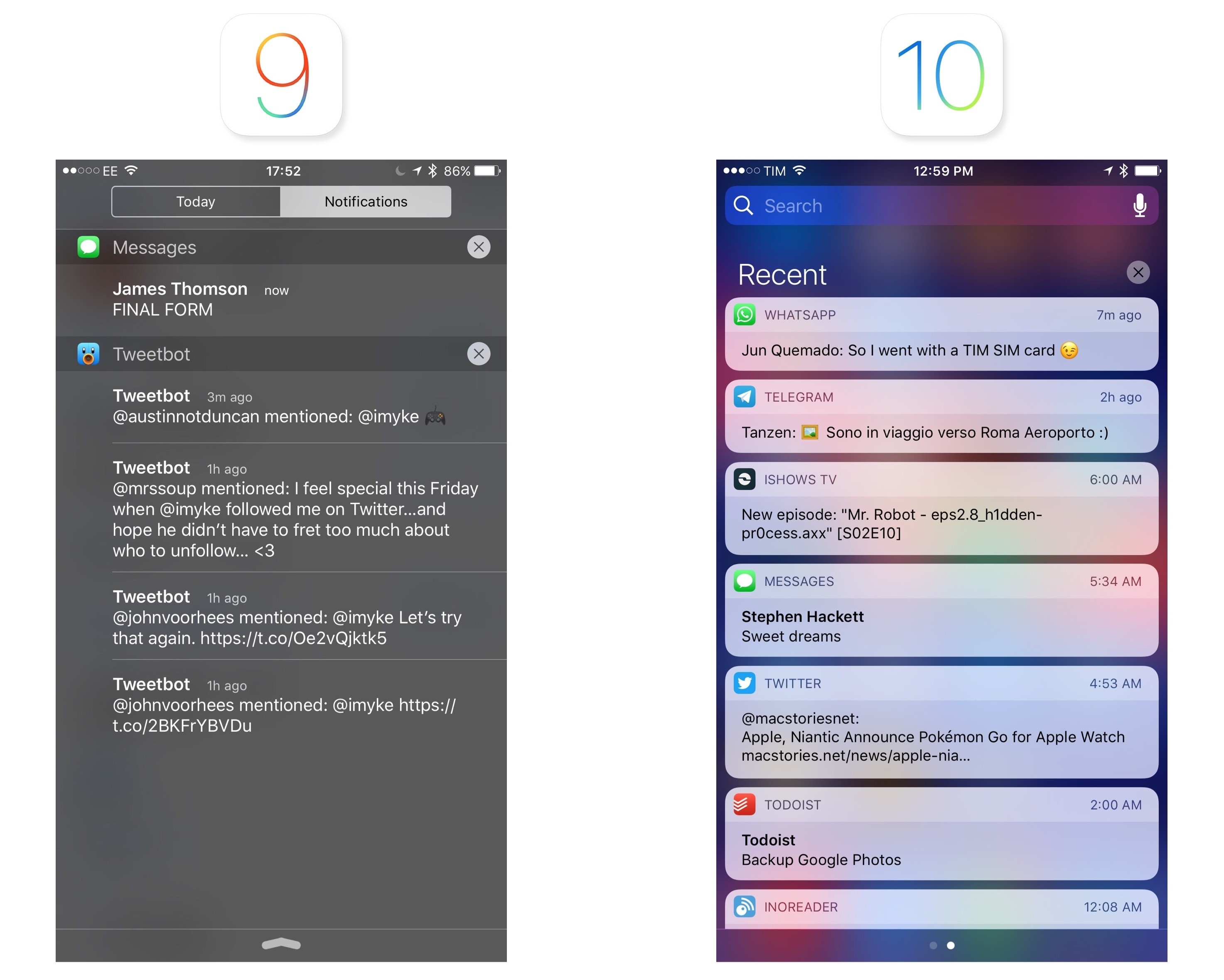
Notification Center has gone through some deeper changes. The segmented control to switch between notifications and widgets at the top is gone, replaced by another set of page indicators. Every time you open Notification Center, iOS 10 will default to showing you notifications in chronological order under a new 'Recent' header – it doesn't remember your position in the two pages. Unfortunately, the option to group notifications by app has also been removed.
Whether by laziness or deliberate design, there's an abundance of ways to activate Spotlight search in iOS 10. Let's round them up:
- Search from the Lock screen (above widgets);
- Open the Search screen (left side of the Home screen) and pull down or tap the search field;
- Pull down on icons on the Home screen;
- Swipe down to open Notification Center and tap Search above notifications;
- Swipe right on Notification Center to open widgets and find Search at the top;
- Use Command-Space on an iPad with an external keyboard and Spotlight will open modally on top of whatever app you're using without going back to the Home screen;
- Last, and perhaps more perplexingly, there's a hidden way to open Spotlight modally when inside apps on the iPhone 6s. When using an app, swipe down slowly from the status bar until you feel a first haptic feedback, then let go. Instead of opening notifications, the text cursor will focus in the search field. If you don't let go after the first vibration but keep swiping down, you'll open Notification Center. This method doesn't work on the Home screen – only in apps. It's also supported on older devices, albeit without haptic feedback.
That's seven ways to open Spotlight search on iOS 10.

Six shades of Spotlight search on iPhone.
Being able to access search from everywhere – be it on the Home screen, the Lock screen, or when using an app – is convenient. It makes Spotlight pervasive. As Apple continues to grow their search efforts across native apps, web partnerships, and Proactive suggestions, Spotlight's omnipresence will become a valuable strategic asset.
Apple continues to be a steadfast supporter of the Home screen as a grid of icons. In a potential disappointment for those who hoped to see a major Home screen refresh this year, the biggest new feature is an extension of 3D Touch quick actions and widgets, rolled into one.

Quick actions and widgets on the Home screen.
Apps that offer a compact widget in iOS 10 can display it alongside quick actions when a user presses the app's icon. The widget is the same used in the Search screen – in fact, there's a button to install it directly from the Home screen.

iPhone Plus models can display quick actions and widgets on the landscape Home screen as well.
I'm not sure I buy into Apple's reasoning for combining widgets and quick actions – at least not yet. The glanceability of widgets finds its raison d'être on the Lock screen and inside apps; on the other hand, I associate going back to the Home screen and pressing an icon with launching, not glancing. Years of iOS usage trained me to see the Home screen as a launchpad for apps, not an information dashboard.
In three months of iOS 10 – and with plenty of glanceable/actionable widgets to test – I've only remembered to use a widget on the Home screen once (it was PCalc). It's not that having widgets alongside quick actions is bad; it's just forgettable. It's the equivalent of two neighbors being forced to live together under the same roof. Having company can be nice sometimes, but everyone would be better off at their own place.
There are other smaller 3D Touch additions to the Home screen in iOS 10. You can press on folders to bring up a Rename action, and apps inside folders that have unread badges will be listed in the folder's quick action menu.
Folders have also received a visual refresh, with a nicer background blur that shows the grid of icons in the current Home screen page.
On the iPad, Apple didn't bring any improvements to the Home screen in iOS 10, but I'm sure you'll be relieved to know that closing an iPad app no longer adjusts the icon's corner radius on the Home screen.
This relates to a deeper change happening to Home screen animations. Apple has rebuilt the entire SpringBoard animation stack with faster, interruptible animations. Along with a reduced animation curve to launch apps (what was one of the most criticized aspects of iOS 7), you can click the Home button right after tapping an app's icon and the animation will stop, going back to the Home screen in an instant.
You can try the same with a folder: tapping outside of it will cancel the animation instantly in mid-flight. The difference with iOS 9's Home screen animations is staggering.
They're not a "feature", but new animations are the best Home screen change in iOS 10.
It's fair to wonder if Apple will ever desecrate the sanctity of the Home screen and allow users to mix icons and widgets.
Anyone who's ever looked at Android will spot obvious similarities between widgets for Google's platform and what Apple has done with widgets in iOS 10. Apple still believes in the separation of icons and app content; they only added widgets to 3D Touch quick actions and they didn't even allow the iPad Pro's large Home screen to go beyond icons. But for how long?
The iOS Home screen has served us well for years, but as screens keep getting bigger, it's time to do more than a grid of icons with quick actions. The other side of the fence is closer than ever; a final leap wouldn't be too absurd.
Control Center
Since its introduction in 2013, Control Center has become a staple of iOS, providing users with a panel of commonly accessed shortcuts. iOS 10's Control Center is a radical shift from its origins, and a harbinger of how iOS is changing.
Control Center's design has evolved over the years, from the wireframe-like look of iOS 7 to the friendlier, rounder buttons of iOS 9.
Apple wasn't led astray by the expansion of iOS, to the point where cramming more functionality into Control Center turned into a balancing act of prioritizing important controls without sacrificing their purpose.
It was clear that Control Center's original vision couldn't scale to the growing nature of iOS. And so with iOS 10, Apple has torn down Control Center and started from scratch. The single-page mosaic of tiny buttons is no more. The new Control Center breaks up system shortcuts and audio controls in two separate pages, with the addition of a third page for HomeKit (if available). Everything's bigger, spacious, and colorful.

The three pages of Control Center in iOS 10.
You still open Control Center with a swipe from the bottom of the display. In iOS 10, swiping pulls up a card with paginated controls underneath it. The design is familiar, yet unmistakably new. Margins across each side convey the card metaphor; controls are bigger and buttons have more padding; there's more color in every card.
After three years of Control Center, the new version in iOS 10 feels lively and friendly; perhaps even more fun. On the other hand, pagination and bigger controls raise a question: has simplicity come at the expense of efficiency in Control Center?
System Controls
A useful exercise to understand Control Center in iOS 10 is to take stock of how much Apple is leaving behind. Let's compare iOS 9's Control Center to the same screen in iOS 10:
The first page of Control Center in iOS 10 has lost audio playback. Initially, that may feel like a downgrade. But let's swipe left and consider what Control Center has gained by separating system and audio controls:
The difference is striking. Giving audio playback its own space lets Control Center present more information for the media being played. It's also more accessible thanks to bigger text labels, buttons that don't need to be carefully tapped, and hardware controls embedded in the same page.
This won't be easy to accept for iOS power users who cherish dense UIs: Control Center buys into a trend followed by many (but not all) parts of iOS 10. Big, bold controls, neatly laid out, spread over multiple views.
The first beneficiary of such clarity is the system controls page. The first row of toggles at the top has kept iOS 9's iconography and arrangement, but each button is color-matched to the setting it activates when toggled.9

Control Center is bleeding...four colors?
I found colored toggles extravagant at first; now, I like that I can glance at those buttons and know which setting is engaged.

Don't forget about landscape mode.
The brightness slider and the AirPlay, AirDrop, and Night Shift buttons have been enlarged and simplified as well. For one, the slider's puck is more comfortable to grab. The buttons reveal another tendency in iOS 10's semi-refreshed design language: they're actual buttons with rounded borders and they use color to indicate status.
In a change that's reminiscent of Sam Beckett's fantastic concept, you can press on the bottom row of shortcuts to show a list of 3D Touch quick actions. These include three intensity levels for the flashlight, timer options, a shortcut to copy the last Calculator result, and different Camera modes.
As I elaborated before, Control Center was an ideal candidate for 3D Touch actions. However, Apple's implementation in iOS 10 is limited to the bottom row of apps; you can't press on the Bluetooth icon to connect to previously paired devices, nor can you press on the Wi-Fi toggle to connect to a different network. The addition of 3D Touch to the lower end of Control Center shows that Apple recognizes the utility of quick actions for system-wide shortcuts, but they're not fully committed to the idea yet.
Despite some missing features and growing pains to be expected with a redesign, iOS 10's first Control Center page is an improvement. With a sensible reliance on color, a more legible layout, and the first steps toward full 3D Touch support, Control Center's system card is easier to parse, nimble, and intuitive.
"It Also Looks Great on the iPad"
Control Center's design direction has been taken to the extreme on the iPad. Only one page can be used at a time; the AirDrop, AirPlay, and Night Shift buttons are needlessly wide. It doesn't take a design expert to figure that Apple just wanted to ensure basic compatibility with an iPhone feature instead of designing Control Center around the iPad.
Look at it this way: if Control Center didn't exist on the iPhone and Apple decided to introduce it on the iPad today, would it look like this?
The lack of an iPad-first approach was passable in the old Control Center because of its compact design. But with iOS 10, following the iPhone's model has a detrimental effect. Buttons are too big and little care went into optimizing the UI for the iPad's screen. Apple should reconsider what they're doing with Control Center on the iPad instead of upscaling their iPhone designs.
Music Controls
In iOS 10, managing music and audio playback from Control Center is a richer experience, visually and functionally superior to iOS 9.
The page is split in three areas: audio information and, for the first time, artwork at the top; progress, playback controls, and volume in the middle; hardware accessories at the bottom. This is true for Apple Music and Podcasts as well as third-party apps, which don't need to optimize for iOS 10 to show album artwork.
I was skeptical when I saw that Apple moved audio controls to a separate card. The ubiquitous presence of an audio widget was my favorite aspect of Control Center; adding an extra step to reach it didn't seem a good idea. After adjusting to Control Center's audio page in the first month of iOS 10, I went back to iOS 9 and controlling music felt limited and bland.
There are two aspects to Apple's design worth noting. First, Control Center remembers the page you were using before dismissing it. If you swipe up, swipe left to open music playback, then close Control Center, the next time you open it, you'll get the Now Playing card instead of being taken back to the first page. Thanks to this, having audio controls on a separate page hasn't been a problem in my experience, but I wonder if Apple should allow reordering pages as an option.
Second, the purpose of the redesign. With artwork and comfortable UI elements, the page feels like a miniaturized music app rather than a cumbersome mishmash of buttons and sliders. It's almost as if Control Center was reimagined for how normal people like to know what's playing.
From an interaction standpoint, artwork creates a bigger touch target that you can tap to be taken into the app playing audio10; in iOS 9, you had to precisely tap on a song's small title in Control Center. There's a deeper sense of context, too. Previously, it always took me a few seconds to read through a song's information. With iOS 10, I can swipe up and glance at the artwork to see what I'm listening to.
There's a subtle touch I want to mention. When music is playing, artwork is big, it has a drop shadow, and Control Center says 'Now Playing on...' at the bottom with an icon for the device where audio output is happening. Hit pause, and the artwork shrinks, losing the drop shadow, as the 'Now Playing...' message disappears. Tap play again, and the artwork grows bigger with a delightful transition.
Control Center's audio page has two functional problems Apple should address. Song details (title, artist, and album) have been turned into lines of text that don't scroll and get cut off. Try to listen to songs with long titles – say, I've Got a Dark Alley and a Bad Idea That Says You Should Shut Your Mouth (Summer Song) – and you'll be surprised Apple designers didn't consider the issue.

That Says...?
In addition, the ability to "love" songs to train Apple Music has been removed from Control Center (and the Lock screen). I don't understand the decision, as having a dedicated page provides even more room for music controls.
Despite the merits of artwork and more intuitive controls, I don't think Apple added a standalone audio card to Control Center for those reasons alone. To me, the most convincing explanation comes from the hardware menu:

Picking audio accessories in Control Center.
With just a few taps, you can connect to Bluetooth headphones or wireless speakers from anywhere on iOS without opening Settings. There's an obvious subtext: for a device without a headphone jack, an easier way to switch between wireless audio accessories isn't just a pet peeve – it's a necessity.
Audio playback is the clear winner of the new Control Center in iOS 10.
Audio playback is the clear winner of the new Control Center in iOS 10. Apple freed themselves from the constraints of iOS 9's tiny audio controls, and, after three years, music is claiming the prime spot it deserves in Control Center. The new audio page brings a more engaging, integrated listening experience that paves the road for what's to come.
HomeKit Controls
You can't use the third page of Control Center unless you've configured at least one HomeKit device. I don't own a lot of HomeKit accessories (I have three Hue lights and a few Elgato sensors), but the new Home page has grown so much on me, I'm no longer using any third-party HomeKit widgets.
Besides being available to users with HomeKit devices, Control Center's Home card only displays accessories and scenes that have been marked as favorites in the new Home app. The page doesn't list every HomeKit accessory, nor does it work with third-party home automation devices that don't support HomeKit.
If you meet these requirements, you'll be able to swipe over the Music card to reveal the Favorite Accessories view.
Accessory buttons carry a name and icon assigned in the Home app, and, if supported, a percentage label for intensity (lights have it, for example). A button in the top right lets you switch between accessories and scenes. To turn them on and off, you just tap a button once.
Buttons can be long-tapped to open a detail screen with more options.11 For my Hue lights, holding a button for a fraction of a second reveals a vertical slider for intensity, which can be adjusted without lifting a finger off the screen.
A second layer of navigation is nested into the detail view. With multicolor lights, you can tap on a Colors button below the intensity slider to modify presets and open a color wheel to pick a different shade. The wheel even has a segmented control to switch between color and temperature – a surprisingly deep level of hierarchy for a Control Center page.

Adjusting colors and temperature for lights inside Control Center.
Unfortunately, accessories that only report basic status messages don't have a useful detail view.
In spite of my limited testing environment, Control Center has become my favorite way to manage HomeKit lights and scenes. It's a testament to Apple's penchant for native integrations: lights turn on immediately because commands don't go through a third-party server, and the entire flow is faster than asking Siri to activate an accessory. I was a heavy user of third-party HomeKit widgets and apps before; on iOS 10, I have no reason to do that anymore thanks to Control Center.
If Apple didn't have big plans for the connected home, they wouldn't have given HomeKit its own section in Control Center. With HomeKit expanding to new accessory lines, I think it's going to be my second most used card after music.
Extended Control
After three years, Control Center is growing up. To make the pendulum swing back towards simplicity, Apple has traded some convenience of the original design for three standalone pages. By unbundling functionality in discrete units, Control Center is more legible, usable, and flexible.
There are missteps. The lack of any kind of user customization is inexcusable in 2016. The bottom row of shortcuts, down to four icons again, still can't be modified to accommodate user-selected apps. And you won't be able to swap toggles at the top for settings you access on a frequent basis.
Half-baked integration with 3D Touch feels like a timid attempt to take Control Center further. The addition of quick actions for apps in the first page is laudable, but why isn't the same true for toggles at the top as well? And if HomeKit accessories can show nested detail views, why can't Apple Music display a lyrics screen, too?
I want to believe that iOS 10's Control Center is foreshadowing the ability for developers to provide their own "app pages" and for users to swap default shortcuts with their favorite ones. More than ever before, Control Center is ripe for extensibility and personalization. Like widgets, I can see a future where we interact with some types of apps primarily through mini interfaces in Control Center.
I wouldn't have expected pagination to be what I wanted, but Apple was right in rethinking Control Center as a collection of pages rather than a complex unified dashboard. The majority of iOS users won't be affected by Apple's design trade-offs; they'll appreciate a screen that doesn't need a manual.
The new Control Center experience isn't a regression; it's a much needed reassessment of its role in the modern iOS.
More 3D Touch
As it's evident by now, Apple has increased the presence of 3D Touch in iOS 10. On top of notifications, Control Center, and the Home screen, 3D Touch actions have been brought to more apps and system features.
Notification Center
Like on the Apple Watch, you can press on the Clear button in Notification Center to clear all notifications in one fell swoop. Finally.
Siri App Suggestions
Apps suggested by Siri support 3D Touch to show the same quick actions available on the Home screen.
Apple Music
Among many changes, Apple Music has been given the extended 3D Touch treatment with a contextual menu for selected items and playback controls. Pressing a song or the bottom player brings up a list of options that include adding a song to a library, liking it, saving it to a playlist, or opening lyrics.
Manage Downloads
When downloading apps from the App Store or restoring a device from an iCloud backup, you can press on an in-progress download to pause it, cancel it, or prioritize it over others.
Share Apps
iOS 10 automatically adds a Share button to an app's quick action menu on the Home screen to share its link with friends. Presumably, this is meant to bolster app discovery and sharing among users.
Beta Feedback
Pressing on the icon of a TestFlight beta app shows a shortcut to send feedback to the developer via Mail.
The pervasive use of 3D Touch in iOS 10 proves Apple wants it to be an essential iOS feature. After using iOS 10, going back to iOS 9 feels like missing several layers of interaction.
This creates an even stronger tension between 3D Touch-capable iPhones and devices without it. Right now, Apple is resorting to swipes and long-taps to simulate 3D Touch on iPads and older iPhones; will they always be able to maintain backwards compatibility without making more features exclusive to 3D Touch?
Messages
iMessage is a textbook example of how a feature can turn into a liability over time.
When it was introduced five years ago, iMessage promised to bring a grand unification of SMS and free, unlimited texting with media attachments. iMessage turned Apple's Messages app into a single-stop solution for conversations between iOS users and those who would later be known as green-bubble friends. It was the right move at the time12, and it allowed Apple to have a communication service as a feature of iOS.
Over the last five years, messaging has outgrown texting. Meanwhile, iMessage (the service) and Messages (the app) have remained stuck in their ways.
Services like Facebook Messenger, WhatsApp, LINE, and WeChat haven't only reached (or surpassed) iMessage in terms of users; as mobile-first messaging apps without SMS' technical (and conceptual) debt, they have been able to relentlessly iterate on design, novel messaging concepts, notifications, and app integrations.
These companies, free of past constraints, have envisioned new ways to communicate. They've grown messaging apps into platforms, enabling others to extend them. And maybe some of the current messaging trends will turn out to be fads, but it's hard to argue against Apple's competitors with their numbers, cultural influence, and progressive lock-in. They're no joke, and Apple knows it.
But I wouldn't ascribe iMessage's slow pace of evolution to its SMS legacy alone. Because of its end-to-end encryption and Apple's strict policy on not storing sensitive user information, iMessage is by nature trickier to extend. Apple's efforts in this area are commendable, particularly when you consider how the aforementioned services diminish in functionality once you add encryption.
However, security hurdles shouldn't be an excuse for iMessage's glaring shortcomings. As laudable as Apple's stance is, most users aren't willing to put up with an app that feels old. They want to liven up conversations with rich graphics and apps. They want messaging to be personal. Technologists won't like this, but, ultimately, people just want a modern messaging app that works.
The time has come for iMessage to take the next step.
From a user's perspective, it's fair to say that Apple has been too complacent with iMessage. The service is by no means a failure – it serves hundreds of millions of users every day. But those metrics don't matter when stasis yields something worse than numbers alone: cultural irrelevancy. That iMessage, as many see it, "is just for simple texting".
The time has come for iMessage to take the next step. With a willingness to welcome developers into its most important app, and without giving up on its security ideals, Apple is reshaping how users can communicate, express themselves, and share. With iMessage in iOS 10, Apple is ready to embrace change.
App Changes
Before delving into the bigger enhancements to Messages, I want to touch upon changes to the app's interface and some minor features.
The conversation's title bar has been redesigned to embed the recipient's profile picture. Having a photo above a conversation helps identify the other person; the increase in title bar height is a trade-off worth accepting.

There's new artwork for contacts without a profile picture, too.
The profile picture can be tapped to open a person's contact card; and, you can press it to bring up a 3D Touch menu – the same one available in Contacts and Phone with a list of shortcuts to get in touch with that person.
iOS 10 brings a new layout for the bottom conversation drawer. By default, a conversation opens with a narrow text field and three icons next to it – the camera, Digital Touch, and the iMessage app launcher. As you tap into the text field to reply to a message, the three icons collapse into a chevron that can be expanded without dismissing the keyboard.
Apple has also redesigned how you can share pictures and videos. The new media picker consists of three parts: a live camera view to quickly take a picture; a scrollable grid of recent items from your library; and buttons to open the full camera interface or the photo library, accessed by swiping right.
The assumption is that, on iMessage, people tend to share their most recent pictures or take one just before sharing it. The live camera view can be used to snap a photo in a second (you don't even have to tap on the shutter button to take it). Moving the camera and library buttons to the side (hiding them by default) has freed up space for recent pictures: you can see more of them thanks to a compact grid UI.
Some won't like the extra swipe required to open the camera or library, but the live photo view makes it easier to take a picture and send it.
After picking or taking a picture, you can tap on the thumbnail in the compose field to preview it in full screen. You can also tap and hold a picture in the grid to enter the preview screen more quickly.13

Markup inside Messages.
Here, you have two options: you can edit a picture with the same tools of the Photos app (albeit without third-party app extensions) or use Markup to annotate it. You can tap on the Live Photo indicator to send a picture without the Live part, or press on it to preview the Live Photo.
Speaking of photos, iMessage now lets you send images at lower quality, likely to save on cellular usage. You can enable Low Quality Image Mode in Settings -> Messages.
One of the oldest entries of my iOS wish lists is also being addressed in iOS 10: you can choose to enable read receipts on a per-conversation basis.
If you, like me, always keep read receipts turned off but would like to enable them for important threads, you can do so by tapping the 'i' button at the top of a conversation and then 'Send Read Receipts'. The toggle matches the default you have in Settings and it can be overridden in each conversation.
Richer Conversations
While Messages may not look much different from iOS 9 on the surface, the core of the app – its conversation view – has been refreshed and expanded. iMessage conversations have received a host of new features in iOS 10, with a focus on rich previews and whimsical, fun interactions.
Links
In its modernization of iMessage, Apple started from web links. After years of plain, tappable URLs, Messages is adopting rich link previews, which are inspired by iOS 9's link snippets in Notes, but also more flexible and capable.
Rich links aren't a special setting of the app: the first time you receive a link in an iMessage conversation in iOS 10, it'll appear as 'Tap for Preview' button in the conversation. This is a one-time dialog to confirm you want to load links as rich previews instead of URLs, which also look different from iOS 9.

Loading a rich link for the first time in iOS 10.
Like in Notes (and other services such as Slack and Facebook), rich previews use Open Graph meta tags to determine a link's title, featured image, audio and video file, or description. A web crawler has been built into Messages: as soon as you send a link, the message's bubble will show a spinner, and, depending on the speed of your Internet connection, it'll expand into a rich message bubble after a second, within the conversation.

Paste, fetch, expand into rich link.
Rich link previews in Messages use the same technology Apple brought to Notes last year, but they've been designed differently. They're message bubbles with a title and domain subtitle; the upper section, where the featured image of a link is, can grow taller than link snippets in Notes. Web articles tend to have rectangular image thumbnails; podcast episodes shared from overcast.fm are square; and links to iPhone apps shared from the App Store show a vertical screenshot.

Multiple types of shared links in Messages.
Furthermore, the behavior of sharing links differs between Notes and Messages. Allow me to get a bit technical here.
In Notes, only links captured from the share extension are expanded into rich previews; pasting text that contains a link into a note doesn't turn the link into a rich preview.
 Guest post with advice about what cyclists should do if a driver crashes into them. Includes infographic about common cycling collisions, and advice to avoid collisions for drivers and cyclists.


 Housing prices are the crux of the matter. They reveal if people have enough housing choices. If vacancy rates are low and rents and housing prices are rising, then a city needs more homes. Period. The city needs to


 Speaking of cement trucks and cement companies — here’s a


 Image courtesy the artist

 Courtesy of FUSION
 Courtesy of FUSION
 Courtesy of FUSION
 Courtesy of FUSION
 Screencap