For an app that’s barely one month old, 10 million downloads isn’t too shabby.
Google Duo was one of two messaging apps announced during Google’s developer conference a few months ago. Duo is a video messaging app, while its counterpart Allo is a text messaging app powered by the Google Assistant.
The app had reached five million downloads in the first week that it had been released, a number which has doubled in the three weeks following. However, you’d never know of it’s success while its currently ranked number 127 in the App Store.
Just two days after its launch, Duo had risen to first place the Google Play Store. Since then, the app has fallen from grace by more than 100 spaces. However, according toAndroid Police, those who use it really enjoy it, therefore awarding it with 4.4 stars.
Reviewers have praised the app’s simplicity, despite getting overshadowed by other announcements during Google’s developer conference. Both Duo and Allo are end to end encrypted.
Q: I’m a renter who has set up most of my apartment with smart lighting, but one major holdout is the fluorescent tube (I think a T8?) in my kitchen. Due to my home’s layout, having it on or off significantly affects the illumination levels in the main living space.
I’ve started to see LED replacements for such fixtures, but no signs of a smart option—is this due to technical limitations, or just a limited market? I suppose an alternative would be something like the Switchmate, although I believe it’s currently limited to a Bluetooth connection. Curious if you guys have any insight on this issue, which I assume must affect at least some of your other readers.
Computer-generated strings of light wiggle and shake in response to your movements in strands, the new interactive light installation from ecco screen. The behavior and and physics of each string in installation is a reaction to the viewer’s presence, each line responding in its own unique way so the appearance of the project’s unbalanced bedsheet facade never repeats itself.
strands was created using custom software the artist wrote in Processing. ecco screen used a blob-tracking device and an Xbox Kinect to pinpoint the user’s position in front of the piece. Thus, the viewer’s physical presence affects the strands in front of them. As viewers pace back and forth, they create what the artist describes as “an effect that resembles running your hand across a harp.”
ecco screen only had one week to put the project together, so “it had to be something simple, minimalistic, but wet at the same time,” he tells The Creators Project via email. At the start of the project, his first priority was to explore all the different possibilities he could explore in terms of the project’s visual element.
strands was presented as part of the Next Art Night show, an experimental art and technology exhibition curated by Natalie Sun in Los Angeles. The show featured work from artists including cabbibo and kyttenjanae and anticipated up to 700+ attendees, putting pressure on ecco screen to create an interactive piece that could function for many people at once. He didn't want people to have to line up in order to play with it, so instead he turned to lines.
During the post-production process, ecco screen ran the whole sketch through CoGe, a comparative genomics platform, to add visual effects and to create the installation’s metallic look. The physics and visual parameters were then put through Vezer, an audiovisual, timeline-based midi sequencer that would morph the appearance of strands over time, allowing it to take on a life of its own.
After consulting with Natalie Sun and the video projection mapping artist collective, Mapjacks, ecco screen decided to use a rear projection onto a fabric screen. Check out strands' majestic results in the footage below:
In the future, ecco screen hopes to take strands on tour. To find out more, head over to his website.
Peter Skillman, speaking during MEX/14 while Head of Design at mapping business HERE, warned against the temptation to focus on flashy, headline elements of the UX. This was often done at the expense of more frequently used, but less glamorous interactions. There is an untapped opportunity to build little moments of joy for the user in small gestures, sounds and visual sequences, creating a cumulative effect and long lasting relationship.
— Part of the MEX Insight Series, highlighting memorable moments from 12 years of MEX conferences at the forefront of experience design.
My algorithms don’t understand me. They remember what I’ve watched on Netflix and make their suggestions, but it’s not quite right. A documentary about competitive swimming? Please, no thank you, but I see what you did there: I do watch documentaries and saw one about cycling and the algorithmic wheels turn in the most unimaginative ways: sports plus doc. They don’t know what really matters to me. “We’re capturing you,” one data scientist told Tom Vanderbilt in his book You May Also Like, “as a location in taste space.” The problem is that my own coordinate in taste space is a mystery to me too. The Apple machines want to remember what I like and build a picture from there (“capture” me, as in a high-stakes game of hunter and hunted) when in fact taste may depend on a peculiar human quirk: the ability to forget.
I once bought a graphic novel (just the one) and now Amazon won’t shut up about it, as if it’s the best thing we ever did together, sending more offers down the pipe, while I’ve moved on. My taste, I think, is not so deliberate: it expresses itself as cognitive accident. Not long ago I discovered that Mosfilm, the Russian film studio that did its best and strangest work during the last decades of the Soviet Union, had posted most of their films on a YouTube channel. I found out through a link on Twitter which caught my eye: a gif of the famous film studio logo, the socialist realist monument of the working man and peasant woman holding tools aloft while the Spasskaya Tower of the Kremlin looms in the near distance in twilight and fog. The mood is of triumph and sadness, as if, in the Mosfilm world, you can never have one without the other. Did I know I wanted to watch these films, many of these films, before tripping on the link? I did not, and yet they wound up taking a weekend of my life.
I once bought a graphic novel (just the one) and now Amazon won’t shut up about it
The films were posted, Mosfilm says, to fight piracy through a colossal act of capitulation: You cannot steal what we give away for free. There may have been a political motivation, as the Putin regime thrives on false nostalgia for Soviet nationalism, which the old movies presumably feed. I have no idea where Mosfilm’s commercial and political imperatives intersect, if at all, but it’s a bad idea to watch Soviet films without the background hum of paranoia. After all, that’s the spirit in which they were made. Some have subtitles, others don’t. Except for the Tarkovsky films, already long popular in the West, I’d never seen any of them before, but had an impulse to binge. I watched them more as objects than as stories, without knowing exactly why.
I like Soviet kitsch. A good algorithm that remembers all and forgets nothing about me might know that I’ve always, since I was a kid, had a soft spot for this stuff, artifacts of a mysterious empire that crept into my world in whispers, through my grandparents who were all closet Communists, one of whom fought in Spain with the International Brigades. One of my great-uncles, a Finn, was a colonel in the Red Army. I never knew him. But I picture a fur hat and a red star. I don’t remember when I first learned the deeper story of the Soviet Union, the gulags and the gun at the back of the head, but it’s enough to say that liking kitsch doesn’t explain what’s going on here: The feeling is more like ambivalence, a dark tug from my past, a reminder of who I might have been as the great-nephew of men who shot poets, but also a Socialist, a Slav, and a sucker for utopian nonsense. So there I was, watching movies from the Brezhnev era.
The 1973 film Ivan Vasilievich Changes Occupation is described in the opening credits as “a non-science fiction, not quite realistic, not strictly historical film.” It involves a hapless engineer who develops a time machine that sends his apartment superintendent and a local petty thief back to the age of Ivan the Terrible, while swapping Ivan the Terrible himself to Moscow in 1973, where the terrorist Tsar has to contend with modern life. The film is the classic fish-out-of-water, identity-switch story in the manner of Freaky Friday and Back to the Future (which it prefigures by 12 years), only with a deeper sense of dread. It sold 60 million tickets in its first Soviet theatrical run. The plot turns on the misplaced Tsar’s worry that he’s been taken from his throne at the moment when the Swedes are about to overrun his kingdom, and the engineer’s worry that his landlord and the thief, now locked in history, will be beheaded. Comic mishaps ensue. There are chase scenes in the style of Benny Hill and the Beatles’ Help.
The film is less important than the images, the detail. The eye looks for clues of a world that no longer exists or, in my case, never did except in the imagination
It can be read as pure slapstick, until you watch with the subtitles off. Free of overwrought dialogue, a theme emerges: The movie is about work, and what happens when all one’s tireless work is negated in an instant, by human error. The ability to temper and deepen comedy with sadness is not solely a Russian trait, but filmmakers of the ’70s were particularly good at it. The Brezhnev era was known as the Era of Stagnation. The Soviets were tired, or at least the leadership was. The ’60s were exhausting: crushing liberal revolt in Czechoslovakia, getting past Kruschev’s cornpone circus and his flirtation with Western economics, trying not to talk about Stalin’s crimes whilst still rounding up the usual suspects who wrote and filmed their parables too explicitly, shooting fewer people but ruining careers and exiling troublemakers where warranted. The ’70s were the hangover, the time for building the dullest, greyest social utopia possible under the circumstances, not unlike what Gerald Ford had in mind for America after Watergate: productive tedium.
I watched dozens more. The Irony Of Fate, Or Enjoy Your Bath! is a 1976 ensemble rom-com in the vein of The Big Chill (again, well before the fact) in which, at one point, a drunken man takes a shower wearing a winter coat and a fur hat. The film is less important than the images, the detail: What’s on the shelf over the sink in the bathroom? What’s in the giant aerosol can with the red lid — Soviet industrial shaving cream? The eye looks for clues of a world that no longer exists or, in my case, never did except in the imagination. Autumn Marathon from 1979 is a comedy-drama about one man’s midlife crisis which is really about an empire’s end-life crisis: No one understands Andrey Buzykin, not his wife nor his mistress nor his coworkers, not his neighbors, not the friend he jogs with in the kind of black-market Adidas knock-off tracksuit that will become the uniform of the mob oligarchs who will run the country after communism crumbles. The film has a Woody Allen feel without the threat of redemption. Not much happens. There are long spells where no one has anything to say, as if they’re too tired to participate in a movie right now. Exhaustion figures prominently in the Soviet films of the ’70s. No one smiles, and everyone smokes, a lot.
What can an algorithm make of this binge of mine? Presumably it would send me more Russian films to watch, or K-19: The Widowmaker, the horrible movie about the Soviet submarine with Harrison Ford. It remembers what I’ve watched, and memory drives the machine. But it doesn’t understand why I’m drawn to these particular films, because it can’t know what I barely know myself. My taste depends on what I’ve consumed in the past, for sure, but also on what I’ve put out of my mind that still gnaws away at me, subconsciously. This is at the heart of the flaw in AI thinking, according to Hubert Dreyfus at Berkeley in California: Machines know that past events, or interests, can dictate decisions in the present through trial and error and the measurement of best outcomes. Whereas humans, most of the time, do things based not on calculation but something closer to a whim, or instinct, which machines can’t fathom.
Our place in the taste space is dictated by what we may have once knew and pushed aside, where it does its work quietly. Taste, like poetry, comes from hidden corners
In baseball the pitcher throws smoke. He doesn’t think about it. He’s been trained, he’s practiced over and over but at some point the body takes over in ways inexplicable by logic. In fact if he starts thinking about his throwing style it all goes wrong, he throws wild, he’s in a slump. The only way to regain his form is to somehow forget what he knows and get back to sheer instinct. The same applies roughly to human taste, which is also a deeply instinctual phenomenon that depends, only partly, on recalled experience. It depends also on deeply buried ideas that might drive us mad if they were constantly in the front of our minds: trauma, sexual fantasy, taboo thrills, all the deep lizard-brain wiring that’s been consciously forgotten but still lingers, somewhere and somehow. “It would not be enough for a poet to have memories,” said Rilke. “You must also be able to forget them.” Our place in the taste space is dictated by what we can’t immediately know or once knew and pushed aside, where it does its work quietly. Taste, like poetry, comes from hidden corners.
These films work as poetry, if watched without subtitles. In Autumn Marathon I’m fixed not on plot, but on Andrey’s apartment: The mix of a ’70s Soviet idea of modern Western, and pre-war junk furniture that he inherited from his parents and never thought to get rid of. Pickled-wood bookshelves against space-race wallpaper. A painting of a sad clown of the non-ironic kind seen in American motels. Powder blue Bakelite rotary telephones, glass ashtrays the size of dinner plates everywhere. Men’s attire, when not the Adidas knock-off, is the mandatory sports jacket over black turtleneck. Even the stuff in Soviet films from the ’70s is sad. Not pathetic, but sad, in the heart-warming way of objects that try hard but can never succeed at their intended purpose. Like the people in the movies, too.
It must be the sadness I like. But that’s too simple, just like my own Red roots can’t fully explain why I’m binging on Mosfilm except as a starting point. It’s more likely that the sadness is familiar. Something about growing up in the last century (and arguably, in this one) put a value on melancholy as a survival mechanism: Pollyanna joy was suspect and naive, Romanticism was long dead and replaced by paranoia over power and cockeyed economic models and family values. Being a pre-teen in the ’70s, the Era of Stagnation in Russia and, as it happens, everywhere else, was a good time to keep your head down and turn out the lights and wait for something better to happen. It’s possible I’ve been watching these Soviet films not because they’re exotic but because they’re familiar, as if I’ve lived them in some way but have forgotten all about it. The melancholy is nostalgic.
A normal algorithm might take all this and panic, send me Dostoevsky and Nabokov to read (something Russian and sad!), and it wouldn’t be far off. But it would never come up with Rilke or Nathaniel Hawthorne or DVDs of the original Bob Newhart Show, which is comedy about pathological sadness: the screwball patients of a Chicago therapist in the ’70s. A really good algorithm would be able to trace this weird strain of melancholy, which I don’t consciously think much about, through unlikely sources. It might figure out that Hawthorne’s characters, and Ivan Vasilyevich, and Elliot Carlin on The Bob Newhart Show, are somehow heroic about their sadness, facing it and carrying on.
Maybe that’s my taste space. If so, it’s been buried, in a way that the algorithmic machinery, which depends on explicit memory and 2 + 2 = 4 to operate, can’t fathom. An encounter with art is more like turning up in a neighbourhood you know, somehow, but can’t remember ever visiting, and getting a chill when you recognize a house you’ve clearly been in. Taste is not about what I remember explicitly, but that which haunts me.
This was a nice find at IFA in Berlin. Udoq is a universal dock for all your gadgets that charge with Apple 30-pin, Lighting, MicroUSB or USB Type C. It comes in different lengths from 25 to 70 cm. And you customize it to your liking. Notice the little details: Aluminium never touches your device or your table. There is always a bit a soft material in between.
Udoq sells you the cables you need, you open the ends of the dock, slide them in and then hide the excess cable within the dock. Then you close it all up, connect the cables to your charger and you have a nice clean solution to check your devices in. Udoq sent me a sample, bit they did not have the multi-port charger yet that belongs on the back of the dock. Instead I used a Tizi 4 port USB-charger.
This thing is very customizable. You can run the cables out of either end, the top or the bottom. You don't have to run all cables out of the same port. On the 40 cm dock, you can easily fit five smartphones, or four with an iPad. You can also adjust the height of each of the plugs by up to 8 millimeters to accommodate protective sleeves around your devices.
This is a keeper. Editor-refuses-to-give-it-back award, big time. Udoq just started a Kickstarter campaign with a significant discount.
Over the last months, Kohei Yoshino and myself worked on improving the discoverability of Firefox Nightly desktop builds and in particular localized builds.
Until recently, the only way to get Firefox Nightly for desktop was to download it in English from nightly.mozilla.org or, if you wanted a build in say Japanese, Arabic or French, look for the right FTP sub-folder in ftp.mozilla.org. Nightly.mozilla.org is itself a static HTML page based on a script that scraps the FTP site for builds periodically.
Of course, as a result, about 90% of our Nightly users use an en-US build. The few thousand users using a localized build are Mozilla localizers and long term contributors that knew where to search for them. We were clearly limiting ourselves to a subset of the population that could be using Firefox Nightly which is not a good thing when you want to actually grow the number of nightly users so as to get more feedback (direct and anonymous). The situation was so frustrating to some of our community members that they created their own download pages for Nightly in their language over time.
Then why didn’t we have a proper download page on www.mozilla.org as we do for all Firefox channels (release, beta, dev edition) ? Why are nightly builds available only from a separate sub-domain? One of the reasons was technical, www.mozilla.org uses data provided by the Release Management team through a public JSON API called product-details and that API didn’t provide any information about Nightly. Actually, this API was a typical legacy piece of code that had been doing the job well for a decade but was meant to be rewritten and replaced by another tool year after year. Until the switch to a new compatible API and the addition of Nightly data there, mozilla.org just didn’t know anything about Nightly.
So first we had to actually end the work on the migration from the old to the new API and mozilla.org switched to this new API in August.
We are working on making that page linked from the nightly site in bug 1302728. That’s only a start of course, we still have a lot of work to make it easier for advanced testers to find our pre-release builds, but now when somebody will ask you for a comprehensive list of Desktop Nightly builds, you’ll know what address to share!
Many thanks to Kohei and the mozilla.org Webdev team for their help on making that happen!
Eileen became an advocate for organ donation after she donated a kidney to her Mother. To help raise awareness of donations, and the healthy life that donors can live, she rode her bike from Victoria to Newfoundland. Amazing, since I poop out after about 40-50 km.
Her: Let me finish the episode of this Korean drama.
Me: Why you watching that? You have Korean drama right here! *points at self*
She laughed, so I had to tweet it.
I think the drama was Scarlet Heart: Ryeo, which she described as, “Kdrama version of Outlander.” All I could tell was everyone looks like a girl, and since all asians look alike to me, I wasn’t going to get my head in a knot watching it.
What a lot of people seem to have missed is that Apple didn't just launch wireless earbuds last week. They launched a wireless microphone as well.
I said this about 2 years ago: The next great product category for device makers will be wireless earbud+mic.
Not only did they go to great lengths to explain how the microphone worked, they also showed how the user can double-tap to access Siri.
Get it?
To jump ahead, simply think about the movie "Her". Think about the Star Trek computer.
The next great, mainstream interface is not going to be Augmented Reality or Virtual Reality. It's going to be voice. It's voice agents. It's conversational commerce (not single purpose chat bots, but a few smart general purpose agents with trainable skills).
Amazon Echo has done a great job of making voice omni-present in the home. I use it all. the. time.
Using Siri or Google Assistant, however, still feels too hard.
If Apple can take the stigma away from 'Bluetooth headsets' they have an opportunity to literally 'have our ear' (or rather, our Attention) all day long.
And before you say "Siri sucks". It's software. It's in the cloud. I guarantee they're working on making it better. Or they will just buy Viv.
Apple this week released watchOS 3, a major update to its Apple Watch software. If you already have an Apple Watch, you’ll definitely want to install the the update (using the Watch app on your iPhone). If you’re an iPhone owner and you’ve considered getting a smartwatch, we think watchOS 3 finally makes the Apple Watch good enough for non-techie people to try.
Want a sneak peek of what we're working on?
Sign up for our weekly newsletter for everything we’re working on and then some.
Installing watchOS 3 makes a first-generation Apple Watch feel like a new, more capable device. After using the beta for a while, and installing the official version this week, we can say that our watches feel snappier and more responsive throughout, with a more intuitive interface. Even better, third-party apps are dramatically faster and more usable. Basically, the Apple Watch now behaves the way you’d want a smartwatch to behave, whether you’re using the built-in features or the apps you’ve installed.
Wunderlist used to take 20 to 30 seconds to open and show a to-do list. Now it’s almost instant.
The biggest change in watchOS 3 is its speed. Everything happens faster, but the most noticeable difference comes when you open a third-party app—assuming, of course, its developer has updated it for watchOS 3. Apps launch much more quickly than in the past, and because they can now refresh their data in the background, they’re usable right away. For example, Wunderlist, our favorite to-do list app, used to take 20 to 30 seconds to open and show a list. Now it’s almost instant. Similarly, popular weather app Dark Sky now almost instantly displays the current conditions, rather than making you wait while it spins, spins, spins. This improvement alone makes the Watch a much more capable device, because it can reliably do the things it’s supposed to be able to do.
The new Dock is much more useful than the older Glances feature—in part because apps launch faster and are more usable.
The faster app loading improves other parts of the OS, as well. In order to get around the issue of slow load times, prior versions of watchOS relied on Glances to give you a (sort of) quick look at an app’s most-important data or features. This approach is no longer necessary, so in watchOS 3, the new Dock gives you full, live previews of your favorite apps that you can quickly access by pressing the Watch’s big side button.
We’re also really enjoying the little interface and navigation improvements. For example, you can now create new watch faces on your iPhone—they show up instantly on your Apple Watch. You can switch between faces on the Watch with a simple swipe on the screen, instead of having to force-press, swipe, accept, and so on every time. Additionally, many more apps can now offer complications for adding information to watch faces. This feature gives you more options for seeing useful data or quickly accessing apps beyond your favorites in the Dock.
Because faces are now more capable and easier to switch between, we’re actually using them now as opposed to picking one and sticking with it based on aesthetics alone. For instance, you can now create a workout face that shows your activity for the day and lets you jump into run tracking with a tap, as well as a simple photo display—in color or black and white—for occasions when you just want to see the time.
Even tasks as minor as creating a new watch face—which you can now do on your phone—are much easier.
Other small improvements include improved message replying—you can write directly on the Watch’s screen, if you want. And a new SOS feature lets you call local emergency services by simply holding down the side button. Finally, the Watch is easier to use with wireless headphones, because Apple added an audio-source toggle button to the Control Center that’s accessible with a quick swipe up.
Overall, watchOS 3 changes the Apple Watch from an interesting but quirky gadget for early adopters into a useful accessory that could be appealing to a lot more people. If we don’t discover any major issues during further testing, you can expect us to update our Apple Watch review to have fewer caveats, soon after we’ve had a chance to try the new Apple Watch Series 2.
UBER has a fleet of self-driving cars in operation in Pittsburgh. Several journalists have taken a ride. Read excerpts from their reports, with links, below. But first, some thoughts from Uber’s top dog.
It’s not just an engineering challenge that’s deterministic, and I know what I have to build. We are figuring out as we go what has to be built because, even when you have the world’s experts on this challenge, there are things that even if you’re Google, or even if you’re anybody, Apple, all the guys that are working on it, there are things that haven’t been invented yet. And that’s part of the fun. . .
. . . you’re still going to need a human-driven parallel, or hybrid. And the reason why is because there are just places that autonomous cars are just not going to be able to go or conditions they’re not going to be able to handle.
The first part of this quote points to the huge challenge of standardization, in a near-term future where an Uber car needs to communicate something about intent, timing, car-train cooperation or God-knows what else, to another robo-car made by Ford, Tesla, BMW, Mercedes, Apple, Google, Baidu, NuTonomy and so on. And it’s all been invented in-house, with key components guarded jealously as trade secrets that enable domination.
Mike Isaac in the New York Times writes about the test drive experience:
During my ride, most of which I spent as a passenger in Boron 6’s back seat, my safety engineer proved his worth. At various moments, he had to take over the wheel and turn through intersections where locals are known to speed. When a truck driver backed out into the road illegally, he put his foot on the brake, immediately taking control of the car. . .
. . . But for most of the ride, I felt safe. In self-driving mode, turns and stops were near seamless, and I often had to check in with my driver to see whether he or the computer was steering the car. I did grow a bit nervous a few times when watching how close the computer drove us to cars parked on the right side of a street. Though, admittedly, that could have been my mind playing tricks on me by being more vigilant than usual about my surroundings.
Nick Bilton in Vanity Fair has a different, but deeper, slant on Uber’s challenge from the robo-car. On the business side, Uber succeeds today by connecting cars (drivers) and passengers. But what happens when someone else owns the car, and the service. And what happens to a society, like the USA and Canada, that is dependent upon cars, and car ownership for transportation and big chunks of GDP? And what is the upshot when those vehicles, most of them currently idle and stored around 90% of the time, become much more effectively productive? Mr. Bilton digs into these ideas.
But back to Uber.
But if you think about it, Uber isn’t actually connecting passengers to cars. Instead, it is really connecting passengers to drivers. When those drivers are replaced by computers, Uber is a less important, and less valuable, middle man. Kalanick is fully aware of this reality. “We are definitely not building the cars,” he noted to B.I., “and I don’t know who is going to own the fleet.” That opportunity is open to a lot of other companies who are trying to not be erased by the approaching reality of autonomous vehicles. . .
. . . It seems that Uber is about to face the classic dilemma that stifles all big businesses as technology starts to attack them from the future: they must change in a way that eats away their core business, or someone else will. There are some businesses that can adapt quickly enough to the changes, and survive, and others that can’t. Steve Jobs was in the former camp when he released the iPhone in 2007, fully aware that it would kill the iPod, a core part of Apple’s revenue. In doing so, he was able to thrust Apple forward to become the most valued company in the world.
I can’t claim that I take excellent notes, but I like them, I use them, and I can at least say that, ever since I was in grade school, my classmates wanted to copy my notes. For me, they were, and continue to be, a source of pride. I always wanted to be the one having the best notes of my entire cohort. I took handwriting lessons, and I observed how other people wrote so that my own handwriting became neater and prettier. When I studied chemical engineering as an undergraduate, I drew distillation towers and reactors using different color pens, and solved all my partial differential equations using mechanical pencil, all the while underlining or boxing results with red ink. I love handwritten notes. Through the years, I’ve continued to feel proud about my notes, and my note-taking ability. Sometimes, it weirds me out when a few of my own students don’t take notes, to be perfectly honest.
There is a lot of discussion in the educational technology community about whether we should let students take noteson a laptop or whether they learn better writing by hand or not, about how challenging it would be for some students with learning and cognitive issues — and this IS an important issue to consider, particularly those for whom handwriting isn’t possible because of disability issues, etc. I am not going to engage with that discussion because I don’t study this field and I have absolutely no scientific answer for that – Mueller and Oppenheimer 2014 do provide some scientific evidence. I do believe my students sometimes need laptops, but a portion of the time it creates opportunities for distraction – but that’s not the point of this particular post.
I always assume that when my students don’t take notes it is because they are paying attention to the material I am delivering (I prefer to trust my students than to doubt them). I used to give out printed copies of my Power Point slides (which I don’t do anymore) so that my students could write on the margins (Power Point has a printing feature that shows the slide and provides space to the right, where you can jot thoughts and commentary.
Since I don’t actually do research on how to take notes, I started looking for material, and researching it, and found a lot of conflicting advice. I shared my concern and received a very relevant response by Dr. Pat Thomson, someone I respect a lot on the topic of academic writing (and learning, in general).
@raulpacheco don't forget that for some of us academic writing IS our research area… We speak about writing as you speak about water…
Some of the advice I read may be grounded on scholarly research, as Pat makes a good point, but other pointers in those websites seem to be simple heuristics turned into God-given advice. Though I have to admit I love The Conversation, which is an online magazine reporting on issues, but based on academic research. Claire Brown’s post on note-taking hit home with me. She teaches the Cornell method for note-taking (which I have tested but decided not to continue using), and it seems effective.
There are a few things I have noticed about my own notes that I think help me think better.
1. I always note the date. This helps me link what I taught or listened to to a specific date. I find that despite the neat organization system that my Everything Notebook provides me, I need to understand material in a sequential, time-wise manner.
2. I always use colours. This is obviously hard for people who are colour-blind, but I have noted that using different colours helps me retain better. In particular, I note the topic or main theme in red ink, and then I use markers (asterisks, bullet points, arrows) to denote specific, important points.
3. I *always* take notes of everything, wherever I am and whatever I am doing. This is also funny for a lot of people. I see people at academic seminars, in class, or during faculty meetings who don’t bring a notebook with them. I trust my memory, but I trust my notes even more.
4. I use shorthand techniques to make my writing faster. When I was a child, I always thought of which tools and techniques I could “sell” (I wanted to be able to work and sustain myself even if my parents were no longer with me). So, I learned shorthand techniques (Gregg and Pitman), which were secretarial (administrative assistant) skills. I no longer write full sets of notes using Gregg shorthand, but I DO use some of their symbols. Also, I use abbreviations that make sense to me, like “w/” to mean “with”, “WRT” to mean “with respect to”, etc. I also use arrows, bubbles, boxes and stars to build mind maps (more on that topic in a future blog post). Something people ask me often is if I take notes of journal articles, books and book chapters that I read. Doing so would seem repetitious and a waste of time for some people. Generally speaking, I scribble on the margins when I highlight a paper, and then I write a memo on it (directly in my computer).
However, there are places where I read or take notes where I can’t use my laptop (e.g. when I’m waiting for my orthodontist to finish her appointment before mine). Thus, I do write notes about specific articles (see below for an example).
The one thing I can surmise from all the readingI did for this post is – taking notes does require you to engage with the material and absorb it in a much more profound fashion (what my friend Dr. Daniel Goldberg indicated is metacognition), and thus there is a lot of value in note-taking.
This post gives some good tips to synchronize note taking in a laptop with storage methods like Evernote.
ProfHacker has an entire set of blog posts with the tag “note-taking”. Yes, professors are obsessed with note-taking! I am not the exception to the norm.
In July, automotive tech company Mobileye, which had provided parts for Tesla’s Autopilot assisted-driving system, announced that it was ending its relationship with the carmaker. Now Mobileye says it parted ways with Tesla because Autopilot was “pushing the envelope in terms of safety.”
Autopilot — which steers the vehicle more actively than other automated safety systems like automatic braking, steering assist, or adaptive cruise control — has come under heavy scrutiny following a fatal May 2016 crash during which the system was in use.
Despite attempts by Tesla and its CEO Elon Musk to assure owners, regulators, and safety experts that the feature is safe, Mobileye now tells Reuters that the company was sending mixed messages that Autopilot was something that it wasn’t: an autonomous driving product.
For example, Mobileye says Tesla boasted about Autopilot’s autonomous capabilities, while also telling drivers they must keep their hands on the wheel at all times.
Drivers in China recently claimed that Tesla sales people were openly marketing the car there as self-driving, resulting in at least one crash involving a Tesla owner who says he took his hands off the wheel while driving because he believed Autopilot would control the car. Following that incident, Tesla cleared up the language on its Chinese site to remove references that might imply Autopilot is the same as autonomous driving.
“It is not designed to cover all possible crash situations in a safe manner,” Amnon Shashua, chairman for Mobileye, tells Reuters. “No matter how you spin it, (Autopilot) is not designed for that. It is a driver assistance system and not a driverless system.”
In response to Mobileye’s belief that the company is pushing the safety limits with the feature, a rep for Tesla tells Reuters that the company has never described Autopilot as an autonomous technology or self-driving car.
“Since the release of Autopilot, we’ve continuously educated customers on the use of the features, reminding them that they’re responsible to keep their hands on the wheel and remain alert and present when using Autopilot,” the spokeswoman said. “Drivers must be prepared to take control at all times.”
After the potential Autopilot connection to the fatal crash was revealed in June, Tesla announced it was taking steps to ensure the safety of drivers who use Autopilot.
In July, Musk said the company wouldn’t disable the function, but would instead increase efforts to educate owners on how the system works and what to expect when using it.
“A lot of people don’t understand what it is and how you turn it on,” Musk said, noting that the carmaker would publish a blog explaining the function soon. The feature is set to off by default until a driver activates it.
Musk stressed at the time that the feature, which launched last fall, was simply a beta feature.
“It says beta specifically so people do not become complacent,” Musk said, adding that disclaimers provided to drivers are “written in super plain language.”
Just this week, the company said it would issue an update to Autopilot making changes to the way in which drivers must keep their hands on the wheel and improvements to the onboard radar system’s ability to detect surroundings through rain, fog, or dust.
Still, the Associated Press reports that the carmaker is facing renewed scrutiny in China after a news report suggested a man killed in a January crash had been using the Autopilot feature.
Authenticity, the blog of the City of Vancouver Archives, has this today. Thanks to writer Sharon Walz.
We are pleased to announce that we are now able to make available a significant volume of records from the City’s Planning Department. The Department has been responsible for land use planning, administering the Zoning and Development By-law and administering development services since 1952. . .
. . . These records cover some of the critical issues that faced the City’s development in the second half of the 20th century, and we hope you find the records provide valuable background information behind the decisions that have shaped the City for the last 60 years.
Vancouver’s 1911-1984 Cambie Street Bridge with BC Place Stadium, on 31 Dec. 1983. Photo by Steve Morgan (click image for larger version)
Fascinating photo: note the stadium amid the piles of lumber and log booms in areas where seawalls, parks and boat parking exist today. I like the modern-day version of this area much better — excellent planning, I’d say.
People make things possible. Institutions make them last.
His italics. His point is specifically that unless something is institutionalized, it does not last. He makes his position explicitly clear:
I had worked my heart out for this thing, evangelized widely, written up the prototypes and the stubs, explained it to the college. But I hadn’t institutionalized it. And so it was bound to die the minute I left.
He is also pretty clear about what that means:
While we like to scoff at all the mucky-muck bureaucracy around training, budgets, policy and messaging, it’s precisely that stuff that prevents your dream initiative of today morphing into rotting infrastructure of tomorrow.
It’s because I respect the work that all of us do in the open — faculty, students, staff — and want to see that work plugged as deeply into the university as the textbook industry used to be.
I take pains to reproduce exactly what he says because of his response to my criticism (and also Jim Groom's criticism).
You can't depend on institutions. And in a sense, you don't need them. Institutions aren't what make tests and exams happen year after year. Institutions aren't what guarantee there will be course outlines and reading lists. What makes this last - the only thing that makes this last - is culture.
Caufield says we have misunderstood what he meant by "institutionalize". What he means is:
To instutionalize is to set up policy and technical architecture that favors activities you want to promote.
Isaid, "Pretty sure I've not misunderstood. Where do you set up policy? Where does staff turnover happen? In institutions. To be open, it has to be supported by more than just an institution. They're fickle. As I said, it must be part of culture."
The point here is that to institutionalize is to set up policy and technical architecture inside an institution. There's no other place these things can really happen. And my response is, contra Caulfield, doing this does not ensure persistence. Indeed, quite the opposite: if your innovation depends on an institution to survive, it won't.
Institutionalized
Caulfield responded to this exchange today with a longish paper called Institutionalized that deserves to be considered in full.
He first responds to my contention that culture, not institutions, preserve the good things we want to preserve:
Institutions are one of the mechanisms we use as a society to perpetuate, change, or disseminate culture. There are other means, but seeing culture as an alternative to institutions is a bit like seeing travelers as an alternative to cars. I understand the relationship of culture and institutions can get a bit chicken and egg. But they aren’t alternatives to one another.
First, and technically, this is not a category error. Institutions and culture have the same ontological status: they are human constructs, they cause changes of state in each other, and they can both be found empirically to be necessary (or not) and sufficient (or not) to preserve openness. We can disagree about the role each plays, but not about the existence or causal efficacy of one or the other.
Second, and much more substantially, he offers an example of 'institutionalizing' a practice through Hostile Architecture"that purposely limits certain uses; here the addition of a middle bar to the bench. People don’t lie down on the bench because the bench prevents it." The best authority I know on this is Dan Lockton, who I've followed for years on the subject of architectures of control.
Caulfield's point, and I take it as given, is that institutions perpetuate and control things. Sometimes they exercise negative control, as when they keep the homeless off park benches, keep black people from voting, or keep poor and coloured people off city beaches. Sometimes they exert a productive influence, such as voter turnout through registration, clean cities through the fixing of broken windows, and the like.
Where we disagree is when we say that the institution is necessary in order to produce and preserve these things. Caulfield offers an example and it's worth quoting in full:
You can say, well — you just need a culture of acceptance, or people just need to be less racist, or whatever. But that’s incorrect. When you put a sign on the bathroom that says “Men” you institutionalize one thing. When you take it off, you institutionalize another. And when you put up a sign that says “All-Gender Bathroom” you institutionalize a third thing. (And no, not having any sign on it is not “de-institutionalizing access”. You’re all smarter than that, right?)
Well - let's think about that. The vast majority of bathrooms do not have signs on the doors. I have two bathrooms in my own home and neither has a sign on the door. What happens? Do people pee on the floor? No - they find the bathroom and use that. In my office, if we removed the signs from the doors people would still use the bathrooms. Having a sign on the door is not necessary to promote the use of bathrooms in order to pee.
By contrast, we also have a room in our office dedicated to eating and drinking; it's called a lunch room. There is a sign on the door that indicates this. Now, observe, first, the sign is not sufficient to induce people to eat there; many people eat in their offices, or at local restaurants. Second, imagine we created two separate lunch rooms, one for men and one for women. Would people obey these signs? Probably not - the institutionalization of segregated lunch rooms would (in this culture) be laughed at.
Institutionalization by means of signs is neither necessary nor sufficient to preserve social behaviours. Culture does. Culture says we pee separately, and not in our offices, but eat together, or sometimes in our offices.
Sure you can build things, like low-level bridges, to attempt to enforce policy through objects. Sometimes these objects last longer than the institutions that created them.
Learning Technology
Part of Caulfield's argument revolves around the choices institutions make.
They impact everything. And again, the point of all those ranting blog posts I wrote when I was a younger person was that the LMS institutionalizes a pedagogy that we don’t really want. And I think the point of those early rants was if you want real change you’re going to have to dismantle — or at least change — the LMS. The LMS chooses what counts. And that effects what gets done. It’s the CompStat of education.
Speaking of category errors, we see one here. An LMS doesn't choose what counts. It is a piece of software, and software does not choose - that is a function reserved for sentience. People choose what counts. Sometimes they choose it directly, and sometimes they choose it (sometimes inadvertently) through their choice of software.
And sometimes - as in the case of institutions - other people make the choice for you, and then enforce it (or, at least, promote it) through policy or technology. That's what Caulfield is reacting to. Witness:
If you want real change, styrofoam padding isn’t going to cut it. Eventually you have to remove the damn bars from the bench. That’s what institutional change is. You make it so people don’t have to be your level of superhero to get it done.
Yes. If you want institutions to change, you have to create institutional change. QED. But do we need - or want - institutions to change in order to support open access, open source, or open educational resources? Or could we get the desired result if (to take the extreme position) the institutions simply went away?
Why would I ask this? Because, from where I sit, institutions are typically the bodies preventing things like open access (and often in the same ways, and sometimes for the same reasons, they prevent the homeless from sleeping on benches or black people from going to the beach). And to take the point even further, what I've observed over the last two decades or so is a substantial struggle between culture - which wants these these things to be free - and institutions - which are trying to prevent that.
Caulfield lists half a dozen or more ways the institution reinforces the textbook and the banking model of education, and yes, this is one of the harmful effects of some of the choices institutions have made for us. I agree with him that these pose a "structural barrier to open pedagogy." But again we may ask whether we need an institution to support open pedagogy, or whether we would get the result we want were we simply to get the institution to cease and desist.
What's happening here, I think, is that Caulfield is imagining that the institution must be implicated in pedagogical choice, one way or another. So if we want something that is a non-banking model of pedagogy, theonly way to get that is to change the institution:
We have made it simple to send hundreds of millions of dollars to textbook companies and difficult to use student dollars to build curriculum in-house for students.
Doesn't it seem from this that he is saying these are the only real options we have?
Look at how he expresses the way culture is changed:
Or imagine another world where there was just a “college store” instead of a bookstore, and where professors had to coordinate directly with publishers to get their books shipped.... What would happen? Suddenly “culture” would change, wouldn’t it? People would walk around and say, wow, you have such a culture of OER on this campus, the same way people walked around the park benches and noticed there was no culture of visible homelessness.
Culture would change, he says. On. this. campus. Because there's no imagining in Caulfield's scenario that the change could happen outside the institution, or without the institution.
Pirate Libertarianism
The alternative to institutionalism is not libertarianism, Caulfield's argument to the contrary notwithstranding. Institutions can easily be used support libertarian (and neo-liberal) structures (indeed, that's what many of them are used for). And libertarianism is often used as an excuse (by institutions) to ignore culture.
Let's take the case of web archiving. It's a fact that institutions failed us with Geocities and with much more besides (we would also have lost all of UseNet, and we have lost countless websites). There are two ways to address this:
Set up institutions to archive the web.
Let anyone who wants to archive the web.
Caulfield wants to do the first. Indeed, he suggests that doing the second amounts to nothing more than putting out fires or catching babies on an ad hoc basis. The problem of archiving should have been address structurally, institutionally:
A big part of it is the fact that a notion of archiving is not built into the model of the Web. If you want to fix that you’re going to have to get people on some committee meetings, a lot of them. You’re going to have to influence the W3C. You’re also going to have to engage with use of Terms of Service, and the regulation of orphaned content. You’re likely going to do that not as a private citizen, but through your institutions: colleges, policy boards, government.
Suppose we had done this. Would we even have the web? What made the web possible at all is that all this overhead wasn't built into it. All of this overhead costs money and resources. This sort of overhead was what made services like Compuserv and Prodigy so expensive.
This - indeed - is the sort of overhead that weighs down our educational system today. Committee meetings. Governing boards. Terms of service. Regulations. It is not clear - and the case has not been made - that this is necessary in a digital society to support learning.
But even more to the point: it is harmful.
If we look at the second option - "let anyone who wants to archive the web" - we can see that, in fact, this is what has largely happened. We have the people who saved Geocities, the people who saved UseNet, Brewster Kahle who created Internet Archive, Google images and Google cache, we have Napster that created MP3s of everything, even Sci-Hub to ensure that academic papers and publications do not (like so many books before them) simply disappear from sight.
The institutional response has been to do whatever it takes to stop this. The institutional response have been to create terms of service, to create regulations and laws, and to put people in jail for what they call piracy. Yes, even though the content would otherwise disappear. Indeed, the net effect of the institutional response has essentially been to enshrine it into law that only institutions can ensure open access. Not because we can't depend the public in general. But because we can.
It's ironic. On the CBC last night I listened to the announcer implore the public to look for a recording of the first ever episode of 'The World at Six', which was broadcast only 50 years ago. Less than my lifetime, and the recordings were lost. But maybe - just maybe - some individuals saved the recordings. It would have been illegal, of course. But maybe they did it anyways.
I don't trust institutions because they have proven time again that they can't be trusted. And I've found just as often than not when I go upstream that it's the institution lighting fires and throwing babies into the river.
Making it Work
I'm not saying people shouldn't work together. I'm not saying we should never build things. What I am saying is that we cannot count on institutions - organized economic and political units - to ensure the lasting value of these things is preserved.
And I am saying, therefore, that policies that make things like open access or non-banking education dependent on the good-will of institutions are misplaced and misconstrued. Because sooner or later someone is going to object (or forget, or simply retire), and the good work goes down the drain.
People do not value education not because we have educational institutions. Rather, we have educational institutions because people value education. And educational institutions are only one of many ways people support their own education, because what people value is the education, not the institution. The people inside educational institutions often miss that point.
We need policies that support education (or, more broadly construed, knowledge and learning). Because these are the things that are valued. And because people value education (and knowledge and learning), I believe they will value open access - indeed, that they have shown this to be the case - even though educational institutions do not.
Institutional change, in this context, is about saving the institution. But if the institutions don't change, culture will find another way. It always has.
Hey, guess what? You can upgrade your iPhone to iOS 10 today! 92 new features, yours free!
(Free, that is, if you have an iPhone or iPad that can run it. That would be the iPhone 5 or later, 2012 iPad or later, 2013 iPad Mini or later, or the 2015 iPod Touch. To perform the upgrade, open Settings -> General -> Software Update once the red “1” badge appears on it. And no, it won’t brick your phone; Apple fixed that glitch within an hour.)
If you’re in a hurry, here’s the busy-person summary of iOS 10:
There are two big-ticket items. First, there’s been a colossal revamp of Messages, Apple’s text-messaging app. Now you can dress up your messages with a wide range of hilarious new visual treats and animations and effects, inspired by the ones in, for example, Snapchat and Facebook Messenger.
Second, Apple (APPL) has brilliantly rethought that moment when you pick up the phone—a hundred times a day. The iPhone now requires fewer steps to unlock, check the latest alerts, or fire up the camera.
Of course, iOS 10 also includes dozens of small tweaks, redesigns, and enhancements—not all of them coherent. In any case: Here’s a huge, complete guide to what’s new, with my assessment of how much impact each change will have on your life, on a scale from 0 to 5.
The unlock experience
In iOS 10, Apple has turned the iPhone into something that’s super useful even before you’ve unlocked it or even tapped it. You can now gain a wealth of information just by lifting it.
A new option in Settings called “Raise to wake” (available on the 6S, 7, and SE families) makes the screen turn on when you just pick up the phone. (Actually, it turns on briefly often, when it’s in your pocket or when you’re walking along with the phone in hand. That side effect doesn’t cost you much in battery power but might bug you.)
So who cares? You will, when you consider the second big change. The usual Unlock screen, showing the time and all your missed calls and texts, is now only the centerpiece of three screens. To the left: a customizable screen full of widgets like news, weather, reminders, your calendar for the day, and so on.
The unlock screen is now actually three screens.
This widgets list is customizable and expandable; almost any app can add a bubble to it. Every bubble can appear either in a space-saving collapsed incarnation or, when you tap Show More, an expended one. The whole thing has been merged with the old Spotlight search bar and Spotlight “you might want to open this app now” feature, and redesigned for better clarity and visual space.
And to the right of the central unlock screen: The camera mode.
Taken together, this means that you can take a picture really fast: Pick up the phone and swipe left. You’ve saved one step and gained a much bigger target for your “swipe to open the camera” (the entire screen, rather than a tiny camera icon).
This also means that you can check your calendar by picking up the phone and swiping to the right. On busy days, I use that technique absurdly often. (I’ve customized the widget screen so that Calendar is at the top.)
A lot of the work you’ll do on your phone will now never require unlocking it at all. You can answer your texts and emails right from the notifications, still without unlocking your phone. You can have a whole Messages conversation, right there from the notification bubble.
But what if you do want to unlock it? Since 2007, the technique to unlock the phone was swiping to the right across the Unlock screen—a safeguard to prevent the phone from turning on accidentally in your pocket. Now, for the first time, you can unlock it instead by clicking the Home button.
If you’re already using the fingerprint reader for security, this feature makes worlds of sense. Now, you can unlock the phone without ever moving your thumb off the Home button. One step instead of two.
And “Press Home to unlock” means that it’s possible to unlock your phone (authenticate with your fingerprint) without going to the Home screen. That’s handy, because some operations require authentication (like deleting an email, or reading a text if you’ve chosen not to display the body of incoming texts)—but you don’t really want to unlock the phone to perform them.
New messages on the Unlock screen let you know whether or not you’ve unlocked it.
(Of course, you can turn off these new features if you’re worried about interlopers picking up your phone when you’re not looking.)
Impact: 5
Messages
Whoa.
Apple, wary of losing customers to creative messaging apps like What’s App, Google’s Allo, and Facebook Messenger, has radically overhauled its built-in Messages app. Its special effects and cool interactions easily match most offerings of rival apps—and, thanks to a new Messages app store, even surpasses them. There are so many creative ways to express yourself now that “Oh, sorry—you must not have picked up on my tone over texting” will no longer cut it as an excuse.
For example:
Now you can draw on a photo with a finger. (To open the markup options, tap the photo before sending.)
Any photo can become your canvas.
You can drag a “sticker” (an animated or still icon) anywhere onto any message you’ve sent. The Messages app store gives access to endless sets of free or for-purchase stickers.
The app store and stickers.
Messages contains a searchable “drawer” full of animated reaction GIFs. Now you, too, can respond to something someone says with a two-second loop of Kevin Spacey slow-clapping.
If you hard-press (or long-press) the blue Send arrow, you get a palette of four new sending styles. The first three—Slam, Loud, and Gentle—animate the typography of your text to make it bang down, swell up, and so on. For example, Slam (below, left) makes your text fly across the screen and then thud into the ground, making a shockwave ripple through the other messages.
Left: The Bubble Effects palette. Right: Invisible Ink, before and after you drag your finger across it.
The fourth special “Send with effect” is called Invisible Ink (above, right). It obscures your message with animated glitter dust until your recipient drags a finger across it. This idea is great for guessing games and revealing dramatic news, of course. But when you’re sending, ahem, spicy text messages, it also prevents embarrassment if the recipient’s phone is lying in public view.
If you hard-press (or long-press) the blue Send arrow, the fifth option is Screen. It opens a palette of full-screen animations, which fill the entire background of the Messages window to indicate your reaction to something—fireworks or falling confetti, for example. (If your text says “congrats,” “happy birthday,” or “happy New Year,” Messages fills the screen with a corresponding animation automatically. Which may or may not get old fast.) (NOTE: The menu of animations from the blue Send arrow does not open if, in Settings, you’ve turned on Accessibility -> Reduce Motion. Bizarre.)
The background of the Messages window is now your playground, too.
If you turn the phone 90 degrees, the screen becomes a whiteboard; what you scribble with your finger looks and feels like real ink on paper and gets sent as a graphic. Just so cool.
Your finger is now your expressive tool.
If someone pastes a web link, you see an actual thumbnail image of the resulting website instead of just the typed web address. And if you paste a link to a video on YouTube or Vimeo, your correspondent can play the video without leaving the Messages window.
The Heart icon opens a palette of crazy interactive art features, mostly inherited from the Apple Watch. One lets you draw on a photo that you choose, defacing it for expressive purposes; in fact, you can even draw on a video as you’re recording it. Another lets you doodle with your finger in a color of your choice. In both of those cases, your recipients see the doodle “played back” on their screens, re-created line by line as you drew it. You can send an animated heart, broken heart, fireball, or kiss. (You can do those on top of a video that you record, too.)
Apple Watch effects, now on the phone.
Taking a new photo or video to send is quicker and easier now—Apple has removed one layer of superfluous dialog box when you tap the Insert button.
When you tap the camera icon, you get this new photo picker.
When you send one or two emoji symbols as your entire response, they appear three times as large as normal.
If you double-tap the Emoji button on your keyboard, iOS 10 highlights any word in your freshly typed (but not yet sent) message that can be replaced with an emoji symbol. Tap any highlighted word to swap in the icon. That’ll be a huge time saver—you’re spared the ritual of scrolling through hundreds of tiny symbols to find the one you want.
The emoji-replacment feature doesn’t always work (why not “pizza”?), but it’s a great idea.
As you type, the standard row of three predictions for the word you’re typing now includes emoji suggestions, like this:
Autocorrect now offers emoji.
If you double-tap a message you’ve been sent, you’re offered a Tapback palette: six little reaction symbols like the ones in Facebook’s Like palette. You can use them to stamp your reaction onto the other person’s text. (You can even change your stamp later in the chat, should your reaction change when you get new information.)
The tapback palette lets you react to a text without having to type anything.
(Getting the idea that emoji are a big deal in iOS 10? You’re right. The set that Apple offers is bigger—and more demographically diverse—than ever. And, with some controversy, Apple has replaced the handgun icon with a water pistol.)
And a few more Messages upgrades:
Apple has also opened up Messages to other app companies; yes, there’s an app store just for messages. There are already apps that let you pay somebody over Messages, or view podcasts, weather, movie listings, trip plans, and other functions, right in Messages. The mind reels.
Apps within Messages. Get used to it.
And you know the three guesses about the next word you’re going to type (that appear above the keyboard)? Now, those suggestions include information you might want to type. If you type “I’m available at,” one of the suggestion buttons will include the next open slot on your calendar. If you say “Pogue’s number is,” the button will offer my phone number (if I’m in your Contacts). If someone asks “where are you?”, one of the buttons offers to drop a Map button.
Autocorrect is now Autoinfo.
In Settings -> Messages, you can opt to send lower-resolution photos. Why eat up your monthly cellular data allotment sending photos that are too big for your phone friends’ screens to show anyway?
Finally, you can now turn off Read Receipts (the indicator to the other person that you’ve read his or her texts) on a conversation-by-conversation basis, rather than turning it on or off for the entire app. (Tap the person’s name at the top of the screen to see the option.)
Clearly, this is a lot of stuff to cram into a tiny messaging-app screen, and you’re to be forgiven if you find it overwhelming, cluttery, and difficult to learn. It kind of is. No longer will the standard Messages screen look like a tidily typed screenplay.
But the white-hot popularity of rival messaging apps have clearly told Apple that this is what the people want.
The young people, anyway.
You might well ask: What happens if I send one of these fancy animated goodies to somebody who doesn’t have iOS 10? Or even has… [shudder]…an Android phone?
In most cases, the recipient gets a still image instead of the full animation. The bubble effects and full-screen effects don’t go through to Android people at all; if you have an earlier iOS version, you get a text message that tells you what you’re missing—for example, “sent with confetti” (for full-screen effects) or “Liked the message” (for tapbacks).
Impact: 5
Control center
For years now, you’ve been able to swipe upward from the bottom of the screen—any time, in any app—to see the Control Center. It’s a single quick-access panel containing the most important switches, like Airplane Mode, WiFi on/off, Bluetooth on/off, and the flashlight.
In iOS 10, the music-playback controls sit on a second Control Center screen, to the right of the first. Unfortunately, it’s too easy to switch to that panel accidentally when you’re dragging your finger on the Brightness slider. And if you don’t know that the second panel is there, you might wonder what the heck happened to those music controls.
The new Control Center—and its twin.
(In the unlikely event that you have any HomeKit home-automation gadgets at your house, a third Control Center panel appears, so that you can control them.)
The Control Center buttons now have colorful buttons when they’re turned on, which is far clearer than “black = on, white = off,” or whatever it used to be.
Also, you can hard-press or long-press the buttons at the bottom of the Control Center to get shortcut menus of useful settings. For example, the Flashlight button now offers Low, Medium, or High brightness! That’s super cool, especially on the iPhone 7, whose much stronger LED flashlight is enough to light up a high-school football game at night.
The LED flashlight now offers three degrees of brightness.
The Timer button offers presets for 1 minute, 5 minutes, 20 minutes, and so on. The Camera button offers Take Photo, Record Slo-mo, Record Video, and Take Selfie. That kind of thing.
Impact: 3
Siri is more open
Until now, only Apple decided what Siri, the voice-controlled assistant, can understand. Now, though, the creators of certain apps can teach Siri new vocabulary, too. Already, you can say, “Send Nicki a message with WeChat,” “Pay dad 20 dollars with Square Cash,” and “Book a ride with Lyft.”
Unfortunately, the only kinds of apps Apple permits to tap into Siri are in these six categories: audio or video calls, messages, payments, photo searching, booking rides, and starting workouts.
Notably absent: music apps. You still can’t say “Play some Dave Brubeck on Spotify,” as you can on Amazon’s Alexa. Apple Music is the only music service Siri understands.
Impact: 2, at least until Apple opens up Siri to more kinds of apps.
Redesigned Apple Music
Apple Music—the app, the $10-a-month service—was a hot mess. The newly redesigned app is far easier to navigate.
Apple Music. Now, with idiot-proof navigation.
With one huge exception: You now see all the buttons and tabs for the Apple Music service even if you don’t subscribe to it! (In the previous version, all that junk disappeared if all you wanted to do was manage your own music.)
The new Apple Music app shows you the lyrics for some songs, which is cool.
Impact: 1, unless you’re a subscriber (and then 4).
Photos app
The redesigned Photos can auto-generate lovely, musical videos, using your photos and videos as its raw material (from a recent time period, or a recent place you visited, or featuring a certain person). It comes with a selection of 80 soundtracks, and plenty of customization controls. It’s a joy to reminisce through these animated slideshows.
In Photos, the automated Memories (animated video/photo slideshows) are spectacular.
Photos’s Search box lets you find images according to what they show. You can search your photos for “dog,” or “beach,” or whatever. You can’t type anything you want—you have to choose a noun from one of Apple’s canned categories—but you can combine a noun search with, for example, a place search, making it much easier to find a certain photo.
Well, at least when the gods are smiling. Apple’s image recognition software makes a lot of mistakes.
Photos also auto-groups the people in your photos, using facial recognition—for example, all pictures of your mom appear in a clump.
Some of these features don’t work until iOS 10 has analyzed your photos, which can take at least a day (during which the phone has to be plugged into power).
Apple proudly points out that all of this analysis is done on your phone. (That’s in contrast to services like Google Photos, which offers similar features but requires that Google accesses your photo library.)
Perhaps more usefully, the editing mode now includes a markup feature: You can draw or type onto your photos, or add a circular magnified area (ideal for highlighting the suspect entering the convenience store).
Impact: 3
A whole lotta misc
The world really needs a complete list of the new iOS 10 features, even if some of them are tiny nips and tucks. So here, for your consideration, are some of the other surprises that await you.
Cosmetic touches. Apple has done a lot of work updating iOS 10’s color and layout schemes. Things are cleaner. Things are easier to spot. Especially when it comes to notifications and widgets. Impact: 4.
Emergency Bypass. This switch, new on each person’s Contacts card, means “Let ringtones and vibrations play when this person calls, even when Do Not Disturb is turned on.” A million parents will now get better sleep at night. Excellent. Impact: 5
Recent searches. When you tap Search in Notes, Mail, and Messages, you see a list of previous searches you’ve conducted, to save you a little time. Impact: 1
Remember my parked car. Maps automatically drops a pin at the spot when you phone disconnects from your car’s Bluetooth system (or CarPlay system, if you have that). Later, it can guide you back. Impact: 4.
More 3D Touch features. If you have a phone whose screen responds to pressure (iPhone 6S and 7 families), you’ll find more of those shortcut menus available in more places. For example, you can reply to a text-message notification, accept a Calendar invitation, or see where your Uber is on a map, all by hard-pressing. If you hard-press a Home-screen folder, there’s now a Rename command. And if you hard-press in the Notification Center (the list that appears when you swipe down from the top of the screen) you finally get a Clear All Notifications command. Unfortunately, there’s no visual clue as to whether some icon offers a 3D Touch menu; you have to learn by trial and error. Impact: 2
Delete the bloatware. For the first time, you can hide Apple’s starter apps on your Home screens (Watch, Home, Stocks, etc.), so you’re not saddled with the icons you never use. You can “delete” them just as you would any app: Hold your finger down on one until the icons start wiggling, and then tap the X button. (You’re not actually deleting them—only hiding them. They still occupy 150 megabytes.) Impact: 4
Donate your organs. The Health app now offers you a chance to sign up for the National Donate Life Registry, so that you can do some good even after your death. Impact: Pretty big, if you save a life.
Multilingual typing. You can now type in two languages within the same text box without switching keyboard layouts. iOS figures out what language you’ve switched to and automatically changes the language for autocorrect entries and QuickType predictions. Impact if you’re a polyglot: 5.
Internet calls treated as phone calls. Apps like Skype, Facebook Messenger, Slack, and WhatsApp let you place voice calls, phone to phone, over the internet (instead of using the cellular network). For the first time, those calls are now treated by the iPhone exactly like regular phone calls. They appear in your Recents and Favorites list, they pop up the photo of the caller, and your Contacts list now has a place to save your friends’ internet calling handles. Impact: 3
Voicemail transcription. The Voicemail list now includes approximate transcriptions of the messages people have left for you, just as Google Voice has had for years! They’re very rough and filled with mistakes, but it’s usually enough to get the gist of a message’s topic and importance. Impact: 5
Apple’s “beta” voicemail transcription isn’t perfect, but it’s helpful.
Bedtime-consistency management. Medical research tells us that sleep deprivation—and inconsistent sleep schedules—takes a terrible toll on our health, mood, and productivity. So iOS 10’s Clock app offers a new Bedtime tab. You answer a few questions about your sleep habits, and the app will attempt to keep your sleep regular—prompting you when it’s time to get ready for bed, waking you at a consistent time, and keeping a graph of your sleep consistency.
Now, the Clock app cares for your health.
Split View on iPad. On Apple’s tablet, you can now view two Safari browser windows side-by-side. Impact: 3
Delete rarely played songs. If you turn on Optimize Music Storage in Settings, then, as your phone begins to run out of storage space, iOS 10 automatically identifies music you haven’t listened to recently. It removes them from your phone to save space. (Of course, you can always re-download them at no charge.) Impact: 2
Upgraded Maps app. Apple’s Maps app still doesn’t know as much about the world as Google Maps; it just doesn’t have the intelligence. Instead, Apple has put its efforts into slicking up the app itself. It looks great, and it now offers to reroute you if traffic will mar your planned commute. And now, app makers can add Maps Extensions—new features for Maps, like the ability to book a restaurant reservation with OpenTable or call an Uber ride. Impact: 1
Upgraded News app. The new app offers breaking-news alerts, subscriptions to certain publications, and a lovely new design. Impact: 1
New home-automation app. This app, Home, lets you control your thermostat, electric drapes, lights, and other home-automation gadgets—assuming that they’re compatible with Apple’s HomeKit standard. (You probably don’t own any.) Impact: 0
Collaborative Notes. You and your buddies can edit a page in Notes simultaneously. Great when you and your spouse are planning a dinner party and brainstorming about guests and the dinner menu, for example. Just tap the new round +person button at the top of the screen and send the invite by message, email, or whatever. The live editing isn’t as animated as it is in Google Docs—you don’t see letter-by-letter typing—but it updates soon enough. Impact: 5
When your remote collaborator makes a change to a note page, the edit appears briefly in yellow.
Saving time making appointments. If you start to type a Calendar event that the app recognizes as something you’ve entered before, it proposes auto-completing it. Calendar also sometimes pre-fills in times and places as you create an appointment, based on information it spotted in an email or message. Impact: 3
Health sharing. You can now share your activity and calorie burn with your friends. It’s fitness through humiliation. Impact: 1
Instant unsubscribe. The Mail app occasionally offers an Unsubscribe button when it suspects that a message has come from a mailing list. Tap it, confirm your choice, and marvel that Mail has sent an Unsubscribe message for you. Impact: 4
Chronological Mail threads. In Mail, conversation view (where exchange messages are grouped) now places messages chronologically—no more scrolling to the bottom to see what everyone’s talking about. You’ll see. It’s good. Impact: 3
Expanded Lookup. When you double-tap a highlighted word and then tap Look Up, you now get a lot more than the dictionary definition. You now get matching Wikipedia entries, movie names, book titles, websites, news headlines, maps, and so on. In essence, Look Up becomes an instantaneous reference feature that saves you a trip to Safari’s search bar. Impact: 4
Live Photo updates. If you’re a fan of Live Photos—Apple’s name for the weird three-second-video+photo feature available on the iPhone 6s and 7 families—you’ll be happy to hear that iOS 10 brings image stabilization and to them. You can also apply the usual Photos editing tools (tweak color, brightness, contrast, and so on) to the video. Impact: 1.
Music continues in Camera mode. Opening the Camera app no longer pauses whatever music is playing. Fashion photographers who play rock music during photo shoots are celebrating everywhere. Impact: 2.
Apple Pay on websites. Website creators can now offer an Apple Pay button, meaning you can pay for stuff without having to painstakingly type in your name, address, and credit-card information 400 times a year. So cool: You can authenticate with your phone’s fingerprint reader! Too soon to say how many Web sites will offer this feature (it doesn’t go live until Sept. 20). Impact: 0.
Better autofill in Safari. Now Safari can fill in a secondary address for you in a web form (like your work address), or even someone else’s address (grabbed from Contacts). Impact: 3
More informative WiFi listings. Now, in Settings -> Wifi, you’ll find out if the WiFi network has no internet connection (“No Internet Connection” in orange letters appears). And if you’re connecting to an open network (no password), you get a “Security Recommendation” link. Tap it, and a message announces: “Open networks provide no security and expose all network traffic.” In other words, take caution, because your internet traffic is sniffable by the bad guys. Impact: 3.
New magnifier. The Accessibility settings offers a new magnifying screen that lets you control the zoom, color tint, and flashlight all at once—great when you’re having trouble reading fine print in a dark restaurant, or tiny black-on-gray print anywhere. You can set up your phone so that triple-clicking the Home button starts this mode. Impact: 4.
Color blindness filter. Also in Accessibility: A feature called Display Accommodations, which adjusts the phone’s screen to help color-blind people. It tells the iPhone’s screen to substitute different, easier-to-see colors for the red and green tones that typically trip up color-blinders (like me). (Incredibly, turning this feature on suddenly let me see all of the hidden numbers in the famous Ishihara dot-pattern tests online! At least in the tests where I couldn’t see them before. In other dot patterns, it made the numbers disappear for me…) Impact: 5, but maybe that’s just me.
If you’re color blind, this feature may blow your mind.
What it all means
Let’s be honest: The simplicity that Steve Jobs once stood for, the courage to say “no” to new features, is long gone at Apple. Today, Apple adds just about every feature that seems to be finding traction among its rivals, and many more.
iOS has become a very dense OS, with more features than you could master in years. I mean, good grief—this review covers only the new features in iOS 10, and it’s 4,300 words long!
Then again, the public may not care about simplicity the way it once did. When smartphones were new, extreme simplicity was critical to helping them accept the concept.
Today’s 9-year-olds weren’t even alive before there were iPhones. And people who got their first smartphones as teenagers grew up along with iOS and Android—evolved along with them—so the sheer complexity doesn’t bother them much. It’s usually only their parents who complain.
But never mind. Despite the creeping featuritis, you should install iOS 10. It’s better, smarter, faster, clearer, and more refined than iOS 9. It takes hundreds of steps forward, and only a couple of tiny steps back.
And look at the bright side: By the time iOS 11 comes along next year, this operating system will seem like the simple one.
David Pogue is the founder of Yahoo Tech; here’s how to get his columns by email. On the Web, he’s davidpogue.com. On Twitter, he’s @pogue. On email, he’s poguester@yahoo.com. He welcomes non-toxic comments in the Comments below.
This post summarizes the advantages (and drawbacks) to static typing, as simply as possible. None of these arguments are new or my own, but I wanted to consolidate them in one place.
First, the advantages:
A large class of errors are caught, earlier in the development process, closer to the location where they are introduced.Example: you have a map whose keys are strings and whose values you expect (elsewhere in your program) to be functions from Int -> Int, and you accidentally insert a function that returns a list of integers. Oops! With static typing, this error would be caught by the typechecker and pointed out to the programmer at the location the erroneous value is inserted. In a dynamic language, the error could go unnoticed until much later, when that value gets pulled out of the map and the function applied. As another example of this sort of thing, many languages have a concept of null (the ‘billion dollar mistake’). Even static languages like Java allow null to be used in place of any type, which leads to a situations where unexpected null values pop up in your program very far from the place where they were erroneously introduced.
The types guide development and can even write code for you—the programmer ends up with less to specify.Example: Haskell has a feature called typeclasses, which derives aspects of your program, purely based on the types, which are often inferred. The resulting code can be noticeably shorter than dynamic languages which cannot disambiguate programmer intent via types. More advanced dependently typed languages routinely derive large amounts of boring code with guidance from the programmer and the types specified. Conor McBride likes to emphasize that types are not merely about preventing errors—they are about declaring more of your intent to the machine so the machine can do more work on your behalf.
One can refactor with greater confidence, since a large class of errors introduced during refactoring will end up as type errors. Example: you have a function that currently returns a single number, and wish to modify it to return a list of numbers. In a static language, updating the declared type signature and fixing any compile errors will catch most, if not all places that need updating.
Static types can ease the mental burden of writing programs, by automatically tracking information the programmer would otherwise have to track mentally in some fashion. Example: you are writing a tricky function, and have two values in scope, f and x. The f you pulled out of a dictionary, the x was the result of calling foo(23). Is it safe to call f(x)? Types provide an automated, precise answer to this question.
Types serve as documentation for yourself and other programmers and provide a ‘gradient’ that tells you what terms make sense to write. For someone trained, the types give a sense of what is expressible using any API. Like puzzle pieces with shapes that we can observe fit together, we can think of types as specifying a grammar for programs that ‘make sense’. In dynamic languages (what Bob Harper somewhat trollishly refers to as ‘singly-typed’ languages), information about what programs make sense needs to be communicated in other ways. Example: many libraries have documentation with examples. Great. But if one of the examples has the line read(message, peer), it’s often difficult to ascertain whether a related expression, like read(fileChunkStream(file1), peer), is also valid. Types provide immediate answers to these questions, especially for someone trained at reading typeful APIs.
I haven’t mentioned performance, but I’d say it’s easier to efficiently execute programs that are statically typed. Dynamic languages executed naively will have much more dynamic dispatch and runtime checks happening. And while it’s possible to execute dynamic languages efficiently, it’s more complicated. You often need some sort of JIT to get really good performance, whereas static languages can do very well with ahead-of-time compilation. Note that I don’t think performance alone is a great reason to prefer static to dynamic—you can get very good performance from dynamic languages with a good JIT (see LuaJIT), and that development cost only needs to be paid once. In contrast, the above bullet points affect everyone using the language, pretty much all the time.
Now for some drawbacks to static typing:
Like any formalism, types require some investment up front to become fluent in.
Type errors are frequently poor. Thus, even though errors are caught sooner, the way they are reported to the user can be frustratingly opaque, which isn’t good for programmer motivation. In the world of static typing enthusiasts, there’s also a segment of people who will state or imply that anyone who gets frustrated by the user experience of fixing type errors is dumb, not a “real programmer”, etc. There are also complexity apologists who will defend the “type error user experience”.
Static typing is a constraint on your program’s structure. How limiting or liberating these constraints are is up for debate, but some people will argue it’s a big deal.
Some tasks, especially around generic programming, can be very easily expressed in a dynamic language, but require more machinery in a static language. For instance, a generic serialization library can be written in a dynamic language, without anything fancy, but providing the same thing in a static language requires more machinery (see for instance Haskell’s generics support), and is sometimes more complicated to use.
It can be difficult to assign static types to some programs, and learning how best to carve a program up into types is a skill that takes years to master. This is sort of a subtle point: when programming in a static language, you always have a choice about what information you encode in the types, and how you encode things. For instance, you can create and use a nonempty list type and have the compiler check it statically or you can let nonemptiness be a dynamic property that you have to check for at runtime. You can have lazy, potentially infinite strings be a distinct type from strict, finite strings, or you can lump both concepts into the same type. And so on. In a static language, you do always have the option of building a less typeful API, where less is enforced by the types, but it is often tempting to spend more time encoding things statically (and then proving things to the typechecker) than would be saved by avoidance of potential future bugs. With experience, you develop a good sense for what is worth tracking statically and what to keep dynamic, but newcomers to static languages can make bad tradeoffs here, which in turn contributes to needless complexity in the language’s library ecosystem. Haskell has this problem IMO, even though on the whole, I find Haskell has some very high quality libraries.
To put this last point another way, with static types, you have to make more choices, and you may have to make these choices at a point in time where you’re unsure how to decide, or when the choice feels distracting.
I think there is room for reasonable people to differ about the degree to which these advantages and drawbacks matter, and it probably can depend on the person. It does seem, though, that once you learn typeful programming in a language with a very good type system, it’s very unlikely you’ll go back to dynamic languages. Why? With more expertise, the drawbacks are minimized, and you better leverage the advantages. On the other hand, some people never get over the hump. Are there things we can do about that? More on that in a minute.
A personal story
I learned programming with C++, in college. Later I learned Java. I didn’t have much of an opinion of static vs dynamic typing until I was introduced to Python, which felt like the breath of fresh air I didn’t know I needed. Until you are introduced to an alternative, it can be difficult to see the things that are problematic with the status quo. After learning Python, all the syntax devoted to types in C++ and Java seemed superfluous. DHH had some quip about lines like Employe employee = new Employee("Bob", "Smith"); in Java that made me go “yeah, totally!!!” I was done with static types for a while.
Fast forward a couple years. I’d learned some other languages: Lua, Mathematica, a bit of Scheme, some Prolog (all dynamically typed, notice!). If you’d asked me back then, I’d have said static languages were crap. Java was a punchline. There was a bit of exposure to functional programming via those languages, which led to me hearing about Haskell.
Haskell, and more generally, typeful languages with good type inference really changed the cost/benefit ratio of static typing.
Most of the dynamic language programs I’d written could be given Haskell types, with zero type annotations if I wanted! This largely eliminates any syntactic advantage to dynamic typing.
Of course, over time, you learn that it’s often helpful to declare your types to the compiler, so it can better tell you how you’ve screwed up.
These days, while I do still think there room for improvement in the ‘typeful programming’ user experience (which is part of why I’m working on Unison), at this point, I’d never go back to dynamic typing. I’m much more excited to improve the user experience for programming in a statically-typed language, so we get all the great benefits, and less of the drawbacks!
One final observation: when I first started doing statically-typed FP, in Haskell and Scala, it took sometimes great effort to figure out how to express programs in a way that would satisfy the typechecker. Type errors were often bewildering to me. And the act of carving up a program into types took effort. But it felt like the good kind of effort, and I kept at it.
Now, these things are almost like breathing. I know what is easy to express in the types. I know lots of ways of encoding things and which ones are likely to work nicely for different scenarios. I don’t struggle with it. Picking types isn’t separate from the act of design. Instead, the design process is intermingled with picking types, and the types help guide the design.
Rúnar Bjarnason made a remark about functional programming that applies pretty well to static vs dynamic typing: he compared functional programming (programming without side effects) to driving on roads. Yes, it can be a constraint. You can’t just drive through a river and over a mountain in a straight line from point A to point B. You have to stay on the roads, learn the traffic laws, and so on. But you still get to your destination, and you probably get there faster.
We had a bit of a delay with the release of the 49th version of Firefox this week… but for good reasons! The release is coming next week – but our latest news are coming right here, right now. Dig in!
If you want to add a discussion topic to the upcoming meeting agenda:
Start a thread in the Community Forums, so that everyone in the community can see what will be discussed and voice their opinion here before Wednesday (this will make it easier to have an efficient meeting).
Please do so as soon as you can before the meeting, so that people have time to read, think, and reply (and also add it to the agenda).
If you can, please attend the meeting in person (or via IRC), so we can follow up on your discussion topic during the meeting with your feedback.
SUMO Day coming up next week! (For real, this time – unless we have to move the release day again…)
Welcome to our Social Superheroes from Brazil!
Want to join us? Please email Rachel and/or Madalina to get started supporting Mozilla’s product users on Facebook and Twitter. We need your help! Use the step-by-step guide here. Take a look at some useful videos:
SUMO Day coming up next week! (As mentioned above).
The Norton startup crash for version 49 is still waiting for a fix from Symantec – if that doesn’t happen, expect a few questions in the forums about that.
A vulnerability was found in the Flash player last week – if you’re using it, please update it as soon as you can to the latest version!
Reminder: If you are using email notifications to know what posts to return to, jscher2000 has a great tip (and tool) for you. Check it out here!
Only Joni or other admins can introduce and/or approve potential last minute changes of next release content; only Joni or other admins can set new content to RFL; localizers should focus on this content.
All other existing content is deprioritized, but can be edited and localized as usual.
To repeat what you’ve heard last week (because it’s still true!): version is 49 coming next week. Highlights include:
caching selected pages (e.g. mozilla.org) for offline retrieval
usual platform and bug fixes
for Desktop
You’ve heard it before, you’ll hear it again: version 49 is coming next week – read more about it in the release thread (thank you, Philipp!). Highlights include:
…I hear there’s a new iPhone in town, but it’s far from being a jack of all trades ;-)
OK, I admit it, I’m not very good at making hardware jokes. I’m sorry! I guess you’ll have to find better jokes somewhere on the internet – do you have any interesting places that provide you with fun online? Tell us in the comments – and see you all next week!
Provincial NDP commit to funding 40% of the Metro Mayors’ transit plan. With the Feds in for 50%, that leaves 10% for the Mayors, down from 17% under the BC Liberals.
A New Democrat government will get Metro Vancouver commuters moving again by increasing the provincial share of capital funding for public transportation improvements to 40 percent, clearing the way to shorter commutes and thousands of new construction jobs over the next 10 years. . .
. . . “The Metro mayors have worked hard to develop a 10-year transportation plan, and New Democrats support their vision. We’re going to work together to break the gridlock on our roads, fight climate change, and create thousands of good jobs as we move ahead.” . . .
. . . “A New Democrat government will increase the province’s capital share from 33 per cent to 40 per cent to get moving on the transportation planning framework developed by Metro Vancouver mayors.
The gist of the whole post is this: "those skeptical of innovation in IT don’ t want to see are projects and initiatives that crowd out, and detract from, the necessary services and operations to which every campus IT unit is accountable. Both the direct and opportunity costs for any academic IT innovation initiative must be recognized, accounted for, and paid for." The obvious response is to allocate a certain percentage of staff and budget for innovation. But what research institute whats to do that? After all, one year's "passion project" may become next year's "necessary services and operations." We see this over and over, and IT staff can't just be maintaining COBOL procedures all day long.
One of the things that never ceases to amaze me is the sheer number and variety of communities that form around different topics. A case in point is the CUNY Games Network games network, reported on by EdSurge, that grew out of the Borough of Manhattan Community College (BMCC). The network has spawned grants and publications and connects more than 160 GBL researchers and practitioners within CUNY. "And participants are showing that gameplay is serious business: data from BMCC classes suggests that when students have fun learning they appear to have more meaningful learning experiences."
Apple has changed the way you use the home button on the iPhone with the operating system’s latest iOS 10 update and a lot of people aren’t enjoying the shift.
While for many it is just a transition period and they’ll get use to the shift, there are some who find it too much of a change and would like it to go back.
Well, if you’re one of those who would just like to have the old home button function back then follow theses few easy steps to put to home button to pre iOS 10 days.
Step 1
Navigate to general.
Step 2
Next, move to accessibility.
Step 3
Now, select Home Button.
Step 4
You can now change the Home Button’s settings.
There you have it. You can now rest easy. Of course if you want to go back and give the new functionality a try you can just turn off the setting.
This month will mark the two-year point since the Apple Watch was first unveiled to the world, and nearly a year and a half since the product first made its way into the hands of consumers. Two years is a long time in technology in general, but particularly so for Apple. In this time the Apple Watch has gone from a product developed in secret, deep within Apple’s headquarters in Cupertino, to the most popular smartwatch in the world. Millions of units have been sold, and surveys have pegged customer sat as extremely high.
Yet despite these positives, the Apple Watch has spent its first two years of existence as a flawed product. This is not due to the Watch’s hardware, which was beautifully designed, decently powered, and boasts enough battery life to easily last a day. Rather, the Achilles' heel of the Apple Watch has been its software.
watchOS has had problems from the start. Apple shipped its first version in an incomplete state, in which third-party applications were purportedly supported, but unable to run natively on the Watch itself. Instead, the logic of each app was executed on the connected iPhone, and the Watch was used as a dumb display for the results. This method was astoundingly slow in practice, not to mention that it rendered the Watch incapable of nearly anything beyond telling the time when disconnected from its iPhone.
It’s not surprising then, that only two months after the Watch’s release to consumers in April 2015, Apple introduced the first iteration on its operating system, watchOS 2. As I discussed in my review of watchOS 2 last year, version 2 did not significantly change any visual designs or interfaces. Rather, it was a foundational update meant to create the base of a more mature operating system, establishing important building blocks that could be iterated upon in the future.
The foundation created by watchOS 2 seems to be paying off, as this year’s major update to the system, watchOS 3, does indeed build up from that base. However, many of the other aspects of watchOS 2 turned out to be failures, and a year in the wild has proved the update unable to fulfill many of the promises Apple made about it.
There were two standout watchOS 2 features which did not hold true. First, the data surfaced by watchOS 2 apps was supposed to be updated more frequently in the background so as to keep them consistently relevant. Second, the move from running app logic on the iPhone to running it on the Watch itself was supposed to make watchOS apps more responsive and fast.
Perhaps when compared to the incomplete and unacceptable performance of watchOS 1, it could be argued that these goals succeeded, but I would disagree. After a year of using watchOS 2 with my Apple Watch strapped to my wrist nearly every single day, I can say unequivocally that apps were not fast enough to cross the threshold of “useable”, nor was data ever updated consistently enough for me to trust that it was not stale.
In lieu of these and other letdowns in watchOS 2, and after over a year of Apple Watches being in consumers’ hands, the next update to Apple’s smartwatch operating system had a lot riding on its shoulders. Would it double down on the sins of its predecessors, adding more interfaces like the spinning circles of friends and the whimsical yet impractical honeycomb Home screen? Would Apple try even harder to achieve the impossible goal (for current hardware, at least) of all apps running as smoothly as iOS apps and updating consistently?
Thankfully, while the rest of us spent the last year debating Apple’s intentions, Apple spent it hard at work.
For this year’s update, Apple took a hard look at the state of its smartwatch operating system, and it found many features wanting. Showing an uplifting ability to admit when they were wrong, Apple did not shy away from tearing out anything that wasn’t working, including features that were emphasized and promoted in announcements and marketing just last year.
watchOS 3’s changes have cut deeply and ruthlessly at its origins.
watchOS 3 is still the same watchOS that you know, but its changes have cut deeply and ruthlessly at its origins. Apple is stripping away the cruft and honing watchOS down to a purer form. The strong system foundation of watchOS 2 and general design language of watchOS 1 are still present, but this year’s improvements have made both far more effective.
The biggest flaws in watchOS 2 and earlier were speed-related, but interface design was clearly the runner up. While the watch face itself is a pretty solid aspect of the Apple Watch, many of the UI choices around it in watchOS 2 had problems. Standouts were the Friends interface that was tied to a physical button despite no one ever using it, the Glances interface that was slow and cumbersome to navigate, and the honeycomb Home screen that made finding specific apps a nightmare.
The problems inherent in all of these interfaces left Apple Watch users in an odd place leading up to the watchOS 3 announcement. Rather than feeling excited for new features, as is the norm for Apple’s other OSes, many hoped that Apple would deviate from their typical forward march, and instead provide a rethinking of some of the basics.
When building iOS, Apple did a remarkable job of starting with a system that got the basics almost completely right. In the last ten years of iOS, they have built upon their original idea and expanded the system massively, but I can’t think of any major system interface feature that they ever had to double back on and completely change. iOS' interface has evolved for sure, both in design and capabilities, but the Home screen still exists just as it always has (and it is still tied to the Home button, like it’s always been). The dock is still the same, too, as is the entire paradigm of apps, albeit expanded greatly in scope. So much of the original iOS (iPhone OS back then) was made so well.
The same cannot be said of the original watchOS interface.
watchOS 1 and 2 did get some things right. As mentioned above, I have no complaints about the watch face itself. I think Complications are great, well-thought-out, and nicely implemented. I would say the same for the notification UI, and Notification Center itself. Apple Pay and Siri too were both well placed for easy and frictionless access.
However, for all that Apple got right with watchOS 1 and 2, there was just as much they got wrong. The Home screen interface was difficult to organize, parse, and interact with. The Friends interface did not reflect a real-world frequent use case for the Apple Watch, yet it was assigned to one of only two physical buttons on the device. The lack of interactivity for Glances hamstrung their usefulness (except for the special ones from Apple, which were in fact very useful), and every Glance being full screen made it difficult to maintain your bearings within the interface.
Fortunately, it’s not just users who have taken note of the Apple Watch’s interface issues. Apple has spent the last year creating new solutions to the unique design needs of these tiny smartwatch screens. While watchOS 2 reserved its biggest changes for under-the-hood improvements (such as the WatchConnectivity framework, NSURLSession, and the introduction of native third-party apps), watchOS 3 shifts focus onto a rethinking of the essentials.
This year’s update may bring plenty of improvements to the underlying system as well, but it is the sweeping interface changes which will stand out most starkly to current users.
The Dock and the Side Button
The biggest change to the Apple Watch interface in watchOS 3 is the reassignment of one of the only two physical buttons on the device. In the annals of Apple design history, it’s certainly a rarity to see a physical button assigned to an entirely different software feature 1. Yes, gone is the Friends interface, which has in fact been removed entirely from watchOS, not just moved someplace else. In its place is a new UI element which has been assigned a classic name familiar to Apple’s other operating systems: the Dock.
While the Apple Watch Dock may have a familiar name, it is very much a reimagining of the concept of a dock from iOS or macOS. On watchOS, the Dock is far more analogous to the watchOS 1 and 2 Glances view. With watchOS 3, the old Glances view is gone, replaced entirely by the Dock, and now tied to the Side Button rather than an upward swipe from the watch face.
Similar to Glances, the Dock is comprised of a horizontal-scrolling list of separate interfaces from the apps that have been assigned to it. Rather than each interface taking up the entire screen, though, they now are zoomed back slightly, revealing glimpses of the edges of the apps placed on either side. Above the snapshot for the app being viewed is its name, and below it is a row of dots, one for each docked app. The dot for the app that is currently centered is highlighted in white, while the rest appear grey.
Swiping anywhere on the surface of the app snapshots will move amongst the list, but now you can also swipe across the row of dots to rapidly move to a new position in the lineup. If you’d rather navigate the list without covering the screen with your finger, spinning the Digital Crown back and forth will slide the interface between apps as well.
One of the main problems with the Glances view in WatchOS 2 was how difficult it was to maintain your bearings within the interface. If I ever added more than three or four Glances, I often found it difficult to remember which direction I needed to swipe in order to get to the next Glance I wanted. Furthermore, swiping could only move one or two Glances at a time, so getting from one side of the interface to another was too slow and took too many swipes. The Dock’s design in watchOS 3 greatly improves upon both of these problems while still maintaining the advantages of the Glances interface, mainly that taking up most of the screen is important for apps to be able to show information legibly on the tiny display.
In the weeks I’ve been using watchOS 3, I’ve found that I enjoy navigating the Dock interface. I have almost always found the Dock to be instantly responsive to my touch (another sin of the old Glances view was that it always felt sluggish and unresponsive), and something about sliding between the miniature snapshots of Watch apps captures that feeling of fun and whimsy which Apple is famous for. It’s certainly similar to the whimsy of swiping around on the Watch’s honeycomb Home screen, but that experience is always accompanied by the frustration of trying to tap on any of those tiny bubbles. The Apple Watch Dock is both whimsical and functional. It is an interface done right, and I’m very happy to see the OS moving in that direction after too many stumbles in watchOS 1 and 2.
While design-wise the Dock may look like the same old Glances view with a few tweaks and improvements, it holds a far more impactful meaning for the apps within it. The Dock can hold a maximum of 10 apps, plus one extra “recent” slot, which will go to your most recently used app that is not already docked. For apps placed in the Dock, watchOS will do everything it can to make sure that the information in their snapshots is as fresh as possible anytime you want to look.
watchOS 2 attempted a similar goal, but for every app on the whole system. The end result was that all apps suffered from a lack of system resources. With watchOS 3, Apple is taking a more conservative approach. It no longer attempts to keep every app updated, instead focusing only on the small subset of ten (max) apps in the Dock and whichever apps are behind any active Complications.
With this in mind, choose carefully when selecting apps for your Dock. The ones you pick are going to receive special privileges, so make sure they’re the apps that you use most often. If you can’t think of ten different apps that you need, my advice is to just leave slots open. If you keep even less than ten docked apps, the resources that would have been divvied out to the empty slots should now be redistributed to the others.
In watchOS 1 and 2, the Glances view was made up of separate interfaces that were optionally built by watchOS developers, called Glances. If a developer did not go through the process of creating a Glance, then their app would not show up as an option to be added to the Glances view. In the watchOS 2 design guidelines, Apple described Glances as interfaces which should not require any user interaction, but simply display the data that a user would be looking for from an app if they simply wanted to “glance” at it. This is why Glances were not afforded any method of receiving user input, but instead just launched the app in question if they were tapped anywhere.
All that has changed for docked apps in watchOS 3. The Dock view does not contain specific interfaces which need to be built explicitly by developers to make their apps eligible for placement. Rather, it simply shows a snapshot of each app, suspended in whichever state they were last left in. As you scroll through the Dock, the Watch will fire up apps which you linger on, so they will actually be running live in the shrunken-back Dock view. Tapping the app then simply zooms you into it. If the app was in memory, this will be a seamless transition. If it was not, a loading animation will temporarily overtake the screen until it is ready (when this does happen, it generally takes far less time than it did in watchOS 2).
In another nice touch, if you press the side button on the Apple Watch while a docked app is open, the interface will zoom back and you will find yourself located at that app’s position in the Dock. Tapping the side button from an app that is not in the Dock will still zoom back, but you’ll be at the very last location in your Dock, the “recent” slot. When you linger on that slot, you’ll see a “Keep in Dock” button slide up, and tapping it will give the app a permanent position in the Dock (assuming you have room).
If you don’t have an open slot then the button will be greyed out, but you can open a space quite easily by sliding over to an app that you’d like to swap out and swiping up on its snapshot. This will reveal a large “Remove” button, which will pop the app out of your Dock and discontinue its special Dock privileges.
Docked apps can be reordered quite easily on the Watch. Simply tap and hold on an app’s snapshot to activate the reordering interface, then slide the app to one side or the other to move it around. This is also a convenient way of counting the number of docked apps you have at any given time, because when you tap and hold on an app it displays the position of the app within the total number of apps in your Dock.
With all that said, the most interesting aspect of the Dock is not its design, nor even the added privileges that docked apps are imbued with. Rather, it’s the story that the interface tells about Apple’s new outlook on the Apple Watch.
In watchOS 1 and 2, it was clear that Apple intended the Apple Watch to be a huge platform for communication and interaction. They believed users would be initiating conversations from their Apple Watches, and moving around between many different apps throughout the day. Their emphasis on the honeycomb Home screen in marketing materials and on stage showed their expectation that this interface was going to be used frequently. Another aspect that they pushed hard on was Force Touch, showing their high hopes for what was at the time their newest mechanism for interaction on any of their devices.
As of watchOS 3, these intentions are either gone entirely or greatly decreased throughout their announcements, marketing, and the system as a whole. Force Touch gestures have been reduced in number; the Home screen was never once mentioned or shown during the WWDC keynote.
Above all else though, the Dock is the greatest indicator of the shift that Apple is making here. By replacing the Friends view with an evolution of the Glances view, watchOS 3 is quietly letting go of the delusions of operating system grandeur held by its ancestors. No longer is initiation of conversations emphasized, nor even navigating the system itself. Instead, glanceable information and quick access to only a small subset of apps is featured more prominently than anything else.
watchOS 3 is quietly letting go of the delusions of operating system grandeur held by its ancestors.
Apple isn’t just making this shift with the watchOS system interfaces. They’re also subtly pushing it on third-party developers. The fact that the Dock spells the end of the separate interface known as a “Glance”, and yet still is supposed to be a method of quickly gathering information from apps, is a gentle push for watchOS developers to make their UIs glanceable. There is no longer a distinction between the part of an app that is glanced at and the functioning app itself.
Few of these changes will come as a surprise to Apple Watch users. I’m truly not sure how Apple got this wrong in the first place, because it was evident to me from the first day I put on my Apple Watch that the great majority of its value lay in quick access to information and very brief interactions. Whether it’s notifications, the current weather, or pausing or skipping a song, the Apple Watch is at its best when only being used for brief intervals. Perhaps Apple was caught up in its own reality distortion field while building the system in secret deep within their campus, but the interface of watchOS 1 and 2 did not reflect the way the device would be used by the masses.
With watchOS 3, Apple has set course in a new direction rather than stubbornly maintaining the old one. Perhaps this has something to do with Tim Cook’s intense focus on R&D...or maybe they just took a little longer to see what the rest of us found obvious. Regardless, the Apple Watch is better for these changes, and the Dock is leading the way to this new and superior watchOS.
Emergency SOS
The Dock isn’t the only new feature tied to the Apple Watch side button. There’s also another notable addition: Emergency SOS. This feature is activated by holding down the side button for 10 or more seconds, and its function is to call emergency services in your area.
Since your Apple Watch knows where you are, and also knows the emergency numbers for every major country or region, the Emergency SOS feature will work even if you need help in a foreign place where you might not know who to call. When you activate Emergency SOS, your emergency contacts (which you can add in the Watch app for iOS) will be notified of your call for help via text message, and these messages will include your current location as well.
Holding down the side button for only two seconds is tied to a screen with options to power your Apple Watch off, access your Medical ID, or call emergency services by swiping across the option at the bottom. The Emergency SOS feature ties the emergency services button to the continued holding-down of the side button after this screen shows up.
If you’re like me, the first thing you’re thinking is “am I going to set this off by accident?” Well, I took the risk and tested it out for you. Holding down the side button for the first couple seconds will bring up the aforementioned page of options. Continue to hold it after this and the Apple Watch will begin to buzz violently, as a countdown starting at 3 shows up on top of the Emergency SOS button on the screen. What I did not expect to happen next in the coffee shop I was testing this in was the maximum volume siren blare that the speaker emits during second 2 of the countdown.
So no, you’re not going to end up accidentally calling emergency services. Furthermore, if your imagination regarding this feature involved surreptitiously notifying authorities if you ever end up in a bank robbery or hostage situation 2, you’ll probably want to rethink that. It seems Emergency SOS is targeted more at medical emergencies or physical injuries like car accidents, where alarm volume won’t be a problem, but having to interact with a tiny screen might be. If you ever find yourself in such a situation, just keep holding onto that side button and help will be on the way.
The last thing to note here, in case you’re worried about children or immature friends getting ahold of your Apple Watch and accidentally calling the cops from your phone number, is that a locked Apple Watch disables Emergency SOS auto-call. The screen will still show up with the Emergency SOS option that can be swiped to activate this anyway, but continuously holding the button won’t do it on its own. I think that’s as it should be.
Emergency SOS is, of course, a feature that we all hope to never need to use. When we need it, though, watchOS 3 makes access to emergency services easier than ever, and it works no matter where we might be in the world. I’m not sure about that siren blare, but accidentally calling the authorities is never great either, so I suppose it’s a decent compromise to make sure you know what you’re doing when you hold down the button.
If you’re really opposed to auto-call, you do have the option to disable it from the Watch app for iOS. In that case, you can still activate Emergency SOS by holding the side button and then swiping the option that will show up on the screen.
Demotion of Time Travel
As it turns out, the Friends interface is not the only once-vaunted watchOS feature that is getting the axe in watchOS 3. Time Travel was one of the marquee features of the watchOS 2 update, but it has now been (sort of) cut from the system as well.
Time Travel sounded like a great idea in theory: spin the Digital Crown while looking at the watch face to see any Complications on the screen either rewind or fast-forward to show time-shifted information. The feature seemed a natural fit for the Watch, and gave the Digital Crown a purpose on the watch face where it was previously dormant. In practice, I always found Time Travel to be useless at best, and bothersome at worst.
As I’ve discussed already, the Apple Watch’s biggest use case is seeing what’s going on now. It’s at its best when presenting immediate information for instant gratification. Spinning the Digital Crown to see what score a game was at several minutes ago, or what the weather is going to be in several hours sounds like a good idea in theory, but the interface was never as good as it sounded for this use case. Such data is better presented as a list of scores with time stamps, or a timeline that shows the highs and lows and a line graph throughout the day. Spinning the Crown was always imprecise and inefficient for getting that kind of information.
In the end, I only ever activated Time Travel for two reasons: to move the watch hands away so I could see the date which they inexplicably cover 3, or on accident. The former is now an unsolvable problem without Time Travel. When the hands are covering the date, you’re just going to have to find a different method of looking up the current date 4. The latter, activating Time Travel on accident, was always in incredible annoyance. This is because it physically moved the watch hands, changing the time that I was very likely trying to read before I hit the Crown on accident. That problem, at least, is no longer an issue in (default) watchOS 3.
Time Travel has not been removed completely from watchOS 3. Instead, it has been disabled by default. This, of course, is just as effective as completely removing it for the vast majority of users. Most previous Watch owners will just think the feature is gone, if they ever knew it existed at all. New users will only ever experience it if they stumble across the setting in the Watch app for iOS.
Specifically, Time Travel can be turned on and off in the Clock section of the iOS Watch app. I can only imagine that it still exists at all because Apple is hoping to think up new ideas for the now disgraced former headline feature. Perhaps they should look into the technology behind Hypertime watches.
Demotion of the Home Screen
As I mentioned briefly above, the watchOS Home screen seems to have received a demotion in importance in the new update. The Home screen was granted quite a bit of screen time in the original Apple Watch introduction and in the watchOS 2 announcement, but it was nowhere to be seen in the watchOS 3 keynote or marketing. This seems to be yet another sign of the new direction that Apple is taking in watchOS 3. No longer are a wide variety of apps being focused on, as they are in iOS and macOS, and even tvOS. Rather, the story of the Apple Watch is one of a small subset of frequently used apps.
It’s possible, perhaps even likely, that this is a temporary change due to constraints on the system. Since the Watch has proven incapable of properly keeping all apps up to date, Apple has chosen to stop featuring the existence of so many apps on the Watch at all.
Regardless, for the meantime, the Home screen has fallen from Apple’s favor. It has received no updates whatsoever in the new OS, and with the addition of the Dock, there is even less need than before to open or navigate the honeycomb interface. This is especially so because apps on the Home screen are not receiving the same special treatment as those in the Dock. As such, opening any of those apps is going to take just as excruciatingly long as it took to open any app in watchOS 2.
For watchOS 4, I hope Apple will choose to take the same harsh overview of the Apple Watch Home screen as it did for the Friends and Glances interfaces in watchOS 3. While it may be acceptable today, it’s unrealistic to think that the operating system will continue to only need ten or so predefined apps kept consistently in memory. There was a time when the iPhone only had a handful of apps as well, and the same for the Mac. Eventually, every operating system matures, and as it does its use cases expand rapidly. Be it next year or the year after that, eventually Apple Watch users are going to want to quickly access more than ten apps. I hope that when that time comes, Apple has figured out a better interface for finding, organizing, and opening apps than the current Home screen in watchOS 3.
Promotion of Complications
watchOS 3 has not been kind to many of the interfaces from watchOS 1 and 2, but one did manage to stand the test of a year in the mass market: Complications.
Complications, introduced in watchOS 2, are tiny interfaces only available in particular positions on certain watch faces. These interfaces display small bits of information from the app they belong to, and they're updated frequently throughout the day.
With watchOS 3, the idea behind Complications and the general implementation is more or less unchanged. The Complication interfaces are still the same tiny size, and the data behind apps chosen as Complications is still updated more regularly than other apps.
In the new OS, however, it is not just the Complications that gets access to extra system resources, but the entirety of the associated apps. Similar to apps in the Dock, the apps behind any Complications living on a user’s active watch are kept in memory to the greatest extent possible.
This change has a lot of effects on which apps users might choose as Complications. In watchOS 2, the only real reason to place a complication on the watch face was to maintain quick access to the information that the Complication exposed. While this is absolutely a great feature, I personally only find a very limited set of data types to be actually useful in such a position. The weather is definitely a great one to have direct access to on a watch face, and the current date is nice as well. Beyond those two, though, I find I never really end up referring to information from other Complications that I’ve tried on my watch face. Instead, I dedicate any remaining slots to Complications that launch apps and don’t show any information themselves.
In watchOS 2, this was a somewhat useful practice for certain first-party apps that launched quickly, such as the Timer or Stopwatch app. For other apps, slow load times generally rendered the easy access from the watch face null anyway, so I never tapped on them. As of watchOS 3, however, this problem is greatly minimized.
Since the apps behind Complications in watchOS 3 are kept in memory (to the best of the OS’s abilities), that means they now launch significantly faster than they did in watchOS 2. This results in me feeling comfortable giving apps Complication slots that I previously would have avoided, because I know the app will launch quickly when I want to use it. For third-party developers, this means that now every app should have a Complication, even if it’s nothing more than the app’s icon, so it can be used as a launcher. The Dock is a great place to keep frequently used apps, and the nice new interface makes navigating it fairly quick and easy, but nothing beats the ease and convenience of accessing an app via a Complication.
With the special privileges of being kept in memory and updated more frequently, the limited slots in the Dock and for Complications are going to be a battleground for watch app developers. Apps that don’t make it into these slots will most likely be used very rarely, if ever, as they will be back to the poor performance that defined the watchOS 2 era.
Watch Faces
With the above in mind, there is a bit of relief for the limit on Dock and Complication slots. Firstly, certain watch faces which previously did not allow any Complications, now do. The most prominent of these is the Photos watch face, which allows two Complications, one above and one below the time. This strikes me as likely one of the most popular watch faces, so it’s good that people who use it no longer have to choose between the convenience and utility of Complications, and their preference for a watch face with their own photos on it. The Motion and Time Lapse watch faces have also added Complication slots in watchOS 3, but the Astronomy and Solar faces remain free of any customization (admittedly, Astronomy has its own special items taking up what would otherwise be Complication slots, so that face at least has an excuse).
watchOS 3 does have a bit of a saving grace for those who want to be able to access more Complications than will fit on their watch faces, be that zero or the maximum of five (on the Modular face). In watchOS 3, a new edge-to-edge swipe gesture will slide between the different watch faces that are set up on your watch. This is a far quicker and more fluid interaction than the previous method of switching watch faces, which required force pressing the watch face, swiping to the one you wanted, then tapping to access it (that interaction still exists if you want to use it, and is still the only way to edit your watch faces on the watch itself).
This new swipe gesture removes much of the friction associated with swapping between watch faces. With it, it makes sense to set up multiple different faces which you slide between on a frequent basis. According to Apple during the watchOS keynote presentation, many users did this already with the old method. With the new one, Apple is upgrading it to a main feature of the Apple Watch. Everyone is expected to be changing watch faces now.
In my own usage of watchOS 3, I’ve found a couple of main reasons to change watch faces. First is mode switching. Alongside my standard watch face, I have a watch face set up for activity, and a watch face for movie theaters. I switch over to the activity face for runs, walks, or other activity. It uses the Chronograph watch face, and has four Complications: Timer, Stopwatch (this one is actually a part of the Chronograph face), Alarm, and Activity.
My movie theater watch face is an idea I got from Twitter (I tried to dig up my original source but couldn’t find the right one, unfortunately). It uses the Modular watch face with nothing on it except for the time in red. The result is an extremely dark watch face, so if the watch lights up when I move my arm during the movie, the light emitted from it isn’t enough to be disruptive.
Different watch faces for changing modes is really not a new concept in watchOS 3 – the behavior was entirely possible and often utilized in watchOS 2 as well. watchOS 3 only makes it a bit easier and more natural. A concept that is more or less new in watchOS 3 is the idea of storing extra Complications on different watch faces adjacent to your main face.
This is also something that was technically possible in watchOS 2, but the steps to move from one watch face to another were far too many for it to really make sense. With watchOS 3, however, I keep a watch face on the left side of my main face which contains four different Complications, all of which are just launchers for various apps. Most of these apps are in my Dock too, but I find that oftentimes it’s even faster to just swipe to the second watch face and tap the app’s Complication than to navigate to it in my Dock and open it from there.
This may just be a preference on my part, but in general I just like the option to quickly launch apps from several different places. If I know that the Dock has been navigated far away from the app I want to launch, then opening it via the second watch face can be faster.
The duplication is of course not necessary – you could keep an entirely different set of apps in the Complications of another watch face than you do in your Dock. The only thing to note about that, though, is that only that apps on your active watch face will be kept in memory. You can still use Complications on another watch face as an extra set of launchers so that you never have to access the honeycomb Home screen interface, but don’t expect those apps to not have to load when you fire them up if you’ve just switched over to that watch face for the first time in a while. However, if the apps are also in your Dock, then they should be staying active based on their privileges from there, so launching them from the Complications will be much faster.
Besides adding Complications to old watch faces, Apple has also introduced several completely new watch faces in watchOS 3. There are now two watch faces specifically devoted to the Apple Watch activity circles: Activity Digital and Activity Analog. As you might expect, Activity Digital shows the time digitally, with the activity rings taking up about a third of the screen in the lower left. Activity Analog is a little more clever, integrating the activity rings directly into the center of the analog watch hands, within the clock circle. Both of these watch faces include a max of three Complications, with one in each upper corner and a third in the bottom center.
Along with the activity watch faces, there is also a Numerals watch face, which is extremely simple. Numerals shows the current in large text, with analog clock hands in the center (but no tick marks to give completely accurate time). The hour number can be customized to a variety of different styles, and the face includes a single Complication in the bottom left corner.
Finally, a new Minnie Mouse watch face joins the Mickey face that has existed since the original watchOS. As with Mickey, the face shows a circle of numbers with an animated Minnie Mouse in the center pointing at the current hour and minute. The Face includes three Complications in the same style as both activity faces, with two in the top corners and one in the bottom center.
Personally, none of the new watch faces are my style, and I’m a bit disappointed that they didn’t release any more. The activity faces are great for people who use their watches primarily for fitness purposes, but the new offerings aren’t particularly interesting for those of us who want wider variety in more normal watch face designs. Numerals is more or less an analog version of X-Large, and Minnie is of course just a duplicate Mickey (I’m surprised Minnie hasn’t been around since the beginning).
For now, I’m sticking with Utility, but I’m still not completely happy with it. I wish Apple would release watch faces as frequently as it releases watch bands, or just open the space up to third-party developers if they are not going to expand it very much themselves (it seems they’re holding back from this in favor of selling watch faces to brands). For the time being, we continue to wait for greater variety in watch face designs. Perhaps now that the designers have finished rethinking the general Watch interfaces they can settle back down and focus on new watch faces instead.
Control Center
With the Glances interface upgraded to the Dock and reassigned to the side button, Apple needed another feature to take the place of Glances for the upward swipe gesture on the watch face. For this, they chose to take a page from iOS’ book and assign the gesture to “Control Center”.
Control Center in watchOS 3 is a collection of large buttons which control a variety of system functionalities. Basically, it’s the same interface that used to be the leftmost Glance in watchOS 2. The very top of Control Center shows whether or not your iPhone is currently connected, and also quickly displays messages giving you system statuses when you tap on buttons within the interface. The top right button toggles Airplane mode on the watch, and when pressed the message at the top will read “Airplane Mode: On” (or Off). You can also tell whether the mode is on or off based on the color of the Airplane mode button, which will turn orange when it is on.
At the top left of Control Center is the Watch’s current battery percentage, and tapping on this percentage will bring up a larger interface which reads the same thing, but in larger text, and includes a graphical representation of the percentage out of a circle. At the bottom of this underwhelming battery “details” view is a button to put the watch into Power Reserve mode. Perhaps a future version of the operating system will expose battery usage statistics on this page, like the Battery section of the Setting app on iOS. For now, there’s not very much to praise here.
Back to the main Control Center interface, one button down on the left side is the Silent Mode button, which will mute/unmute the sounds coming from the Apple Watch. I’ve had my Watch muted since the day I opened it, and I don’t ever plan to change that.
To the right of Silent Mode is Do Not Disturb. When this button is highlighted your Watch won’t buzz when notification are received. I find notifications to be pretty surreptitious regardless, and feeling the buzz myself does not bother me, so I’ve never found this feature very useful for my Apple Watch. If you do use it though, you can find the option in Control Center.
Back on the left side, below Silent Mode, is the iPhone locator button. I find this to be the most useful Control Center function by far. Tapping the button will cause the iPhone connected to the watch to give out a loud ring, whether or not the phone is silenced. While this is great for when you’re trying to find which couch cushion you left your iPhone under, I’d advise against tapping it in public when you haven’t lost your phone. It may garner some strange looks, like I just got before typing this paragraph.
To the right of the iPhone locator button is the Lock button. Tapping this will immediately lock your Apple Watch, requiring you to type your passcode back in or unlock your iPhone (if you have that feature turned on) to be able to use the Watch again. I’m not sure what kind of situation would require such a button, particularly since removing the Watch from your wrist locks it anyway, but it’s there if you ever need it.
The final button on the watchOS 3 Control Center interface is the AirPlay button. It lives on its own row at the very bottom, requiring you to scroll down to see it fully. Tapping it will reveal any AirPlay-capable devices that the Watch finds nearby (iOS devices, including the Watch’s connected iPhone, do not appear in this list), and tapping those will redirect any audio or video streams coming from the Watch to whichever device is chosen. If you pick up some of Apple’s new AirPods next month, this button might become a lot more useful to you.
Overall, I find Control Center for Apple Watch to be supremely underwhelming as a whole. In the last three months of using watchOS 3, I have only opened it two times with real needs for its functions. Both times were to make my iPhone ring when I couldn’t remember where I had left it in my house.
I’m not against the idea of the upward swipe being tied to Control Center at all, but what surprises and annoys me about the change is that the Now Playing screen is not a part of the new interface. Instead, Now Playing has been moved to the Dock, which simply makes no sense with the rest of the Dock paradigm.
The Dock is supposed to contain apps, but Now Playing is not an app in and of itself. It is sort of a piece of the Music app, but the actual now playing screen within the Music app is its own separate thing (of note here: the Music app’s now playing screen can’t control audio from external sources, such as podcasts). Rather than taking up one of only ten highly valuable slots in the Dock (it can of course be removed, but then it is not accessible anywhere, and it’s certainly a useful interface), the Now Playing screen should be returned to exactly where it was in watchOS 2: available via an upward swipe from the watch face.
No matter which way I look at this, I continue to be confused by Apple’s decision to move Now Playing to the Dock. On iOS, where the Control Center idea came from, audio playback controls have always been a part of the interface. In iOS 10 these controls have been moved to a separate pane that is to the side of the system controls part of Control Center. In watchOS 2, audio playback controls already existed as its own Glance, separate from the system controls Glance, but available via a sideways swipe between the two. I don’t get why Apple didn’t leave the Now Playing screen exactly where it was, alongside the system controls, for the new watchOS Control Center.
The reason that this discrepancy bothers me so much is because of how much I loved the Now Playing screen in watchOS 2. The screen was the only Glance I ever used, so it was always the first thing available when I swiped up. In watchOS 3, I would love to have it permanently tied to the swipe up, in which case I would use Control Center all the time. Instead, Now Playing exists as a weird non-app in the Dock, where its ease of access is reduced since the Dock may be navigated to any particular app at any given time you open, requiring swiping around to get back to Now Playing.
This issue also makes Control Center feel like a wasted interface, where it could so easily have been a great interface. I think easy access to system control is fantastic, but the fact remains that system controls are required far more rarely on watchOS than they are on iOS. If Apple had placed the Now Playing screen alongside the system controls in Control Center, using the exact same configuration that people would be accustomed to from iOS 10, then the Control Center interface would be useful on a daily basis for controlling audio playback. On the rarer occasions when system controls really are needed, they would still be there too, right alongside Now Playing.
I have hope that at some point in the future Apple will correct this apparent oversight, and adjust the watchOS Control Center to mimic its iOS namesake (it could even have a third pane for easy access to HomeKit functions as well, just like the iOS version). In the meantime, I generally just pull out my iPhone and use the music controls there instead of messing with the interface to get to the Now Playing screen on my Watch. Audio controls, in my experience, need to be readily available to suddenly pause a song to talk to someone, or jump backward 30 seconds in a podcast when I miss something that was said. watchOS 3 has sadly made it too fiddly to access the Now Playing screen – one of the few things I actually loved in watchOS 2. It is a rare step backward in an overall very successful update, and I hope Apple eventually sees what seems so obvious to me, and rectifies the problem.
Unlock your Mac
Another headline new feature of watchOS 3 goes in tandem with macOS Sierra, the upcoming update to Apple’s desktop operating system. Aptly named Unlock your Mac, the feature does exactly what its name suggests. When you enable the ability in your Mac’s settings, all you have to do is bring your Watch into the vicinity of your Mac, and the Mac will unlock if it is on the login screen.
While I was very excited about this feature at first, I find that I’ve cooled on it in practice. I think future updates have the opportunity to make it much better, but for now, the process of unlocking the Mac moves slower than I had hoped. When you turn on your Mac’s screen and the Apple Watch starts to do its thing, you’ll see an “Unlocking…” message show up on the screen of the Mac while it does the authentication handshake. This usually only takes a second or two, but the big problem I’ve experienced is that doing nothing for even just one second feels like a much longer amount of time that it does to do something (i.e., typing your password) for a few seconds.
It takes me about two to three seconds (on a bad day) to type my password and hit return to unlock my Mac. This amount of time is so close to the one to two seconds it takes to unlock the Mac from the Apple Watch that I still prefer typing over waiting.
The latency of this feature disappoints me, but I have hope that now that it exists, future macOS and watchOS updates will optimize it and make it as fast as it needs to be. The dream of my Mac being unlocked already the moment I want to interact with it is still appealing, but perhaps by this time next year we’ll have Macs with Touch ID sensors that are going to be faster for this process anyway.
For now, if you want to try out Unlock you Mac on your own devices, there’s a couple things you need to note. First off, it requires you to have two-factor authentication set up on your devices (two-factor, which is different from the older two-step authentication). Once you’ve done that, the setting will show up under Settings -> Security & Privacy -> General on your Mac, and enabling it should get the process running for you.
Notifications and Scribble
The general design of Notifications in watchOS 3 has remained the same as it was in watchOS 1 and 2, but within these bounds there have been some minor changes. Mainly, a few new capabilities have been introduced for third-party developers, and the interface for replying to notifications has received an upgrade. I’ll start with the latter.
In watchOS 1 and 2, notifications which supported replies, such as those from Messages or Mail, had options for replying via voice, emoji, or static responses. In watchOS 3, these options are still around, but there’s also a new feature called Scribble.
Scribble allows you to draw letters on the screen of your Watch, manually writing out your response letter by letter. As the system reads and understand the letters you draw, it displays your message up to whichever point you’re at on the screen above the drawing area. Below the drawing area are two buttons – space and delete. Any characters besides them must be drawn on the screen. When finished, the send button at the top will send off the message.
The character recognition for Scribble is very strong. Apple has come a long way since the Newton. When drawing on Scribble’s text field, you can begin drawing the next letter directly on top of the first one without waiting for Scribble to finish parsing. Scribble is surprisingly adept at understanding the difference between drawing different letters and drawing the extra bits on the same letters (like dotting your i’s and crossing your t’s).
The Scribble feature has surprised me not only for how well its character recognition works, but also for how useful I’ve found it. I don’t use it extremely often, but there have been multiple situations over the last few months when I’ve been apart from my iPhone, or when taking my iPhone out wasn’t a great option, and the Scribble feature has come in handy.
The Scribble feature has surprised me not only for how well its character recognition works, but also for how useful I’ve found it.
All in all, Apple’s implementation of Scribble is so strong that I find it hard to imagine a much better way of entering completely custom text on the Apple Watch’s tiny screen. Dictating texts is of course an alternative, but oftentimes moments when you can’t use your phone coincide with moments when you can’t talk out loud to your Watch. Furthermore, dictating to your Watch is not nearly as versatile as writing out text yourself. For instance, there are certain names that dictation simply will not spell right, and certain words that it frequently confuses with others.
In my opinion though, the biggest issue with using dictation for responses is that it removes personality from messages. Everybody has their own personality through text, down to the tiny details such as different spellings of common words. To me the most egregious of dictation’s particular spellings is outputting “ha ha” rather than “haha”. All of these issues can be bypassed by using Scribble, at least for short message responses.
The other advantage that Scribble has over dictation is that it’s possible to include emoji in a message when using Scribble. This is done via Scribble’s suggestions feature, which is essentially the Apple Watch version of the suggestions bar that appears above text fields in iOS.
As you are scribbling letters, a small up-and-down arrow icon will appear next to a word when watchOS has some alternate suggestions for it. To access the list of suggestions, simply spin the Digital Crown and the list will appear on top of the Scribble interface. Most of these suggestions are alternate word spellings, tweaking of capitalizations, or longer words that the Watch suspects you may be in the process of spelling. These suggestions can be useful since the only other way to change part of a word is to delete all the way from the end of the word to the mistake and then rewrite from there.
One case suggestions excels at is getting capitals of letters where the capital and lowercase versions are the same except for sizing. For instance, if you want to start a word with a capital “S”, Scribble will try to recognize this based on the size of the “S” you draw on the screen. In practice, that works only decently well, and it’s often quicker to just leave the lowercase “s” and then change it via the suggestions interface after you finish writing the word. In my experience, there is almost always a suggestion to change the capitalization of the first letter of any word that you write.
Getting back to the emoji: one of the possibilities that will often be surfaced by suggestions are emoji based on the word that is being suggested for. This doesn’t work for all emoji, but many that can be explained simply in one word will be suggested when you write the word out. A few useful examples: spinning the Crown after writing “smiley” will offer up a smiley face emoji, “sad” will give a sobbing emoji, “heart” will give a heart emoji, and “done” will get a green check emoji (strangely, “check” does not offer up this emoji).
I definitely think that Apple could have included a better way of adding emoji into messages while using Scribble. For instance, there’s an empty space in the lower left corner of the interface where they could have added a third button alongside space and delete. This could have been the emoji button, and tapping it could show the standard emoji picker interface, allowing you to pick from all the emoji and insert one into the text. In the absence of something like that, it’s good that there is now at least some way of adding emoji inline into text messages via the Apple Watch. Before Scribble’s suggestions, the only way to send emoji from the Watch was one at a time, by themselves, with no text attached.
Suggestions in Scribble are not limited to the last word that you’ve written. As you draw out words, Scribble will show the contents of your text on a single line near the top of the interface. If your message stretches out further than will fit on this line, you’ll see a “…” before the first word to indicate this, and you can then swipe the line left or right to see the text that has gone off the screen.
The line does more than just preview your message. If you tap on any word within the line of text that you have written, it will highlight in green. You can then spin the Digital Crown to activate suggestions for the word in question. When you’re done picking a suggestion, you can wait a moment for the interface to go away, or tap the word again to dismiss the suggestions. At this point, your cursor will have moved to be at the end of the word you just changed, so if you continue writing you will be inserting at this point rather than at the end.
If you want to move the insertion point for your message without activating suggestions, just double tap the word that you want to start inserting behind. Again, you can only place the cursor at the end of words – there’s no way to pick up editing in the middle of one.
The last thing to note about Scribble is its language support. I hope that the options are expanded soon, but currently Scribble has support for three different languages: English, Simplified Chinese, and Traditional Chinese. I don’t have the language skills to test these out myself, but Apple demonstrated Scribble’s ability to translate Chinese on stage at WWDC and it certainly looked as strong and as quick to process as English translations. Swapping between languages is easy: you just have to force press the notification screen to bring up the “Change Language” option. Tap that and you’ll see the list of languages that you have set up for keyboards on your iPhone. Pick the one you’d like to Scribble in and the interface will change to accept that input (note that this will also change the input accepted by dictation and the labels for reply buttons). You do have to change the language before opening the Scribble interface. Force Touching within the interface does nothing at all.
That’s it for Scribble, the biggest new addition to input and notifications in watchOS 3. You should now see the Scribble option in any notification or area of an app that utilizes the standard Apple Watch text input interface.
Now on to a few more changes to watchOS notifications.
For Messages notifications, Apple has promoted reply options to the top level. This means that you’ll now have access to Scribble, dictation, emoji, and Digital Touch replies immediately in the notification. In watchOS 1 and 2 you had to first tap on “Reply” before you would see these buttons. Removing a step is always a good improvement in my book, so I’m pleased with this small change.
The emoji options on the Watch are mostly the same, with the scrollable list of regular emoji now displayed first, and the weird giant Apple Watch emoji accessible by swiping to the left. Swiping right from the standard emoji will show a new set of options, which is your recently used stickers from iOS 10. There’s no way to access the full sticker packs to send whatever you’d like, but if you have some favorite stickers that you send regularly, they’ll be available in this section so that you can send them straight from your Apple Watch.
All of the changes to the notification reply interface have also been reflected into the watchOS Messages app, where they are accessible at the bottom of conversations as the reply options. Beyond that bump, Messages for watchOS has not received any significant upgrades this year around (there’s no way to send Messages with effects like you can in iOS 10, although you can see the effects on the Watch if a friend sends one).
The final new development for notifications in watchOS 3 is the introduction of some new abilities that third-party developers will be able to take advantage of. Mainly, this is animations and other more powerful inline elements in notifications.
I’ll discuss some of these new capabilities a bit more in depth in the System section, but the important thing to know is that developers are now able to include custom inline content in their notifications. This can be live-streaming videos from HomeKit cameras, pictures, 2D or 3D animations, and more. The limitations do not seem to be particularly strict as far as I can tell, so it will be interesting to see what kinds of things developers come up with to improve their notifications.
I do see the risk here of notifications becoming too showy and including less useful content, but let's hope most developers will use these new abilities as a force for good.
The design changes in watchOS 3 are rigorous, and ruthless. Sidestepping the lure of hubris, Apple amputated entire interfaces which they toted just one year ago. This has shown an impressive ability to look unbiased at a product which they built from nothing, recognizing and righting its flaws for the good of all its users.
WatchOS 3’s interface changes have renewed my hope for the future of the system, as well as my enjoyment in wearing my Apple Watch every day. With the majority of the most egregious flaws out of the way, Apple has eliminated the baggage of poor design decisions in the system’s early days, and cleared a path for future versions of watchOS to look forward rather than back.
Apps
Despite the huge amount of design effort channeled into the fundamental interfaces of the operating system, I was surprised by how many standalone first-party apps Apple still got around to building for watchOS 3. None of these apps are particularly complex, and all but one of them already exists on iOS. Still, it’s good to see Apple moving more apps over to the Watch, and I particularly love the extremely simple design language that all of the new first-party Watch apps have in common.
Apple is leading the way forward in watchOS app design, building simple and straightforward interfaces so users can get in and get out. I hope to see third-party developers follow these trends with their own apps as well.
Reminders
Reminders for watchOS is an incredibly simple app, including just three different views and with its only real functions being to check or uncheck reminders as completed. Opening the app will reveal the same group of reminder lists that you’re familiar with from its iOS counterpart (although, mercifully, without the paper-texture background). Each list displays its name and the number of incomplete reminders within it.
Tapping on a list will display a stack of reminders that have been added to it, each with an open circle on the side that can be tapped to mark the item as completed. Completed items will remain visible (so that you can uncheck them again if need be) until you return to the main view, or when the app is purged from memory.
If you’d like to see all completed items in a list, you can force press on the interface to reveal a “Show Completed” button, and tapping that will reveal them. Completed items show in the exact same way as incomplete ones (and will appear below any still-incomplete items in the list), except their circles are filled in. Tapping these circles will uncheck them and return the item to an incomplete state.
That’s it! Those are all the functions and views of the watchOS 3 Reminders app. The app does not support any explicit method of creating new reminders – it only allows marking and unmarking reminders that already exist. If you do need to create a reminder from your Apple Watch, you can of course do this in the same way you’ve always been able to: by using Siri. Once created with Siri, the reminder should show up in the watchOS Reminders app.
All-in-all, there’s really not much to say about Reminders for watchOS, except that I think it’s a pretty solid example of what a watchOS app should be like. The app is simple and to the point. It doesn’t waste time on extraneous functions or interfaces that users rarely will need or want on their Apple Watches.
I think that any third-party reminder app would need to at least add a button to create new reminders via the app, but the first-party one can get away without that option due to its tight integration with Siri. I suppose iOS 10 apps could use SiriKit to get this same advantage, but many users will likely be unaware of the option to interact with third-party apps via Siri, at least for quite some time.
Even for Apple’s Reminders, where users are far more likely to know about the ability to add reminders from Siri, I still feel like it wouldn’t hurt to include a Force Touch option to add a reminder manually. Sometimes using Siri isn’t practical, and with the new Scribble feature available it makes sense to expose interfaces for manually typing text. This seems like a natural fit for reminders in particular, as these are often very short messages that could be written out quickly and easily with Scribble. Force Touching on the main screen of the Reminders app currently does nothing at all, so the app even has space available were a “New Reminder” button could be added. Maybe next time, I suppose.
Beyond that minor nitpick, there’s not much else to complain about with Reminders for watchOS. The app is quick to load and quick to navigate, and it includes a launcher Complication so it can be added to watch faces for frequent users.
For watchOS apps, it’s always better to err toward too simple than toward too complex. Reminders falls at an acceptable point along this continuum, and is a solid addition to the stock watchOS apps.
Timer
The Timer app has been completely redesigned in watchOS 3 to align with Apple’s extra simple design language. Rather than opening to a large circle and requiring you to spin the Digital Crown to set a number of minutes for your timer before you could start it, Timer now opens to a grid of timers, each with different common counts. If the timer you want to start matches one of them, just tap the button to start it. If you’re looking for a timer that is different from these, just scroll to the bottom and tap “Custom” to open up the old Timer interface and choose your own time.
The new Timer is just another example of watchOS apps designed to get to the point. The best apps on the Watch will prove to be those that need as little user interaction as possible to complete what user is looking to do with them.
Breathe
Breathe is a rare example of an app unique only to watchOS, not yet included on any of Apple’s other systems. The sole purpose of Breathe is to facilitate breathing exercises for Apple Watch wearers, and it is another great example of the simplicity that most watchOS apps should be shooting for.
The Breathe app opens to a single page with a blue-green flower-like shape in the background. The large button at the bottom reads “Start”, and will begin a breathing exercise for the number of minutes specified in the top right. In the upper left you’ll see how many breaths will be taken throughout the exercise, and in the center are statistics on how many minutes of breathing you’ve done today, as well as what your heart rate was after the last exercise.
Spinning the Digital Crown while on the main screen will adjust the number of minutes (as well as the number of breaths) up or down. Once the setting is where you want it, pressing the Start button will begin the exercise.
Each breathing exercise consists of nothing more than breathing deeply in and out, with the Apple Watch setting the pace. When an exercise is begun, the Breathe app interface slides away, except for the blue flower. Below the flower the text “Be still, and bring your attention to your breath” fades in. After a few moments, the flower contracts, and then begins to expand while the words “Now inhale…” fade in. As the flower expands, the Apple Watch’s Taptic engine begins to vibrate, first quickly and then slowly as the flower grows close to filling the screen. Once the flower reaches its peak, it begins to shrink as the words “And exhale.” fade through.
From there, the flower continues to expand and contract, coinciding with taps from the Apple Watch, until the number of minutes specified at the beginning are up. As long as you match your inhaling and exhaling to the flower or the taps, then by the end of the exercise you will have taken the number of breathes specified at the beginning.
When the exercise completes, the words “Well Done.” fade through momentarily. Then the flower spins away, morphing into the twisted arrow shape that is the Breathe app’s icon5 and a summary of the interval shows up on the screen.
The summary shows the total number of minutes that you have spent on breathing exercises for the day, as well as your current heart rate following the exercise. At the bottom is a single button labeled “Breathe Again”, which will return you to the original screen of the Breathe app.
The only other aspect of Breathe are the new Time to Breathe notifications that are sent in watchOS 3. These are essentially the same as the Time to Stand notifications that you’re likely familiar with from watchOS 1 and 2 (those are still around too, if you haven’t turned them off by now).
Time to Breath notifications pop up throughout the day when you aren’t using the Breathe app regularly. They include a button to launch the Breathe app so that you can run a breathing exercise. Time to Breath notifications can be turned off in the Breathe app settings area of the iOS Watch app.
Overall, I’ve been surprised by how much I’ve enjoyed using the Breathe app. I don’t follow the Time to Breathe notifications, but I’ve left them on so that I get periodic reminders that the feature exists and is available to use when I need it. Personally, I’ve found that in times when I’m feeling excessively stressed, using the Breathe app can calm me and make me feel a bit better and more refreshed. I’ve even found them to be helpful for reducing headaches. Your mileage, I’m sure, will vary.
Breathing exercises aren’t for everyone. I’m not even sure that they’re really for me, as while I’ve mostly enjoyed them when I do them, I still haven’t been converted into someone who utilizes them every day. Still, even if you’re skeptical, I would encourage you to at least give them a shot when you install watchOS 3. You may be surprised by how much you like their calming effect. At the very least, it’s nice to have another option in your tool belt when life starts to feel overwhelming.
I think the Breathe app is great, and I love to see Apple expanding the number of possible ways for the Apple Watch to help people’s health, both mental and physical. I have no complaints with Breathe, but I would love to see an even deeper set of statistics at the end of an exercise. Help me compare my hearth rate before, during, and after the exercise. Show me the benefits of breathing for longer sessions. I’m sure Apple will get to these kinds of stats in the future, and I’m excited to see where this app goes, and how its received by users.
Home
The new watchOS Home app presents a list of any HomeKit devices you have connected, and allows you to tap on one to change or view its states. The app will also pop up with notifications when certain devices are triggered, such as a doorbell camera, and the notifications will have the live video from the camera directly on them.
The Home app is simple, but in my opinion, Apple didn’t quite go in the right direction with it. I’m trying to get more HomeKit devices to try out Apple’s system more rigorously, but for now the main home automation system in my home is SmartThings, and it offers a watchOS app as well. The SmartThings app only includes options for triggering “Routines”, SmartThings’ term for activating several preset settings on multiple connected devices at once. In general, I find this a better option for a watchOS app, as it allows getting more done at once, changing the home’s whole feel between preset modes. On the other hand, SmartThings’ app has no ability to deal with devices on an individual level, which sometimes is the only thing needed.
Comparing the two systems, I think a combination of Apple’s and SmartThings’ watchOS apps would make the best possible smartwatch home automation app. Expose whatever the system’s word for “Routines” is in the main screen, but enable switching over to a per-device mode of control via a Force Touch menu option. This kind of interface will be simple up front, and expose the controls to do the most at once. Yet behind an intuitive and quick menu it would expose the more granular controls that I often find myself wanting in the SmartThings watchOS app 6. Perhaps a third-party developer will be able to make an app like this for HomeKit using the new watchOS HomeKit APIs.
Heart Rate
The Heart Rate app has come about in lieu of the Heart Rate Glance going away. The app is nothing more than the single page that the Glance was, and opening it will automatically begin a measurement of your heart rate. If you miss the Heart Rate Glance, just place the Heart Rate app in your Dock to get the same effect.
This app is another case where I could see a slightly more complicated interface bringing something good to the table. I would love to see the Heart Rate app allow you to scroll down or swipe to the side to see some sort of over-time view of your heart rate data. Even just a daily average over the past week, or a few data points throughout the last few hours could be cool, and adding this would not overcomplicate the app.
Find My Friends
Find My Friends has been introduced on Apple Watch in watchOS 3. The app is very similar to its iOS counterpart, displaying a list of those who have shared their locations with you as its main page. Tap on a friend in the list to see an interface with their name, the city and state they’re in, how many miles from you they are, and a map on which their location is represented.
Scroll down and you can see the exact address of your friend’s location, as well as three buttons. The button with a picture of a car on it will open up the watchOS Maps app with a route set up from your location to theirs. The message bubble button will switch you to the Messages app and automatically open your conversation with this friend. Finally, the Contact button at the bottom will open up the friend’s contact information, which contains a button to call them as well as another message bubble button.
I think the watchOS Find My Friends app is great. I’ve got no real complaints, and nothing else I feel like the app should add. It does everything I expect and everything I need from it.
Watch for iPhone
The Apple Watch app for iPhone has received a significant facelift in iOS 10 to go along with watchOS 3. The My Watch page which the app opens to is now dominated by a central view of the different watch faces you have set up. You can swipe horizontally to scroll through the faces, and tap one to edit it. You can also tap the edit button above the list to change the order of faces, or delete them.
Above the list of faces is a section displaying the Apple Watch that you are viewing. As of iOS 9.3/watchOS 2.2, you can pair multiple Apple Watches to your iPhone, and this section is where you will deal with that complication. Tapping anywhere on the section will open a view where you can choose to pair a new Apple Watch to your iPhone. When you have multiple watches paired, you can also switch between them from this page. That said, since I’m not currently operating with a day watch and a night watch, I don’t have a second Apple Watch to test out exactly what that interface looks like. In theory, you should see all paired Apple Watches with their names, descriptions, and pictures of the face they are currently displaying. Tapping one of these will change the main interface to display all the details of the selected Apple Watch rather than one of the other ones you have paired.
For most people, the important part of this paired watch page is the small info button on the right side of the picture of their paired watch. Tapping this info button is how you access the Find My Apple Watch feature, which will let you locate, enable Lost Mode, or erase a lost Apple Watch. You can also unpair your watch from this page, which you’ll want to do if you’re selling or returning it, or giving it away.
Back to the My Watch page, the new interface for editing watch faces on the iPhone is a breath of fresh air for anyone who has become frustrated trying to go through all the options on their Apple Watch. After tapping on one of your watch faces that you’d like to edit, you’ll see a new screen with the top half displaying the look of your watch face. The bottom half is where you access all of the options, such as setting the highlight colors for the face, picking from the different styles (if the face supports them), and choosing Complications.
The Complications section is the best part here, as that has always been the most annoying aspect of setting up a watch face on the Apple Watch. If you have a large number of available Complications for your Watch apps, picking the one you want from the iPhone app’s interface will go much quicker, and the preview section gives you the same clear idea of what the finished product will look like.
At the bottom of the interface, you can choose to set your newly edited watch face as the current face on your Apple Watch, which has the same effect as swiping over to it with edge swipes on the Watch itself. You can also remove the face from the bottom of that interface, useful if you’re experimenting with designs and decide the entire face is not what you’re looking for.
While the My Faces list in the My Watch tab allows you to reorganize, edit, and remove your existing watch faces, it is not where you turn if you want to add a brand new face. For this, there is an entirely new tab in the Watch app for iOS – the Face Gallery tab.
Opening Face Gallery will show a page filled with different horizontal lists of watch faces. The top section, for now at least, is labeled “New in watchOS 3”. It currently includes all the new faces mentioned earlier: Activity Digital, Numerals, Minnie Mouse, and Activity Analog (their order, not mine). Below this section is a “Featured Complications” section, which shows a wide variety of watch faces, each with an app icon and name below them. On each face, you’ll find the Complication for the app in question (although faces with multiple complication slots will have Complications from other, unmentioned apps as well).
Tapping the See All button in the top right of the Featured Complications section will direct you to a new page with dedicated lists for each of the featured Complications. Scrolling across the list for each app will show the look of the app’s Complication on every available watch face. If the app supports different layouts of Complications, each face will show the Complication in every available layout (such as the long layout at the bottom of Utility as well as the small layout in the top right or left of Utility).
Anytime you see a layout (on any of these lists in the entire Face Gallery tab) that you think looks interesting, you can tap it to open up the same edit view as you see when editing your already-added faces from the My Watch tap. In the Faces Gallery, you’ll see an extra 'ADD' button under the title at the top which will allow you to push the new face to your Apple Watch.
Back on the main Face Gallery page, if you scroll down below the top two lists, you’ll get into lists of every individual watch face that is available. Scrolling horizontally across lists will preview every color and variation on the face, other than Complications (which seem to be picked randomly and scattered across the faces). When you see one you like, just tap, edit, and add it to your Watch.
Watch App Store and Settings
The other tabs of the Watch app for iOS are the same App Store and App Store Search that they have always been. It’s worth noting that if you’re looking specifically for apps that contain Apple Watch apps, you can use the App Store tab in the Watch app rather than the actual iOS App Store. All apps present here will show screenshots from their Apple Watch interfaces rather than their iPhone interfaces, although iPhone screenshots can be accessed via the ‘Additional Screenshots’ button that shows up below the Watch screenshots. (That button will also be present on the entry for these apps in the standard App Store as well, but will display their Watch photos since their iOS photos are shown by default there.)
While the last tab in this app is used to search the Apple Watch App Store, you can also search the settings of the Watch app itself. Like in the main iOS Settings app, this search field lies at the top of the My Watch section, where all of the settings are contained. It works as expected – nothing particularly special about it.
As you scroll down through that My Watch page you’ll also run into a few other new changes. There’s a new top level settings page for the Dock, which allows you to add, remove, and reorder the apps that show up in the Dock on your Apple Watch. This is definitely a better interface for doing all of these things than doing it on the Watch is, and it’s also a good place to be able to quickly scan through all of your Apple Watch apps and determine which ones will be most useful in the Dock.
If you change the order of apps from the Dock area of the Watch app while you have your actual Dock open on your Apple Watch, you can actually see the app snapshots zoom around if you move those on either side of the snapshot you are looking at. If you move the snapshot you’re looking at itself then those on both sides will slide away and its new neighbors will slide back in. A nice touch.
Besides the above, other changes to the iOS Watch app are just small settings scattered throughout. In General you’ll find the Emergency SOS settings page, where you can set up your emergency contacts who you want to be notified if you ever trigger an Emergency SOS call. This is also the page where you can turn off auto-call if you don’t want the feature to be activated by holding a button for too long.
General also contains a new setting to enable screenshots on the Apple Watch, a feature which is disabled by default in watchOS 3. I’m pretty pleased with this option, as it has finally put an end to the semi-frequent accidental watch face screenshots that have been showing up in my camera roll over the past year and a half. If you ever do need to take screenshots on your Apple Watch (like when you decide to write a 20,000-word review of the operating system), just flip this setting back on until you’re done.
Further down on the My Watch screen, you’ll find the settings for the new Breathe app. If you’re not a fan of the Time to Breathe reminders, this is where to go to get those turned off. You can also set them to occur at more or less frequent intervals from this page.
If you think the breathing intervals themselves are too fast or too slow, you can find a setting here to speed them up or slow them down. The speed is set in breaths per minute, and the default is 7. You can speed it up to 10 breaths per minute, or slow it down to just 4. Below that option you’ll find a setting to adjust the strength of the haptic taps during breathing exercises (including turning them all the way off). Finally, at the very bottom, you can enable or disable “Use Previous Duration”. When on (the default), this setting automatically adjusts new breathing exercises to be the same length as the previous one you ran.
If you’re a wheelchair user, you should open up the Health setting in My Watch and change the Wheelchair option to 'Yes'. This will cause your Apple Watch to start tracking pushes rather than steps (we’ll get to more on this later). Setting the Wheelchair option to Yes also activates several new options under the Workout section of My Watch, where you can go to adjust the set of metrics that the Watch will display when you’re doing various workouts.
That’s all for the Watch app. With new additions like the Face Gallery, My Faces section, and Dock organization, I expect I might find myself opening this app up a bit more often this year than I did last. Either way, it’s definitely a much better way for new Watch users to get a sense of what kind of options they have for their watch faces and Complications.
Overall, watchOS 3 does not have anything particularly game-changing in terms of updated or new apps. All the changes to apps this time around feel natural and iterative. The Reminders and Find My Friends apps should have been around since the beginning, but at least they’re here now. The redesigned Timer app removes the finicky nature of its previous version, yet still keeps its old interface within reach for when it's needed. The Heart Rate app is a direct port from the Heart Rate Glance, and while I’d love to get a bit more from it, there’s no argument that it doesn't do what it promises in its current form.
The Home app is simple and gets the job done, but I think it will be mostly useful for its notifications and the occasional tweak of a light or thermostat when your phone is not within arm’s reach. Trying to change more than one device’s settings at a time will likely prove too slow and too many steps to be used frequently.
The new faces sections in the Watch app on iOS don’t technically allow anything new, but they make designing watch faces and picking Complications for them a much better and more enjoyable experience. I feel encouraged to experiment more because of them, and have designed a couple new faces for my Watch which I’ve enjoyed having in my repertoire.
The Breathe app is the only completely new application, and that one is indeed a great addition to the system. I hope to see more new apps like Breathe in the future – apps which come to the Apple Watch first because they fit its features and abilities better than any other platform.
I hope to see more new apps like Breathe in the future.
I also like Apple’s extremely simple approach to design for their watchOS apps, which seems to have grown even more focused for all of the new additions. A few of the apps could use a bit more depth, but I think it's far better to start small and grow slowly than to overpack an app and end up with an interface that is too complicated to begin with. I hope to see third-party developers take note and start building their own Watch apps in a similar fashion.
The only Apple apps that remain to be discussed are the Activity and Workout apps, both of which belong to a larger discussion about watchOS 3’s new forays into health and fitness. Let’s jump in.
Activity
Timezones make things weird when everyone's numbers reset at midnight.
According to Apple, one of the most frequent things people do with their Apple Watch is look at their activity rings. The fitness-focused portions of the Apple Watch are so popular that for Apple Watch Series 2, Apple is changing its entire marketing strategy to place them at the center. Clearly, health and fitness are important to the Apple Watch.
While the Breathe app is the only brand new health-related app that Apple introduced with watchOS 3, the company has also brought improvements to its watchOS Workout app, and its Activity app on both iOS and watchOS.
Activity Sharing
With watchOS 3, Apple has chosen to go after a time-honored strategy for making people work harder: competition. The new activity sharing feature lets you share your activity data with chosen friends or family. You can then see the data that they choose to expose and compare it with your own.
Activity sharing begins in the Activity app for iOS. As of iOS 10, the app now includes a new tab, labeled Sharing. Opening up this tab for the first time will reveal a blank page telling you to tap the plus button in the top corner, which will in turn bring up an interface to invite people to share their activity with you. Unlike location following in Find My Friends, activity sharing is a two way street. If someone accepts your invitation to share activity, you will both gain access to each others’ data.
Interestingly, Apple notes specifically in the “About Activity Sharing” page in the iOS Activity app that if you start sharing your activity with someone else, your activity data will then be sent to Apple so that they can securely share it with whomever you choose. Presumably this means that Apple stores shared activity data differently than non-shared activity data, although that may just signify holding it somewhere other than your iCloud account where it would be otherwise. Either way, Apple’s note says that they only keep shared activity data for a “short period of time”, and will use it only for this sharing feature.
It’s also worth noting that activity sharing occurs at the iCloud account level. If you get a new phone or watch, or if you have multiple phones or watches, then as long as you’re signed into your iCloud account on all of them your activity from each will be shared.
So what exactly is the “activity” that’s being shared? For starters, it is not y...
Without doubt, it will be one of the most extraordinary works of art in the world – and an irresistible challenge to anyone who enjoys an outdoor workout. It’s the Vessel:
Big, bold and basket-shaped, the structure, “Vessel,” stands 15 stories, weighs 600 tons and is filled with 2,500 climbable steps. Long under wraps, it is the creation of Thomas Heatherwick, 46, an acclaimed and controversial British designer, and will rise in the mammoth Far West Side development Hudson Yards, anchoring a five-acre plaza and garden that will not open until 2018. Some may see a jungle gym, others a honeycomb.
But Stephen M. Ross, the billionaire founder and chairman of Related Companies, which is developing Hudson Yards with Oxford Properties Group, has his own nickname for “Vessel”: “the social climber.” And the steep price tag Mr. Ross’s privately held company is paying for Mr. Heatherwick’s installation? More than $150 million. …
The design reflects Mr. Heatherwick’s belief that city natives are always looking for their next workout. “New Yorkers have a fitness thing,” he said. (It will test many city folk who can barely climb into their Ubers, but there will be an elevator for anyone unable to reach the top.)
Inside the piece, the 154 interconnecting staircases may put visitors in mind of a drawing by M. C. Escher, especially given that the open-topped structure will have 80 viewing landings. …
One of Mr. Heatherwick’s main goals for the piece is to raise people significantly above ground level so they can see the city — and one another — in a new way.
“The power of the High Line is the changed perspective on the world,” Mr. Heatherwick said.
The interactive feature of “Vessel” was partly a reaction to what Mr. Heatherwick sees as previous failures in public projects: Plop art. “We’ve gotten used to these 1960s, 1970s plazas with obligatory big artworks plunked down,” he said.
“Vessel” is only 50 feet in diameter at its base, rising to 150 feet at the top, meaning that it has a “small bum,” Mr. Heatherwick said, and does not take over the plaza’sground level. …
“It’s a leap of faith in terms of scale,” said Susan K. Freedman, president of the Public Art Fund, who has seen the “Vessel” renderings and likes them. “ I admire the ambition,” she added. “You can’t be small in New York.”
But Ms. Freedman had her reservations. “The bigger problem may be traffic control,” she said, given that the work will be near the already crowded High Line, the tourist attraction whose northernmost segment winds around Hudson Yards. “I think people will want to experience it.”
Update 09/15/16: Rogers spokesperson Andrew Garas told MobileSyrup: “We’re making sure that all of our customers get their iPhone 7’s as quickly as possible. Any business customers who re-place their order here: http://www.rogersdirect.ca will be placed back in the pre-order line in a similar spot.”
Rogers may be canceling certain iPhone 7 preorders, according to several Twitter users.
Many outraged customers have taken to the social media platform with screen shots of emails or online accounts with the Big Three telecom.
One customer’s email states that the order was submitted through the incorrect reservation system, and the company was therefore unable to fulfill the request.
@RogersHelps@Rogers what a joke. You cancel my iPhone reservation, due to your own error and require me start over? You lost me…
The common theory from Twitter users, many of whom stated they had business accounts, is that business customers were able to inadvertently put their preorder through the consumer system. Rogers then cancelled their preorders outright and sent them to the business system, where many were not given an equivalent place in line.
There are a few differences between business and consumer preorders. For one, business customers are not billed the $40 deposit fee that consumers are, and secondly, business preorders arrive at the customer’s address, while consumers have to pick their devices up at the store when they come available.
While Rogers may have needed to right the error, it’s unclear why they chose to cancel the preorders rather than resolve the issue internally. MobileSyrup has reached out to the carrier for comment.
Building sprawling suburbs is better at making cities affordable than building tall towers, according to research released Wednesday.
Environmentalists, urban planners and economists are pushing cities such as New York and San Francisco to build more housing to help combat rapidly rising rents and home prices that are crowding out the middle class. But trying to build upward in order to keep cities accessible to average families may be a losing battle, according to findings to be released Wednesday by BuildZoom, a website for contractors.
Even cities that were able to increase the pace of housing construction without sprawling, such as Portland and Seattle, were unable to keep pace with demand nearly as well as their counterparts that spread outward. Portland saw inflation-adjusted home values increase 78% from 1980 to 2010 and Seattle saw home prices jump 119%, according to BuildZoom. Meanwhile, Las Vegas saw real home values increase just 4.7% and Atlanta saw a mere 14% jump.
There are a variety of reasons why building up has proven less effective at keeping housing costs down. For one, tall buildings are more expensive to build than single-family homes, so the apartments and condos in them tend to be pricier.
If American cities were willing to level single-family homes and build apartment towers, they could likely keep up with demand without sprawl, but that is unlikely given the political power given to local community groups and the radical changes that would mean to virtually any American city outside of Manhattan.
“The big takeaway is that if expensive cities like New York and San Francisco want to do something about affordability they have to do so at a scale that is unprecedented in this country,” said Issi Romem, chief economist at BuildZoom. “Realistically the odds of that happening are slim to none.”
Indeed, housing production in the U.S. remains overwhelmingly concentrated in suburban, not urban areas. More than 88% of new homes in the 2000s were built in undeveloped or suburban areas, according to BuildZoom.
To be sure, there are many reasons to continue building up even if it is unlikely to offer a solution to rising housing costs. For cities like San Francisco that are bounded by hills and waters, there may be little other choice. For those like Atlanta and Houston that have sprawled for decades, commute times and pollution offer incentives to curb outward growth. The cost of driving long distances also partly offsets the benefits of cheaper housing from sprawl.
The findings ultimately seem to offer two unappealing scenarios: a future in which cities continue to eat into the neighboring countryside and commute times and pollution rises, or one in which home prices in some cities will become out of reach for more people.
“What you’ll get there is an exacerbation of the problems we already have in expensive cities. The distinction between homeowners and renters will become less and less a stage of life and more and more if your parents can help you. That’s not a future that seems very welcoming to me,” Mr. Romem said.
 Images courtesy the artist


 This thing is very customizable. You can run the cables out of either end, the top or the bottom. You don't have to run all cables out of the same port. On the 40 cm dock, you can easily fit five smartphones, or four with an iPad. You can also adjust the height of each of the plugs by up to 8 millimeters to accommodate protective sleeves around your devices.


It’s not just an engineering challenge that’s deterministic, and I know what I have to build. We are figuring out as we go what has to be built because, even when you have the world’s experts on this challenge, there are things that even if you’re Google, or even if you’re anybody, Apple, all the guys that are working on it, there are things that haven’t been invented yet. And that’s part of the fun. . .

 I can’t claim that I take excellent notes, but I like them, I use them, and I can at least say that, ever since I was in grade school, my classmates wanted to copy my notes. For me, they were, and continue to be, a source of pride. I always wanted to be the one having the best notes of my entire cohort. I took handwriting lessons, and I observed how other people wrote so that my own handwriting became neater and prettier. When I studied chemical engineering as an undergraduate, I drew distillation towers and reactors using different color pens, and solved all my partial differential equations using mechanical pencil, all the while underlining or boxing results with red ink. I love handwritten notes. Through the years, I’ve continued to feel proud about my notes, and my note-taking ability. Sometimes, it weirds me out when a few of my own students don’t take notes, to be perfectly honest.
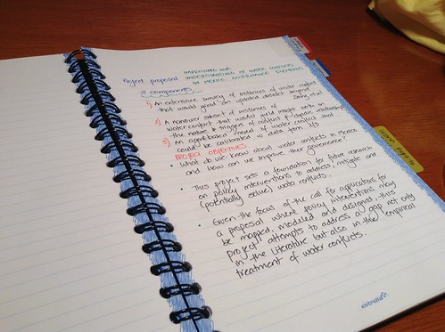
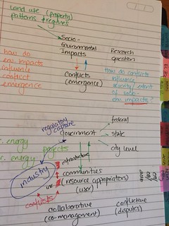 4. I use shorthand techniques to make my writing faster. When I was a child, I always thought of which tools and techniques I could “sell” (I wanted to be able to work and sustain myself even if my parents were no longer with me). So, I learned shorthand techniques (Gregg and Pitman), which were secretarial (administrative assistant) skills. I no longer write full sets of notes using Gregg shorthand, but I DO use some of their symbols. Also, I use abbreviations that make sense to me, like “w/” to mean “with”, “WRT” to mean “with respect to”, etc. I also use arrows, bubbles, boxes and stars to build mind maps (more on that topic in a future blog post). Something people ask me often is if I take notes of journal articles, books and book chapters that I read. Doing so would seem repetitious and a waste of time for some people. Generally speaking, I scribble on the margins when I highlight a paper, and then I write a memo on it (directly in my computer).