Shared posts

10 Feb 23:05

David Pogue on FCC and net neutrality

Meet the new, business-friendly FCC

Remember net neutrality?

Back in 2014, you couldn’t miss it, nor the videos that people created to explain it. Like the one I made.

Net neutrality is the principle that internet service providers (ISPs) like Comcast (CMCSA) and AT&T (T) should not be able to charge more to pass along some kinds of data than others. It’s an issue now that these companies own more than the “pipes”—they also own the companies that send video through them. For example, Comcast owns NBC, and AT&T owns DirecTV. Should Comcast be allowed to charge Netflix (NFLX) more because it’s a rival?

2014 was the year of net-neutrality debate. The whole country was up in arms. Every consumer-advocacy group took to the streets. In the end, net neutrality was preserved; the internet continued as it always has.

But now there’s a new FCC chairman, handpicked by Donald Trump: former Verizon (VZ) lawyer Ajit Vai. He wasted no time—without any announcement or discussion—in tearing down the FCC’s consumer-protection laws. He took about a dozen actions, including these:

  • “Net neutrality’s days are numbered,” he announced. He’ll face a battle to dismantle it completely, but that’s his goal.
  • He has defunded nine smaller ISPs that participate in the Lifeline program, created by Republican presidents Ronald Reagan and George W. Bush to bring service to lower-income Americans.
  • He has killed the FCC’s effort to eliminate the cable-box rental industry, which costs you more than $230 a year, per box. The previous FCC felt that its circuitry could easily be built into our TVs or gadgets like the Roku or Apple (AAPL) TV.
  • He has halted the FCC’s efforts to end price-gouging monopolies on phone calls from jails and prisons, which cost as much as $17 per 15-minute call before the regulator acted to rein in prices.

Pai’s goal, like Trump’s, is to eliminate as many regulations as possible—regulations that cost money to large corporations like Verizon (2015 profits: $42 billion), AT&T ($13 billion), and Comcast ($3.5 billion).

Alas, the loser in these transactions is you, the consumer. Once net neutrality is dead, you’ll pay more for Netflix and other services that aren’t owned by the ISPs.

Of course, not everyone will be unhappy with the new, anti-consumer FCC spirit. Shareholders will love it.

Disclosure: Verizon has made an offer to buy Yahoo Finance’s parent company, Yahoo.

David Pogue, tech columnist for Yahoo Finance, welcomes non-toxic comments in the Comments below. On the web, he’s davidpogue.com. On Twitter, he’s @pogue. On email, he’s poguester@yahoo.com. You can read all his articles here, or you can sign up to get his columns by email.

10 Feb 23:05

Everyone Has A Different Journey

by Richard Millington

I like this from StackOverflow.

“Q&A tends to be somewhat competitive and adversarial. This means that users often get answers to their questions within minutes. But not everyone enjoys that sort of activity. So we are experimenting with another way to contribute to the art and science of programming. We call it Documentation. In its first year, users have created 21,954 examples organized in 6761 topics and representing 890 tags. Our vision of Documentation will only succeed when many developers pitch in with improving edits.”

It takes a lot of empathy to understand how the environment you shape influences the emotions of members. It takes even more to see how that the same behavior that drives a lot of activity prevents others from participating entirely.

If you don’t think you can give the first or best answer, why contribute at all?

Everyone has a different journey through your community. Your job isn’t to force everyone through (and try to optimize) a single journey but to identify and develop multiple ways people can participate which reflects their authentic behavior.

Competitive communities will always attract a small group of loyalists yet be off-putting to others. So how else can you persuade people to participate?

10 Feb 23:05

The Top Benefits of Electric Bikes

by Chandler Harris

The use of electric bicycles, or eBikes, is growing quickly throughout the world. An estimated 200 million electric bicycles are ridden around the world today and by 2050 that number is expected to reach 2 billion, according to the Electric Bike Worldwide Report.

The reasons for the explosive growth in electric bikes are numerous. The following are some of the key benefits of electric bikes.

  1. Smart Commuting

EBikes present numerous advantages when it comes to traveling to work, running errands or getting around town:

  • You don’t need a car, so you’ll save on gas, insurance, parking fees, car maintenance.
  • Easy parking. You no longer need to drive around in circles to find a parking spot
  • Cut through traffic jams. Reduce your stress level and even get to where you need to go faster.
  • Get good exercise rather than sitting in a car
  • Easily bike over hills without getting sweaty
  • You can bring a foldable electric bike on a bus or train, so you can commute to your final destination easier.
  1. Better Health

A University of Colorado study studied a group of new riders on pedelecs (electric bikes that are powered when a rider pedals) and found improvements in the riders’ cardiovascular health, including increased aerobic capacity and improved blood sugar control.”

  • Riding an electric bike is good exercise even with an electric motor.
  • Flexible exercise: Get as much or as little exercise as you like. An electric bike provides exercise for people of all ages and physical stamina
  • Improved coordination
  1. Help the Environment

Riding an electric bike helps the environment at large, but also the immediate societal environment.

  • No harmful greenhouse gasses from an eBike
  • Ease traffic congestion
  • A renewable/rechargeable form of transportation
  1. A Fun Lifestyle

An electric bike is ultimately fun and can add a great deal of adventure to your life.

  • Explore further with an electric bike that you thought possible
  • Get back into cycling if you haven’t done it in a while
  • Enjoy the feel of the wind and sunshine while you ride
  • Spend time with your loved ones outside
10 Feb 23:04

PolaPi-Zero: the tiny thermal-printing camera

by Alex Bate

Using a Nano Thermal Receipt Printer from Adafruit, a Sharp Memory LCD screen, and a Raspberry Pi Zero, Hackaday.io user Pierre Muth has created the PolaPi-Zero, or as I like to call it, the Oh-My-Days-How-Cute-Is-This-Camera-LOOK.

PolaPi-Zero Raspberry Pi

In lieu of banana, a Euro for scale.

Having gifted his previous Pi-powered camera to a friend, it was time to build a new one. A version 2.0, if you will.

The camera considers itself a makeshift Polaroid, allowing for review of an image via the LCD screen before you press a button to print via the thermal printer.

PolaPi-Zero

Instant-Printing-Point-and-Shoot camera : https://hackaday.io/project/19731-polapi-zero -Raspberry pi Zero -Camera module -Sharp Memory LCD -Adafruit nano Thermal printer

Having designed the case in 123D, he used an online 3D printing service to complete the body of the camera. You can download the case file here.

Code for the camera can be found on GitHub, where Pierre apologises for the less-than-elegant look:

“This project is a good excuse to start learning Python (finally).”

You can also download the image directly here.

PolaPi-Zero Raspberry Pi

Follow the build via Hackaday.io, and if you make one, be sure to share it with us in the comments below. If you’ve made a similar project, again with the comment sharing.

The post PolaPi-Zero: the tiny thermal-printing camera appeared first on Raspberry Pi.

10 Feb 23:03

It's back to the office for IBMers

by Volker Weber

The Register:

IBM is cracking down on remote workers, ordering unlucky employees to either come into one of six main offices and work "shoulder to shoulder" – or leave for good.

While The Register mentions IBM Marketing, this is a broader initiative and explains some of the recent defections like Luis Benitez who worked out of his home country Puerto Rico.

IBM has been telling everybody (and itself) that location does not matter anymore and that distributed teams come together through software, but it hasn't been working well for the company. Process rules at IBM and things that seem easy are in fact very difficult. I have the utmost respect for any IBMer who gets anything done. After years of falling revenues the company is now reorganizing. Without a doubt IBM will be losing many talented people who have made other plans.

To my knowledge this IBM initiative has not been rolled out to other countries yet. Tell us if you know otherwise.

In this context it is interesting that Microsoft is working differently. Microsoft Germany doesn't count hours or days and they don't make you come to the office. It's only the results that count, not the time you put into them. It has made Microsoft one of the most attractive employers here. And it is working. From partnering to PR I see no other vendor coming close.

10 Feb 23:03

Courses, Books and Doctorates

Miscellaneous things I’ve been up to/will be being up to over the next few months:

  1. I’m contributing a chapter (provisionally titled Hate Crimes, their Past and Future) to Greg Wilson’s Stuff that Actually Matters, a book on, well, stuff that actually matters, also featuring Emily Gorcenski, Melinda Minch and Gem Barrett because the pool of socially-interested code people is about 5 people wide.
  2. I’m writing a course for DataCamp on manipulating and consuming data from the web using R. Wayback when I started using R, it was for just these purposes (my first ever package release was an API client) so I’m super psyched to geek out about APIs at new data scientists. Plus they’ve told me I can use props in the videos.
  3. Aaand last but not least in good news: I got into the University of Washington’s PhD program in Human-Centred Design and Engineering. This was tremendously surprising to me and, apparently, 0 other people in my life, and life is about to get very interesting.
10 Feb 23:03

Stagehand Review: Living Platforms

by Federico Viticci

One of my first memories of a portable platform game takes place in the summer of 1996 and it involves Super Mario Land 2 for the original Game Boy. I was 8, and until that point, my only console experience had been with a Super Nintendo my parents bought me for Christmas. I could play with it a few hours each week, which didn't satiate my infinite curiosity for videogames. When I saw Super Mario Land 2 on a friend's Game Boy, I was taken aback by two distinct aspects: the contagious fun of a platformer (my only SNES game was Stunt Race FX – don't ask) and its ubiquitous availability – provided you had enough daylight and 4 AA batteries.

Later that year, I convinced my mom to buy me a Game Boy. A couple of years later, I got a Game Boy Color. For the past 20 years, portable consoles and Nintendo's Mario games have shaped my taste in videogames and defined my moments of quiet downtime. From Super Mario Advance 1 and 3 (both remakes of games I had never played) to New Super Mario Bros and, to an extent, the recent Super Mario Run for iOS, all my favorite 2D platform games agreed on a basic idea: you control a surprisingly athletic plumber who runs and jumps from left to right.

Conversely, Stagehand, the latest creation by Big Bucket (makers of The Incident and Space Age), upends decades of platformer conventions by turning the genre on its head. You don't maneuver a character with meticulously timed jumps across retro-styled stages filled with floating platforms and spikes; rather, you sloppily modify the stage itself with touch, dragging platforms to accomodate the hero's run and making sure he doesn't run headfirst into cliffs, fall into pits, or get eaten by the inexorable advance of the left side of the stage.

Stagehand is an endless runner combined with a dynamic platform game, only you don't control the character – you facilitate his run by reshaping the stage around him.

This novel idea – conceived by Big Bucket's Matt Comi and Neven Mrgan – may sound like a pretentious gimmick, but after some initial moments of confusion and panic, it demonstrates how a simple twist (control the stage instead of the character) can foster a deep and strategic mechanic.

Consider Mario's iconic brick blocks, for instance. In one of its many throwbacks to classic arcade and platform games (including a delightful use of parallax layers), Stagehand features brick blocks in a variety of sizes, lengths, and orientations. Because of the game's inverted approach to running, however, these canonical elements become obstacles to avoid rather than innocuous objects to destroy for free coins.

Brick blocks: both platforms and obstacles in Stagehand.

Brick blocks: both platforms and obstacles in Stagehand.

In Stagehand, non-terrain pieces such as brick blocks can't be moved vertically; if you run into one and can't move further, the stage will continue to swiftly move toward the right side, you'll be stuck, and you'll lose.

Every run through Stagehand's procedurally generated courses is a fine balance of swipe dexterity, keeping momentum via speed-boosting platforms and jumps, and forging a path ahead by planning where Frank – The Incident's returning protagonist – will land.

This tension between immediate hurdles and pondering your next move is what defines Stagehand's gameplay. Combined with Frank's ability to perform small jumps automatically, the pursuit of coins, and Cabel Sasser's memorable soundtrack, the result is a title with plenty of character and a unique blend of platformer norms reimagined to fit the game's foundation.

And it works. Once you move past the perplexity caused by indirect manipulation of the character, you'll start to think the way a god-like puppeteer would think about his creation. Should I swipe this platform down to combine it with the upcoming chains of coins underneath, or elevate it to make Frank jump and skip three platforms in a row? What if a jump is too high and I lose control of Frank, causing him to fall into a lava pit I didn't see coming?

Somehow, this mix of falls and jumps driven by adjustable platforms soon starts making sense within the miniaturized universe of The Stagehand – much like you didn't question why most of modern civilization's manufactured goods would fall from the sky in The Incident, but simply avoided them. A physics engine that makes Frank react credibly helps maintain this illusion, yielding a type of gameplay that will require you to pay attention to how quickly you have to swipe to let Frank jump or trot based on the platform he's on. Stagehand's "gimmick" becomes a plausible raison d'être for Frank's effort, and an infuriatingly fun exploitation of the iPhone's touch hardware.

Like The Incident, and more so than Space Age, Stagehand can only exist on iOS. Stagehand hasn't been adapted for touch controls just to reach a larger audience; it's a game tailored to the iPhone's touch screen, built around the premise of swiping platforms to create an optimal path for the ever-escaping character. No other control system would do Stagehand justice.

The iPhone 7 deserves a special mention here. Comi and Mrgan delivered an exceptional use of haptic feedback in Stagehand, leveraging individual thuds for heavy landings and a series of buzz-like taps to simulate Frank's legs sprinting on a boosting platform. It's hard to convey, but the Taptic Engine makes Stagehand even more peculiar and fun on the iPhone 7.

This landing will produce a subtle tap with the iPhone 7's Taptic Engine.

This landing will produce a subtle tap with the iPhone 7's Taptic Engine.

Stagehand is a game with a steep learning curve that takes a long time to master. I spent the first 30 minutes rewiring my brain after two decades of platform games and the past 2 months trying to beat my high score (I did, two days ago). I don't know if I'll ever manage to break the 4,000-meter ceiling, but it doesn't matter. In every session, I'm motivated by my friends' high scores1, humming along to Sasser's theme song while I'm focused on keeping Frank's movements under control. Stagehand is delightfully difficult but always fair and true to its rules.

I would have liked to see more variety in Stagehand. Stages, even with a day/night cycle that alters the colors of platforms and backgrounds, tend to reuse the same elements and patterns. There could have been room for experimentation with platforms featuring different surfaces, moving obstacles, or multiple types of collectable items. Accumulating points to unlock new characters will drive replayability, but it's a double-edged sword for users who will never collect enough to see the characters. Ultimately, I'm left wanting more from Stagehand – wondering how its deceptively ingenious mechanic could have worked for all kinds of stages, characters, and missions.

But perhaps it's Stagehand's utter simplicity and rigorous approach that make it stand out. This is it. Stagehand is blessed by one pure, iconoclastic gameplay mechanic and your willingness to learn it, deconstruct it, and master it over time.

Stagehand is the opposite of Nintendo's classic Mario games. But, in many ways, it also shares the same underlying principles. The control system is the game itself. The game becomes an extension of the player. From this standpoint, it's only fitting that it was the iPhone's multitouch that reversed the platform genre. Stagehand couldn't exist anywhere else.

Stagehand is available on the App Store.


  1. Displayed contextually within the game as vertical lines and labels. ↩︎

Support MacStories Directly

Club MacStories offers exclusive access to extra MacStories content, delivered every week; it’s also a way to support us directly.

Club MacStories will help you discover the best apps for your devices and get the most out of your iPhone, iPad, and Mac. Plus, it’s made in Italy.

Join Now
10 Feb 23:03

Touch Bar Support is Available to Microsoft Office Beta Testers

by John Voorhees

Touch Bar support for Microsoft Office was announced last fall at Apple’s MacBook Pro event and on Microsoft’s blog. Those features are beginning to appear in some of the apps in Microsoft’s Office suite through Office Insider, a public beta program that anyone can join. Touch Bar support is currently available in Word, Excel, and Powerpoint, and is expected to be added to Outlook and Skype later. Although the features are currently only available through the Office Insider program, they should be available to other users later this year. I updated to the latest Office beta and tried its new Touch Bar features.

A selection of the Touch Bar functions included in Office.

A selection of the Touch Bar functions included in Office.

In Word, Touch Bar support includes formatting, style application, and table editing buttons. A 'Focus Mode' has also been added to Word that eliminates all menus, controls and status bars from the app, leaving nothing but the document you are drafting on a black background. Focus Mode highlights one of the best use cases for the Touch Bar. By moving commonly-used controls onto the Touch Bar you get the best of both worlds: an uncluttered minimal writing environment in an app historically known for just the opposite, but with commonly used formatting tools close at hand.

Excel includes formatting buttons similar to Word but adds styling options specific to spreadsheets and quick access to common chart types. The style buttons are particularly nice because the Touch Bar's OLED display allows the buttons to provide a full-color preview of the formatting that they apply. Excel also shows equation search results in on the Touch Bar as you begin typing one into a cell.

PowerPoint users get a series of mini slide images in the Touch Bar in presentation mode that make it easy to jump to a specific part of a presentation. PowerPoint also includes buttons for adding slides, tables, and shapes. Word, Excel, and Powerpoint have a button that lets you access recent documents from the Touch Bar too.

The Touch Bar is a natural fit for the feature-rich apps in Microsoft’s Office Suite. It feels like there is even more that Microsoft can do with it in each app, but it’s still early in the testing phase, so I wouldn’t be surprised if more Touch Bar functions are added in the coming weeks. If you are interested in testing Office's Touch Bar support, you can sign up for the Office Insider program here.


Support MacStories Directly

Club MacStories offers exclusive access to extra MacStories content, delivered every week; it’s also a way to support us directly.

Club MacStories will help you discover the best apps for your devices and get the most out of your iPhone, iPad, and Mac. Plus, it’s made in Italy.

Join Now
10 Feb 23:03

Reading Laruelle 1 – a review in 3 parts

by Rob Shields

Alexander Galloway, Laruelle: Against the Digital.  Minneapolis: University of Minnesota Press 2014.  ISBN 9780816692132

1. Against the digital as differentiation

I first read this book in one sitting of 7 hours but have divided this review as I wanted to extend my discussion of Galloway’s treatment of Deleuze.  This will appear as Part 2 of this review.  Alexander Galloway’s book Laruelle: Against the Digital presents 14 theses across 10 chapters that move from the inaccessible monolithic material oneness of the Real to a critical assessment of ‘analysis’ that is the hallmark of philosophy.  Philosophical elements, such as analysis, are presented under the label of the ‘Standard Approach’. Galloway argues that François Laruelle (From Decision to Heresy, Experiments in Non-Standard Thought. New York: Sequence. 2012) offers a realist or ‘Non-Standard Approach’ that foregrounds imminence and the a priori commonality of all being and thought as a general category of the undifferentiated, indifferent, or generic.  Being and thought go together and imply each other inseparably (cf. Heidegger).  Galloway insists he is not offering a book about Laruelle, but he closely follows the lines of his philosophical position.  The generic is the ‘analog’ that Galloway pits against the tradition of differentiation and division that underpins the digital 0-1 binary system.  Standard Approach philosophy is thus digital.  Lucretius, Spinoza, Deleuze, Althusser are important references for Galloway in Part Two of his book where he considers the politics and aesthetics of cybernetic control society, the aesthetics of darkness and light, and an ethics of the generic.

As mentioned, the most interesting aspects of the book for me are found in Galloway’s discussion of Deleuze’s Society of Control (see Part 2 of this review). However before he arrives at his discussion of Digital Capitalism, Galloway’s text moves through several labyrinthine chapters on analytical division, Laruelle’s critique of hermeneutics, dialectics and multiplicity, and the hierarchical temporal logic of the event.

“Laruelle is charting an exodus out of representation more generally. Thus, the true withdrawal from digital quality will lead to imminence, not analogy. The ultimate withdrawal from digital will lead to the generic” (89).

The Standard Model of philosophy is premised on the division of the One into two as an event and a decision.  It is both ontological and metaphysical.  The NonStandard Model does not permit either a hermeneutics that separates surface and depth, a structuralism that separates appearance and structure, not even a division of the digital and analog, nor critique based on some sort of external subject position that assesses an ignoble problem object.

Galloway takes the zero – one logic of today’s digital world as a logic of distinction, decision, difference, and division. He does not discuss other possible readings or understandings of this zero as a non-negative that cannot simply be contrasted against a one, meaning a particular or an entity. For example, contemporary mathematics often understands zero as exactly Laruelle’s undifferentiated whole that is an inclusive infinity or plenum that includes All.  My thought is that oneness is an eerie anticipation of quantum computing’s ‘all-at-once’ computation of a field of possibilities (an analogue space without time produced in only a single computational cycle).  It also points toward the possibility of a future social theory encounter with social diversity as an analogue phenomenon, variation rather than difference.  This entails an examination of the Janus – faced quality of the zero in the 01 binary logic,  This is one of the exciting opportunities that Galloway gestures toward (Chapter 4 and 5 of the book) but does not provide. However, it seems that Laruelle, and Galloway following him, argues for a focus on a meta-stasis of pure immanence that prevents any rational representation and analysis of being, except as the grand illusion of a divided world of subjects and objects.

…Part 2 follows.

Rob Shields (University of Alberta)

10 Feb 23:03

Interiority Complex

by Rae Nudson

When I walk outside at night in Chicago, I look for lit-up interiors. I don’t care about seeing the people inside, but I do want to see how they live. Do they have a fireplace? Is it real? Are there pictures hung above it like mine? I look so long and hard into people’s private spaces that sometimes I trip on the sidewalk.

Online, seeing inside people’s homes is easier. All I need to do is open Pinterest or Instagram, and there are interiors laid bare for anyone to see. These images provide something different from what I can see through windows from the street, or what I once might have got from looking at decor magazines. In these online forums, interiors are not simply a glimpse at an arrangement of things; a different sense of “interiority” is evoked: People share their home-design fantasies as well as explore approaches to how they want to live in reality. Instead of a static catalog, the set pieces online shift with the focus of who’s looking, reposting, and commenting. Through hashtags and other methods of interlinking, people can show their homes while seeing how their ideas and lives fit in with others’. In fact, in this environment, showing off and fitting in become mutually reinforcing, each dependent on the other. Showing off becomes a way of fitting in rather than standing out.

With the homes I see on my street, in my physical neighborhood, we share geography but not emotional contact. Whereas with the interiors online, I’m not just on the outside looking in; I can feel as though I have a standing invitation to come inside and look as long as I want. It’s as though I’m in the midst of an imagined community, grounded not in geography but in our dreaming together of what our lives could be.

I had such communal decoration daydreams long before I ever heard of an Instagram feed. When I was little, a friend and I would build elaborate mansions in our heads. We would come up with designs that we would describe to each other, and my friend would draw it out with pencil and paper. We filled pages and pages of our made-up home with curtains, marble columns, and anything else we deemed fancy enough. These shared dreams became a medium of friendship; articulating these fantasies was a way to learn to want new things while grounding a connection that already existed. It blended the familiar with the new.

Selecting design ideas from a communal stream carries them from signifying the group to signifying the individual and back again, with one perspective never fully erasing the other

In the corners of the internet devoted to real estate and interior design, I can now iterate a series of dream homes without the pencil and paper, taking in pictures of houses from all over the world, from people with different tastes, backgrounds, and bank accounts than me. And I connect not just with friends but countless others who are doing the same thing. I can collaborate in the commentary on images; I can see how people try to solve various home-design quandaries and contribute my own ideas. Seeking design inspiration no longer need entail the isolation of window shopping. Among these communities, decorating can feel like a grassroots movement rather than a decree.

In some respects, this collective project of fantasizing how to live reflects changes in housing expectations after the financial crisis. Instead of anticipating having a house of one’s own, many people found themselves looking at renting apartments with roommates or moving into a relative’s basement. Under such circumstances it makes sense that there would be comfort in shared pictures of beautiful houses, vicarious escapes into familiar aspirations suddenly made even more remote. When I shared a bathroom with roommates, it was easy to revel in images of expansive white marble bathrooms that exuded relaxation, with large bathtubs under skylights. After I schlepped dirty clothes to the laundromat, I would click through images of perfectly organized laundry rooms, with space to sort and fold my lights and darks.

But if people find a kind of vicarious indulgence in the various images of homes and spaces online, they also may find security in the community of people posting them. Online interaction makes decorating feel more inclusive and more directly personal than when it was restricted to having guests come over (or strangers peering in). It no longer relies exclusively on mass-market magazines and their aspirational standards. And it can occur at a more theoretical, experimental level — expressing an idea through interior design no longer requires committing time and money to a particular physical arrangement of things, or special times at which such arrangements can be put on display to selected audiences. Decoration can be divorced from particular occasions and be more a matter of ongoing self-expression.

With the breadth of people sharing and resharing images online, you might expect to see a flourishing of combinations of objects and motifs, creating spaces you could never actually see in real life. With no rules to follow, someone could theoretically make an online version of their own made-up mansion, with ever wilder rooms full of fantasies. Without physical or budgetary limits, people could seemingly explore new design options with less risk, but it may be that the nature of the risk changes. The stakes are not so much making a bad investment of time and money, but expressing tastes that jeopardize one’s sense of community. In other words, if online image sharing makes for a community, it also tends to foster what communities have always fostered: conformity.

In online groups, tastes can begin to converge, focusing on the same stores, the same pieces, the same safe ideas. The sense that one’s decor is always potentially on display, capable of being posted to social media whenever, tightens the feedback loop between what is in actual homes, and what appears in the design-themed posts of our carefully chosen social media peers, which then later appears again in social media, and on and on. This ubiquity can exhaust the vitality of certain design approaches even as it makes them harder to challenge. Instead of extravagant creative visions, it’s the same couches, the same rugs, the same curtains, remixed slightly into a different combination, and then settling back into sameness — a comfortable familiarity cast in the image of furniture.


One item in particular has haunted me: A black-and-white graphic $10 pillow from IKEA has continually popped into my feed for years. Once I noticed it, I started to see it repeatedly, a plushy manifestation of the Baader-Meinhof phenomenon. I’ve seen it at home in a Brooklyn apartment, nestled into a modern leather chair, sitting on a couch on a popular TV show. The pillow looks to me like a pixelated version of an ikat pattern, an old design from Indonesia, eons older than the internet, made of intricate, repeating shapes. Because the yarn used in traditional ikat textiles is dyed before it’s hand-woven, the edges of the pattern are sometimes blurry, shapes dreamily bleeding into one another. But the IKEA pillow seems the opposite of traditional ikat: Its shapes have hard edges, it is mass-produced, and instead of dancing colors, it is black and white.

In “In Behind the Warps and Wefts: Indonesian Textiles in Context,” Brigitte Khan Majlis discusses how millennia-old textiles from the Indonesian Archipelago, like the ikat, came into Western consciousness in the early 1900s, when trading brought cultures together. “Dutch consumers became enamored with the colorful wrappers from the small island of Sumba,” she writes, “which were worn by the local aristocracy during ceremonies … such textiles were admired for their aesthetic qualities rather than for their traditional meanings and uses, which were known only to a very few Westerners.” As the pattern spread, the cultural context that went with it was lost, along with its traditional meaning. For new groups who didn’t know its history, it would mean something else, with a different sense of community born around it. For those who buy the pattern and recognize it at one other’s homes, it signifies a different sense of cultural belonging, within a globalized culture of appropriation.

The line between inspiration and appropriation is hard to draw and can be erased as quickly as a mouse click. On an individual’s Pinterest board, ikat doesn’t signify Indonesian culture so much as one’s personal inspiration and participation in a culture (Pinterest’s) that privileges such individualistic displays of taste, in the form of trends.

Interior design, like the housing market, is built on a delicate mirage: It is supposed to cast an image of the life you want to live. But the desire to be both seen and protected don’t always cohere

Just as IKEA makes style in the form of patterns like ikat available to the masses by making them cheap, sites like Pinterest democratize “inspiration” by making it systematic, breaking it down into isolated units in an endless series of reconfigurable grids. Like so many bricks, the tiny boxes on Pinterest pages stack into formidable houses built of shared dreams, and they disaggregate as easily. The context changes, meaning is erased and reconstituted, and the objects transform into something new.

In “Welcome to Airspace,” Kyle Chayka looks at how technology has pushed the same design aesthetic to different places. According to Chayka, companies like Airbnb have helped commoditize a generic look that makes users feel at home around the world. The “anesthetized aesthetic of International Airbnb Style,” he argues, comes from, in part, millions of people online “all acting and interacting more or less within the same space, learning to see and feel and want the same things.” The well-off traveling class spread their sensibilities, pollinating cities and social media feeds with images of natural wood and industrial lighting. As these tastes spread, places grow more similar. (Search #cafeculture on Instagram to see this in action.) In return, people gain an easy comfort in new places and fluency in a shorthand visual language, regardless of whether they can speak the local spoken languages. This generic style is successful for the same reason chain restaurants are: It is something familiar to hold onto no matter where you are.

At the personal level, the effectiveness of this generic design style doesn’t depend on the aesthetics of any particular pillow or light fixture. It relies instead on the ease with which such motifs circulate in images. Selecting design ideas or items from a communal stream to include in a personal vision carries them from signifying the group to signifying the individual and back again, with one perspective never fully erasing the other. Users at once express individual tastes and communal belonging.

To sustain this dual signification, a different sort of erasure is necessary: Actual people are often banished from interior design images, presumably so viewers can imagine themselves in the space instead, dreaming that they too could live inside perfection. Pictures try to look “lived in,” but in a way that no one actually lives. Books on tables can’t be too messy; blankets have to be draped just so. Styling hides imperfections, and Photoshop erases mistakes left behind by human hands. By banishing people from these pictures, the images become abstract, free from any lived context that might complicate their beauty. As context and history are lost in the online circulation of images, what’s left is varying displays of sameness.

I have developed a fear that this sameness will overwhelm me. I was broke when I was younger and moved often, and my home has its share of IKEA furniture. But I am afraid of my interiority becoming like a catalog. I am afraid of being effaced, being disappeared to wherever everyone else in interior-design images have been sent. I get furniture from garage sales and hand-me-downs from family members, and I paint what I buy to try to transform it somehow into my own. My favorite piece of art that I own is a giant painting of a ship my boyfriend and I found at a garage sale for $5. I can take comfort I won’t see it in any magazines, and it feels like the opposite of an image repinned on Pinterest. Unless (or until) I pin it there myself.

Interior design, like the housing market, is built on a delicate mirage: It is supposed to cast an image of the life you want to live. But a home is meant to shelter you from the world even while it may be meant to expose your truest you. It presumes a desire to be both seen and protected, and these don’t always cohere. I share my home online and participate in design communities partly to feel connected to others, but it also connects me to the speed of trends, the rate of their exhaustion, the process of decontextualization. At some point so many contexts will have collapsed that it may seem as though there’s nothing left for anyone to appropriate, nothing and no one new left to follow. I’m afraid that after I have opened my home to those online and off, I will still feel alone, surrounded by beautiful, generic things. It’s not the following that scares me. It’s not knowing what will happen when it stops.

10 Feb 23:02

Sharing the same traits and qualities

by Nathan Yau

My son used to watch Daniel Tiger’s Neighborhood (a modern take on Mister Rogers’ Neighborhood) a lot, and one song’s chorus goes like, “In some ways we are different, but in so many ways we are the same.” This commercial from TV2 in Denmark is the grown-up, categorical version of that message.

Tags: commercial, human

10 Feb 23:02

How annotation layers define “segments of interest” for new kinds of applications

by Jon Udell

Here are some analogies we use when talking about software:

Construction: Programs are houses built on foundations called platforms.

Ecology: Programs are organisms that depend on ecosystem services provided by platforms.

Community: Programs work together in accordance with rules defined by platforms.

Architecture: Programs are planned, designed, and built according to architectural plans.

Economics: Programs are producers and consumers of services.

Computer hardware: Programs are components that attach to a shared bus.

All are valid and may be useful in one way or another. In this essay I focus on the last because it points to an important way of understanding what web annotation can enable. My claim here is that the web’s emerging annotation layer forms a shared bus for a new wave of content-oriented applications.

A computer’s bus connects devices: disk drive, keyboard, network adapter. If we think of the web in this way, we’d say that devices (your computer, mine) and also people (you, me) attach to the bus. And that the protocol for attachment has something to do with URLs.

You can, for example, follow this link to display and interact with the set of Hypothesis annotations related to this web page. You can also paste the link’s URL into a message or a document to share the view with someone else.

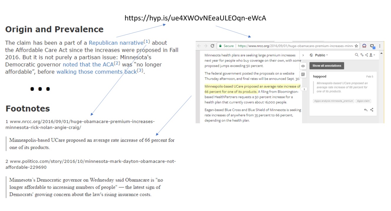
That same URL can behave like an API (application programming interface) that accesses the resource named and located by the URL. A page like this one, part of the DigiPo fact-checking project, uses the link that way. It derives the Hypothes search URL from its own URL, and injects the resulting Hypothesis view into the page.

Every time we create a new wiki page at digipo.io, we mint a new URL that summons the set of Hypothesis annotations specific to that page. In principle there’s no limit to the number of such pages — and associated sets of annotations — we can add. And that’s just one of an unlimited number of sites. The web of URL-addressable resources is infinitely large.

Even so, URLs address only a small part of a larger infinity of resources: words and phrases in texts, regions within images, segments of audio and video. Web annotation enables us to address that larger infinity. The DigiPo project illustrates some of the ways in which annotation expands the notion of content as a bus shared by people and computers. But first some background on how annotation works.

The proposed standard for web annotation defines an extensible set of selectors:

Many Annotations refer to part of a resource, rather than all of it, as the Target. We call that part of the resource a Segment (of Interest). A Selector is used to describe how to determine the Segment from within the Source resource.

When the segment of interest is a selection in a textual resource, one kind of selector captures the selection and its surrounding text. Another captures the position of the selection (“starts at the 347th character, ends at the 364th”). Still another captures its location in a web page (“contained in the 2nd list item in the first list in the seventh paragraph”). For reasons of both speed and reliability, Hypothesis uses all three selectors when it attaches (“anchors”) an annotation to a selection.

When a segment of interest is a clip within a podcast or a video, a selector would capture the start and stop (“starts at 1 minute, 32 seconds, ends at 3 minutes, 12 seconds”). When it’s a region in a bitmapped image, a selector would capture the coordinates (“starts at x=12,y=53, ends at x=355,y=124”). When it’s a piece of a vector image, a selector would capture the Scalable Vector Graphics (SVG) markup defining that piece of the image.

The W3C’s model of web annotation lays a foundation for other kinds of selectors in other domains: locations in maps, nodes in Jupyter notebooks, bars and trend lines and data points in charts. But let’s stick with textual annotation for now, consider how it expands the universe of addressable resources, and explore what we can do in that universe.

Here’s a picture of what’s happening in and around the above-mentioned DigiPo page:

The author has cited a Hypothesis link that refers to a piece of evidence in another web page. The link encapsulates both the URL of that page and a set of selectors that mark the selected passage within it. When you follow the link Hypothesis takes you to the page, scrolls to the passage, and highlights it. That’s a powerful interactive experience!

Now suppose you want to review all the evidence that supports this investigation. You can do it interactively but that will require a lot of context-disrupting clicks. So another program embedded in the wiki page summarizes the cited quotes for you. It uses a variant of the Hypothesis direct link that delivers the interactive experience. The variant is a Hypothesis API call that delivers the annotation in a machine-friendly format. The summarization script collects all the Hypothesis direct links on the page, gathers the annotations, extracts the URLs and quotes, injects them into the Footnotes section of the page, and rewrites the links to point to corresponding footnotes.

To enable this magic, an app that people can use to annotate regions in web pages is necessary but not sufficient. You also need an API-accessible service that enables computers to create and retrieve annotations. Even more fundamentally, you need an open web standard that defines how apps and services work not only with atomic resources named and located by URLs, but also segments of interest within them.

What else is possible on a shared content bus where segments of interest are directly addressable both by people and computers? Here’s one idea being pondered by some folks in the world of open educational resources (OER). Suppose you’re creating an open textbook that attaches quizzes to segments within the text. The quizzes live in a database. How do you connect a quiz to a segment in your book?

Because a quiz is an URL-addressable resource, you can transclude one directly into your book near the segment to which it applies. Doing that normally means encoding the segment’s location in the book’s markup so the software that attaches the quiz can put it in the right place. That works, but it entangles two editorial tasks: writing the book, and curating the quizzes. That entanglement makes it harder to provide tools that support the tasks individually. If you can annotate segments of interest, though, you can disentangle the tasks, tool them separately, build the book more efficiently, and ensure others can more cleanly repurpose your work.

Analogies are necessary but imperfect. The notion of a shared bus, formed by an annotation layer and used by applications oriented to segments of content, may or may not resonate. I’m looking for a better analogy; suggestions welcome. But however you want to think about it, the method I’m describing here works powerfully well, I’ll continue to apply it, and I’d love to discuss ways you can too.

10 Feb 23:02

Flipboard 4.0 Presents Deeper Personalization Options

by Ryan Christoffel

Flipboard 4.0 launched today, introducing a redesigned app that revolves around one core new feature: Smart Magazines. The magazine analogy isn't altogether different from Flipboard's previous interface, where certain topics or news sources made up a grouping of stories through which users could flip. The main difference here is found in the deeper level of personalization available with Smart Magazines.

In past versions of Flipboard, searching for a topic like 'Apple' would present the option to simply add that broad topic as a source of stories to view in the future. With Smart Magazines, Flipboard dives deeper into nuanced areas of a topic in an effort to pinpoint stories that are of particular interest to you. So searching 'Apple' as a topic of interest will now present you a screen full of sub-topics to help ensure that the stories you want to see are the stories you'll get.

Setting up a new Smart Magazine is quick and easy.

Setting up a new Smart Magazine is quick and easy.

If you're a former user who loved Flipboard in the past, and haven't been totally satisfied with newer services from Apple or Google, now is a good time to give Flipboard another try.

Flipboard was my news app of choice for several years, right up until Apple News was unveiled in 2015 as part of iOS 9. As Apple News continued improving – particularly with its iOS 10 revamp – Flipboard seemed to remain in a relatively quiet season as far as updates are concerned. I'm glad to see that change with today's release. Smart Magazines and the new look may not be enough to compel me to switch from Apple News, but they do make a good service even better.

Magazines can still be viewed in the traditional block-style as before.

Magazines can still be viewed in the traditional block-style as before.

One disappointing note worth mentioning is that Flipboard's redesign is currently only available on iPhone, not iPad. For an app that got its start on the iPad, this seems an odd omission. According to a company statement to Walt Mossberg, "An iPad version is likely in a few months." Here's hoping the word 'likely' refers to the timeframe, not the creation of an iPad app altogether.

Flipboard 4.0 is available on the App Store.


Support MacStories Directly

Club MacStories offers exclusive access to extra MacStories content, delivered every week; it’s also a way to support us directly.

Club MacStories will help you discover the best apps for your devices and get the most out of your iPhone, iPad, and Mac. Plus, it’s made in Italy.

Join Now
10 Feb 23:02

En vrac du mercredi

by Tristan

En vedette :

How to #StayOutraged Without Losing Your Mind, quelques conseils pour résister au mandat de Trump. Tout à fait valable ailleurs (la neutralité du Net, la vie privée, les conditions des minorités…) et résister à l’insupportable sans y laisser sa santé mentale :

  • déconnectez-vous régulièrement. Faites des pauses entre les mauvaises nouvelles. Ne vous sentez pas coupable de ne pas tout savoir sur le mandat de Trump (ou ce qui vous rend dingue). On a le droit de déconnecter de temps en temps !
  • Concentrez votre énergie sur un ou deux sujets. La défense du féminisme, de l’immigration, etc. On ne peut pas lutter contre toutes les injustices à la fois en étant tout seul !
  • Amusez-vous quand vous faites de l’activisme. Allez manifester avec des copines, allez boire un coup après une opération activiste, etc.
  • Prenez soin de vous ! Prenez soin de votre santé, allez chez le docteur et le dentiste, chez un psy ou un coach, dormez suffisamment, prenez du temps pour vous, sortez et profiter de la nature, voyez vos amis, mangez sainement.

En vrac

10 Feb 23:02

Business books are stories. Here’s how to write one.

by Josh Bernoff

Most business books are boring because there are no people — just endless rambling on about strategy. You need people and stories to make them come alive. I wrote my first business book proposal in 2005. It was for a book called “The End of TV as We Know It,” and it reflected my decade … Continued

The post Business books are stories. Here’s how to write one. appeared first on without bullshit.

10 Feb 23:02

Vantage Review: A New Take on Calendars

by Jake Underwood

In middle school, a friend and I would hang out on the weekend and live out our rock-n-roll dreams with Guitar Hero. As the notes would come down the line, we’d press sequences of red, green, yellow, and orange, jamming to songs in the iconic and aesthetically innovative game.

I haven’t thought much about Guitar Hero recently, but an app I downloaded a couple of weeks ago reminded me of it. However, it’s not a rhythm-based guitar game, or even tied to music at all.

It’s a calendar app called Vantage.

A Lot to See

Vantage is not a calendar for power users. Instead, it’s most likely to appeal to people who have used the same calendar app for years and are looking for something different.

Vantage is definitely different from anything you’ve ever seen in a calendar app. The presentation of information is what reminded me of Guitar Hero, with its long line of information that emerges from the horizon.

The differentiating feature of Vantage is its design. All of the usual calendar features are here. You can create, view and edit events, for instance. However, it's the way the app displays your calendar items that is the main selling point.

In general, Vantage strikes a good balance between being visually innovative and usable. The vertical timeline is reminiscent of a to-do list. Each day consists of a series of cards for the events on your calendar. Tapping the date collapses the cards into a stack, an animation that fits well with the overall feel of the app, which is full of bold animations.

To minimize the amount of scrolling to reach future dates, Vantage displays a slider along the top of the screen for jumping ahead weeks or months. Along the right side of the screen, a pull tab peeks out to draw you into a more traditional streamlined calendar view if you want a break from the timeline approach. Tapping the list button at the top changes to this view for you.

Vantage's “Color Packs” section lets you choose from six themes to change Vantage’s look. I’ve tended to stick with the traditional “Black,” but “Lava Rock” and “Stealth” are also great options.

Black, Lava Rock, and Stealth

Black, Lava Rock, and Stealth

Conclusion

Vantage is a viable replacement for almost any calendar app you’re currently using. The app's fresh, unique, and customizable UI should appeal to people tired of an app category that isn't known for experimental designs. Although I will be sticking with Timepage for the time being, there are a lot of interesting ideas in Vantage that I’m going to keep an eye on as the app is developed further.

If you’d like to check out Vantage, you can pick it up in the App Store for $3.99 (Universal).


Support MacStories Directly

Club MacStories offers exclusive access to extra MacStories content, delivered every week; it’s also a way to support us directly.

Club MacStories will help you discover the best apps for your devices and get the most out of your iPhone, iPad, and Mac. Plus, it’s made in Italy.

Join Now
10 Feb 23:02

Turn Touch: A Smart, Flexible Remote Control

by Ryan Christoffel

Samuel Clay, the founder of NewsBlur, is seeking funding on Kickstarter for an interesting new project: Turn Touch.

Turn Touch is a four button remote control carved out of solid wood. Get instant control of your devices and your home. With only four buttons, your Turn Touch connects you to apps, lights, speakers, and more.

While most smart devices found in the home today are designed to be controlled via a smartphone or a voice-controlled device like Amazon Echo, Turn Touch is a more tactile option. It's designed to look less like a standard remote control and more like a piece of decor in the home.

Turn Touch was made to be compact and attractive.

Turn Touch was made to be compact and attractive.

The power of Turn Touch is found in its versatility. Though it only has four buttons, it is fully customizable using the Turn Touch app for iOS or macOS. The app allows you to program your remote to work with different devices, such as Hue Lights, Sonos speakers, or a Nest thermostat. You can also integrate Turn Touch with various apps on iOS or macOS, such as Apple Music or Spotify. Additionally, there are built-in Turn Touch apps to do things like set a timer or alarm clock. The Kickstarter page shows a list of integrations that are currently promised, and states that more are in the works. Lastly, Turn Touch can also be configured to trigger a URL on the web, opening up its possible benefits immensely.

The iOS app for Turn Touch.

The iOS app for Turn Touch.

The ability to activate several different integrations wouldn't be as useful if only one action could be assigned to each of the Turn Touch buttons. Fortunately, the device's interface provides clever ways to make the most of its four buttons. Actions can be assigned to activate through either a single tap of a button or a double tap, making eight actions available at once. And holding a button down for half a second will switch the app you're interacting with, meaning a new set of actions will be activated.

Turn Touch is available in three different styles.

Turn Touch is available in three different styles.

The Kickstarter campaign for Turn Touch ends on March 9th, and units are projected to ship this November. If you'd like to make a pledge, there are varying backer levels depending on the style of Turn Touch you'd like.


Support MacStories Directly

Club MacStories offers exclusive access to extra MacStories content, delivered every week; it’s also a way to support us directly.

Club MacStories will help you discover the best apps for your devices and get the most out of your iPhone, iPad, and Mac. Plus, it’s made in Italy.

Join Now
10 Feb 23:02

Bike Storage

by brandon

Cycling certainly has it’s benefits, but there is one drawback that any cyclist will agree on: bicycles have an uncanny ability to take up valuable space in the home or office. To help, we've sorted out our top 5 favorite racks that we use daily and .

1.  Simple Snap Bike Stand: $15.00

If you're looking for a quick fix on a budget, you've found it.

This tiny one-piece bike storage solution is easy to install, easy to use, and never gets in the way. The design allows storage horizontally or vertically to best fit any space and any bike. In both orientations, the bike’s weight is always supported by the ground, so you don't have to worry about heavy lifting or wall damage.

  • Fits most tires from road (23mm) to mountain (2.25")

  • Bikes can be mounted horizontally or vertically

  • Black or white

  • Height 8cm Depth 6cm Width 5.5cm

  • Made in USA

[commerce_cart_tokens:nid:407:1]


2. Classic Floor Stand: $25.00

Don't mind your bike taking up a little space but want to save your walls from the constant rubbing of handlebars?

The easy to assemble plastic bike stand will proudly display your bike on any level floor surface. This one is about as straight-forward as they come and is the most moveable rack on our list as it does not require mounting.

  • Durable black plastic

  • No tools required, snap assembly

  • Easily moves to any room in the home

  • Accepts tires up to 2 1/4" wide


3. Ceiling Bike Hoist: $40.00

Free up floor and wall space with this ceiling mounted bike hoist.

We use several of these in our shop, changing bikes out daily, to best utilize our space. The brackets mount directly into a ceiling joist and the pulley arms are adjustable to hold a variety of items: bikes, ladders, canoes, hammocks for small children and more.

  • Includes all mounting hardware

  • Holds up to 50lbs

  • Locking pulley makes raising / lowering safe and easy


4. Minimal Wall Mount: $70.00

This rugged yet minimal design was heavily influenced by reclaimed and industrial furniture. Constructed of natural hardwood and steel, the rack mounts directly into a wall stud and holds any bicycle with a a top tube measuring 1 1/2"  or smaller.

  • 2 bolt mounting system

  • Made in USA

  • Fits all steel frames with standard sized tubing


5. Artifox Bicycle Wall Rack: $250.00


Whether you're tight on space or simply want to showcase your bike, this vertical rack has been elevated to heirloom furniture. It will look just as good without your bike as it will with it.

Made in the USA to last from solid hardwood and powder coated steel. Installation is easy, as a unique mounting system self-levels the rack along any surface, while a cleverly placed magnet conceals the final screw. Fits nearly all bike styles and wheels up to 4.5" wide.

  • Black walnut hardwood, aluminum hardware, powder coated steel and leather

  • 64" x 3.5" x 4.5"

  • 7.5 lbs

  • Fits all wheels up to 4.5"

  • Leather guard to protect wheels

[commerce_cart_tokens:nid:426:1]

 
Feature content: 
No
10 Feb 23:02

Now Accepting Apple Pay on the Web at Hover

by James Koole

We’re all about making it easier and faster to register and purchase a domain name at Hover. So when we saw Apple Pay on the web last fall while watching the WWDC livestream, we immediately thought, “We should do that!”

So we did!

Starting today, customers set up with Apple Pay can pay on Hover using Apple Pay on the web. It makes checkout fast and and easy.

Keep in mind that there are some specific hardware and software requirements for Apple Pay on the Web. Apple’s Support site has all the details.

How it works

When you make a purchase, we’ll check with your web browser during checkout and if reports back that it is able to pay with Apple Pay, you’ll see that option in the billing info section. Clicking or tapping the Apple Pay button will cause a payment sheet to be displayed on your iPhone, your Apple Watch or on your MacBook (if you have one of the sweet new ones with Touch ID and Apple Pay built in).

All you’ll need to do is to authenticate by using the Touch ID sensor, or via your Apple Watch, and you’re all set. There’s no need to type in or provide your payment info, address, etc. It’s quick and easy and most of all, very secure.

You can also change to use Apple Pay for your renewals or future payments by updating your payment information in your account settings. It works the same way; if we detect Apple Pay on the web is supported, we’ll offer you that option.

For customers who don’t have Apple Pay, Hover accepts payment via PayPal, VISA, MasterCard, American Express, Discover, and JCB.

Here’s a video showing our Apple Pay integration in action.

10 Feb 23:02

Battery Levels

by Volker Weber

d6d9f07dba9824cc0d0f3238a40036cc

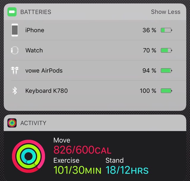
At the end of the day, iPhone is still running well, but low on battery. Watch would be good for another day. AirPods have recharged in the case. And the freaking Logitech K780 is still at 100 percent after a couple of months.

In related news, I was active today and am now ready to recharge. :-)

10 Feb 23:02

11 Milestones that will Shape Vancouver’s Future

image

What are the significant events, activities and decisions in 2016 that will shape Vancouver’s future?

Earlier this fall, the Vancouver City Planning Commission put together a preliminary list of 2016 planning milestones that was reviewed by planners, architects, landscape architects, developers, urban historians and engaged urbanists. The list was put to a vote and the final results were presented and debated at an event last week. It included panelists such as the former Mayor of Vancouver and Premier of BC, Mike Harcourt, and Carla Guerrera, a leader in real estate development and urban planning. 

Here is the list published by the VCPC, in order of significance. I agree that all of the items on the list will have a significant impact on Vancouver’s future (except maybe the launch of bike-sharing - do we have statistics on the success of the program since its launch?). It is worth noting that many of these milestones are “good news” planning goodies. What is not mentioned are the negative trends affecting them, such as the city’s homeless count, which was the highest ever recorded in 2016, and the benchmark price of a home in Greater Vancouver, which rose by 31.4 per cent to $933,100 in one year.

What do you think were the most important planning milestones of 2016? Is anything missing?

image

Design Concept for Evergreen Line station (Photo: BC Ministry of Transportation)

1. SkyTrain Expansion Connects Port Moody, Coquitlam to Vancouver

TransLink’s Millennium Line Evergreen extension opened on December 2, 2016, connecting the Tri-Cities region of Metro Vancouver to the rapid-transit network that runs into downtown Vancouver (my retired and super keen urban planner Dad rode it three times on opening day!). Expansion of the TransLink network is expected to start a new urban era for the region. The rapid-transit connection will bring more affordable housing and allow quiet bedroom municipalities outside Vancouver to become more urban. TransLink anticipates daily ridership of 70,000 within five years. 

2. City Steps Aggressively into Housing

The crisis of limited affordable housing forced Vancouver to accept greater responsibility for housing despite limited financial resources. City Council prodded senior levels of government to contribute to housing construction by offering four City-owned sites for specific projects. The municipal housing agency also sparked interest in modular housing that can be manufactured off-site, stacked, relocated and reconfigured. 

image

Vancouver Mayor, Gregor Robertson, speaking about affordable housing in the Downtown Eastside (Photo: Mark Van Manen)

3. City buys Arbutus Corridor

The City of Vancouver paid $55-million to buy the Canadian Pacific Railway Limited rail line that ran between Kitsilano and the Fraser River for redevelopment as greenway, including cycling and pedestrian paths. The land is also to be preserved for a potential light-rail corridor. Renamed the Arbutus Greenway, the green space may spark some densification in close proximity to the corridor. 

4. Tax on Foreign Nationals Buying Metro Vancouver Real Estate

In June 2016, the B.C. government announced a 15 percent property transfer tax on foreign nationals buying real estate in Metro Vancouver.  The tax was introduced to dampen prices in Vancouver’s hot real estate market, where the average price for detached properties peaked in January 2016 at $1.83-million. By November, the average price had decreased to $1.61-million and bidding above asking price was rare.

image

Resident Beaver in Vancouver’s Olympic Village (Photo: CBC)

5. Vancouver Park Board Approves Biodiversity Plan

A comprehensive Biodiversity Strategy, approved by the Vancouver Board of Parks and Recreation on February 1, 2016, is intended to increase the size and quality of Vancouver’s forests, wetlands, streams, shorelines and meadows. The Park Board stepped beyond its traditional role as custodian of green space to set the goal of restoring or enhancing 25 hectares of natural areas by 2020. Habitat is to be expanded for pollinators, birds, salmon, herring, beavers and otters. 

6. Strata Rules Eased

The provincial government changed the B.C. Strata Property Act on July 29, 2016, to allow a strata corporation to be terminated with the support of only 80 per cent of the owners. Previously 100 per cent support was required. This action is expected to lead to the sale and demolition of many three- and four-storey walk-ups built in the 1970s and earlier, uprooting long-time residents and leading to increased density. 

image

2013′s Truth and Reconciliation Walk in Vancouver (Photo: Murray Bush)

7. City Moves Forward on Truth and Reconciliation Commission’s Calls to Action

Vancouver City Council approved 41 actions outlined by the federal Truth and Reconciliation Commission. The Vancouver Park Board also approved 28 actions. These include the long-term goals of strengthening local First Nations and urban aboriginal relations, promoting aboriginal peoples arts, culture, awareness, and understanding and incorporating the perspectives of the Musqueam, Squamish, and Tsleil-Waututh First Nations, and the urban aboriginal community in development and delivery of city services.

8. Empty Homes Tax Introduced by City

In a hot real estate market where homes are purchased and flipped like stocks, Vancouver City Council became the first municipality in Canada to approve a one percent tax on empty homes. It is intended as a disincentive to property investors, who are believed to be holding around 10,000 houses and condos off the market, at a time when the vacancy rate in Vancouver is below one per cent. Staff project the one percent tax could turn up to 4,200 empty units into occupied homes, while revenue from the tax will enable the City to recoup its administration expenses and net revenues will be reinvested into affordable housing initiatives.

image

Preliminary design concepts for Robson Square

9. 800-block Robson Street Permanently Closed to Traffic

On April 20, 2016, City Council approved the permanent closure of the 800-block of Robson Street to all vehicular traffic, turning the roadway into a public plaza.   The decision allows for the revival of the original architectural and social goals for a three-block site: to create the largest public space in the heart of downtown Vancouver.

10. Vancouver Starts Up a Bike-Sharing Program

On July 20, 2016, the City of Vancouver launched a bike-sharing program named “Mobi,” which is expected to lead to expanded options for mobility, encourages a healthy lifestyle, increased use of new bike lanes in the city, reduced pressure on transit, and less vehicular traffic. By the beginning of December, around 5,000 people signed up for monthly or annual bike-share memberships and an additional 5,000 bought daily passes.

image

Grandview-Woodlands Citizens Assembly

11. Grandview-Woodlands Citizens Assembly Sets a New Direction for Community

A group of 48 community members worked collaboratively as a Citizens Assembly to develop recommendations for a community plan for the Grandview Woodlands neighbourhood. For the first time in Canada, a Citizens’ Assembly put local residents at the centre of the planning process to grapple with contentious issues dividing an iconic community of the City. In an unprecedented initiative in citizen engagement, local residents led roundtable discussions, planning workshops and walking tours to come up with directions, policies and the recommendations.  City Council approved the plan, with some controversial changes, on July 27, 2016.

10 Feb 23:01

Pogue's Basics: How to end a call on your iPhone

This is going to sound insane. But since Apple released iOS 10, a lot of people have asked how to hang up at the end of a call. It’s true: The bright red Hang Up button no longer appears on the call screen!

For a mysterious reason known only to Apple, once you press your Home button for any reason during a call—to wake the phone because it’s gone to sleep, for example, or to open a different app for reference—the red Hang Up button goes away, as shown in the video above.

So here’s the solution: To hang up, press the Sleep button (the off switch on the side or top of the iPhone). That hangs up on the call.

Alternatively, you can tap the person’s name and number at the top to make the red Hang Up button appear—and then tap it.

Now you’re no longer baffled—as much.

Adapted from “Pogue’s Basics: Tech.” David Pogue, tech columnist for Yahoo Finance, welcomes non-toxic comments in the Comments below. On the Web, he’s davidpogue.com. On Twitter, he’s @pogue. On email, he’s poguester@yahoo.com. You can read all his articles here (http://finance.yahoo.com/news/david-pogue/), or you can sign up to get his columns by email (http://j.mp/P4Qgnh). 

More Pogue

iOS 10 Hidden Feature: Bedtime-consistency management

Pogue’s Basics: Money – The Amazon card

iOS 10 Hidden Feature: Do Not Disturb Emergency Bypass

Pogue’s Basics: Money – Extended warranties

Pogue’s cheap, unexpected tech gifts #2: ThinOptics glasses

A dozen iOS 10 feature gems that Apple forgot to mention

GoPro’s most exciting mount yet: a drone

Professional-looking blurry backgrounds come to the iPhone 7 Plus

Pogue’s Basics: Turn off Samsung’s Smart Guide

Pogue Basics: Touch and hold Google Maps

The Apple Watch 2 is faster, waterproof—and more overloaded than ever

We sent a balloon into space — and an epic scavenger hunt ensued

Now I get it: Snapchat

The new Fitbits are smarter, better-looking, and more well-rounded

Apple has killed every jack but one: Meet USB-C

10 Feb 23:01

Park MTB at work without Kickstand [duplicate]

by Jérôme

This question already has an answer here:

This might seem like an odd question but I am really wondering. Up to now I used my trekking bike to commute to work and I never had any issues to leave it in the bicycle floor parking rack due to its factory default kick stand.

However I just bought a new mountain bike (XC) and I found out today that its tires barely fit into the bike stand. I had to apply brute force to get them in and out. In addition, it wobbled around and I had to use a tension belt to keep everything in place and from falling over.

Park MTB at work without Kickstand

Questions:

  1. Could this have any negative effects on the tires? (I am taking the bike every single day to commute and I leave it for 9+ hours. I would like to use the MTB at least half the time.)
  2. Is there any more elegant solution to this problem rather than using brute force / tension belts apart from adding a kickstand and than putting the bike next to the rack?

I would like to avoid a kickstand for the reasons mentioned in other threads such as here. Right now I am considering adding a kickstand and removing it after work if I decide to take a detour through rougher terrain.

P.S. Please note that I have seen plenty of mountain bikes lying on the ground after work in the past. (Due to wind or people bumping into them etc..) However I would like to avoid this if possible.

10 Feb 23:01

mtaartsdesign: We are celebrating #BlackHistoryMonth with...

by illustratedvancouver


mtaartsdesign:

We are celebrating #BlackHistoryMonth with #JacobLawrence’s final public artwork, “New York In Transit”, a large scale mosaic fabricated by Miotto Mosaic installed at the Times Square station, which pays tribute to the wide variety of intersections and connections that take place in our subway system.

10 Feb 23:01

Bikentines Day. 10 Mission Bicycle Love Stories

by kai

Boy meets girl, girl meets girl, boy meets boy, all powered by bike. 


We've seen our fair share of cyclist love stories unfold over the years at Mission Bicycle. This month it's more than appropriate to reflect on the love that our bikes have brought into the lives of our customers.


Meet Craig, who came to our shop with the intention of building 2 complimentary bikes for himself and his then girlfriend, Steph. 

 His plan was to surprise her with a new bike, which is incredibly sweet. Little did she know he would then double surprise her by proposing on the innagural ride. Spoiler alert- she said yes!

Watch a time lapse video of both bikes being built simultaneously. 


Next there was Janice and Laelia. "We stumbled into your shop and were so taken we decided to design bikes as wedding gifts to each other."

They originally met on a long bike ride. 17 years later, they took a much shorter ride down their wedding aisle, on two new Mission bikes.


Then there was Liberty (pictured below), who received a custom bike as a surprise wedding present from his fiancee Stacy. Here he is on pick-up day, beer cans emptied and included free of charge.


Ever thought you might go the extra mile for your special someone? In 2012 our customer Payam Rajabi went the extra 27 to show his girlfriend how big his heart was for her. About the size of San Francisco. 


We shared his story and it went viral. Verizon even made a commercial about it using the real Payam and his real Mission bike. 


Our co-founder Zack Rosen thought he'd ask Robin Pam out. Can you guess? A bicycle date. A self-guided tour of street art in the Mission.


A Mission Bicycle can make a good first impression. They got married in 2015. Photos by Alison Yin.


Even our General Manager, Jefferson, and his partner, Gary, got in on the action this past year (congrats again.)

With one of their first dates having been a Midnight Mystery Ride, they decided to bring things full circle on their special day. 


Staff member Robin's first date with Mission Bicycle customer Edward was on Christmas day. As of last week, Robin has a sparkling new Mission Bicycle so the love birds took their first impossibly romantic ride together and shared the below photo with us. Lovely.


Our production manager Josh built this bike as a gift for his valentine. Happy Valentines Liesse!


Mission Bicycle owners Katie and Scott, who are actually Floridians but made the trek all the way to SF this past July on a "mission" to be married on Mission bikes at our beautiful city hall. Congrats you two!


Wanted to leave you with this couple steaming up our window. Ok so these two aren't customers yet. But based on what we've seen over the years, a couple of Mission Bicycles might just increase their odds.

Love, The Mission Bicycle Team


Just now remembering you haven't picked up a card for that special someone this year? Not to worry, we've got you covered.

[commerce_cart_tokens:nid:214:1]

And if you've been left inspired to go big this year, we've always got the option of a custom designed bicycle. Now available in a box.

Including:

  • Personalized note from our design team

  • Catalogue outlining options & upgrades

  • Color fan to aid in selection of 250 frame color options.

  • Bike multi-tool for making quick adjustments

  • Pedro's Tire Levers

  • A link of chain just for fun

Simply select a deposit amount below and we'll build the bike of their dreams.

[commerce_cart_tokens:nid:527:1]

10 Feb 23:01

What are the 3 Main Categories of Electric Bikes?

by Andre Malmberg

Electric bikes are taking the world by storm. There are an estimated 200 million electric bicycles ridden around the world today and by 2050 that number is expected to reach 2 billion, according to the Electric Bike Worldwide Report.

Still, many are unaware exactly what an electric bike is and the different types of electric bicycles. Most electric bikes are, first and foremost a bicycle. The main difference is an electric bike is powered by a rider’s legs and an electric motor when needed.

The following are the three main types of electric bikes:

Pedal Assist -- Pedal Assist electric bikes, sometimes referred to as “pedelecs,” are equipped with electric motors that provide additional power when the bike is being pedaled. A sensor detects when the bike is being used, and provides the selected level of assistance. Some people explain the experience like having an invisible hand pushing them as they ride. Pedal assist bikes are limited to 20 mph and 750 watt motors.  

Most pedelecs allow the rider to tailor the bike’s power to meet specific physical needs and geographies. For instance, if you know if there is a big hill on your route, you may want to increase the power so you have additional assistance while pedaling.  Pedelecs electric bicycles are a great for all around use, since they allow riders to adjust how much or how little assistance they need at any given time.

Power on Demand - The primary difference between pedal assist electric bikes and power on demand electric bikes is that power on demand bikes allow for manual control of the electric motor. Similar to operating the power on a moped or motorcycle, riders can activate the motor with a throttle, button or trigger located on the handlebar. Just like pedelec, power on demand electric bicycles are limited to 20 mph and 750 watt motors.

Power on demand electric bikes are ideal for those who like the options of pedal assist and a manual throttle. These are generally great for people who are easing back into cycling or want to gradually increase their level of exercise while riding an electric bike. Power on demand bikes are also great for people who may want to switch between a physically strenuous bike ride one day, and an easy commute with less sweat another day.

Speed Pedelecs - Speed pedelecs, or “S-pedelecs,” are similar to normal pedelecs except that riders can combine the power of their legs with the power of the motor to achieve speeds greater than 20 mph. Most s-pedelecs have motors at 750 watts or lower and that max out at 20 mph when used as the only source of power. Yet they don’t prohibit the bike’s overall speed when the motor’s power is coupled with the rider’s own pedaling power.

It’s important to check your state and local laws regarding any possible restrictions when riding S-pedelecs.
10 Feb 23:00

Building Peer Groups

by Richard Millington

Two weeks ago, we hosted an exclusive community event with Lithium to bring 20 of the highest ranking community people together to discuss and share issues in a safe, private, environment. We all learned a lot from it.

The remarkable thing here is just how cost-efficient this is. People leave with a sense of not being alone, a collective validation of their efforts, and an assortment of new ideas and thought processes. Most of all, they get a group of people they can contact for help in the future.

I’ve lost track of the number of solutions private peer groups have helped us with over the years. This ranges from the prices of different platforms, opinions on prospective recruits, feedback on different implementation vendors, information on potential leads, heads up on possible problems, and solutions to some of our toughest challenges…along with all the emotional support.

It’s hard to talk about some things in public. This is especially true in places where community members, colleagues, or your friends might read your innermost fears.

I suspect there are opportunities in every sector and for each of our careers to build more of these. It doesn’t cost much and can save you huge amounts of time, money, and prevent mistakes.

p.s. blog post from Joe here.

10 Feb 21:42

TMD is the new BAT

by mjkim

This is the first post in our series: Discover China’s Next Unicorn, where we will go over the potential tech giants that are leading China’s IT industry. Stay tuned over the coming month to keep updated on the next ‘BAT.’ 

Anyone who is interested in IT industry in China would probably be familiar with what ‘BAT’ stands for: Baidu, Alibaba, and Tencent, the three tech giants in China. However, they are all quite mature and old. Indeed, it is time for a new acronym that represents three significant companies, following the success of BAT.

Now, we’d like to introduce a new acronym, TMD: Toutiao, Meituan, and Didi Chuxing.

01522155d6953332f875a132a6c7b4

Toutiao (头条)

Toutiao, meaning “headlines” in Chinese, is an insanely popular Chinese news aggregation app. Toutiao boasts some 700 million users in China, with more than 68 million active daily users.

It is important to note that Toutiao is not a mere news reading service but rather a curation platform with highly sophisticated machine learning technology. With the database of readers’ taste and preference, Touiao precisely tailors its offerings accordingly to get more clicks.

Recently, Toutiao acquired Flipagram, a popular video app in the US. The company plans to integrate Flipagram videos in those recommendations, so that should improve Flipagram’s reach.

201512310721451533384357

MeituanDianping (新美大)

Meituan and Dianping, two of the dominant group deals e-commerce platforms, merged in October 2015, forming a joint company called Meituan-Dianping or Xinmeida in Chinese.

By joining forces, it claimed RMB 170 billion (US$ 25.84 billion) in gross merchandise volume (or the value of merchandise sold online) last year and currently serves about 150 million monthly active users who place about 10 million orders each day.

Just last month, Meituan-Dianping announced the launch of their own online financial services, following Alibaba and Tencent.

9213b07eca8065385de29e409fdda144ad34825c

Didi Chuxing 

After a bruising two-year battle in mainland China, Uber sold its China operations to Didi Chuxing which in turn gives Uber a one-fifth stake in Didi.

The Didi deal is the latest sign that global Internet and technology companies are struggling to break into China’s cut-throat market, where local entrepreneurs have built formidable businesses, partly helped by a supportive government.

10 Feb 21:41

"If we don’t change direction soon, we’ll end up where we’re going."

“If we don’t change direction soon, we’ll end up where we’re going.”

-

Irwin Corey, ‘foremost authority’, has passed away at 102.

image

My favorite Corey story: The author Thomas Pynchon sent Cory in his place to accept the National Book Award in 1974 for Gravity’s Rainbow:

Jim Knipfel, Who Am the World’s Foremost Authority?

So, after being mis-introduced (as ‘Robert Corey’), the little man with the wild hair and the rumpled suit walked to the podium and addressed some of the most esteemed figures in American publishing and literature:

'However…I accept this financial stipulation–ah–stipend in behalf of Richard Python for the great contribution which to quote from some of the missiles which he has contributed… Today we must all be aware that protocol takes precedence over procedure. However you say–WHAT THE–what does this mean…in relation to the tabulation whereby we must once again realize that the great fiction story is now being rehearsed before our very eyes, in the Nixon administration…indicating that only an American writer can receive…the award for fiction, unlike Solzinitski whose fiction does not hold water.

Comrades–friends, we are gathered here not only to accept in behalf of one recluse–one who has found that the world in itself which seems to be a time not of the toad–to quote Studs TurKAL. And many people ask ‘Who are Studs TurKAL?’ It’s not ‘Who are Studs TurKAL?’ it’s ‘Who AM Studs TurKAL?’…’

10 Feb 21:41

Reality, only better: The promise of augmented reality | The Economist

Reality, only better: The promise of augmented reality | The Economist:

edgeperspectives:

I suspect the Economist is right: while VR is fascinating, augmented reality will create the most value

Yes.