Shared posts

06 Jun 17:43

Apple Updates iPad Pro Lineup with New 10.5″ and 12.9″ Models

by Alex Guyot

Today at its WWDC Keynote event in San Jose, California, Apple announced two refreshed models in their iPad Pro lineup. While both new iPads sport the same set of hardware and design improvements, the most significant change is unique to the smaller iPad Pro model. The original line included a 12.9-inch and a 9.7-inch model, but today the 9.7-inch has been replaced by a larger 10.5-inch iPad. This change could mark the beginning of the end for the 9.7-inch screen size — a size which has remained constant in the iPad line since the introduction of the original iPad back in 2010.

Design

While the exterior design of the 12.9-inch iPad Pro remains the same, the bezels on the new 10.5-inch model have been reduced by 40% to accommodate the larger screen while keeping the overall exterior as compact as possible. To compare the new iPad Pro chassis with that of the 9.7-inch standard iPad (which did not receive an update today): the 10.5-inch Pro is 9.8 inches high by 6.8 inches wide while the iPad is 9.4 inches high by 6.6 inches wide. The iPad Pro does continue to trounce the iPad in thickness, however — coming in at 0.24 inches thin to the iPad's 0.29 inches.

Interestingly, Apple managed to keep the weight of the new 10.5-inch iPad Pro down to only 1.03 pounds — the exact same weight of the current model 9.7-inch iPad. The 12.9-inch iPad Pro still weighs in at 1.49 pounds.

Display

The 12.9-inch iPad Pro maintains its 2732‑by‑2048 resolution Retina display. The new 10.5-inch model brings a brand new resolution to the game — 2224‑by‑1668 — nestling in between the 12.9-inch Pro and the 9.7-inch iPad's 2048‑by‑1536 display. The displays on all three of these iPads have the same 264 ppi density, which still falls short of the aging iPad Mini's 326 ppi display.

For the first time the 12.9-inch iPad Pro has been updated with a display supporting Apple's True Tone technology for adjusting its white colors to match the lighting in the room where it is being used. The 10.5-inch model includes this as well, and both also support wide color gamut, ultralow reflectivity of only 1.8%, 600 nits brightness, and HDR video.

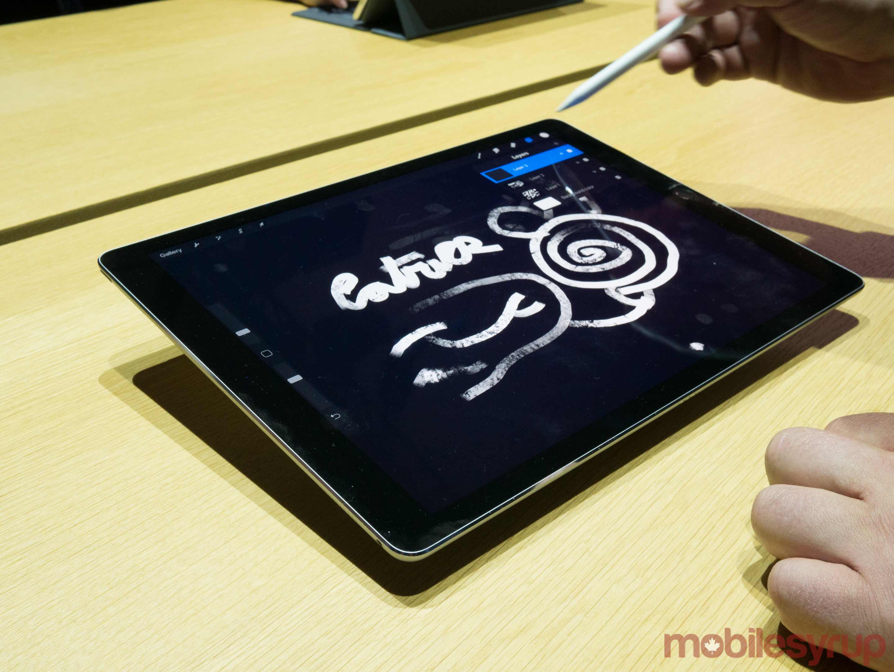
The displays on both new iPad Pro models also include a brand new technology that Apple is calling "ProMotion." ProMotion displays deliver incredible 120Hz refresh rates — double the previous best for iPad displays. When using the Apple Pencil on a ProMotion display, Apple claims that they only have 20 milliseconds of latency.

The new displays can also dynamically adjust their refresh rates depending on usage — saving battery life by dropping to only 24Hz for displaying still images, 48Hz for video content, etc.

Performance and Battery Life

The new iPad Pros are powered by Apple's brand new A10X Fusion chips. The A10X packs a six-core CPU — with three high-performance and three high-efficiency cores — and a twelve-core GPU. Altogether the A10X delivers 30% faster CPU performance over previous iPad Pro models, and 40% faster graphics. The battery life in both new iPad models remains the same "all-day" 10 hours, so customers who don't think that's enough will again not see improvement with this round.

Cameras and Speakers

Both iPad Pro models feature the same 12-megapixel cameras with optical image stabilization and 7-megapixel FaceTime HD cameras that are shipping in current iPhone 7 models. They also continue to use the same advanced 4-speaker system that debuted on the original iPad Pro — with no new improvements this year.

Miscellany

The new iPad Pros are the first iPad models to ship with Apple's second-generation Touch ID fingerprint sensors. This means that fingerprint authentication to the devices will be twice as fast — or the same speed that everyone is used to since this sensor has been shipping on iPhones since the 6S.

The new 10.5-inch iPad Pro has been released alongside a new version of Apple's Smart Keyboard to match the size of the new chassis. Apple says this is a full-sized keyboard, and for the first time it comes in unique layouts for 30 different languages (the Smart Keyboard for the 12.9-inch iPad Pro has been updated to receive these new layouts as well).

Apple has also released brand new leather sleeves for both sizes of iPad Pro. The sleeves come in several different colors and include a slot to store an Apple Pencil at the top. Standalone leather Apple Pencil cases have been released as well — available in the same set of colors.

Wrap-Up

The new iPads look like a great refresh of Apple's iPad Pro lineup. With impressive improvements in display technologies and expected increases in CPU and GPU performance, the new iPad Pros bring advancements in all the right places.

The screen size adjustment for the 10.5-inch model shows that Apple is searching for a sweet spot between the spacious 12.9-inch and the somewhat crammed 9.7-inch displays of their previous iPad Pro offerings. Time will tell if they've pinned that down, or if they need to continue iterating on this aspect of their professional iPad hardware.

While all of these hardware improvements are welcome and necessary, the greatest part of Apple's new iPads will be the software that they run. Thankfully, Apple devoted significant effort this year into upgrading iOS specifically for iPads. We'll cover these changes in detail in our iOS 11 overview later today, but be sure that the combination of new software and hardware has resulted in extremely exciting new prospects for iPads as a whole.

Both of Apple's new iPad Pro models are available for purchase today, starting at $649 for the 10.5-inch model and $799 for the 12.9-inch model. Storage starts at 64GB on either model, and can be configured with up to 512GB. As usual, cellular models are available for an extra $130 on top of any storage and size configuration.


You can also follow all of our WWDC coverage through our WWDC 2017 hub, or subscribe to the dedicated WWDC 2017 RSS feed.


Support MacStories Directly

Club MacStories offers exclusive access to extra MacStories content, delivered every week; it’s also a way to support us directly.

Club MacStories will help you discover the best apps for your devices and get the most out of your iPhone, iPad, and Mac. Plus, it’s made in Italy.

Join Now
06 Jun 17:43

Twinned Tweets — Road Pricing

by Ken Ohrn

The (presumably Federal) Gov’t of New Zealand is moving towards road tolls, especially in Auckland.   With thanks to Isaac Davison in the New Zealand Herald.

Its U-turn came after a joint Government-Auckland Council report showed the city would grow by 700,000 people over the next 30 years. The report said tolls of between 3c and 40c a kilometre would help reduce congestion.

Bridges said at the time that tolling in Auckland could be done by GPS satellite, as opposed to toll gantries or cameras.

GPS is considered the gold standard for road pricing, because it does not require as much physical infrastructure and is effective in changing behaviour, rather than just collecting revenue. . . .

. . .  Labour’s Auckland and transport spokesman Phil Twyford said his party supported road pricing because it meant the transport system was not “subsidising urban sprawl”.

But he said the Government first needed to invest more in public transport so commuters had “genuine alternatives” to driving once tolls were in place.

Meanwhile, thanks to CKNW.com, we hear that Metro Vancouver is stepping in the same direction.  Expect details tomorrow (Tuesday), with recommendations and findings in early 2018.

The Metro Vancouver Mayors and the TransLink Board will announce terms of reference for an independent commission that will study mobility pricing Tuesday.

. . . In the run-up to the election the NDP told TransLink it was supportive of mobility pricing and open to new funding models, while the Greens have been explicit about using mobility pricing to cut congestion and pay for any new road infrastructure.


06 Jun 17:42

The Truth About Living in a Small Family Home

by Alison Mazurek
All of us jammed into the bathroom (back when Mae was in my belly). Photo: Blue Window Creative

All of us jammed into the bathroom (back when Mae was in my belly). Photo: Blue Window Creative

Living small is sometimes uncomfortable, a bit awkward and never boring. Here I've attempted to summarize the awkward and imperfect about living in a small space with kids that maybe you always wanted to know (or maybe not!) .

One Washroom 4 humans

Though Theo has moved to using the full-sized toilet, we keep his potty in the washroom for emergencies where one of us is using the washroom and he can't hold it. It sits out or hides in the tub.  I would love to lose the potty altogether but have found it also comes in handy when little friends are over and seem to always need to go at the same time.

When 1 or more people are sick

Nothing makes your space feel small like having one or more people sick. Maybe an overshare but Theo and I took turns throwing up last week. Trying to keep two moving kids somewhat separated when one is sick is impossible in our space.  Not to mention that the overflow of laundry and trying to quickly wipe down all surfaces the sick people touch so as not to infect the other family members.... not our small space's most shining moment.

No Naps or Sleep-ins for Mom and Dad

I keep hearing from friends about this wonderful deal where on Saturdays one spouse sleeps in and the other gets up with the kids and then they swap roles on Sunday.  This isn't an option in our small space.  If the kids are up, everyone is up. There's no where for one of us to hide and get an extra hour of shut eye. This is one of the reasons bunk beds appeal to me so much.  I have dreams of sneaking away to the top bunk one afternoon, closing the doors to the kids room with the black out blinds pulled and having a long nap (I'll let you know if this ever happens one day).

Stroller in the entrance hallway

I've mentioned this before but our stroller is basically our second vehicle as I walk everywhere with the kids. There is no where else for it to sit but in our front entrance.  It blocks our closet that holds our coats, shoes and bags. Then if you roll it out of the way to access that closet it blocks our pantry or washer and dryer closet.  Not to mention the dirt, rain etc that it tracks into our home. I am constantly sweeping, vacuuming and mopping this area. I would also argue it is an eyesore visible from many areas of the apartment. I think I have almost developed a blindspot to it, like "what stroller?".

Everywhere is a play space

Because space is limited I want our kids to be able to play everywhere in our home.  Thus, toys end up everywhere, the couch is a climbing gym and the length of our home a race track or hotwheel track. We can't be too precious about our furniture or things. Our furniture can be beautiful but it also needs to be hard wearing and washable. While I love a minimal, modern, inviting space, I need ours to be kid friendly. Anything too precious that can be broken, damaged or hurt little ones, has been removed from our space. The last thing I'm waiting see how long I can hold out on is my ceramic and wood planter stand (that I love!), Mae has taken an interest in it but we'll see if it becomes a hazard.

Our Laundry Room is a closet

And by closet I mean a single closet that only holds our stacking washer and dryer (and I know how lucky we are to have in-suite laundry!!). So hang-drying clothes end up in the bathtub on the drying rack. Clean laundry ready to be folded ends up on the couch ready to be jumped on by kids. It motivates us to fold and put away quickly before they are dirtied before they are even worn again. But sometimes it feels like laundry is taking over our home.

Master Closet is in the Shared Kid's Room

I've mentioned this in the past but our Master closet is still in the kid's room. It holds both mine and Trevor's clothes as well as our two document boxes and some miscellaneous seasonal storage. This is the closet where we knocked out the bulkhead to maximize storage (post here). Anyway this means that at night we are reluctant to access our clothes once the kids are asleep (especially since Mae is a light sleeper, despite all our best efforts to convince her otherwise). This doesn't bother us too much in our day to day life but sometimes we would like to pack at night for a trip or plan an outfit and it really is a risky move to access this closet after both kids are asleep.


I hope these real life awkward realities of living small with 4 people in 600 square feet are mostly amusing. For us they are small sacrifices that we are comfortable making for the overall benefits of living small with fewer things. Often over a glass of wine Trevor and I will talk about the quirks and difficulties of living small with kids and come up with ideas to solve issues that are affecting us. But usually the conclusion is that these small inconveniences are worth it to live in the city we love, in a walkable neighborhood, within our financial means, that allows us to adventure more.

I have found that raising a family in a small space is often misunderstood or judged by others. I always hope that my sharing our lifestyle on this blog will encourage others to consider living small or if you already live small to celebrate it. I'm grateful to have found other like-minded people through this platform and Instagram.

This post was written for inclusion in the June collection of the Small Family Homes Blog Community. Read below for more writings on the truth about living small from our community of writers. Check back next month for a new topic and posts in the series and follow our community board on Pinterest for the latest small homes and family minimalism pins!

Minamalist Meg -- “The Truth About Living SMALL” : What does living in a small space look like for a family of 4? Probably not a whole lot different from you. 

Little Bungalow-- "Less Space, More Happiness" : In a small home, less space doesn’t equal more happiness. Except, of course, when it does. 

600 Square Feet and a Baby-- "The Truth About Living in a Small Family Home" : Living small as a family of four is sometimes uncomfortable, a bit awkward and never boring. Sharing the awkward and imperfect of living small with 4 humans that you always wanted to know (or maybe you didn't.)

Shelley Vanderbyl-- "Five Things You Don't Need in a Small Home" : Gatekeeping is about recognizing what things you don't need or want, and trying to keep those objects from coming into your home.

The Streamlined Life-- "The Truth About Living Small: Less Possessions, Greater Value": Just because you're a minimalist family doesn't mean you aren't sentimental. 
 

The Justice Pirate-- "What Small Home Living is Like" : No matter if I lived in a cardboard box or a small home, I just like being with my family, who are my home.

Our Nest in the City-- "The Truth About Living in a Small Family Home" : My post gives three challenges to living in a small home with our family of five, and counters them with three ways we "cope" and thrive despite it all :)
 

Fourth and West-- "You Can't Have it All" : Small space living requires compromise and sacrifice.

RISING*SHINING-- "The Truth About Living in a Small(ish) Family Home" : A smaller home is why we're able to live such a full life.

Birch and Pine-- "It's Not Always Easy" : Living tiny often means defending your own life and choices: daily.

Family At Sea-- "The Meaning of Space: Thoughts from a Former Tiny Home Mom" : After moving onto a boat, I thought the hard work of decluttering and downsizing was done, but I didn't realize that living in a tiny space was the beginning of the real work of the soul. 

Real Food Simple Life--  https://realfoodsimplelife.com/2017/06/06/the-realities-of-living-in-a-small-home-with-a-big-family/: A look into the benefits and challenges that a family of 6 (going on 7) experiences living together in an 800 square foot home in Scotland.

Tiny Ass Camper-- "I Didn't Know Tiny Living Was For Me" : My thoughts on the give and take of living tiny. 

Family Pedals-- "Location Trumps Size" : The truth is, it has been our home's location--not size--that has determined our happiness in a given space.


06 Jun 17:42

Apple plays catch up with new iOS 11 features for China

by John Artman

While Apple did talk a lot about China, almost completely glossed over at the announcement (taking up less than 30 seconds in a 2.5-hour presentation), were some very interesting feature additions to iOS 11 for Chinese customers. Will this be enough to shore up their defenses and decrease their rate of market share loss?

WechatIMG57

Image credit: Bajiahao

Here’s a quick breakdown of the features and what it could mean for customer gain and retention in China.

TL;DR: Many of these features have existed in China for some time; Apple is just playing catch up.

QR code support

While QR codes have been a bit of an oddity in the West, they have exploded in China. Remember, it wasn’t until recently that URLs could actually have Chinese characters in them. To combat this, many Chinese sites used long and almost indecipherable combinations of letters or just resorted to numbers. QR codes were a great way to reduce the friction and, as we have seen since, are now used in super interesting ways, including possibly AR.

While many Chinese apps now have this functionality, Google only just introduced it into Android last year via Google Now. As noted in the China Tech Talk podcast, Apple’s China woes boil down to non-existent or completely irrelevant services ecosystem. The introduction of QR code support shows that Apple is taking this weakness seriously and could see users choosing the native function over the myriad options they have in various apps (there is a very strong counter-argument to this, but for the sake of brevity, I will leave it out).

SMS fraud extension

This is a function first introduced by local phone makers and enhanced by Xiaomi. Indeed, many of the SMS features in Xiaomi phones were some of the strongest selling and retention points for many users; the best was crowdsourcing the origin of phone numbers, whether that was a delivery person, a telemarketer, or a fraudster. However, this feature and other features were quickly copied by local makers; many are now standard on phones sold in China

Traffic camera alerts

This feature had a lot of people shaking their heads in confusion as the slide itself is quite confusing. However, Redmond Pie has a good breakdown of the new features announced and one of those is traffic camera alerts in China. This is a feature present in almost all Chinese map and navigation tools. It is rare to see a Chinese police officer giving tickets; instead, the state relies on traffic cameras to dole out fines and punishments for traffic violators. CCTV cameras of all types are ubiquitous and are seen as a way to increase safety in a country with an unreliable police force.

Shanghainese dictation

China, from the outside, may seem homogenous. However, the opposite is quite true. Not only does China have 57 distinct ethnicities (the main one is Han), but almost every part of China has its own dialect, ranging from slightly different vocabularies to almost completely alien languages. Mandarin, the official language, is commonly spoken across the country, but areas like Guangdong, Hong Kong, and Shanghai have held tight to their heritage. Sharing some similarities, it can be difficult for a Mandarin speaker to read or speak these two dialects (Cantonese in Guangdong and Hong Kong, Shanghainese in Shanghai).

iOS has supported Cantonese voice input for some time, but the introduction of Shanghainese could provide some needed help. Shanghai is a very affluent city and arguably one of the most international. If Apple can gain in this market, their market share could be bolstered.

English on a 10-key pinyin keyboard

This is another feature that is highly prevalent on many China keyboards available for iOS and Android. This inclusion means that users may be less likely to switch to a 3rd party keyboard. However, they have other reasons to do so anyway, including dictionary migration from Android and better prediction that includes internet slang.

Phone number as Apple ID

This is huge. As with the PC, China has pretty much skipped over email with many local email providers innovating little on the experience. Now, with WeChat, there is very little reason to use email for regular communication and many people may never have even created an account. What everyone does have, however, is a phone number.

In China, phone numbers can be used to register for almost any online service and are typically used to also verify accounts, for both registration and security. For service providers of all types, the phone number is actually preferable: China has gotten serious about real-name registration and phone numbers are the most basic. In order to access social networks, buy train tickets, and make payments, your accounts need to be tied to an ID. The Chinese government has put a lot of time and effort into ensuring that phone numbers are tied to IDs with very few SIM cards now not tied to an ID.

For businesses, including Apple, this is a boon: with a phone number, they can be reasonably sure that the user is who they say they are.

Final thoughts

These new features will make users think twice before switching their primary phone to a local one. These iOS features, however, are not enough to stem their continued market share decline. They need more localized services and, more importantly, they need a completely separate China strategy.

06 Jun 17:41

A Time to Kill iTunes

06 Jun 17:40

The 27 most interesting new features in iOS 11

Tim Cook, CEO, holds an iPad Pro after his keynote address to Apple’s annual world wide developer conference (WWDC) in San Jose, California, U.S. June 5, 2017. REUTERS/Stephen Lam

If there were one big lesson from the announcements at Apple’s developer conference Monday morning, it’s this: It’s getting harder and harder to add Big New Features to a phone operating system.

When iOS 11, the new, free iPhone/iPad OS upgrade comes this fall, you won’t gain any big-ticket feature. Instead, you’ll get a wholllllle lot of tiny nips and tucks. They seem to fall into five categories: Nice Tweaks, Storage Help, iPad Exclusives, Playing Catch-Up, Fixing Bad Design.

Nice Tweaks

Expectations set? OK—here’s what’s new.

  • A new voice for Siri. The new male and female voices sound much more like actual people.
  • One-handed typing. There’s a new keyboard that scoots closer to one side, for easier one-handed typing. (You can now zoom in Maps one-handed, too.)
The new one-handed keyboard.
  • Quicker transfer. When you get a new iPhone, you can import all your settings from the old one just by focusing the camera on the new phone on the old one’s screen.
  • Do not disturb while driving. This optional feature sounds like a really good one. When the phone detects that you’re driving—because it’s connected to your phone’s Bluetooth, or because the phone detects motion—it prevents any notifications (alert messages from your apps) from showing up to distract you. If someone texts you, they get an auto-response like, “I’m driving. I’ll see your message when I get where I’m going.” (You can designate certain people as VIPs; if they text the word “urgent” to you, their messages break through the blockade.)
No more distracting notifications while you’re on the road.
  • Improvements to Photos. The Photos app offers smarter auto-slideshows (called Memories). Among other improvements, they now play well even when you’re holding the phone upright.
  • Improvements to Live Photos. Live Photos are weird, three-second video clips, which Apple (AAPL) introduced in iOS 9. In iOS 11, you can now shorten one, or mute its audio, or extract a single frame from that clip to use as a still photo. The phone can also suggest a “boomerang” segment (bounces back and forth) or a loop (repeats over and over). And it has a new Slow Shutter filter, which (for example) blurs a babbling brook or stars moving across the sky, as though taken with a long exposure.
  • Swipe the Lock screen back down. You can now get back to your Lock screen without actually locking your iPhone—to have another look at a notification you missed, for example.
  • Smarter Siri. Siri does better an anticipating your next move (location, news, calendar appointments). When you’re typing, the auto-suggestions above the keyboard now offer movie names, song names, or place names that you’ve recently viewed in other apps. Auto-suggestions in Siri, too, include terms you’ve recently read. And if you book a flight or buy a ticket online, iOS offers to add it to your calendar.
  • AirPlay 2. If you buy speakers from Bose, Marantz, and a few other manufactures (unfortunately, not Sonos), you can use your phone to control multi-room audio. You can start the same song playing everywhere, or play different songs in different rooms.
  • Shared “Up Next” playlist. If you’re an Apple Music subscriber, your party guests or buddies can throw their own “what song to play next” ideas into the ring.
  • Screen recording. Now you can do more than just take a screenshot of what’s on your screen. You can make a video of it! Man, will that be helpful for people who teach or review phone software! (Apple didn’t say how you start the screen recording, though.)

Storage Help

Running out of room on the iPhone is a chronic problem. Apple has a few features designed to help:

  • Camera app. Apple is adopting new file formats for photos (HEIF, or High Efficiency Image Format) and videos (H265 or High Efficiency Video Codec), which look the same as they did before but consume only the half the space. (When you export to someone else, they convert to standard formats.)
  • Messages in iCloud. When you sign into any new Mac, iPhone, or iPad with your iCloud credentials, your entire texting history gets downloaded automatically. (As it is now, you can’t see the Message transcript history with someone on a new machine.) Saving the Messages history online also saves disk space on your Mac.
  • Storage optimization. The idea: As your phone begins to run out of space, your oldest files are quietly and automatically stored online, leaving Download icons in their places on your phone, so that you can retrieve them if you need them.

iPad Exclusives

Many of the biggest changes in iOS 11 are available only on the iPad.

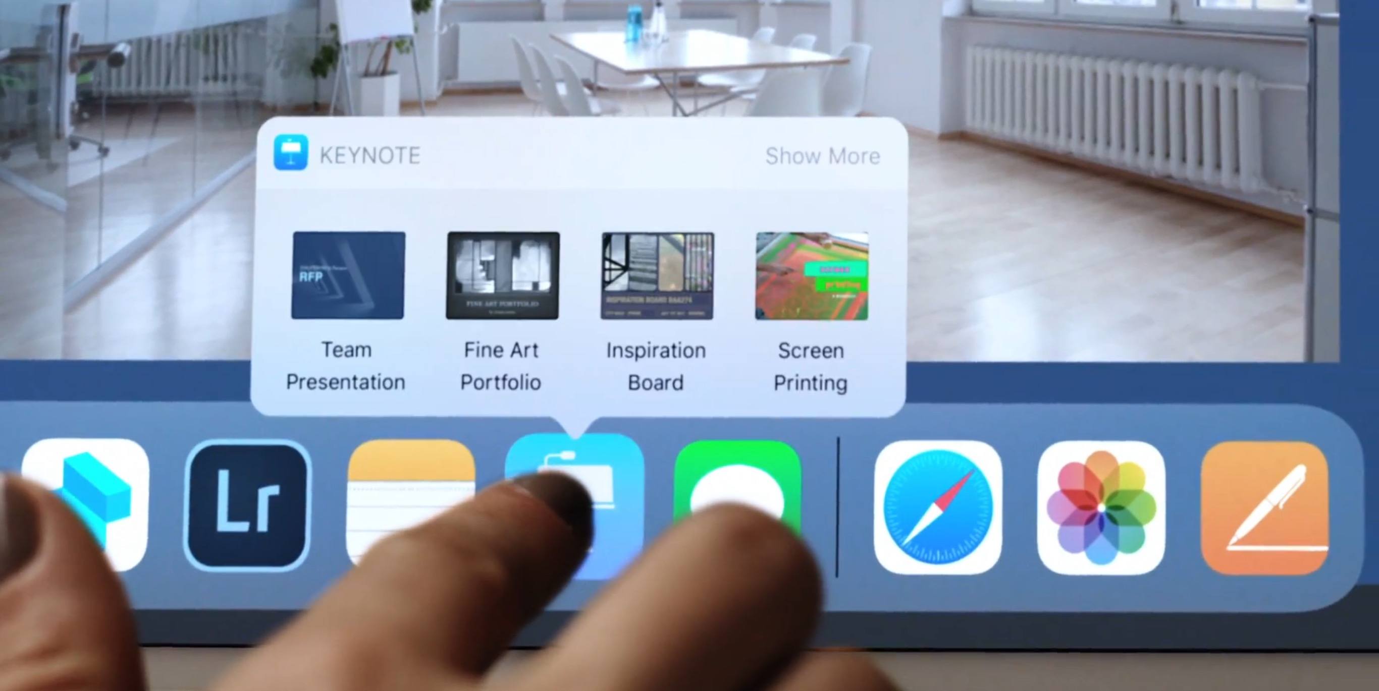
  • Mac features. In general, the big news here is the iPad behaves much more like a Mac. For example, you can drag-and-drop pictures and text between apps. The Dock is now extensible, available from within any app, and perfect for switching apps, just as on the Mac. There’s a new Mission Control-type feature, too, for seeing what’s in your open apps—even when you’ve split the screen between pairs of apps.
The iPad now offers a “Mission Control,” showing what’s going on in all your apps.
  • Punctuation and letters on the same keyboard. Now, punctuation symbols appear above the letter keys. You flick down on the key to “type” the punctuation—no more having to switch keyboard layouts.
No more switching keyboards just to type punctuation.
  • A file manager! A new app called Files lets you work with (and search) files and folders, just as you do on the Mac or PC. It even shows your Box and Dropbox files.
A Finder–a desktop–comes at last to iOS.
  • Pencil features. If you’ve bought Apple’s stylus, you can tap the Lock screen and start taking notes right away. You can mark up PDFs just by starting to write on them. A new feature lets you snap a document with the iPad’s camera, which straightens and crops the page so that you can sign it or annotate it. Handwriting in the Notes app is now searchable, and you can make drawings within any Note or email message.
The iPad grows ever closer to becoming a legal pad.

Playing Catch-Up

With every new OS from Google (GOOG, GOOGL), Microsoft (MSFT), or Apple, there’s a set of “us, too!” features that keeps them all competitive. This time around, it’s:

  • Lane guidance. When you’re driving, Maps now lets you know which lane to be in for your next turn, just as Google Maps does.
Lane guidance. At last.
  • Indoor Maps. The Maps app can now show you floor plans for a few malls and 30 airports, just as Google Maps does.
  • Siri translates languages. Siri is trying to catch up to Google Assistant. For example, it can now translate phrases from English into Chinese, French, German, Italian, or Spanish. For example, you can say, “How do you say ‘Where’s the bathroom?’ in French?”
  • Siri understands followup questions. Siri now does better at understanding followup questions. (“Who won the World Series in 1980?” “The “Phillies.” “Who was their coach?”)
  • Person-to-Person payment within the Messages app. Now, you can send payments directly to your friends—your share of the pizza bill, for example—right from within the Messages app, much as people do now with Venmo, PayPal, and their its ilk. (Of course, this works only if your friends have iPhones, too.) When money comes to you, it accrues to a new, virtual Apple Pay Cash Card; from there, you can send it to your bank, buy things with it, or send it on to other people.

  • iCloud file sharing. Finally, you can share files you’ve stored on your iCloud Drive with other people, just as you’ve been able to do with Dropbox for years.

Fixing Bad Design

Some of the changes repair the damage Apple made to itself in iOS 10. For example:

  • Redesigned apps drawer in Messages. All the stuff they added to Messages last year (stickers, apps, live drawing) cluttered up the design and wound up getting ignored by lots of people. The new design is cleaner.
  • Redesigned Control Center. In iOS 10, Apple split up the iPhone’s quick-settings panel, called the Control Center, into two or three panels. You had to swipe sideways to find the control you wanted—taking care not to swipe sideways on one of the controls, thereby triggering it. Now it’s all on one screen again, although some of the buttons open up secondary screens of options. And it’s customizable! You can, for example, add a “Record voice memo” button to it.
The new, customizable, somewhat ugly Control Center.
  • App Store. The App store gets a big redesign. One chief fix is breaking out Games into its own tab, so that game and non-game bestseller lists are kept separate.
After nine years, the App Store gets a new look.

Coming this fall

There are also dozens of improvements to the features for overseas iPhones (China, Russia, India, for example). And many, many enhancements to features for the disabled (spoken captions for videos and pictures, for example).

So what’s the overarching theme of the iOS 11 upgrade?

There isn’t one. It’s just a couple hundred little fine-tunings. All of them welcome—and all of them aimed to keep you trapped within Apple’s growing ecosystem.

More from David Pogue:

Inside the World’s Greatest Scavenger Hunt: Part 1    •  Part 2   •   Part 3  •  Part 4  •  Part 5

The DJI Spark is the smallest, cheapest obstacle-avoiding drone yet 

The new Samsung Galaxy does 27 things the iPhone doesn’t

The most important announcements from Google’s big developer’s conference

Google Home’s mastermind has no intention of losing to Amazon

Now I get it: Ransomware

Google exec explains how Google Assistant just got smarter

Amazon’s Alexa calling is like a Jetsons version of the home phone

David Pogue, tech columnist for Yahoo Finance, welcomes nontoxic comments in the comments section below. On the web, he’s davidpogue.com. On Twitter, he’s @pogue. On email, he’s poguester@yahoo.com. You can read all his articles here, or you can sign up to get his columns by email

06 Jun 17:40

Apple polishes up 23 features in Mac OS High Sierra

Craig Federighi, Apple’s senior vice president of software engineering, speaks about High Sierra operating software during an announcement of new products at the Apple Worldwide Developers Conference in San Jose, Calif., Monday, June 5, 2017. (AP Photo/Marcio Jose Sanchez)

Let’s be honest: The biggest Mac news from Apple’s developer conference Monday wasn’t about software features—it was about new hardware.

All Apple (AAPL) laptops and iMacs will gain Intel’s latest, fastest processor, known as Kaby Lake. The new iMacs will get huge bumps up in available storage, memory, and graphics power. And in December, Apple will see just how much it can pack into an iMac by releasing the iMac Pro: the most powerful Mac ever made. Dark gray metal, 5K screen, an Intel Xeon chip with up to 18 cores, 128 GB RAM, 4 terabytes of solid-state storage, and a 10 GB Ethernet jack. $5,000 and up. A truly monster machine—and yet it’s not the long-awaited update to the Mac Pro; that’s coming, too, Apple says.

But there was a software unveiling, too—of the next free Mac OS version, coming this fall. It will be called Mac OS High Sierra, and the name suggests exactly what it is: a set of refinements to the current Mac OS, called Sierra.

What you’ll soon discover is that (a) it’s a whole lot of miscellaneous, and (b) it’s a lot of stuff that’s also coming to iOS 11 on the iPhone this fall.

Still, there’s a lot of useful stuff. Here’s what you can look forward to.

Safari

Apple has continued to work on Safari, its web browser—and says that the new version will be the fastest desktop web browser in the world.

It will also use less power. Apple claims that you’ll be able to watch Netflix (NFLX) for two hours longer in Safari than other browsers.

Maybe even more thrilling to the world’s internet surfers (and less thrilling to advertisers), Safari will be able to auto-block auto-play videos. Now, no video will begin playing unless you click it. (You can grant certain sites permission to autoplay every time, if you like.)

That’s not the only way Safari will frustrate advertisers. Apple says that “Safari now uses machine learning to identify advertisers and others who track your online behavior, and removes the cross‑site tracking data they leave behind.”

This is cool, too: You can create different viewing settings for different sites. You might like the New York Times site to appear with larger text, ad blocking turned on for Dilbert.com, and so on. (Page zoom, location services, notifications, and ad blockers are among the settings memorized for each site.)

And if you like the Reader view—which hides all ads, navigation stuff, blinking stuff, competing colors and fonts—you can now tell Safari to use it for everything. Every time you open an article that works with Reader, it pops into that format automatically. You end up with far fewer migraines from just trying to surf the web.

Apple File System

The file system is the underlying software that organizes all your documents, photos, mail, and so on. The one driving the Mac is now 33 years old.

So the big-ticket item underneath Mac OS High Sierra is the Apple File System, developed for the new era of solid-state drives and increased security threats.

All of this is probably very satisfying to programmers. But you, the average person, will probably notice only a couple of changes: First, when you duplicate a file or folder, it happens instantly. There’s no progress bar, no wait. Second, getting the size of a folder is also instantaneous.

Photos

The Photos app has received a lot of work. Now, the left side has an ever-present sidebar, showing your photo groups. A new Imports view shows not just the latest batch of imported photos, but the batch before that, and the batch before that, and so on.

You can now filter your view by Favorites, photos you’ve edited, only movies, only stills, and so on. The Faces feature, which knows who’s in each photo, has been improved, and the face-categorizing you’ve done on the Mac gets auto-synced to your phone.

New editing tools bring Photos ever closer to Photoshop. You can now manipulate the Curves of a photo’s histogram, or edit only the reds (for example) in a photo. And, inevitably, there are now Instagram-style filters.

Editing in the Photos app is getting more sophisticated.

Better yet, you can now send a photo to Photoshop (or any other external program) for editing, just as you could in iPhoto. Better yet yet, the changes you make in that app are non-destructive—you can undo them at any time. In other words, you can use Photos for its superior organizational and sharing tools, but Photoshop for editing.

Round-trip editing is back!

The Photos feature called Memories (automatically grouped and curated slideshows with music) are much smarter now. Instead of grouping photos only by event or location, they now auto-recognize and auto-build slideshows of your pets, babies, outdoor activities, performances, weddings, birthdays, and sports games.

Finally, Apple introduces some editing options to Live Photos: weird, three-second video clips that the iPhone can capture. In iOS 11, you can now shorten a Live Photo, mute its audio, or extract a single frame to use as a still photo. Photos can also suggest a “boomerang” segment (bounces back and forth) or a loop (repeats over and over). And it has a new Slow Shutter filter, which (for example) blurs a babbling brook or stars moving across the sky, as though taken with a long exposure.

Notes

The Notes app continues to develop:

  • Pin your best Notes. In the Notes app, you can now pin your most used notes (to do lists, grocery lists, etc.) to the top of the list, so they don’t get sorted down chronologically as they do now.
  • Tables. Yes! You can now add a table to a Note. Great for bake-sale assignments, sports scores, and so on.
Notes picks up pins and tables.

Misc

  • Smaller multimedia. Apple is adopting new file formats for photos (HEVC) and videos (H265), which look the same as they did before but consume only the half the space. (When you export to someone else, they convert to standard formats.)
  • Mail enhancements. When you search in Mail, a Top Hits section presents the messages Mail thinks are the best matches (based on Read status, senders you’ve replied to, your VIPs, and so on). Mail also offers a split-screen view when composing new messages in full-screen mode. And it stores your messages in 35% less disk space. More space is always welcome.
  • A new voice for Siri. The new male and female voices sound much more like actual people.
  • iCloud file sharing. Finally, you can share files you’ve stored on your iCloud Drive with other people, just as you’ve been able to do with Dropbox for years.
  • Capture a FaceTime moment as a Live Photo. You can snap a 3-second snippet of a video chat—a Live Photo—for later sharing. (You can’t do so secretly, however; the other person knows.)
  • Messages in iCloud. When you sign into any new Mac, iPhone, or iPad with your iCloud credentials, your entire texting history gets downloaded automatically. (As it is now, on a new machine, you can’t see your chat histories.) Saving the Messages history online also saves disk space on your Mac.
  • Family storage sharing. You can now share an iCloud storage plan with family members.
  • More Spotlight wisdom. The Spotlight search feature can now provide flight arrival and departure times, terminals, gates, delays, and flight maps. It can also return multiple Wikipedia results on a single screen.
  • Developer goodies. Apple now offers development kits for virtual reality and augmented reality, hoping to jump-start new apps in an area where Apple is now way behind. There’s a new version of Metal, too, the Mac software that addresses your graphics card.

Hi, High Sierra!

This is one of those off years, where Apple takes a breather (and gives us a breather). Instead of piling on new stuff to find and learn, it cleans up what it’s already got.

There’s nothing wrong with that. In fact, the world probably wouldn’t mind if more companies adopted that schedule.

More from David Pogue:

Inside the World’s Greatest Scavenger Hunt: Part 1    •  Part 2   •   Part 3  •  Part 4  •  Part 5

The 27 most interesting features in iOS11

The DJI Spark is the smallest, cheapest obstacle-avoiding drone yet 

The new Samsung Galaxy does 27 things the iPhone doesn’t

The most important announcements from Google’s big developer’s conference

Google Home’s mastermind has no intention of losing to Amazon

Now I get it: Ransomware

Google exec explains how Google Assistant just got smarter

Amazon’s Alexa calling is like a Jetsons version of the home phone

David Pogue, tech columnist for Yahoo Finance, welcomes nontoxic comments in the comments section below. On the web, he’s davidpogue.com. On Twitter, he’s @pogue. On email, he’s poguester@yahoo.com. You can read all his articles here, or you can sign up to get his columns by email

06 Jun 17:40

Safe Avocado-ing

by Matt

I’m glad the New York Times is covering how to safely cut an avocado, because I’ve messed that up 100% of the time I’ve tried to handle an avocado in the past month. It makes you almost want to forgive them for that green pea guacamole thing.

06 Jun 17:40

WordPress Atlas

by Don Park

Disclaimer: This is a personal side-project, not an official Automattic project, and in no way reflects official plans.

In Beyond Future of WordPress Platform, I wrote:

WordPress Atlas – uses data-science to pull blogs and websites into neighborhoods, towns, and cities based on topics, interests, and relations. Intention is to use real world metaphors to make discovery and sense of community more natural and explicit than, say, blogroll or news aggregators.

I now think the Atlas without data-science. How?
Using what we already have: blogs, bloggers, blogging tools, and WP community.

So WordPress Atlas is just a loosely-coupled network of blogs using a new class of themes, themes that displays blog contents in a way that looks map-like. Atlas blog contents are information about other blogs. Yes, Atlas blogs are like Linklogs but more visual-centric.

What does it look like? Rather what does this reminds you of?

screenshot_265.png

Pinterest! It’s a place where people collect bookmarks presented as cards, through which people can chat with others, etc. Those cards are place-like when laid out.

But Pinterest layout is not static so they change which is not at all map like. Value of maps is in stable visual memory. Buildings and streets may come and go over time but not overnight or by mere window resize.

So Pinterest-like but layed-out in a virtual page over which visitors will zoom and pan over like Google Map.

Who will build Atlas blogs and will they come? I’ll answer this with another question: who builds and maintains those Awsome-xxxx lists on Github and do people use them?

screenshot_264.png

Visual layout is an essential differentiator. Other-wise textual awesome-list is better. It’s a difference that gets emphasized each time user navigates from a blog to a map it links to: destination map will knows where, in its layout, the referring blog is and display the neighborhood around that blog, maybe with some fancy transition animation.

Atlas pages contain cards laid out in visually memorable, relatively compact patterns. These cards could not only be about individual blogs but blog pages, people (like designers and developers relevant to the neighborhood) and plugins.

Notion of neighborhood helps with discovery and creates a sense of community.

Destinations, what cards are about, can be in multiple maps, and maps of same neighborhoods can exist at different depth and filtering (like tourist maps) as well as languages.

Atlas layout style is dictated by theme designer with vary capabilities. Some would allow streets to be named, like Fashion street, on which cards for major vendors could be placed and backstreets for boutique shops. Maybe specialty shops will form their own specialized clusters, like Latex Cave. When a neighborhood gets too crowded, they can be broken out to their own map linked from original neighborhood. Expansion is no problem. Real Estate value may or may not be controlled. Depends on map creator’s revenue model.

Experiments to do: Build a prototype Atlas theme then use it to create an aggregation blog using the theme. Use existing standards like Image Map. Search should include all the blogs on a page as user would expect. This adds value beyond mere link directory role. Get feedback.


06 Jun 17:40

Search Blogs

by Don Park

While thinking about search functionality aspect of WordPress Atlas, I was reminded of Search Hat and MSN SearchPoint ideas which I blogged about in 2004. MSN team seemed receptive but Google implemented it first then dropped it for various reasons.

In context of the Atlas, the idea is best described as as Search Blog. But, ironically, this term is difficult to search for obvious reasons. John Battelle even uses it in his blog’s name. Maybe someone will come up with a better name.

Search Blog is a blog about other blogs/websites. It’s primary function is to provide a search context. Simple, seemingly familiar yet distinct in usage. Don’t remember if Yahoo directories allowed each directory to be used as search context. It’s an obvious idea in hindsight. Jury is out on whether it’ll be popular however.

Atlas needs to be a Search Blog as well.

06 Jun 17:40

Behaviour and Community in Open Science

In response to the latest incident of bro misbehaviour in open science, Jon Tennant has written up a very polite plea for civility and good behaviour in open science advocacy. Despite my general love of good behaviour (I’m an ethicist and former community manager) I disagree with pretty much all the well-intentioned advice it contains.

There are a lot of individual bits I could dig into (you embed the tweet of a woman in STEM already complaining about being harassed by open science bros into the tweet you broadcast to ten thousand people, including open science bros? really?!) but the big thing is those final three paragraphs:

What we have to remember is that Open Science is a social movement. This means that we have to be sure that all communities and demographics feel welcomed and invited to participate in discussions, and not excluded from them. It can be easy to let our emotions and frustrations and interfere with this, that much is understandable. But we can be better and stronger as a community by actively preventing this. I’m not innocent either, and have in the past said some things I regret to others on social media. What matters, though, is using those experiences to become better for ourselves and others.

When we see bad behaviour, from and towards anyone, it is each of our responsibilities to call it out. Preferably via a civil note in private, rather than any sort of public shaming. If we see this sort of behaviour happening and don’t try and stop it, then we’re complicit in allowing it to happen. This is especially the case when it is happening within our own communities or social circles. Don’t turn a blind eye, as that never solves anything.

And it doesn’t matter that this sort of behaviour is actually fairly widespread on social media. What matters is being better than that. Taking the moral high ground, engaging with those who you don’t agree with in a courteous manner, listening instead of insulting. These are all things that we should be practising on social media, because that’s just doing this stuff right. At the end of the day, we want a social environment where people feel welcomed to share their views without fear of retaliation.

This is bad advice. Not the idea of ‘we should be nice to people’, that’s great - but specifically, the argument that if you spot bad behaviour happening you should politely call the person out in private, explicitly avoiding public callouts.

Not only is it bad advice, it’s avoidable bad advice, because every longstanding community - including the (non-open) scientific one - has been dealing with this problem for years, and any halfway decent community manager or simply any marginalised person could look at it and go ‘ahhhh’.

To break it down: misbehaviour, normally by white dudes you could buy twenty times over for what they’re worth long before you hit what they think they’re worth, is not a novel thing. It’s a wider pattern replicated in pretty much every field of western endeavour due to a hell of a lot of social conditioning. Because of this, communities much older than the open science community, and the people they contain, have already tried solving it. They’ve been doing so for kind of a while, and members of those spaces (particularly but not exclusively marginalised members) have a good idea of what works, what doesn’t, and what the consequences of common attempted solutions are.

The consequence of emphasising that callouts be civil and private…is that harassment and abuse continues. Within your community, and outside it. If someone is harassing or abusing a community member, and the emphasis is that callouts be private, the person called out is free to keep harassing more just so long as they do it where the original complainant did not see so that nobody spots it’s a pattern. If the emphasis is that callouts be private, even if people do put 2 and 2 together and boot the harasser, they are free to just mosey along to the next community along and continue their pattern.

We know this is what happens because we’ve seen it, in a ton of spaces, scientific ones included. If you look at the harassment-in-STEM-departments controversies over the last few years, you’ll notice a common marker: there was always more than one victim and incident, and people didn’t take it seriously as a problem to be solved until it was public, which is what let the harasser cross the line so many times.

Furthermore, private callouts invite newer members of the community to internalise the entirely wrong lesson. If your callouts are private, the pattern that a new community member sees is: people are talking, someone misbehaves….and nothing happens to them. The lesson from this is: that kind of misbehaviour is okay in that space. And so you go from having one asshole to having two, and four, and eight, and it doesn’t matter if you call out individual assholes privately because they’re reproducing memetically.

On the other hand, what happens if you do a public callout? Well the first thing that happens is that the harasser suffers actual, genuine consequences for their behaviour - which is a good way to ensure they think twice about doing it again. The second thing that happens is other people see those consequences. Marginalised people - perhaps people the harasser has messed around before, who have been reluctant to say anything given the lack of any suggestion complaints would be met positively - know this is a place where they can expect at least some kind of shielding and support. Non-vulnerable people, particularly those who are inclined to assholery, know that this space is one in which assholery will not be tolerated.

In other words, you get a space where marginalised people feel supported, non-marginalised people feel like there are rules, and assholes feel like they should shape up or ship out. That seems pretty much ideal for a set of community norms, as far as I can tell. And the alternative - private callouts - does none of this. Instead it actively protects the people causing the problems by allowing them to do whatever they want as long as they be sure to be caught by different people each time. It, and its emphasis on ‘civility’, prioritises the feelings and reputation of the person causing the problem above the individuals suffering.

Again: this isn’t new. This is community dynamics 101. This is about missing stairs. If you want to create a comfortable and open environment, that means you need to very visibly deal with those who instead want it to be their own private gentleman’s club. Picking a process that emphasises their reputation, their feelings, does not do that. Picking a process that makes damn clear misbehaviour won’t be tolerated does.

06 Jun 17:39

Raspberry Pi Looper-Synth-Drum…thing

by Alex Bate

To replace his iPad for live performance, Colorado-based musician Toby Hendricks built a looper, complete with an impressive internal sound library, all running on a Raspberry Pi.

Raspberry Pi Looper/synth/drum thing

Check out the guts here: https://youtu.be/mCOHFyI3Eoo My first venture into raspberry pi stuff. Running a custom pure data patch I’ve been working on for a couple years on a Raspberry Pi 3. This project took a couple months and I’m still tweaking stuff here and there but it’s pretty much complete, it even survived it’s first live show!

Toby’s build is a pretty mean piece of kit, as this video attests. Not only does it have a multitude of uses, but the final build is beautiful. Do make sure to watch to the end of the video for a wonderful demonstration of the kit.

Inside the Raspberry Pi looper

Alongside the Raspberry Pi and Behringer U-Control sound card, Toby used Pure Data, a multimedia visual programming language, and a Teensy 3.6 processor to complete the build. Together, these allow for playback of a plethora of sounds, which can either be internally stored, or externally introduced via audio connectors along the back.

This guy is finally taking shape. DIY looper/fx box/sample player/synth. #teensy #arduino #raspberrypi #puredata

98 Likes, 6 Comments – otem rellik (@otem_rellik) on Instagram: “This guy is finally taking shape. DIY looper/fx box/sample player/synth. #teensy #arduino…”

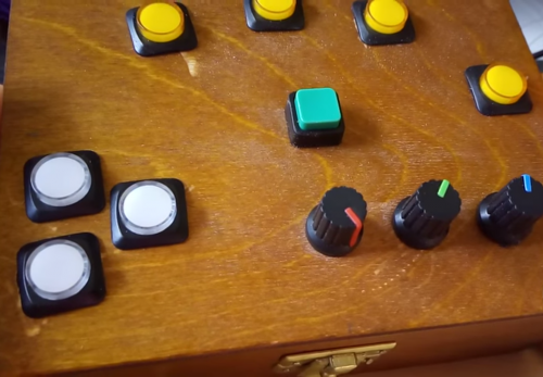
Delay, reverb, distortion, and more are controlled by sliders along one side, while pre-installed effects are selected and played via some rather beautiful SparkFun buttons on the other. Loop buttons, volume controls, and a repurposed Nintendo DS screen complete the interface.

Raspberry Pi Looper Guts

Thought I’d do a quick overview of the guts of my pi project. Seems like many folks have been interested in seeing what the internals look like.

Code for the looper can be found on Toby’s GitHub here. Make sure to continue to follow him via YouTube and Instagram for updates on the build, including these fancy new buttons.

Casting my own urethane knobs and drum pads from 3D printed molds! #3dprinted #urethanecasting #diy

61 Likes, 4 Comments – otem rellik (@otem_rellik) on Instagram: “Casting my own urethane knobs and drum pads from 3D printed molds! #3dprinted #urethanecasting #diy”

I got the music in me

If you want to get musical with a Raspberry Pi, but the thought of recreating Toby’s build is a little daunting, never fear! Our free GPIO Music Box resource will help get you started. And projects such as Mike Horne’s fabulous Raspberry Pi music box should help inspire you to take your build further.

Raspberry Pi Looper post image of Mike Horne's music box

Mike’s music box boasts wonderful flashy buttons and turny knobs for ultimate musical satisfaction!

If you use a Raspberry Pi in any sort of musical adventure, be sure to share your project in the comments below!


The post Raspberry Pi Looper-Synth-Drum…thing appeared first on Raspberry Pi.

06 Jun 17:38

Ending the Referendum Requirement – 2

by pricetags
mkalus shared this story from Price Tags.

Bill Holmes added an important comment to the announcement post on the Price Tags Initiative to the End the Referendum Requirement.

Actually, there is no referendum requirement. The referenda provisions of the relevant legislation – the South Coast British Columbia Transportation Authority Referenda Act – have not been brought into force. Even if they had been, the holding of a referendum would not be mandatory. The legislation leaves it up to cabinet to decide in each case whether to order a referendum. Hence, the questions to MLAs should be worded differently, i.e., not based on there being a legislated requirement for a referendum.

It’s a mystery why the government enacted legislation that was not brought into force or used for the vote on the 0.5% sales tax. …

.

Helpful clarification, Bill – but it’s also important to note that the Liberals, in responding to the Mayors’ Council survey of all parties prior to the election, indicated this when asked about supporting completion of the 10-year vision:

Legislative requirement that any new source will require holding a referendum.

So unless we hear otherwise from the Liberal MLAs, Price Tags is assuming they would impose the referendum using whatever legislation they have.  We’d like an unequivocal statement that the requirement would be removed, whether legally required by legislation or decided by cabinet.  The most sincere expression from all parties would be a vote to remove the enabling legislation.

_________________

Alex Botta thinks this comment from Geoff (also on his blog here) should be brought forward:

Regardless of whether there will be another referendum, I think it would be wise to communicate with the public as if there will be. Strong public support would make many of the political problems we have seen simply go away. I think the #CureCongestion slogan is counterproductive. I have been developing some thoughts about an alternative approach.

Values are the foundation of a powerful message. It is critical that people believe that your values are sincere, so that they will be open to the rest of what you have to say:

1. Everyone has a right to mobility, to economic opportunity, and to a clean environment.

2. TransLink and the Mayors’ Council are dedicated to achieving these things. They live, work and take transit here, just like us. (Lead by example: get those mayors and TransLink officials on trains and buses.)

3. Our task is to give people choices that maximize their ability to get where they need to go safely, affordably, and cleanly.

Establish mobility as a core value:

4. Mobility is the foundation of a modern economy. Our economy is our people. Mobility enables us to be productive.

5. Everyone has a right to mobility: workers, children, the elderly, the disabled. (Poverty has negative connotations. Don’t bring it up, but respond if raised: “I’m glad you brought that up, because low income groups benefit the most from better transit.”)

6. We benefit from the mobility of others: family, friends, workers, people who provide us with goods and services. Mobility brings people together. (Always talk about mobility, never about congestion.)

The importance of transit follows naturally:

7. Transit gives us choices, enhancing our mobility. Transit and roads work together to get us where we need to go. (Do not engage in us-and-them anti-car rhetoric. “People,” not “drivers.” “Use road space more efficiently,” not “take away car lanes.” “Give people choices,” not “get people out of cars.” “Free up road space,” not “take cars off the road.”)

8. Transit is an investment. A dollar invested in transit produces more than three dollars in economic activity.

9. Transit is an essential part of an active, healthy and green city.

This leads to a positive plan of action that includes citizens as active participants:

10. Our transit system is extremely successful relative to comparable systems elsewhere. We need to build on that investment so that we do not fall behind.

11. Citizens support transit expansion. They understand the importance of in mobility, choice, independence and wise public investment. (People give their support when they feel that they are part of a group or movement.)

12. Our democratic representatives have collaborated on a plan to invest in transit. Participation from the people who live here is essential to that plan, and to continuing expansion in the future. (Focus on a legitimate and inclusive ongoing process, not the technical details, trade-offs and winners and losers of a particular project.)


This is a good statement with respect to values and mobility – and hence the problem with a referendum.  All that gets disregarded or ignored when the referendum gets highjacked by those who can more effectively sow division for partisan purposes or for their own ideological agenda.  In an age of social media, it’s almost impossible for rational and considered debate to occur.  As we saw with the last one, it instead becomes a shitshow.

And don’t let the same thing happen to our comments section. This PT initiative is about the politics of the referendum, not about the specifics of the Mayors’ plan or its alternatives, funding options, TransLink as an organization or public-service salaries. The delete button will be used more aggressively if highjacking becomes a problem.


.


06 Jun 17:38

papr - rate papers on biorxiv in a single swipe and help science!

Like a lot of modern scientists I now find papers to read to a large extent based on what I see on social media. It is a great way to find out what my colleagues are reading and keep up with the newest cool research.

A few weeks ago I released a really simple prototype for an app that would improve on this experience called papr, its like Tinder but for papers :). The basic idea is for you to log in to the system, and then swipe to rate preprints on biorxiv on one of two scales:

  • Boring versus exciting
  • Probably accurate versus questionable.

Since then Lucy and Nick went crazy and turned it into something way more interesting. You can now rate papers just like before by swiping:

But now Lucy and Nick have added a recommendation engine that will learn from what you like and show you more papers that meet your personal tastes.

But there’s more! You can download your ratings to analyze yourself or you can take a sneak peak into our recommendation engine to find other papers you might like with this interactive PC plot:

But my favorite feature is that you can see other people who have liked similar papers and follow them on Twitter - so you can discover new scientists that work in your field!

We hope to aggregate the data and get a community level view of what is going on biorxiv. Lucy and Nick have done an amazing job and I really hope that you will check it out and rate some papers, who knows you might find a new paper or Twitter friend!

https://jhubiostatistics.shinyapps.io/papr

06 Jun 17:38

watchOS 4 Introduces Proactive Watch Face, Streamlined Navigation, and Fresh Refinements

by Ryan Christoffel

Yesterday at Apple's WWDC keynote, watchOS 4 was introduced alongside updates to iOS and macOS. The latest version of the Apple Watch's operating system features few major improvements, instead focusing on a variety of smaller updates that, taken together, add up to a solid release.

watchOS 4 takes the tasks that the Apple Watch already does well and makes them better. It features new ways to receive proactive information, to track health and fitness data, and more. It also streamlines navigation in a number of subtle ways to require less user interaction, such as fewer button presses and app switches.

Watch Faces

Throughout the Watch's two years on the market, two main pieces of the product have seen continual change. On the hardware side, Apple has consistently updated its collection of available watch bands. And on the software side, each major update of watchOS has introduced a variety of fresh watch faces. Version 4 is no exception.

Likely the most exciting watch face for the tech community is the Siri face. It features a complication that invokes Apple's digital assistant, but its main appeal is in the proactive content cards that Siri populates your watch face with. Relevant information about upcoming meetings, travel time estimates, passes from your Wallet, and more will appear throughout the day as needed – or at least, as needed according to Siri. The watch face displays two to three content cards at a time, and you can scroll through additional cards using the Digital Crown. And when you want to do something with one of those content cards, you can tap it to view more information or open the app it came from.

If it truly proves itself to be proactively intelligent, the Siri face could make for one of the most significant alterations to the way Apple Watch is used to date, requiring little if any navigation of different apps, and instead simply doing all Watch interaction through the Siri face. But unfortunately, that's a big if.

If you're looking more for aesthetic rather than functional value in your watch face, watchOS 4 also features a Kaleidoscope face and three faces featuring characters from Disney•Pixar's Toy Story. The former takes images from your library of Photos and turns them into interesting patterns, while the latter batch displays short animated scenes every time your watch face lights up.

Fitness

Apple continues its quest to make Apple Watch the ultimate health and fitness device, as evidenced in watchOS 4 by the attention given to the Workouts and Activity apps.

Workouts has received a variety of updates. The first makes it easier to start a new workout; a single tap will do the job now. One update I'm excited about is the ability to set certain playlists to automatically start playing when you begin a specific workout; music playback can then be controlled without ever leaving the Workouts out – simply swipe left from the workout summary screen. If you need to run multiple workouts at once, you can do that while your first workout is running by swiping right and hitting the 'New' button that now lives alongside the existing 'End' and 'Pause' buttons. Swim tracking can now automatically detect sets and rests, so you'll have more detailed data at the end of your swim. There's a new workout category called 'High Intensity Interval Training,' so those doing high activity cardio workouts will receive more accurate data. Also, by default Do Not Disturb is now activated whenever you start a workout.

A final update to Workouts won't be relevant until later this year, and even then it will only benefit a select number of users. Apple has worked with the makers of gym equipment to have workout data sync from their equipment to the Apple Watch. This special integration also means that starting or stopping a workout on the equipment will simultaneously start or stop it on your Watch. The equipment featuring this integration doesn't begin shipping this fall, but Apple notes that the partners it has teamed with provide 80% of existing equipment in gyms (presumably in the U.S.).

The Activity updates are relatively minor compared to those in Workouts. The Activity app will now send more personalized notifications to update you on your progress for the day. One example of this is a notification at the end of the day that says you've almost closed your Move ring, and that taking a brisk 12-minute walk should wrap it up. Another type of notification will let you know when you're getting close to reaching a big achievement, such as topping your previous Exercise streak. Monthly challenges are another addition, encouraging you to one-up your activity numbers from the previous month. There are also nice new animated effects that help make hitting a goal or closing a ring that much more rewarding.

Miscellany

While there may not be many major updates in watchOS 4, there are quite a few small tweaks that add up to a better experience overall.

Dock

The Dock was a major new piece of watchOS 3 last year, and this year the way it's organized has been changed. Rather than scrolling through your list of apps horizontally, all docked apps are now presented in a stack that you scroll through vertically – similar to how tabs work on an iPhone in portrait mode. For the longest time I had no idea you could even use the Digital Crown to scroll through docked apps in watchOS 3, and even now I still accidentally scroll the wrong direction frequently, so a vertical orientation sounds like just what I need.

Music

The Music app has received a redesign meant to make it easier to select the music you love using the Watch's limited interface. Like apps in the redesigned Dock, album art in the Music app now appears in a stack that you can vertically scroll through using the Digital Crown. Implemented here, the effect resembles flipping through records or CDs at a music shop.

Besides the UI changes, Music now also works better when it's disconnected from your iPhone. Previously you could only sync a single playlist to the Watch, but now there is automatic syncing of several Apple-curated playlists, including My Favorites Mix, My New Music Mix, Heavy Rotation, and the new My Chill Mix.

Apple News

Apple has one notable app debut in watchOS this year: Apple News. It displays news headlines, and if a headline looks interesting, you can take one of two actions on it: either read a brief summary of the story on your Watch, or save the full story for later reading on your iPhone or iPad.

Although bringing News to the Watch seems like somewhat of an odd choice for Apple, it makes more sense when considering the abilities found in the new Siri watch face. News headlines fit in perfectly among the other proactive information that face displays.

Now Playing

Last year in watchOS 3, Apple made the Now Playing screen more difficult to access than it had been before. In watchOS 1 and 2 you could get to Now Playing by swiping up from the bottom of the screen, but that changed with the advent of Control Center. Although it could be argued that Now Playing would have fit well in Control Center on a second page, similar to the multi-panel layout of Control Center in iOS 10, instead it was relegated to simply being an app in the Dock – and one without a complication at that. While watchOS 4 does not add audio controls into Control Center, it does at least make the Now Playing app more accessible with the addition of a complication. It's a small change, but that complication will undoubtedly receive a permanent space on my Watch face.

Apple Pay

Apple is adding person-to-person payments through Apple Pay as an iMessage app in iOS 11, and that functionality is available in watchOS as well. In the Messages app, below the Scribble option there is now an Apple Pay button. Pressing it asks you how much money you'd like to send the person, then all you have to do is double-click the side button to complete the payment.

Flashlight

A minor new addition to Control Center this year is a flashlight, which essentially just lights up the screen with a bright white light. There have been a number of times I've wanted a flashlight on my Watch before, so this is a win in my book.

Pushing the Vision Forward

Apple Watch has seen a lot of software changes in its short lifespan. Its first couple versions lacked real focus, instead adopting a more iPhone-inspired approach of "It can do everything!" The company shifted gears last year with a complete rethinking of watchOS in version 3, and that new foundation is being built on here. There's nothing revolutionary in watchOS 4, but that's okay, because last year set the Watch on a new and focused path.

Apple has settled on a vision for the Watch's existence, and that vision fits well with the way I, and many other people, use their Apple Watch every day. watchOS 4 focuses on enhancing the Watch's ability to serve as a source of glanceable information, a fitness tracker, and a device that, paired with AirPods, can untether you from the iPhone. It may not bring the most glamorous improvements, but watchOS 4 pushes the Watch forward in all of these key areas. Revolution isn't needed every year, but evolution is – and that's exactly what Apple has delivered.

watchOS 4 will release publicly to all Apple Watch users this fall.


You can also follow all of our WWDC coverage through our WWDC 2017 hub, or subscribe to the dedicated WWDC 2017 RSS feed.


Support MacStories Directly

Club MacStories offers exclusive access to extra MacStories content, delivered every week; it’s also a way to support us directly.

Club MacStories will help you discover the best apps for your devices and get the most out of your iPhone, iPad, and Mac. Plus, it’s made in Italy.

Join Now
06 Jun 17:35

iPad Pro 10.5-inch Hands-on: Closing the Surface gap

by Patrick O'Rourke
ipad pro 10.5-inch

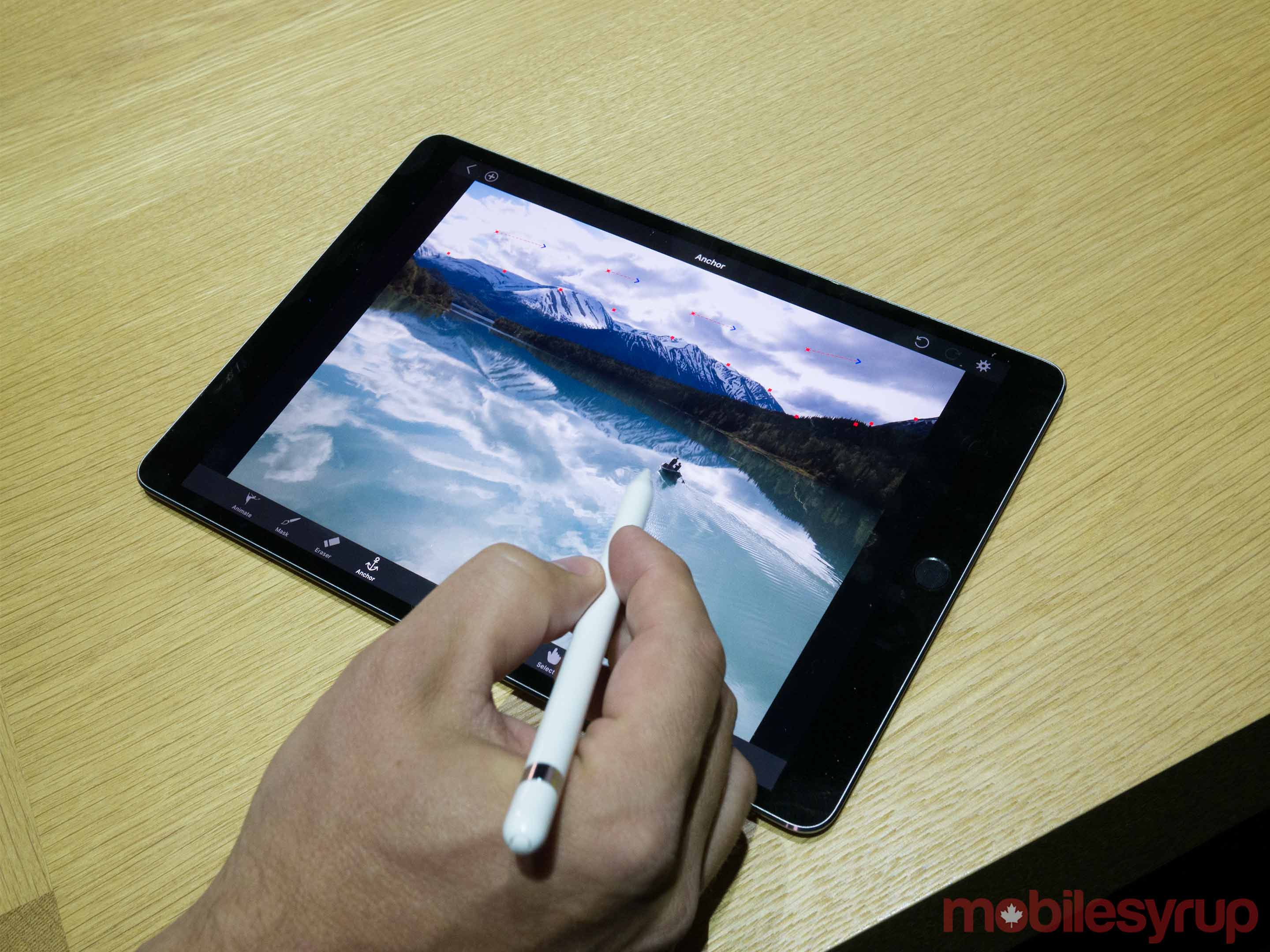
While the various iPad-focused features included in iOS 11 are arguably more exciting than Apple’s latest tablet announcement, I checked out the tech giant’s new 10.5-inch iPad Pro during a hands-on session following the company’s WWDC 2017 keynote, and walked away surprisingly impressed with the device.

As you may have guessed, the new iPad doesn’t stray dramatically from the current iPad Pro lineup and features the same overall physical design as the 9.7-inch iPad and the still massive 12.9-inch iPad Pro, though with considerably thinner bezels.

More screen real estate, but not much larger

10.5-inch iPad Pro

Apple has managed to pack a larger display in a device that looks and feels only marginally bigger than the 9.7-inch iPad Pro. It’s worth noting that the new 10.5-inch iPad Pro also weighs the same as the the 9.7-inch iteration, according to an Apple representative I spoke to at the event. This results in a device that feels ‘normal’ sized and very manageable; the new 10.5-inch Pro doesn’t seem too small like the 9.7-inch iPad, but it also doesn’t seem overly large like the 12.7-inch iteration.

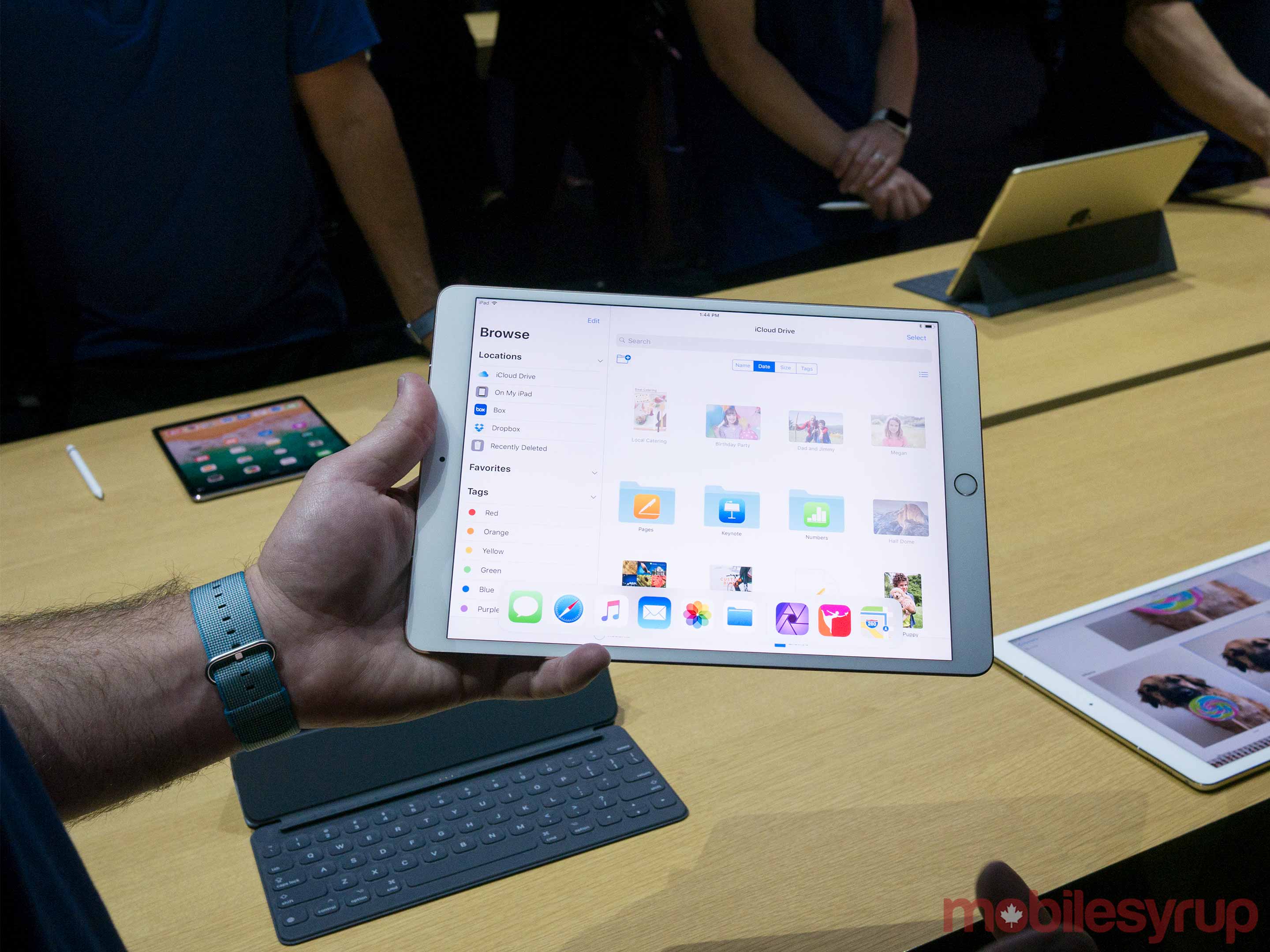
I tested out the new 10.5-inch iPad Pro during a demo of ARKit — which I discuss in greater detail here — the company’s new augmented reality development kit. I was also able to try out the smart keyboard designed for the 10.5-inch iPad; it’s much easier to type with when compared to the cramped version for the 9.7-inch iPad Pad because its size more closely resembles that of a full-sized keyboard.

The 10.5-inch iPad features a brighter display, a powerful new 64-bit A10X Fusion Chip and a feature Apple is calling ‘Pro Motion’ that increases the display’s refresh rate, removing the blur that sometimes occurs when swiping rapidly. The company claims this technology also makes the Apple Pencil feel more accurate and natural, but in my brief hands-on time I wasn’t able to discern any substantial difference in sensitivity.

Multitasking actually makes sense now

multi-tasking

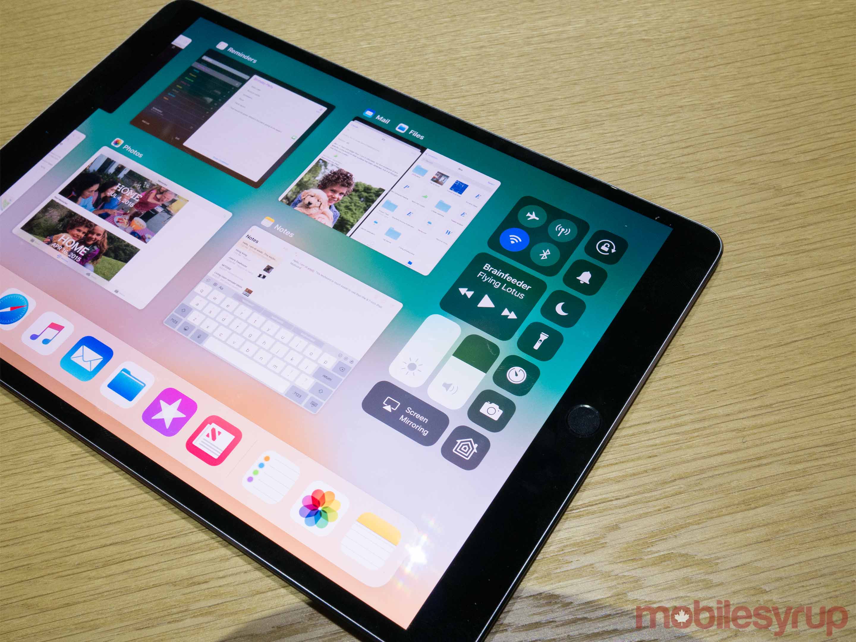
What’s more interesting about the device, however, are iOS 11’s new multitasking features, making Apple’s mobile operating system feel decidedly more capable and macOS-like. While I’m sure I’ll still feel limited when using the iPad Pro, Apple has made strides towards solving many of the tablet’s most significant issues through much-needed new features.

For example, Apple now allows users to access files and manipulate apps in new ways, which is reminiscent of the simplistic tablet version of Windows 10 prominently featured in Microsoft’s Surface devices, or even the recently announced Windows 10 S.

Multitasking makes more sense now too, with the standard dock being available even when inside apps, allowing users to swipe up from the bottom of the screen at any time to access it — you can then drag and drop any app to the side of the screen to put it in multitasking mode. Some apps also feature floating sidebars, like iMessage for example, with others snap to the side of the screen.

10.5-inch iPad Pro

While a subtle shift, I feel like multitasking in iOS 10 never really clicked for me and didn’t become a feature I instinctively used frequently. Now, however, I think it’s possible I’ll utilize multitasking more frequently when using Apple’s tablet line, though more hands-on time with the feature is definitely necessary.

The ability to drag and drop two apps, opening them side-by-side, is also very useful. The demonstration showed off involved opening Mail and Safari and dragging web content directly into an email draft, a task that was a chore to perform before.

The new Files app however, which I briefly mentioned earlier, is perhaps the most interesting iOS 11 feature because it gives users access to the iPad’s file system for the first time, though I unfortunately wasn’t able to test it out myself. Multi-touch can even be used to move multiple files from one folder to another.

The hybrid productivity battle continues

ipad pro multitasking

With the 10.5-inch iPad Pro coupled with iOS 11, Apple has taken steps towards solving many of the iPad and particularly the iPad Pro’s productivity related issues. While those looking to replace their laptop with an iPad Pro will still likely run into frustrating issues related to the still mobile-focused operating system’s limitations, thanks to iOS 11’s new features, these problems are likely to occur less frequently.

I still, however, am not sure if I could really use a Pro on a daily basis for work or basic productivity. This is the type of question that can only be answered after spending time testing out iOS 11 for a longer period of time.

On the other hand, Apple is successfully moving towards closing the gap between the Pro and Microsoft’s popular Surface line of laptop/tablet hybrid devices.

The 10.5-inch iPad Pro model starts at $869 CAD for a model with 64GB of memory, $999 for 256GB or $1,259 for 512GB. For cellular versions of the smaller model, the price is $1039 for 64GB, $1,169 for 256GB or $1,429 for 512GB. All versions of the 10.5-inch iPad Pro are available to order now from Apple Canada’s website and ship within an estimated four business days.

The post iPad Pro 10.5-inch Hands-on: Closing the Surface gap appeared first on MobileSyrup.

06 Jun 17:35

Telus is investing $4.2 billion for improved wireless infrastructure in Alberta

by Sameer Chhabra

Hot off the news that Telus is investing in British Columbia’s wireless infrastructure, the Canadian telecom giant announced similar plans for Alberta.

In a media release, Telus announced plans to invest $4.2 billion CAD to improve Alberta’s wireless infrastructure, by 2020. A similar $4.7 billion investment plan was also recently announced by Telus for British Columbia.

The company also announced that it would be investing $900 million by the end of 2017, in order to extend the province’s LTE wireless service, while also extending Telus’s PureFibre Internet throughout the province.

“As Canada celebrates this significant milestone in our collective history, we have the opportunity to reflect upon the many advantages we enjoy in this exceptional country,” said Darren Entwistle, Telus president and CEO, in a statement.

The Alberta investment is part of Telus’s ‘Next 150’ initiative. According to Telus, this year the company will have invested more than $150 billion in funding and operations across the country since 2000.

“Our sustained investment across Alberta underpins our unwavering commitment to this resilient province during challenging economic periods,” said Entwistle.

Source: Telus

The post Telus is investing $4.2 billion for improved wireless infrastructure in Alberta appeared first on MobileSyrup.

06 Jun 17:35

10 things to know about the Huawei P10 Plus

by Rose Behar
huawei p10 plus

Huawei’s P10 and P10 Plus are the company’s first flagship handsets to launch at major carriers in Canada, marking a significant step forward in the brand’s progress towards gaining market share in North America. Rogers will be the first to offer the P10, with Canada’s largest carrier starting to sell both the P10 and P10 Plus on June 6th. The P10 will also be available through Quebec-based regional carrier Videotron and Bell.

To mark the premium device’s imminent arrival, here are ten important things to know about the Huawei P10 Plus.

1. It looks like an iPhone.

huawei p10 plus

The first thing to know about the Huawei P10 Plus (and, for that matter, the P10) is that it’s an iPhone doppleganger, from its flat matte back with rounded edges to the antenna bands and camera/button placement. That’s not necessarily a bad thing — after all, Apple built its brand on design prowess. It just isn’t very original.

There is one unique touch, though: the side-mounted power button on the black P10 Plus is edged in red, giving it a distinct glint in the right light.

2. Its dual-camera setup is optimized for low-light shooting.

huawei p10 plus

Rear dual-camera setups are becoming a more and more popular point of differentiation for premium smartphones. The iPhone 7 Plus and LG G6 both feature dual rear cameras, with the iPhone 7 Plus using its setup to provide 2x optical zoom while the G6 focuses on wide-angle snaps.

The focus of the Huawei P10 Plus’ dual-camera setup is low-light shooting. Its 20-megapixel monochrome (black and white) sensor allows for the capture of more light and detail, while the 12-megapixel RGB (colour) sensor with optical image stabilization adds the necessary colour.

3. The P10 Plus’ camera optics are significantly better than the P10’s.

If you’re looking for a great camera, which is the main marketing point for the P10 and P10 Plus, you’ll likely want to opt for the larger model. That’s because it features a f/1.8 aperture lens for its 12-megapixel camera, while the P10 has a narrower f/2.2 aperture.

There are other considerable differences between the two models as well, shown in the comparison chart above.

4. Its chipset outperforms the Pixel on benchmarking tests.

huawei p10 plus

While North Americans might not be familiar with the HiSilicon Kirin 960 octa-core processor that the devices run on, the chipset provides the P10 Plus with a higher average benchmark than the Google Pixel XL, which features Qualcomm’s Snapdragon 821, on Geekbench.

In AnTuTu rankings, the Huawei P10 and its Kirin 960 SoC appear before the Google Pixel XL, but the Huawei P10 Plus isn’t listed. Other third-party showdowns between the Kirin 960 and the Snapdragon 821, MediaTek Helio X25, Exynos 8890 and Apple’s A10 chip also show the HiSilicon SoC’s prowess.

5. You’re not going to want to take off that screen protector it comes with.

huawei p10 plus

At first it seems like a cool perk that the P10 Plus comes with an already-applied screen protector (even if it’s only plastic), but the reason for its inclusion is that Huawei hasn’t put an oleophobic coating on the device, like there is on most Android phones, making it extremely susceptible to grease.

Apart from this, though, the 5.5-inch 2560 x 1440p IPS-NEO display is quite beautiful.

6. It has a 3,750mAh battery.

huawei p10 plus

Far outdoing the Huawei P10’s 3,200mAh battery, the P10 Plus has a 3,750mAh power pack — large in comparison to premium competitors like the Google Pixel XL, which has a 3,450mAh battery, and the Samsung Galaxy S8+, which has a 3,500mAh battery.

Huawei also promises that its SuperCharge technology will deliver enough battery power to watch a full-length HD movie on a five-minute charge, but further testing is needed before we can verify this claim.

7. It might take a while to uninstall apps at first, but EMUI has improved.

huawei p10 plus

Huawei’s EMUI skin has been toned down compared to previous versions, making it easier to use. There’s still some customization to do (like adding the app drawer), and there’s a sizable batch of bloatware. That said, most of the pre-loaded Huawei apps can be removed.

8. The phone offers some interesting fingerprint sensor gestures.

huawei p10 plus

If there’s one thing we’ve learned from the Google Pixel and its swipe gesture to pull down the notification shade, it’s that fingerprint sensor gestures are cool. Huawei goes all in on this concept by allowing your fingerprint sensor to act as both your return button and recent apps list.

All you have to do is swipe right or left to get recent apps, tap lightly for return and press to bring yourself home. It’s actually extremely intuitive, but if you hate that idea you can still get on-screen buttons to perform all those tasks — though then you won’t be able to use the fingerprint sensor as a home button and it takes up extra screen real estate.

9. The pro camera mode offers easy manual tools and saves photos in RAW.

huawei p10 plus

The P10 Plus’ pro camera mode is easy to access, simple to use with one hand and saves photos in RAW for easy editing, making it a great device for photography buffs.

10. It’s not water resistant.

huawei p10 plus

There’s a lot to be excited about when it comes to the P10 Plus, but water resistance isn’t one of those things, unfortunately. For a premium device (albeit at the lower-end of premium at $750 outright at Rogers), that’s a little disappointing. However, the P10 has premium peers like the Google Pixel that have also refrained from adding that extra layer of durability that can the mean the difference between life and death after an accidental dunk.

Keep your eyes out for a full review of the Huawei P10 Plus on MobileSyrup in the next few weeks.

The post 10 things to know about the Huawei P10 Plus appeared first on MobileSyrup.

06 Jun 16:49

Visual Vocabulary

by Don Park

Liked this visual vocabulary chart by FT a lot. PDF version is at Github. MIT licensed.

screenshot_268.png

06 Jun 16:48

Some thoughts on the future of the Open Badges backpack

by Doug Belshaw

Update: I’ve slept on this, and think that the ‘Credential Switch Guarantee’ isn’t quite the correct metaphor, as there’s nothing ‘in the middle’. A better model might be that of escrow, but even that isn’t perfect. I’ll keep thinking…


Last week, Jason McGonigle, CTO of Digitalme got in touch to say he’d written a blog post about the future of the Open Badges ‘backpack’. For those unaware, here’s a quick history lesson.

In the early days of Open Badges it was felt that Mozilla needed a place that any earner, no matter where they had earned their badges, could store and display them. This was seen as somewhat of a ‘stopgap’ measure. The priority after launching v1.0 of the specification in 2012 was to ‘decentralise’ the Open Badges ecosystem by federating the backpack.

This federation, in practice, was more easily said than done. Three things caused it to be problematic. First the inevitable politics. There’s no need to go into details here, but the spinning out of the Badge Alliance from Mozilla was doomed to failure. As a result, the focus on federating the backpack (and on creating BadgeKit to make badge issuing easier) went by the wayside.

Second, there were technical issues beyond my understanding with federating the backpack. Apparently it’s a very hard thing to do. Third, the need for federation is just something that’s quite difficult to explain to people. We’re so used to centralised services. I used to try and do so by talking about the way email works. These days, my example might be Mastodon.

As a result, Mozilla’s backpack became a central piece of the Open Badges puzzle. That, I think, actually worked to the advantage of badge advocates. While the Open Badges specification can be rather technical and dry, there’s something about the backpack that’s ‘homely’ and easier to explain to people. Having somewhere to store and show off your digital credentials just makes sense.

Carla Casilli, my former colleague at Mozilla, wrote a post this time last year in which she gave her views on the backpack and explained how it is rooted in ideology:

So much ink has been spilled already on the subject of the Mozilla badge backpack: almost from the start it has been both an important philosophical stake in the ground about personal data ownership as well as a raging battleground about its necessity. Questions about it have abounded. What works, what doesn’t. Who uses it, who doesn’t. What’s happening with it, what has happened to it. And yet, even with all of this back and forth, there has always been so much more to say about it.

Jason alludes to user sovereignty in his post, but I think Carla really nails it in hers:

One of the best unheralded benefits? When a badge earner used the reference implementation of the Mozilla Open Badges backpack, there was no requirement for them to be a member of a separate, corporate-owned social network in order to display their badges. Not at all.

In other words, users need a place to store and display their badges that aren’t tied to badge issuers. End of story.

These days, there’s no-one at Mozilla working on Open Badges. That’s been the case for at least a couple of years now. Instead, Digitalme were given a contract by Mozilla to continue work on the Open Badges backpack, while overall development of the standard is now the responsibility of IMS Global Learning Consortium. This, and the fact that there’s no badge track at MozFest 2017 tells you all you need to know about Mozilla’s future plans around badges.

So we’re left in the situation where one of the major players in the Open Badges landscape is responsible for a key bit of infrastructure. It’s not ideal, even if I know and trust the people at Digitalme.

The backpack is, and always has been, a place focused on user choice and control. I certainly hope it stays that way, and think that Jason’s vision of a ‘Credential Switch Guarantee’ might be a workable one. Users need something tangible that’s independent of commercial offerings.

Long live the backpack!

Image CC0 Alexandre Godreau


Interested in Open Badges? Subscribe to Badge News!

06 Jun 16:48

The Things That Matter From Apple’s 2017 WWDC Keynote

by Nick Guy
The HomePod speaker is the big news from Apple’s 2017 WWDC, along with some small updates to the MacBook, iMac, and iPad lines.
06 Jun 16:31

Ending the Referendum Requirement – 2

by pricetags

Bill Holmes added an important comment to the announcement post on the Price Tags Initiative to the End the Referendum Requirement.

Actually, there is no referendum requirement. The referenda provisions of the relevant legislation – the South Coast British Columbia Transportation Authority Referenda Act – have not been brought into force. Even if they had been, the holding of a referendum would not be mandatory. The legislation leaves it up to cabinet to decide in each case whether to order a referendum. Hence, the questions to MLAs should be worded differently, i.e., not based on there being a legislated requirement for a referendum.

It’s a mystery why the government enacted legislation that was not brought into force or used for the vote on the 0.5% sales tax. …

.

Helpful clarification, Bill – but it’s also important to note that the Liberals, in responding to the Mayors’ Council survey of all parties prior to the election, indicated this when asked about supporting completion of the 10-year vision:

Legislative requirement that any new source will require holding a referendum.

So unless we hear otherwise from the Liberal MLAs, Price Tags is assuming they would impose the referendum using whatever legislation they have.  We’d like an unequivocal statement that the requirement would be removed, whether legally required by legislation or decided by cabinet.  The most sincere expression from all parties would be a vote to remove the enabling legislation.

_________________

Alex Botta thinks this comment from Geoff (also on his blog here) should be brought forward:

Regardless of whether there will be another referendum, I think it would be wise to communicate with the public as if there will be. Strong public support would make many of the political problems we have seen simply go away. I think the #CureCongestion slogan is counterproductive. I have been developing some thoughts about an alternative approach.

Values are the foundation of a powerful message. It is critical that people believe that your values are sincere, so that they will be open to the rest of what you have to say:

1. Everyone has a right to mobility, to economic opportunity, and to a clean environment.

2. TransLink and the Mayors’ Council are dedicated to achieving these things. They live, work and take transit here, just like us. (Lead by example: get those mayors and TransLink officials on trains and buses.)

3. Our task is to give people choices that maximize their ability to get where they need to go safely, affordably, and cleanly.

Establish mobility as a core value:

4. Mobility is the foundation of a modern economy. Our economy is our people. Mobility enables us to be productive.

5. Everyone has a right to mobility: workers, children, the elderly, the disabled. (Poverty has negative connotations. Don’t bring it up, but respond if raised: “I’m glad you brought that up, because low income groups benefit the most from better transit.”)

6. We benefit from the mobility of others: family, friends, workers, people who provide us with goods and services. Mobility brings people together. (Always talk about mobility, never about congestion.)

The importance of transit follows naturally:

7. Transit gives us choices, enhancing our mobility. Transit and roads work together to get us where we need to go. (Do not engage in us-and-them anti-car rhetoric. “People,” not “drivers.” “Use road space more efficiently,” not “take away car lanes.” “Give people choices,” not “get people out of cars.” “Free up road space,” not “take cars off the road.”)

8. Transit is an investment. A dollar invested in transit produces more than three dollars in economic activity.

9. Transit is an essential part of an active, healthy and green city.

This leads to a positive plan of action that includes citizens as active participants:

10. Our transit system is extremely successful relative to comparable systems elsewhere. We need to build on that investment so that we do not fall behind.

11. Citizens support transit expansion. They understand the importance of in mobility, choice, independence and wise public investment. (People give their support when they feel that they are part of a group or movement.)

12. Our democratic representatives have collaborated on a plan to invest in transit. Participation from the people who live here is essential to that plan, and to continuing expansion in the future. (Focus on a legitimate and inclusive ongoing process, not the technical details, trade-offs and winners and losers of a particular project.)


This is a good statement with respect to values and mobility – and hence the problem with a referendum.  All that gets disregarded or ignored when the referendum gets highjacked by those who can more effectively sow division for partisan purposes or for their own ideological agenda.  In an age of social media, it’s almost impossible for rational and considered debate to occur.  As we saw with the last one, it instead becomes a shitshow.

And don’t let the same thing happen to our comments section. This PT initiative is about the politics of the referendum, not about the specifics of the Mayors’ plan or its alternatives, funding options, TransLink as an organization or public-service salaries. The delete button will be used more aggressively if highjacking becomes a problem.


.


06 Jun 16:30

Necessary Purity

by Danya Glabau

Some people live with impurity less easily than others.

Take me, for instance. I grew up on an organic farm in Maine. Farm life is supposed to fortify a body against later immune dysfunction, like allergies. But my body doesn’t tolerate very much. My list of environmental allergies is long: Most of the major allergenic pollens in the northeastern United States, every mold I’ve been tested for, cockroaches, dogs, cats, and horses. Not only does my body have high standards for purity, the things I must exclude are all over the map of statistical probability and at times defy the logic of medical science. When it comes to food, I’m allergic to select nuts — especially cashews, but not peanuts (the most common food allergy) or almonds — and most fish, but not, as far as I know, the more commonly allergenic crustaceans. I’m doubled over in pain after eating some stealthy anchovy paste in French-style roast chicken, but I can gobble down a jar of kimchi as a snack with no trouble. And keep me away from anything made with Chardonnay grapes, though Rieslings are welcome.

The difference between living well and catastrophic illness makes purity more than a metaphor, even as its metaphorical register inspires political intervention

I am far from alone, though. While data is thin before 1997, survey data suggests that food allergy is a condition that is on the rise. As many as one in eight people in the United States may have the condition, with the “top eight” allergens — peanut, tree nut, milk, egg, wheat, soy, fish, and shellfish — accounting for 90 percent of food allergies. Somewhere in the neighborhood of 2,000 people a year may be hospitalized due to a reaction, which can become serious quickly, progressing from a skin rash and gastrointestinal symptoms to wheezing, fainting, a “feeling of doom,” and cardiac and respiratory distress just minutes after eating the wrong food.

Rising rates of food allergies seems to validate the menacing sense that the postindustrial world is inimical to human health. It is even tempting to regard food allergy as the signature disease of modernity, as historian Mark Jackson has suggested. Some speculate that people with food allergies may be canaries in the coal mine, their hypervigilant bodies warning us all about the eventual dangers we’ll face from exposure to the pesticides and industrial additives of the unclean modern world. If so, a return to pure, clean living — avoiding pollution, pesticides, the hustle and bustle of modern life — would seem to be the solution.

But the forms of scientific evidence and analysis are not — at least, not yet — fully enough elaborated to explain food allergy in terms of our general condition of contamination. Biomedicine, which treats biology as the exclusive explanation for sickness, does not make such grand claims. In scientific terms, food allergy involves complex, as yet incompletely understood interactions between inherited genetic and epigenetic dispositions, conditions in the womb, microbial colonization in the first moments of life, and the precise timing and route of early-life exposure to foods. Tying modern life to food allergy scientifically — at either the level of the individual body or the level of society — remains a work in progress, often driven by non-scientists who experience bodily changes as a response to modernity.

From a biomedical point of view, “purity” is a matter of timing individual bodily encounters with foods with the immune-system development. An intentional feeding of eggs or peanut butter to an infant by a conscientious caretaker might trigger an allergy. Or it might be a child’s peanut-covered fist finding its way into their mouth after grabbing food-coated playground equipment — an accidental exposure to a normal substance in an ordinary environment. This “impurity” appears to have little to do with the generalized pollution of modernity.

At the same time, certain forms of early exposure can help prevent allergy formation: Exposure to the mother’s microbiome in the vagina seeds the newborn infant with a borderline unruly zoo of friendly and pathogenic microbes that may have a protective effect against food allergy. Though it may appear to violate the hygienic sensibility of the aseptic modern hospital, it potentially stands as a sort of necessary impurity. But once food allergies develop, impurity is no longer indeterminate. A nut, a seed, a crumb, an invisible smear of protein and oil on a cooking surface become contaminants, posing major threats to exquisitely sensitive bodies.

Material purity has thus become a rallying cry of food allergy activists, with local political efforts being directed toward keeping peanuts out of schools and sports stadiums and having federal food purity reporting standards changed. Such purity projects are not needless, nor are they reactionary responses to modernity’s undetectable dangers. In this limited sense, there is a necessary purity for foods and environments that can make the difference between living well and a potentially catastrophic illness. This makes purity more than a metaphor for those living with allergies, even as its metaphorical register does, at times, inspire political intervention. As a metaphor, purity easily translates from necessary practices to exclusionary principles, from protecting an individual’s body in ways appropriate for them to limiting exposure to all kinds of people who might be carrying or cooking with the food that might pose a threat.

How, then, should we understand the biomedical significance of purity without further muddling its material and metaphorical uses? What forms of purity are necessary? Could a degree of impurity save us from rising rates of chronic immunological illness? What evidence is acceptable for answering these questions, and how might we collect it? Who has the authority to say what forms of hygiene and pollution lead to sickness and health? And how do we find answers to these questions without demanding purity in our politics and societies where none is needed?

If food allergy appears to be a modern disease, manageable by techniques of purification and carefully controlled contamination, it also uncannily recalls pre-20th century ecological understandings of human health, in which environments rather than specific pathogens were seen as responsible for illness. With allergies, no clearly identifiable trigger tips the body over the threshold from “healthy” to “ill.” While an array of contributing factors can be described, pinpointing a single, specific cause is elusive. Instead, one becomes allergic during the course of life, often early but possibly at any time. While the stereotypical food allergic individual is an elementary school child with a peanut allergy, my own nut allergies appeared well into my twenties. In online communities, middle-aged women recount the acquisition of five, 10, even 20 food allergies following the birth of a child, gradually over many years, or suddenly and following no apparent trigger at all. Their cases confound their doctors, which in turn compounds their sense of fragility and fear.

The way that food allergy tracks an individual’s biography is reminiscent of pre-germ theory environmental medicine. In this paradigm, bodies with the certain underlying, constitutional dispositions were thought capable of living harmoniously with the diseases, soil emanations, and climactic vagaries of particular places. A healthful body, then, was one whose features complemented those of the place where the person lived.

For example, as historian Conevery Bolton Valenčius documented, mid-19th century Americans settlers in the Arkansas and Missouri territories were fixated upon the healthfulness of the land. Healthful land could be identified in part by geospatial features: elevation, climate, wetness or dryness, vegetation, and so on. The healthfulness of the land could also be detected through its effects on human bodies. In the world of 19th century America, the human body itself was understood to be dynamically, flexibly, and continuously interacting with its environment. Smells indicated the presence or absence of putrescent materials that could give rise to disease. A land that produced frequent fevers in its inhabitants was more than likely an unhealthy land, whereas one that grew tall, muscled, hardy young people undoubtedly had essential features to commend it. To live in healthy country was to have a healthful body; a healthy body was evidence that the country was healthful.

Food allergy is peculiar because the patient’s memory and real-time bodily functions are considered more reliable than the way the body is mediated through medicine’s sophisticated apparatus

By abiding in a locale, some peoples’ bodies could, within certain bounds, become accustomed to a place. This process was called seasoning. The porousness of the body was, for individuals with the right constitutions, potentially a resource for survival. But not all bodies were thought to be susceptible to seasoning in the same way, or to mesh well with every environment. In the American south, for example, human bodies of African descent were thought to intrinsically possess the right constitutional characteristics to adapt most successfully to subtropical climes, regardless of their individual histories of exposure. Thus, they were seen as more suited to agricultural labor than white settler bodies. Such ideas traveled everywhere that white Europeans and Americans colonized in the 19th and early 20th centuries, providing scientific justification for the exploitation of the people they occupied and persisting as an influential medical framework until as late as the 1920s.

Starting in the late 19th century, discrete biological causes like microbes began to replace environmental, constitutional, and seasoning mechanisms as the explanations for disease. Allergies recall these older kinds of environmental and constitutional explanations, though to date they have resisted the same sort of pernicious racialization. Perhaps it is this anachronistic aura that prompts the question I often receive when people find out what I study: Are food allergies real?

As I understand this question, it employs a very restricted sense of the word real. I think what people are actually asking is: Are food allergies verifiably biological, and not just in someone’s head? Can they be detected objectively with modern diagnostic technologies? Can they be shown to be inherent in specific, individual bodies rather than a sign of our general decline as a nation, as a society, as a human race? That is, can we assure ourselves that they are the problem of certain, troublesome individuals, and not something that might be a general pathology triggered by modern life?

The case for the “reality” of food allergy is complicated by the current state of food allergy diagnostics. Blood tests are available for food allergy, as they are for many conditions. It’s just that they are not universally thought to be useful for helping patients manage their condition. These tests measure the body’s response to specific allergens rather than some intrinsic, independent property of the body itself. Confusingly, an immunological response in a blood test does not always mean a person will have symptoms. This means, from a treatment perspective, that it is not the same as having the disease. Many people with “positive” blood tests to certain foods show no symptoms when they eat them, and they may restrict their diets unnecessarily if they avoid foods based on that metric alone.

For these reasons, blood tests are often regarded as secondary to other diagnostic tools, like a patient’s history of reactions and direct tests of the body’s sensitivity through skin-prick tests and other exposures. Most definitive and direct of all is the so-called oral food challenge: feeding a patient the foods they believe they are allergic to in a controlled clinical setting to see if they react to it. In this simulation of ordinary eating, sudden onset of illness serves as incontrovertible evidence of an allergy.

Food allergy is peculiar among modern diseases because the patient’s memory and the real-time functions of their body are often considered more reliable than the way the body is mediated through modern medicine’s sophisticated technological apparatus. Much of modern biomedical practice makes a habit of suspending belief in a patient’s symptoms until it can be technologically verified, whether through a 19th century technology like a stethoscope or a computerized CT scanner. How can a disease be “real” in the 21st century if it cannot be validated by laboratory techniques that operate independently of human bodies?

For philosopher Bruno Latour, this desire for laboratory verification extends the laboratory into society, and extends society into the laboratory. According to Latour, Louis Pasteur, the 19th-century inventor of the sterilization process that bears his name and an advocate for germ theory, was the first to master these translations. In his research on anthrax, he made aspects of the laboratory transparent to outside observers and assumed the authority to speak for the anthrax microbes he observed there in a variety of public forums. After Pasteur, Latour suggests, everyone in society must enter the laboratory to have their non-expert sensations and observations verified as factual, as real. The laboratory — and, by extension, scientific expertise more generally — has subsequently gained the authority to adjudicate on what is “real” in the society that lies beyond its walls.

But food allergy so far defies this measure of reality. It is epistemologically elusive, not easily reduced to objective proof from high-tech tests or measurements. It is an ontologically impure disease, troubling biomedical biases about the borders and definitions of disease. Food allergy is not an either/or kind of disease (either environmental or individual, either testable or a matter of memory, either subjective or objective) but a both/and: both externally verifiable and personally experienced, both a question of how bodies encounter the world and how the processes within them function. It promiscuously skirts the edges of what counts as a sensible biomedical category: It is both genetic and environmental, both constitutionally patterned and triggered by specific exposures, both detectable in the lab and diagnosable through patient experience.

During the AIDS crisis in the 1980s, women were also afflicted and died, but their symptoms were illegible to medical science. Purity as a guiding principle marginalizes and kills

It is within this confusing matrix of purity and impurity, laboratory verified facts and embodied sensations, that people with food allergies are tasked with finding things to eat that do not make them sick.

Sociologist Alexis Shotwell recently inveighed against the pursuit of purity in Against Purity: Living Ethically in Compromised Times. For Shotwell, the pursuit of purity has dark political implications. Defending environmental purity through a discourse of moral panic about gender ambiguous frogs, she suggests, devalues queer and trans struggles for political recognition. And clinging to a pure definition of a disease as a problem affecting a single demographic group or generating a single set of symptoms can exclude patients from necessary treatment. During the AIDS crisis in the 1980s and early 1990s, women were also afflicted and died. But since their symptoms were illegible to medical science, they often did not receive the same needed treatment and disability payments as their male counterparts. Purity as a guiding principle, Shotwell tells us, marginalizes and kills.

But here again, food allergy resists the rubric. With food allergy, there is, at the level of practice, necessary purity and helpful impurity. Precisely timed impurity early in life might lower the chance that a person would ever develop the disease. But once one develops the condition, material purity — food made of purely what it is said to be — is not just a metaphor but a bodily necessity.

What food allergy teaches the careful observer is to be specific about the kind of purity necessary to live. It does not extend to avoidance of foods that have not triggered reactions. Nor does it extend to a narrow understanding of single-cause disease etiology or a definitive testing regime that precludes the need to listen to messy patient stories and to observe real-time bodily reactions (at least not yet). And it most certainly does not extend to exclusionary interpersonal, or institutional politics — something to remain especially vigilant of because of the historical tendency of white Americans to claim that the bodies and lifeways of people of color, immigrants, and people with disabilities introduce contaminating influences into society.

Purity is necessary in a limited, practical sense in the case of food allergy. Thinking about purity in this context serves as a parable for understanding its role in other areas of life. We must be specific concerning the politics that necessary purity practices enact or demand. While a politics of providing appropriate care for specific bodies throughout the life course is a good politics for unpredictable times, demands for total purity of category, kind, and substance at all costs seem more dubious. Yet purity practices are embedded in — and can even be ways of materializing — our politics. We hope that purifying our problems by identifying simple causes of our ailments or demanding political allegiance around a single analytic frame or idea can simplify our search for a better life. But this has rarely been the case, and it should not motivate our every pursuit.

We must remain vigilant that necessary purity practices do not translate into exploitive and exclusionary purity politics. Necessary purity exists, but it is specific, modest, material, and local. The muddled status of food allergy points to the limits of purity as an epistemic, ontological, and material ideal for biomedical science. Identifying simple causal triggers, inventing new tools that guarantee easy identification, and developing quick fixes for diseases on the rise, like food allergy, are tempting. But these pursuits would also limit what we are capable of seeing as reasonable, long-term solutions to caring for our messy, unpredictable bodies.

Should we be seeking quick fixes for ailments of individual bodies? Or should we be aiming to make it easier to live as part of collectives and communities with a wider variety of bodily difference, by lowering the cost of medical treatments and expanding health-care access and other social services? Will new obsessions with protecting the purity of bodies translate into new forms of paranoia about living with bodies that are racially, sexually, or otherwise different from our own? We ignore the material specificity and historical lessons of the changing politics of bodily purity at our own peril. Seeking purity and simplicity limits how we confront the challenges that face us in constructing more livable, healthful futures — and even what we imagine them to be.

06 Jun 16:29

Introducing ARKit

files/images/104511058-Screen-Shot-2017-06-05-at-2.36.45-PM.530x298.jpg

Apple, Jun 09, 2017


Icon

The important thing to come out of Apple's World Wide Developer Conference (WWDC) isn't the smart speaker that has been all over the media, it's the Augmented Reality kit (ARKit) that lays the groundwork for what will probably be future hardware from the company. Some jargon: "ARKit uses Visual Inertial Odometry (VIO) to accurately track the world around it. VIO fuses camera sensor data with CoreMotion data. These two inputs allow the device to sense how it moves within a room with a high degree of accuracy." More from The Verge, TechCrunch, CNBC, 9to5Mac. While no doubt educators will focus on the teaching applications of augmented reality (AR) the main benefit is in performance support, helping people solve problems without needing extra teaching. [Link] [Comment]

06 Jun 16:29

The Right Start — The Behavior Economics of Successful Digital Transformation: Part 1

by MikeW

Let’s continue the discussion of digital transformation (DT), but we will take a different perspective today. As some of you might know, I’ve always had a keen interest in human behavior. I’ve published many articles on gamification, behavior economics, and its application in the business world. Since DT is typically a multi-year project with many stakeholders and complex human factors, perhaps we can apply a little behavior economics (or even gamification) to this transformation process.


However, DT is also a journey that starts with the adoption of some technology to transform some part of your business, where should you start? We’ve already learned that a customer-centric DT strategy is crucial to paving the road to success, but there are still many parts of a business that could interact with customers. How should you phase this multi-year project? Where should it end up? These are the questions we will explore over the next few posts. Today we will focus on choosing the right starting point.


If you missed the previous blog posts on this topic, I recommend reviewing some of the background materials before moving forward. The related blog posts can be accessed here:

  1. Successful Digital Transformation Must Go Beyond Digital to the People, Process, and Culture
  2. Why Transform Your Business Digitally? — A History Lesson through the 4 Gears
  3. The Offensive Logic to Digital Transformation — Customer Experience
  4. Gear Up for the Next Level of Digital Engagement


Engagement is Hard, Enlistment is Even Harder

engage vs enlist 640px.pngFrom the 4-gears model, we know that business must learn to spin the engagement and enlistment gears in order to survive the digital disruption. So it’s natural for practitioners to start spinning these 2 gears right from the beginning. There is nothing wrong with this. Many digital visionaries have already gone down this path, and they are enjoying the fame and glory from their success. But it really takes a visionary who have a strong conviction (which is rare) to pull this through. However, most business people are pragmatists and conservatives. How should the majority of the businesses (~68%) tackle DT?


The answer is simple: don’t start with engagement or enlistment, because these 2 gears are relatively new compared to acquisition and monetization. Most enterprises have a natural tendency to resist jumping into something new that they don’t fully understand. Although many brands (even the conservative ones) understand the need to engage, many practitioners are still being held back. Here are some of the most common reasons for their resistance.

  1. Lack of urgency: it’s a nice-to-have, not a must-have, so it can wait
  2. Lack of resources: both funding and human resources
  3. Lack of industry best practice (although this is changing as we speak): companies must learn to engage and manage customers (in the case of enlistment) who probably don’t want to have a relationship with the brand
  4. Lack of standard ROI models for different engagement and enlistment use cases (this is also changing)
  5. Incomplete measure of engagement: missing the depth dimension of engagement


In addition to the common objections for diving in with engagement, enlistment often faces a few extra challenges of its own.

  1. Unfamiliarity: most enterprises probably never even heard of enlistment, but related concepts, like crowdsourcing, is gaining popularity in business
  2. Lack of business processes for enlistment: successful enlistment requires brands to incorporate customers’ voices into their company’s routine operation, but many companies don’t have any of these processes in place
  3. Lack of control: enlistment require the business to collaborate and rely on customers, but the company has no control over what their customers will do or say
  4. Long time-to-ROI: even in cases where a clear positive ROI is demonstrable, it is only realizable much later, because it takes a long time to enlist customers

To overcome all these challenges within a traditional company is truly a herculean effort, and that is why those who did it deserve the fame and glory of heroes.


Where Should You Begin Your Digital Transformation Journey?

If your DT efforts were dismissed, perhaps your organization isn’t ready for prime-time engagement and enlistment yet. That doesn’t mean you should just sit and wait, because the price of doing nothing may be the end of your business. So this is where you need to apply a little behavior design or gamification to drive the adoption behavior of your organization.


starting point orig 640px.png One of the most powerful behavior-driving principles for large groups of people with disparate motivation is the concept of baby steps. In fact, this principle is so crucial that it’s one of the core tenets of successful gamification. The idea is simple and has 2 phases. First, if you want an organization to adopt something new and unfamiliar, it’s best to start from something that they already know and are already doing. The next phase involves building a ramp for your company to advance towards the final behavior outcome, and we will cover this in the next post.


If the final behavior is for your company to learn to engage and enlist your customers (which they haven’t started), then you should not start with these 2 gears. The fact that they have not started engaging or enlisting by now means that these 2 gears are probably too challenging for your organization. You must start with one of the gears they are already spinning—acquisition (marketing) or monetization (transaction).


In theory, it doesn’t matter which gear you choose to begin your DT journey, since the 4 gears is a loop anyway. In practice, however, it’s a lot easier to start with acquisition for several reasons:

  1. Most of the enterprises (even the pragmatists and conservatives) are either already doing some forms of digital acquisition.
  2. It’s much easier to create a customer-centric strategy around digital acquisition, and customer centricity is crucial to the long-term success of your DT initiative.
  3. There are also a lot more technologies in the market that can help you digitally transform your acquisition gear than do the monetization gear. If you don't believe me, just take a look at this marketing technology landscape infographic.


Digitally Transforming Your Acquisition Gear

Now that we have chosen to begin your DT journey with acquisition (i.e. marketing), how should you transform this business function digitally? I wish I could to tell you, but unfortunately, this is unique for every business. More specifically, it depends on your vision of what DT really means to your brand. And this can be very different for every organization.


Now, you might recall from the first vlog entry of this mini-series where we discuss the 3 most important failure modes that must be addressed at the beginning of every DT project. Addressing these failure modes has led to the 3 initial ingredients that are crucial to the long-term success of DT projects:

  1. A customer-centric strategy
  2. A clear vision of what DT means to your business
  3. The right technology that is fully integrated into your digital ecosystem and simple to use


Since we are beginning the DT journey with acquisition, we must make sure these 3 ingredients are present from the get-go. This can often be established with the 3 sets of questions below:

  1. Do you have a customer-centric acquisition strategy? Are you improving the customer experience (CX) when acquiring their attention on digital channels? Since a good CX during acquisition often means more relevant and personalized messaging, are your marketing content personalized? Are they hyper-personalized?
  2. Is your DT helping your business acquire more effectively and more efficiently? Since acquisition (marketing) is something that every company already does, there is an established standard to measure its performance. So are you improving the performance of your existing marketing efforts? Can you measure this improvement by standard marketing KPIs?
  3. Can the new technology be fully integrated with the rest of your marketing technologies? Does the technology simplify your marketing team’s work? Can your marketing team use the technology without much training? Does the technology increase the efficiency and productivity of your marketing team even factoring in the learning curve?

If the answer is “YES” for all the questions above, then the DT of your marketing operation is on the right track.


Conclusion
3 questions 640px.pngStarting your DT journey by engaging and enlisting customer is often difficult (though not impossible) for most of the traditional enterprises. Because these 2 gears are relatively new compared to the acquisition and monetization gears, many DT practitioners still get pushed back when starting with the engagement or enlistment gears. We can apply the principle of baby steps to increase the success rate of this challenging transformation process. This is accomplished by starting with the acquisition gear (i.e. marketing), because most companies are already familiar with marketing and are already doing it.


How you transform your marketing with digital technology is specific to your business, but it must contain the following 3 success ingredients:

  1. Improving the CX for your customers
  2. Improving the performance of your company’s marketing KPIs
  3. Improving the productivity of your marketing teams


Picking the right place to start is an important first step. Next time we’ll build the ramp that enables your company to take baby steps toward the final behavior outcome—thriving in today’s digital economy. And that will require all 4 gears (i.e. acquire, engage, monetize, enlist) to spin in sync.


*Image Credit: tpsdavegeralt, and HypnoArt.


Michael Wu, Ph.D.mwu_whiteKangolHat_blog.jpg is CRM2010MKTAWRD_influentials.pngLithium's Chief Scientist. His research includes: deriving insights from big data, understanding the behavioral economics of gamification, engaging + finding true social media influencers, developing predictive + actionable social analytics algorithms, social CRM, and using cyber anthropology + social network analysis to unravel the collective dynamics of communities + social networks.


Michael was voted a 2010 Influential Leader by CRM Magazine for his work on predictive social analytics + its application to Social CRM. He's a blogger on Lithosphere, and you can follow him @mich8elwu or Google+.

06 Jun 16:29

iOS 11: The MacStories Overview

by MacStories Team

At this year's WWDC keynote event, Tim Cook took the stage in San Jose to reveal the eleventh major version of Apple's flagship mobile operating system. iOS 11 includes a number of improvements across the board, but with significant emphasis placed on increasing productivity for the iPad.

Alongside the storm of iPad-specific features, the next version of iOS will also bring advancements to the Lock screen and Control Center interfaces. Built-in apps and services such as Maps, App Store, Notes, Messages, Podcasts, Music, Siri, and more received individual updates — some more comprehensive than others. The new ARKit and Core ML frameworks were announced as well, giving us our first tangible examples of Apple's investments in AR and developer-friendly machine learning.

Despite a decade in the wild, in many ways iOS is still a young operating system. It's good to see Apple not resting on its laurels, but instead continuing to reevaluate and redesign the areas of the OS that need it — such as iPad productivity features and the App Store. The ground-breaking potential for iPad users in iOS 11 shows just how much that aspect of the system has been neglected, but many of the other changes show how Apple's slow refinements over years are paying off.

Below you'll find a detailed look at what Apple is unabashedly calling "turning iOS up to 11."

iPad Productivity

Ryan: Craig Federighi called iOS 11 the largest iOS release for iPad ever, and that's no exaggeration. The next major version of iOS provides iPad users with an upgraded Dock, improved multitasking, systemwide drag and drop, a powerful file system, and enhancements to Apple Pencil and the software keyboard.1

Dock and Multitasking

iOS users know the Dock as the space at the bottom of the screen where a select number of frequently used apps live. Historically, the Dock on iOS has been relatively featureless – it allows you to quickly access your favorite apps from any navigation screen, but nothing more. But with the changes coming to iOS 11, the iPad's Dock is getting upgraded to more closely resemble its macOS counterpart, with a few special multitasking benefits to boot.

The first change worth noting with the iPad's new Dock in iOS 11 is that it can hold a lot more apps than before. Similar to the Dock on macOS, now the Dock can feature a screen-wide assortment of your most important apps. This is supplemented by a new predictive area on the right-hand side of the Dock, which offers suggestions based on what app it believes you'll want to launch next – including Continuity apps.

Besides its added space for more apps, the iPad's Dock is also more accessible than ever before. No longer confined to your Home screen, the Dock can be invoked while inside any app by sliding up from the bottom of the screen – a gesture formerly assigned to bring up Control Center. This provides quick, easy access to all of your most-used apps systemwide so you can switch apps without needing to return to the Home screen.

In addition to providing a quick way to switch apps, the Dock also allows you to engage in multitasking by dragging an app directly out of its docked icon and on to a select portion of the screen, effectively opening the second app in Slide Over. Once this second app is floating above your primary app in Slide Over, you can tap and hold it to drag it along a horizontal plane – it can either come to rest on the right or left-hand side of the screen. If you'd like to make that app a permanent fixture on your screen, you can choose to have it lock into Split View on the side of the screen where you placed it.

For all apps found in the Dock, this is a tremendous upgrade in multitasking behavior over the previous app picker, enabling quicker access to the right apps and more flexibility in the way you configure those apps – including options for the app on either side to be in 1/3 or 2/3 view.

The multitasking features of the Dock join with a newly redesigned App Switcher to provide even greater multitasking improvements over past versions of iOS. When sliding the Dock up from the bottom of the screen, if you continue dragging further upward, you will invoke the new App Switcher. This redesigned App Switcher can contain not only other apps, but also app spaces. Similar to the spaces found in macOS, any screen setup of two apps side-by-side can be saved as a space in the new App Switcher, allowing you to create custom screen setups for different tasks on the iPad. The App Switcher is also, interestingly, now home to iOS 11's redesigned Control Center. Overall, the iPad's new App Switcher shares a lot in common with the Mac's Mission Control feature, and it works well in its iOS form.

iOS 11's updates to multitasking seem to provide iPad users exactly what they've long hoped for. The Dock is a clever importation of a familiar Mac concept, and the new App Switcher is sure to make iPad power users quickly forget about its unfortunate predecessor. Multitasking on iPad has new and greatly improved days ahead.

Drag and Drop

Touch screens have long provided a more intimate form of interaction with content than is possible using a trackpad and cursor. Yet despite that, the ability to intuitively drag and drop items across different apps has been lacking on iPad, the touch device best suited for it. That changes in iOS 11, with robust drag and drop support offered in a touch-enhanced form.

In its keynote presentation, Apple showcased drag and drop being used to do things like move images, text, and URLs between different apps – and in more ways than one. The simplest method is simply to tap on content and drag it from one app in Split View into the app on the other side of your screen. But the feature can also be used to drag content from an app on screen into an app that isn't currently on screen. This can be done by bringing up the new App Switcher and dragging your content into an app that resides there.

The richness of dragging and dropping content across not only current apps, but also those in the App Switcher, is made possible thanks to drag and drop's multitouch support. With multitouch, you can select some content, then use other fingers or your other hand to select additional content, and pull up the Dock or the App Switcher to navigate to wherever you'd like to drop that content – all in one swift action.

Despite being one of the more impressive technical achievements in iOS 11, there isn't a lot else to say about drag and drop right now other than that it's here, and it looks fantastic. Time and testing will provide more details on the specifics of its implementation in iOS, but assuming it works as advertised, Apple has created an elegant, intuitive, and capable method of drag and drop that's perfectly suited for iPad.

Files

File management on iOS has a new name: Files. Gone are the days of the iCloud Drive app; it has been replaced by the more powerful Files, which resembles macOS's Finder in the way it provides rich organization tools and can integrate with third-party cloud storage providers like Dropbox, Google Drive, and more.

Files is truly a Finder equivalent on iOS – and then some. As I mentioned, you can set up all of your third-party cloud services inside of Files, making it a unified hub for all file management needs. Every file you have, across all your cloud providers, accessible in one place. This unification of files benefits from the new Recents tab of the app, which shows all of the most recently updated files across the entire Files app, no matter which providers those files come from.

Another highlight of Files is its expanded organization tools. Unlike the iCloud Drive app, Files includes support for tagging files – a feature macOS has had since El Capitan. It also includes a new Favorites section where you can keep any folders you need quick access to. There is also an expanded line of options for sorting or filtering through files, making it easier to find what you need.

One way that the Files app takes advantage of drag and drop is that if it's in your Dock, you can tap and hold on its icon to view a handful of your most recent files, each of which can be picked up and moved into another app. Files also features rich drag and drop support for selecting multiple items at once, and moving them around into different folders or tag assignments.

Apple has long been resistant to the idea of adopting traditional approaches to file management on iOS. The previous iCloud Drive app merely served as a half-baked, limited imitation of the Mac's Finder. I'm thankful that the company has changed course and provided a rich, powerful solution like Files on both iPad and iPhone. Implementing a system that's more familiar to legacy options should make it easier for more people to transition from Mac to iPad, should they desire to do so.

Pencil and Keyboard Enhancements

Rounding out the iPad-specific improvements in iOS 11 are enhancements to the Apple Pencil and the software keyboard.

The Apple Pencil is now more deeply integrated into a number of areas across iOS. Paired with the new Create PDF system-wide action extension, Instant Markup is a powerful tool to easily annotate content from a variety of apps. The Markup feature found in iOS 10 has been upgraded with more tools that mimic those found in Apple Notes' sketching feature, and it's more streamlined too. With Instant Markup, there are less taps required to annotate a document – simply press the Pencil to the screen and mark away.

Instant Markup is especially helpful when you want to annotate a screenshot. By default, after you take a screenshot in iOS 11 that screenshot's thumbnail will appear at the bottom of the screen. Tapping the thumbnail instantly loads it in Markup mode.

Apple Notes is home to several of the Pencil's other new powers. A feature called Instant Notes allows you to simply tap your Pencil on the iPad's Lock screen to unlock it and begin taking a new note. Handwritten notes are now searchable as well, making Apple Notes a solid option for storing both typed and handwritten text. Another Notes feature that relates to the Pencil, though only indirectly, is that Notes now has a Document Scanner so you can scan paper directly into the app, then annotate with the Pencil if needed. A final Pencil feature in Notes, which is also available in Mail, allows you create inline drawings – typed text will move out of the way to make space for your drawing.

The iPad's software keyboard has been improved through consolidation.2 Now letters, numbers, symbols, and punctuation marks live on the same keyboard. This is accomplished by putting two options on every key. The primary button input is in black, while secondary input options appear at the top of each key in light grey; flicking down on a key triggers its secondary option.

System Apps

Alex: Every iOS revision to date has included improvements to a grab-bag of system applications, and iOS 11 is no different. While there are definitely a few regulars that Apple seems to enjoy toying with as design and interface playgrounds, the rest of the batch are generally a mystery until keynote day. This year we saw a fairly standard batch for the most part, but with a few unexpected contenders making appearances — such as the App Store app and a new Apple Pay iMessage app.

App Store

The App Store received the biggest change this year, with a full-scale redesign to match the design language that was pioneered by the Music app last year. A series of five tabs at the bottom divide the app into its main sections, with the primary tab being the new "Today" view.

Today is a new take on featured apps in the App Store, where Apple can choose new apps to highlight each day and include individual editorials for them. The view is made up of a horizontal stack of cards that can be scrolled through — each card showing artwork for the featured app in question. Tapping the artwork will bring up an editorial that Apple's team has written discussing the app, such as a story about a moment in a game or a how-to article describing how to use an advanced feature. This is a fresh take on featured apps which Apple hopes will bring back some of the fun of discovering great new apps in the App Store.

Beyond the Today section are sections for Games and Apps, which have thankfully been split apart into two different categories. This could potentially help to cut down on Games utterly controlling the App Store market in recent days, but we'll see how it plays out over time. From what we can see so far, these two sections seem to be where Apple is moving the featured sections that used to make up the front page of the old App Store.

The last two tabs are familiar: Updates and Search. While Updates doesn't have any noteworthy changes, Apple is boasting a new "enhanced search." Supposedly this will allow apps to be discovered by more than just their name or any keywords their developers have bought ads against. The example on Apple's new App Store preview page shows a search for "geometry puzzle" finding the newly released (!) Monument Valley 2.

Overall, the "all new design" of the App Store seems a bit underwhelming to me, but I do see legitimate potential in the new Today section. Editorials around apps is something we love here at MacStories, so we're excited to see Apple's take on writing interesting pieces about new apps.

Maps

In iOS 11, Apple's Maps app will be seeing three big new features: indoor maps, lane guidance, and speed limits. All of these are welcome additions, continuing to close the feature gap that Google Maps still maintains over Apple.

Indoor maps are launching for shopping centers and airports at first, and will show detailed views of where shops and terminals are located, including what floor they're on. This feature is launching in a small selection of cities at the start, but Apple says they'll be expanding it over time (similar to their flyover feature from a few years ago).

Lane guidance is a feature that Google Maps already has strong support for, and I'm very excited to see it come to Apple Maps as well. With this addition, Maps will not only instruct you on which roads to turn on, but will actually inform you which lane you need to be in when approaching your next exit or fork. When driving on unfamiliar freeways this can greatly improve your ability to navigate without missing any important exits.

The speed limit feature is also a welcome addition — and pretty much self explanatory as to why it's useful. If you've ever asked or thought the question, "What's the speed limit right now?", then you know why this could be helpful.

Messages

The biggest new feature for Messages is syncing with iCloud. Finally we can say goodbye to our Messages failing to sync their order or sometimes failing to come through at all when we switch between devices. Furthermore, deleting a message on one device now deletes it from all of them, another welcome addition. Naturally, the syncing is all still end-to-end encrypted.

Beyond syncing, Messages is also getting a slight UI tweak for iMessage apps. An iMessage app bar is now instantly visible at the bottom of the screen when you open a new conversation, requiring fewer taps to access the apps, and also will likely make it harder to forget they're there like I often do in the current interface.

One final note that goes in the low-hanging fruit category: Digital Touch has lost the prominent placement it previously held in Messages, demoted to simply being an iMessage app now.

Apple Pay iMessage App

Apple is adding a brand new iMessage app of their own: Apple Pay for iMessage. This iMessage app enables person-to-person payments via Apple Pay for the first time. Simply open the iMessage app in a conversation and enter an amount, then hit send and authenticate with Touch ID to pay. I think this will be a great new way to easily transfer money — and will eliminate the hesitancy people sometimes feel about giving their credit card info to some of the other payment solutions that are popular these days, such as Square Cash and Venmo.

Camera

Apple's Camera app has seen some love in iOS 11 as well. The app includes new filters to improve portrait photography, including advancements in low light photo quality. New compression technology also allows the photos taken by Camera to be stored at half the size without degrading quality.

The aspect I'm most excited about are some of the new features around Live Photos. These include the ability to select a different frame of the Live Photo as the main frame, something which was not previously possible. There are also new features to turn your Live Photos into GIFs. Apple tries to do this intelligently and automatically, so you just need to choose an effect and iOS takes care of the rest. These effects include infinitely looping GIFs, "bouncing" GIFs, and infinite exposures (this just fuses the whole photo like a long exposure, it doesn't make a moving GIF).

Photos

In the Photos app, Apple continues to bear down on their machine learning initiative. Now the app will create more "Memories" based on events like birthdays, anniversaries, compilations of your pets, etc. These Memories will also automatically adjust to fill the screen whether you're watching in portrait mode or landscape.

In terms of interoperability, Photos will now sync your metadata between devices. No longer will the work you put into confirming people's faces and names be wasted each time you pick up a different device.

News

The News app will now contain daily curated content from Apple News editors in a new Spotlight tab, as well as a selection of the day's top videos from around the web. Other than that, the News app has gone mostly unchanged in this version of iOS.

Music

Apple may have failed to gain traction with their music social networks in the past, but that never has and seemingly never will stop them from trying again. This year, Apple Music subscribers can create a profile so their friends can follow them and see all the music that they're listening to. Friends can also share playlists with each other and see the Apple Music Radio stations they've been listening to.

Home

Apple's Home app has remained mostly unchanged, but it has received support for a new category of devices: AirPlay 2 speakers. So far this change seems purely added for Apple's upcoming HomePod devices, but we'll see if other device manufacturers are added to that list over time.

Notes

Along with the impressive iPad-specific new features added to Notes, the app has also gained the ability to create inline tables. The new functionality is accessible from the shortcut bar above the QuickType keyboard in the Notes app.

The Notes share sheet UI has also been updated, now enabling you to browse through your folders, and even search for specific notes before choosing where to save your content.

Despite all the new additions in Notes, the background paper texture in the app has survived another year — an unwavering final tribute to the skeuomorphism of iOS 6. Please, Apple... Please take it away.

Siri

Apple has once again reworked Siri's voices, now claiming that they sound more natural and expressive than ever before. A brand new feature for Siri is its ability to translate between languages. Apple is calling this a beta for now, but the potential of a fully-functioning translator in a phone is immense.

Siri also has new integrations with Apple Music, so asking it to play you a song will have a better chance of resulting in something that you will actually like. It can also answer contextual questions about currently playing tracks, such as "Who's the drummer in this song?"

Apple is also talking up their machine learning capabilities system-wide, and pushing the idea that Siri is a universal personal assistant, ingrained throughout the fabric of the OS. Better QuickType suggestions, Safari search suggestions, intelligent calendar event suggestions, recommended stories in News, and more. Some of these features are not entirely new concepts to iOS, but Apple seems keener on them this year than last, so perhaps they've finally really pulled it off.

User Interface Improvements

Ryan: Ever since the introduction of iOS 7 in 2013, Apple's mobile operating system has yet to see a major overhaul of its user interface. With each version since then, there have been only minor UI revisions, and iOS 11 continues that trend. It contains no substantial refresh, but it does come with a handful of noteworthy iterative tweaks.

Unified Design Language

One of the most immediately noticeable changes in iOS 11 is the spread of certain design elements from iOS 10's Music, News, Maps, and Home apps. The design trend pioneered by those apps made its way into the TV app last December, and also this year's update to the WWDC app, so it's not surprising that iOS 11 further expands that same style. The Podcasts app is the most prominent adopter of this design, closely imitating the Music app now, while in many other system apps the majority of design elements remain the same as before. Certain specific elements though – such as headers and search bars – have changed to help provide a more unified look and feel across the OS.

Lock Screen and Notification Center

One point of fragmentation regarding notifications is being altered in iOS 11. Now when viewing notifications from a device's Lock screen, you can swipe up to load the full list of missed notifications – the exact list you would have previously seen inside of Notification Center. This new Lock screen behavior is the only way to access Notification Center in iOS 11; swiping down from the top of the screen now returns you to the Lock screen, where you can access the Search screen as usual by swiping right, and the Camera by swiping left. This change may bring some initial confusion, but it seems like a helpful consolidation that promotes greater simplicity in the long run.

Another feature of the Lock screen I've noticed in my brief usage of iOS 11 is that a card containing audio playback controls will proactively appear on the Lock screen for short periods of time after I've paused playback. This is a small, but extremely useful addition I'm sure to take advantage of every day to restart playback.

Control Center

iOS 11 brings two major changes to Control Center, one of which has long been asked for, and the other of which comes as a real surprise.

On the hopes-and-dreams-fulfilled side of things, Control Center can now be customized with the buttons and toggles that you care about most. Not only that, but you can also 3D Touch on more objects in Control Center than ever before, and some of those objects expand into a menu with even more buttons in it.

The second major change is that Control Center has received a full redesign. Gone are the three separate panels introduced just last year in iOS 10. In their place is a single-paged Control Center that looks and feels substantially different. It is rare for Apple to introduce a whole new interface design just one year after another similarly radical shift, but that's what they've done here. It seems like the best route to go though; iOS 11's update appears simpler and more efficient than before, so it's a welcome change.

System Frameworks

Alex: While new interfaces and improved applications always get the spotlight, Apple's yearly framework updates and new releases are a category that requires attention as well. These may not be as flashy, but they often represent brand new opportunities for developers to create categories of apps that have never existed before on the platform. Over the coming months and even years, as we see more and more apps released with AR and machine learning capabilities, we'll be able to trace their origins back to the frameworks announced alongside iOS 11 this year.

ARKit

ARKit is a brand new framework from Apple which allows developers to create augmented reality experiences on iPhones and iPads. The framework fuses camera sensor data with CoreMotion data from Apple's M-series motion coprocessor chips to accurately track the world relative to the position of an iOS device. In other words, as you move a device around a room, ARKit is able to track exactly where the device is at any given point, including its orientation.

The other main aspect of ARKit is analyzing a room to determine the location of flat planes such as tables or the floor. It can then use these or other feature points to anchor virtual objects in place and make them impervious to the movement of the device.

The above two features are among the hardest problems for developers of AR apps to handle, and with ARKit Apple is taking these almost entirely off their plate. Developers of ARKit apps will thus be free to create and build their worlds without having to pay so much attention to the problem of making sure their worlds stay in place in the real world.

Core ML

Core ML is the second brand new framework that Apple announced at this year's keynote. This framework's goal is to expose the power of machine learning to developers without requiring them to build these complex abilities into their apps from scratch.

The two flagship features of Core ML are computer vision and natural language processing. Core ML's computer vision functionality supports face tracking and detection, landmark identification, image registration, object tracking, and detection of text, rectangles, and bar codes. On the natural language processing front, the framework will intelligently analyze text and output information about it such as the important parts of speech and other powerful language recognition techniques.

Core ML has other features as well, making it easier for developers to integrate a wide variety of machine learning models into their apps and run those models locally on their customers' iOS devices. These aspects of the framework are a bit beyond the scope of this article, but if you're interested you can read deeper into them on Apple's Core ML preview page.

Core ML doesn't do all of the work for developers, as they will still need to understand machine learning models well enough to handle the output of the framework's processed data. However, the most difficult part of that work — taking raw data and processing it into something meaningful — can now be handled by Apple.

Machine learning may still be a highly advanced field to get into, but Apple has taken the first step toward lowering that barrier to entry with the introduction of Core ML. It will be very interesting to see where they go with this framework in future years.

SiriKit

SiriKit was announced at last year's WWDC, marking the first time that third-party developers had an officially supported method of allowing users to interact with their apps via Siri. The main limitation of SiriKit is that Apple only opens it up to a small subset of app types, and unfortunately that fact is not changing this year. Instead, Apple is choosing to continue slowly, ever so slowly, opening the framework to new types of apps.

In the latest version of SiriKit, the lucky winners are task lists and note-taking apps. Developers of apps in these groups can now set up Siri integrations so that users can create and manage their task lists or notes using their voices. This includes setting up tasks based on a user's current location, or a specified date.

SiriKit has also been opened up to QR code apps, so users can make or request payments, or display their contact information by asking Siri to call up a QR code from a third-party app. Users can also request that Siri scan a QR code for them — after which their iOS device will automatically open the app that the scanned code relates to.

Miscellany

Ryan: As with every iOS release, there are plenty of smaller additions to improve the overall experience of the platform. One that will appear among the first iOS 11 changes for owners of new devices is Automatic Setup. The setup process on new devices has grown substantially longer over the last several years, and Automatic Setup is meant to address that problem. It can import many settings, passwords, and preferences on to a new device automatically if you hold that device near an existing iPhone, iPad, or even Mac, making setup experiences quicker and thus more pleasant.

A new expansion of Do Not Disturb is designed to help create a safer driving experience. When you first begin driving with an iOS 11-equipped device in tow, your device will suggest turning on Do Not Disturb While Driving. With this feature activated, incoming notifications will be blocked until you've arrived at your destination. It can be configured so that people who message you while you're driving will receive an automated reply letting them know that you're currently driving, and that you will get back to them later. There's even a helpful addition that lets those people message back "Urgent" in case of emergency, and their message will be let through.

Another smaller feature is the One-Handed Keyboard, which slides keys over closer to one side of the screen so your thumb won't have as far to reach while typing. iPhones are used one-handed every day, so the addition of a keyboard optimized for one-handed use makes a lot of sense.

AirPlay 2 is a major upgrade to Apple's proprietary wireless audio and video streaming technology. The highlight feature of AirPlay 2 is that it enables multi-room audio, so you can control playback through multiple speakers from a single device.

Full Speed Ahead

iOS 11 brings new and exciting developments to a variety of fronts. Despite the ways iOS has grown in maturity over recent years, Apple has clearly kept investing a substantial amount of resources into continuing a strong development streak. Some of that effort has gone into making the iPad a better PC replacement for power users and the mass market alike. New frameworks like ARKit provide a glimpse into the enormous potential that AR technologies have to transform the way we view the world – and the part our iPhones have to play in that. A number of iOS 11's improvements are subtler, more iterative, but they combine to make the platform simultaneously more capable and easier to use.

It's no secret that here at MacStories, we're big fans of the iPad. Federico laid out his vision for the future of the iPad last month, and with iOS 11 Apple has delivered on several of the wishes and thoughts he outlined. The Dock, App Switcher, and drag and drop solve so many of the iPad's limitations – they make common actions like moving documents or switching apps both simple and intuitive. A powerful, unified file management system like the Files app removes one of the major barriers to entry for those transitioning from a Mac or PC into iPad-first computing. These changes all further weaken the narrative that the iPad isn't built for real work.

With another year of major iOS evolution upon us, it becomes more and more evident that iOS is Apple's primary software platform for the mass market – both now, and especially in the future. Despite Apple showing a lot of positive evidence today of its commitment to the Mac, that legacy platform continues to demonstrate signs of morphing into a more niche option for a relatively small set of users – particularly professional users. Hundreds of millions of people use iOS every day on their iPhones, and Apple is making it easier for those same people to adopt iPads as their productivity devices.

iOS 11 is the work of a company passionate about developing for iPhone and iPad, and excited about the future those devices will usher us into. How long the current pace of iOS development can keep up is anyone's guess, but it shows no signs of slowing down.

If you belong to Apple's developer program, iOS 11 is available as a beta download from the developer portal. The public will be able to download it in beta form later this month, and it will see a worldwide release to all iOS users this fall.


You can also follow all of our WWDC coverage through our WWDC 2017 hub, or subscribe to the dedicated WWDC 2017 RSS feed.


  1. Many of these may seem familiar to MacStories readers. ↩︎
  2. On all iPad keyboards except that of the 12.9" iPad Pro, which remains unchanged. ↩︎

Support MacStories Directly

Club MacStories offers exclusive access to extra MacStories content, delivered every week; it’s also a way to support us directly.

Club MacStories will help you discover the best apps for your devices and get the most out of your iPhone, iPad, and Mac. Plus, it’s made in Italy.

Join Now
06 Jun 16:26

Why Aren’t American Teenagers Working Anymore?

Why Aren’t American Teenagers Working Anymore?:

I worked in high school, summers especially. Kids nowadays aren’t:

Why aren’t teens working? Lots of theories have been offered: They’re being crowded out of the workforce by older Americans, now working past 65 at the highest rates in more than 50 years. Immigrants are competing with teens for jobs; a 2012 study found that less educated immigrants affected employment for U.S. native-born teenagers far more than for native-born adults. Parents are pushing kids to volunteer and sign up for extracurricular activities instead of working, to impress college admission counselors. College-bound teens aren’t looking for work because the money doesn’t go as far as it used to. “Teen earnings are low and pay little toward the costs of college,” the BLS noted this year. The federal minimum wage is $7.25 an hour. Elite private universities charge tuition of more than $50,000.

Or maybe, as cranky old people have asserted for generations, teenagers are just getting lazy.

A recent BLS analysis offers another theory, backed up by solid data. It appears that millions of teenagers aren’t working because they’re studying instead.

Over the last few decades, education has taken up more and more of teenagers’ time, as school districts lengthen both the school day and the academic year. During the school year, academic loads have gotten heavier. Education is also eating up teenagers’ summers. Teens aren’t going to summer school just because they failed a class and need to catch up. They’re also enrolling in enrichment courses and taking courses for college credit.

In July of last year, more than two in five 16- to 19-year-olds were enrolled in school. That’s four times times as many as were enrolled in 1985, BLS data show.

06 Jun 16:25

On Rights and Religious Liberty

by Stephen Downes
Without commenting on the particular events in U.S. politics that give rise to these issues, I want to consider the argument that it is reasonable to allow religiously-based schools to discriminate.

Here is the argument advanced in a column from Michael J. Petrilli, and it's a good argument:
Just as we wouldn’t expect a Montessori school to hire teachers who aren’t trained in, or committed to, the Montessori method, we wouldn’t expect a Christian school to hire teachers who are not committed to the Christian faith. The same holds true for Jewish schools, Muslim schools, and those of other faiths.
This is a premise that can be accepted. I'm not saying that I would endorse it personally, but the premise is certainly defensible, and I can imagine a reasonable person holding this view.

As I've documented before, there was a case in my own history when I was asked to please not return to Vacation Bible School because it was pretty clear I didn't have faith. I understood that request, and we amicably parted ways.

So why wouldn't this work for the school system? Why, in particular, wouldn't it work in a school voucher system, as suggested in this article? Petrilli suggests this line of reasoning:
There is great value to all Americans in preserving and promoting a pluralistic school system that allows schools to come in all shapes, sizes, and moral codes, and that empowers families to find schools that match their own values and educational priorities.  
I've written about this as well. Diversity is a strength. School boards should enable students with different wants and needs to attend different types of schools. I am comfortable with schooling that is based in religion. It's not for me, of course, but neither is hockey school.

So, abstracting from the hot-button issue of religion in schools, what can we make of the argument in its more general form to the effect that different types of schools can and should focus on different types of needs and methods, and that this necessarily means excluding some teachers and some students from them?

This is on the face of it pretty reasonable. You wouldn't enroll a non-dancer into dance school, and yet we have schools for young dancers in Canada. It would be absurd to close them.

So where does the Petrilli argument break down? It's in the difference between the public system and a system funded by vouchers.

In a voucher system, where schooling is offered by private providers, when a person (whether non-religious, or gay or lesbian, or whatever) is excluded, then the education of that person becomes someone else's problem.

It's not simply that the voucher school provides specialized learning, it's that it takes no responsibility for those outside the special group of students it serves (and teachers it hires).

When a publicly funded school system, by contrast, offers specialized schooling - be it sports-focused, religious-focused or Montessori-focused - it automatically assumes the responsibility to offer an education to those students not thusly specialized.

Education is a social responsibility.

That's why people without children (like me!) pay taxes to support education. We pay not just to support our own children, but to support all children in our society. The need for this is clear: if the only people who paid for education were people who had children in school, then few people could pay for education.

Too often the proponents of voucher systems turn their back on that responsibility. What do we do about a person who has a voucher but no school? How have we addressed this person's need? A proponent of a voucher school for one type of person has by that fact a responsibility to provide a school for the other type of person.

And this brings us back to discrimination.

It is reasonable to support a school based on certain values and principles. But it is not reasonable to deny the same degree of support for people without those values and principles. Not just equivalent services: but equivalent community, and sociality, and acceptance.

You don't get to exclude people from society. You don't get to exclude those people who are not like you or your children from all the comforts and benefits of society. Especially children: excluding children is a cruel form of abuse.

The more you wish to exclude a certain sort of person from a school, the more you have a responsibility to welcome them in your home.

06 Jun 16:13

Are Open Access Journals Immune from Piracy?

files/images/PLOS-downloads.png

Angela Cochran, The Scholarly Kitchen, Jun 09, 2017


Icon

The answer to this question should be yes (particularly if you use CC-by and don't care if someone locks your content behind a paywall) but  Angela Cochran  wants us to believe it's no. "Sci-Hub harms OA journals," she argues, "when papers are downloaded from Sci-Hub and the associated LibGen database, the publisher site loses the download counts...  usage would never be included giving paying authors and their universities that subsidize the OA activity a less than realistic way to quantify usage." It's all pretty weak.  [Link] [Comment]

06 Jun 16:13

Alleged Surface mobile device leak reveals a smartphone with built-in projector and stylus

by Dean Daley
Microsoft Lumia 950 device

Rumours of Microsoft working on another smartphone with the ‘Surface’ branding have been circulating around for several years. However, today, it appears a leak might have actually surfaced online.

An accidental upload from a Microsoft-related social channel in China appears to have leaked information about a Surface mobile device. Although the video was quickly deleted by Microsoft’s ‘Bilibili‘ account, several websites were able to archive it before it disappeared.

The description text for the video, translated by Google, reads as follows:

“This is not just a handheld terminal. Based on the Qualcomm Snapdragon mobile platform, the perfect balance of performance and power consumption, and the added power to increase productivity; the new “ONTO TABLE” projection Continuum function, sustainable for more than an hour of desktop work; 185 degrees, providing a comfortable experience; equipped with exclusive Surface Pen, a key to call out OneNote, easy notes into. The new Surface peking and Surface Slavonia, not only a handheld terminal, it is a portable work platform.”

Deciphering the description would lead one to believe that there will be two Surface mobile devices, codenamed Surface “Peking” and “Slavonia.” Beijing was once romanised as Peking. Slavonia, meanwhile, is a region inside of Croatia.

Microsoft labels the Surface Phone as “not just a handheld terminal” but a “portable work platform,” suggesting the company expects users to utilize the device for work purposes. Additionally, the description mentions the phone features the “perfect balance of performance and power consumption, and added power to increase productivity,” signifying a flagship chipset like the powerful Snapdragon 835 that’s featured in the Samsung Galaxy S8 and Essential Phone.

Furthermore, the description mentions a “new ‘ONTO TABLE’ projection Continuum function, sustainable for more than an hour of desktop work.” Continuum is a Windows 10 feature that, similar to Samsung’s DeX Station, allows users to operate their smartphone in a desktop-like operating environment when they connect their device to a monitor, keyboard and mouse. ONTO TABLE projection sounds like a version of Continuum that would allow the Surface Phone to project a Windows 10 interface onto a surface, allowing the smartphone to work like a desktop PC in short bursts. It appears the device will also have a stand to prop the smartphone up while it’s in projection mode.

Lastly, the description mentions an exclusive pen that will work with OneNote. Taking out the stylus will most likely activate OneNote.

As with all leaks, it’s important to take this one with a healthy amount of skepticism. It’s possible we’ll never see a device like the one detailed above come to market.

Source ITHome, via WinCentral

The post Alleged Surface mobile device leak reveals a smartphone with built-in projector and stylus appeared first on MobileSyrup.