Shared posts

24 Jun 17:36

Malcolm Gladwell Knows More About Predictable Revenue than Aaron Ross

by David Greenberger

The interest in sales education feels to be at an all time high. For years Dale Carnegie and Zig-Ziglar reigned supreme as king of the closers. Great car salesmen and salad-ware slingers alike would drop the patience close and the notepad close to happy customers across the globe.  Today there’s a new king in town, Mr. Aaron Ross and the Predictable Revenue movement.

All of these are somewhat useless tools for today’s salesman.

Avoid Using Old Tricks

These tools aren’t helpful anymore for the same reason Dave Matthews got lame and Rick James is somehow cool again. It’s simply old news.

Dale Carnegie’s How to Win Friends and Influence People is one of the rawest, most logical books on the psychology of human interaction that’s likely to have been written. It’s packed with helpful tricks to “hack” the relationship.

malcolm

The problem is, salesman the world over have used these techniques so many times, and so many bad salesman have gotten ahold of them, that we, humans, have evolved to become impervious to them. If someone I’ve just met approaches me and says “you know, Dave”, “Right, Dave?” three times in a matter of 3 sentences, a red flag is immediately raised “this joker is trying pull something over on me”.

Be Critical About What You Read

Today, there seems to be more sales education content available than ever before and the feedback loop is extremely quick. Today it’s hard to even think about sitting in a board room explaining your sales process without identifying your SDR process for turning MQL’s to SAL’s.


There’s more sales content available than ever before and the feedback loop is extremely quick
Click To Tweet


Aaron Ross charted Salesforce’s revolutionary playbook and shared it with the world. Transforming modern sales as we know it. Now, sites like SaaStr, SalesHacker, Building The Sales Machine are adding new incredible tips, tricks and hacks every day. But we need to be careful with the things we read.

Stop Copy-Catting and Stay Ahead of the Curve

We live in a copy-cat world. It’s important to stay ahead of the curve with the things we do. Trends are cyclical, if you’re caught in the wrong phase of the cycle, it can have adverse affects. Let me explain via the fame of 80’s sweetheart, David Hasselhoff. Think about this:

  • 1989: Hasselhoff has Knightrider, Baywatch fame firing on all cylinders. He’s the hottest man alive
  • 1996: Baywatch re-runs have reduced Hoff to a joke
  • 2000: The German population, always in love with David, somehow thinkens their love for the idol
  • 2002: Americans begin pick up on the Germans peculiar love for Hasselhoff
  • 2003: Kids in Brooklyn are ironically wearing a “Don’t Hassel the Hoff” shirt
  • 2005: Hoff’s the hottest thing
  • 2010: Middle Age dads are wearing a “Don’t Hassel the Hoff” shirt
  • 2011: Hasselhoff’s back on the shelves

To capitalize on the good, you need to anticipate and hit on the 2003-’05 Hoff-hype, and never be caught in the 2011.

Focus on the “Why” Not the “How” to Stay Ahead

Don’t focus on copying the ‘best new trick’ to vault your sales team ahead. Instead, try to help your sales team understand why these tactics work, not how they work. I’ve always had book clubs on my team. At Foursquare, rather than reading Spin-Selling or Secrets to Closing the Sale, we read Malcolm Gladwell’s Blink. This is not a blue chip “sales” book. It’s a study of social science and why people react the way they do to certain scenarios.

Upon gaining a better understanding of the subconscious mind and the cause-effect reactions it induces, our team was armed to create their own playbook using original tactics. We would read sales blogs for ideas to help us brainstorm, but were careful to steer clear of using exact techniques.

Many of our new tactics work well because they are just that, new, and creative, and cut through the noise.

Helping your team to understand these principles is going to make for a more predictably successful sales team than copying a process ever could.

The job of a salesperson is to: gain trust, understand the problem, and communicate your product’s solution to that problem. If you’ve done that and you have a decent product, you’re likely to attract the sale. Gaining trust is the hardest part. Be real, be honest, and be yourself, and you’re in good shape. Use principles you learn, rather than copied tactics to guide those interactions.

The last thing I want is to be the 100th guy to send my prospect:

Please respond:

  1. If you want to hear more, but have been busy
  2. If you’re not interested
  3. You’ve been abducted by a Penguin! 

malcolm june 27

PS: Want to come work at Splash and read Malcolm Gladwell with us? We’re hiring!


The post Malcolm Gladwell Knows More About Predictable Revenue than Aaron Ross appeared first on Sales Hacker.

24 Jun 17:36

101 of the Most Fantastic Interactive Infographics You’ll Love

by Meghin Hewitt

If you have a ton of data and you want to tell a good story, interactive infographics are a fantastic tool. They entice your audience to explore the content, whether it’s a data set or a guided storytelling experience, and they can provide far more information than a static infographic.

So, what makes a good interactive infographic? Whether it’s super simple or incredibly complex, it comes down to good design, engaging interactivity, and an interesting subject. The options are pretty much endless. If you’re thinking about experimenting with interactive infographics or looking for some serious inspiration for your next project, we’ve rounded up 101 of our favorites, covering everything from the cosmic web to cocktails. Scroll through the whole list (they’re listed, not ranked), and click on the images to visit the interactive infographic.

101 Awesome Interactive Infographics

1. “How Search Works: From Algorithms to Answers”

With the ease of Internet search, it’s easy to forget how much work goes into generating each search result. This interactive infographic, created by Google, helps you fully understand the process.

Google Interactive Infographic

2. “The New New York Skyline”
New York has one of the most recognizable skylines in the U.S., but it is changing, as this interactive by National Geographic shows. Scroll through the city and click on landmarks for more information.

Best interactive infographics 99

3. “The Evolution of the Web”

This interactive infographic by Google Chrome details the growth of the web. You can explore the infographic from two perspectives: the growth of the Internet as a whole or by looking at individual browsers and technologies.

Best Interactive Infographics 3

4. “World’s Biggest Data Breaches”

Everyone is at risk of data theft, but large entities are particularly targeted. This interactive infographic created by David McCandless of Information is Beautiful lets you see who’s been hacked and to what extent.

Best interactive infographics 4

5. “Vitamin Atlas: An Interactive Guide to Nutrition and the Human Body”

This interactive by Good Magazine guides you through the body like Ms. Frizzle guides her students on The Magic School Bus, giving you a full biology lesson.

best interactive infographics 52

6. “Hungry Tech Giants”

Tech giants don’t climb down from beanstalks; they grow through acquisitions. This interactive by Simply Business allows you to see the conquests of five major companies from 1999 to 2014.

Best interactive infographics 5

7. “Diversity in Tech: Employee Breakdown of Key Technology Companies”

This interactive infographic by David McCandless looks at the demographics of the largest tech companies. The data is not perfect, as not all companies declare their figures. But you can search by gender, ethnicity, or company.

Best interactive infographics 6

8. “Will a Robot Take your Job?”

BBC created an awesomely terrifying interactive infographic that shows the likelihood of robots making your job obsolete. Either type in your profession or choose from a comprehensive list to see the percentage.

Best interactive infographics 6

9. “A Visual Introduction to Machine Learning”

Machine learning is the field of study that gives computers the ability to learn without being explicitly programmed. It is as abstract as it sounds, but if you want to learn more the best way to do it is with this interactive infographic created by Stephanie Yee and Tony Chu.

Best interactive infographics 7

10. “45 Words You Should Know About HIV/AIDS”

This interactive created by Healthline fights misinformation surrounding HIV and AIDS. Terms are color-coded, and you can click to learn more.

Best Interactive Infographics 100

11. “The Visual Web”

This interactive infographic by Ceros visualizes a study conducted by GumGum and Brand Innovators about the power of visual content.

Best interactive infographics 10

12. “Mapping the Dead: Gun Deaths Since Sandy Hook”

This Huffington Post interactive map of gun deaths in the U.S. allows you to see how prevalent gun violence is across the country and in your own state.

Best interactive infographics 11

13. “International Women’s Day: Political Rights Around the World Mapped”

The Guardian’s interactive map on women’s rights allows you to scan information by region, time period, or by right (voting, right to run, elected). More info is found by clicking on a country.

100 best interactive infographics

14. “The Data That Lies Beneath”

Column Five partnered with Lucidworks to create this interactive infographic, which examines true cost of dark data and how brands can tap into the huge potential dark data provides.

Best interactive infographics data

15. “NFL Salaries by Team and Position”

The Guardian’s interactive team created this interactive infographic to showcase the salaries of NFL players, based on their team and position. You can compare teams or explore a single team’s data.

best interactive infographics 27

16. “Space Craft For All”

This interactive by Google combines illustration and video to provide an in-depth look at the history of ISEE-3, a spacecraft meant to monitor information from the sun. The interactive allows you to watch the journey, see a live view, and inspect the data more closely.

best interactive infographics 41

17. “Gay Rights in the US, State by State”

This interactive by The Guardian showcases the evolution of gay rights in America. It’s broken down by state and region, allowing an in-depth look at all laws regarding marriage, hospital visits, adoption, employment, housing, hate crimes, and schools.

Best Interactive Infographics 100

18. “Geography of Hate: Geotagged Hateful Tweets in the United States”

Created by a professor and students at Humboldt State, this piece shows an interactive map of all tweets featuring hate speech in America. The data is from all geotagged tweets between June 2012 to April 2013.

Best interactive infographics

19. “What’s Your Pay Gap?”

This visualization by the Wall Street Journal highlights the issue of pay discrepancy. The interactive lets you plug in your profession and calculate how much you make compared to the opposite gender. (Interestingly, it shows that women getting paid less. There are professions where men are making less than their female counterparts—cough cough: dieticians.)

Best Interactive Infographics 13

20. “Parable of the Polygons: A Playable Post on the Shape of Society”

This piece by Vi Hart and Nicky Case illustrates the complications of small individual biases and their impact on society as a whole. You’re playing a game with “unhappy polygons” and learning about society all at once.

Best Interactive Infographics 18

21. “The Refugee Project”

The refugee crisis is one that affects people all over the world, but the true issue can be difficult to understand without a visualization like this from Hyperakt and Ekene Ijeoma, which shows refugee migration from 1975-2014.

Best interactive infographics 19

22. “Years You Have Left to Live, Probably”

Wouldn’t it be nice to know exactly when you are going to die? Isn’t that the reason so many people visit psychics? This visualization from Nathan Yau allows you to input your gender and age, then it calculates the probability of how long you will live.

best interactive infographics death

23. “How You Will Die”

Another cheery infographic by Nathan Yau answers the second part of the death question— not just when you’ll die but how. Input a bit of information about yourself, such as gender, ethnicity, and age, then see a list of possibilities for your demise.

best interactive infographics death

24. “Wind Map”

Made by Fernanda Viégas and Martin Wattenberg, this gorgeous visualization shows real-time wind patterns from the National Digital Forecast Database. Zoom closer to see weather conditions in your area.

Best Interactive Infographics 20

25. “Scaled in Miles”

Miles Davis had an impressive career, and this impressive visualization by Fathom captures it. Explore the data from more than 400 recording sessions.

best interactive infographics 32

26. “The Fastest Growing Companies in America”

This interactive infographic is the love child of Inc. and Column Five. Press play to watch the growth of the top 500 companies or apply a filter and scan data by industry, state, or time period.

Best interactive infographics 42

27. “Workers’ Comp Benefits: How Much is a Limb Worth?”

Workers’ comp is a pretty awful, lengthy process for those unfortunate enough to experience it. But did you know there’s actually a price tag on each of your limbs, depending on your state of residence? This interactive infographic by ProPublica lets you compare compensation by limb, state, and national average.

Best interactive infographics 53

28. “Global Child Mortality”

This interactive was created by Halina Mader for UNICEF and educates you on the issue of child mortality all over the world. Best Interactive Infographics 23

29. “The Fallen of World War 2”

This interactive by Neil Halloran combines infographics, video, and photos to provide an in-depth look at WWII deaths by time, place, and country. The data viz shows the staggering number of deaths on all sides, especially for Germans.

Best interactive infographics 56

30. “From Aspiration to Action: What will it take to end Malaria?”

This interactive created by Column Five for the Bill & Melinda Gates Foundation spotlights efforts to eradicate Malaria. Explore the individual efforts, regions most affected, and where the majority of the finance comes from.

Best interactive infographics 24

31. “Species in Pieces”

This beautiful interactive celebrates evolutionary distinction using only CSS polygons (created by Bryan James). As you scroll through the endangered species, each animal transforms into the next, making this site not only informative but also visually stunning.

best interactive infographics 40

32. “World Inequality Database on Education”

Interactive Things created this interactive for UNESCO to illustrate the disparity in education around the globe. You can compare countries, compare groups within countries, and spot overlapping disparities.

best interactive infographics 25

33. “The Dude Map: How Americans Refer to Their Bros”

Dude, bro! This interactive infographic map of the U.S. was created by Quartz. Using data from billions of tweets, it tracks the heaviest uses of various terms of endearment across the country.

Best interactive infographics 26

34. “U.K. Energy Consumption Guide”

This interactive was created to help Brits visualize their energy consumption. Designed for EvoEnergy by Bryan James, you can quickly compare current consumption trends with those of the past.

best interactive infographics design

35. “Inception”

The movie “Inception” left many of us bickering about what truly happened. But Matt Dempsey puts those debates to rest with his interactive, which helps make sense of the plot.best interactive infographics 26

36. “Small Arms and Ammunition – Imports and Exports”

This interactive was produced by Google. It’s a fascinating look at the transfer of small arms, light weapons, and ammunition across the globe between 1992 and 2010.

best interactive infographics ammunition

37. “People for Periods”

People for periods is an interactive project by Column Five dedicated to exploring the history and state of menstrual health care around the world to start the conversation and normalize the experience.

People for Periods Best Interactive Infographics

38. “Poverty Tracker”

This interactive infographic by Fathom focuses on poverty in New York City, guiding viewers through the struggle toward wealth. Data can also be filtered based off of education, gender, age, and ethnicity.

best interactive infographics poverty

39. “Digital Attack Map: Top Daily DDoS Attacks Worldwide”

Distributed Denial of Services (aka DDos) attacks make websites unavailable by overwhelming them with traffic from multiple sources (usually bots they’ve acquired through malware). This interactive created by Google Ideas and Arbor Networks shows the history of these attacks. This visualization is beautiful—until you realize all the pretty colors are black-market hackers.

Best interactive infographics 9

40. “How Music Travels: The Evolution of Western Dance Music”

Want to know the roots of trance or blues? This great interactive from Thomson shows the twisted history of music’s roots, layered over a map for maximum clarity.

Best Interactive Infographics 28

41. “Film Dialogue from 2,000 screenplays, Broken Down by Gender and Age”

It’s no secret there’s unrest in Hollywood when it comes to gender. To get more perspective, Polygraph sifted through tons of data to see what’s making the scales so uneven. This interactive infographic lets you see the breakdown by genre, amount of words per gender, and more.

best interactive infographics 29

42. “The Largest Vocabulary in Hip Hop”

This visualization by Polygraph allows rappers’ vocabulary to be compared side by side, according to the first 35,000 words of their lyrics. The data can be viewed by artist, by region, etc. You can even measure artists’ vocab compared to Shakespeare!

Best interactive infographics 30

43. “2016 Primary Forecasts”

The elections are difficult to follow, especially when dealing with fickle polls. The 2016 Primary Forecast interactive created by Nate Silver for FiveThirtyEight shows you the latest polls, which you can explore by state, party, or date.

best interactive infographics 57

44. “Eurozone Debt Web: Who Owes What to Whom?”

This interactive created by the BBC gives you an overview of the world’s debt. You can analyze debt by country, then trace it back to its source.

best interactive infographics 70

45. “The Network Effect”

This is by far one of the most intriguing interactives on the list. Created by Jonathan Harris and Greg Hochmuth, this interactive is a multi-sensory experience with a time constraint, which makes it all the more exciting. As they explain, “Like the Internet itself, the project is effectively endless, containing 10,000 video clips, 10,000 spoken sentences, news, tweets, charts, graphs, lists, and millions of individual data points, all presented in a classically-designed data visualization environment.”

Best interactive infographics limited

46. “The Most Timeless Songs of All-Time”

In case you were looking for data-driven proof of the best songs of all time, here it is. This interactive infographic from Polygraph used Spotify data to visualize the most popular songs by decade. You can also look at songs rated by performance, Billboard spot, and awards won.

best interactive infographics 30

47. “Counting the Hours: This is How You and America Spend Time Each Day”

It’s easy to lose track of time, especially on the weekends when two days tend to fly by like two hours. This interactive infographic by Nathan Yau (FlowingData) shows a breakdown of how Americans spend their time and on what. The infographic is broken into sections looking at time spent working, cleaning, caretaking, sleeping, and eating.

best interactive infographic nathan yau

48. “Graph Ratings of Your Favorite TV Shows”

This interactive infographic by Kevin Wu uses data from IMDB and graphs every season of a show, based on ratings. Simply type in any show that you can think of and voila! There’s a graph.

best interative infographics tv

49. “How Music Taste Evolved”

This interactive timeline by Polygraph follows the most popular songs from 1958-2016. You can jump through the decades and jam out to the most popular songs as they move rank.

best interactive infographics music

50. “Conductor”

Although this may be considered more fun than informative, it still makes the list. Alexander Chen’s interactive turns the subway into a string instrument. The more intertwined the lines become the more interesting the music becomes. Click and drag to create your own tune.

best interactive infographics subway

51. “Decibels & Decimals”

This awesome interactive created by Brady Fowler visualizes the relationship between listener’s habits and artist similarities on Spotify. Scroll through this tangled web and maybe you’ll find your new favorite artist.

best interactive infographics 52

52. “Common MythConceptions: World’s Most Contagious Falsehoods”

The best infographics are the ones that teach you things you didn’t know you needed to learn. David McCandless is back at it again with this interactive infographic, which explores the most prevalent myths.

best interactive infographics myth

53. “13 Reasons Why Your Brain Craves Infographics”

Nothing’s better than an interactive infographic that explains why we love infographics. This is a great visual for helping beginners understand the importance of infographics. Brought to you by NeoMam Studios.

best interactive infographics brain

54. “The Enlightened Happy Hour: An Interactive Guide To What You’re Sipping”

Happy hour is a time to pretend the world outside doesn’t exist, but a calorie check is a great way to bring you back down to Earth. Column Five’s boozy interactive allows you to drink smarter.

best interactive infographics drinks

55. “Beneath the Thinking Cap: The Basic Functions of the Brain”

What’s cooler than using your brain to study the functions of the brain? This interactive by OnlineCollegeCourses breaks down the complex functions of the brain for easier comprehension.

best interactive infographics thinking

56. “The Bright Future of Car Sharing”

This interactive encourages car sharing by letting you “drive” through the interactive, using the arrow keys on your keyboard. It features tons of information alongside simple illustrations, created by Hyperakt and Collaborative Fund.

best interactive infographics car

57. “Stereotropes”

This interactive by Boucoup is an incredibly detailed breakdown of TV tropes, by gender. Based on info from TVtropes.org, it’s a fascinating exploration of the gendered archetypes depicted in media.

best interactive infographics tropes

58. “The Scale of the Universe 2”

Nothing will make you feel more insignificant than seeing the size of your body scaled alongside the entire universe. Cary Huang’s interactive lets you zoom in or out to compare the size of things in the universe. It’s mindboggling—and even more impressive considering Huang was 14 when he created it.

best interactive infographics universe

59. “Project Ukko: Seasonal Wind Predictions”

Wind power is underutilized in many ways. This interactive map explains the basics. The project was created by EUPORIAS to help close the gap between users and scientists.

best interactive infographics wind

60. “Watch How the Measles Outbreak Spreads When Kids Get Vaccinated”

The Guardian created this interactive to simulate the effectiveness of vaccines when attempting to prevent a measles outbreak. The graphic shows 10 different communities with varied vaccination rates, including who would and wouldn’t be protected.

best interactive infographics measles

61. “How Red Meat Joined the 478 Other Things That Might Give You Cancer”

This interactive, created by Bloomberg, helps readers understand what’s happening in the meat industry, particularly how meat contributes to cancer.

best interactive infographics meat

62. “This is Every Active Satellite Orbiting Earth”

This interactive infographic by David Yanofsky and Tim Fernholz shows the more than 1,300 active satellites orbiting space. They can be searched by country, age, purpose, user, and more.

best interactive infographics space

63. “Cosmic Web”

The Cosmic Web, or the idea that the universe is a set of discrete galaxies held together by gravity, is still very abstract. This interactive created by Kim Albrecht combines three models of the cosmic web to let you explore.

best interactive infographics cosmic web

64. “The Demographics of Space Travel”

This interactive created by Amanda Montañez for Scientific American shows the demographics of space travel up to 1980. The number of explorers is categorized by country of origin and gender. You can also click on individual data points to reveal the traveler’s name and mission details.

best interactive infographics space travel

65. “1001 Blistering Future Summers”

This interactive, brought to you by Climate Central, shows what summers are like in your city now—and what summers will be like in 2100. It really puts climate change front and center.
best interactive infographics climate change

66. “What the World Eats”

This interactive infographic by Fathom gives you an in-depth look at the food intake of 22 different countries. Data can be analyzed by year, the quantity of food, or caloric intake.

best interactive infographics diet

67. “When Yellowstone Explodes”

This is another awesomely informative scientific interactive brought to you by staffers at National Geographic. It takes you 500 miles under the Earth’s crust to see what’s underneath one of America’s most beloved state parks.

best interactive infographics yellowstone

68. “Snake Oil Supplements”

This interactive infographic by David McCandless allows you to explore the many different solutions to medical ailments, all ranked by their effectiveness.

best interactive infographics medicine

69. “PlaneTruth”

This interactive by David McCandless (surprise!) is for everyone whose hands sweat more than normal when a plane experiences turbulence. See the specific details relating to every single commercial plane crash of the last 20 years. And just in case you’re wondering, 47% of the crashes were caused by human error.

best interactive infographics plane

70. “Global Threat Interactive: What’s the World Scared of?”

Fear has the uncanny ability to transcend language barriers and control the masses. But do we all fear the same things? The Guardian visualized the fears that bind us in this fascinating piece.

best interactive infographics fear

71. “200 Years of Immigration to the U.S.”

U.S. immigration is always a hot-button topic, but this interactive by Natalia Bronshtein of Insightful Interaction approaches the subject simply. The visualization breaks down legal immigration over the last 200 years, based on data provided by the U.S. Department of Homeland Security.

best interactive infographics immigration

72. “100 Years of Tax Brackets, in One Chart”

The best interactives take a very complicated topic and present it in a simple, easy-to-read graphic. That’s exactly what Alvin Chang of Vox did with this interactive on tax brackets, which shows you the number of tax brackets by presidency.

best interactive infographics tax

73. “How Minorities Have Fared in States with Affirmative Action Bans”

This interactive by Ford Fessenden and Josh Keller was created for The New York Times to highlight the issues associated with bans on affirmative action. You can look at data year by year, from individual universities, and different states.

best interactive infographics school

74. “What Would it Take to Turn Blue States Red?”

This political interactive lets you toy with voter turnout to see what it would take to change a state’s party alliance. As you adjust the demographic blocks, the states jump from Democrat to Republican or vice versa. This gem is also brought to you by Nate Silver.

best interactive infographics politics

75. “Infinite Jukebox

This is pretty trippy. This interactive by Paul Lamere analyzes and breaks down your favorite song into specific parts. You can play each individual section to see exactly how the song is constructed.

best interactive infographics jukebox

76. “How Fast is LAFD Where You live?”

When you’re having a heart attack, the cliché “every second counts” could not ring more true. Ben Walsh, Robert Lopez, and Kate Linthicum of The Los Angeles Times created this interactive infographic to accompany their story on longer wait times for rescue teams headed to exclusive neighborhoods.

best interactive infographics police

77. “Out of Sight, Out of Mind.”

This profound interactive infographic by PitchInteractive shows the tragic breakdown of drone strikes. You can search data by attack or victim stats.

best interactive infographics drone

78. “Notabilia”

This interesting interactive by Moritz Stefaner, Dario Taraborelli, and Giovanni Luca Ciampaglia visualizes the Wikipedia articles that have been deleted, revealing a larger snapshot of what is conventionally accepted by Wikipedia.

best interactive infographics wikipedia

79. “Inequality is Real”

This interactive by Periscopic and the Economic Policy Institute helps you truly grasp the idea of income inequality. Through illustration, animation, and video, you learn what inequality is, how it happens, and how it can be resolved.

best interactive infographics inequality

80. “You Draw It: How Family Income Predicts Children’s College Chances”

The best part of this interactive by Gregor Aisch, Amanda Cox, and Kevin Quealy for the New York Times is that the interactive first asks your opinion, then shows how your predictions fit into the actual data.

best interactive infographics education

81. “Is it Better to Rent or Buy?”

Like many other infographics on this list, the goal of this interactive by Mike Bostock, Shan Carter, and Archie Tse for the New York Times is educational; it helps viewers figure out whether they should rent or buy. The extent to which you can personalize this interactive is pretty impressive.

best interactive infographics buy

82. “20th Century Authors”

Good writers keep good company. This interactive by Stardotstar shows how famous authors are connected.

best interactive infographics authors

83. “Who’s Been Working in America?: An Exploration of 50 Years”

This interactive infographic by Periscopic for General Electric shows viewers the demographics of the American workforce over the past 50 years.

best interactive infographics working

84. “U.S. Gun Deaths in 2013”

As the gun control debate rages on in America, this interactive by Periscopic presents the data related to deaths from gun violence in a powerful way: through time stolen from victims.

best interactive infographics guns

85. “We Are Sorry to Announce”

This interactive by Harry Stewardson explores the percentage of train delays in the UK over a 15-year period.

best interactive infographics trains

86. “Major League Baseball Franchises”

Major League Baseball teams have enormous valuations, reaching into the billions. This interactive by Bloomberg breaks down each team’s value.

best interactive infographics MLB

87. “Supreme Court Decisions”

The Supreme Court rules on the most significant cases in the country, and it has varied in its leanings over the years. This interactive infographic by Column Five visualizes how the court has ruled (liberally or conservatively) since its beginnings.

best interactive infographics supreme court

88. “Top Secret America”

This interactive infographic brought to you by The Washington Post is an excellent example of web design and journalism intersecting. The interactive lets you explore the secret organizations of the nation as a whole, as well as individually.

best interactive infographics government

89. “Mapping Student Debt: How Borrowing for College Affects the Nation”

Collective student loan debt is up to $1.3 trillion. This interactive debt map by Marshall Steinbaum and Kavya Vaghul for the Washington Center for Equitable Growth illustrates the extent of this epidemic in our nation.

best interactive infographics real

90. “The Atlantic Slave Trade in Two Minutes”

This interactive by Andrew Kahn for Slate shows the journey of millions of slaves through the centuries. The interactive can be paused and rewound, allowing viewers to click on individual journeys and see the beginning and ending of each destination, as well as the number of those enslaved.

best interactive infographics map

91. “Mapped: India Predicted to Become the World’s Most Populous Country by 2022”

This interactive map created by Raziye Akkoc for The Telegraph uses the latest data to map each countries’ population rate. Clicking on a country lets you see the rate of population change, as well as the average life expectancy.

best interactive infographics india

92. “15 Trillion Dollars of World trade”

This interactive by Owen Cornec for Harvard’s Center for International Development depicts an economic landscape of countries around the globe. It may take a moment to load, but there’s a lot of data coming together for this graphic, and it’s well worth the short wait.

best interactive infographics economic data

93. “Nuclear Notebook: Nuclear Arsenals of the World”

Nothing will scare you into a sleepless night like this interactive infographic by The Bulletin, which lets you see how the number of nuclear weapons has increased since the ’40s.

best interactive infographics nuclear

94. “Better Life Index”

This interactive by Moritz Stefaner shows the quality of life worldwide. Input the things that are important to you, and you’ll see which countries would give you the best quality of life.

best interactive infographics better life

95. “Baseball Analytics, Chartball Style”

If you want to see a baseball player’s offensive stats all at once, you’ll love this interactive by Andrew Garcia Phillips. Featuring radar charts and single-player visualizations, it’s a deep dive into stats.

best interactive infographics baseball

96. “Most Common Use of Time, By Age and Sex”

Time is a precious commodity, and we all use it in different ways. Here’s another Nathan Yau interactive that lets you see how you use your time compared to others.

best interactive infographics schedule

97. “Your Life on Earth: How You and the World Have Changed Since You Were Born”

This interactive from BBC teaches you about yourself, as well as the world around you. Simply answer a few simple questions, then see the data on how have you changed, how has the world changed, and how have we changed the world.

best interactive infographics time

98. “HTML5 & CSS3 Readiness

This interactive, created by Paul Irish and Divya Manian, shows how HTML5 support has evolved since 2008. Let your nerd flag fly!

Best Interactive Infographics 2

99. “Beerocracy: Who Drinks the Most Beer Worldwide?”

People like infographics about beer almost as much as the real thing, so here’s another interactive by Retale that focuses on the world’s beer consumption.

best interactive infographics beer

100. “Deep Time”

If you weren’t paying attention in class, this interactive built by Jamie Brightmore breaks down time as we know it—visualizing the entire known history in a single clock. Learn about major events, eons, and everything else you slept through.

best interactive infographics time

101. “The Complete Sports Twitterverse”

Who are the most influential voices in sports? Find out, according to this visualization by Andrew Garcia Phillips, which visualizes the major sports players on Twitter.

best interactive infographics sports twitter

Want to see more inspiring content? Check out these 9 infographic designs that will leave you inspired.

24 Jun 17:35

This simple tool makes sure you automatically get the best price on Amazon (AMZN)

by Nathan McAlone

honey screenshot

If you want to always see the best price on Amazon immediately, a nifty browser extension called Honey will do it for you.

Honey was previously on our radar as a good way to automatically search for coupon codes and sales whenever you check out online. Honey gives you a button in your browser that scours the web and applies any coupon codes it finds to your shopping cart.

But it didn’t really work as well for Amazon shoppers, founder Ryan Hudson tells Business Insider, because those coupons and codes weren't really available. So Hudson’s team decided to try and build a feature that would streamline your Amazon experience.

What they came up with was adding a button to the Honey extension that always shows you the best price.

honey button

Doesn't Amazon do that already? The answer is "sort of."

When you search for something on Amazon, the default price it slaps at the top is a bit of a black box, Hudson says. It takes into account things like lowest price and shipping speed — but it doesn’t always show you the cheapest you can get. That’s especially true because Amazon connects to a bunch of third-party sellers, which can sometimes have much lower prices, but also are not necessarily eligible for things like Prime shipping.

To get the absolute best price on Amazon, you have to navigate to the list of prices and take stock of your options by factoring in shipping and tax. Tax is a particularly big one, since Amazon doesn't make it very clear how much tax you'll pay on an item.

Sometimes you just want to see the best price right away.

Honey’s new button puts a lowest price button right next to the default Amazon one. The price takes everything into account (include shipping and tax). It’s simple and can save you time.

If you’re obsessive like me, you might still go to the full menu and check things like the “star rating” of the third-party seller, but many people are just after the lowest price.

Check out Honey for Chrome or Firefox.

SEE ALSO: These 17 life hacks will change the way you use Gmail

Join the conversation about this story »

NOW WATCH: Chrome has a ton of hidden features — here’s how to find and enable them

24 Jun 17:35

13 of the best 'office hacks,' according to an ex-Googler

by Cadence Bambenek

Larry Gadea

For someone whose hack got him noticed by Google at just 18-years-old, it's no surprise that Larry Gadea is still fascinated by hacks a decade later.

After interning with Google through college and working at Twitter for two years after graduation, Gadea decided to pursue his own startup. While searching for an idea, Gadea noticed that larger companies, like Apple and Google, had some in-house office hacks that didn't seem to be accessible to smaller businesses.

In response, he founded Envoy, making it his business to make one specific office hack, visitor sign-in software, accessible for more than just the larger businesses.  In a similar spirit, Envoy launched a podcast earlier this spring dedicated to exploring and sharing office hacks found in companies like Stitcher, Mozilla, and Slack. He also included instructional "how to" blog posts. 

"It kind of came from the same idea of why we even started Envoy," Gadea told Business Insider. "We noticed that people were building things in their own office and a lot of companies were just rebuilding the same thing ... the point of [our podcast] Office Hacks is to kind of highlight some of the fun, quirky things that people are doing in their office to make it more efficient but also make it more enjoyable."

Here are some of the best office hacks from startups.


SEE ALSO: This tiny New York apartment has a hidden 60-inch flat-screen TV and motor-powered cabinets

Office Hack #1: Weebly’s secret room

At Weebly, employees pull a specific book on the book shelf and the door opens to reveal a hidden space.


...which even includes a bar.


See the rest of the story at Business Insider
24 Jun 17:34

Rainmaker Rewind: 3 Simple Hacks for Better Copy and More Conversions in Less Time

by Caroline Early

Rainmaker FM rewind

This week on Rainmaker Rewind, Jerod Morris welcomes copywriting and content marketing expert Joanna Wiebe to The Digital Entrepreneur.

Joanna is the brains behind Copy Hackers: a copywriting resource for digital entrepreneurs and online business owners. On this special episode of The Digital Entrepreneur, Joanna offers up a handful of simple copywriting hacks.

And, as always, be sure to check out the other great episodes that recently aired on Rainmaker FM.

  1. The Digital Entrepreneur. Joanna Wiebe of Copy Hackers joins Jerod Morris to share a few copywriting hacks that work especially well for digital products: 3 Simple Hacks for Better Copy and More Conversions in Less Time
  2. Copyblogger FM. Rainmaker Digital COO Tony Clark hops on the show with Sonia Simone to discuss the powerful new tools that can make marketing messages more effective: The New Age of Marketing Automation: Powerful, Simple, Cost-Effective
  3. Confessions of a Pink-haired Marketer. Sonia Simone explores transparency, authenticity, and the point at which sharing becomes oversharing: Things I Love / Things I Hate #4: Trade Secrets, Transparency, and Lemonade Stands
  4. Elsewhere. Jerod Morris sat down with Mike Chan on the Go and Grow Podcast to chat about the power of developing a valuable brand: Jerod Morris on the Go and Grow Podcast
  5. Zero to Book. Pamela Wilson and Jeff Goins dive into the art (or science) of titling your book: Name Your Book: How to Go from a Working Title to a Title that Works
  6. The Writer Files. Jane Friedman joins Kelton Reid on the show to discuss her own writing process as well as the business of being a scribe: How Publishing Consultant, Educator, and Author Jane Friedman Writes: Part One
  7. Hack the Entrepreneur. Jon Nastor and Trivinia Barber talk about the importance of avoiding complacency and finding value in your work: Work Like You Are Going to Lose It All
  8. Youpreneur. Chris Ducker welcomes Jason Resnick to the show to discuss the power of creating and nurturing valuable relationships: Building a Successful Freelancing Business, with Jason Resnick
  9. The Missing Link. Jabez LeBret unravels the world of public relations on LinkedIn with guest Lisa Buyer: How to Handle Public Relations on LinkedIn Like an Expert
  10. The Showrunner. Jerod Morris and Jon Nastor expand on why many of your podcast’s listeners might not stick around for the long-term and what you can do about it: Listener Life Cycles: A Podcaster’s Guide

And, one more thing …

If you want to get Rainmaker Rewind sent straight to your favorite podcast player, subscribe right here on Rainmaker FM.

The post Rainmaker Rewind: 3 Simple Hacks for Better Copy and More Conversions in Less Time appeared first on Copyblogger.

24 Jun 17:34

7 Costly LinkedIn Publisher Mistakes You Should Never Make

by Cloris Kylie

7 Costly LinkedIn Publisher Mistakes You Should Never Make

LinkedIn Publisher (LinkedIn Pulse) can be a powerful vehicle to share your message and position you as an expert in your field, but only if you use it the right way.

When misused, LinkedIn Publisher can damage the perception that current and potential business connections have of you, ultimately affecting your bottom line.

Your recent posts will be first to show on your LinkedIn profile. This means that it’s very likely that your profile visitors will click on your latest posts, and if they don’t like what they see, they’ll quickly move onto the next profile.

Similarly, current connections receive a notification every time you post an article on LinkedIn. If your content is subpar, they will probably run in the opposite direction next time they’re notified that your new article is live. Furthermore, they might dismiss you as a low-quality business connection.

That’s why you must avoid the seven costly LinkedIn publisher mistakes below.

1. Selecting cute or vague headlines

When was the last time you clicked on a post titled “A Stellar Moment in Time”? If you visit the most popular posts on LinkedIn Pulse, you’ll notice they all have a specific, attention-grabbing headline.

Readers don’t have the time to click on your article to figure out if it’s worth reading. Just as people judge a book by its cover, they decide whether your article is worth their time based on its headline.

This post by Jeffrey Towson is a perfect example of how a headline explains the essence of the article and, in this case, sparks the reader’s curiosity.

jeffrey towson headline for LinkedIn Publisher Mistakes

Make your title as specific as possible, and craft it so that it falls into one of the 4 main categories of powerful headlines:

  • Social proof: “Why 10 million Americans are closing their Facebook accounts.”
  • Move away from pain: “Warning: Don’t drink another glass of apple juice until you read this.”
  • Move toward a desired result: “5 ways to wake up rested each morning.”
  • Case study or story: “Little-known hacks I used to double my income in 27 weeks.”

2. Linking to your site instead of posting the actual content

Have you ever enthusiastically clicked on an attention-grabbing headline only to find out that the only content is a link to the article on the author’s site?

Below is a mock post I created to illustrate what you would see.

link of site instead of the content for LinkedIn Publisher Mistakes

If you encountered such a post, would you feel duped? I would!

When people click on an article on LinkedIn, they expect to read the article within the LinkedIn platform. Only a minuscule percentage of readers will make the extra effort it takes to visit your site and read your article.

Even if you are repurposing an article from your site, copy and paste the entire content on LinkedIn Publisher. You’ll experience a boost in readership and engagement, and you’ll build your goodwill account.

3. Presenting a problem without giving a solution

A version of a bait-switch strategy, you might have read posts in which the author presents a pressing problem in detail by:

  • Asking a series of questions preceded by “Can you relate to the following?”
  • Presenting the story of someone who experienced the problem

You continue reading, excited to discover the solution.

But at the end of the article, the only thing you find is a hyperlink that says something along the lines of: “Contact me for a consultation so I can help you solve this problem”.

This mistake is a personal-brand killer.

Instead, include tactical advice in your article that guides readers to find a solution to their problem. You will build authority, trust and goodwill – the trifecta for positive business relationships.

Only after you have provided true value, may you close the article with an invitation to learn more about how you can help them implement the advice.

4. Writing your entire content in one LONG paragraph

According to a 2015 study by Microsoft Corp., people generally lose concentration after eight seconds. Writing excessively long paragraphs is a sure way to lose a reader who is being bombarded by myriad stimuli.

As a rule of thumb, limit your paragraph length to 5 lines or fewer. Vary paragraph length to visually engage your reader.

Furthermore, add bullet points, images and quotes to make your content is more visually appealing.

Below is how I added visual variety to one of my recent posts. Note the bullet points, italics, and questions to engage the reader.

bullet points italics and questions for LinkedIn Publisher Mistakes

5. Publishing a series of 1-line paragraphs

As beneficial as it is to add short, easy-to-read paragraphs, a series of 1-liners screams “laziness”.

As Maya Angelou said, “I’ve learned that people will forget what you said, people will forget what you did, but people will never forget how you made them feel.” Stories are the key to emotionally engaging your reader.

If you pepper your article with examples, case studies, or stories, your readers will not only remember your message; they will remember YOU as the expert on the topic.

Note how this popular post by Walter Kim is centered on his story.

walter kim post for LinkedIn Publisher Mistakes

Willingness to be open and vulnerable will help your readers relate to you. They will want to continue reading. They will remember you as someone who has the knowledge and expertise to help them. They will trust you.

6. Posting articles about relationships, sports, cooking, and other non-career-related topics

Facebook users aim to connect with their friends and be entertained, but LinkedIn users want to make business connections and seek useful information to succeed in their careers.

Before you publish your article, take a step back and ask yourself whether you’re posting content suited for the LinkedIn platform.

If your expertise is in a non-career-related topic, find a twist that makes your content ready for LinkedIn.

Below is a popular article by Bernard Marr, who cleverly found a link between weight loss and business.

popular article by bernard marr for LinkedIn Publisher Mistakes

When you write with the LinkedIn reader in mind, your articles will be appreciated and shared, boosting your visibility and positioning you as an expert in your field.

7. Skipping the call to action

You have written an engaging and valuable article. Now what? What is the next step you want your reader to take?

Define your end goal before you write your article, and design your article with a call-to-action in mind.

Want to use your article to build your list of subscribers? Offer a link to a landing page where readers enter their email address in exchange for free training on the subject of your article.

I ended my post about “5 Reasons People Don’t Subscribe to Your Email List,” with an invitation to download my opt-in page template.

good offer + poorly designed op-tin page for LinkedIn Publisher Mistakes

Seeking to book more consultations with potential clients? End with a short explanation of how you could help the readers achieve their goals and a link to book a time with you.

Melonie Dodaro applies this strategy on her post “How to Create a LinkedIn Company Page”

Is your main goal to bring awareness of who you are and the services you provide? Finish your article with an invitation to access more information on your site, and be sure to include your bio with relevant links.

Jeff Bullas shows proof of his expertise at the end of his article by including links to his most significant awards.

jeff bullas proof of expertise for LinkedIn Publisher Mistakes

Avoid these 7 mistakes people make on the LinkedIn Publisher network, and it can be one of your best tools to build authority and grow your business. After all, your next business partner or client might be only one article away…

24 Jun 17:34

Bill Clinton just made a big style mistake — here's what you can learn from it

by Dennis Green
24 Jun 17:24

Target Your Best Prospects By Segmenting Your Best Customers

by Mike Nierengarten

Closeup view of silhouette of three darts sticking in a professional sisal dartboard. All three darts hit the inner bull / bull's eye / mark.

As marketers, we work hard to acquire and retain new customers, but not enough of us spend much time thinking about what type of new customers we want to acquire by looking at our existing customer base.

The best customers are those that last a lifetime, and by segmenting your current customers and identifying which are the most profitable, stay the longest, expand service, and refer new customers, you can allocate more of your marketing dollars to acquiring similar prospects. Segmentation also highlights which of your customers are leaving, helping you understand what causes them to churn and therefore make a conscious effort to fix it.

If you’re a B2B organization, your company likely markets to large enterprise customers with large budgets differently than more price-conscious small-to-medium businesses (SMBs) whose needs may be different. You might separate your enterprise sales teams from SMB sales teams, and you may have different cost per new customer targets for enterprise and SMB. If you’re a Consumer organization, your marketing understands that marketing to pre-teens is different than marketing to a new mom—your whole approach may be different, including your revenue goals. Go beyond just segmenting your customers into large buckets and distinguish sub-segments for each of your customer segments.

Here are four steps to segment your existing customers to target the right prospects:

1. Identify Your Best Customers to Find Your Best Prospects

If you want to acquire the right prospects, it starts with knowing who your core customers are. Your best customers are going stay with you for a long time, refer you, and extend your marketing and sales efforts. So, prospects who have the same personas, or attributes as your core customers are your best prospects.

Every company is going to have different ways of defining their best customers and prospects. As an example, Dialpad understands the key attributes that make up their customer personas: industry, number of employees, company revenue, job roles, product interests, etc. But they also realize that their best customers share their positive experiences on social media, so they target prospects who have the same persona as their core customers and are more likely to publicly advocate. Specifically, they look for prospects who have shared positive experiences on social media profiles and technology review sites in the past. Then, they pair this knowledge with data from exploratory questions, onboarding information, and third party tools. They know their best customers use Google Apps, for example, and this factors into their prospect vetting process.

2. Calculate the Customer Value

In creating a list of your best customers, take into account the value that each customer brings your business. Calculate their profit margin, customer lifetime value, and retention rate and consider added value such as client referrals, joint marketing, case studies, and reference.

While profit margin and lifetime value are significant, do not underestimate the value of advocacy. A past study by Zuberance revealed that brand advocates are worth five typical customers, significantly multiplying the overall customer value. Understanding common attributes in your customers advocating your brand will help you easily identify future brand advocates.

3. Increase Spend on Campaigns Targeting Core Prospects

Once you have put together a profile of your best customers, you can use those same attributes to identify your top prospects. Since long-term, highly profitable customers who advocate are worth more than a standard customer, you should spend more to acquire them.

Picture a campaign budget of $100,000. Let’s assume a core customer costs twice as much to acquire, but profit margin is 15% compared to 10% for a standard customer and their lifetime revenue is five times a typical customer.Core vs Standard

If historically, half of your budget was spent on acquiring standard customers and half was spent on acquiring core customers, you could increase profitability by 35% just by shifting your media spend to 80/20, targeting more core prospects. Campaign Spend

Despite spending more on targeting core customers, these buyers will provide more value to your business due to their advocacy, retention, service expansion, and overall spend.

4. Run More Campaigns Targeting Core Prospects

By knowing who your best prospects are from evaluating your best customers, you can optimize your current campaigns and determine which are most effective at acquiring these target buyers. You can go a step further and establish different cost per opportunity targets for core prospects and then optimize campaigns to drive future long-term customers and advocates. For example, if your general customer target is IT decision-makers and you determine that IT companies who use Hadoop with 100-1,000 employees are more profitable and advocate more often, you can increase your cost per opportunity target for the sub-segment of Hadoop users at mid-size companies. Ideally, you’ll know just how much more you can pay. And if in your analysis of your best customer you determine that your best customers are worth 8x a standard customer, you should be able to increase your target cost per opportunity by 8x.

Long-term revenue goes beyond just acquiring customers. If you have a good grasp on the correlation between your best customers and what you are willing to pay for those customers, you may end up paying a little more per customer in the short-term, but your long-term profitability will skyrocket. On the flip side, it’s just as important to proactively identify which customer segments are more likely to churn and work hard to continuously provide value to them to retain them.

Have you started segmenting your customer base to find the best prospects to target? Share your experience in the comments below!

24 Jun 17:23

Article: Most Consumers Willing to Wait for Digital Purchase Deliveries

When it comes to shipping, consumers are willing to wait days for their order. February 2016 research found that many US digital buyers prefer the economy ground delivery option—up to seven days from time of purchase to delivery—for their items.
24 Jun 17:17

Research Identifies Top Barriers in Meeting Sales Quota

by Meghan Steiner

Same as it ever was. Same as it never was.

The B2B selling environment remains difficult for sales professionals to navigate successfully on a consistent basis. There is nothing new about facing rejection or difficult competition. What has changed dramatically is buyer behavior, based on greater access to information, advances in technology, social networking, and disruptive innovation.

What does all this mean for sales organizations? This is the question we at Richardson research annually in our Selling Challenges Study. By surveying more than 400 field sales reps, senior sales professionals, and sales leaders, we gain insight into current pain points across the sales process, from prospecting through closing. We discover where sales professionals are getting stuck and which barriers they face in attaining quotas. We share these overall findings and top-level analysis with the sales industry and, on request, can provide industry-specific reports.

Richardson 2016 Selling Challenges Study

In the most recent survey, respondents felt strongly that the selling environment has never been more challenging. Sales professionals at all levels, in every role, and across experience cite being increasingly challenged by shifts in buyer behaviors, committee decision making, price concessions demanded by procurement groups, the need to maintain or lower costs, heightened expectations for customer service, and a host of others.

Their comments expressed frustration:

“We need to constantly demonstrate what our differences are. Bottom line is there really are none, and the customers know so they drive us on price.”

“Protecting margins is a challenge. Protecting clients is a challenge. Selling is a challenge.”

“The competition is coming at us from all directions. They seem much more aggressive with technology solutions, and the bright, shiny penny is winning.”

On a more granular level, these are among the top challenges respondents identified in 2016:

  • In the prospecting stage: The top response, for the second year in a row, was the ability to identify triggers and sales signals that indicate issues the sales professional can resolve. This was closely followed by the ability to identify target accounts, while the third most cited challenge was qualifying prospects. All three are interconnected and illustrate how sales professionals (and their marketing colleagues) are having an increasingly difficult time breaking through to buyers who receive a flood of information, correspondence, promotions, and basic lead-nurturing communications on a daily basis.
  • In uncovering and exploring client needs: Respondents told us the key challenges in developing sales opportunities were 1) creating value and insight during client conversations, 2) uncovering complete information regarding the client’s decision-making process, and 3) exploring client issues in order to define the strategic impact of proposed solutions. These were also the top three challenges identified in 2015, which reveals an ongoing difficulty in differentiating value propositions and the hurdles presented by a changing cast of decision makers.
  • In the negotiating stage: It should be little surprise that the top challenge in this stage was rising prices. This was followed by the handling of adversarial negotiations and clients who continue to reopen negotiations to gain additional concessions. A respondent wrote, “Just when we thought we had made it through all of the hurdles, processes, budget cuts, committees, and nobody willing to make a decision to begin to finalize the deal, the opportunity goes to procurement, and the first thing they say is…we need to cut prices across the board 15%.”
  • In closing a deal: The key issue for nearly half the respondents was competing against a low-cost provider. A respondent wrote, “The challenge is many of our clients and prospects view our product as a commodity. They are looking for the lowest rates, deepest buying, or loosest guidelines. Due to high levels of competition, this market is creating challenges. Protecting my margin and increasing revenue are my biggest challenge, as clients don’t see the difference, and they are buying on price.”
  • In managing an account: The ongoing shifts in buyer behavior have created obstacles in the buyer-seller relationship. Respondents said finding ways to add relevant value for various stakeholders was most difficult, followed by balancing their roles in selling versus relationship management, and addressing problems and complaints. As more and more stakeholders are brought into the sales process at varying points within the cycle, sales professionals struggle with the added task of trying to identify new targets, while ensuring their solution is being implemented properly for current accounts.
  • In expanding relationships: In the growth phase of a client lifecycle, the top three challenges identified were cross-selling products, the ability to challenge clients with insights, and selling an aging product line. A respondent wrote, “My market has very little opportunity for growth, except in product improvement.”

Respondents also identified a number of additional trends and concerns. These included inadequate sales management structure, less than optimal alignment between marketing and sales organizations, and lack of consistent customer service provided to clients after the sale.

One clear and unsurprising message surfaced from our 2016 Selling Challenges Study: sales professionals continue to face significant hurdles in the B2B marketplace. This can be a glass-half-empty or glass-half-full scenario. There has never been a better time to adapt, change, and leverage the new selling tools available in today’s digital age. Sales professionals have unprecedented access to CRM systems, competitive data, social selling tools, web alerts, and real-time analytics. With the right training for the right roles, sales professionals can hone their knowledge and skills to help them prepare like never before and truly differentiate themselves to buyers.

To be successful in 2016 and beyond, sellers need to focus on fully understanding their clients’ business environment, demonstrating how their products and services provide real value, and becoming much more than a selling agent. The hurdles are high but not impossible to clear.

Download the Richardson 2016 Selling Challenges Study here.

Get more from every lead that enters your pipeline, routing them effectively and measuring every step of the way. Find out how when you download the free e-book.

24 Jun 17:17

15 Motivational Quotes From Notable Sales Leaders to Get You Fired Up

by lhintz@hubspot.com (Lauren Hintz)

Are_you_willing_to_pursue_luck_with_a_vengeance-.jpg

I’m not sure about you, but for me, quotes have a way of staying in my head and replaying over and over again.

Steve Prefontaine once said, “To give anything less than your best is to sacrifice the gift.” It’s been on my mind ever since my sixth grade cross country coach quoted it at practice. And its motivational power didn't get left on the track -- it still helps push me to go the extra distance today. 

It's Friday, and after today, there are four selling days left in the month. Time to start sprinting towards the finish line. And just in case you're like me, I thought I would share some of my favorite quotes to give you that extra shot of motivation. 

Here are 15 motivational quotes to get your blood pumping, the speakers of which are all speaking at INBOUND 2016. (If you're interested, you can take a look at the full speaker lineup here.)

1) "I got lucky because I never gave up the search. Are you quitting too soon? Or are you willing to pursue luck with a vengeance?" - Jill Konrath, author of Agile Selling

2) "Lean in, speak out, have a voice in your organization, and never use the word 'sorry.'" - Trish Bertuzzi, author of The Sales Development Playbook

3) "Being on par in terms of price and quality only gets you into the game. Service wins the game." - Tony Alessandra, founder and CVO of Assessments 24x7

4) "People only buy when they feel safe. Salespeople need to help prospects feel safe by coaching them, advising them, and counseling them through their buyer's journey. You're not interrupting or convincing, but educating instead." - Mike Lieberman, CEO of Square 2 Marketing and co-author of The Inbound Sales Effect

5) "A rep who uses pauses and silence to their advantage comes across as far more confident than their overly chatty peers. If you’re confident in your product, there’s no need to go overboard." - Jeff Hoffman, founder of the "Why You? Why You Now™?" and "Your SalesMBA™" sales programs

6) "Be an example. Are you prompt? Are you professional? Are you engaged? As sales leaders, we have to set the bar high for ourselves as well as our teams." - Lori Richardson, CEO and founder of Score More Sales

7) "LinkedIn is a tool that allows you to promote yourself, your business, and your products and services. Don’t be shy. Tell your audience why they should work for, buy from, or hire you." - Viveka von Rosen, founder of Linked Into Business

8) "Salespeople who commit to being helpful -- always looking for needs and providing the right solutions -- will not just succeed but will thrive in this new environment. Successful salespeople realize that it is not about 'why' their product or service is great, but rather 'how' their products or services can be used to solve their clients’ problems." - Matt Sunshine, managing partner at The Center for Sales Strategy and LeadG2

9) "It’s time to go where your buyers live: online. If you pride yourself on being where your buyers are, why aren’t you online yet?" - Jamie Shanks, CEO of Sales for Life

10) "The best sales leaders recognize that salespeople need to be incentivized to not only close deals, but create customer advocates. Why? Because a salesperson will never be as trusted as another customer will be." - Emmanuelle Skala, VP Sales, Influitive

11) "Sales leaders who learn to say 'no' to the time-sucking corporate meetings and picking up the fire hose to fight their company’s every fire will be handsomely rewarded for their intentionality." - Mike Weinberg, author of Sales Management, Simplified

12) "The biggest mistake is thinking there must be a winner and a loser in every negotiation. To improve your results and the durability of any agreement, understand the WIIFM (What’s In It For Me) for all parties involved." - Linda Swindling, CEO of Journey On

13) "An Olympian does not obsess over winning a gold medal; they focus on doing the things they need to do to win the gold medal. If they execute according to their plan the result will be gold." - Steve McKenzie, head of sales at InsightSquared

14) "Teaching is the new selling.” - Jim Keenan, CEO and President at A Sales Guy

15) "One of the main reasons a growth mindset drives high achievement is because it alters how the brain perceives failure. Those with different mindsets are more prone to see failure as a judgment on themselves." - David Hoffeld, CEO and chief sales trainer at Hoffeld Group

Want more? Each sales expert on this list will take the stage at INBOUND 2016. This year, the massive industry event will have its very own sales track. Purchase your ticket today with promo code FIRST100, which gets you $200 off a general All Access Pass and $100 off a partner or customer All Access Pass.

Save $200 on INBOUND 2016 Registration

24 Jun 16:46

How To Engage Lead Nurturing Properly in Your Campaign

by Matt Ford

Not all of the leads you receive will be ready to buy right away. Some will take a few weeks, a few months or even longer before they will be serious about making a purchase. That’s why you need a lead nurturing program. A lead nurturing program will keep your name in front of these leads and, over time, will help to build trust and credibility with your prospects.

lead nurturing

Short-term vs. long-term

Your nurturing program will have both a short-term and long-term component. When leads start coming in, it’s important to start lead nurturing right away. Strike while the iron is hot, as they say. When prospects respond, you are on their radar at least for a short period of time. Don’t miss this opportunity. Several months later, you’ll still have many leads that haven’t converted – but you still want to stay in touch.

Sales is all about timing, and even an occasional email or postcard could result in some surprising sales down the road. Mostly email, but email is the clear choice as the most effective way to develop a lead nurturing program. It’s targeted, fast and cheap. And so much of it can be put on autopilot. Email is very seductive in this way. But don’t overlook the mail.

A follow-up mailing could have a dramatic impact if only because no one else is doing it. Keep in mind too that some prospects don’t use or check their email as often. With direct mail, you have many choices in format – a sales letter, a self-mailer, a postcard or a printed newsletter. As with email, it’s best to look at your direct mail not as a single mailing, but as a series of contacts spread out over time.

And don’t forget the phone. Your sales team should understand that not every call to a prospect has to be a sales pitch. You can use the phone to build your relationships with prospects by providing helpful information and continued engagement. Look for content to engage. Lead nurturing is most successful when you can engage your prospects with additional levels of response and interactivity. And this is accomplished through content. You’ll not only be solidifying your relationship with your new prospects, you’ll also be able to see – thanks to email tracking – which prospects are most engaged in your content.

You can use your emails to invite your new prospects to

  • join a webinar
  • watch a video
  • view a slideshow presentation
  • watch or read a tutorial
  • read some frequently asked questions
  • respond to a survey or a poll
  • participate in research
  • download a case history or customer story
  • download additional white papers

Of course, if creating this type of content is just not practical for you from a time or money standpoint, consider a simpler lead nurturing program – one that combines simple email messages with follow-up postcards. This approach won’t engage your prospects as much, but it will keep your name in front of them. And that’s important too.

24 Jun 16:46

White Paper Marketing: To Go Gated or Ungated Content?

by Rachel Moore

gated_versus_ungated_content

At its core, inbound marketing is about creating content people love and sharing it with the world. Who cares if that content actually generates any leads or customers, because as long as people are happy the world is a better place. Right? Wrong… sort of.

Why gate content?

While we’re certainly not pro-making people unhappy and we’re definitely, 100%, totally all for making the world a better place, at the end of the day, marketers and salespeople have lead numbers and sales quotas to hit. And to hit those numbers, you need, well, leads.

One of the most common ways inbound marketers generate leads is through gating content. That “gate” usually comes in the form of either a landing page or a pop-up modal that requests some sort of personal information (at a minimum, first name, last name, an email address) in order to access the content. What that content actually is can take many forms. However, most gated content falls under the blanket of “premium content:” high quality, in-depth, usually long-form content that is of substantial value to prospects.

If you’re thinking the definition of premium content – and thus the line between what should be gated or ungated – sounds a bit vague, you’re not alone. While many marketers may already be familiar with The Great Gate Debate, countless others have spent more time than they’d like to admit wondering just how to tell what content should be gated and what should be free to access by all.

While there’s no one-size-fits-all answer to the question of what or how much to gate, it is possible to find a happy medium between gated and ungated content.

Finding a happy balance

One of the most popular ways to find a balance between gated and un-gated content is known as the content pillars approach. Anne Murphy over at Kapost defines a content pillar as:

…A substantive and informative piece of content on a specific topic or theme which can be broken into many derivative sections, pieces, and materials. Examples of content pillars include eBooks, reports, and guides.

With this approach, a central “pillar” piece of gated content is supported by related, lighter weight un-gated pieces like blog posts. Those ungated pieces then can drive traffic to the pillar content, which converts that traffic into leads.

Other ungated content you could create in support of gated premium offers includes:

  • Stats, tips, quotes, or ideas shared via social media
  • Free preview chapters or sections of eBooks
  • “Micrographics:” small sections of a larger infographic or freestanding infographics themselves that illustrate just one or two main points
  • Blog posts that focus on issues discussed in just one section of your premium content offer
  • List posts that cover the main issues discussed in your gated content offer at a high level
  • If your gated content includes any assets like a checklist, table, or worksheet, consider providing either a portion of the asset or the entire thing as an ungated resource

Regardless of what ungated content you choose to support your premium offer, always be sure to link to the gated offer somewhere on the page where the related ungated content lives. After all, the goal of this ungated content is to funnel people towards your gated lead generation opportunity!

Why use the pillar approach to balance gated and ungated content?

There are a couple big advantages to the content pillars approach:

First, because the original pillar content can easily be broken up into lighter weight content offers such as blog posts and the like, it’s basically ready-made content. Use the topics covered in the pillar content as inspiration for or the punchline of ungated content and save time brainstorming content ideas and doing research.

Second, if properly planned, your gated pillar offer will be the natural next step someone would be interested in clicking on or downloading after seeing the related ungated asset. Here’s an example: after reading an (ungated) blog post about the 10 best recipes from 2015 (complete with mouthwatering pictures and savory descriptions), my natural next question would be “Ok guys, where can I get these recipes? Must. Cook. Now.” What better follow-up offer to that blog post than an eBook containing those 10 best recipes?

Third, if you do your homework and choose a topic your personas are interested in, you’re virtually guaranteed to attract the right traffic to your site with your ungated offers and can be confident that your gated offer is appealing enough for a CTA click. And hey, if you play your cards (i.e. optimize your landing page) right, that pillar content may even snag you a new lead!

Balanced gating in the wild

Wondering what content pillars look like in action? Here’s another quick example using SmartBug’s own content: to support our “Anatomy of a Great Homepage” eBook (a gated premium content offer), we created several blog posts (un-gated content) about a very closely related topic, such as this one about 5 Homepage Best Practices for Better Lead Gen.

We also created an infographic using data points and information found in the gated eBook. Although the infographic could be considered a premium content offer in itself, because of the innately shareable nature of infographics, we instead used it as a traffic generator and asset to funnel people towards the eBook.

The blog posts, infographic, as well as social promotion of these assets helped drive traffic relevant traffic to the SmartBug site. After reading the ungated content, many of these visitors then opted to learn more about the high level topics they discussed by downloading the “Anatomy of a Great Homepage” eBook.

Does your organization use a mix of gated and ungated content? How do you find a happy balance?

24 Jun 16:46

The Challenge of Authenticity

by James Mathewson

pixabay_generic-665038_1280

How to write content that is both outside-In and authentic to your brand

In my last post, I promised several follow-up posts delving deeper into the three insights. I still want to do that, but not this time. This post is about a central theme of all my work, including my latest book, which I co-authored with Mike Moran—how to be authentic and user-centric at the same time.

My primary advice for web writers, content strategists, and marketers is to write for your audience. This means learning their information needs and using that data as the basis of what content you should write and how you present it. That’s the essence of outside-in marketing.

The strongest objection I get from writers is that they lose their voice and unique creative contribution if they focus on what the audience wants. Every creative writing class ever offered starts with advice about being true to yourself, delving deep into your authentic identity, and writing about what you’re passionate about. When you do this, according to the teachers, you are bound to be successful, because that authentic passion is attractive to readers.

There are two flaws to stock creative writing advice:

  1. Those who hold true to the advice are only successful through luck. Most of the literature collecting dust in libraries is never read because no one is looking for it. Unless you happen to get famous by some stroke of extreme luck, no one will ever read your authentic writing. This was true in print and is even more apparent on the web, where you only get found if your writing is relevant to someone’s information journey. If you want to get read by a lot of people, you have to learn what they are looking for. Fortunately, search engines give us this data (unlike card catalogues). So the web is a place where anyone can develop a loyal readership simply by learning what people need to know, and writing credible content that gives them that information in an elegant, coherent package.
  2. Initially, readers don’t care about your authentic identity. This is a harsh truth, but it is borne out by research. The most successful writers through history were the best at telling the story as clearly and simply as possible, and otherwise getting out of the way. Again, it was true in print and even more so on the web. On the web, readers don’t have the time and attention to even read stories much anymore. They look for the shortest presentation of the facts they can find.I was reminded of this by an excellent recent New York Times opinion by Adam Grant. The article synthesized dozens of studies which showed that authenticity often leads to less success than would be expected given the quality of work done. In the article, Grant showed that, in general, people don’t want you to reveal personal details about yourself until after you have already established credibility with them. Instead, the trait that led to more success is called self-monitoring, in which you learn what other people need and you adapt your presentation to that.

    What’s true of interpersonal and office communications is also true of writing. You have to develop credibility with your audience by giving them what they need. Only after you do this for a while can you fold authentic personal details. In the article, Grant showed that the most successful people were able to be both helpful and authentic. But it almost always happened when they started by being helpful first, and slowly revealed their authentic selves.

Personal brand and corporate brand

When connecting with the audience, brands are not that different from individuals. At least the information patterns are the same, so it is helpful to think about how a brand should communicate with its audience in terms of the way individuals write for their audiences. They need to start by being helpful on and in audience language and only reveal the unique details of the brand when the audience is ready.

The most important unique details about a brand involve how it is differentiated against competitors. But if brands start with their differentiation, it is akin to revealing personal details about oneself before the audience is ready. There are three ways your audience might react when you lead with your differentiation:

  1. Nobody finds your branded content because there is no demand for the brand names. It is relatively easy to rank in Google for your brand names. But, unless you have a popular brand, very few will search for it.
  2. When they do find your branded content, few will understand it. When they don’t understand, they abandon your experience. Again, unless you have already established your brand in the hearts and minds of your audience, they won’t understand the brand name without first establishing the context. Setting the context involves explaining the problem the product or service solves in a brand-neutral way and conditioning the conversation towards the brand differentiators—again, much as you slowly reveal personal details about yourself to new colleagues.
  3. Those who find your brand and understand it are already bought in. This is a tiny slice of the whole audience, but the most important one. If someone is searching on your brand names and they understand your differentiators, chances are, they are ready to be contacted for a more one-on-one nurturing experience, either by sales or pre-sales.

Establishing your personal brand is a delicate balancing act between revealing too much and being too impersonal. The same is true for the brands you manage. In both kinds of branding, if you lead with empathy for the audience, establish trust by being helpful, and reveal your personal or product differentiators when your audience is ready, you will be more successful.

24 Jun 16:46

Why eMarketer Says The Phone Is The Most Frustrating Channel

by Amber Tiffany

Closeup portrait upset sad, skeptical, unhappy, serious woman talking on phone, displeased with conversation isolated outdoor background. Negative human emotion facial expression feeling. Bad news

Earlier this year, eMarketer reported that consumers say the phone is the most frustrating channel for customer service. Callers are a company’s most valuable leads, yet they aren’t taking care of these potential customers and are losing business because of it. Marketers, we’ve got to fix this before it’s too late.

In its Customer Experience Roundup, eMarketer shed light on the most common pain points in the customer journey and what marketers are doing about it. It turns out, the phone is a huge problem area. Here’s what you need to know:

Marketers Have to Facilitate a Better Omnichannel Customer Experience

In the age where customers rule, the companies that deliver a customer experience that is personal, consistent, and convenient will win. According to eMarketer, 68% of decision makers said that an omnichannel strategy has had a positive impact on sales. Meanwhile, a bad customer experience is affecting digital conversion rates according to 43% of decisions makers and 38% believe it damages their reputation or brand image.

But what is really interesting is that marketers seem to think they’re doing a better job than they actually are when it comes to omnichannel. Only 5% of decision makers report that when it comes to providing a consistent customer experience, they need great improvement. Compare that to the 20% of consumers who think the customer experience needs great improvement.

Consisten, omnichannel customer experience

Poor Caller Experiences Are Driving Away Customers

As digital marketers, when we think about the customer experience, our minds immediately jump to the online channels — websites, apps, email and social.

The truth is, customers often prefer a phone call to a digital interaction. In our report, The State of the Mobile Experience, Invoca found that 65% of people had called a business within the last month, versus only 24% who had contacted a business through a web form. It turns out, while we’re focused on optimizing the digital journey, our customers are busy offline, and that’s where we’re dropping the ball.

According to eMarketer’s survey data, 32% of internet users say the phone is the most frustrating channel for customer service. That’s more than double of the people who said a company’s website, live chat service, or email was the most frustrating channel.

phone is the most furstrating customer service channel

The phone is supposed to be our friend. It’s where customers can get one-on-one help, and have their most important and personal questions answered that they can’t anywhere else. The problem is not the phone, it’s us. According to eMarketer some of the biggest complaints include:

  • Having to repeat information at every step
  • Waiting on hold
  • Navigating the phone tree

This is costing companies, especially retail, telecom/cable, travel, and financial service companies, big money as customers are ending their relationship with a company after a bad experience.

emarketer lost business

What We Can Do To Fix It

As marketers, we have to start paying attention to the entire customer journey — from the digital interaction to the phone conversation and beyond. Call intelligence technology gives marketers that kind of visibility so they can align the caller experience with the digital experience.

When a customer makes a phone call, call intelligence captures things like the marketing campaign they’ve interacted with, what web pages they’ve visited, what keywords they’ve searched, if they’re a repeat caller, their geographic location, and more.

These data points are captured in real time and can be used to guide, automate, and optimize the caller experience. For example, knowing a person’s keyword search and the landing page they are calling from provides clues into what product they are interested in or have questions about. With this information, you can use call intelligence to make sure they are automatically routed to the right person or department, who will have all the caller’s details in front of them. This not only eliminates the need for a complex phone tree, it also provides call center and sales agents with the information they need to have personal and relevant conversations.

Call intelligence also gives companies the insight they need to properly staff their call centers or sales floors so customers won’t be stuck on hold. With call intelligence, you can track peak times and days for phone calls. And once you know how your marketing efforts drive phone calls, you can set expectations and be prepared when your next big marketing campaign goes live.

Marketers have no excuses when it comes to creating a successful caller experience. With the right tools in place, you can turn one of the most frustrating channels into a successful part of the omnichannel customer journey.

24 Jun 16:44

Design How Your Team Thinks

by Mark Bonchek
jun16-24-537498116

Every day, we sit in meetings in which someone presents a problem or opportunity. The response is always a version of “What are we going to do about it?” When’s the last time someone said, “How are we going to think about it?”

Design thinking is popular these days. We design products, experiences, and even business models. But something is missing. We’ve embraced design thinking, but we’ve failed to design our thinking.

To design our thinking, we have to become adept at working with mental models and managing thinking styles. This requires both learning and unlearning.

We normally aren’t conscious of our mental models. They are the proverbial “water to the fish,” shaping how we see the world, make distinctions and connect cause and effect. It’s hard to see our own mental models. But we can see their reflections, like the shadows in Plato’s Cave, through our language.

For example, consider the way we think and talk about an organization. It is a body when we talk about the head of a department. (The word corporation comes from the Latin corporare, to combine in one body). It’s a machine when we talk about high-performance. It’s a species when we talk about ecosystems. It’s a brain when we talk about a learning organization. And it’s a computer when we talk about everyone being in sync.

Once we see the mental models that already exist, we can begin to design new ones. There is a saying that the map is not the territory. The design of mental models is the design of better maps to fit a changing landscape.

For example, social media has changed the nature of marketing. The old models — whether segments, funnels or campaigns — were linear, intermittent and asymmetrical. We need new models that are more continuous, multi-dimensional, and peer-to-peer.

The design of thinking is more how we think as individuals and what happens inside our heads. But we also have to design how we think as teams and what happens in our relationships.

Normally we think about building teams based on what people do. We select for skills and assign tasks and responsibilities. It’s a mental model that comes from teams. We put everyone in the right position. But we can also design teams based on how people think.

The first step is to understand what kind of thinker you are. I’ve outlined this simple process in an earlier article. Next, identify how everyone else on your team thinks. Now you’ve got the building blocks to begin designing the thinking of your team.

W151111_BONCHEK_WHATSYOUR


As an alternative mental model, think about your team as a portfolio of thinking styles. Just as you construct an investment portfolio differently for different investment objectives, you want construct your thinking portfolio.

Most teams need every kind of thinking style at one point or another. So just as geese tend to take turns leading the flock, different thinking styles should also take turns. In the beginning of the project, Explorers and Planners are helpful to set the strategy and structure the work effort. Then Connectors and Energizers take the lead to create the vision, access resources, and enroll the stakeholders.

As strategy and planning give way to execution and operations, those with a more micro orientation take the lead. Experts and Optimizers work together to work out the details and find the efficiencies. Meanwhile, Producers execute the plan and cross things off the list, while Coaches keep everyone engaged and performing at their best.

The shift from doing to thinking has consequences for the role of the team leader. First, the leader is responsible for maintaining the effectiveness and alignment of the team’s mental model. This is more than keeping the team informed. Information gets filtered in or out depending on the mental model. So team leaders are responsible for setting the context more than the content of people’s thinking.

Second, the leader is responsible for creating the right mix of thinking styles. Then, like an orchestra conductor, the leader chooses which thinking style comes to the fore at a particular point in time to carry the tune. Put too much focus on big picture thinking and the details won’t get done. Give too much emphasis on action and process thinking, and you will lose the vision or drop out trust and connection.

Thinking styles can also be helpful in making hiring and staffing decisions. Consider not just the experience and personality of the candidate, but also their thinking styles.

As an example, say you are hiring new sales team or adding to an existing team. What kind of thinking styles are most important? Do the salespeople need to come up with creative ideas? Look for an Explorer style. To structure effective solutions — Planner. To answer technical questions — Expert. To improve existing systems — Optimizer. To form coalitions — Connector. To build deep relationships — Coach. To push the pipeline — Producer. To close the deal— Energizer.

When hiring, also consider more than what they know and how fast they learn. You want people who are able to unlearn and shift their thinking. Do they have not only mental ability, but mental agility. In some roles, it’s also critical that they have an ability to the shift the thinking of others. Great leaders today are able to persuade by creating and shaping the mental models of their organizations and communities.

In this time of rapid change, it’s not enough to do new things. We have to think in new ways. This takes more than “getting out of the box.” We have to design a new box and, like a hermit crab, find a way to get from the old to the new. We can start by becoming conscious of our mental models, understanding our thinking styles, and conducting our teams as orchestras of diverse and complementary thinkers.

24 Jun 16:44

The Right Sales Messaging Templates Will Boost Your Sales Team’s Connect Rate

by Megan Tonzi

It has been a time of information overload for many and much of that overload includes a large number of poorly-written emails. I can’t even count how many emails I receive on a daily basis, let alone the ones that are sales-based and far from customized. Communication skills, relevance, and understanding context are key components of being successful in sales. However, it’s eye-opening as to how few people try to strengthen their communication skills and messaging. Crafting relevant, timely, and personalized messaging is a crucial skill in creating a successful prospecting program. Whether you’re on the phone having sales conversations, sending emails to try and get prospects on the phone, or for your personal brand as a sales and marketing professional – messaging matters!

Finding the Optimal Mix of Messaging Channels

Understanding how best to prospect using phone, email, and social together with an optimal cadence is important, but it’s just as important to have clear, personalized, and meaningful messaging to drive your efforts forward.

Relevancy and Testing are Key

When you’re hoping to communicate with someone, you’re looking to have an interactive conversation and that won’t happen if your messaging isn’t spot on within your emails and in your voicemails. I could receive communication in my preferred format – say email – at an appropriate time during which I would open and read it – say around 7am. However, if it’s a poorly written or irrelevant email, then it’s not going to be a very fruitful attempt for the sender to get in touch with me because I just deleted it.

As of June 2, 2016, MailChimp is noting that companies in the software and app industry are experiencing only a 2.36% click through rate on the emails they send. If you’re solely relying on email to prospect, then that’s a harsh number to choke down and further presses the need to test and optimize your messaging and email strategies.

P.S. If you’re using the word alligator in your email or voicemails, asking me for a “quick 10 minute phone call” in the first or second sentence, or tell me a major responsibility of mine must not matter to me because I haven’t responded to a poorly-written email – take your fingers off the keyboard before sending another email and take a look at these guides!

The Right Sales Messaging Templates Will Boost Your Sales Team’s Connect Rate

24 Jun 16:44

What is a Blog Post Worth to Your Business? How to Calculate ROI of a Blog Post

by Lacy Boggs

How serious are you about using your blog to grow your business?

Over the last couple of weeks, I’ve been working on debunking the myth that you can’t sell from your blog. (You totally can, you just have to do it right.) Hopefully by now you’re convinced that your blog is an important part of your launch and sales strategy.

But do you actually know how much a blog post is worth to your business? Can you put a number on it? That’s the ROI of a blog post — the return on investment — and knowing yours can change your perception on blogging.

If you do it, then you should’a put a number on it — to calculate ROI of a blog post

I often find that when people are discouraged about blogging, it’s often because they don’t know why they’re doing it in the first place. Someone, somewhere told them they ought to, and so they are, but they really don’t know why.

Putting a dollar value on your blog posts gives you a nice big solid why.

But, as we’ve been discussing, a blog post very rarely directly leads to sales. For most of us, most of the time, it’s nearly impossible to say, “This blog post led to this sale and therefore was worth this amount of money to my business.”

The blog post is at the top of your sales funnel. But what you can do is look at some averages and use those averages to see what your blog post is worth.

What is an email address worth to you?

For most of us, the true goal of a blog post is collecting an email address from an opt-in. It’s a good metric to measure how well a post was received. (It’s also a good metric to measure how much promotion you got off your booty and did — but that’s a topic for another day!)

But do you know how much that email address is worth to your business?

Here’s how you find out: take your total revenue from last year and divide it by the number of email addresses you had on your list. (If you don’t have numbers from last year, you can use your current totals for this year.)

revenue / leads = value per lead

This shows you how much each email address is theoretically worth to your business.

The smaller your list compared to your revenue, the bigger the number. Also, as your list grows, the value per lead goes down naturally. Last year when I ran this number, my value per lead was around $45 — that was artificially high, because most of my revenue came from just a few VIP customers.

When I ran the numbers just now, the value per lead is closer to $14, which is much more believable and makes sense because I’ve tripled the size of my list and I’ve been focusing on driving a higher percentage of my income from products instead of 1:1 services.

Knowing how much a lead is worth is valuable in a couple of scenarios. When I buy Facebook ads, for example, I’ve been paying between $1–$5 a lead; I know this is a pretty good deal when, on average, each lead is worth $14.

Here’s a tip: don’t get caught up in what that dollar amount actually means. It’s an average, remember. I don’t have a single product that costs $14. My least expensive offer is $29, going up to thousands of dollars. But not every lead turns into a sale. So we’re just averaging this out to arrive at this number, OK?

The other great way to use this number is to calculate the ROI of your blog posts.

What is the ROI of a blog post?

Once you know what a lead is worth, it’s a simple step to multiply that dollar amount by how many leads you get from a particular post and determine its theoretical value.

I have my systems set up to show me exactly how many opt-ins I get from each lead magnet I produce:

lead magnet chart

As you can see, I have a lot to track. 😉

But as you can also see, I have some that do really well the week they are released (those big happy spikes of color.)

My most recent success was actually just a few weeks ago, with the Launch Content Checklist.

The week that was released, I had 138 people opt in for that content upgrade. Some of those people were likely already on my email list, but that doesn’t matter for this exercise. (You could filter out and calculate for just new leads if you want to.)

So: 138 * $14 = $1932

My blog post was worth $2,000 — and that’s just the week it was released. As you can see from the chart, certain opt-ins continue to do well after their release. If I promote or mention an old blog post, I tend to see a spike in opt-ins.

What this tells me, though, is that for that one blog post, I added $2,000 to my business. Even when I multiply out how long it takes me to write a post and how much I charge for an hour of my time, it’s still a good deal. I’m still making money on that post.

Plus, once again, this is only a rough estimate — because I can’t know how many people read that post, liked it, and clicked around and opted in somewhere else. Or how many people read that post and didn’t opt in, but came back next week and opted in on my home page, etc. etc.

What I can say, however, even just from this rough estimate, is that writing a blog is most definitely worth my time and adds money to my business. Once we calculate the ROI of a blog post, it becomes clear that they’re definitely adding to my bottom line.

What if the ROI of your blog posts is a little sad?

If you’re not happy with the ROI of your blog post, you have two options:

  1. You can decide that blogging is not worth your time — because, obviously, numbers don’t lie.
  2. Or you can change what you’re doing to improve your ROI.

How do you decide which is the right course of action for you?

First, ask yourself where you get the majority of your leads. If you get them from a general opt-in form on your website, how do you drive new traffic to your website?

Then ask yourself if you are happy with the number of leads you’re getting and the process by which you’re getting them.

Let’s say, for example, you use Instagram (or Facebook, or Twitter — it doesn’t matter) to drive traffic to your website, and from there, people have the opportunity to opt-in for leads. If you’re happy with the number of leads you’re getting, then don’t change a thing. Your content marketing strategy is working without a blog. Good on you.

If, on the other hand, you’re not super thrilled with the results you’re getting — no matter what your strategy is — then I highly suggest adding a blogging strategy to your content marketing mix.

Regardless of how you drive traffic to generate leads for your business, knowing the value of those leads will help you calculate the ROI of your content marketing efforts — and knowing that can help you see what’s working… and change what’s not.

23 Jun 16:46

A Highway that Will Produce Power Instead of Roadkill

by Jason Fell
Missouri hopes to have the first solar panel-paved stretch of U.S. highway before the end of the year.
23 Jun 16:45

Building Selling Skills: Avoid Always Saying “Yes”

by Kevin Smith

When you are thinking about developing your selling skills you might focus on your ability to demonstrate execution proficiency. This sales proficiency is a desired objective for anyone who wants to improve their ability to build client relationships. The ability to execute against client requests denotes competence, expertise, know-how, and mastery. Yet, providing an immediate “yes” to all client requests can sometimes lead sales professionals into a trap that winds up sabotaging relationships with clients. In this post I explore the sales trap that involves excellent execution. To learn more about other common sales traps, check out this article on The Technical Trap.

Your Selling Skills Should Be Built on more than Execution

Sales professionals who build client relationships based on responding to their requests with outstanding performance can find themselves in an execution trap.

Consider this scenario:

You have a legacy program or solution in place, and because you have such a solid relationship with the client, he/she asks you to do something else. You are such a known entity that he/she feels comfortable making this request, and you respond by doing what is asked. What could possibly be the problem here?

The trap is that your strong client relationship gets diluted every time you immediately say yes. When you simply do what the client asks, you become just another order-taker. Instead of seeing great value in your ability to execute with excellence, the client may eventually realize that someone else could just as easily fulfill his/her requests. The client loses sight of your capability to offer an informed perspective. If you fail to strategically utilize your selling skills when a client makes a new request, don’t be surprised if the next move by the client is issuing an RFP for something you thought was a done deal.

Improve Your Selling Skills and by Shaping New Opportunities

To avoid the execution trap, you, as the seller, need to step back from the initial request and see if there is an opportunity to shape the opportunity, based on the insights you bring to the table from your relationship with this client, your experience in the market, and your experience with the problem that needs to be solved. You can improve your selling skills by being proactive in anticipating possibilities that the client hasn’t thought of, and help them understand the true nature of their business problem.

Benefits of Avoiding the Execution Trap

In today’s information-rich environment, buyers need guidance to make the best decisions. They may have unprecedented access to data and information, but they need knowledge and context to help them sort through the noise. Buyers appreciate sellers who can share something they don’t already know, helping them to sift through the avalanche of options available, distilling it down to what can drive the desired results.

So, when that long-time client gives you something else they want you to do, don’t immediately jump on it. Take the time to step back and evaluate whether or not this is an opportunity to employ your selling skills by offering some perspective, and delivering relevant insights and solutions. Only then will it be possible for you to shape this opportunity and set yourself up to create additional opportunities — and avoid becoming an order-taker.

——-

Click on the following link below to learn more about how Richardson’s Consultative Selling Programs can lead to selling skills improvement.

Richardson consultative selling training solutions for improving selling skills

The post Building Selling Skills: Avoid Always Saying “Yes” appeared first on Richardson Sales Training and Enablement Blog.

23 Jun 16:41

Canadian pilots lauded for ‘incredible and inspiring’ courage after rescuing sick workers from South Pole

by Seth Borenstein and Eva Vergara, The Associated Press

A Canadian plane crew has won praise for braving Antarctica’s harsh winter and completing an audacious rescue of two sick employees from a research station at the South Pole.

The National Science Foundation said the two workers — flown in a plane owned and operated by Calgary airline Kenn Borek Air — arrived safely in Punta Arenas, the southernmost city in Chile, late Wednesday after a long trip from the Amundsen-Scott station at the South Pole. They stopped for a few hours at a British station on the edge of Antarctica to be put on another plane.

Robert Schwarz / National Science Foundation
Robert Schwarz / National Science FoundationThis Canadian bush plane landed at the South Pole Tuesday to rescue an ailing research employee.

“From Punta Arenas, the two patients aboard will be transported to a medical facility that can provide a level of care that is not available at Amundsen-Scott,” said a statement on the National Science Foundation’s Facebook page.

The foundation runs Amundsen-Scott and two other centres in Antarctica. It did not identify the sick workers or give their conditions, citing medical privacy. They were described only as seasonal employees of Lockheed Martin, which is the prime contractor for operations and research support for the foundation’s Antarctic program.

At Magallanes Clinic in Punta Arenas, nurse Mauricio Seron told The Associated Press that a female patient “with a gastric problem” was the sicker of the two. He said the second was a male patient who had suffered a heart attack. The woman was carried in on a stretcher and the man walked in on his own accord.

In a hectic two days of flying, the rescue team flew nearly 5,000 km roundtrip from Britain’s Rothera station to the South Pole and returned to Rothera with the sick workers Wednesday afternoon, said Peter West, spokesman for the National Science Foundation. The workers were transferred to a second Canadian-owned Twin Otter plane for the flight to Punta Arenas.

At Rothera, the temperature was a balmy -2.5 C Wednesday afternoon. That was toasty compared to the South Pole, where it was -60 C in the morning.

West confirmed that the operation, coming right after the equinox, was the darkest and coldest of all past missions to the South Pole for medical evacuation. He said that the departure of the two workers should not affect the functioning of the base.

Before they left, there were 48 people — 39 men and nine women — at the Amundsen-Scott station for the winter.

Joel Estay / Associated Press
Joel Estay / Associated PressA worker from the U.S. South Pole Amundsen-Scott station arrives at a clinic in Punta Arenas, Chile, on Wednesday.

Normally, planes don’t go to the U.S. polar outpost from February to October because of the dangers of flying in the pitch-dark and cold. The first day of winter in the Southern Hemisphere was Monday, and the sun will not rise at the South Pole until the first day of spring in September.

Steve Barnet, who works with a University of Wisconsin astronomy team at the polar station but is in the U.S. now, lauded the rescue crew.

“The courage of the pilots to make the flight in extremely harsh conditions is incredible and inspiring,” Barnet wrote in an email.

The extreme cold affects a lot of things on planes, including fuel, which needs to be warmed before takeoff, batteries and hydraulics, West said. The Twin Otter can fly in temperatures as low as -75 C, he said.

British Antarctic Survey via Associated Press
British Antarctic Survey via Associated PressRothera, the British Antarctic Survey station on the coast of Antarctica, is seen from the air.

“The air and Antarctica are unforgiving environments and punishes any slackness very hard,” said Tim Stockings, operations director for the British Antarctic Survey. “If you are complacent, it will bite you.”

“Things can change very quickly down there” with ice from clouds, high winds and snow, he said.

The station has a doctor and a physician’s assistant and is connected to doctors in the U.S. for consultation, West said, but sometimes workers need medical care that can’t be provided at the South Pole. There have been three emergency evacuations from Amundsen-Scott since 1999.

The 1999 flight, which was done in Antarctic spring during slightly better conditions, rescued the station’s doctor, Jerri Nielsen, who had breast cancer and had been treating herself. Rescues also were done in 2001 and 2003, both for gallbladder problems.

Scientists have had a station at the South Pole since 1956. It does astronomy, physics and environmental science with telescopes, seismographs and instruments that monitor the atmosphere. The foundation runs two other research stations in Antarctica.

British Antarctic Survey via Associated Press
British Antarctic Survey via Associated PressOne of the two Canadian-owned Twin Otter turboprop planes used to help rescue two workers from the South Pole, shown here at Rothera on Wednesday.
23 Jun 16:35

People Who Think They’re Great Coaches Often Aren’t

by Jack Zenger
jun16-23-3091235

“I think I am a pretty good coach,” the executive across the desk said to us.

Impressed with his positive attitude about himself, we asked, “How do you know?”

He said he had attended a coaching course and learned many of the techniques of good coaching. That triggered a question for us. How many leaders believe they are better coaches than they really are? After all, the most critical test for measuring your effectiveness as a coach lies not in your belief about your own skills but rather on how the recipients of your coaching rate your skills (and on how their own competencies increase afterward).

We examined data on 3,761 leaders who assessed their own coaching skills and had the courage, afterward, to have others give them assessments as well. We analyzed those who overrated their coaching skills and compared the results with those who’d underrated.

What we found: 24% of the leaders in our sample had overrated their skills. Just as many adults believe they are far above average in their driving skills or in possessing common sense, this group believed they were above-average coaches.

We were curious about the effect of this overrating. The graph below shows the results. On average, those who underrated their skills were above average in their overall coaching effectiveness (reaching the 57th percentile). Those who had overrated themselves, however, were significantly below average, reaching only the 32nd percentile. This phenomenon was described by two Cornell psychologists, David Dunning and Justin Kruger, who observed that for any given skill, incompetent people fail to recognize their own deficiencies and don’t recognize the skill in others. The lower an individual is on any scale of measurement, the more out-of-touch they tend to become.

W160617_ZENGER_LEADERWHO


This means that those who overrated their abilities were in the bottom third, as viewed by others. In other words, if you think you’re a good coach but you actually aren’t, this data suggests you may be a good deal worse than you imagined. Bursting the bubble of your illusion of superiority could be highly advantageous to your continued development as a leader. In fact, this is the best reason to find a way to obtain honest feedback about your coaching skills.

The second reason to do so is to find out where, specifically, you could most improve in your coaching skills. Our data identified seven characteristics of those who overestimated their abilities most frequently. Do any of these apply to you?

  • Poor listening. Few people describe themselves as poor listeners. True effectiveness of a listener relies on the perceptions of others. Effective listeners do it without judgment, have a strong desire to understand, and are willing to take the time to hear about the needs and concerns of others. An important test of being an effective listener is what your response is to feedback from others. If you get defensive and resist the feedback, you will not be perceived as an effective listener.
  • Not a role model. Effective coaches are trusted and viewed as role models. The best coaches create an open, trusting environment by initiating positive interactions with others. Giving credit to others and looking for opportunities to recognize and praise others increases trust.
  • Not collaborative. Effective coaches look for opportunities to cooperate and collaborate with others. Ineffective coaches, conversely, are competitive. Less-effective coaches look for opportunities to make themselves or their teams look good in front of others. They compete for resources and believe there are winners and losers in the organization.
  • Don’t develop others. Great coaches help others develop new skills and prepare them for future opportunities. The reality is that helping another person develop new skills takes time and personal effort. Having the willingness to bring someone close and make the ongoing effort to coach them is an active demonstration of the desire and skill it takes to be a good coach.
  • Fail to provide feedback. The best coaches are willing to give clear, honest, pointed feedback about what people need to do to improve performance. And they do it in a positive, enabling way. Ineffective coaches either avoid giving feedback or bombard people with so much criticism that they demotivate and discourage participants from trying.
  • Lack integrity. Great coaches do the right thing. They honor commitments and keep promises. They do what is right regardless of personal consequences. Others know they will keep confidences. Ineffective coaches talk behind people’s backs. They say one thing and do another.
  • Don’t encourage diversity. Great coaches respect others and values differences regardless of age, gender, or race. They do this not because of laws or rules in the organization but because they truly value and appreciate the advantages that diversity brings. Colleagues feel that they care.

Coaching skills are a great asset to any leader. Becoming a great coach begins with aspiring to be a good one. If you have attended some training, that’s a good start. But don’t stop there. Assess your specific coaching skills — and have your team assess them too. If your skills are good, you will find ways to make them even better. And if you need to improve, the way to start is to identify those blind spots.

23 Jun 16:34

Intel Disrupted: Why large companies find it difficult to innovate, and what they can do about it

by steveblank

In the 21st century it’s harder for large corporations to create disruptive breakthroughs. Disruptive innovations are coming from startups – Tesla for automobiles, Uber for taxis, Airbnb for hotel rentals, Netflix for video rentals and Facebook for media.

What’s holding large companies back? Here are four reasons:

First, companies bought into the false premise that they exist to maximize shareholder value – which said “keep the stock price high.” As a consequence, corporations used metrics like return on net assets (RONA), return on capital deployed, and internal rate of return (IRR) to measure efficiency. These metrics make it difficult for a company that wants to invest in long-term innovation. It’s a lot easier to get these numbers to look great by outsourcing everything, getting assets off the balance sheet and only investing in things that pay off fast. To do that, companies jettisoned internal R&D labs, outsourced manufacturing and cut long-term investment. These resulting business models made them look incredibly profitable.

Second, the leaders of these companies tended to be those who excelled at finance, supply chain or production. They knew how to execute the current business model.

Intel under their last two CEOs delivered more revenue and profit than any ever before. They could point to record investment in R&D for more expensive chip fabs yet today the writing is on the wall that Intel’s leading days are over.  Why?

Over the last decade, Intel missed two important disruptive trends. First, the shift away from desktop computers to mobile devices meant that Intel’s power-hungry x86 processors weren’t suitable. ARM, a competitor, not only had a better, much lower power processor, but a better business model – they licensed their architecture to other companies that designed their own products. Intel attempted to compete, (and actually owned an ARM license) but fell victim to a classic failure of ignoring a low-end disruptor and hobbling their own chances by deciding not cannibalize their own very profitable x86 business. All of Intel’s resources – fabs, manufacturing strategies, and most importantly executive mindset — were geared towards large, expensive x86 processors, not low-cost mobile cores of someone else’s design.

The result, Intel just laid off 12,000 people, 11% of their company.roadkill

But it’s not over for Intel. Their most profitable segment is very high-end processors used in data centers in servers and the cloud. Today that’s built on the premise that an x86 architecture is the one best suited for big data. It’s becoming clear that extracting intelligence from that big data requires machine learning architectures which are better implemented with non x86 chips from companies like NVidia. It’s possible that by the end of this decade history might repeat itself in Intel’s most profitable segment.

The third reason why companies find it hard to innovate is the explosive shifts in technology, platforms and markets that have occurred in the last 15 years–personal computers moving to mobile devices; life science breakthroughs in therapeutics, diagnostics, devices and digital health; and new markets like China emerging as consumers and suppliers.

Which brings us to the fourth reason it’s harder for large corporations to offer disruptive breakthroughs: startups.

For the first 75 years of the 20th century, when capital for new ventures was scarce, the smartest engineering talent went to corporate R&D labs.

But starting in the last quarter of that century and accelerating in this one, a new form of financing – risk capital (angel and venture capital) — emerged. Risk capital has provided financing for new ideas in the form of startups. Capital is returned to these investors through liquidity events (originally public offerings, but today mostly acquisitions).

Startups have realized that large companies are vulnerable because of the very things that have made them large and profitable: by focusing on maximizing shareholder return, they’ve jettisoned their ability to do disruptive innovation at speed and scale. In contrast, startups operate with speed and urgency, making decisions with incomplete information. They’re better than large companies at identifying customer needs/problems and finding product/market fit by pivoting rapidly. Their size lets them adopt flatter and more agile organizational structures while providing incentives that reward risk-taking and collaboration.

Startups are unencumbered by the status quo.  They re-envision how an industry can operate and grow, and they focus on better value propositions. On the low-end, they undercut cost structures, resulting in customer migration. At the high-end they create products and services that never existed before.

As we’ve seen, corporations are very good at maintaining, defending and refining existing business models, and they’re pretty good at extending existing models by identifying adjacencies. But corporations are weak, and have become weaker, in identifying new disruption opportunities.

Innovation can come from inside the corporation, by adopting Lean Startup language and methods, developing intrapreneurship, and fostering innovation-driving behaviors such as GE’s FastWorks program. And corporations can foster innovation from the outside by promoting open innovation and buying startup-driven innovation. Google has bought close to 160 companies in the last decade. Its acquisition of Android may have been the biggest bargain in corporate history.

So to succeed, corporations must re-think and then re-invent their corporate innovation model, replacing a static execution model with three horizons of continuous innovation: This requires a corporate culture, organizational structure, and employee incentives that reward innovation. It requires establishing acceptable risk level and innovation KPIs for each horizon.

And it also requires understanding the differences between executing the existing business model, extending the business model and searching for and disrupting the business model.

Lessons Learned

  • Even the most innovative companies eventually become yesterdays news
  • To survive companies need to run three-horizons of innovation
    • Horizon 1 – execute their existing business model(s)
    • Horizon 2 – extend their existing business model(s)
    • And for long-term survival – Horizon 3 – search for and create new/disruptive business model(s)


(this article first appeared in the Peoples Daily.)Peoples Daily


Filed under: Corporate Innovation, Customer Development
23 Jun 16:34

6 Science-Backed Strategies to Get More Followers on Twitter, Facebook, Instagram, and More

by Kevan Lee

Follower count is often considered one of the vainest of vanity metrics. I can relate. I’ve had my fair share of ego tied to that golden number on Twitter, Facebook, Instagram, and LinkedIn—one day I’ll point out my follower growth to a friend and the next I’ll feel all insecure about the number not being big enough.

Still, despite the vanity, there is value in follower count. While it seems like a smug number to chase, followers have a proportional impact on how far and wide your message spreads and the rate at which you get clicks and impressions.

I think the best bit of advice on followers I’ve read is from our co-founder Leo:

Quality is key. Quantity can’t be forgotten.

Follower count is one of the metrics we keep a close eye on with our social media reports and audits. There is a lot of great advice on how to grow your followers on social media (much of which I’ll relay below), and at Buffer we’ve always been interested in the research behind the advice. How, specifically, can you increase your followers? Which actionable tactics can you take today to grow your follower numbers?

I went looking for data—and I think I found a few good answers.

Get more followers, clicks, and engagement by sharing to social media sites at the right times! Schedule your first post today!

How to Get More Followers on Twitter, Facebook, Instagram, and More

10 tried-and-true bits of advice on follower growth

Before we get into the research-backed methods for growing your followers, I wanted to start off with a quick outline of some best practices for follower growth. You’re likely to come across these ideas when you’re searching for social media tips or reading up on how someone got the followers they did.

Here are the Big 10:

  1. Post great content
  2. Write a professional bio
  3. Use hashtags
  4. Place a Facebook/Twitter/Instagram logo on your blog
  5. Engage with others on the social platforms
  6. Make sure your content is shareable
  7. Reshare other people’s content
  8. Reach out to influencers
  9. Stay active
  10. Follow other users

Get More Followers

There’s lots of really good advice here on what works and what doesn’t in terms of adding followers. These strategies are really good for consistent growth of your followers, and most of the advice you’ll read—How I Went From Zero to 380,000 Followers and Twitter Tips From a Marketer with 200K Followers—will be variations on many of these bullet points.

You may have noticed that there is no single, simple hack to get more followers. I’m afraid there’s no switch to flip to get the followers flowing. I’ve seen firsthand that the above tactics do work for building your follower count, so long as you can remain patient, determined, and consistent.

But while there’s no magic bullet for getting more followers, there is at least a good deal of research that can take you down the right path and ensure that your efforts are not in vain. Looking for a surefire way to gain more followers? There’s a good blueprint in this data.

1. Informers vs. Meformers

The key to getting 2x more followers: Share less about yourself

Are you an informer or a meformer?

Researchers at Rutgers University found that only 20 percent of us are informers on social media, while the other 80 percent are meformers. What exactly is a meformer?

  • Meformers — Users who post social media updates mostly relating to themselves
  • Informers — Users who post updates that are mostly information-sharing

The Rutgers team ended up creating the term “meformer” after analyzing data from a sampling of Twitter accounts. Their analysis, based on patterns of usage along with tweet and follower data, found a clear divide between those who share information and those who share about themselves.

And how does this relate to followers?

Informers had more than two times the followers of meformers.

It would seem that sharing information on social media is better for your follower count than sharing about yourself.

How can you tell which cluster you fall into—informer or meformer? The research study included an interesting breakdown of the classification of tweets. Researchers rated a sample of tweets and assigned a category to each. Overall, there were nine major categories that were used for classification. Do you recognize some of your tweets in the following examples?

9 Types of Updates

According to the study, 53 percent of the tweets from informers fell into the Information Sharing category, whereas 48 percent of the meformers’ tweets were Me Now.

Screen Shot 2014-05-19 at 9.37.49 AM

Takeaway

Aim to boost your information sharing on social media so that you more closely align with the informer cluster rather than the meformer cluster.

2. Call yourself an authority

Gurus, authors, and experts get a bump of 100+ more followers

Roy Povarchik has an interesting idea about follower growth. It’s called Twitter Greatness, and it goes something like this:

The real quick way to get a bunch of people following you: Be Barack Obama. Or Katy Perry. Or Joel Gascoigne.

What do folks like these have in common? Fame, yes. But they are also creators and doers and leaders. The act of creating is what sets them apart. Povarchik went so far as to create a helpful pyramid to display the hierarchy of greatness on Twitter. You can apply this pyramid to most other social networks, too, with a few tweaks (e.g., reporting is greater on Twitter than other networks).

Twitter Greatness pyramid

Do you see yourself somewhere on this pyramid?

Of course, this interesting idea of greatness is made all the more powerful with some stats to back it up. Hubspot data scientist Dan Zarella researched the effect of authority in a Twitter bio. Have you heard variations on the theme of “don’t call yourself a guru”? Zarella found this to be false. Self-professed gurus have an average of 100 more followers than a typical Twitter user.

And it’s not just “guru.” Many different types of authoritative titles can help boost your follower count.

Screen Shot 2014-05-20 at 9.28.58 AM

Takeaway

Create amazing things and be a leader in your industry. Then don’t forget to mention it in your bio. Terms like author, expert, founder, and official can be powerful assets to growing your followers.

3. Avoid bursts of updates

Social scheduling is the #1 fix to retain the followers you have

You could also approach the question of getting more followers from the other side: Part of having lots of followers is knowing how to keep them.

There was an interesting study by a group of Korean researchers into the how and why of unfollowing. They looked at 1.2 million Twitter accounts and analyzed 51 days’ worth of tweets and interactions. Through analysis and interviews, they found that the following factors came into play with unfollowing:

  • Leaving too many updates within a short time
  • Posting about uninteresting topics
  • Sharing the mundane details of one’s life

The interview portion of the research study revealed the concept of “Bursts”—too many updates all at once. More than half of unfollows come as a result of bursts. (Hey, that’s pretty much why we created Buffer! If you’re losing followers because of burst, let us help—try Buffer for free!)

There are other factors at play here, too, and many of them are areas that could ring true for marketers or brands. Do any of these types of tweets hit home for you?

Screen Shot 2014-05-19 at 2.49.58 PM

Takeaway

To get a lot of followers, minimize the number of those who unfollow you. Avoid bursts by sending your updates with a scheduler like Buffer. And keep in mind other types of updates to avoid—politics, mundane topics, lack of personality, etc.

4. Give the people what they want

52% of followers want special offers

If you are a brand looking for more followers on social media, it’ll help to know what your followers are after. Nielsen research conducted a study for Twitter UK back in March, revealing the top ten reasons why people follow brands.

  • 55% follow because they like the brand.
  • 52% follow for special offers or promotions.
  • 51% follow to stay up to date with news from the brand.

Among the top 10 reasons, one of the biggest themes was discounts. Reasons for following included special offers or promotions, freebies, and exclusive content. Interesting, the fact that a brand posts entertaining and useful content the seventh-most popular reason for following a brand. This would seem to indicate that there’s more to being followed than good content marketing.

why-follow-brands-twitter

Takeaway

Give things away. Twitter users love discounts and freebies, and they are likely to follow a brand to get some goods. If you can add value in this way—along with your content strategy and branding—you might see your followers grow.

5. Increase your frequency

The more you post, the more followers you’ll have

This one might fall under the title of “common sense” for many of you, so it’s great to see that there’s data to back up the claim. Social media analytics company Beevolve analyzed 36 million Twitter profiles and 28 billion tweets to find the correlation between tweet frequency and twitter followers.

The results (as you might have guessed): Those who tweet more have the most followers.

Specifically:

  • A Twitter user who has sent 1 to 1,000 tweets has an average of 51 to 100 followers
  • Users who have tweeted more than 10,000 times are followed on average by 1,000 to 5000 users
  • It’s estimated that a person with more than 15,000 tweets has between 100,001 to 1 million followers.

Followers & Frequency

The big question with data like this is whether the correlation equals causation. In other words, why do people with a lot of tweets have a lot of followers? Could it really be true that tweeting 10,000 times next week will be a free pass to gaining 5,000 new followers?

I think it’s important to keep a few things in mind with this data:

Lots of tweets equals lots of activity. And the more active you are on social media (see the tried-and-true tips at the top of this article), the more likely you are to gain followers, make connections, and build relationships.

Lots of tweets equals lots of experience. As you tweet more, you get better at tweeting. This could play into your becoming a better Informer or simply iterating on tweeting formulas that work.

Lots of tweets equals longevity. It makes sense to think that that the longer you’re around on social media, the more time and opportunity you’ll have to grow your followers. Posting 10,000 updates would mean a years’ worth of 27 posts daily. You’d deserve all the followers you get at that awesome pace!

Takeaway

Post to social media often, as part of a consistent, dependable strategy. You’re bound to get better as you go, and people are going to notice and appreciate that you’re sticking around to stay connected.

(Note: One of my favorite nuggets from the Beevolve study was that the average Twitter user is an English-speaking, 28-year-old woman with about 208 followers. So if you happen to have more than 208 followers, you can feel good about being above average!)

6. Share positively

Happy updates correlate to more followers

The tone and voice you have on social media really does make a difference. Dan Zarrella’s research into followers—how factors like conversations, self-reference, and avatars affect follow count—touched on the topic of tone. He found that negative remarks are tied to lower follower counts.

Debbie Downer follower stats

Takeaway

Share happily. Take care to avoid coming across as sad, aggressive, angry, cynical, or morbid with your social media updates. Users notice. They’re more likely to follow a positive account than a Debbie Downer.

What strategies do you have for growing your followers?

We’ve touched on a lot of tips here for growing followers: Informers vs. Meformers, authority, bursts, freebies, frequency, and happiness. Hopefully one (or more) will be key to getting your follower count growing!

I’d love to hear from you about what has worked in the past for growing your follower base. Any tips you’d like to share? Any tactics you’re itching to try out?

Image credits: Dan Zarrella, Beevolve, Twitter UK, Rutgers, Business 2 Community, Cezary Rudaś (the Noun Project)

23 Jun 16:34

Three Reasons Why Your Users Should Care about IoT data

by Michael Lock

Data is data, right? It varies in quality and origin, but it all winds up in my dashboard. It couldn’t have a material impact on the way I make decisions…right?

At a typical data-driven company, the decision process is fickle and fast-changing. Technology plays an important role in the way we transform data into insight, as does organizational maturity. Companies that have the right processes and internal capabilities in place are simply better positioned to exploit the potential of analytics and make better decisions.

However, Aberdeen Group’s research suggests that the type of data used for analysis can also impact the decision process and boost user satisfaction. According to recent research exploring companies that use Internet of Things (IoT) data frequently, there are several factors of decision-making that strongly correlate with the usage of this type of information.

1. Timely information

Research shows that IoT shops have a greater urgency for information, yet they’re more likely to get it on time. The volume and constant propagation of IoT data can certainly create challenges for companies, but it also creates opportunities to get real-time data into the hands of users faster.

2. Data quality

To a substantial degree, issues with data quality are born out of human error. Erroneous entries, missing fields, multiple versions of the same data, etc. Due to its nature of being machine-generated, IoT data is less prone to these types of quality issues and Aberdeen’s survey respondents validate that claim.

3. Analytical firepower

Any company using IoT data frequently is most likely engaged in analytical activities beyond just simple static reports. When handled properly, this type of data can fuel sophisticated predictive models and other advanced analytical techniques to provide real insight from the capture and usage of data.

User satisfaction drives analytical performance

For top-performing companies, their ability to improve these aspects of the decision process and then translate that value to their users is critical. The research shows that companies using IoT data on a frequent basis were far more likely to be satisfied with these key factors:

Pic1

With a strong analytically inclined user base, these companies were not only able to bring about a more efficient decision process, but also deliver double digit improvement in key metrics like revenue growth and profitability.

Connecting the dots between IoT data and business performance

On the surface, it might seem odd to suggest that simply using a certain type of data can impact a company’s decision process and business performance. The implication here is not that data usage guarantees performance, but that breadth of data usage, particularly IoT data, is a bellwether of efficiency in the analytical process.

Aberdeen’s March 2016 data preparation report highlighted several characteristics that Best-in-Class companies share. Perhaps the most important common characteristic is flexibility in the data used for analysis. Beyond traditional structured transactional data, top companies frequently leverage text-based unstructured data, rich media files, geospatial information, and machine-generated sensor data as well.

Understanding the pedigree of a Best-in-Class company helps connect the dots between data usage and business performance. Companies that are committed to capturing and storing IoT data, and exploiting its value in the analytical process, are able to create faster and richer insights, delivering substantial business results.

For more information, explore the full report: IoT Analytics and the Value of Data Versatility

23 Jun 16:34

Cause Marketing: How your Company can Focus on Purpose as Well as Profit

by Kristy Elisano

Now more than ever before, cause marketing initiatives hold importance in the workplace. Companies who exhibit social responsibility have a competitive advantage as their values illustrate that they care about more than just increasing their bottom line. For consumers, this plays a critical role during the decision-making process and can be the difference between brand loyalty or disengagement.

Contrary to popular belief, cause marketing is neither corporate philanthropy nor social marketing. It’s a mutually beneficial partnership between a for-profit and a non-profit, involving a variety of activities that align the brand with a cause. As a result, this alliance generates business and societal benefits for both parties. The causes can range from large global initiatives to smaller, local efforts and the benefits can include increased connection with the public, communication of shared values, creation of social value, identifying new talent pools, and of course, increased profits.

Choosing the right cause marketing initiative is vital to success. But choosing the wrong cause or partner can have negative results — or worse, cause major damage to both parties.

Here are four steps to start your company’s cause marketing initiative:

1. Identify the “why”:

First, determine why you’re seeking to engage in a cause campaign. Do you need to change a perception about your brand? Do you want to align yourself with a specific audience? Are you looking to penetrate a new, niche market?

2. Evaluate your staff:

Without adequate bandwidth, skill sets and motivation to execute a potentially high-profile cause campaign, you’re likely to experience poor results. To avoid disappointment, analyze key criteria that will place the non-profit, community and your business in a position to thrive, and manage expectations from that point forward.

3. Pick a partner:

Choosing the right cause marketing partner is vital to success. Research partners that fully align with your goals and beliefs and have a clear understanding of what objectives are achievable. Remember, the biggest mistake you could make is to force inauthentic alliances. Consumers are savvy, and they can see through any blatant attempt to forcibly change perception. At Sparks, we are fortunate to employ many hard working, passionate women, and although male-owned, our executive leadership believes in the advancement of women and is at the forefront of companies who are leading female-focused initiatives. Therefore, our alliance with Dress For Success, our 2016 cause marketing partners, is an organic relationship that is mutually beneficial.

4. Discuss your ideas:

Once you’ve selected an organization to support, analyze their current strengths and weaknesses, and determine which specific skills and resources you and your staff can bring to the table. Then, develop a proposal for the organization that outlines your specific ideas. At Sparks, we specialize in producing high impact experiential events, and therefore will be assisting Dress for Success with their marquee events throughout 2016. Since many of our female employees hold aspirational leadership positions within the company, they will also serve as mentors to women who are looking to enter the job market.

Summary

Positive outcomes for well-executed cause marketing initiatives can include increased media coverage or new, strategic partnerships, relationships or clients. Overall, a great cause marketing initiative should help increase a company’s brand exposure, captivate an audience of high-level potential clients, and provide its entire employee base with an opportunity to participate in a cause that matters to them. The time is now to think and act outside of our silos and leverage our skill sets and passions to positively impact the communities we serve.

revcontent-98%25-of-sites-get-denied-are-you-in-the-2%25

23 Jun 16:32

3 Ways Sales Machine Mastered Social Selling

by Keenan
sms2

Last week I spoke at Sales Machine with some other great folks, Seth Godin, Gary Vaynerchuk, Simon Sinek, and more. I was on a panel with the brilliant Jill Rowley and the ever engaging Jamie Shanks.  We were talking about social selling and how the tools available to sales people today have never been so powerful in helping salespeople connect with buyers.

Hillary Bird of Consensus reached out and asked if we’d be willing to share HER thoughts as a social participant at Sales Machine.  I thought that was a great idea.

So, if you didn’t go to Sales Machine, here’s additional perspective of a great event.

BTW: Seth and Simon killed it!!

——————————

By Hilary Bird, Marketing at Consensus, @goconsensus


sales-machine-keenan-jill-rowley

I watched remotely from the comfort of my desk, listening to Keenan, Jill Rowley, and Jamie Shanks speak about social selling. A little later, it dawned on me that Sales Machine Summit had encompassed what it means to social sell and market. Let’s quickly break down the top three things I noticed:


#1 THE LIVE BROADCAST

Sales-Machine-Demo-JamI wasn’t even at the show, but it didn’t feel that way. Our Consensus team was there, sending out tweets like mad men, snapping pics with sales influencers and industry leaders – all the while, I hopped on to the live broadcast in a matter of seconds. I took screenshots of speakers that moved me and paused the video when I needed to quote them and share on Twitter or Facebook. It was debatably more convenient this way, and I didn’t run the risk of missing speakers. Even got to watch my team win their #DemoJam! Making the live broadcast so accessible and shareable allowed anyone not at the show to still participate in its social community – this insanely increased the potential social activity.


#2 THE HASHTAG

Salesforce and Sales Hacker had gathered some of the most innovative minds in the sales industry, which meant they were all on top of their social game just as much as Sales Machine. That being said, the online Twitter community was blowing up about Sales Machine (seriously, “#SalesMachine” was trending on Twitter on June 15th). This audience was one of the most, if not the most, socially savvy audience I’ve ever seen at a show – sponsors, speakers and attendees alike were treating the Twitter community as an extension of the show. This helped keep the remote audience (such as myself) highly engaged.

Keyhole-Sales-machine-twitter

Check out the Twitter social activity of #SalesMachine over this 5-day span. Pretty cool it’s still getting 10-25 mentions a day, 5 days after the show. (Source: Keyhole).


#3 THE RIGHT TOOLS AND AUDIENCE

Again, to have a successful social execution at a show requires a lot on the part of the audience. I havejill-rowley-tweet 
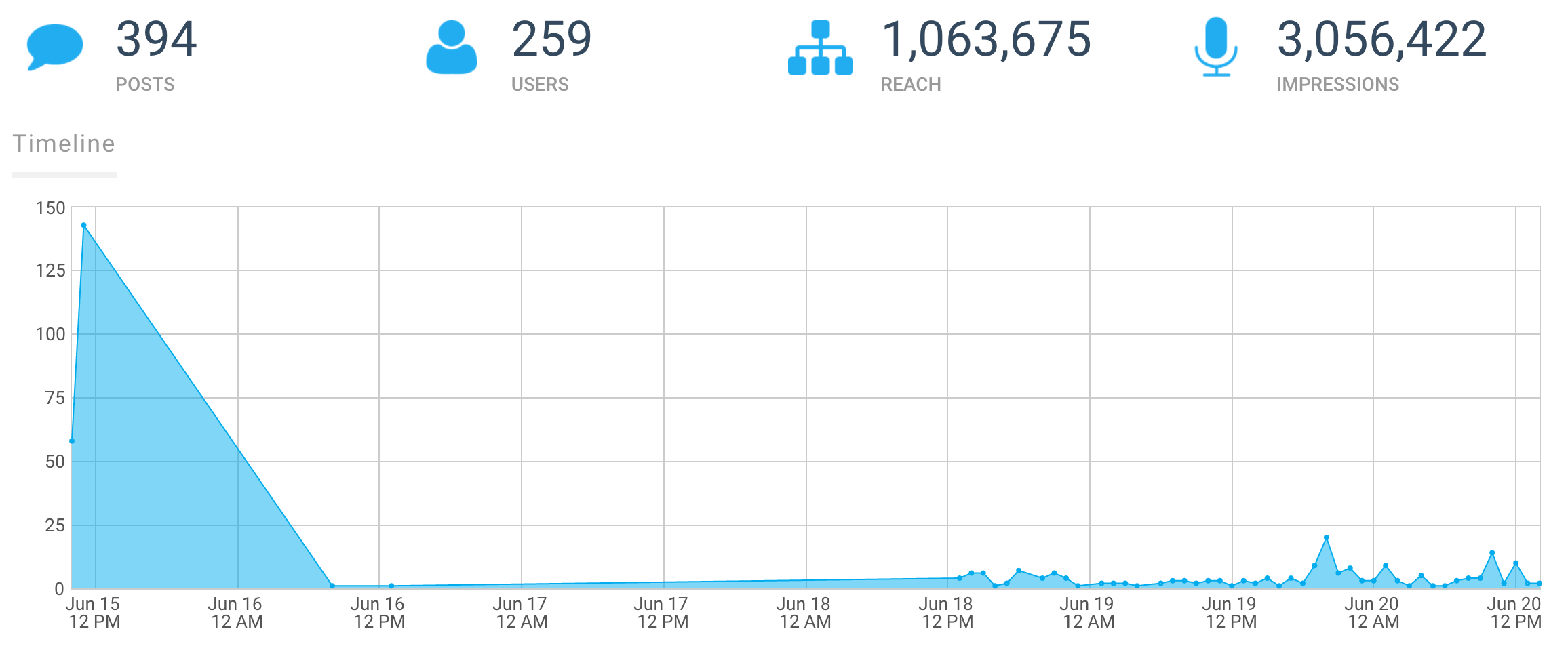
seen shows that flop on the social media side, and it can be hard to pinpoint the exact cause (as it’s most likely a combination of things). Hosts can only do so much to encourage social activity until the event is live. But Sales Machine had the right audience, and provided the right tools far in advance – making it a social success. From pre-made tweets and nicely designed social pics emailed to me, and constant reminders with critical logistics info, sharing socially was made very easy. Nice job, Sales Machine!

What other ways can we leverage social to increase brand awareness, educate and ultimately close more deals? Leave a comment about what’s worked for you!

23 Jun 16:32

ABM: An Ancient Practice?

by Randy Watson

There’s no denying that Account-Based Marketing (ABM) is hotter than hot. I’ve been to all of the big B2B marketing conferences this year, and the topic is being discussed everywhere. According to a survey from the #FlipMyFunnel B2B Marketing and Sales Festival held in Austin earlier this month, 49% of B2B marketers are already performing some sort of ABM initiative, and 64% are planning to do so in the next year.

Well, a long time ago, a very wise person said, “What has been will be again, what has been done will be done again; there is nothing new under the sun.” With all of the recent buzz around ABM, you may think this person was just proven wrong, especially when you look at an index of Google searches on ABM, which shows a huge spike in interest in the topic in the past year.

Google Trends - Account-Based Marketing

Google Trends. Accessed 6/22/2016.

However, despite the recent hype, ABM experts like Sangram Vajre, the founder of #FlipMyFunnel, and Jon Miller, CEO of Engagio, agree that ABM is not a new concept.

So if ABM isn’t new, where did it come from?
In 2004, the Information Technology Services Marketing Association (ITSMA) published the paper, Account-Based Marketing: The New Frontier, acknowledging that ABM offers more than just personalized messaging but also the promise of creating deep and trusted relationships with key accounts. As well as something much greater: the potential for substantially improved results compared with more traditional approaches.

That same year, Charles Doyle of Accenture presented three objectives of client-centric marketing at ITSMA’s annual conference: (1) manage perception; (2) create a differentiated position; and (3) generate demand.

But even ITSMA traces the roots of ABM back beyond this time. They credit The One to One Future, written in 1993 by Don Peppers and Martha Rogers, with the rise of Account-Based Marketing.

The book, which Businessweek (I know, remember magazines?) called “one of the bibles of new marketing,” listed the following one-to-one strategies:

  • Find the 20 percent—or 2 percent—of your own customers and prospects who are the most loyal and offer the biggest opportunities for future profit.
  • Collaborate with each customer, one at a time, just as you now work with individual suppliers or marketing partners.
  • Nurture your relationships with each customer by relying on new one-to-one media vehicles—not just the mail, but the fax machine, the touch-tone phone, voicemail, cell phones and interactive television.

Yes, you read that correctly—the fax machine, which is all but dead, and the interactive television, which is just starting to show promise at scale, both listed as new channels…in 1993.

I had the privilege of hearing Dr. Rogers at a marketing conference in the mid-1990s; she was, and is, extremely impressive. However, I think you can trace ABM back even further.

I recently went back to material from my first Miller Heiman sales training course in the mid-1980s. Why in the world would anyone do such a thing, you might ask? Well, it was specifically to prove this point to myself.

We were talking about ABM back then. Although to be clear (since all great marketing approaches have sales at their core), we called it Account-Based Selling. Take a look at a Blue Sheet, a Green Sheet or a Gold Sheet, and tell me that identifying multiple buyers within an account, understanding their ideal criteria, aligning players and providing a summary of next best actions to address specific concerns are remotely new to the effective selling process. The forms have been part of the Miller Heiman Strategic Selling methodology since its inception in 1976.

So why is an approach that’s been around for more than 50 years garnering so much attention in sales and marketing circles these days? Stay tuned…

23 Jun 16:29

5 Basic Tips for Boosting Your Conversions

by Dave Smith

How effective is your Inbound Marketing program? If you’re seeing a rise in your site visits, but conversions have plateaued (or even plummeted), you’re not alone. Here are some quick tips across your entire online operation for analyzing your data and boosting your conversions.

Heat Maps

The first step in website optimization is to understand the effectiveness of your Calls-To-Action (CTAs). There is no information better than real user data. And to capture and analyze real user data on your website, there is no better method than heat maps.

Tools such as Hotjar allow you to record user interaction on your website, showing you where your visitors are clicking, where they’re not clicking, how far down the page they’re scrolling, etc. This information is invaluable when optimizing your website UX and improving your conversion rates.

Optimize for Mobile

Most of the site-building platforms these days offer responsiveness for all devices and screen sizes – but that does not mean that it’s optimized for conversions. This is where heat maps come in handy again.

In the example above, 96% of traffic visited this landing page on a mobile device. Though everything was displaying correctly and legibly, the form was so far down the display that literally not one single visitor made it that far, which made the mobile conversion rate for the page 0%.

The heat map showed that nearly 50% of mobile visitors clicked on the image of the book (which initially was just an image and not a link), so we made it an anchor link to the form below. Any click on the book would take the user straight to the bottom of the page so they could quickly submit the form and receive the free eBook. We also added a “Download Now” button as another anchor link at the top of the page, which, again, sent users to the form at the bottom.

Slide-In CTAs

The problem with static CTAs is that after a while visitors will start to tune them out. So the longer a user spends on your site, the less likely he is to click a CTA. It should be the other way around.

But this isn’t just about repeating visitors, either. We’re so used to static CTAs and banners on web pages, we’ve gotten pretty apt at ignoring them, even when visiting a site for the first time. Conversely, nobody wants their user experience marred by incessant pop-ups. Fortunately, there’s a happy medium.

Slide-In CTAs are the elegant, useful version of the pop-up ad. They’re unobtrusive, and, above all, they’re relevant and helpful. To maximize the effect of slide-in CTAs, the offer should be clear, concise, and related to the information on the page to which it is attached.

By executing your own slide-in CTA strategy, your conversions are likely to see a noticeable increase. HubSpot has a helpful tutorial on how to add a slide-in CTA with HTML, and there are tools available, such as LeadIn and BrightInfo.

Optimize Marketing Emails

Personally, I am notorious for overlooking or just flat ignoring any email that does not look like it was sent directly to me, on purpose, by a human being. So, when creating marketing emails, someone like me is my own biggest challenge. As with all aspects of Inbound Marketing, the keys to success lie within relevance and personalization. With emails, especially, personalization is paramount.

Of course, none of us have the time to write an actual personalized email to everybody on our marketing list. Thankfully, there are several checkpoints to ensure that your emails are as personalized, relevant, and compelling as possible.

Subject Line

In email marketing, half the battle is getting the recipient to just open the email. A clear, attention-grabbing subject line that effectively conveys relevant value is much more likely to be opened than ignored. Use actionable language such as “get your free” or “download now.”

Sender Name

Your marketing emails should not be coming from donotreply@business.com. Instead, use an actual team member’s mail – ideally the team member that will handle the contacts as they continue to move down the sales funnel.

Email Body

Congratulations, they’ve opened your email! The other half of the battle is to get them to click a link taking them back to your website. This can be a CTA to a gated content, or it can be a link to a relevant blog post, which should have a CTA as well.

Begin the email by addressing the recipient by his or her first name – use a personalization token; a personal touch can go a long way. Keep the email copy relevant, direct and as short as possible. Most people don’t have time to read a long-winded email, so keep that in mind.

CTAs

Most contacts on your email list are currently in your sales funnel, so it’s important to include next-stage CTAs in your communication with them. If your list is comprised of leads that converted on a consideration-stage offer, then include a CTA for the decision stage of the Buyer’s Journey.

Optimize Thank You Pages

This one is often overlooked because the conversion has already happened. But even after an anonymous visitor has converted to a known lead, it’s important to continue nurturing them.

On the Thank You Page include navigation links that lead into your website. Additionally, include a next-stage offer to continue moving the contact through the sales funnel. But remember to remove the social sharing links – you don’t want people sharing the non-gated content page.

These are just a few of many, many ways to analyze your website data and optimize it to increase conversions. What are some additional methods that you use to boost your conversions on your own site?

23 Jun 16:28

New Way To Generate Leads From Content

by Miles Austin

We all know that “content is king”, right? In fact – a recent survey discovered that content influences 2 of every 3 purchase decisions. The only problem is creating content is time-consuming, costly, and hard! And it’s also very competitive.

After all, there’s already so much content out there, with more and more flooding the web every day. So what if creating MORE content is NOT the answer?

What if the companies benefiting from content the MOST – don’t create ANY content? (…and you don’t have to either)…

For the first time ever, you can create powerful traffic & lead campaigns just by browsing the web! Speedleads transforms your *web-browser* into a powerful lead-gen tool. SpeedLeads is a Browser Extension for sales and marketing  that adds a Branded Call-to-Action to any page you share – straight from your browser. You can generate traffic & leads in literally 3 clicks (seriously, you have to see this to believe it!).  Just by sharing links to interesting content you discover.

Watch the demo below and see how you can generate leads by doing what you are already doing but doing it smarter.

Get Access Now!

If you’ve read this far, you know that I always work with product creators to give my readers something special. In this case I have been able to get a special Coupon Code: SPEED. It is only valid until 5:00 pm Eastern on June 23rd. Use it at checkout and you will save $3.00 off the already low launch price. In addition, when they know you learned about this from Fill the Funnel, you will also receive a stack of eight additional bonuses that I have added that compliment the power of this new tool

Most likely you are already sharing content that is helpful and relevant to your customers and prospective customers. Adding SpeedLeads to your browser is just plain common sense – because it lets you get more out of what you ALREADY do…You’re already browsing the web every day, right? So why not turn every browsing session into a lead-gen opportunity?

Get Access To SpeedLeads Now!

Original article: New Way To Generate Leads From Content

©2016 Fill the Funnel. All Rights Reserved.

The post New Way To Generate Leads From Content appeared first on Fill the Funnel.