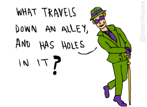


Riddle me this…
poopyscott...great. I hope it ends with his powerbook coming back to life with Alien AI and forcing the world to drink Crystal Pepsi
View Comments
justjared.com – posted by annekar
I learned something the other day when we were fleshing out the background properties in the Almanac. It's such an intuitive thing, that I guess I just never stopped to think about it before.
By default, background-position is 0 0, the top left corner. Now imagine you set it to 50% 0. That background image is now center top. It figures out the size of that image, and positions the center of it at the center of the element.
That's different than if you, say, had an <img> and positioned it at left: 50%; in that scenario, the left edge of the image would be at the halfway point. If you want to center it, you'll need to pull it back to the left (negative translate or negative margin).
Here's a visualization of that difference:
See the Pen The Difference Between background-position and left by Chris Coyier (@chriscoyier) on CodePen.
So if you set something like background-position: 25% 25%, that positions the image such that 25% of the way across itself aligns with 25% of the way across the element. And the same vertically.

Nothing revolutionary here. I just think it's cleverly designed. You don't have to think about it much, because it just works like you would assume it works. Of course if I set right top for the background-position the image is drawn in the right top corner. I don't think about how the browser must be calculating the image size and the element size and aligning axises at those positions.
I like how percentage background-position works is a post from CSS-Tricks
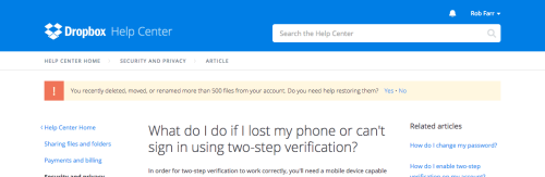
Dropbox - When you visit the Dropbox support website having recently deleted or modified a large number of files in your account, the website displays a notification asking you whether you need help recovering the files that you have deleted.
View Comments
blog.queze.net – posted by nogo09
poopyscottThis looks fuckin cool, but I have no idea what's going on.
 Little did you know that Pinto Bean was the one constant in the ever-changing insanity known as Dragon Ball Z.

Capcom might've pulled a fast one on the PC community by stating that Resident Evil Revelations 2 wouldn't contain any local co-op mode at the last minute. However, the modding community says otherwise. of local co-op are now able to play the game locally using a mod developed by a fan.
There was a lot of backlash from the gaming community revolving around the sudden lack of local co-op within Resident Evil Revelations 2 - especially after Steam listed that it would contain it originally. This led someone in the community to take it upon themselves to develop a mod that will now allow PC players the opportunity to play locally with friends. Modder FluffyQuack, also known in the community has Sectus, recently released his mod, known as Fluffy Manager 5000, that adds the local co-op feature. This addition, however, still has some bugs to be worked out, such as players only being able to experience the mode through gamepad controllers. As Sectus mentioned in his Youtube notes:
"Keyboard/mouse controls always affect both players, so it's not usable."
Still, he states that the mod currently works perfectly with Episode 1 content and is currently working to make local co-op work for Raid mode to be made available in the future. Thank you, Sectus for giving much of the fanbase what they wanted! For some footage of the mod in action, check out the video below. Feel free to download the mod from the link found in the video description.
However, today Capcom released a statement on their Steam page that, in response to the growing community feedback. In it, they conclude that an official local co-op mode is being made:
Hello RE fans,
Following Resident Evil Revelations 2 PC player feedback, we've got some new information to share. The development team has been exploring various options and we're in the process of creating a way for players to utilize a local co-op feature
Soon we plan to release a beta branch on Steam which will allow two players to play the Story and Raid modes locally via a split screen. We want to get this feature in the hands of our PC players as soon as possible, so this option may not be 100% polished when it is released. Feedback from those who try it out is welcomed. For anyone who isn't satisfied with this option, refunds are available through Steam.
We'll have more specific news to share when the beta branch goes live, so please stay tuned.
EDIT: Open beta patch is now live. Detailed instructions on how to access the beta branch can be found here.
Whether you choose to download the official Capcom beta now or use Sectus' mod instead, we've got the local co-op mode been wanting since the beginning.
Note: we will continue to state on our PC page of Resident Evil Revelations 2 that the game contains an online co-op experience only until the official mode is released.
poopyscottyaaaaaaay
View Comments
store.steampowered.com – posted by Forestl
poopyscottHoly shit, capcom.

Well, gang, it looks like ol Mr. Capcom pulled a fast one on us. Despite Resident Evil: Revelations 2's page on Steam's virtual storefront prominently displaying an "offline co-op" feature, gamers have quickly discovered that this is not, in fact, the case.
As it turns out, the game's PC version doesn't feature co-op of any sort upon release, as the Raid Mode's online co-op feature will be patched into the game at some point in the near future. This is a huge disappointment for PC-based Resident Evil fans who've been patiently waiting for their chance to experience the game's asymmetrical co-op. Unfortunately, there was no indication that the game would not deliver on this promise until the day it hit virtual shelves.
A spokesperson at Capcom UK had the following to say about the issue:
The PC version of Resident Evil Revelations 2 supports a variety of customisable visual settings and resolutions. The decision to prioritise a single local screen was made to ensure a stable user experience across a variety of different PC settings and devices.
Raid mode will support online co-op shortly after launch when a free patch is available for players to download which adds this feature, but the main campaign on PC will only be available to play in single local screen.
Their reasoning for the mode's exclusion is fair, as delivering a working product should take top priority, but Capcom shows a huge lack of awareness from this situation. As of the writing of this article, the "Offline co-op" tag has been removed from the game's listing, but the mode is still contained in the game's description. An addendum at the very bottom of the page is the only indicator that this is incorrect.
Unfortunately, we here at Co-optimus were also duped by the misinformation and have now updated the game's PC page to reflect the change. We apologize to anyone who errantly purchased the product based on this information.
poopyscottWHAT THE FUCK APPLE. The Pointer Event spec actually does sound pretty amazing
View Comments
timkadlec.com – posted by Baryn

Once again, PC gamers are going to have to wait a bit longer to play Grand Theft Auto V for themselves. Rockstar recently announced that they've delayed the title on PC again, this time until April.
Yes, PC players will have to wait until April 14th this time to try out their version of the game that many console players have experienced for quite some time now. Rockstar understands very well that that the constant delays are frustrating that section of the gaming community, most who've been waiting patiently for its release after multiple delays. However, Rockstar assured us on their latest Newswire post that this extra four weeks will allow them to make any last few edits on the game work as smoothly as it can:
"Our apologies to PC gamers worldwide who have been counting down the days until the launch of the game, but a bit more time is needed to ensure that the game is as polished as possible, and to make certain that both Heists and the GTA Online experience are ready to roll out on day one for PC."
However, they'll be increasing the amount of in-game cash players will receive for preordering the game as an apology of sorts. With this extra amount added, players will have close to enough to purchase a Rhino tank within a short amount of time.
"As a gesture of thanks for your understanding, we will grant anyone who has pre-ordered the game an additional $200,000 in-game cash for use in GTA Online."
More positive news includes new information on the Online Heists that players have been extremely patient waiting for. If all things go according to plan, we can expect GTA Online's Heists to launch for consoles on March 10th, adding an all new way to play co-operatively with four friends! From our extensive coverage of the mode, it's not hard to tell that this mode is high on our co-op wish list. Waiting for this mode since the last generation consoles, we can hardly wait to dive right into a multi-tiered raid/robbery all across the land. More into on these modes is to come at a later date.
View Comments
youtube.com – posted by FullPetalAlchemist

Let’s b real here: social media has all but eliminated the need for official band websites. If you’re interested in a band these days, chances are pretty good you’re getting all your news about them via Facebook or Twitter, or through fine journalistic sources like this one. Still, many bands continue to embrace the hottest idea of 1995 with their own Personal World Wide Inter-Net™ Web-Site®©, and by “continue to embrace,” I mean just kinda forget about or not bother redesigning and/or updating.
That’s not to say that official websites are entirely obsolete, merely that it’s a lot easier to see band news pop up in your news feed of choice that you’re already wasting your day with, instead of seeking out tour dates, album details and live photos somewhere else.

“Satanic Necroboner is touring!!!”
A functional, up-to-date and user-friendly website can be a wonderful thing. Not only can it keep fans informed about your band, but in an age of great web design, it can also be a creative outlet to establish a unique presence for your music on the web, attracting new fans and keeping old ones interested. The sites below do not fall into that category. Prepare your delicate iBalls.

Silly goth, you can’t tune a snake.
If you had a band page in the ancient MySpace days of yore, you may have encountered Texan gothic rock band Opulent at some point thanks to their thousands of fans, friends or whatever the hell they were called back then and the many, many images of their star-boob’d bassist in Hot Topic outfits. What you probably didn’t see is their eye-meltingly bad official website, complete with scrolling banners, missing images and link font choices & colors seemingly chosen at random. Don’t miss the mile-long photos page with this little gem at the bottom.
What’s that? You say it’s possible that the site might have looked slightly less shitty several years ago? While the band was still active? And before the site owner’s photobucket account lapsed? No… no. No.

“You!” “No, me!”
I know what you’re thinking, and no, sadly, that’s not Tommy Wiseau. But much like the am-auteur (get it? amateur auteur? lolz!) of The Room and his crapsterpiece that only vaguely resembles a film, Chastain have produced a crapsterpiece that only vaguely resembles a website that doesn’t suck. If female-fronted power metal is your jam, you could do a lot worse than Chastain, however you’d be hard-pressed to find a less organized site.
Check out the roughly seventeen thousand interviews linked from their site, helpfully located two-thirds of the way down the massive homepage, right beneath the eighty or so links to Amazon Japan, CDbaby, FYE, Tower Records and “Newbury Comics” for some reason. Also, like Opulent, their photo page is also a goldmine of bad decisions.

*views own website* “BBLLLEAAAGHH”
Based on Thou’s vocalist’s choice of stage attire, I’m inclined to think their website is some kind of overall mission statement on how appearance doesn’t matter, how their art should speak for itself, DIY 4 LYFE man, don’t judge a book by its cover and all the other piddly crap that fits so nicely on an embroidered pillow. That said, the site landing page still looks like something you’d create in an entry-level web design course, y’know, the kind where they show you how to format a website in Microsoft Word or something. This certainly makes it really, really easy to find shit.
Nice effort, guys.
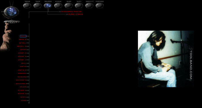
Tool are a band who delight in fucking around with their fans, avoiding making music, and making documentaries about the shit they do when they’re avoiding making music. Given their singer’s brain-searingly awful taste in home decor, along with their countless hey guys we’re making a new album lol j/k u fans r dumb press releases, it’s no surprise then that Tool’s website is a giant middle finger to everyone unfortunate enough to stumble across it. And like Thou, it’s probably an intentional statement about how blah blah who fucking cares.
All the hallmarks of a shitty page from 1999 are here: Flash animations, super-long pages, laughably outdated graphics, a chat forum that doesn’t work and tiny little image previews that were once cutting edge.

Chiller font: indicator of official death metal content
Alright I’m cheating a bit here since this is obviously an archived version of Obituary’s site circa the sun-dappled halcyon days of 2004 (check out that congrats to Lance Armstrong toward the bottom of the main page!). Notice how nicely it fits in with the overall theme of “this looks like ass.” I particularly like the reverse-pacman skull leaving a trail of dots away from the Tour Schedule header, and… what’s this?! YES! A WAVING AMERICAN FLAG AT THE BOTTOM! USA! USA!
Obituary have since redeemed themselves with a slick modern website, but most importantly they have pioneered the use of a new phrase which we here at Toilet Ov Hell Industries will begin using effective immediately:
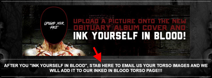
STAB HERE. Do not click. STAB. Fucking brilliant. Obituary for President in 2016.

_______________
poopyscotthttps://www.youtube.com/watch?v=gkIjRPnejsg - someone modded the original voice acting into a new RE engine and recreated a scene. I want this so bad now.
View Comments
youtube.com – posted by seanziewonzie
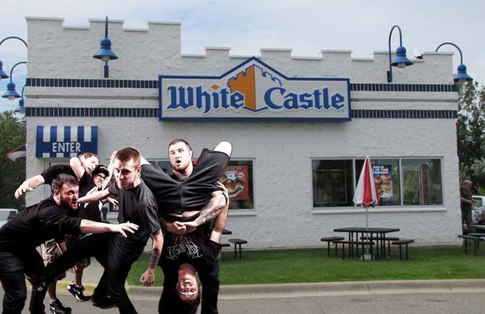
Making White Castle look tasteful since 2006.
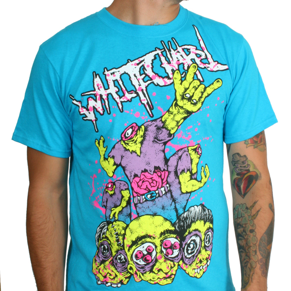
Whitechapel are one of those bands that have managed to make a bit of a following despite me never running into one of their fans in real life. Similar to Job For A Cowboy, Whitechapel started off in a somewhat maligned subgenre before moving more towards death metal. Both bands have released albums recently that have received praise from traditional metal outlets and both still have trouble shedding the stigma of their previous sound. Sometimes a label persists despite changes in sound or content (See: Zao, Christian hardcore band), and sometimes a label persists because a band has bad merch that falls neatly in line with said label.
Whitechapel – Purple Yellow and Brown
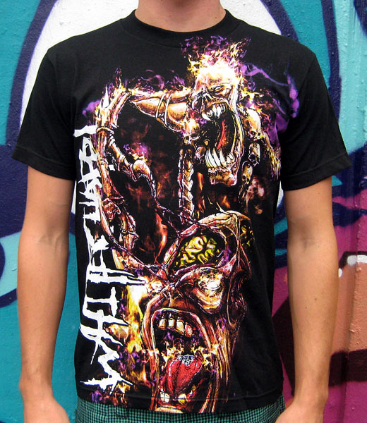
I don’t know what upsets me more: the strange design or the color scheme. Both are really, really, re-ha-ha-ha-eally bad. What exactly is going on in this picture? Is that Jay Leno-jawed monster thing finger-banging that Alien-faced thing’s brain? Is the Alien-faced thing enjoying it? Is the Jay Leno monster on fire? Is it related to Mr. Fantastic, hence the stretchy arm? Did the Alien-faced thing take a swig of some Steven Seagal’s Lighting Bolt energy drink and now spits lightning? I fear that these mind-boggling questions will never be answered. Unfortunately, that’s only half of the problem with this murder-scene tarp.
Who thought the combination of purple, brown, and yellow would look good on a shirt? Did the artist have the hots for a dirty Babs Bunny? It’s simply a bad combination and makes a bad shirt even worse. And why does the design go past the bottom stitching? Was it just that could that they couldn’t fit it in the designated area known at “the rest of the t-shirt”? Perhaps it was all an attempt to distract us from the hideous pants that the model is wearing. Now it makes slightly more sense.
Whitechapel – Now with Even Less Punctuation
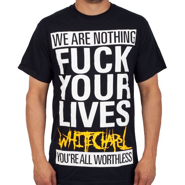
Let’s all read this out loud together. Deep breath. Ready? Go.
“We are nothing fuck your lives Whitechapel you’re all worthless”.
That’s Shakespearean. Bashō could not have crafted something more poetic than this shirt. It’s as if the winds gently kissed the pristine ocean as a golden sun sank slowly into the darkening horizon. I’m actually fighting back tears. We can only guess what the wordsmiths in Whitechapel were thinking when they put pen to paper to ink to shirt. The giant block letters, the ALL CAPS, the lack of punctuation, the swear word that guarantees a lot of people won’t wear it in public, the band name that’s smaller than some of the other words. It’s a true work of art. This shirt should be hanging in the Louvre.
Whatever state of mind the band was in, we should all be grateful that they had the sense to put this national-anthem-in-the-making on a guaranteed money-making shirt.
Whitechapel – HUURRRRRRRUUUGGGHHHH… *spit* … *spit*
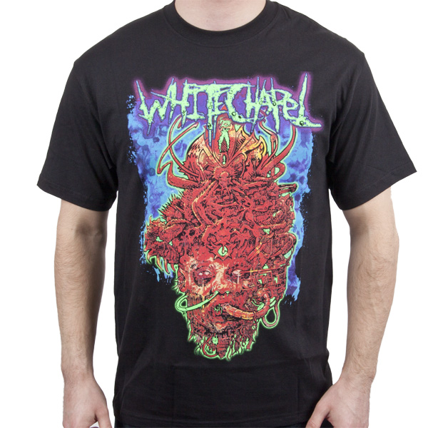
This design-cum-notebook doodle looks somewhat familiar. It’s one part Carcass‘ “Reek of Putrefaction” and one part The County Medical Examiner‘s “Olidous Operettas“. It has an ultra-detailed goriness that is both disgusting and confusing. Sure it’s gross, but we’re not 100% sure why. Whitechapel’s lyrics aren’t gory or gross, so that can’t be the inspiration Maybe they just like that one Cannibal Corpse album with that one song. You know the one, bro. The one where it’s all “urrrrrr gurrrrrr urrrrrr”. You should totally download it, dude. I’ll find a torrent.
It looks like a gross face with some stuff (tentacles? string cheese?) coming out of its nose and mouth. Why? I don’t know. Why is it outlined in neon green? Again, I don’t know. Why is the background the color of blueberry Icees? Yeah, I don’t know. Why does their logo look like mucous? I don’t know, yo. What the hell is coming out of it’s head? Seriously, stop asking. I. Don’t. Know. I have a feeling the band, artist, label, and printer didn’t know either.
Whitechapel – There’s Something Familiar About That Face…

Why are Whitechapel such a bunch of Negative Nancys and Angsty Andys? There’s no need to be a bunch of Grumpy Guses and Cursing Curtises on your shirts, guys. Don’t you want people to like you and buy your stuff? Buncha Mean Mandys over in Whitechapel town. To be fair, even if the back of the shirt didn’t feature an “Angry 15 year old on Xbox Live” quote, this shirt would still be inducted.
My drawing skills are minimal, but I still think I could probably sketch out something on a napkin comparable to the front of this shirt. Unlike the other shirts, the colors are good and the design is sound. People being burned by fire. We all get that, right? Then why do these people look so funny? The guy in the bottom corner looks like he’s sneezing, the guy above him looks like Bub from Day of the Dead (see my avatar for reference), and I’m not even sure what’s going on with the guy at the top. Is he a dying Highlander?
Hmmm. There’s something very familiar about the woman on the front. It’s as if I’ve seen her somewhere before. Wait. Could it be? Yes! It is! It’s the black metal vocalist from that KFC commercial!

Whitechapel – Larry, Curly, and Whoa
We’ve already talked about the neon-colored band shirt trend before. Either this is an old shirt or it’s still a thing and that really depresses me. Everything about this is offensive to the eye and gives me a headache. That’s a shade of blue that no one anywhere ever should wear. Pilots use this shirt to warn them that they’re too close to buildings. Armies now fly this shirt to show that they surrender.
For whatever reason, this shirt has decapitated zombie Three Stooges. I mean, that’s clearly Moe and Curley. That’s not exactly the best Larry, but it’s close enough. No idea what’s going on with their eyes, though. I don’t think it’s a great leap to guess that anyone wearing this shirt has little to no knowledge of who The Three Stooges were. If the Stooges were reanimated, I doubt they’d be throwing up the horns or wearing tight V-necks, girl pants, and scene belts. They’d probably want to be with their families or eating some flesh. If they’re still hungry, point the Three Zombies in the direction of Whitechapel. Thanks.
View Comments
m.youtube.com – posted by Bloodsynlol
Looking at the resumé, Paul felt like they’d found the perfect person for their data warehouse project. The resumé had all the relevant qualifications and experience needed to make a remarkable ETL tool. Paul talked to the candidate, Brad, briefly during the interview process. “It says here that you’re proficient with Linux and have extensive database knowledge.”

by Daofengmusic - Own work
“Well, yeah,” Brad scoffed. “They call me the ShaoLinux Monk. I karate chop through Linux like a stack of concrete blocks, no matter what the distro. When it comes to databases, they always bow to my will. I’m the right man for this job.”
Paul didn’t like his cocky nature, but Brad aced the rest of the interview, and despite some concerns, he was hired.
Paul showed Brad around the office and showed him to his workstation on his first day, and got Brad logged in. “OK, so how do I change my password from this default junk?” Brad asked.
“Use your ShaoLinux-fu!” Paul replied, while pantomiming karate moves. Paul assumed Brad was joking, and would have his password changed in a jiffy. Paul went back to his office.
Twenty minutes later, an email from Brad dinged into his inbox. “NO SERIOUSLY, how do I change my password on this thing???” A little late, perhaps, but Paul determined that Brad wasn’t kidding around. Since Brad was the cocky new guy, Paul decided he deserved a good ribbing on his first day.
“This link should tell you everything you need to know!” Paul shot back. Brad never replied to this attempt at helpful humor, so Paul assumed Brad got his password straightened out and got started on the world’s greatest ETL tool.
A few days later, Paul started getting complaints from other members of the team about Brad asking them too many questions and being unprofessional. Paul always encouraged his guys to ask questions if they weren’t sure about something, so he wanted to know what the big deal was. He stopped by to talk to Lacey, the network admin.
“Oh, yeah. Brad wanted to know the IP for his workstation. I told him, and then he sent me this email.”
Nice try, but you should double check your work! I poked around some, and I HAVE IT ON GOOD AUTHORITY THAT THE IP ADDRESS FOR THIS BOX IS 127.0.0.1! Brad - 1. Moron - 0!
That wasn’t acceptable behavior, so he went to Brad to straighten him out. As soon as he approached though, Brad berated him. “I don’t know how you expect my advanced brain to create any magic here! This stupid system needs all of these goofy Linux commands that I can’t be expected to know. All I usually need is cd, cp, mv and rm. The rest is all programmer-y bullcrap that your devs refuse to help me with. The monk will NOT take a vow of silence on this!”
“Sorry, Brad. I shouldn’t have assumed that you would know all of these shell commands,” he replied, while recalling Brad practically claimed he created Linux during his interview. “I’ll set up a conference call and make sure my devs know to help you out here. But you have to adjust your attitude, it won’t help anything.”
Paul scheduled the call, but got tied up in another meeting, and ended up dialing in late. He beeped in just in time to hear Brad riffing on him. “You guys shouldn’t be listening to Paul, anyway. He has no idea what he’s talking about.” Paul decided to mute his phone and see where this went. “If I ran this place, things would be so much better, and you guys would totally respect my authority! I have 10 years experience in IT, and I know what I’m doing. Paul is weak. He told me to ‘adjust my attitude’. What kind of passive-aggressive shi…”
“BRAD!” Paul unmuted himself. “You do realize I’m on this call, right? I set it up? Hang up and pack up your stuff, you’re done here.” Paul stomped over to Brad’s desk to ensure he actually followed instructions for once.
“You’re making a mistake, letting a talent like me go,” Brad muttered as he headed for the exit. Paul rolled his eyes as he watched Brad head back to the ShaoLinux Temple where rejects like him studied the fine art of arrogance.
 [Advertisement] Release!
is a light card game about software and the people who make it. Play with 2-5 people, or up to 10 with two copies - only $9.95 shipped!
[Advertisement] Release!
is a light card game about software and the people who make it. Play with 2-5 people, or up to 10 with two copies - only $9.95 shipped!
View Comments
youtube.com – posted by FUCKCOST
Any time you use a shorthand property in CSS, you set all the values for all the properties it deals with. It's not a bug, it's just how CSS works. I've seen it confuse people plenty of times. Let's shine a light on the issue to hopefully make it more understood.
Here's an example:
.module {
  background-repeat: no-repeat;
  background: url(lion.jpg);
  /* Oops! This will repeat. */
}
The shorthand CSS background property overrides all the sup properties. The default value for background-repeat is repeat, so by not declaring it in the shorthand, it gets set to that default value.
It works that way for every single one of the background sub properties:
.module {
  /* This will get set to `repeat` */
  background-repeat: no-repeat;

  /* This will get set to `0 0` */
  background-position: top right;

  /* This will get set to `auto auto` */
  background-size: 100px;

  /* This will get set to `scroll` */
  background-attachment: fixed;

  /* This will get set to `border-box` */
  background-origin: content-box;

  /* This will get set to `border-box` */
  background-clip: padding-box;

  /* This will get set to `transparent` */
  background-color: red;

  /* This will get overridden */
  background-image: url(cool.png);

  /* OVERRIDE */
  background: url(lion.jpg);
}
This is the case with box model (and related) stuff, like:
.module {
  margin-right: 20px;
  margin: 10px;
  /* margin-right will be 10px now */

  padding-top: 30px;
  padding: 10px;
  /* padding-top will be 10px now */

  border-left: 1px;
  border: 0;
  /* border-left will be removed */
}
Fonts is another situation where you can accidentally reset yourself:
p {
  /* Will get reset to what is set in shorthand (required) */
  font-family: Sans-Serif;

  /* Will get reset to what is set in shorthand (required) */
  font-size: 24px;

  /* Will get reset to `normal` */
  line-height: 2;

  /* Will get reset to `normal` */
  font-style: italic;

  /* will get reset to `normal` */
  font-weight: bold;

  /* will get reset to `normal` */
  font-variant: small-caps;

  /* OVERRIDE */
  font: 16px Serif;
}
Note that the shorthand requires at least the font-family and font-size to work.
Lists are yet another:
ul {
  /* Will get reset to what is set in shorthand */
  list-style-type: square;

  /* Will get reset to `outside` */
  list-style-position: inside;

  /* Will get reset to `none` */
  list-style-image: url(cooldot.png);

  /* OVERRIDE */
  list-style: disc;
}
The flex property as part of flexbox layout is also shorthand:
.flex >  span {
  /* Will be reset to `auto` (or `main-size` if supported) */
  flex-basis: 150px;

  /* Will be reset to `1` */
  flex-grow: 0;

  /* Will be reset to `1` */
  flex-shrink: 0;

  /* OVERRIDE */
  flex: auto;
}
This is an unusual one though, as rather than the shorthand resetting things you might not want reset, it resets them in ways you probably do want reset and might not even know it. Fantasai:
We (the Flexbox spec editors) strongly recommend not using the longhands of 'flex' unless you really, really want to cascade in flex settings from some other style rule, so I'd suggest somehow discouraging the use of 'flex-grow/shrink/basis' here (or, preferably, leaving it out/in an advanced section). The shorthand resets things in appropriate ways, and will therefore result in fewer cascading errors. Please use the shorthand!
Here's a Pen with some of this stuff in real code.
Accidental CSS Resets is a post from CSS-Tricks
View Comments
gamespot.com – posted by TareXmd


