Shared posts
14 Nov 12:40
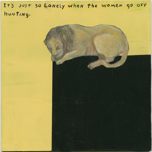
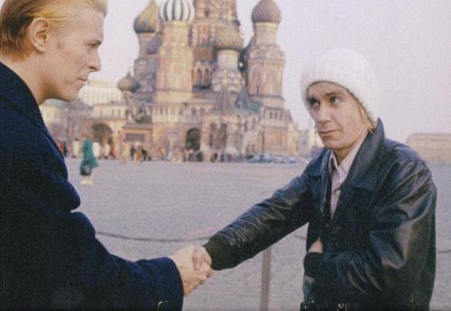
The Greatest Halloween Costume Ever!
Igor SafonovNice one
Daria Nifontova, Alexander Yarovoy likes this
31 Oct 09:09
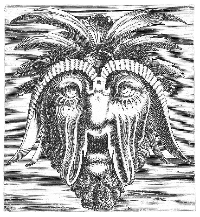
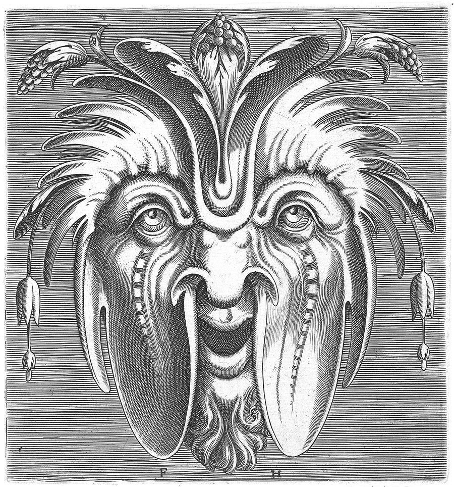
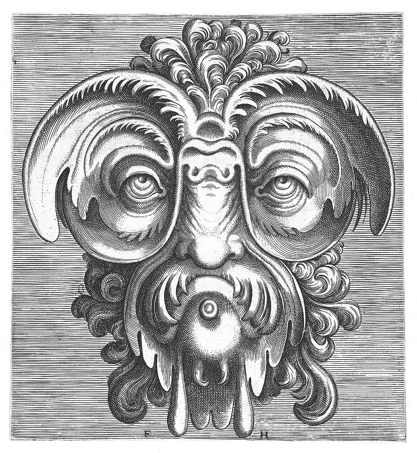
A mask tells us more than a face
by but does it float
Masks designed by Cornelis Floris and engraved by Frans Huys, in 1555
Title: Oscar Wilde


 From BibliOdyssey
Folkert
From BibliOdyssey
Folkert
From BibliOdyssey
Folkert
Leandro Gabriel and -1 others like this

15 Oct 17:37

Forget Your Past
by Scott


Timothy Allen brought back some great shots of the abandoned Buzludzha monument in Bulgaria. As you can see from some of the before shots, this monument was quite a sight during it’s Communist heyday. I can’t imagine what it would be like to stand in front of an architectural and artistic work of this scale knowing it’s just sitting there rotting away.
Allen used a microlight to get the aerial shots, pretty amazing imagery and story.
More at his site
Permalink |
Comment On This Post (8) |
Tweet This Post | Add to
del.icio.us | Stumbleupon
Post tags: abandoned buildings, bulgaria, Photography
Lapada, Sasha Pais and 3 others like this
07 Oct 06:30
 Karloff Positive
 Karloff Positive Italic
 Karloff Negative Bold
 Karloff Negative Bold Italic


Beauty and Ugliness in Type design
by johno
Peter Biľak on the process of designing his newly released Karloff typeface, demonstrating just how closely related beauty and ugliness are. Karloff explores the idea of irreconcilable differences — how two extremes could be combined into a coherent whole.
In 2010 I was invited to a design conference in Copenhagen to speak on the subject of conceptual type. The organisers were interested in examples of typefaces whose principal design feature was not related to aesthetic considerations or legibility, but rather some underlying non-typographical idea. In my address I argued that there is no such thing as conceptual type, since type design is a discipline defined by its ability to execute an outcome; the process that transforms the pure idea into a functional font is a critical part of the discipline. Having rejected the topic of the conference, I nevertheless went on to speculate on what a true example of a conceptual typeface might be like.

At the time I was also interested in the idea of irreconcilable differences and how two extremes could be combined into a coherent whole. As an example, I looked for the most beautiful typeface in the history of typography — as well as the ugliest one — and for a way to meld them.
The Beauty
While any choice representing beauty is bound to be very personal and subjective, many agree that the high-contrast typefaces created by Giambattista Bodoni and the Didot clan are some of the most beautiful in existence.
Bodoni was one of the most widely-admired printers of his time and considered amongst the finest in the history of the craft. Thomas Curson Hansard wrote in 1825 that Bodoni’s types had “that beautiful and perfect appearance, which we find it difficult and highly expensive to equal.”¹ In his Manuale Tipografico of 1818, Bodoni laid down the four principles of type design “from which all beauty would seem to proceed”, namely: regularity, clarity, good taste, and charm.

His close competitors in France were the Didots. Not only did François-Ambroise Didot invent many of the machines used in printing, but his foundry endeavoured to render the types more beautifully than his rivals Baskerville and (later) Bodoni. Some considered Didot’s works the most beautiful types that had ever been used in France (up to that period),² though others found them delicate but lifeless.³

The Ugliness
I have to admit that dealing with ugliness was a lot more interesting than revisiting the beauty contests of the classicist printers. The search for ugliness triggers a certain primal, voyeuristic curiosity, and from the designer’s perspective there is simply a lot more space to explore. Capturing beauty has always been considered the primary responsibility of the traditional artist, and even now it is rare to find examples of skilled and deliberate ugliness in type design, (although examples of inexperience and naïveté abound).
The eccentric ‘Italian’ from the middle of the Industrial Revolution was a clear choice. This reversed-contrast typeface was designed to deliberately attract readers’ attention by defying their expectations. Strokes that were thick in classical models were thin, and vice versa — a dirty trick to create freakish letterforms that stood out in the increasingly saturated world of commercial messages.

No other style in the history of typography has provoked such negative reactions as the Italian. It was first presented in Caslon & Catherwood’s 1821 type specimen, and as early as 1825, in his Typographia Thomas Hansard called the type a “typographic monstrosity”. Nicolete Gray called it “a crude expression of the idea of perversity”⁴, while others labeled it as “degenerate”.⁵

The goal of my project was to show just how closely related beauty and ugliness are. Donald Knuth, an American computer scientist with a special interest in typography identified over 60 visual parameters that control the appearance of a typeface. I was interested in designing typeface variations that shared most of these parameters, yet included both the ugliest and most beautiful letterforms.
Karloff, the result of this project, connects the high contrast Modern type of Bodoni and Didot with the monstrous Italians. The difference between the attractive and repulsive forms lies in a single design parameter, the contrast between the thick and the thin.
Karloff Positive
Karloff Positive Italic
Karloff Negative Bold
Karloff Negative Bold Italic
I asked Pieter van Rosmalen for help, and both of us worked on both versions. While at the beginning I looked at the Didot from Imprimerie Nationale as a reference, Pieter departed from this model and made the project more personal. We worked on both models at the same time, trying to be very strict about mathematically reversing the contrast between two weights. The advantage of working on both versions together was that we could adjust both of them to achieve the best forms, rather than creating one as an afterthought of the other.


Towards the end of the project, I worked with Nikola Djurek, our frequent collaborator, who helped with interpolation and fine-tuning of the fonts. Having designed two diametrically opposite versions, we undertook a genetic experiment with the offspring of the beauty and the beast, interpolation of the two extremes, which produced a surprisingly neutral low contrast version. Karloff Neutral required only minimal intervention, because the master weights from which it was interpolated were well defined.
About the name
Karloff was the artistic name of the British actor William Henry Pratt. He chose this pseudonym to prevent embarrassment to his dignified family, who considered him the black sheep of the family. Although he played mainly sinister characters, in real life, Karloff was known as a very kind gentleman who gave generously, especially to children’s charities.

Thanks to Paul Shaw, James Clough, and David Shields.
1. Hansard, Thomas C. Typographia: an Historical Sketch of the Origin and Progress of the Art of Printing, 1825.
2. Encyclopædia Americana, 1832.
3. Updike, Daniel B. Printing Types: Their History, Forms, and Use, 2001.
4. Gray, Nicolete. Nineteenth Century Ornamented Typefaces, 1938
5. Benson, John H and Carey, Arthur J. The Elements of Lettering, 1940

Sponsored by H&FJ.
Beauty and Ugliness in Type design
Igor Safonov likes this
05 Oct 23:17
Maggie Rizer by Mario Sorrenti for Joe's Magazine
by Lawrence
Mario Sorrenti (via etoystk)

24 Sep 16:10
One can consider every body as a mind that is instantaneous but deprived of memory
by but does it float
Collages by Thomas Robson
Title: Lyotard quoting Bergson quoting Leibniz


 Folkert
Folkert
Natalia Pokrovskaya, Masha Vorslav and one other like this
03 Sep 16:48
Vintage Russian Camera Manuals
by Jakub


Came across a huge collection of camera and lens manuals from the Soviet Union, all of them have that DDR/Cold War feel and look. Being born in communist Poland i’ve been shown a lot of this kind of design thru my whole life, I find a strange attraction to it.
Permalink |
Comment On This Post (4) |
Tweet This Post | Add to
del.icio.us | Stumbleupon
Post tags: Vintage Camera Manuals
Elena Bulygina, Igor Safonov likes this
30 Aug 12:26
tumblr_l657f9EYyj1qc7g3mo1_500.jpg (JPEG-Grafik, 495x700 Pixel)
by theflu

Igor Safonov, Sasha Pais and 4 others like this
01 Aug 22:51
Escape
by nobody@flickr.com (Jay Roeder)
Igor SafonovStory of my life
Jay Roeder has added a photo to the pool:
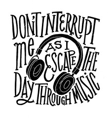
When I was younger I would escape shitty days by drawing and blaring music, and it always helped me get away. Many years later I find myself doing the same exact thing. I think I’m ready for tomorrow.
www.jayroeder.com
Elena Bulygina likes this
27 Jul 00:02
 JAQK Signature Playing Cards combine distinctive contemporary design with the peerless quality theory11 is known for.


JAQK Signature Playing Cards
by Tiana Spellman
JAQK Signature Playing Cards combine distinctive contemporary design with the peerless quality theory11 is known for.  |
 |
Igor Safonov likes this
26 Jul 23:50
True statement. Via
by freeformlife
Scott Pilgrim, Alexander Yarovoy and one other like this
10 Jul 14:41

Best Apps for Wedding Planning
by Stephanie
 Photo via Wedding Chicks
In the past month alone, I have had three friends and a sister (yay!) get engaged, not to mention the six other weddings/engagements that have already occurred this year. So with this barrage of weddings, I thought I would be a helpful friend/bridesmaid/maid of honor and research some of the best wedding apps for organization and planning.
I’ve rounded up those wedding apps on My Life Scoop this week. Click here to read the full post and contribute your favorite wedding apps and organizational tools. No one wants to be a bridezilla, so please share all the wedding stress-relieving tips you can! — Stephanie


07 Jul 10:56
Feature Friday • Travis Jensen
by Nathan

We all know Instagram is awesome, such a fantastic way to visually follow your friends. But, lately, I’ve particularly enjoyed it as a source of inspiration—learning of new people and following their creative endeavors. Enter Travis Jensen, a San Francisco based photographer who has embraced the digital lomography movement with three simple tools: his iPhone, Hipstamatic (for capturing) and Instagram (for sharing). These images are from his ongoing collection of San Francisco Street Photography. Be sure to check out all his collections and pick up some photo books on his personal site, travisjensenphoto.com.


04 Jul 19:37

Iphone Wallpapers by Marius Roosendaal
by Jonathan
")
")
")
")
Great set of iPhone Wallpapers by Marius Roosendaal, whom we’ve covered before here on the blog. Always great surprises await when re-visiting this prolific designers portfolio from the Netherlands.
You can download directly by clicking HERE or by visiting his portfolio.
I personally chose to go with one of the black and white designs included in the pack:
")
Permalink |
Comment On This Post (10) |
Tweet This Post | Add to
del.icio.us | Stumbleupon
Post tags: iphone, Marius Roosendaal, Wallpapers
30 Jun 21:52
Feature Friday • Micah Lidberg
by Katie

I just get lost in the work of Micah Lidberg. All of the color, line and tiny nuances, it’s like stories within a story. Overgrown forests, dinosaurs, unicorns, beastlies—I love it all. Be sure to check out his large lush collection of work on his site as well as on his rep’s site, Hugo & Marie.


Igor Safonov likes this

28 Jun 07:01
Bulgarian Socialist Era Album Covers
by Jonathan
")
")
")
")
")
")
")
")
")
")
")
")
")
")
")
")
")
")
")
")
")
")
Continuing with album design theme, here is a great set of Bulgarian Socialist era album cover designs, curated by SOCMUS.
SOCMUS is a virtual museum that presents different sections of the Bulgarian graphic design from the socialist era, 1944-1989, and is curated by photographer Nikola Mihov, and the architects Martin Angelov and Valeri Gyurov.
Permalink |
Comment On This Post (6) |
Tweet This Post | Add to
del.icio.us | Stumbleupon
Post tags:
Igor Safonov likes this
