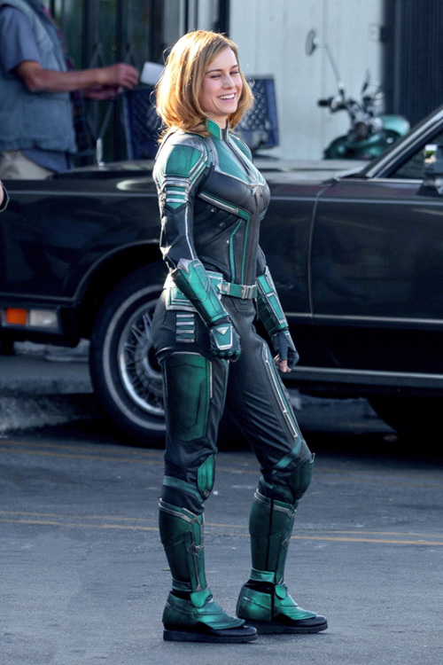
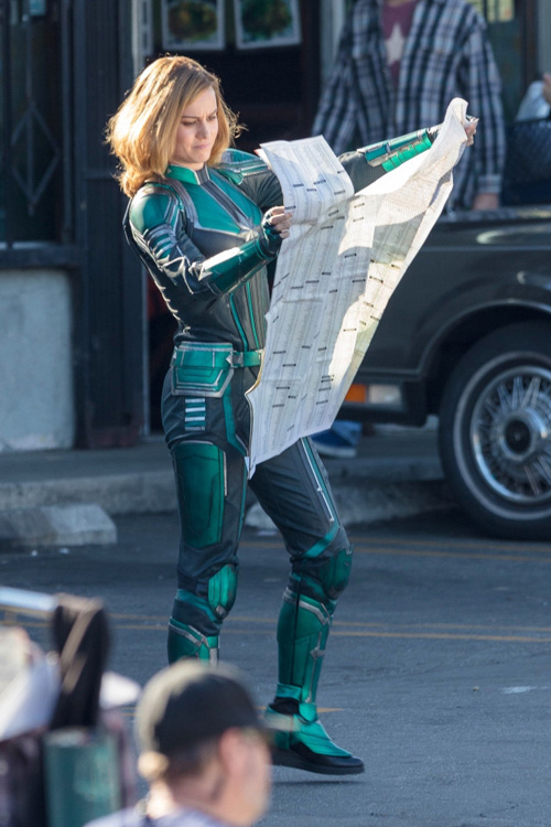
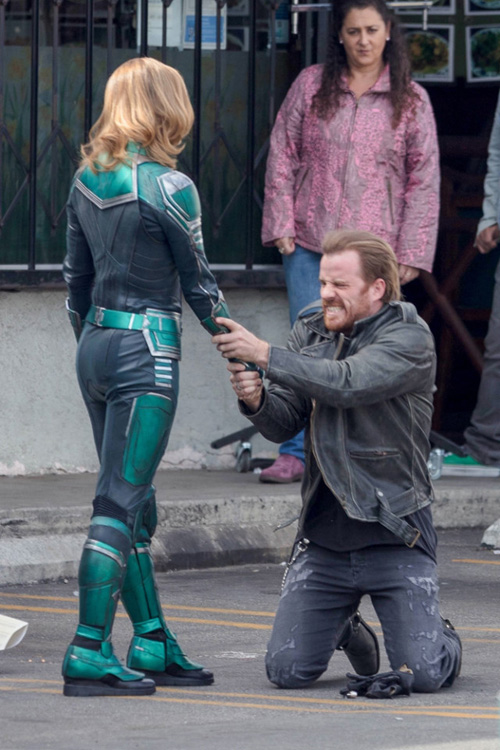
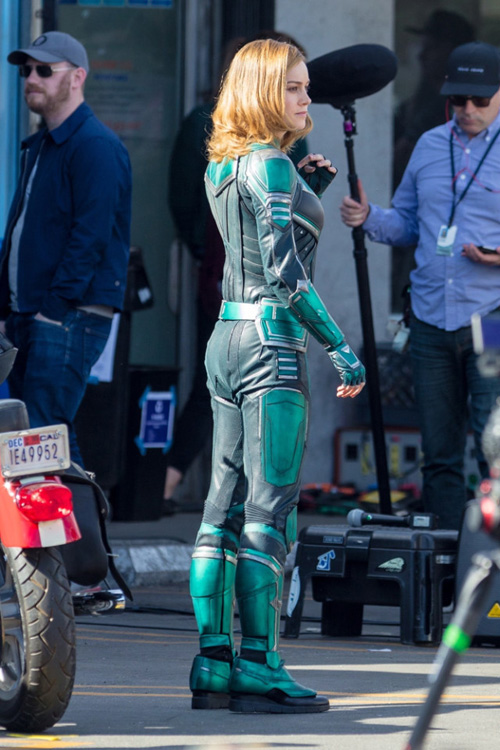
The first set photos of Brie Larson in costume as Captain Marvel have appeared online and they show a color scheme to her suit that some fans might not have been expecting. Carol Danvers is wearing a green, black and silver suit. It may be a nod to a stretch of Marvel Comics where Carol wore the traditional green and white uniform of the Kree before later donning her more recognizable red, blue and gold uniform. The original Captain Marvel (the Kree known as Mar-vell) also first wore a green and white costume.
Our guess is she'll also be getting a more traditional Captain Marvel look at some point in the movie, but it's all speculation at this point. Brie Larson's Carol Danvers is confirmed to appear in Avengers 4 as well as in her own solo movie, which hits theaters in 2019.
Here are the set photos, what do you guys think of this look?
Integral’s 512GB microSD card meets Video Speed Class 10 (V10) and UHS-I U1 standards and offers transfer speeds up to 80MB/s. It’ll launch in February 2018 for an undisclosed price. Whatever the price ends up being, it’s probably not going to be cheap, but it’ll be pretty cool to add half a terabyte of storage to your phone just by popping in a tiny microSD card.
Are you thinking about buying this new 512GB microSD card?
In the next few months, there will be hundreds of millions of Android and iOS devices that are able to provide augmented reality experiences - meaning you'll be able to look at the world through your phone, and place digital objects wherever you look. To help bring this to as many users as possible, we've been exploring how to bring augmented reality to the web platform, so someday anyone with a browser can access this new technology. In this post, we’ll take a look at a recent prototype we built to explore how AR content could work across the web, from today’s mobile and desktop browsers, to future AR-enabled browsers. Techies, take note: the last section of the post focuses on technical details, so stick around if you want to dig deeper.
How the prototype works
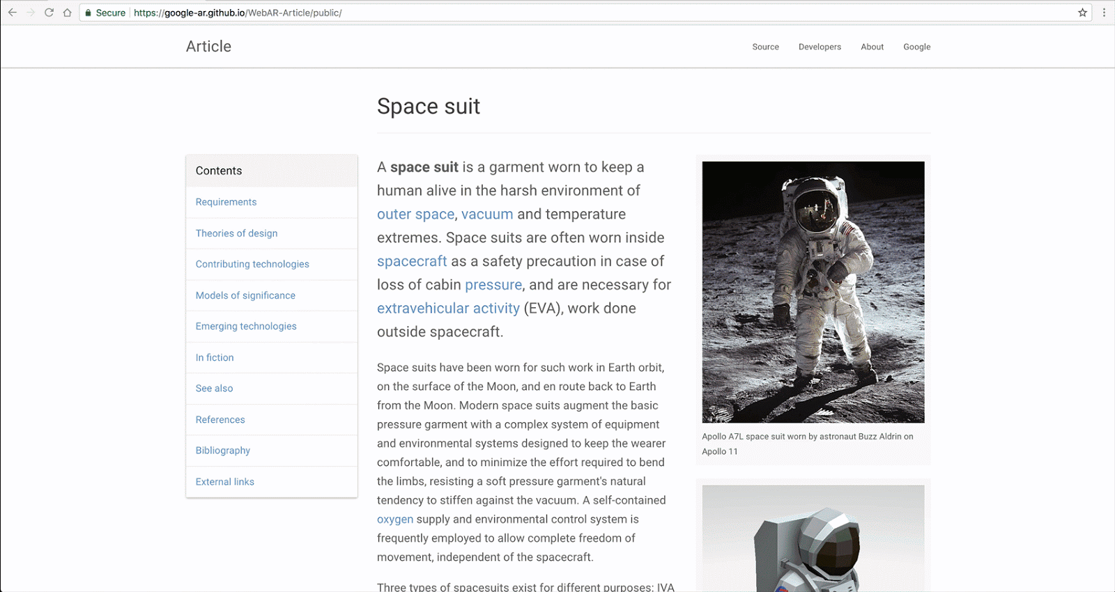
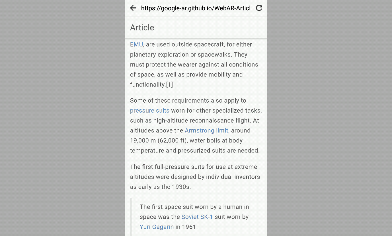
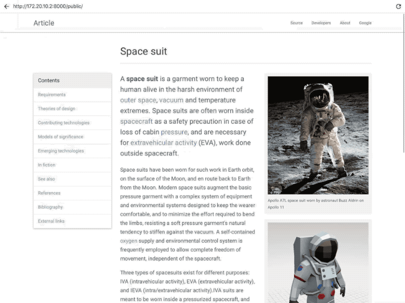
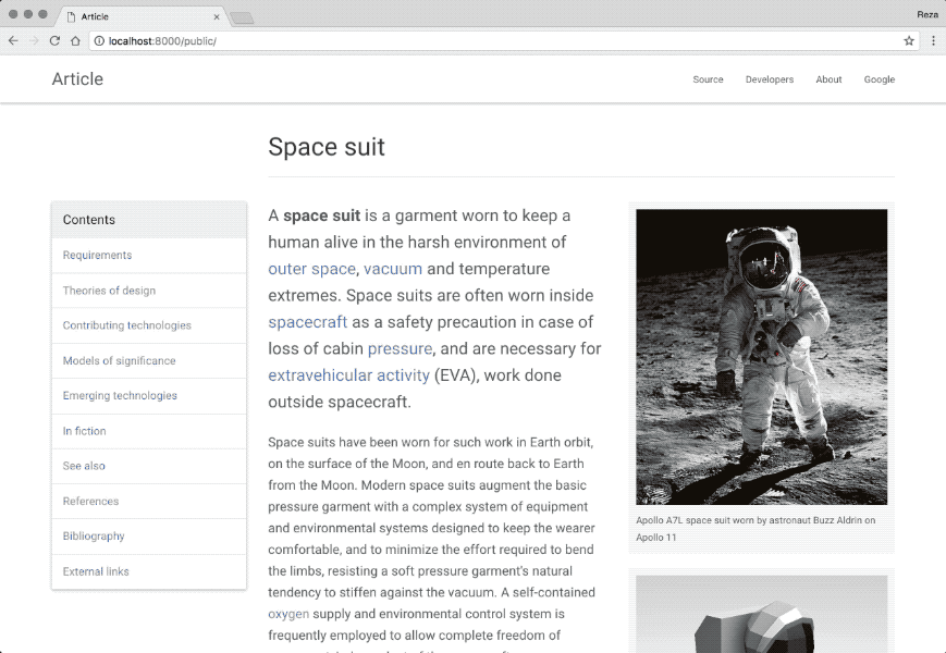
Article is a 3D model viewer that works for all browsers. On desktop, users can check out a 3D model—in this case a space suit—by dragging to rotate, or scrolling to zoom. On mobile the experience is similar: users touch and drag to rotate the model, or drag with two fingers to zoom in.
The desktop model viewing experience
To help convey that the model is 3D and interactive—and not just a static image—the model rotates slightly in response to the user scrolling.
With augmented reality, the model comes alive. The unique power of AR is to blend digital content with the real world. So we can, for example, surf the web, find a model, place it in our room to see just how large it truly is, and physically walk around it.
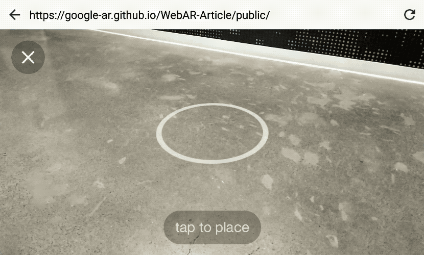
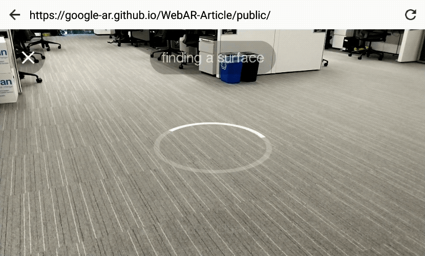
When Article is loaded on an AR-capable device and browser, an AR button appears in the bottom right. Tapping on it activates the device camera, and renders a reticle on the ground in front of the user. When the user taps the screen, the model sprouts from the reticle, fixed to the ground and rendered at its physical size. The user can walk around the object and get a sense of scale and immediacy that images and video alone cannot convey.
Article’s AR interface as viewed on an AR-capable tablet
To reposition the model, users can tap-and-drag, or drag with two fingers to rotate it. Subtle features such as shadows and even lighting help to blend the model with its surroundings.
Moving and rotating the model
Small touches make it easy to learn how to use AR. User testing has taught us that clear interface cues are key to helping users learn how AR works. For example, while the user waits momentarily for the system to identify a surface that the model can be placed upon, a circle appears on the floor, tilting with the movement of the device. This helps introduce the concept of an AR interface, with digital objects that intersect with the physical environment (also known as diagetic UI).
Diagetic activity indicators hint at the AR nature of the experience
Under the hood (and on to the technical stuff!)
We built our responsive model viewer with Three.js. Three.js makes the low-level power of WebGL more accessible to developers, and it has a large community of examples, documentation and Stack Overflow answers to help ease learning curves.
To ensure smooth interactions and animations, we finessed factors that contribute to performance:
Carefully controlling the number of lights in the scene;
Decreasing shadow resolution when on mobile devices;
Rendering the emulator UI (discussed below) using shaders that utilize signed distance functions to render their effects at infinite resolution in an efficient manner.
To accelerate iteration times, we created a desktop AR emulator that enables us to test UX changes on desktop Chrome. This makes previewing changes nearly instant. Before the emulator, each change—no matter how minor—had to be loaded onto a connected mobile device, taking upwards of 10 seconds for each build-push-reload cycle. With the emulator we can instead preview these tweaks on desktop almost instantly, and then push to device only when needed.
The emulator is built on a desktop AR polyfill and Three.js. If one line of code (which include the polyfill), is uncommented in the index.js file , it instantiates a gray grid environment and adds keyboard and mouse controls as substitutes for physically moving in the real world. The emulator is included in the Article project repo.
The spacesuit model was sourced from Poly. Many Poly models are licensed under Creative Commons Attribution Generic (CC-BY), which lets users copy and/or remix them, so long as the creator is credited. Our astronaut was created by the Poly team.
Article’s 2D sections were built with off-the-shelf libraries and modern web tooling. For responsive layout and typography and overall theme, we used Bootstrap, which makes it easy for developers to create great looking sites that adapt responsively across device screen sizes. As an nod to the aesthetics of Wikipedia and Medium, we went with Bootswatch’s Paper theme. For managing dependencies, classes, and build steps we used NPM, ES6, Babel and Webpack.
Looking ahead
There’s vast potential for AR on the web—it could be used in shopping, education, entertainment, and more. Article is just one in a series of prototypes, and there’s so much left to explore—from using light estimation to more seamlessly blend 3D objects with the real world, to adding diegetic UI annotations to specific positions on the model. Mobile AR on the web is incredibly fun right now because there’s a lot to be discovered. If you’d like learn more about our experimental browsers and get started creating your own prototypes, please visit our devsite.
“Probably the best thing to do is try and reorganize the project some,” Tim, “Alien”’s new boss said. “It’s a bit of a mess, so a little refactoring will help you understand how the code all fits together.”
“Alien” grabbed the code from git, and started walking through the code. As promised, it was a bit of a mess, but partially that mess came from their business needs. There was a bunch of common functionality in a Common module, but for each region they did business in- Asia, North America, Europe, etc.- there was a region specific deployable, each in its own module. Each region had its own build target that would include the Common module as part of the build process.
The region-specific modules were vaguely organized into sub-modules, and that’s where “Alien” settled in to start reorganizing. Since Asia was the largest, most complicated module, they started there, on a sub-module called InventoryManagement. THey moved some files around, set up the module and sub-modules in Maven, and then rebuilt.
The Common library failed to build. This gave “Alien” some pause, as they hadn’t touched anything pertaining to the Common project. Specifically, Common failed to build because it was looking for some files in the Asia.InventoryManagement sub-module. Cue the dive into the error trace and the vagaries of the build process. Was there a dependency between Common and Asia that had gone unnoticed? No. Was there a build-order issue? No. Was Maven just being… well, Maven? Yes, but that wasn’t the problem.
After hunting around through all the obvious places, “Alien” eventually ran an ls -al.
~/messy-app/base/Common/src/com/mycompany > ls -al
lrwxrwxrwx 1 alien  alien    39 Jan  4 19:10 InventoryManagement -> ../../../../../Asia/InventoryManagement/src/com/mycompany/IM/
drwxr-x--- 3 alien  alien  4096 Jan  4 19:10 core/
Yes, that is a symbolic link. A long-ago predecessor discovered that the Asia.InventoryManagement sub-module contained some code that was useful across all modules. Acutally moving that code into Common would have involved refactoring Asia, which was the largest, most complicated module. Presumably, that sounded like work, so instead they just added a sym-link. The files actually lived in Asia, but were compiled into Common.
“Alien” writes, “This is the first time in my over–20-year working life I see people reuse source code like this.”
They fixed this, and then went hunting, only to find a dozen more examples of this kind of code “reuse”.
[Advertisement] Release!
is a light card game about software and the people who make it. Play with 2-5 people, or up to 10 with two copies - only $9.95 shipped!
Ahahaha! From Ahch-To to table: porg chops! StarWars.com posted a recipe so you can turn regular old pork chops into delicious porgs. And they'll taste great with a little salt from Crait.
What You?ll Need: Black olives Nori (dried seaweed) sheets
Ingredients: 4 boneless pork cutlets 3 Tablespoons unsalted butter, melted 1/4 cup breadcrumbs 2 Tablespoons Parmesan cheese Salt and pepper
After British MP Andrea Leadsom called for the Royal Mail to issue a postage stamp commemorating Brexit, some people who are not entirely in favor of leaving the EU have posted their best efforts at a stamp design on Twitter under the #brexitstamps hashtag. A few of my favorites:
The issue is that the only way for elements to participate in the same CSS grid together (or flexbox for that matter) is for them to be siblings. So, in some cases we might be incentivized to forego HTML semantics for the benefit of layout (not great).
One answer to this is display: contents;—a magical new display value that essentially makes the container disappear, making the child elements children of the element the next level up in the DOM.
This value becomes useful if you want to add some element because it makes sense in terms of document semantics, but doesn’t in terms of display. Perhaps you have some content that makes sense marked up as an article, that article is then a flex item in your layout BUT the elements you really would like to be flex items are nested inside that article. Rather than flattening your markup and remove the article element to enable these inner elements to be part of the flex layout, you could remove the boxes generated by article using display: contents. You then get the best of both worlds, semantic markup plus the visual display your design requires. That sounds good to me.
display: contents makes that the div doesn’t generate any box, so its background, border and padding are not rendered. However the inherited properties like color and font have effect on the child (span element) as expected.
There is also a very related subject to all this: subgrids. Probably literally display: subgrid;. It's probably less important in terms of maintaining semantics than display: contents; but also different.
Grid layout is the first serious candidate to fill that hole in the past two decades, and I don’t want to see them hamstrung from the outset. Subgrids are essential to the adoption of grids. I hope they’ll be implemented as soon as possible
You won’t get far through a conversation about subgrid in CSS Grid Layout without someone suggesting that display: contents solves most of the problems anyway, so do we really need subgrid? This really isn’t the case, display: contents does indeed solve a class of problems, but these are different problems to those that subgrid would help us with.
Note: The image at the top of this post does not show the actual interface. See the update below.
The Honolulu Civil Beat has tweeted a screenshot of the interface that was used to send an real alert for a nonexistent incoming ballistic missile on Saturday morning.
Instead of selecting “DRILL - PACOM (CDW) - STATE ONLY” from what looks more like a list of headlines on The Drudge Report than a warnings & alerts menu, the operator chose “PACOM (CDW) - STATE ONLY” and sent out a real alert.
The design for this is obviously terrible. As others have noted, there are better interfaces for confirming much more trivial actions on our phones. In Mailchimp, the service that powers the Noticing newsletter, you are asked to manually type in the word “DELETE” as a confirmation for deleting a template (an action a tiny bit less consequential than sending out a ballistic missile launch alert):
But the response to the false alarm has been worse. The employee who triggered the erroneous alert has been “reassigned” and, as the news cycle continues to wind itself up, it wouldn’t surprise me if he were soon fired. And the fix for this, again per the Honolulu Civil Beat, is the addition of the “BMD False Alarm” link at the top of the menu, presumably so that if a real alert is sent out again in the future, it can be followed by a message saying, “actually, that was a drill”.
Hopefully this, uh, “redesign” is temporary and a full overhaul is in the works. That menu is a really dangerous bit of interface design and adding an “oopsie, we didn’t mean it” button doesn’t help. The employee made a mistake but it’s not his fault and he shouldn’t be fired for it. The interface is the problem and whoever caused that to happen — the designer, the software vendor, the heads of the agency, the lawmakers who haven’t made sufficient funds available for a proper design process to occur — should face the consequences. More importantly, the necessary changes should be made to fix the problem in a way that’s holistic, resilient, long-lasting, and helps operators make good decisions rather than encouraging mistakes.
Update: John Allspaw, who worked at both Etsy and Flickr at a time when they thought deeply about design and engineering process, says that a wider view is needed to truly understand what happened and fix it.
Focusing solely and narrowly on the “bad UI’ design in the Hawaii alert accident would be like focusing solely and narrowly on the F-15 misidentification in @scottsnook’s causal map in “Friendly Fire”.
Here’s the map he’s referring to, along with a link to a discussion of the F-15 incident described by Snook in the context of causal landscapes.
To compound this challenge, people want definitive 1-2 word answers, as if life was a series of mechanical operations and it was possible to affix blame and diagnose faults. If a copying machine jams, there is usually a mechanical reason — a sheet of paper may have gotten stuck in the assembly and once it is removed, the problem is solved. Mechanical problems like this are determinate; there is a cause and it can be identified. Yet most of our problems are not mechanical. They are not determinate. There is not a single cause. There are multiple, intersecting causes and we may never uncover some of the most important causes. We live in a multi-cause, indeterminate world and our attempts to understand why events occurred will usually be frustrating. We cannot expect specific single-cause 1-2 word answers.
It’s easy to say that the menu is wrong and it should be redesigned. But how did that menu come to be? What’s the context? What does the casual landscape look like here? Back to Allspaw (emphasis mine):
How are operators of the alert system involved in the design of their tools? How have those tools changed over time, across staff changes and feedback rounds? How do ‘near-misses’ happen with this system? How many operators are familiar with these tools and how many are new?
What does this system look like (not just UI) contrasted with other states with similar systems? How have accidental false-alarms been caught before? What data is collected about the type of work (difficulty, frequency, procedure-updating, etc.) including upward mgmt?
In other words: we focus on the UI because unhelpful UI is endemic to software, and easily identified and cartoonishly convicted. But there’s always much more to the narrative of an accident.
As it says on the front page of the site for Allspaw’s new consulting firm (which works with groups facing problems just like the Hawaii alert snafu): “Incidents are encoded messages your system is sending you about how it really works.” I hope that message is being received by the Hawaii Emergency Management Agency in the right way.
However, state officials now say that image was merely an example that showed more options than the employee had on the actual screen.
“We asked (Hawaii Emergency Management Agency) for a screenshot and that’s what they gave us,” Ige spokeswoman Jodi Leong told Civil Beat on Tuesday. “At no time did anybody tell me it wasn’t a screenshot.”
HEMA won’t share what the interface actually looks like because of security concerns (which is understandable) but they did provide a new image that “better represents what an employee would have seen on Saturday”:
While this doesn’t look so much like a homepage from 1995, I would argue that fundamentally, the design (how it works, not how it looks) is unchanged. There are fewer options but the problematic similarity between options hiding vastly difference consequences remains. (via @andrewlong166)
I don't wear watches anymore. The prospect of wearing a watch because it is "smart" doesn't entice me. Judging by how many people own smartwatches, it doesn't seem to entice the general either.


 [Advertisement] Release!
is a light card game about software and the people who make it. Play with 2-5 people, or up to 10 with two copies - only $9.95 shipped!
[Advertisement] Release!
is a light card game about software and the people who make it. Play with 2-5 people, or up to 10 with two copies - only $9.95 shipped!


 I don't wear watches anymore. The prospect of wearing a watch because it is "smart" doesn't entice me. Judging by how many people own smartwatches, it doesn't seem to entice the general either.


