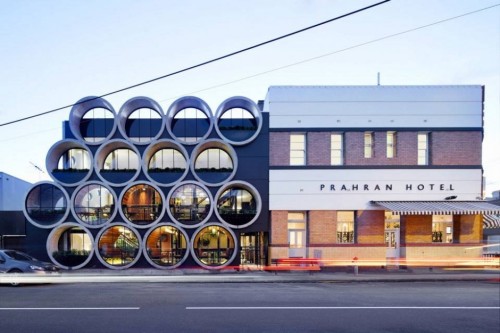
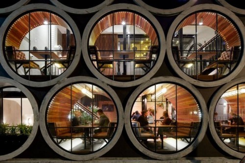
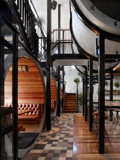
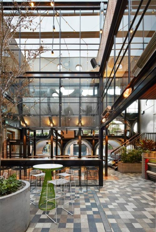
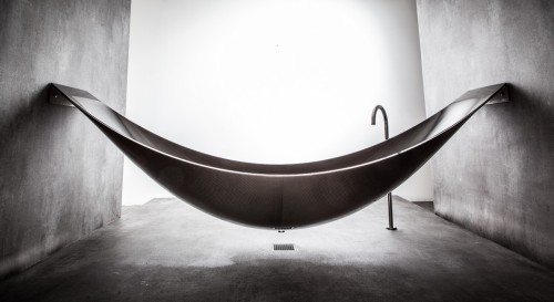
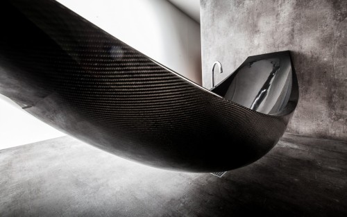
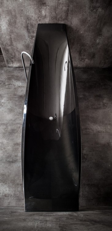
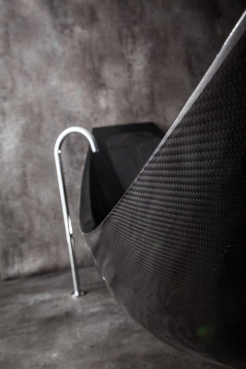
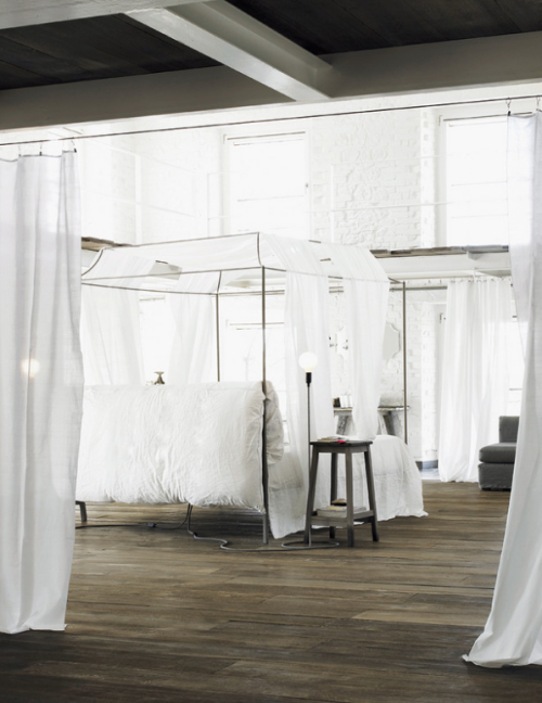
The Art of Relaxation: Bathtub and Hammock Combined by Splinter Works
The peaceful experience of kicking-back in a hammock has been further enhanced by combining it with the comfort of soaking in a hot bath. By literally elevating the experience of bathing into a suspended sculpture, the bathroom has been reinvented as a contemplative sanctuary for artful relaxation. Designed by Splinter Works for use in a wet room, Vessel is suspended from the walls and does not touch the floor. It is fixed with stainless steel brackets that can be covered over, or left revealed. The bath is filled using a floor standing tap and the waste water released through the base into a floor drain. A down-pipe drain can also be installed if a wet room setting is not possible.
In 1959, Henning Larsen founded his own architecture studio, and he was active for more than 50 years. Henning Larsen’s life work counts a number of significant building works in Denmark and abroad. He was often described as a “master of the light”. From 1968 to 1995, he was a professor at the Royal Danish Academy of Fine Arts, School of Architecture in Copenhagen.
↑ Ministry of Foreign Affairs in Riyadh (Saudi Arabia, 1984)
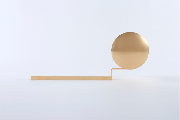
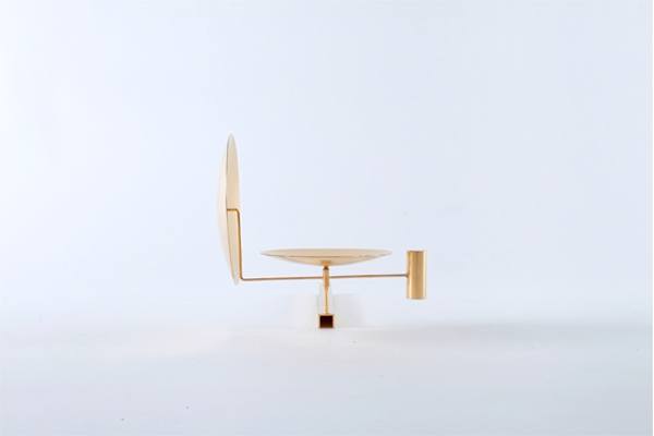
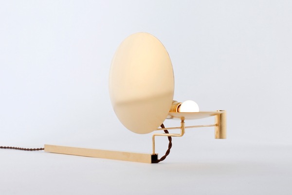
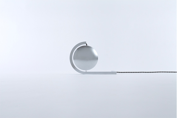
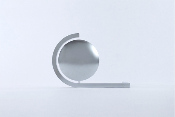
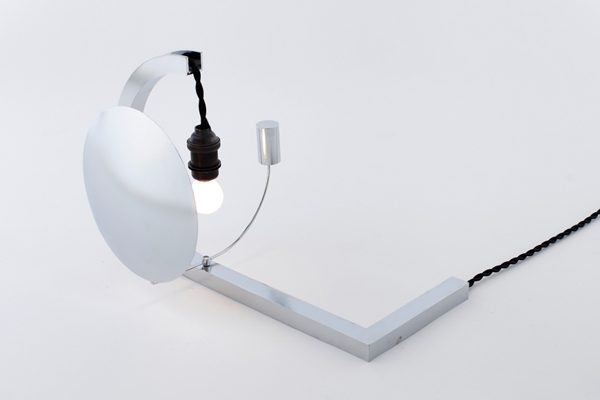
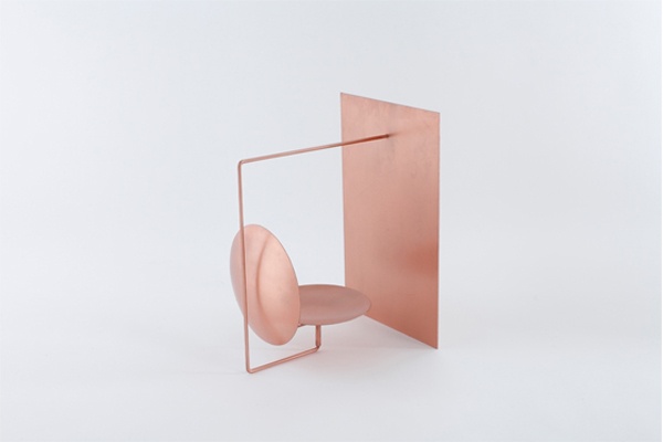
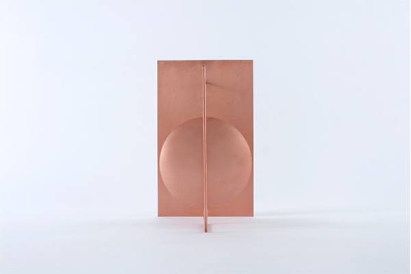
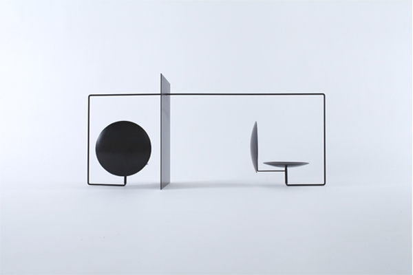
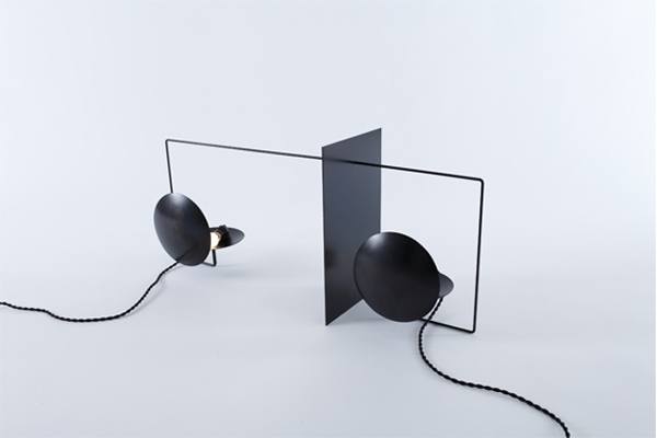
How charming are these ‘Dish of Light” sculptures by designer Kouichi Okamoto of Kyouei Design? While simple in appearance, each piece’s form is a careful balancing act of weight and counter weight. The one common feature among the four models is the metal shielding plates which are designed to rotate freely around an axis – not only allowing for interaction and aesthetic adjustments but also for the more functional acts of containing, reflecting and shielding light.
Dish of Light A – iron, 24 K gold plating – 21.7″ w x 8.7″ d x 8.7″ h
Dish of Light B – iron – 13.4″ w x 8.7″ d x 9.3″ h
Dish of Light C – iron, copper – 11″ w x 8.5″ d x 13.8″ h
Dish of Light D – iron, trivalent chromel plating – 30.7″ w x 8.5″ d x 13.8″ h
The Dish of Light series ranges in price from approximately $440 – $860 USD (shipping included) and is available for purchase through Kyouei Design. As a little heads up… bulbs and cord sets are not included.
Photography by Yuichi Yamaguchi. Spotted on Trendland.
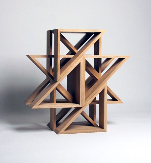
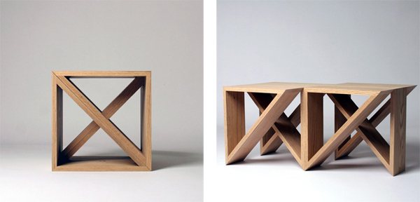
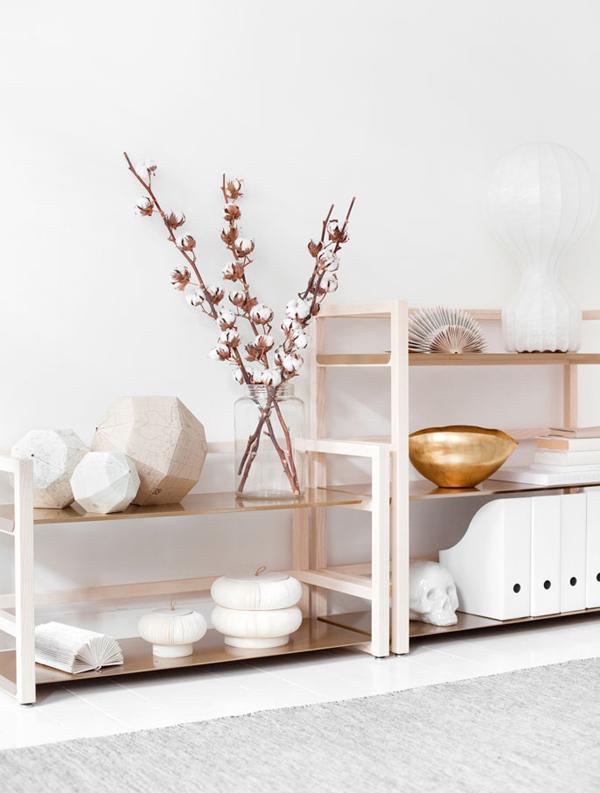
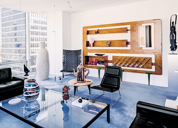
Today we have a roundup of shelving finds from D’s files. For those who love to do it yourself… be sure to read the captions for ideas along the lines of transforming industrial shelves into brass plated gems and links to DIY plans for hanging shelves. As for the rest of you, hopefully there will be a few things to inspire your next design and/or shopping trip. Enjoy!
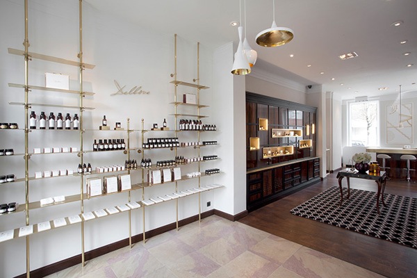
Brass shelving adds some sparkle to the Delbôve boutique in Brussels. Design by Christophe Remy.
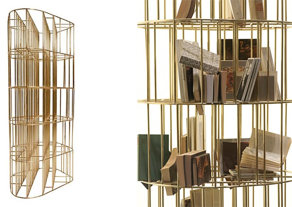
It’s a bookcage! Golden Cage, designed by Vincenzo De Cotiis, is a free standing bookcase made of hand-brushed brass rods. Available through ddc.
This striking modular piece is formed from a series of stackable ‘M.stools’. Two M.stools build a cube, eight a circle and so on. While not exactly your traditional bookcase, the possibilities of this modular sculpture seem limited only by your imagination. Designed by Jaewon Cho, founder of the Los Angeles bassed J1 studio. Available through Lin MorrisInspired by Japanese sliding doors Nina Jobs‘ Tre shelves were carefully designed by Stockholm based so as not to show a single nail or screw. The frame is compose of natural wood and the shelves are made of sheets of thin metal.
Inspired by Japanese sliding doors, Nina Jobs‘ Tre shelves were carefully designed so as not to show a single nail or screw. The frame is composed of natural wood and the shelves are made of sheets of thin metal.
This oversized faux case piece, complete with functional shelves, is just so cheeky I had to include it. Location – the Olympic Towers apartment of Murray Moss. Photo courtesy of Sketch42.
Soft shelving – the Altamura Organizer by Casamidy, is great design idea for the space constrained.
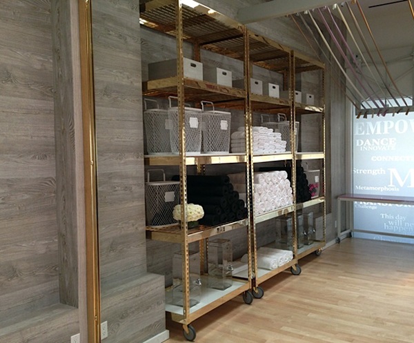
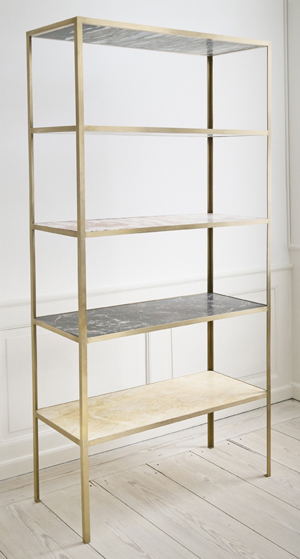
Designer Windsor Smith ingeniously transformed industrial metal shelves into gold by plating them in brass and swapping out the particle board for marble shelving. The lucky recipient of these drab gone fab shelves? Fitness guru Tracy Anderson for her Brentwood studio.
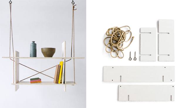
Do it yourselfers – this one’s for you. The Flying Shelf by Zürich based design firm Kueng Caputo was created as part of a make-your-own-furniture workshop in Osaka, Japan. The plans for constructing their whimsical design are available here.
The new furniture and homeware shop for Folklore took care to reflect the founder’s ethos of remaining mindful of the environment, with products that are recyclable and made of re-purposed materials.
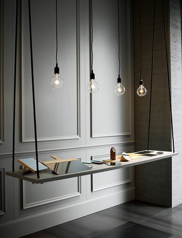
Milan based Studiopepe created this refined hanging shelf for a Spotti showroom exhibit. Here, a clean cut slat of wood painted to match the walls works together with a shock of black rope to up the sophistication factor. Photo by Andrea Ferrari.
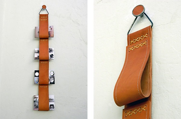
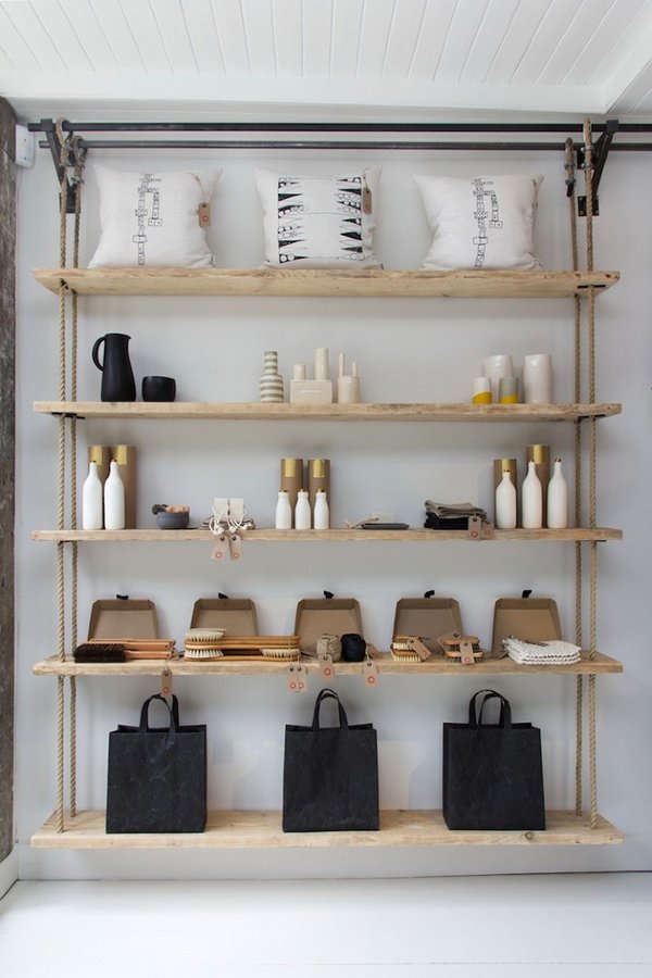
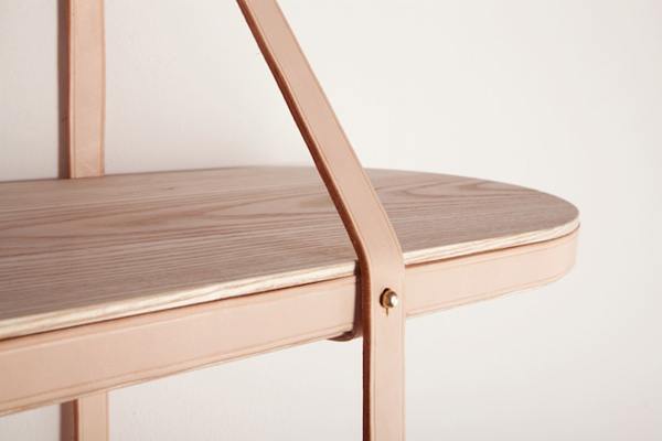
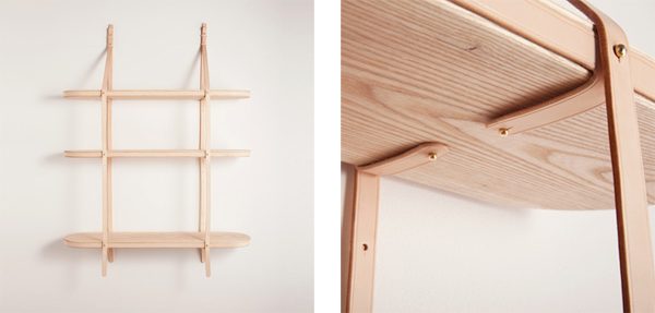
These wood, leather and brass hanging shelves, designed by Tomas Alonso for Vera, were constructed using the language and techniques of horse saddlery.
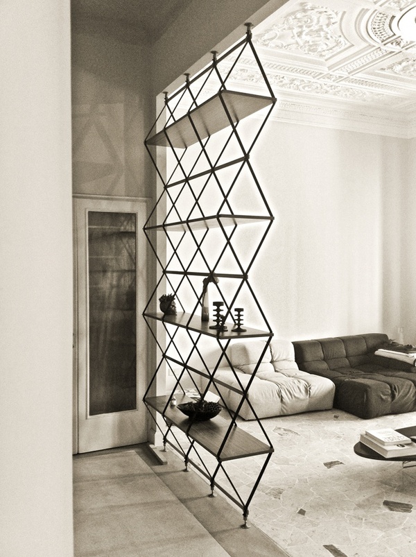
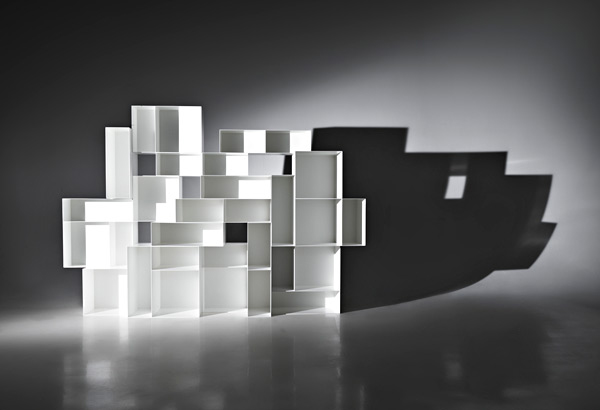
The very talented Pietro Russo recently debuted these stunning floor to ceiling pieces at Milan Design Week 2013.
Welcome to the future. Designed by Davide Anzalone, this stunning bookshelf was the first place winner of the Olympus FRP 2012 Carbon Fiber Design Contest. The purpose of the competition was to promote the use of carbon fiber (a uniquely strong and light material) in the field of furniture design. Here’s hopping this lovely one makes it to market someday.
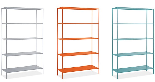
Room&Board’s classic Slim Étagère comes in a selection of ten powder-coated colors, rendering it one cheerful piece to have around.
The Alma Bookshelf, designed by Studio 63 for Property Furniture, is composed of white metal modules of varying shapes and sizes. While the pure white boxes make for a striking sculptural composition, color fabric inserts are available as an add on if you choose to bring a punch of color to the back of each shelf.
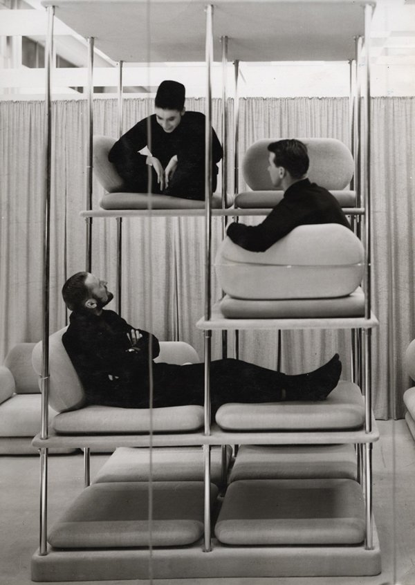
A people shelf – too fun not to include! This 1963/1964 designed Multi-Level Lounger is the work of the late and great Verner Panton. Part of me is a little heartbroken that this indoor jungle gym never became a furniture staple.
The house is 4m wide by 20m long including 1 semi-basement, 1 mezzanine floor and 3 stories above constructed by RC frame and brick walls with a total of 238sqm floor area. The concept is to create an “intermediate space” connecting all other functional spaces, this open space is either courtyard, internal void or common space semi-opened to the outside while semi-closed in other to protect the necessary privacy of the residence. Louver Façade and Sliding Glass roofs area designed to maximize the connection with outside environment overcoming the limitation of getting in touch with the outside for such long and narrow townhouse. Other more discrete areas such as bedrooms and bathrooms expose to this “intermediate space” through the internal void running throughout the house. These spaces can be opened or closed whenever necessary.
Greenery is located inside this “intermediate space” including 3 Babylon gardens provided with medium height trees which are about 4m higher than ground level. These gardens filled with sunlight and winds bring in the relaxing feelings for the people and shorten the distance to nature which is quite difficult for townhouse. Unifying the whole space with the “intermediate space” helps people living inside to enjoy these gardens wherever they are within the house. Sub-functional spaces such as garage, storage, technical rooms are located in the lower part of the house attached but separated with the actual living space which is located in the upper part to get close to the outside atmosphere. Natural ventilation and lighting helps reducing the energy effectively.
Typical townhouse of Vietnam is influenced by the old habit of old city commercial tradition where every house tries to get in touch with the front street and resulted in very long and narrow sites with very limited façade, some of them even smaller than 4m. Similar examples can be found in 36 streets of Hanoi or ancient town of Hoi An. Expanding in city population nowadays led to the necessity of putting more slabs in the house and making them higher, this also makes it harder to ensure the living condition of them which demands natural ventilation and lighting. With the concept of using green “intermediate space”, this project is hoped to be a new model for such type of Vietnamese townhouse providing the people the enjoyable and relaxing living condition.
Architects: Stephenson ISA Studio
Location: Cheshire, UK
Architect In Charge: Stephenson ISA Studio
Project Manager: Mr John Gray
Structural Engineer: Mr Christopher Munro
Area: 486 sqm
Year: 2007
Photographs: Courtesy of Stephenson ISA Studio
The house is sited on a tree lined suburban road in Cheshire and was designed for a young family couple. On the road, the house types are suburban; conservative, bland and mock traditional. Our approach was to create a fresh contemporary version of the suburban house type; one that reacts to its context and is tailored to suit the specific needs of the client.
The client asked us to design a four bedroom contemporary house to house their family. They also asked for a three car garage, and an independent granny flat (this later became adapted to become the children’s playroom.) Of prime concern to the client was the privacy of the living areas and the garden. They were also keen that the internal spaces felt bright and open with rooms flowing into one another; They did not want everything to be visible upon first entering the house, rather that it allowed one to meander through it; discovering places and views as one does so. During the whole design and construction process, the clients were very open to suggestions and permitted us a great deal of design freedom.
When commencing the design, we first looked at how the garden could relate to the internal spaces. To the front of the house, there was a large south facing garden, which in the neighbouring properties was poorly utilised due to its visual exposure to the public road. Our starting point therefore was to create extra screening along the site boundary to allow this area to become a useable private family outdoor space. As the outdoor garden space was now private, we were then able to put the living areas on the ground floor, allowing for direct access from inside to out. The privacy of the gardens also allowed us to create large window openings, providing views into the garden without the need for screening, during the day or night. We designed the house in such a way that rooms did flow into one another, with each room having its own individual relationship with the outside, creating a dramatic spatial sequence.
In order to divide the vehicle and pedestrian entrance, we ran a concrete wall from the house to the site entrance, dividing the front garden up into pedestrian entrance/garden and driveway. This wall also worked to physically anchor the house into the site and its context.
The actual form of the building is expressed as the meeting of two volumes; the main volume contains the house, whilst the lower stone volume’s wing contains the granny flat and garage. The solid stone block sits aligned with its neighbours whilst the higher rendered block cantilevers over it on the south elevation, creating a dramatic entrance. In a way, the whole design is about the drama of entrance; even as you move through the house the visitor is continuously entering; discovering the drama of each space sequentially.
We did have a lot of opposition from the planning department and had to really struggle to get the building approved. The planning officer put the project to committee as she said that she did not understand modern architecture! We had also originally designed a canopied entrance gateway, but the planners asked us to remove this. We later submitted a separate application for this item as we felt so strongly about its importance to the design, but it was rejected at appeal.
As we had to work within a tight budget, we spent a lot of time searching for good quality materials at low prices; bartering with companies to get better prices. One of the joys of working on this project was investigating the qualities of the different materials and assembling with the client an acceptable materials palette. Externally, we used a white silicone render and sandblasted Jura limestone (which we had discovered on another project.
This stone could be supplied at low cost and by sandblasting it, gave it the appearance of Portland stone.) For the internal floor surfaces we primarily used the same Jura limestone on the ground floor (but from a different seam and in a different finish.) On the first floor, we used chemically treated light brown oak timber flooring. Within the ensuites, we used flamed black granite stone tiles, which we were able to purchase at an extremely low cost as it was meant to be used for street paving.
The building’s structure was made up of concrete floor slabs on blockwork. The structure was initially designed and detailed as a steel frame, but it was discovered very late on that a very large saving could be made by simplifying the construction method. Again for budget reasons, we used a metal deck roof. One of the joys of working on this project was working with craftsmen, like the stone masons and the carpenters who really understood their materials and were able to pass on their knowledge and contribute to the building’s construction.
The contractor turned out to be very good. Although they had never constructed a modern building before, they worked with a high level of enthusiasm, understanding and pride. But because of their novelty, they were unable to keep the programme under control and it extended significantly beyond their expected completion date.
On the first floor of both the lower and upper buildings, all guestrooms have direct access to the plunge pools of their own, representing the effect of being adjacent to the sea. Another advantage of locating the back building on top of the slope is that most of the guestrooms have clear view towards the sea, not being blocked by the lower building and other buildings in front.
In a crowed auditorium in central Los Angeles on Sunday, Swiss architect Peter Zumthor sat down with the Los Angeles County Museum of Art (LACMA) director Michael Govan to kickstart the opening of The Presence of the Past: Peter Zumthor Reconsiders LACMA. The hour-long discussion, captured in the video above, began with an insightful overview of Zumthor’s most famous works before moving to an in-depth conversation about the underlying ideas that drive Zumthor’s design for the highly anticipated LACMA overhaul.
The project – already six years in the making and yet still in its schematic phase – plans to replace LACMA’s aging cluster of three pavilions with an elevated, 21st century facility. A detailed project summary, alongside images captured from Zumthor’s 6 ton, concrete exhibition model, is available for you to review here on ArchDaily. Enjoy!
Born in Milan in 1891, Gio Ponti would go on to become one of the most prolific and influential Italian architects and designers of the 20th century. But this is only half the story, as Ponti’s avid international lecturing and roll as the editor of Domus (1928-1941, 1948-1979) and Stile (1942-1947) magazines rendered him not just a composer of architecture and design but also one of the most important conductors of the architecture and design conversation for nearly half a century.
It all began in 1921 when following the completion of his architectural degree, Ponti set out to work as both an architect and an industrial designer. While his body of work is decidedly eclectic – running the gamut from neoclassical ceramics to modernist glass clad buildings – it could be argued that his most celebrated works, particularly a series of residences known for their abundance of light, texture and color, allow for the influence of both.
Much can be said about Ponti, but perhaps Alice Rawsthorn sums it up best in her 2011 article for The New York Times where she writes, “It was quite a career. As a designer, Gio Ponti worked for 120 companies. As an architect, he built in 13 countries. As a magazine editor, he produced 560 issues and wrote at least one article for each one. As an academic, he lectured in 24 countries. He also found time to dictate some 2,500 letters and draw 2,000 illustrated letters, as well as for painting and poetry.”
Below is just a small selection of the vast output of a man who worked with endless stamina and passion from the beginning of his career to the very end. Enjoy!
Villa Plancart
It was the early 1950s when the wealthy Venezuelan couple Armando and Anala Planchard persuaded the Italian master of Modern architecture and design, Gio Ponti, to design their new Caracas home. Four years later, in 1957, the architect/designer would unveil a hill top abode complete with a wing like roof. Ponti referred to the residence as a machine or abstract sculpture meant to be experienced from the inside and as was his custom, he attended to every detail from the Italian marble flooring, to the wall and ceiling finishes, to the furnishings and art. The result is one of Ponti’s most celebrated works – bearing his trademark light filled spaces, and unique plays on color, pattern and texture.
Industrial Design
Gio Ponti Chandelier (late 1950s early 1960s) via Urban Archaeology ($35,000)
Dormitio armchair (1950s) via 1stdibs (no longer available)
Sterling silver salt and pepper set (1950s) via 1stdibs
Diamond flatware service (circa 1955) via Phillips (sold for £18,750 or $29,220)
Fabric designed for Rubelli. Photo courtesy of Molteni&C
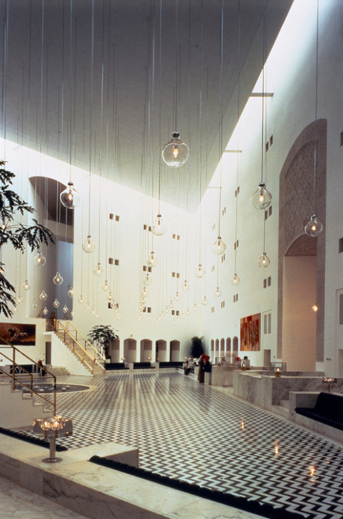
Parco Dei Principi Hotel
More than a half century after its 1961 completion, Gio Ponti’s Sorrento Parco Dei Principi masterpiece is one of the few, if not only, great hotels from that era to still stand as the architect/designer intended. Built atop the ruins of a 19th century English Gothic castle, Ponti gave an intentional nod to the site’s past by designing a series of three decorative crowns to adorn the apex of the front facade. Upon first entrance to the space, one is met by a series of stunningly detailed wall features encrusted in thousands of ceramic “pebbles”. The color scheme was intentionally kept to a soothing and almost exclusive blue and white pallet and Ponti’s original furnishings still adorn the hotel’s public and private spaces. But perhaps the resort’s most striking and impressive feature is the 30 different custom tile patterns which Ponti designed in collaboration with a local tile producer. Shown above is just a small selection from the collection but I think you will agree, excesses like this can only be born from a heart that carries a true passion for design.
Vivere alla Ponti – Living Ponti-style
Molteni&C and Dada recently teamed up to reissue a seven piece collection of Gio Ponti’s designs produced between 1935-1957. Both the furniture line and the movie above stand as tributes not only to this 20th century master’s architecture and design, but also to his still relevant vision of modern living.
*** About Friday Flashback: each month D features an architect, designer, or artist from the past. As the name implies a new Flashback will appear one Friday per month.
Photos: 1, 2. courtesy of Gio Ponti Archives, 5. from World of Interiors via Man Make Home, 3, 4. Photos by Victor Pastore, 6. via SkyScraperLife, 7. by Miguel Braceli, 14, 16, 17. courtesy of Royal Group, 15, 19-22. by Sam Grawe via Dwell, 18. Photo via Mens Reverie, 23-26. courtesy of Molteni&C.
''Even A Brick Wants To Be Something'' - Louis Kahn
In 1904, at the age of three, Kahn suffered severe burns to his face and hands marking him for life. Who would have ever thought then that his preferred drawing material would have been charcoal with which he sketched ''objects'' that went on to become some of the most important buildings of the 20th century during the final two decades of his life.
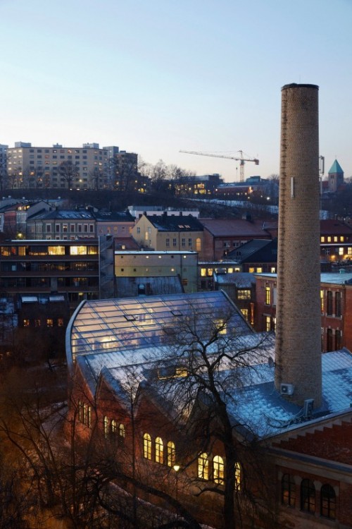
Signal Mediahus sits next to the Aker River in Oslo. The original industrial building has a rich history of uses, from textile industry to offices and events. Part of the building burned down in the 1980s. The project inserts a completely new architecture inside the shell of the old while preserving the historic. The two correlates while both being clearly architecturally defined.
The commission was a house for a surfer and his family that would rescue typical elements of the architecture of the area in a contemporary way, and to create spaces protected from the cold southern wind (a constant in the area) and management of the afternoon sunlight, without impairing the view to Punta de Lobos (surf point) in this same direction.
We reinterpreted the “plinth” element, a local flagstone base on which most of the buildings in the historic center of Pichilemu were built (1885).
At the Plinth House, this element builds a platform, which forms an outer space for the house with terraces protected from the southern wind, and controlled green areas, limiting the irrigation area due to water scarcity in the area. The base and walls of the house ventilate, reducing indoor humidity and heat transfer of the house. The flagstone was obtained from a quarry enabled on the same site.
Southern wind and sunlight.
With a prevailing view towards Punta de Lobos, the volume is placed so that the greatest number of rooms look to the sea, but with a break in order to protect the northwest facade from the southern wind without losing the view. The layout of the house is basically: hermetic bedroom area towards the south, as this is the area of the volume that blocks the wind to the north area of the house, where there is a large living room, dining room and kitchen, open to an intermediate space where the barbecue area and terraces are fully protected from the wind and get northern sunlight.
Through an overhang along the length of the volume, the interior is protected from excess sunlight and also these spaces, built mostly out of wood from the area, generate intermediate spaces protected from the southern wind.
With the intention of generating continuity with the base, and of working the fifth facade, the roof was also clad in flagstone.
With the intention of generating continuity with the base, and of working the fifth facade, the roof was also clad in flagstone.
The saga of the Southbank Centre redevelopment in London heated up recently, after the scheme for the new ‘Festival Wing‘ was formally submitted to Lambeth’s planning department. The scheme, which has been well received by some of the architecture community, including the centre’s original architects Norman Engleback and Dennis Crompton, has run afoul of the skateboarding community, which opposes the plan to infill the undercroft that has been their home for almost 40 years.
After a petition to save the skatepark garnered over 40,000 signatures, the skating community has mobilized once again to object to the planning application en masse. The campaign to save the skatepark has even garnered the attention of skateboarding legend Tony Hawk, who wrote to the Southbank Centre’s director of partnership and policy Mike McCart to explain that:
“It’s truly an historic feature of London street culture, and is as well known to skateboarders around the world as Big Ben or Buckingham Palace. Honestly.”
In order to replace the existing skatepark, the Southbank Centre has submitted a separate planning application which will enable them to relocate the skaters to an area beneath the nearby Hungerford Bridge. Mike McCart explains that the decision to infill the undercroft with retail establishments was made not only to present a more welcoming front for other users of the Southbank Centre (whose first point of contact will be at this level), but also to secure funding for the whole project, as commercial loans are expected from the businesses that will eventually occupy the space. He emphasizes that:
“We’ve always made it clear that while their activity is safe on the south bank, it’s not necessarily in this location.”
The severity of the backlash from the skating community, however, demonstrates that attempts to compromise may be in vain. For skaters – locally, nationally and internationally – there may be simply no way to replace the Southbank skatepark.


 On the first floor of both the lower and upper buildings, all guestrooms have direct access to the plunge pools of their own, representing the effect of being adjacent to the sea. Another advantage of locating the back building on top of the slope is that most of the guestrooms have clear view towards the sea, not being blocked by the lower building and other buildings in front.