Shared posts

19 Aug 14:20

Winner Announced: Designconnected Giveaway

by Ronen Bekerman
 Winner Announced: Designconnected Giveaway

The 1st 2013 blog birthday giveaway is here! DesignConnected will give one of you lucky followers a chance to pick 15 models from their 3971 strong collection… any model you like. You will also have the chance to win 15 more great 3d models by sending a 3d render/s you made using one of their freely or commercially available models.

First Part Winner Announced

Congratulations to Mihailo Krsmanovic

You are the lucky winner of a 15 DesignConnected 3D Models. Start picking them!

Just like MATERICA D-SIGN did last time with the great image you see above featuring DesignConnected models that they picked from their catalog.

About DesignConnected

DesignConnected mission is to make your interior designing and presentation process easier and tight connected with the latest 3d technologies. It’s aim is to deliver the best quality digital content for all the interior design professionals. Starting from all the design classics, going through the most iconic modern design furniture and ending with the latest design arrivals at the furniture fair stands It connect’s you with the only digital library that is dedicated to interior design.

Designconnected models are being used by many of this blog followers, and you can see their work being featured on DC’s gallery section icon wink Winner Announced: Designconnected Giveaway

Most of Designconnected models come supporting 3dsmax Scanline, VRay & Mental Ray as well as SketchUP, Artlantis, OBJ and a great FBX format that I have discovered work perfect straight out of the box in real-time too.

gallery 01 728x606 Winner Announced: Designconnected Giveawaygallery 02 728x562 Winner Announced: Designconnected Giveawaygallery 03 728x617 Winner Announced: Designconnected Giveaway

How to Enter

All you need to do to enter is:

  1. Follow me on Twitter and/or Facebook by liking it icon wink Winner Announced: Designconnected Giveaway
  2. Post a comment below, using the post to Linkedin, twitter or Facebook check-boxes, telling which of the DesignConnected models you like best, How it saved the day for you on a project, or any other cool story!

Here is an image preview to show were you should check these options while commenting further below, at the end of this post icon wink Winner Announced: Designconnected Giveaway

comment box 728x273 Winner Announced: Designconnected Giveaway

The first part of this giveaway will close on Monday morning, August 19, 10:00 GMT, and a winner will be randomly selected shortly afterwards. This post will be updated with the winner information and DesignConnected we’ll get in touch with you.

The second part of sending your 3d renders showcasing one or more of DesignConnected models will end on September 15. Please use the following form to send your renders.

Thank you all for uploading your images in this giveaway. The submit form is now closed and the winner will be announced in a few days.

A big thanks to DesignConnected, for sponsoring this giveaway. Good luck, and be sure to follow this blog or subscribe so that you can find out if you’re a winner!

Winner Announced: Designconnected Giveaway is a post from Ronen Bekerman's 3D Architectural Visualization Blog

12 Aug 05:29

15 Free 2D Cutout People

by Ronen Bekerman
 15 Free 2D Cutout People

Juan Carlos Ramos kindly shares his first 2D Cut Out People Pack. As I always say – You can never have too many 2d people, and this pack has 15 of them. Enjoy!


Visit Juan Carlos Ramos Website to learn more about him and his work.

Catalog V1 728x878 15 Free 2D Cutout People

15 Free 2D Cutout People is a post from Ronen Bekerman's 3D Architectural Visualization Blog

26 Jul 07:55

Primary School in Karlsruhe / wulf architekten

by Jonathan Alarcon

Architects: wulf architekten
Location: Karlsruhe, Germany
Colleagues: Ingmar Menzer (PL), Oliver Hasselbach, Larissa Schuster, Christopher Velz
Year: 2012
Photographs: Brigida González

From the architect. The Protestant primary school with sports hall in Karlsruhe was completed in April 2013, after building work lasting for a good year. The school ensemble is immediately adjacent to residential buildings, an old peoples’ home, technical college, kindergarten and church, and represents a new and important urban building block for north-west Karlsruhe.

The design emerged from a competition (multiple commissions) and the two-storey primary school was developed on Montessori educational principles. The so-called learning building is typical of this: it was built in front of the classrooms in the form of generous, open usage areas.

Both the new buildings are designed as lucid, right-angled structures that derive their special look from storey-high coloured aluminium sections. These fins, placed freely but rhythmically, mean that the façades show up in a constantly changing interplay of shades of red and green – whichever way youlook at them.

Pupils are greeted by a two-storey, open assembly hall on the ground floor of the 37 x 37 m school building. The landing on the stairs adjacent to the hall is in maritime pine and can be adapted to provide seating for special events. This means that the assembly hall is the centre of the school, which was built to accommodate eight classes. A single flight of stairs leads to the upper floor, which houses a music room, a creative space and a library, as well as the classrooms. The balconies running all the way round outside this storey reinforce the connection with the open air, and can also serve as emergency escape routes.

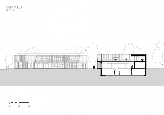
The adjacent sports hall is sunk about 3 metres into the existing land. Its roof area can be used as a break-time space and additional playing field. This level is lucidly framed by a roofed, angled walkway.

Primary School in Karlsruhe / wulf architekten © Brigida González Primary School in Karlsruhe / wulf architekten © Brigida González Primary School in Karlsruhe / wulf architekten © Brigida González Primary School in Karlsruhe / wulf architekten © Brigida González Primary School in Karlsruhe / wulf architekten © Brigida González Primary School in Karlsruhe / wulf architekten © Brigida González Primary School in Karlsruhe / wulf architekten © Brigida González Primary School in Karlsruhe / wulf architekten Plan Primary School in Karlsruhe / wulf architekten Plan Primary School in Karlsruhe / wulf architekten Section Primary School in Karlsruhe / wulf architekten Section
26 Jul 07:54

Jean Nouvel Selected to Design National Art Museum of China

by Karissa Rosenfield

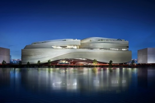
The rumors are true: Jean Nouvel has been selected as the official winner of the highly acclaimed National Art Museum of China (NAMOC) competition in Beijing. According to Dezeen, the news has been confirmed by Nouvel’s adviser, Oliver Schmitt. Though little has been released about the winning design, earlier reports have described it as a “vast structure” based on the simplicity of a single line – “a single brush stroke.”

In an interview with Financial Times, Nouvel quoted the Chinese artist Shi Tao (1642-1707): “A single line is the source of everything in existence. [...] We started with calligraphy. [...] Pupils used to spend half a year just on that first line with a brush. That first line contains all of Chinese culture – painting, writing and the energy of Chi.”

An official announcement from the Chinese government has yet to be released. We will keep you updated as the details unfold.

Last year, Nouvel was named as a top contender for the NAMOC, alongside Zaha Hadid and Frank Gehry. Once complete, the 20th century art and calligraphy museum will become the centerpiece of a new cultural district at Olympic Park.

Read the Financial Times’ complete report for more information on Nouvel’s project.

26 Jul 07:51

DC House / Geza

by Fabian Cifuentes

Architects: Geza
Location: Udine, Italy
Design Team: Fabio Fulchir, Lodovico Lorenzini, Alessandro Zuccolo
Area: 290 sqm
Year: 2008
Photographs: Massimo Crivellari

Structure: Andrea Craighero, Fabio Fulchir
Landscape: Enrico Sello, Paolo Roiatti

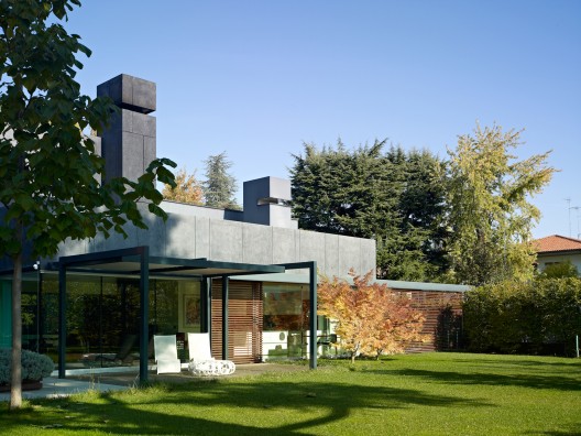
From the architect. The project includes three different volumes: a two-story main residence with a single-floor structure facing a private garden; a dependance making a whole front northwards; a covered pool concealed from bordering buildings to the west. A large basement links all three elements and, by creating two underground patios, serves as a multipurpose space, including a large wellness area.

There are no fixed destinations for the volumes, but for the pool. This is designed as a large transparent tub and makes the heart of the whole project at all seasons, by day and night. The texture of exposed concrete reproducing the larch wood ceiling and the movement of water constantly contribute to create little vibrations, inside and outside.

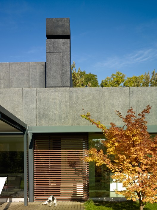
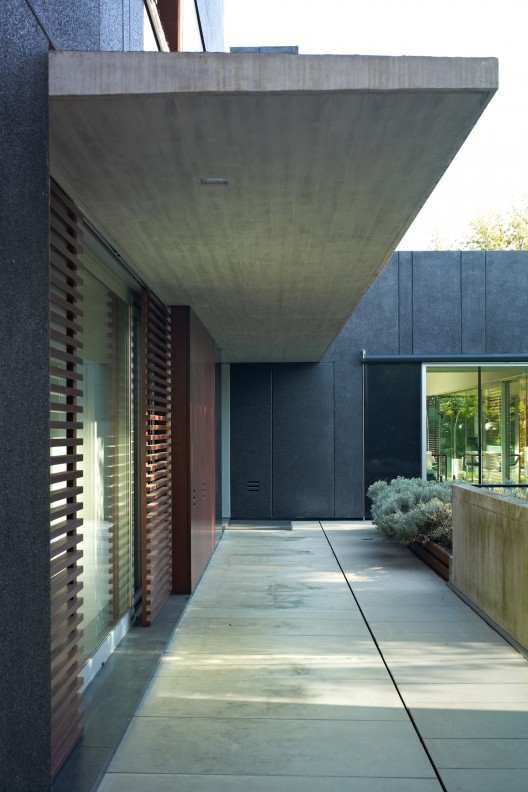
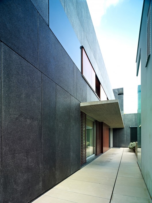
The facades of the main residence were coated with large ventilated concrete panels, finished with absolute-black granite chip and anthracite pigment. The pattern of these continuous panels is broken by glossy black granite slabs and polished aluminum frames, whose aim is to lighten the huge weight of the facade by way of mirroring slabs and surfaces capable of reflecting the sky and the trees.

In addition to outside views, all areas in the house entertain a special relation with the landscape of the property, so that a strong introversion is maintained with respect to the neighborhood.

DC House / Geza © Massimo Crivellari DC House / Geza © Massimo Crivellari DC House / Geza © Massimo Crivellari DC House / Geza © Massimo Crivellari DC House / Geza © Massimo Crivellari DC House / Geza © Massimo Crivellari DC House / Geza © Massimo Crivellari DC House / Geza © Massimo Crivellari DC House / Geza © Massimo Crivellari DC House / Geza © Massimo Crivellari DC House / Geza © Massimo Crivellari DC House / Geza © Massimo Crivellari DC House / Geza © Massimo Crivellari DC House / Geza © Massimo Crivellari DC House / Geza Floor Plan DC House / Geza Site Plan DC House / Geza Elevation DC House / Geza Elevation DC House / Geza Sketch
26 Jul 07:49

Lynda.com – Illustrator CC One-on-One: Fundamentals (Complete)

by U.N.Owen
26 Jul 00:15

Headquarters for Santa Fe Architects Association / Gabriel Biagioni, José Giolongo, Javier Mendiondo, Sergio Pecorari, Luis Pessoni, Ramiro Piva

by AD Editorial Team

Architects: Gabriel Biagioni, José Giolongo, Javier Mendiondo, Sergio Pecorari, Luis Pessoni, Ramiro Piva
Location: Santa Fe, Argentina
Project Area: 765 sqm
Project Year: 2010
Photographs: Federico Cairoli, Unknown photographer

Collaborators: Moreira, Alejandro; Gonzalez, Martín; Imhoff, Daniel; Condal, Lucas; Pachoud, Pablo Aranda, Virginia; arqs. Gonzalez, Fabio; Surín, Soledad
Site Management: Biagioni, Gabriel; Pessoni, Luis; arqs.
Structures: Botto, Damián; Chiappini, Enrique; Ings.
Client: Colegio de Arquitectos de la Provincia de Santa Fe
Construction: CAM S.A.

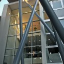
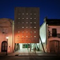
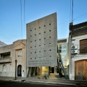
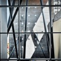
From the architect. The Architects Association must be the home of the architects, a space for them to converge. It must be a meeting place for the different actors involved in our discipline. The architectural space emerges as the cornerstone to generate this convergence.

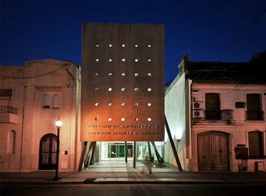
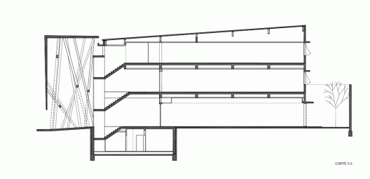
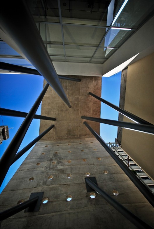
An initial gesture – a folded plane – was transformed into an element that shapes this convergence space. From a site with two facades, this structural element announces, on one hand, the creation of a space inside the building, and on the other, an opening toward the public space of the historic center of Santa Fe. The fold and the space thus become a transition device between architecture and the city. There is a first limit, precise and forceful, a lid that reconstitutes the urban scale, which contains what happens from that point onwards, an autonomous microclimate from its forms, a succession of draining spaces.

This project participates in the urban event where it is located, as a piece of continuity of the scale of the built fabric, but it also generates a clear rupture from the perceptual, technological, and formal perspectives.

From an environmental perspective, the exposed concrete piece responds to the notion of creating an environmental situation that mitigates the western sun, which in the case of Santa Fe is the orientation with the most extreme climate impact during our hot summers. Besides being the image of the institution, this concrete piece acts as a device that calibrates and manages the incidence of solar rays that are introduced into the building.

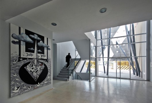
A three-dimensional grid of meeting spaces structures the functional units, respecting a principle of permanent flexibility throughout the building. On the second level, a connection that integrates the new building to the offices of the former headquarters is opened through the party wall. Few materials, solid and strong, give the idea of permanence and timelessness.

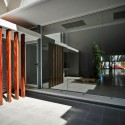
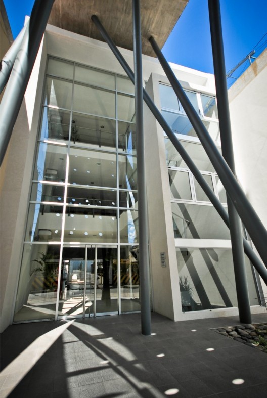
Sede Colegio de Arquitectos de Santa Fe / Gabriel Biagioni, José Giolongo, Javier Mendiondo, Sergio Pecorari, Luis Pessoni, Ramiro Piva © Federico Cairoli Sede Colegio de Arquitectos de Santa Fe / Gabriel Biagioni, José Giolongo, Javier Mendiondo, Sergio Pecorari, Luis Pessoni, Ramiro Piva © Federico Cairoli Sede Colegio de Arquitectos de Santa Fe / Gabriel Biagioni, José Giolongo, Javier Mendiondo, Sergio Pecorari, Luis Pessoni, Ramiro Piva © Unknown photographer Sede Colegio de Arquitectos de Santa Fe / Gabriel Biagioni, José Giolongo, Javier Mendiondo, Sergio Pecorari, Luis Pessoni, Ramiro Piva © Federico Cairoli Sede Colegio de Arquitectos de Santa Fe / Gabriel Biagioni, José Giolongo, Javier Mendiondo, Sergio Pecorari, Luis Pessoni, Ramiro Piva © Federico Cairoli Sede Colegio de Arquitectos de Santa Fe / Gabriel Biagioni, José Giolongo, Javier Mendiondo, Sergio Pecorari, Luis Pessoni, Ramiro Piva © Federico Cairoli Sede Colegio de Arquitectos de Santa Fe / Gabriel Biagioni, José Giolongo, Javier Mendiondo, Sergio Pecorari, Luis Pessoni, Ramiro Piva © Federico Cairoli Sede Colegio de Arquitectos de Santa Fe / Gabriel Biagioni, José Giolongo, Javier Mendiondo, Sergio Pecorari, Luis Pessoni, Ramiro Piva © Federico Cairoli Sede Colegio de Arquitectos de Santa Fe / Gabriel Biagioni, José Giolongo, Javier Mendiondo, Sergio Pecorari, Luis Pessoni, Ramiro Piva © Federico Cairoli Sede Colegio de Arquitectos de Santa Fe / Gabriel Biagioni, José Giolongo, Javier Mendiondo, Sergio Pecorari, Luis Pessoni, Ramiro Piva © Federico Cairoli Sede Colegio de Arquitectos de Santa Fe / Gabriel Biagioni, José Giolongo, Javier Mendiondo, Sergio Pecorari, Luis Pessoni, Ramiro Piva © Federico Cairoli Sede Colegio de Arquitectos de Santa Fe / Gabriel Biagioni, José Giolongo, Javier Mendiondo, Sergio Pecorari, Luis Pessoni, Ramiro Piva © Federico Cairoli Sede Colegio de Arquitectos de Santa Fe / Gabriel Biagioni, José Giolongo, Javier Mendiondo, Sergio Pecorari, Luis Pessoni, Ramiro Piva © Federico Cairoli Sede Colegio de Arquitectos de Santa Fe / Gabriel Biagioni, José Giolongo, Javier Mendiondo, Sergio Pecorari, Luis Pessoni, Ramiro Piva © Federico Cairoli Sede Colegio de Arquitectos de Santa Fe / Gabriel Biagioni, José Giolongo, Javier Mendiondo, Sergio Pecorari, Luis Pessoni, Ramiro Piva Basement Level and First Floor Plan Sede Colegio de Arquitectos de Santa Fe / Gabriel Biagioni, José Giolongo, Javier Mendiondo, Sergio Pecorari, Luis Pessoni, Ramiro Piva Second Floor Plan Sede Colegio de Arquitectos de Santa Fe / Gabriel Biagioni, José Giolongo, Javier Mendiondo, Sergio Pecorari, Luis Pessoni, Ramiro Piva Third Floor Plan Sede Colegio de Arquitectos de Santa Fe / Gabriel Biagioni, José Giolongo, Javier Mendiondo, Sergio Pecorari, Luis Pessoni, Ramiro Piva Section Sede Colegio de Arquitectos de Santa Fe / Gabriel Biagioni, José Giolongo, Javier Mendiondo, Sergio Pecorari, Luis Pessoni, Ramiro Piva Elevations
22 Jul 06:06

Making of Eltham House

by Ronen Bekerman
 Making of Eltham House

Kiernan May‘s ELTHAM HOUSE renderings awarded him Best Visualization of the Week NO. 26 using Maya as his main platform for setting up his scene. Kiernan managed to mix lots of colors in his dusky images keeping the balance with a great final result. Check out his process of making this all work. Enjoy!

kiernan may Making of Eltham Housebest of week 80 Making of Eltham House

Author: Kiernan May

Kiernan May is a 3D Visualization Artist and Photographer based in Canberra, Australia. He studied Art and 3D Animation for Screen at the Academy of Interactive Entertainment between 2003-2007. Since then, he had many years of experience in visualizing and photographing projects around Australia.

Introduction

Firstly, big thanks to Ronen for all the resources and inspiration on this site over the last four years. It is an invaluable source of information I enjoy reading and being exposed to all the different ways people go about making their images.

This article will be about the making of Eltham House and how I went about making the images for this project. The software used was SketchUP, Maya, V-Ray for Maya with post production in Photoshop and Lightroom.

I understand that Maya is probably not the best suited tool for Arch-Viz, however, combined with SketchUP, V-Ray and plugins like VRayScatter, it can be pretty good to work with.

I dipped my toes into 3D with 3dsmax back when it was around version 4, but I completed a course that taught Maya for a couple of years, so I guess in the end I was more comfortable with Maya. I think that 3dsmax & Maya are similar in many ways and many tips and techniques that are shared on this site are thankfully translatable between the two (and other platforms too if using V-Ray).

Basic Scene Setup

The basic mesh was sourced from the 3D Warehouse in SketchUP format. It was imported directly into Maya and I did not change that much about it. Minor things needed fixing once imported for instance, new windows were needed along with more detailed frames, new staircase, interior fixes and adding in detail to most exterior edges like beveling operations and of course textures. Apart from that it was in pretty good nick.

The more important elements to this project in terms of 3D were the foliage, shading, lighting and of course, post production.

The base mesh in all it’s glory…

eltham house 01 import 728x448 Making of Eltham House

And with some added work on it…

eltham house 01 import 02 728x430 Making of Eltham House

After importing the model into Maya, I already knew the kind of shots I had in mind, so modelling a highly detailed ground was not a high priority for me. In the end it was a very simple surrounding.

eltham house 02 ground 728x352 Making of Eltham House

The plane was tweaked with some noise and slopes provided by Maya’s sculpt brush.

To keep the scene efficient, but at the same time keeping things looking like they were highly detailed in the render, I used VRayPattern from iCube R&D for the large grassy area.

The source mesh that was used for VRayPattern :

eltham house 03 vraypattern 728x411 Making of Eltham House

VRayPattern can be basically described as geometry based displacement. So for this particular project, rather than scattering individual grass patches over a surface, VRayPattern works literally by making the grass patch “appear” at render time on the base geometry. The scale of this patch of grass is controlled by the base geometry UV map.

It really is quite elegant as it somehow manages to do all this without any memory increase and is a far more efficient alternative to the more expensive grass solutions like fur, scattering or displacement.

The only drawback to VRayPattern is, as the name suggests, that it literally tiles the mesh in UV’s, like textures are repeated, and in certain instances it’s really obvious to see the repetition. It must be used appropriately.

xoio covered VRayPattern in the past and it is a great read :

5Morgen seafront full Teaser Big 728x268 Making of Eltham House

You can also download a basic scene to play with :

Teaser BIG VrayPattern Wiese 728x268 Making of Eltham House

Once all that “groundwork” was in place, I had to set up the lighting.

Lighting

I think lighting is the key for any render and I try and get it down as early as possible in the workflow. It is also my favorite part of a project.

I had a few magazine references that I was keen to recreate. Originally I had in mind an afternoon sunset type shot but as the project moved forward, I went and restarted the lighting towards what ended up as the current “blue hour” look.

I thought the house was more attractive and welcoming with all the interior lights on during this time of the day.

I chose Peter Guthrie’s 2003 HDRi to light the scene assigned to a VRayDome Light object.

Before any test renders were started, I used a material override in the scene which just involved turning all shaders to a non reflective 50% grey material. This is mainly because it’s fast to render but also very easy to tell what the lighting is doing without the distractions and manipulation that regular shaders can cause.

eltham house 04 hdri 728x464 Making of Eltham House

V-Ray RT once again proved to be very useful in helping to quickly tune the lighting direction as well as finding a good V-Ray color mapping and exposure settings. I must say I ended up with some awkward color mapping settings on this one, but it provided some nice contrast even before post production, which is what I was after.

eltham house settings 728x745 Making of Eltham House

I also used a V-Ray Physical Camera even if the settings are probably not that accurate for what you would expect in the real world on a camera for this scenario. I just used it primarily because of the automatic lens shift (3ds Max users will know it as the Guess Vert. button).

This method is much better than correcting the lens shift by eye – or worse in post production!

Materials

Most shaders in this scene used traced reflections no matter how subtle. I think V-Ray is an exceptionally fast render engine, so I’m not that conservative with glossy materials on exterior scenes, especially when the renders are stills only.

While I’m on the subject of reflections, I also used some pretty high subdivs on materials. Usually, they started around 80 and if they appeared too noisy, I’d bump them up even higher or drop them depending on glossiness amount. I’ll go into my reasoning behind this a little later.

The original model was imported with low res placeholder textures, all of them had to be replaced with higher quality ones. Everything was mapped with planar mapping since all textures are tiled.

The wooden floor material used.

eltham house woodenfloors 728x369 Making of Eltham House

Outside concrete tiles material.

eltham house textures outsideconcrete 728x369 Making of Eltham House

The render preview swatches in Maya are quite small and hard to judge by, so most if not all materials start life from pre made presets I made… Things like glass, fabric, lacquered wood, rubber, plastics, aluminium, chrome etc. It allows for a faster workflow and less test renders to desired result.

Once I apply the base preset on a material it’s usually as easy as plugging in a diffuse map. 90% of the time it looks okay after making slight adjustments to the reflection strength and glossiness.

However, if it doesn’t look convincing after a few test renders, then extra textures are needed to help like normal maps, reflection maps and sometimes even glossy maps.

For the foliage, I pretty much always use the below preset for a starting base which is always connected to a VRay2Sided Material.

eltham house plantmaterial 387x1000 Making of Eltham House

Lighting (Feature Lighting)

After I was happy enough with shading and texturing, I then added in some artificial interior and exterior lights.

Once more, with the help of the 50% grey material and V-Ray RT, I was able to adjust all the lights until it looked like the right amount. Since I’m working with a HDRI instead of V-Ray’s physical Sun + Sky, lighting values become a little more guesswork as they usually aren’t physically accurate anymore due to the HDRI. You can get close however.

Test render with 50% grey material showing the exterior lighting feature lights :

eltham house 04 5 ies 728x464 Making of Eltham House

IES lights were used for all the exterior feature lights.

eltham house 06 extreriorlights 728x366 Making of Eltham House

Initially, I used IES lights for the interior as well, but I was unhappy with the “uneven” spread of light that they caused. I added in more IES lights to try and solve it, but it just ended up making my render times increase too much.

In the end, while probably somewhat less realistic, I used a large V-Ray Plane Light for each room which flooded the interiors with an even light.

eltham house 07 interiorlights 728x366 Making of Eltham House

You can still just see the interior IES lights in the viewport above, but they are turned off in favour of the V-Ray Plane Light.

After all the lights were added, I then turned off the 50% material override and conducted a few test renders with all the lights and final shaders on.

The lights are on, but nobody is home!

eltham house 05 lighting 728x463 Making of Eltham House

In the end I was happy with balancing between the artificial lights and the HDRI lighting.

After lighting, it was on to populating the scene.

Landscaping

I started work on the foliage first.

For the closeup grass, I used VRayScatter to scatter three different grass patches and some extra things like flowers and clovers along the ground mesh. Although its was not too noticeable in the final render because it is dark, the extra detail still helps I guess.

The vrmesh grass that was used for scattering.

eltham house modelBank 728x561 Making of Eltham House

The flat grey mesh surrounding the entire house has VRayPattern grass assigned to it while the foreground grass used VRayScatter.

eltham house 08 vrayscattergrass 728x366 Making of Eltham House

A mask curve was needed to block out any potential grass from clipping with the path and or worse yet, stopping the grass from growing inside the house!

Fallen leaves were manually placed in the scene via the spPaint3D python script. I believe it works much like 3ds Max’s paint objects tool.

eltham house 09 leaves 728x366 Making of Eltham House

Background trees were then added in with the help of VRayScatter.

eltham house 10 trees 728x366 Making of Eltham House

After I was happy with the setup, I added in some extra key trees, bushes and plants from my library. These were different from the models used in the background to help make the foliage look a little more varied.

eltham house 11 trees 728x366 Making of Eltham House

Interior Furnishings

Using a bunch of pre-made models from my library that has been built up over the years, I decorated the rooms with some furniture and assets. We simply can’t have an empty house after all.

Some furniture pieces were hand made from previous projects, others pieces were from sites like archive3d.net or even manufacturers sites like vitra.com.

eltham house furniture01 728x414 Making of Eltham House

eltham house furniture02 728x448 Making of Eltham House

Rendering

Setting up some views (Some trees and bushes had to be moved around to look okay from every viewpoint).

eltham house 12 views 728x366 Making of Eltham House

eltham house 12 views2 728x366 Making of Eltham House

After a few test renders, tweaks and tests to make sure everything was working okay, it was onto the final render settings!

Final render times for a resolution of 2700px wide by 1518px tall was around 2 or 3 hours for each image on a Quad Core i7 950. Even though Brute Force takes longer to render, I much prefer it over irradiance mapping because it is very reliable and easy to predict.

eltham house rendersettings 728x717 Making of Eltham House

I was able to set the AA threshold quite loosely at .02, but to do so, I first had to set the Adaptive Amount to 0.9 and tweak a few key materials and lights.

Using 0.9 as an Adaptive Amount is just easier for me to work with as it means that V-Ray will only give 10% of subdivs to a light or material to start with. For example, for the most grainy things that would render out, I could just bump up the subdivs to something like 80 and know it would be smoother and even in some cases quicker than the default settings.

<h2>Post Production</h2>

For the render passes, I didn’t use very many on this project as I was pretty happy with the beauty pass. The main ones I did use though, were the reflection and ZDepth passes.

I rendered everything to 16bit PNG’s and many hours later, I comped it all in Photoshop for a basic sky replace and basic color correction.

The Raw Render :

eltham house 15 raw 728x398 Making of Eltham House

And after Curve, image sharpening, sky replacement and a slight reflection pass boost was needed…

eltham house 15 photoshop 728x398 Making of Eltham House

After Photoshop I kind of prefer to do the rest of the color correction in Lightroom because it’s really fast to change things and syncing it all between shots is really easy.

eltham house 16 lightroom 728x361 Making of Eltham House

With this particular project not too much color correction was really needed.

making of house eltham preview 728x388 Making of Eltham House

9115002620 24862a682f b 728x409 Making of Eltham House

9112701673 1bd7756bf5 b 728x409 Making of Eltham House

9112723785 df768278ed b 728x409 Making of Eltham House

The very last thing I like to do in a project, or sometimes when I get stuck, is a really cool little trick someone once told me and that is to flip the image horizontally. This way your brain sees the image for the very first time and it’s easy to pick up mistakes or other things you normally don’t see.

9112701673 1bd7756bf5 b r 728x409 Making of Eltham House

9114974292 5867ecb11b b r 728x409 Making of Eltham House

I think that just about covers it all. This is a simple project and thank you very much for reading and I hope this is somewhat useful to people out there.

If you have any questions, I’ll be happy to answer them in the comments below!

Thanks again,

Kiernan.

Making of Eltham House is a post from Ronen Bekerman's 3D Architectural Visualization Blog

21 Jul 22:37

VSQ2 / Tony Caro Architecture

by Javier Gaete
Bah.j.man

Be een migan nama

Architects: Tony Caro Architecture
Location: Sydney, Australia
Design Team: Tony Caro, Simon Mather, Blair Young, Jason Fraser
Area: 29,600 sqm
Year: 2012
Photographs: Brett Boardman

Documentation Architect: Alan Johnson, Dejan Simovic
Structural/Stormwater : Geoff Hopkins

From the architect. This project is the first of a three stage, 1100 apartment Master Plan developed by TCA in collaboration with the City of Sydney and the client for this highly significant site along the South Dowling Street corridor connecting Central Sydney with the Airport. The site forms a key part of the Victoria Park precinct and wider Green Square Urban Redevelopment undertaken by the State Government and City Council. TCA have worked in this market sector for some years, driven by interests in cities, the making of integrated urban projects, and improving quality-of-living outcomes for people within a highly constrained, over-riding commercial context.

The Master Plan was set out in a way that facilitated opportunities for a high level of apartment amenity, together with a legible network of streets and publicly accessible courtyard/garden spaces for the public and residents to enjoy. Car-parking was located below ground to extend the ground plane through the site, creating high levels of accessibility and visual permeability.

Commercial constraints are endemic to the nature of this type of project and market sector. We see this as being a challenging but legitimate design parameter and are continually developing our understanding of how to produce robust design that is able to stand up to the rigours of value engineering, novation and rapid construction. This was also an opportunity to continue our interest in improving the way that this typology relates to the public domain. With the provision of useful and unambiguous public spaces throughout the site, all of the building’s facades become visible from and therefore a part of the public domain. There is a risk with this scale of development that an overwhelming agglomeration of buildings results in a relentless character and visually compromised public domain.

This was achieved by resisting a site-wide uniform architectural parti and rather, making the expression of individual building relate to their immediate context. This more dynamic neighbourly relationship resulted in tactics such as the mega-scaled, framed and articulated architectural elements adjacent to the busy highway of Southern Cross Drive, the finer metallic modulation of the northern low rise façade, and the delicately textured and punctured masonry street wall facing Defries Avenue to the west.

The tower form was generated by articulation of the plan into four vertical elements pin-wheeled around the core, with two distinctive, corner elements addressing the southern portal entry to the city and the city itself from the north. The multi-level stacked boxes forming these elements have identical floor plans and achieve their visual complexity through rotation of the brise-soleil elements outside of the façade line of enclosure. We felt that this was a cost-effective design strategy for achieving architectural diversity within the rigorous commercial constraints of the Sydney high-density residential market.

VSQ2 / Tony Caro Architecture © Brett Boardman VSQ2 / Tony Caro Architecture © Brett Boardman VSQ2 / Tony Caro Architecture © Brett Boardman VSQ2 / Tony Caro Architecture © Brett Boardman VSQ2 / Tony Caro Architecture © Brett Boardman VSQ2 / Tony Caro Architecture © Brett Boardman VSQ2 / Tony Caro Architecture © Brett Boardman VSQ2 / Tony Caro Architecture © Brett Boardman VSQ2 / Tony Caro Architecture © Brett Boardman VSQ2 / Tony Caro Architecture © Brett Boardman VSQ2 / Tony Caro Architecture © Brett Boardman VSQ2 / Tony Caro Architecture © Brett Boardman VSQ2 / Tony Caro Architecture © Brett Boardman VSQ2 / Tony Caro Architecture © Brett Boardman VSQ2 / Tony Caro Architecture © Brett Boardman VSQ2 / Tony Caro Architecture © Brett Boardman VSQ2 / Tony Caro Architecture © Brett Boardman VSQ2 / Tony Caro Architecture © Brett Boardman VSQ2 / Tony Caro Architecture © Brett Boardman VSQ2 / Tony Caro Architecture © Brett Boardman VSQ2 / Tony Caro Architecture © Brett Boardman VSQ2 / Tony Caro Architecture © Brett Boardman VSQ2 / Tony Caro Architecture © Brett Boardman VSQ2 / Tony Caro Architecture © Brett Boardman VSQ2 / Tony Caro Architecture Typical Floor Plan VSQ2 / Tony Caro Architecture Site Plan VSQ2 / Tony Caro Architecture North Elevation
21 Jul 05:25

Brisbane Convention and Exhibition Centre Expansion / Cox Rayner Architects

by Sebastian Jordana

Architects: Cox Rayner Architects
Location: Brisbane, Australia
Client: South Bank Corporation
Photographs: Angus Martin Photography, Christopher Frederick Jones, Florian Groehn Photography

From the architect.

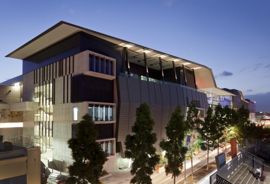
BCEC on Grey Street is a major expansion of the Brisbane Convention and Exhibition Centre (1996), but also a completion of the concept of the original building which was discontinued in 1996 due to a then dispersal of Government funds to other public projects.

The time delay has significantly befitted the overall facility in enabling its elements to meet the changed demands for conventions toward smaller, more boutique and more self-contained venues combining auditoria, meeting and exhibition spaces within discrete parcels.

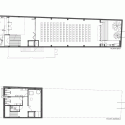
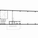
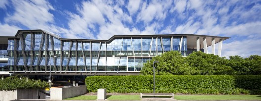
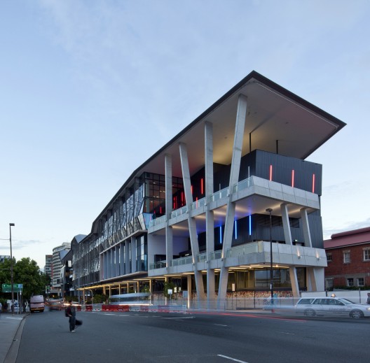
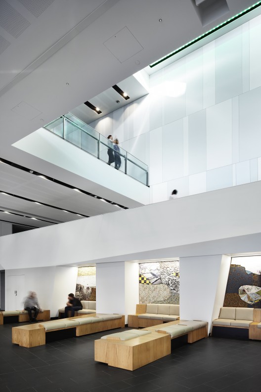
The design albeit by the same architects, does not mimic the original but, reflects the changed functional demands in a new form and expression. This expression also responds to a site some 200 metres long and only 30 metres wide, creating what we refer to as an ‘architectural sentence’ of ‘clauses’ and ‘punctuations’ in both elevation and corresponding roofscape. In this way a previously impoverished portion of Grey Street is enlivened, the building connecting the historical rail station it overlooks with the commercial and hotel heart of South Bank.

Conceptual Framework
The primary philosophical aspirations were to reflect a new age of convention formats than those which prevailed in the 1990s, and to animate an alienated portion of South Bank’s main Grey Street by enlivenment using the concept of an ‘architectural sentence’. The first aspiration meant contrasting with the original BCEC architectural language which our practice had formerly done, and creating a new language in which the functional parts are strongly expressed to the street, and transparently seen to within.

The second aspiration entailed animating an unusually long and narrow site (200m x 30m) with a sequence of undulating roof scales and a series of elevational articulations, comparable to both a sentence in literature or stanza in music. Within the major shifts in language corresponding with part-theatres, foyers, meeting spaces, function terraces – are further articulations, such as visual penetrations to the theatres enabling external outlook from them.

Public and Cultural Benefits
BCEC on Grey Street has helped ‘rescue’ a downgraded yet critical piece of Grey Street that links the city’s cultural centre with the urban heart of South Bank. It has significantly enhanced public safety of the street (as is testified by neighbouring QPAC) through its accessibility and transparency.

It has created a new public access path over the South Bank railway, linking South Bank to West End, and below the railway in a through-corridor which penetrates the original building’s carpark. Most significantly, it has facilitated Brisbane’s ability to stage types of integrated conventions and performances unavailable in any other Australian city, enabling BCEC complex to remain by far Australia’s most successful convention centre commercially and in terms of visitation.

Relationship of Built Form to Context
The strong philosophical approach and architectural resolution of contextual relationship is captured in the above descriptions, including to the street, to the original building it is grafted with, and to the end where it opens out towards.

Program Resolution
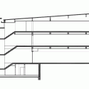
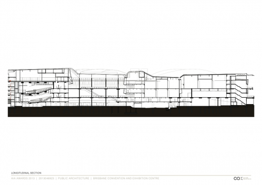
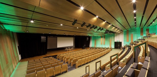
The program primarily resolved the long and cross-section to which the plan responds, rather than the converse. The governing constraints were the elevated railway level and the existing BCEC plaza level. The decisive ‘move’ was the overlapping stacking of the two 600 + 400 seat theatres in such a way as to enable all four functional levels to flexibly access the theatres forming ‘self-contained’ convention/exhibition venues.

Allied Disciplines
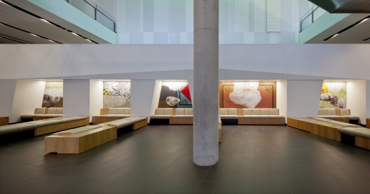
The key collaboration was with the artist Bruce Reynolds who created three series of works generating different historical and geographical interpretations of the South Bank context, one a series of faceted sculptures, one a backdrop of art recesses, and one the ‘cliff’ wall along which people climb (fronting the rail corridor) through a sequence of atrium spaces.

Cost/Value Outcome
The project budget was $140 million. In the words of BCEC’s CEO the value has been expressed as: “Boutique in concept, dramatic in architecture….the opening was a period of frenetic activity with more than 300 event bookings which will deliver $93 million in one year alone to the Queensland economy”. BCEC on Grey Street was responsible for the whole centre recording in 2012 its highest revenue since opening in 1995.

Sustainability
Brisbane Convention and Exhibition Centre is one of only two Australian convention centres with a 5 Star Green Star (Design) rating with the Green Building Council of Australia. It was designed to utilise the energy capacity of the existing Brisbane Convention and Exhibition Centre and does not have any additional water chilling plant. The system also utilises solar hot water generation to not increase energy demands on the convention centre’s existing system. The airconditioning system is tailored to occupation of the multiple boutique spaces such that there is minimal, if any, wastage.

All fixed and loose furnishings are sourced from sustainable and recyclable materials, and a vast underground water tank supplies the Centre’s non-potable water, with excess used for irrigation. As is also evident, the façade system is designed with a woven mesh system of angled solar blades shaped to minimise eastern sun exposure and glare, the western solar exposure being blocked by the existing BCEC and atrium skylights providing filtered daylight to the atrium depth of the centre.

Response to Client and User Needs
Client response is mentioned above. User responses include from the first major convention ‘Antimicrobials 2012’ CEO Geoff Coombs describing in writing BCEC on Grey Street as “the best conference facility we have experienced for its size in the world”, and the ‘SETE APOSE 2012’ CEO Renee Jolly stating: “The layout of the centre was perfect…the rooms and auditoria were easily accessible and flexible for our program of plenary lectures and concurrent meeting sessions”.

Brisbane Convention and Exhibition Centre Expansion / Cox Rayner Architects © Angus Martin Photography Brisbane Convention and Exhibition Centre Expansion / Cox Rayner Architects © Christopher Frederick Jones Brisbane Convention and Exhibition Centre Expansion / Cox Rayner Architects © Angus Martin Photography Brisbane Convention and Exhibition Centre Expansion / Cox Rayner Architects © Florian Groehn Photography Brisbane Convention and Exhibition Centre Expansion / Cox Rayner Architects © Angus Martin Photography Brisbane Convention and Exhibition Centre Expansion / Cox Rayner Architects © Christopher Frederick Jones Brisbane Convention and Exhibition Centre Expansion / Cox Rayner Architects © Florian Groehn Photography Brisbane Convention and Exhibition Centre Expansion / Cox Rayner Architects © Angus Martin Photography Brisbane Convention and Exhibition Centre Expansion / Cox Rayner Architects © Angus Martin Photography Brisbane Convention and Exhibition Centre Expansion / Cox Rayner Architects © Angus Martin Photography Brisbane Convention and Exhibition Centre Expansion / Cox Rayner Architects Plan Brisbane Convention and Exhibition Centre Expansion / Cox Rayner Architects Plan Brisbane Convention and Exhibition Centre Expansion / Cox Rayner Architects Plans Brisbane Convention and Exhibition Centre Expansion / Cox Rayner Architects Plan Brisbane Convention and Exhibition Centre Expansion / Cox Rayner Architects Plan Brisbane Convention and Exhibition Centre Expansion / Cox Rayner Architects Section Brisbane Convention and Exhibition Centre Expansion / Cox Rayner Architects Elevation
20 Jul 05:38

The Courtyard House / AR43 Architects

by Javier Gaete

Architects: AR43 Architects
Location: Singapore, Singapore
Architects: Lim Cheng Kooi, Murphy Wong, David Mok
Area: 646.3 sqm
Year: 2013
Photographs: Albert KS Lim

Structural Engineer: Ronnie & Koh Consultants
Mechanical & Electrical Engineer: Wistec Engineers & Associates
Quantity Surveyor: RJ Consultants
Builder: Bestec Construction

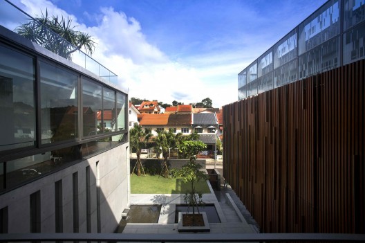
From the architect. Though situated within an exclusive Good Class residential area, the land is surrounded by densely built neighbourhood without much exciting views. The owner, a ‘Hakka’ descendent, envisions to have a large communal home built for his growing family, multiple guests and frequent gathering among the siblings. Inspired by the Courtyard House, a symbolic design feature for the Hakka ethnic similar to the Hakka Walled Village in China, the house is designed to be inward looking for three generations to live under one roof. Moving beyond the intentions of the typical ‘L’-shaped plan, the U shape plan courtyard house provides strongly delineated edges to nearly contain the outdoor space. The primary difference between them is that the plan layout often sets up a visual axis of sight to a focal point, and the arrangement of the plan allows maximum privacy of the indoor and outdoor spaces.

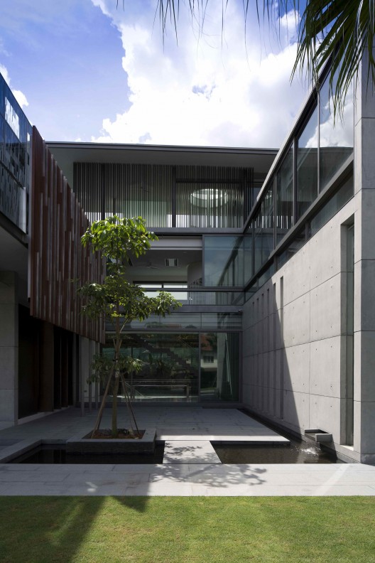
Typically, the principle rooms are arranged around a central courtyard with sunlight and airflow permeating through both sides of each room. A clear separation of living and sleeping spaces can be achieved while allowing all rooms’ direct link to the same external space. In this courtyard house, the designer effectively gave an inward facing design where the ‘U’ – Shaped plan, consisting of 2 wings (East & West) framing the central courtyard that depicts a traditional Hakka Courtyard House. This does not only helps secure the sense of belonging and privacy but also strengthens the visual link between its major internal spaces and outdoor courtyard.

The main entrance is placed strategically, allowing one to be welcomed within the central courtyard before entering the internal space. Still adopting the Hakka architecture concept, the courtyard is treated as part of the room that allows the owner to further extend their activity from indoor to outdoor flawlessly. In the scenario when the owner plays host to a certain event, both the dining room and the living room have the potential to expand by opening itself towards the courtyard. The flexibility and the interchangeable usage of central courtyard reflect the spaces used in traditional Hakka’s courtyard house while the water feature flowing around the perimeter of the courtyard, symbolizes calm and also functions as natural cooling system.

The first level of bungalow. Living room and a cornered powder room are located at the east wing. Dry kitchen, wet kitchen, maid room and bedroom (“mother’s” room) are placed within west wing. East and west wings are bridged by the dining room ( a common meeting point for the traditional Chinese families ). The wood-like screens are located along the living room and the master bedroom is designed to filter the harsh western sun. While on the first level of west wing, the corridor wall leading to the bedroom is deliberately designed with slits for both natural lighting and maintaining the link to the courtyard without compromising the privacy of the mother’s bedroom. The vertical circulations are being located at the South of building. The stairs are treated to be semi-transparent element. By reducing visual impact on the staircase, the designer created an opportunity to strengthen the visual link across from the front courtyard to the dining room and the rear garden.

At the 2nd level, Family room is located on the south bridging between Master bedroom on the east and 3 children’s bedroom suites located on the west. The designer emphasized the master bedroom by cladding the space with semi-transparent fritted glass panels differentiating from the rest which are fortified by the fair face concrete walls. Spiraling up from 2nd level to the roof level, a metal staircase is built in solid pealing ribbon-like balustrade leading upstairs with a skylight over it. A lap pool and the roof garden/terrace are designed on the roof to achieve privacy while enjoying the panoramic view of the entire neighborhood. The greenery and the lap pool are also positioned strategically to help reduce heat absorption and giving a better insulation to the living spaces beneath.

The Courtyard House / AR43 Architects © Albert KS Lim The Courtyard House / AR43 Architects © Albert KS Lim The Courtyard House / AR43 Architects © Albert KS Lim The Courtyard House / AR43 Architects © Albert KS Lim The Courtyard House / AR43 Architects © Albert KS Lim The Courtyard House / AR43 Architects © Albert KS Lim The Courtyard House / AR43 Architects © Albert KS Lim The Courtyard House / AR43 Architects © Albert KS Lim The Courtyard House / AR43 Architects © Albert KS Lim The Courtyard House / AR43 Architects © Albert KS Lim The Courtyard House / AR43 Architects © Albert KS Lim The Courtyard House / AR43 Architects © Albert KS Lim The Courtyard House / AR43 Architects © Albert KS Lim The Courtyard House / AR43 Architects © Albert KS Lim The Courtyard House / AR43 Architects © Albert KS Lim The Courtyard House / AR43 Architects First Floor Plan The Courtyard House / AR43 Architects Second Floor Plan The Courtyard House / AR43 Architects Basement Floor Plan The Courtyard House / AR43 Architects Attic Floor Plan The Courtyard House / AR43 Architects Section The Courtyard House / AR43 Architects Section The Courtyard House / AR43 Architects Elevation The Courtyard House / AR43 Architects Elevation
19 Jul 06:09

SKALGUBBAR / Free 2D Cutout People

by Ronen Bekerman
 SKALGUBBAR / Free 2D Cutout People

You can never have enough 2d cutout people for your renders. A steady supply is needed to avoid repetition and today I stumbled upon this great looking site and resource by Teodor Javanaud Emdén called SKALGUBBAR. It is an online library of free high-resolution cutout images of people for your renderings. Finding people images on the internet was hard so Teodor started to take photos of his friends and they all started to use them in their visualizations.

The quality of the images is very good and Teodor’s friends also pose some unexpected scenarios which is nice for a change. Putting it into a website format motivated further growth of the library and you can also see some of the works being made using this library on the SKALGUBBAR website and a few samples here too (seems like a great way for up-and-coming architects to get into the big firms around the world) :

tumblr mp5zg7YRAx1stuolio1 1280 728x779 SKALGUBBAR / Free 2D Cutout People

Skalgubbar saves the day for Javier Mosquera González and and the win of a cultural center competition in Chapultepec.

tumblr mp5zesysEo1stuolio1 1280 728x421 SKALGUBBAR / Free 2D Cutout People

Skalgubbar saves the day for OMA and their plans for a Miami Beach Convention Center.

tumblr mp5zdkcbTs1stuolio1 1280 728x400 SKALGUBBAR / Free 2D Cutout People

Skalgubbar saves the day for SANAA and their plans for New Downtown Arts & Design Campus in Jerusalem

tumblr mp5z1yjsqd1stuolio1 1280 728x477 SKALGUBBAR / Free 2D Cutout People

Skalgubbar saves the day by helping Envés Arquitectos to win the competition for the New Central Library in Berlin!

It looks good, simple, free and unique – Visit SKALGUBBAR now!

SKALGUBBAR / Free 2D Cutout People is a post from Ronen Bekerman's 3D Architectural Visualization Blog