Shared posts

05 Apr 12:25

Why are back seats so rubbish?

by Yorgos Saslis
Even the most luxurious of back seats… they’re pretty rubbish!

I think cars with 4 seats have a major design flaw everyone ignores:
their back seats. They simply don’t work.

Let’s start with a simple question:

How did you enjoy the last time you took a trip in the back seat of a car?

Chances are it’s not the most memorable experience you’ve had — well, not in a positive way at least — and it’s been exactly the same for me!

Every time I find myself traveling in the back seat of a car, I am truly stricken by the difference in experience for those traveling in the back and those traveling in the front.

Let’s be honest — traveling in the back… sucks!

It’s not a coincidence everybody wants to go in the front seat. In fact, it’s exactly the opposite: there’s even the “shotgun” game (the one where whoever shouts the word “shotgun” first is granted access to the front seat). Young kids want to grow up just so they can sit at the front. Teenagers fight about it. Adults make deals about sharing the burden of traveling in the back (one does it each way). It’s a mess…

As any self-respecting engineer would do when spotting a problem, I also immediately tried generalization: is this just a local or global problem? Is this just a problem with cars, or is it a more general issue with all our means of transport? Are they all designed in a way that some people get a better travel experience than others?

Here’s a quick list I put together:

Bus: all seats are basically as good as one another. People standing are at a clear disadvantage, but I can appreciate the design choice there is to make up more space so as to allow more people on the bus.

Metro: similar situation to the bus. Sitting is fine (most of the times), standing mostly sucks — but same comments as above hold.

Airplanes: pretty much everyone has a crappy experience. It’s tight, everyone is crammed, your legs don’t fit, the person next to you might be drooling on your shoulder, but, hey — at least they go really fast… You can buy better seats in planes though.

Trains: some seats are a little bit better than others, but as long as you have a seat… there’s no striking difference here. Again, you can buy 1st class seats.

So, it seems

… and then… we get to:

Motorcycles: on the contrary to a car, the person on the back of a motorcycle arguably has a better seat than the driver. I am referring to the ones where the back seat is actually higher than the drivers seat.

Here’s how that looks like:

And that makes all the difference!

You see, with this simple — almost unnoticeable you could say — modification, the designers have managed to completely turn the tables on the experience of the back seat.

Where you were stuck looking at the back of a helmet, now you have an almost unobstructed view!

Where you were forced to pick one shoulder to look over, so that you could look left or right, now you can easily turn your head.

The experience of the back seat has been… elevated. : )

And this was done simply by the designer treating the back seat passenger no different than the driver. Because… why shouldn’t they both enjoy the ride the same?

And this brought me to the simple question:

Why can the same thing not happen with cars?
Why can we not have higher back seats in cars?

Now, I am not an expert of any sort on car design, but I have put together a quick drawing of how that would look like:

Unreal drawing skillz

There you have it then folks. No more nauseating rides in the back seat. No more fighting. No arguing. World peace is a tiny step closer. All rejoice!

</end of rant>

09 Nov 22:29

UX Login, Register and Password: The Ultimate Design Guide

The UX of Login and Registration is always painful. Nobody loves registering on a new site by filling forms, check and validate emails, invent new passwords that follow strictly rules.
28 Oct 11:52

LEGO célèbre les « Femmes de la NASA » avec de nouvelles figurines

by Elodie
Les célèbres scientifiques Mae Jemison, Margaret Hamilton, Nancy Grace Roman et Sally Ride, sont à l’honneur chez LEGO avec leur […]
14 Oct 12:03

What if dinosaurs hadn’t died out?

What would have happened to them – and us
14 Oct 12:01

The Outrageous Cost of Skipping TDD & Code Reviews

14 Oct 11:51

How flying messes with your mind

There’s a reason you sniffle at the inflight movie
14 Oct 11:43

Why Do Leaves Change Color?

14 Oct 11:41

Tendances du retail : la technologie au service des magasins et de l'expérience des consommateurs

14 Oct 11:37

The beauty of Go

10 Oct 07:07

Polyethylene Glycol: The Amazing Liquid that Pours Itself [Video]

by Geeks are Sexy

In this video, Youtuber “The Action Lab” showcases a really interesting high-molecular weight polymer that can self-siphon and pour itself our of a beaker. The reason it can do this is because it can be made to have a very high molecular weight. The solution in the video has a MW of 1,000,000 while water has only a MW of about 18.

The solution he used had a MW of 1,000,000. The solution is basically like a molecular sized bowl of string or beads that pull each other out of the beaker once the initial pour has started. Polythylene Glycol is also used as a laxative. It is very slippery feeling like mucus and once it is on your hand it is tough to get off!

[The Action Lab | Via LS]

The post Polyethylene Glycol: The Amazing Liquid that Pours Itself [Video] appeared first on Geeks are Sexy Technology News.

28 Sep 20:11

Yuval Noah Harari : "Soon, books will read you while you are reading them"

by Dominique Leglu
Yuval Noah Harari is the author of Homo deus, a brief history of tomorrow (Albin Michel). He answered by mail a number of questions sent by Sciences et Avenir. See also our Hors-Série "9 Révolutions scientifiques", available since september 28th.
28 Sep 11:17

Main sur le cœur ou genou à terre, que doivent faire les Américains pendant l'hymne national ?

Le week-end dernier, plus d'une centaine de sportifs américains se sont agenouillés durant l'hymne national pour protester contre les propos désobligeants de Donald Trump, à l'égard du quaterba
28 Sep 11:14

Worrying Scientist Interviews

They always try to explain that they're called 'solar physicists', but the reporters interrupt with "NEVER MIND THAT, TELL US WHAT'S WRONG WITH THE SUN!"
27 Sep 20:48

Visual proof of Pythagoras Theorem.pic.twitter.com/MhcjnHdAYi

by (@robertoglezcano)

Visual proof of Pythagoras Theorem. pic.twitter.com/MhcjnHdAYi

27 Sep 20:47

A visual explanation of how compression algorithms work

Compression Decompressedor, Making Things Smaller: A Visual Introduction

Compression is everywhere. It's used to more efficiently store data on hard drives, send TV signals, transmit web pages like this one, stream Netflix videos, package up video games for distribution, the list is endless. Almost no significant area of modern computing exists that doesn't make use of compression technologies.

So what is it?

Whether you've been using desktop compression software for years, or never thought about it at all, this article will try to explain a little of what goes on under the hood when you squash a file or stream a video. We'll look into the answers to the big questions, and probably raise more new ones along the way.

What does it mean to compress something?

How can you make something smaller than it already is?

How do you practically go about doing that?

Let's get to work!

27 Sep 19:47

Twitter passe à 280 caractères : et la France dans tout ça ?

Réalité française et implications business d'un changement majeur sur la plateforme
26 Sep 20:36

The Ten Essentials for Good API Documentation

by by Diana Lakatos

API documentation is the number one reference for anyone implementing your API, and it can profoundly influence the developer experience. Because it describes what services an application programming interface offers and how to use those services, your documentation will inevitably create an impression about your product—for better or for worse.

In this two-part series I share what I’ve learned about API documentation. This part discusses the basics to help you create good API docs, while in part two, Ten Extras for Great API Documentation, I’ll show you additional ways to improve and fine-tune your documentation. 

Know your audience

Knowing who you address with your writing and how you can best support them will help you make decisions about the design, structure, and language of your docs. You will have to know who visits your API documentation and what they want to use it for. 

Your API documentation will probably be visited and used by the following audiences. 

Developers

Based on their skills, experience, and role in projects, developers will generally be the largest and most diverse group. They’ll be using your docs in different ways.

At Pronovix, we started conducting developer portal workshops with our clients to help them learn more about what developers need and how to best support their work—and what they’re really looking for in API documentation. This is also supported by solid research, such as the findings published in Stephanie Steinhardt’s article following a two-year research program at Merseburg University of Applied Sciences.

Newcomers: Developers lacking previous experience with your API tend to need the most support. They will take advantage of quickstart guides that encourage them to start using your API—clear, concise, step-by-step tutorials for the most important topics, and sample code and examples to help them understand how to use it in real projects. If you can make onboarding pleasant for newcomers, they will be more likely to devote themselves to learning every nuance of your API.

External developers: Developers already working with your API will come back repeatedly to your docs and use them as reference material. They will need quick information on all the functionality your API offers, structured in an easy to understand way to help them quickly find what they need.

Debuggers: Developers using your API will encounter errors from time to time and use your documentation to analyze the responses and errors that crop up.

Internal developers: API providers tend to focus so much on their external audience that they forget about their own developers; internal teams working on the API will use the API documentation, as well.

These are just the most common use cases.

Decision makers

Decision makers like CTOs and product managers will also check out your API documentation and evaluate your API. They need to determine whether your API will be a good fit for their project or not, so it’s crucial to your business that this group can easily and quickly find what they’re looking for.

Other audiences

Although not as common, journalists, technical writers, support staff, developer evangelists, and even your competition might read your API documentation. 

Remember the purpose of documentation

The foundation of your API documentation is a clear explanation of every call and parameter.

As a bare minimum, you should describe in detail:

  • what each call in your API does
  • each parameter and all of their possible values, including their types, formatting, rules, and whether or not they are required.

Context-based structure

People won’t read your API documentation in order, and you can’t predict which part they will land on. This means, you have to provide all the information they need in context. So following the best practices of topic-based authoring, you should include all necessary and related information in the explanation of each call.

Context.IO, for example, did a great job documenting each of their API calls separately with detailed information on parameters and their possible values, along with useful tips and links to related topics.

Examples

In order to be able to implement your API, developers need to understand it along with the domain it refers to (e.g., ecommerce). Real world examples reduce the time they need to get familiar with your product, and provide domain knowledge at the same time.

Add the following to the description of each call:

  • an example of how the call is made
  • an explanation of the request
  • sample responses

Studies have shown, that some developers immediately like to delve into coding, when getting to know a new API; they start working from an example. Analysis of eye-tracking records showed that visual elements, like example code, caught the attention of developers who were scanning the page, rather than reading it line by line.  Many looked at code samples before they started reading the descriptions.

Using the right examples is a surefire way to improving your API docs. I’ll explore ways to turn good API docs into great ones using examples in my upcoming post “Ten Extras for Great API Documentation”.

Error messages

When something goes wrong during development, fixing the problem without detailed documentation can become a frustrating and time-consuming process. To make this process as smooth as possible, error messages should help developers understand:

  • what the problem is;
  • whether the error stems from their code or from the use of the API;
  • and how to fix the problem.

All possible errors—including edge cases—should be documented with error-codes or brief, human-readable information in error messages. Error messages should not only contain information related to that specific call, but also address universal topics like authentication or HTTP requests and other conditions not controlled by the API (like request timeout or unknown server error).

This post from Box discusses best practices for server-side error handling and communication, such as returning an HTTP status code that closely matches the error condition, human-readable error messages, and machine-readable error codes.

Quickstart guide

Newcomers starting to implement your API face many obstacles:

  • They are at the beginning of a steep learning curve
  • They might not be familiar with the structure, domain, and ideas behind your API
  • It’s difficult for them to figure out where to start.

If you don’t make the learning process easier for them, they can feel overwhelmed and refrain from delving into your API. 

Many developers learn best by doing, so a quickstart guide is a great option. The guide should be short and simple, aimed at newcomers, and list the minimum number of steps required to complete a meaningful task (e.g., downloading the SDK and saving one object to the platform). Quickstart guides usually have to include information about the domain and introduce domain-related expressions and methods in more detail. It’s safest to assume that the developer has never before heard of your service.

Stripe’s and Braintree’s quickstart guides are great examples; both provide an overview of the most likely tasks you’ll want to perform with the API, as well as link you to the relevant information. They also contain links to contact someone if you need help.

Tutorials

Tutorials are step-by-step walkthroughs covering specific functionality developers can implement with your API, like SMS notifications, account verification, etc.

Tutorials for APIs should follow the best practices for writing any kind of step-by-step help. Each step should contain all the information needed at that point—and nothing more. This way users can focus on the task at hand and won’t be overloaded with information they don’t need.

The description of steps should be easy to follow and concise. Clarity and brevity support the learning process, and are a best practice for all kinds of documentation. Avoid jargon, if possible; users will be learning domain-related language and new technology, and jargon can instill confusion. Help them by making all descriptions as easy to understand as possible. 

The walkthrough should be the smallest possible chunk that lets the user finish a task. If a process is too complex, think about breaking it down into smaller chunks. This makes sure that users can get the help they need without going through steps they’re not interested in.

Screenshot of Twilio's tutorials page
Twilio’s tutorials explain the most-likely use cases with sample apps in a wide variety of programming languages and frameworks.

Universal topics

To implement your API, there are some larger topics that developers will need to know about, for example:

  • Authentication. Handled differently by each type of API, authentication (e.g., OAuth) is often a complicated and error-prone process. Explain how to get credentials, how they are passed on to the server, and show how API keys work with sample code.
  • Error handling. For now, error handling hasn’t been standardized, so you should help developers understand how your API passes back error information, why an error occurs, and how to fix it.
  • HTTP requests. You may have to document HTTP-related information as well, like content types, status codes, and caching.

Dedicate a separate section to explaining these topics, and link to this section from each related API call. This way you can make sure that developers clearly see how your API handles these topics and how API calls change behavior based on them. 

Layout and navigation

Layout and navigation are essential to user experience, and although there is no universal solution for all API docs, there are some best practices that help users interact with the material.

Dynamic layout

Most good examples of API documentation use a dynamic layout as it makes navigation easier for users than static layouts when looking for specific topics in extensive documentation. Starting with a scalable dynamic layout will also make sure you can easily expand your docs, as needed.

Single page design

If your API documentation isn’t huge, go with a single page design that lets users see the overall structure at first sight. Introduce the details from there. Long, single page docs also make it possible for readers to use the browser’s search functionality.

Screenshot of Stripe's API reference page
Stripe managed to present extensive documentation in an easy to navigate single page.

Persistent navigation

Keep navigation visible at all times. Users don’t want to scroll looking for a navigation bar that disappeared.

Multi-column layout

2- or 3-column layouts have the navigation on the left and information and examples on the right. They make comprehension easier by showing endpoints and examples in context.

Screenshot of Clearbit's API reference page
Clearbit’s three-column layout displays persistent navigation (table of contents) on the left, references in the middle, and code examples on the right.

Syntax highlighter

Improving the readability of samples with syntax highlighting makes the code easier to understand.

Screenshot of Plaid's API documentation page
The syntax highlighter in action on Plaid’s API documentation site.

If you’d like to start experimenting with a layout for your docs, you might want to check out some free and open source API documentation generators.

To learn about the pros and cons of different approaches to organizing your API docs in the context of developer portals, this is an excellent article by Nordic APIs.

Editing

All writing that you publish should go through an editing process. This is common sense for articles and other publications, but it’s just as essential for technical documentation.

The writers of your API docs should aim for clarity and brevity, confirm that all the necessary information is there, and that the structure is logical and topics aren’t diluted with unnecessary content. 

Editors should proofread your documentation to catch grammar mistakes, errors, and any parts that might be hard to read or difficult to understand. They should also check the docs against your style guide for technical documentation and suggest changes, if needed.

Once a section of documentation is ready to be published, it’s a good idea to show it to people in your target audience, especially any developers who haven’t worked on the documentation themselves. They can catch inconsistencies and provide insight into what’s missing.

Although the editing process can feel like a burden when you have to focus on so many other aspects of your API, a couple of iterations can make a huge difference in the final copy and the impression you make.

Keep it up-to-date

If your API documentation is out of date, users will get frustrated by bumping into features that aren’t there anymore and new ones that lack documentation. This can quickly diminish the trust you established by putting so much work into your documentation in the first place.

When maintaining your API docs, you should keep an eye on the following aspects:

  • Deprecated features. Remove documentation for deprecated features and explain why they were deprecated.
  • New features. Document new features before launch, and make sure there’s enough time planned for the new content to go through the editorial process.
  • Feedback. Useful feedback you get from support, or analytics should be reflected in your docs. Chances are you can’t make your docs perfect at the first try, but based on what users are saying, you can improve them continuously.

For all this to work, you will have to build a workflow for maintaining your documentation. Think about checkpoints and processes for the above mentioned aspects, editing, and publication. It also helps if you can set up a routine for reviewing your docs regularly (e.g. quarterly).

Following these best practices, you can build a solid foundation for your API documentation that can be continuously improved upon as you gain more insight into how users interact with them. Stay tuned for part two, where I give you some tips on how to turn good API docs into amazing ones.

26 Sep 20:15

A quoi ressemblerait la Smart City de demain grâce à l’Internet des Objets ?

by Yassir Sennoun

Contexte

Source: Econocom

Près de la moitié de la population mondiale vit dans les villes et ce chiffre passera à 70% à l’horizon de 2050. En outre, ces mêmes villes qui ne représentent que 2% de la surface du globe produisent à elles seules 80% des émissions de gaz à effet de serre. Il est évident que ce rythme ne peut perdurer, il est par conséquent crucial de transformer le fonctionnement classique des villes d’aujourd’hui pour répondre aux enjeux énergétiques, de mobilité, sociaux, sécuritaires et environnementaux de demain. Cette transformation doit se caractériser par l’optimisation des coûts, de l’organisation et avant tout du bien-être de ces habitants en termes de confort et de sécurité. C’est ce qu’on appelle une ville intelligente ou « Smart City » en anglais.

Une transformation se base sur l’utilisation d’un ensemble de données. Dans le cadre d’une ville, les données sont celles des équipements (caméra, panneau de signalisation, poubelle…) qui donnent en temps réel des informations sur l’état d’une ville. Afin de déclencher de façon automatique des actions pertinentes pré-établies par un opérateur il est nécessaire de collecter ces données. L’Internet des Objets, noté IoT (dont le principe est décrit dans l’article suivant), apporte des solutions techniques à bas coût pour connecter les équipements. On voit donc que l’IoT constitue un formidable outil de transformation d’une ville en Smart City.

Les principaux axes de transformation, pour atteindre cet objectif de Smart City, portent sur les thématiques suivantes :

–  Énergie: une meilleure optimisation entre consommation et distribution de l’électricité, eau et gaz, c’est ce qu’on appelle le Smart Grid
–  Mobilité : une meilleure fluidité et sécurité dans la circulation automobile, une meilleure gestion des transports en commun et des zones de stationnement, il s’agit du Smart Mobility
–  Infrastructure : une meilleure gestion des ressources et de la sécurité des bâtiments, c’est ce qu’on appelle le Smart Building
–  Environnement: une agriculture plus saine et respectueuse de l’environnement, une prévention des catastrophes naturelles, une meilleure prévention des fuites d’eau. C’est le Smart Environment

Smart Grid

Les Smart Grid (réseaux intelligents) sont des réseaux électriques qui, grâce aux technologies de l’information, ajustent les flux d’électricité entre fournisseurs et consommateurs. En collectant des informations sur l’état du réseau, les smart grids contribuent à une adéquation entre production, distribution et consommation. En effet, des équipements de communications dit « Smart Meters », mesurent et communiquent les données à un centre de contrôle qui connaît en temps réel le niveau de consommation et de production d’énergie. Par la suite, avec des algorithmes d’optimisation (notamment de Machine Learning) il est alors facile d’optimiser la production et la distribution d’énergie (électricité, eau et gaz). L’image suivante expose ce principe concernant la production et la consommation d’électricité.

Source: Économie numérique

Exemples:

  • En France, le projet Linky mené par Enedis (anciennement ErDF) déploie son réseau de compteurs électriques intelligents (Smart Meters). L’objectif est de remplacer 90 % des anciens compteurs dans 35 millions de foyers en France d’ici 2021. Chaque smart meter communique avec une passerelle qui, après avoir collecté les données, les transmet via internet au centre de contrôle. La communication entre le smart meter et la passerelle se fait soit par CPL (Courant Porteurs en Ligne) en utilisant le protocole de communication G3-PLC ou PRIME soit par une technologie radio.

Compteurs Linky (un triphasé à gauche et un monophasé à droit). Source: cpchardware

  • Pour le gaz, GrDF déploie également son réseau de compteurs intelligents dans le cadre du projet Gazpar. Contrairement au compteur électrique, ce dernier communique à partir d’une technologie radio pour éviter les risques d’incendies qui pourraient être causés par un court-circuit.

Compteur Gazpar. Source: Engie

Dans un registre similaire, la gestion de l’éclairage public est aussi une grande problématique en terme de gestion électrique mais aussi de maintenance. En effet, il est important de pouvoir moduler l’éclairage en fonction des heures de la nuit et de détecter plus rapidement une panne ou une anomalie sur un lampadaire (par exemple l’usure de l’ampoule).

Source: Billion

Exemple:

  • Depuis plusieurs années la ville de Lyon, dans le cadre de son projet Smart Lighting, mène plusieurs expérimentations sur le sujet.

Smart Mobility

La Smart Mobility correspond à une gestion de la circulation plus optimisée en proposant aux usagers un calcul d’itinéraire en fonction de l’état de la circulation. Elle permet également de remonter des alertes d’incidents (comme des accidents) pour alerter les automobilistes, mais aussi les opérateurs afin de déclencher une intervention rapide.

Exemple:

  • La société Colas mène actuellement des expérimentations pour développer un capteur de détection de verglas et de détection de chocs sur les barrières d’autoroute. Dans le premier cas, cela permettrait à la fois d’alerter les automobilistes des zones de verglas et aux municipalités d’optimiser la tournée des saleuses. Dans le second cas, cela permettrait de détecter un accident de la route et de déclencher rapidement une intervention de secours.

La qualité des transports en commun sera grandement améliorée grâce à l’internet des objets. En effet, il sera alors possible de prévenir les pannes et les anomalies, d’optimiser la disponibilité des trains, bus et tramway en fonction du nombre d’usagers et d’améliorer le confort et la sécurité des usagers (plus d’espace, temps d’attente réduits au maximum, plus de surveillance et d’interventions ciblés).

Exemples:

  • Sur les réseaux ferroviaires de la SNCF, les ruptures de caténaires se font de façon inattendue et régulière, ce qui provoque de lourds retards pour ses usagers. C’est pourquoi la SNCF souhaite prévenir et détecter rapidement ces ruptures. Elle a donc lancé le projet Surca qui a pour but d’installer des capteurs sur les caténaires. Ces derniers émettent des données relatives à la tension mécanique du caténaire. Il est alors possible pour la SNCF de monitorer constamment l’état de la tension, et d’émettre une alerte en cas de variation.

Un capteur connecté et un caténaire. Source: SNCF

  • Dans le même esprit, il est aussi possible de monitorer l’état des rails pour mesurer des variations trop importantes de température ou des chutes de branches d’arbre. La SNCF tente également d’améliorer le confort des usagers en installant des capteurs à l’intérieur des wagons afin de prévenir et de détecter des pannes de climatiseurs ou des toilettes défectueuses.

L’internet des objets permet également de gérer plus efficacement la disponibilité des zones de stationnements, c’est ce qu’on appelle le Smart Parking. En effet, un capteur est placé sur chaque place de parking afin de détecter si un véhicule est présent ou non. Le capteur envoie via une technologie radio la donnée à un centre de contrôle qui détermine en temps réel l’état d’occupation des zones de stationnement. Ce qui offre la possibilité aux automobilistes, à partir d’une application, de réserver une place de parking libre.

Modélisation du Smart Parking. Source: Libelium

Exemple:

  • Depuis 2016 à Issy-les-Moulineaux , une expérimentation de Smart Parking est menée en collaboration avec les sociétés Colas et Bouygues Telecom.

Smart Building

Le Smart Building peut être défini comme étant le modèle de bâtiment à la fois intelligent et connecté, c’est-à-dire équipé de composants capables d’échanger des informations entre eux, de réagir aux sollicitations de l’environnement extérieur, d’effectuer des économies d’énergies, d’assurer une meilleure sécurité et d’améliorer le bien-être et le confort des personnes présentes.

Exemple:

  • La société Simfony a développé une solution basée sur la technologie LoRaWAN pour le Smart Building. Le kit inclut une passerelle et des capteurs qui mesurent les conditions d’environnement telle que la qualité de l’air intérieur, la présence, la luminosité et l’ouverture et fermeture de portes/fenêtres.

Source: Simfony

Smart Environment

Comme nous l’avons vu plus haut, le Smart Grid apporte des solutions pour l’optimisation de la gestion énergique. En outre, il apporte des solutions pour la préservation de l’environnement car il permet l’introduction de façon plus efficace de sources d’énergies renouvelables et propres tels que les énergies solaire, éolienne, hydrolienne.

La qualité de l’air est une des préoccupations des villes d’aujourd’hui, les pics de pollution (principalement d’origine industrielle et automobile) sont de plus en plus fréquents et leur impact sur la santé des hommes et le changement climatique est désormais avéré. En effet, selon L’OMS, le risque de maladies respiratoires augmente en fonction de la pollution atmosphérique et celle-ci est même responsable de 9% des décès en France. Il est par conséquent urgent de développer des solutions pour prédire et empêcher ces pics en déclenchant des mesures adéquates telle que l’interdiction de circulation de certaines voitures polluantes. Une solution viable consiste à répartir dans toute une ville des milliers de capteurs radio. Chaque capteur mesure et communique régulièrement le niveau de CO2 mais aussi d’autres informations comme la température, l’humidité, la pression atmosphérique, les niveaux de bruit et de luminosité. Grâce à toutes ces informations, un opérateur est en mesure de cartographier la qualité de l’air sur l’ensemble de la ville et de déterminer à l’avance des pics de pollution.

Modélisation de la mesure de la pollution. Source: Factorysystemes

Un réseau de distribution d’eau au sein d’une ville est fait de milliers de kilomètres de tuyauteries, les risques de fuite d’eau et de contamination sont ainsi très grands et très difficiles à détecter. L’internet des objets permet à un opérateur tel que Véolia de monitorer son réseau grâce à un ensemble de capteurs qui remonte des données sur le débit d’eau et la présence de certaines substances. Ainsi, l’opérateur est capable de détecter et de localiser une fuite ou une contamination.

Un exemple de perte importante d’eau. Source: Blog-Habitable-Durable

Exemple:

  • La société Véolia a inauguré en 2016 « Vig’iléo », un nouveau centre de pilotage intelligent du réseau d’eau de la ville de Lille. Plus de mille capteurs ont été déployés sur les 4300 km de ce réseau.

Dans la gestion des ordures ménagères, il est également possible d’apporter des solutions pour sauvegarder l’environnement et améliorer le confort des habitants. En effet, des poubelles connectées permettent de connaître à distance leur niveau de remplissage. Par conséquent, en fonction de ces niveaux il est possible d’optimiser la tournée des bennes à ordures ménagères.

Exemple:

  • La société Véolia s’est associée avec la société Huawei pour interconnecter les poubelles du monde.

Selon l’ONU, la population mondiale continuera à augmenter pour atteindre le nombre de 9,8 milliards en 2050. L’agriculture, qui constitue la base de la production de nos aliments, ne pourra pas alimenter toute cette population avec les méthodes actuelles. Il faudra optimiser l’utilisation de l’eau, déterminer plus finement les meilleurs dates de collectes et de semences, contrôler la qualité des sols, prévenir des risques de pollution et d’incendies… On se rend facilement compte qu’avec un outil d’aide à la décision, qui se base sur l’ensemble des données mesurées par des capteurs connectés, un agriculteur peut ainsi effectuer des actions adaptées. Il sera alors possible de produire plus efficacement tout en respectant l’environnement.

Exemple:

  • L’assureur Groupama dirige actuellement des expérimentations en direction des agricultures pour développer des applications de prévention des incendies des fourrages et de gestion raisonnée de la ressource en eau.

Conclusion

Les différentes sections et exemples nous ont offert un panorama des villes de demain. Et, cela grâce à l’Internet des Objets qui apporte des solutions concrètes aux problématiques des villes d’aujourd’hui. En outre, le potentiel de l’IoT est grand, ce qui pourra faire naître de nouveaux projets encore plus innovants et stimulants.

Liens utiles

http://blog.xebia.fr/2016/02/26/linternet-des-objets-2-connecter-vos-capteurs-aux-reseaux-iot/
https://www.opendatasoft.fr/2016/04/29/cest-quoi-la-smart-city-une-introduction-a-la-ville-intelligente/
https://www.digital.sncf.com/actualites/internet-des-objets-iot-voyage-au-coeur-de-la-donnee-industrielle-sncf
http://www.usine-digitale.fr/article/lorachallenge-et-les-gagnants-sont.N489679


26 Sep 20:11

The 7 stages of becoming a Go programmer

by lestrrat
The 7 stages of becoming a Go programmer

One day at work, we were discussing the Go programming language in our work chatroom. At one point, I commented on a co-worker's slide, saying something along the lines of:

"I think that's like stage three in the seven stages of becoming a Go programmer."


read more
20 Sep 21:58

Fly Me: It’s 2017, so why are flight attendants still being sexualized?

I’m a flight attendant. My job is to make sure passengers get from point A to point B as safely as possible, which is why I’ve been trained to handle any number of emergency situations, the kind that airlines don’t want you to think about when you’re in the air. This is why airlines create silly safety videos starring Mr. Bean or a squad of bikini-clad Sports Illustrated models. Airlines want to make you forget why I’m here, really here.

Maybe it’s because of my job that I see things most people don’t see. Take “Star Wars: The Force Awakens.” When I saw it last year, I became fixated on Rey’s long flowing vest. She wore it belted at the waist. It was pretty, maybe a little too pretty for someone who kicks ass swinging a light saber. What if it got stuck under a Storm Trooper’s boot? What if Kylo Ren wrapped it around her neck?

I applauded when Rey ditched the flowing vest in the last five minutes of the film. It just so happened to coincide when she became an official Jedi.

“Young girls can look at her and know that they can wear trousers if they want to,” Daisy Ridley, the actress who played Rey, told Elle in 2015. “That they don’t have to show off their bodies.”

Why am I talking about pants? Because some people have very strong feelings about flight attendants who wear them. In a magazine I read years ago, a bigwig working for an international Asian carrier was quoted stating, “Passengers wouldn’t dare yell at a flight attendant wearing a dress.” (Actually, they would, but that’s another matter.)

Asiana told the Seattle Times that its skirts-only policy was meant to emphasize the company’s brand of “high-class Korean beauty.”

“Aesthetic elements such as the appearance of female flight attendants are part of its service for passengers and an essential tool for staying competitive.”

When Asiana Flight 214 crash landed in San Francisco, photos surfaced of a petite Asiana flight attendant giving passengers piggyback rides to safety. I wonder if any of the passengers she carried had strong feelings about whether she wore pants or a skirt? What about eyeglasses? I ask because in 2013 Asiana’s female flight attendants fought for the right to wear pants (and eyeglasses), and actually won. Of course male flight attendants didn’t have to join the fight since they could always wear glasses.

Yet it seems the historically sexist industry still has strong feelings about how some flight attendants should look. Female cabin crew with British Airways Mixed Fleet finally won the right to wear trousers about a year ago — after a two-year dispute. Actually, they won the right to request to wear trousers. The right to ask their manager if it’s okay to wear them; God forbid they just put them on.

Virgin Atlantic, likewise, reviews requests to wear trousers on a case-by-case basis, with skirts the norm.

At Etihad, in 2015, the opposite occurred when the second largest carrier in the UAE took away uniform pants as an option for female crew members.

Ryanair has yet to make trousers available, although since last year its female crew are no longer encouraged to pose in bikinis for an annual calendar, so that’s something.

Then there are airlines like ViaJet who skip the bikinis and go straight for lingerie-clad models in ads to promote business. Nothing says let me help with your seat belt (wink wink) quite like women posing in the aisle wearing nothing but a pair of panties and a bra with red thigh-highs and heels.

Then there’s the issue of age. At airlines like Emirates and Qatar, rarely anyone gets hired over the age of 30. Those who do are offered contracts that often don’t get renewed. Meanwhile pilots, most of whom are male, aren’t subjected to the same age and weight limitations.

You know what else male pilots don’t have to do? Take pregnancy tests before they get hired. Iberia Airlines was recently fined for requiring flight attendants to take pregnancy tests before they’re hired.

Iberia isn’t alone. The CEO for Qatar Airways Akbar Al Baker recently bragged that the average age of his cabin crew was 26. Then he made fun of U.S. airlines by reminding people that passengers on American Airlines were being served by grandmothers. The room erupted in laughter. I wasn’t surprised by Al Baker’s comment, I know how he feels about women and human rights, but hearing laughter from international reporters covering the event was disappointing.

Qatar doesn’t have the best track record when it comes to women. In 2015, it announced it would no longer fire women for getting married or pregnant within the first five years of employment. There isn’t any maternity or paternity leave at Qatar. An earlier contract said women must notify the airline as soon as they know they are pregnant and Qatar would then be free to terminate the contract. Failure to admit pregnancy or attempts to conceal it would be a breach of contract.

The current contract has improved a little. It maintains the airline’s right to terminate pregnant women’s contracts, but says they can apply for ground positions if available. That’s a big IF. According to The Guardian in 2015, 80 percent of Qatar Airways cabin crew are women.

THIS is how they keep cabin crew young. This is why Qatar can brag about the average age of crew and poke fun at American carriers. Because in America we have the same human rights as passengers. Thank God for that.

What’s behind this blatant and pervasive sexism? My guess is that it has to do with keeping the sexual coffee-tea-or-me fantasy alive — as dictated by mostly male executives who run these airlines.

Melanie Brewster, an assistant professor of psychology and the co-founder of the Sexuality, Women, & Gender Project at Columbia, told Yahoo earlier this year that flight attendant uniforms were an example of “a long history of women having to ‘suck up’ pain and discomfort in order to adhere to unrealistic cultural norms.”

“Women who are in historically sexualized occupations (i.e., flight attendants, hostesses, waitresses, fashion models) are some of the easiest to objectify because their jobs put them on display for consumption,” Brewster said.

Maybe that explains why once when I was tweeting about fatigue and the short, 8-hour layovers my airline forces us to endure, a complete stranger suggested I spent too much time shopping for shoes on my layovers.

Shopping.

When men write about fatigue do you think people assume they’re really tired because they were shopping for shoes? I doubt it. When you have what looks like a fun-time sexy job, people don’t think twice about making disrespectful comments. Even women make sexist remarks.

That or they tell you to quit. That’s what one aviation blogger told me to do because I didn’t seem happy. Because I didn’t tweet happy things anymore. Unfortunately I have a lot of important things to write about. Take my uniform, for instance. For almost a year now, I’ve been tweeting a lot of “unhappy things” about the new uniforms that American Airlines introduced last year for crew members.

Toxic chemicals in the new uniform made me sick. It also sickened 5,000 of my co-workers, just like a similar uniform sickened flight attendants at Alaska Airlines several years ago.

The media has barely reported it. I’ll be tweeting about the uniform and get private messages from journalists at big news sites asking me questions about why we have ash trays on nonsmoking flights. That or magazines are looking for my Top-10 makeup tips or packing tricks. About six months into the uniform crisis, I started to get angry. One day I tweeted something about the media being sexist. A reporter sent me a message saying he had tried to write about the uniform crisis, but his colleagues chalked it up to “just a bunch of women moaning.”

Never mind the fact that it’s not only women flight attendants who have been affected by this. It’s rampers and pilots and agents and every work group that must wear the uniform. But you wouldn’t know that based on what most of the journalists who have covered our story have written. In 2011 Jezebel wrote about Virgin America flight attendants who were suffering reactions from their new uniforms. The headline read: New Sexy Uniforms Give Flight Attendants Sexy Rash. Have you ever seen a sexy rash? Me neither. Which is why I bashed the media for being sexist in an article I wrote that focused on my uniform and how it’s affecting my health.

Over 5,000 people at American Airlines are experiencing all kind of symptoms from toxic chemicals that are in the uniform. The uniform has been treated with chemicals to make it durable. If removing a single olive from every salad saved my airline $40,000 a year, imagine how much they’d save if they didn’t have to issue replacement skirts at their cost.

Meanwhile Doug Parker, our CEO, continues to remind the news media how much everyone likes the way the uniform looks, even though 1 out of 10 flight attendants are suffering, even as that number continues to rise. Name another CEO who can get away with making people sick by focusing on looks over health?

These chemicals do make the uniform look good, I’ll give him that. The same chemicals that make it possible to wash a uniform in a hotel sink and still look great has caused many of my coworkers to have bloody noses, eye infections that don’t respond to antibiotics, flu-like symptoms and sky-high heart rates. It messed with my thyroid function. It’s affecting many flight attendants’ menstrual cycles.

I’ve seen rashes that look more like chemical burns. I don’t care how hot you might be, nobody looks good when it looks like someone threw acid on your face. But you won’t read any of that anywhere because, well, it doesn’t follow the sexy script the media likes to report. A few sites that HAVE covered what’s going on did an excellent job at sexualizing a health crisis. For the record, I’ve never called my uniform sexy, but you probably wouldn’t know that based on some of the headlines.

“In many professions where a uniform is required, as is the case for the flight crews of commercial airlines, these clothing choices reflect a “tacit expectation … either look ‘sexy’ at work, or find another job,” Brewster told Yahoo.

Funny. That’s exactly where I’m at now. Wear a uniform that makes me sick or find another job.

I love my job, and I’m good at it. But it’s trying to work in an industry where my appearance is prioritized — even to the point of making me sick. What’s just as bad as that is nobody cares. Why? I don’t know. Maybe because I’m just a flight attendant, a flight attendant over the age of 26 who is married and also a mother. By the way I wear eyeglasses at night. I prefer pants on my days off. No wonder the media is silent.

Will the Force ever awaken? Like, for more than five minutes?

20 Sep 21:45

Ouragan, tempête, typhon : pourquoi leur donne-t-on un prénom ?

Alors que la saison des ouragans bat son plein, deux interrogations surgissent : qui baptise ces dépressions climatiques et pourquoi ? Retour sur une tradition très codifiée, datant de la moiti
17 Sep 13:29

The orphaned program

by CommitStrip

25 Aug 23:32

Mille milliards de mille bises

by Romy Têtue

Je déteste tellement faire la bise au travail que j'ai envoyé un message à tous mes collègues pour le dire…

Premier jour de boulot. La personne qui m'accueille me claque la bise. Et chacun·e après lui. C'est le genre de boîte moderne où l'on ne reste pas engoncé en tailleur et costard-cravate à se serrer la main de loin avec le sourire convenu, comme sur les photos des banques d'images. Ici on se fait donc la bise, carrément. Effectivement, entre le serrage de main et la bise, nous n'avons guère d'autre choix en France.

Toute nouvelle, fraîche et dispose, de retour de vacances bien dépaysantes, je me plie au rituel local. Nous faisons le tour des bureaux et smack, smack… C'est gentil, mais ça commence à faire beaucoup. Je pressens qu'il est de mise, ici, de prendre le temps de saluer ses collègues chaque matin. Et que j'en aurai également envie, car l'ambiance est effectivement chaleureuse. Mais comment vais-je leur faire comprendre que je n'apprécie pas la bise, alors que c'est la coutume ici ?

Il est toujours extrêmement difficile, lorsqu'on arrive dans un nouvel endroit qui a déjà ses habitudes, de prétendre y déroger…

Je tarde à rédiger mon mail de présentation. Vous savez, ce tout premier message, que l'on envoie à toute la boîte, pour se présenter… Exercice toujours difficile pour moi. Tellement, que j'appelle les ami·es à l'aide, urgemment. Les voici qui biffent et commentent en direct mon texte, via Framapad, c'est rigolo. Ça m'est d'autant plus difficile à rédiger que m'est venue l'idée d'y prévenir que je n'aime pas la bise. Après tout, c'est le moment. Plus je tarde, plus il sera difficile de rectifier, après avoir laissé l'habitude s'installer, et ce sera pénible de le répéter à chaque personne, l'une après l'autre, individuellement, chaque matin… Voici donc ce que j'écris :

« Ah, j'oublie un détail, mais qui a sa petite importance : en réalité je déteste la pratique de la bise au boulot. Ça complique la vie de tout le monde (quand on va trinquer, OK, et plus si affinité — notez que j'adore les hugs — mais pas au boulot). Je vous propose donc le salut à la japonaise, à l'indienne, le check, le give me five, le sourire radieux à la cantonade… ou tout simplement la bonne vieille poignée de main qui met tout le monde à égalité, sans prise de tête :) »

Je doute. Est-ce vraiment une bonne idée d'envoyer cela à mes plus de 400 nouveaux collègues ? Au risque de passer pour une mégère rabat-joie dans cette boîte particulièrement cool ? Ça ne peut pas être pire que de me forcer chaque matin ! Un rapide calcul m'effraie définitivement : ne rien dire m'engage à des bises par milliers (422 salarié·es x 2 bises x 250 chaque matin x N années = pfiou…), perspective qui m'indispose tellement que j'ai déjà envie de repartir. Et si je m'installais plutôt à mon compte, pour avoir la paix ? Si je veux tenir bon dans la durée ici, il ne faut pas que je me taise.

Je reste longtemps le doigt suspendu au-dessus du bouton d'envoi. Après tout, révéler cela de ma personnalité, reste dans l'esprit du message de présentation. Je prends une grande inspiration. Il faudra bien faire, eux comme moi, avec cette Romy qui ne bise pas. Clic. C'est parti.

Je regrette aussitôt, me remémorant certaines réactions de collègues par le passé. C'est relou. Vraiment relou. Passé un certain temps où la distance est respectée, y'a celui qui décrète : « wé, mais c'est bon, maintenant on se connaît ! » et te la claque, sans se préoccuper un instant de ta préférence. Le respect du consentement, c'est vraiment pas leur truc, aux mecs. Y'a celle qui se ravise sur le tard : « ah oui, c'est vrai, toi tu fais pas la bise » et qui tourne aussitôt les talons, ne sachant pas comment saluer autrement, ce qui la condamne à t'ignorer la plupart du temps. Celle qui te veut du bien : « Hey détends-toi ! Regarde, moi, je fais la bise à tout le monde et y'a pas de problème ! ». L'autre qui fanfaronne : « aujourd'hui je suis rasé, je peux donc t'embrasser pour une fois : je suis tout doux ! Tiens, vérifie ! » et continue son tour des bureaux pour bisouiller tout l'effectif féminin. Celleux qui entreprennent de t'expliquer combien tu manques de coolitude : « moi je préfère la bise. C'est moins hautain. » Le pire : « Tu peux pas renier ta féminité : c'est comme ça, les filles, on leur fait la bise épicétou ! » Jusqu'au manager qui, sans explicitement parler de bise, t'invite à faire « des efforts, pour mieux t'intégrer »…

Au point que tu ne sais plus ce qui est pire entre supporter la réprobation sociale ou le rituel gluant. Et que tu y cèdes parfois, pour avoir la paix. Combien de milliers de bises ai-je ainsi échangé à contre-cœur, avec parfois de parfaits inconnus ? Suis-je condamnée à continuer ainsi jusqu'à la fin de mes jours ? Jusqu'à mille milliard de mille bises ?

L'expérience m'a appris que je préfère encore subir la désapprobation que d'abandonner mes joues — hey, c'est mon corps à moi, hein — sans en avoir envie. Nouvel emploi, nouveaux collègues, je prends le pari d'un nouveau départ. Quand bien même ce serait vain. Car ce n'est rien moins qu'une coutume nationale. Mais qui ne tente rien n'a rien.

Le mail est parti. Mon doigt est encore sur le bouton. Apnée. Je reprends mon souffle. Advienne que pourra.

Le lendemain matin, je retrouve mes nouveaux collègues devant l'ascenseur. Je n'en mène pas large, avec mon mail de présentation que j'imagine déjà lu par tout le monde, m'annonçant revêche jusqu'à Sydney et São Paulo. Inévitablement, l'un d'eux s'avance pour m'embrasser. Malgré ma détermination, je n'ai pas le temps de réagir qu'un autre l'arrête, lui barrant le torse de son bras : « nan, elle ne fait pas la bise », avant de me saluer gentiment en souriant. Et je ressens soudain, sans doute pour la première fois au boulot, ce petit sentiment qui change tout, d'être à ma place.

La scène se répète plusieurs fois les jours suivants et chacun·e s'efforce, bon gré mal gré, de trouver une autre modalité de salutation avec moi. Celui-ci me tope la main, celle-là me la serre tout simplement, j'échange un « namasté » avec celui qui connaît aussi l'Inde, des sourires radieux avec ma manager, un « salut » jovial avec mon équipe… Le salut sans contact l'emporte, apportant un trésor de sourires, beaucoup topent, celui-ci y ajoute un claquement de doigts à sa façon, cet autre un léger coup de coude, celle-ci un coup de hanche, cet autre préfère cogner les poings fermés, celui-là termine en levant le pouce…

Teacher Has Personalized Handshakes With Every Single One of His Students -
abcNEWS

Avec cette diversité de salutations, qu'il me faut faire l'effort de retenir — comme ce professeur américain qui a fait le buzz parce qu'il prend le temps de saluer chaque élève de sa classe de façon personnalisée — c'est toute une richesse de personnalités différentes qui s'offre à moi. Et je reste stupéfaite du nombre de personnes qui, non seulement a lu mon message, mais s'en souvient et m'identifie comme en étant l'émettrice, en tient compte et fait l'effort de s'adapter, à ma singularité, saisissant là l'occasion de réinventer les us et coutumes. Non, cette boîte n'est pas cool, elle est géniale ! Je vous aime, les gens ! Namasté !


25 Aug 23:27

Common problems to look for in a code review

by /u/speckz
24 Aug 08:20

Documentation Is Your Secret Weapon

by Michael DeHaan

I’m writing this because — for a project author, a company, or a community — I believe documentation is the most import thing on earth. Yet it is something we often think of as an afterthought or just outsource to a documentation department and never really invest in.

I’ve been pretty successful because of a focus on documentation and wanted to pass on some tips in hopes others could take advantage.

While I was pretty awesome in English class, I’ve never been a documentation writer by trade. I‘ve built software and managed people building software. I want to be building more things — And it is documentation, not technical issues, that keep me from being better, every single day.

I should be pretty solid as a developer, I’d think, but I struggle with this stuff. I find of lot of tech highly frustrating in this regard. I think I’m good at making basic programs and cutting out complexity, but I’m not so good at staying up to date with the latest things. And I’m really wondering if that is my fault. Shouldn’t I have some awesome video synthesizer project and know 14 languages instead of just cranking out over-glorified shell scripts?

I recently sat in a car dealership deciding whether I should learn Go, Rust, or Elixir — all while waiting for a very slow service appointment. I actually gave up on all three, because various critical questions weren’t well presented, and I couldn’t easily learn what I wanted to learn. (Ok, I lie slightly, I got mad at language design choices in most of them too).

I know people love all of these languages, but they have overcome problems through some enormous slog, and along the way, their problems and trials have not been converted to making things easier for future developers along the way. I’m not sure why, but I think it’s mostly because docs are a skill that hasn’t been taught well, and too many developers don’t enjoy writing.

As another example, I really believe computer books shouldn’t have to exist. While many writers do great work, often people are learning something as they are writing the book, so they aren’t really experts. More importantly, things change constantly and books grow out of date. Who is not the best person to communicate the vision of the thing they are creating than those who are creating it? I believe this should be the case.

I told myself, when I was starting my company — that if it supported a consultancy (something that was needed to explain and install the product and get it going) I had failed, because I wanted to build something that anybody could learn in a short amount of time. This relates to my philosophy on documentation — if a separate book is required to be purchased, I have failed in communicating that vision. (If people would like a book, great, but it shouldn’t be required).

Plus, if you want to get an idea out there, what is the best way to communicate how to use an idea if not free dissemination of collected knowledge?

Imagine that you have an existing project that doesn’t have the uptake that you want. You might think about the splash page, or holding community events. What I’m hear to tell you is that your most overlooked secret weapon to being widely loved and celebrated is probably the one you aren’t thinking of: better documentation.

In the the rest of this post, I’ll show you a bit about how to make it better. I’m not saying I couldn’t do better with what I did — I could. But I did the best with what I had.

The Failure of the .Com Homepage

Today’s main .com webpages frequently make grievous errors. They copy similar often-single-page formats, showing meaningless clip art, and then try to describe a product using puffery and good-sounding adjectives. The result is often that I, as a very seasoned developer and former CTO, can’t tell what your product is. I am exceedingly infuriated at about 80% of the technological marketers out there for being totally incompetent when selling to technical audiences. If you just have a free software project, don’t copy them.

Even if you say your app “schedule workloads” or “manages containers” that still doesn’t even tell me all that much. As the worst example, I once worked at database company that didn’t use the word “database” on their webpage.

While you can and should fix those things, in the event your company is organized/separated in ways that make this comically not easy, the one thing you do have is the great hammer of documentation. It’s where I go to decide what a product REALLY is, and what their commitment to userland is. Documentation is truth.

If you have a product homepage, show screenshots, code, and maybe a few very very short videos showing the product itself. A meaningful architectural diagram doesn’t hurt either. Then link to the documentation and keep it real.

Learning Styles

In college, I took a version of the intro-to-engineering course called “E497F”, taught by Dr. Porter. It was a pretty excellent class, and he referenced a lot of work from Dr. Richard Felder, also at NC State University.

I’ve read various less-informed Hacker News comments trying to say the whole “Learning Styles” idea is junk, claiming it didn’t hold up to testing, but it seems many of them weren’t talking about Felder’s idea so much, but other papers. I am still not sure those studies even looked at engineering education either.

As presented to us, everybody in class took a survey that figured out if they learned more visually, audibly, or in writing — and whether they preferred to learn more sequentially (like a math proof) or more globally (like it doesn’t make any sense until it comes together all at once).

At the time, it was interesting — all of the computer science students in the class, and mostly ONLY them, came out in the “global” vs “sequential” learning form.

However, if you think about it, most books and manuals are presented sequentially. They build knowledge on bases of other knowledge. If the learning style theory applies, and for some weird reason even freshman C.S. brains are so different than those of the rest of engineering, this makes it really hard on computer types to learn from the usual books and documentation.

I, but not everyone (and maybe even a minority of everyone, it has been a while), also ended up pretty heavy in the “visual” learning bucket. I pretty much require a whiteboard or pen to understand what you are talking about most of the time and get lost in meandering explanations.

As a result, I tend to ask lots of unrelated questions as I’m learning something, needing to explore weird corners, and I really benefit from seeing the “big picture” before I hear explanations. Seeing facts build up slowly on top of each other, compared to just seeing what I want to do and then breaking it down — tends to be frustrating to me.

I developed the docs for the ansible project with that in mind — that different people learn differently and need information presented in different ways. Thank you to Dr. Porter and Dr. Feldman for this, as I think it’s really responsible for the success of my company.

Helping “Global” Learners In Tech Documentation

First off, there should be a clear index sidebar so you can explore rapidly all the things the app can do. Thankfully many people do this.

When in each section, explain why I should care about each section. What do these features do, and when would I use them? What are the benefits? What am I about to learn, and what other sections might I want to read?

When describing each feature, show it in context.

If we take the example of programming libraries, much of the documentation is commonly shown as either code generated simple listings of functions, or it is still very reference oriented.

Reference oriented documentation does not present the “why” you would use something and does not show how other features, functions, or API details would be used surrounding the code in question.

In looking over a very low level audio library recently (I gave up) I found out I had no idea what it was doing, because the results of one function were only meaningful when used with another dozen or so functions.

In this case, showing code snippets and diagrams, showing how the tool X solves a particular use case — and how to accomplish it, is infinitely better for people who want to learn “globally”, if we buy into the learning styles idea.

People who also learn globally will probably want to jump into other related topics, lightly study them, and see what other details they want to explore before going on. To do this, I recommend a “see also” section in almost every docs page that links to other material that would either be remedial or new jumping-off points for future learning and exploration.

Don’t always assume there is one path through your docs. People will skip chapters. Think of it as “Choose Your Own Adventure”.

Make Folks Excited

While one shouldn’t get too wordy or conversational, you want the user to feel like they are learning something powerful and useful. Pass on the reasons why someone is learning something, and tell them what they can do with it. This helps focus attention and prevent skimming over documentation, not knowing what is important.

Avoid Elevations To Rocket Science

Avoid overcomplexity. One of my competitors came from a very academic background, and that showed in the product and documentation. In reality, the problem being solved was a simple problem. Simple explanations win. Make the depth available if people want to read it, but don’t lead with something that makes a tool sound like it is more complicated than it is. You don’t need to make yourself feel smart for building it — you want your users to get a giant ton of work done for building it.

Re-Read Your Docs

Blind spots occur when you know a product too well. Frequently re-read your project documentation trying to ignore everything you thought you knew. Read it aloud if need be, and think about what parts need more explanation, which parts are not clear, and what parts could be shorter.

All Features Must Be Documented

While it wasn’t 100% successful, I strongly fought to make sure any feature or configuration option added to the program contained documentation approximately at the same time the code was merged in. This couldn’t always be required to be part of a pull request because not everyone is a great writer — and we had a lot of great ESL contributors too! — but making sure every option is well documented avoids worry about hidden documentation.

It’s also important to document implicit behaviors. Sometimes things work a certain way because they are not described. When this behavior changes, it is a bug or was it supposed to work that way? Was the old behavior a bug? Who knows! Document how things work, or better yet, write a test.

The Thirty Minute Rule

I credit most of my awareness of this idea from an IRC conversation with Seth Vidal, who helped me a ton with Ansible.

The idea is that people don’t have a lot of time to try something new out, and they will get frustrated and move on. I’ve usually discussed this in a product perspective, but it’s not just a product thing. My competition at the time could take several days to get remote communications working (for me anyway). By creating a tutorial that allowed the user to accomplish something cool in 30 minutes, you could have someone successful within their lunch hour. This is super key, and I can’t state this enough — your documentation must have people making a lot of successful gains, and saying “wow, that’s great!” as they try to stuff out along the way.

By contrast, I’ve spent some time trying to learn various programming languages these days, and have seen some start off with about a two hour dive into memory management. It didn’t keep my interest, and I didn’t have a very good program in 30 minutes, and I moved on.

Show The Whole Picture

I was recently trying to learn a programming language I thought I’d like, but found nothing in the official docs about how to deploy it. There was a github project somewhere, I think, but it was unclear on how to use it. The project was very dependent on interactive shells for all the examples, but I couldn’t tell how I would ever share it with anyone.

Another project I was trying to learn relied on a code generator, which output results into a target directory, and also created various other directories. Upon presenting the code generator, it didn’t bother to explain any of the directories it created or what files were important. The lack of desire to explain this lead me to believe there were many other problems down the road.

Rehash Information

Your audience is coming in at different levels of experience and background. For me, developers may have known a lot about X and systems administrators a lot about Y. Some people would be right out of school and others would have more experience with systems than me. So even in basic instructions, I tried to include a bit more level of background information than I normally would.

Perhaps a silly example is one of TV recaps. When a new show comes on it will recap what happened in the previous week so you can remember what happened. If you remember what happened, it doesn’t take too long, and probably helps your neurons wake up. If you did, it isn’t much of a loss.

I vaguely remember reading Hardy Boys books when I was a kid. How many times did a book remind you who Chet was? Or what kind of car he had? This was so you didn’t have to read every book in sequence.

I think about the giant stacks of knowledge that require understanding these days before I can understand something. It has completely kept me from digging into say, javascript, knowing that before I can know A, I must understand dependencies B and C, which are explained in context of tool D, which assumes you already understood E.

I recall a README for some random Ruby library that said something like “Rainbow is Sprockets for Unicorn and Sunshowers”. I’m not sure if that’s what it said or not, but it was something like that. Now I had to look ALL of those things up, and I’m sure the documentation was self-referential.

I can imagine what that feels like for folks new to programming if it feels so bad to me.

Speak With Confidence

When I was considering learning Rust recently I found a docs webpage where two versions of the documentation were presented on the main web site. Door number 1 was an old version but apparently “explained the esoteric parts” but was probably out of date in a few areas, and version 2 was a rewrite, that said it was missing some sections.

This does not inspire confidence in a learner. Your act must be together. Say your docs are good and know it because your docs are good, and you spend a lot of time on them.

(Rust was worse a year ago, where the documentation was out of date with the current version, and you had to try to figure it out)

No Skipped Steps

In install instructions, don’t tell someone to “just go install Node”. Any time you ask people to go research how to do something, or link to other install instructions, you’re losing people’s attention and time. Show all the steps.

If you can show all the steps in a bash script you can just execute, all the better.

There is nothing worse than seeing a library that you think might be interesting but not being sure how to install it, and losing an hour in the process.

Also IMHO: please don’t just pipe a bash script through curl — I care about where things are being installed and would rather just execute the steps.

Generated Docs

For generating documentation, I like something where the documentation can live in source control. This helps with collaboration, but also allows open source teams (where available) to easily make additions. For Ansible, I we used Sphinx. Sphinx templates don’t always look the best, but it is easy to use. Start there, or with something similar. I believe Tim Bielawa deserves credit for the very first push to Sphinx. It was huge, so thanks!

I’ve also mentioned it a lot, but J.P. Mens also made a really great addition for us. We had a lot of modules that were submitted by open source contributors, who would frequently not write documentation copy. So what we did was add a way for the documentation stubs for Sphinx to be generated from code. This documentation was more referenced based, so we extended that to include some additional examples, showing the module used in context. That helps users a lot as they can quickly process what parameters it takes rather than trying to consume a huge chunk of text.

Again, written for different learning styles.

Consider Keeping Docs Online

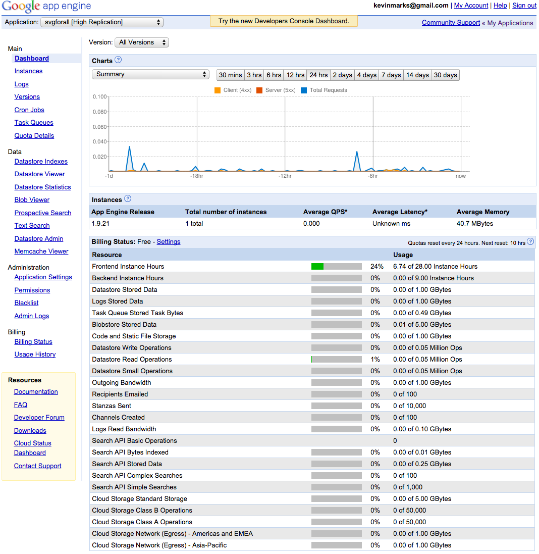
As your project grows in popularity, your doc site will grow in traffic. Traffic to the ansible docs page regularly dwarfed traffic to the main .com webpage. By keeping docs online, we were able to let people know what the current release was, occasionally run a banner about an upcoming event, and also introduce some *minor* advertising for a commercial product. Additionally, strong online docs are things that people can link to on places like Hacker News and Reddit or (more importantly) Stack Overflow.

Commercial advertising in docs need not be heavy handed — your goal is not make people think they need some software, but just make people aware that something exists and let them try it if they think it would be valuable.

If we had focused on locally built docs, it would have been harder to keep people on the current version, we would have lost analytics information (I was mostly just interested in web traffic count and where referrals came from), and we wouldn’t have been able to make people as aware of commercial offerings.

If you are selling physical hardware (like alarm clocks) though, I highly recommend making a PDF manual available. The rules for rapidly changing pure software products are a bit different.

Think About Eliminating Questions

When writing documentation — just like code, one of the more powerful things you can do is figure out how to eliminate a question or problem from being encountered again.

In documentation this is hard — people skim. But what areas could be misunderstandings? What ares need to be re-iterated throughout the doc?

Does the documentation need to integrate your whole theory-of-the-universe so people don’t use your cleverly designed hammer to paint with?

If you can eliminate a common problem by better structuring an error message to provide advice, do that.

Share Tips

I have always felt that the phrase “Best Practices” is kind of a lie. They are usually pushed by someone who does not know something, and then insists their way is the best.

Or they are arrived at by groupthink, and don’t actually apply in a wide variety of cases.

Still, offering tips and tricks is a solid idea. While you present each concept in learning-based sections, how do you combine ideas and use them in concert?

You can include a Tips section or also just sprinkle them through the document. I preferred to include them all in one place.

You Can’t Please Everyone

Despite what felt like me spending 40% of my time in the first year of the project building what I thought were pretty solid documentation, things are not always so happy on twitter.

At the same time people would say “you have great docs”, people would say “you have the worst docs”.

I don’t know if this was true — I imagine they were just frustrated with a problem and choosing to blame docs, but it is a clear example of the need to present information for multiple learning styles and backgrounds.

Some folks may file bugs or even fix things via a pull request, but don’t count on it. Having a section on each page to easily suggest suggestions to the documentation using some kind of web form is probably a good start.

Final Advice

With a highly technical product that isn’t instantly intutive, your product will be perceived by it’s documentation service.

I have worked with many tech writers over the years, who have all been great people. At Ansible, during the first year before the company, as well as all the way through my tenure of Ansible 1.9.3, we didn’t have any.

This was because the documentation mattered that incredibly much, and it wasn’t a product where you could just hand that off to anyone without miles of sysadmin experience. I wrote most of them, in a time where my time organizing the project itself was at a massive premium.

The person leading a project must care about it’s perceived surface area more than anyone else, and to some extent, if you want a happy userland, the documentation is the most important thing you have.

I don’t think a lot of developers DO love to write, but if you look at the more successful projects, they have two things — (1) great API design and modularity, (2) really strong web presence.

A classic example of that for me would be nearly everything coming out of the Rails community. Partially because they all come from .com web space, they nail typefaces and presentation.

Compare that instead with the average nearly-blank README of a GitHub project, and you can see how they gather steam at such increased rates.

I’ve never really explained my views on crafting documentation to anyone in full before. So here they are. Hopefully the ideas above are useful, and will help make some other technical documentation better, and improve the uptake of something you have built.

24 Aug 08:01

Post a boarding pass on Facebook, get your account stolen

Updates

  • 16.10. Article removed
  • 25.8. Added a note about an additional step when resetting United password

Article removed for legal reasons, sorry.

After receiving a Czech version of a cease and desist letter from a legal representative of A. F., I've removed the article. You'll find articles based on my story in “Recommended reading” below, go read them.

08 Aug 19:51

Women considered better coders – but only if they hide their gender

When a group of computer science students decided to study the way that gender bias plays out in software development communities, they assumed that coders would be prejudiced against code written by women.

After all, women make up a very small percentage of software developers – 11.2% according to one 2013 survey – and the presence of sexism in all corners of the overwhelmingly male tech industry has been well documented.

So the student researchers were surprised when their hypothesis proved false – code written by women was in fact more likely to be approved by their peers than code written by men. But that wasn’t the end of the story: this only proved true as long as their peers didn’t realise the code had been written by a woman.

“Our results suggest that although women on GitHub may be more competent overall, bias against them exists nonetheless,” the study’s authors write.

The researchers, who published their findings earlier this week looked at the behavior of software developers on GitHub, one of the largest open-source software communities in the world.

Researchers found that code written by women was approved at a higher rate (78.6%) than code written by men (74.6%)

Based in San Francisco, GitHub is a giant repository of code used by over 12 million people. Software developers on GitHub can collaborate on projects, scrutinise each other’s work, and suggest improvements or solutions to problems. When a developer writes code for someone else’s project, it’s called a “pull request”. The owner of the code can then decide whether or not to accept to proffered code.

The researchers looked at approximately 3m pull requests submitted on GitHub, and found that code written by women was approved at a higher rate (78.6%) than code written by men (74.6%).

Looking for an explanation for this disparity, the researchers examined several different factors, such as whether women were making smaller changes to code (they were not) or whether women were outperforming men in only certain kinds of code (they were not).

“Women’s acceptance rates dominate over men’s for every programming language in the top 10, to various degrees,” the researchers found.

The researchers then queried whether women were benefiting from reverse bias – the desire of developers to promote the work of women in a field where they are such a small minority. To answer this, the authors differentiated between women whose profiles made it clear that they were female, and women developers whose profiles were gender neutral.

It was here that they made the disturbing discovery: women’s work was more likely to be accepted than men’s, unless “their gender is identifiable”, in which case the acceptance rate was worse than men’s.

A woman uses computer in lounge area of Chaos Communication Congress (25C3) in Berlin.
Photograph: Thomas Peter/Reuters

Interviews with a number of female developers who use GitHub revealed a complicated picture of navigating gender bias in the world of open-source code.

Lorna Jane Mitchell, a software developer whose work is almost entirely based on GitHub, said that it was impossible to tell whether a pull request was ignored out of bias, or just because a project owner was busy or knew another developer personally.

Her profile on GitHub clearly identifies her as female, something she won’t be changing based on the results of this study.

“I have considered how wise it is to have a gender-obvious profile and to me, being identifiably female is really important,” Mitchell said by email. “I want people to realise that the minorities do exist. And for the minorities themselves: to be able to see that they aren’t the only ones ... it can certainly feel that way some days.”

Another developer, Isabel Drost-Fromm, whose profile picture on GitHub is a female cartoon character, said that she’s never experienced bias while working GitHub, but that she normally uses the site to work on projects with a team that already knows her and her work.

Jenny Bryan, a professor of statistics at the University of British Columbia, uses GitHub as a teacher and developer in R, a programming language. Her profile makes clear that she is a woman, and she doesn’t believe that she’s been discriminated against due to her gender.

“At the very most, men who don’t know me sometimes explain things to me that I likely understand better than they do,” she writes. “The men I interact with in the R community on GitHub know me and, if my genderhas any effect at all, I feel they go out of their way to support my efforts to learn and make more contributions.”

Bryan was more concerned with the paucity of women using GitHub than she was with the study’s results. “Where are the women?” she asks. One possibility she raises is the very openness of the open source community.

“In open source, no one is getting paid to manage the community,” she writes. “Thus often no one is thinking about how well the community is (or is not) functioning.”

That’s a pressing question for GitHub itself, which has faced serious charges of internal sexism which led to the resignation of co-founder and CEO Tom Preston-Werner in 2014. GitHub did not immediately respond to a request for comment on the study.

In 2013, GitHub installed a rug in its headquarters that read, “United Meritocracy of GitHub.” The rug was removed in 2014 after criticism from feminist commentators that, although meritocracy is a virtue that it is hard to disagree with in principle, it doesn’t do much for diversity in the workplace. CEO Chris Wanstrath tweeting, “We thought ‘meritocracy’ was a neat way to think of open source but now we see the problems with it. Words matter. We’re getting a new rug.”

As the researchers of the pull request study wrote, “The frequent refrain that open source is a pure meritocracy must be reexamined.”

31 Jul 19:59

Passwords Evolved: Authentication Guidance for the Modern Era

by Troy Hunt

Sponsored by: Matchlight by Terbium Labs: Know when your exact data appears on the dark web. Contact us for a demo today.

Passwords Evolved: Authentication Guidance for the Modern Era

In the beginning, things were simple: you had two strings (a username and a password) and if someone knew both of them, they could log in. Easy.

But the ecosystem in which they were used was simple too, for example in MIT's Time-Sharing Computer, considered to be the first computer system to use passwords:

Passwords Evolved: Authentication Guidance for the Modern Era

We're talking back in the 60's here so a fair bit has happened since then. Up until the last couple of decades, we had a small number of accounts and very limited connectivity which made for a pretty simple threat landscape. Your "adversaries" were those in the immediate vicinity, that is people who could gain direct physical access to the system. Over time that extended to remote users who could dial in - I mean literally dial in via phone - and that threat landscape grew. You pretty much know the story from here: more connectivity, more accounts, more threat actors and particularly in recent years, more data breaches. Suddenly, the simple premise of matching strings no longer seems like such a good idea.

A couple of months ago I wrote about Password reuse, credential stuffing and another billion records in Have I been pwned (HIBP). Here we have a situation where there's a 10-figure number of credentials sitting there waiting for evildoers to start testing them against any site of their choosing and that presents a very interesting challenge: how do we defend against this? I mean you're trying to run your online system and someone has valid credentials for some of your users, how are you going to stop them from getting in? The simple string matching of the 60's just isn't going to cut it.

There's a lot more to how authentication has evolved than just the rise and rise of credential stuffing though, many other aspects of how we logon to systems has also changed. In some cases, this has led to once-held "truths" about how we create and manage accounts to be totally flipped on their head, yet we still see modern organisations applying the patterns of yesterday to the threats of today. This post sets out to address this gap and talk about how we should be designing this critical part of our systems today. My hope is that in times where a company says "we're doing this screwy thing because security", this post becomes the resource that well-wishers direct them to.

Listen to Your Governments (and Smart Tech Companies)

Let me start by referencing others because there's a lot of great material out there from recent times which I'm going to draw on. I want to lay these out early to be clear that a lot of the guidance I'll outline below is not the personal views of one individual, rather it's direct from the likes of the National Institute of Standards and Technologies (NIST). In fact, their recently released Digital Identity Guidelines from only last month (this is SP 800-63 for those interested in the details) were arguably the catalyst for me finally putting this together because there's so much good stuff in there.

The National Cyber Security Centre (NCSC) in the UK government is another excellent resource I'll be drawing on. They've consistently put out really thoughtful pieces on the topic at hand and refreshingly, it's an example of a government department really "getting it" when it comes to modern day tech.

I'll also be referring to Microsoft's Password Guidance paper from the Identity Protection Team. The first page of the document talks about Microsoft having a "unique vantage point to understand the role of passwords in account takeover" due to them seeing 10 million attacks every day so yeah, they have some experience in this area! This is a very practical document that's been put together by people who put a huge amount of thought into keeping online accounts safe.

I'm sure there are other such examples too and I welcome people to add these to the comments section below. That's just a few sources and you'll see many others referenced throughout the remainder of this post. Let's get into it!

Authentication Should be More Than a Binary State

I want to start with a more philosophical look at how authentication usually works: you're not logged on so you have no access to anything then you logon and you have full access to everything that your account should have rights too. There are no grey areas, it's either one or the other.

One of the really neat things we're seeing in many aspects of infosec these days is the recognition of threat or confidence levels, that is that sometimes we're more confident in a particular risk scenario (i.e. logging on) than at other times. For example, rather than just allowing multiple logon attempts to an account and then locking it out completely after say, 5 failed attempts (notice how this is always an odd number?), perhaps after 3 attempts a CAPTCHA should be presented. This recognises that confidence in the user has dropped and steps should be taken to ensure an automated attack isn't being mounted. It's tough on bots, but a minor inconvenience for users and you can still lock out after X more failed attempts if necessary.

Likewise, once someone is successfully authenticated, should they have full access to all features? For example, if it took a few goes to get the password right and they've come in from a previously unseen browser in a different country to usual, should they have unbridled access to everything? Or should they be limited to basic features and must verify they still control the registered email address before doing anything of significance?

These are simple examples but the thought process I'm trying to get going is that we can be a lot smarter than the traditional binary authentication state that still prevails in the vast majority of systems today. You'll see this theme pop up a few times during the remainder of this blog post.

Longer is (Usually) Stronger

Let's get into the nuts and bolts of things and we'll start with something easy: this is not a good password policy:

That first sentence in that pop-up is probably one of the most common poor password anti-patterns going, that is a short arbitrary length. It kills password managers (more on them soon), it kills pass phrases and subsequently, it kills usability. On that last point, the tweet above is from a 2016 blog post of mine on how we keep failing at the basics and along with Etihad's bad policy (which incidentally, they allegedly do "because security"), I show how PayPal effectively locked me out of my account due to a similar policy.

In addition to the problems mentioned above, short arbitrary limits like this regularly cause people to speculate that password storage is insufficient. When cryptographically hashed, all passwords are stored with the same fixed length so an arbitrary limit such as the one above may indicate the password is stored in a plain text and the column only allows 10 characters. Now that's not necessarily the case (Microsoft limits their accounts to 16 characters and I'm confident they have very robust password storage), but you can see how it causes the aforementioned speculation.

Edit: See Ariel Gordon's comment below regarding Microsoft no longer imposing this limit.

So how long should you allow a password to be? No, not "as long as you want" because there is a size at which you have other problems. For example, at over 4MB you'd exceed the default ASP.NET max request size. Here's NIST's view:

Verifiers SHOULD permit subscriber-chosen memorized secrets at least 64 characters in length

No reasonable person is going to use a website with a 64-character password limit then turn around and say "this site's security is crap because they didn't let me use more than 64 characters in my password". But just to be sure, make it 100. Or 200. Or stick with NIST's thinking and make it 256, it doesn't matter because it's going to hash down to the same number of characters anyway.

NIST also makes another important if not obvious point when it comes to password length:

Truncation of the secret SHALL NOT be performed

This is really the simplest of concepts: don't have a short arbitrary password length and don't chop characters off the end of a password provided by a user. At the very least, an organisation defending this position should say "we know it's bad, there's legacy reasons, we'll put it on the road map to be rectified".

All Characters Are Special (But You Don't Have to Have Special Characters)

I want to look at two different aspects of special characters and I'll start with this one:

Typically, certain characters are disallowed as a means of defending against potential attacks. For example, angle brackets may be used in XSS attacks and an apostrophe may be used in SQL injection attacks. However, both of these arguments show serious shortcomings in the security profile of the site in question because firstly, passwords should never be re-displayed in the UI where an XSS risk could be exploited and secondly, because they should never be sent to the database without being hashed which would mean only alphanumeric characters prevail. Plus of course you have output encoding and parameterisation even if you were inappropriately handling passwords by re-displaying them in the UI and saving them in plain text to the database.

NIST is pretty clear on this - don't do it:

All printing ASCII [RFC 20] characters as well as the space character SHOULD be acceptable in memorized secrets. Unicode [ISO/ISC 10646] characters SHOULD be accepted as well.

It's also worth noting their point on Unicode characters; there are many precedents of sites restricting perfectly valid language characters simply because they don't fit into what a site's developers consider "normal". Then, of course, there are passwords like this:

The ❄️ 🌟 🔦 ⚪ on the mountain 🌙 🌠. 🙅🏻 a👣 to 🐝 👀. A 🏰 of 😢, and it 👀 like☝️️ the 👑. The 💨 is 🐺 like this 🌀 ❄️ ☔️ 🏠. 🙅🏻 keep it in, ☁️ 💡 ☝️️ tried.

If someone really wants to have a password that's an emoji representation of the first verse of "Let It Go" from Frozen, good on 'em!

The other aspect of special characters is this from NIST:

Verifiers SHOULD NOT impose other composition rules (e.g., requiring mixtures of different character types or prohibiting consecutively repeated characters) for memorized secrets

Wait - what?! You mean people aren't required to have lowercase, uppercase, numbers and symbols?! This goes against so much of conventional password wisdom and it's not until you step back and think about it logically that it really makes sense. To demonstrate this, I recently wrote about how password strength indicators help people make ill-informed choices, the premise of which was that mathematics alone (which is what most password strength meters use), does not help us make strong passwords. Requirements such as these leave scope to use passwords such as "Passw0rd!" and rule out passwords such as lowercase passphrases.

Microsoft has precisely the same guidance as NIST in their aforementioned documentation:

Eliminate character-composition requirements

What tends to happen when there are requirements around password complexity is that people first try something basic then they tweak characters until it comes up to the minimum requirement of the site. Microsoft explains the problem as follows:

Most people use similar patterns (i.e. capital letter in the first position, a symbol in the last, and a number in the last 2). Cyber criminals know this, so they run their dictionary attacks using the common substitutions, such as "$" for "s", "@" for "a," "1" for "l" and so on.

This will almost certainly still be a bad password and almost certainly one they've previously used in other places too so all that's been achieved here is that the user has been put through a level of frustration in order to still arrive at a bad password!

Password Hints Are Definitely Out

Anecdotally, password hints are far less frequent today than what they used to be. This was the premise of "hey, people forget passwords, let's make it easier for them to remember" and it meant that at signup, as well as providing a password you could provide a hint as to what the password actually is. The problem is that this hint is shown to unauthenticated users because that's the precisely the point at which it's needed. The other problem is that because this is usually a user-provided piece of data, it's probably going to be terrible.

Adobe stored password hints in their database that was disclosed back in 2013. Just to illustrate the terribleness of these hints, I went back to take a look at the data and thought I'd highlight a few of them here:

  • my name
  • adobe
  • usual
  • password
  • email

These were all stored in plain text too so think of what that meant once the system was compromised. For obvious reasons, NIST thinks these are a bad idea:

Memorized secret verifiers SHALL NOT permit the subscriber to store a “hint” that is accessible to an unauthenticated claimant.

Like I said, they're rare to see in an online system these days anyway but just in case you were thinking about doing this, don't!

Embrace Password Managers

I've been going on about the value of password managers for a long time now, since early 2011 actually when I wrote about how the only secure password is the one you can’t remember. The premise is simple and I'll boil down to a few bullet points:

  1. We know that passwords must be "strong", that is that they shouldn't be predictable or readily brute forced so in other words, the longer and more random, the better.
  2. We know that passwords shouldn't be reused because disclosure by one service puts the user's other services at risk. This is the whole credential stuffing problem I referred to earlier.
  3. People cannot create strong, unique passwords across all their services using only their brain to remember which one they used where.

Now some people will argue that a password manager means putting all your eggs in one basket and they're right; if that basket gets compromised it's going to be bad news. But this is an exceptionally rare event compared to the compromise of an individual service which consequently exposes credentials. Further to that and as I wrote more recently, password managers don't have to be perfect, they just have to be better than not having one.

But this post isn't intended to provide guidance to individuals about how to secure their accounts, rather it's aimed at people building services. This means that regardless of your personal views on password managers, you shouldn't be doing this:

This is typical short-sightedness and I could easily point to dozens of other tweets of a similar nature. It entirely neglects the 3 bullet points I outlined earlier and what it's essentially doing is saying "hey, create a password you can easily remember and yeah, it'll be weak and probably the same as your other ones, but do it because security".

The NCSC is quite explicit about this and has the following in the infographic accompanying their Password Guidance: Simplifying Your Approach resource:

Passwords Evolved: Authentication Guidance for the Modern Era

In other words, don't break password managers and don't trot out lines like in the tweet above. But the NCSC goes even further, providing the following recommendation targeted clearly at how organisations enable their staff to create and manage passwords in a secure fashion:

You should also provide appropriate facilities to store recorded passwords, with protection appropriate to the sensitivity of the information being secured. Storage could be physical (for example secure cabinets) or technical (such as password management software), or a combination of both. The important thing is that your organisation provides a sanctioned mechanism to help users manage passwords, as this will deter users from adopting insecure ‘hidden’ methods to manage password overload.

Have a think about the environment you work in at present - do they have password strength criteria? Do they possibly have annual training or posters on the wall, each encouraging unique and complex passwords? Inevitably there's at least some control and education around this, but do they actually provide you with a "sanctioned mechanism" to help you achieve those objectives? Almost certainly not and I know this because it's one of the questions I often ask when I run training in organisations. It's amazing that this gap prevails.

Let Them Paste Passwords

Closely related to the use of password managers is the ability to paste passwords into the login screen. There are plenty of password managers that can auto-fill credentials, but there are occasions where either pasting is still necessary or where a service blocks a password that hasn't been typed in character by character (easily identified with a bit of JavaScript). It means we have situations like this:

Back in 2014, I wrote about the “Cobra Effect” that is disabling paste on password fields. I explain the meaning of this term in the blog post but in short, a cobra effect occurs when an attempted solution to a problem makes the problem worse. When a website blocks the pasting of passwords in an attempt to improve security, they force some users to weaken their passwords to the point where they're dumbed down to easily typed versions.

The NCSC is behind me on this one too:

Passwords Evolved: Authentication Guidance for the Modern Era

They even coined a term for the anti-pattern - SPP or "Stop Pasting Passwords" - and they go on to debunk common myths around the "risks" of pasting passwords. They also reference my cobra effect article mentioned earlier which is nice endorsement from the British Government!

NIST echoes the NCSC's position with this statement:

Verifiers SHOULD permit claimants to use “paste” functionality when entering a memorized secret. This facilitates the use of password managers, which are widely used and in many cases increase the likelihood that users will choose stronger memorized secrets.

Let there be no doubt about it: there is unanimous support from both sides of the Atlantic for encouraging the use of password managers as well as not actively blocking them.

Do Not Mandate Regular Password Changes

I had an easy way of remembering how long I'd been using a password for in my previous corporate job: I'd take the number in it that I incremented every time the company forced a quarterly password rotation and divide it by 4. I got about 6 years out of that particular password, only ever changing 1 or 2 characters at a time. If you're working in an environment that mandates regular password changes, you're very likely doing the same thing because it's an easy human control to deal with a technology requirement that's seen as an impediment.

Let's think through the rationale of this approach for a moment: the premise of a regular password change is that should that password be compromised, forcing a change means it is no longer valid, ergo it cannot be used by malicious parties. The problem is, attackers have got up to 3 months in the example I gave earlier or in some cases, even longer:

Think about it: attackers don't generally just sit around waiting, they get on with the business of exploiting accounts. This is the same flawed logic which led to Lifeboat covering up their breach last year based on the following screwy rationale:

When this happened [in] early January we figured the best thing for our players was to quietly force a password reset without letting the hackers know they had limited time to act

Per the tweet above, the NCSC agrees that forcibly rotating passwords is a modern-day security anti-pattern saying this about the practice in their password guidance documentation:

carries no real benefits as stolen passwords are generally exploited immediately

And it makes its way into the associated infographic too:

Passwords Evolved: Authentication Guidance for the Modern Era

Microsoft is also on the same page here:

Password expiration policies do more harm than good, because these policies drive users to very predictable passwords composed of sequential words and numbers which are closely related to each other (that is, the next password can be predicted based on the previous password). Password change offers no containment benefits cyber criminals almost always use credentials as soon as they compromise them.

Now this is not to say "don't force password cycling and do nothing else", rather it's a recognition that there should be a broader, more evolved approach to password management. For example, the NCSC also recommends the following:

  1. Monitoring logins to detect unusual use
  2. Notifying users with details of attempted logins, successful or unsuccessful; they should report any for which they were not responsible

Which brings us neatly to the next section:

Notify Users of Abnormal Behaviour

This is an important part of the "evolved" component of authentication and you may well have seen this in action before. I recently logged in to Yammer from my new Lenovo Yoga 910, a machine I'd not previously used with the service. Shortly afterwards, I received this notification:

Passwords Evolved: Authentication Guidance for the Modern Era

I later logged into Dropbox via the browser with the same machine and immediately received this:

Passwords Evolved: Authentication Guidance for the Modern Era

Now neither of these stopped me from logging in and indeed I could have been a bad guy holding the victim's legitimate credentials. But they let me know as soon as it happened and that's enormously valuable because per the messages above, I could now go and boot an intruder out of my account if necessary. Dropbox actually showed me devices I'd auth'd as far back as 5 years ago and gave me the ability to de-auth them:

Passwords Evolved: Authentication Guidance for the Modern Era

Being able to identify account behaviour in this fashion is enormously useful, for example seeing which devices are presently logged in to my Facebook account:

Passwords Evolved: Authentication Guidance for the Modern Era

As with Dropbox and Yammer, there's also the ability to now log any of these out which means it gives the rightful account owner back some control in the event that their account has been inappropriately accessed. Many modern services do this; GitHub is a great example and they go into a lot more detail including the IP address and the specific security event, for example a 2FA request or the creation of a public key.

Here's another scenario:

This too, makes a lot of sense and when you start considering the various scenarios you could proactively notify users about, you start to realise how much you can do with really very little effort.

Block Previously Breached Passwords

Getting back to the whole credential stuffing thing for a moment, once passwords are disclosed they must be considered "burned", that is they should never be used again. Ever. Once they're out there in the wild, an untold number of other parties now have those credentials which therefore significantly heightens the risk anyone uses them now faces. Imagine having access to a billion email address and password pairs taken from actual data breaches as I highlighted in the credential stuffing post:

Passwords Evolved: Authentication Guidance for the Modern Era

NIST talks about the problem as follows:

When processing requests to establish and change memorized secrets, verifiers SHALL compare the prospective secrets against a list that contains values known to be commonly-used, expected, or compromised. For example, the list MAY include, but is not limited to: Passwords obtained from previous breach corpuses.

In layman's terms, this means that when someone registers or changes their password, you should be checking to ensure it's not a password that's previously appeared in a data breach. It doesn't matter that it may not have been the user who is presently registering that used the password in the breach, the mere fact that it has now been leaked publicly increases the chances of it being used in an attack. They also mention that the password shouldn't be a dictionary word or a "context-specific word"; when I wrote about CloudPets leaving their database publicly exposed, I pointed out how even bcrypt hashes were easily crackable by using a small password dictionary including words such as "cloudpets". Don't let people use a password which is the name of the service they're signing up to because they will!

Beyond the Basics

There's a lot more I consciously decided not to delve into here. For example, the various multi-step verification mechanisms which are available and indeed which NIST speaks to in their documentation. I wanted to focus on the absolute fundamentals in this post but certainly layering additional defences such as an authenticator app on top of everything above greatly improves the security position, it's just a shame barely anyone uses them:

Another consideration is the ability to actually identify and defend against a highly automated attack in the first place. Think about it - how well-equipped are you to identify a sudden influx of login attempts such as via a credential stuffing attack? Would it be a matter of waiting until a whole bunch of people reported their accounts pwned or would you know as soon as it started happening? And if you did identify an attack, could you rapidly deploy defences to mitigate that risk? For example, by toggling the security level on Cloudflare:

Passwords Evolved: Authentication Guidance for the Modern Era

I also didn't delve into password storage, instead deciding to focus on the more immediately visible components of how websites deal with credentials. So I don't leave that totally untouched, check out OWASP's Password Storage Cheat Sheet for guidance there. Also have a good read of how Dropbox securely stores your passwords which is a very interesting piece combining both a modern-day approach to hashing and the use of encryption.

It goes much deeper than just what I've covered here, the point is that what I've outlined above should be the modern "normal", but it's not necessarily where you stop.

Summary

Here's the bigger picture of what all this guidance from governments and tech companies alike is recognising: security is increasingly about a composition of controls which when combined, improve the overall security posture of a service. What you'll see across this post is a collection of recommendations which all help contribute to a more robust solution by virtue of complementing one another. That may mean that individual recommendations such as dropping complexity requirements look odd, but when you consider the way humans tended to deal with that (they'd just choose bad passwords with a combination of character types) alongside guidance such as blocking previously breached passwords, things start to make a lot more sense.

Now there's just one more thing: as good as all this guidance is, practically implementing it can be somewhat trickier. I'm going to follow this post up with another one next week that will introduce something all new; something that will make it easier for site owners to protect their subscribers. It's something I've invested quite a bit of effort in over the last few weeks and I'm going to give it away for free so check back soon and I'll also update this post with a link to the resource as soon as it goes public. Stay tuned!

Edit: As promised, here's that new resource: Introducing 306 Million Freely Downloadable Pwned Passwords

21 Jul 14:30

UI/UX How the Web Became Unreadable

It’s been getting harder for me to read things on my phone and my laptop. I’ve caught myself squinting and holding the screen closer to my face. I’ve worried that my eyesight is starting to go. These hurdles have made me grumpier over time, but what pushed me over the edge was when Google’s App Engine console — a page that, as a developer, I use daily — changed its text from legible to illegible. Text that was once crisp and dark was suddenly lightened to a pallid gray. Though age has indeed taken its toll on my eyesight, it turns out that I was suffering from a design trend.

There’s a widespread movement in design circles to reduce the contrast between text and background, making type harder to read. Apple is guilty. Google is, too. So is Twitter.

Typography may not seem like a crucial design element, but it is. One of the reasons the web has become the default way that we access information is that it makes that information broadly available to everyone. “The power of the Web is in its universality,” wrote Tim Berners-Lee, director of the World Wide Web consortium. “Access by everyone regardless of disability is an essential aspect.”

But if the web is relayed through text that’s difficult to read, it curtails that open access by excluding large swaths of people, such as the elderly, the visually impaired, or those retrieving websites through low-quality screens. And, as we rely on computers not only to retrieve information but also to access and build services that are crucial to our lives, making sure that everyone can see what’s happening becomes increasingly important.

We should be able to build a baseline structure of text in a way that works for most users, regardless of their eyesight. So, as a physicist by training, I started looking for something measurable.


Google’s App Engine console before — old-fashioned but clear
Google’s App Engine console after — modern, tiny, and pallidIt wasn’t hard to isolate the biggest obstacle to legible text: contrast, the difference between the foreground and background colors on a page. In 2008, the Web Accessibility Initiative, a group that works to produce guidelines for web developers, introduced a widely accepted ratio for creating easy-to-read webpages.

To translate contrast, it uses a numerical model. If the text and background of a website are the same color, the ratio is 1:1. For black text on white background (or vice versa), the ratio is 21:1. The Initiative set 4.5:1 as the minimum ratio for clear type, while recommending a contrast of at least 7:1, to aid readers with impaired vision. The recommendation was designed as a suggested minimum contrast to designate the boundaries of legibility. Still, designers tend to treat it as as a starting point.

Contrast as modeled in 2008For example: Apple’s typography guidelines suggest that developers aim for a 7:1 contrast ratio. But what ratio, you might ask, is the text used to state the guideline? It’s 5.5:1.

Apple’s guidelines for developers.Google’s guidelines suggest an identical preferred ratio of 7:1. But then they recommend 54 percent opacity for display and caption type, a style guideline that translates to a ratio of 4.6:1.

The typography choices of companies like Apple and Google set the default design of the web. And these two drivers of design are already dancing on the boundaries of legibility.

It wasn’t always like this. At first, text on the web was designed to be clear. The original web browser, built by Berners-Lee in 1989, used crisp black type on a white background, with links in a deep blue. That style became the default settings on the NeXT machine. And though the Mosaic browser launched in 1993 with muddy black-on-gray type, by the time it popularized across the web, Mosaic had flipped to clear black text over white.

When HTML 3.2 launched in 1996, it broadened the options for web design by creating a formal set of colors for a page’s text and background. Yet browser recommendations advised limiting fonts to a group of 216 “web-safe” colors, the most that 8-bit screens could transmit legibly. As 24-bit screens became common, designers moved past the garish recommended colors of the ’90s to make more subtle design choices. Pastel backgrounds and delicate text were now a possibility.

Yet computers were still limited by the narrow choice of fonts already installed on the device. Most of these fonts were solid and easily readable. Because the standard font was crisp, designers began choosing lighter colors for text. By 2009, the floodgates had opened: designers could now download fonts to add to web pages, decreasing dependency on the small set of “web-safe” fonts.

As LCD technology advanced and screens achieved higher resolutions, a fashion for slender letterforms took hold. Apple led the trend when it designated Helvetica Neue Ultralight as its system font in 2013. (Eventually, Apple backed away from the trim font by adding a bold text option.)

As screens have advanced, designers have taken advantage of their increasing resolution by using lighter typeface, lower contrast, and thinner fonts. However, as more of us switch to laptops, mobile phones, and tablets as our main displays, the ideal desktop conditions from design studios are increasingly uncommon in life.

So why are designers resorting to lighter and lighter text? When I asked designers why gray type has become so popular, many pointed me to the Typography Handbook, a reference guide to web design. The handbook warns against too much contrast. It recommends developers build using a very dark gray (#333) instead of pitch black (#000).

The theory espoused by designers is that black text on a white background can strain the eyes. Opting for a softer shade of black text, instead, makes a page more comfortable to read. Adam Schwartz, author of “The Magic of CSS,” reiterates the argument:

The sharp contrast of black on white can create visual artifacts or increase eye strain. (The opposite is also true. This is fairly subjective, but still worth noting.)

Let me call out the shibboleth here: Schwartz himself admits the conclusion is subjective.

Another common justification is that people with dyslexia may find contrast confusing, though studies recommend dimming the background color instead of lightening the type .

Several designers pointed me to Ian Storm Taylor’s article, “Design Tip: Never Use Black.” In it, Taylor argues that pure black is more concept than color. “We see dark things and assume they are black things,” he writes. “When, in reality, it’s very hard to find something that is pure black. Roads aren’t black. Your office chair isn’t black. The sidebar in Sparrow isn’t black. Words on web pages aren’t black.”

Taylor uses the variability of color to argue for subtlety in web design, not increasingly faint text. But Taylor’s point does apply — between ambient light and backlight leakage, by the time a color makes it to a screen, not even plain black (#000) is pure; instead it has become a grayer shade. White coloring is even more variable because operating systems, especially on mobile, constantly shift their brightness and color depending on the time of day and lighting.

This brings us closer to the underlying issue. As Adam Schwartz points out:

A color is a color isn’t a color…
…not to computers…and not to the human eye.

What you see when you fire up a device is dependent on a variety of factors: what browser you use, whether you’re on a mobile phone or a laptop, the quality of your display, the lighting conditions, and, especially, your vision.

When you build a site and ignore what happens afterwards — when the values entered in code are translated into brightness and contrast depending on the settings of a physical screen — you’re avoiding the experience that you create. And when you design in perfect settings, with big, contrast-rich monitors, you blind yourself to users. To arbitrarily throw away contrast based on a fashion that “looks good on my perfect screen in my perfectly lit office” is abdicating designers’ responsibilities to the very people for whom they are designing.

My plea to designers and software engineers: Ignore the fads and go back to the typographic principles of print — keep your type black, and vary weight and font instead of grayness. You’ll be making things better for people who read on smaller, dimmer screens, even if their eyes aren’t aging like mine. It may not be trendy, but it’s time to consider who is being left out by the web’s aesthetic.

16 Jul 17:35

king - man + woman is queen; but why?

by /u/pmigdal