
Shared posts
20 Nov 09:03
M (France)
by Coverjunkie
3 covers, page 1, 2, 3"Bleu, blanc, rouge; vivre avec, vivre ensemble, vivre en France"
M is a lifestyle magazine about current events and fashion from Le Monde from France, launched September 2011.
Editor in chief : Marie Pierre Lannelongue Creative director : Eric PillaultDirector of Photograpy: Lucy Conticello Art Director: Jean-Baptiste Talbourdet-Napoleone

20 Nov 08:58
Pig on Fire
by Lovely Package
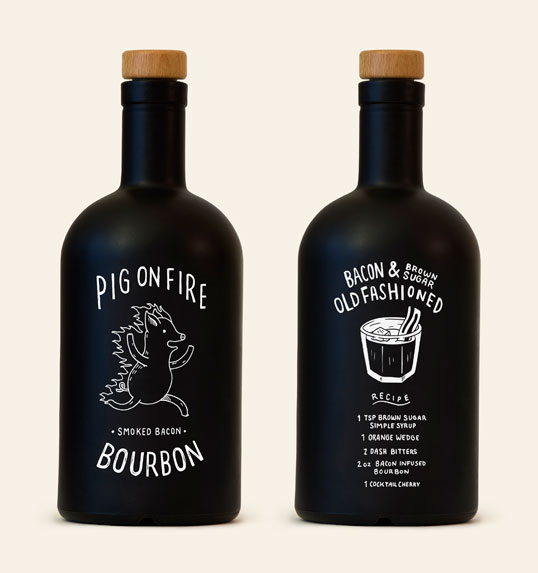
Designed by John Larigakis & Jon Mandell | Country: Canada
“Pig On Fire is a small batch hand crafted bourbon infused with applewood smoked bacon.”


Jeff likes this


17 Nov 14:33
Oxford Dictionaries Word of the Year Is an Emoji
by Jack Lowe

Oxford Dictionaries has announced its 2015 Word of the Year - the "Face With Tears of Joy" emoji. That's right, the word of the year isn't even a word. According to Oxford Dictionaries, the decision was made because the emoji "best reflected the ethos, mood, and preoccupations of 2015."


16 Nov 09:29

Photographer Spotlight: Cru Camara
by Jeff

Photos by Cru Camara, a student at SVA in New York, originally from Manila, Philippines. Love her work. More images below.
16 Nov 09:22

Disturbingly Accurate Digital Manipulations by Artist Antoine Geiger
by Staff

French artist Antoine Geiger perfectly captures the all-absorbing and soul-sucking nature of contemporary cellphone culture. More striking images from his series “SUR-FAKE” below.
22 Oct 09:46
Pecker
by Sean

*** NSFW(ish) ***
Introducing Pecker, the book, the bible of bang sticks, the one stop cock shop, is the world’s biggest collection of knobs, dongs, penis pencillings and schlong scribbles.
Pecker is the brainchild of designer and visual artist Jon Bland and copywriter Louie Zeegen, we caught up with them ahead of their upcoming launch at KK Outlet this Thursday to chat bollocks:

Pecker. How did the book come about?
We lived together for a few months when Jon moved to London at the beginning of this year. After helping each other on various other projects, we decided to spend the time under the same roof producing something together. A penis book was the obvious choice.

What was your thinking behind Pecker? Is it all a clever social commentary on the domination of males in the creative industries? Or cause willies are funny?
The beautiful thing about drawing a penis is that anyone can produce a belter. It’s as simple as that really, but yeah sure, the social commentary thing works too.
The book launch is Thursday 22nd at KK Outlet, can you reveal a bit about it?
We’re taking over KK with shit loads of dicks and beer. It’ll be more like a mini exhibition than just a normal book launch. It’s a must for any penis enthusiast.

Who’s Peckers can we expect to see on show?
There are some big names that we’re super chuffed to have inside our book, such as Ian Wright, Marion Deuchars, Jean Jullien and Mike Perry, but also people who aren’t illustrators at all, just massive cock lovers. There’s a healthy mix of superstars, professionals and total novices. Cock lover no. 1 Mr Bingo has written us a lovely foreword too.
Who’s Peckers have been most impressive so far?
We’re big fans of George Heaven’s – he drew in it about 10 minutes at the Kiosk Independent Book Fair in Peckham that we had a stall at. Quick, hilarious and disgusting – the perfect pecker. We’ve had other great ones from Stella Murphy, Li-En Yeung and Leon Karssen. After seeing thousands, we are hard to shock now, so generally the more bizarre the better.

How long does it stay up for?
Just over a week, but the book will pleasure you forever. Mum’s Christmas present sorted right? www.pecker.world

Anything else to add?
We continue to receive dick every day but it’s fine – our inbox is massive. We hope it never stops: mailsack@pecker.world
—
Thanks Louie and Jon


21 Oct 09:46
Connaissance du 21/10/2015
Le poisson-zèbre, originaire de l'Inde, a la possibilité de régénérer des parties de son corps en cas de blessure. Il peut régénérer ses nageoires, sa rétine, son nerf optique voir même un partie de son coeur.


15 Oct 08:47
Connaissance du 15/10/2015
En astrophysique, tout le monde connait le trou noir, mais théoriquement parlant il devrait aussi exister un trou blanc (ou fontaine blanche). En fonction du type de trou noir, le trou blanc serait la "porte de sortie" dans un autre univers.
15 Oct 08:46
M (France)
by Coverjunkie
M is a lifestyle magazine about current events and fashion from Le Monde from France, launched September 2011.
Editor in chief : Marie Pierre Lannelongue
Creative director : Eric Pillault
Director of Photograpy: Lucy Conticello
Art Director and Photography Director: Jean-Baptiste Talbourdet-Napoleone


01 Oct 15:22
How should we talk about breast cancer?
by Eliza Williams
Cancer is hard to talk about. Our feelings about the disease will be affected by personal experience, stories from famous people, media reporting and advertising. In the latter category, the challenge for charities and health organisations lies in getting advice across to people in a way that is straightforward and easy-to-understand but still compelling.
Looking at a series of recent breast cancer awareness ads, it would seem that one perceived solution to this problem has been to place the emphasis on breasts themselves, and leave the cancer part to the tagline. A new spot from BETC Paris for Carte Noire and the Association Le cancer du sein – parlons-en! (Let’s talk about cancer!) features numerous French personalities sharing nicknames for their breasts. Beautifully shot, the film feels more like a upmarket fashion ad than a cancer awareness spot.
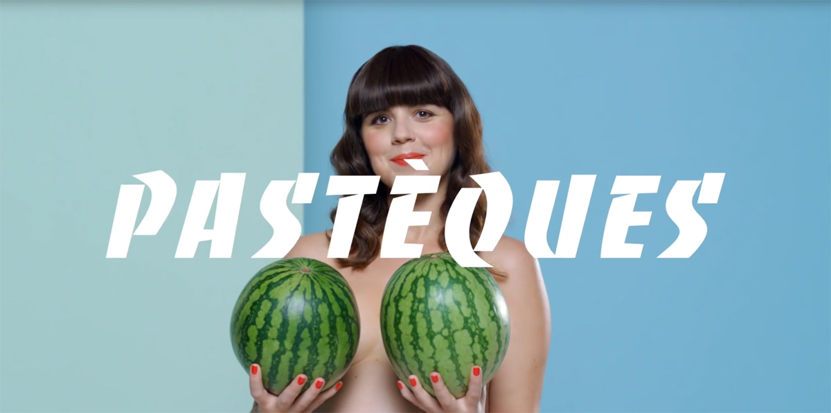

Ad for Carte Noire and Association Le Cancer du Sein – Parlons-en (Let’s Talk About breast Cancer) by BETC Paris
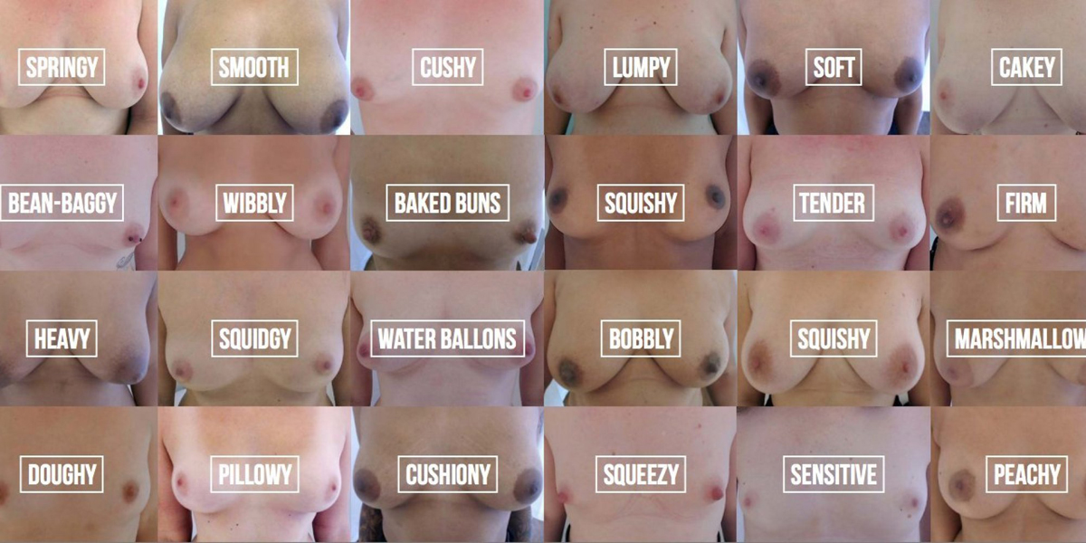
Also focused on the way that women describe their breasts is an ongoing campaign from UK charity Coppafeel. Titled ‘what normal feels like?’, these ads feature images of bare breasts, with words such as ‘squidgy’ and ‘peachy’ written across them. Coppafeel is a charity aimed particularly at young women (it was founded by Kris Hallenga, who was diagnosed with breast cancer at just 23), and these ads are apparently intended to encourage women to think about their breasts in non-sexual terms. If this is the case though, the use of nudity here is confusing, and again vastly overshadows the campaign’s message. And, like the CarteNoire spot, there is little information on what exactly women should be looking out for, what the danger signs actually are.
While obviously well-intentioned, there is a risk with these campaigns that the core health-awareness message gets lost, or worse, that women even feel offended by them. Other breast cancer campaigns emphasising sexiness or innuendo have been even more blatant – ‘No Bra Day’, an initiative apparently created by breast cancer campaigners, has led to headlines such as ‘Set your girls free’ in the press, which raises the question of who exactly it is aimed at. For women such an approach can feel boring, objectifying, and patronising. (I wonder too how these campaigns might feel to women who have already been diagnosed with breast cancer and undergone surgery. Is there a danger that an emphasis on the sexiness of breasts may actually be painful for breast cancer sufferers, instead of supportive?)

Perhaps an alternative approach might be to talk to women about breasts as if they are another body part, rather than one that is always bound up in sex. Humour could still be used – it is after all a powerful way of imparting difficult information – though it is interesting to read that recent reports have shown that awareness of breast cancer has also risen since Angelina Jolie spoke publicly about her decision to have a double mastectomy, a sign that we are also able to cope with serious discussion of the disease too.
Jolie’s ‘Diary of a Surgery’ in the New York Times highlighted the need to be pragmatic around cancer, to be aware of the risks and not fear them. At no point did she try to lighten the message or to link breast cancer awareness with being sexy and fun. Because let’s face it, it isn’t.


01 Oct 08:16


Illustrators create cute patches for Fred Perry Bradley Wiggins collaboration
by Emily Gosling
Cycling and creative propensities often go hand in hand, if the friendly fleet of bicycles outside the INT studios is anything to go by. A brand who knows the links between aesthetics and athletics is Fred Perry, as proved by its latest venture to commission some beautiful illustrated patches. Working with our own INT Works, five illustrators were tasked with creating a patch design based on their own city, including London, New York, Tokyo, Munich and Paris. For our home city of London, Thomas Slater depicted a very sweet little pedaler against the capital’s skyline, while Gabe Designs’ glorious Munich patch shows the German countryside reflected in a pair of shades and Damien Correll strips bustling New York down to a single arch.


22 Sep 08:03

“Matchstickmen” by Wolfgang Stiller
by Staff

Incredible wood sculptures by German artist, Wolfgang Stiller, a literal take on feeling burnt out. See more images below!
Damien.ldp likes this