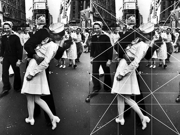
Has someone ever asked you why you like an image? Beneath the surface of great picture, there is a geometric design in hiding. During World War II, photographer Alfred Eisenstaedt worked for the early version of the Associated Press and went on to become a Life Magazine photographer, taking over fifty cover shots for them. Without getting too deep into Eisenstaedt’s personal story, I will say that he started photography with very little formal training.
Words To Know
-
1:1.5 Ratio: The 35mm negative measures 36mm x 24mm. Mathematically it can be reduced to a 3:2 ratio. Reduced even further it will be referred to as the 1:1.5 Ratio or the 1.5 Rectangle.
-
Eyes: The frame of an image is created by two vertical lines and two horizontal lines. The intersection of these lines is called an eye. The four corners of a negative can be called the “eyes.” This is extremely important because the diagonals connecting these lines will form the breakdown of an image.
-
Armature: When we use specific rectangles there is a system of connecting and intersecting lines that create a grid, or armature, which will form the composition. They are created by finding specific diagonal lines and their reciprocals.
-
Gamut: As we will see there are 360° in the image circle of a lens. This creates more lines in any armature than we would like to use. The limited number of directions we use in a composition is called the Gamut. Good artists rarely use more than 5 or 6 in any one image. As Myron Barnstone taught me, if you use all the lines of the grid your picture will look like the bottom of a bird cage.
-
Intervals: These are lines that are repeated throughout that create a rhythm in a picture.
-
The Horizontal, Vertical, & Diagonal Lines: Artists have a very limited alphabet. At their disposal they have a point, a vertical, horizontal, diagonal line, and a curve or arabesque. In order to successfully design compositions all good artists and photographers organize schemes with straight lines.
-
Major Lines: In an image we are creating a hierarchy. If there is no hierarchy it is very difficult for the viewer to understand what is important in an image. There is usually a single vertical, horizontal and diagonal line that dominates a composition.
-
Reciprocal: This is a line that intersects a diagonal at a 90° angle. Introducing the reciprocal will strengthen an image by reinforcing the diagonal. But careful, it should support not compete with the diagonal.
-
1.5 Armature: There are two ways to break down a 1.5 rectangle. The most basic is the 1.5 Armature. It is created by drawing two diagonals from each corner of a negative. Then draw their reciprocals from opposing corners, which intersect the diagonals at 90°. Through the Eyes of the Diagonal and their reciprocals, draw vertical and horizontal lines through their intersections. The 1.5 Armature was a very popular method used by Cartier Bresson early in his career.
Keep these terms somewhere you can easily refer to, since without them it is difficult to navigate a composition.
The Ballerinas
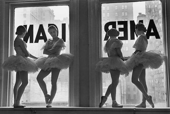
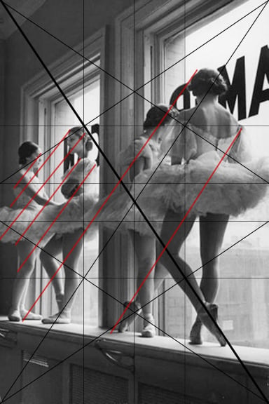
Eisenstaedt has a number of famous images of ballerinas. The two selected here are both arranged on a 1.5 armature. The first image has vertical, horizontal, and diagonal elements which are established as equally important. When all the lines are stressed evenly the composition tends to flatten itself and read as two dimensional. The second image (later in this article) is organized heavily on the diagonal and we will see what happens when a hierarchy is introduced to an image.
By shifting his position while taking the picture, we can see the difference between a photograph which is organized on a horizontal and a photograph organized on a diagonal. Let’s go through the horizontal image first and look at the importance of each line. This will help us understand how Eisenstaedt designed this image. It will reveal what parts of the picture were important to him and more importantly, allow us to take pictures with a more educated eye.
The Sinister Diagonal
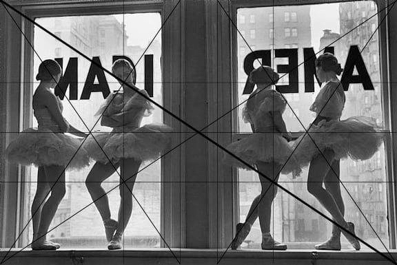
Sinister diagonal in bold
In general images are read from left to right. It’s a function of Western Culture. Being a lefty, I probably would have been burned at the stake in an earlier century, but the canon of art understands movement from left to right as “Baroque” and from right to left as “Sinister.” Even in Eastern cultures things on the left or left handedness is still discouraged. By selecting either the Baroque or the Sinister Diagonal, the tone of an image starts to emerge.
Eisenstaedt uses the Sinister Diagonal to draw our attention to the ballerina facing us. She is the subject. How can I tell? Squint your eye while looking at the picture. The ballerina facing us has the highest level of light and dark visible on her body and her silhouette jumps out because of the position of her legs. The other girls are shown in profile and one from the back.
The Sinister Diagonal, which runs from the bottom right to the upper left hand portion of the image lands right on the ballerina’s face. It is also the intersection of the reciprocal. You can see that the reciprocal starts at the lower left hand corner, runs through her face and intersects the sinister diagonal at a 90° angle.
The Vertical & Horizontal
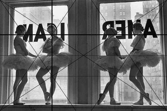
The dominant vertical and horizontal lines.
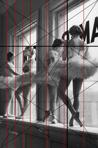
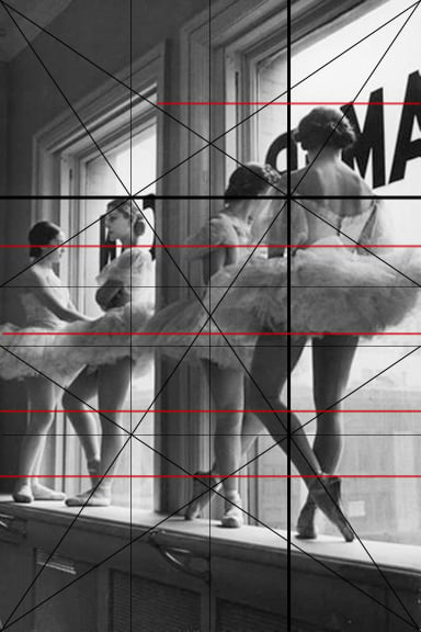
At the Eye of the Sinister Diagonal and its Reciprocal we have Vertical and Horizontal lines. These are the dominant lines in the composition. They are reinforced or supported by parallel lines throughout, shown in red. The spacing between the supporting lines starts to create a rhythm, “Do you see it?” The supporting lines reinforce the basic structure of the photograph.
Connecting the Dots
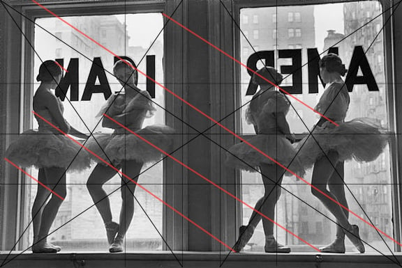
Repeated diagonals
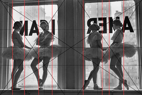
Repeated verticals
Man has connected stars in the sky since the beginning of time. Our brains can locate one point and another point and mentally draw a line. Artists and photographers use the Eyes of a rectangle like stars in the sky. By connecting the dots they create movement and action in a picture. Here we can see how important the foot in the lower right hand corner really is to the image. It starts the diagonal that runs from the right side, through the knee of the second ballerina, to the face of the third. The ballerinas are designed on a diagonal. If you can start designing on a diagonal, your pictures will be infinitely more engaging. Watch the corners of your viewfinder for things that connect on diagonals as an exercise.
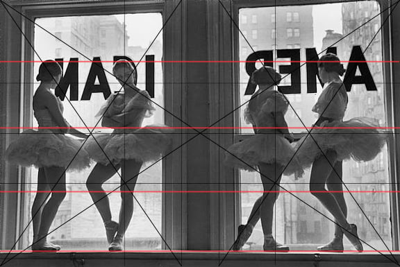
Repeated horizontals
In this image, the verticals of the window frames and the ballerinas are as strong as the diagonal lines. Also the lines connecting their heads, waists, and feet on the horizontal are very strong. When all the lines are of equal importance the image tends to become flat and two dimensional. It’s kind of like setting all the dials on an amplifier to zero. There is no balance because every element is at the same intensity.
Creating a Dominant Diagonal

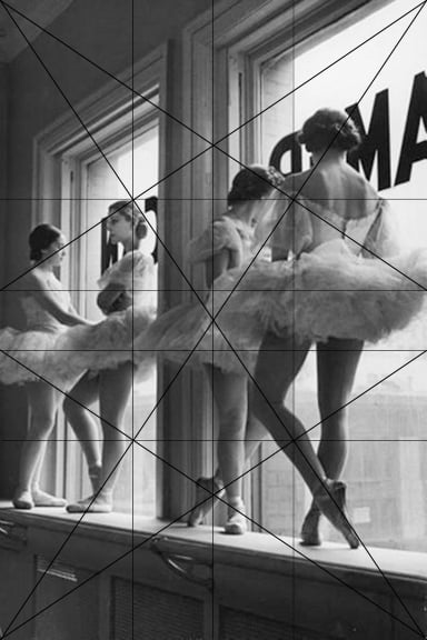
The 1.5 armature
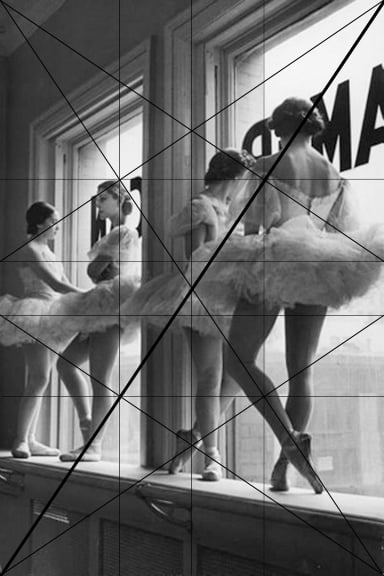
In this second image, Eisenstaedt moves to the right side and the image totally changes. Composed as a portrait, the dominant diagonal is now a Baroque Diagonal, instead of the Sinister Diagonal. We are using the exact same 1.5 Armature, but tipping it on end. This causes the Dominant Diagonal to start in the lower left and run to the upper right hand corner.
The feeling is less aggressive than the previous photo because the ballerina who was facing us in the last picture is now in profile. Her role has diminished since she is receding into the background. If we squint our eyes again to look for the subject we see the greatest level of contrast happening on the back of the ballerina all the way to our right. Her armpit falls exactly on the Baroque Diagonal.
When we follow the Reciprocal we see that it connects her tutu and her shoulder, then continues through the next ballerina’s head. Here is a perfect example of the Reciprocal supporting the Baroque Diagonal and making it stronger.
Stressing The Important Parts
Baroque diagonal
Repeated diagonal
In the previous image, the window frames landed right on the vertical intervals of the armature. Landing something on a major division makes it important. In this image, the windows are less important because the verticals land on three of the four ballerinas. The second ballerina is the only one whose body coincides with the window frame. Additionally, the verticals and horizontals in the previous image ran parallel to the 1.5 Armature. They were a very dominant force in the picture.
By moving to one side, Eisenstaedt was able to reduce the coincidences of the window frames from the armature. Since this picture is really about ballerinas and not window frames, I would say this is a more successful composition.
Using Anatomy as a Tool

Dominant Vertical and Horizontal lines
Repeated verticals
Repeated horizontals
In the first image, the ballerina on the right was pointing her toe downwards. This created a line from her foot, through the next ballerina’s knee and up to the subjects face. We could say it started the conversation, but was not delivering a speech.
In the second picture look how powerful the leg on the Sinister Diagonal (remember the one running from right to left) is to the composition. The leg, from toe to thigh, lands right on that diagonal. These are the types of coincides we are looking for in order to design a strong image. That leg is critical to the composition.

Look at how important her leg is to the composition. It runs right along the sinister diagonal.
Try this: hold your finger a few inches away from the screen and cover that leg (the one on the Sinister Diagonal) for a second. Look at how lifeless the other legs are in the rest of the image. Now remove your finger, BANG! See how that leg jumps out? It is essential to the design of the image.
Master photographers like Eisenstaedt knew what was important in an image to create action, drama, and movement. Otherwise we are left with a “sea of mannequins” standing in the window. But with that simple point of the toe, the ballerina’s leg enlivens the entire composition.
The Roots Of An Image
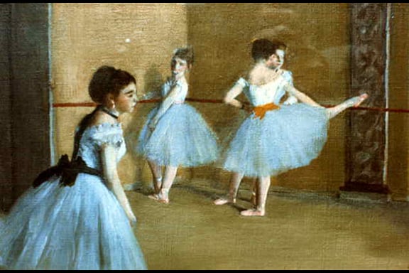
Dancers at the Opera by Edgar Degas. The slight black line at the top and bottom represent the original image. It looks like they cropped it slightly when they scanned it.
Most great photographers studied, looked at, or were educated in painting. In the history of art, photography is fairly new. So our exposure to images often comes through paintings. This certainly would have been true of Eisenstaedt. If we look back to the 1800s we discover that French painter Edgar Degas worked extensively with dancers.
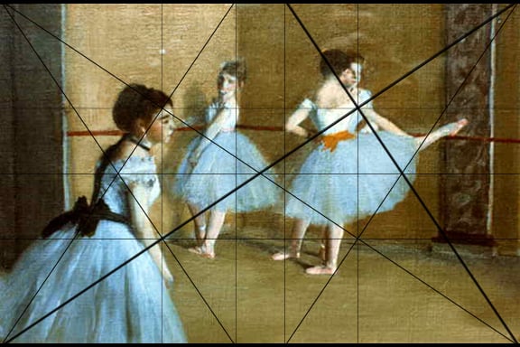
The 1.5 armature and the baroque diagonal with its reciprocal.
Edgar Degas
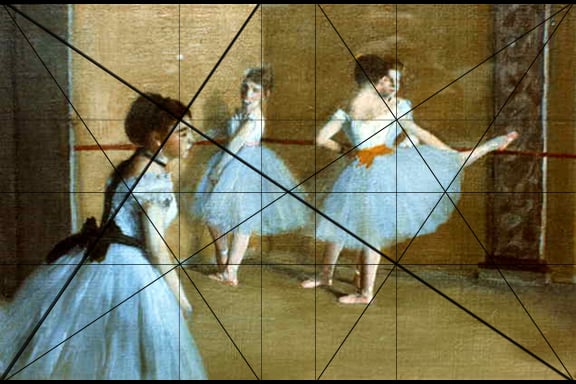
The sinister diagonal and its reciprocal
Degas has one huge advantage over Eisenstaedt. He can make sketches watching the dancers, then refine his design back in his studio. As a result, painters tend to have more elegant and complex designs than photographers. As I mentioned earlier, a composition on the Diagonal is the most active type of arrangement. We see Degas using the Baroque Diagonal running from the lower left to the back of the dancer on the right. The Baroque Diagonal hits the white of her shoulder and finishes in the upper right hand corner. The Reciprocal Diagonal forms the angle of her body and creates a vertical that hits her elbow.
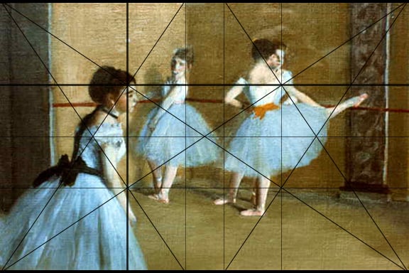
Dominant vertical and horizontal
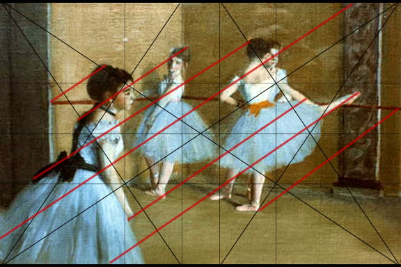
Repeated diagonals
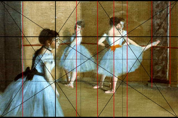
Repeated verticals

Repeated horizontals
On the opposite side we see the Sinister Diagonal and its Reciprocal landing on the forehead of the ballerina in the foreground. The Sinister Reciprocal also creates the angle at which the ballerina in the background (facing us) is standing. While there are vertical lines and horizontal lines in the picture, we can see that Degas made them less important than the diagonal. He wants us to feel the movement of the dancers. He does not want them standing like statues. Notice the almost uncomfortable lean of the ballerina in the foreground. She looks as if she might fall over. We literally fall into the image with the gesture of her body. Everything is this image is a deliberate design decision. The more a photographer can understand design and the classical tradition of art, the more effectively they will be in making images.
Conclusion
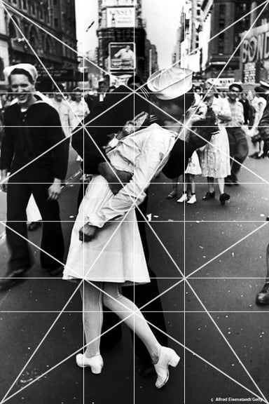
V-J Day in Times Square
Applying the lessons of design to photographs will reveal the “Subterranean Architecture” used by artists and photographers to design pictures. In essence, the compositions are not very complicated, but will prove to be incredibly effective at creating a successful hierarchy in images.
Based on the information above, you will easily see why Eisenstaedt’s “V-J Day in Times Square” is considered to be a classic. The woman falls on the Baroque Diagonal, its Reciprocal passes through both of their faces; the Sinister Diagonal passes through both of their arms and hits his elbow and shoulder. Can you see how exquisitely designed this image really is? Hopefully with this analysis you will be able to articulate why an image works or why it is poorly made.
About the author: Adam Marelli is an artist, photographer, and builder who lives in New York City. He holds popular photography workshops year-round around the world. Visit his website here. This article originally appeared here.


