
fooled ya brain
JdinotoThis is surreal and whimsical.


Project from GLKT generates surreal walking characters made with random objects and can save your results in GIF format:
Random Access Character is a procedural character generator.
It lets you generate an infinite number of different characters, made from various objects and textures. Morphology, colors, movements, patterns are mixed together to create a unique blend and generate a unique character every time.
You can save an animated GIF of your favorite find, that will be upoaded to imgur. You can then share your encounter to the world !
It is available for PC, Mac and Linux here
 |
submitted by /u/GreenFrog76 [link] [comments] |
JdinotoReally nice policy-based data visualization. Not character - this focuses on policy. High quality material.
 |
submitted by /u/LMGagne [link] [comments] |
JdinotoNot surprising, but this isn't anything new. Before Trump this seems an accurate portrayal of how the network news stations responded.
 |
submitted by /u/2big_2fail [link] [comments] |
JdinotoDon't drink and drive please.
![[Do not drink and drive. Book a cab or call a friend]. Percentage of US car crash fatalities where driver blood alcohol level was .01 and above, 1999–2012](https://b.thumbs.redditmedia.com/zhT0Udvo5rndnJEuvGfYxJSRfOuKrPgDFL00lCVlfOI.jpg "[Do not drink and drive. Book a cab or call a friend]. Percentage of US car crash fatalities where driver blood alcohol level was .01 and above, 1999–2012") |
submitted by /u/daldablade [link] [comments] |
JdinotoSaving this for later.
 |
submitted by /u/fuckyousir69 [link] [comments] |
JdinotoSlopegraphs are great.
Elizabeth Ricks recently joined the storytelling with data team after spending the past decade in various analytical roles in the healthcare, manufacturing, retail and payments processing industries. Most recently, she was Assistant Vice President of Analytics for Bank of America Merchant Services, where she strengthened her data storytelling skills by using the key lessons covered in the storytelling with data workshop. Elizabeth has a passion for helping her audience understand the "so-what?" when communicating with data. Join me in welcoming Elizabeth and her first blog post here! You can connect with her on LinkedIn or Twitter.
Communicating the “so what?” is fundamental to telling a story with data and I can’t overemphasize the importance of choosing an intuitive visual. Often our story is lost, simply because because we’ve chosen a graph that forces the audience to do more work than necessary. Today’s post illustrates this transformation with a real-world (de-identified!) example.
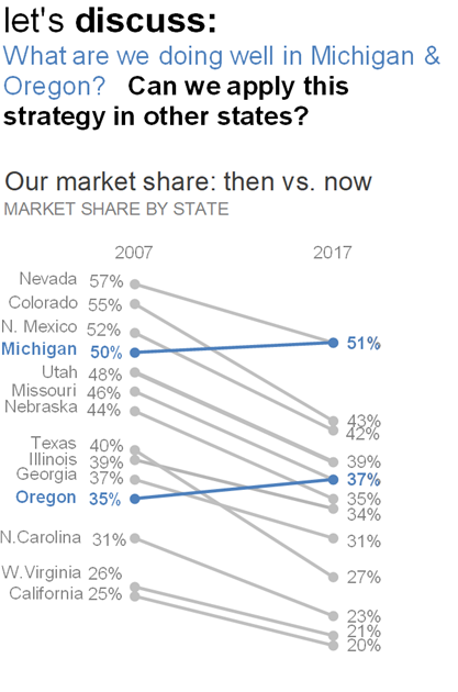
Imagine you’re a marketing analyst tasked with evaluating your product’s market share and communicating the growth opportunity to your senior marketing leadership team. You’ve gathered the data on the 14 states in which you operate and visualized your market share over the past decade in this bar chart:

This graph is functionally adequate. It’s thoughtfully designed using pre-attentive attributes. The color blue cues us where to look first (that’s our market share now!), which allows our second series (our market share then) to fade to the back.
Additionally, horizontal bar charts have many visual advantages as outlined in storytelling with data:
Familiar and easy to read
Useful for long category names
Align well to how we typically process information: starting from top left and zig-zagging across the page so that we process the category names before interpreting the data
We see this final point demonstrated here, as a quick vertical scan makes it relatively easy to see that our product’s market share is down in every state, except Michigan and Oregon.
That’s fantastic if that’s the end of the story. However our task is twofold: we also need to communicate how our market share has changed over time and our recommendation for the opportunity. With the current design, how easily can you see which state(s) had the greatest decline in market share? Between Michigan and Oregon, which had the greatest improvement?
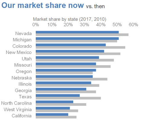
As the designer of this information, we are asking our time-crunched marketing executives to do a lot of work to scan the graph and make 14 different comparisons. Never make the audience do more work than necessary to understand a graph! Perhaps a different visual would make the task easier.
Enter the slopegraph.
The slopegraph is a visually intuitive way to see what’s changing in your data. For a deeper analysis of the beauty of slopegraphs, check out this post.
Let’s instead connect the data points with a line. Notice where your eyes go first now.
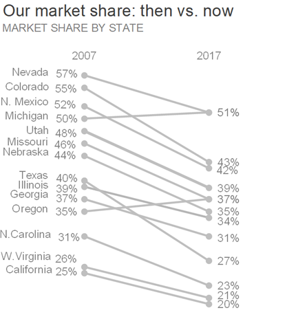
A few interesting things emerge. We can immediately see that some states have higher rates of change than others, both positive and negative. That’s the "so-what" what we want our audience to understand!
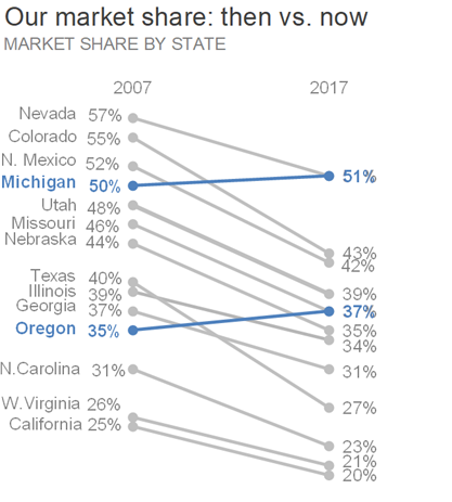
We can further improve by using color to focus our audience’s attention on specific takeaways. For example, we might use blue to highlight the positive story: we’ve improved in 2 states!
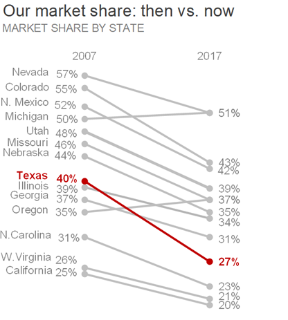
Or we could focus attention on Texas, the state with the greatest market share decline.
Finally, we’d add a call to action emphasizing how the audience should use this information. Remember, we always want our audience to do something!
In conclusion, if your “so-what?” is what’s changed over time, then the slopegraph can be an extremely effective visual. If interested, you can download the Excel file with the above graphs.
From a formatting standpoint, slopegraphs can take some time to set up. However, that’s time well invested if it means your audience clearly understands the story. Here’s a handy Excel template to get you started.
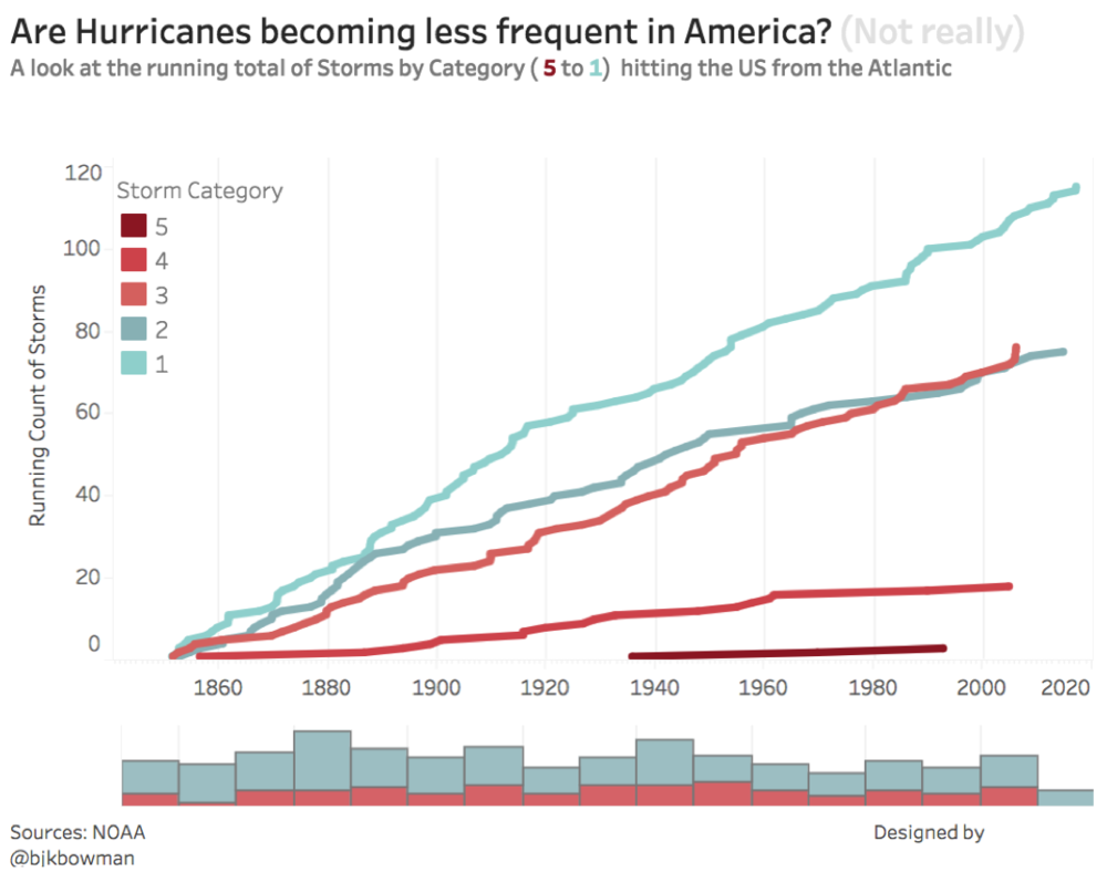
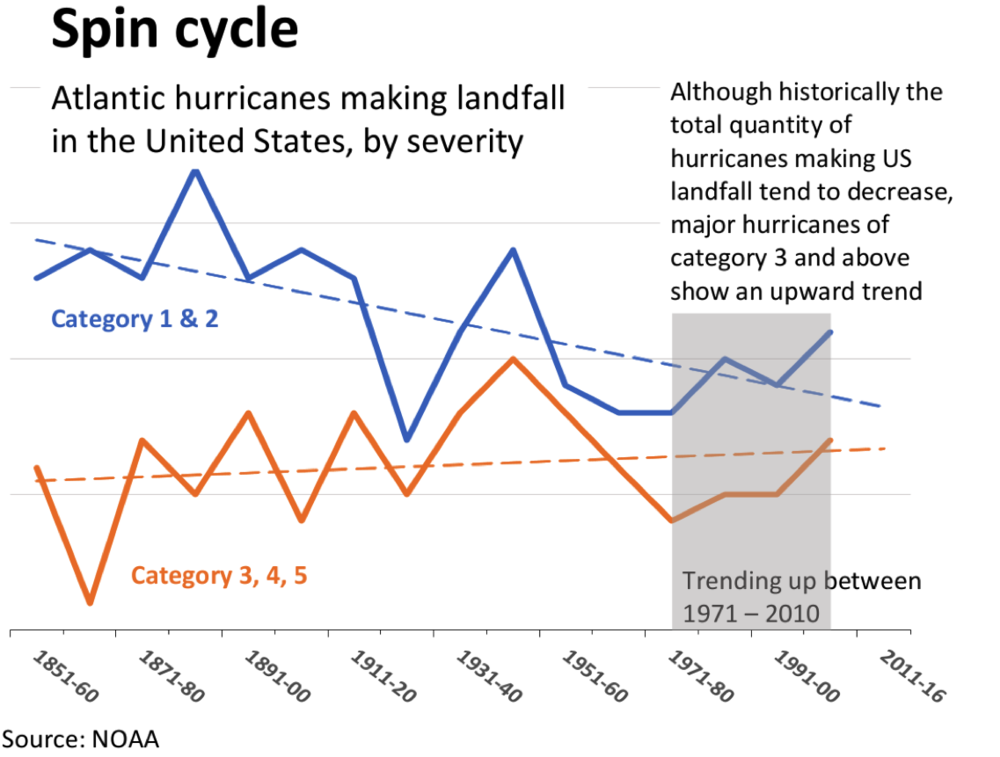
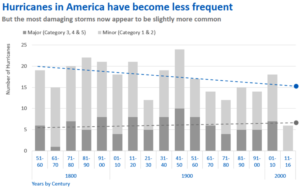
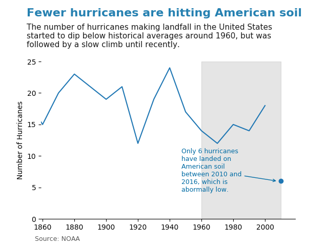
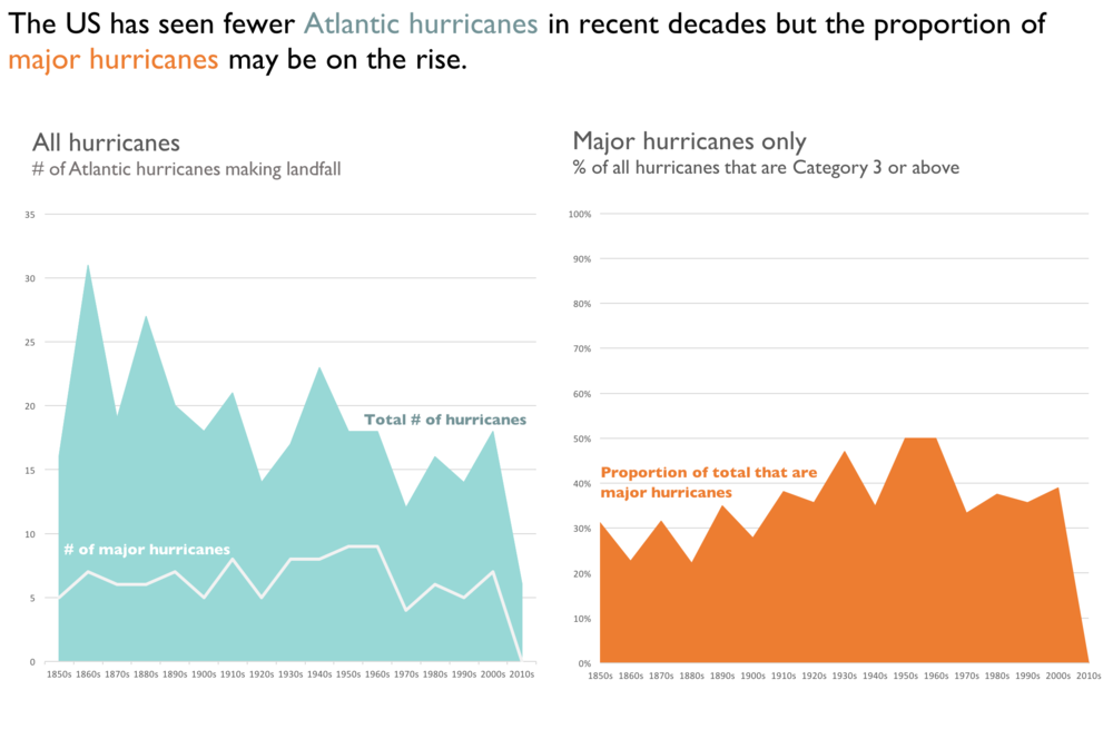
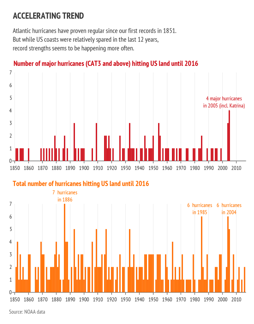
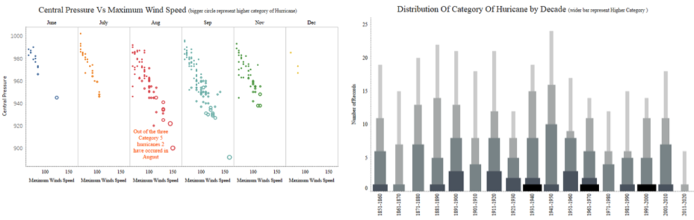
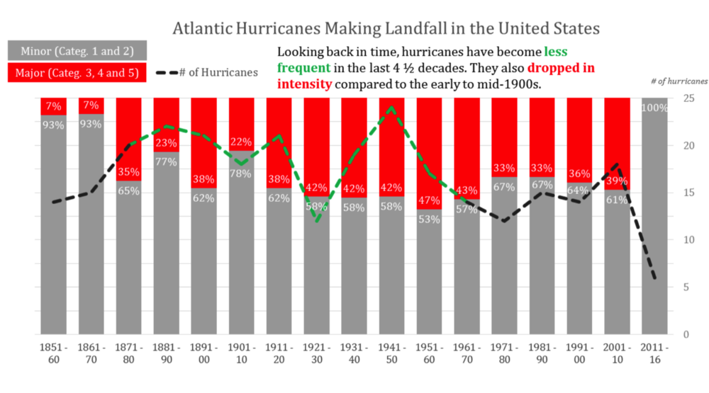
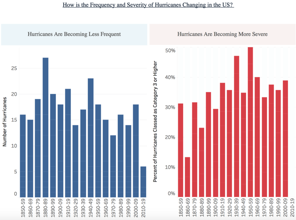
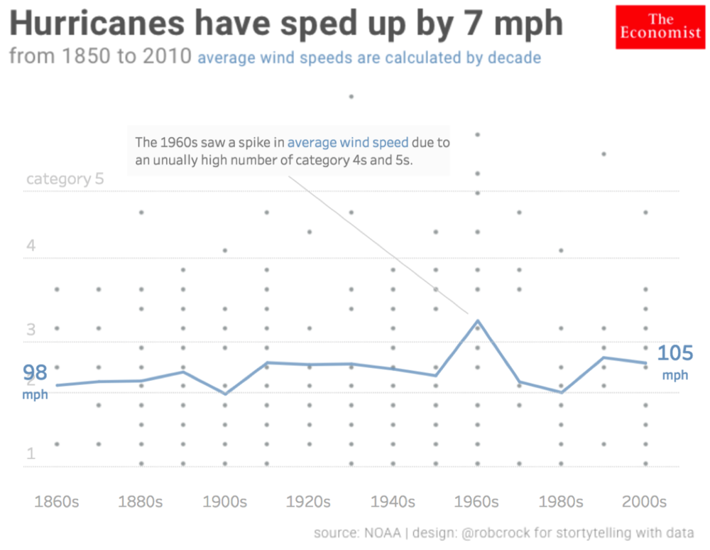
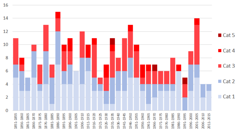
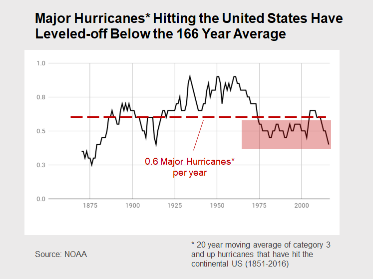
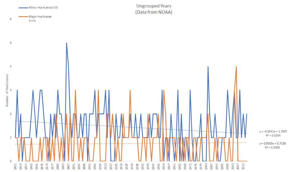
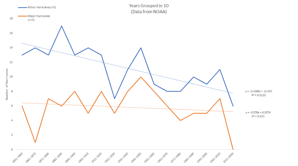
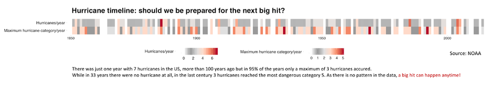
JdinotoAn amazing array of Hurricane data visualization!
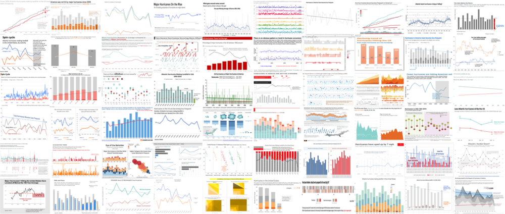
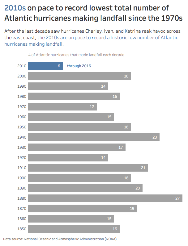
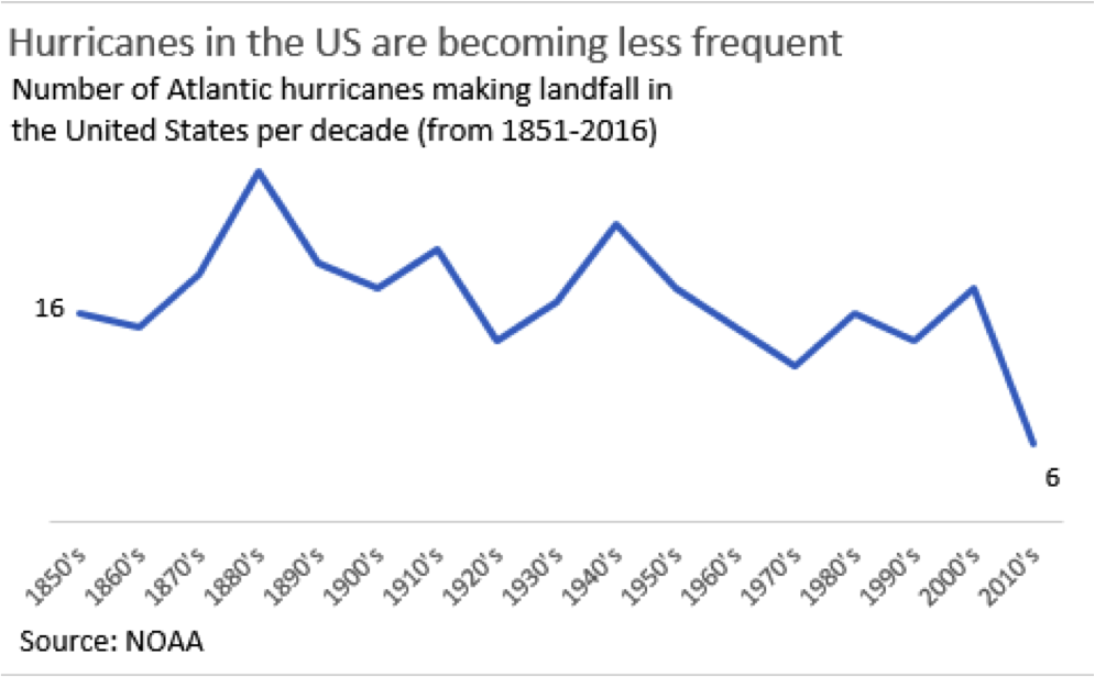
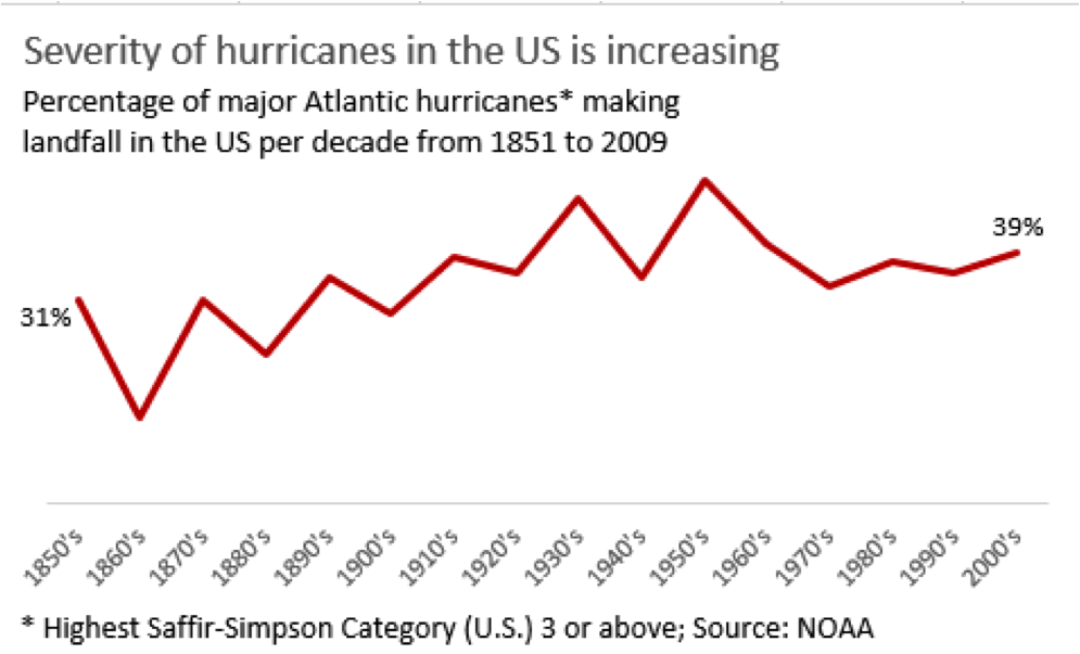
A few weeks ago, I posted a visual from The Economist on hurricanes and invited readers to makeover the graph and let me know what headline they would put on it. I was excited by the variety (and number!) of responses from all over the world. Thanks for your patience awaiting this follow-up post: it took a bit of time to pull 60 makeovers together in a sensible way!
First, let me summarize some of what I saw. People used a variety of tools (mainly Excel and Tableau, but also R/ggplot2, D3, Python, STATA, PowerBI, and others). Folks also visualized the data in various ways (lines, bars, stacked bars, area, bubbles, dot plots, maps, and more). Many people used multiple graphs. Some pulled in other data points (e.g. barometric pressure, wind, number of deaths, cost of damage). Many people chose to highlight the lack of pattern/trend in the data or otherwise changed the headline and takeaway(s) called out.
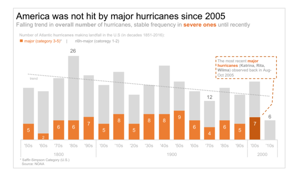
Here is the original graph from The Economist:
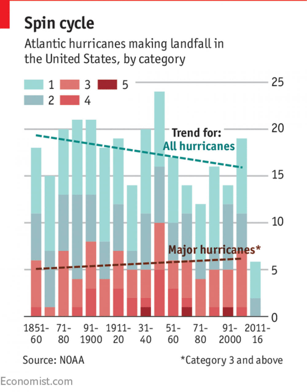
Common points raised about the above included:
It's clear you had fun with this. There were a number of comments simply expressing excitement about the challenge and it seemed folks found it to be a stimulating exercise. I'm happy you thought so and would love to do more of these. Stay tuned on that front. I should mention also that I did not personally participate in this challenge—it would have been unfair after seeing all of your amazing remakes and I decided my time would be better spent compiling and sharing back all of the great work you've done.
A couple notes to those who submitted makeovers: first off, THANK YOU for taking the time and sharing your work. In my copying/pasting/condensing, if I've misrepresented anything or failed to include a social media profile you'd like to have linked, please send a note with specifics to makeover@storytellingwithdata.com and I'll take care of it. The makeovers are posted below in alphabetical order by first name + last initial (I omitted full last names in respect of those who would rather remain anonymous). If you thought you submitted a makeover but don't see it here, please send a note with your makeover to the address above and I'll add it (I think I got them all, but you never know). Also, I'll apologize up front for any fuzzy visuals—that's my doing (not yours)—getting everything into a common form for posting here was more challenging than one might imagine!
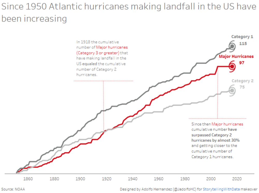
Adolfo visualized cumulative hurricanes in an annotated line graph:
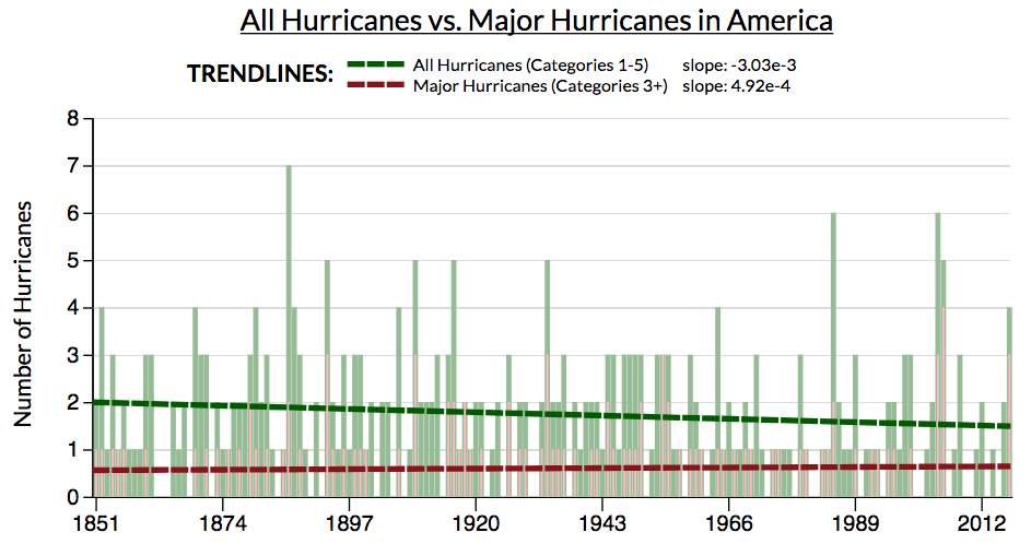
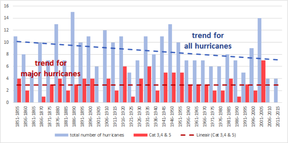
Alex (LinkedIn) from Warsaw, Poland, recapped the following changes in Excel: "aggregated into 2 groups (major, non-major), tried to communicate 2 things with title: 1) about trend in overall number and majors; 2) long time gap since last major, pushed back/out non-data (gridlines, non-major series, subtitles), eye-catchy color for majors, labels for majors—to see that trend is stable for them, extra callout for recent majors back in 2005, downward sloping trendline for total number (although, here it's kinda cheaty, since last decade is only 6 years, but I decided not to reveal this cheat), and made order with Y axis (more clear I guess)."
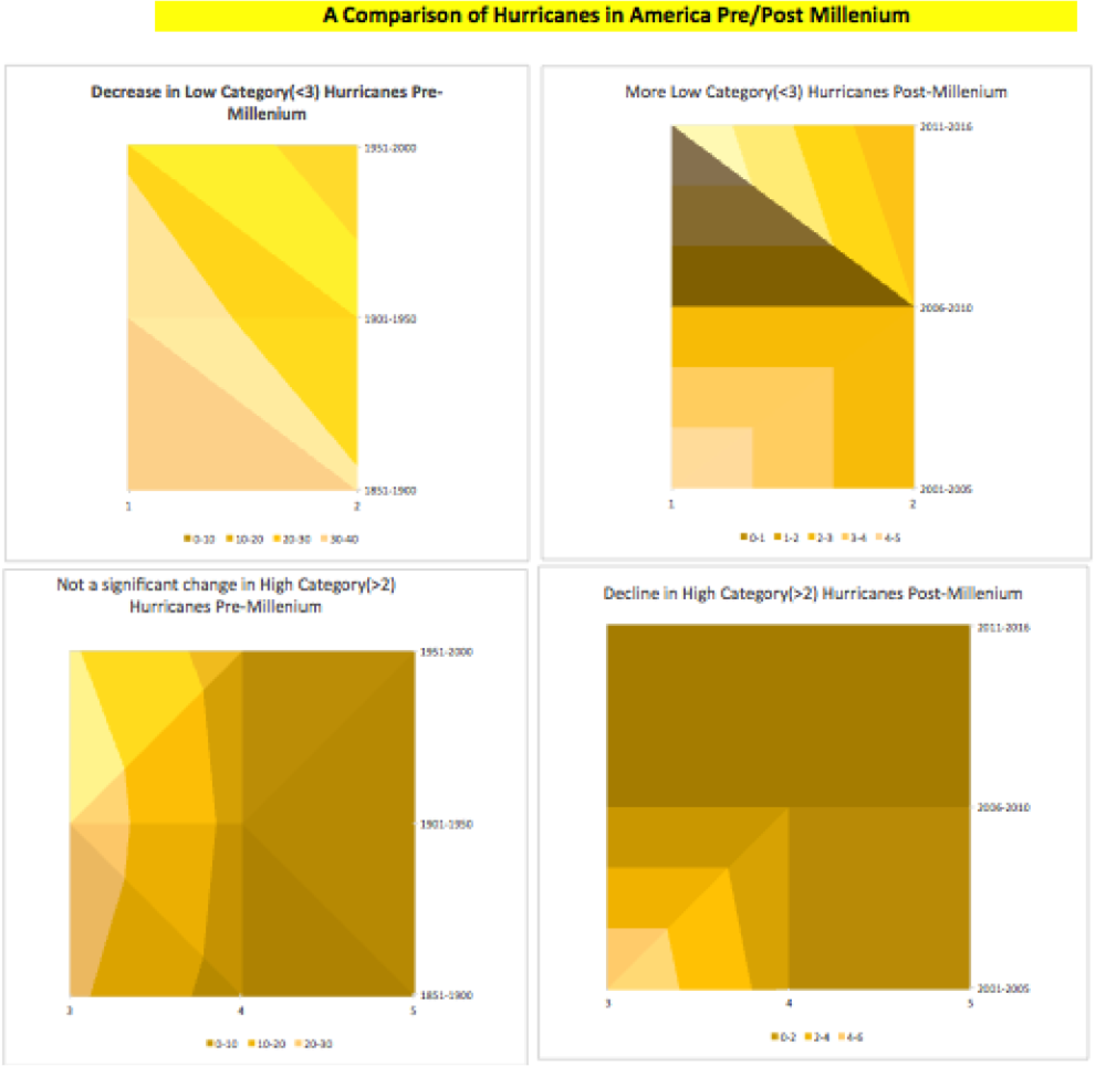
Alessandro said he'd group categories together, as illustrated below, and accompany this graph with the following 50-year stats:
1900-1950: -3.1% total number of hurricanes, +60% hurricanes force >=4, -6.5% hurricane force <=3
1950 - 2000: - 24.2% total number of hurricanes, -12.5% hurricanes force >=4, -24.4% hurricanes force <=3
Andrew chose a view that focused on major hurricanes with a line graph:
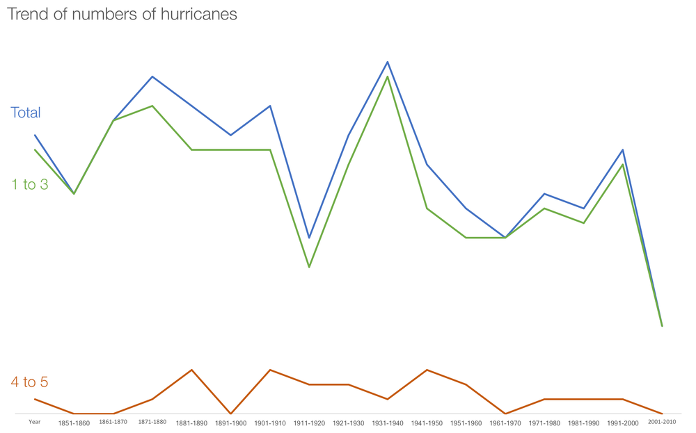
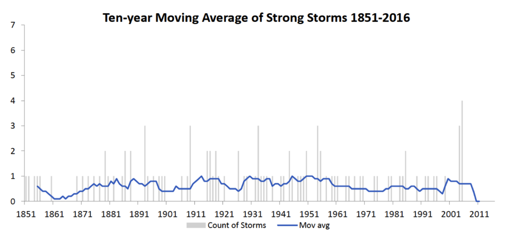
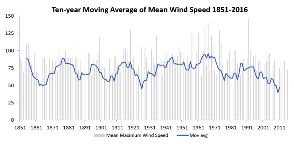
Andrew illustrated the hurricane data through three views, plotting both actual (bars) and moving average (lines) for number of storms, number of strong storms, and wind speed.
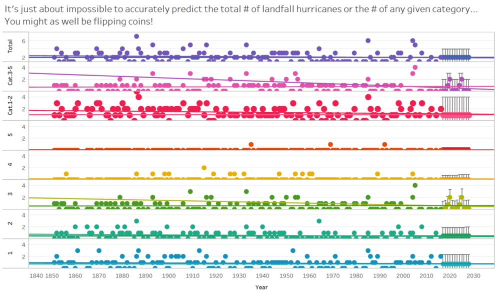
Andy (Twitter | LinkedIn) likened hurricane predictions to flipping coins in his colorful view of the data:
Ariane, Marina, and Luciana decided to keep the headline but group the years in a different way. They said: "We are using 5 because we don't have complete information for our current decade (2011 - 2020). So we're afraid of comparing apples and oranges. Another option of our group was not to mention the growing trend for category 3 hurricanes. We believe it would change the headlines completely!"
Ben (Twitter) used Tableau to visualize the hurricane data. Here is the Tableau Public version.
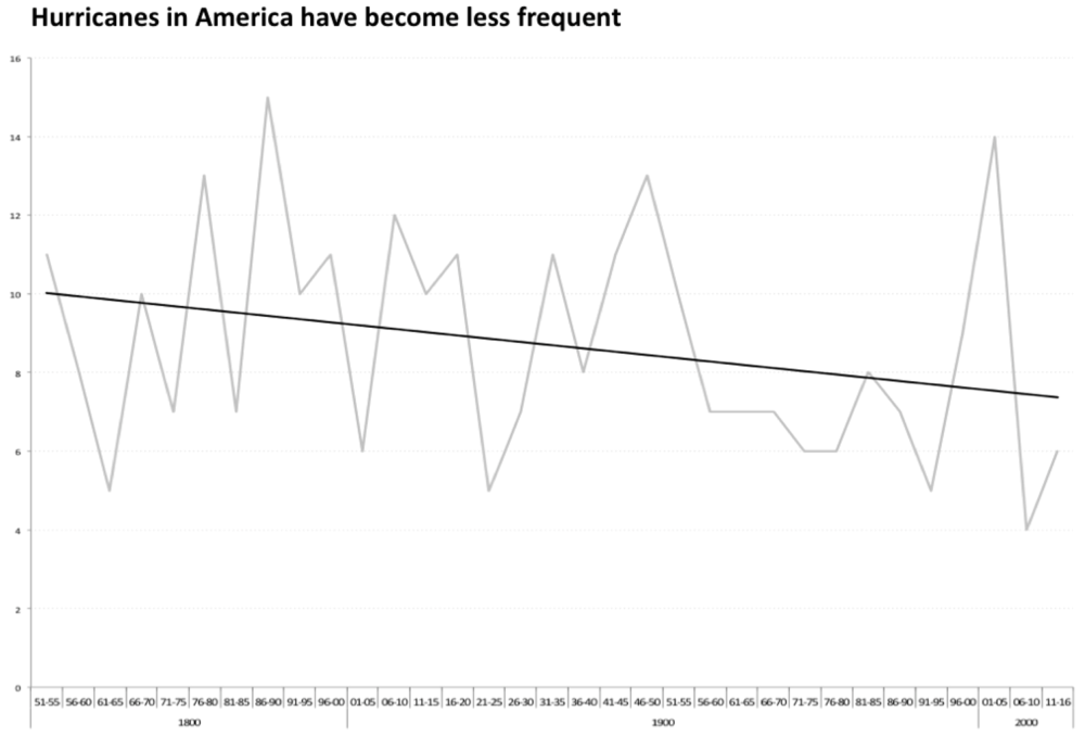
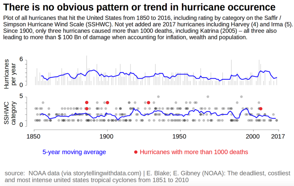
Billy (Reddit) was the very first to submit a makeover for this challenge. He writes, "There’s no significant trend on that chart (definitely not a downward one!), and the author does his/her readers a disservice by implying otherwise."
Bridge (Twitter) created two views of the data, along with the following explanation.
Version A: In sticking with the original headline (and not reading the article), I came up with this (assuming I'd drop in the Source, and Major* qualifier would be included further below).
Version B: In perhaps sensationalizing the headline, I took a slightly different approach, partially to better handle the white space, but also because it's what I'd actually imagine reading.
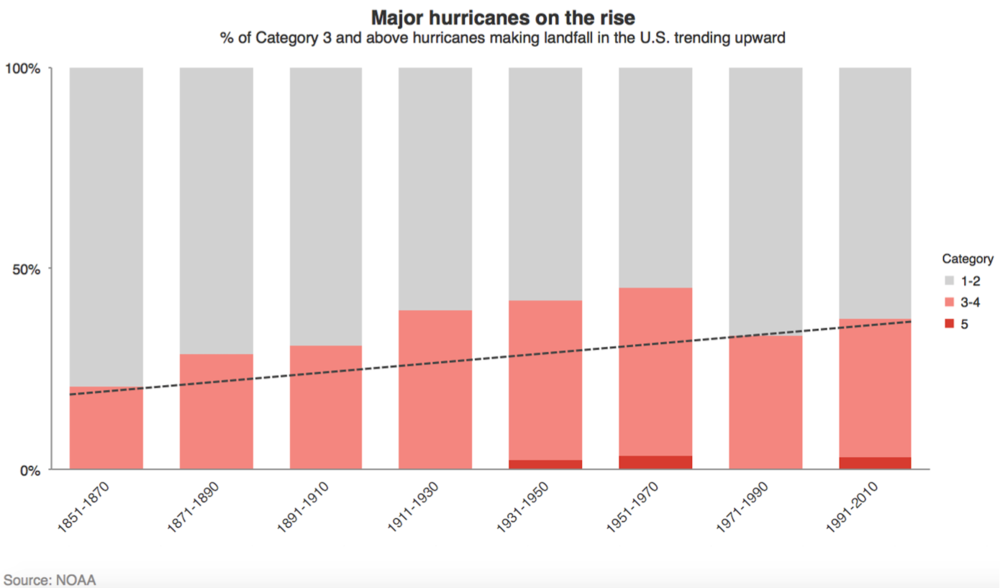
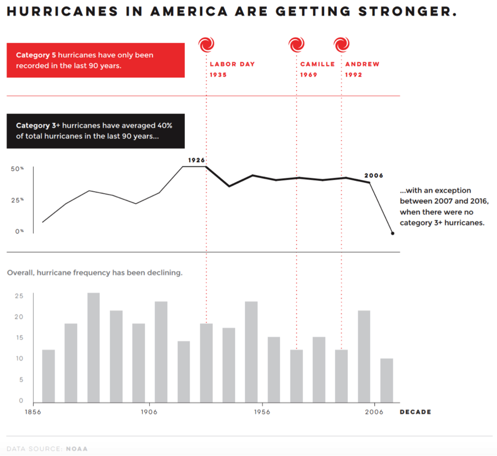
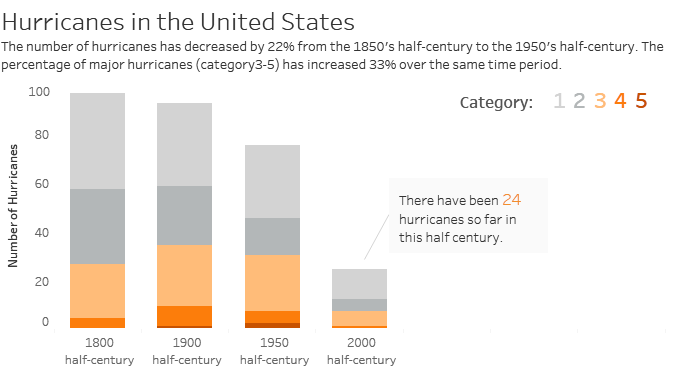
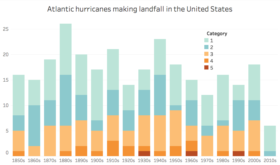
Budana's suggested headline is: "Major hurricanes in America have become more frequent." With the following graph and comments:
Cindy and Amanda worked together on a bar/line combo:
Colin (Twitter) created an interactive visual on Tableau Public (where you can hover over specific data points and see details). Below is a screenshot. He also posted about his work—and how he applied the storytelling with data process—on his blog.
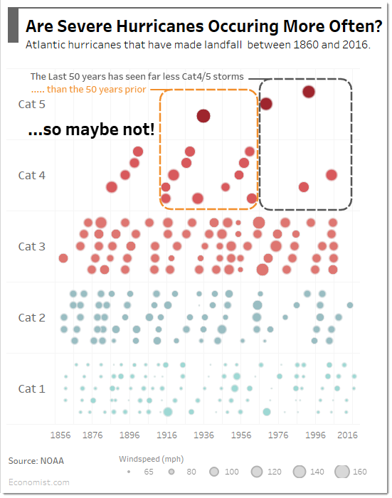
Craig (Twitter) from Syndey posed the question, "Are severe hurricanes occurring more often?" He wrote about his process on his blog. Also check it out in interactive form on Tableau Public.
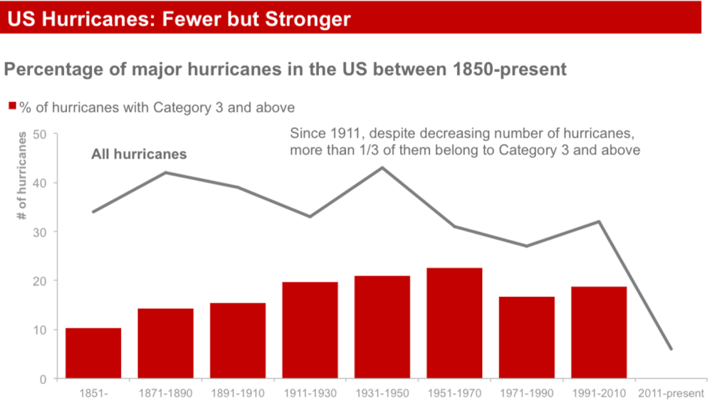
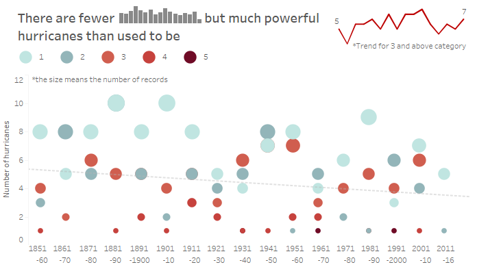
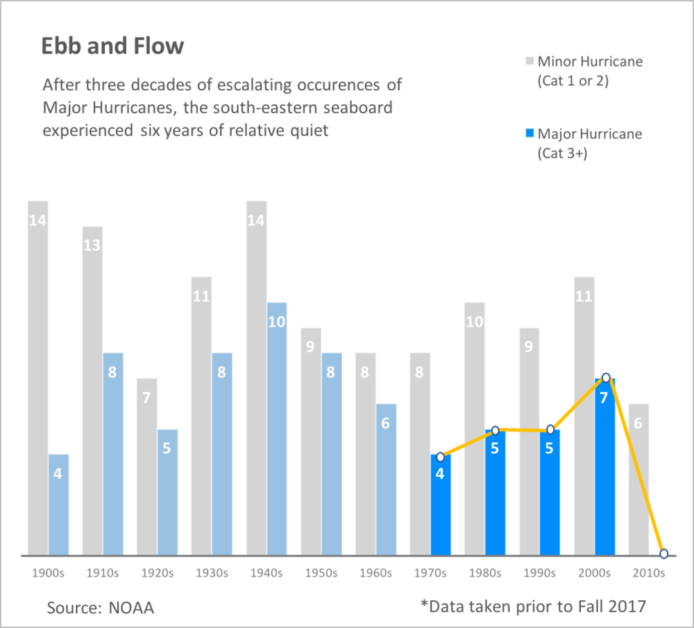
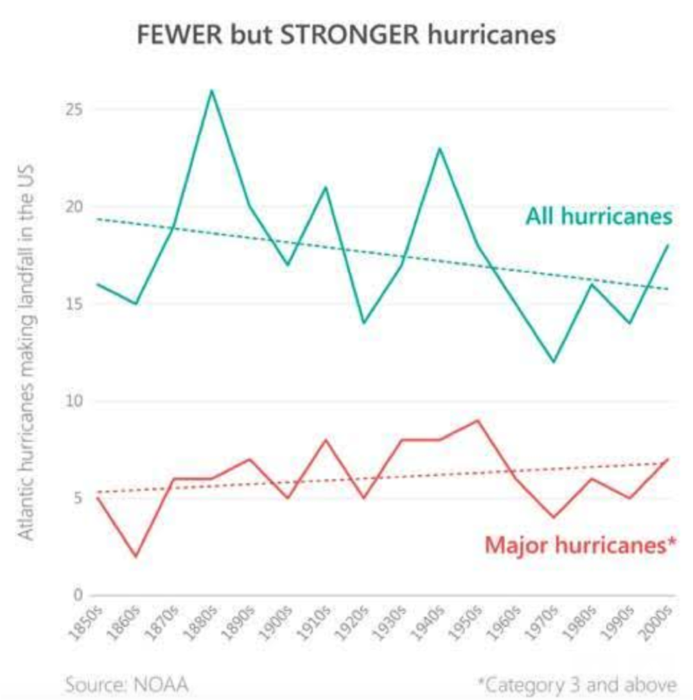
Dangfun plots total and percent Category 3 and above with lines and bars and the headline, "Fewer but Stronger."
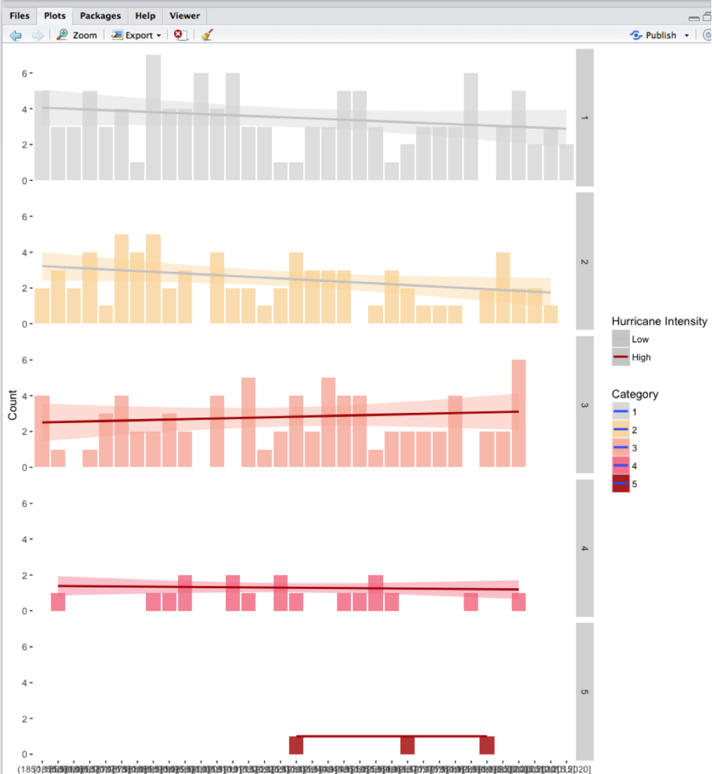
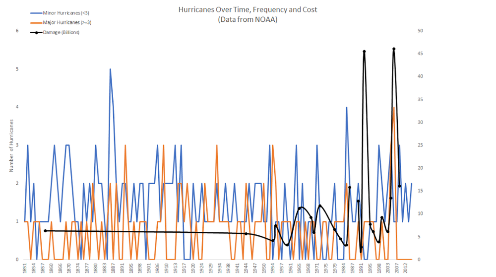
Daniel (blog) from Germany created the following in R, noting, "I decided early on that I wanted to do a visual that includes all data from the source (instead of showing only aggregated versions) to give a visual representation of all the noise and randomness we're seeing there. Also I trashed a few variations with additional data (like death count and damage for the hurricanes) feeling that it made the graph way too complicated to read. It should be possible to get a comparable result in Excel by adding transparency to the plot points (it makes scatterplots sooo much nicer and adds density information)." He also blogged about his approach.
Divya questions the original headline, writing: "Ignore the horrible overlapping interval labels (every 5 years), but you see how the slope for all categories is only slightly decreasing and in all cases the Standard Error band (colored haze) allows for the possibility of the trend line to go in the exact opposite direction? So one cannot strongly assert that hurricanes are decreasing across categories. I'm using same scale to show that even relative frequency (higher for low category earthquakes) doesn't dampen the possibility but actually has larger SE bands."
"I've seen a number of your posts point out the above effect where artificial precision induces a false accuracy. I'm approaching the same from a core stats perspective. [This] doesn't make for a very good graph, let alone for a headline, but in favor of effective data communication over pure viz, it's a point pertinent to convey."
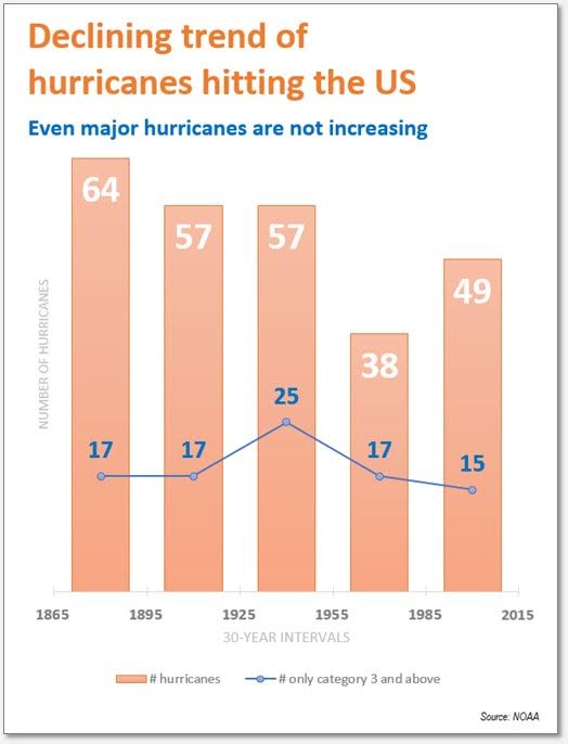
Eduardo highlights a declining trend via 30-year buckets:
Gavin also highlights a decreasing overall trend, but also comments on a slight increase in the most damaging storms:
Glenn shows two views of the data, along with his comments: "Show the raw data as 10 year rolling averages. While this introduces a lag, it creates a trend that isn't dependent on grouping the data into decades, which is independent of the frequency. Only show total hurricanes and major hurricanes. Show the ratio of major to total, to see if hurricane intensity is increasing (it isn't, but total frequency is increasing)."
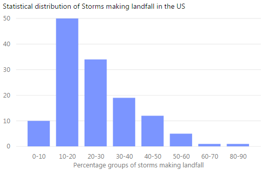
Gregg (Twitter) from the UK shows two views of the data, commenting, "I had a think about this graph and the biggest problem for me was the dataset used. While hurricanes making landfall in the US affect more people, this view misses the bigger trend of the total number of Atlantic hurricanes. If the trend of total Atlantic hurricanes is increasing then the trend of hurricanes hitting the US will increase as well."
"Second, I would include an additional graph to show that the storms making landfall in the US is random and that it follows a typical statistical distribution."
"I think that these charts show the key takeaway from the data: The number of storms and intensity of storms varies each year but is generally on the rise. It naturally follows the more storms instead of less will hit the US in the coming years."
Heather (Twitter) focuses attention on major hurricanes:
Ivett (Twitter) from Budapest says, "I enjoyed redesigning that stacked bar chart because there was another reason why I read again Cleveland's Graphical Perception study and your book. By the way I also learned a lot about the hurricanes." She also blogged about her process and visual perception in dataviz.
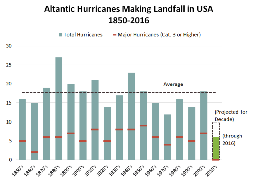
Jason plotted total and major hurricanes, drawing attention to and projecting a full decade for the final point of data:
Jon built a tool to explore the data in D3 and posted this plus his thoughts and some animated GIFs of the tool in action on GitHub.
Kat (Twitter) pulled together a couple graphs and annotations into a single view:
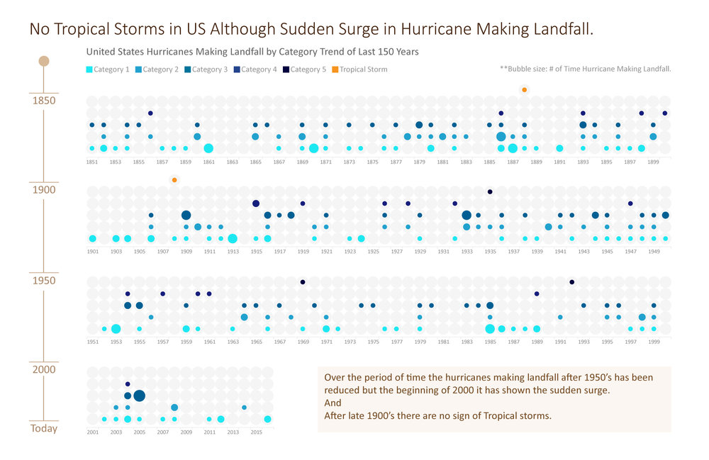
Kettki in India writes, "The major concern of mine in ET_NOAA version was the absence of data, 'years when the hurricane did not made it to the landfall' and it’s an important part missing from the data. I thought seeing the pattern here is more important than the numbers, especially when we are analysing centuries of data together. And that the exploratory analysis would be the better approach to this. I agree that it is a challenging to showcase more than 150 years of information on small real-estate, and it made me thinking all over again. To begin with I was not in the favour of stack bar charts (as I did not think, adding # of storms would depict the right information) but now after working on this, it made me wonder."
Kevin (Twitter | blog) created the following and posted on Tableau Public.
Kevin R. created a line graph focusing on the decrease in total hurricanes over time.
Leonard shared the following: "Since the goal of the chart was to show that major hurricane landfalls are trending upwards, I got rid of the background column chart showing hurricane counts per year. I found the column chart distracting: the counts fluctuate so wildly from decade to decade that it leads the viewer to question the accuracy of the trend. I also made the line continuous, rather than bucketed by decade."
"In my title, I would have coloured the words "major hurricane" to match the red line, perhaps negating the need for a legend altogether. The tool I used to do this (Power BI) doesn't have that option though."
"I do wonder how meaningful regression analysis is on such a dataset, given that measuring wind-speed in 1901 was surely less accurate than it was in 2001. Clearly, The Economist feels comfortable with it though."
Man listed what was less than ideal in the original...
...followed by what was done to simplify, make more readable, and deliver a clearer message:
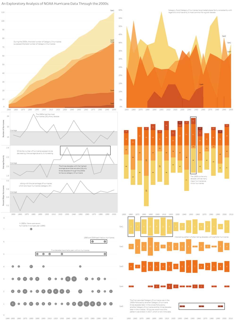
Marco did a ton of analysis in STATA, outlining a number of observations and illustrating in tabular and graphical form (I've included just a subset here), which he summarizes in the following:
"For me the summary is, when we consider yearly data we find no evidence for statistically significant linear trends over time for major or all hurricanes over time. Moreover, different choices of periods of time or different starting points can produce different results: looking at the last ten decades shows us an almost significant downtick in major hurricanes."
Marco also writes:
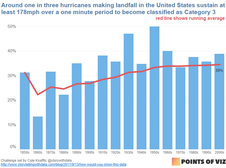
Mark (Twitter) writes, "I’m not sure the outcome is sensational enough to justify a headline, but if I were to offer one it would be something neutral, such as 'Around one in three hurricanes exceed 178mph.' " Mark also blogged about his process.
Matthew chose a horizontal bar chart, emphasizing the most recent decade:
Meike points out, "Great example of how data can be used to push an agenda! That's why I chose 2 versions for my makeover—one keeping the original headline (replacing "America" with "US" though), and one to tell a different story."
"Some design decisions I took: changing the x-axis labels to make them easier to understand, removing the category 1-5 distinction and just showing one development per graph (Total vs. % Major Hurricanes/Total), removing y-axis labels and labelling first and last value instead, removing trend lines, removing gridlines. Apart from that, I chose to remove the 2010's in the second graph—because as recent events have sadly shown, the hurricanes have not stopped in 2016. I left it in in the first graph, though, because that's what was done in the original version and it reinforces that message."
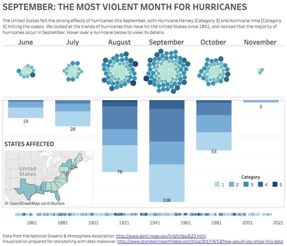
Michelle's headline would be, "September: The Most Violent Month For Hurricanes." She says, "I experimented with a few things, and the biggest pattern that I noticed was that most hurricanes occur in September. Not too surprising, but I had fun making the data interesting to play with anyway!" Here is the Tableau Public version.
Miguel from Portugal created two views of the data in Excel:
Mike (Twitter) writes, "The top half is the true re-viz of what The Economist was trying to say; the bottom half is a more in-depth interactive for viewers to engage with." Here is the Tableau Public version.
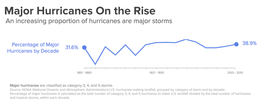
Min (Twitter) chose a side-by-side layout and highlights the proportion of major hurricanes increasing:
Neil (Twitter) chose a "dumbbell" view, blogging about how to frame the title in dataviz and his process. You can also view this makeover on Tableau Public.
Nicolas chose a line graph to depict the data:
Olesia used Python's matplotlib library, editing with Inkscape afterward. She says, "Unlike journalists from The Economist, I've decided to highlight the lack of pattern in hurricane data. Don't want to sound like climate change denialist but the trends shown in the Economist's graph may very well be just statistical flukes and the NOAA overview cited in the article explicitly says that 'It is premature to conclude that human activities – and particularly greenhouse gas emissions that cause global warming – have already had a detectable impact on Atlantic hurricane or global tropical cyclone activity.' "
Olivier (LinkedIn) from Switzerland shared the following comments on the original graph:
Here is the online version of the makeover on Plotly.
Paul (LinkedIn) enjoyed trying to be a little artistic with it while still showcasing the analysis from the original version and adding a non-time based trend to it. You can view his makeover on Tableau Public.
Raf (Facebook) from Belgium shared the following view:
Rahul (Twitter) said his story would have revolved around the following four views:
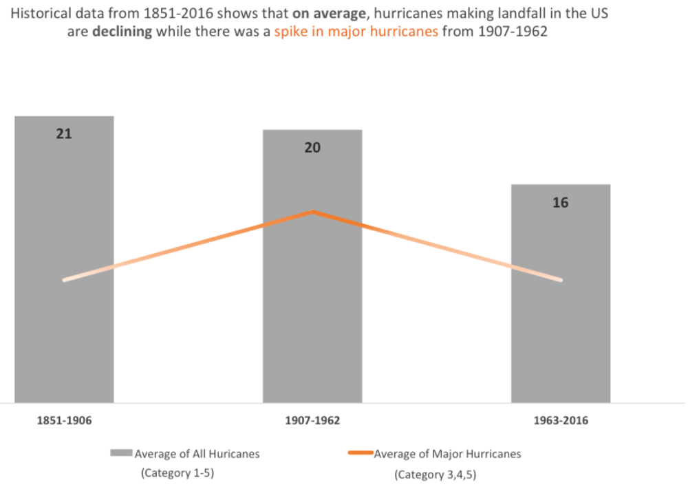
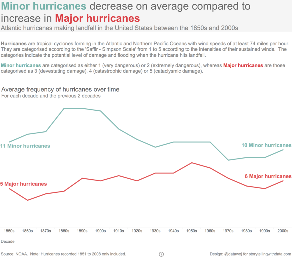
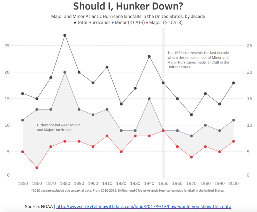
Rebeca (LinkedIn) "basically merged the hurricanes into two categories (minor and major) and looked at both frequency and intensity by decade."
Rob (Twitter) writes, "The Economist writer is clearly trying to articulate that the incidence of severe hurricanes has increased over time. Possibly an agenda linked to climate change, arguing that climate change is making hurricane season worse for America. They've loosely managed to portray this—as the trend lines show a falling absolute number of hurricanes, and a rising absolute number of severe hurricanes. But why not just plot the relative frequency of severe hurricanes during each time period?" Here is his Tableau Public Dashboard.
Robert (Twitter | LinkedIn) wrote a 3-part series on his process (post 1, post 2, post 3), culminating in the following view. His interactive viz can be found here and he'd accompany with a headline like "Should we be concerned?"
Robert (LinkedIn) felt the original headline was "plain misleading!" He goes on to say:
"Overall, there is no significant linear correlation between year and number of hurricanes (r=-0.12), although this you wouldn't expect a large correlation, this could mean something. However, the the correlation between year and category 3 plus hurricanes is just plain zero. So bascially, the data is going all over the place without a clear trent for heavy hurricanes. So you shouldn't show a trendline and if you do make sure it is flat."
"Although a bit boring, this is the most relevant conclusion which should be reflected in both the headline and graph. The headline could be something like 'Every era will suffer hurricane hits' or 'Hurricanes are as bad as they were 100 years ago'. Well, I'm obviously not a copywriter but you catch my drift."
"The graph itself is not that bad, I have definitely seen worse. The color coding makes sense, as does the packing of years. The legenda could be a bit more clear and the trend lines just have to go because there aren't any."
"I would do a couple of things differently to support the main idea that there is no trend in total number of hurricanes or 3 plus category hurricanes:
You could also just show the total number of hurricanes and the major one (second graph).
Rody wanted to focus on major vs minor hurricanes that make U.S. landfall, while giving scope of the total. Here is the Tableau Public version.
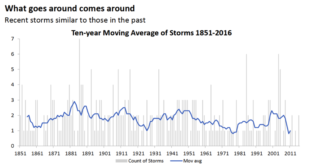
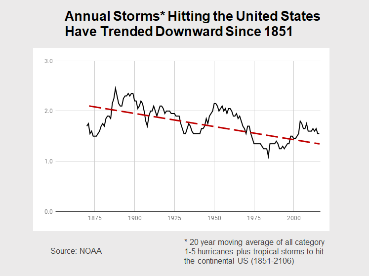
Ron notes, "I could see what they were trying to do. They were hoping to find a trend by filtering 166 years worth of data into decade-wide bins on a stacked bar graph. I liked the attempt, but wondered if there was a better way to filter the data. So, rather than binning it into ten-year buckets, I applied a 20-year moving average filter to all the data and plotted the results on separate line graphs." He shares the following two visuals:
Ryan left the historical data there for context, but focused attention on the more recent decades:
Sam writes, "I have tried to simplify it, while keeping the major features."
Sharon's proposed title would be: "No significant change observed in hurricane frequency since 1851. Cost and damage of storms has increased markedly and since the early 1990s." She goes on to write the following.
"Here are the main things that concerned me with The Economist’s viz:
"In my analysis I looked also at the damage data (in terms of cost) for the top 30 costliest tropical cyclones in the US (taken from NOAA, http://www.nhc.noaa.gov/pdf/nws-nhc-6.pdf). While damages are ascribed to only 30 of the 289 hurricanes in the data set (and this is less than ideal I realize), even with the limited data available it is clear the damages have increased dramatically over the last 60 years, across storm categories."
Srikanth shares the following views:
Teresa (LinkedIn) says her headline would be “Hurricanes this half century on track with previous.”
Thomas (Profile | Twitter) from Austria used R (especially dplyr and ggplot2) to build the following hurricane timeline:
Tim (blog) shared the following:
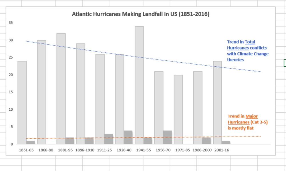
Todd writes, "So this took me waay longer than it should have. I was trying to create a calculated field in the pivot table to show just Major Hurricanes so I would have two values columns (Total and Major) but I couldn't figure it out. I ended up just hardcoding the data, which is disappointing."
"I may have forgotten some of the ideas in your book/website so this is a good refresher. [Here] is my best attempt. I wanted to extend the trend line more to the left but I can't seem to do it....but I at least think I'm in the right ballpark! PS. Grouping by 15 year increments seems to work better than 10 year increments b/c using the latter a) creates more bars and more clutter and b) creates a partial category for the last plot (2011-2016.)"
"FYI I realized after I sent it that the blue text could be worded better. Maybe something like 'Trend in total hurricanes doesn't align with climate change trends' is better. I just thought it needed a more impactful takeaway."
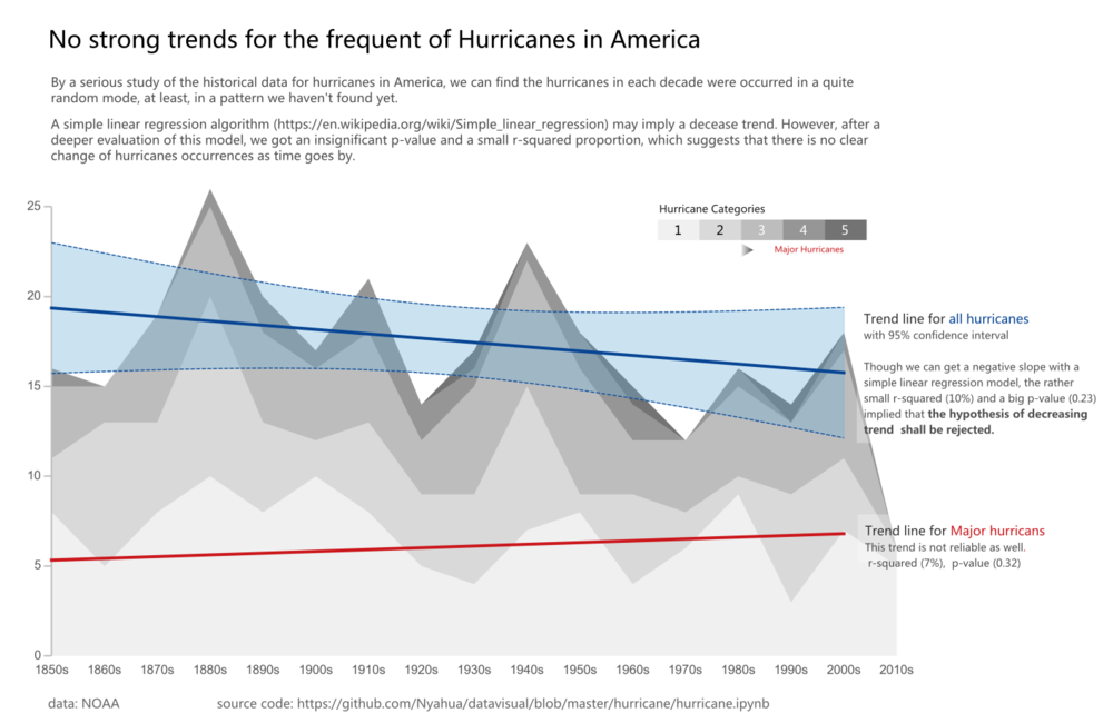
Last, but not least, Ziwei shares the following stacked area graph, concluding "no strong trends"—
Huge thanks again to everyone who participated for taking the time and sharing your work!
JdinotoLook at the list for Dems... quite interesting.
Welcome to FiveThirtyEight’s weekly politics chat. The transcript below has been lightly edited.
micah (Micah Cohen, politics editor): Today’s topic: If you’re a Republican elected official, what qualifies you as anti-Trump?
Why are we talking about this? Well, there are plenty of GOP senators — Susan Collins, Lisa Murkowski, John McCain, Jeff Flake, Bob Corker, etc. — who have been critical of the president but haven’t necessarily done much about it legislatively. So many people on the left call the whole narrative that they’re standing up to Trump BS.
So, to start us off: How much do you think these elected Republicans are doing to restrain Trump?
natesilver (Nate Silver, editor in chief): Well, they weren’t doing very much at first. Then more signs of resistance emerged over the summer.
In some ways, we’re still waiting for the pivotal tests, though.
What if Trump fires special counsel Bob Mueller, who’s investigating his campaign and potential Russian collusion? What if he pardons Jared Kushner? What if he tries to appoint to his Cabinet someone who’s an obvious hack?
perry (Perry Bacon Jr., senior writer): The Russia sanctions bill was significant in that Congress passed it despite administration objections. The hearing with fired FBI Director James Comey was too. So was prominent GOP senators basically all-but-ordering the president not to fire Attorney General Jeff Sessions. Republicans, particularly in the Senate, are doing more to resist Trump than the liberal conventional wisdom seems to hold.
harry (Harry Enten, senior political writer): Yeah, you are seeing some more outward signs of resistance. You have both Flake and Corker not running for re-election in order, it seems, to be able to critique Trump to their fullest ability. And just this week, McCain put out this tweet:
I believe in Americans and the American dream, but it’s time we wake up. pic.twitter.com/QmSIqP0TEs
— John McCain (@SenJohnMcCain) October 30, 2017
Now, do those count? Otherwise, I think the Russia bill was the first step, so I concur with Mr. Bacon.
natesilver: Wait — so Flake and Corker not running for re-election is a sign of resistance?
Not sure I buy that, Enten.
harry: I see it that way. Here’s why: Yes, they didn’t run, probably in part because they thought they might lose. That’s especially the case for Flake. But they could have decided to change course. They could have sucked up to Trump. Instead, they chose not to run and to criticize the president.
perry: If you think Trump will go down as the worst president in modern U.S. history and that he breaks lots of important norms along the way, then they are still not doing nearly enough. If you grade them based on their deep desire to 1. get re-elected, 2. please the Fox News base, and 3. get tax cuts and conservative judges, then the level of resistance in the GOP that we’re seeing seems more significant, with Collins/Corker/Flake/McCain at the more resisting end of the spectrum.
harry: I wonder if any of them think Trump is the worst president.
natesilver: Well, Flake was probably going to lose anyway. But Corker is popular enough that he could have stayed in the Senate as a sort of Susan Collins type.
harry: Corker’s numbers slid. I’m not sure he would have won necessarily if he really wanted to critique Trump.
micah: Yeah, isn’t the idea that he would have become far more unpopular by speaking out against Trump?
perry: I think many of these Republican senators believe Trump is uniquely terrible. That is what Flake and Corker are getting at: Let’s use our inside voices outside. If he is terrible, let’s tell people.
natesilver: Corker might have lost. But now you’re almost guaranteed to have someone more Trump-friendly in that Senate seat.
micah: So much of this comes down to how big of a threat you think the president is, right? If you’re on the left and you see Trump as a clear and present danger, then of course you’d be underwhelmed by the anti-Trumpiness of the GOP.
perry: Right.
micah: But let me introduce another element here …
THE FIVETHIRTYEIGHT TRUMP SCORE!!!!
Nate, can you give the people a snappy description of what this is?
natesilver: It’s how often a member of Congress votes the way that Trump wants.
That’s it. It’s pretty simple. It’s a measure of roll-call votes.
micah: So people have been throwing around Flake’s and McCain’s and Corker’s Trump scores — which are all very high — as evidence that their criticism of Trump is hollow.
That seems silly to me, but what do you all think?
natesilver: It’s certainly possible that you could agree with Trump on his legislative priorities but also think he’s a danger to the Republic. In that case, you might have a high Trump score, since most of what’s reflected in it is legislation.
harry: Can I just note that there’s nothing new about measures like the Trump score? People have been tracking stuff like this for years. What’s different here is that we’re doing it in real time. It’s more about the interpretation that some people are taking.
natesilver: Yeah. We’re doing it in real time. And our scores are more transparent — it’s more obvious what they mean.
perry: Micah and I have had this debate a lot internally. So we can have it publicly now.
I appreciate the work of my colleagues in creating this tool. And it explains some things really well. But I see these liberals saying, “Well, Trump is with Flake 90 percent of the time.” Flake wrote a book trashing Trump. Trump wanted Flake out of the Senate. Something is not being captured there.
And the other challenge is that Trump is often very disengaged from the legislative process. So the things that get voted on are really the Paul Ryan-Mitch McConnell priorities, or put differently, the Koch brothers agenda. I know why we are calling it a Trump score, but I at times worry that that communicates to the audience that Trump has defined priorities on a lot of legislation, some of which I doubt he knows exist.
natesilver: I don’t know. It’s a tool. Like any tool, it can be misused.
micah: Perry has outlined the fairest criticism.
But like … don’t the Trump scores simply show that Trump hasn’t pushed an agenda distinct from normal GOP orthodoxy?
perry: Right.
I think people are misusing/misunderstanding the tool.
micah: We could rename it the “GOP Congress-Trump Legislative Agreement Score.”
natesilver: I mean, the scores show that the Republican agenda and the Trump agenda have become pretty well aligned.
The lowest Trump score among Republicans (Collins at 81 percent) is much higher than the highest Trump score among Democrats (Joe Manchin at 54 percent).

harry: Also, the Republican senators with the lowest Trump scores aren’t surprising; they tend to be the senators widely recognized as the most anti-Trump: Collins, Rand Paul, McCain, Corker, etc.
| SENATOR | STATE | TRUMP SCORE | |
|---|---|---|---|
| 1 | Roy Blunt | Missouri | 96.2% |
| 2 | John Boozman | Arkansas | 96.2 |
| 3 | Bill Cassidy | Louisiana | 96.2 |
| 4 | Thad Cochran | Mississippi | 96.2 |
| 5 | John Cornyn | Texas | 96.2 |
| 6 | Orrin Hatch | Utah | 96.2 |
| 7 | John Hoeven | North Dakota | 96.2 |
| 8 | Pat Roberts | Kansas | 96.2 |
| 9 | Mike Rounds | South Dakota | 96.2 |
| 10 | John Thune | South Dakota | 96.2 |
| 11 | Thom Tillis | North Carolina | 96.2 |
| 12 | Roger Wicker | Mississippi | 96.2 |
| 13 | Richard Burr | North Carolina | 96.1 |
| 14 | Mitch McConnell | Kentucky | 96.1 |
| 15 | Marco Rubio | Florida | 96.1 |
| 16 | Dan Sullivan | Alaska | 95.9 |
| 17 | Johnny Isakson | Georgia | 94.4 |
| 18 | John Barrasso | Wyoming | 94.2 |
| 19 | Ted Cruz | Texas | 94.2 |
| 20 | Cory Gardner | Colorado | 94.2 |
| 21 | James Inhofe | Oklahoma | 94.2 |
| 22 | Tim Scott | South Carolina | 94.2 |
| 23 | Richard Shelby | Alabama | 94.2 |
| 24 | Shelley Moore Capito | West Virginia | 94.1 |
| 25 | Jerry Moran | Kansas | 94.1 |
| 26 | David Perdue | Georgia | 94.1 |
| 27 | Lamar Alexander | Tennessee | 94.0 |
| 28 | Tom Cotton | Arkansas | 92.3 |
| 29 | Mike Crapo | Idaho | 92.3 |
| 30 | Steve Daines | Montana | 92.3 |
| 31 | Mike Enzi | Wyoming | 92.3 |
| 32 | Joni Ernst | Iowa | 92.3 |
| 33 | Deb Fischer | Nebraska | 92.3 |
| 34 | Chuck Grassley | Iowa | 92.3 |
| 35 | Ron Johnson | Wisconsin | 92.3 |
| 36 | John Kennedy | Louisiana | 92.3 |
| 37 | James Lankford | Oklahoma | 92.3 |
| 38 | Rob Portman | Ohio | 92.3 |
| 39 | Todd Young | Indiana | 92.3 |
| 40 | Dean Heller | Nevada | 90.4 |
| 41 | Mike Lee | Utah | 90.4 |
| 42 | James Risch | Idaho | 90.4 |
| 43 | Ben Sasse | Nebraska | 90.2 |
| 44 | Pat Toomey | Pennsylvania | 90.2 |
| 45 | Jeff Flake | Arizona | 90.0 |
| 46 | Luther Strange | Alabama | 90.0 |
| 47 | Lindsey Graham | South Carolina | 88.5 |
| 48 | Bob Corker | Tennessee | 86.3 |
| 49 | Lisa Murkowski | Alaska | 86.3 |
| 50 | John McCain | Arizona | 84.0 |
| 51 | Rand Paul | Kentucky | 84.0 |
| 52 | Susan Collins | Maine | 80.8 |
natesilver: Yeah, it does a pretty decent job.
perry: Yeah, that actually is perfect in capturing the anti-Trump wing in the Senate. Although, it is strange that Luther Strange is there.
But broader point: I don’t expect someone like Flake, who is quite conservative, to vote against tax cuts because Trump supports them.
natesilver: Right, but it’s reasonable to point out that someone like Collins — despite occasionally disagreeing with Trump, including on important issues — is still quite an asset to him, compared with a Democrat from Maine.
micah: Well, this gets us back to how you judge Republican resistiness — there are people who think Trump is such a threat to the nation that Republicans should be blocking appointments/legislation even if they support them on substance. There are people who think they should switch parties! If you subscribe to that theory, then the Trump score does count as evidence that the McCains and Flakes of the world haven’t done much.
As Nate just said, Collins is still an asset overall.
natesilver: There haven’t been many appointments lately — and Trump has mostly sidestepped making controversial ones.
harry: I mean, these are still Republicans.
perry: This is an interesting question. Tom Price had a bunch of controversial behavior well before he was confirmed as health and human services secretary and well before he resigned after the plane stuff. Should Flake/Corker/McCain have not voted for him? (They did.) Would they do that today?
natesilver: That’s why I’m saying the big tests are still ahead.
harry: What are the big tests? Do we know them yet?
natesilver: Ultimately, some of the resistance will have to come in the form of roll-call votes — like rebuffing his Cabinet nominees or (gulp) even voting to impeach him.
perry: Right, but taxes is the wrong issue on which to judge GOP resistance. Nominations and appointments are right. So are U.S. attorneys, foreign policy appointments, people who could be involved in Russia stuff: Like if Secretary of State Rex Tillerson were to leave and Trump wanted to appoint an even more pro-Russia person. Or if his U.S. attorney appointment in New York seems to be someone with obvious ties to Trump who won’t prosecute crimes by Trump allies.
natesilver: Congress could pass legislation that would make it more difficult to fire Mueller. The fact that they haven’t yet is a good point for the critics.
micah: Or Congress could pass laws aimed at curbing Trump’s potential corruption/conflict of interest stuff.
perry: Yes.
harry: Of course, a number of GOP senators have also said that Trump shouldn’t fire Mueller.
perry: Like this is a serious idea: Republicans should join with Democrats to block any U.S. attorney nominee who Trump has personally met with.
And, yeah, the fact that the pro-Mueller bills have not moved is telling.
natesilver: People are also within their rights to be skeptical of Republicans standing up to Trump based on how the 2016 primaries went down. Trump, famously, received very few endorsements from Republican elected officials. But as we learned, there’s a big difference between failing to endorse and actually resisting someone.
harry: By the way, Flake has not signed onto a bill that would make it harder for Trump to fire Mueller.
micah: I think what we’re seeing is a number of Republican senators who are anti-Trump on non-policy issues (protecting Mueller/rule of law/etc.) and pro-Trump on policy (which is basically just pro-GOP). … BUT they’re active on the policy things and passive on the non-policy things.
That’s the key: active vs. passive.
natesilver: Right. There’s been an impressive amount of passive resistance to Trump and not (yet) very much active resistance.
perry: I guess it’s somewhat hard to be active on non-policy things, since Congress doesn’t really vote on those, right?
micah: Couldn’t they, though?
perry: Is active resistance politically possible in the Republican Party of today?
Politicians perhaps should do things that are political risks. But they almost never do.
micah: That’s a hard question to answer, Perry. My first instinct is “no.”
But maybe that’s simply a case of expectations.
What would happen if every Republican senator up for re-election in 2018 simultaneously came out and broke with Trump in a sustained way?
perry: Well, on Russia sanctions it happened.
He whined, signed the bill and the party people won the fight.
If every senator up for re-election did that, they would all increase their chances of losing to a Steve-Bannon-backed candidate. There is no safety in numbers when the number is fairly small — only six Senate Republicans are up in 2018 (not counting Flake, Corker or the Alabama special election). If every House Republican did that, that would be different. It would be something like 240 people.
harry: I think we’re seeing a major resistance to resisting Trump in that fashion. Look what’s happening in the Alabama Senate race. Roy Moore has said a lot of stuff outside the mainstream, and he was welcomed into Washington with open arms before he’s even won the seat. The fear of losing is really, really powerful. Distancing themselves from that part of the Republican base is not tenable because it would mean, in their mind, losing the election.
perry: A good test will be if Mitt Romney ever says a negative thing about Trump again, since he is rumored to be considering a Senate run in Utah if Orrin Hatch retires.
micah: Clare is on vacation, but in her honor I feel compelled to say …
MITT!!!!!
Anyway, give me a little more detail on what we would see the key tests being for Republicans in Congress.
natesilver: I continue to think the three nuclear-level events are:
micah: Let’s talk short of nuclear-level, though.
What would the ramp-up tests be?
natesilver: Part of the problem is that there aren’t that many ramp-up tests.
micah: Interesting!
harry: Again, what are you breaking with Trump on? The GOP Congress and Trump agree on most major policy questions — hence those high Trump scores.
micah: The Federal Reserve chair has to be confirmed by the Senate, right?
Other appointments?
And what about investigations?
Proactive anti-corruption laws?
Seems like there are a lot of options?
harry: I mean, if they started passing those anti-corruption laws, that would be a sign of something.
natesilver: If Trump tried to appoint, say, Rudy Giuliani to something, that would be interesting. But Trump has actually played it pretty carefully on appointments so far.
perry: Giuliani. New Jersey Gov. Chris Christie.
I think it will be fairly hard to have clear votes on things because McConnell will signal to the White House when the votes are there and when they’re not.
micah: You think the Senate would balk at Christie?
perry: Let’s not debate Christie. He will not be nominated.
micah: Lol.
natesilver: Yeah, and that’s another flaw with roll-call measures — they don’t measure things that never get to the floor.
harry: Why the hate toward Mr. 14 Percent Approval? (Also known as Chris Christie.)
natesilver: BTW, Congress could be doing a lot more on its own to investigate Trump, and they could make more of those investigations public.
micah: Yeah, that would qualify as a ramp-up test to me.
natesilver: Mueller — and the media — have devoted a lot of resources to investigating Trump, obviously, but that doesn’t mean that Congress couldn’t ramp up its investigations too.
perry: And that is an important place where Congress is not pushing back on Trump.
In fact, Republicans in Congress have moved in a pro-Trump, anti-Hillary Clinton direction in terms of investigations.
harry: That’s why I think you said to watch Richard Burr, right, Perry? To watch some of those investigations.
perry: GOP super-partisans have basically captured all of the committees but Burr’s. That’s important.
micah: OK, final question: Is it accurate to call Collins, Flake, Corker, McCain or any other Senate Republican “anti-Trump”?
perry: I call them Trump-skeptical. Maybe that’s cautious, but it’s more accurate, I think.
micah: I like that terminology.
harry: My problem with this is it’s difficult to call someone anti-Trump when they are agreeing with him a lot on policy. I would call some of them Trump-headaches. I know, lame phrase.
natesilver: You could call them “anti-Trump-curious.”
micah: lol
perry: Jennifer Rubin and Bill Kristol are anti-Trump. I can’t think of a Republican member of Congress who is really anti-Trump.
They are anti-Trumpism.
If we think of Trumpism as being more about nationalism, white identity politics, norms-bashing, institution-breaking, media-slamming, then Flake, Corker, etc., are against that. But not really Trump policies.
harry: For an anti-Trumper, the disagreements with Trump’s behavior, etc., have to override policy agreement. I don’t think we see that yet in Congress.
micah: Yeah, the passive vs. active seems like the dividing line.
Let’s call them “passively anti-Trump curious.”
JdinotoExcellent article about attention spans after violent tragedies.
 |
submitted by /u/laughlander [link] [comments] |
JdinotoThis is delightful!
I'm happy to see that Google Translate is still turning (many types of) meaningless character sequences into spoken-word poetry. Repetitions of single hiragana characters are an especially reliable source — here's "You need to know something":

And "I feel a strange feeling":

And "Stay free to leave":

Repeated combinations also often work — here's repetitions of "Ga mama" rendered as "Let it go / As it is":

These works also often reveal some interesting things about the letter-to-sound part of Google's current text-to-speech algorithms, e.g. the performance of that last one:
And as usual, if you ask for it again, you get a performance that sounds like the system has had a drink or five:
Here are the inputs in case you want to try them:
か
かかかかかか
かかかかかかか
かかかかかかかか
かかかかかかかかか
かかかかかかかかかか
かかかかかかかかかかか
かかかかかかかかかかかか
かかかかかかかかかかかかか
かかかかかかかかかかかかかか
かかかかかかかかかかかかかかか
かかかかかかかかかかかかかかかか
かかかかかかかかかかかかかかかかかか
かかかかかかかかかかかかかかかかかかか
が
ががが
がががが
ががががが
がががががが
ががががががが
がががががががが
ががががががががが
がががががががががが
ががががががががががが
がががががががががががが
ががががががががががががが
がががががががががががががが
ががががががががががががががが
がががががががががががががががが
ががががががががががががががががが
がががががががががががががががががが
ががががががががががががががががががが
ま
まま
ままま
まままま
ままままま
まままままま
ままままままま
まままままままま
ままままままままま
まままままままままま
ままままままままままま
まままままままままままま
ままままままままままままま
まままままままままままままま
がまま
がままがまま
がままがままがまま
がままがままがままがまま
がままがままがままがままがまま
がままがままがままがままがままがまま
がままがままがままがままがままがままがまま
がままがままがままがままがままがままがままがまま
がままがままがままがままがままがままがままがままがまま
がままがままがままがままがままがままがままがままがままがまま
JdinotoAmazing!
 |
submitted by /u/sataky [link] [comments] |
JdinotoVery interesting blog, lots of other neat cave maps there too!
![Cave Distribution in Kentucky, Tennessee, Alabama, and Georgia (KTAG) [OC]](https://b.thumbs.redditmedia.com/Kctp3m2FjNV8hMV0wjtqwQPDnEsZietkzS5kVPcdqzk.jpg "Cave Distribution in Kentucky, Tennessee, Alabama, and Georgia (KTAG) [OC]") |
submitted by /u/chucksutherland [link] [comments] |
JdinotoWill it be one of their top 5?
 |
submitted by /u/rantdurdenwu [link] [comments] |
JdinotoFantastic period table interpretation!
JdinotoThis is beautiful!

Perched atop the Kodiak Queen, a former WW2-era Navy fuel barge, this 80-foot ‘Kraken’ now serves as the base of an artificial reef and marine research station on the ocean floor near the British Virgin Islands. The project, entitled BVI Art Reef, accomplishes a range of goals all at once: saving a decorated ship from destruction, transplanting coral to a new site in the hopes that it will flourish, creating an epic dive site and underwater art gallery, and providing a new habitat for marine life.


Photographer Owen Buggy documented the process, from the early stages of building the massive sea monster to sinking it in April 2017 to checking out the results a few months later. Sunken off the coast of the island Virgin Gorda with the help of tugboats and helicopters, the installation is already helping to rehabilitate heavily over-fished marine populations. Filmmaker Rob Sorrenti also got some great footage, presented as a documentary entitled ‘The Kodiak Queen,’ which is due for release in early 2018.

“This is the story of learning from past lessons and coming together to create something greater; rooted in joy and fueled by the power of play,” reads the BVI website. “This is the story of a group of friends from around the world who fell in love with the BVIs… and turned a weapon of war into a platform for unity – and a catalyst for new growth. This charitable kick-off in the British Virgin Islands combine art, ocean conservation, world history, marine science and economy… to solve a series of challenges in the BVIs by asking: how can we use play and collaboration to install permanent solutions that boost the local economy, secure the prosperity of these pristine islands for generations to come?”


“Our solution: a fantasy art eco-dive and ocean conservation site that puts the BVIs on the map as having one of the most unique and meaningful dive sites in the world… and one of the most forward-thinking approaches to creative problem solving that secures the education of its youth, and the health and prosperity of this island nation.”
Get updates on the project at the BVI Art Reef Facebook page.
Though Nelson Mandela's passing will spur the creation of memorials worldwide, a number of larger-than-life tributes are already extant or planned. Nelson Mandela Capture Monument (images ...
It sounds like the premise of a science fiction film, but deep in a rural valley of Japan there is a town where eerily lifelike dolls have been slowly replacing actual residents of Nagoro for ...
Game of Thrones author George R.R. Martin purchased a sprawling abandoned bowling alley in Santa Fe, New Mexico so an art collective called Meow Wolf could transform it into a bizarre and ...


JdinotoI feel like this could be a good bit of data to re-visualize.
Jdinoto1) Voter Suppression and 2) Candidates who do not represent the interests of the average citizen.

From BrilliantMaps, this is the Did Not Vote Election Map, showing the magnitude if all voting-eligible adults that did not actively vote in the 2016 Presidential election. A Presidential candidate needs 270 Electoral College votes to win. The "Did Not Vote" candidate would have have gathered 41% of the total votes from the voting eligible population, and 471 votes from the Electoral College! A Landslide!
The map above shows what the 2016 US Presidential Election results would have been if votes not cast for Hillary, Trump or one of the third party candidates had gone to fictional candidate “Did Not Vote.”
As a percentage of eligible voters, Clinton received 28.43% (65,845,063) of all votes compared to Trump’s 27.20% (62,980,160) and Did Not Vote’s 44.37%(102,731,399).
Total voter turnout was estimated to be 55.3% of the voting age population and 59.0% of the voting eligible population.
Map created using 270 To Win, based on reddit user Taillesskangaru’s posts here and updated here.
Disclaimer: The map above was accurate as of January 17th, 2017. Totals below were true at the time of writing but may no longer currently be accurate as additional votes and recounts are conducted.
Thanks to Mike Wirth for sharing on Facebook!
JdinotoExcellent review of cartography in hurricane reporting. Whatever your views of the NYT are, their data visualization team is first rate.
#Harvey in perspective. So much rain has fallen, we've had to update the color charts on our graphics in order to effectively map it. pic.twitter.com/Su7x2K1uuz— NWS (@NWS) August 28, 2017


JdinotoThe comments section contains a link to the data itself: https://github.com/joshyazman/random-projects/tree/master/politico-scrape
![Share of Politico stories mentioning the word "Poll" over time [OC]](https://b.thumbs.redditmedia.com/ES4opAiae5RXiPc27VH13ZFE9PDsy77_ZRmGm4pNb-M.jpg "Share of Politico stories mentioning the word \"Poll\" over time [OC]") |
submitted by /u/j_yazman [link] [comments] |
JdinotoThis is great!
![I do these interactive data vis projects where people use push pins and string to add data to a board, and then I digitize them in Adobe Illustrator afterwards. [OC]](https://b.thumbs.redditmedia.com/hoRQ9E9RASHToZPM5FDluVbVQ0Cn8PgFbM-Xvamw1gc.jpg "I do these interactive data vis projects where people use push pins and string to add data to a board, and then I digitize them in Adobe Illustrator afterwards. [OC]") |
submitted by /u/whiskeyfoxtrot_ [link] [comments] |
JdinotoA good note about excel charts, they're not entirely worthless.
It's true that Excel is responsible for large numbers of horrible charts. I just came across a typical example recently:
This figure comes from Edward Wolff's 2012 paper, "The Asset Price Meltdown and the Wealth of the Middle Class." It's got all the hallmarks of Excel defaults. It's not a pleasing object to look at.
However, it's also true that Excel can be used to make nice charts. Here is a remake:
This chart is made almost entirely in Excel - the only edit I made outside Excel is to decompose the legend box.
It takes five minutes to make the first chart; it takes probably 30 minutes to make the second chart. That is the difference between good and bad graphics. Excel users: let that be your inspiration!
JdinotoThere is no reason for this to be a circle.
 |
submitted by /u/Tiffany_Aching [link] [comments] |
JdinotoThis is a fantastic resource!
JdinotoVito d’Incognito is a very cool name. :)
Unusual personal names collected by onomasticist Elsdon C. Smith for his Treasury of Name Lore, 1967:
According to the Veterans Administration, Love’n Kisses Love is a deceased sailor formerly of Bremerton, Washington. Walt Disney employed an animator named T. Hee. Outerbridge Horsey VI was named ambassador to Czechoslovakia in 1963. (“I am the sixth Outerbridge Horsey and my unhappy son is the seventh. In fact, the only trouble with any new post is explaining the name to people.”) Gisella Werberzerck Piffl was a character actress in Australia in 1948. Two police officers who worked together in Long Beach, California, in 1953 were named Goforth and Ketchum. Jack Benny’s wife said that the firm Batten, Barton, Durstine & Osborn (now BBDO) “sounds like a trunk falling down stairs.”
And “When Mrs. Rum of Chicago divorced her husband she was allowed to resume her maiden name of Cork.”
See Local Color, Roll Call, Pink Labels, Roll Call, Roll Call, and Bent Handles.
JdinotoThe animation at the top if SUPERB! It very clearly illustrates the concept of a progressive income tax.


![[link]](https://en.wikipedia.org/wiki/Driving_under_the_influence#/media/File:%25_of_US_Car_Crash_Fatalities_Where_Driver_Blood_Alcohol_Level_Was_.01_and_Above_1999_-_2012.gif)
![[link]](https://i.redd.it/7n91py8wboqz.jpg)