Trey Peden
Shared posts

10 Apr 02:27
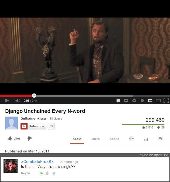 via via via via via via via via via via via via via via via via via via via You may also like: More Funny Youtube Comments 20 Images That Have a Surprise Ending
20 Funny Youtube Comments (4.9.13)
by Jeff Wysaski
via via via via via via via via via via via via via via via via via via via You may also like: More Funny Youtube Comments 20 Images That Have a Surprise EndingHave you visited Pleated Jeans today?
09 Apr 21:35
Social hierarchy in elevators
by Jason Kottke
Human behavior in elevators is endlessly fascinating and so is this tidbit about social organization in elevators from an ethnographic study of elevator users.
Yet, moving back to the interaction with elevator interior design elements, it was noticed that interaction went hand-in-hand with social organisation. As a result of 30 elevator journeys (15 in each building) a clear social order could be seen regarding where people positioned themselves inside the elevators and how they interacted with the design features, such as mirrors and monitors. More senior men in particular seemed to direct themselves towards the back of the elevator cabins. In front of them were younger men, and in front of them were women of all ages. Men watched the monitors, looked in the side mirrors (in one building) to see themselves, and in the door mirrors (of the other building) to also watch others. Women would watch the monitors and avoid eye contact with other users (unless in conversation) and the mirrors. It was only when the women travelled with other women, and just a few at that, that women elevator users would utilise the mirrors. One interviewee even mentioned that she only looked in the mirrors when there was no one else in the elevator.
(via @triciawang)
Tags: elevators
09 Apr 16:01
Now THAT'S a Recommendation!
Trey PedenYeah, but... look who the mayor is. So, does that really help?
09 Apr 15:35
TENNESSEE: Former Politician Tried For Masturbating Out Car Window At 90mph
by Joe
Trey PedenKeep it classy, Tennessee!
So this happened. Somehow.
A former Tennessee politician was arrested and charged with indecent exposure after he allegedly masturbated out his car window while driving 90 mph on Interstate 26 earlier this year. Apparently this is not a new multi-tasking endeavor for the former Mount Carmel vice mayor — the charges mirror complaints made him against him several years ago that were never fully investigated. And now he’s facing up to all of them.
09 Apr 15:19


I Was Actually Looking for Something to Make My Party MORE Fun
Submitted by: Unknown
Thebenz540 likes this
09 Apr 15:16
GIF Reactions
by swissmiss

Ever wished you could easily find an animated GIF for a specific reaction? YES! This is quite wonderful. Claps.
(via brainpicker)
Lilyccaulfield, sgcarbonetti and one other like this
09 Apr 14:57

Brothers in Binary
by Greg Ross
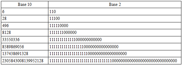
A number is said to be perfect if it equals the sum of its divisors: 6 is divisible by 1, 2, and 3, and 1 + 2 + 3 = 6.
St. Augustine wrote, “Six is a number perfect in itself, and not because God created all things in six days; rather the converse is true; God created all things in six days because this number is perfect, and it would have been perfect even if the work of the six days did not exist.”
Perfect numbers are rare. No one knows whether an infinite quantity exist, and no one knows whether any of them are odd. The early Greeks knew the first four, and in the ensuing two millennia we’ve uncovered only 44 more. But they have one thing in common — they reveal a curious harmony when expressed in base 2:
Ionut, willowbl00 and 25 others like this

09 Apr 00:59

Don't forget to cast your vote about this post online


WNBA Steps Inline
by Armin
![]()
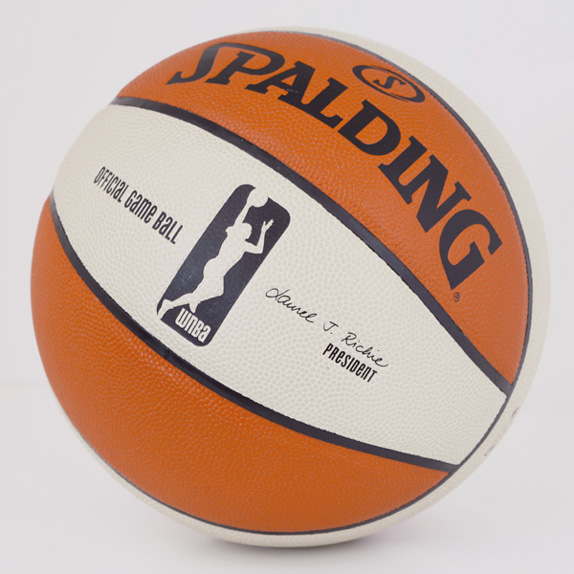
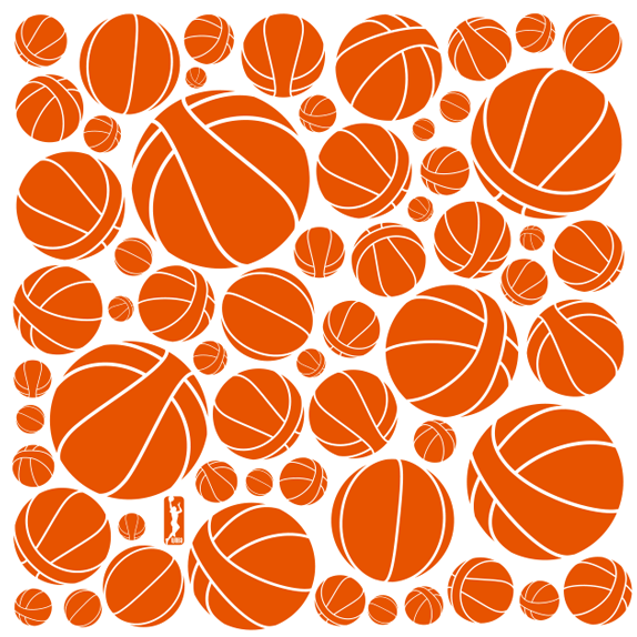
Established in 1996 when the NBA Board of Governors approved the concept of a women's National Basketball Association, the WNBA began play in the summer of 1997 with eight teams and a few well-known stars at the time, like Sheryl Swoopes and Lisa Leslie. Four expansion teams have been added since and although attendance peaked in 1999 — with an average of 10,000 attendees per game — and dropping since, the WNBA is still considered the "most successful women's professional team sports league in the world." Last Thursday, the WNBA introduced a new logo and identity designed by New York, NY-based OCD | The Original Champions of Design. For a brief video of Laurel J. Richie, WNBA President (and 2010 Brand New Awards judge!), explaining the logo click here.
![]()
The refreshed identity reflects how far the level of play has come in 16 years as stronger, more agile players have made the game more competitive. The cornerstone of the new WNBA visual identity is a more modern "Logowoman" — the player silhouette within the logo — that better embodies the athleticism and diversity of today's WNBA players while leveraging the distinctive orange-and-oatmeal color scheme of the league's iconic game ball.
— Press Release
![]()
OCD explains: "Logowoman is an evolution of the original WNBA shield. The silhouette was redrawn to better symbolize the athleticism and diversity of today's players. The orange and oatmeal were brought in from the league's most ownable asset: the WNBA game ball."
![]()
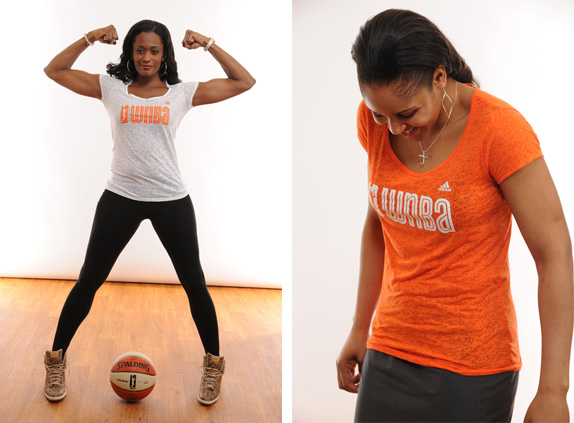
In addition, the league will launch a viral media effort under the "I Am Logowoman" theme. Powered by players, the campaign is designed to engage fans in celebrating WNBA athletes — past and present — who have propelled the game forward. Players and fans will be encouraged to post shots and photos of themselves going to the basket using the "#iamlogowoman" hashtag.
— Press Release
Just who is the woman in #iamlogowoman? "A celebration of all WNBA athletes past and present who have inspired the new league logo."
This is a tough one to judge overall, as the new logo and identity are trying to operate within the design rules, or at least the expectations, of American sports organization brands (i.e., MLB, NFL, NHL, and, obviously, NBA) but at the same time it's trying to set its own rules. Which, come to think of it, is quite appropriate since there is no WMLB, WNFL, or WNHL. Let's start with the icon. The "before" and "after" both take their cue from the NBA's logo by freeze-framing a player in action. The "before" opted for the same action pose as the NBA's Jerry West figure: dribbling. The "after" goes for something with more action: A layup. The change is a significant gesture, presenting WNBA players as more aggressive — not in the Lebron-James-Staring-After-He-Dunks-On-You stupid macho aggressiveness but in a more subtle way, that the players are constantly attacking the basket. I very much like the change in figure — although the pre-fabricated "who is the woman in the logo?" campaign is a little annoying — and even more so the change in holding shape, from the previous italicized shield to one that is exactly like its brother company, the NBA's. Switching from the typical blue-white-and-red color palette, the WNBA has opted for a rusted orange that is taken from their official game ball, which turns out to be one of the league's most recognizable elements. The new color is a great way to give the WNBA its own, distinguishable look.
Swin Cash and Maya Moore show off the new logo.
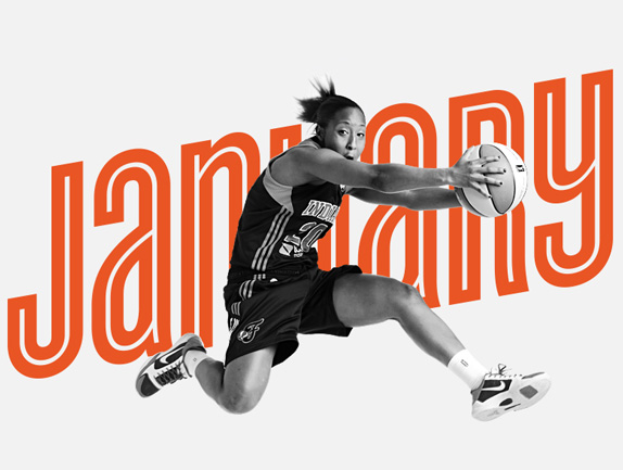
2012 WNBA Champions Indiana Fever's Briann January.
Then there is the typography… Hoefler & Frere-Jones' Cyclone… This is where I have a really hard time liking this even though there are aspects of it that are quite appealing. Let's start with the bad. In the logo, the typography spells out "wnBa" or "WnBa" (depending on how you judge the initial letter) but either way, the upper and lowercase combination is really annoying and far too playful (although I wouldn't even describe it as playful but kindergarden-ish) for a professional sports organization. Probably a little harder to kern but if they had gone with the default "WNBA" characters from Cyclone, it would have been a (wait for it) slam dunk. Cyclone's inline aesthetic is a fun, conceptual nod to the ridges of the WNBA basketball and I actually love the idea of the unexpected use of an inline font but as the official wordmark of the WNBA, to me, it just seems like a (wait for it) missed free throw.
However, there is a lot of good about Cyclone in application. It provides a very identifiable aesthetic that lends itself really well to pairing with basketball action imagery and words. I'm not sure how many years Cyclone has in it to be maintained as the house font, as it starts to feel more campaign-like than brand-like but it certainly helps draw a line in the sand between pre-2013 WNBA and post-2013 WNBA, and that's no easy feat.

Event and online media lock-ups.

Partner and message lock-up.

Patterns.
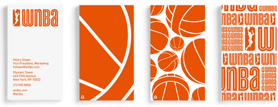
Patterns on business cards.
Don't forget to cast your vote about this post online
João Coutinho likes this

09 Apr 00:31


If you are having a bad day I promise this will help.
If you are having a bad day I promise this will help.

09 Apr 00:23
Ghost Hunter
by drew

“Hold on,” I said, waving the rest of the group back. “I’m getting a reading on my $60 K-II EMF Reader For Ghost Hunting.” The lights on the plastic wand flickered red, yellow, and green. “Is there someone here who lost a relative… Their name starts with… S?”
“ME!” cried an old lady. “My mother. Sally. It’s my mother, isn’t it?! Oh, please, say, it’s my mother!”
I laughed. “Ghost hunting is fake, and when you die, you are gone forever,” I told her. “I owned you, you thought this thing was real, and you got owned.” As she sobbed quietly, I pointed to the others on the ghost hunting tour. “Owned,” I said to each one, as I pointed. “Owned, owned, owned.”
Monosodiumglutamate, Russian Sledges and one other like this


08 Apr 21:19


A zombie-bitten father tries to save his infant daughter in this bittersweet short film
by Lauren Davis
So you've been bitten by a zombie. So long, conscious brain activity, hello craving for human meat. But the protagonist of the short film Cargo has bigger problems than his impending demise: he has to find a way to save his infant daughter, even if he has to die first to do it.
08 Apr 21:11
tumblr_m7qmf8PGVL1qiv53ho1_500.jpg (imagen JPEG, 500 × 500 píxeles)
by kndll

Leoysaito, Pascal Heinemann and 11 others like this