We have more data than God wants anyone to have. We have more talent deployed than was ever true in history. We have more money being pumped into our ecosystem than ever before. We have our senior leadership involved like never before.
Yet the end result of all that is so far away from where it should be. We definitely stink less in most cases. But with all this data, talent, money and leadership support, we are not knocking the ball out of the park.
I mean look at Zappos. It is functional. If you know what you want, you can buy it. But does the experience have to be like you are staying at a Motel 6? (Even they have refurbished everything per their TV ads!) I'm trying to buy a $1,845 Just Cavalli dress. It is an uninspiring page. The description is.. is. The You May Also Like has a $50 Converse shoe and a Sperry Top-Sider Angelfish for $63. Even the title of the page is "Just Cavalli S04CT0255N36734". What!
Click around randomly. Look at any page. Functional, yes. Inspired? Brand love evoking? No. Would you go there to explore your next fashion choices? Absolutely positively not! Not even if someone poked you with a sharp stick. Even for shoes, think of why and when you go to Zappos (vs. other stores/brands).
Zappos has great return conditions and very good customer service. That gets it xx million customers. But if they decided not have a Motel 6 experience, rather step up to a Hilton, or God forbid the Four Seasons, could they have xxx million customers (and improve margins while they are at it)?
Motel 6 is a good hotel chain, it serves an important purpose. But if you are running a hotel and you are Motel 6, it is difficult and expensive to raise everything up to the level of a Hilton (and even more expensive to to get it to get to the Four Seasons).
But when it comes to digital, it is only a bit more expensive to to punch significantly higher than your weight. Bits and bytes are cheap. You just get a little nicer talent, you get a different design group (internal or external) and you let your mind be open to new possibilities.
That is where this blog post comes in. My hope is to present a cluster of experience, each doing something spectacularly amazing, to open your minds to new possibilities. Because you want to move your digital strategy beyond just sucking less, you can rock so much more to achieve the combination of being unique, creating delight in your customers and improving your bottom-line (profit).
And I don't mean to pick on Zappos. Try Gucci. At best someone at the company has checked of a box that they have a digital presence. Or checkout Bare Necessities. If someone can create something truly awesome with the assets at their disposal, they are it. Yet. Or visit Orbitz. How long would it take you to find 14 things to fix on any page you visit? Two minutes? Or see Gillette. Enough said. Or have you been to Huggies? They go two things in their corner: Babies and irrational parents who don't know what to do. And this is the site they deliver!
We all can do a lot better.
This post has a collection of seven experiences that I love and adore. My hope is that they'll inspire you to not settle at sucking less. My hope is you are going to take the data, talent, money and leadership support to transform your digital experience into something truly delightful.
We will look at many different examples. From bras to dresses. From B2C to B2B. From pants to jewelry. From simple and effective personalization on your owned channels (your site) to deep and profoundly impactful engagement on your rent channels (YouTube). Here are the seven winning strategies…
1. Rock joy-inducing mobile experiences. Forget mobile first, it's a mobile only world!
2. Deliver fantastic, yet simple, personalization. Don't wait for perfection.
3. Empower customer reviews that are actually helpful. Start stinking less today.
4. Design a glorious purchase experience. Take their money, please.
5. Convert like a champion! Solve for on-line, off-line, later-line, maybe-line!
6. Win with innovative, magnificent, brand experiences. See-Think-Do YouTube.
7. Create inspiring, luscious experiences. What if the first interaction with your brand is digital?
Excited to go from simply not-stinking-at-all to punching significantly above your weight? Ready to take this expansive journey to not just win at performance marketing and brand marketing? Yes!?!? Let's go…
1. Create joy-inducing mobile experiences. Forget mobile first, it's a mobile only world!
This one, this year and this month, is so, so, so gosh darn painful.
According to eMarketer in 2010 we spent 3:11 (hrs:min) on digital content consumption and 4:24 on TV in the US. In 2014 those numbers are 5:46 for digital and 4:28 on TV. A stunning increase in digital content consumption.
The major contributor to digital finally beating TV? Mobile!
In 2010 we spent 24 minutes a day on non-voice use of mobile devices. In early 2014 that number is 2 hours and 51 minutes! Our time on desktops actually went down.
We are increasingly heading into a world where the slogan to follow is not mobile first, it is mobile only!
It is pretty surprising then that so many businesses are still not serious about their mobile strategies.
For example, I type in for "trip to Hawaii" (not an esoteric destination) into Google. I click on an organic listing for Travelocity. I end up on the site below on the left. In 2014. How crazy is that? Is it possible to make it any harder for me to give you money?
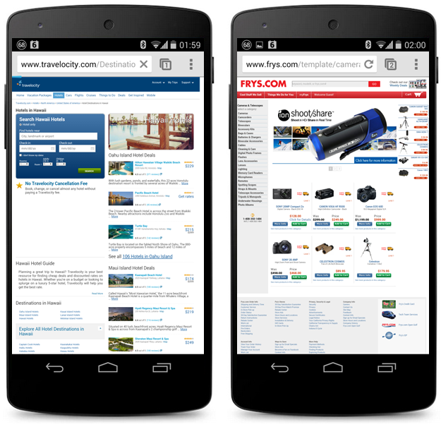
Ditto if I do a Google search for "high zoom digital camera" and get an ad for Frys Electronics. Clicking on the ad takes me to the site above.
Now, I was not looking to buy on my phone. I had a few minutes, I wanted to research the inventory and go buy it at a local store. Guess what store I did not go to buy my camera? I call it the silent death from not having an acceptable mobile strategy – you don't even know you are getting killed. And you are guessing why store sales are down (and because of such a simple fix!).
B2C sites like Travelocity and Fry's have not cornered the market on this.
A search for "sales automation" shows a link for Zoho, leading me to the site below left. If the mobile phone did not have a back-button hard-coded into the hardware perhaps I would try to read the. Since I have a choice, bounce and back I go.

You might think Salesforce is the winner here. They are not.
Yes, they meet the lowest bar for digital. They have a mobile friendly website. But for a search query stuffed with think intent, they have created a do page.
Let me rephrase that. Salesforce is the person that comes to a first date completely naked. If you are not interested in jumping into bed right away, they are happy to walk around the bar and look for someone else. They care that deeply about you. On. The. First. Date!
So. Not only should you have a great mobile experience. Make sure it is a relevant mobile experience that puts the customer first rather than yourself.
Here's an example of what awesome looks like. Warby Parker (mobile site: http://m.warbyparker.com).
Think of how hard it is to sell prescription glasses. Think of all the concerns and worries and freakouts people have. Yet, Warby Parker is challenging the giants in the space.
They do many things right, including the mobile experience. It is easy to see the glasses, try out different views with a couple swipes. You can switch colors, choose which version to add to cart with a single press of the button, read a brief well-written description and you've reached the end of the page!

Not only are they solving for the do audience, they also solve for the think audience. See the lovely + Home Try-On button. Quickly add five pairs to your selection and you can pick the one you really love form the comfort of your home.
It used to be silly to not have a smart phone and tablet friendly experiences of your digital existence. It is now profoundly harmful to your bottom-line. Silent death. Let the nice folks at Warby Parker inspire you to do better (and remember the Salesforce lesson above).
[If you refuse to have a true mobile-awesome experience, at least suck-less by using responsive design – like this blog. Responsive design is not the right way to go, but you will definitely suck-less.]
2. Deliver fantastic, yet simple, personalization. Don't wait for perfection.
There is, rightly, an insane obsession with Users rather than visits and cookies. From a data perspective this is reflected in our obsession with multi-channel attribution modeling or user based visitor segmentation. From a marketing perspective we have been on a quest to figure out how to personalize the user experience on our sites. It was the early promise of the web, we have your behavior/data, we can create a unique store/newspaper/everything.
Except that you've noticed that after million of dollars and trillions of hours being spent on this, there is almost no personalization on the web. When people do talk about personalization successes, they still talk about Amazon's "items related to the ones in your cart" or Amazon's light personalization of the home page. Most sites don't even do that (or do it badly like Zappos recommending Converse All-Stars with my Just Cavalli dress).
Personalization is hard from a technology perspective. But what is even more dramatically under-estimated is how hard it is for a company to create all the assets and meta-data and all the other stuff required to do personalization.
If all that nirvana is hard, why not let the users personalize their experiences by giving you a mass of data? Anonymously?
Much, much cheaper. Much, much, much more doable.
I have two examples for you to consider emulating. The first one is my favorite, Victoria Secret's personal bra boutique .
I'm not logged into the site, I don't have an account, they have no idea who I am. But upon landing on the site rather than being overwhelmed/distracted by the world of possibilities, I simply head over the the bra boutique…
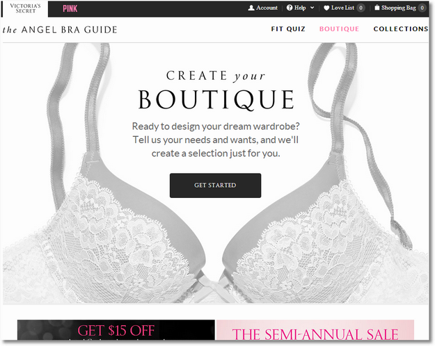
I click on Get Started and I'm presented with a lovely screen where I can pick my bra size.
I choose 34 D. (As I'm not intimately familiar with bra specs, I'm making random choices above and below. In case you were curious.) I have an option to measure myself, or convert from international sizes. Good options.

That done I can move to the second (of five) steps. I choose how much coverage I like. The experience is nice, each choice is clearly highlighted with a brief description. I choose "like a Demi."

There are three more steps: Padding, Straps, Support. And Boom! I have my boutique with 202 bras chosen just for me!
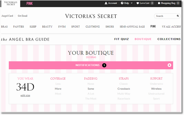
The fun does not stop there. The bras are sorted by the percentage that they match with my wear, coverage (more), padding (some), straps (cross back) and support (wireless).
I can see the bra, prices, sale prices, and by clicking on the bra I can get a quick view with other details if I want. There are also some additional sorting and filtering options.

It does not take a very long time to pick my colors and other options to narrow down to just 12 to choose from. I order the first three with the highest percentage in the match column. Rocking them comfortably now!
I also take some of the others and click the heart icon to save them for future consideration.
An otherwise painful or just "it does not suck a lot" experience transformed into something that delights (and makes me give VS more money).
And all of this without first opening an account (so stupid when companies make you do that first!), and without it feeling like a torture from an experience stand point. I can open my account now if I want and save by bra boutique for the future. And VS can accomplish this without the worlds most crazy-freaky predictive algorithms of Earth and alien juice from Mars.
Why can't your customers personalize your website with just six clicks? Why can't they build their own store, newspaper, library, product catalog, ad experience and so much more in six clicks?
Here's one more example to inspire you… from another one of my favorites… Rent The Runway.
They have a feature called Our Runway / Woman Like Me that allows you to go from their infinite choice to your own specific set of dresses very quickly…
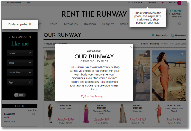
As you can see above, there is not a lot to it.
From the left nav you just choose your basic information like height, bust, usual size etc and as you choose from each drop-down the dresses you see change dynamically…

I pick 6', 32C, 10 and 30-39 and I get my custom store!
What is particularly fantastic about Rent The Runway is that they have an astonishingly loyal user base who sends in their pictures and now I can see women like myself! No fancy models (though if you miss them they are not too far away as you can see below).

It is so much easier for me not imagine how I would look in the dress I'm comparing for my special day. From a combination of my look and feel as well as the dress, I can easily choose the dress I want. I pick the one Katie's rocking…

Read her brief review (I can dive in and read more reviews and checkout other women – Asian like me – who rented the dress). From there it is but a short hop to renting it for myself…

$40 for an extra-special event, and new memories.
Personalization in the case of Rent The Runway came from two magical sources. 1. The basic dress and person data. 2. The information (reviews, pictures etc) contributed for free by existing Rent The Runway users.
Both, doable. Both, will take you less time (and deliver a strategic long-term advantage).
I'm not trying to dissuade you for pursuing the fantastic software/hardware/advance artificially intelligence path that takes years to bear even small fruit. I'm simply saying that you could see that with very little data and a little bit of moxie both Victoria's Secret and Rent The Runway can deliver an amazingly personalized experience. Do that first, even if you have unlimited money and a beguiling software vendor promising you everything magically personalized without any effort from you (well except your money). You'll still win big by emulating VS and RTR.
Personalize, smartly!
3. Empower customer reviews that are actually helpful. Start stinking less today.
Rent The Runway is a bridge into this critical awesomzation of the digital experience.
Is there anything more done to death more than reviews on the web? And it is all so boring. Who wants to work on reviews or improve them?
You. You should want to. Because you'll deliver higher customer value, customer loyalty and business profit.
The "gold standard" for review spec is Amazon. Name, date, text comment.
Why not go for a bold standard and stand out from the crowd? Two examples.
First, let's look at Rent The Runway. I'm considering renting the Psychedelic Floral Dress by Nanette Lepore.
It looks nice. But what about the reviews?
The dress currently has 55 reviews. What is particularly helpful are other features included such as Usually Wears (4 and 10 below) because I can compare that to what size of this dress the person ordered. I can also get other qualitative information such as Rented For (formal affair). And of course the pictures are super helpful!

On top of the reviews is also another lovely set of information related to Fit (small, true to size and large). I can also filter by various physical criteria to find the reviews to find just the ones I might find to be helpful.

Why aren't the reviews at Macy's or Nordstorm this awesome? Or Bare Necessities or Wal-Mart or every other website paying lip-service to customer reviews?
Perhaps your company's excuse for not innovating with reviews is that you don't sell clothing/fashion.
That's not good enough of an excuse.
Let me share with you one of my other favorite sites in this context, Williams-Sonoma. You are welcome to look at any random product, but let's look at the All-Clad d5 Stainless-Steel French Skillet.
The reviews have the common elements you see in the "gold standard" reviews like a text review and the various sort options. But when you look at the latter you get your first clues to the smartness at WS. In addition to Newest First or Ratings High to Low, you also see other lovely and helpful things like Photo Reviews First, Video Reviews First, Length Long to Short etc.
Awesome, is it not? In a world like Amazon's where every single product is four star rated, this is would be so helpful to narrow down to just the reviews you might find helpful.
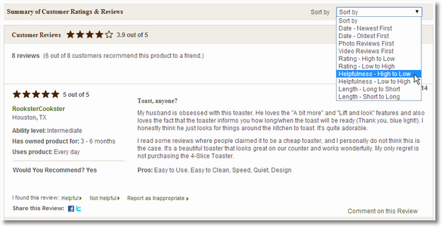
And, it gets better.
Notice the area to the left of the review. I absolutely love Ability Level, Has Owned Product For and Uses Product!
In a world where people are passionate about every hotel, product, thing, I can how hone in on my type of people or people I would trust more/less. If my level in cooking is intermediate, I'll trust Rookstar's review more. The fact that she/he has had the product for 3-6 months increases my confidence, as would the fact that she/he has used the product every day.
It is not unusual for people to write product reviews even before the product is shipped. Or the day they get it. Or people slam a sophisticated camera because it does not make them coffee in 24 hours. Or a new game because their ability level is low and the game is more suited to ability level high.
Here's a great example, of my, now beloved, Breville toaster .
The toaster, when I first saw it, seemed to be too expensive and the reviews were mixed. But WS makes it easy for me to move away from the clutter and hone in on just the reviews I might find helpful.

While I respect drmikie, it is easy to ignore his/her review and identify more like belloftheball that have more of the elements filled out that match with my preferences.
Reviews are more painful today than they need to be. We need to adopt the "bold standard" followed by Williams-Sonoma and Rent The Runway. We need to deliver more than the look we suck as much as everyone else.
Care more. Be bold.
4. Design a glorious purchase experience. Take their money, please.
I've shared my love for Bonobos in the past. They do lots of small and big things right (along with doing the biggest thing right, sell great pants!).
Here's a tiny example of how smart the user experience is, full of delicious little bonbons everywhere.
When you hover your mouse over your waist size, it automagically shows you what length is available.

And of course it also works the other way around. Hover over the desired length, it shows the waist sizes in stock.
Awesome right?
Other companies also let you pick your waist and length and show you what's in stock. It just needs more clicks, drilldowns, and standing on one feet while balancing a coffee cup on your nose.
But the reason to mention Bonobos today is to introduce you to the world's greatest ecommerce purchase and checkout experience.
When you click start checkout you land on this beautiful sexy page.
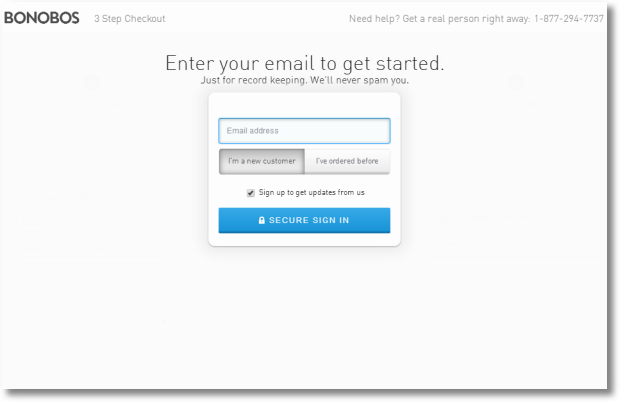
No awful SECURE CERTIFIED, VERISIGN CHECK OK, NO VIRUS CERTIFIED, GROWTH HARMONES EXCLUDED, yada, yada, yada. It is 2014 after all. It is safe to assume intelligence at the other end.
No buy this and buy that. No also look at this and that. No fifty other columns of garbage.
Just a page. Waiting for you to do your thing. And if you are weak-willed, it says right up top, 3 Step Checkout. In the small chance you are having a heart-attack, you'll be comforted by the Get a real person right away. There. Feel better?
You add your email address, that's it. You move on.
If you already have an account with them things get more yummy, but let's just use the worst case scenario.
Here's step one in your checkout process. The choice for shipping is built in, press a button if you must. The default is free.
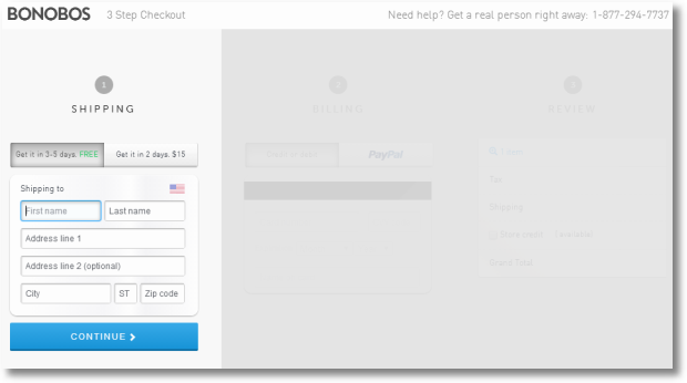
Surely by know you can fill in your shipping address in a few seconds and click Continue.
Gaze at the simplest credit card entry page known to mankind.

(I want to note that Bonobos does do error checking. The above is fictional address but recognized as legit by most address checking systems. I mistakenly had NE for state, the Bonobos system prompted me with a clear indicator that the Zip was wrong. Even before I clicked continue. United Airlines people, make note of this!)
It is easy to see where on your credit card the information will be that you need. Instead of just saying "billing address is same as shipping address," they repeat my street address and ask if that is also my billing address. Nice.
Instead of typing in the four required fields, I can also choose to pay via Paypal.
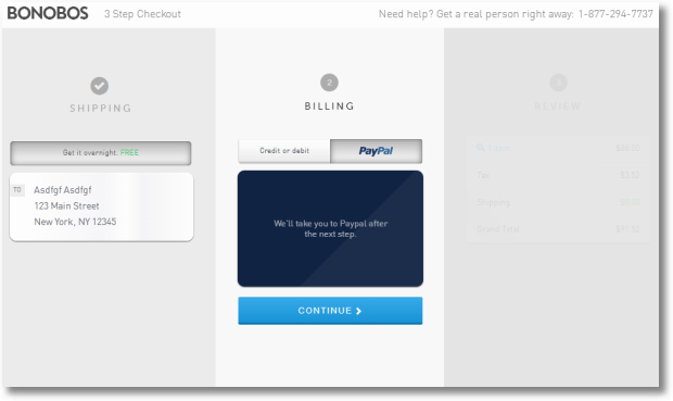
The whole checkout process becomes even simpler.
I click on Paypal and then Continue and I get my review page for the costs and a nice green Checkout With Paypal button.

I can log into my Paypal account and pay in a second. All I had to do is type in my shipping address.
Did you notice the reassuring "Free prepaid return label in the box" under the checkout button? If you were going to take five seconds to press that button, you'll press it in 0.5 seconds now!
Checkout abandonment rates routinely run in the high seventy and eighty percent. That is simply unacceptable. If people want to give you money, why not Bonobos your checkout experience and take that money quickly?
Bonobos' checkout experience does every single thing required, and nothing that is not required. Let them be your inspiration to move beyond we've met the standard of not sucking. Do more. Profits await.
Now. Where are my Blue Moon 30/34 pants?
5. Convert like a champion! Solve for on-line, off-line, later-line, maybe-line!
After looking at a great mobile experience we worked on creating simple personalizatoin that is driven by customer data. Then we did the next most optimal thing, focused on creating "bold standard" reviews. From there it is a simply hop-skip-and-jump to creating a delicous checkout experience.
We've gotten our conversion rate up. Hurray!
Time to focus on doing business however the customer wants to, rather than just want's convenient to us. Time to obsess about multi-channel outcomes.
I want to use an unusual example, Cartier. Unusual because if you look at most luxury websites they stink to high heaven. We will come back to this topic in item number seven below. For now, take my word that by not making you learn to use the internet all over again the team at Cartier is unusual and worth admiring.
If you are interested in the delightful Tank Anglaise watch, there's a simple red Add to Shopping Bag button.
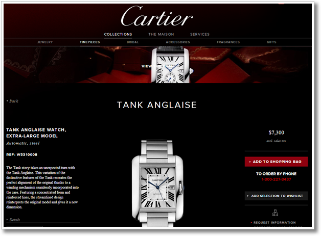
Oh, and get $7,300 ready. On that note the Cartier team deserves another kiss. Most companies in their space will make you call them to visit a store or refuse to give you any option to do business online. You know because this internet thing is a fad. No Cartier though. They are happy to take your money.
So far a couple of nice things. But that is not why the Cartier site is in this post.
They are here because of everything surrounding their Add to Shopping Bag button.

There are five other choices for you to efficiently part with your money. Order by phone. Add to wishlist (in case you don't want to convert in the first visit!). Request information. And lastly, contact an ambassador.
Everything stacked up beautifully in a nice cluster. Cartier is solving for Do as well as See and Think. They are solving for online and offline. They are solving for people who need no help, people who need some – request info – and people who need a lot – ambassador.
This is rare. Yes, many websites offer some of these pieces. Only a few offer all. Even when some of these pieces are available, they are spread all over the website and hard to find.
Why?
Why not make it easy?
Why not have the macro-conversion and the micro-conversions related to making money, presented in a way that makes our customers feel like they are in control and we are happy to move at the pace they choose for themselves?
Please solve for the on-line, off-line, later-line and maybe-line. Your mom will be so proud of you.
6. Win with innovative, magnificent, brand experiences. Owned audiences await.
We've mostly focused on performance marketing, time to shift our attention to the other love of my life… brand marketing!
Let's focus primarily on the See stage with some Think thrown in with a very tiny pinch of Do. [The awesome See-Think-Do framework.]
Let's look at beauty, looking and feeling beautiful regardless of who you are.
I'm sure you know that only a small tiny handful percent of attention in the video space is being earned by big or small beauty brands. From your Chanels of the world to your Head & Shoulders to Olay to Axe. Yes these brands have YouTube channels and every once in a while they throw up a viral video and everyone oohs and aahs. They get temporary attention, there is no residual impact on the brand. Follow-on views. Subscribers. Offline sales. Online visits. Take any metric you want.
Attention in the beauty space is earned by Zoella, Carli Bybel, Bethany Mota, Jen Chae and, I think literally, hundreds of other real people in the world who are expressing their passion for beauty for free. There are teenagers with more Subscribers than many gigantic beauty brands.
So it is not the case that there is not attention to be earned. The problem is that your, and your lovely expensive agency's agenda of videos in the spirit of "LOOK AT US OUR PRODUCTS ARE BEAUTIFUL" does not work. Neither does "LOOK AT OUR MODELS THEY ARE SO AWESOME, RUN OUT, BUY OUR STUFF!" And of course video after video that says "LOOK AT ME I'M AM PRETTY" leads to 300 views or less.
Larger companies also have a unique problem where each of their brands tries to go after attention individually and that strategy means each brand has a gigantic problem to solve. They get zero benefit from scale that should normally flow for large companies.
Recently I came across and example of a large company that has decided to think different.
The wonderful team at Unilever UK identified that attention was currently owned by vloggers and other non-paid contributors. Furthermore pimpy videos don't work. Solving for short-term virality is not a sustainable strategy. And individual brands were individually struggling to make any headway.
Their solution is pretty amazing. It solves for See, Think, Do and Care by providing inspiration, utility and unique points of engagement.
They've created a beautiful custom designed YouTube brand channel singularly focused on hair (for all their hair-care brands). It's called… All Things Hair.

Pretty is it not? It also does a million clever things.
This post kicked off with a deep emphasis on user-driven personalization. Unilever UK is doing that well right off the bat. Once you get over how beautiful the channel is and how happy and delightful all the people seem to be, your eye with settle on the My Hair Is area. A quick click…

I can pick my hair color, curliness and length. As I do this the videos I see change. Relevance!
But the delights don't stop there. I can select what I want to do with my hair in the Make My Hair section.
I choose messed up. Why not? : )
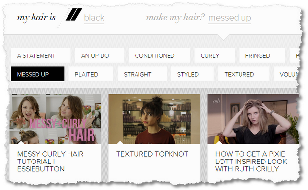
And now I go from hundreds of videos to an absolutely delightful curate set of guaranteed to be helpful videos. All I have to do is press play. (I'm trying the Pixie Lott inspired look. Let me how how it looks next time you see me. :))
Rather than creating all the videos using their current stable of models and personalities, the team at Unilever is using people who already have attention on YouTube from their current body of work. They are using YouTube vloggers to create videos that deliver on the important dimensions of quality, authenticity and value. The videos are not too polished, just enough. It is extremely clear that the videos were commissioned by a Unilever brand, yet the tone, texture and content is authentic. And the 30 or so videos that I looked through were extremely valuable.
This is incredibly hard to pull of. If you work at a large company (and you don't have to be Unilever large) you can feel in your soul how freaking hard this is to do. A million barriers. A million entrenched agendas. A million reasons to keep sucking at YouTube and to keep shouting on TV. A million agencies, divisions, leaders, and more to work with.
It is unbelievable that Unilever UK managed to invest in a long-term sustainable strategy for the Unilever family of hair-care products, because it would be so much easier to just suck like everyone else in the beauty space around the world.
Back to the videos.
The videos show up in a custom window in a custom player. They are all pretty short (YouTube standard!). Sharing is built-in and prominent, see buttons under the video on the right side.
On videos where Unilever products are used, they show up in a space called the Hamper.

Because this is solving for the whole family of Unilever products, they can nicely showcase the entire portfolio of products that were used to deliver the hair look-feel-awesomeness.
The Buy Now button is small and subtle, but it is there and you can see it. You don't have to click on it. The tone set in the video also does not solve for selling, it solves for making you look and feel beautiful.
If you do click on a product, I could not resist something called radiating tropical elixir, you are taken directly to the product page where you can read the reviews, learn more, share it on various social channels or buy the product online or offline.
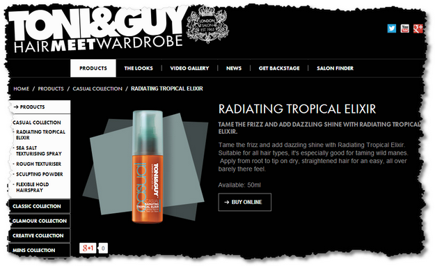
As the brand manager of one product, say TRESemmé, you can still take your current assets, relationships and people and be a part of the All Things Hair family.
Here's one of those videos by Matthew Curtis on how to get a vintage wave. In the past it might have languished by itself on a product brand channel, now it has 650k views and attention it deserves.

Visit All Things Hair – UK. Poke around. Checkout the videos. Try the personalization / solutions finder. Listen to the tone and texture of the videos. Pay attention to the authenticity. I think you'll love what the Unilever team has done.
One of the things you might notice are the lovely points of engagement spread out in the channel.
For example, the weather. Not as relevant for us here in the US (or for you in Nairobi), but useful for their core audience.
You'll notice that the elements with 40s and 80s actually move and are not stills. I don't know how they are doing it, but they are freaky and cool both at the same time!

And of course you'll notice the quizzes. Not the sexiest things in the world, but a delightful point of engagement with the channel.
Every number you look at for YouTube is going up and to the right. Amount of time and average person spends. The number of videos uploaded. The number of massive celebrities created on the back of YouTube. The number of people looking to YouTube as a See and Think medium. The amount of devices people are watching YouTube content. The number of subscribers on top channels. The number of successful movies/products/revolutions launched off YouTube. Pick any metric you want. Up and to the right.
Through All Things Hair the Unilever UK team shows us how to be ahead of the game and get a massive return on their investment. The primary purpose is to do more than/better than what they do with branding on all other media channels, the secondary, much smaller purpose is to enable commerce in a very quite manner.
It is very hard to do this. Even if the imagination exists, and that is a big if, the forces of entropy in companies large and small are hard to overcome.
I'll be the first to admit that you can still suck for a little while and your business will be fine. But the amount of time you have in front of you is as long as the person who will replace you in your job. And she/he will passionately hate you.
Owned audiences await you, move beyond renting. Create innovative, magnificent, brand experiences. One YouTube, and everywhere else you exist.
7. Create inspiring, luscious experiences. What if the first interaction with your brand is digital?
Since we are on brand marketing, one last quick example of a site I'm deeply fond of. Hermès.
Most luxury websites try really hard to be different. Company leaders have a desire to be the most unique experience on the internet to represent the uniqueness of the brand. Since they also have lots of money, the internal or external design team is happy to separate the company from that money and create a website that no one outside their immediate building will be able to use. Mice don't really work. If on a tablet you have not idea what to click, where to find information you actually want. They have bizarre horizontal scroll bars. And obviously the font size will be 6. Oh, oh, oh and you are right, light gray font on a light gray background. Or should I say sexy gray with subtle hues of love. Still does not work though.
I don't know what they are solving for.
As an example, I really do love Chanel. Great products. Wonderful brand. Fantastic heritage. But all of that is not enough for me to want to first learn how to use the internet in order to visit their various sites. It is 2014. Why do I need to first learn how to use the internet! They are simply trying to be too clever. [Though you can make a very strong and legitimate case for the fact that I'm too poor to be their target audience.]
It is of course entirely possible to create a stunningly unique experience that lives up to your brands heritage and glory, and does not require people to learn to use the internet first.
I give you the wonderful Hermès website.
This is the gorgeous page that shows up while the site loads. A custom beautiful animation!

The site, in a very subtle and not-in-you-face manner, pays homage to the brand's orange color preference. [I love orange. Flavor. Color. Land. People. Everything!]
See what I mean, you can show this is something special and uniquely you?
When the site loads you are presented with a cluster of what seems like an infinite number of tiles. Even shrunk down to this tiny size, you can make out what they are and what information they might provide (and as this is the French version of the site, it would help a little to know French though that is not mandatory).
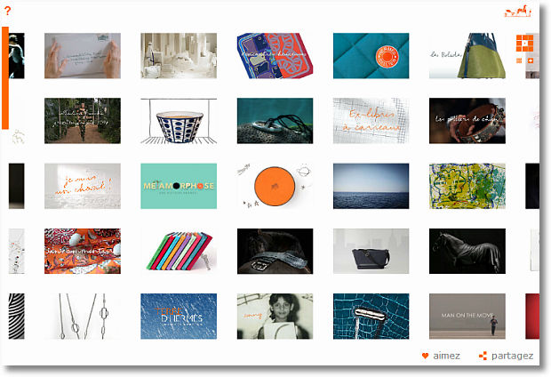
The navigation aid is the little grid you see on the top right.
Move your mouse to the right element and the tiles more as well. Left, or right or center or top left or right or… well, wherever you want to explore. You also have a small + and – underneath to allow you to zoom in and out. Takes you less than two seconds to understand how to use the site.

Click on the tile itself and it zooms up to a large size (the image below is shrunk down). You can now consume the content. Video. Audio. Helpful hints. Stories. And more.
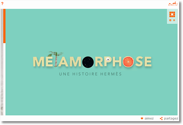
There are tiles that display text. Perhaps the only element that could be executed better, and even they are pretty readable (I bet even in the reduced size you see below!).
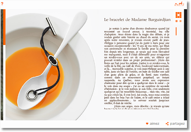
Did you notice the orange? Is it too subtle? : )
Sharing it built into each element, bottom right brings up the social icons you need.
Hermès is famous for many things, but perhaps their scarves most of all.
I love this tile that times how long it takes you to tie a scarf, or anything else really. A very creatively produced element. The belts move and change. The whole thing is so well done.
And that's what's awesome about the Hermès digital experience. A million small things done well with love and creativity to bring you closer to the brand.

Did I say the scarves are awesome?
I might betray my design sensibilities, but the Hiroshi Sugimoto collection is a favorite of mine. [Gentlemen and ladies, start your wishlists for me!]
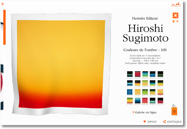
It is easy to switch scarfs, see larger images, browse other galleries.
And when I'm ready to buy, the Hermès ecommerce website awaits ready to delight and deliver an amazing experience while taking my money.
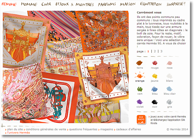
Once I pick the scarf I want, I can easily J'achete it!
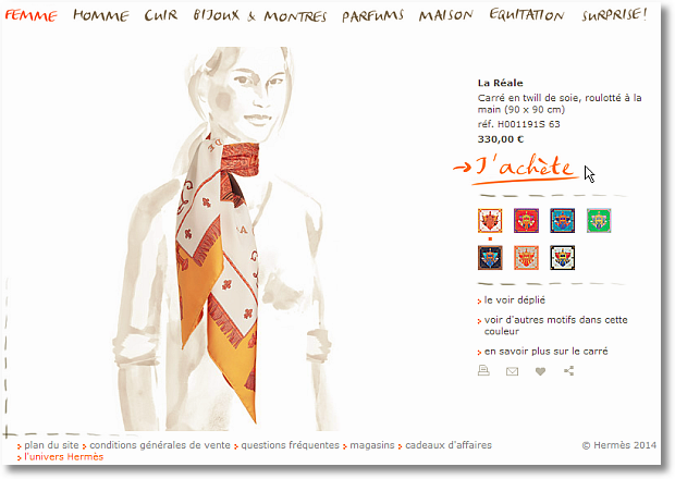
Oh and did you think they are only solving for softer outcomes like enhanced brand equity and harder things like ecommerce? No!
They've read this blog. [I presume!] They do macro and micro-conversions .
Here's their email sign up form…

Did I already say it is possible to deliver an amazing unique brand experience while not requiring people to learn how to use the internet all over again simply because you are trying so hard?
I think I did.
One last thing that touched me the first time I visited the Hermès site last year.
I tried to look for the nearest real-world store. The experience to find it is pleasant.
What was delightful was the sketch that I got next to the address. It was so lovely . (Did you notice the hint of orange? :)) I was really impressed that they created a special sketch for their store locator.

Then I went to look for a store in San Francisco . And much to my surprise, I got a different sketch!
And then I tried other cities. Different sketches!!
And then I went on a journey around the world to look at all the sketches. They were all beautiful, unique and heart-warming.
You can tell me you are special. Or you can show me how special you are. By caring deeply about things small and big. By going way above the call of duty. By setting your smartest people free to express their creativity. By creating a perfect match of what made you amazing in the real world and creating a perfect digital manifestation of that exact thing.
Everything above is amazing. But the most remarkable thing about Hermès is that their digital existence around the world looks the same, works the same way. Try to change the country. And their ecommerce stores also look feel the same around the world. Truly worth admiring because of the people, process, egos and platforms involved.
All of us can be Hermès. You just have to want to badly enough.
In their unique way, each of our stories today is a walking-talking example of going well beyond the call of duty and not settling at we don't suck any more. Each an example of being truly customer-centric, while solving for greater business profitability.
They inspire me to think different, and I hope they inspire you as well.
As always, it is your turn now.
Is there a mobile experience you are impressed with? Why? Who has impressed you with deeper personalization of your experience, beyond the obvious? Do you have another example of customer reviews to add to Rent The Runway and Williams Sonoma? What did you think of the Bonobos checkout experience? Is there someone simpler/awesomer? Does your ecommerce experience provide all the options like Cartier, that beautifully? Would All Things Hair work for your company's YouTube strategy? Who else do you love? Did you adore Hermès as much as I do? Is your heart with someone else how has managed this astonishing balance between unique and functional?
Please share your stories, critique, examples, best practices and everything else via comments below.
Thank you.
Digital Design & User Experience Best Practices: Happiness + Profits! is a post from: Occam's Razor by Avinash Kaushik

 I read somewhere that data was the key to boosting sales. Really? Says who?


 After weeks of searching and
  The failure to accurately forecast sales revenues has critically compromised the careers of many promising CEOs, Sales VPs and Sales Managers. Getting it wrong - and particularly getting it wrong consistently - sheds jobs and shreds reputations.




 Whenever you start a negotiation, you're trying to decide whether to be cooperative or antagonistic with the person on the other side of the table.


 If this list is accurate, then plenty of B2B sales reps might rank pretty high on the company payroll. This is for a number of valid (and very obvious) reasons. Take the ERP software industry for instance where sales engineers wouldn’t look out of place. These are the people working day and night on user training sessions, explaining the technologies to prospects, and demonstrating how it can improve their current work processes.


 Take one look at the investment your organization makes in events and the importance of these marketing activities is clear. But what’s also clear is the challenge marketers face when trying to demonstrate the specific and tangible return on their investment in events.


 I was working with a client a few years ago. While I was onsite the CEO and CFO were huddled to discuss pricing on a transaction for a very large prospect. I soon learned they had been negotiating for over two weeks. Over that time the pricing had eroded to the point where they were actually concerned whether the transaction was going to be profitable.


 Should you cave in and rake in or should you try marketing a product that’s not all that dependent on helping two parties trying to do each other in? The answer is somewhere between both.