Shared posts

20 Jan 02:27

Extreme makeover as beauty brand Wahanda becomes Treatwell

by Angus Montgomery
DesignStudio_Treatwell_Press-Images_1

DesignStudio has rebranded online hair and beauty brand Wahanda, which is relaunching as Treatwell.

Wahanda was set up in 2008 and has recently acquired a number of competitor businesses in the UK and Europe. One of the businesses it has bought is Treatwell, and the company is now unifying all of its businesses under the Treatwell brand.

The previous identity

DesignStudio was briefed to create a new identity and brand strategy for the company, which could be used across all ten countries in which it operates.

The new look was developed over a six-month period, with DesignStudio’s team sharing office space with Treatwell in London and Amsterdam.

The consultancy says it has aimed to base the new identity on the concept of “celebrating individuality”, rather than “glossy, airbrushed images of beauty”.

This individuality is expressed using photography and illustration, says DesignStudio, while a “bright, bold” colour palette brings an “energetic and playful” attitude to the brand.

The look and feel also features “abstract body shapes and patterns”, which are used across the website, app and other brand communications.

DesignStudio creative director Tim Williams says: “We wanted to change how beauty is perceived. The rebrand looks to celebrate self-expression and individuality, of both the salons and the customers who use the service.”

A set of in-house tools and guidelines has also been developed for Treatwell, which will be used to implement the new branding across different countries.

DeisgnStudio_Treatwell_Press-Images_8
DesignStudio_Treatwell_Press-Images_4
DesignStudio_Treatwell_Press-Images_5
DesignStudio_Treatwell_Press-Images_9
DesignStudio_Treatwell_Press-Images_12
DesignStudio_Treatwell_Press-Images_13
04 Jan 19:17

Vol. 109 | No. 1

by james i bowie

College football programs are spending hundreds of thousands of dollars on facility graphics to lure recruits and impress donors.

---

Link

--- QuipImage Many thanks to our ADVx3 Partners
02 Dec 18:14

Venturethree helps UN build “Great Green Wall” across Africa

by Tom Banks
GGW_Logo_Green

Venturethree has branded an ambitious United Nations project to create a “Great Green Wall” across the breadth of Africa, made up of plants and trees.

The Great Green Wall campaign launches today at the UN climate change conference COP21 in Paris where world leaders will engage with the project.

8000km band of vegetation

United Nations Convention to Combat Desertification hopes that an 8000km band of vegetation – which stretches from Mauritania in the West to Somalia in the East – will provide a sanctuary for those affected by climate change by providing them with food and jobs.

The scheme has been running for eight years but without a brand or much public engagement. Venturethree was appointed in July and tasked with bringing the initiative to a global audience by promoting its benefits ahead of COP21.

Stage one of this has been to bring together different strands of the programme as a single idea – “growing a world wonder”.

Symbolic identity

The symbolic identity and its green and white colour palette have stemmed from this positioning along with pictograms and photography to show the scale and impact the project could have.

A short film made by Venturethree and a selection of brand assets are being shown to world leaders today at COP21.

Virtual reality film

The consultancy has also worked with executive producer Al Maxwell and VR specialists Apache on a virtual reality film entitled Growing a World Wonder.

It tells the story of a young Senegalese girl and her family who have been given hope by the prospect of the Great Green Wall. It will also be shown to the heads of state today.

The film will be available on YouTube, Samsung GearVR and Google Cardboard for iOS and Android.

Venturethree creative strategist David Milsom says: “The Great Green Wall is a symbol of hope that humanity can reverse the effects of climate change.

“The brand we’ve created will help everyone understand what the wall is about and with the VR film, they can actually see it for themselves.”

GGW_Logo
Unknown
GGW_Iconography
GGW_Messaging_01
GGW_Icon
GGW_Microsite
GGW_Branded_Headset

GGW_Event_standGGW_Photography01

25 Nov 15:32

Interview – Karen McGrane, UX Designer & Content Strategist

by Paulina Vargas
Karen-McGrane-Interview

karen-headshot-bw-webFor nearly 20 years Karen has helped create more usable digital products through the power of user experience design and content strategy. She founded Bond Art + Science in 2006, and has led content strategy and information architecture engagements for Franklin Templeton, Marriott, and Celebrity Cruises. She has worked with nearly every major publisher in the business, including Hearst, The Atlantic, Fast Company, and Time Inc.

Previously, Karen helped build the User Experience practice at Razorfish, hired as the very first information architect and leaving as the VP and national lead for user experience. There she led major design initiatives for The New York Times, Condé Nast, Disney, and Citibank, and managed a diverse team of information architects, content strategists, and user researchers.

Karen teaches Design Management in the MFA in Interaction Design program at the School of Visual Arts in New York, which aims to give students the skills they need to run successful projects, teams, and businesses.

Her book Going Responsive was published in 2015 by A Book Apart, and her first book, Content Strategy for Mobile, was published in 2012. She is also the co-host of A Responsive Web Design Podcast with Ethan Marcotte. Her pithier writings often wind up on Twitter at @karenmcgrane.


Can you share a little about yourself and some history about how you got into UX Design work?

I’m one of the rare people in this industry who came in through the front door and I’ve never done anything else. I have an M.S. in Technical Communication and Human-Computer Interaction from Rensselaer Polytechnic Institute, an engineering school in upstate New York. The mid-90s was a great time to learn the principles of user-centered design, and to learn them in a communications program means I was trained in information architecture and content strategy from the start. I got my first job at Razorfish in 1997 and have been working in UX ever since.

As a creative, how did you transition into Content Strategy?

I wouldn’t use the term “a creative” to refer to anyone in this industry. Everyone is creative—I’ve worked with back-end developers who are some of the most creative people I’ve ever known.

What were some of the most challenging websites you’ve worked on? Can you share the solutions you developed for them?

I just worked with a fantastic team on the redesign of The Toast and we wrote up a case study of our process. What made this project special was working with a group of people who are all exceptionally good at what they do. The team at The Toast was also a delight to work with. There are so many complex decisions to be made over the course of a web project, being able to trust the people you work with is the most important thing.

What do you say to companies that are reluctant to invest in UX Design, how do you make others aware of the significance of UX Design?

I don’t even try to convince the non-believers. It’s not worth it. Partner with people who already understand why user experience is important and value your work. We don’t have enough skilled UX people to solve the problems of companies that already get it, why waste time trying to convince people?

Can you tell us about the time you spent at Razorfish as the VP and National Lead for UX? Can you share some of your notable accomplishments there?

I was the first person hired with a background in user experience, and when I left I was running the practice nationally. Over the years, I helped shape and build the practice, managing a team of information architects, content strategists, user researchers, and experience directors. I was privileged to work with some exceptionally talented designers at Razorfish, and it seems like most of my cohort from those early days at Razorfish have gone on to interesting leadership positions.

Was there any specific problem you set out to solve at Razorfish?

I had a different job every year, even though I worked for the same company. I often describe it as a crash course in every situation that a business might encounter: explosive growth, going public, multiple acquisitions/mergers, massive layoffs, strategic shifts. As a designer and a manager I was exposed to so many different situations—not all of which I was prepared to deal with. I learned a lot about running teams, projects, and businesses, and that has paid off handily in the years to come.

Karen-McGrain-Quote2

How did you transition from Razorfish to Bond Art+Science?

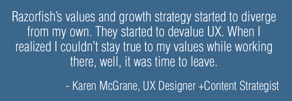
I made a very good decision to quit my job. For the majority of my time at Razorfish I felt the values of the company aligned solidly with my values, and my career opportunities dovetailed nicely with the needs of the company. At a certain point, Razorfish’s values and growth strategy started to diverge from my own. The company became more of an advertising agency and I’d say—from my admittedly biased vantage—that they started to devalue UX. When I realized I couldn’t stay true to my values while working there, well, it was time to leave.

I have been running Bond since 2006, at first with partners and now entirely on my own.

Could you explain your thoughts on “company culture” and how it can be fostered in a work environment? Do you feel that Bond Art+Science has its own unique culture?

Bond is just me, but I work quite regularly with a variety of partners. Culture means something different to me today than it did even a decade ago, when I might have talked about how the office space should be conducive to meetings and discussions, or how lunches and other social activities go a long way towards creating trust. With so many people working remotely, and many people working on ad-hoc teams, culture is more elusive since people aren’t working face to face. But, regardless of whether it happens in person or on Slack, clear communication and being kind to each other are things I value.

What do you believe are some vital content strategy concepts that designers/developers may not understand?

“Starting with the content” doesn’t mean waiting until all the content is done. Too often, I see content treated as almost a binary state: either we have the content or we don’t. Designers and developers often complain about how difficult it is to get clients to give them the content.

Content strategy is a whole set of processes that make it easier for clients to say what the content should be—and make it easier for clients or copywriters to actually create that content. Content strategy also makes it easier for designers and developers to understand the structure of the content, its size and shape, where it will come from, and how it might be reused. Knowing the structure of the content is the most useful input to the design process—in some ways even more useful than having a few examples of the “real” content, because this process ensures you’re considering a range of possible scenarios and variables.

Karen-McGrain-Quote1

As someone who knows both content strategy and UX Design, do you think it’s advantageous for anyone in the business of design to learn the strategy side of things?

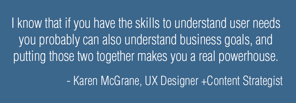
I teach the Design Management class in the MFA in Interaction Design program at the School of Visual Arts. It’s basically “business skills for UX designers.” I’m fond of saying that “design is the easy part.” Working in isolation, it’s not difficult to imagine a better interface, a better user experience. (That’s why redesigning something like the United Airlines website as a portfolio piece is so satisfying and yet so superficial.) Figuring out how to actually make better design happen, understanding the business strategies that support or hinder great experiences—I think every designer needs to have some understanding of how business works. Frankly, I’ve seen so many of my UX design peers go on to lead successful businesses, I know that if you have the skills to understand user needs you probably can also understand business goals, and putting those two together makes you a real powerhouse.

You teach Design Management at SVA, what does one learn from the Interaction Design program?

The interaction design program is a 2-year MFA, and it’s run with a studio model, so the students move together as a cohort. They take all their classes together and there are no electives. The program covers a range of perspectives in interaction design—this isn’t just about design for the screen. I recommend it for professionals with a few years of experience who are looking to explore user experience design more fully. One of the benefits of a program like SVA is the network of relationships students make, with the school and with other members of the program.

Is this a difficult process to teach in an industry where technology and tools are constantly changing/improving? How do you stay up-to-date?

The class I teach is about business principles, which don't change all that much! A lot of what I do in content strategy is also more slow-paced. I believe that investment in content modeling, taxonomy, and information architecture is something that can last companies for years or decades. People working in front-end design and development have to keep up with so much! If you’re familiar with Stewart Brand’s concept of Pace Layers the work most web designers and developers do is on the fashion layer, and I work in the commerce and infrastructure layers.

What kept you motivated in the early days of your career, and what keeps you actively engaged in the industry now?

I feel genuinely lucky to have found a profession that maps so well to my interests and how my brain works. I am never bored. Honestly, I just have a huge amount of gratitude for the growth of the web over the past 20 years.

What was the general process of writing your latest book, Going Responsive?

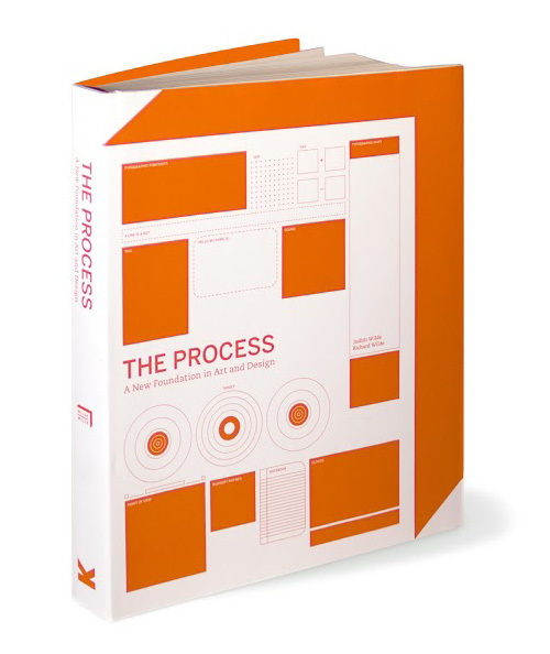
Going Responsive was my second book and it came out last week, on November 18. The process was a bit different from writing the first one, Content Strategy for Mobile. For my first book, I didn’t really know what to expect or how the ideas would emerge, so I just started writing. With Going Responsive, I was very clear from the start what I wanted to talk about, and I mapped out an outline for each chapter and section with expected word counts for each. I stayed pretty close to that structure and wrote about 1500 words per day (on the days that I wrote; I didn't write every day.) The first draft took around three months to write. Once the book was drafted then there were successive rounds of development edits, line edits, copy edits, and proofreading. Then the book went into production for the print layout and the ebook. That whole process took a few more months, give or take. I haven’t actually seen the print book yet, so it’s not quite real yet!

Going Responsive-KarenMcGrane

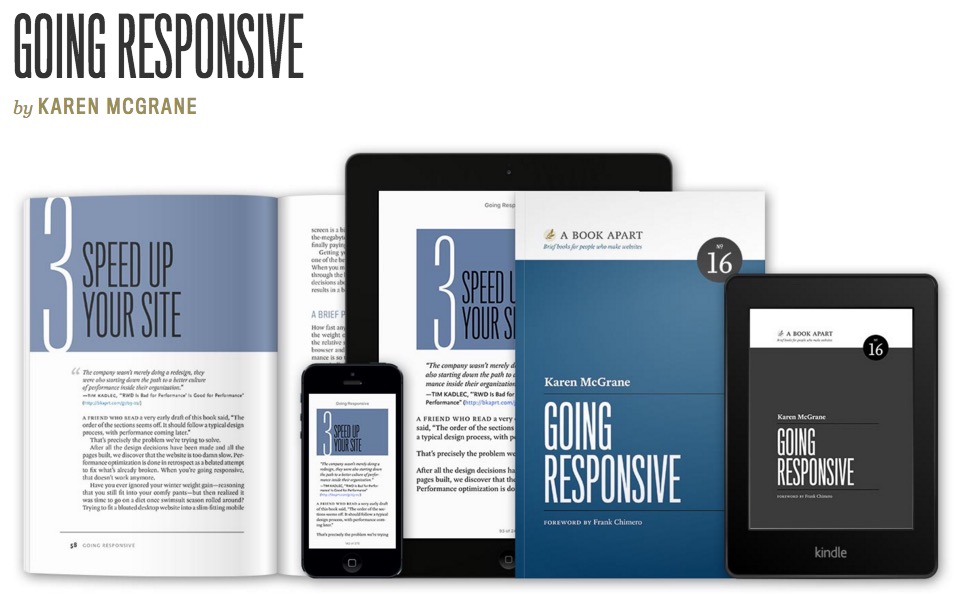
What are the major points you feel the reader can take away from your book?

Responsive design is more than fluid grids, flexible images, and media queries—it’s a new way of communicating and working that affects the whole team. This book is based on research and interviews with dozens of companies that have pulled off a successful responsive redesign.

Readers will learn about:

  • Why responsive is the right solution (given other options for mobile)
  • Planning and scoping responsive projects
  • Changing how teams are structured and collaborate
  • Why every responsive design project is also a content strategy project
  • New ways of dealing with browser support and testing
  • Measuring success and expected outcomes

If you could travel back in time and give your younger self one piece of advice, what would it be?

The problems you’re anxious about today won’t matter at all in 5 months or 5 years, so don’t waste so much time and energy worrying about them. The benefit of age is that you have experience getting through things, and so you feel more confident you can deal with whatever challenges life throws at you.

karen-mcgrane-web-res-photo-by-erik-westra-1

What do you believe the future of UX will look like over the next 5 years? Do you have any plans for new projects in the future?

I hope the future of UX is more diverse. People who use the products we design are increasingly diverse—mobile phones bring the internet to a much wider audience than traditional desktop computers. Having more perspectives on a team results in better products. Right now, the tech industry is dominated by affluent white people, with most tech companies skewing heavily male. If we care about creating great products for people, then we should ensure that the design and development team also brings a range of different perspectives.

Finally can you share any individuals you look up to in your industry and why?

Dana Chisnell is a personal hero of mine. Her work at the Center for Civic Design helping election workers design more usable ballots landed her a consulting job at the White House and the US Digital Service. I find her work so inspiring.

Lisa Welchman is another person I admire greatly. Her book, Managing Chaos, is one of the best books I’ve read this year. There’s no one else out there who understands how to wrangle large organizations and their digital processes like she does.
I don’t know him personally, but I think
Tim Allen
is the UX professional most likely to become CEO someday. He’s worked agency side at RGA and Sapient and later as ECD at Amazon, and now is the North American president for Wolff Olins. Someone to keep an eye on.

Read More at Interview – Karen McGrane, UX Designer & Content Strategist

19 Nov 16:32

HTML5 Sets New Standards for Web Advertisers

by Paulina Vargas
Advertising-HTML5

Now that Flash is officially dead since Apple and Google have decided to no longer support it.

despite being mostly irrelevant in the web design space, Flash was still seen in the online advertising space. Recently, The Interactive Advertising Bureau (IAB) has published guidelines on an international standard that set the latest specifications following HTML5-based banner advertising.

HTML5 replacing Flash

The change comes as Google AdWords now makes it possible to automatically convert advertisements created using Flash into HTML5. Below is a list of some of the advantages that come with the change from Flash to HTMLs when it comes to ad design and capability.

  • Smaller File Sizes
  • Mobile friendly
  • Advertisers and developers have more options
  • HTML5 banners can be constructed responsively
  • Can use everything from animations, web fonts and complex graphics, even video!

Read More at HTML5 Sets New Standards for Web Advertisers

19 Nov 16:30

Should illustrators be treated like designers?

by Alice Moloney
Final_illo

There’s a new breed of illustrator emerging: one who’s ready to be commissioned like a designer now would – for research, ideas and strategy – while still using their drawing skills as part of their process.

Read more

18 Nov 18:09

How to Use Color in Design to Guide Your User

by Paulina Vargas
Color to guide users eyes

The colors you choose in your designs can really help guide a user through a site or application. The human eye is generally designed to perceive brighter colors to appear closer and, therefore, seems more accessible. A darker color tends to fall into the foreground and appear subdued.

Scenery 1

Foreground (Brighter)

Scenery 2

Background (Darker)

scenery foreground

You can apply the same reaction to color in a scenery image to your UX or Web design palette. Color can be used to create an effective focus point directing attention to the part of your design you want the user to focus on. A variation of different tints and shades can also guide a user throughout a website, allowing them to click according to what you, as the designer, dictates as the next step.

Tints and shades Tints and Shades 2

Once you have decided what you want your user to focus on when navigating your site, give the element a vivid color. For action buttons, a bright signature color is recommended. For forms fields, a white or light fill within the field on a darker background is recommended. This makes it easier for your user to quickly identify the what fields they need to fill out with information, in order to move on to the next step. You can add color to the rest of the site, however, mind the brightness. You do not want the color to compete for attention and confuse the user. Stick to a subdued tone of color to allow for the best distinction of elements for your user’s eye.

Colo highlight in web design

Trianline 3
Trainline does an excellent job at executing different depth of color perception in both their website and mobile app design. Have you seen any other sites or apps apply this simple but effective technique to their design? Please share in the comments below.

Trianline1Trianline2

Read More at How to Use Color in Design to Guide Your User

17 Nov 16:59

J. J. Johnson and Kai Winding ‎”Jay and Kai” 1957

by shazen

jj-and-kai

1957. It’s like a type specimen! Except they’re missing two letters—oh, wait, I get it.

12 Nov 17:11

Animade creates fantastic animations for Airbnb’s New York City Marathon campaign

by Rebecca Fulleylove
Pizza

For the last year or so Animade have been working with Airbnb to bring the travel website’s logo, Bélo to life in various iterations. And as part of last year’s New York City marathon and Brooklyn half marathon, the team produced a series of looping gifs featuring Bélo in different scenarios. The logo is seen running on an oversized bagel, chasing a suspended slice of pizza for motivation and generally prepping for the race, and the animations are simple but effective.

Read more

11 Nov 20:24

Vol. 107 | No. 24

by arminvit

Groovy, paper-fold-y opening titles by Dani Wolf for KIKK Festival 2015.

---

Link

---

(If you can not see a video above view this post on Quipsologies) Many thanks to our ADVx3 Partners
04 Nov 18:33

Illustrator Eric Chase Anderson on Work Beyond His Brother’s Films, Game-changing Career Advice + More

by Anne Quito

Chances areyouve already been charmed byEric Chase Andersons distinctiveillustrations. Working on his brother Wes films, Anderson has helped inventthe now famous Andersonian aesthetic for cult classics such as the The Royal Tenenbaums, TheDarjeeling Limited,Fantastic Mr. Fox,The Life Aquatic with Steve Zissou, and Rushmore. For The Royal Tenenbaums, Anderson designed the bedrooms foreach of the main characters and was the hand behind the moodypaintingsbyLuke Wilsons character, Richie.

Aside from his work on films, Anderson has also created illustrations for hotels, album covers, numerous publications, and has authored a childrens book, Chuck Dugan Is AWOL: A Novel, With Maps.We caught up with the sought-after illustrator, who was just recently named brand ambassador for Winsor & Newton pens.

Illustrations for Miami Beachs Edition hotel
Illustrations for Miami Beach's Edition hotel

Youve said thatan old surveyors mapinspired you to pursue a career in illustration.What was so specialabout that map?
I say it was a survey map that caught my attention,because I dont have any other reference point for it. But it mayhave been an insurance map or a highly detailed real estate map.My father made maps for Sinclair Oil in Texas in the 60s.

However, this thing was so large and in such incredible detailrightdown to the individual trees, all hand-drawnthat Ithink it must have been some kind of surveyors map.It was very large: four feet across by four and a half feettall, in a big wooden frame. It was in color, presumably hand-painted, and it was probably a lithograph or some kind ofindustrial reproduction.

I didnt snap my fingers and decide to become an illustratorright then and there, but I did go to a toy store nearby, whichhad a small art supplies section. I bought a pen with areplaceable nib that you dipped in an ink well and a set ofwatercolor paints. For a while, all I did was make maps of theneighborhood, switching things around. And then, simply doingthat led me to make maps of more things, other things. And thatwas the beginning. Maps were the beginning of the journey.

Illustration for musician Tobias Jesso Jr.

What other objects inspire you now?
There are many objects I find myself returning to. TheAmerican Museum of Natural History houses many of them, as doesthe Metropolitan Museum of Art. But a lot of the time its aparticular spot in a particular neighborhood that possessed acertain feeling I want to return to and re-experience,either to remember, or just to see what it feels like now.I do think its important, however, to continue exploringnew places with new associations.

I have many homemade bulletin boards that I look at a lot,which… will often have a mix of illustrations and photographs, oftenfrom movies and TV shows.One thing I particularly love are theTIMEcoversfrom the 50s. Theyre all illustrated portraits, often withstrange props and thematically relevant imagery swirlingtogether, yet all rendered with tremendous skill and verve.

eric-chase-board-time-magazine

Can you tell us about working as an illustrator on afilm? How does it differ from a print project or a project for acommercial client?
Mostly, the film work Ive done has been separated from theactual filmmaking by a long chunk of time, either way ahead orway behindparticularly with the drawings Ive done for theCriterion Collection DVDs.

My one proper experience of working during pre-productionand then throughout production was on my brothers movie TheRoyal Tenenbaums. It was an incredibly busy time. There were multipleideas he had of things for me to do, which included me making myfirst attempts in oil paint. With the oils, I just opened them upand started painting. Of course, I almost always had incrediblyspecific parameters and ideas of his to work with.

For contrast, Ill tell you about a campaign I worked onfor Virgin Mobile. I was asked to make a small series of drawingsthat were meant to be as if young Richard Branson had made themback in the early 60s, presciently envisioning some slightlyskewed, crazy young persons vision of their futurecommunications empire. But with my first drawing I think Idisappointed them slightly. I stuck too closely to theirpreliminary sketches and ideassomething I was accustomed todoing. They told me, Eric, just go crazy. They wanted to besurprised. It was a perfect piece of direction.

For Virgins Young Branson campaign

What projects are you most proud of?
One thing thatleft a deep impression on me was seeing themain menu of TheLife Aquatic Criterion DVD (disc one). It was avery gently animated version of my illustration of the cutaway of the ship from the story,with a white dolphin and various soundeffects and the flag in the sea breeze. It was pretty magical,and I thought, I made this? Of course, I didnt really.Ihelped make it, but it was the work of many people. Nevertheless,its a drawing that I really like, and which was based on aproper architectural schematic by an old draftsman at the Rome studioCinecitt, where the movie was shot.

Map of Muskrat Cove from Chuck Dugan Is AWOL

Im also very proud of my book, Chuck Dugan Is AWOL. For onething, it was a big step forward in terms of trying to be more ofa more craftsman-like illustrator. It was also the culmination ofa long-running dream of being an author. I was so convinced thatkids everywhere were being deprived of good maps in stories thatI made it a point to include like a minimum of three maps in everysingle chapter.

NYU Alumni Magazine
NYU Alumni Magazine

Last fall I made a map of WashingtonSquare Park for the NYU Alumni Magazine. It was a big production,I believe, since it came as a fold-out supplement inserted intothe magazine and had a hand-lettered chart on the back foridentifying all of the creatures.It was one of those more demanding jobs that leftme with numb fingers and toes and these spastic tremors. Ilooked it up and found that these are all symptoms of repetitive-motion tasks. Presumably, every illustrator experiences this kindof thing. I wish I had more sophisticated advice than a tube ofBengay, but thats about all Ive got.

What are your favoritedrawing tools? Do you draw on the computer or is everything madeon paper?
My favorite tools are pencils and paint. I use a .3mmSanford drafting pencil with a semi-hard (H) graphite lead andWinsor & Newton Designers Gouache, primarily because I learned,at one point, that its the same thing Richard Scarry used toillustrate his books. I also really like colored pencil (I use Faber-Castell Polychromos pencils), which Ive only beenusing in the lastcouple of years to justadd a few details here and there.

Work isnt really possible anymore without a scanner, sothat and Photoshop to prep an image before I send it out, areessential tools. But everything I draw, yes, is done the old-fashioned way, on Bainbridge Board No. 80cold-pressed anddouble-thick.

Life Aquatic Belafonte cutaway

What are you working on these days?
Im working with an author to illustrateher next novel. Its not something I’ve done before for anyoneother than myself.Im also doing a logo for a company thats aboutto launch a venture capital operation to fund creativeinitiatives.

And, of course, I was flattered to be contacted byWinsor & Newton to try out their new pigment markers. Theyrereaching out to various illustrators, asking them tomake something from their hometown that emphasizes the color possibilities. Since Im here in New York,I made a chimpanzee climbing the Empire State Building. Maybe theantenna and viewing deck of the Empire State Building look like my normal thing,since theyre made with a drafting pencil and a few dabs ofgouache paint. But the Hudson River and sunset over New Jerseyare very different for me: bold areas of bright color juststacked above one another like stripes in the atmosphere.

Illustration for Winsor & Newton

What’s the best piece of career advice you’ve received?
I wastrying to get more commercial illustrating work, and Id put offthe problem of a website for a long time. I was talking about it with a guy I know whos very sharp about real life, and I saidto him, You know what? Fundamentally, I just dont know what awebsite means. I dont have a sense of what its saying. He said. It means youre open for business. That pretty much put things into perspective.

04 Nov 15:44

Anagrama’s Design for Making Horror Film Co. Reveals the Story of a Murder

by Madeleine Morley

Its difficult to make a spooky logo based on scarymovie tropes without it looking naff (or like something ona box of Clue), so when a horror film production company inHong Kong approachedAnagrama to make them an identity, the Mexican design studio definitely had their work cut out for them. The client wanted the aestheticto beclassic horror sansover-the-top blood, so Anagrama turned tothe gory yet gritty imagery of a forensic crime scene. We started by using props to create surprises, like evidence bags and glow-in the dark ink, explains the studios creative director and co-founder, Mike Herrera.

What seems like harmless letter paper or an ordinary business card later reveals itself to be covered in finger prints and blood spatters when a black light reveals neon green traces. The identity contains a secret, mysterious narrative, and like the best scary movies, its a narrative that stays hidden but finds ways to reveal itself slowlyand creepilyover time.

For the Making Horror logo, Anagrama conducted a series of typographical experiments using their scanner, personal specs, and magnifying glasses to stretch and warp some simple Futura Extra Bold. As a result, the four final logos appear to shriek and shudder like a ghostone of them even seems to be growing monstrous jaws.

We wanted a logo that could easily be a signature, says Herrera. However, we also wanted it to say everything about the brand through some simple and elegant solution. Its a shadowy, Jekyll-and-Hyde kind of typefaceneat and legible, but also a bit deranged.

For the font that delineates company details, Anagrama used a typewriter to show real human errors and evoke an old-fashioned detectives office. Their inspiration came largely from the aesthetic of Stanley Kubrick, who often features Futura Extra Bold in his films and whose 1980 film,The Shining,features a terrifying scene with Jack Nicholson ata typewriter,typingout one of horrors most memorable andchillingsentences.

Anagrama topped it off by designingMaking Horror their very own movie poster, as well asa disk of film demos that comes in a brown envelope plastered with red tape, as if it were a CD containing top-secret evidence. The overall look is playful and evocative without being clich or screaming horror too loudlychoosing to whisper horror instead.

28 Oct 13:41

A playful new identity for Sharing Economy UK

by Tom Banks

Sharing Economy UK, the trade body for major peer-to-peer companies including AirBnB and ZipCar, has been rebranded by Supple Studio, which has created a playful concept focusing on the idea of sharing.

SEUK was founded in 2014 and is a membership trade body for the sharing economy set up to promote the domestic sector and best practice.

Visualising sharing

Supple was briefed to create a vibrant identity that feels “established and authoritative” according to Supple Studio creative director Jamie Ellul.

“We wanted to create a simple unobtrusive logo that got across sharing in a quick and memorable way. When we hit on the idea of the two words ‘sharing’ a letterform it felt very natural and got across the concept of sharing resources very succinctly,” he says.

A set of icons has been created to show the range of services offered by Sharing Economy UK affiliated companies so themes such as spare rooms and time-sharing could be summed up visually.

Icons for market sectors

Ellul says: “We drew the icons in a very economical way, they all share angles which allows them to be locked up together in a variety of ways to suggest the sector joining forces. These lockups then form a background for the brand.”

Jim Davies of Totalcontent has worked on copy and tone of voice and a new website has been designed and built by Mud.

Unknown-11
Unknown-9
Unknown-8
Unknown-7
Unknown-6
Unknown
Unknown-5
Unknown-1

BESbswyBESbswyBESbswyBESbswyBESbswyBESbswyBESbswyBESbswyBESbswyBESbswyBESbswyBESbswyBESbswyBESbswyBESbswyBESbswyBESbswyBESbswyBESbswyBESbswyBESbswyBESbswyBESbswyBESbswy

27 Oct 13:36

Illustrator Wren McDonald’s busy landscapes are full of detail and character

by Rebecca Fulleylove
Wren_mcdonald_int_list

Illustrator and cartoonist Wren McDonald’s friendly style has nabbed him commissions for The New York Times, The New Yorker, Vice and The North Face among others. Full of soft lines, detail and thoughtful characters, Wren’s work reminds me of the illustration of my childhood like a distant, grown-up cousin of Nick Sharratt. Wren often blends sci-fi with a post-apocalyptic world, but it’s his work based in the everyday that draws me in more.

Read more

21 Oct 14:49

Vol. 106 | No. 55

by arminvit

The new Acumin type family by Robert Slimbach for Adobe is amazing — it's the Helvetica- and Univers-killer-in-one you never knew you needed. The microsite by Nick Sherman is stunning too.

---

Link

--- QuipImage Many thanks to our ADVx3 Partners
14 Oct 13:29

Vol. 106 | No. 33

by arminvit

Cute animation by &Orange Motion Design of the different contraptions to make coffee.

---

Link

---

(If you can not see a video above view this post on Quipsologies) Many thanks to our ADVx3 Partners
13 Oct 16:30

Vol. 106 | No. 20

by arminvit

Previewed at Adobe MAX, Project Faces will allow anyone to design a custom typeface by modifying a "skeleton". In the first minutes of the video I dismissed it as a geometric-sans-serif maker but it gets pretty impressive soon after. Type designers: be afraid, be very afraid.

---

Link

---

(If you can not see a video above view this post on Quipsologies) Many thanks to our ADVx3 Partners
06 Oct 17:58

FlatDSGN is your Design Resource for All Things Flat

by Jake Rocheleau
00-flatdsgn-logo

Perhaps the most popular modern UI design trend is flat design. Apple’s iOS 7 adopted this design style with Google following suit afterwards. Many web designers also prefer the flat style for its simplicity and widespread acceptance.

FlatDSGN is an inspiration gallery and directory full of flat design resources. It’s an ode to designers looking for high-quality flat design elements like freebies, website templates, and even live examples on websites & mobile apps.

The site is completely free to browse and does not require an account. Freebies include both flat UI designs along with flat iconsets. Plus new resources are added frequently which makes this the single-best resource for improving your flat design work.

flat freebies design homepage

On the homepage you’ll find a flat website inspiration gallery submitted by readers. The site is hand-curated so only the best content gets through. But with so many new flat designs each year, there’s bound to be plenty of great content for many years to come.

If you’d want to submit content you can use the FlatDSGN submission form. It’s completely free and offers a great way to build exposure for a website or freebie resource.

Those who are big into flat design trends will definitely want to be notified of the latest site updates. You can check out FlatDSGN on Facebook or follow their latest tweets on Twitter @flatdsgn.

Read More at FlatDSGN is your Design Resource for All Things Flat

06 Oct 13:38

Vol. 106 | No. 5

by arminvit

Fontself is a jaw-dropping plugin by Franz Hoffman for Adobe Illustrator and Photoshopt that will turn your lettering drawings into a font in a matter of seconds (as long as the characters are easily discernible).

---

Link

--- QuipImage Many thanks to our ADVx3 Partners
30 Sep 17:52

Design Disruptors: A Documentary of the Design World at Major Tech Companies

by Jake Rocheleau
00-design-disruptors-preview

We live in an era where design is prevalent and technology is a rapidly growing sector of the private workforce. Yet there’s a shocking absence of quality documentaries that peek into the design world.

The team at InVision has worked diligently to create a new documentary named Design Disruptors. It looks at 15 different tech corporations with combined values of $1 trillion to gauge their opinion on product design and user experience design.

Companies featured in the documentary include Twitter, Facebook, MailChimp, Netflix, Dropbox, and so many more.

Here’s a description from the film’s official website:

The 21st century has seen massive change in the world of business. Traditional industries have been shaken to their foundations by startups that seem to spring up out of nowhere.

How are they doing it? With design.

In Design Disruptors, you’ll meet top designers at the world’s smartest companies, and discover how design has become the new language of business.

As of now there is no official release date but you can sign up to be notified on the official Design Disruptors webpage.

But you can get a sneak peek of the film with InVision’s 2-minute preview trailer on YouTube.

Read More at Design Disruptors: A Documentary of the Design World at Major Tech Companies

16 Sep 14:06

Gabriella Marcella Makes Everything She Touches Radiate with Color and Pattern

by Madeleine Morley

If you happened to be in Glasgow during Book Week Scotland, you might have stumbled across the public library and noticed a rainbow array of colors streaming from the four brown columns of the buildings faade. Glasgow is a city made froma lot of stone, so thecolor stood out enormously. Thebright, Memphis-inspired explosion is the work of Gabriella Marcella,a graphic designer who leaves whatever she touches spangled in pattern and paint. My reaction to surface or space is to decorate it, Marcella coolly informs me. Wrapping the library columns in massive patterns was instinctive.

Gabriella_Marcella_Inverness_Library
Gabriella_Marcella_Inverness_Library_2

As well as a portfolio jammed with posters, public-space initiatives, album covers, and silk scarves, Marcella runs Risotto, aRisograph print shop where she can inject a wide spectrum ofAdobe colors into everything that comes her way. For the young designer, pattern is a way to alter and lift the world around her. The aim is to animate surface, to transform things by giving volume to something flat. Marcellas densely packed posters combine retro Riso with a bold, illustrated hand that brings life to whatever grey lamppost they might be attachedto.

Gabriella_Marcella_The_Art_School_Freaky_2
Gabriella_Marcella_The_Art_School_Freaky_1
Gabriella_Marcella_The_Art_School_Poster_Freaky_3
Gabriella_Marcella_Super_Signs_Poster
Gabriella_Marcella_ride_june_Poster

Its also unsurprising that music plays an important part in Marcellas work; she transforms rhythm and noise into visual symbols in an almost synesthetic way, and album art and venue posters seem the perfect platform for her designs. For a lot of designers, its the ideal industry to work for, as your interests and values are in sync, Marcella says. In addition tomusic, scroll through Marcellas blog and youll find an array of other reference pointsAlbert Camus book covers, LEGO box designs, psychedelic Rolling Stones posters, and, of course, different iterations of the color wheel.

Gabriella_Marcella_Nice_N_Sleazy_Promotional_Material

Dressed in a zebra-striped coat and glowing red top, or zig-zag earrings and a neon pink-and-blue smock, Marcellas aesthetic feeds into all areas of her life. Im a magpie for color and print, and everything I buy is loud. When I speak with her, shes in the midst of planning a fashion collection and shes also just redecorated, covering her apartment in thick dollops of white paint. My thinking was that having a plain background would reduce the circus vibe, and I think its worked. But if her graphic art is anything to go by, the white walls probably wont remain that way for very long.

Gabriella_Marcella_INdia_Street
09 Sep 15:18

29 Websites using Clean Thin Typography

by Jake Rocheleau
25-antro-agency-website-homepage.jpg

Typekit and Google Webfonts have paved a new superhighway for web typography. Designers have the option to choose from a growing library of fonts that include all font styles. Thin font families are great for minimalist layouts and spacious areas of content.

Choosing the right font is difficult – and it’s even more difficult to match different fonts together. The websites in this gallery exhibit thin, crisp typographic choices. Design qualities span the gamut from corporate sites to startups and live events but they all use similar typographic design characteristics.

Federation Square

federation square typography layout

Comedy Hack Day

comedy hack day event website

Supereight Studio

supereight studio uk website layout

Small Fortune

small fortune website homepage layout

Northbound Design

northbound design agency homepage

Wild Blue Technologies

wild blue technologies website

The Modern House

the modern house website homepage

Department Creatif

dept department creatif typography

Kingdom

kingdom coffee cycles website

Kettle

kettle nyc design agency

Crowns&Owls

crown and owls website design

Design Week Portland

design week portland website layout

Solo

solo webapp tool resource website

The Design Files

the design files open house

Kin HR

kin hr website typography thin

Whoa Nelly Catering

whoa nelly catering homepage layout design

Oli Lisher

oli lisher designer portfolio typography

Jason James

jason james freelance layout big text

Jun Duffy

jun duffy clothing website design

Hartford Design

graphic design firm typography orange layout

Miss Mary’s Morning Elixir

miss mary morning elixir retro

Design for Good

design for good aiga homepage layout

Status Bureau

fullscreen custom typography layout

Another Pony

another pony digital agency layout

Antro

antro creative agency homepage layout

Stonehenge Veterinary Hospital

stonehenge veterinary hospital virginia homepage

True Ventures

true ventures capital investing homepage typography

Monograph

monograph design typography layout inspiration

Syropia

syropia layout website design homepage

Read More at 29 Websites using Clean Thin Typography

09 Sep 15:18

New Freebies Gallery "Designer Mill" Launches Online

by Jake Rocheleau
featured-designer-mill

Designers of all skill levels can appreciate the value of an open source resource. Whether it’s a font family, iconset, or complete website PSD.

And with so many online collections there seems to be a never-ending supply of freebies. This latest site Designer Mill just launched in early September 2015 and it shows a lot of promise.

Designer Mill homepage

The goal of any gallery is collection & maintain a series of useful resources whether they be inspiring websites or free interfaces.

Although the site is small, it has grown rapidly in just under a week’s time. Here’s a brief list of the current categories:

  • Free Fonts
  • UI Kits
  • Photoshop Freebies
  • Illustrator Freebies
  • Sketch Freebies
  • Website Templates

Designer Mill does accept submissions from any other website including Dribbble, blog posts, or your own personal portfolio. If you know of any great freebies head over to the submission page and contribute to this growing collection of resources for designers.

Read More at New Freebies Gallery "Designer Mill" Launches Online

01 Sep 14:00

Tools & Resources for Creating Seamless Patterns

by Jake Rocheleau
01-camping-night-pattern

It takes real skill to create a usable design from nothing but imagination. However the creative part is only the first half of the puzzle – the rest is figuring out how to technically create your idea.

Programs like Photoshop and Sketch are industry standards and once you learn how to use them you’ll command immeasurable power over your creative ideas.

If you’ve never created seamless patterns before then you may feel intimidated by the whole process. Luckily there are some exciting new tools and plugins which offer assistance to interface designers. I’ll offer a few tips for getting started with patterns & free resources to get you moving on the right path.

Tileable Icons vs. Textures

It should be noted there’s a difference between a tileable pattern & tileable texture. Most textures are manipulated from photographs or scanned images of real-life textures. This is because it’s incredibly hard to manifest realistic textures armed only with a graphic design program.

Alternatively tileable icons can be made with only digital tools. If you know how to create illustrations, icons, and/or graphics then you can pair them together into a seamless tile.

camping icons vector pattern

Both types of patterns can work great in different situations. Each project will call for different styles and as the designer you should be able to create any of them.

As you might imagine, it’s technically easier to create a repeating texture than icons. Not everyone is a good illustrator and thus may not be able to create the icons at all, let alone create a seamless tile from them.

But you can also work with free patterns to get started and learn how they’re built. It takes a little perspicacity to understand pattern design but with great examples you can get there.

free watercolor texture

The important thing to remember is that tileable patterns come in a few different styles. You should try to learn them all but when first getting started you really should focus on 1 particular style – and most of the time it’s easiest to stick with textures.

Digital Textures

Not every designer is a photographer so it’s not always easy to come across usable license-free images. Alternatively if you have textures lying around the house you could try scanning them into your computer.

But perhaps the quickest way to access digital textures would be through a photo library. Professional photographers often grab shots and sell them to premium libraries for designers to purchase and use in their work.

One of the most recent libraries is the Adobe Assets collection released alongside Creative Cloud. It’s only been around for a couple years but contains a voluminous collection of environments, people, animals, and certainly textures.

creative cloud photo assets library

If you purchase these photos with full rights then you can use them however you see fit. Many designers will create a “textures” folder on their computer full of usable texture images.

Designers who aren’t photographers should really consider using a texture library. Texturevault is another great resource for premium items.

find a photo texture

But if you’re stretched for cash take a look at the free photo engines like FindA.Photo or Pexels. Quantity may be limited but you have a good chance of finding something that works under an open source CC0 license.

Online Pattern Generators

Some very simple patterns can be generated without the need for photographs or icons. One particular example is the Noise Generator webapp that generates a tileable color with digital noise added into the mix.

noise texture generator webapp

It’s completely free and can be a little easier than making this same pattern in Photoshop. Since the tile is pre-built to repeat seamlessly you don’t need to make any last-minute adjustments.

A very similar web application is Noise PNG which generates dynamic noise and shows a preview on the screen. It behaves almost identically to Noise Texture Generator so you can’t go wrong with either one.

bg patterns webapp

Moving into the iconographic side of things we have BG Patterns. This free webapp can be used to style dynamic patterns including icons, illustrations, and even photographs.

It’s not the easiest thing to use but once you get the hang of how it works you’ll be amazed at what’s possible.

But perhaps one of my favorite go-to webapps is Stripe Generator. It’ll create striped tiles at various orientations, sizes, and colors.

stripe generator webapp

It’s completely free and very easy to use.

A slightly more complicated app named Patternizer follows a similar methodology. Patternizer has a few more settings and thus it’s a tad more complicated. Overall these are both terrific choices if you need a quick striped pattern in a hurry.

Designing Patterns from Scratch

If you really want to learn the technical skills then you’ll need to practice. This may present a problem to newbies considering they don’t have the necessary skills to practice.

The solution is to follow online tutorials and learn from other professionals. Most tuts use the Adobe software using either Photoshop or Illustrator.

Photoshop is more for textures and custom FX applied to bitmap images while Illustrator is made for icons and vector patterns.

You may prefer one style over the other but you should study both to develop competency as a skilled graphic designer.

Photoshop Tutorials

If you want to start with Photoshop then follow along with any of these tutorials that catch your attention. Some work with illustrated elements but others rely on filters and textured photos.

Seamless Grunge Texture

photoshop seamless grunge texture

Repeating Pattern

repeating texture pattern pscs6

Filter Offset in Photoshop

cs6 ps howto offset texture

Illustrative Seamless Pattern

seamless vector illustration pattern

Abstract Pattern

photoshop create an abstract pattern

Illustrator Tutorials

Adobe Illustrator was basically made for vector work. Since the canvas size is malleable it works great for custom-made patterns. If you already have illustration skills then try following these tutorials which focus your energy beyond illustration and into seamless pattern generation.

Honeycomb Pattern

vector honeycomb pattern

Children’s Animal Pattern

animal vector pattern tutorial

Seamless Wicker Pattern

illustrator wicker pattern howto

Cute Winter Pattern

cute seamless winter graphics pattern

Practice Makes Perfect

If there’s one true maxim of creative work it’s that practice makes perfect(or as my art teacher says, practice makes permanent). The more you practice the more you’ll screw up but you’ll also learn along the way. Stick with it and over time you’ll be creating patterns the same way you sleep or breathe: passively and involuntarily.

Read More at Tools & Resources for Creating Seamless Patterns

01 Sep 13:59

We Found Your Next Tattoo: Why Illustrations by Harriet Lee-Merrion are Appearing on Bodies Everywhere

by Madeleine Morley

Harriet Lee-Merrion spent her childhood surrounded by a mess of colorful pens, paint, and paper. Her parents were both Bristol-based artists, and they often drew with their kids and read them lots of fairy tales. It seemed natural that Lee-Merrionwent on to study illustration at the prestigious Falmouth University, and in her second year fell in love with cream-colored paper whilst working at a print-making and etching workshop in Finland. She liked how the paper looked crisply organic and softqualities well-suited to thedelicate thin lines of her drawings.

Unwind Your Mind
Maze for Oh Comely
Vimalamitra for Tricycle, The Buddhist Review
Being in Love Eases the Pain
For Tender Journal

Lots of people actually get tattoos of my work, Lee-Merriontells me over the phone, wondering whether it might have something to do with the fact that she uses paper thats the color of skin. I think it means they can easily imagine it on their body. Looking at her strikingly emotive and raw work, its easy to see why people want to keep the images close to them. With just a few lines, Lee-Merrionconveys great depths of feeling and a sense of narrative that speaks to you in intimate ways. Ill get lots of responses to a drawing when I post it on Facebook or Tumblr. People write all sorts of interpretations, ones that I didnt even intend.

The Dalai Lama for Tricycle, The Buddhist Review
Aristophanes inspired by Plato
Christiane Pohle for The Bavarian State Opera
Zenkai for Tricycle, The Buddhist Review

Her enigmatic work resonates like a folk tale, which is where Lee-Merriongets many of her ideas. When reading Platos Symposium, shebecame enchanted by the myth of how man and woman were once connected, but Zeus severed them in two with a lightening bolt (this is where the term my other half comes from, sheinforms me). As a response, she drew a picture of two separated lovers and a flower cut in half. Now, after reading an Inuit tale in Angela Carters Book of Fairy Tales, Lee-Merrionis penning an illustration that depicts a world where mothers find babies hidden under the ice. Shes always on the look out for stories that capture great mysteries and inscrutable feelings.

Toothpaste for Wired
For Protein
Mimosa for Oh Comely

Dream-like and distinctive, Lee-Merrion’spoetic illustration have alsocaught the eye of clients like Wired, Oh Comely and, most recently, Therapy Today, which selects one illustrator to draw each issue and which Lee-Merrionis currently working on. The challenge is wonderful, she says. I have all these ideas floating around in my mind, waiting to be found.

Harriet-Lee-Merrion-Personal-Work
01 Sep 13:52

Vol. 105 | No. 1

by arminvit

Stumptown Coffee Roasters is partnering with The Late Show with Stephen Colbert to give out 10,000 bottles of of "Col' Brew" cold brew coffee on September 8 to promote the show's premiere.

---

Link

--- QuipImage Many thanks to our ADVx3 Partners
25 Aug 15:21

Harry James ”King James Version”

by shazen

harry-james-king-james-version

1976.


harry-james-king-james-version-detail

20 Aug 14:30

Cheeky, cleverly-composed illustrations from Studio Takeuma

by Rebecca Fulleylove
Studio_takeuma_itsnicethat_list

A kaleidoscope of black lines and saturated colour, Japanese illustrator Takeuma’s Flickr account is a treasure trove of editorial and personal illustrations. We last featured Takeuma’s delightful poster work over a year ago, but these illustrations have a cheekier, more playful edge to them. Using simple line drawings to express his ideas, Takeuma’s images are uncomplicated and clever. The world he creates is bright but believable, with witty observations of human and animal behaviour. His skill is in giving just the right amount of detail to deliver the punchline perfectly.

Read more

13 Aug 13:18

Vol. 104 | No. 33

by arminvit

Solid new book — both in content and size and weight — by SVA's Richard and Judith Wilde, The Process: A New Foundation in Art and Design, a "compendium of 13 experimental projects designed to teach conceptual thinking and problem solving to art and design students."

---

Link

--- QuipImage Many thanks to our ADVx3 Partners
11 Aug 14:48

Basic Guidelines for Typographic Hierarchy on the Web

by Jake Rocheleau
typography-style-web-design-thumbnail

The initial design phase of a website caters more toward composition and page structure. But once you move into the nitty-gritty stuff you’ll be paying much more attention to content structure. This minutiae becomes critical when mapping out pixel-perfect mockups and page designs.

I’d like to cover a series of tips outlining best practices for typography structure on the web. The act of typography design is quite different from the act of structured text on a webpage. Hierarchy is generated through whitespace, placement, and font styles. It is my hope that these tips will prove useful to web designers who want to learn more about hierarchal content structure on the Internet.

How is Text Consumed?

Page structure is at least indirectly related to content consumption. The average person who lands on a page may not jump into reading text immediately. They’ll first notice general design choices like header location, line height, and paragraph spacing.

Some people might be familiar with the site and jump into reading without catching a breath. However a new design will be unfamiliar and needs to create a sense of familiarity. Visitors need to feel comfortable skimming content and recognizing how paragraphs, headers, blockquotes, and other contextual elements relate to each other.

One handy guideline for text consumption is building natural relationships. Place headers closer to their related paragraphs and leave plenty of space between lines of text. Ensure that bold/italic words stand out against other words on the page.

Also take into account the intimidation factor of large text blocks. When you have paragraphs spanning a full 1920px monitor the lengthy lines can create discord and imbue a lack of interest in the reader.

Instead try to limit paragraph widths to smaller bite-size chunks like on SimpleBits.

simplebits dan cederholm portfolio

Although Dan’s portfolio is both responsive and spacious, page content is condensed toward the middle of the screen. Smaller paragraphs feel easier to digest and there’s a greater sense of accomplishment when reading feels quicker.

Of course this style may not be perfect for every site. The other alternative would be to increase the font size so that text is more vibrant. Try alternating between different sizes to distinguish levels of importance between blocks of text.

diy animator course typography

DIY.org has an interesting layout with a variety of text effects. You’ll find many different typefaces along with contrasting colors and varying font sizes. The DIY page flows naturally and seems to drive you further into each section.

Reading is always going to require time and focus. Text consumption isn’t like video consumption and text-heavy pages need to be designed with this in mind.

Font Sizes & Placement

Composition has influence at all levels of design. Even when you’re crafting smaller typographic elements it’s important to zoom out every-so-often to catch a glimpse of the bigger picture.

Text size and placement are two key components to influencing content hierarchy. Larger text will stand out more than smaller text. But the placement of text alongside other elements creates a certain atmosphere on the macro and micro scale.

google ventures typography design

Google Ventures has an outstanding layout design which feels corporate but not stuffy. Their typography is also flawless both in spacing and form. What I most admire about their page is how content falls naturally into a pattern.

Smaller paragraphs lead into topics with a natural flow. Thumbnail images are used to offset typography and create an alternating pattern. I also like that each header uses all caps to distinguish from paragraph text. This formatting choice allows visitors to skim and recognize headings quickly without relying solely on font size.

salesforce desk homepage

For a more detailed example you might check out the homepage for Desk. Their composition feels inviting and ushers you down further into the page. Large and small headers blend together into different sections, disconnected by groupings of white space.

Desk has one pristine landing page and there’s very few changes worthy of consideration. All the links, headers, and smaller elements fit together like a puzzle. Contrast also plays a role which is where the colors and icon styles tie into content structure.

Relationships via Whitespace

As I mentioned earlier, whitespace should be used at all levels of composition to build visual hierarchies. Live examples of whitespace may help you see how the content hierarchy becomes dependent on space. Too much space will look gaudy, but too little space will feel cramped.

With time and practice you’ll learn how to see proper white space values. The first step is to analyze how other websites incorporate white space to blend typography into a hierarchal structure.

For example, headers should be located close to their related paragraph text. But paragraphs need a lot more space between each other to give the sense of distance. Readers want to difinitively recognize when a paragraph is over and when a new one is beginning. No amount of font size or contrast will solve this problem; whitespace is the best solution.

stuff and nonsense agency typography

Stuff & Nonsense is a design agency with a serene grasp on typography. Their company about page uses a series of different headers and columns which all seem to blend together nicely. Content relationships are noticeable even when standing away from the monitor.

Along with headers and paragraphs you’ll also want to consider smaller typographic elements. Think about tidbits of metadata or microcopy scattered throughout the page. Whitespace values get smaller when dealing with small bits of text, and in these scenarios a few pixels can make all the difference.

better typographic hierarchy design

I recently found a helpful Medium post written by Andrew Coyle covering better typographic hierarchy. In one of the examples he demonstrates how a little space between blog post metadata can seriously improve readability.

The lesson to take away is that whitespace should be your friend. In many cases you’re better off using too much whitespace rather than not enough. With practice you’ll be able to discern when something doesn’t look right and subconsciously know how fix the problem infallibly.

Noticeable Link Styles

Hyperlinks are distinguishable from regular text because they’re interactive. Paragraph text is primarily made of static letters on the page. Hyperlinks are clickable and should be designed to feel clickable.

The design style of link text will change based on a website’s color scheme and page structure. Font size also plays a role but ultimately link text should stand out through contrasting effects. Underlines, colors, and/or backgrounds can be used along with other features.

information highwayman link style design

Take a peek at the layout for Information Highwayman which uses a very loud and harmonious tone for hyperlink design. The text color changes to a brighter red and the background includes a yellow parchment texture.

I feel like this works great because links are so blatantly conspicuous. Someone could be standing 10 feet away from the monitor and still recognize the design.

Not every design can work with bright links that jump off the page but you should try to design links that can stand out when skimming through paragraphs.

Final Thoughts

When crafting a new web project keep in mind that text is going to be a huge part of the finished piece. Content hierarchy does include more than just text – but text can set the stage for other elements. Use the tips from this post along with your own intuition to design beautiful layouts with order and typographic rhythm.

Read More at Basic Guidelines for Typographic Hierarchy on the Web