Dial M for Martin

Established in 1976, Martin is a vocational education and training institution in Australia offering government-accredited diplomas in business, management, information technology, marketing, graphic design, events, and tourism. With campuses in Brisbane, Melbourne, Gold Coast, and Sydney, each with an average of 400 students, Martin offers full-time, part-time, online, and distance learning. Earlier this month, the college introduced a new identity designed by Sydney-based Born & Raised.
Martin College has existed for over 35 years, providing diplomas across Business and Marketing, Graphic Design and IT, Travel and Tourism. But despite its heritage, the brand has lacked any distinction in market — and talked to all student types in the same generalist manner. With an ambitious new management team and equally ambitious business targets in place, along with new higher education courses coming online, we developed a brand with the ambition and confidence to match the organisation's changing culture.
Project page on Behance
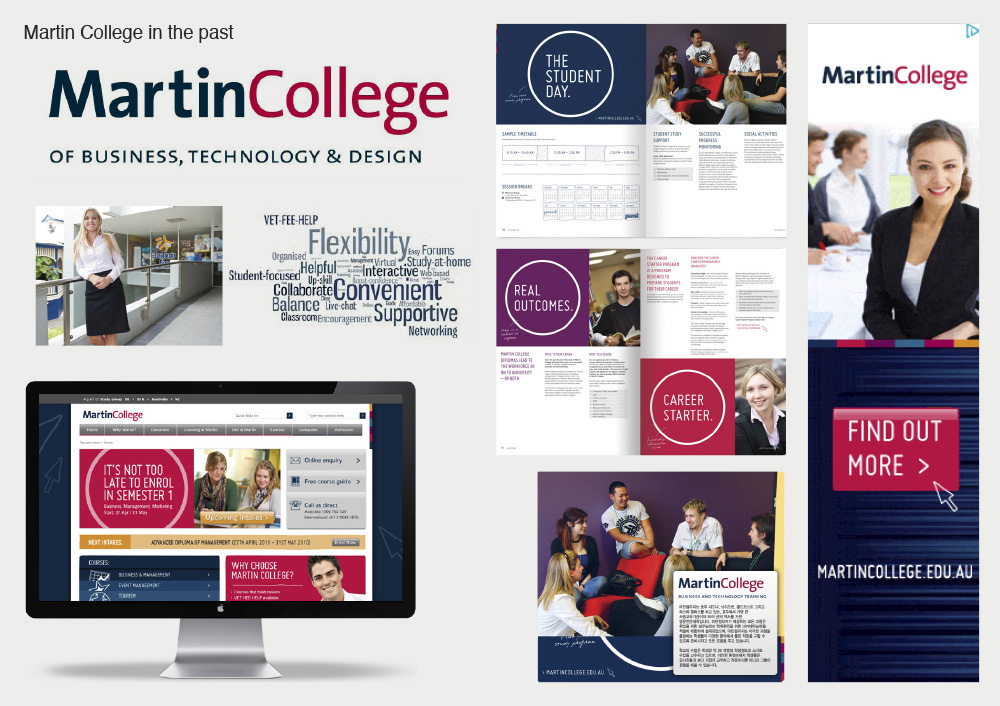
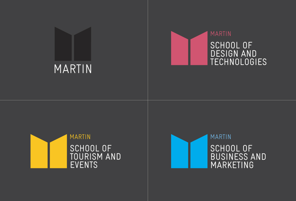
A research and strategy phase unlocked a new brand architecture for simpler Schools (faculties), and drove the name change to Martin, doing away with the educator's vocational heritage.
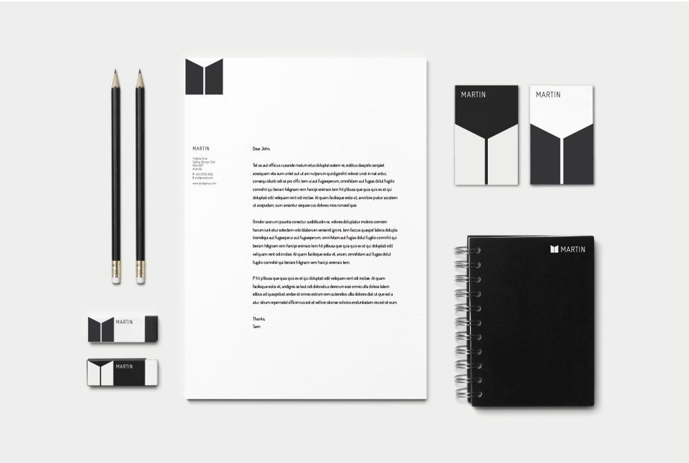
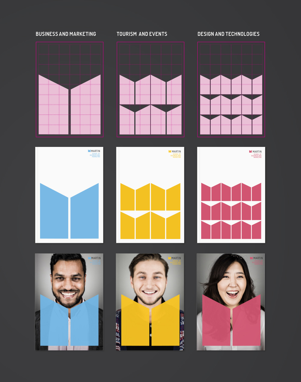
We created a flexible branding system that spoke to creative industries in a very different way to business candidates, using our M mark as a bold, flexible pattern.
We developed strong messaging and tone of voice that placed focus on Martin's unique qualities — teachers and mentors that genuinely care, a supportive and social working environment, and incredibly flexible study options.
Project page on Behance
The old logo and look were dowdy at best and failed to provide Martin with any kind of unique voice to attract students. The new logo, with the big M, feels fairly institutional — it could easily represent the architecture of a big campus structure from a large college — and professional. The wordmark seems like it could use some Wheaties, it's a little thin in contrast to the really large M monogram and their visual relationship doesn't quite finish meshing together. The main lock-ups with MARTIN underneath or MARTIN to the side (as on their website) make the name appear too small or too big, respectively; while a six-letter name would seem like the more flexible, cooler option to work with, adding "COLLEGE" into the lock-ups would have yielded more balanced configurations. The combination works much better in the sub-brands (below) where there is more type, balancing out the size of the "M". It's definitely a much more marketable logo and one that should be far more memorable than its predecessor.
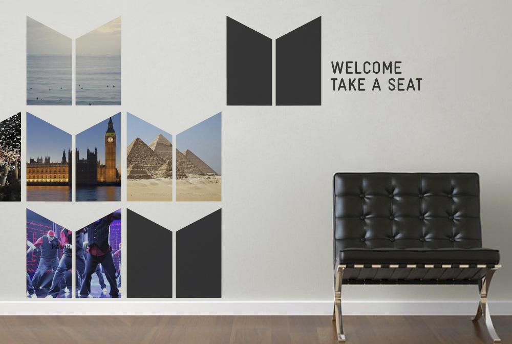
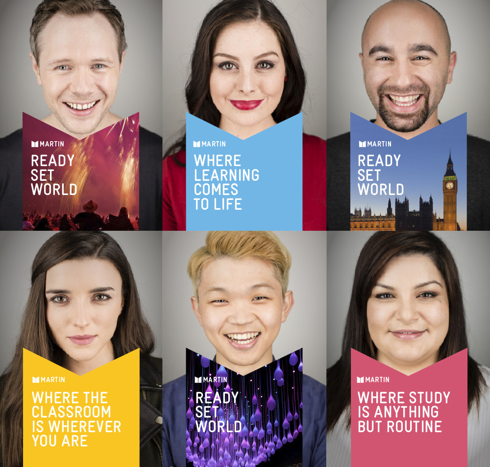
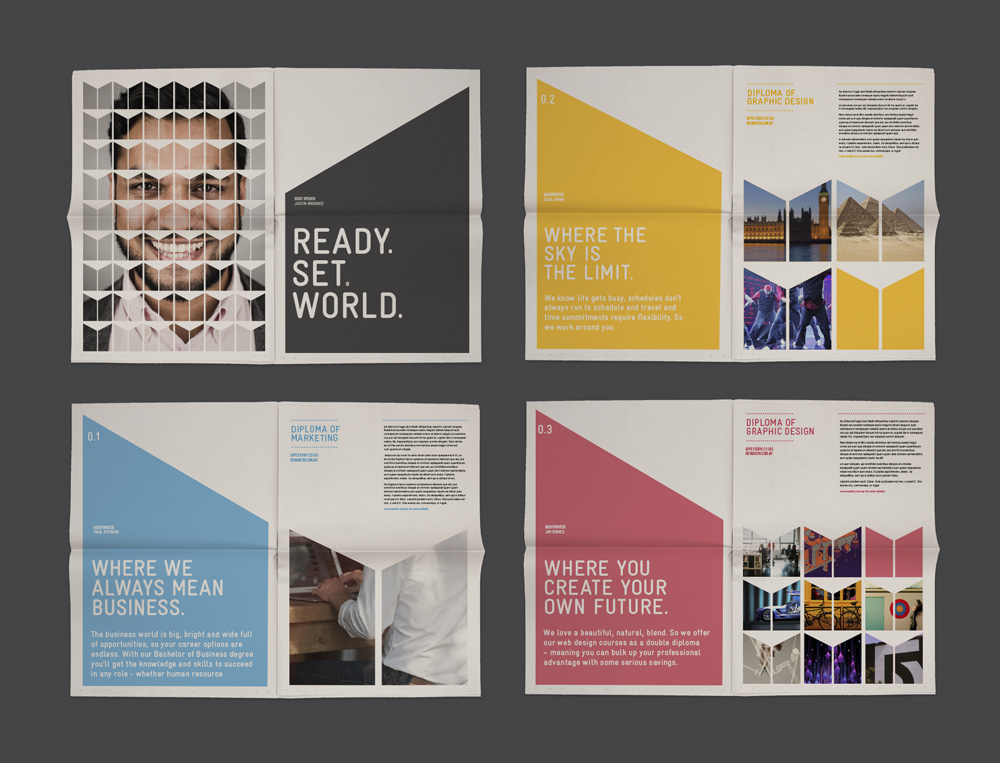
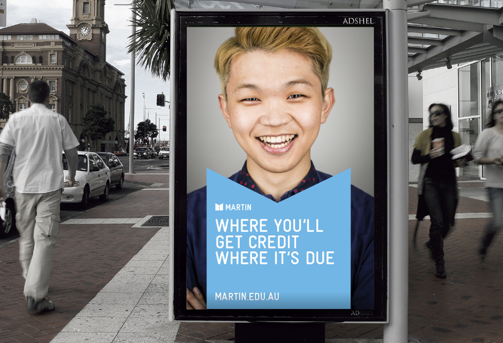
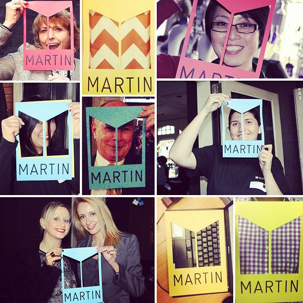
In application there is a few attractive things happening, like the "M" used almost like a bow tie on top of pictures of smiling students and a vibrant color palette. There is the good ol' logo-as-window approach, which doesn't feel as grating here as it usually does, perhaps because of the large square footage of the "M" that provides plenty of window for the images, and when used in a pattern (as in the newspaper) it actually looks cool. Overall, nothing groundbreaking but an obviously beneficial redesign that gives Martin plenty of variations to communicate in a more interesting way than before.