Shared posts

24 May 10:43

French Fertility Fall

by Robin Hanson

Why do we have fewer kids today, even though we are rich? In ancient societies, richer folks usually had more kids than poorer folks. Important clues should be found in the first place where fertility fell lots, France from 1750 to 1850. The fall in fertility seems unrelated to contraception and the fall in infant mortality. England at the time was richer, less agrarian and more urban, yet its fertility didn’t decline until a century later. The French were mostly rural, their farming was primitive, and they had high food prices.

A new history paper offers new clues about this early rural French decline. Within that region, the villages where fertility fell first tended to have less wealth inequality, less correlation of wealth across generations, and wealth more in the form of property relative to cash. Fertility fell first among the rich, and only in those villages; in other villages richer folks still had more kids. The French revolution aided this process by reducing wealth inequality and increasing social mobility.

It seems that in some poor rural French villages, increasing social mobility went with a revolution-aided cultural change in the status game, encouraging families to focus their social ambitions on raising a fewer higher quality kids. High status folks focused their resources on fewer kids, and your kids had a big chance to grow up high status too if only you would also focus your energies on a few of them.

It seems to me this roughly fits with the fertility hypothesis I put forward. See also my many posts on fertility. Here are many quotes from that history paper:

This analysis links fertility life histories to wealth at death data for four rural villages in France, 1750–1850. … Where fertility is declining, wealth is a powerful predictor of smaller family size. … [and] economic inequality is lower than where fertility is high. … The major difference in the wealth–fertility relationship at the individual level. Where fertility is high and non-declining, this relationship is positive. Where fertility is declining, this relationship is negative. It is the richest terciles who reduce their fertility first. … Social mobility, as proxied by the level of inequality in the villages and the perseverance of wealth within families, is associated with fertility decline. …

The exceptional fertility decline of France is a … spectacular break from the past has never been satisfactorily explained. … The decline of marital fertility during the late nineteenth century was almost completely unrelated to infant mortality decline. … Time was the best indicator for the onset of sustained fertility decline: excluding France, 59 per cent of the provinces of Europe began their fertility transition during the decades of 1890–1920. …

Any socio-economic explanation for early French fertility decline must consider that England, with a higher level of GDP per capita, a smaller agrarian sector, and a larger urbanization rate, lagged behind French fertility trends by over 100 years. … almost 80 per cent of the French population were rural, and nearly 70 per cent lived off farming at the time of the decline. … ‘farming remained primitive’ and that there were numerous indicators of overpopulation (such as increases in wheat prices from the 1760s to the 1820s). … It is widely accepted that many localities began their fertility transition long before [the Revolution of] 1789. …

Weir … states ‘evidence on fertility by social class is scarce, but tends to support the idea that fertility control was adopted by an ascendant “bourgeois” class of (often small) landowners’. … Children became ‘superfluous as labourers and costly as consumers’. The decline of fertility in France in the early-to-mid-nineteenth century was primarily due [he said] to the decline of the demand for children by this new class. … The results of this analysis support Weir’s hypothesis. … Compared to cash wealth alone, property wealth is a better predictor of the total negative wealth effect in the decline villages. …

The old social stratifications under the Ancien Régime, where hereditary rights had determined social status, were weakened by the Revolution. All of this served to facilitate individuals’ social ambition, and the limitation of family size was a tool in achieving upward social mobility. … For the villages where fertility is declining, the Gini coefficient is significantly lower than where it is not. …

Where the environment for social mobility is more open, father’s wealth should have less importance in the determination of son’s wealth than would be the case where social mobility is limited. … Where fertility is high and not declining, father’s wealth is a highly significant predictor of son’s wealth.This relationship appears to be far weaker where fertility is declining. …

Wrigley’s proposition of a neo-Malthusian response cannot be valid as it was the richest terciles who reduced their fertility, and Weir’s explanation, again, does not uniquely identify France. What was unique to France was the pattern of landholding and relatively low level of economic inequality.

24 May 09:55

Partons extraire les données du web lors du premier scrapathon !

by Samuel Goëta


Capture d’écran 2013-05-23 à 19.47.27Nous nous associons à Data Publica pour organiser le premier Scrapathon qui se tiendra le 12 juin 2013 de 16 heures à minuit à Paris. Le « scrapathon » (marathon de scraping)  est un événement ouvert à tous et consacré au recueil de données sur le Web. Il réunira une communauté de scrapeurs dont l’objectif est de collecter un maximum de données nouvelles en un minimum de temps.

Ce scrapathon sera hébergé par DojoBoost 41 boulevard Saint Martin à Paris. DojoBoost est un accélérateur qui accueille jusqu’à 50 startups par an.

L’événement débutera par une séance ouverte de formation au scraping de 16 heures à 18 heures le mercredi 12 juin, il sera suivi de 6 heures de pratique pendant lesquelles les participants scraperont des sites d’intérêt.

Les données recueillies seront libres et mises à la disposition de tous par l’Open Knowledge Foundation France sur nosdonnées.fr, le portail open data citoyen que nous gérons avec Regards Citoyens.

Inscrivez-vous à l’événement ici :
http://fr.amiando.com/scrapathon


22 May 04:45

Datawrapper 1.3

by gka

We are proud to announce our next major release of Datawrapper. This post briefly describes the new features:

Automatic time series detection

If the first column of your dataset contains valid dates, Datawrapper will now recognize them automatically. This allows us to improve the rendering of date values in axis labels, including localization of month names and date formats.

Improved rendering of time series data in line charts

Line charts will treat time series datasets differently, including natural axis ticks, correct handling of ‘missing’ dates. Also line charts will now show vertical grid lines on relevant date changes (such as the starting of a new decade).line-chart

Showing time slider instead of select box in 1d chart types.

When displaying a 2d time series with lots of rows in 1d chart types (such as pie charts or flat column charts), the default select box is now replaced with a decent time slider. Clicking in this slider will switch let the visualization switch to that row.

time-slider

Read more about the time series features here.

Other small improvements

Besides of that there are also several smaller improvements in this release:

  • Allowed for input of named colors in the custom color dialog. For instance this allows you to enter ‘SkyBlue‘ instead of ‘#87CEEB’.
  • You can now search for charts in your MyCharts page. The search will look at the chart title, the description line, and the data source, so you can even look for all charts displaying data from a certain organization.
    search
  • Also MyCharts now allows you to only show published or unpublished charts.
  • In the describe step of the chart editor you can now ignore columns of your dataset by clicking the table header. They are still shown in the table, but not in the chart. Especially helpful if you want to try focussing your chart without having to edit the data in Excel again and again.
  • Added Italian translation (kindly contributed by Alessio Cimarelli from dataninja.it)
  • Also we fixed several small bugs and made it easier to customize self-hosted Datawrapper instances.

You find a more detailed list of updates in the Changelog.

We hope you will enjoy this update.

21 May 12:43

Optimal Meeting Point on the Paris Metro

tl;dr: Play with the app here

When you live in Paris, chances are you are (home or work) very close to a metro station, so when you want to meet with some friends, you usually end up picking another metro station as a meeting point. Yet, finding the optimal place to meet can easily become a complex problem considering the dense network we have. Now that the RATP (the public transport operator in Paris) had made some of their datasets available, this sounds like a good job to be solved with R and Shiny.

In the spirit of the current open data movement, the RATP has made available a number of datasets under the Etalab license, and among them, two are of a particular interest for us:

arret_ligne <- read.csv("ratp_arret_ligne.csv", header=F, sep="#",
	    col.names=c("ID","Ligne","Type"),
	    stringsAsFactors=F)

arret_positions <- read.csv("ratp_arret_graphique.csv", header=F, sep="#",
		col.names=c("ID","X","Y","Nom","Ville","Type"),
		stringsAsFactors=F)

To state our problem more clearly, we are given initially a set of n metro stops among all N possible, and we want to find S the optimal stop where to meet. A first step will involve computing the distances among all metro stops (shortest path, preferably on a time scale rather than a space scale!), and the second step is to find some kind of “barycenter” of these n stops. For these purposes, we model our metro network as a graph. The shortest path among two stops can be found using the very common Dijkstra algorithm, while defining the “barycenter” can be a bit cumbersome. Using a geographic barycenter doesn’t make any sense (we might end up in a place with no stop, or even with the closest stop being physically far away from a duration perspective). The next thing could be to think of this problem as finding the centroid of the cluster formed by our n stops, using something in the spirit of k-means (which doesn’t need actual points in space but only distances), and mapping this centroid to our larger network, but empirically the results didn’t look sound. No point in complicating things, another way to think of this is merely as a minimax problem: finding the stop which minimizes the maximum distance from each of the n initial stops to S. And this is actually very easy to implement in R!

There are two technical problems worth highlighting:

  • First, the RATP doesn’t provide us with the dataset for the actual network, only a mapping from stations to lines. This means we don’t know the actual ordering of the stations on the line, and this is actually not a simple 1:N mapping since we have forks and isolated circles (think of line 13 after “La Fourche”, and line 7bis where there is no real terminus but a circle at the end of the line).
  • Second, the RATP doesn’t provide us with the dataset for the transportation time between any two stops, as this might be a great competitive advantage they have for gathering metro users to their website and app. I have no reference for this, I’m only guessing! The solutions used here for these two problems are as follow:
  • We boldly assume that stop A is connected to stops B and C if and only if stops B and C are the closest stops physically from A, A, B, C are on the same line, and B is different from C. That could work in a wonderful world. Here, this assumption is surprisingly not bad at all, but manual corrections are still needed (the worst line being line 10 with 5 errors around Auteuil and Michel Ange, but otherwise no more than 1/2 errors per line).
  • We boldly assume that the time taken from stop A to stop B can be decomposed into three parts:
  1. A stopping time (train slows/accelerates, doors open/close, people get in/out), about 1 minute
  2. A connection time (only when changing lines), about 5 minutes
  3. The actual transportation time (physically between A and B), proportional to the geographical distance from A to B, about 100 minute per degree. Since stops are referenced with longitude and latitude, the physical distance between the two is in degrees… The calibration of the model has been done manually with some trial and error, it is a rough estimate and not perfect at all, but that does the job.

So here we are, equipped with our distance matrix D between any two stops of the RATP metro network, ready to identify the optimal stop to meet when people come from, say, Barbès-Rochechouart, Bastille, Dupleix, and Pernety.

sources <- getIDFromStation(c("Barbès-Rochechouart", "Bastille", "Dupleix", "Pernéty"))
target <- names(which.min(apply(D[,format(sources)], 1, max)))
getStationFromID(target)
# "Odéon"

That’s actually great because Odéon is a cool place to get together and have a drink. Thinking about it, it would actually be useful to integrate a penalty for metro stops without any nice bar around…
In case you have a similar problem one of these days, consider using that page, where a Shiny version of the app is available, along with a ggplot2 chart. I know this should be done in D3 for more interactivity, but that’s on my todo for sure!

21 May 05:55

OpenSpending visualisations featured in Le Monde

The OpenSpending platform experienced a huge peak in traffic earlier this week as a visualisation based on French data was featured in Le Monde.

The article "PLF : des avions au bouclier fiscal, la java des amendements", (PLF=Projet de loi de finances, the draft finance law) deals with suggested amendments to the draft finance law and which parties were demanding what amendments.

The OpenSpending visualisation used in the article is intended to give a high-level representation of some of the main areas of government expenditure in France:

Besides the OpenSpending visualisation, there are some simple but effective infographics on how many amendments were filed to the draft, and by whom.

Read the full article on Le Monde. A slightly different view of the visualisation was also featured in Libération. Read the piece here.

16 May 15:32

Map of live Wikipedia changes

by Nathan Yau
Pachevalier

Pas extraordinaire

Wikipedia change map

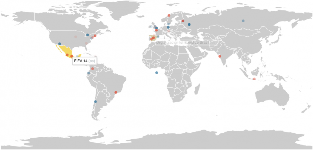
On Wikipedia, there are constant edits by people around the world. You can poke your head in on the live recent edits via the IRC feed from Wikimedia. Stephen LaPorte and Mahmoud Hashemi are scraping the anonymous edits, which include IP addresses (which can be easily mapped to location), and naturally, you can see them pop up on a map.

07 May 05:57

Data Questions? ask.schoolofdata.org!

by Michael Bauer


Ever got stuck in a dataproject and found no way out? Ever wondered if there is an efficient way to transform some dataset you work with? Looked for someone to ask these questions? Look no longer: Ask School of Data!

327122302_bbc4a3935b_z_d

At the School of Data we aim to create a community of learning and sharing knowledge together. We’ve started the process with hands-on workshops, data expeditions and online courses. We will now complement this with a forum to ask questions and give answers. Whether its finding data, extracting it, processing it or visualizing it: ask.schoolofdata.org is there for you.

Join the community now!

flattr this!

07 May 05:55

(VU SUR LE WEB) Parcourez la boîte Gmail de François Hollande

by Marie Coussin

L’idée est drôle et très bien réalisée : pour faire le bilan d’un an du Président, l’équipe du site France TV s’est amusée à imaginer la boîte gmail de François Hollande. Ses échanges avec Manuel Valls, Lionel Jospin ou Michel Sapin ; son chat avec François Bayrou… Cliquez sur les mails ou les liens, comme vous le feriez sur une vraie boîte mail pour découvrir les fonctionnalités.

gmailFH

06 May 08:17

Data Wrapper Tutorial – Gregor Aisch – School of Data Journalism – Perugia

by Lucy Chambers

By Gregor Aisch, visualization architect and interactive news developer, based on his workshop, Data visualisation, maps and timelines on a shoestring. The workshop is part of the School of Data Journalism 2013 at the International Journalism Festival.

This tutorial goes through the basic process of creating simple, embeddable charts using Datawrapper.

Preparing the Dataset

  1. Go to the Eurostat website and download the dataset Unemployment rate by sex and age groups – monthly average as Excel spreadsheet. You can also directly download the file from here.
  2. We now need to clean the spreadsheet. Make a copy the active sheet to keep the original sheet for reference. Now remove the header and footer rows so that GEO/TIME is stored in the first cell (A1).
  3. It's a good idea to limit the number of shown entries to something around ten or fiveteen, since otherwise the chart would be cluttered up too much. Our story will be about how Europe is divided according to the unemployment rate, so I decided to remove anything but the top-3 and bottom-3 countries plus some reference countries of interest in between. The final dataset contains the countries: Greece, Spain, Croatia, Portugal, Italy, Cyprus, France, United Kingdom, Norway, Austria, Germany.
  4. Let's also try to keep the labels short. For Germany we can remove the appendix "(until 1990 former territory of the FRG)", since it wouldn't fit in out chart.
  5. This is how the final dataset looks like in OpenOffice Calc

dw-prepared-dataset.png

Loading the Data into Datawrapper

  1. Now, to load the dataset into Datawrapper you can simply copy and paste it. In your spreadsheet software look for the Select All function (e.g. Edit > Select All in OpenOffice).
  2. Copy the data into the clipboard by either selecting Edit > Copy from the menu or pressing Ctrl + C (for Copy) on your keyboard.
  3. Go to datawrapper.de and click the link Create A New Chart. You can do this either being logged in or as guest. If you create the chart as guest, you can add it to your collection later by signing up for free.
  4. Now paste the data into the big text area in Datawrapper. Click Upload and continue to proceed to the next step.

dw-paste.png

Check and Describe the Data

  1. Check if the data has been recognized correctly. Things to check for are the number format (in our example the decimal separator , has been replaced with .). Also check wether the row and column headers have been recognized.
  2. Change number format to one decimals after point to ensure the data is formatted according to your selected language (e.g. decimal comma for France).
  3. Now provide information about the data source. The data has been published by Eurostat. Provide the link to the dataset as well. This information will be displayed along with the published charts, so readers can trace back the path to the source themselves.

dw-source3.png

  1. Click Visualize to proceed to the next step.


Selecting a Visualization

  1. Time series are best represented using line charts, so click on the icon for line chart to select this visualization.
  2. Give the chart a title that explains both what the readers are seeing in the chart and why they should care about it. A title like "Youth unemployment rates in Europe" only answers half of the question. A better title would be"Youth unemployment divides Europe" or "Youth unemployment on record high in Greece and Spain"
  3. In the introduction line we should clarify what exactly is shown in the chart. Click Introduction and type "Seasonally adjusted unemployment rates of under 25 aged". Of course you can also provide more details about the story.
  4. Now highlight the data series that are most important for telling the story. The idea is to let one or two countries really pop out of the chart, and attract the readers attention immediately. Click Highlight and select Greece and Spain from the list. You might also want to include your own country for reference.
  5. Activate direct labeling to make it easier to read the chart. Also, since our data is already widely distributed, we can force the extension of the vertical axis to the zero-baseline.
  6. We can let the colors support the story by choosing appropriate colors. First, click on the orange field to select it as base color. Then click on define custom colors and pick red for high unemployment countries Greece and Spain. For countries with low youth unemployment such as Germany, Norway and Austria we can pick a green, or even better, a blue tone (to respect the color blind). Now the resulting chart should look like this:

dw-result1.png

  1. Click Publish to proceed to the last step.


Publishing the Visualization

  1. Now a copy of the chart is being pushed to the content delivery network Amazon S3, which ensures that it loads fast under high traffic.
  2. Meanwhile you can already copy the embed code and paste it into your newsrooms CMS to include it in the related news article – just like you would do with a Youtube video.


Further tutorials can be found on the Datawrapper website

Enjoyed this? Want to stay in touch? Join the School of Data Announce Mailing List for updates on more training activities from the School of Data or the Data Driven Journalism list for discussions and news from the world of Data Journalism.

flattr this!

06 May 08:07

Data Science: The End of Statistics?

by normaldeviate
Pachevalier

Tout à fait d'accord avec son commentaire

Data Science: The End of Statistics?

As I see newspapers and blogs filled with talk of “Data Science” and “Big Data” I find myself filled with a mixture of optimism and dread. Optimism, because it means statistics is finally a sexy field. Dread, because statistics is being left on the sidelines.

The very fact that people can talk about data science without even realizing there is a field already devoted to the analysis of data — a field called statistics — is alarming. I like what Karl Broman says:

When physicists do mathematics, they don’t say they’re doing “number science”. They’re doing math.

If you’re analyzing data, you’re doing statistics. You can call it data science or informatics or analytics or whatever, but it’s still statistics.

Well put.

Maybe I am just pessimistic and am just imagining that statistics is getting left out. Perhaps, but I don’t think so. It’s my impression that the attention and resources are going mainly to Computer Science. Not that I have anything against CS of course, but it is a tragedy if Statistics gets left out of this data revolution.

Two questions come to mind:

1. Why do statisticians find themselves left out?

2. What can we do about it?

I’d like to hear your ideas. Here are some random thoughts on these questions. First, regarding question 1.

  1. Here is a short parable: A scientist comes to a statistician with a question. The statistician responds by learning the scientific background behind the question. Eventually, after much thinking and investigation, the statistician produces a thoughtful answer. The answer is not just an answer but an answer with a standard error. And the standard error is often much larger than the scientist would like.

    The scientist goes to a computer scientist. A few days later the computer scientist comes back with spectacular graphs and fast software.

    Who would you go to?

    I am exaggerating of course. But there is some truth to this. We statisticians train our students to be slow and methodical and to question every assumption. These are good things but there is something to be said for speed and flashiness.

  2. Generally, speaking, statisticians have limited computational skills. I saw a talk a few weeks ago in the machine learning department where the speaker dealt with a dataset of size 10 billion. And each data point had dimension 10,000. It was very impressive. Few statisticians have the skills to do calculations like this.

On to question 2. What do we do about it?

Whining won’t help. We can complain that that “data scientists” are ignoring biases, not computing standard errors, not stating and checking assumption and so on. No one is listening.

First of all, we need to make sure our students are competitive. They need to be able to do serious computing, which means they need to understand data structures, distributed computing and multiple programming languages.

Second, we need to hire CS people to be on the faculty in statistics department. This won’t be easy: how do we create incentives for computer scientists to take jobs in statistics departments?

Third, statistics needs a separate division at NSF. Simply renaming DMS (Division of Mathematical Sciences) as has been debated, isn’t enough. We need our own pot of money. (I realize this isn’t going to happen.)

To summarize, I don’t really have any ideas. Does anyone?


05 May 08:22

« Copyfraud » : le ministère de la Culture privatise le domaine public

by Pierre-Carl Langlais

Le ministère de la Culture se donne pour mission première « de rendre accessibles au plus grand nombre les œuvres capitales de l’humanité, et d’abord de la France ». Il est en train de faire exactement l’inverse.

Depuis quelques mois, les accords entre la Bibliothèque nationale de France (BNF) et plusieurs entreprises privées suscitent une intense polémique. Ils prévoient notamment une exploitation commerciale exclusive de contenus placés dans le domaine public. Ainsi, pendant une dizaine d’années, une société comme Proquest pourra tirer profit de milliers de manuscrits du...

03 May 15:20

Setting aside the politics, the debate over the new health-care study reveals that we’re moving to a new high standard of statistical journalism

by Andrew

Pointing to this news article by Megan McArdle discussing a recent study of Medicaid recipients, Jonathan Falk writes:

Forget the interpretation for a moment, and the political spin, but haven’t we reached an interesting point when a journalist says things like:

When you do an RCT with more than 12,000 people in it, and your defense of your hypothesis is that maybe the study just didn’t have enough power, what you’re actually saying is “the beneficial effects are probably pretty small”.

and

A good Bayesian—and aren’t most of us are supposed to be good Bayesians these days?—should be updating in light of this new information. Given this result, what is the likelihood that Obamacare will have a positive impact on the average health of Americans? Every one of us, for or against, should be revising that probability downwards. I’m not saying that you have to revise it to zero; I certainly haven’t. But however high it was yesterday, it should be somewhat lower today.

This is indeed an excellent news article. Also this sensible understanding of statistical significance and effect sizes:

But that doesn’t mean Medicaid has no effect on health. It means that Medicaid had no statistically significant effect on three major health markers during a two-year study. Those are related, but not the same. And in fact, all three markers moved in the right direction. They just weren’t big enough to rule out the possibility that this was just random noise in the underlying data. I’d say this suggests that it’s more likely than not that there is some effect–but also, more likely than not that this effect is small.


The only flaw is this bit:

There was, on the other hand, a substantial decrease in reported depression. But this result is kind of weird, because it’s not coupled with a statistically significant increase in the use of anti-depressants. So it’s not clear exactly what effect Medicaid is having. I’m not throwing this out: depression’s a big problem, and this seems to be a big effect. I’m just not sure what to make of it. Does the mere fact of knowing you have Medicaid make you less depressed?

McArdle is forgetting that the difference between “significant” and “not significant” is not itself statistically significant. I have no idea whether the result is actually puzzling. I just think that she was leaping too quickly from “A is significant and B is not” to “A and B contradict.”

Also I’d prefer she’d talk with some public health experts rather than relying on sources such as, “as Josh Barro pointed out on Twitter.” I have nothing against Josh Barro, I just think it’s good if a journalist can go out and talk with people rather than just grabbing things off the twitter feed.

But these are minor points. Overall the article is excellent.

With regard to the larger questions, I agree with McArdle that ultimately the goals are health and economic security, not health insurance or even health care. She proposes replacing Medicaid with “free mental health clinics, or cash.” The challenge is that we seem to have worked ourselves into an expensive, paperwork-soaked health-care system, and it’s not clear to me that free mental health clinics or even cash would do the trick.

Other perspectives

I did some searching and found this post by Aaron Carroll. I agree with what Carroll wrote, except for the part where he says that he would not say that “p=0.07 is close to significant.” I have no problem with saying p=0.07 is close to significant. I think p-values are often more of a hindrance than a help, but if you’re going to use p=0.05 as a summary of evidence and call it “significant,” then, indded, 0.001 is “very significant,” 0.07 is “close to significant,” and so forth. McArdle was confused on some of these issues too, most notably by mixing statistical significance with a Bayesian attitude. I wouldn’t be so hard on either of these writers, though, as the field of statistics is itself in flux on these points. Every time I write a new article on the topic, my own thinking changes a bit.

I see some specific disagreements between McArdle and Carroll:

1. McArdle writes:

Katherine Baicker, a lead researcher on the Oregon study, noted back in 2011, “people who signed up are pretty sick”.

Carroll writes:

Most people who get health insurance are healthy. They’re not going to get “healthier”.

This seems like a factual (or, at least, a definitional) disagreement.

2. McArdle:

We heard that 150,000 uninsured people had died between 2000 and 2006. Or maybe more. With the implication that if we just passed this new law, we’d save a similar number of lives in the future. Which is one reason why the reaction to this study from Obamacare’s supporters has frankly been a bit disappointing.

Carroll:

This was Medicaid for something like 10,000 people in Oregon. The ACA was supposed to be a Medicaid expansion for 16,000,000 across the country. If 8 people’s lives in the study were saved in some way by the coverage, the total statistic holds.

(16,000,000/10,000)*8*7 = 90,000, so that’s in the ballpark of the claimed 150,000 in seven years. I’m guessing that McArdle’s would reply that there’s no evidence that 8 people’s lives were saved in the Oregon study. Thus, numbers such as 100,000 lives saved are possible, but other things are possible too.

The bottom line

What does this all mean in policy terms? McArdle describes Obamacare as “a $1 trillion program to treat mild depression.” I’m not sure where the trillion dollars comes from. A famous graph shows U.S. health care spending at $7000 per person per year, that’s a total of 2.1 trillion dollars a year. I’m assuming that the Obama plan would not increase this to 3.1 trillion! Maybe it is projected to increase annual spending to 2.3 trillion, which would correspond to an additional trillion over a five-year period? In any case, that sounds pretty expensive. Given that other countries with better outcomes spend half as much as we do, I’d hope a new health-care plan would reduce costs, not increase them. But that’s politics: the people who are currently getting these 2.1 trillion dollars don’t want to give up any of their share! The other half of McArdle’s quote (“mild depression”) sounds to me like a bit of rhetoric. If a policy will reduce mild depression, I assume it would have some eventual effect on severe depression too, no?

Beyond this, I can’t comment. I’m like many (I suspect, most) Americans who already have health insurance in that I don’t actually know what’s in that famous health-care bill. I mean, sure, I know there’s something about every American getting coverage, but I don’t know anything beyond that. So I’m in no position to say anything more on the topic. I’ll just link to Tyler Cowen, who, I assume, actually knows what’s in the law and has further comments on the issue.

Let me conclude where I began, with an appreciation of the high quality of statistical journalism today. In her news article, McArdle shows the sort of nuanced understanding of statistics and evidence that I don’t think was out there, twenty years ago. And she’s not the only one. Journalists as varied as Felix Salmon, Nate Silver, and Sharon Begley are all doing the good work, writing about newsworthy topics in a way that acknowledges uncertainty.

The post Setting aside the politics, the debate over the new health-care study reveals that we’re moving to a new high standard of statistical journalism appeared first on Statistical Modeling, Causal Inference, and Social Science.

03 May 13:59

Metametrik Sprint in London, May 25

by Velichka Dimitrova

The Open Economics Working Group is inviting to a one-day sprint to create a machine-readable format for the reporting of regression results.

  • When: May 25, Saturday, 10:00-16:00
  • Where: Centre for Creative Collaboration (tbc), 16 Acton Street, London, WC1X 9NG
  • How to participate: please, write to economics [at] okfn.org

The event is meant for graduate students in economics and quantitative social science as well as other scientists and researchers who are working with quantitative data analysis and regressions. We would also welcome developers with some knowledge in XML and other mark-up programming and others interested to contribute to this project.

About Metametrik

Metametrik, as a machine readable format and platform to store econometric results, will offer a universal form for presenting empirical results. Furthermore, the resulting database would present new opportunities for data visualisation and “meta-regressions”, i.e. statistical analysis of all empirical contributions in a certain area.

During the sprint we will create a prototype of a format for saving regression results of empirical economics papers, which would be the basis of meta analysis of relationships in economics. The Metametrik format would include:

  • XML (or another markup language) derived format to describe regression output, capturing what dependent and independent variables were used, type of dataset (e.g. time series, panel), sign and magnitude of the relationship (coefficient and t-statistic), data sources, type of regression (e.g. OLS, 2SLS, structural equations), etc.
  • a database to store the results (possible integration with CKAN) – a user interface to allow for entry of results to be translated and saved in the Metametrik format. Results could be also imported directly from statistical packages
  • Visualisation of results and GUI – enabling queries from the database and displaying basic statistics about the relationships.

Background

Since computing power and data storage have become cheaper and more easily available, the number of empirical papers in economics has increased dramatically. Despite the large numbers of empirical papers, however, there is still no unified and machine readable standard for saving regression results. Researchers are often faced with a large volume of empirical papers, which describe regression results in similar yet differentiated ways.

Like bibliographic machine readable formats (e.g. bibtex), the new standard would facilitate the dissemination and organization of existing results. Ideally, this project would offer an open storage where researchers can submit their regression results (for example in an XML type format). The standard could also be implemented in a wide range of open source econometric packages and projects like R or RePec.

From a practical perspective, this project would greatly help to organize the large pile of existing regressions and facilitate literature reviews: If someone is interested in the relationship between democracy and economic development, for example, s/he need not go through the large pile of current papers but can simply look up the relationship on the open storage: The storage will then produce a list of existing results, along with intuitive visualizations (what % of results are positive/negative, how do the results evolve over time/i.e. is there a convergence in results). From an academic perspective, the project would also facilitate the compilation of meta-regressions that have become increasingly popular. Metametrik will be released under an open license.

If you have further questions, please contact us at economics [at] okfn.org

01 May 13:39

Tutorial: Youth Unemployment in Europe visualized

by Mirko Lorenz

This year, Gregor Aisch attended the “International Journalism Festival 2013″ in Perugia. For one of his sessions he put together a brief tutorial showing how to successfully create a chart from data through all steps: Search, filter/clean, visualize, publish.

The example shows that Datawrapper can by now handle more complex visualizations, where selection of colors is important to get a clear message out.

Link: School of Data Tutorial 

30 Apr 10:07

Slides, Tools and Other Resources From the School of Data Journalism 2013

The School of Data Journalism, Europe's biggest data journalism event, brings together around 20 panelists and instructors from Reuters, New York Times, Spiegel, Guardian, Walter Cronkite School of Journalism, Knight-Mozilla OpenNews and others, in a mix of discussions and hands-on sessions focusing on everything from cross-border data-driven investigative journalism, to emergency reporting and using spreadsheets, social media data, data visualisation and maping for journalism.

In this post we will be listing links shared during this training event. The list will be updated as the sessions progress. If you have links shared during the sessions that we missed, post them in the comments section and we will update the list.

Video recordings 

Slides, tutorials, articles

Tools and other resources

  • Source, an index of news developer source code, code walkthroughs and project breakdowns from journalist-coders
  • School of Data - online tutorials for working with data
  • The Data Journalism Handbook - reference book about how to use data to improve the news authored by 70 data journalism practitioners and advocated
  • Open Refine (for data cleaning)
  • Gephi (for graph visualisations)
  • Hashtagify (visualisation of Twitter hashtags related to a particular #tag)
  • Investigative Dashboard (methodologies, resources, and links for journalists to track money, shareholders, and company ownership across international borders)
  • Tabula (open-source application that allows users to upload PDFs and extract the data in them in CSV format)
  • Topsy (social media analysis tool mentioned in the panel on covering emergencies)
  • DataSift (platform that allows users to filter insights from social media and news sources, mentioned in panel on covering emergencies)
  • Storyful (service that mines social media to discover content relevant for news organisations and verifies it)
  • GeoFeedia (tool that enables location-based search for social media content) 
  • Spokeo (organises information about people from public sources and make it available for search)
  • The Tor project (free software that helps defend against network surveillance and censorship)
  •  

Projects and organisations

30 Apr 08:45

(ASKMEDIA SUR QUOI.INFO) Record du chômage, l’analyse en data

by Marie Coussin

Pour la première fois, en mars 2013, le nombre de demandeurs d’emploi en France a dépassé la barre symbolique des 5 millions (catégories A, B et C). C’est 1,8 million de plus qu’il y a 5 ans et surtout le nouveau record absolu depuis 1997.

Sur Quoi.info, Ask Media a analysé les chiffres publiés par la Dares et l’Insee pour comparer les caractéristiques du chômage entre 1997 et 2013 : quelles sont les catégories les plus concernées ? Quelles sont les régions les plus touchées ?

chomageQuoi

Les graphiques ont été réalisés avec Datawrapper, la carte avec Google Fusion Tables.

30 Apr 08:45

School of Data journalism : 10 idées à retenir

by Marie Coussin

logo

Du 24 au 27 avril, le Centre pour le journalisme européen et l’Open Knowledge Foundation (OKFN) organisait, dans le cadre du Festival international de journalisme de Pérouse, la « School of Data journalism ».
Quatre jours d’ateliers et de conférences avec les spécialistes du journalisme de données : le New York Times, le Guardian, la Mozilla Foundation News, Steve Doig, Gregor Aisch, le centre d’investigation et d’observation sur les crimes organisés et la corruption, etc. 10 idées à retenir parmi leurs interventions.

1. Les données sont partout.
Steve Doig, lauréat du Pulitzer et professeur de data journalisme à l’Université de l’Arizona a introduit son atelier « Excel pour les journalistes » en expliquant ce qu’étaient « les données » : « Les données ne sont rien de plus qu’une façon d’organiser l’information. Chaque information peut potentiellement être transformée en data ».
Il donnait l’exemple de son identité : Steve Doig, professeur, américain. Une fois ces informations ordonnées dans un tableau avec en en-tête des colonnes nom, profession, nationalité ; elles deviennent des données.

2. Le data journalisme peut concerner toutes les thématiques.
Steve Doig conseillait aux journalistes de ne pas se limiter : les questions budgétaires ou financières ne sont pas les seuls spectres pour le journalisme de données. Des sujets très locaux comme « les animaux domestiques ou la qualité de l’air » peuvent être tout aussi pertinents.
Le blog d’Arnaud Wéry, data journaliste pour l’Avenir en Belgique en est une très bonne illustration.

3. Ce n’est pas parce qu’une information est en ligne qu’il n’y a rien à en tirer.
Pas besoin d’obtenir des données exclusives pour raconter une histoire inédite : voilà la conclusion de l’un des membres de la Knight-Mozilla Open News, responsable du projet « Open Spending » qui met en ligne de nombreuses données sur les budgets et dépenses des gouvernements. Certaines séries statistiques sont publiées sans pour autant qu’elles aient été entièrement exploitées d’un point de vue journalistique.

4. L’accès aux données est un droit.
C’est l’argument principal du mouvement Open Data, popularisé dès 2006 par la campagne du Guardian « Rendez-nous les joyaux de la Couronne » : en payant des impôts, les citoyens financent la collecte des données. Ils ne doivent donc pas payer une seconde fois, en achetant une licence de réutilisation des données, pour accéder à ces informations.

5. Le data journalisme demande du temps et de l’argent, mais c’est parfois la seule façon de trouver des informations.
Aron Pilhofer, responsable du pôle interactif du New York Times citait ainsi l’exemple du projet « Government incentives », réalisé cette année par le titre américain et qui recense l’ensemble des subventions publiques attribuées par le gouvernement ou par les Etats pour les 200 plus grandes compagnies américaines. Certaines, dont Amazon, General Motors, Shell ou Microsoft ont reçu plus de cent millions de dollars.
Le projet a demandé dix mois de travail à une équipe dédiée.
L’intervention d’Aron Pilhofer rappelle la phrase de Simon Rogers, Data Editor du Guardian : « Le data journalisme c’est 80% de transpiration, 10% de bonnes idées, 10% de rendu. »

nytimes

6. « Vous n’échapperez pas au Big Data ».
Cette citation un peu biblique est celle de James Ball, qui remplace Simon Rogers à la tête du pôle data journalisme du Guardian. Il en sait quelque chose : il a travaillé pendant plusieurs semaines sur les Offshore Leaks, qui révélaient des informations sensibles sur les comptes détenus dans les paradis fiscaux. A la source, un disque dur de 2,5 millions de fichiers concernant 48 pays.

7. Tout le monde ne peut pas tout faire.
Durant la conférence sur l’état du data journalisme en 2013, les différents intervenants ont tous évoqué Nate Silver. Journaliste, bloggeur, statisticien, ce dernier s’est fait connaître du grand public lors de la dernière élection présidentielle américaine : en se basant sur des calculs statistiques complexes croisant des données de sondages et des résultats d’élections passées, il a réussi à prédire les résulats exacts pour tous les Etats.
Pour Aron Pilhofer du New York Times, la tentation est désormais grande de tous faire du Nate Silver. Mais il faut prendre des gants : « il faut très bien maîtriser les méthodes de probabilité. J’en ai suffisamment fait pour savoir que je ne devais pas m’y lancer sans la surveillance d’un adulte » ironisait-il.

8. Il faut apprendre à collaborer
C’est l’enchaînement logique des points 6 et 7 : avec l’avènement du Big Data qui demande de plus en plus de compétences spécifiques, sur des champs de plus en plus transversaux et dans une économie de plus en plus mondialisée, impossible de rester dans son coin et de tout faire tout seul. James Ball du Guardian évoquait la collaboration avec 40 autres médias lors des Offshores Leaks : « un des problèmes dans notre profession, c’est qu’il y a souvent beaucoup d’égos. Parfois, j’avais l’impression d’être avec 40 vieux chats en colère. Un conseil : essayez de rester sereins dans ces collaborations trans-médias. Résistez à la tentation de vous battre pour tout. Gardez vos forces pour ce qui vous importe vraiment. »

9. Utilisez les ressources mises à disposition.
Bonne nouvelle : dans le monde sauvage du data journalisme, vous n’êtes pas seuls. Parmi leurs missions, le Centre européen pour le journalisme et l’OKFN ont celles de promouvoir le traitement de données. Tutoriels, guides pour les outils, cours en ligne : de plus en plus de ressources permettent désormais d’appréhender le monde des données et de transformer ces séries de chiffres en informations. Parmi les sites à regarder : celui de la « School of Data » pour les bases du data journalisme, et celui du NICAR pour les data-investigations.

10. « Keep dating »
Le mot de la fin revient à James Ball, du Guardian : « continuer à faire du data, à essayer, ne pas lâcher. ».

27 Apr 15:17

Slides, Tools and Other Resources From the School of Data Journalism 2013

The School of Data Journalism, Europe's biggest data journalism event, brings together around 20 panelists and instructors from Reuters, New York Times, Spiegel, Guardian, Walter Cronkite School of Journalism, Knight-Mozilla OpenNews and others, in a mix of discussions and hands-on sessions focusing on everything from cross-border data-driven investigative journalism, to emergency reporting and using spreadsheets, social media data, data visualisation and maping for journalism.

In this post we will be listing links shared during this training event. The list will be updated as the sessions progress. If you have links shared during the sessions that we missed, post them in the comments section and we will update the list.

Video recordings 

Slides, tutorials, articles

Tools and other resources

  • Source, an index of news developer source code, code walkthroughs and project breakdowns from journalist-coders
  • School of Data - online tutorials for working with data
  • The Data Journalism Handbook - reference book about how to use data to improve the news authored by 70 data journalism practitioners and advocated
  • Open Refine (for data cleaning)
  • Gephi (for graph visualisations)
  • Hashtagify (visualisation of Twitter hashtags related to a particular #tag)
  • Investigative Dashboard (methodologies, resources, and links for journalists to track money, shareholders, and company ownership across international borders)
  • Tabula (open-source application that allows users to upload PDFs and extract the data in them in CSV format)

Projects and organisations

27 Apr 11:58

Data visualization guidelines – By Gregor Aisch – International Journalism Festival

by Lucy Chambers

The following tips are from Gregor Aisch, visualization architect and interactive news developer. We’re delighted he could join us to lead the workshop: “Making Data Visualisations, A survival Guide” here at the International Journalism Festival in Perugia.

Watch the Video

See the slides

Charts

  • Avoid 3d-charts at all costs. The perspective distorts the data, what is displayed ‘in front’ is perceived as more important than what is shown in the background.
  • Use pie charts with care, and only to show part of whole relationships. Two is the ideal number of slices, but never show more than five. Don’t use pie charts if you want to compare values (use bar charts instead).
  • Always extend bar charts to zero baseline. Order bars by value to make comparison easier.
  • Use line charts to show time series data. That’s simply the best way to show how a variable changes over time.
  • Avoid stacked area charts, they are easily mis-interpreted.
  • Prefer direct labeling wherever possible. You can safe your readers a lot time by placing labels directly onto the visual elements instead of collecting them in a separate legend. Also remind that we cannot differentiate that much colors.
  • Label your axes! You might think that’s kind of obvious, but still it happens quite often that designers and journalists simply forget to label the axes.
  • Tell readers why they should care about your graphic. Don’t waste the title line by just saying what data is shown.

Color

Colors are difficult. They might make a boring graphic look pretty, but they really need to be handled with care.

  • Use colors sparingly. If possible, use only one or two colors in your visualization.
  • Double-check your colors for the color blind. You can use tools such as ColorOracle to simulate the effect of different types of color blindness.
  • Say good-bye to red-green color scales. A significant fraction of the male population is color blind and have problems differentiating between red and green tones. Use red-blue or purple-green are common alternatives.
  • In doubt, use color scales from colorbrewer2.com

Maps

  • Don’t use the Mercator projection for world maps. The distortion of area is not acceptable. Use equal-area projections instead.
  • Size symbols by area, not diameter. A common mistake is to map data values to the radius of circles. However, our visual system compares symbols by area. Use square root to compute radii from data.

Recommended reading

flattr this!

27 Apr 11:53

(ITW) James Ball, nouveau chef du data journalisme au Guardian

by Marie Coussin

Le monde du data journalisme a connu une petite révolution le 18 avril dernier : le « Data editor » emblématique du Guardian, Simon Rogers,  a annoncé son départ pour Twitter. Avec son équipe, Simon Rogers avait fait du titre britannique la référence en Europe dans le journalisme de données.

Il est remplacé par James Ball, au Guardian depuis deux ans et connu notamment pour son travail d’investigation sur les émeutes de Londres en 2011.

Ask media a rencontré James Ball à l’occasion du Festival international de journalisme à Pérouse, où il intervenait dans le cadre de la « School of Data journalism ».

JamesBAll

Comment êtes-vous devenu data journaliste ?
Comme beaucoup, je suis devenu data journaliste par accident. Il y a cinq ans, alors que j’étudiais le journalisme à l’Université, ma tutrice travaillait sur les forces de police au Royaume-Uni et disposait à ce titre de plusieurs séries de statistiques.
Je les ai compilées dans des tableurs excel, de manière très basique, pour faire quelques comparaisons. Nous en avons tiré des informations assez étonnantes comme des présences massives à certains endroits contre des forces assez faibles dans des villes importantes.
A cette période, on a commencé à parler de plus en plus de data journalisme dans les pays anglo-saxons. On parlait même de « computer-assisted reporting » (journalisme assisté par ordinateur). D’ailleurs, j’ai toujours trouvé ce terme stupide, comme si le journaliste ne faisait que transmettre des informations à une machine, presque vivante, qui traitait les données à sa place. Quelque que soit le terme utilisé, je me suis rendu compte que j’aimais travailler avec les données, faire des croisements, trouver des informations. C’est une manière différente de faire le métier de journaliste, c’est prenant et j’aime ça.

Comment êtes-vous arrivé au Guardian ?
A la suite de mes études, j’ai travaillé pour un magazine économique, The Grocer, spécialisé sur le secteur des supermarchés. J’ai ensuite rejoint le Bureau of Investigative Journalism, groupement de journalistes d’investigation qui publient des enquêtes dans différents médias comme la BBC. Avec eux, j’ai travaillé sur les câbles irakiens fournis par WikiLeaks. J’ai ensuite travaillé chez WikiLeaks, pas très longtemps, avant d’arriver au Guardian il y a deux ans, dans l’équipe de Simon Rogers.

riots

Vous êtes maintenant à la tête de cette équipe.
Combien êtes-vous et comment le travail s’organise-t-il ?
Nous sommes quatre data journalistes au Guardian, sur le Datablog mais aussi sur des projets à plus long terme. Et nous ne sommes pas les seuls à faire du data journalisme au Guardian, nous avons d’autres ressources suivant les projets. Par exemple, une carte interactive nous la faisons nous même, mais si nous avons besoin d’une plate-forme ou d’une application, nous faisons appel à nos collègues graphistes et développeurs.

Quels sont vos projets ?
Mon objectif est de développer le data journalisme au sein du Guardian, mais de le développer à la bonne place. Certains contenus doivent utiliser davantage les données, mais ce ne doit pas être systématique : on ne va pas faire des graphiques pour faire des graphiques. Il faut qu’ils racontent quelque chose, qu’ils servent l’histoire. A ce titre, travailler avec les journalistes non data est souvent un bon filtre : s’ils trouvent que le graphique, l’infographie ou l’application apporte quelque chose à leur sujet, c’est souvent que ce mode de traitement se justifie.
Je souhaite aussi renforcer l’analyse que nous faisons des données. Visualiser le taux d’évolution du chômage sur les cinq dernières années, c’est intéressant et c’est un service. Mais analyser ces données et montrer en quoi elles démentent les croyances populaires par exemple, ça c’est vraiment le travail du data journaliste. C’est ce que je veux faire : aller plus en profondeur.

26 Apr 13:10

Social network analysis for journalists using the Twitter API

by Lucy Chambers

Social Network analysis allows us to identify players in a social network and how they are related to each other. For example: I want to identify people who are involved in a certain topic - either to interview or to understand what different groups are engaging in debate.

What you’ll Need:

  1. Gephi (http://gephi.org)
  2. OpenRefine (http://openrefine.org)
  3. The Sample Spreadsheet
  4. Another sample Dataset
  5. Bonus: The twitter search to graph tool

Step 1: Basic Social Networks

Throughout this exercise we will use Gephi for graph analysis and visualization. Let’s start by getting a small graph into gephi.

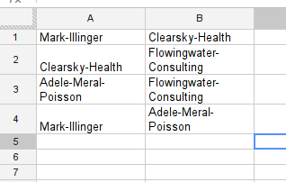
Take a look at the sample spreadsheet - this is data from a fictional case you are investigating.

In your country the minister of health (Mark Illinger) recently bought 500,000 respiration masks from a company (Clearsky-Health) during a flu-scare that turned out non substantial. The masks were never used and rot away in the basement of the ministry. During your investigation you found that during the period of this deal Clearsky-Health was consulted by Flowingwater Consulting and paid them a large sum for their services. A consulting company owned by Adele Meral-Poisson. Adele Meral-Poisson is a well known lobbyist and the wife of Mark Illinger.

While we don’t need to apply network analysis to understand this fictional case - it helps understanding the sample spreadsheet. Gephi is able to import spreadsheets like this through it’s “import csv” section. Let’s do this.

Walkthrough Importing CSV into Gephi

  1. Save the Sample Spreadsheet as csv (or click download as → comma seperated values if using google spreadsheet)
  2. Start Gephi
  3. Select File → Open
  4. Select the csv file safed from the sample spreadsheet.
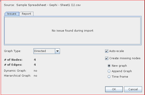
  5. You will get a import report - check whether the number of nodes and edges seem correct and there are no errors reported

  1. The default values are OK for many graphs of this type. If the links between the objects in your spreadsheet are not unilateral but rather bilateral: e.g. lists of friendship, relationships etc. select Undirected instead of directed.
  2. For now we’ll go with directed - so click “OK” to import the graph.

Now we have imported our simple graph and already see some things on the screen let’s make it a little nicer. By playing around with Gephi a bit.

Walkthrough: Basic layout in Gephi

See the grey nodes there, let’s make this graph a little easier to read

  1. Click on the big fat “T” on the bottom of the graph screen to activate labels

  1. Let’s zoom a bit, click on the button on the lower right of the graph window to open the larger menu

  1. You should see a zoom slider now, slide it around to make your graph a little bigger:

  1. You can click on individual nodes and drag them around to arrange them nicer.

Step 2: Getting data out of Twitter

Now we have this, let’s get some data out of Twitter. We’ll be using the twitter search for a particular hashtag to find information who talks about it, with whom and what do they talk about. Twitter offers loads of information on their API for search it’s here: https://dev.twitter.com/docs/api/1/get/search

It basically all boils down to using https://search.twitter.com/search.json?q=%23 tag (the %23 is the #character encoded - so %23ijf corresponds to #ijf). If you open the link in the browser you will get the data in json format - a format that is ideal for computers to read - but rather hard for you. Luckily Refine can help with this and turn the information into a table. (If you’ve never worked with refine before, consider having a quick look at the cleaning data with refine recipe at the school of data: http://schoolofdata.org/handbook/recipes/cleaning-data-with-refine/)

Walktrough: Get JSON data from web apis into Refine

  1. Open Refine
  2. Click Create Project
  3. Select “Web Adresses”
  4. Enter the the following url https://search.twitter.com/search.json?q=%23ijf - this searches for the #ijf hashtag on twitter.
  5. Click on “Next”
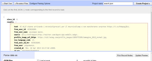
  6. You will get  a preview window showing you nicely formatted json:

  1. Hover over the curly bracket inside results and click this selects the results as the data to import into a table.
  2. Now name your project and click “create project” to get the final table

By now we have the all the tweets in a table. You see there is a ton of information to each tweet: we’re interested in who communicates with whom and about what: so the columns we care about are the “text” column and the “from_user” column  -let’s delete all the others. (To do so use “All → Edit Columns → remove/reorder Columns”)

The from user is stripped of the characteristical @ in front of the username that is used in tweets - since we want to extract the usernames from tweets later, let’s add a new column with from as @tweets. This will involve a tiny bit of programming - don’t be afraid it’s not rocket science

Walkthrough: Adding a new column in Refine

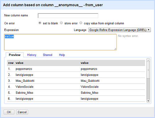
  1. On your from_user column Select “Edit column → add column based on this column...”

  1. Whoah - Refine wants us to write a little code to tell it what the new column looks like
  2. Let’s program then: Later on we’ll do something the built in programming language doesn’t let us do, luckily it offers two alternatives Jython (basically python) and clojure. We’ll go for clojure as we’ll need it later.
  3. Select Clojure as your language
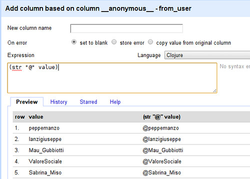
  4. We want to prepend “@” to each name (here “value” refers to the value in each row)
  5. Enter (str “@” value) into the expression field

  1. See how the value has been changed from peppemanzo to @peppemanzo - what happened? In clojure “str” can be used to combine multiple strings: (str “@” value) therefore combines the string “@” with the string in value - what we wanted to do.
  2. Now simply name your column (eg. “From”) and click on OK you will have a new column

Ok we got the first thing of our graph: the from user - now let’s see what the users talk about. While this will get a lot more complicated - don’t worry we’ll walk you through....

Walkthrough: Extracting Users and Hashtags from Tweets

  1. Let’s start with adding a new column based on the text column
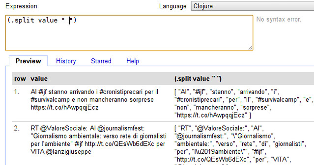
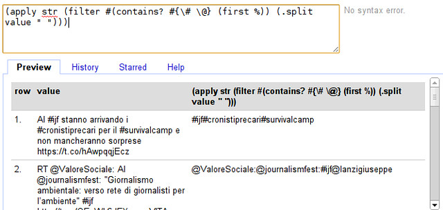
  2. The first thing we want to do is to split the tweet into words - we can do so by entering (.split value “ “) into the expression field (make sure your language is still clojure)

  1. Our tweet now looks very different - it has been turned into an “Array” of words. (an Array is simply a collection, you can recognize it by the square brackets.
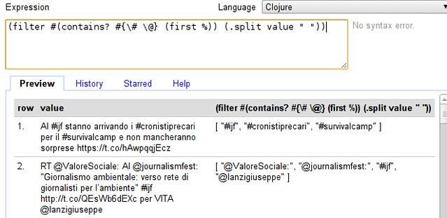
  2. We don’t actually want all words, do we? We only want those starting with @ or # - users and hashtags (so we can see who’s talking with whom about what) - so we need to filter our array.
  3. Filtering in clojure works with the “filter” function, it takes a filter-function and an array  - the filter-function simply determines whether the value should be kept or not. In our case the filter-function looks like “#(contains? #{\# \@} (first %))” - looks like comic-book characters swearing? Don’t worry, contains? basically checks if something is in something else, here whether the first character of the value (first %) is either # or @ (#{\# \@}) - exactly what we want. Let’s extend our expression:

  1. Whoohaa, that seemed to have worked! Now the only thing we need to do is to create a single value out of it. - Remember we can do so by using “str” as above.
  2. If we do this straight away we run into a problem: before we used “str” as (str “1st” “2nd”) now we want to do (str [“1st” “2nd”]) because we have an array - clojure helps us here with the apply function: (apply str [“1st” “2nd”]) converts (str [“1st” “2nd”]) to (str “1st” “2nd”). Let’s do so...

  1. Seems to have worked. Do you spot the problem though?
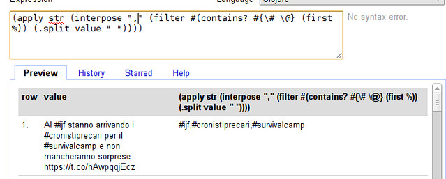
  2. Exactly the words are joined without a clear seperator, let’s add a seperator: The easiest way is to interpose a character (e.g. a comma) between all the elements of the array - clojure does this with the interpose function. (interpose “,” [1 2 3]) will turn out to be [1 “,” 2 “,” 3]. Let’s extend our formula:

  1. So our final expression is:

(apply str (interpose "," (filter #(contains? #{\# \@} (first %)) (.split value " "))))

Looks complicated but remember, we built this from the ground up.

  1. Great - we can now extract who talks to whom! name your column and click “OK”  to continue

Now we have extracted who talks with whom, but the format is still different from what we need in gephi. So let’s clean up to have the data in the right format for gephi.

Waltkthrough Cleaning up

  1. First, let’s remove the two columns we don’t need anymore: the text and the original from_user column - do this with “all → edit columns → remove and reorder columns
  2. Make sure your “from” column is the first column

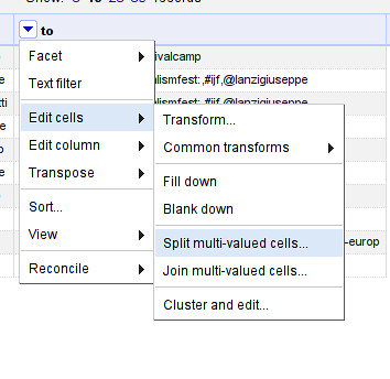
  1. Now, let’s split up the to column so we have one row in each entry: use “to → edit cells → split multi valued cells” enter “,” as seperator

  1. Make sure to switch back to “rows” mode.
  2. Now let’s fill the empty rows: Select “from → edit cells → fill down”
  3. Notice that there are some characters in there that don’t belong to names (e.g. “:” ?) Let’s remove them.
  4. Select “to → edit cells → transform...”
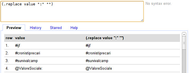
  5. To replace our transformation is going to be (.replace value “:” “”)

You’ve now cleaned your csv and prepared it enough for gephi, let’s make some graphs! Export the file as csv and open it in gephi as above.

A small network from a Twitter Search

Let’s play with the network we got through google refine:

  1. Open the CSV file from google refine in gephi
  2. Look around the graph - you’ll see pretty soon that there are several nodes that don’t really make sense: “from” and “to” for example. Let’s remove them
  3. Switch gephi to the “data laboratory” view

  1. This view will show you nodes and edges found

  1. You can delete nodes by right clicking on them (you could also add new nodes)
  2. Delete “from” “to” and “#ijf” - since this was the term we searched it’s going to be mentioned everywhere
  3. Activate the labels: it’s pretty messy right now so let’s add some layouting. To layout simply select the algorithm in layout and click “play” - see how the graph changes.
  4. Generally combining “Force Atlas” with “Fuchterman Reingold” gives nice results. Add “label adjust” to make sure text does not overlap.
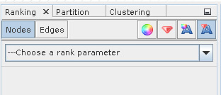
  5. Now let’s make some more adjustments - let’s scale the label by how often things are mentioned. Select label size in the ranking menu

  1. Select “Degree” as rank parameter

  1. Click on “Apply” - you might need to run the “label adjust” layout again to avoid overlapping labels
  2. With this simple trick, we see what kind of topics and persons are frequently mentioned

Great - but it has one downside - the data we’re able to get via google refine is very limited - so let’s explore another route.

A larger network from a Twitter search

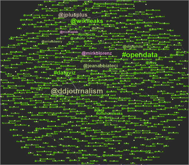
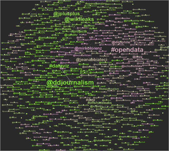
Now we analyzed a small network from a search - let’s deal with a bigger one. This one is from a week of searching for the twitter hashtag #ddj. (you can download it here)

The file is in gexf format - a format for exchanging graph data.

Walkthrough: Network analysis using Gephi

  1. Open the sample graph file in gephi
  2. Go to the Data view and remove the #ddj node
  3. Enable Node labels
  4. Scale labels by Degree (number of edges from this node)
  5. Apply “Force Atlas”, “Fuchterman Rheingold” and “Label Adjust” (remember to stop the first two after a while).
  6. Now you should have  a clear view of the network

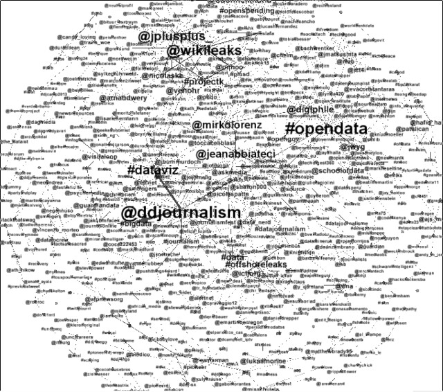
  1. Now let’s perform some analysis. One thing we are interested in is: who is central and who’s not: in other words: Who is talking and who is talked to.
  2. For this we will run statistics (found in the statistics tab on the right) - we will use the “Network diameter” statistics first - they tell us about eccentricity, Betweenness centrality and closeness centrality. Betweenness centrality tells us which nodes connect nodes: in our terms: high betweenness centrality are nodes who are communication leaders. Low betweenness centrality are topics.
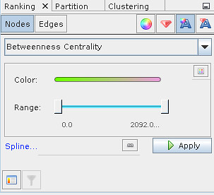
  3. Now we ran our test, we can color the labels according to this. Select the label color ranking and “Betweenness Centrality”

  1. Pick colors as you like them - I prefer light colors and a dark background.

  1. Now let’s do something different. Let’s try to detect the different groups of people who are involved in the discussion. This is done with the “modularity” statistic.
  2. Color your labels using the “Modularity Class” - now you see different clusters of people who are involved in the discussion

Now we have analyzed a bigger network - found the important players and the different groups active in the discussions - all by searching twitter and storing the result.

Bonus: Scraping the twitter search with a small java utility

If you have downloaded the .jar file mentioned above - it’s a scraper extracting persons and hastags from twitter - think of what we did previously but automated. To run it use:

java twsearch.jar "#ijf" 0 ijf.gexf 

This will search for #ijf on twitter every 20 seconds and write it to the file ijf.gexf - the gexf format is a graph format understood by gephi. If you want to end data collection: press ctrl-c - simple isn’t it? - In fact the utility just runs using java - it is written entirely in clojure (the language we used to work with the tweets above).

25 Apr 08:37

Do Labor Market Policies have Displacement Effects? Evidence from a Clustered Randomized Experiment

by Crepon, B., Duflo, E., Gurgand, M., Rathelot, R., Zamora, P.

This article reports the results from a randomized experiment designed to evaluate the direct and indirect (displacement) impacts of job placement assistance on the labor market outcomes of young, educated job seekers in France. We use a two-step design. In the first step, the proportions of job seekers to be assigned to treatment (0%, 25%, 50%, 75%, or 100%) were randomly drawn for each of the 235 labor markets (e.g., cities) participating in the experiment. Then, in each labor market, eligible job seekers were randomly assigned to the treatment, following this proportion. After eight months, eligible, unemployed youths who were assigned to the program were significantly more likely to have found a stable job than those who were not. But these gains are transitory, and they appear to have come partly at the expense of eligible workers who did not benefit from the program, particularly in labor markets where they compete mainly with other educated workers, and in weak labor markets. Overall, the program seems to have had very little net benefits. JEL Codes: J68, J64, C93.

22 Apr 07:55

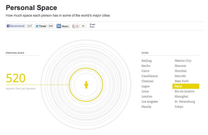
Paris, Pékin, Mexico… : combien de mètres carrés de vie ?

by Karen Bastien

How much space each person has in some of the world's major cities


22 Apr 07:55

New York : le métro des inégalités

by Karen Bastien
19 Apr 10:59

IFG-Anfragen: Wie transparent ist der Staat?

by ZEIT ONLINE : Digital
Pachevalier

Le premier graphique est assez élégant.

Nur der Hälfte aller Anfragen auf Basis des Informationsfreiheitsgesetzes wird stattgegeben. Unsere Visualisierung zeigt, welche Behörden besonders verschlossen sind.
18 Apr 13:37

Visualize large data sets with the bigvis package

by David Smith

Creating visualizations of large data sets is a tough problem: with a limited number of pixels available on the screen (or just with the limited visual acuity of the human eye), massive numbers of symbols on the page can easily result in an uninterpretable mess. On Friday we shared one way of tackling the problem using Revolution R Enterprise: hexagonal binning charts. Relatedly, RStudio's chief scientist Hadley Wickham is taking a comprehensive approach to big-data visualization with his new open-source bigviz package, currently available on GitHub. (Disclaimer: early development of this package was funded by Revolution Analytics.)

The basic idea of the package is to use aggregation and smoothing techniques on big data sets before plotting, to create visualizations that give meaningful insights into the data, and that can be computed quickly and rendered efficiently using R's standard graphics engine. Despite the large data sets involved, the visualization functions in the pacakge are fast, because the "bin-summarise-smooth" cycle is performed directly in C++, direcly on the R object stored in memory. The system is described in detail in this Infovis preprint, and includes this example chart using the famous airline data:
Bigvis
The bigvis package is available for installation now on GitHub (use the devtools package to make the install easier). You can find installation instructions and links to the documentation in the README file linked below.
GitHub (Hadley Wickham): bigvis package

18 Apr 08:29

Subway series

by Andrew

Screen Shot 2013-04-17 at 9.28.42 PM

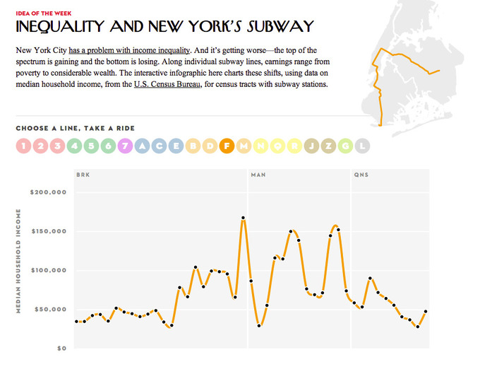
Abby points us to a spare but cool visualization. I don’t like the curvy connect-the-dots line, but my main suggested improvement would be a closer link to the map. Showing median income on census tracts along subway lines is cool, but ultimately it’s a clever gimmick that pulls me in and makes me curious about what the map looks like. (And, thanks to google, the map was easy to find.)

Screen Shot 2013-04-17 at 9.29.42 PM

The post Subway series appeared first on Statistical Modeling, Causal Inference, and Social Science.

18 Apr 08:14

(VU SUR LE WEB) New York : les lignes de métro par revenu moyen

by Marie Coussin

Dans sa rubrique « Idée de la semaine », le New Yorker explique que la ville de New York connaît un problème croissant d’inégalité de revenus. Les riches deviennent plus riches alors que les pauvres deviennent de plus en plus pauvres. Le journal a retenu une des façons de montrer cette situation par le biais d’une application interactive : pour chaque station de ligne de métro, on peut voir le revenu médian des ménages. La différence entre MAN (Manhattan) et BRX (Bronx) ou les autres quartiers de New York sont frappants.
Cette application utilise les chiffres du US Census Bureau.

NYorker

16 Apr 21:35

GitHub mania

by François

GitHub est une plateforme qui héberge du code sur la base d’un système de collaboration, git, qui a fait ses preuves en servant à coordonner le travail des 40 000 collaborateurs au noyau de Linux. Les Internets regorgent de ressources sur Git : voici une vidéo pour les plus avertis, et un guide de présentation plus accessible.

Les deux auteurs de ce blog sont assez fan de GitHub : vous nous y retrouverez assez facilement — et je pense que Joël a vraiment innové en publiant du code sur GitHub et en se faisant citer par le Canard enchaîné la même semaine ! GitHub a l’avantage d’être gratuit, ouvert et (très) robuste, de ne pas souffrir de limite sur la taille des documents, et enfin d’être obsessionnellement collaboratif. C’est une plateforme parfaite pour copier-coller des petits bouts de code, ou même pour héberger des données. J’ai testé ces fonctionnalités à partir de l’année dernière, en évoquant rapidement les résultats ici.

Cette année, j’ai testé les fonctions collaboratives de GitHub en donnant un coup de main sur un plugin Stata pour TextMate, et en commençant à soumettre des fonctions dans quelques packages pour R. C’était l’objet du point n°4 dans un billet de février, qui a débouché sur une fonction du package questionr de Julien Barnier, qui continue là où son très bon package rgrs s’était arrêté, et à qui j’espère pouvoir bientôt soumettre de nouvelles fonctions, inspirées de mes expériences (et de celles de mes étudiants) avec la manipulation de données d’enquêtes sous Stata.

Je viens aussi de publier une fonction dans GGally, un package qui a vocation à construire sur l’excellente librairie graphique ggplot2 ; là aussi, j’espère pouvoir écrire quelques fonctions de plus en m’inspirant du package arm d’Andrew Gelman et al., qui sert à analyser des régressions. Je vous raconte ça parce que je suis content comme un môme quand j’arrive à coder des trucs utiles aux autres, et parce que je souhaite encourager tous les lecteurs de ce blog à jeter un coup d’oeil à GitHub, qui a de très nombreux usages scientifiques, bien au-delà de la “pure” programmation.

Rêvons qu’un jour, il sera possible à la science politique de faire un coup de force en rendant publics ses jeux de données et ses scripts d’analyse sur une plateforme comme GitHub (ou même HAL-SHS), ce qui permettrait d’insister un peu plus lourdement sur l’opacité des méthodes de collecte et de redressement que l’on rencontre dans le secteur commercial. On peut d’ailleurs trouver sur GitHub des scripts ayant servi à des membres de l’équipe de campagne de Barack Obama l’année dernière…

11 Apr 15:29

La France va-t-elle filtrer Wikipédia ?

by Pierre-Carl Langlais

Bienvenue au club… Selon Emmanuel Roux, le secrétaire national du Syndicat des commissaires de la police nationale, la France pourrait prochainement mettre en place un filtrage de Wikipédia. La nation des droits de l’Homme se retrouverait en charmante compagnie : Chine, Arabie saoudite, Iran, Pakistan, Ouzbékistan…

En cause ? Toujours cet article sur une petite station militaire du Massif central. La semaine dernière, la DCRI tente d’intimider un administrateur bénévole afin d’obtenir sa suppression. Cette procédure à la légalité douteuse suscite un tollé mondial.

Comme...