This is a post where home decor meets my personal life. I’ve known the homeowners of this fabulous place for, wow, I think 20 years now…girl, can you believe it’s been that long? Carrie was my boss at a startup dot com back in 2000. Her style has evolved over time, and I can officially say, this home is hands down my favorite. It’s bold, fearless, and confident…just like her and her husband. She worked with interior designer extraordinaire, Jen Talbot, to bring this past meets present bonkers decor to life. Situated in Chicago’s Bucktown neighborhood, this home was recently featured in LivingEtc’s March issue (on newsstands now), and it’s an absolute honor to feature this modern home tour here on House Of Hipsters. Let’s dig into my interview with Jen (oh and be sure to follow @jentalbotdesign on Instagram).
 Dustin Halleck Photography
What was the inspiration for this modern Bucktown home? Highly curated, vintage 80’s with a sculptural overtone and purposeful use of color. The client’s tag line was “modern sophisticated meets Kelly Wearstler in the 80’s”.
 Dustin Halleck Photography
She had just wrapped a 3-year design project at the new luxury boutique hotel, the St. Jane Hotel (formally the Hard Rock Hotel), and wanted her personal space to reflect the fresh innovative approach she applied to the hotel and her wardrobe. Unique pieces that were singular to her space.
Is the finished design close to the mood board you first presented to the client? Mood boards always evolve. This one more than usual because we used so much vintage. Often times we would find an amazing piece, and it would get snatched up before we pulled the trigger to purchase. The overall essence of the board did not change, just the actual pieces. The beauty of that? The design became more curated because we were forced to source even better pieces, one treasure at a time.
 Dustin Halleck Photography
The homeowners let you take some serious risks. Was there anything they said no to? There was one weird metal floor lamp I found that pretty much belonged in outer space and looked like an evil octopus. It was a piece that I was on the fence about. But oftentimes if you are not sure you love or hate a piece, that’s the sweet spot. It’s a very fresh visual to push out of your comfort zone.
 Dustin Halleck Photography
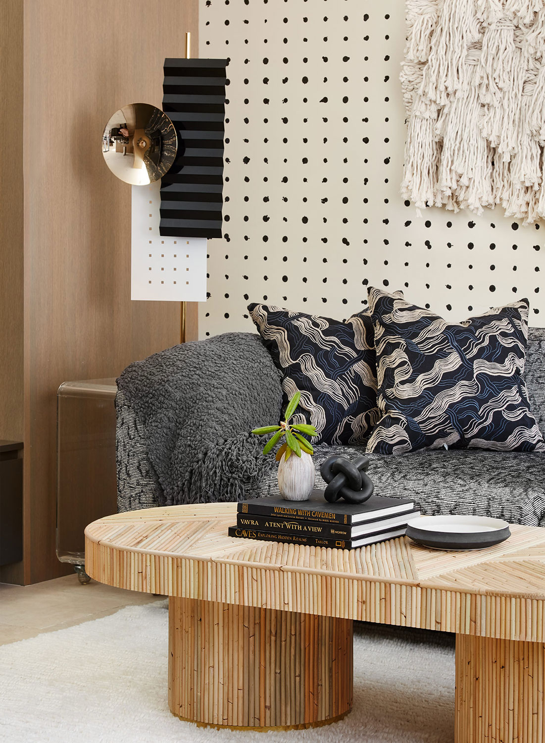
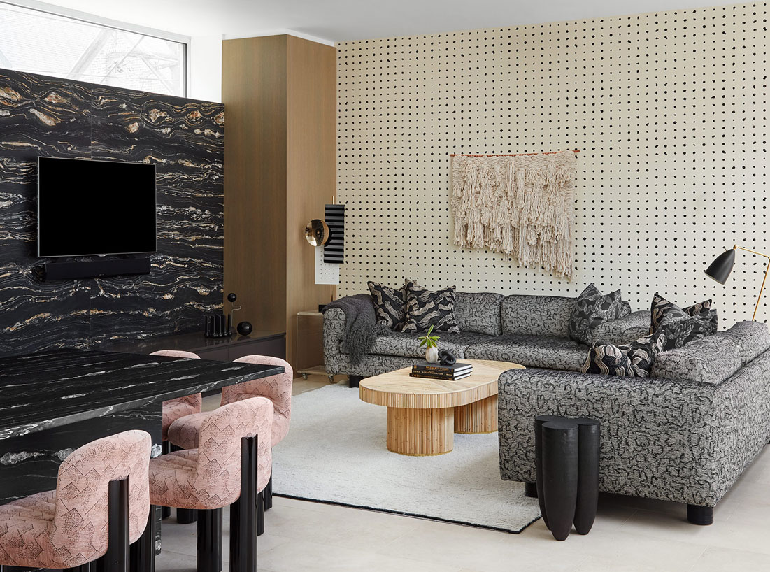
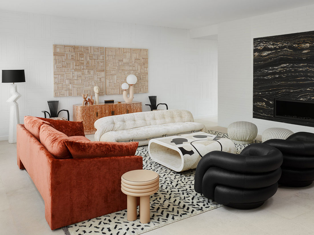
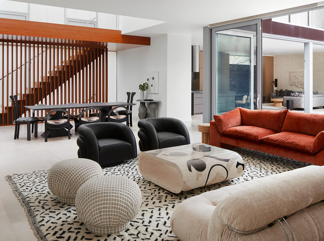
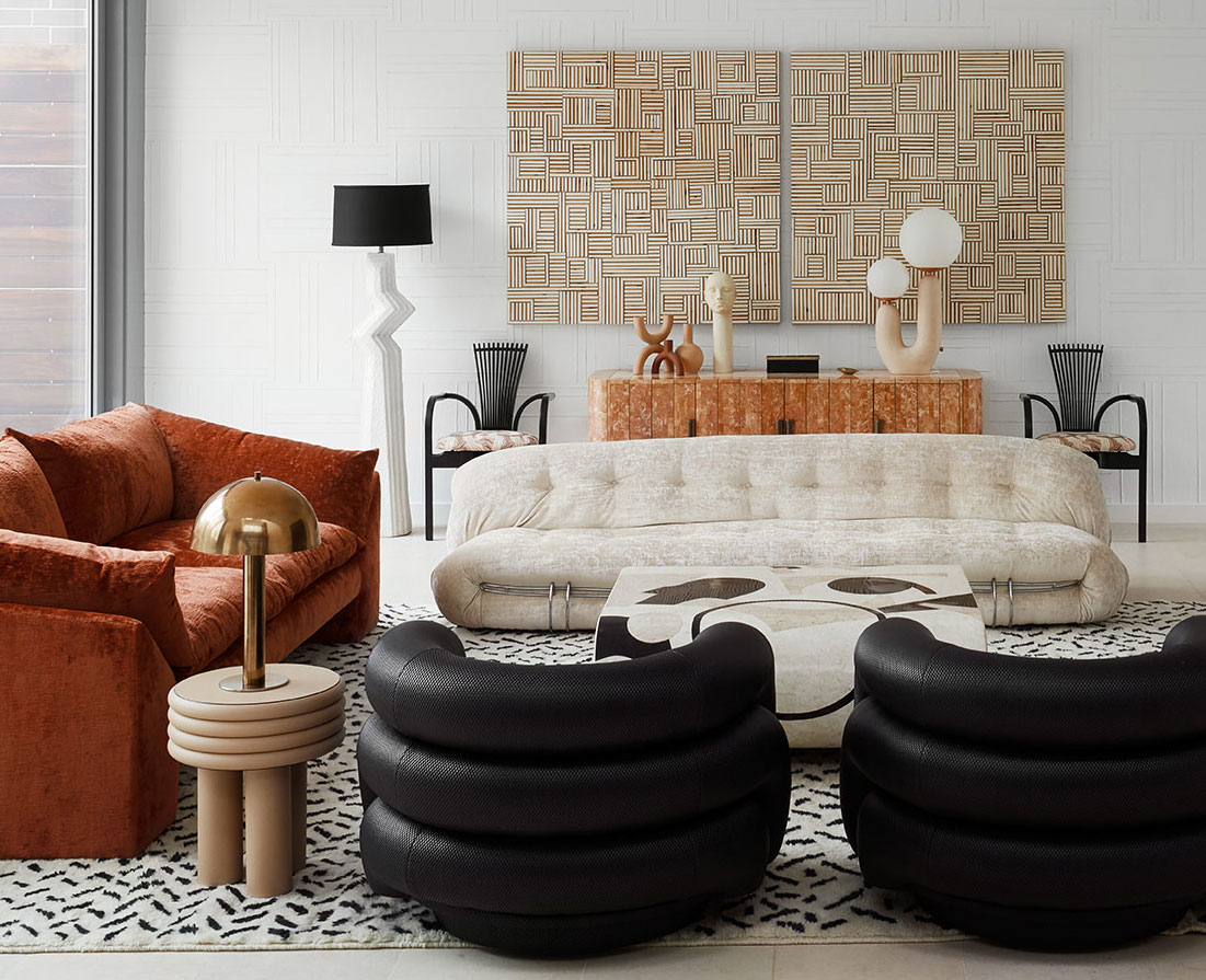
When you initially started the design, what room did you dig into first? We started with the main floor — the living room, dining room, and kitchen area are all open to each other and have to play together. Once the living room was designed, we built out from there. The client knew she wanted a particular sofa, so that became our anchor and jumping-off point.
 Dustin Halleck Photography
 Dustin Halleck Photography
 Dustin Halleck Photography
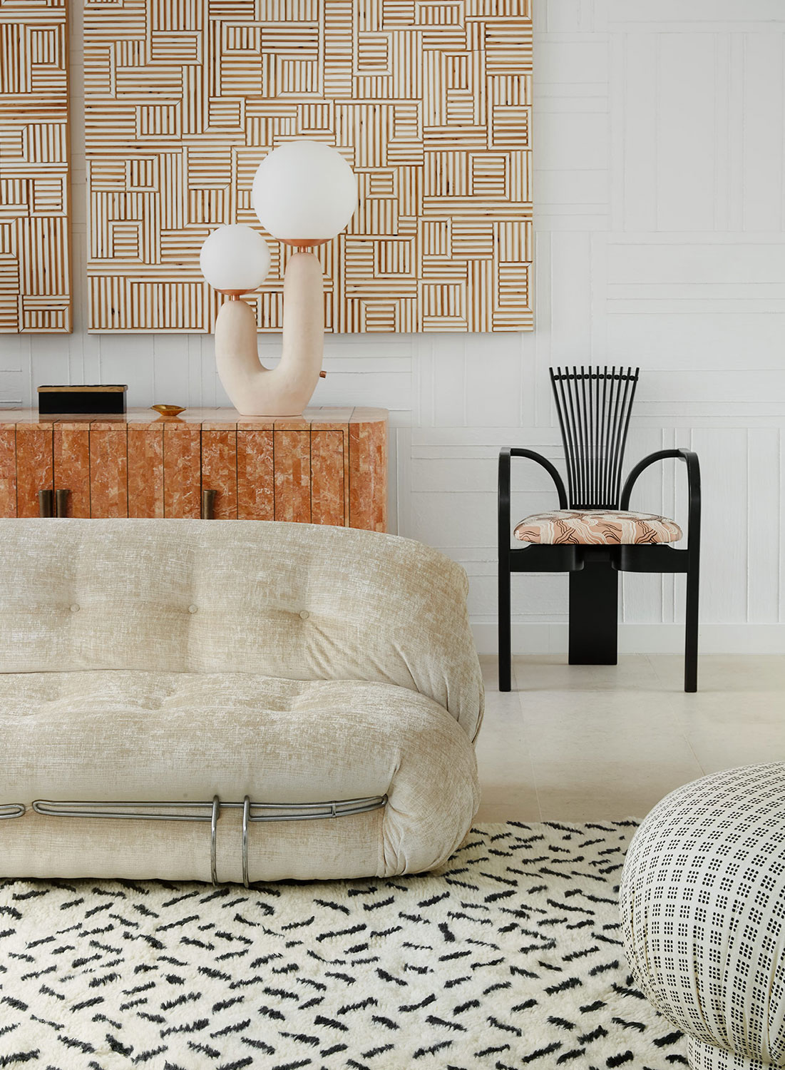
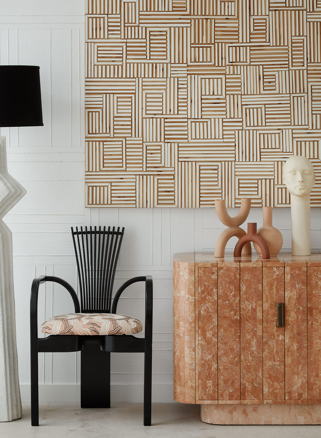
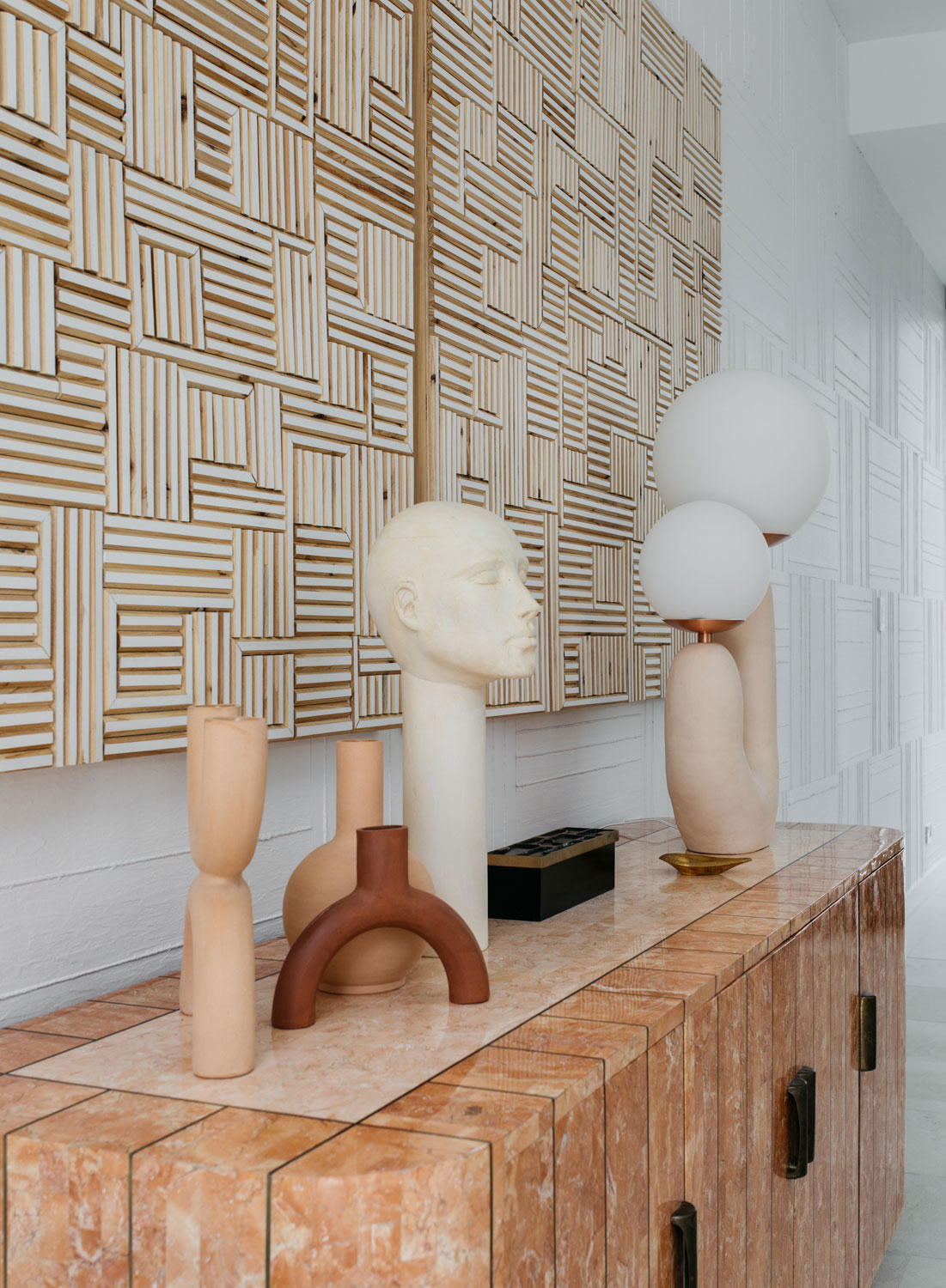
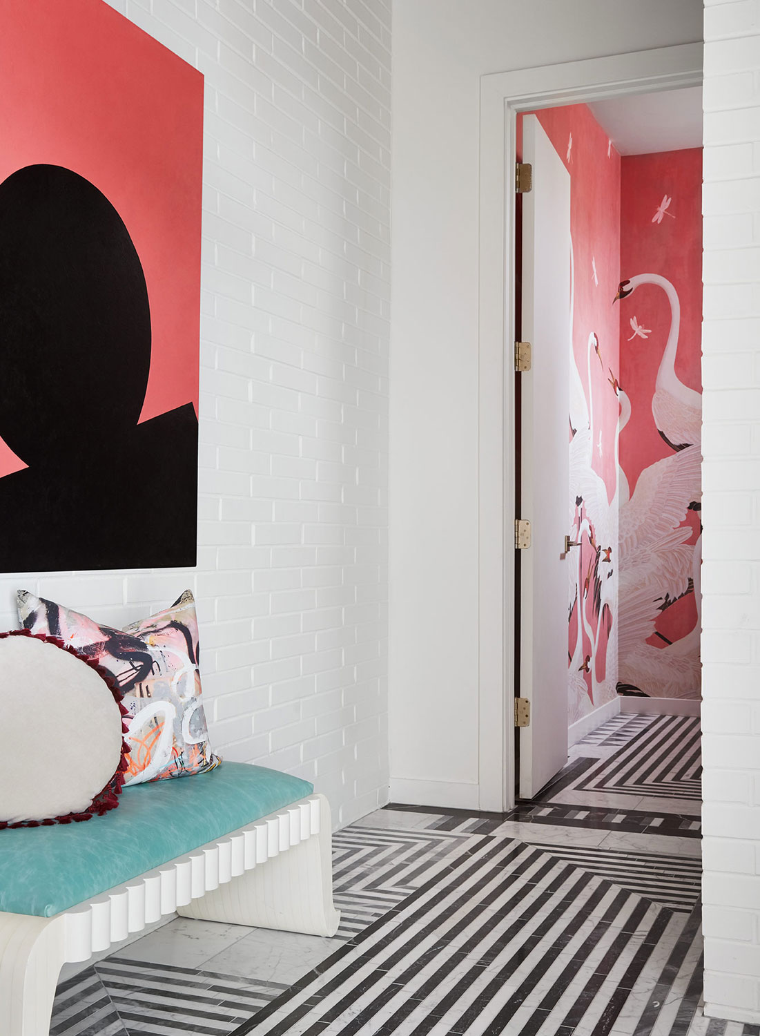
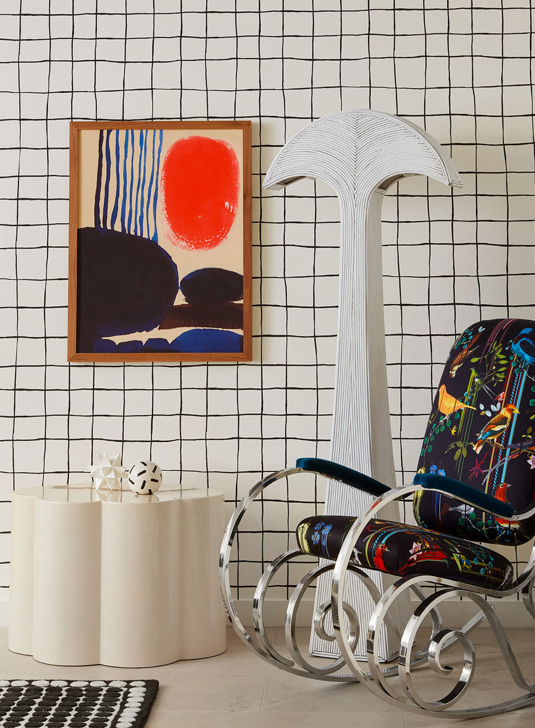
The wallcoverings add so much texture to each room. I especially love the subtle texture in the front living room and the beige on beige with black graphics printed in the bedroom. Can you tell me more about these? The client talked about getting sick of patterns easily so we decided to explore textures. The textured wallpaper in the living room was custom developed for the space. By working with a wallpaper company that was already doing textured, we had them change the direction and layout, color match, and cut it into 18 x 18 squares. We then “tiled” the wall, giving it a complete customized look.
It’s stunning, and I love how the art plays off the wall covering. You guys nailed it.
 Dustin Halleck Photography
 Dustin Halleck Photography
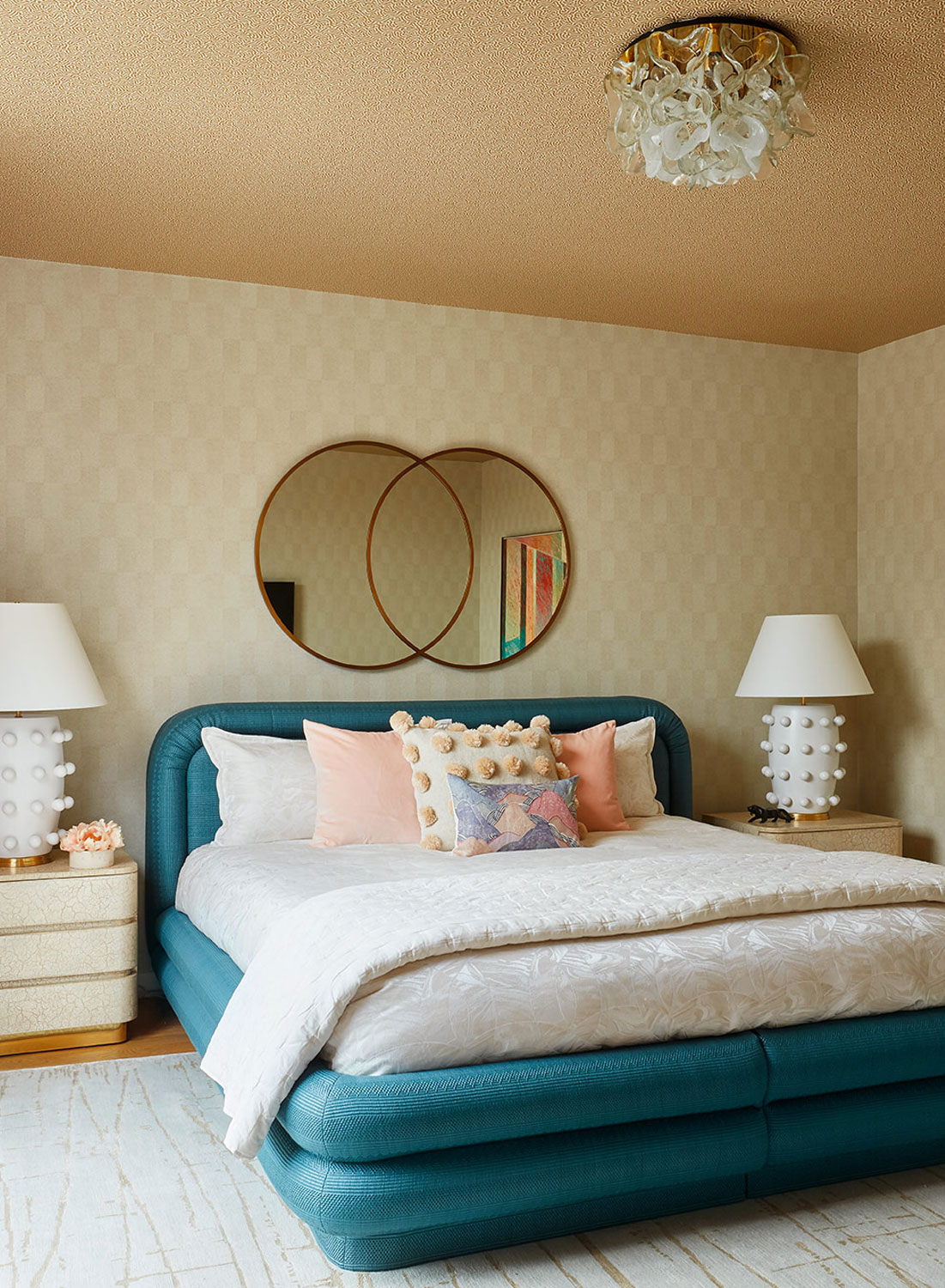
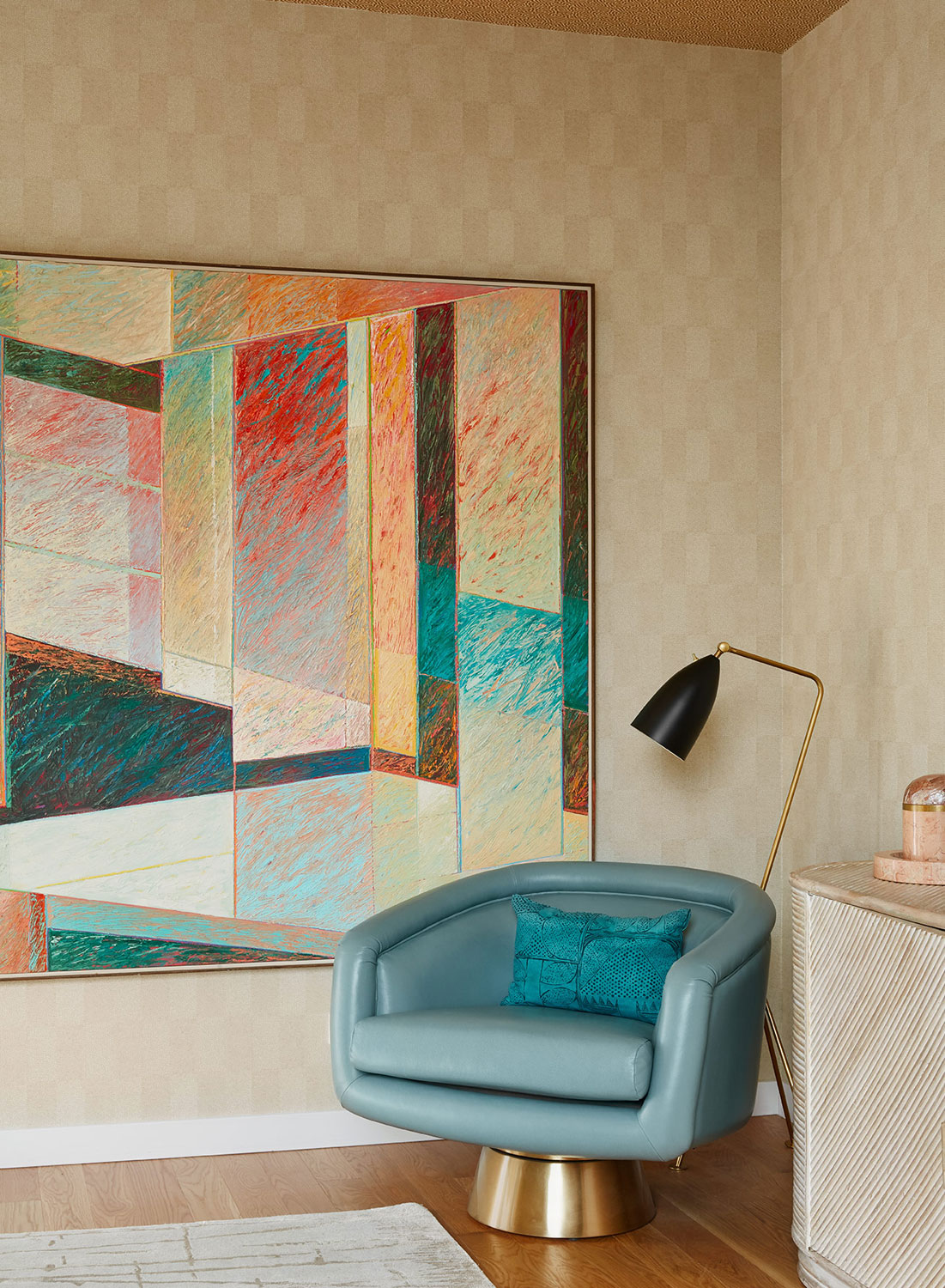
In the master bedroom, we worked to find two papers that could play off each other and be paired to create visual interest. Selected were two subtle wallpapers from Osborne and Little — same color family with a similar size print. They naturally related to each other.
 Dustin Halleck Photography
 Dustin Halleck Photography
Jen, that’s genius! The effect adds spectacular texture to the bedroom. Also, the bold pop of turquoise and that gold ceiling is spectacular.
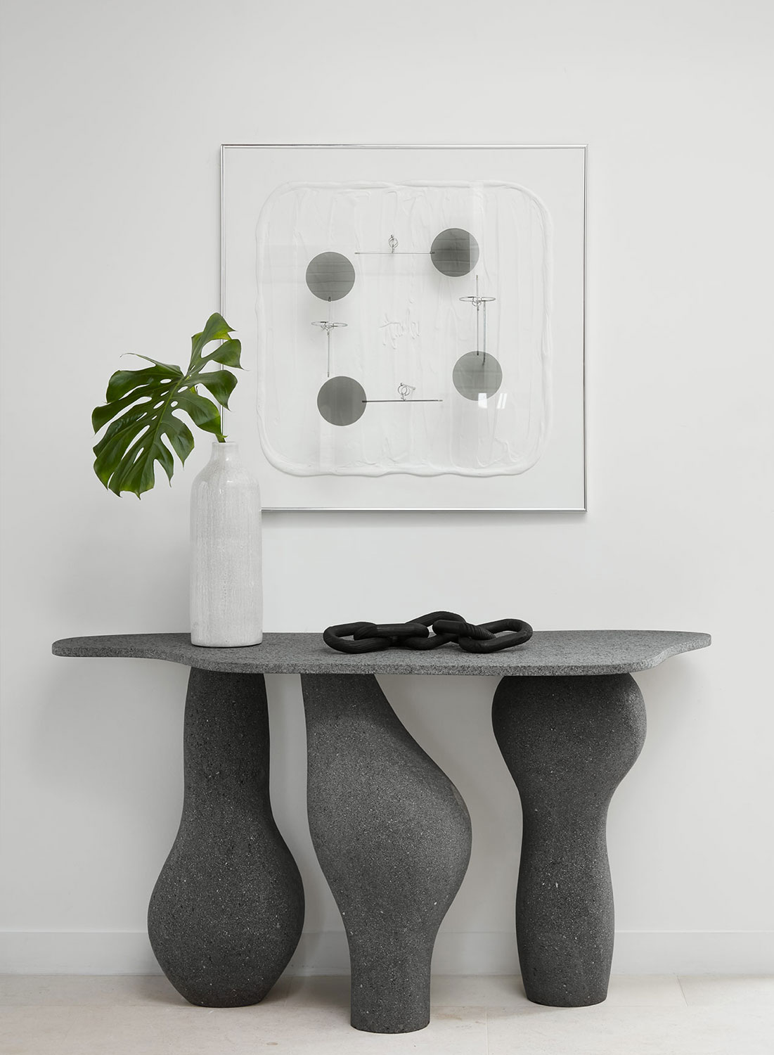
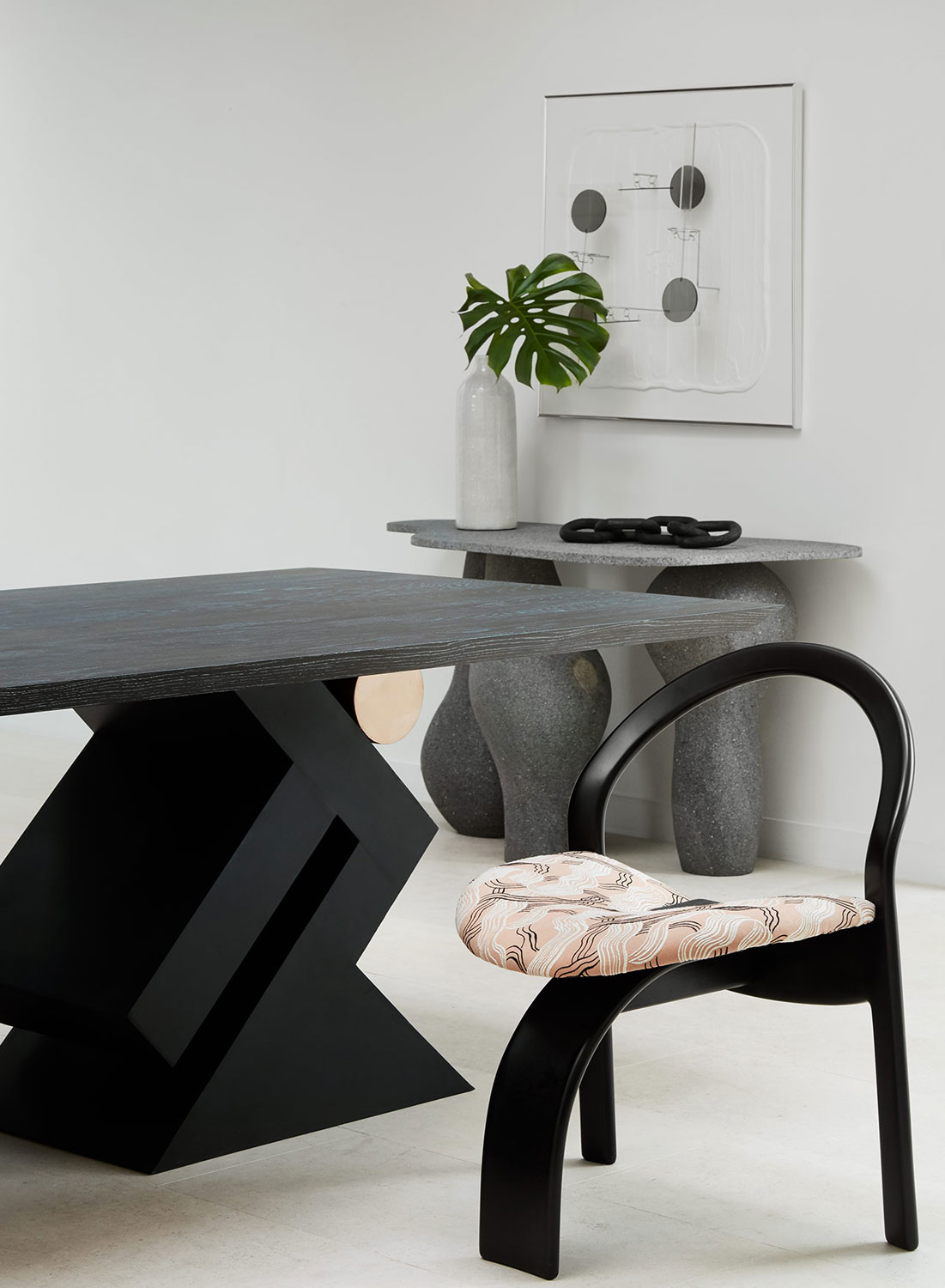
What was your biggest challenge while designing this space? The modern framework of the existing space was definitely a challenge. I am more accustomed to working with vintage homes and pairing each room with modern elements. In this home, we had to make the visually dominant wood staircase work into the overall design. Originally, the wall was exposed brick, but we painted it white to give the space a more modern flavor. We also reworked the fireplace stone surround to create cohesion with the kitchen stone.
 Dustin Halleck Photography
Dustin Halleck Photography
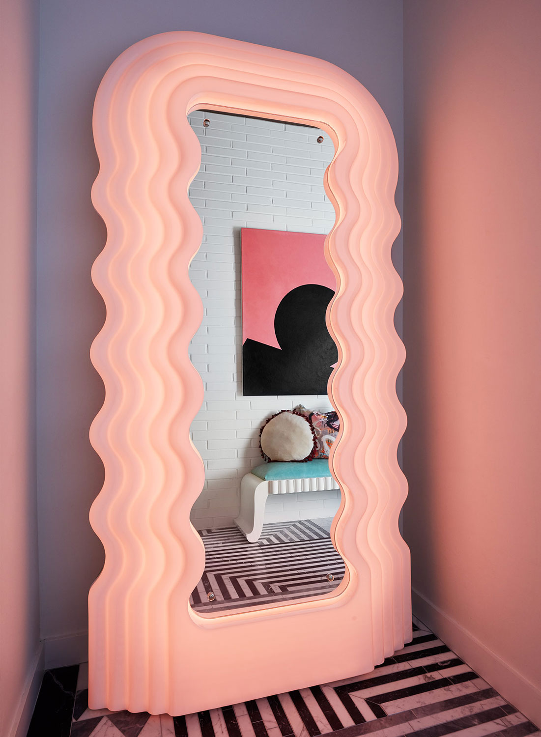
There are so many amazing vintage treasures in this home. What is your hands-down favorite piece? That is a hard question because there are so many I love! Probably the Ultrafragola illuminated floor mirror designed by Ettore Sottsass for Poltranova. They are pretty rare and hard to come by.
 Dustin Halleck Photography
I’ll admit, that’s my absolute favorite as well. Undulating pink…it’s without a doubt my dream mirror.
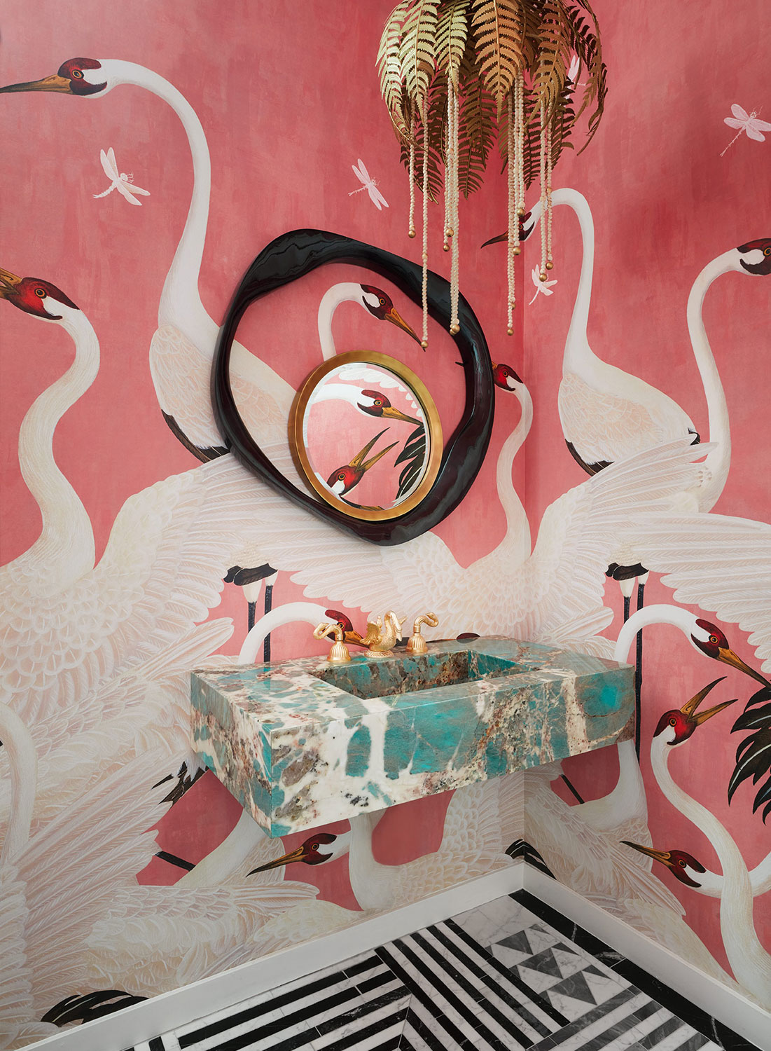
I attended a party at the home while you were still finishing the design. I must confess…before I left, I went into the pink Gucci powder room and totally snapped some pictures because it’s just too good…oh and not to share it on Instagram…that was challenging. What was your inspiration for this daring bathroom and can you elaborate on that amazing sink? In this space, the client wanted to completely “go for it” and create a room that her guests would talk about for weeks after leaving her party. The space started with the stone selection. We were shopping for the kitchen stone and fell in love with the green marble. I had to find a way to work it in. The powder room was the obvious place, and we designed the room around it. I love using just a hint of unexpected color in a space; it can make it feel so special. Other times I love to see the conversation I can start between colors and color stories. It’s a wonderful challenge to push yourself creatively.
 Dustin Halleck Photography
 Dustin Halleck Photography
In Drawing 101, back in my art school days, we were not allowed to use any color until we mastered the use of just graphite pencils on paper. That way we could learn shading a shape, rather than being overwhelmed with what colors to use. Color came much later because it was a new challenge and a different way to look at things.
Hmmmmm, maybe that’s why I design in neutrals so often. Color and pattern are both challenging. You certainly nailed this design.
 Dustin Halleck Photography
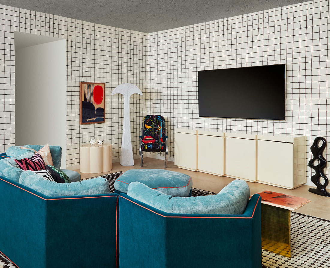
The sofa in the kids’ playroom has such an unusual shape. Can you tell me more about it? This was a great vintage find but in terrible condition when we found it. The lines were great with huge potential, but it had to be completely rebuilt. The sofa is three pieces that fit together to create a “U” shaped sectional, and each section almost “hugs” your body when you sit in it. It’s pretty fantastic. For the design, I loved the idea of a two-tone piece, that was one color on front and another complimentary color on the back, with contrasting piping detail. The end result was better than I imagined.
 Dustin Halleck Photography
Talk about leveling up. The piping really does add that extra special something. If you don’t mind, I’ll be keeping this idea in my brain for my next upholstery project.
 Dustin Halleck Photography
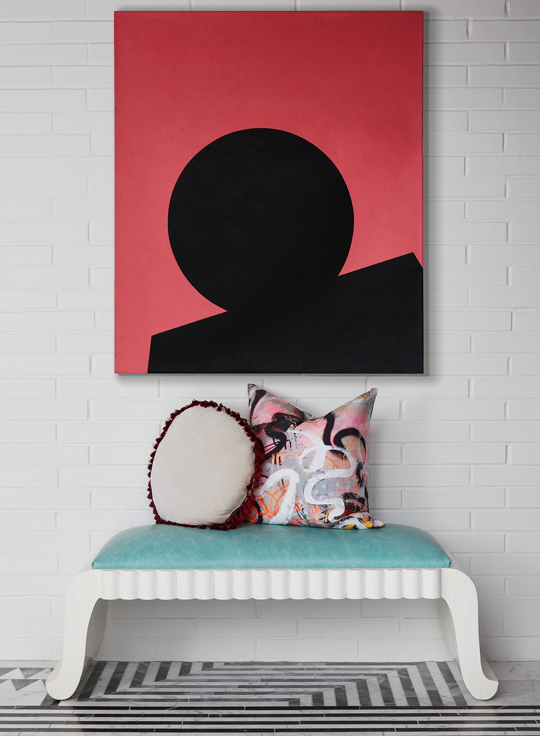
Do you have a favorite room? I think the living room is my favorite. The textures and mix of subtle with bold color and the pop of wild pattern on the coffee table is perfection…but maybe the powder room is tied for first.
 Dustin Halleck Photography
Have a space you’d like to have featured on HOH? Fill out the contact form and include a link to a few images. I’d love to check it out!
The post Modern Sophisticated Meets Kelly Wearstler In The 80’s — Modern Home Tour appeared first on House Of Hipsters.


.gif")
 Turn on your JavaScript to view content