It is safe to say that I see a lot of packaging design. Likely more than anyone else in the world. In 2007, I created The Dieline to begin to document and define what I believe to be the world’s best examples of packaging design. 7 years later we have become the leading package design resource online, where we receive over 5,000 package design submissions a year.
We have also produced 7 thought-provoking packaging design conferences and have held 6 annual The Dieline Awards competitions formally recognizing well-designed consumer package design worldwide. Through The Dieline Awards annual competition, where we receive over 1,000 entries a year, we have awarded over 180 awards and have hosted 8 exhibits of our winners around the world.
Seeing so much packaging design on a daily and yearly basis puts me in a very unique position to identify the emerging trends amongst the sea of the same. It has trained my eye to be able to start seeing patterns, connections, and themes emerge in consumer products and packaging design. As these patterns start becoming more established and embraced by designers, agencies, and consumer product companies worldwide, they become emerging trends.To really nail down these emerging trends and ensure that they do indeed exist, we make sure they are backed up by analytical data from The Dieline. Toward the end of each year, our team of editors begin an internal process to distill our insights into the emerging trends that every designer needs to know. In addition to our insights, we are able to see what trends are really emerging by examining the most viewed and shared projects each year by our readers.
Through The Dieline Awards competition, we also take a look at what our highly esteemed Jury votes for as the most defining package design projects of the year. We take a close look at not only the projects, but the overarching themes that are emerging, and the agencies that are pushing them to the next level. For 2015, I have identified four key emerging trends, that I believe are or will be extremely prevalent in packaging design and consumer products in the next year: Visual Authenticity, Luxury of Less, Ultra-Pure, and Biobased.
Trend #1 VISUAL AUTHENTICITY
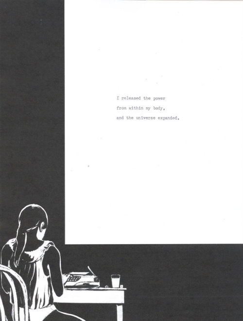
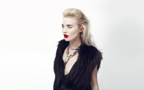
Visual Authenticity is a trend that marks a significant departure from the mainstream, yet is quickly becoming mainstream in itself. This trend visually marks a complete rejection of established corporate brand design. Visual Authenticity is a response to shifting consumer values, with many consumers no longer wanting to rely on, or trusting, established brands. Appetites are skewing towards more real, quality and honest products. Products that appear uncomplicated, yet are crafted, maybe even vintage inspired. It’s about products that illustrate trust and create inadvertent human connection.
The digital age is fostering a decline in human connection which is most prevalent office Gen Z consumers. Because of this, these shoppers are not responding to traditional established corporate brands. They want more. They demand more. They desire a real, trusted, human connection to the products and the brands that they consume. This connection can be expressed in different ways, from a connection to nature, to the written word, to the past, or to simply to other people. This is beyond hipster. This style is a rejection of technology. a pre-
computer era style, if you will.
For many of the brands choosing to go for a Visually Authentic style, they do so with the goal of reconnecting themselves to consumers. They do this by showcasing the craft, quality, and skill in both the product and the packaging design. As this trend has evolved, it has moved beyond small artisan brands and is becoming to become more mainstream itself.
Trend Characteristics:
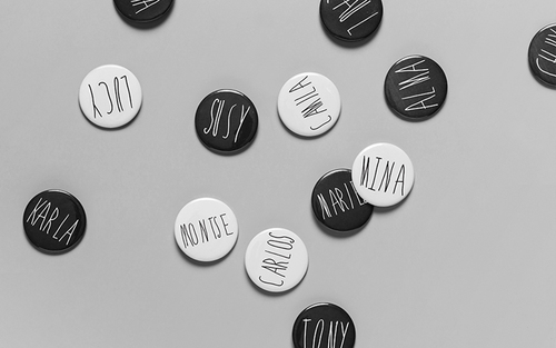
- Handwritten, raw, freeform, or sketchy typography
- May include vintage inspired references or typography
- Hand rendered, simple illustrations
- Natural color palettes
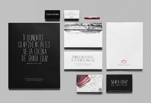
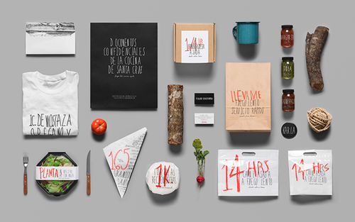
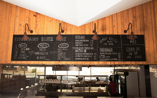
Restaurant branding & packaging
Anagrama Studio created simple, honest, and direct brand for Santa Cruz, a quick service Mexican BBQ restaurant located in Santa Catarina, a municipality of the greater Monterrey area in northeast Mexico.
“The hand-made quality of the logotype and overall identity is meant to praise the careful, traditional and apprehensive food making process of Santa Cruz. The brand is simple and direct, and above all, always honest and sincere, never attempting to hide its conceptual rugged awkwardness. Destined to be franchised in the future, Santa Cruz's honest and handcrafted demeanor will inevitably be distinctive amid all other, more synthetic fast food chain restaurants.”
Designed by: Anagrama Studio, Mexico

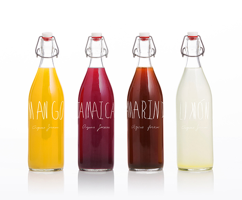
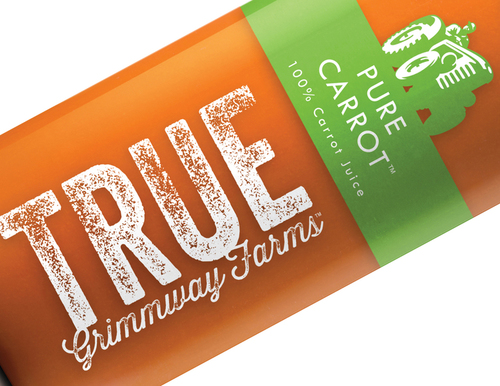
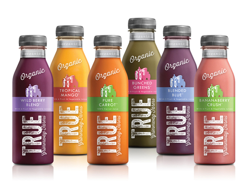
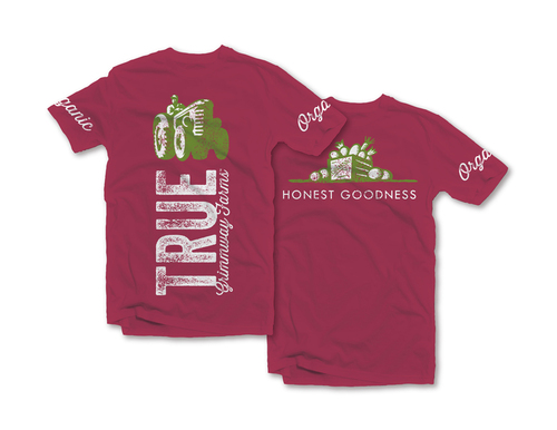
Organic Juice Brand
Grimmway Farms worked with McLean Design to create a fresh organic juice brand that would capture the essence of the family growers behind it. Grimmway Farms began as a farm stand founded by two brothers back in 1968 and stands today as the largest, family-owned carrot producer in the world. The company wanted its branding and design to reflect it's honest hardworking approach. True to its name, McLean created a brand and design that captures an authentic, honest connection between the farm and the consumer.
"The new line captures the small town nature of a family-run farm stand, with the farmer as hero of his own tale, bringing goodness straight from the earth to your local grocer." - McLean Design.
Designed By: McLean Design, California
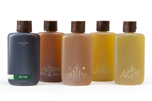
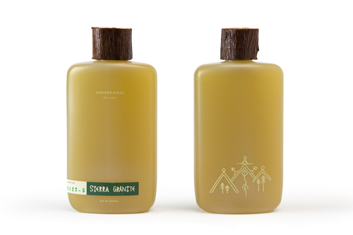
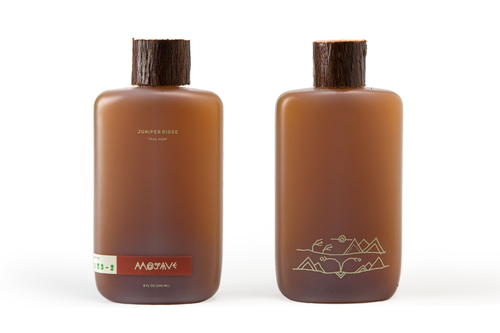
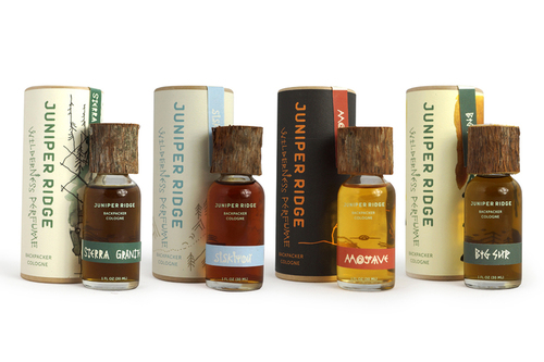
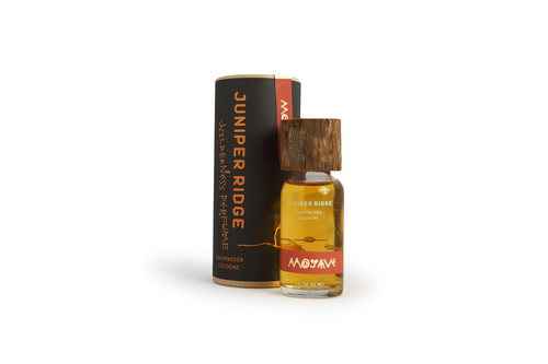
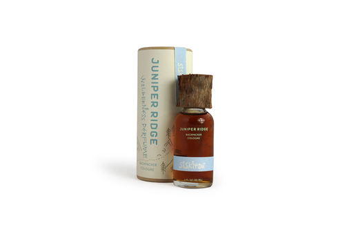
Natural, all-foraged soaps and scents.
Juniper Ridge makes 100% natural, all-foraged scents and soaps, wildcrafted from ingredients sourced from the earth which include bark, moss, mushrooms, plants, and countless items sourced from the backcountry. Juniper Ridge recently redesigned their packaging which includes wilderness paintings by the brand's Chief Storyteller Obi Kaufmann, and wooden caps hand-carved in their Oakland workshop.
"Juniper Ridge distills colognes and perfumes from real plants, bark, moss, mushrooms, and tree trimmings found hiking the backcountry. Fragrances are made on dirt roads and trails, around campfires, and in their Oakland, California workshop. All to capture the quiet beauty of the Mojave Desert at sunrise, or a late-season Sierra trailhead with winter right around the corner. At Juniper Ridge, it's all about foraging deep in the woods for scents that'll transport you into the wilderness."
Designed by: Indicate Design Groupe, California
Trend #2 Luxury of Less
Luxury of Less is a trend that represents a new generation of luxury goods that are less reliant on established luxury brands names and ostentatious, flashy, over-design. In this post-recession era, a new wave of luxury branding is emerging, especially in Western cultures. I call this the Luxury of Less. In this new era, packaging design and luxury branding are being designed to whisper, rather than shout. The era where the overall brand experience is valued almost as much as the actual product itself. Often times, more. Although the economic climate has changed for luxury brands, there is still a strong need for their brands to express quality, heritage, provenance, and luxury values. Gone are the days of excess, over done, and unapproachable branding. This new wave is all about brands that are exude class, rather than flash. Subtle cues in the packaging are the most important aspect of the brand. It is a return to a well-crafted and well-considered notion of luxury.
Trend Characteristics:
- Subtle, understated design cues
- Tactile textures
- Soft, understated color palettes
- Hand drawn icons, emblems, or graphic elements
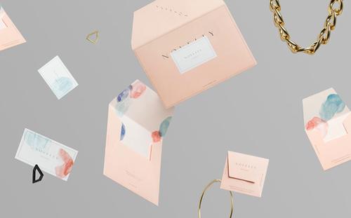
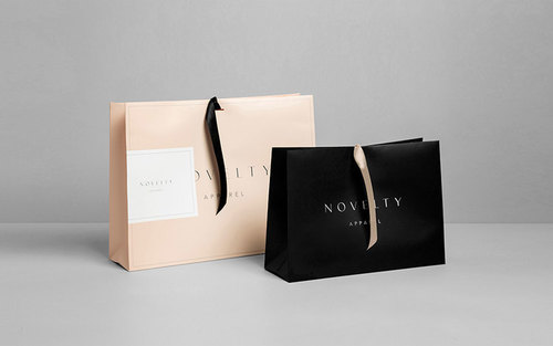
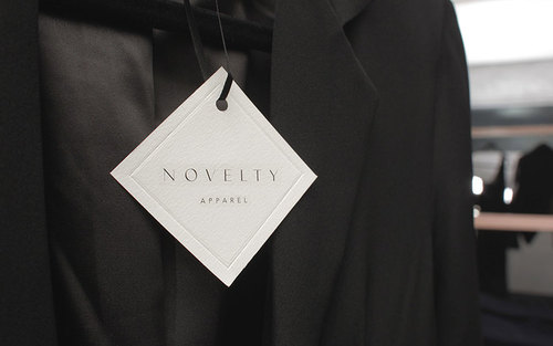
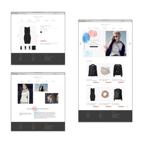
Boutique Branding & Packaging
Novelty is the high-end fashion store version of a curiosity shop based in Monterrey, Mexico. that retails high-end, yet casual apparel to chic young women with a taste for fresh, modern, high fashion. Anagrama created the luxurious yet approachable branding, interior design, and packaging. It features simple watercolor illustrations, a soft pastel palette, and textural design elements.
“The shop started up as a project by Novelty's partners once they returned from the exciting and ever-evolving New York fashion scene. The shop features handpicked items that can be considered quirky and novel trendsetters, something you couldn't find in any other shop, hence our choice for naming. Located in Calzada del Valle, a gardened boulevard inside the exclusive area of San Pedro, a suburb of the larger metropolitan city of Monterrey, Mexico.Like its attire inventory, the brand is sober and feminine but has the ability to thrive among more eccentric elements, such as the watercolor marks in the stationery or the collage-like composition of its printed ad.” - Anagrama
Designed by: Anagrama, Mexico


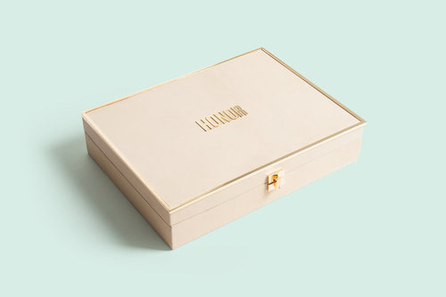
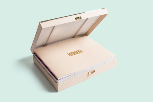
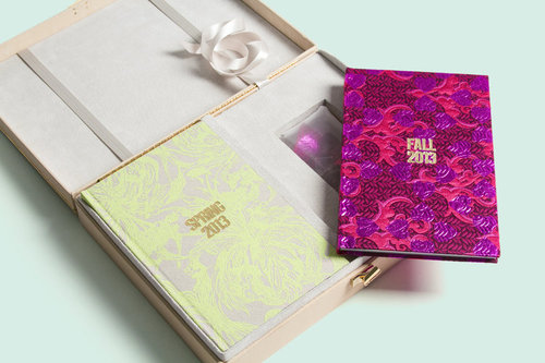
Fashion Branding & Packaging Design
New York-based RoAndCo Studio created the branding, collateral, and packaging for Honor, a high-end women’s fashion brand. The full-fledged luxury brand translates the nostalgia of an old-world atelier, into a line of clothing that’s wearable and visceral. The branding and packaging were created to be revenant to the contemporary woman. Honor expresses its’ luxury through a design that is minimal, understated, and well-crafted.
“We transformed designer and owner Giovanna Randall’s initial sketches into a full-fledged luxury brand that felt established, yet relevant for the contemporary woman.Immaculate print collateral, impactful campaigns and an elegant online and in-store retail experience have led to resounding success with clients, buyers, editors and tastemakers.” - RoAndCo
Designed by: RoAndCo Studio, New York
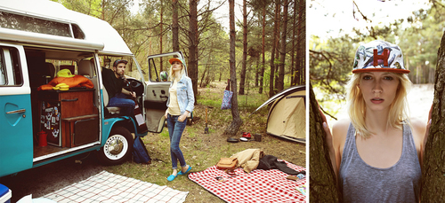
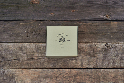
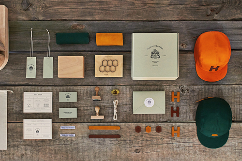
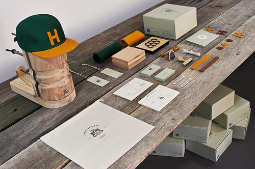
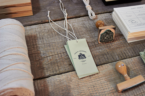
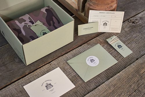
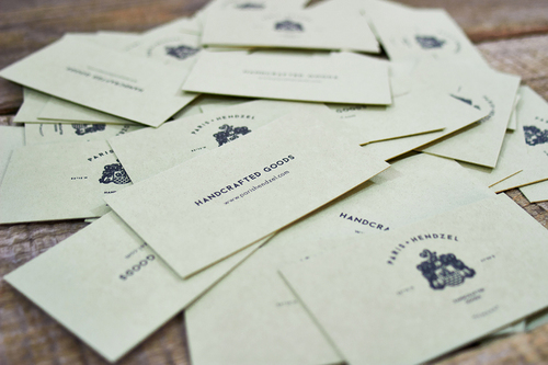
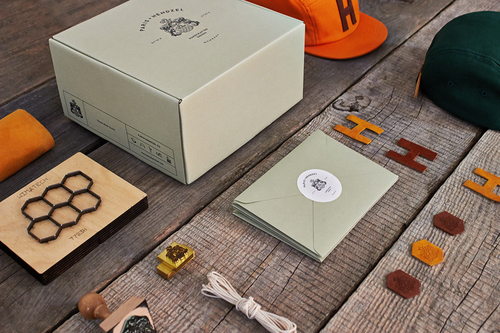
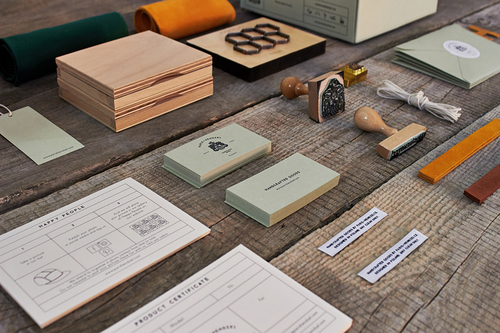
Luxury Headwear Branding & Packaging
Paris+Hendzel Handcrafted Goods was conceptualized, designed, and produced by the Poland-based branding studio of the same name, Paris+Hendzel. They create artfully designed headgear pieces that are all about family tradition, quality, craft, and detail. The name of the brand is derived from the last names of the founder’s parents. This carries through with a heavy emphasis on the coat of arms emblem, which is used to establish provenance and a sense of history. The color scheme focuses on neutral soft tones.
“The Company Paris + Hendzel Handcrafted Goods is the realization of dreams, ideas,and ideas that often scrolled in the life of its creator. It is the passion with which we give in to the design, selection of designs, and materials. The company products are created by hand from the highest quality materials and with the utmost attention to detail.
We want our products not only to be unique headgear to protect you from the sun and rain. We want them to be a particle of your "ego", to embody your desires and fantasies. To accompany you in your travels through the world of everyday experience and sensations.” - Paris+Hendzel Studio
Designed by: Paris+Hendzel Studio, Poland

Trend #3: Ultra-Pure
Ultra-Pure is a trend where brands are looking to create pure, stark, highly minimal stripped back brands, packaging systems, and brand environments. This trend is a reaction to growing consumer appreciation and desire for minimally designed brands and products. Ultra-Pure takes brand minimalism a step farther: It is the process or reducing a brand’s essence into the purest, simplest abstract form. It is the opposite of excess, it is the ultimate expression of brand purity.
The brand is typically expressed through simple abstract shapes, usually representing some aspect of the product itself. It relies on an absence of branding: there are usually no traditional logos. Rather, brands following this trend typically use simple sans-serif style typography for both the brand’s logo and the packaging typography. Ultra-Pure is a bold brand statement, usually with monochromatic or dichromatic color schemes.
Trend Characteristics:
- Monochromatic or dichromatic, generally no more than 2-3 colors
- Straight forward and stark design
- No traditional logos, generally a minimal word mark
- Abstract, geometric shapes, patterns, or graphic elements
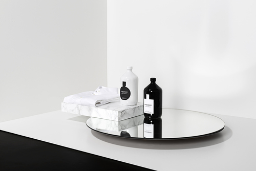
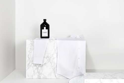
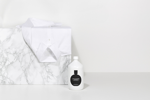
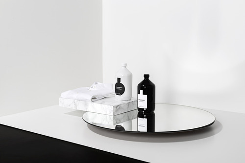
L’eandry
Luxury Laundry Detergent Brand
L'eaundry is a new brand of luxury laundry detergent by The Deli Garage. German-
based Korefe, completed the concept and design execution for L'eaundry. L'eaundry has taken an everyday product and created a new product concept and packaging design that is inspired by high-end perfume. To express this, the packaging features an ultra minimal black and white color palate with simple abstract perfume bottle shapes. The L’eaundry logo is set in contrasting sans-serif type.
"Concept and a design for a new laundry detergent by The Deli Garage: L’eaundry, a luxury laundry detergent that smells and looks like a high-class perfume. To treat your second skin like your first. Bottles in the shape of vintage chemists’ bottles establish the connection to washing agents while the typography and formal style fully invoke the world of fine scents.
Available in two scents: Figue pour femme. Olibanum pour homme”
Designed by: Korefe, Germany.
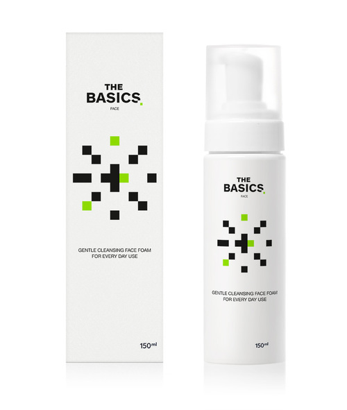
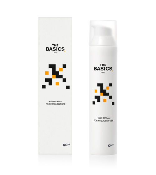
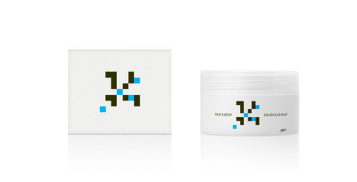
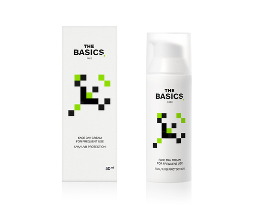
Specialized Skincare Line
The Basics is a new line of extremely specialized products within the cosmetics and skincare industry, and was created to be an exercise in consumerism. The Basics produces 4 types of products which can effectively cover all skin care needs. Mousegraphics named the line “The Basics” to express this, and designed packaging featuring minimal black on white branding. The minimal abstract organic shapes were inspired by Space Invaders.
“The idea of ‘the essential’ behind the birth of this line is quite simple and comes from a pharmacist with a relevant experience. We used the same straightforward approach for the packaging: white bottles and a design referencing the essential. Our inspiration was the design structure and related function of the highly popular video arcade game, ‘Space Invaders’ (released in 1978). Each of the 4 different bottles in our packaging carries a quasi recognizable shape modeled after an animal or other natural form. The elements forming each shape are the same, the basics, so to speak, but their different configuration creates a series of possibilities.”
Designed by: Mousegraphic, Greece
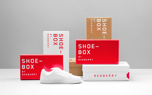
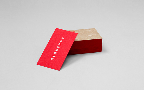
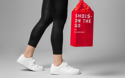
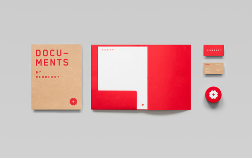
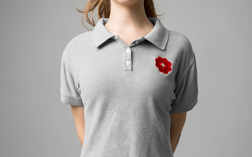
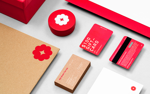
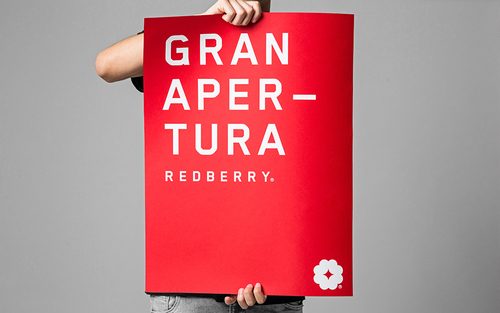
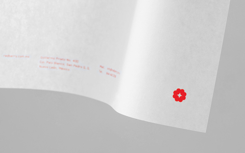
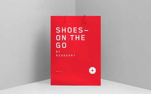
Factory Footwear Store
Redberry is a factory footwear store located in Mexico that sells branded footwear at affordable prices to the general public. The minimal branding created by Anagrama, features an abstract shape and a core brand color that is reminiscent of a raspberry. A sans-serif block style typeface acts as the brands logotype, and graphic element. The interior design, something Anagrama is known for doing when approached to brand a store, restaurant or company has taken a modern and functional approach in a very industrial setting.
“Our branding proposal takes off from the store's name, Redberry. So we designed an iconic logo based on the simplification of a raspberry's unique shape. On the other hand, the typographic style and the main single-color selection within the identity act as the contributing factor that defines the brand with an industrial / modern style. Following this concept, our interior design proposal uses industrial materials, such as metal and concrete, to immerse the consumer in a factory-like setting with a modern twist that comes from the brand's look and feel. The use of raw finishes in the interior design, such as the gridded metal shelves, increases the brands industrial feel and rounds it up perfectly.”
Designed by: Anagrama, Mexico

Trend #4: Biobased
Biobased packaging is not necessarily a new trend in package design, rather, it is a next-
generation technological evolution of sustainable packaging materials. Consumers are demanding pure, honest, and environmentally responsible products and packaging. There has been a recent surge of new Bio-Tech substrate innovations inspired by nature, with the goal of reducing our carbon footprint. Packaging designers themselves have become much more aware, and hyper-vigilant about the problem of packaging waste and its impact on our planet, and how it will affect the next generation of humanity. We are beginning to feel a real obligation to push the boundaries of packaging substrates in order to protect the future of our the planet. That's no easy task.Luckily, these new sustainable packaging innovations are on the horizon, and designers, companies, and consumers are beginning to experiment with these new innovative substrates.
Trend Characteristics:
- New innovative substrates made from natural materials
- Inspired by the biology of nature
- Edible packaging substrates
- Carbon Neutral
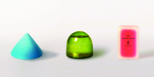
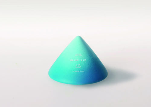
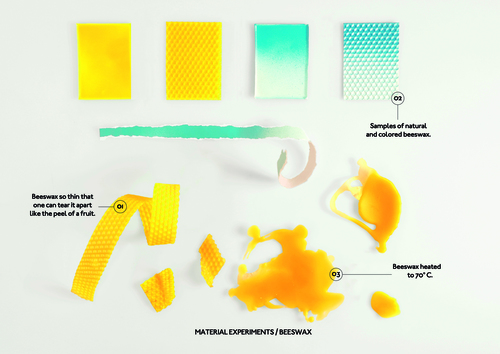
Sustainable Biobased Packaging Concepts
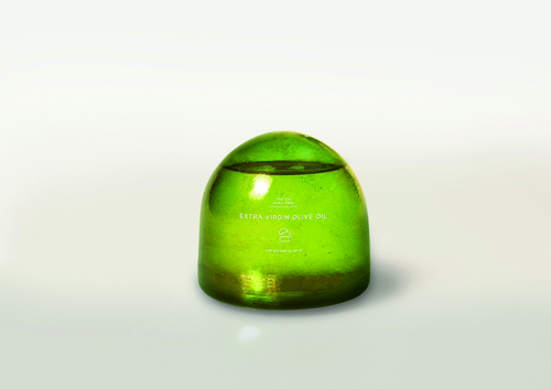
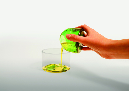
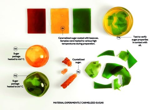
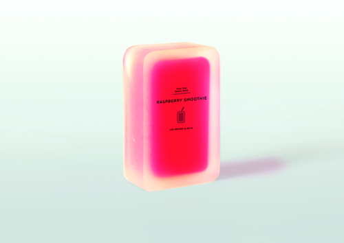
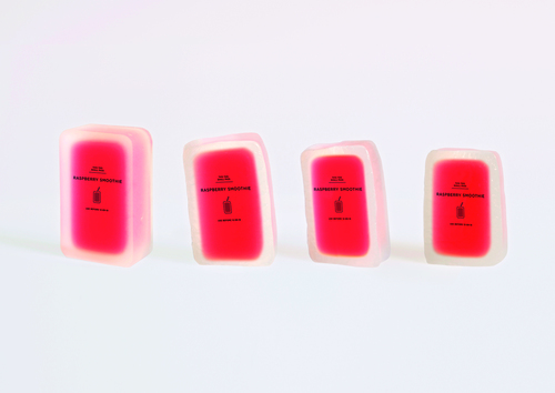
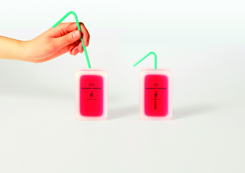
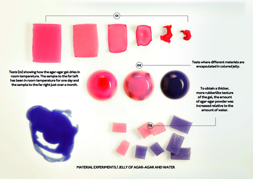
Tomorrow Machine is a Swedish design firm based in Stockholm and Paris who has a distinct work is to help shape the world of tomorrow, through innovate new sustainable packaging substrates. Tomorrow Machine has created a series three new food and beverage concepts, collectively called This Too Shall Pass. This series looks toward a future of sustainable food packaging made out of natural materials including beeswax, sugar, and seaweed. Intended for dry foods, the Basmati Rice Concept is made out of soft beeswax, is printed with soy ink, and is dusted with a pearlescent robin’s egg blue. The beeswax is so thin, that the package opens by tearing it apart like the peel of a fruit. !The Olive Oil Concept, intended for oil-based food, is made out of hardened caramelized sugar that is coated with wax. It opens by cracking it open, much like an egg. After opening, the package melts away when it comes in contact with water. !The Raspberry Smoothie Concept is intended for drinks that have a short lifespan such as fresh juice, smoothies, and cream. It is made out of agar-agar seaweed and water, which event reacts to its environment by shrinking when exposed to excessive heat and over time. The packaging opens by simply sticking a straw in it.
“Our vision as designers is to build a better world through research, new technologies & intelligent material. We believe in looking at science from a creative point of view to shape the innovations of tomorrow.”
Designed by: Tomorrow Machine, Sweden

Package-free Edible Food Pearl
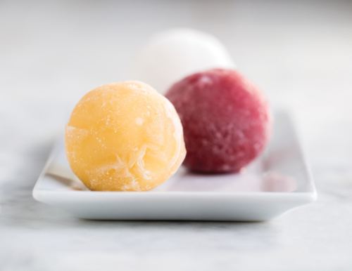
Stonyfield has set itself apart for years as a sustainable, organic, healthy food business. They've led the way in organic dairy products as well as the way their products are packaged. Stonyfield's main objective is to reduce the amount of packaging in their products. Recently they've worked with WikiFoods' WikiPearlTM yogurt technology, which uses organic fruit skins to keep moisture in and contaminants and oxygen out, forming a washable, portable covering for the portion-controlled organic yogurt serving.
“WikiPearl skins are inspired by the way nature packages fruits and vegetables. These skins are delicious protective coatings against water loss and contaminant entry, and potential carriers of effective and functional nutrition. The skin is a protective electrostatic gel formed by harnessing interactions between natural food particles, nutritive ions, and polysaccharide.” -WikiFoods
"We are completely redefining a product experience you already think you know, in a form/function that is a package-free solution. Stonyfield Frozen Yogurt Pearls are so groundbreaking, the retail spaces weren’t quite equipped to sell them completely package-free. But they absolutely can be.” - Stonyfield Farms
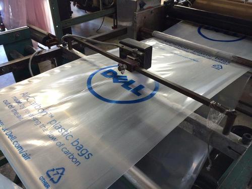
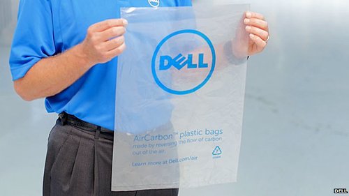
Dell AirCarbon Plastic Bags
Plastic Made from Air, Not Oil
As a part of Dell’s efforts to source 100 percent of their packaging materials from sustainable sources, they have turned to NewLight Technologies’ AirCarbon to manufacture protective bags out of plastic made not from oil, but from carbon literally pulled out of the air. It is a carbon-negative process, meaning it actually reduces carbon emissions. It is a solution that is not only environmentally beneficial, but is actually typically less expensive that oil-based plastics.
“After 10 years of research, Newlight has invented and commercialized a carbon capture technology that combines air with methane-based greenhouse gas emissions to produce a plastic material called AirCarbonTM: a carbon-negative material that can match the performance of oil-based plastics and out-compete on price.” -Newlight Technologies
“Dell is the first in the IT industry to use AirCarbon. While the initial pilot project will focus on packaging – specifically for the protective bags for Dell Latitude notebooks shipped to the U.S. and Canada – AirCarbon’s functional flexibility makes it attractive for other possible uses with Dell products.” -Dell
http://www.dell.com/learn/us/en/uscorp1/corp-comm/air-packaging
http://newlight.com
These 4 trends not only represent where the state of packaging design is heading, but they represent where the state of consumerism is at. They prove that consumers tastes and desires are not only changing, but they are rapidly evolving and becoming more expressive and passionate about the products they consume, and the packaging they come in.Visual Authenticity shows that consumers are no longer relying on or trusting established brands. They want real, honest, crafted products that offer a human connection.Luxury of Less shows that consumers are beginning to reject traditional luxury branding, now often seen as flashy and distasteful. Instead, they are choosing luxury brands that whisper rather than shout. Products that prioritize quality and experience over anything else. Ultra-Pure shows that consumers are appreciating, and actively embracing extreme simplicity in their brands, products, and lives. They no longer need the excess and are now opting for products in their purest, simplest form.
Biobased shows that consumers are not only embracing environmentally responsible packaging, but they demand it. This demand is truly fueling a new wave environmentally responsible products and packaging substrate innovations.Knowledge of these trends will help you as a designer to understand the cultural shifts that are currently underway, and how consumers are now reacting and responding to branded design and products. They show that consumer brands must work harder as consumers want all aspects of their lives to be simple, authentic, meaningful, and honest. As designers, we must ask ourselves:
What more can we do to add more simplicity, authenticity, meaning, and honesty to the brands we create?


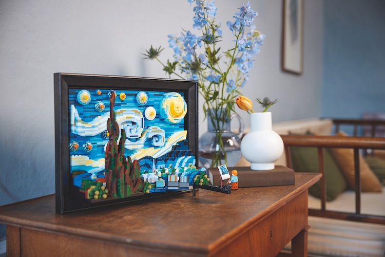
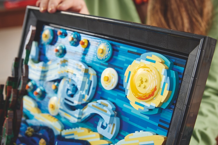
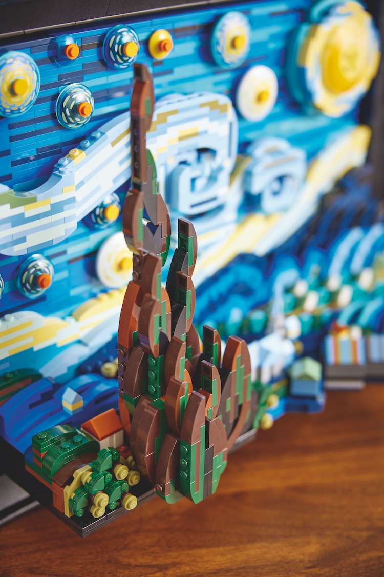
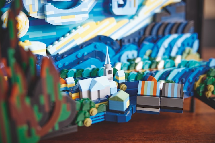
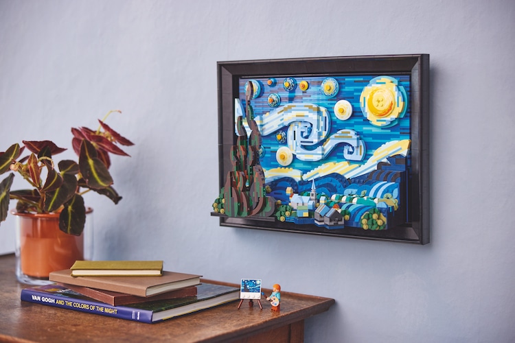
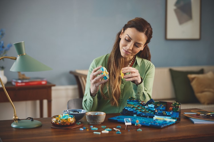
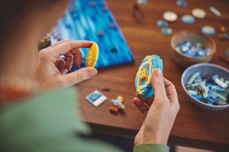
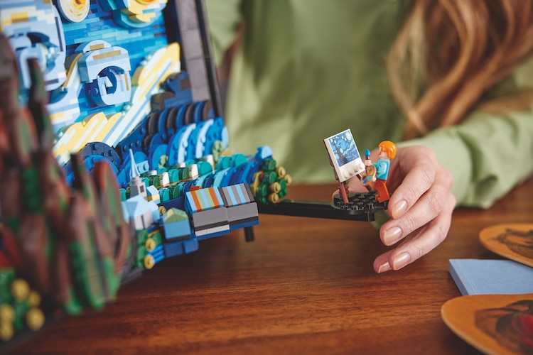
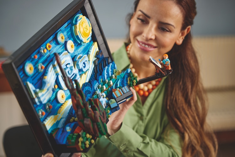
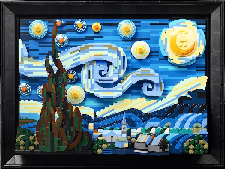
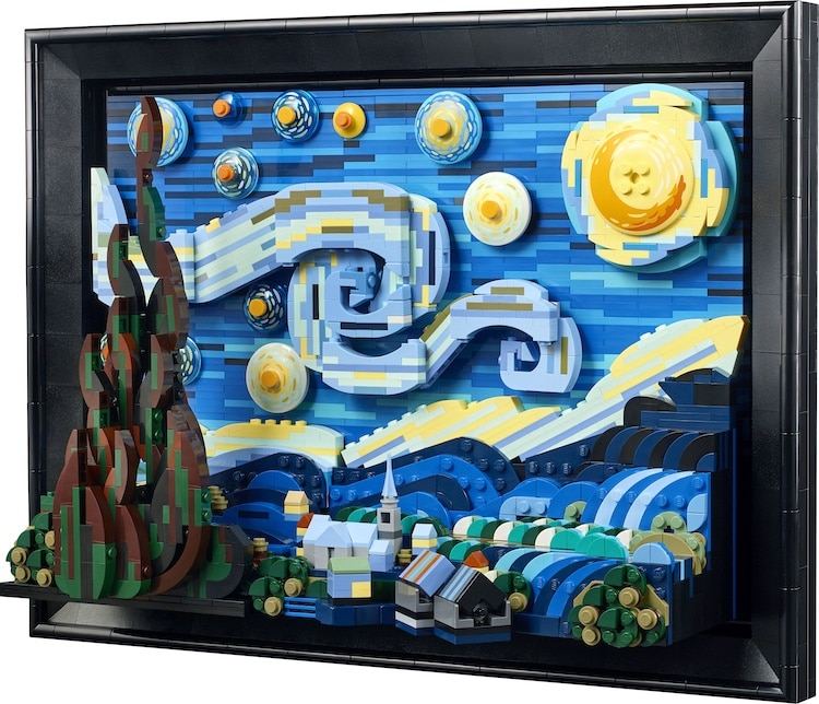

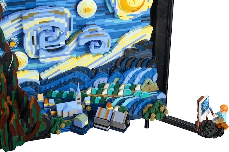
 LEGO:
LEGO: