Shared posts

25 Jun 09:46

Homebiogas: easy, clean, climate-friendly way to heat and power your home with garbage

by Cory Doctorow

https://www.youtube.com/watch?v=20LY1316IM8

Yesterday, I saw a demo of the Homebiogas bioreactor: it's essentially an artificial stomach that uses colonies of microbes to digest your home food waste (it can do poop, too, but people tend to be squeamish about this), providing enough clean-burning biogas to cook your next meal, heat your house, or run a generator -- what's left behind is excellent fertilizer. (more…)

17 Jun 21:49

Here are 15 privacy settings you should change from defaults, from Linkedin to cellphones to smart TVs

by Cory Doctorow

The Washington Post rounds up 15 privacy defaults that no one in their right mind would want to leave as-is, and provides direct links to change 'em (hilariously and predictably, Verizon/Oath/Yahoo's privacy settings dashboard times out when you try to load it) -- once you're done with that, go back and follow his links to unfuck the privacy defaults for Google, Apple, Amazon, Microsoft and #DeleteFacebook. (via Reddit)

12 Jun 01:15

Tony

by David Simon
I was still on the sofa at four in the afternoon, still half-dressed, when I decided that my life could not be complete if I did not somehow become friends with Anthony Bourdain. My son, then a young teenager, also in his underwear, was as inert and transfixed as I was. We were both locked […]
17 May 13:52

Cornhole score leads to cornpone scrap

by Rob Beschizza

https://youtu.be/24Tifo-hJac A game of cornhole at the Douglas County Fair in Georgia led to a dispute between players, reports WSB-TV in Atlanta--a dispute that escalated into a fists-flying brawl at the Foxhall Resort.
Alex Cannon was standing so close, he nearly had to duck while filming the chaos. Cannon told Channel 2 Action News he is always up for a game of cornhole. He just never knew it could be a 'contact sport.' After the dispute over the score, Cannon said someone threw a beer then someone else threw a punch. He told us the lesson he learned is: "Alcohol and beanbags do not mix."

The police were not called and no-one arrested, according to reports. [via @popehat]

03 May 19:07

Arrested Development: Star Wars with Ron Howard

by Mark Frauenfelder

My family came late to the Arrested Development series, and so we've been binge watching it on Netflix. The series is narrated by Ron Howard, and also narrates this very good Arrested Development: Star Wars sketch from The Star Wars Show. Spoilers, of course.

20 Apr 12:46

Customizable cat-purr emulator

by Clive Thompson

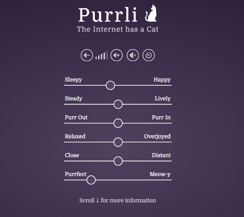
Stéphane Pigeon has created Purrli, a web site that generates audio of a cat purring.

It's customizable; I found setting it for "sleepy" and "relaxed" produced my particular fave timbre of cat-purr.

As Pigeon notes:

The sound of a purring cat is one of the most comforting sounds available and can help soothe and calm you down when you're feeling stressed. Naturally, it's not just the sound that is important, but it's also the presence of the warm cuddly cat. Purrli tries to recreate both the sound and the presence of your very own virtual cat through a custom sound engine modelled after real purrs.

With a purr that delicately changes over time, Purrli aims at making the experience as real and lively as possible. Just like a real cat, Purrli will call for your attention. Just be careful when adjusting the last slider, if you don't want to be nagged in the middle of your work.

Scroll down the page and read the testimonials -- it's quite interesting to see the varied reasons people enjoy hearing a virtual cat purr, including:

My cat that grew up with me during childhood died two or three years ago, and whenever I was upset, she would come and lay next to me and purr to calm me down. She would nap with me, and her purring would help put me to sleep. I really miss that. This cat purr generator sounds just like her, and it really helps with my anxiety, especially during large projects.

I have fibromyalgia, so I am constantly in pain. This cat purr generator relaxes me and puts me to sleep. When I wake up during the night with pain, it helps me to fall back to sleep. I wish I had this years ago.

I have misophonia and work in an office. The purr generator has been a life saver. Now I can drown out the things like coughs, sniffles, throat clears, etc., that used to drive me nuts! It's comforting and helps me to focus.

19 Apr 13:02

Fragments of the Great Inflorescence

by noreply@blogger.com (Patrick Stuart)
Evlyn has sent out a bunch of these game-fragment objects


What are we to make of this? There are three elements.

- The Guilds themselves.
- The Hexes.
- The standees.

It seems like some kind of elaborate D&D art challenge, or some popular tween collectable from an alternative hipsterverse.

If other bloggers received these, and if they want to, we could try a "Yes and" improve game/setting development thing.

The guilds themselves are probably the easiest.


We have these guilds with charming arabesque (I think that's the word?) 19 adventurers with these tiny but expressive body-portraits, with room for wee stats and wee notes.


How would these be used? DM pass-outs? Would each player have a guild of their own?


The Hexes. These are strange dual-coloured, sub-divided bio-landscapes.


How would you actually use these? With the standees?


The standees - charming, animated bio-creatures ranging from pseudo-humanoid to fully non-human, bacterial, protozoic, to splotches and piles of strange infection.

These are by Evlyn so they feel non-threatening, not quite whimsical either - calmly Other. You feel you are going to have a weird conversation with them.

......................................


So, an imagined world  of these somewhat bande dessinee adventurers going into the Great Inflorescence, meeting these freaky dudes, maybe having a fight, maybe getting/being infected by and strange fungal thing.

As I turn them over in my head and hands the elements almost feel like parts of a strategy game or a short, fast diplomacy/combat game where the guilds are in conflict, or like a kids trading-card game where you both bring 3 hexes and a guild while you eat. And you get to keep the artefacts and maybe even the pop-people dudes.

What do you think? What would you make of this?
11 Apr 16:35

Mumm-Ra joins Wu Tang Clan

by Rob Beschizza

Good to see Mumm-Ra still getting work from the Ancient Spirits of Evil, though I'd have preferred it if Gordon Ramsay were on the altar being seranaded with Shimmy Shimmy Ya. I know that it's a tough mashup, but Earl Hammond's voice is so amazing as to be incapable of failure, and Swedemason is a master of the medium. Here's Trump joining Talking Heads:

https://www.youtube.com/watch?v=nSuregWhlWk

27 Mar 18:40

Fight back against Facebook overcollection with EFF's free Privacy Badger plugin

by Cory Doctorow

Privacy Badger is EFF's free privacy plugin; it blocks trackers and ads from companies that practice "non-consensual tracking," in which your browser's "do not track" instructions are not honored. (more…)

20 Mar 14:26

How to permanently delete your Facebook account

by Mark Frauenfelder

By now, every sane person realizes that Facebook is horrible. It uses your personal data in unsavory ways. It sells your data to unscrupulous companies. It encourages businesses to build their online headquarters on Facebook and then ruins those companies by changing its algorithm. And, maybe worst of all, it has one of the ugliest and most confusing interfaces ever made. I deactivated my account a long time ago, but this week's news about Facebook's relationship with the ultra sleazy data mining firm Cambridge Analytica prompted me to permanently delete my account. Wired has an article that shows you how to do it:

Now, to permanently delete your account, you'll need to learn where the delete option resides. The easiest way to find it is by clicking the "Quick Help" icon in the top-right corner, then the "Search" icon. When you see the search field, type “delete account.” You'll see a list of search results. Click on "How do I permanently delete my account?" and Facebook will give you the obscure instructions to “log into your account and let us know.” In this case, “let us know” is code for “delete my account,” so click on that link. From here, the final steps are clear: Enter your password and solve the security captcha, and your request to permanently delete your account is underway.
15 Mar 20:47

How to use an eierschalensollbruchstellenverursacher

by Carla Sinclair

For those who want to know how to use their eierschalensollbruchstellenverursacher properly, here is a tutorial that explains it in simple steps.

And for the rest of you who just want to know what the heck an eierschalensollbruchstellenverursacher is, it literally means "eggshell predetermined breaking point causer." According to Wiktionary, it's "a device used to create breaking points in egg shells in order to allow one to easily remove the top part of an egg using a knife without causing the shell to splinter; used for the humorous effect of its overly-formal construction."

And yes, they do sell them on Amazon.

08 Mar 14:16

A 1788 dictionary of vulgar slang

by Clive Thompson

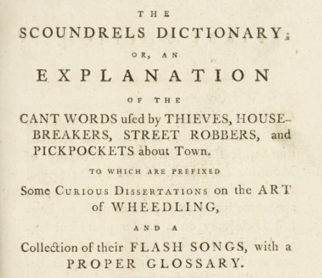
I am having too much fun reading A Classical Dictionary of the Vulgar Tongue, published in 1788 to provide definitions of the sort of vile, unmannerly slang employed by 18th-century streetfolk.

It was created by William Grose, and as The Public Domain Review notes, Grose's goal was to craft a dictionary of all the naughty words that Samuel Johnson deemed too grody for his famous dictionary a few decades earlier. As they continue ...

While a good deal of the slang has survived into the present day — to screw is to copulate; to kick the bucket is to die — much would likely have been lost had Grose not recorded it. Some of the more obscure metaphors include a butcher’s dog, meaning someone who “lies by the beef without touching it; a simile often applicable to married men”; to box the Jesuit, meaning “to masturbate; a crime, it is said, much practised by the reverend fathers of that society”; and to polish meaning to be in jail, in the sense of “polishing the king’s iron with one’s eyebrows, by looking through the iron grated windows”. Given this was the era of William Hogarth’s famous painting Gin Lane (1751), it’s not surprising to find the dictionary soaked through with colourful epithets for the juniper-based liquor: blue ruin, cobblers punch, frog’s wine, heart’s ease, moonshine, strip me naked. The Grose dictionary also contains hundreds of great insults, like bottle-headed, meaning void of wit, something you can’t say about its author.

The whole dictionary has been beautifully scanned here by the Internet Archive.

06 Mar 13:54

Could you pass the chicken test?

by Rob Beschizza

To ensure that its graduates can discharge their duties with the absolute minimum of human warmth, Indiana University Police Academy challenges recruits not to laugh when a squeaky rubber chicken is slowly introduced to their field of vision and then squeezed.

I definitely prefer to be policed by the failures!

02 Mar 13:47

Visual and Information Design In RPGs

by noreply@blogger.com (Zak Sabbath)
So a few days ago I went over to the USC games department (yes, it looks like you imagine: arcade machines in the hallway and always someone hopping to class on a pogo-stick in the background) and gave a lecture to their tabletop RPG design class (yes, USC has a tabletop class) on visuals in RPGs.

It was fun and signs point to "they liked it". For the benefit of y'all here are the basic talking points--longtime readers will recognize some familiar takes.
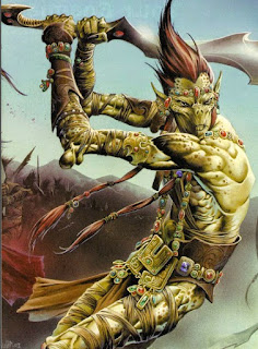
Anybody recognize this guy? That's right, the Githyanki!
Why?  He's still around and popular...

Here he is, still in modern D&D. Why? Because he looked cool on the cover of the
book. That's the only reason! How do we know?...

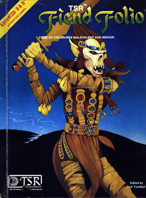
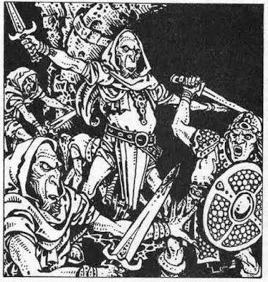
...because here's his almost-identical brother from the Fiend Folio,
the Githzerai. Muchhhh less sticking power. (though still around--WOTC
doesn't toss away IP) And what's the difference?
Only the picture.

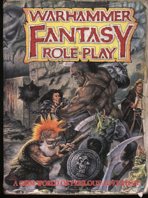
Warhammer was kinda different than D&D--but then so was Runequest,
Tunnels & Trolls, MERP & a billion other fantasy games.
What really set Warhmmer apart? The beautiful art--with very
specific designs like that mohawk dwarf, who appeared only
a few years ago in the Hobbit movie

Eberron's art had a task to do: make robots ("steel golems") and steampunk
stuff look like D&D. And they did it: these folks look like they could
be next to a knight or a wizard. Mission accomplished.

Here's a space guy from Traveller. Traveller was a great system and
got to the "epic space RPG" space first (Metamorphosis Alpha was the first
sci fi game but less epic). It should've been the game for people who liked Star Wars.
BUT...the art was so generic. It didn't catch peoples' imaginations.

This guy on the other hand...everyone knows the RIFTS system sucked,
but the designs were original, and Siembieda and Long's artwork made
sure they felt concrete and toyetic--even if you don't like the art,
it's easy to reognize this guy, the psi-stalker, the skull-walker as things
specific pieces of IP that other post-apoc and genre-mash games don't have.
So the game is still around.

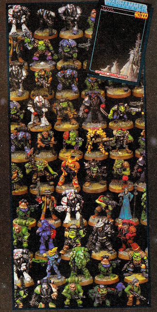
An old Games Workshop ad from Dragon Magazine. I am not joking
when I say these were often the best things in any given Dragon issue.
The designs and The Design were head and shoulder(pad)s more thought
out than the stuff around them. The space marines are very distinctive,
designed with the tabletop in mind, and the overall look of the ad
combines branding and world-building into one activity.
These sci-fantasy postpsychedelic color schemes really helped
set them apart before the grimdark took over entirely.

A Warhammer 40k design. Jess Goodwin's task: make people
want to play a dancing elven space clown. And, goddammit,
he succeeded. 40k not only had nice art, it had those
specific pieces of design: the chainsword. The jump-pack.
The harlequin. The space marine. These are non-transferrable
pieces of The Look.

Like RIFTS, your instructors here at USC will be ragging on the
game design of Vampire: The Masquerade all semester.
But Tim Bradstreet's art built and then sold this game so well--especially
to women--that people just figured out how to play
without the rules.
Teacher in front row: "That image is burned into my brain"
"Yep, and it's burned into the brain of every indie game designer,
that's why the art on Monsterhearts and Apoc World looks just like
this but worse"

Now we're moving on to the bad examples:
So this is the first D&D book--it's basically a zine.
On the left we have class descriptions, then... a page about
item costs? Characer gen doesn't pick up again til the next page.
But what do you want? It's a cave painting. 

Fast forward 40 years, they have a graphic design budget..it still sucks.
On the left it takes FOUR PARAGRAPHS to say what a "fighter" is...

And say you wanted to make a fighter...you die midgame, try
to make a new PC. Half the things you get are here and...

...you gotta turn the page to get the rest. Interpol agents can tell you
horror stories of finding the mangled
fingers of graphic designers who tried stuff like this
at LotFP found littering the Finnish countryside.

Kinda useful tables here in the 5e D&D Dungeon Master's Guid...

...and since these tables aren't grouped together or color-coded I had to draw an arrow to each one
along the (disintegrating) page-edges

The standard TSR dungeon map is actually a nice piece of design,
there's a set of standard symbols (trap, secret door, rubble, pit, etc) that
you can draw and so sit at your desk all day in math class just
making up dungeons.
The only problem is...

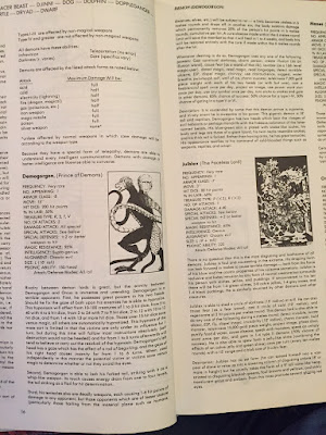
...when they key the dungeon and they refer to these massive
useless larded paragraphs. If the players are listening at the door to
room 13 are you gonna want to scan all that before you tell them
what they hear?
DM's books are like cook books: they are used at speed and under pressure and
require special unique design consideration.

Fast forward 40 years and surely module design has
imp...nope.

They even put a page turn right in the middle of a scene.
As for how these things link together? A visual map
is totally eschewed in favor of more paid-by-the-word lard.

Now some good examples of info design:
the Call of Cthulhu character gen pages.
You can run your whole group through character creation using this spread.

Where info design and game design merge: to determine where your
grenade lands, drop a die onto the picture of the tank.
Yes, I stole this concept for Vornheim--and btw it works because
you aren't doing it on every single die roll. If you were
you'd get real sick of it.

Jez Gordon's Qelong map--instead of little color codes
saying what the terrain is, the map looks like what terrain
is there
.  You can sit in one hex and the GM can tell you what you see over
the horizon in adjacent hexes. Yay!

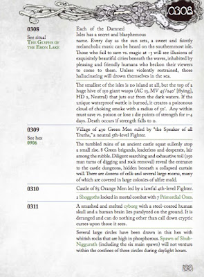
Carcosa hex descriptions: something in each hex! 2 things!
Separated by a divider. Easy to read. Short sentences.
To the point. Many entries are boring--it doesn't matter,
because you are giving people a landscape to have adventures
over, not trying to describe it all in useless detail.

This is just me proving that you could fit all of the Keep on the Borderlands
on three spreads: one for the Caves, one for the wilderness, one for the Keep,
and maybe like one spread w. the treasure on it. You just saved like dozens
of pieces of paper.

Dr Doom's castle--an excellent FASERIP map. On the right all the info on
all the rooms is listed. I've used this as SO MANY different castles.

The Monster Manual format is actually a good pice of
design--it acts as its own index and its easy to find things. Its not perfect in its original
form, but it was a good precedent.

the blue and the red are notes I added to the standard Night's
Black Agents character sheet--literally all of the character creation
rules for the game can fit on the sheet.

Kirin Robinson's wonderful Old School Hack is an example of
simple graphic design tools (standard fonts, too) used to
make rules clear, accessible, readable and concise

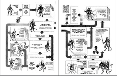
Many lifepath character gen systems have a "from here you can go here
or here" format. Rogue Trader realized you could visually map it--from each
node you can go down to the next register to any adjacent node. It helps
the group identify commonalities--like we can see a lot of the PCs have
"fortune or exhilaration" in common--so the GM could build
and adventure around that.

All over the world, people know how to paint their Chaos warriors all chaosy. How?

...the grimoire-like and aggressive and aggressively-specific aesthetic of
the original Realms of Chaos books, that's how

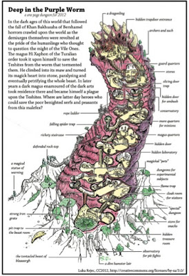
Luka Rejec's excellent one-page-worm-dungeon.
Its missing some detail but how many pages would it take
TSR or WOTC to do just this?

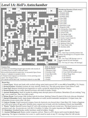
The Original One Page Dungeon: Michale Curtis' Stonehell.
Efficiency is beautiful. Efficiency is art.

Making a chaos champion looks fun, amirite?


So to walk y'all through the process, I am gonna show you some of my own stuff.
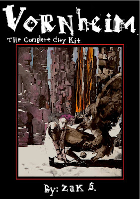
Do you all have Vornheim? "Yes, they all have Vornheim, it's on the syllabus"
Excellent.
These are projects that win design prizes and all it costs is the
graphic designer's first-born child.

One-spread dungeon. With pictures--maybe you can't read my pictures til you
understand the description? It's ok, it's right there. Then you look back and
go "Ohhh, it's a piano"

Simple graphic solution to keep track of NPCs

Most fantasy cities are based on a New York model--a grid of knowable
streets in a discrete area. I based Vornheim off LA and San Francisco--
and on the way they were described in noir stories--sprawling,
borderless, shapeless, linked by common roads, not comprehensible geography.
This lead to the realization that unless there's a zombie
apocalypse in your game, the geography can be mapped while
still being abstracted.

I actually invented the adventure as I drew.
If you're not an artist or graphic designer, having them on from
the jump helps.

Name of the room on the room--and descriptive. Not rocket science but mainstream
games still haven't figured it out.


The famous Vornheim die-drop covers

I made this map so that if you invented a location you could write it
in and there'd be enough info to place it and describe what was nearby. The drawing
style reflects only the info you'd need to nail down a building as specific ("conical
roof, grey stone, bridge, near the wall" etc)

Split-column tables: roll once and read straight across or, for variety-
 roll once for each column.
I think I invented that.
All these projects require telling your graphic designer to ignore rules
about things like white space and switching fonts that are bedrock
rules of their training. This is a different thing.

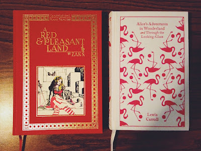
Red & Pleasant Land was a different challenge than Vornheim.
Vornheim was about maximizing the info in 64
black-and-white-pages. RPL also needed to feel like a convincingly
luxurious object from inside the gamewold.

The gameworld itself was built on gamelike principles
because Lewis Carrol's fiction was gamelike to
begin with.

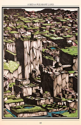
Nearly all the RPL pictures were done on one big piece of board

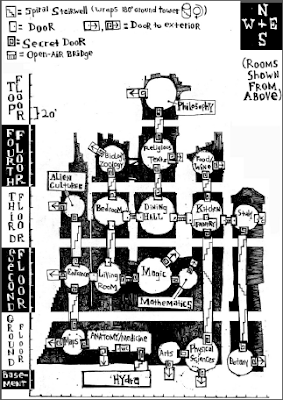
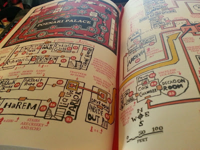
Name of the room on the room, also invented some symbols
that show map structure, like the one in the Liquid Parlor showing a door
in the floor and the one in the dry room showing a door in the ceiling.

Reprint the relevant section of map on every page. When there's a diagram,
make a full illustration out of it to kill 2 birds with one stone.

Showing what adventurers in the land could look like: half Alice Pleasance Liddel,
half D&D murderhobo. This is a really important part of RPL so it felt
like an organic while and didn't just
feel like: "Ok, now your knight is sitting on a mushroom" like the April Fool's issue of
an old issue of Dragon.

Simple map, with random encounter solution (different dice) on the right

Monster Manual format, basically. We all use this bc it works.

Again showing what adventurers here look like--in this
case I wanted Connie to show a black girl
fitting easily into the setting's western/middle european vibe

Jez Gordon's lovely spread-map. I ran adventures off this one spread for
4 sessions.

The challenge in Maze was: I wrote short stuff for Maze, but Patrick's prose
was long and I didn't want to edit it much

The original painting

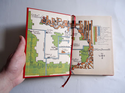
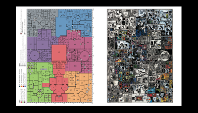
Left: the color coded version of the map--to make finding the page numbers easy.
Right: the original map, which the illustrations make easy to figure out where you are.
You go: Oh here's the tongue guy--then quickly find your page.
Hopefully offering more context than a standard megadungeon.

Every picture in Maze is just a blow up from that one painting.
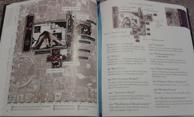
The entries have short summaries ont he first spread....

Then longer ones with any extended prose on the next

Search the body table where its easy to find.

Colorcoded.

Lovely lovely look at me

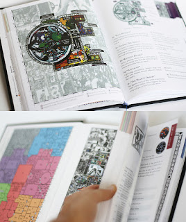
We used the left over space to repeat useful info to minimize page turns:
Search the body table, random encounters for that area, minimap, etc.
Nobody complained it was redundant bc it helps.

for Frostbitten & Mutilated (now at the press) we wanted a real doom/black metal look.
Luka Rejec did the graphic design for us.

Same info design imperatives as before but different aesthetics

Again, almost all the art fit on one page

A WILDERNESS MAP WHERE ALL THE AREA DESCRIPTIONS ARE
ON THE MAP! So excited.


etc

etc

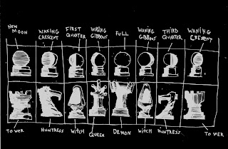
Info design combines with world design and game design--the
Amazon chess game is also a divination game

Whole dungeon fits on the spread, as 

etc

Painters take note I just put a bunch of wet thin white paint over a black background
and let it dry and it krink;ed up into a landscape


Visual random table. Kelvin Green did it first.

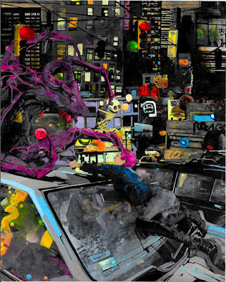
Demon City.
I basically said What's the specific thing I imagine happening
in Demon City? That image--the one that makes you think
the game is a Thing. Paint that specifically. 
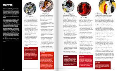
General description of each Motive (class) at the top of each column,
character gen rules underneath, during-game panic rules at the bottom.
Shawn Cheng's design can take advantage of the fact that, since
its a modern setting, the game can use some modern "designy"
looks.


I printed out the logo on paper, dipped the paper in
water, photographed the water dripping and wrinkling
the paper and then tinted it pink.
Since modern cities are somewhat defined by the logos
and designs all over them, the design IS basically
an illustration of the city.

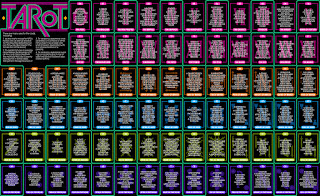
The tarot page doesn't need to be consulted fast--it's sexy
and that's what's important.

Although all the art is by me, I want to give a range of
kinds of imagery because Demon City can do the
Kubrick Shining horror or Anime guro or whatever


I keep telling Shawn to give my art these vintage-looking designy
treatments...

I eventually just realized: hey why not paint these patterns right
into the pictures and give him a break?

"Are there any naked men in demon city?"
"Not in the art--also no birkenstocks. brown clothes
or trees that aren't dead or palm trees. Demon City
represents one artist's sensibility: what's there
is what I want to look at. You wouldn't say:
'Hey Prince, write some songs
about hot dudes'--but it is fair to ask about representation.
Right now this book is a limited edition, maybe 1500 copies? But if it becomes
a smash hit and becomes an industry-dominating force and
many peoples' intro to the hobby then I'd feel an
obligation to hire some artists with a less cishet
take. I can't pretend to want to look at dudes but I can
hire people who do. Fair?"

22 Jan 20:11

Surprising result of calculating speeds of two cars hitting a tree

by Mark Frauenfelder

Here's the set up: two cars are side by side on the road. One car is going 70mph and the other is going 100mph. The drivers of the cars see a fallen tree in the road and start braking at the same time. The car that had been going 70mph stops right before touching the tree. How fast is the other car going when it hits the tree? The answer surprised me.

08 Jan 13:57

The US health-care system looks awfully like post-apocalyptic chaos

by Clive Thompson

David Chapman writes about how he's spent the last year "navigating the medical maze on behalf of my mother, who has dementia." His key observation? The American health-care system isn't a system at all.

Or to put it another way, US health-care no longer demonstrates systematicity. If want to send a package with Fedex, they have an excellent system in place that ferries your parcel from point A to point B. They know what's going on inside their complex system of many moving parts. Fedex also has a simple user interface, which is another crucial property of good systems: To use Fedex, you don't need to call your friend with clout who can "get you in". You just call Fedex.

The health-care system displays none of these properties. It may possess formidable amounts of medical tech, but there's almost no formal information flow, so access to anything requires a doctor wielding mafia-like connections. As Chapman notes ...

It’s like one those post-apocalyptic science fiction novels whose characters hunt wild boars with spears in the ruins of a modern city. Surrounded by machines no one understands any longer, they have reverted to primitive technology. Except it’s in reverse. Hospitals can still operate modern material technologies (like an MRI) just fine. It’s social technologies that have broken down and reverted to a medieval level. Systematic social relationships involve formally-defined roles and responsibilities. That is, “professionalism.” But across medical organizations, there are none. Who do you call at Anthem to find out if they’ll cover an out-of-state SNF stay? No one knows. What do you do when systematicity breaks down? You revert to what I’ve described as the “communal mode” or “choiceless mode.” That is, “pre-modern,” or “traditional” ways of being. Working in a medical office is like living in a pre-modern town. It’s all about knowing someone who knows someone who knows someone who can get something done. Several times, I’ve taken my mother to a doctor who said something like: “She needs lymphedema treatment, and the only lymphedema clinic around here is booked months in advance, but I know someone there, and I think I can get her in next week.” Or, “The pathology report on this biopsy is only one sentence, and it’s unsigned. The hospital that faxed it to me doesn’t know who did it. I need details, so I called all the pathologists I know, and none of them admit to writing it, so we are going to need to do a new biopsy.”
(Illustration via the CC-licensed stream of Hucky)
07 Jan 13:22

Watch how to train cats to shake hands

by Andrea James

Jun from Jun's Kitchen has very well-behaved cats, even the new one they rescued. Here, he takes a break from cooking to show how they got so well-trained. (more…)

31 Dec 14:37

Forward your spam to sp@mnesty.com and a bot will waste the spammer's time

by Rob Beschizza

Spamnesty is a simple service: forward your spam to it and it will engage the spammer in pointless chatbot email chains, wasting their time.
If you get a spam email, simply forward it to sp@mnesty.com, and Spamnesty will strip your email address, pretend it's a real person and reply to the email. Just remember to strip out any personal information from the body of the email, as it will be used so the reply looks more legitimate. That way, the spammer will start talking to a bot, and hopefully waste some time there instead of spending it on a real victim. Meanwhile, Spamnesty will send you an email with a link to the conversation, so you can watch it unfold live!

The conversations are indeed posted live, and some are quite funny. It's fascinating how obvious it is when a spammer switches from their own bot to giving a human response, and satisfying to see them fooled.

Have you met Lenny?

29 Dec 16:33

You can help the web be better in 2018: just ditch Facebook and use your browser instead

by Cory Doctorow

Foster Kamer has advice for people who want a better web in 2018: ditch Facebook and find cool stuff by checking bookmarks, visiting your favorite sites by typing their URLs in your browser bar, or searching for them on your favorite search-engine. (more…)

20 Dec 13:44

The Toy Museum

by noreply@blogger.com (Zak Sabbath)

Really,  you wonder, how haunted can a doll be?

Very haunted, it turns out.


This is not a bunch of random internet photos--these are all from the same place, the Pollock Toy Museum in London, where I just was at.

In the guidebook inexplicably has a "recommended for children" beanie next to it but that is wrong and insane and, bonus, it is always deserted.

You give the Hermione at the counter your 12 pounds and then go in through a musty red door like it was an episode of Outer Limits.

"Oh would you like to see the toy museum????"

That's normal and not at all something from an anime where a little girls gets folded up like an origami and mailed to hell

The idea of these is really apparently that you drop the doll in the river and it washes away bad luck 
These aren't aliens.

Top Middle is totally not made of pig grease and betrayal
That is what a reasonable person does.
Not at all the queen of any damned
This bell jar was not created in 1903 by theosophists and does not have ectoplasmic containment properties
Mr Stripes is a delightful cycling cat and not going anywhere bad on his Omen/Saw trike

This is totally not the corner where bad children go


Why does this museum exist?
Left horse is totally not Linda Blair
The plasmic ghoul from the Medusa House in Vornheim is not sitting at that back table
Ha, he has fallen, it is comical
Mother what is in the chest mother?
YET NO OTHER MUSEUM WANTED ERIC DID YOU EVER THINK ABOUT WHY?
Totally not a cannibal child

Ah, a charming souvenir

Oh hey the devil
Fuck.

20 Dec 13:38

Recomendo 2017

by claudia

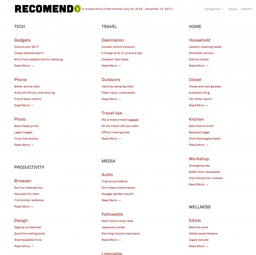
There is so much more cool stuff in the world besides tools. Every week Mark, Claudia and I encounter great podcasts, bingeable video series, amazing people to follow, memorable destinations, perfect tips, and many other types of things besides tools we’d like to recommend. Thus was born Recomendo a year and half ago. Conceived as a weekly email, Recomendo now has about 15,000 subscribers. (Sign up here, free.)

We thought that after 73 weeks of 6 recommendations per week, we’d make Recomendo even better by compiling a categorized version on the web. So Claudia rounded up the past issues and sorted all the recommendations by subject. The Recomendo website now offers all the travel tips, or cleaning techniques, or browser hacks in one place. Check it out, it’s pretty neat. The links have been rechecked and updated. This compendium can serve as an alternative way to refresh what we’ve raved about recently, or it is also a perfect way to inform a friend about our collective recommendations. Over 450 great tips and recommendations of cool stuff. To share on social media use this shortened link: http://goo.gl/7Zpa6b

Let us know what you think.

-- KK

19 Dec 18:23

This political sorting hat will assign you a nice flag

by Rob Beschizza

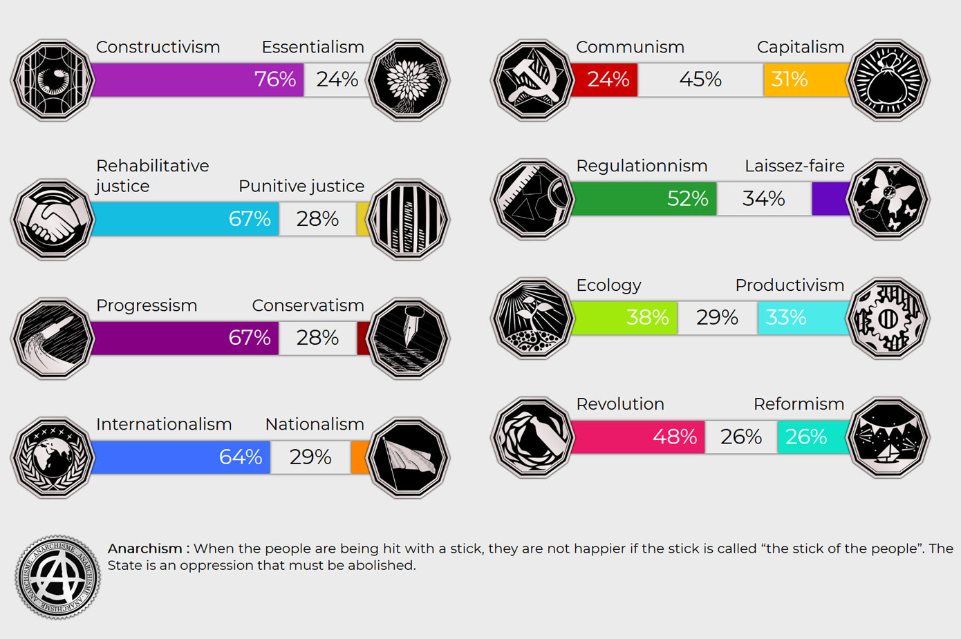
According to Politiscales, a political Myers-Briggs type questionnaire and sorting hat, I'm some kind of happy hippy anarchist with no time for terfs. I often found the questions vague or open to interpretation, so would moderate answers that might be more assertively stated down the pub. It coughed up this nice purple flag, too. I've never seen it before and Google Images doesn't know what it represents, but it's rather suggestive of the sexier regions of the left.
12 Dec 19:40

Collage.com lets you print virtually anything on anything

by Boing Boing's Shop

If you want to give your family and friends a truly personalized gift for the holidays, we’re offering $100 of credit on Collage.com for $24.99 in the Boing Boing Store. And if you order before the 15th, you can make sure your custom-printed objects arrive in time for Christmas.

With Collage.com, you can bring your photographic memories into the real world in the form of blankets, mugs, printed canvas, and even iPhone cases. In addition to applying your own images to any of their 50 items, you can add text to anything you order to give your gifts an extra-unique touch. Although you have to take advantage of this deal within 180 days to use the full $100 credit, your original $25 purchase doesn’t have an expiration date — you can still use it next year if you get behind on your holiday plans.

Get $100 worth of credit from Collage.com for $24.99 when you order from the Boing Boing Store.

12 Dec 13:37

Stranger Things: A Bad Lip Reading

by David Pescovitz

"Maybe she's a simpleton."

11 Dec 16:37

Bigots who swore their religious beliefs would force them to divorce if Australia passed marriage equality renege on promise

by Cory Doctorow

In 2015, Nick and Sarah Jensen publicly swore that their religious beliefs would force them to divorce in protest if Australia enacted marriage equality laws that allowed for same-sex marriage. This week, Australia passed such legislation, but the Jensens were evidently lying, and now Nick Jensen told the press (by text-message!) that they meant their "public comments regarding civil divorce never envisaged me separating from my wife, but rather our marriage from the state." (more…)

11 Dec 16:35

Square dancing was a racist hoax funded by Henry Ford to get white people to stop dancing to black music

by Cory Doctorow

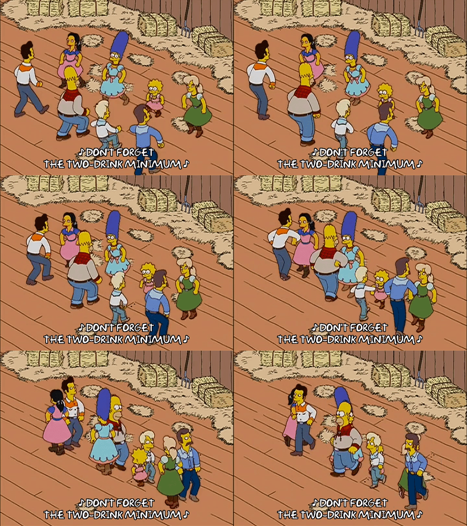
Wonkette writer Robyn Pennacchia went on a brilliant Twitter rant about the strange history of square dancing, which is not an old American tradition, but rather a 20th century hoax that Henry Ford and Dr Pappy Shaw created to get white people to stop dancing to music made by black people. (more…)

07 Dec 14:02

To build the future, we must escape the present, or, "The bullet hole misconception"

by Cory Doctorow

Air force pilots in WWII got shot like crazy and suffered farcical levels of fatalities; in an effort to save airmen, the Allies used statistical analysis to determine where the planes that limped home had taken flak and armored up those sections -- which totally failed to work. That's because the planes that made it home had suffered non-critical damage, so shoring up the sections where they'd been hit had virtually no effect on the rate at which flak to critical sections of the aircraft caused it to be shot out of the sky. In other words, by looking at survivors rather than the dead, they were protecting the least important parts of the planes. (more…)

04 Dec 22:01

The OSR as D&D Stuckists

by noreply@blogger.com (noisms)
I am not a big fan of the moniker "OSR". I find it a little self-congratulatory, but also, being 36, I can't claim to have been on the D&D bandwagon long enough to feel comfortable adopting it. While I feel I have to use it, I regret doing so.

I have no expectation of any alternatives catching on, but I'd prefer to think of myself as a D&D Stuckist. Stuckism is an artists' movement which was established to promote "contemporary figurative painting with ideas"; it was started by a group of British artists in the late 1990s and took its name from Tracy Emin's accusation that Billy Childish, one of the founders, was "Stuck! Stuck! Stuck!" in the past. You can read its manifestos here, but in essence the group is about rejecting post-modernism in art, particularly in the way it is deployed in the contemporary British scene, and returning to humanist and universalist goals.

A lot of the Stuckist literature feels very teenage and deliberately provocative, although you get some nice soundbites out of it ("To call The Turner Prize 'The Turner Prize' is like calling bubble-gum 'caviar'"; "Today's critics display a disgraceful cowardice"). Two key concepts emerge: Remodernism and Anti-anti-art. The former is a plea for a re-engagement with Modernism - attempting to grapple with what it means to be human and with fundamental human truths through art. The latter is an assertion that Duchamp's insights may have been valuable in the context in which he was producing his Readymades, but that in the contemporary artistic establishment 'anti-art' had become the stultifying norm and true innovation was a return to 'spiritual art'.

D&D Stuckism doesn't need to be thought of as being quite so pretentious and porpentous as that. Quite the opposite. It's not about Remodernism and Anti-anti-art. D&D Stuckism (the 'OSR') has, rather, been about re-randomization and anti-anti-gamism.

Re-randomization is a return to, and re-engagement with, the creative power of dice, random tables, and sandbox play. It throws narrative control out of the door and reconnects us with processes which foster organic and surprising gaming session and campaigns.

Anti-anti-gamism is the reaction against two different movements which came to prominence in the 1990s and 2000s. The first strand ran through Dragonlance by way of the Old World of Darkness games through to 4th edition D&D. It emphasised story and deliberate construction and playing-out of narratives. The second ran through The Forge by way of Dogs in the Vineyard through Fate. It emphasised the spreading of narrative control from GM/referee to the players in order to make the creation of story the explicit aim of 'play'. Both of these movements were "anti-gamist" because they viewed the old ways of doing things - dice, dungeons, death saves - as embarrassingly like a game with winners and losers, and insufficiently high standards for hoped-for outcomes (a "story").

D&D Stuckism, in other words, isn't about reviving the old for its own sake; it's a desire to use old principles to revitalize what is current.
01 Dec 21:04

One-minute movie about a doomsday prepper

by Rob Beschizza

Gaspar Palacio is brilliant, and concise.
"When the siren rings in the distance, a family has to get inside the shelter... Nothing will ever be the same again."
10 Nov 16:49

Games show how the presence of competent women generates hostile behavior in incompetent men

by Rob Beschizza

A 2015 study set out to understand the nuts and bolts of sexist hostility using a timely method: how people behaved in online rounds of Halo 3. They found that incompetent men are triggered by competent women. Surprise!

We hypothesised that female-initiated disruption of a male hierarchy incites hostile behaviour from poor performing males who stand to lose the most status. To test this hypothesis, we used an online first-person shooter video game that removes signals of dominance but provides information on gender, individual performance, and skill. We show that lower-skilled players were more hostile towards a female-voiced teammate, especially when performing poorly. In contrast, lower-skilled players behaved submissively towards a male-voiced player in the identical scenario.

The worse the player, the more hostility expressed toward women in-game. Angry gamers: Losers even in their own escapist fantasies, like Arnold Rimmer with a tiki torch.

Unless I misread the study, it also shows a tipping point at extremes of competence and incompetence, where particularly high-performing female players begin to receive greater praise than similarly excellent males; and at the other end, more abuse is heaped on particularly useless male players than on useless female ones.

I couldn't find links to the transcripts, and wonder what they reveal about the specific terms of abuse.

https://twitter.com/JBerdahl/status/927977366105681920

Photo: Shutterstock.