
Shared posts
22 Jul 17:54

the boxes we put people in
by Marc Johns

Another favourite drawing from the archive. Now available as a signed print for $20.
I think we all have our own categories that we put people in :)
Check for other available drawings and signed prints in the shop.
28 Jun 09:17

Don't forget to cast your vote about this post online


Moleskine Better Have Some Thick Skin
by Armin
![]()
First produced in 1997 by Modo & Modo SpA in Milan, Moleskine — produced by the eponymous Italian parent company since 2007 — is an extensive line of pocket-sized, trusted travel companion notebooks with over 14 million units sold in around 23,000 points-of-sale, including nine branded stores, in 90 countries across the globe. Between the classic notebooks and all its variants — small, large, ruled, squared, plain, colored covers — and dozens of special editions Moleskine's collection includes over 750 products. Earlier this month Moleskine introduced a new monogram and a revised wordmark desiged by Milan-based Achilli Ghizzardi Associati.
A set of nine modules consisting of the M of Moleskine and eight rounded squares come together to form a grid, evoking the essential design elements of the Moleskine notebook with its rounded corners as well as those of the digital realm. Each module is a flexible space that can house a wealth of content: the letters of the company name, the colors and configurations of the collections, community creations and multimedia content will all fill the new Moleskine monogram.
— Press Release (PDF)

Animated GIF presenting the new logo.
![]()
"Sketches" of the new logo. In quotes because this image couldn't be any more Photoshopped unless it had Kim Kardashian on it.
The new monogram presents the brand as designer of open platforms for creativity, communication and sharing. […] Tthe intention was to create a fluid visual icon that communicates its multi-faceted and open nature while unifying its many objects, types of users and brand values.
— Press Release (PDF)

Monogram detail, above. With stuff, below.

Re: the above image. Shoot me now.
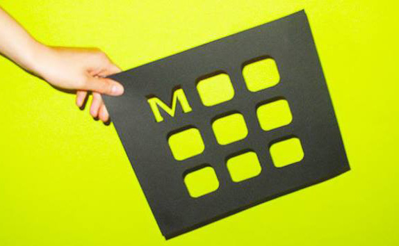
The logotype remains unchanged apart from a more emphasized roundness to the curves of the letters, creating a proprietary font for the first time in the company's history. Particular attention has been given to the letter M, which becomes the pivot for the whole visual identity.
— Press Release (PDF)

Detail of the wordmark. Apologies for fuzziness, it's the best I could find.
If it were designed today, I would vehemently complain about the old wordmark being set in the overused and underwhelming Copperplate Gothic but, now, compared to the atrocious update to it, I find the simplicity and established ubiquity of the old one a major loss. The new wordmark takes out all the edge and crispness of the old and sands down every corner down to a stubby soft corner, while getting rid of inward serifs that provided necessary balance. A major downgrade. Then there is the new monogram, that takes the new "M" and places eight rounded squares (that mimic the rounded corners of the notebooks, see?) around to create a 3-by-3 grid. It's not totally a bad idea, but why squares? As far as I can tell, there isn't a single square Moleskine out there and it's not like every logo should replicate its product or history but the disconnect here is quite obvious and flawed. The monogram then uses the logo-as-window in the most obvious and boring ways, kind of ruining that maneuver for the rest of us. Finally, the monogram is used in tandem with the new wordmark, where it becomes so small to be unreadable. Overall, a very disappointing evolution, specially considering the product's popularity and embrace in creative industries. It deserved better.
Thanks to Yotam Hadar for first tip.
Don't forget to cast your vote about this post online
Flávia R. likes this


27 Jun 07:31
Risadas por trás das câmeras
by Eloise Martins

Na mesma pegada que as fotografias de backstage de filmes famosos que mostramos nesse post aqui, confira mais imagens que mostram um ar descontraído por trás das câmeras.

Indiana Jones e os caçadores da arca perdida – 1981

Harry Potter e o Cálice de Fogo – 2005

Gladiador – 2001

Game Thrones – 2011

Clube da luta – 1999

Batman-O cavaleiro das trevas ressurge – 2012

007 – operação Skyfall – 2012

Star Wars – 1977

Star Trek – 1966

Pulp Fiction – 1994

Os excêntricos Tenenbaums – 2001

O profissional – 1994

O Poderoso Chefão – 1972

Os Miseráveis
| via
Lfgalvao, Joana Morgado likes this
12 Jun 08:58

the speech impediment of the 21st century
by Marc Johns

Original drawing is available (ink & watercolour, 8x10 inches). Signed prints available too.
Check for other available drawings and signed prints in the shop.
Betnyjean likes this
11 Jun 15:04
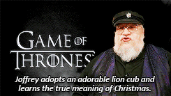


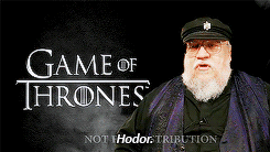

In this mysteriously leaked DVD commentary for Season 4 of...
In this mysteriously leaked DVD commentary for Season 4 of “Game Of Thrones,” author George R.R. Martin drops some MASSIVE plot bombshells. You’ve been warned. [x]
Nuno Catarino, Lfgalvao likes this
11 Jun 14:11
O Sr. Cachorro
by Eloise Martins

Curiosamente, um cachorrinho nasceu com uma mancha igual a um bigode. E não é que ele cresceu como um verdadeiro gentleman?


Feel like a dog:

| via

30 May 09:08
Janela para o passado
by Eloise Martins

Artista e fotógrafo húngaro cria sobreposições temporais e visuais na série Ablak a Múltra (Janela para o Passado).
Na foto acima, 1900 encontra o ano 2012.

1968 – 2012

1963 – 2012
Kerényi Zoltán utilizou imagens do portal Fortepan, que disponibiliza online fotos amadoras de desde o começo do século passado até os anos 90, sobrepondo-as com fotografias contemporâneas tiradas por ele nos mesmos locais.

1945 – 2912

1939 – 2012
Com a janela aberta por Zoltán, podemos comparar as inúmeras transformações que perpassam a história de um espaço, permitindo uma espiada na diferente cultura, arquitetura, moda e tecnologia, além de um contato intrigante com algo que já se foi há muito tempo.

1954 – 2011

1953 – 2012


1962 – 2012
| via
Lfgalvao, Nuno Catarino and one other like this
24 May 16:58


fruity summer striped ice cubes...
by Joy
As summer approaches, I always find myself craving fresh fruit and juices of all kinds. I love smoothies, but it's not always possible to whip out the blender and make a fresh one whenever I want. So I decided to make these pretty (and practical) juice and smoothie ice cubes, which can be frozen and saved to have on hand anytime you need a juicy kick!
They can be added to some sparkling water for a dose of fruit, or stored in the freezer so you can have smoothies on hand whenever you want some (just put a handful of the saved cubes in a cup and into the fridge the night before). Plus, they are so, so beautiful to look at in a pretty glass with a cute straw!
Here are some of my favorite combos and flavors to use, shown above:
JUICES: I used store-bought grapefruit juice, mango juice, limeade, and made some strawberry/beet juice.
SMOOTHIES: I combined kiwi, cucumber, mint and lime make for a beautiful green smoothie blend.
COCONUT MILK: I layered a lot of these cubes with coconut milk, which can be poured right from the can.
Simply add layers of pre-made juice, smoothies, and/or coconut milk (which I love for its color and for a creamy touch) to standard ice cube trays. I've even been adding veggies (like carrots, beets, and cucumbers) to my smoothie mixes for Ruby, to get her those extra vitamins whenever possible!
What kinds of fruity ice cubes would you guys make?
{Photos: Julia Stotz. Art direction and concept: Oh Joy. Production Assistant: Michelle Tu.
This summer inspiration is brought to you by Target. Find more fun and surprises all season long on Target's #SummerUp Pinterest board. All content, ideas, and words are my own. Thanks for supporting these sponsors that allow me to create new and special content like this for Oh Joy.}
Stephmchung, Ayelet.h.eran and 7 others like this
23 May 15:51


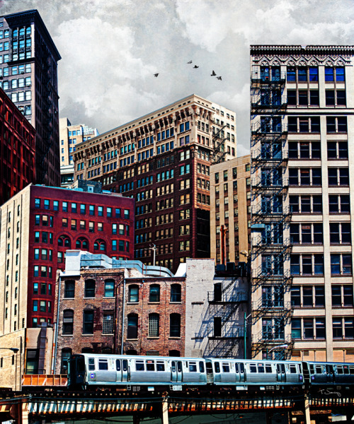
Architecture photography by Jared Lim
by jaap
Accidental architecture patterns captured by Singapore-based photographer Jared Lim, in his series ‘Urban Exploration’.


© Jaap Grolleman, LooksLikeGoodDesign
Tweet on twitter |
Share on facebook |
Add to del.icio.us
Designby31216, Nuno Catarino likes this
No more posts. Check out what's trending.