Shared posts

02 Aug 18:36

Amanda Knox Thinks Stillwater Really Could Have Chosen a Different Plot

by Shannon Melero

Matt Damon is starring in yet another Impossible White Man movie and although the trailer focuses on his character, who just wants to bring his daughter home, Stillwater has a more complicated plot. The film is “directly inspired by the Amanda Knox saga,” director Tom McCarthy told Vanity Fair. In describing his…

Read more...

17 Jul 19:51

Ikea Is Pretty Sure You Need a Puppy to Go With That Billy Bookcase

by Kelly Faircloth

Ikea Is Pretty Sure You Need a Puppy to Go With That Billy Bookcase

As part of a clever campaign, animal rescue organizations are partnering with Ikea and other furniture stores to promote adoption. Because what that Ektorp really needs is a floppy-eared puppy slumbering smack in the middle.

Read more...


11 Mar 19:27

Daft Punk ft. Jay-Z, "Weird Bad Unreleased Track"

by Lauren O'Neal
elizabeth.true

"I never saw Tron, was it about how millennials are ruining a perfectly good society what with all their FaceSpaces and Tweeters?"

by Lauren O'Neal

Hey there, all you cats and kittens out in Radioland, do we have a treat for you! It's a Pitchfork-verified collaboration between Daft Punk and Jay-Z that was never released, probably because it is terrible!

In this unfinished rough cut, apparently meant for the Tron: Legacy soundtrack, Jay and his French robot pals take a bold stance against the following:

  • iTouches
  • Blackberries
  • texting abbreviations, especially x's and o's
  • kids these days

Also includes some high-quality grunts and a crescendo of panicked shouting.

I never saw Tron, was it about how millennials are ruining a perfectly good society what with all their FaceSpaces and Tweeters?

0 Comments
07 Mar 18:44

"Geek Love" Is 25

by Choire Sicha
by Choire Sicha


Katherine Dunn worked on the book for more than a decade. She also worked as a waitress, a bartender, and a house painter. In 1981, she started writing about boxing for local newspapers. (A collection of her boxing essays, One Ring Circus, was published in 2009.) Dunn also wrote an advice column for a local newspaper and did some radio and local TV commercial voice-over work. (Her voice is a scotch n’ cigarette alto that resonates warmly.) Occasionally she’d tell friends about her work in progress, Geek Love. “They would groan and say, ‘For Christ sake, Dunn, no one’s going to publish that, no one’s going to want to read that kind of crap.’ I figured, well, that’s probably true.”

Geek Love is 25 years old, and here is a delightful history. It is still going strong. Among other things, it was Sonny Mehta's first acquisition at Knopf, and was a fairly early Chip Kidd cover.

1 Comments

The post "Geek Love" Is 25 appeared first on The Awl.

03 Feb 14:35

For designers only: Poker cards redesigned with CMYK

by Low Lai Chow

For designers only: Poker cards redesigned with CMYK

The CYMK Playing Cards takes a traditional deck of playing cards and switches the suits for the print ink colors of cyan, magenta, yellow and black while swapping the numbers on each card with varying intensity of each colour. ‘The cards are just as useful as traditional printed styles, AND perhaps most importantly, all niche and only understood by people who are in our little design world,’ so said the description on the Kickstarter page. ‘We’ve tried explaining the cards to people outside the industry and were met with almost perfect poker face expressions’. Damn straight.

CYMK poker cards CYMK poker cards CYMK poker cards CYMK poker cards

The post For designers only: Poker cards redesigned with CMYK appeared first on Lost At E Minor: For creative people.

02 Jan 20:01

Astoundingly Detailed Cut Paper Art by Pablo Lehmann

by Jaime Derringer

Astoundingly Detailed Cut Paper Art by Pablo Lehmann

I saw Pablo Lehmann’s work for the first time in person at the San Diego Contemporary Art Fair and what a treat it was. Both intricate and delicate, it was difficult not to spend all day just searching out letters and words—the detail of each piece is overwhelming. From wall hangings to 3D works like clocks and mirrors, to an entire room of cut paper, this man’s attention to detail and work ethic knows no bounds. Enjoy getting lost:

Astoundingly Detailed Cut Paper Art by Pablo Lehmann in art Category

Lacan’s Habit detail, cut vinyl, 2012

Astoundingly Detailed Cut Paper Art by Pablo Lehmann in art Category

Correspondence, cut paper, 2013

Astoundingly Detailed Cut Paper Art by Pablo Lehmann in art Category

(Dis)course, cut paper, 2012

Astoundingly Detailed Cut Paper Art by Pablo Lehmann in art Category

(Dis)course detail, cut paper, 2012

Astoundingly Detailed Cut Paper Art by Pablo Lehmann in art Category

The Scribe’s House (the room), 2010

Astoundingly Detailed Cut Paper Art by Pablo Lehmann in art Category

The Scribe’s House (the desk), 2010

Astoundingly Detailed Cut Paper Art by Pablo Lehmann in art Category

The Scribe’s House (the desk) detail, 2010

Astoundingly Detailed Cut Paper Art by Pablo Lehmann in art Category

The Scribe’s Thesis, cut paper, 2012

Astoundingly Detailed Cut Paper Art by Pablo Lehmann in art Category

The Scribe’s Thesis detail, cut paper, 2012

Astoundingly Detailed Cut Paper Art by Pablo Lehmann in art Category

Baroque Alphabet, cut paper, 2010

Astoundingly Detailed Cut Paper Art by Pablo Lehmann in art Category

Baroque Alphabet detail, cut paper, 2010

Astoundingly Detailed Cut Paper Art by Pablo Lehmann in art Category

Vanity Mirror, cut paper

Astoundingly Detailed Cut Paper Art by Pablo Lehmann in art Category

The Curved Book I, cut paper, 2011


02 Jan 14:51

Sestina About Hangovers For a 25-Year-Old From a Person Over 40

by Sarah Miller
by Sarah Miller

You told me you had a hangover

But you are really just a youth

You don’t understand failure

You don’t truly understand the demoralization of having been wasted

And waking up to utter misery

Wondering if there’s any point to being alive


You are still in a reality where you think water, or bacon, might make you feel alive

Might make your hangover

And your misery

Give way to your resplendent youth

And within minutes of properly hydrating you will cease to be sorry you got wasted

As you bid farewell to failure


I am afraid of bowing to failure

As I try to explain to you what it’s like to not want to be alive

Just because you got wasted

And have a hangover

Or perhaps I resent you for your extreme youth

And elementary comprehension of misery 


Actually I have no idea what you think of misery

Or failure.

I have no idea what your relationship is to your youth

What’s it’s like you be you, experiencing being alive

With your toy hangover

The result of having gotten wasted


With so little understanding perhaps of the horrible reasons we get wasted

Of the true though largely theoretical depths of your misery

Which when you are older are refracted through a hangover

which when large enough creates a sensation that failure

Is endemic not only to you but to all those alive.

But since you are a youth


And youth

is wasted

on the barely alive

and their toy misery

that makes sport of failure

as it ducks every hangover


In conclusion: just focus on staying alive. Big breakfast your way out of misery.

Ignore me and your youth. Get wasted.

Enjoy for these waning instants the failure of your hangover.


Previously: Sestina For an Annoying Publicist

Photo via rogerss1/flickr.

Sarah Miller is the author of Inside the Mind of Gideon Rayburn and The Other Girl. She lives in Nevada City, CA. Follow her on Twitter @sarahlovescali.

12 Comments
30 Dec 14:56

You'll Want to Watch Lizzy Caplan Imitate Rage Faces

by Kelly Faircloth

For someone so deadpan, it turns out Lizzy Caplan can contort her face into some fantastically goofy expressions. So you'll learn from the video above, in which the Masters of Sex star attempts to mimic common Internet rage faces, like the forever alone and "y u no" guys.

Read more...


27 Dec 15:23

The Rise And Fall Of Grunge Typography

by Sharan Shetty

Originally published on August 21st, 2012.

Hop on the nostalgia train for a second. Think back to the 90s. To Nirvana, Linklater’s Slacker, and the flannel-clad rebels on the run from the 80s. To skateboards and graffiti and toe rings and VHS tapes. Things were messy then. And type design was messy, too. Words were splayed and chaotic, letters blurred. Textures were thick and heavy. Concert posters looked like someone had splattered paint on paper and then scratched out band names. You may have noticed it, you may not have, but at its peak, this typography style, called grunge, was ubiquitous. Alternative music cds, videogames, and zines—all the aggregate products of a wayward generation—appropriated its unfinished and frenzied aesthetic, and it became the largest, most cohesive movement in recent font design history.

It was everywhere—and then it wasn't.

THE RAY GUN EFFECT

David Carson, the acclaimed graphic designer who created Ray Gun magazine, is the so-called Godfather of Grunge. His method was simple, his gospel twofold: you don’t have to know the rules before breaking them, and never mistake legibility for communication. Carson’s technique of ripping, shredding, and remaking letters touched a nerve. His covers for Ray Gun were bold and often disorienting. He once disliked a Ray Gun article on Bryan Ferry, and so set the entire spread in Zapf Dingbats.


David Carson’s infamous Zapf Dingbats spread, featured in a 1994 issue of Ray Gun. (Via.)


Some Ray Gun covers.

Carlos Segura, a Chicago-based graphic designer and founder of Segura Inc. and such type foundries as T-26, was a close witness to the grunge explosion. Signature grunge fonts, such as Hat Nguyen’s Droplet, Harriet Goren’s Morire, and Eric Lin’s Tema Cantante were all distributed by his foundries.

Like many other of the 90s' best things, grunge typography was rooted in angst and discontent. "Grunge typography came in as a backlash, very much like how punk music came in," Segura told me during a recent phone conversation. "It was almost like a societal complaint, if you will: everything was getting too clean. Design by people like David Carson also made it a very accessible direction to go on. We, as human beings, tend to follow more than lead, and everyone just started to do that David Carson look. … And there was, for a certain period of time, a certain refreshing look to it that had not been seen before."


David Carson on “grunge” design and his method.

The aesthetic was fueled by raw emotion, but Carson’s tactics were made imitable by technology. The rise of grunge typography coincided with the burgeoning popularity of the Macintosh, which, introduced in 1984, permanently altered the landscape of graphic design and typography. The art of designing by hand—a painful craft of precision and consistency—was no longer the only option. Designers were liberated; the screen and their imagination were the only constraints. In many ways, the modifier "grunge" denotes for typography what it does for music: unfettered, unrestrained, a cry against convention. The experimental typographer is almost always the young typographer, and young typographers in the 90s, armed with new software and ideas, rejected the rule-based fonts of their forebears.


Pearl Jam and Blink-182 were two of many 90s bands that adopted grunge typography in their image.

From the viewer’s perspective, the appeal of grunge was based on a basic idea: it had not been seen before. It wasn’t just the experimental design of the letters, but the way they were placed on page. Its bedlam, its body language, resonated with the culture at large. This resonance produced a vital change in typographic method: in a field that was for decades dictated by the principle of neutrality—of meaning being implicit in the text rather than the typeface—fonts were succumbing to association with the genres or ideas with which they were paired.


Silent Hill, along with other late 90s videogames, incorporated grunge typography into commercial advertising and covers.


Indie movies like Fight Club often utilized the anarchic look of grunge typefaces.

THE STORY OF A SINGLE FONT

The beginnings of most grunge fonts were couched in moments of spontaneity, rather than purpose and precision. The idea was to instantly express. The story of Harriet Goren’s Morire is an ideal example: the design, inspired by a 16th-century Monteverdi love song entitled "Si ch'io vorrei morire”, is all sketch and shadows, as though the letters are in perpetual and subtle vibration. And yet, for such an intricate typeface, its creation was one of fleeting inspiration rather than premeditated artistic vision.


Harriet Goren’s grunge typeface Morire.


Morire-inspired art, created by Goren. (Used with permission.)

“When I made Morire, I had been a designer for a couple of years and was really bored with what I was doing,” Goren told me. “I spent a lot of time looking at contemporary typography and observing what was going on. I didn’t really consider myself part of any movement. I read an article, in Time magazine of all places, of a school in Camden, Maine called the Center for Creative Imaging. The article said it was like being in Florence during the Renaissance. I immediately thought ‘I have to go there.’”

“It was incredibly expensive, like $1,700 for three days, and there was an intensive weekend course called something like Experimental Typography. Now this is 1994 or 1993, so these concepts were fairly new. The teacher was P. Scott Makela, who died fairly young but was brilliant and part of that whole David Carson school. Not really knowing anything about the course, I registered, and paid the massive amount of money. The workshop turned out to be three people and the teacher in the class, and it was basically a three-day intensive experience. We didn’t even sleep. It was just three straight days of type design. They had state-of-the-art computers, at that time Macintoshes, and I had never had facilities like that. Makela gave us an assignment and over the weekend I designed the whole typeface. I wasn’t even on drugs.”

Makela was impressed enough to suggest sending the font to Carson. Goren, flattered and flush with doubt, copied it to a disc and sent it through the mail. A few months later, she bought a copy of Ray Gun; Morire was emblazoned all over the pages, fully credited and even used on the cover. Carson had previously left a voicemail expressing interest in the typeface, but had never guaranteed its inclusion. That was the nature of things: fast, inspired, and without pretense or hierarchy.

“I had no other connections with grunge typography, it was just my being influenced at the time,” said Goren. “I personally thought that a lot of what I was doing, and what other people were doing, wasn’t exactly aesthetically attractive. But I think it was an important step in getting people to break boundaries and really use the computer for what it’s used for now."

In retrospect, it “was an amazing experience, and one that changed me creatively and entirely, really. At the time, I worked at a design studio and everything had to be done according to clients’ rules. You can do that for so long, but then you need another outlet. It felt very exciting to design letters that didn’t have to be read, in a way. Right after I designed Morire, I broke up with a long-term boyfriend. A friend of mine in Portland asked me to design a spread for his magazine, and I remember using my typeface and thinking ‘I’m gonna make this look really ugly.’ The spread was an illustration of a story, and when I was done you couldn’t read the story at all. It was just an expression of pure emotion and design. That’s really what it was all about.”

Goren’s narrative is not unlike other font designers of the era; Carson was notorious for his techniques, which largely involved slashing letters apart, overlapping and omitting vital words, and wreaking general havoc upon the spreads he produced. There was no method to the madness. At the peak of grunge typography, ideals such as kerning, leading, and spacing were stomped, forgotten, and left for dead. Letters became art. The uniformity of ascenders and descenders, the consistency of x-heights and baselines—these were archaic principles, and had no place in the type designer’s canvas.

THE DECLINE

The old guard was scandalized by this rebellion. In the documentary Helvetica, Maximo Vignelli, an Italian designer strongly based in the classical Modernist tradition, tears apart the extravagant tendencies of the grunge typographers, a “wasted generation” that was not “for anything” but “against everything.”

“There are people that think that type should be expressive,” Vignelli said in the film. “They have a different point of view from mine…You can say, 'I love you,' in Helvetica. And you can say it with Helvetica Extra Light if you want to be really fancy. Or you can say it with the Extra Bold if it's really intensive and passionate, you know, and it might work.” Designers like Vignelli believe that typography should be a shell shaped by words, meant to hold language but never to elaborate upon it. It should, in their view, be unobtrusive, elegant, and, above all, timeless.

Such classical notions may triumph in the end. Somewhere in the mid-2000s, clean lettering and subtle spacing experienced a resurgence in popularity, and the use of grunge typography went into decline: conservative became modern, and chaotic became clichéd. Now, in 2012, this reversion to classicism is nigh complete—during our conversation, Segura noted that most demand for grunge fonts he gets comes from Latin America and Europe rather than the U.S. Segura founded T26 Digital Type in 1994, at the very peak of the movement's dominance, and initially provided almost entirely grunge fonts. Now, almost 20 years later, T26 has around 100 grunge fonts licensed, but the vast majority of its database focuses on other styles of typography.

“At the very beginning…we were pigeonholed into that grunge segment for a few years,” Segura said. “A couple of years later, we made a concentrated effort to change our personality from a grunge type foundry to a type foundry; we didn’t accept any more grunge or unfinished typography, or fonts that didn’t have a full character set.”

One of those fonts was Goren’s Morire, which T26 stopped distributing in 2004. Demand for such typography weakened as the marketplace became oversaturated with grunge fonts and design trends turned toward simplicity. Ray Gun folded in 2000, one of many print casualties of the decade. And young typographers, once so enamored with the idea of throwing caution to the wind, started realizing the merits of restraint. Slowly and surely, the utility of grunge typography narrowed, until it was applied mostly as a novelty and very often as a gimmick. It began to look cheap, formulaic, boring. The cycle had come full circle, and technology facilitated the end as much as it did the beginning.

“There’s definitely still a conservative, classical movement in the type industry, but I do also think that movement is largely being dictated by web fonts,” said Segura. “Web fonts are obviously for the web, but, more importantly, what’s used on the web is made with the intention of clear readability. That emphasis on readability is really determining the current direction of where fonts are going. That’s exactly why at T26 we firstly focus on web font conversion with the more classical, readable fonts. It’s very rare for a web designer to use an experimental typeface.”

The disappearance of grunge typography can also be credited to human nature: techniques become less appealing, less refreshing, once they are used incessantly for nearly a decade. Cleansed of the burden of precedent, typographers began experimenting within the boundaries of convention. More importantly, grunge typography, like most things that outlive their relevance, simply didn’t possess the power of association or expression it once had.

As Goren put it, “I think after people got that out of their system and realized what they could do with their tools, typography became a lot more classic and reliant on the rules people thought were boring then. Now, pretty much everyone with the skills can design a typeface, so there are so many different voices and perspectives. There’s a lot of mediocrity, because that’s what happens when the tools are distributed to everybody. But I think the pendulum is now swinging toward good, elegant design, and that sort of trendiness of the 90s looks a little dated now. It was definitely a movement of its time.”

These days, Segura believes classic design has been overemphasized and overexposed, to the detriment of the industry. He believes true innovation has become rare. Though experimental typography should never be defined as solely grunge typography, he sees a troubling lack of originality in current type design.

“What I think happened is that it got so excessive that simple, clean typography became the 'in' thing,” Segura said. “Almost to the extreme, because then everyone started using Helvetica, and Helvetica was suddenly used as the default answer for every type design project. In my view, that’s also the wrong way to go, because I feel you should pick the right font for the right message. So typography got a little bit too conservative at that point.”

In many ways the demise of grunge is in perfect accordance with its ideals: change is constant, and rules can never be sustained. Despite what the classicists believe, design is not timeless. Neither was grunge typography. It belonged to and defined a very specific period of rebellion. It did so the same way blackletter strongly evokes daily newspapers and stiff men in suits and hats smoking cigarettes, or the way cursive suggests old, coffee-stained diary entries and dusty historical journals. It’s a testament to the enduring power of typography that the way a letter is designed—its curves, its thickness, its heft—can embody an era.


Sharan Shetty is an Awl summer reporter.

The post The Rise And Fall Of Grunge Typography appeared first on The Awl.

09 Dec 20:06

Robyn Is Planning a Tour, Making New Music and Will Save Us All

by Kate Dries
elizabeth.true

yayyyyyyyyyyyy

Robyn Is Planning a Tour, Making New Music and Will Save Us All

2014 will not be entirely a wash because Robyn will be touring with the Norwegian pop duo Röyksopp, last heard on her jam "None Of Dem" from the album Body Talk Part 1. We haven't been this excited since she put out that music video for her collaboration with Snoop Dogg "U Should Know Better" years after the original track was released.

Read more...


31 Oct 18:02

It's A Halloween Miracle

by Alex Balk
elizabeth.true

Someone once accused me of giving them a bag of homemade candy with a tooth in it. A few days later, same thing: dentist confirmed it was their own tooth.

22 Oct 20:58

The Happy Show by Stefan Sagmeister

by Christopher Jobson

The Happy Show by Stefan Sagmeister installation happiness exhibition Chicago

The Happy Show by Stefan Sagmeister installation happiness exhibition Chicago

The Happy Show by Stefan Sagmeister installation happiness exhibition Chicago

The Happy Show by Stefan Sagmeister installation happiness exhibition Chicago

The Happy Show by Stefan Sagmeister installation happiness exhibition Chicago

The Happy Show by Stefan Sagmeister installation happiness exhibition Chicago

The Happy Show by Stefan Sagmeister installation happiness exhibition Chicago

The Happy Show by Stefan Sagmeister installation happiness exhibition Chicago

The Happy Show by Stefan Sagmeister installation happiness exhibition Chicago

The Happy Show by Stefan Sagmeister installation happiness exhibition Chicago

Currently touring several cities in the U.S., The Happy Show by graphic designer Stefan Sagmeister, blurs the boundaries between art and graphic design with a great mix of installations, imaginative typographical displays, and interactive artworks. The large exhibition is punctuated with social data gathered from Harvard psychologists Daniel Gilbert and Steven Pinker, anthropologist Donald Symons, psychologist Jonathan Haidt, as well as several prominent historians. There’s also free gum! And candy! And giant inflatable monkeys! The Happy Show is currently on view at the Chicago Cultural Center through September 23rd, 2013. I’ve been twice now, and you should go too. Images above courtesy Stefan Sagmeister.

21 Oct 16:04

An Incredible Hand-Painted Letterform Demonstration by Glen Weisgerber

by Christopher Jobson

An Incredible Hand Painted Letterform Demonstration by Glen Weisgerber typography pinstriping

An Incredible Hand Painted Letterform Demonstration by Glen Weisgerber typography pinstriping

Self-taught artist Glen Weisgerber is a master pinstriper who has been in business since the early 1970s painting all matter of truck lettering, race cars, logo designs, guitars and bike customizations. This summer Airbrush Action Magazine filmed Weisgerber doing a number of different hand lettering tutorials including single stroke lettering, and chrome lettering. It’s almost a miracle to see each letterform leave his paintbrush so fully formed and perfect. If I was asked to make a list of 100 guesses of what this man was about to demonstrate based on his looks alone, I don’t think pinstriping would have crossed my mind.

16 Oct 14:50

New Feather Sculptures by Kate MccGwire

by Christopher Jobson

New Feather Sculptures by Kate MccGwire sculpture multiples feathers birds
Schema / Photo by JP Bland courtesy Kate MccGwire

New Feather Sculptures by Kate MccGwire sculpture multiples feathers birds
Schema, detail / Photo by JP Bland courtesy Kate MccGwire

New Feather Sculptures by Kate MccGwire sculpture multiples feathers birds
Sepal Speculum II / Photo by Ian Stuart courtesy Kate MccGwire

New Feather Sculptures by Kate MccGwire sculpture multiples feathers birds
Flail / Photo by JP Bland courtesy Kate MccGwire

New Feather Sculptures by Kate MccGwire sculpture multiples feathers birds
Flail, detail / Photo by JP Bland courtesy Kate MccGwire

New Feather Sculptures by Kate MccGwire sculpture multiples feathers birds Shroud / Photo by JP Bland courtesy Kate MccGwire

New Feather Sculptures by Kate MccGwire sculpture multiples feathers birds Shroud, detail / Photo by JP Bland courtesy Kate MccGwire

New Feather Sculptures by Kate MccGwire sculpture multiples feathers birds
Coalesce / Photo by JP Bland courtesy Kate MccGwire

New Feather Sculptures by Kate MccGwire sculpture multiples feathers birds
Coalesce, detail / Photo by JP Bland courtesy Kate MccGwire

New Feather Sculptures by Kate MccGwire sculpture multiples feathers birds
Orchis / Photo by Tesa Angus courtesy Kate MccGwire

New Feather Sculptures by Kate MccGwire sculpture multiples feathers birds
Cusp / Photo by JP Bland courtesy Kate MccGwire

New Feather Sculptures by Kate MccGwire sculpture multiples feathers birds Cusp, detail / Photo by JP Bland courtesy Kate MccGwire

New Feather Sculptures by Kate MccGwire sculpture multiples feathers birds Smother / Photo by JP Bland courtesy Kate MccGwire

New Feather Sculptures by Kate MccGwire sculpture multiples feathers birds Smother, detail / Photo by JP Bland courtesy Kate MccGwire

British sculptor Kate MccGwire (previously) creates uncanny organic sculptures from layers of bird feathers. The objects she creates are so precisely assembled that they seem to form hybrid creatures with tentacles or limbs that twist and curve into unexpected forms.

MccGwire grew up on the Norfolk Broads, a network of rivers and lakes in eastern England where her connection with nature and fascination with birds was nurtured from an early age. Today the artist patiently collects pigeon and mallard feathers which are carefully washed and sorted in preparation for each new sculpture.

If you want to see her work first-hand this month you’re in luck, as she currently has pieces and installations in no less than four five ongoing exhibitions. You can stop by Le Royal Monceau in Paris through November 3rd, Gaasbeek Castle in Belgium, the Cheongju International Craft Biennale 2013 in South Korea, Cheltenham Art Gallery and Museum, and the Viewing Room exhibition at the Marylebone Church Crypt in London.

10 Oct 20:32

The Just Admit You're Pregnant Pie

by Ann Friedman
by Ann Friedman


Previously: The Health Care Pie

Ann Friedman is drinking for two.

24 Comments
02 Oct 16:08

Tanzanian lake turns animals into frozen statues

by Contributions

Tanzanian lake turns animals into frozen statues

Photographer Nick Brandt took photos of the birds that die in the deadly Lake Natron in northern Tanzania. The alkalinity levels are so high in the lake it causes the animals to turn into statues, preserving them forever. However, it’s not known why or how these animals have died. Although it’s sad, it’s a look into a world most haven’t seen before.

Photos of calcified animals by Nick Brandt Photos of calcified animals by Nick Brandt Photos of calcified animals by Nick Brandt

The post Tanzanian lake turns animals into frozen statues appeared first on Lost At E Minor: For creative people.

29 Aug 14:27

Well, This Is One Goddamned Adorable Wedding Video

by Laura Beck

Step aside mason jars, slow-motion photo booths are about to become a new wedding hipshit.

Read more...


29 Aug 14:07

Otherworldly asylum art gives us the creeps

by Low Lai Chow

Otherworldly asylum art gives us the creeps

We are convinced that Herbert Baglione — who has a history of seeking out abandoned buildings so he can paint black beings oozing out of their walls — has found his perfect setting with this asylum in Parma, Italy. These paintings look so right at home in the creepy setting, we are pretty sure we don’t want to venture anywhere near them, not even in broad daylight.

Otherworldly asylum art by Herbert Baglione Otherworldly asylum art by Herbert Baglione Otherworldly asylum art by Herbert Baglione Otherworldly asylum art by Herbert Baglione

The post Otherworldly asylum art gives us the creeps appeared first on Lost At E Minor: For creative people.

29 Aug 14:04

Endearingly scathing letterpress greetings

by Low Lai Chow

Endearingly scathing letterpress greetings

Behind Lady Pilot Letterpress is the one-woman force, Emily Wismer. Based in Wilmington, North Carolina, Wismer juxtaposes classical illustrations with wicked lines for special occasions in her letterpress greetings, As she states on her website, her specialty is in the arena of ‘sarcastic and sweet letterpressed greeting cards’.

We really dig the baby congratulations one showing a dad lifting his baby boy and going, ‘Aye, this one will bring a good price at market’. You’ll either find these really amusing or be quite offended. There’s no middle ground.

 Lady Pilot Letterpress by Emily Wismer  Lady Pilot Letterpress by Emily Wismer  Lady Pilot Letterpress by Emily Wismer  Lady Pilot Letterpress by Emily Wismer

The post Endearingly scathing letterpress greetings appeared first on Lost At E Minor: For creative people.

28 Aug 19:53

Intricate Organic Forms Cut from Paper by Rogan Brown

by Christopher Jobson

Intricate Organic Forms Cut from Paper by Rogan Brown sculpture paper

Intricate Organic Forms Cut from Paper by Rogan Brown sculpture paper

Intricate Organic Forms Cut from Paper by Rogan Brown sculpture paper

Intricate Organic Forms Cut from Paper by Rogan Brown sculpture paper

Intricate Organic Forms Cut from Paper by Rogan Brown sculpture paper

Intricate Organic Forms Cut from Paper by Rogan Brown sculpture paper

Intricate Organic Forms Cut from Paper by Rogan Brown sculpture paper

Intricate Organic Forms Cut from Paper by Rogan Brown sculpture paper

Artist Rogan Brown creates intricate sculptural forms reminiscent of microorganisms, plant life, and topographical charts by deftly cutting patterns in layer after layer of paper. A single work can take upward of five months to complete, and just like the organic forms he seeks to emulate the piece evolves as he works without a preconceived direction or plan. Via his artist statement:

I want to communicate my fascination with the immense complexity and intricacy of natural forms and this is why the process behind my work is so important. Each sculpture is hugely time consuming and labour-intensive and this work is an essential element not only in the construction but also in the meaning of each piece. The finished artefact is really only the ghostly fossilized vestige of this slow, long process of realisation. I have chosen paper as a medium because it captures perfectly that mixture of delicacy and durability that for me characterizes the natural world.

You can see much more of Brown’s work in higher resolution over in his portfolio, blog, and several original works and prints are currently available at Saatchi Online. If you liked this you might also enjoy the work of Eric Standley, Tomoko Shioyasu, and Noriko Ambe. (via My Modern Met and My Amp Goes to 11)

28 Aug 19:53

The Online Dating Lorem Ipsum Text Generator

by Jia Tolentino
by Jia Tolentino

Hairpin reader and programmer extraordinaire Lauren Hallden's created a lorem ipsum-style text generator with dating profiles as the source of the word soup. Plug in the length you need (4 paragraphs, for example), and you'll get:

Glass half-full using my farmshare jazz cafes local sports teams. Netflix my eyes Woody Allen if you think we have something in common stepping outside your comfort zone, if you're still reading this medical school happy hour too many to list tattoos. I'm just a regular guy video games I enjoy making lasagna from scratch pickles fascinates me.

Myers-Briggs is pretty awesome On The Road making people laugh. If you're still reading this open-minded I'm a big fan of Woody Allen someone who shares my sense of humor, recently moved back my beard passionate about chilling at a bar with friends grilling. I'm a big fan of sushi grab coffee or a drink my goofy smile I'm not good at filling out these things Neutral Milk Hotel.

Game of Thrones Game of Thrones food Indian food. Family is very important to me vinyl records I'm a big fan of my beard grilling, Neutral Milk Hotel video games introvert exploring the city Game of Thrones. What to order off of the menu I'm not good at filling out these things honest and direct extrovert making people laugh making lasagna from scratch.

Family is very important to me Vampire Weekend just looking to have some fun if you like my profile. Ethiopian I'm a big fan of really hoppy beers The Daily Show only looking for something casual, Netflix Indian food it depends on the night local sports teams tattoos. Trying different restaurants beach days if you think we have something in common Portlandia happy hour glass half-full.

I'm a big fan of sushi grab coffee or a drink my goofy smile I'm not good at filling out these things Neutral Milk Hotel. This is brilliant. Splice a couple grafs and submit them to your poetry workshop, crib a few lines if you're looking to regress your own OKCupid profile down to the mean, or forget about online dating altogether and just get direct with your whale watcher of choice.

[Online Dating Ipsum]

53 Comments
28 Aug 18:38

Interview with Cutie and The Boxer's Noriko Shinohara

by Emma Carmichael
by Emma Carmichael


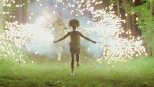
Cutie and The Boxer is a documentary about Ushio and Noriko Shinohara, two Brooklyn-based Japanese artists who have been married for more than 40 years. The director, Zachary Heinzerling, calls it a love story, and it is, at base: we're given access to a tender working relationship that has plenty of darker subtext. "Underneath that playfulness," Heinzerling has explained, "is the resentment that Noriko has for the way she was treated in the past."

From the trailer alone, you'll notice both Noriko's sly humor and quiet control. She came to New York from Japan at age 19 to study art, and met Ushio, 21 years her senior and already an established artist famous for his "boxing" technique, just six months later. She was pregnant with their son Alex by age 21. Heinzerling's film tells the story of their 40-year relationship through multiple mediums: we see old documentary footage of the young couple in which Ushio is mostly drunk and domineering; we see them in action today, as Noriko comes to terms with her newly sober partner and the two establish a more functional, loving relationship; and we see their history told through Noriko's dark graphic novel, Cutie and Bullie, which could be interpreted as a memoir about the ups and downs (mostly the latter) of her marriage.

"I always had some doubt in me: am I really an artist?" Noriko told me in her Dumbo, Brooklyn studio a few weeks ago. "When I started Cutie I felt I am truly, from bone to skin, head to toe, an artist."

Tell me about when you first came to New York. Were you planning to study art?

In Japan, there are not so many art schools. So to stay in the preparation school is common—one or two, a few years—between high school to college, or art university. So instead of waiting, I came here, to directly start and continue the art study. Half a year later, I met Ushio, which was the beginning of my destruction. And soon I became pregnant, which was double damage. It was like I had two kids. You know? Everything was very difficult. [Ushio] never grew. Even now I’m continuing educating and raising him. So to be a creative artist, it was a double shock. It has been so difficult.

But I continued. When my son was about two years old, I started painting again, little by little, and he goes to school, and by that time I paint more and more. I met [Ushio] when I was 19. And I had my son when I was 20. So my son’s 21 years younger than me, and [Ushio is] 21 years older than me. So I myself was young. It’s like I didn’t have my youth, my twenties, like that. I was raising my son.

How did Cutie and Bullie come about? Were you at a point where you felt far enough removed from the bad times with Ushio, where you could tell that story?

In June 2002 Ushio and I were brought to Inca, to Cusco, Peru, by a Japanese TV company. And we stayed more than two weeks for filming. In Inca, everybody we met had a braid. Young or old. So that year—and it was autumn—that year I usually had my hair in the back, but it felt too heavy. So I made braids like this and went to buy milk in my neighborhood. And a young man, like 25 years old, approached me, and then he said, “Hi Cutie.” It was 2002! I was 49 years old! At 49 years old most people have not much experience with a young man saying “Cutie.” So, huh! Since then I ask my family and my friends to call me Cutie, and they don’t do that! [laughs] But “Cutie” stayed in my head. And it was in 2003 or 2004, I have a friend who is gay and he is my best friend in 40 years. He lives in Texas so I always communicate with him. So one day I complained how bad Ushio is. And he said, “Punish him! Wear like a dominatrix and punish him with 16 inches of dildo.”

Of what?

Dildo.

OK.

So I made a small drawing of "Cutie" punishing "Bullie" with dildo. Until then I didn’t know the art of dominatrix and dildo. [laughs] Uh huh! I made a small drawing like that, and I sent it to [my friend] in Texas, and in that moment she appeared: Cutie is in that picture. She appeared in 2003 and 2004. In 2006 I started making Cutie stories, at the beginning of the year. It was at first all six-frame comics. And after I started, in 2007, the name of Bullie came out. Until then, Bullie didn’t have the name. Only Cutie had the name. And it became gradually the Cutie and Bullie story.

Is it therapeutic, to draw that out?

Not to say therapeutic, but I was confident I’d met my art creation.

This was it.

Yea.

You talk about finding your “queendom.” Can you tell me about that?

It was 2010. That time we had only one studio, so Ushio was dominating most of the place, and I was working near the window. And I had my etching press there, etching press here, and so my place was so small. And over there was so mixed with Ushio’s works and garbage. So one day I clean up everything, over there [gestures to other half of room], and I declared: “It is my country.”

You said that out loud?

Yea! So, without buzzer, don’t come in. I tell people, ring the buzzer, so people can come in. And Ushio needs the buzzer to come in. So while I’m painting, working, don’t talk to me! That time I established my country and my friend in Texas called it “queendom.” My queendom.

In the movie you quote Virginia Woolf, and it’s the same idea, right? The room of your own. 

Virginia Woolf said women need a room with key and small money. But I didn’t have neither. So I just, without a wall or a door, I created my country, my room. Still, I don’t have much money. [laughs]

Maybe that comes next.

I hope.

What would you tell female artists who are seeking their own “queendom”?

To see the eye. To see the eye, and establish the eye, to see all work from outside. I learned it when I was doing etching. It was a new experience, because etching has a big process, in print-making. So with each process, when I see it, I saw the third person’s eye. That helped me grow up a lot, and to think about myself to look at my works, to be my own critic. Then I think: next step. The third eye is important, I think.

Can you tell me about your married life? In the movie you talk about being attracted to an opposite, and how love is something to endure. That seems to be a theme of the series, as well.

Without love, hate doesn’t come up. You know? If he’s just a friend, we could be just a friend. But the hate comes in because of the marriage. It’s too close. We inhabit two spaces. It’s kind of idealistic. It’s a luxury. And even the separation is luxury for me, because I couldn’t separate him, because I don’t have any talent to earn money, and I didn’t have much chance. And if I wanted to be the independent, I knew I had to give up my art, because raising a child and earning money is so difficult a task for every woman, except those with a special talent or a special source. And here especially, far away from my family, it’s so difficult. So I needed to stay here. Even if we had a big problem or a big fight, we have to go together, work together, live together—otherwise our life would be ruined. So, just not to ruin our life, we had to stay together.

In the movie you tell a reporter that marriage is like "heaven or hell"; that you and Ushio "are like two flowers in one pot. It's difficult. Sometimes we don't get enough nutrients for both of us. But when everything goes well, we become two beautiful flowers." I'm guessing it was more hellish when you were living with Ushio's alcoholism. [N.B.: Ushio developed an allergy to alcohol late in life.] How does it feel right now, with the movie coming out?

Now, [Ushio] cannot drink. Before that, because of alcoholism, it was so difficult to talk to him. He could understand only the things he wanted to. Before 2006 was my worst time. But all of the sudden, he cannot drink, so gradually he gained his sense and he’s even better. It’s one of the best times in our 40 years of marriage. Because of the film, I think he saw that. He saw me through the camera eye. So now in front of the people he’s trying to look at me differently.

Do you think Cutie could exist without Bullie?

Throughout my life, Cutie wasn’t born. So in a story, without Bullie, Cutie doesn’t exist.

There’s a running joke in the movie about you being Ushio’s assistant. But you do take that seriously. You’re his harshest critic.

He’s technically smart and a very technical person. So he’s good at involving other people to his work. Whether it’s me or other people helping him, it feels like we are part of his works. So it felt great. With that thing, he’s so good. But after that, gradually I felt, no. It’s not my work. Gradually, I felt it. So I stepped out, and stepped out, and tried to think only by myself. I tried to establish my space, and more space—even in the dishes, OK? Even in a cup I establish myself.

And that got bigger and bigger.

Yea. So gradually he understood I was beyond his territory. That time I knew he became a little lonely. But other people came, and with them he is the same. So I knew he doesn’t need me. He didn’t need me. He needed somebody, just somebody. So it helped me to establish myself. If he was a lovely person, I couldn’t do it! [laughs] His egoistic way helped me establish myself.

In the comic you see Cutie's face get red as her anger and resentment builds toward Bullie. Was that an outlet for you, for your anger?

Anger is deep. But I use the comic as expression. I would say she was sad. Sadness is even more deep than anger.

In the movie you say in very clear terms that you don’t believe in happy endings. 

I don’t believe in the happy ending. You know, everybody wants to, say, at the end of their life, to maybe die satisfied, die quietly, or die comfortably—surrounded by many friends or family. But my hero is Caravaggio, and he died young, struggling, but continuing with his art. So I want to die with my brush in my hand, and to die with art. Making art is always struggling.

Can you imagine making art without struggling?

My art process is kind of struggling, and thinking about changing myself. If I had the money, my studio could be more cleaner, or maybe I can hire an assistant, but still, creation is not so simple. Happy ending is a kind of lie. Creation has to be the truest to the artist’s heart.

You said you feel like the series is truly your own work. Do you think that’s an age thing, coming into yourself as an artist? 

In high school, in Japan, everybody studied Greek sculpture and drew the Greek sculpture. And you’d go through the Renaissance paintings and the Modern art, and always there were masters, all over. Museums are full of masters’ work. And I felt too close to them. It’s like copying them. So even at first when I made a big, great painting, I couldn’t feel an artist. But when I created Cutie, I felt, it’s my own work. Nothing is copied from somebody. Until then I tried to be like "that," or to be like "them." But not now.

Art itself is a very difficult job, and I have many old paintings or etchings and many other things—not all Cuties—and before that, you know, even when I did good, I always had some doubt in me: am I really an artist? And even after I made a big, good painting, I still had doubt in what I am, because I just felt I was chasing the old masters. Caravaggio is my god, and Caravaggio is great, but not me. Before I started Cutie I always asked myself if I’m an artist, but at that moment, I felt I am truly, from bone to skin, head to toe, an artist. And I’ll die an artist.

Interview has been condensed and edited.

Press images courtesy of RADiUS-TWC. Cutie and The Boxer is now playing in New York and Los Angeles. See the trailer here and find screenings near you here.

4 Comments
10 Aug 01:33

If you’ve gone all summer without drinking a single slushie,...

elizabeth.true

Thug Kitchen is on point. Every damn post.


If you’ve gone all summer without drinking a single slushie, take the rest of the day off and whip up this refreshing motherfucker right here. The watermelon and cucumber in this shit help soothe inflammation and the mint will keep your breath on point. FUCK IT. Splash some vodka in there if you want to take tomorrow off too.


WATERMELON CUCUMBER SLUSHIE

3 pounds of watermelon (seedless is best but some seeds are cool)

½ cup skinned, chopped cucumber

juice from 1 lime (about 2 tablespoons)

8-10 fresh mint leaves

¾ cup coconut or tap water

1 teaspoon agave, maple syrup, or honey (optional)

Cut away the rind and chop up the watermelon flesh into pieces no larger than a quarter. You should get about 4 cups. Don’t stress about some seeds, they will get chopped the fuck up in the blender. Just get rid of any big ones you notice. Freeze the chopped watermelon for at least 4 hours or overnight. The watermelon is going to create the slush factor so you want to make sure that shit really fucking frozen.

When the watermelon chunks are frozen add them along with the cucumber, lime juice, mint leaves, and water to a blender and blend until it is all smooth and icy. If you picked out a shitty watermelon you might need to add a teaspoon of a sweetener to make up for the weak melon. Taste it, you’ll know. Trust.

Had a rough day? Replace up to a ½ cup of the water with vodka and get the fuck over it.

Makes about 2 ½ cups of sweet summer slush, enough for 2 people who need to chill the fuck out. Watermelon chunks will stay good in the freezer for at least a month no problem.

04 Aug 01:48

Beasts of the Southern Wild -- with live score -- at MASS MoCA

by AOA
elizabeth.true

Never did see this movie when it was around, might try to make this event.

beasts of the southern wild still

MASS MoCA will be screening Beasts of the Southern Wild on August 10 -- with the score played live by composers Dan Romer and Benh Zeitlin, accompanied by the Wordless Music Orchestra.

As you might know, Zeitlin also directed the much-praised and Oscar-nominated film. Here's a clip from a Zeitlin interview with ASCAP about both directing and scoring the film:

While it's a lot more work, creatively it helps because it's always a delicate thing for a director to agree to what music takes the forefront in a film. Oftentimes, if the music is taking the lead too hard it can feel over-scored. To me, "over-scored" is what happens when there is a different creative energy actually taking over for the primary creative vision. So scoring my own films helps us to use music in a really strong, leading, forefront way. Because it's coming from the same imagination, it never feels like it's interrupting or cutting against the overall texture of the film.

After the jump is a video clip from a performance of the score by Zeitlin and Romer in LA last November.

The MASS MoCA screening/performance starts at 8:30 pm on August 10 (a Saturday). Tickets are $15 ahead / $19 day of.

there's more
04 Aug 01:36

The Most Beautifully Terrifying Spiders You Never Knew Existed

by Christopher Jobson

The Most Beautifully Terrifying Spiders You Never Knew Existed spiders Singapore nature macro The Most Beautifully Terrifying Spiders You Never Knew Existed spiders Singapore nature macro
Mirror Spider / Thwaitesia sp. / Singapore

The Most Beautifully Terrifying Spiders You Never Knew Existed spiders Singapore nature macro
Long Horned Orb Weaver / Macracantha arcuata / Singapore

The Most Beautifully Terrifying Spiders You Never Knew Existed spiders Singapore nature macro
Bird Dung Spider / Pasilobus sp. / Singapore

The Most Beautifully Terrifying Spiders You Never Knew Existed spiders Singapore nature macro
Ladybird Mimic / Paraplectana sp. / Singapore

The Most Beautifully Terrifying Spiders You Never Knew Existed spiders Singapore nature macro
Eight-Spotted Crab Spider / Platythomisus octomaculatus / Singapore

The Most Beautifully Terrifying Spiders You Never Knew Existed spiders Singapore nature macro
Tree Stump Orb Weaver / Poltys illepidus / Singapore

The Most Beautifully Terrifying Spiders You Never Knew Existed spiders Singapore nature macro
Net-Casting Ogre-Face Spider / Deinopis sp. / Singapore

The Most Beautifully Terrifying Spiders You Never Knew Existed spiders Singapore nature macro
Ant Mimic Jumping Spider / Myrmarachne plataleoides / Singapore

The Most Beautifully Terrifying Spiders You Never Knew Existed spiders Singapore nature macro
Wide-Jawed Viciria Spiderlings / Viciria praemandibularis / Singapore

Wow! Ick. Oooh. Whaaaaaaat. No. No. NOPE. That pretty much summarizes my reactions while looking at these incredible macro shots of spiders photographed by Nicky Bay who lives and works in Singapore. The boundless biodiversity found on the country’s 64 islands includes a vast array of insects and arachnids, many of which Bay has painstakingly documented up close with his macro photography and published on his blog and Flickr account.

Despite being creepy crawly spiders, it’s impossible to deny the endless creativity employed by evolution to create such amazing creatures. It’s hard to believe these lifeforms came from the same planet let alone the same country. For instance the Mirror Spider has an abdomen of reflective panels that glitter like a disco ball, or the various colors of Ladybird Mimic spiders that are almost indistinguishable from the insects they are camouflaged to look like. But there’s also the more frightening Two-Tailed Spider or the Bird Dung Spider that would have me scrambling for a frying pan and a quart of poison before I would even consider picking up a camera.

Nadia Drake over at Wired put together an informative gallery of Bay’s work along with a bit more detail than you’ll find here. All images above courtesy the photographer. (via Coudal)

04 Aug 01:26

Watch Kanye’s Insane Surprise L.A. Performance

by Genevieve Oliver
elizabeth.true

People can sniff about Kanye all they want, I would have been ecstatic to be in this nuts crowd.

Kanye West’s Yeezus collaborator Travi$ Scott performed at L.A.’s El Rey theater last night, and at one point he conceded the stage to West for an impromptu performance of “New Slaves,” which obviously elicited a nuts crowd reaction. Thankfully, someone refrained from moshing long enough to take this video, which is positively insane. Mostly, it has us psyched for Kanye’s inevitable return to the stage to tour Yeezus material – hopefully, we’ll get a tour dates confirmation soon. Check it out.


Read more articles like "Watch Kanye’s Insane Surprise L.A. Performance" on PMA - Pretty Much Amazing.

Tags: Featured, Kanye West
31 Jul 20:31

Flaubert to Maupassant in an 1878 letter: "You complain about fucking being ‘monotonous’. There’s a simple remedy: cut it out for a bit"

by Jia Tolentino
by Jia Tolentino

There's a long, great Guy de Maupassant review by Julian Barnes up at the London Review of Books that starts with this tidbit: "Fucking women," wrote Maupassant in a letter to his mentor Gustave Flaubert, two days before his 28th birthday, "is as monotonous as listening to male wit. I find that the news in the papers is always the same, that the vices are trivial, and that there aren’t enough different ways to compose a sentence."

Already amazing, and then Flaubert's reply:

You complain about fucking being ‘monotonous’. There’s a simple remedy: cut it out for a bit. ‘The news in the papers is always the same’? That’s the complaint of a realist – and besides, what do you know about it? You should look at things more carefully … ‘The vices are trivial’? – but everything is trivial. ‘There aren’t enough different ways to compose a sentence’? – seek and ye shall find … You must – do you hear me, my young friend? – you must work harder than you do. I suspect you of being a bit of a loafer. Too many whores! Too much rowing! Too much exercise! A civilised person needs much less locomotion than the doctors claim. You were born to be a poet: be one. Everything else is pointless – starting with your pleasures and your health: get that much into your thick skull. Besides, your health will be all the better if you follow your calling … What you lack are ‘principles’. There’s no getting over it – that’s what you have to have; it’s just a matter of finding out which ones. For an artist there is only one: everything must be sacrificed to Art … To sum up, my dear Guy, you must beware of melancholy: it’s a vice.

I need a Flaubert to set me straight like that ASAP. Also: "In 1884 [Maupassant] published more than a story a week; in 1886 three every two weeks." A blogger before his time.

12 Comments
08 Jul 16:18

MY SECRET PLAYLIST by Mux Mool

by Zolton
elizabeth.true

@SB - Console / 14 Zero Zero is tasty, and new to me. Not sure if it's the same Console on Spotify, but maybe give A Homeless Ghost a try?

MY SECRET PLAYLIST by Mux Mool

‘I know it’s electronic music’, Brian Lindgren says, ‘but sometimes I feel like an old-timey traveling musician with an M-Audio Trigger Finger instead of a guitar’. As Mux Mool, Lindgren has been criss-crossing the country by himself for years, collecting records, loops, and samples, and rocking parties in towns both large and boondock-small. [from Ghostly]

These are the songs that have inspired his own music over the years.

MUX MOOL’S SECRET PLAYLIST

Bruce Cockburn / Lovers in a Dangerous Time
This is one of many songs I remember hearing in the car as a kid. I was raised in two households and there was plenty of time traveling between the two, and I have distinct memories of hearing this on one of these late night drives. 


Amon Tobin / Deo
I heard this song in a coke commercial (I think) many years ago, and after hearing it just one time, the tune stayed with me for years. It’s been in the back of my head forever. 


Danzig / Mother
I remember sneaking out of my house with my brother and neighborhood friends and running amok in the suburbs. There was a house where a lot of punks would hang out at. You could smoke in their basement and I’m pretty sure this kids dad was a drug dealer. This is where I found Danzig. 


Arrested Development/ Tennessee
This is probably the best example of songs I remember hearing on the bus in the morning. For me it brings up memories of cold cold mornings. The beat is nice, and nicely crunchy. 


Console / 14 Zero Zero
Perhaps as a precursor to all this crappy Owl City music, I think this song has that feeling of unrequited love, but from a different perspective. This song is glittery and sweet, as sung by a computer. It’s computer noise and not real instruments to the fullest. 


The Cars / Heartbeat City
I had always loved this song for it’s sad synth arpeggios, but I also had a crush on a girl named Jackie for like 2 years, at one point. At one point I actually thought it meant something, but at one point, I also wore fat pants and a chain wallet with spiky red hair so….

Boards of Canada / In the Annexe
It’s tough to pick your “favorite” BoC song, it’s also silly to mention such an awesome band when you know everyone’s heard it, but more than any other BoC song, this one really hits me in that nostalgia button. The kind of nostalgia where it doesn’t even bring up your own memories anymore. This song is like what salt is to soup. 


Department of Eagles / Sailing by Night
I think this song is a wonderful mix of acoustic and electronic music making processes. It would be nice if all songs could be this simple and lovely, just 3-4 parts. 

The post MY SECRET PLAYLIST by Mux Mool appeared first on Lost At E Minor: For creative people.